Paint an Abstract Expressionist Jazz Album Cover
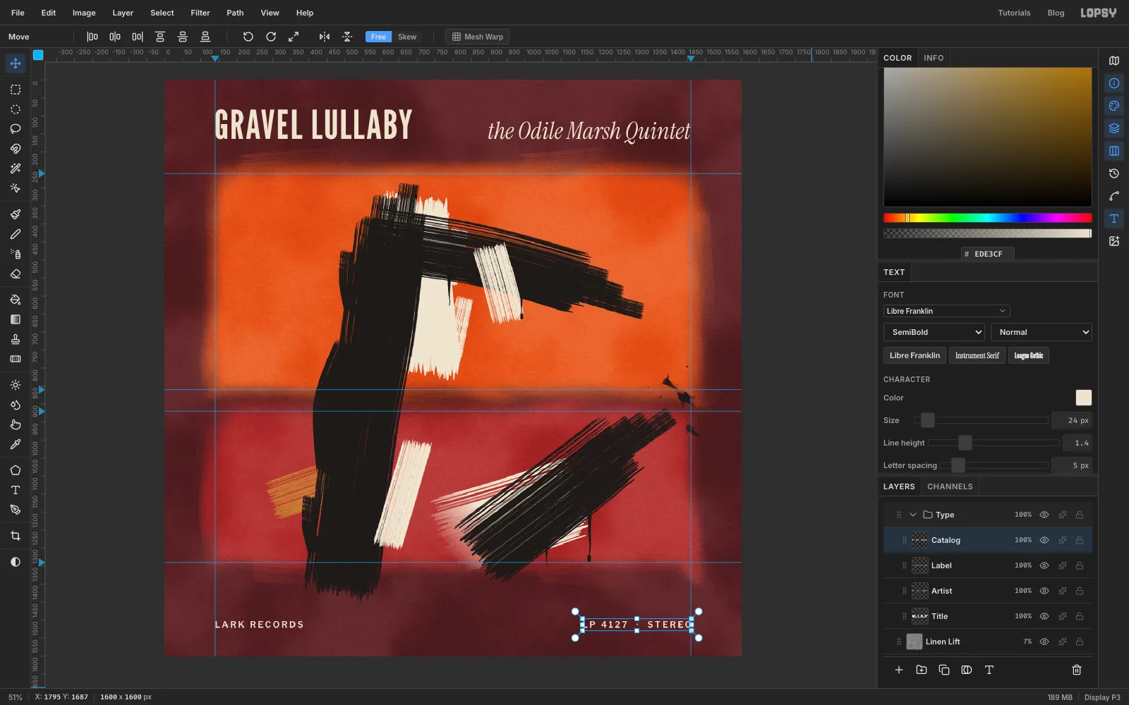
Paint a Rothko-and-Kline style jazz LP sleeve in Lopsy with soft colour fields, a custom dry-bristle brush, drips, splats and tracked type.
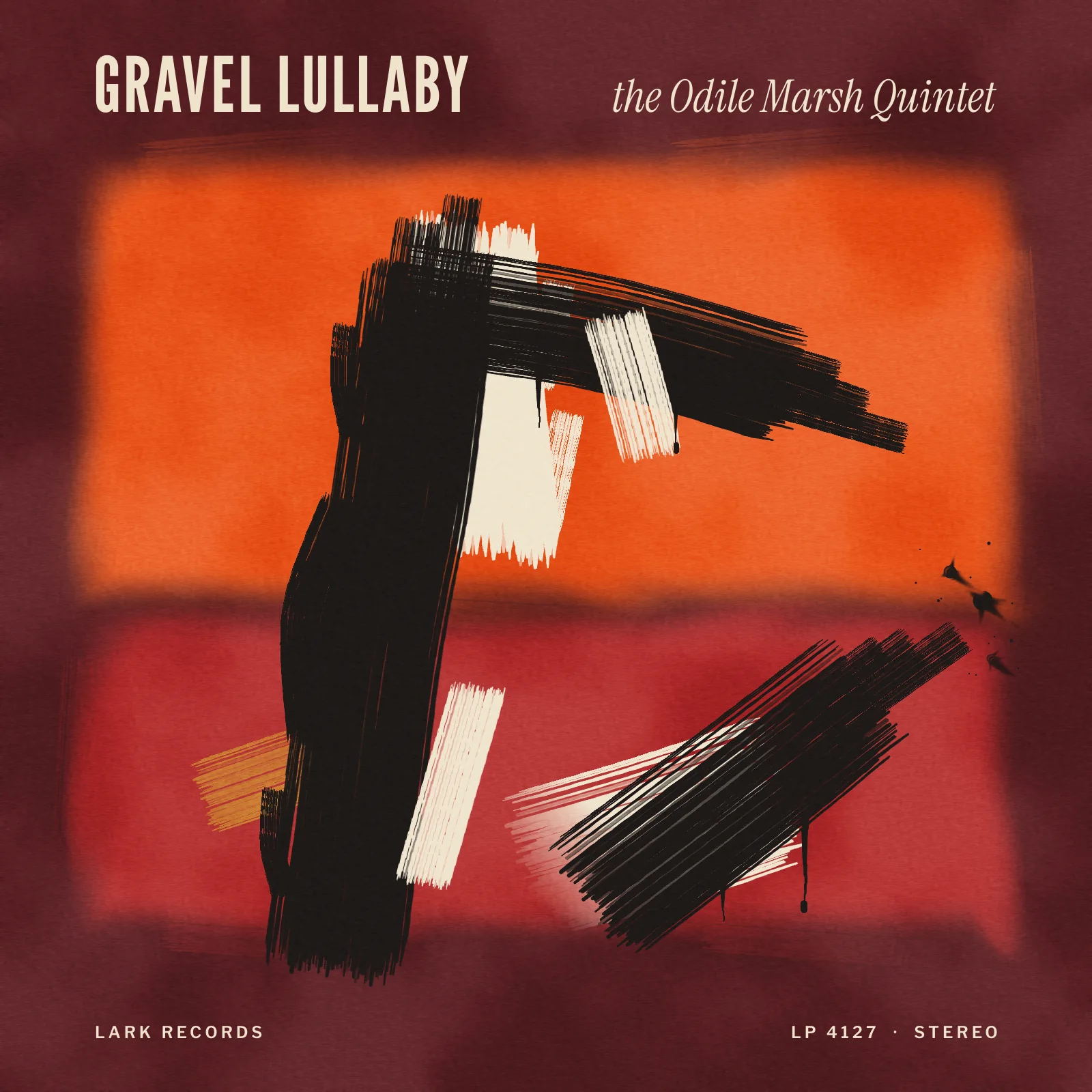
In the 1950s, the painters of the New York School and the bebop players shared the same downtown bars, and a lot of jazz records went out in abstract expressionist sleeves. This tutorial paints one for an invented record, Gravel Lullaby by the Odile Marsh Quintet. It mixes two kinds of abstract expressionism:
- Mark Rothko's soft, glowing colour fields, stacked one above the other
- Franz Kline's huge black brush beams, painted with a house-painter's brush that's running out of paint
Most of the work is making paint look like paint. Clean digital strokes look wrong in this style, so you'll build a ragged bristle brush and let every stroke end dry and broken.
Along the way you'll use:
- feathered marquees and the Smudge tool
- Clouds, Add Noise, Motion Blur and Emboss
- Edit → Define Brush, and the Brushes modal's angle dial, texture and Taper settings
- the Move tool's rotate handle
- a layer mask with a gradient
- the Outer Glow effect and the Soft Light, Overlay and Screen blend modes
- point text with letter spacing, positioned to the pixel
The palette is warm and dark, with one bright field:
-
Oxblood ground
-
Cadmium orange
-
glow
-
Crimson
-
Lamp black
-
Bone white
-
Ochre
-
Start a square sleeve
Album covers are square. Open Lopsy and press Cmd+N (or choose File → New). Set Width and Height to
1600, leave the background on white, and click Create.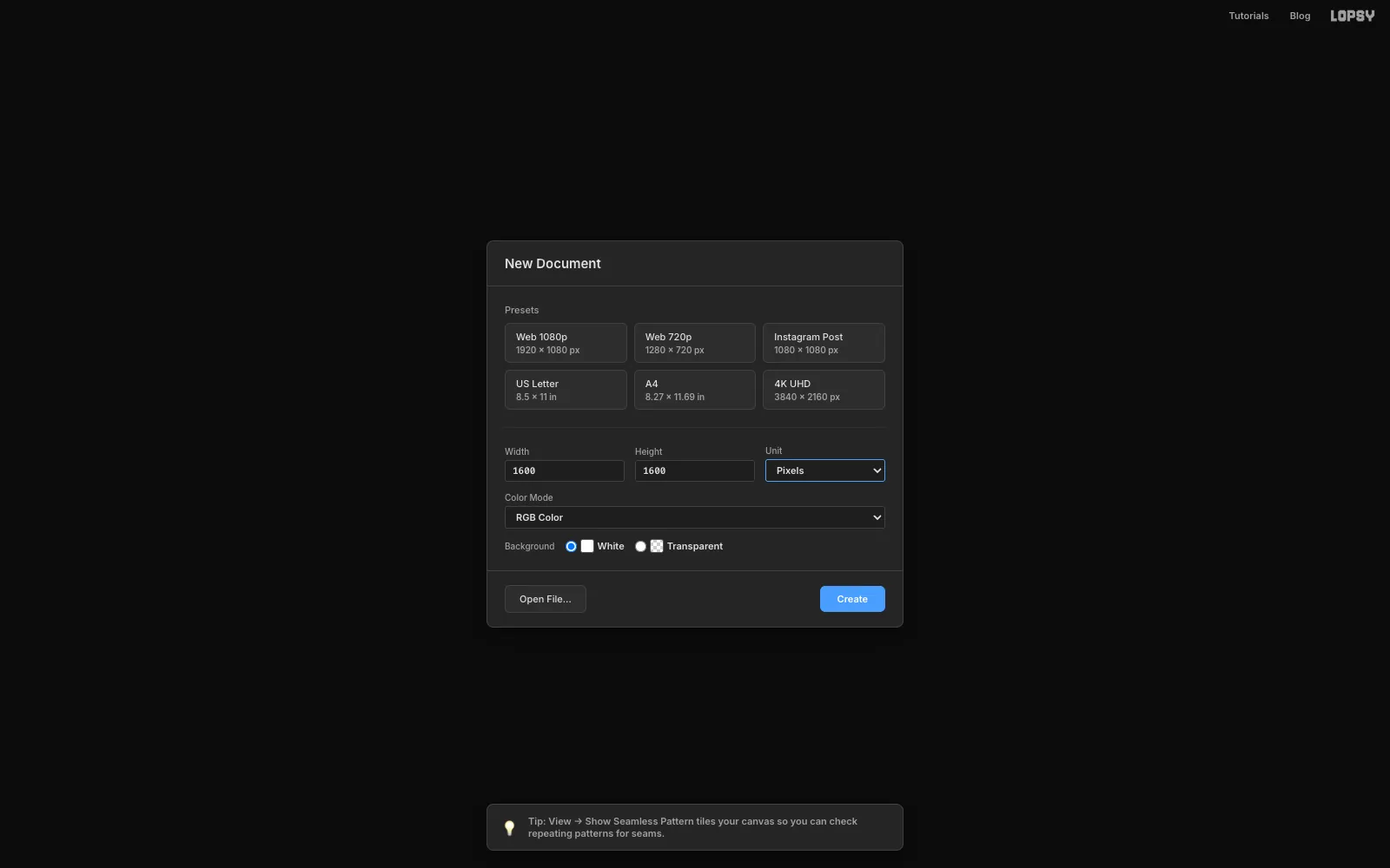
-
Lay the oxblood ground and the guides
Click the Background layer. Type
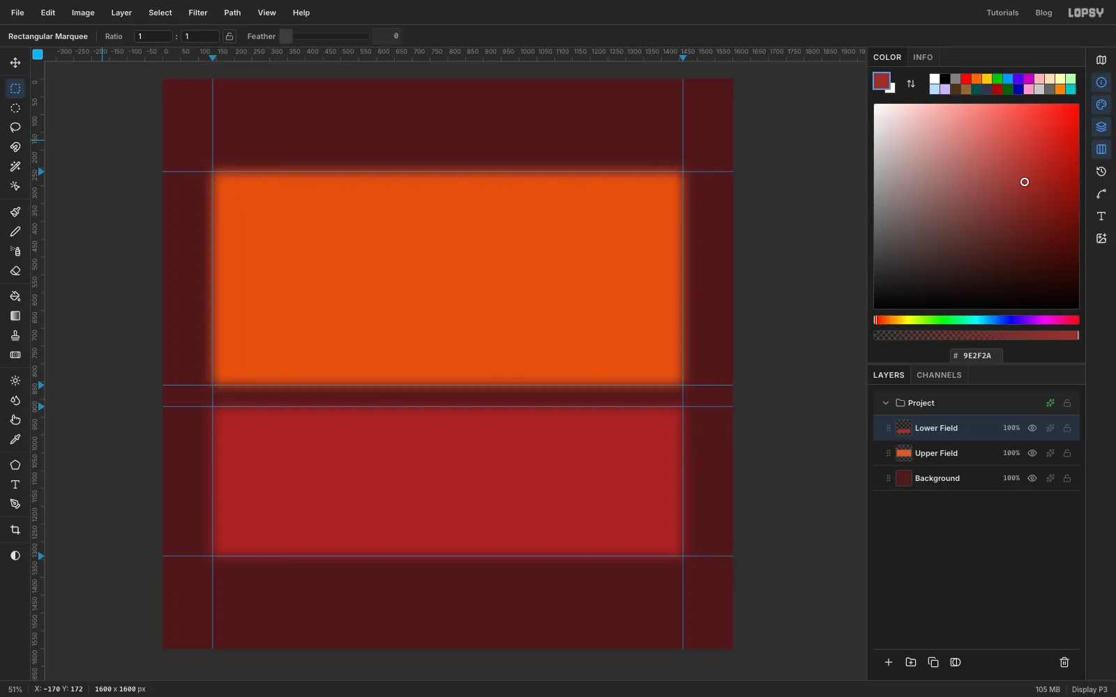
4A1A1Cinto the hex field of the Color panel and choose Edit → Fill.The layout is two stacked fields with a thin gap between them, and a generous margin above and below for the type. Click the top ruler at
140and1460to drop two vertical guides. Then click the left ruler at260,860,920and1340to drop four horizontal ones.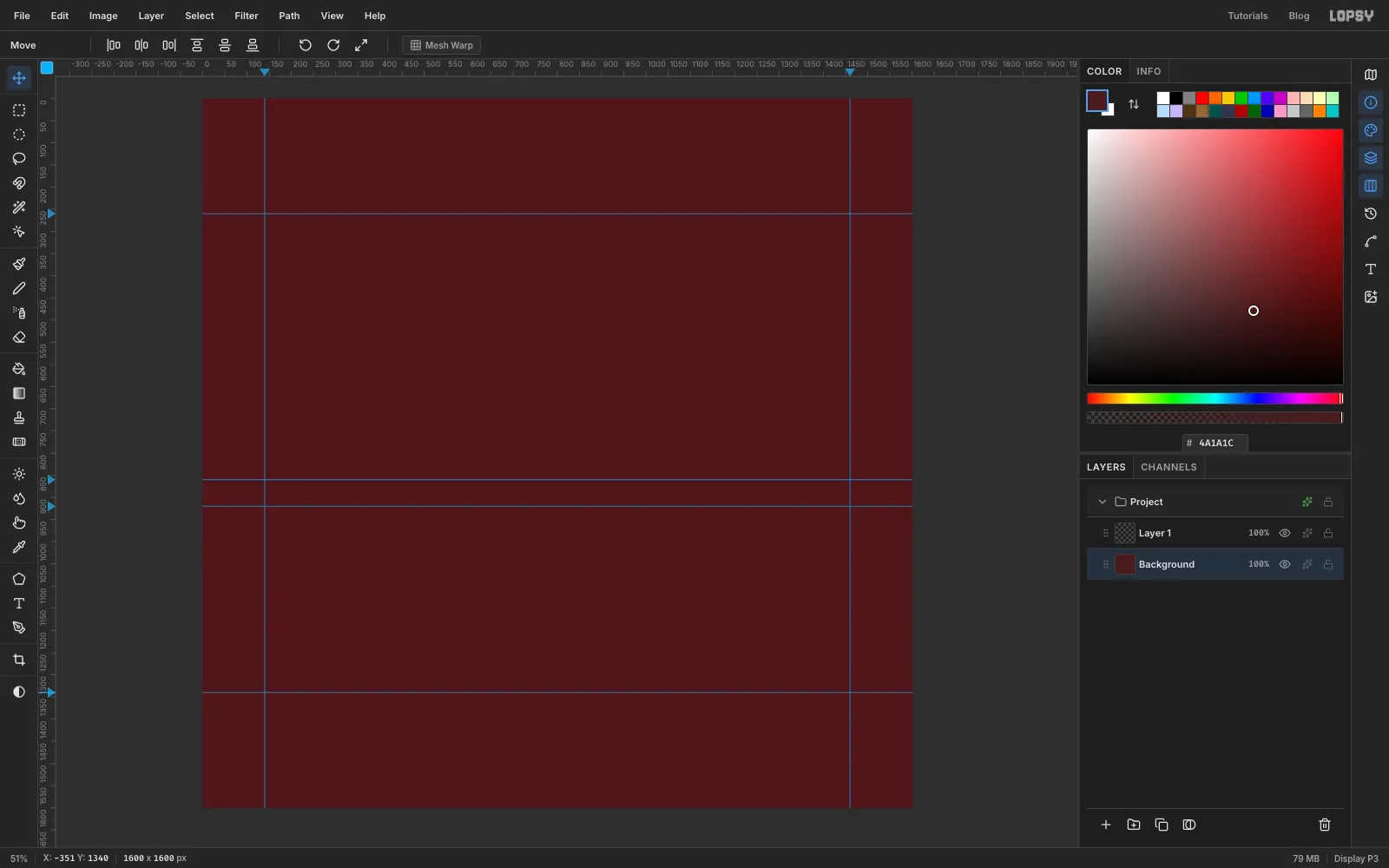
-
Fill the orange field
Double-click Layer 1 and rename it
Upper Field. Press M for the Rectangular Marquee and drag from the top-left guide crossing (140, 260) to the crossing at1460, 860. The marquee snaps to the guides.Choose Select → Feather…, set it to
34and click Apply. Set the foreground to and choose Edit → Fill. Press Cmd+D to deselect.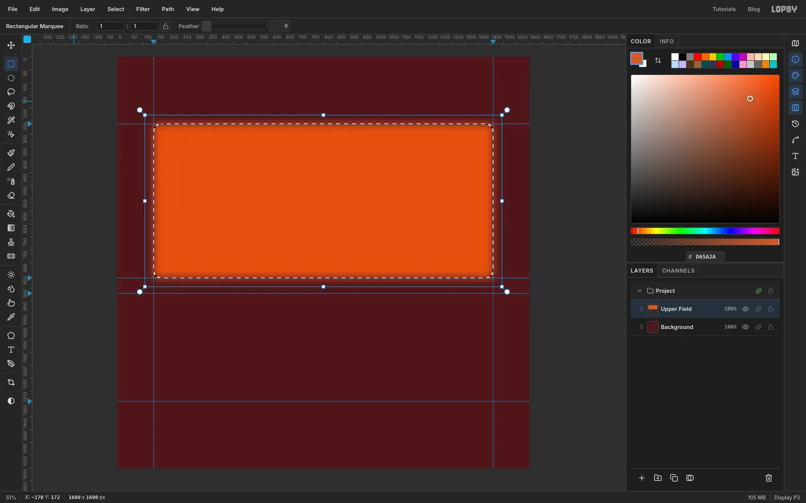
-
Fill the crimson field
Click Add Layer at the bottom of the Layers panel and rename it
Lower Field. Marquee from140, 920to1460, 1340, feather it by34again, and fill it with . Deselect.Rothko's fields are close in value and slightly blurred, so they seem to hover. These two already do.
-
Smudge the edges unevenly
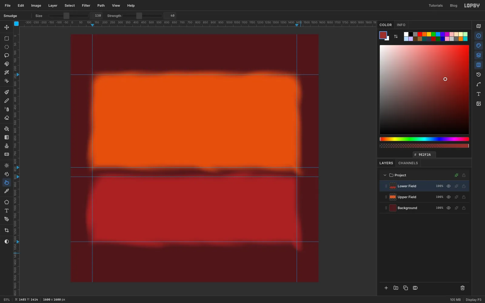
A feathered rectangle still looks machine-made. Press R for the Smudge tool and set Size
130and Strength40.Select Upper Field and make slow, curved drags. Each one starts just inside an edge and drifts 20 to 50 px out into the ground. Work your way round the field, with the most drags along the top and right edges and only a few on the left. Vary their length and spacing. Then do the same on Lower Field, this time favouring the bottom edge. Uneven sides are what make the field feel painted.
-
Mottle the paint with Clouds
Add a layer named
Mottleabove the fields. Choose Filter → Clouds…, set Scale to6and click Apply.Open the layer's effects drawer with the ✦ button on its row, and set Blend to Soft Light. Then click the layer's opacity readout (
100%) and drag the slider that opens to22%. The fields now look like layers of thin stain.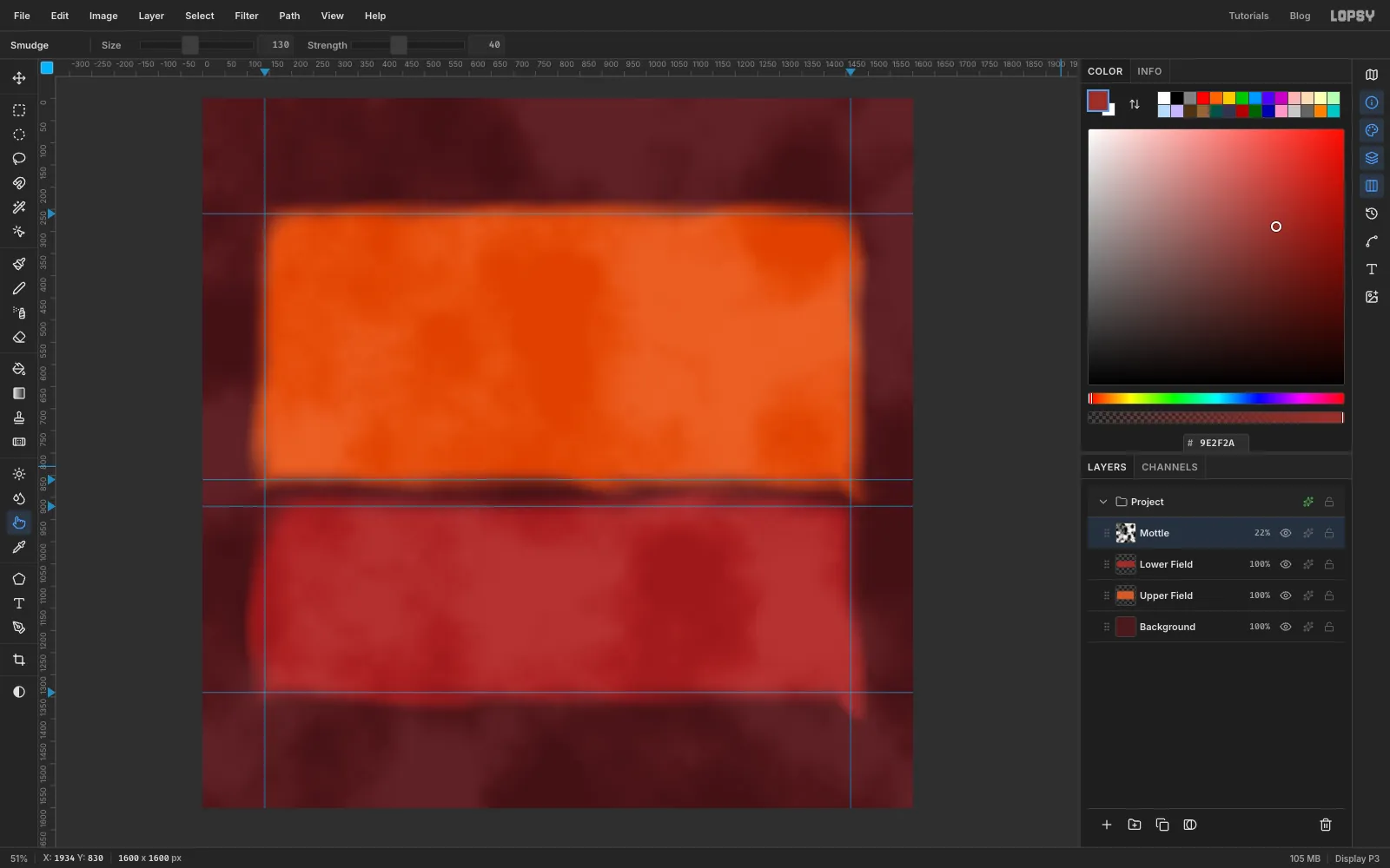
-
Build a dry bristle brush
Kline worked with cheap, wide house-painter's brushes, which leave separate bristle tracks. You'll make that tip yourself.
- Add a layer named
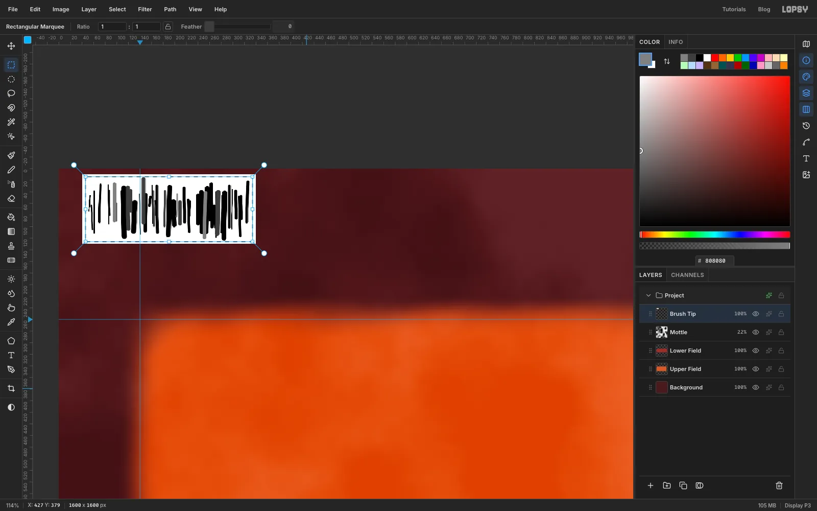
Brush Tip. Set the foreground to white. In the empty top-left corner of the canvas, marquee a box about 300 × 120 px, choose Edit → Fill and deselect. - Press B for the Brush. Click the brush thumbnail at the left of the options bar to open the Brushes modal and pick Hard Round.
- Switch the foreground to black and draw about fifty short vertical ticks side by side across the box. Change the Size between
2and10as you go, make some ticks three times longer than others, and leave small, uneven gaps. - Redo a few ticks in dark grey and a few in . Grey becomes partial coverage, like a bristle that's nearly dry.
- Marquee round the ticks and choose Edit → Define Brush…. Name it
Dry Flat. - Delete the Brush Tip layer with the trash button.
Define Brush turns dark pixels into paint, so the black ticks become bristles. The uneven tick lengths are important, because they give every stroke a ragged start and end.
- Add a layer named
-
Dry-brush the field edges
Open the Brushes modal again. Dry Flat is now the active tip.
- Shape: Size
120, Opacity28 - Dynamics: Opacity Jitter
30 - Texture: Grain
Set Fade in the options bar to
320.The tip is a horizontal row of bristles, so it leaves streaks when you drag across the row. The angle dial on the Shape tab rotates it:
90°for strokes that go left or right0°for strokes that go up or down (drop the Size to110for these)
Select Upper Field and set the foreground to . Brush two or three short strokes along its top and bottom edges, half on the edge and half off, and one up its right side.
Then select Lower Field, switch to and do the same, with one stroke up its left side. Set Fade back to
0when you're done.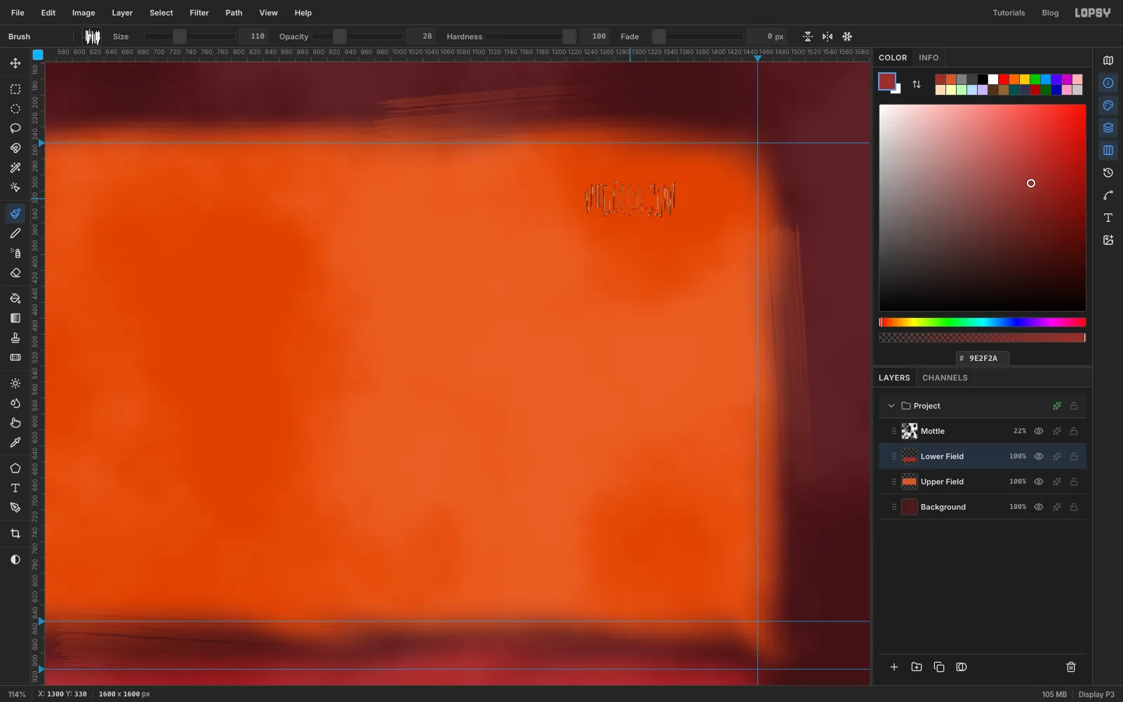
- Shape: Size
-
Underpaint the creams
Kline's whites are as important as his blacks. Click Mottle, then click New Group in the Layers panel and rename the group
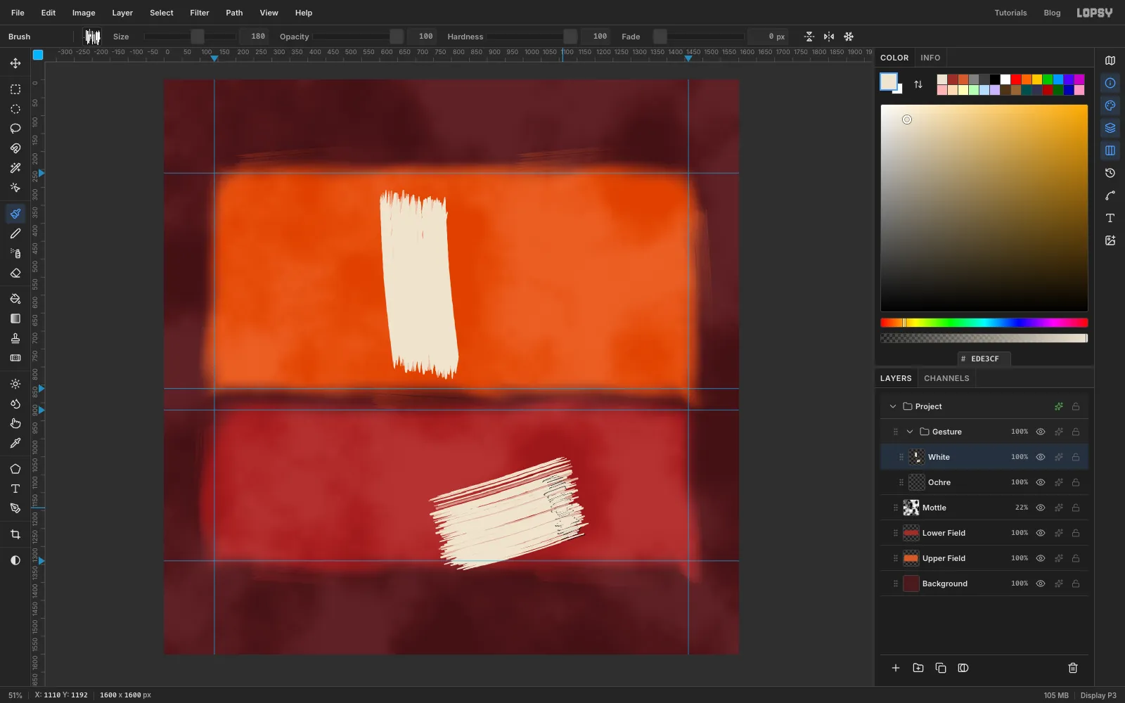
Gesture. Inside it, add a layer namedOchreand then one namedWhite.On White, set the foreground to . In the Brushes modal, set Size
180, Opacity100, Opacity Jitter0and Texture to No Texture.- Set the angle to
8°. In the orange field, a little left of centre, drag from just above the field's bottom edge up to near its top. - Set the angle to
14°and go over it once more, slightly offset, so the bristles don't line up. - In the crimson field, set the angle to
75°and drag a band that rises gently from the middle of the field to the right. - Set the angle to
70°and add a second, slightly lower pass.
- Set the angle to
-
Scumble a little ochre
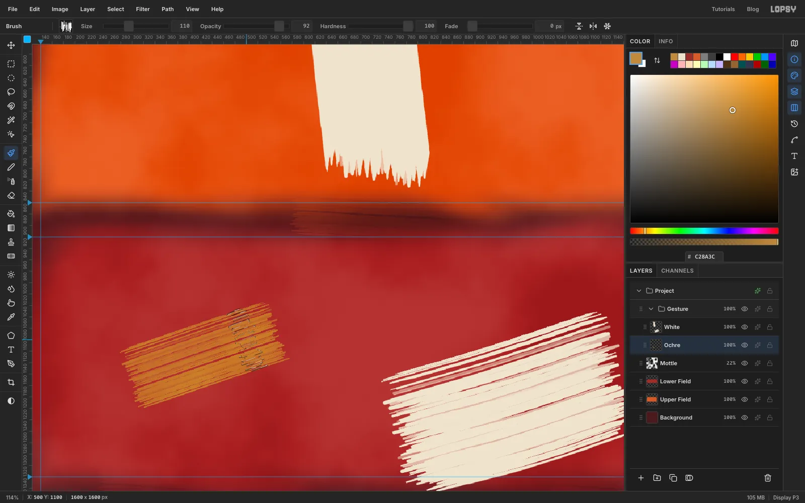
Click the Ochre layer and set the foreground to . Set the brush to Size
110, Opacity92, Opacity Jitter15, Texture Grain and angle70°.Make one short stroke, rising slightly, in the left third of the crimson field. It's an accent, so keep it small.
-
Paint the black beam
Click White and add a layer named
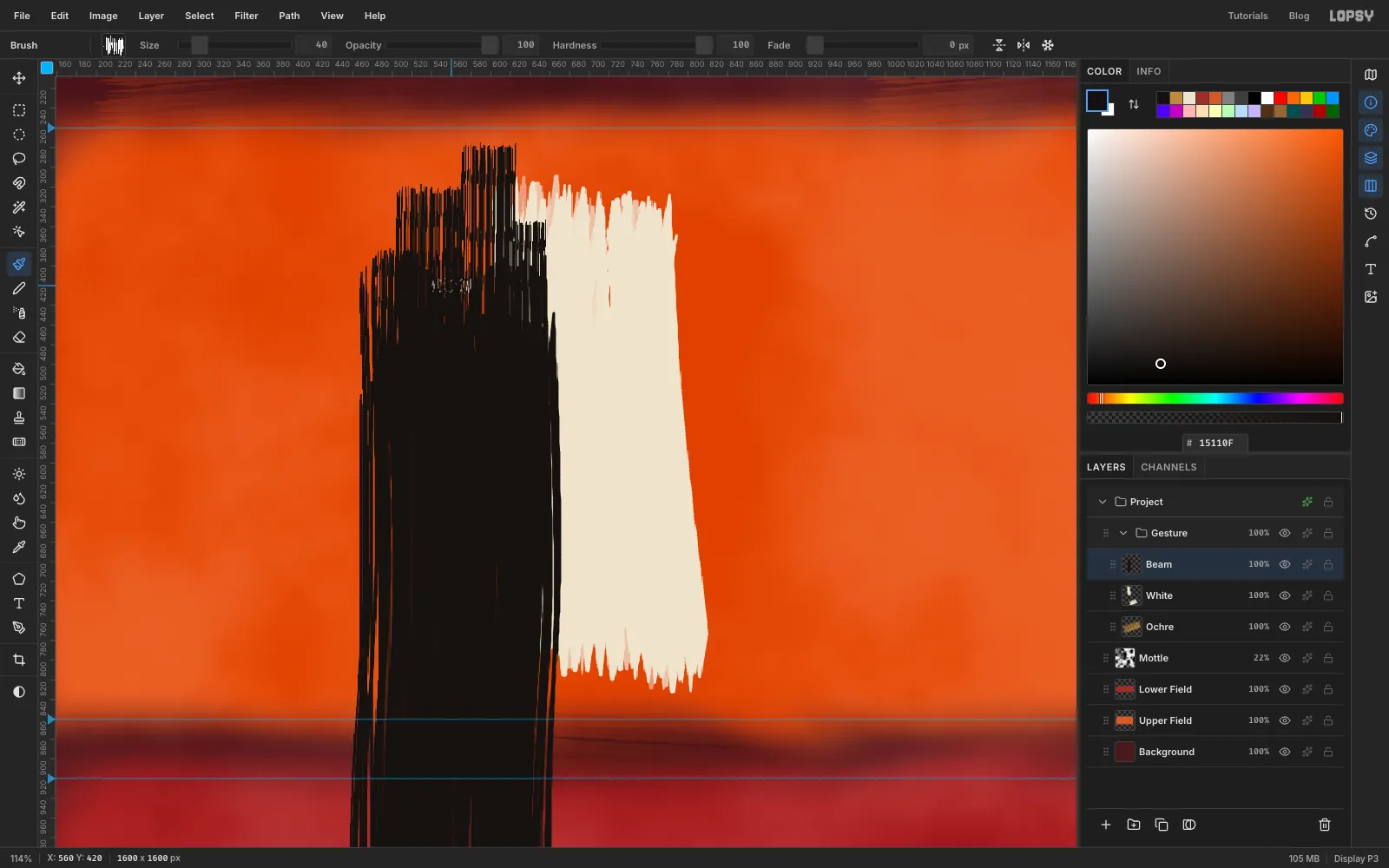
Beamabove it. Set the foreground to . In the Brushes modal, set Size190, Opacity100, Opacity Jitter0, No Texture and angle0°.Start in the bottom margin, just left of the cream stroke, and drag straight up until you're about 100 px below the top of the orange field. Make two more passes, each slightly offset and with a slightly different angle (
4°and357°), and stop each one at a different height.A loaded brush runs dry at the end of a stroke. To show that, use narrow strokes that run out at different heights:
- Set the Size to
70and drag from inside the beam up past its top. - Do the same at Size
55,45and40, at different places across the beam's width.
Each one should stop at a different height.
- Set the Size to
-
Lean the beam off plumb
A perfectly upright beam crossed by an arm reads as a cross. Tilt it instead:
- Open the View menu and untick Snap to Guides. Otherwise the marquee's bottom edge snaps to the
1340guide and leaves the bristle tips behind. Leave it off for the rest of the painting. - Press M and marquee round the whole beam, with a little room to spare.
- Press V for the Move tool. Drag the round handle just outside the top-right corner clockwise, about 8°.
- Press Cmd+D to commit.
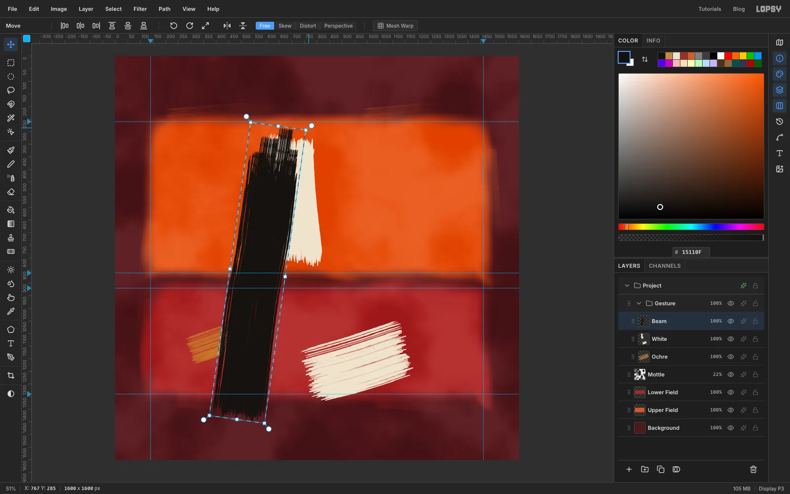
- Open the View menu and untick Snap to Guides. Otherwise the marquee's bottom edge snaps to the
-
Add the arm
Click Beam and add a layer named
Blackabove it. Press B and set the brush to Size150and angle100°.Start inside the upper part of the beam and drag right and slightly downhill, until you're about 130 px short of the right-hand guide. Then:
- Make a second pass at Size
125and97°, a little lower. - Finish with three narrow strokes (Size
60,45and50) that carry on past the end and stop at different lengths.
Letting the arm grow out of the beam, rather than crossing it, is what keeps the shape abstract.
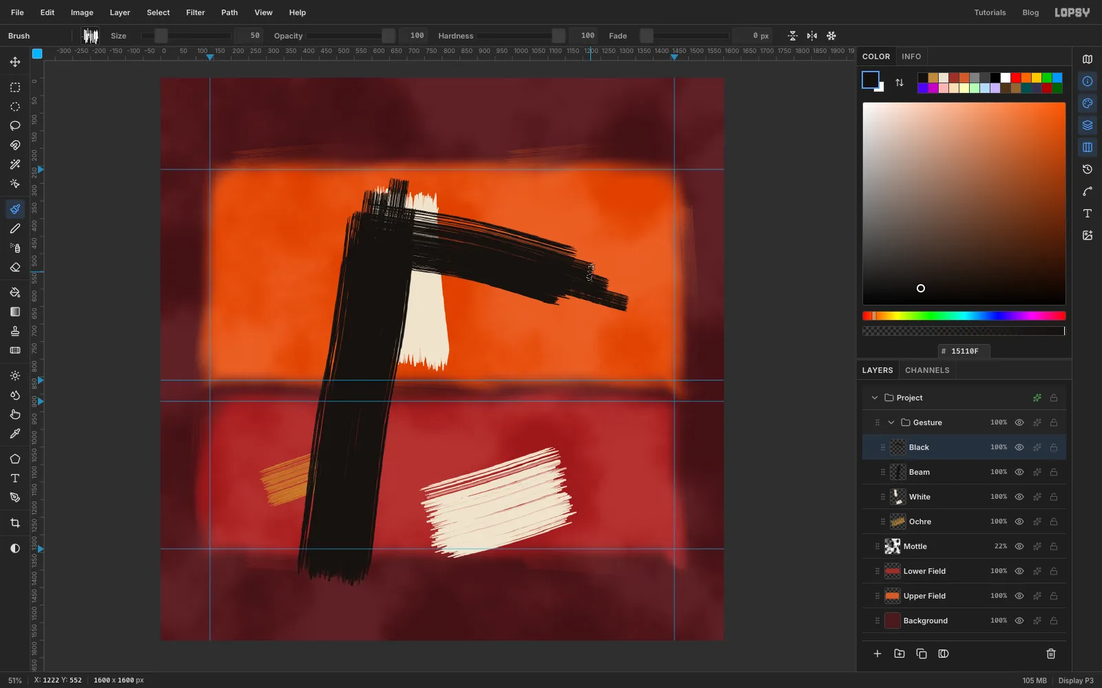
- Make a second pass at Size
-
Throw a counter-diagonal
Stay on Black. Set Size
190and angle53°. In the crimson field, start below the cream band and drag up and to the right, ending near the field's top-right corner.Add a second pass at Size
165and49°. Then add three narrow strokes at Size70,55and45that run out towards the top-right corner. The diagonal pushes against the beam and stops the picture from feeling static.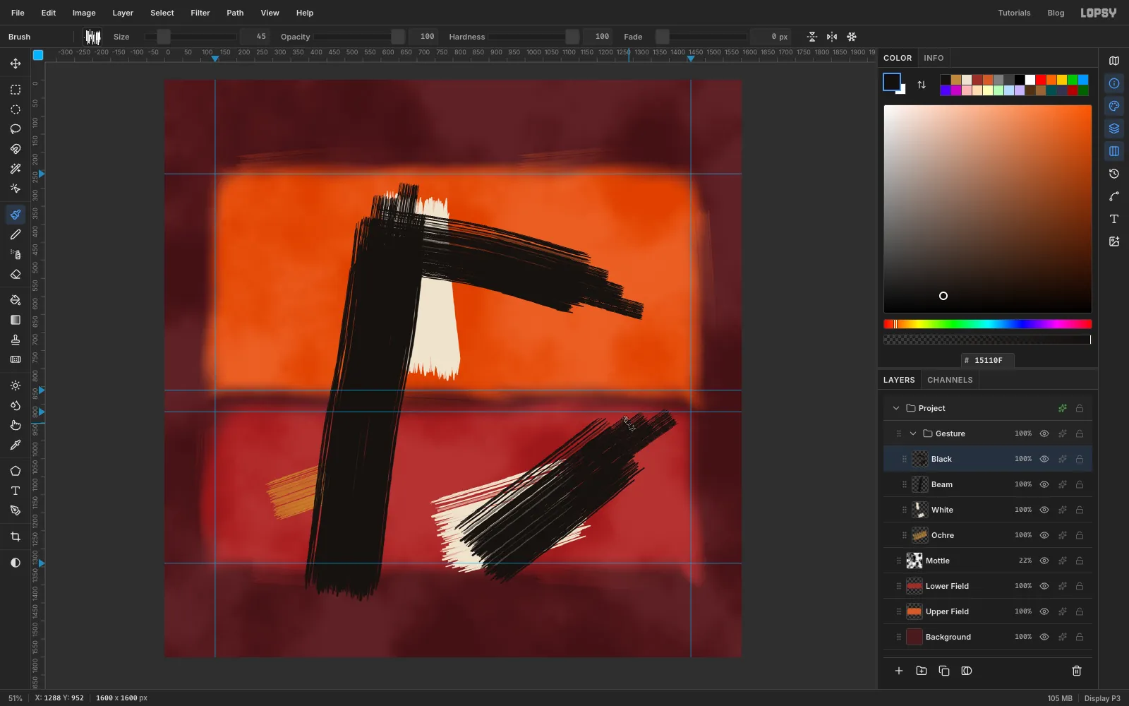
-
Push cream back over the black
Kline painted white back over his blacks, so the edges fight. Add a layer named
White Overabove Black. Set the foreground to , Size90and angle0°.- Drag a short stroke straight up across the arm, about halfway along it.
- At Size
80and355°, drag a second one up beside the lower right edge of the beam.
You'll tilt both of these later, once the rest is in place.
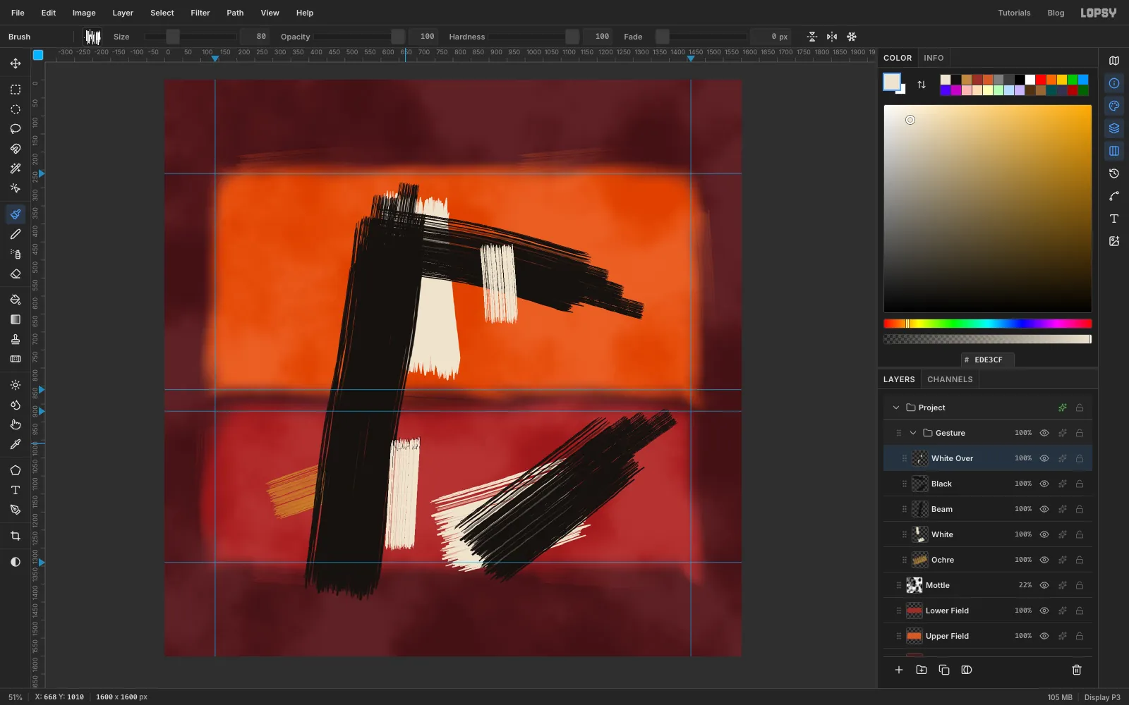
-
Fade a stroke with a mask
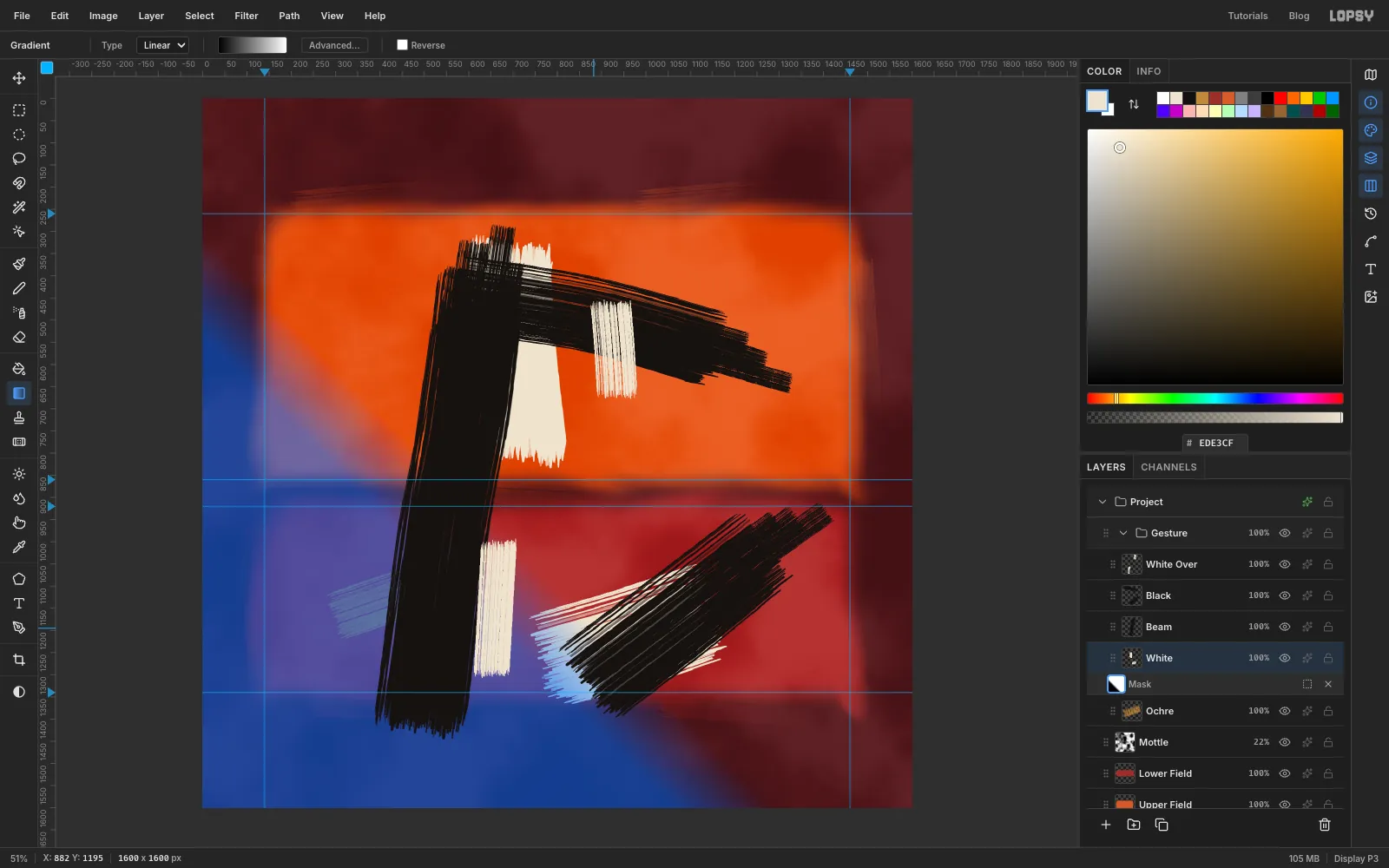
The lower cream band starts with a blunt end. Click White, then click Add Mask at the bottom of the Layers panel. Click the new mask thumbnail to edit the mask.
Choose the Gradient tool from the toolbox. Its default runs from black to white. Drag a short diagonal, up and to the right, across the band's left tip. Black hides, so the tip fades out. The blue overlay shows what's hidden.
Click the White row to leave mask editing.
-
Let a few drips run
Click White Over, then add a layer named
Drips. Choose the Brush with Hard Round, and set the foreground back to lamp black . Each drip is a single wobbly drag straight down from just inside a black edge.- In the Brushes modal, set Size between
9and12. - Set Taper to a little more than the drip's length, so it narrows to a point.
Make one or two from the underside of the arm and two from the bottom edge of the diagonal, between 50 and 120 px long. On two of them, set Taper back to
0and add a tiny 10 px drag at the end for a bead.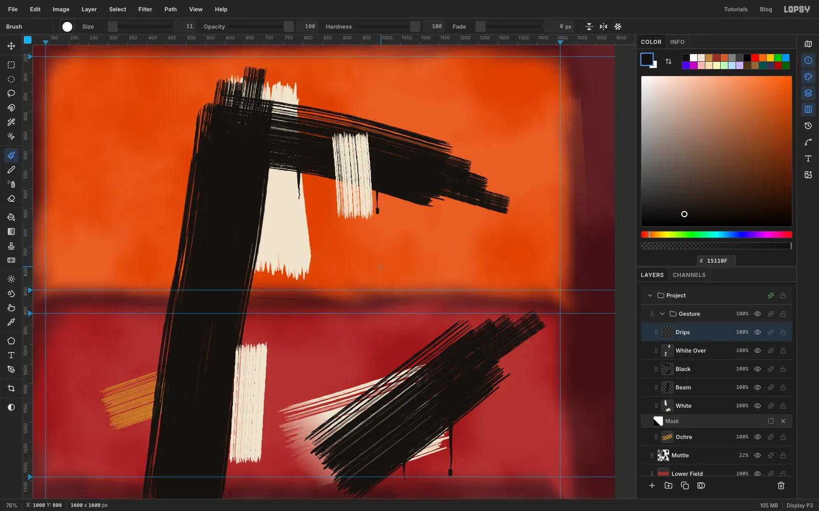
- In the Brushes modal, set Size between
-
Throw a few splats
Add a layer named
Splats. Click once with the Hard Round brush at Size30, just beyond the top-right end of the diagonal.Switch to Smudge at Size
14and Strength80. Drag four or five short spikes outward from the dot's centre. Then go back to the brush at Size3to6and click a few flecks around it. Make two smaller splats (sizes20and14) nearby.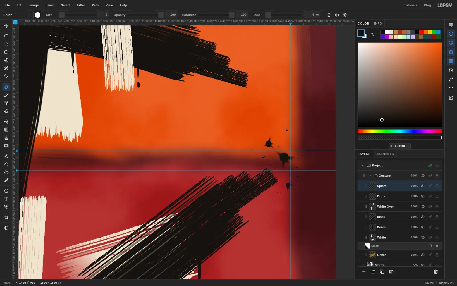
-
Give the splats a direction
Step back and look at the whole painting. A few marks still look stamped, and the splats are the first: they're too round. Choose Smudge at Size
18and Strength85. Drag one long tail out of each splat, down and to the right, as if the paint was flung from the upper left.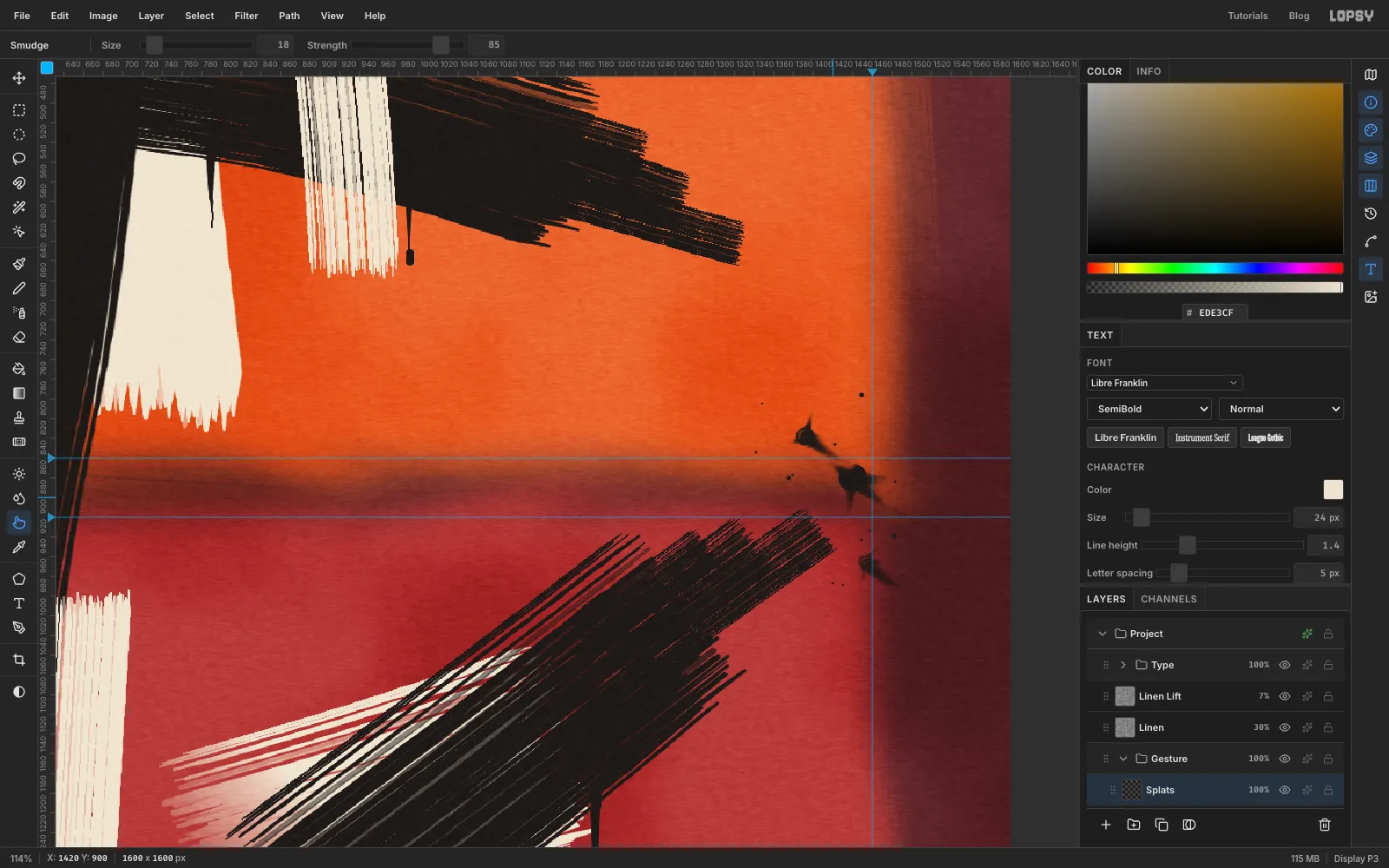
-
Tilt the cream boxes
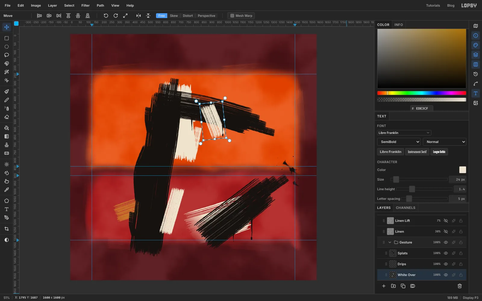
The two creams on White Over stand perfectly upright and read as boxes. Select White Over, press M and marquee round the cream on the arm. With the Move tool, drag the rotate handle about 11° anticlockwise and press Cmd+D. Then marquee the cream beside the beam and rotate it about 13° clockwise.
-
Swell the beam
A beam with dead-straight sides still looks like a letter. Select Beam, set the foreground to and choose the Brush with Dry Flat at Size
90and angle8°. Drag up along the beam's left edge, bowing out about 20 px around the middle of the picture, as if you leaned on the brush there. Go over it again at Size50.Add two narrow stray tines (Size
36) on the left edge, one high and one low. Then select White, switch to , and add two narrow tines at Size46that stray past the right edge of the big cream.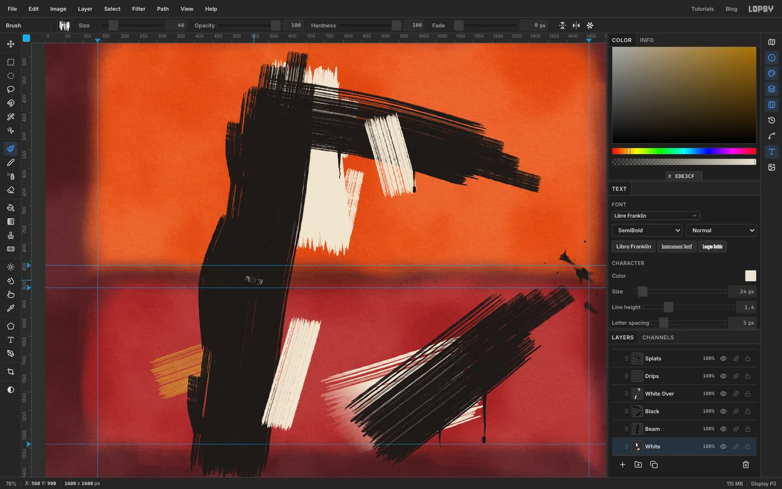
-
Make the orange field glow
Rothko's fields seem lit from behind. Select Upper Field, open its effects drawer and tick Outer Glow. Set the colour to , Size
70, Spread0and Opacity45.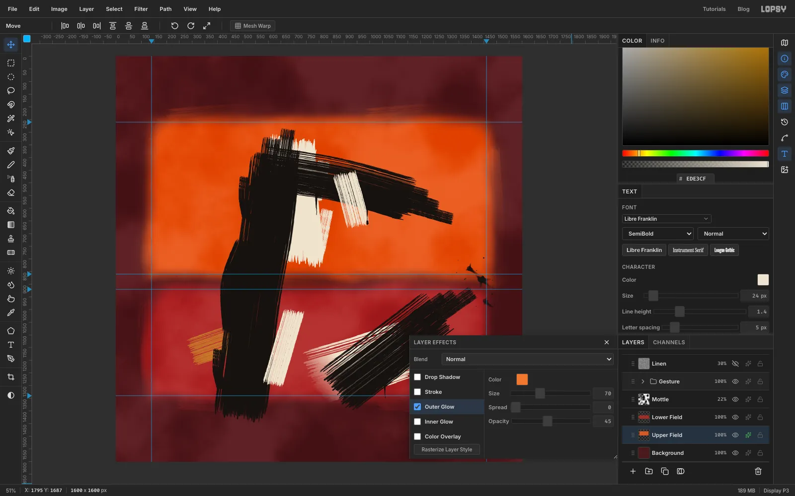
-
Add a linen weave
Collapse the Gesture group with its arrow, click its row and add a layer named
Linen. A new layer added while a collapsed group is selected lands above it.Set the foreground to and choose Edit → Fill with nothing selected. Then run these filters:
- Filter → Add Noise…: Amount
100, Mono, Uniform. - Filter → Motion Blur…: Angle
90, Distance5. - Add Noise again: Amount
70, Mono, Uniform. - Motion Blur again: Angle
0, Distance5. - Filter → Emboss…: Angle
135, Strength40.
The two noise-and-blur passes make crossing threads, and Emboss gives them relief. Set the layer's blend to Overlay at
30%.Overlay doesn't change pure black, so choose Layer → Duplicate Layer. Rename the copy
Linen Liftand set it to Screen at7%. Now the weave shows on the beams too.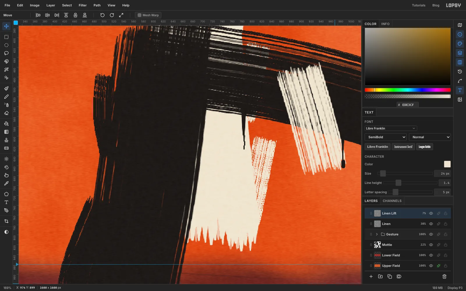
- Filter → Add Noise…: Amount
-
Set the title and artist
With Linen Lift selected, click New Group and rename it
Type.Changing font or size in the Text options restyles whichever text layer is selected. So before each new piece of text, click Add Layer to select an empty layer, and delete these helpers at the end.
- Add an empty layer inside Type. Press T for the Text tool and pick League Gothic at Size
112, with the foreground set to . - Click in the top margin, type
GRAVEL LULLABYand press Tab to commit. - In the Text panel, set Letter spacing to
3. - With the Move tool and the arrow keys, put the left edge of the letters on the
140guide and the cap tops 80 px from the top. The baseline lands at164.
Add another empty layer. Choose Instrument Serif, Italic, Size
66, and set Letter spacing back to0(the panel keeps the last value). Typethe Odile Marsh Quintet.Nudge it until its right edge sits on the
1460guide. Line up the bottom of the lowercase "the" with the title's baseline, not the tail of the Q, which hangs below the line.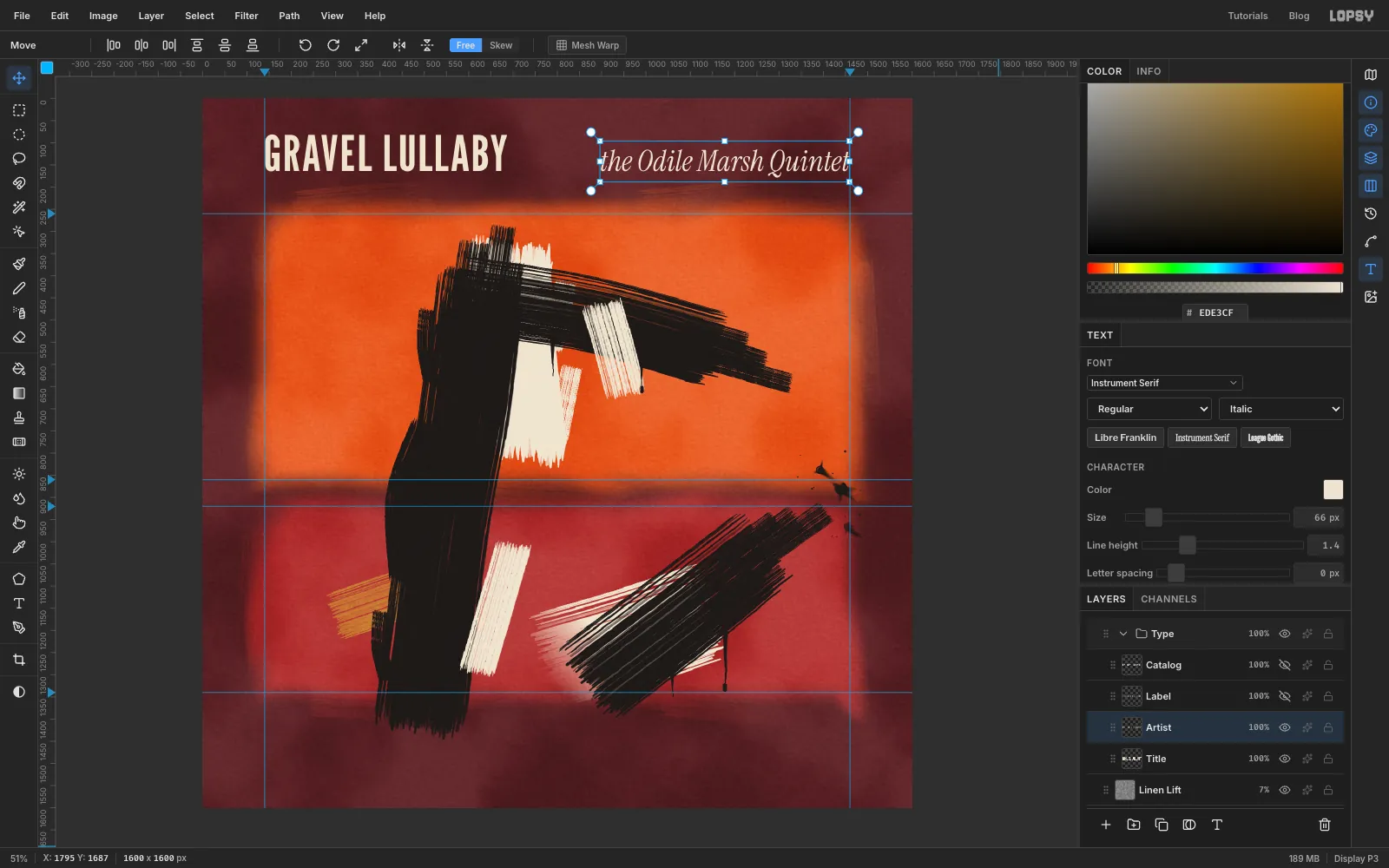
- Add an empty layer inside Type. Press T for the Text tool and pick League Gothic at Size
-
Set the label lines
Add another empty layer and set Libre Franklin, SemiBold, Size
24, Letter spacing5. TypeLARK RECORDSand put it on the left guide with its baseline at1520. That's 80 px from the bottom, the same margin as above the title.Add one more empty layer and type
LP 4127 · STEREO, right-aligned to the1460guide on the same baseline. Delete the empty helper layers.Choose File → Quick Export PNG for the finished sleeve and File → Save Project to keep every layer, mask and effect editable.
For a whole series, keep the brush and the type layout and change the fields. A blue-over-black sleeve with a single white beam would make a good companion record.