Baroque Still-Life Magazine Cover from Museum Photos
Build a Dutch Baroque still-life magazine cover in Lopsy from public-domain museum photos, with Hard Light glass, refracted type and a plate of oysters.
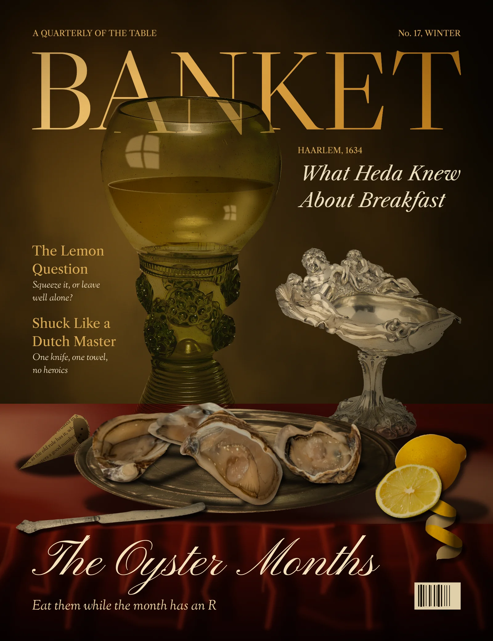
In the 1630s, Haarlem painters such as Willem Claesz Heda made a speciality of the banketje, the "little banquet": a table of oysters, a lemon half peeled, a tall glass of wine and tipped silver, all lit from one window against a dark wall. Oysters meant luxury, and the unfinished meal hinted that pleasure doesn't last.
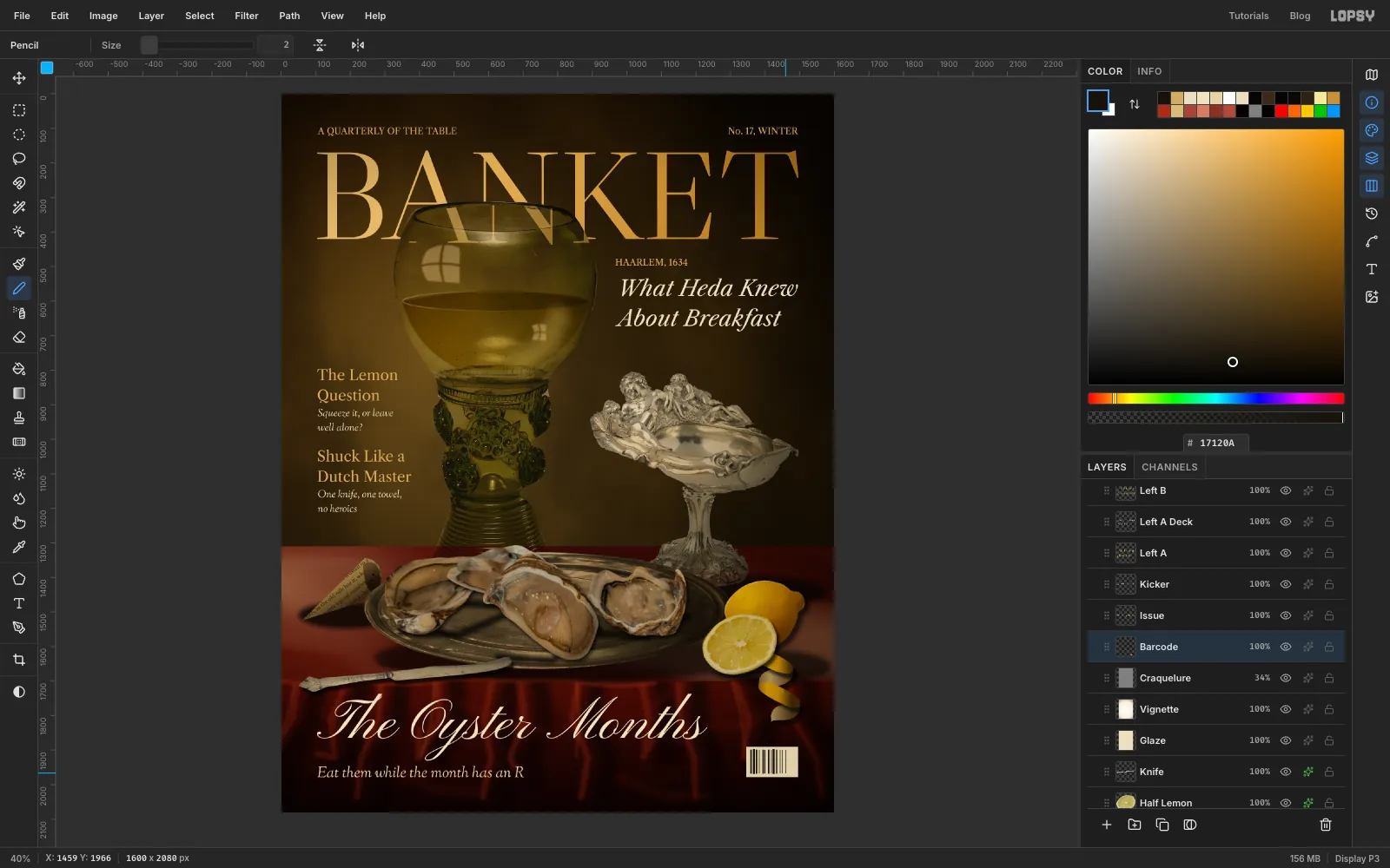
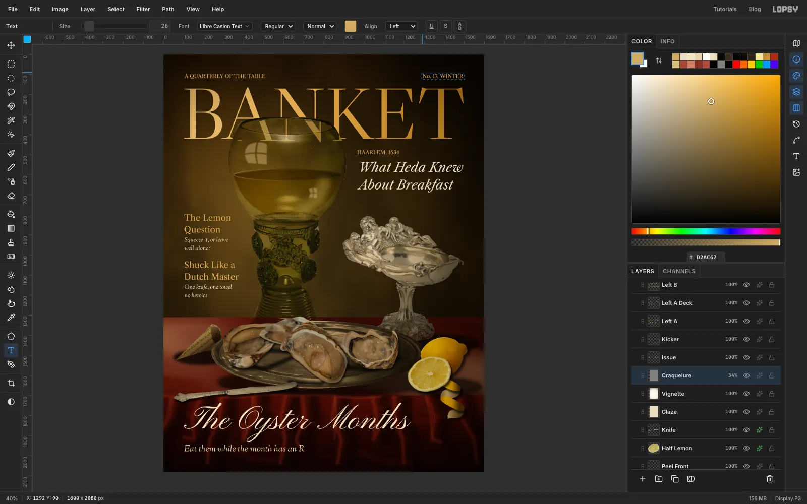
This tutorial builds that scene as the cover of BANKET, a made-up food quarterly. The issue is The Oyster Months, named for the old rule that you only eat oysters when the month has an R in it. It's a photomontage. Everything on the table is a real object, photographed by a museum or a diner, then cut out and relit in Lopsy until they share one room.
The tricky part is that none of these photos were lit alike. Here's how the tutorial gets around that:
- Hard Light lets glass shot on grey sit over a dark wall, with the masthead still showing through it.
- Selections made from a layer's own thumbnail clip Multiply shading to each object.
- A shared group grade and a warm glaze over everything pull the photos together.
The document is 1600 × 2080 px, a magazine page at about 190 dpi.
The photos are all free to use, from Wikimedia Commons:
- Roemer glass, The Metropolitan Museum of Art, CC0
- Silver shell tazza_Coupe_van_gedreven_zilver,_BK-NM-12985.jpg), Rijksmuseum, CC0
- Plate of oysters, CC0
- Pewter plate, Albany Institute of History and Art, CC0
- Lemon, CC0
- Half lemon.jpg), CC0
- Knife, 1601, Rijksmuseum, CC0
For the layout and light, look at Heda's Still Life with Oysters, a Silver Tazza, and Glassware.
Before you start, crop the photos in any image viewer so each object nearly fills its frame, because Lopsy shrinks a paste that's larger than the page. The sizes used here were:
- Glass: about 900 × 1600
- Tazza: about 1500 × 1500
- Pewter plate: about 1500 × 1340
- Lemon: about 1300 × 940
- Half lemon: about 1000 × 940
- Knife: about 370 × 1400
- Oysters: cut four from the photo, with the long side about 1100
The palette:
-
Wall
-
Table
-
Cloth
-
Masthead
-
Cream type
-
Gold type
-
Wine
Two habits save trouble throughout:
- V then a handle. Only the Move tool transforms pixels. Draw a marquee around the object with M, press V, then use the handles.
⌘-drag a corner to scale evenly, and drag the circles outside the corners to rotate. - Paste leaves things armed. Every paste selects the pasted pixels and switches to the Move tool, so press ⌘D before you do anything else. Also press ⌘D to commit each transform. Enter does not commit one.
-
Paint the wall
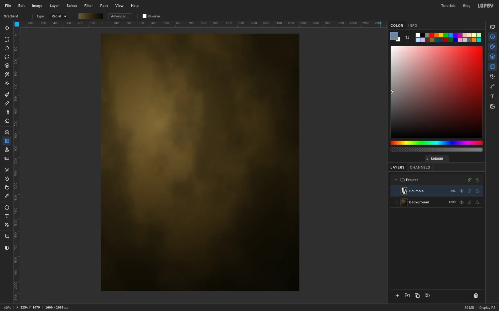
- Create a 1600 × 2080 document. Delete Layer 1 and click Background.
- Pick the Gradient tool and set Type to Radial. Click Advanced… and set the stops to , at 40%, at 78% and . Click the handle row to add a stop, drag it to its position, and type its hex. Stops stay in the editor between gradients, so delete any extras each time you start a new one.
- Drag from a point left of centre, a third of the way down, out to the lower right corner. That's your window light.
- Add a layer called Scumble. Set the foreground to and choose Edit → Fill, then run Filter → Clouds… and Filter → Add Noise… with Amount 18.
- Click the sparkle icon on the layer's row and set its Blend to Overlay, which is where every blend mode in this tutorial lives. Click the percentage on the row and set the opacity to 20%. Old walls look scrubbed and uneven rather than flat.
-
Lay the table
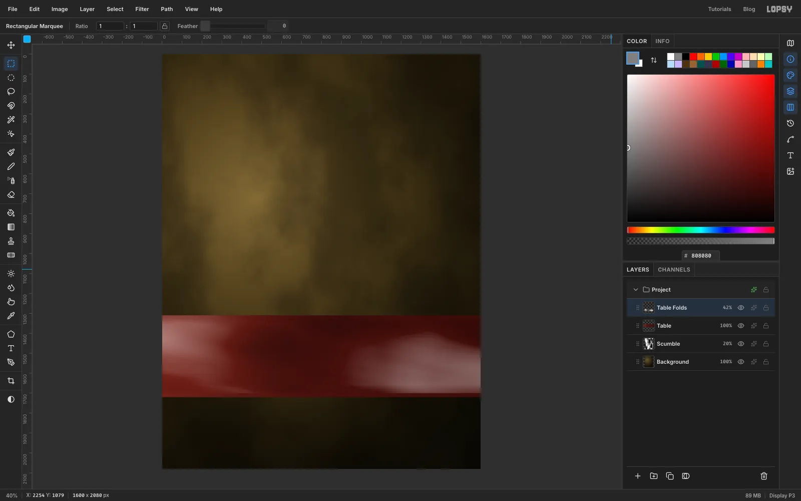
- Add a layer called Table and press M. With nothing selected, click once on the canvas to open the exact-corners dialog, and enter X 0 to 1600, Y 1310 to 1720.
- Set a Linear gradient to , at 45% and , then drag from the left end of the band to the lower right. Press ⌘D.
- Add a layer called Table Folds and use the dialog again for X 0 to 1600, Y 1310 to 1700. Fill it with , then run Clouds… followed by Motion Blur… with Angle 12 and Distance 420. Press ⌘D.
- Set the layer to Hard Light at 42%. Mid-grey does nothing in this mode, so only the light and dark smears show.
-
Hang the cloth
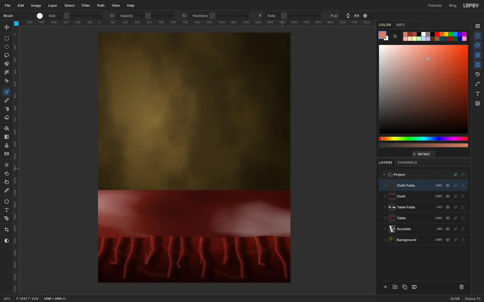
- Add a layer called Cloth. With the Lasso (L), draw around the area below the table with a very slightly wavy top edge at the table's front, about 380 px above the bottom of the page.
- Drag a vertical Linear gradient through it, from through to . Press ⌘D.
- Add a layer called Cloth Folds, and lasso the same shape again so you can't paint above the table edge.
- Press B and paint about eleven fold valleys from the table edge downward, at Size 96, Hardness 15, Opacity 62, in . Space them unevenly, let them lean outward from the centre as they fall, and stop some of them well before the bottom.
- Paint a lit ridge just to the left of each valley, at Size 34, Hardness 0, Opacity 40, in .
- Straight folds look like curtain stripes, so paint six short sagging strokes across pairs of neighbouring folds at Size 50, Opacity 16, in .
- Add a few thin highlights near the top of every third ridge at Size 12, Opacity 32, in .
- Press ⌘D and run Filter → Gaussian Blur… with Radius 10.
-
Bend the light around the edge
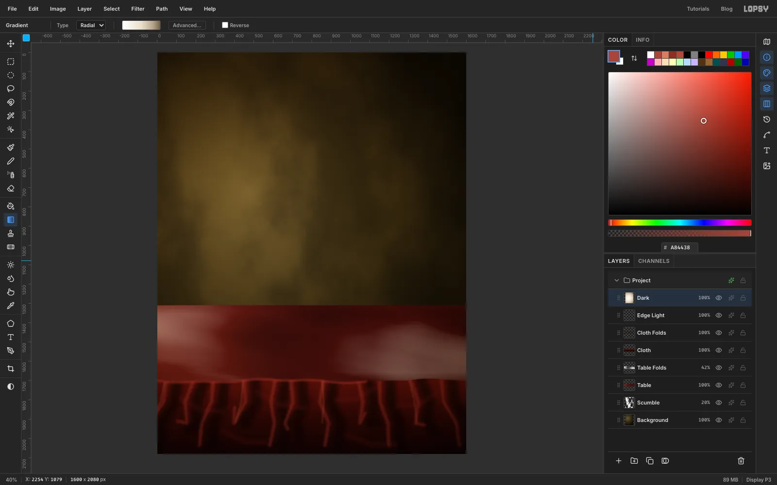
- Add a layer called Edge Light. With the Brush at Size 26, Hardness 0, Opacity 42 and colour , paint along the table edge from the left for about two-thirds of the width. Stop there, because that end is furthest from the window.
- Add a layer called Dark. Drag a Radial gradient from the middle of the page to the bottom right corner, with stops , at 50%, at 82% and .
- Set Dark to Multiply. This is the only layer here that shades the room itself. The objects get their own shading later, and it needs to stay under the masthead so the gold keeps its strength.
-
Set the masthead
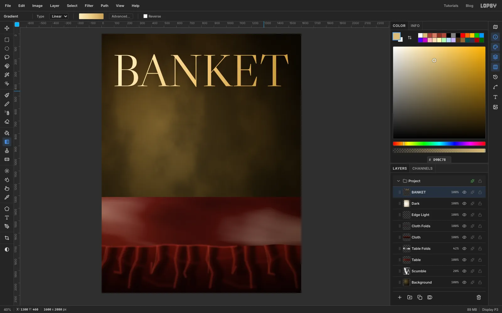
- With Dark active, press T. Set the font to Libre Caslon Display and Size to 362, set the colour to , then click about 90 px from the left and 40 px from the top, and type
BANKET. Press Tab to commit. - Text sits below where you click, so the letters land about 165 px from the top. Check the left and right margins match, at about 104 px, and press the arrow keys with the Move tool (V) if they don't.
- Click Rasterize Layer at the bottom of the Layers panel, because you'll be cutting into these letters later.
⌘-click the layer's thumbnail to select the letters. Drag a Linear gradient diagonally across them with stops , at 50% and . Press ⌘D.
- With Dark active, press T. Set the font to Libre Caslon Display and Size to 362, set the colour to , then click about 90 px from the left and 40 px from the top, and type
-
Put the shadows down first
Shadows go under the objects, so it's easier to lay them before the objects arrive.
- Add a layer called Shadows above BANKET.
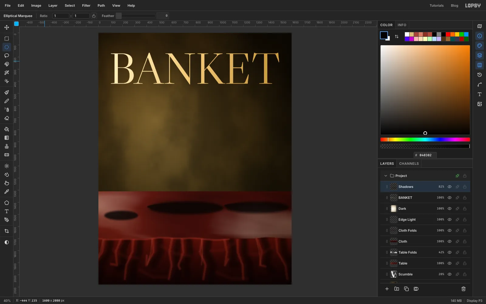
- Click the Elliptical Marquee in the toolbox. With nothing selected, click once on the canvas and the exact-corners dialog opens, which is the easiest way to place these. Each ellipse gets Select → Feather… and then Edit → Fill in , and the fill leaves the selection live, so press ⌘D before the next click.
- Make the five ellipses listed below. They lean to the right, because the light comes from the left.
- Press ⌘D and set the layer to 82% opacity.
The ellipses:
- The cone, at the far left of the table: X 50 to 330, Y 1470 to 1548, Feather 14.
- The glass, a cast shadow: X 420 to 1040, Y 1392 to 1500, Feather 20.
- The glass, a tight contact shadow: X 404 to 850, Y 1412 to 1462, Feather 6.
- The tazza, a cast shadow: X 1050 to 1580, Y 1392 to 1490, Feather 20.
- The tazza, a tight contact shadow: X 1040 to 1350, Y 1408 to 1450, Feather 6.
-
Paste the silver tazza
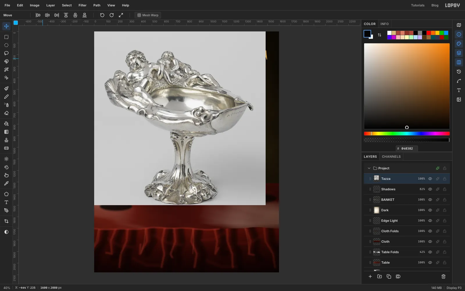
With Shadows active, paste your tazza crop with ⌘V. It lands in the top left corner on a new layer. Name it Tazza and press ⌘D.
-
Select the backdrop with the wand
This backdrop is an even grey, so let the Magic Wand (W) find it.
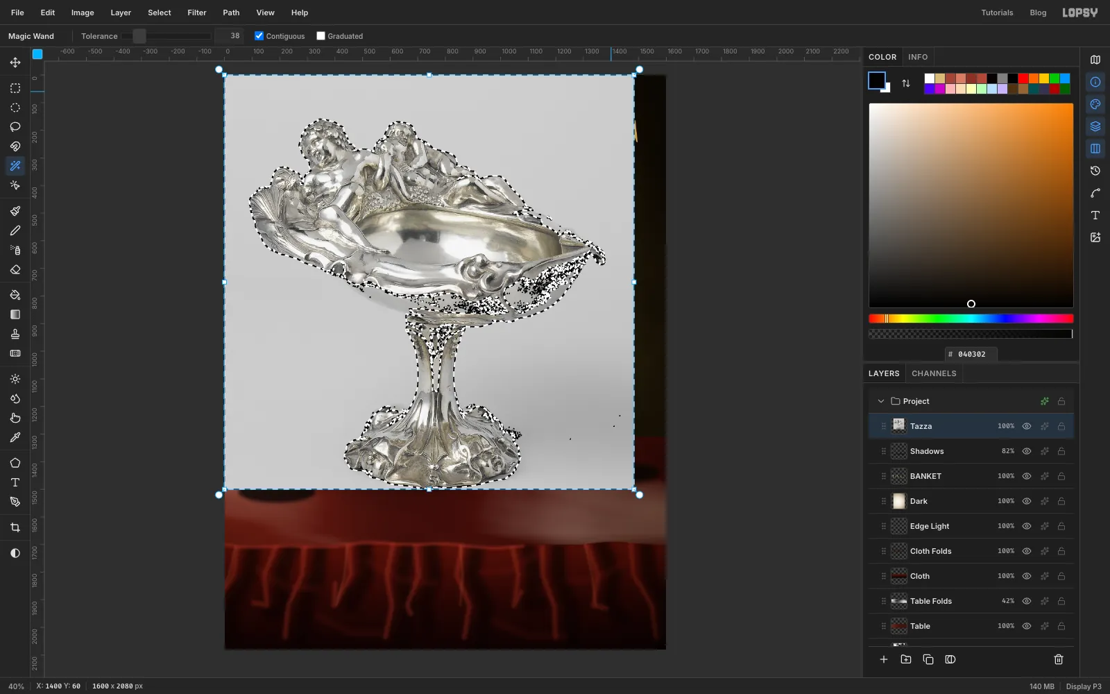
- Set Tolerance to 38 with Contiguous on, and click a corner of the grey.
Shift-click the other three corners to add them.
Look closely at the ants. The figures on top are selected beautifully, but polished silver reflects the backdrop, so the selection has leaked into the stem and the underside of the bowl.
-
Take the silver back out of the selection
Press L and hold
Altas you drag to subtract from the selection. Trace just inside the silhouette, from the underside of the bowl, down the stem, around the foot and back up the other side. Include the curled tip at the right end of the bowl too. Keep the line tight against the edge where the grey touches the silver. Anything left selected there will bite a hole in the rim.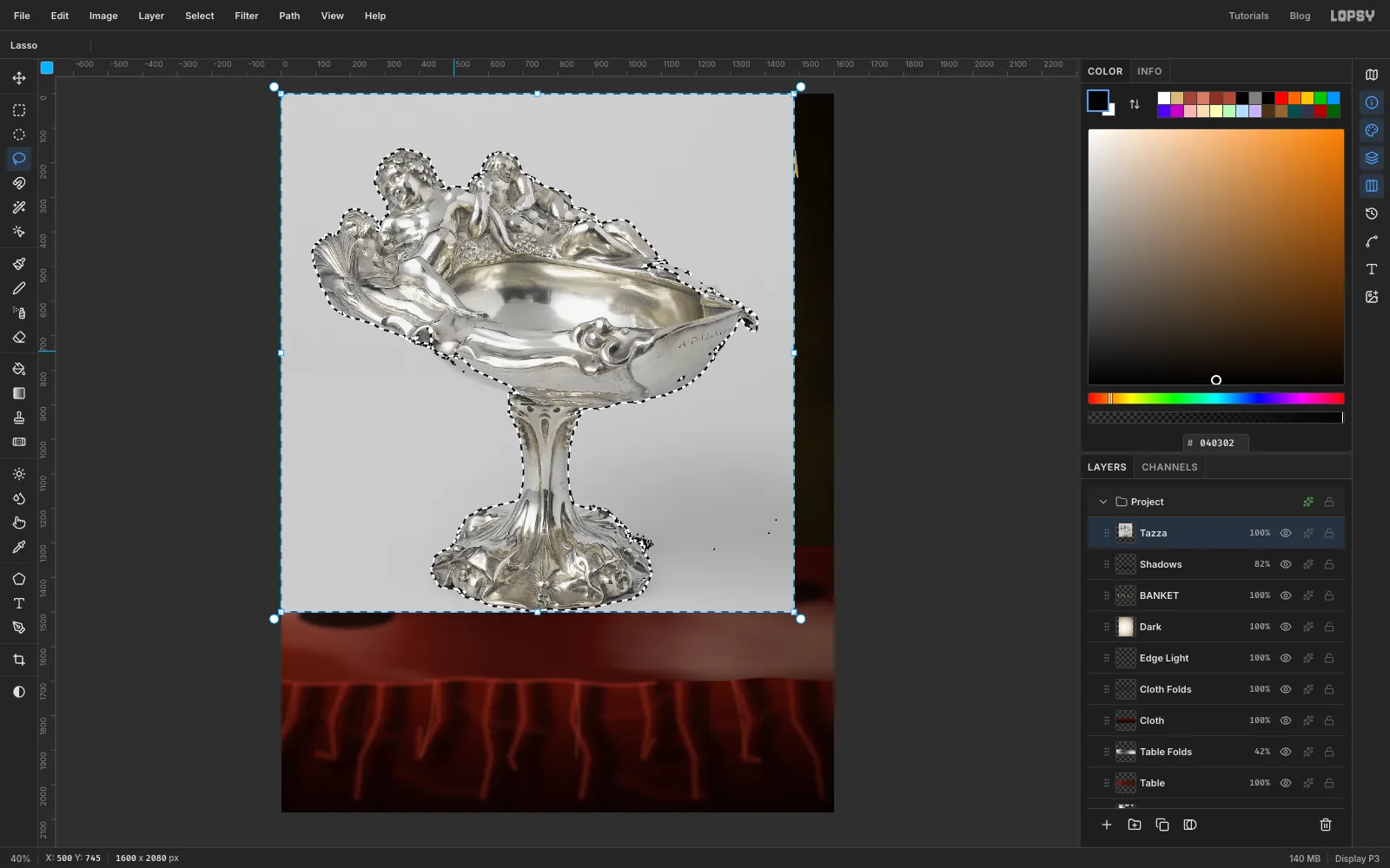
-
Delete the backdrop and trim the fringe
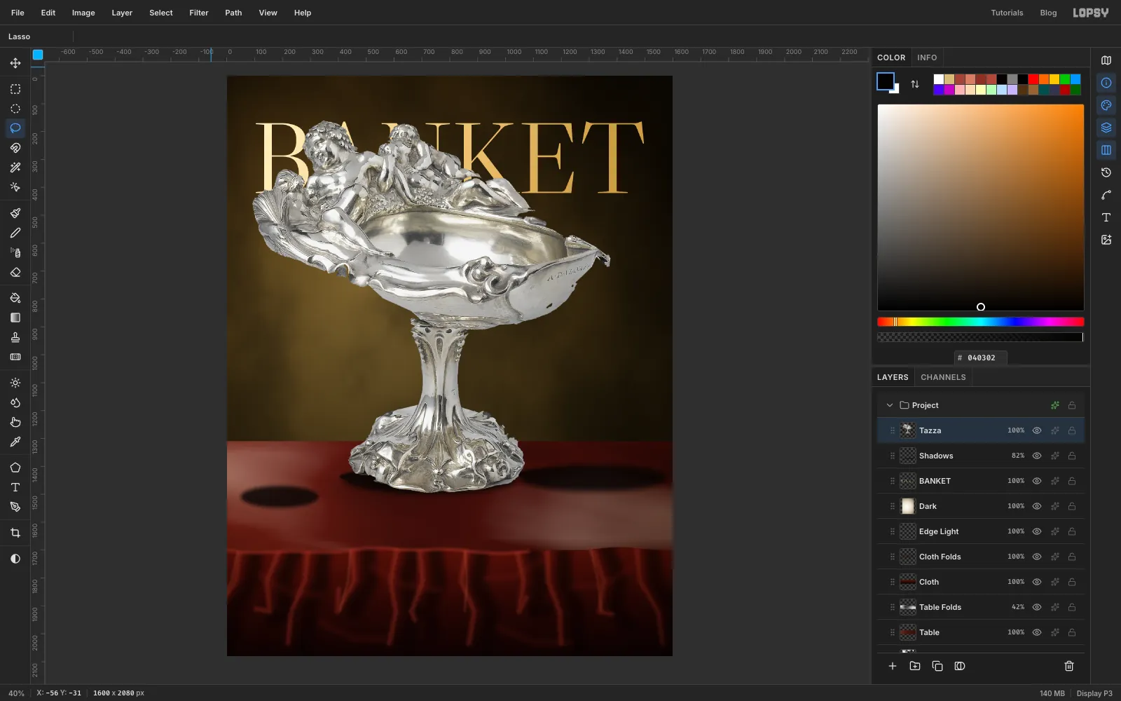
- Press Delete, then ⌘D.
- A wand leaves a thin rim of backdrop that glows against a dark wall, so
⌘-click the Tazza thumbnail. - Choose Select → Shrink… with 2, then Select → Feather… with 1, then Select → Inverse. Press Delete and ⌘D.
-
Scale and place it
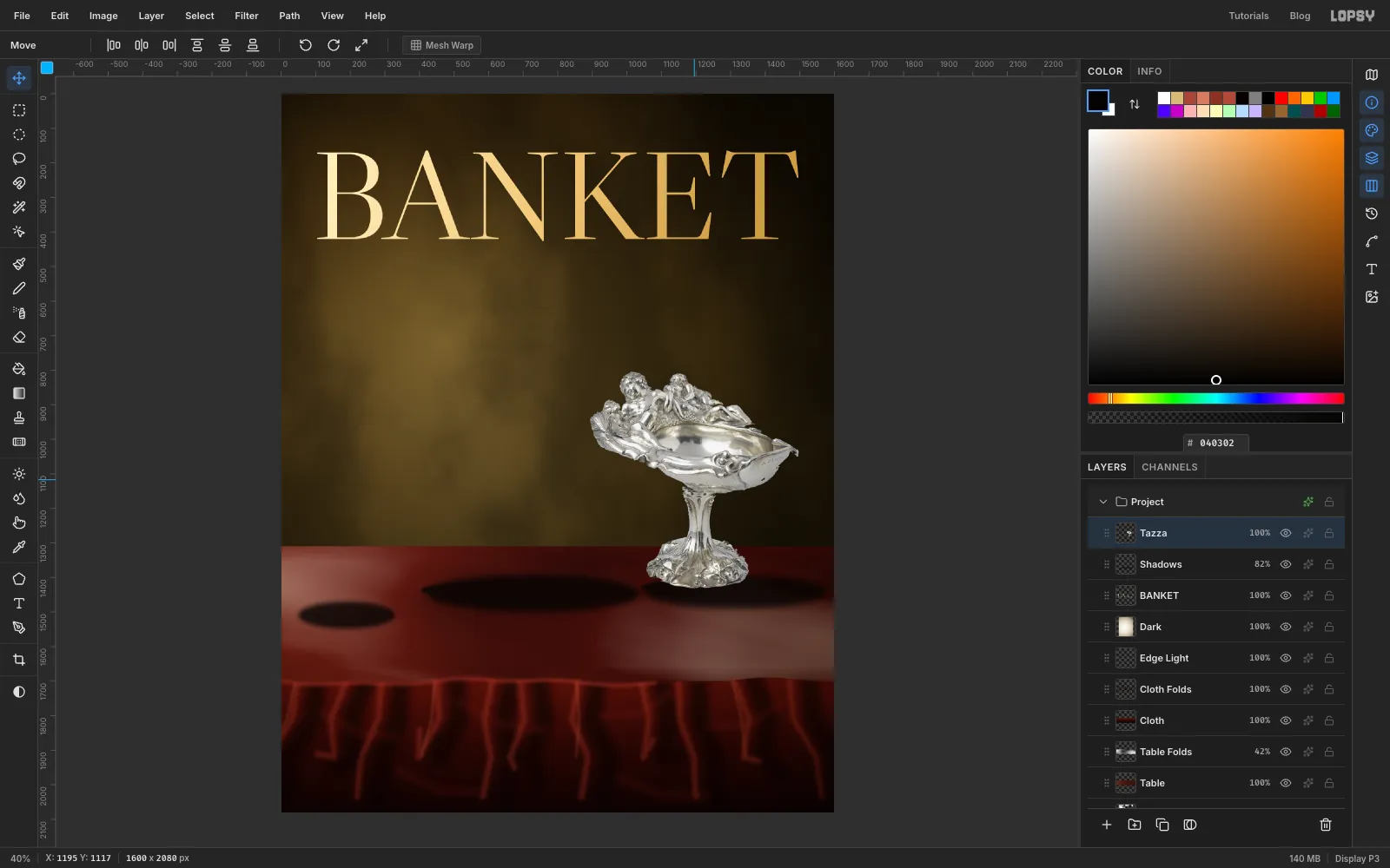
- Marquee around the tazza (M), press V, then
⌘-drag the bottom right corner up and in until it's about 47% of its size. Press ⌘D. - Marquee it again, press V, and drag it into place, with its right tip on the 104 px margin and its foot just below the back edge of the table, over the shadow you made. Press ⌘D.
- Marquee around the tazza (M), press V, then
-
Move the silver into the room
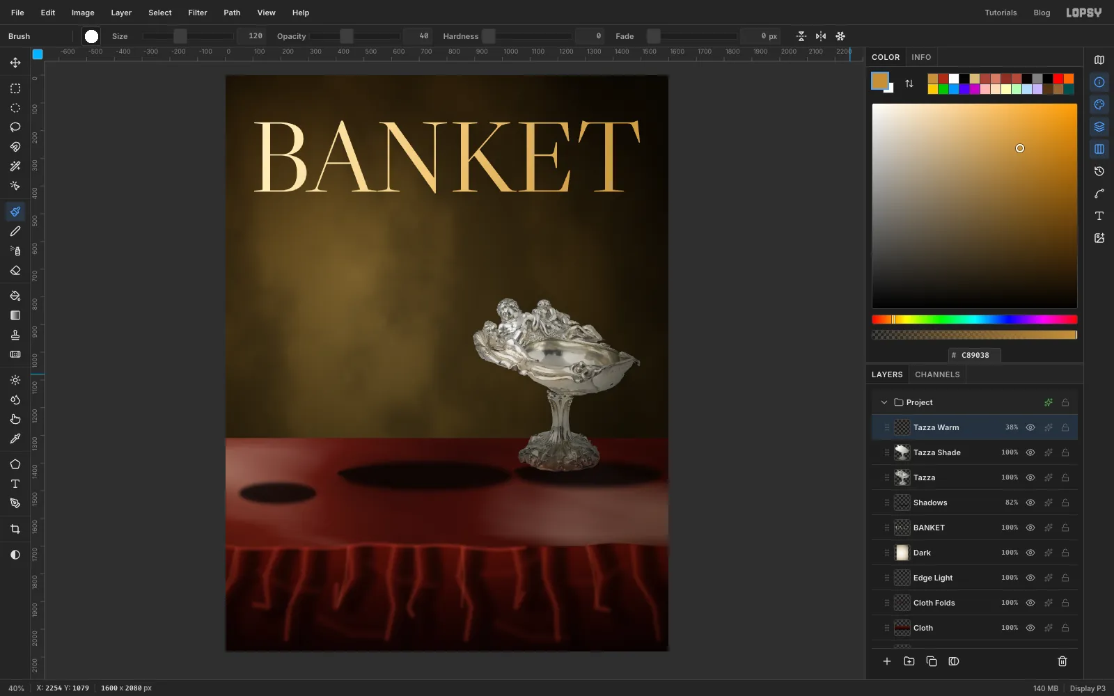
⌘-click the Tazza thumbnail and add a layer called Tazza Shade. The selection stays live and clips what follows.- Drag a Radial gradient from the upper left of the bowl to the lower right of the foot, with stops , at 45% and . Set the layer to Multiply.
- Add a layer called Tazza Warm. Polished silver mirrors whatever is around it, so with the Brush at Hardness 0, paint across the foot at Size 90, Opacity 55, in the cloth's red, .
- Paint across the left of the bowl at Size 120, Opacity 40, in .
- Press ⌘D and set the layer to Overlay at 38%.
-
Cut out the glass
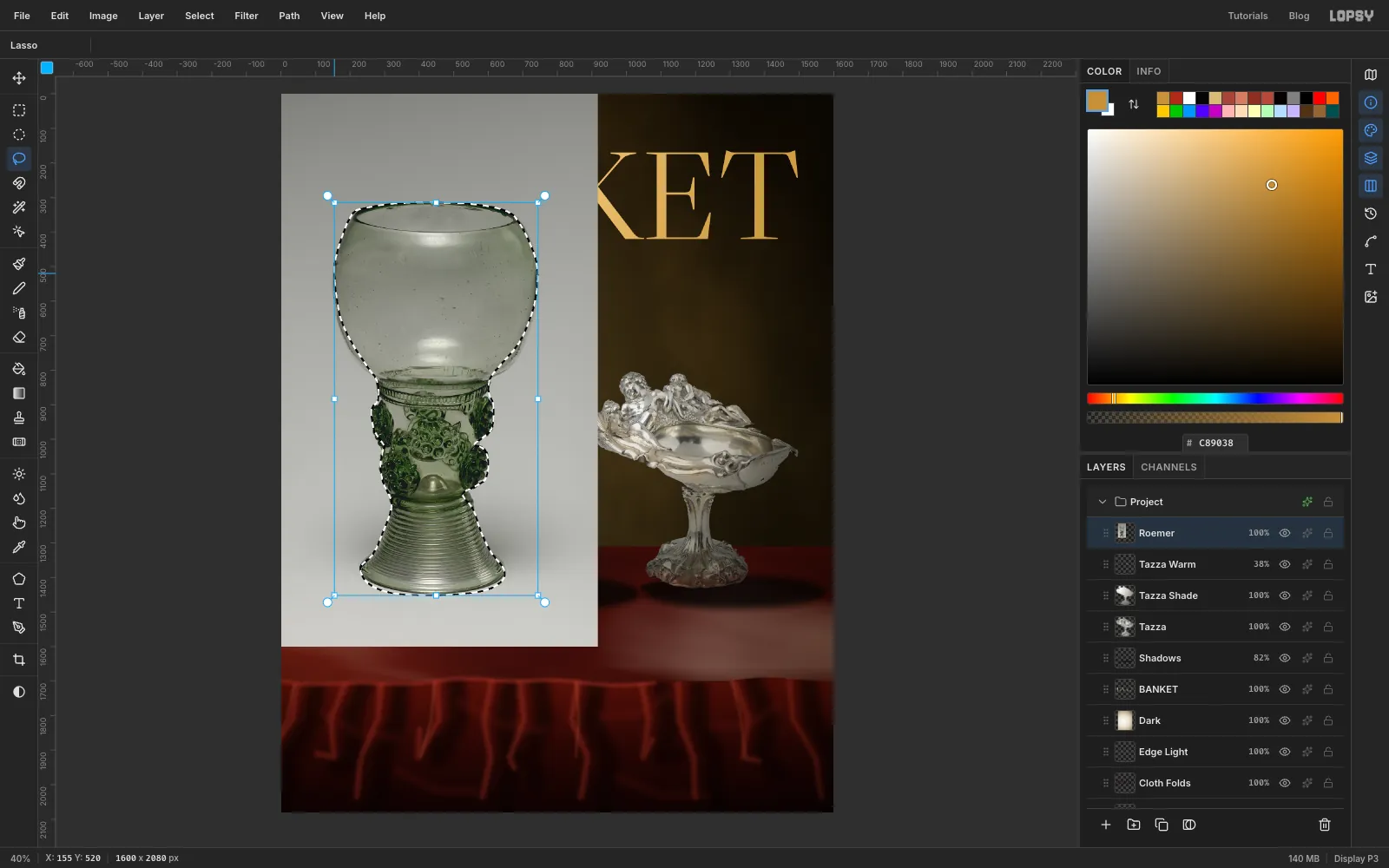
- Click Tazza Warm, paste the roemer crop with ⌘V, name the layer Roemer and press ⌘D.
- A wand can't help here, because the glass is the same grey as the backdrop. Lasso (L) around the outline by hand. Take your time on the knobbly prunts on the stem.
-
Clean the prunts and place the glass
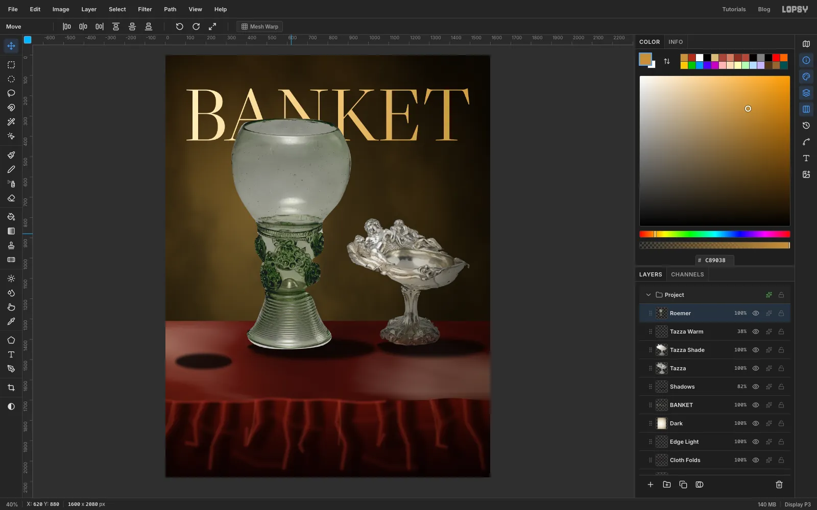
- Choose Select → Inverse, press Delete and press ⌘D.
- Slivers of backdrop will remain between the prunts, and these will show as pale slips later.
⌘-click the Roemer thumbnail, then choose Select → Shrink… with 7 and Select → Inverse. - Press M, then hold
Shift+Altand drag a rectangle across the stem only, from below the bowl to above the ribbed foot. That keeps just the stem's fringe selected, leaving the bowl and foot alone. Press Delete and ⌘D. - Marquee the glass, press V, and drag it so it sits left of centre, with its foot on the contact shadow. Its rim should overlap the bottom of the masthead. Press ⌘D.
-
Turn the glass transparent
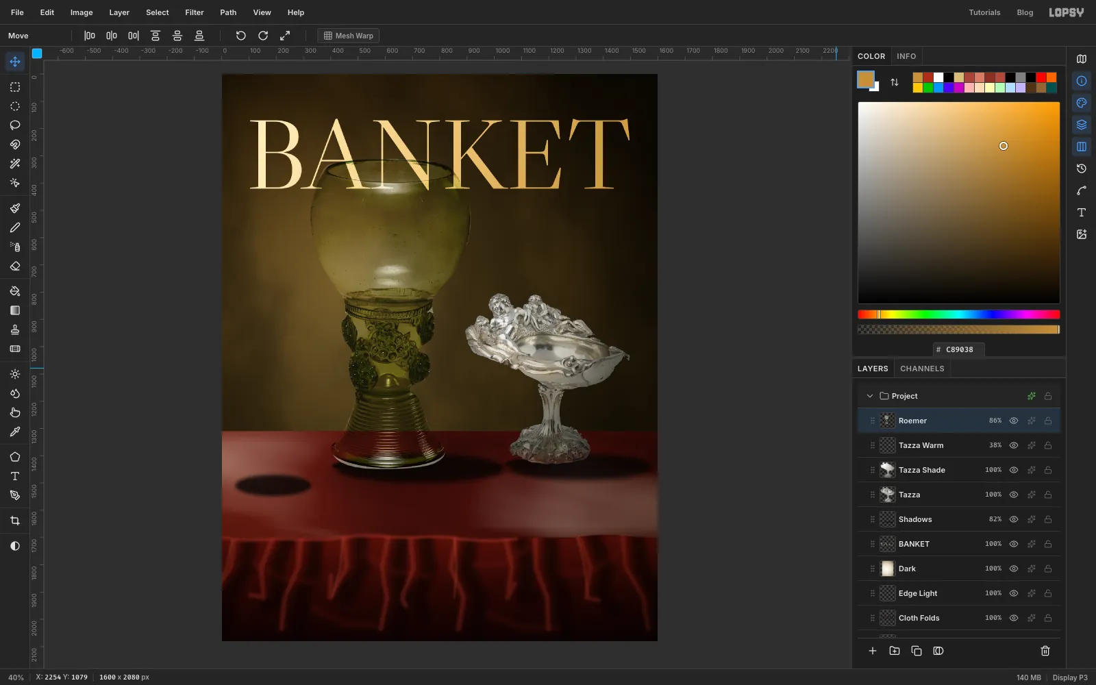
Set Roemer to Hard Light at 86%. In this mode, anything lighter than mid-grey lightens what's below and anything darker darkens it. A grey backdrop inside the glass is close to neutral, so the wall and the masthead appear through it, and only the glass's own highlights and dark lines are left. This one setting does most of the work on the whole cover.
-
Bend the letters through the bowl
Real glass moves whatever you see through it.
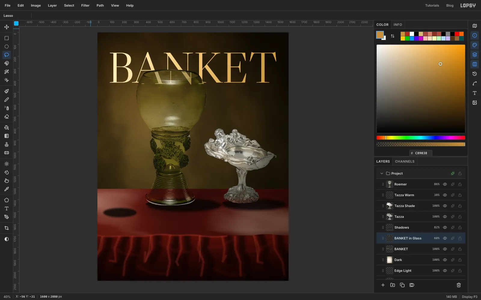
- Click the BANKET row and lasso the part of the bowl that overlaps the letters, staying on the bowl's outline.
- Press ⌘X then ⌘V. The letters come back in place on their own layer directly above BANKET. Name it BANKET in Glass and press ⌘D.
- Marquee the piece, press V, and drag it about 26 px right and 10 px down. Press ⌘D.
- Some of it now pokes out past the bowl, so lasso the same outline, choose Select → Inverse, press Delete and press ⌘D.
- Set the layer's opacity to 60%.
-
Pour the wine
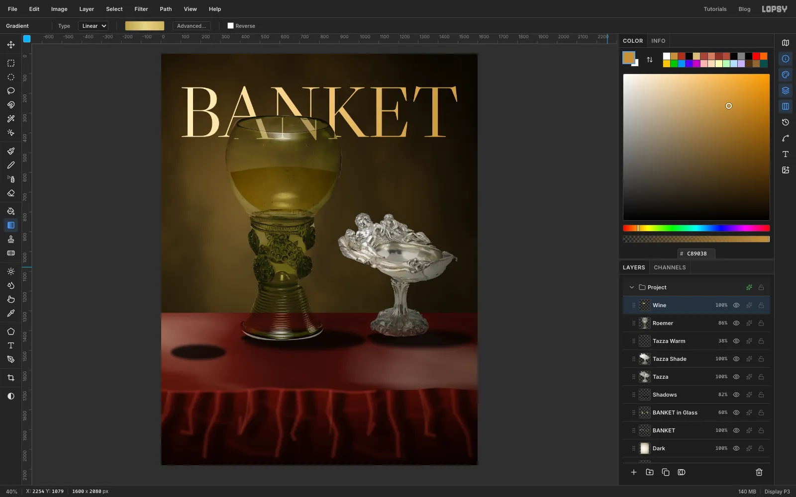
- Click Roemer and add a layer called Wine. Lasso the lower half of the bowl, just inside the glass wall, with a shallow curve along the top about halfway down the bowl. Stop where the bowl meets the collar.
- Choose Select → Feather… with 3.
- Drag a Linear gradient from one side of the wine to the other, with stops , at 50% and . White wine is pale and a little green, so stay away from orange. Press ⌘D.
- Set the layer to Multiply.
-
Add the surface and the light inside
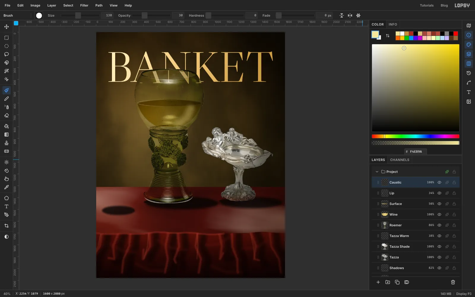
- Add a layer called Surface. Use the Elliptical Marquee to draw a flat ellipse across the wine level, about 530 px wide and 56 px tall.
- Drag a Linear gradient from left to right, with stops , at 55% and . Press ⌘D and set the layer to Multiply at 50%.
- Add a layer called Lip. Draw the same ellipse a couple of pixels larger and drag a left-to-right gradient of , at 50% and .
- Choose Select → Shrink… with 3, press Delete and press ⌘D, which leaves only a thin ring. Set it to 34%.
- Add a layer called Caustic. Glass focuses light on the side away from the window, so paint one soft curve in the lower right of the wine with Size 130, Hardness 0, Opacity 30, in . Set the layer to Screen.
-
Reflect the window
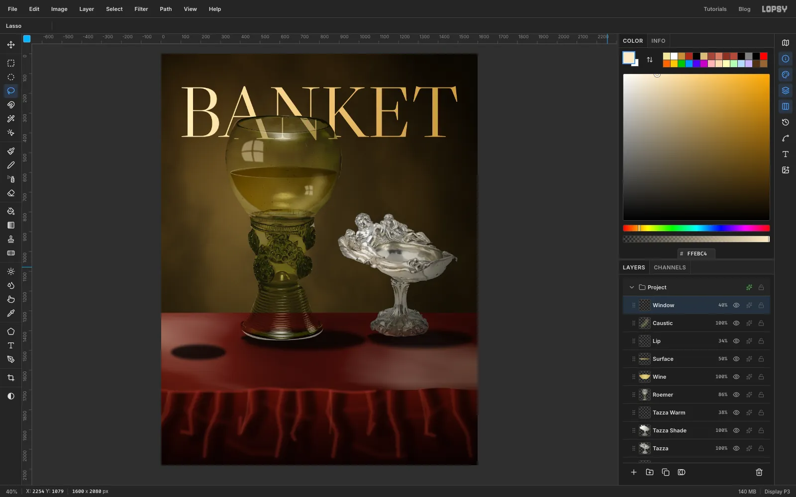
Every glass in a Dutch still life has this: the painter's studio window, bent around the bowl.
- Add a layer called Window and set the colour to .
- With the Lasso, draw four small panes with slightly bowed sides in the upper left of the bowl, about 90 px across in total, leaving a thin bar between them. Fill each with Edit → Fill and leave the selection until you start the next pane.
- Do the same at about half that size in the lower right of the wine, where the window comes through small and upside down.
- Press ⌘D and run Gaussian Blur… with Radius 6. Set the layer to Screen at 40%.
-
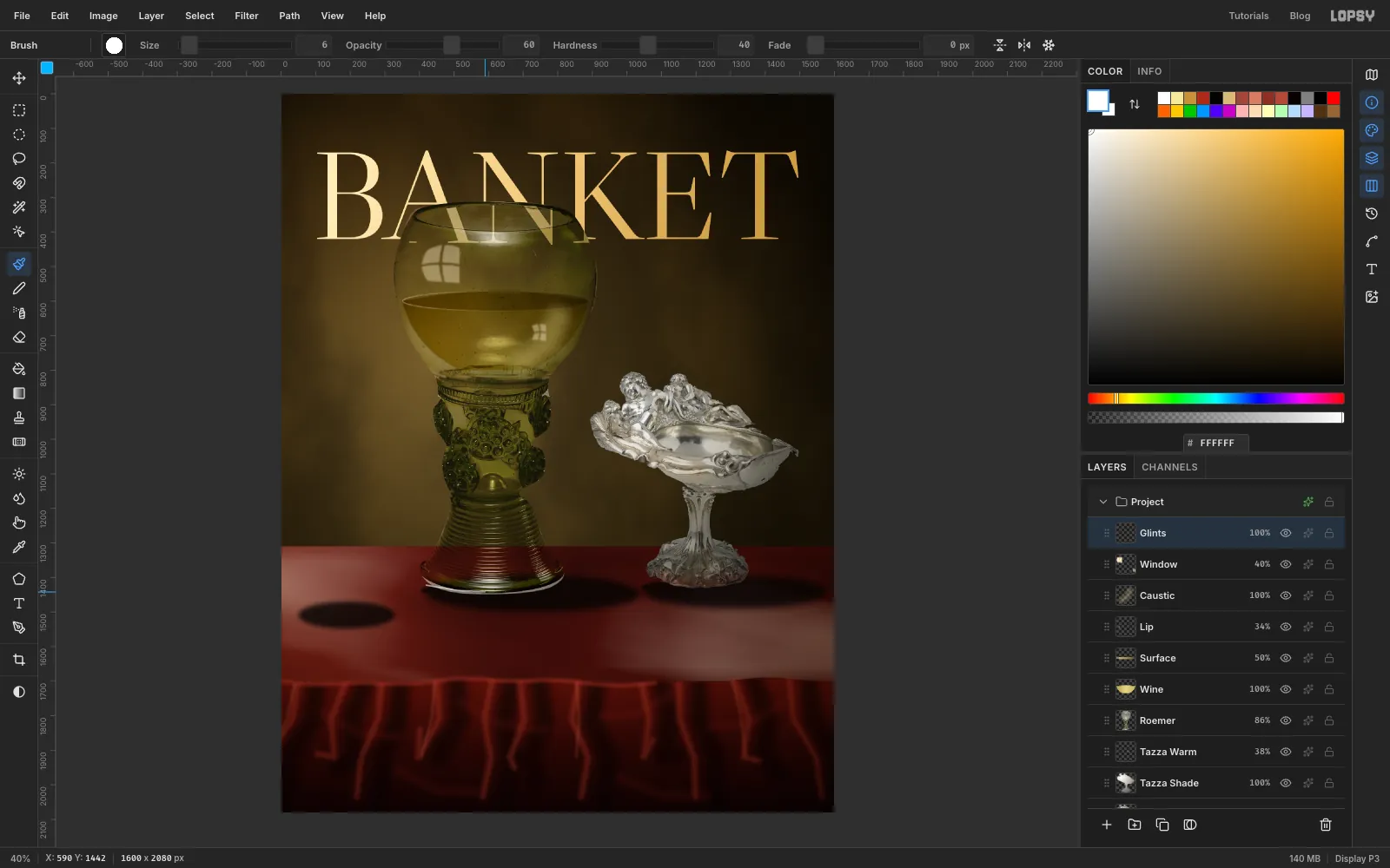
Add a few sparks
Add a layer called Glints and paint in white. Be sparing, because too many look like digital specks.
- Click five spots on the prunts, with the Brush at Size 8, Hardness 20, Opacity 55.
- Paint one stroke along the front edge of the foot at Size 6, Hardness 40, Opacity 60. It pulls the foot away from the dark table.
-
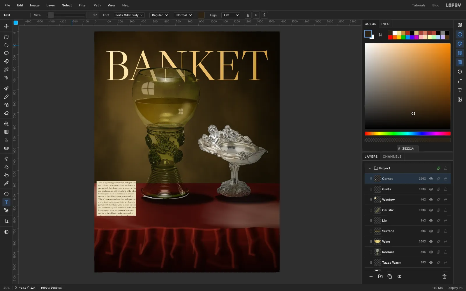
Set a page of type
Dutch painters loved a cone of pepper twisted from a printed page.
- Add a layer called Cornet, marquee a rectangle about 340 × 300 px at the left of the table, fill it with and press ⌘D.
- Press T, with Sorts Mill Goudy at Size 17 in , and click just inside the top left of the rectangle. Paste or type about thirteen lines of any old recipe text, and press Tab.
- Click Rasterize Layer, then choose Layer → Merge Down to print the type onto the paper.
-
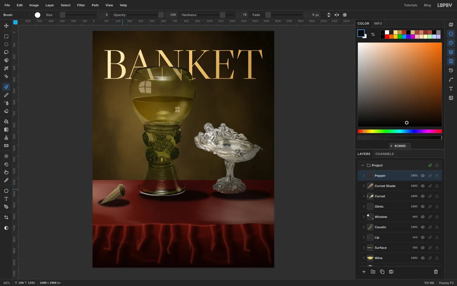
Roll the page into a cone
- Marquee the page, press V, rotate it about 38° counter-clockwise and press ⌘D.
- Lasso a long cone with its point at the lower left and a rounded open end at the upper right, about 240 px long. Choose Select → Inverse, press Delete and press ⌘D.
⌘-click the Cornet thumbnail and add a layer called Cornet Shade. Drag a Linear gradient across the cone's width, from on the lit top edge through at 45% to . Press ⌘D and set it to Multiply.- Add a layer called Pepper. Lasso the mouth of the cone and drag a gradient across it from through at 55% to . The lighter side is the inside of the paper.
- With the Brush at Size 8, Hardness 70, Opacity 100, in , click a few peppercorns into the mouth. Press ⌘D.
-
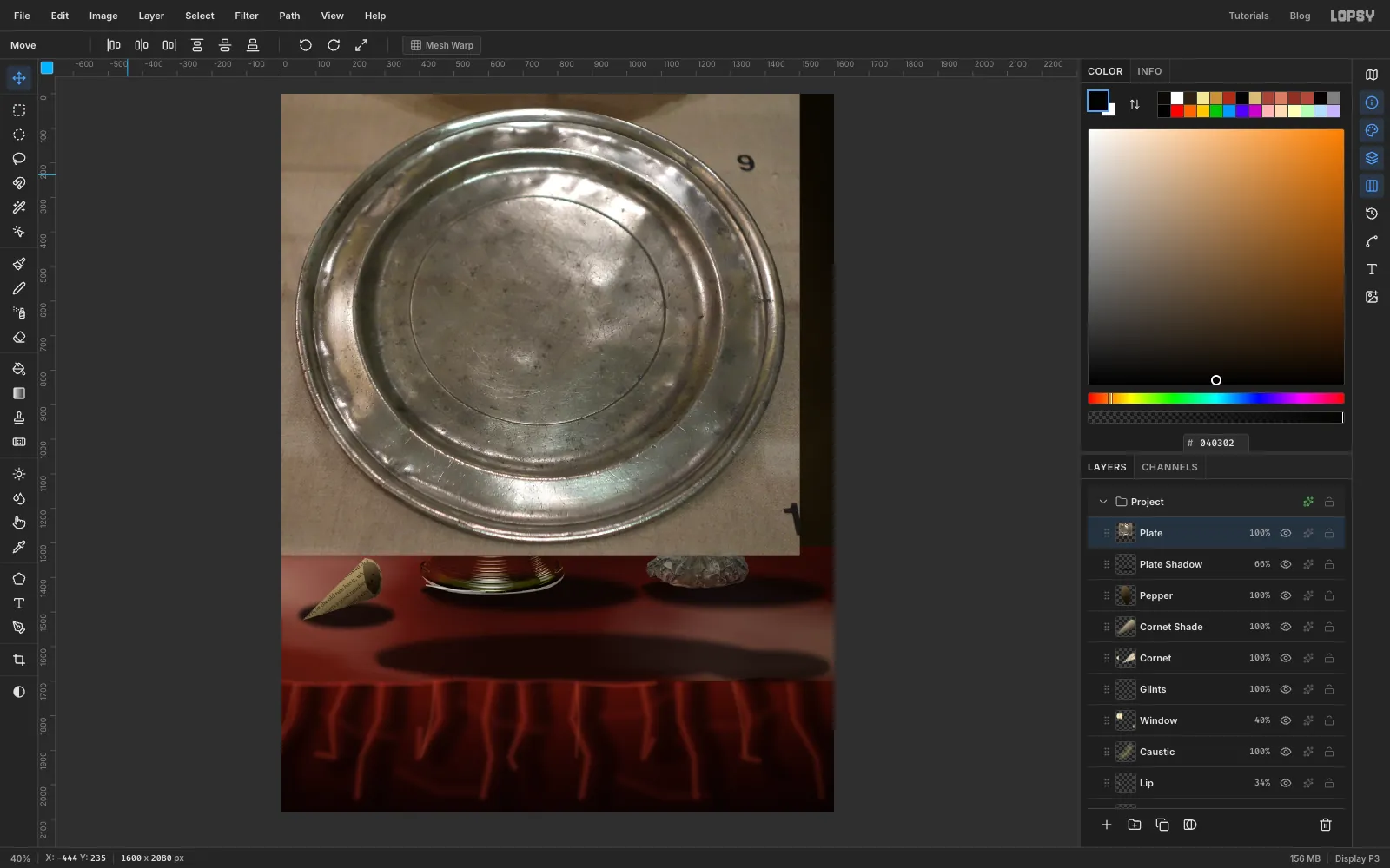
Paste the pewter plate
- Click Pepper and add a layer called Plate Shadow. With the Elliptical Marquee's exact-corners dialog, make the three ellipses listed below, feathered and filled with as before.
- Press ⌘D and set the layer to 66%.
- Paste the plate crop, name the layer Plate and press ⌘D.
The ellipses:
- Under the plate: X 270 to 1380, Y 1560 to 1702, Feather 18.
- A tight contact shadow: X 280 to 1290, Y 1610 to 1684, Feather 7.
- Under the lemon, to come: X 1230 to 1590, Y 1610 to 1706, Feather 16.
-
Foreshorten the plate
- Lasso around the rim, then choose Select → Inverse, press Delete and press ⌘D.
- Marquee the plate, press V, and
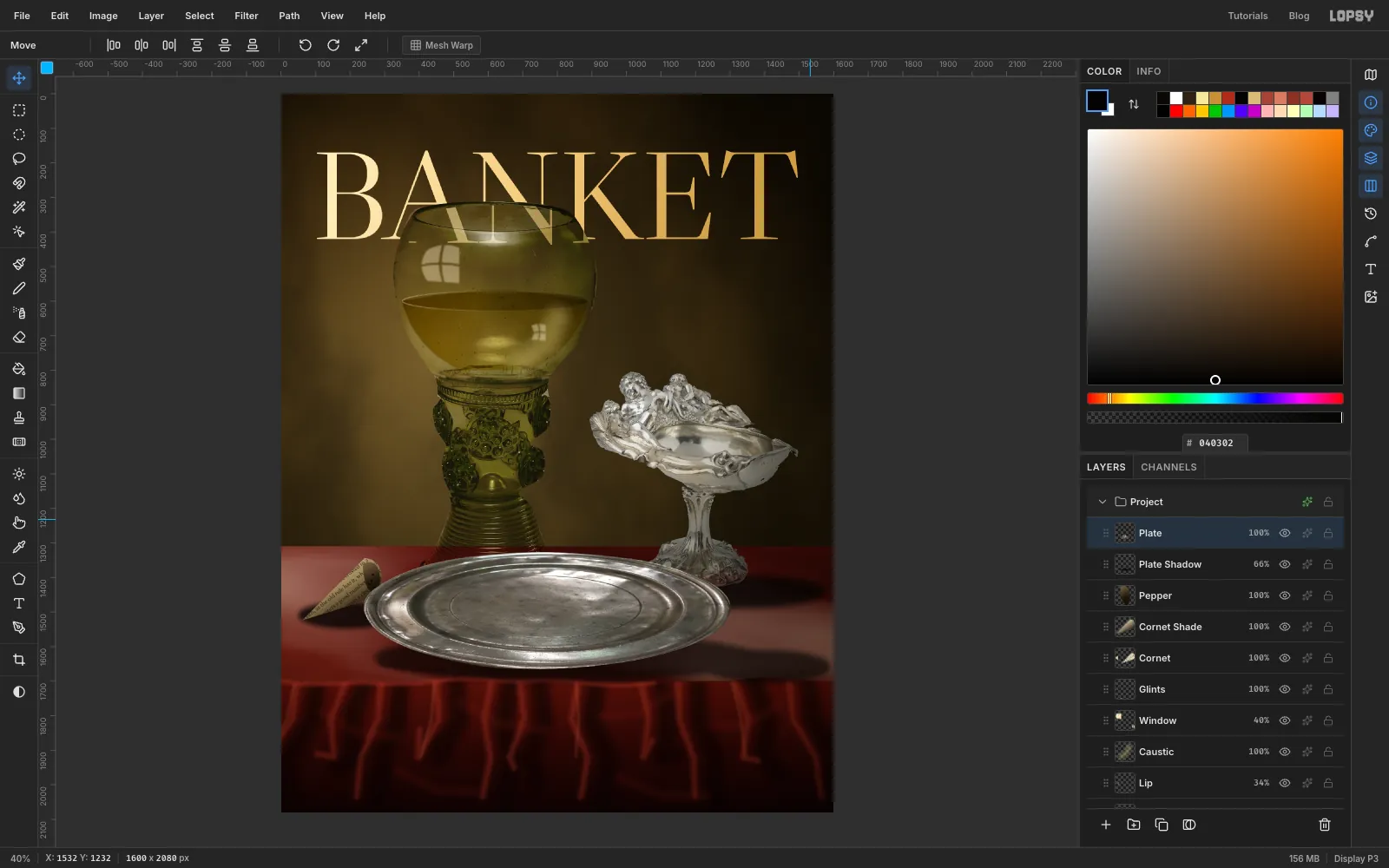
⌘-drag a corner until it's about 75% of its size. Press ⌘D. - Marquee it again and drag the bottom middle handle up until it's about 36% of its height. A round plate seen from low down is a very flat ellipse. Press ⌘D.
- Marquee it once more, press V, and drag it to the centre of the table. Press ⌘D.
- Run Filter → Hue/Saturation… with Saturation −25.
A painted gradient ellipse can't match this plate. The dents and scratches are what make the surface look like old metal.
-
Shade the plate
⌘-click the Plate thumbnail and add a layer called Plate Shade. Drag a Radial gradient from the upper left of the plate to its right rim, with stops , at 50% and . Press ⌘D and set the layer to Multiply.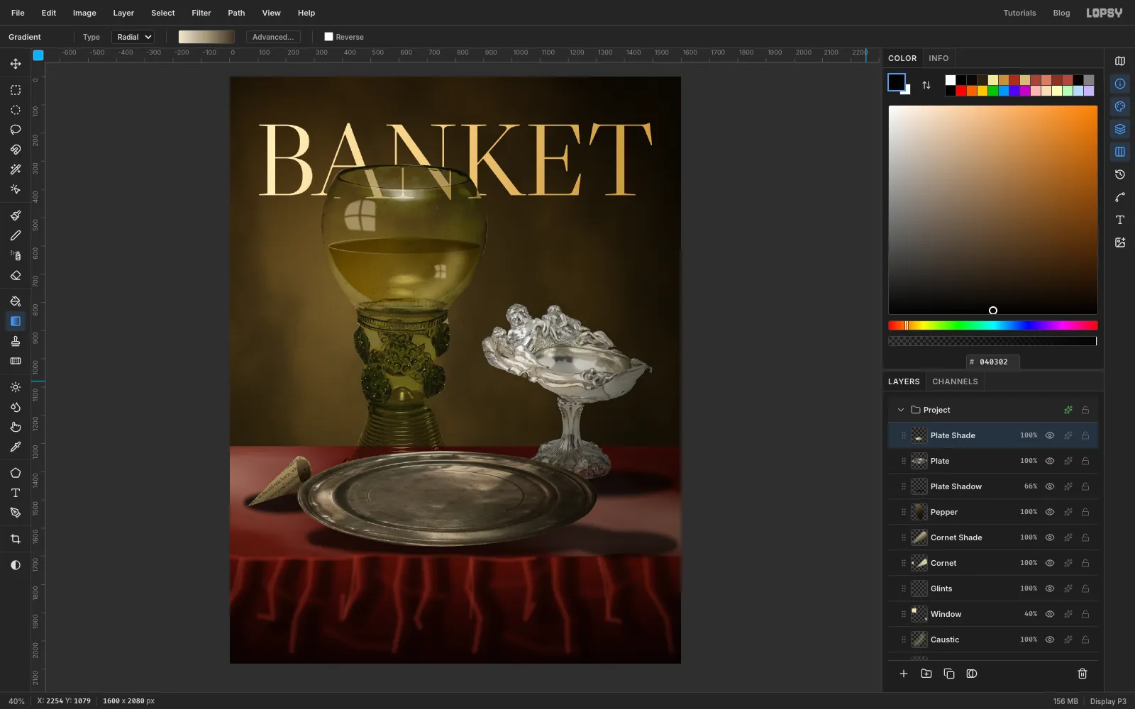
-
Cut the first oyster
- With Plate Shade active, add an empty layer called Occlusion. You'll paint on it once the oysters are placed.
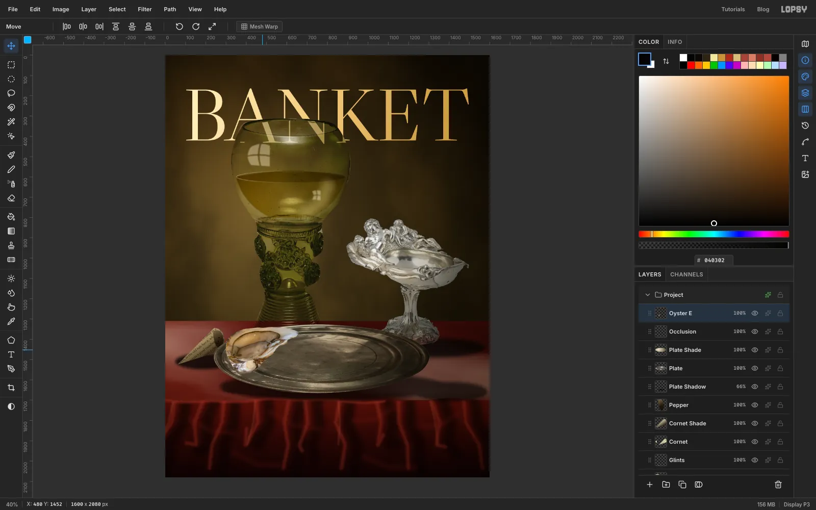
- Paste an oyster and name it Oyster E. Press ⌘D, lasso around the shell, then choose Select → Inverse, press Delete and press ⌘D.
- The shell's pale edge melts into the white plate in the photo, so pull the outline in a little:
⌘-click the thumbnail, then Shrink 5, Feather 2, Inverse, Delete, ⌘D. - Marquee it, press V, and drag it to the middle of the page so nothing crosses the canvas edge when you rotate. Press ⌘D.
- Marquee it, press V, and
⌘-drag a corner to scale it to 37%. Press ⌘D. - Marquee it again and drag the bottom handle up to 62% of its height. Press ⌘D.
- Marquee it again and rotate it about 10° counter-clockwise. Press ⌘D.
- Marquee it once more, press V, and drag it onto the left side of the plate. Press ⌘D.
The letters in the layer names come from lettering the photo's six shells A to F, which is why they skip.
-
Add the two oysters behind it
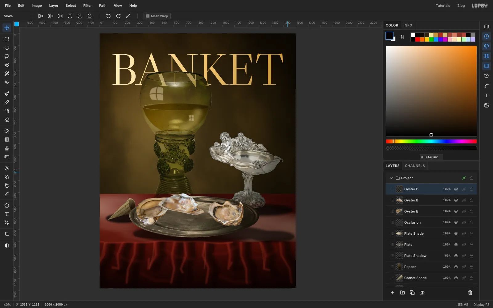
Repeat the whole recipe for two more oysters, keeping each new paste above the last:
- Oyster B: scale to 37%, height to 70%, rotate 5° clockwise, and place at the back of the plate.
- Oyster D: scale to 37%, height to 75%, rotate 70° clockwise, and place on the right.
Click each of the three in turn and run Gaussian Blur… with Radius 2. It's a small amount of depth of field, so the eye goes to the front.
-
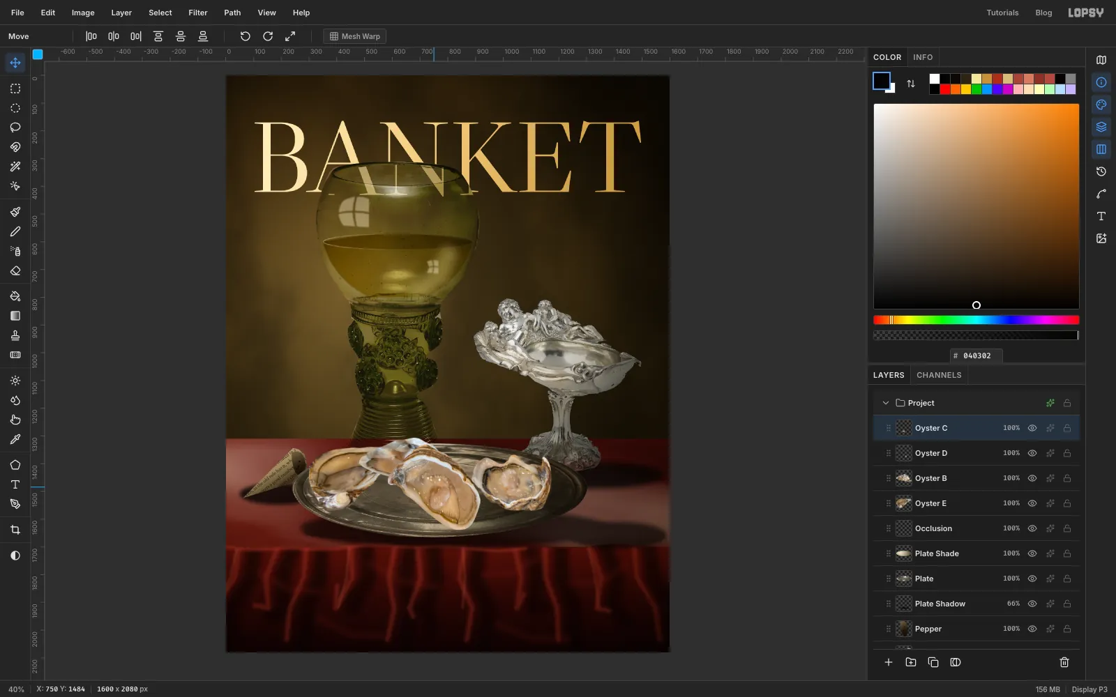
Place the hero oyster
Click Oyster D, then cut a fourth oyster, Oyster C, the plumpest one, in the same way. Use a larger scale: 47%, height to 72%, then rotate about 80° counter-clockwise, and place it front and centre. Keep the whole shell inside the plate's rim. No blur on this one.
-
Model the hero shell
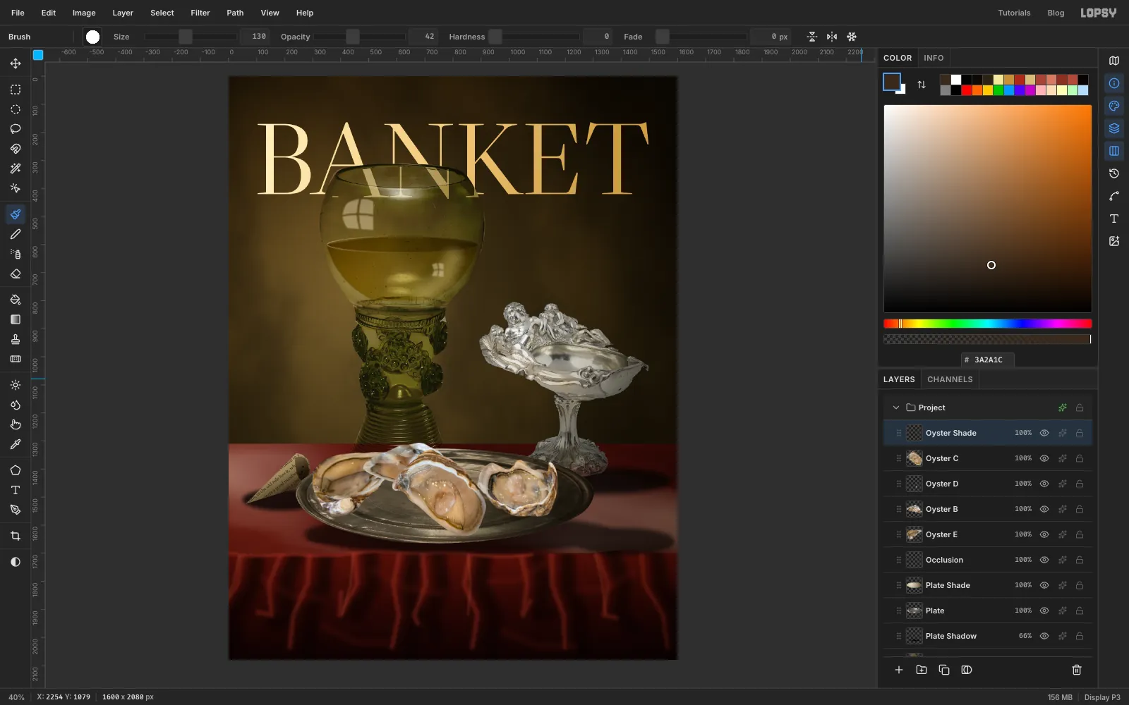
The photo was lit from above, but our light comes from the upper left.
⌘-click the Oyster C thumbnail and add a layer called Oyster Shade.- With the Brush at Size 130, Hardness 0, Opacity 42 in , paint one stroke down the right side and along the bottom of the shell. Press ⌘D and set the layer to Multiply.
- Click the Occlusion layer. With Size 44, Hardness 0, Opacity 75 in , paint a tight dark line on the plate under the lower right edge of each oyster. This makes them sit on the plate, not float over it.
-
Bring in the lemon
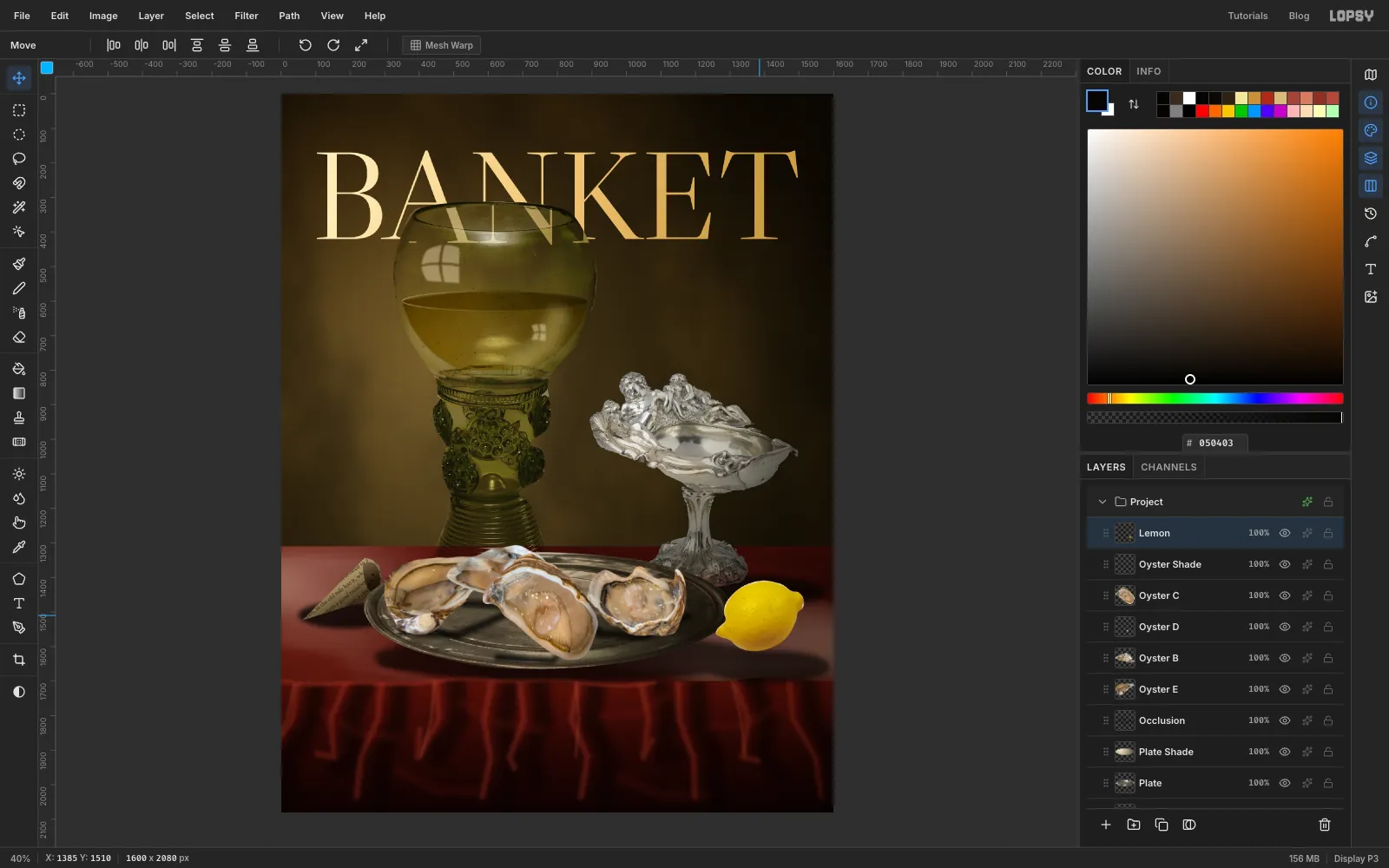
- Click Oyster Shade and paste the lemon. Name it Lemon, press ⌘D, lasso around the fruit and leave out its shadow. Choose Select → Inverse, press Delete and press ⌘D.
- Run Filter → Hue/Saturation… with Hue 9, Saturation −18, Lightness 2. That shifts the photo's orange toward lemon yellow.
- Move it to the middle of the page and scale it to 29%, then rotate it about 14° counter-clockwise, then move it to the right of the plate. Use ⌘D between steps.
-
Shade the lemon
⌘-click the Lemon thumbnail and add a layer called Lemon Shade. Drag a Radial gradient from the upper left of the fruit past its lower right, with stops , at 50% and . Press ⌘D and set the layer to Multiply.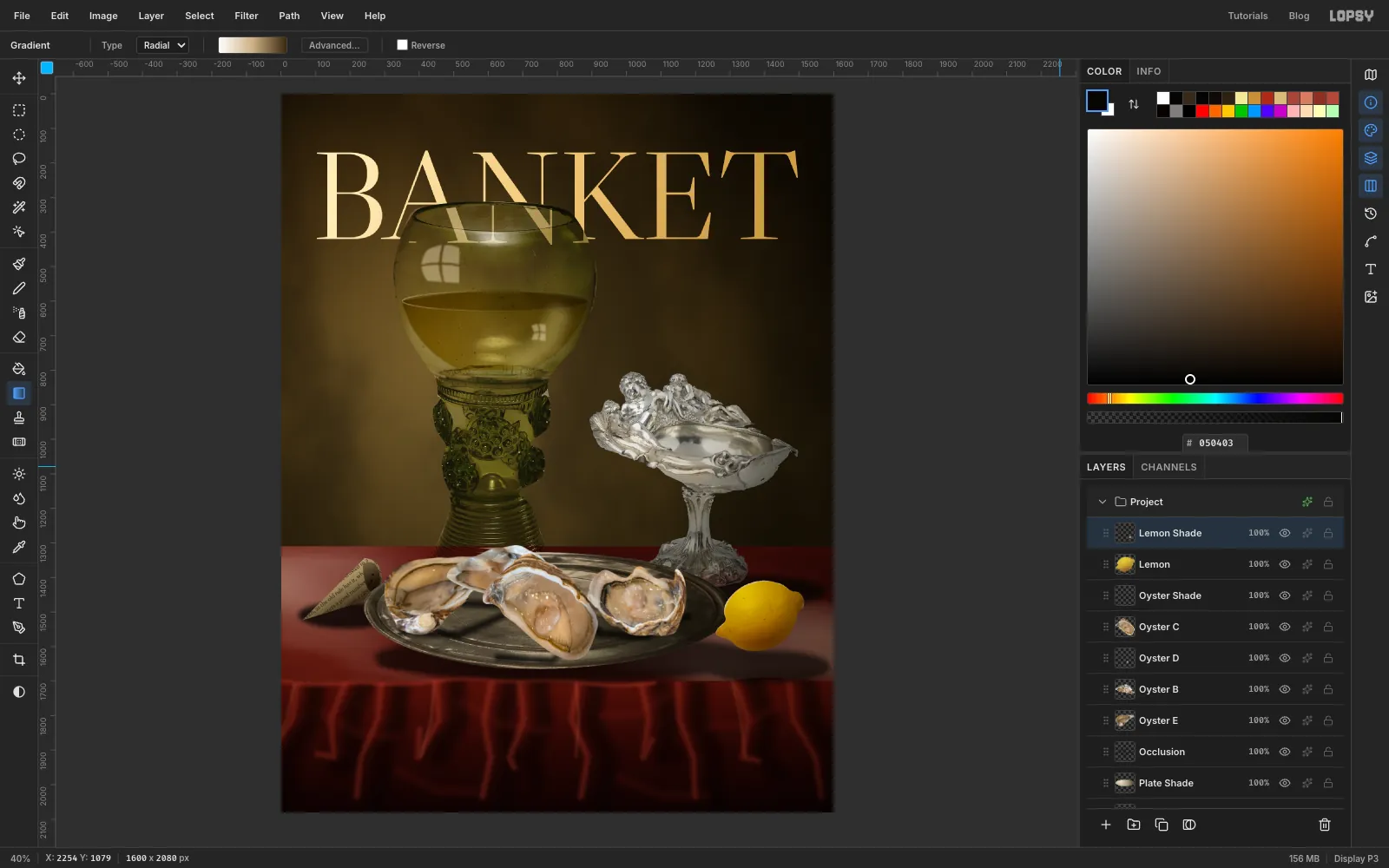
-
Draw the rind spiral
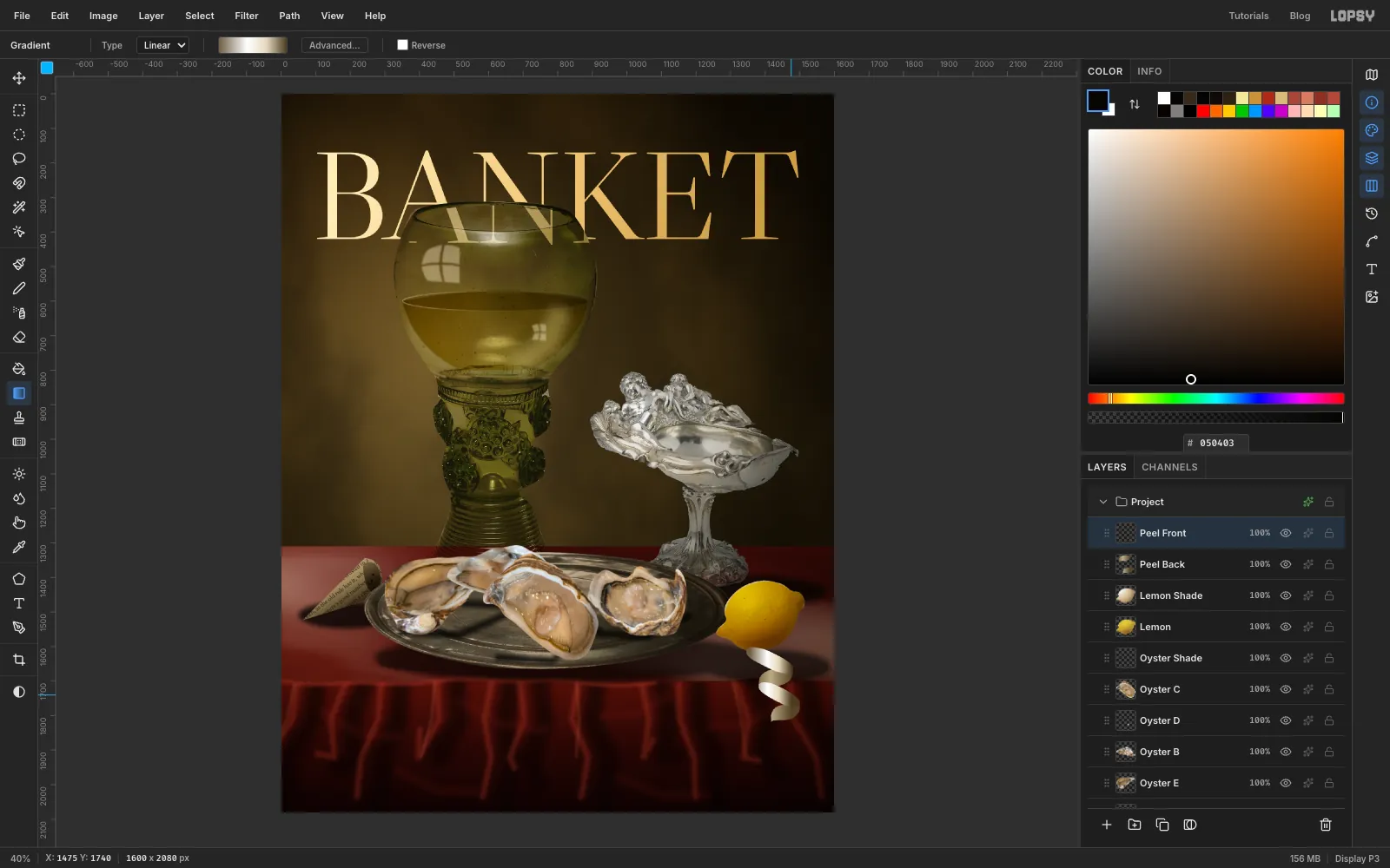
A spiral of peel is two sets of shapes: the outside of the rind, facing you, and the inside of the rind, going around the back.
Start the spiral under where the half lemon will go, and let each turn lean slightly further right as it drops past the table edge. Each crescent is about 130 px wide and 50 px tall.
- Add a layer called Peel Back. Lasso two narrow crescents, one under the other, curving down to the left. Fill each with a Linear gradient dragged across its width, with stops , at 50% and . That's the inside of the rind. Press ⌘D.
- Add a layer called Peel Front. Lasso two more crescents that curve the other way, and overlap the ends of the back pieces so the ribbon appears to wind around. Fill each with a gradient from through at 42% and at 70% to .
- Press ⌘D.
-
Cut real rind into the ribbon
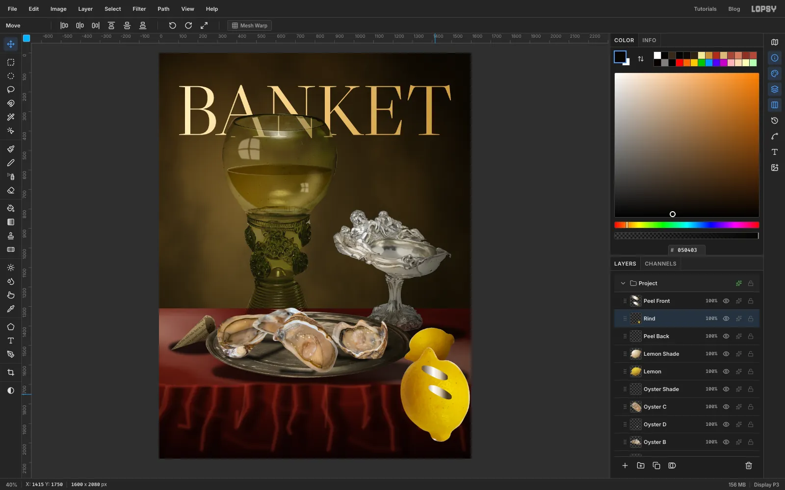
Those front shapes are only shading so far. The rind itself comes from the lemon photo.
- Click Peel Back and paste the lemon again. Name it Rind and press ⌘D, then cut it out the same way as before.
- Run Hue/Saturation… with Hue 9, Saturation −12, Lightness 2.
- Move it to the middle of the page and scale it to 52%. Rotate it 90° clockwise, and drag it down over the spiral.
-
Trim the rind to shape
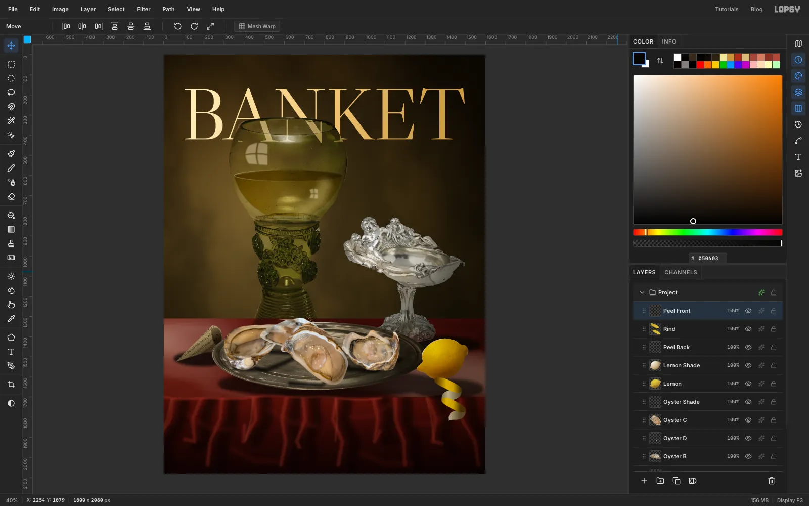
- With Rind still active,
⌘-click the Peel Front thumbnail. The selection comes from that layer, but the active layer doesn't change. - Choose Select → Feather… with 1, then Select → Inverse, press Delete and press ⌘D.
- Click Peel Front and set it to Multiply. Its white-to-brown gradients now shade the pores, so the ribbon looks curved.
- With Rind still active,
-
Add the cut half
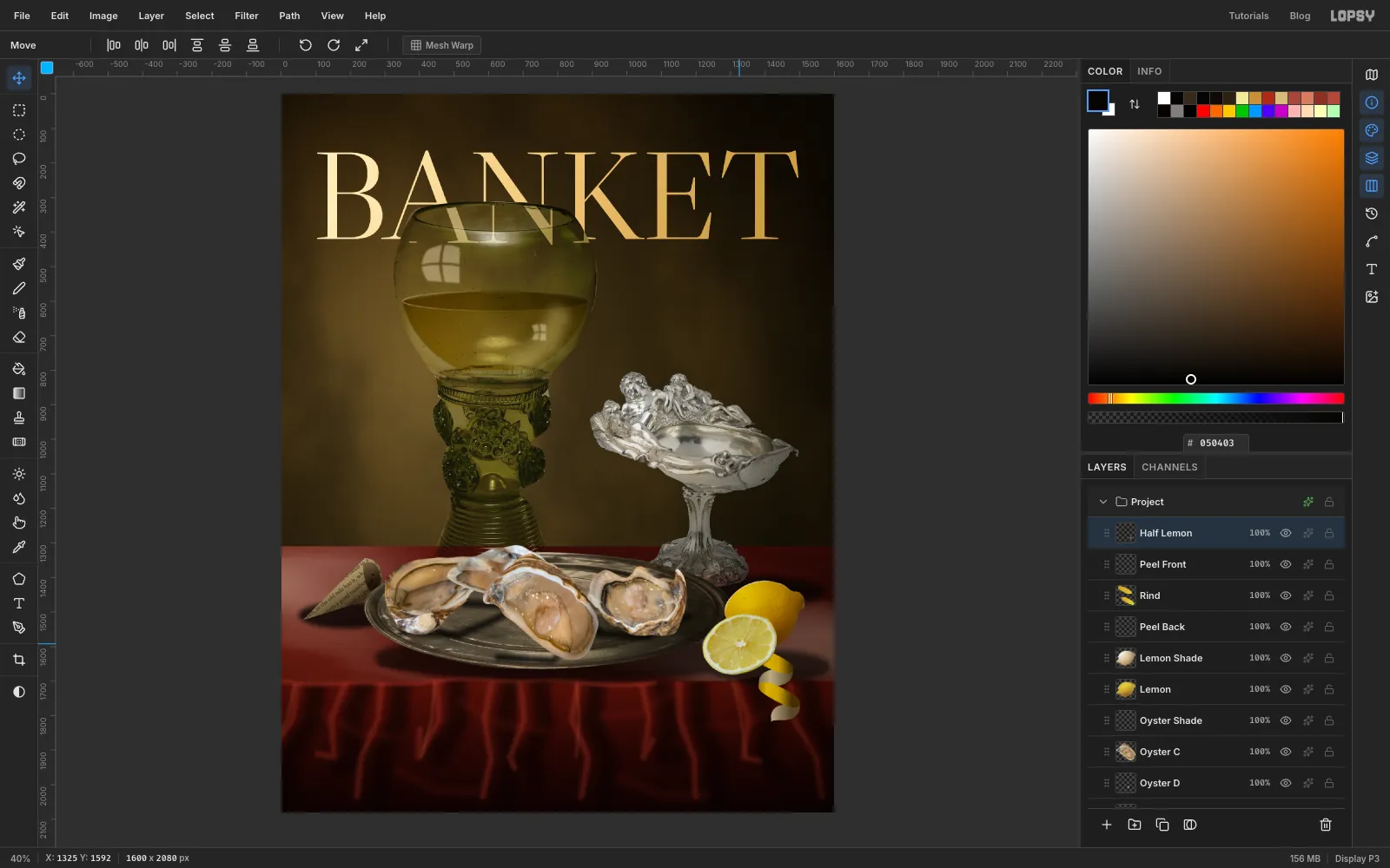
- With Peel Front active, paste the half lemon and name it Half Lemon. Press ⌘D, lasso around the rim, then choose Select → Inverse, press Delete and press ⌘D.
- Run Hue/Saturation… with Hue 6, Saturation −12.
- Move it to the middle of the page. Scale it to 24%, drag the bottom handle up to 82% of its height, and rotate it about 18° counter-clockwise. Use ⌘D and a new marquee between steps.
- Drag it to lean against the whole lemon, hiding the point where the rind begins.
-
Lay down the knife
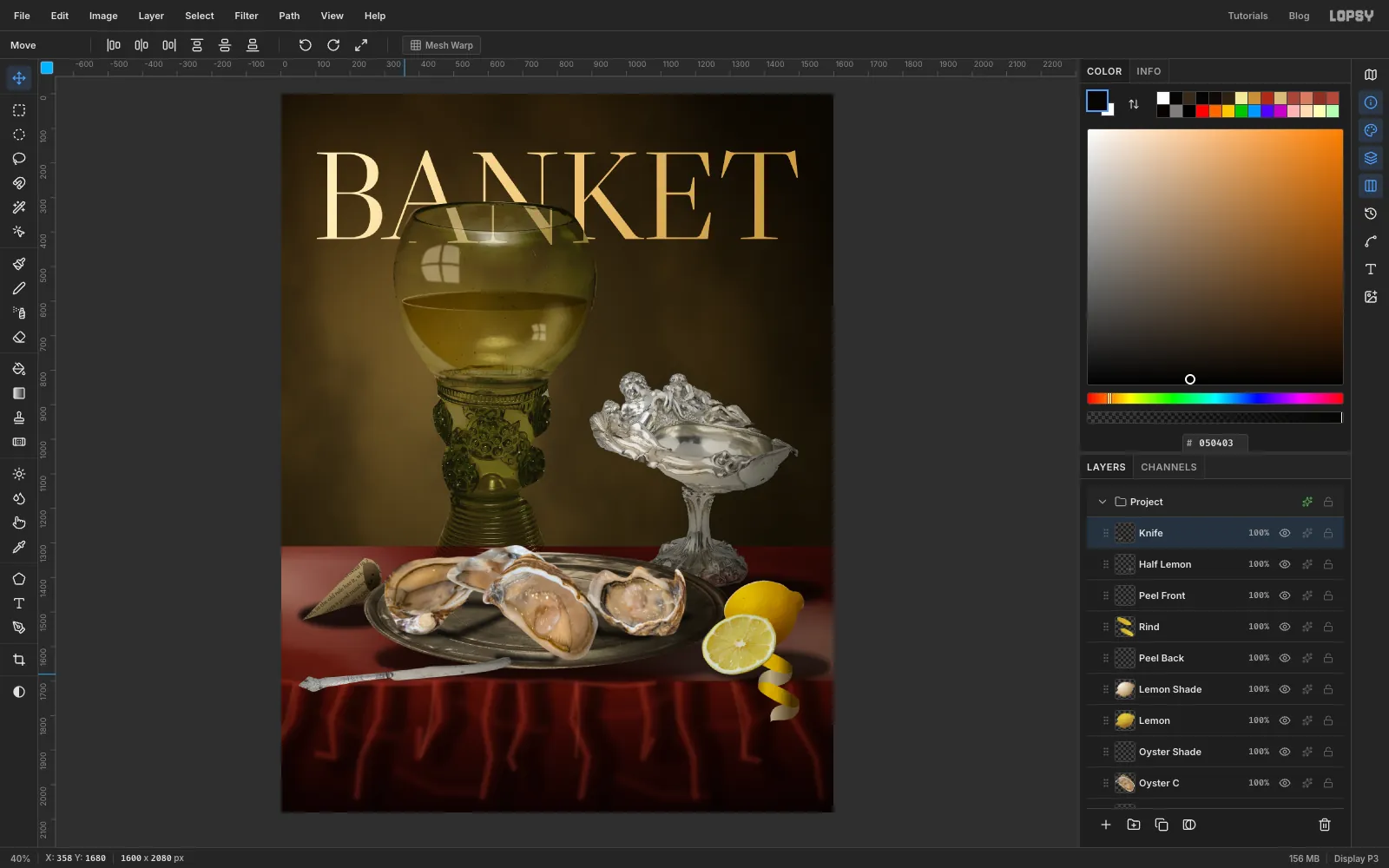
- Click Half Lemon, paste the knife, name it Knife and press ⌘D. Lasso around it, then choose Select → Inverse, press Delete and press ⌘D.
- Run Hue/Saturation… with Saturation −85, Lightness −4. This blade is gilt in the photo, and a gold knife would compete with the masthead.
- Move it to the middle of the page and scale it to 46%, then rotate it 98° counter-clockwise so the handle points left and slightly down. Then drag the bottom handle up to 70% of its height.
- Drag it to the front left of the table, with its tip almost at the plate and its handle hanging out over the edge. It's the one strong diagonal in a very horizontal picture.
-
Seat everything with soft shadows
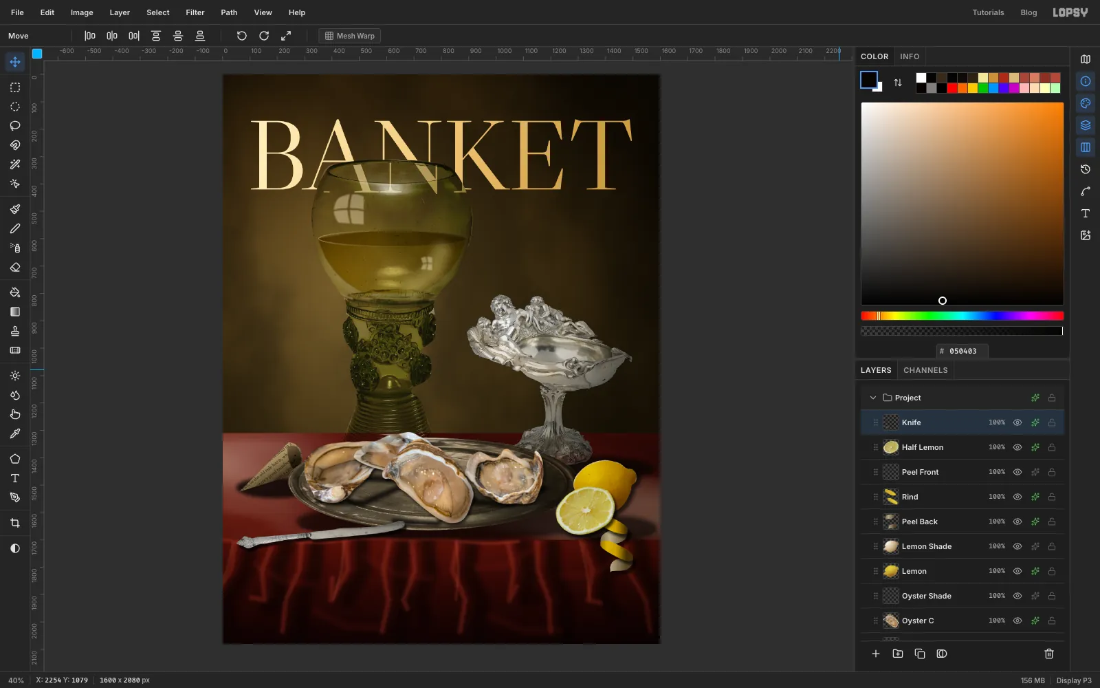
Click each layer, open its effects (the sparkle icon on its row) and turn on Drop Shadow. Keep them soft, because hard offset shadows look pasted on.
- Oyster E, Oyster B, Oyster D: Offset X 5, Offset Y 7, Blur 14, Opacity 72
- Oyster C: Offset X 6, Offset Y 8, Blur 16, Opacity 78
- Lemon: Offset X 14, Offset Y 10, Blur 18, Opacity 66
- Rind: Offset X 14, Offset Y 16, Blur 12, Opacity 66
- Peel Back: Offset X 12, Offset Y 14, Blur 10, Opacity 56
- Half Lemon: Offset X 8, Offset Y 10, Blur 12, Opacity 72
- Knife: Offset X 7, Offset Y 12, Blur 8, Opacity 74
-
Grade the oysters together
The oysters were photographed in bright daylight on a restaurant table, and they still look it.
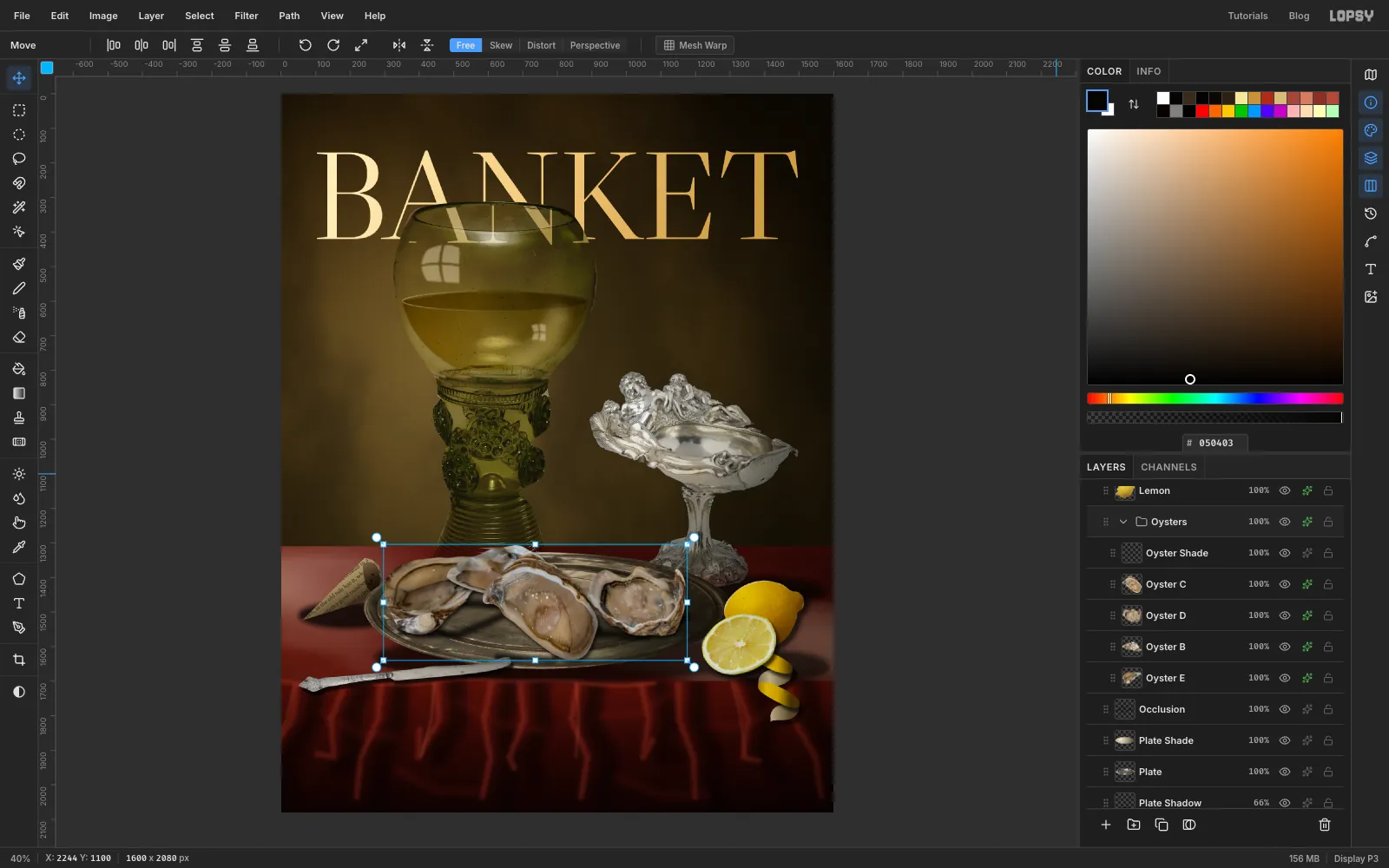
- Click Oyster E, then
Shift-click Oyster Shade to select the five layers. - Choose Layer → Group Layers and name the group Oysters.
- Open the group's effects and use Add Adjustment for each of these: Exposure −0.32, Saturation & Vibrance with Saturation −22, and Contrast 14.
- Click Oyster E, then
-
Glaze the whole picture
Old Master paintings have one varnish over everything, and that's what finally makes these separate photos read as one picture.
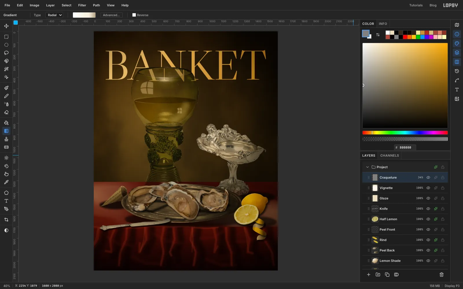
- Click Knife and add a layer called Glaze. Fill it with and set it to Multiply.
- Add a layer called Vignette. Drag a Radial gradient from the middle of the page to the bottom right corner, with stops , at 72% and . Set it to Multiply.
- Add a layer called Craquelure. Fill it with , run Add Noise… with Amount 22, then Filter → Emboss… with Angle 135 and Strength 30. Set it to Overlay at 34%. Up close, it's a fine painted tooth over everything.
-
Set the cover lines
Keep the type above the glaze so it stays crisp, as printed ink over a painting would. A text click inside an existing text layer edits that layer, so work from the bottom of each column upward. Click Craquelure before each new line so the options don't restyle the previous one, and set the options bar's style dropdown back from Italic to Normal after the italics.
Press T, then click, type and press Tab for each line:
Eat them while the month has an R: Sorts Mill Goudy Italic, 44, , on the left margin near the bottom.The Oyster Months: Pinyon Script, 166, , on the left margin, just below the table's front edge. Check that the y's tail clears the line below, and the capital T clears the knife handle.What Heda Knew, a line break, thenAbout Breakfast: Libre Caslon Text Italic, 62, , with its right edge on the 104 px margin, just under the masthead.HAARLEM, 1634: Libre Caslon Text, 26, , just above it and aligned to its left edge.- The left column sits beside the stem on the 104 px margin, from level with the bottom of the bowl to just above the table. Working bottom-up:
One knife, one towel,/no heroics: Sorts Mill Goudy Italic, 30, .Shuck Like a/Dutch Master: Libre Caslon Text, 42, .Squeeze it, or leave/well alone?: Sorts Mill Goudy Italic, 30, .The Lemon/Question: Libre Caslon Text, 42, .A QUARTERLY OF THE TABLE: Libre Caslon Text, 26, , at the top left.No. 17, WINTER: the same, at the top, with its right edge on the margin.
-
Finish with a barcode
A barcode makes it read as a real magazine straight away. Keep it ivory, because pure white would be the brightest thing on the page.
- Click Craquelure and add a layer called Barcode. Marquee a label 150 × 88 px at the lower right, with its right edge on the margin and its bottom level with the bottom of Eat them while the month has an R. Fill it with and press ⌘D.
- Set the colour to and press N for the Pencil. For each bar, set Size to 2, 4 or 6, click near the top of the label and
Shift-click near the bottom. Space about thirteen bars unevenly across the label. - Export with File → Quick Export PNG, and save the project with File → Save Project.
Try swapping in your own table. Any cheap object photographed on a plain backdrop can join this scene, as long as you shade it and give it a contact shadow. It's the shared light that makes them belong together.