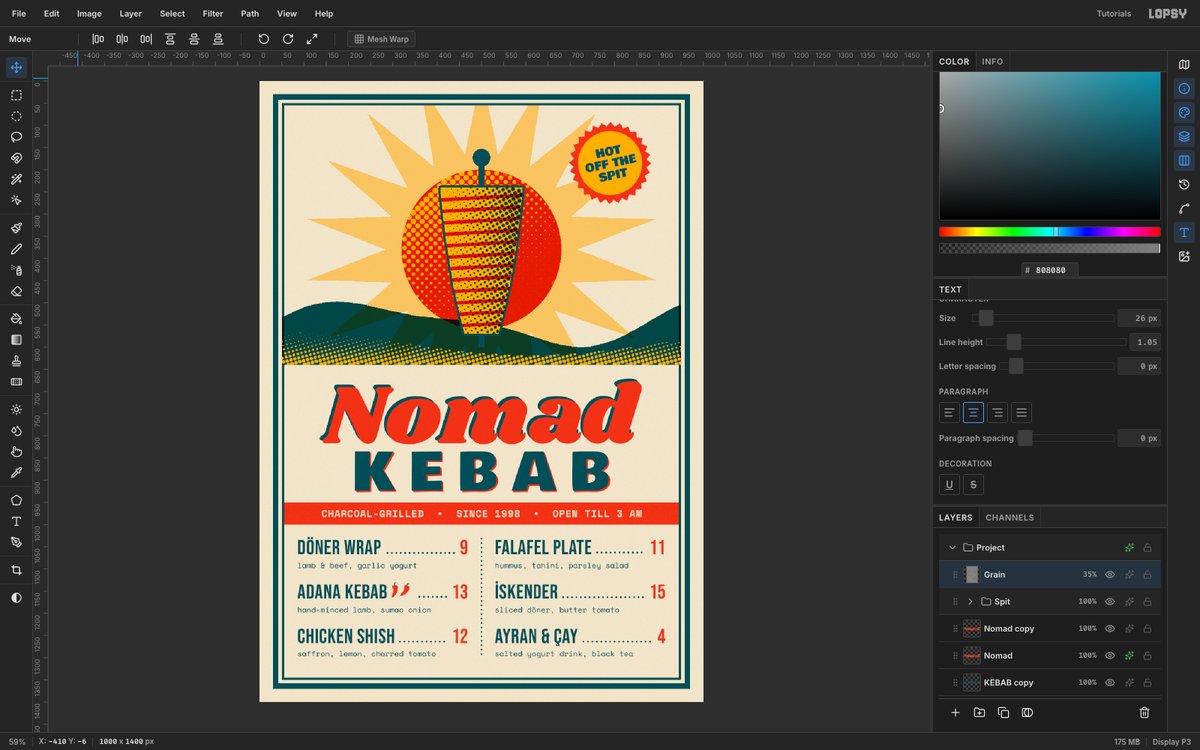
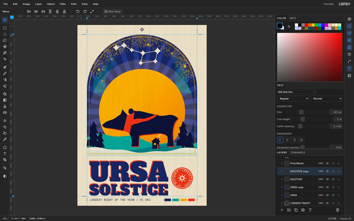
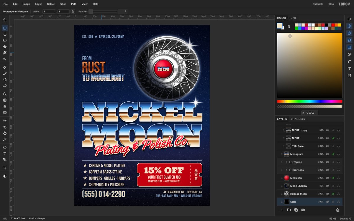
Make a Screen-Print Style Coffee Shop Flier
Design a four-ink screen-print flier in Lopsy with Multiply overprints, a halftone sun, knocked-out type, a rotated stamp and deliberate misregistration.

A screen print is made one ink at a time, each one pushed through its own stencil onto the paper. That process gives the style its look, and you can copy every part of it in Lopsy:
- A few flat inks. Here there are four: mustard, teal, red and a navy "key" ink for the line work.
- Overprints. Inks are slightly see-through, so where two of them cross you get a third, darker colour for free.
- Knockouts. You can't print a light colour over a dark one, so anything that should be paper-coloured is cut out of the inks underneath.
- Halftone dots instead of smooth shading.
- Misregistration. The stencils never line up perfectly, so each ink sits a few pixels off from the others.
In this tutorial you'll use all five on a flier for an imaginary small business, Tandem Espresso, a coffee bar that travels on a tandem bicycle. The visual joke is that the bike's wheels are two coffee cups seen from above, with saucers, handles and latte-art hearts. The flier also does a small business's job: name, what it is, when and where, plus a reason to bring the flier along.
The fonts are free Google Fonts:
- Alfa Slab One for TANDEM and the stamp's FREE
- Bebas Neue for ESPRESSO, MOBILE COFFEE BAR and CORTADO
- Oswald for the small print
- Pacifico for the tagline
The palette:
-
Paper
-
Mustard ink
-
Teal ink
-
Red ink
-
Navy key ink
Each ink gets its own group in the Layers panel, called a plate. Every plate is set to Multiply, so the inks overprint just like real ink. Lopsy keeps everything inside a top-level Project group, so the plates sit inside it. New layers land above whichever layer is selected, and inside a group if that group or a layer in it is selected, so before each step pick a layer in the right plate.
-
Create a 1200 × 1600 document
Open Lopsy. In the New Document dialog, set Width to
1200and Height to1600pixels, keep the White background and click Create. That's a 3:4 portrait, a good shape for a letter-size or A4 flier.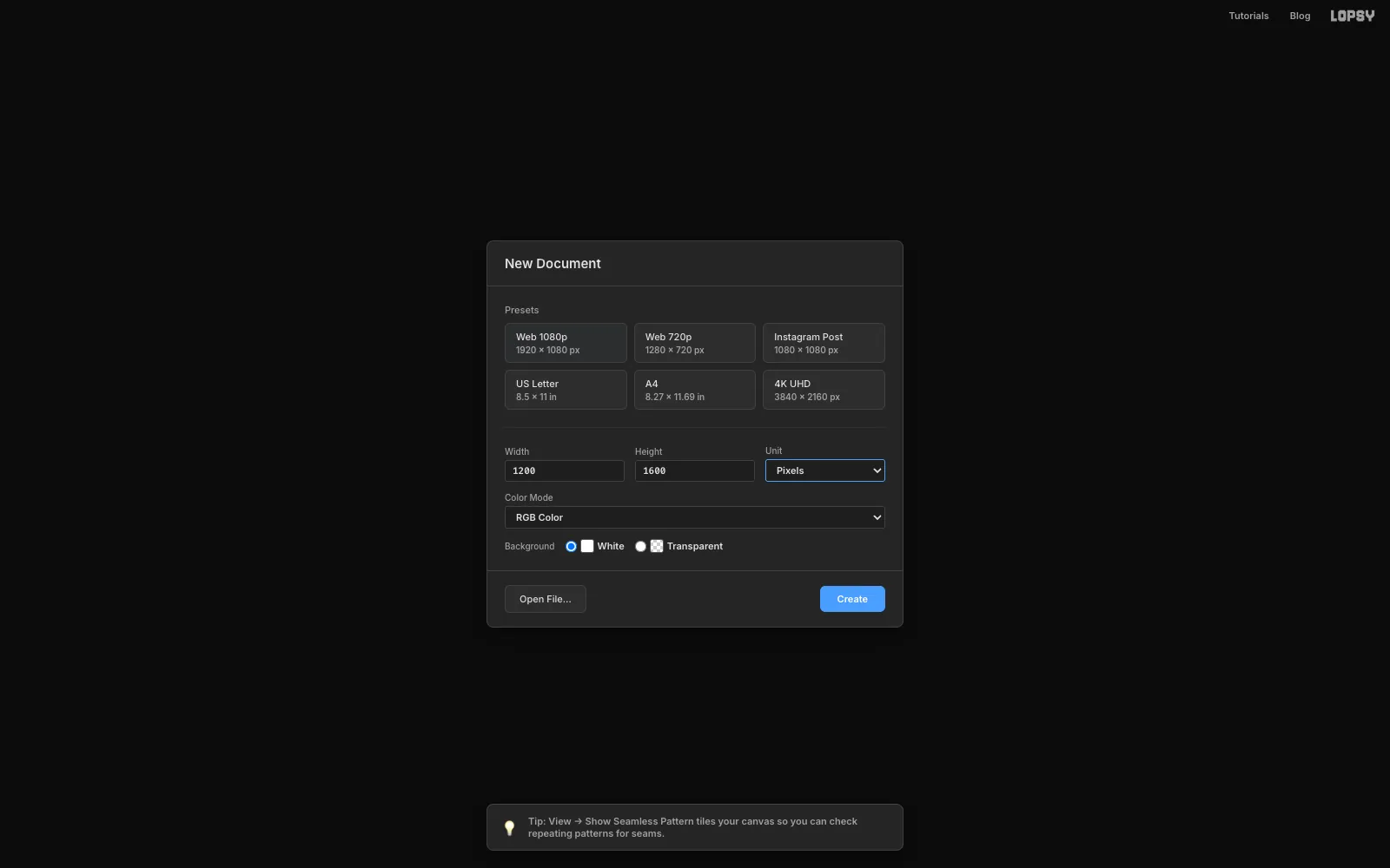
-
Lay down the paper and the guides
Select Background, set the foreground colour to and choose Edit → Fill. Add a little tooth with Filter → Add Noise…: Amount
5, Mono.Rename Layer 1 to
Paper Fibersand run Filter → Fibers… with the default settings. Fibers draws a strong grey grain, so set the layer's blend mode to Multiply and its opacity to about8%. That's just enough to read as paper.Now the guides. Each one is a single click on a ruler:
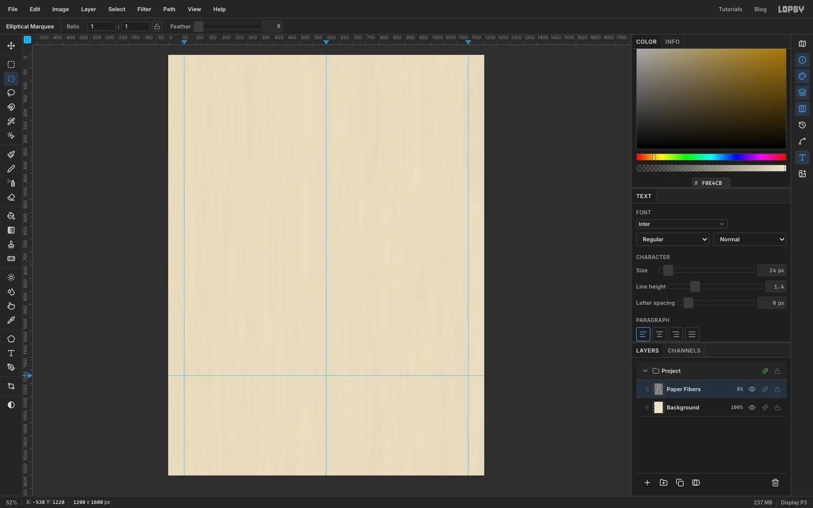
- Cmd-click (Ctrl-click) the middle of the top ruler. Cmd snaps the guide to an exact fraction of the page, so it lands at the centre, 600.
- Click the top ruler at 60 and 1140 for the side margins.
- Click the left ruler at 1220. This is the ground line the bike's wheels will stand on.
-
Make four ink plates
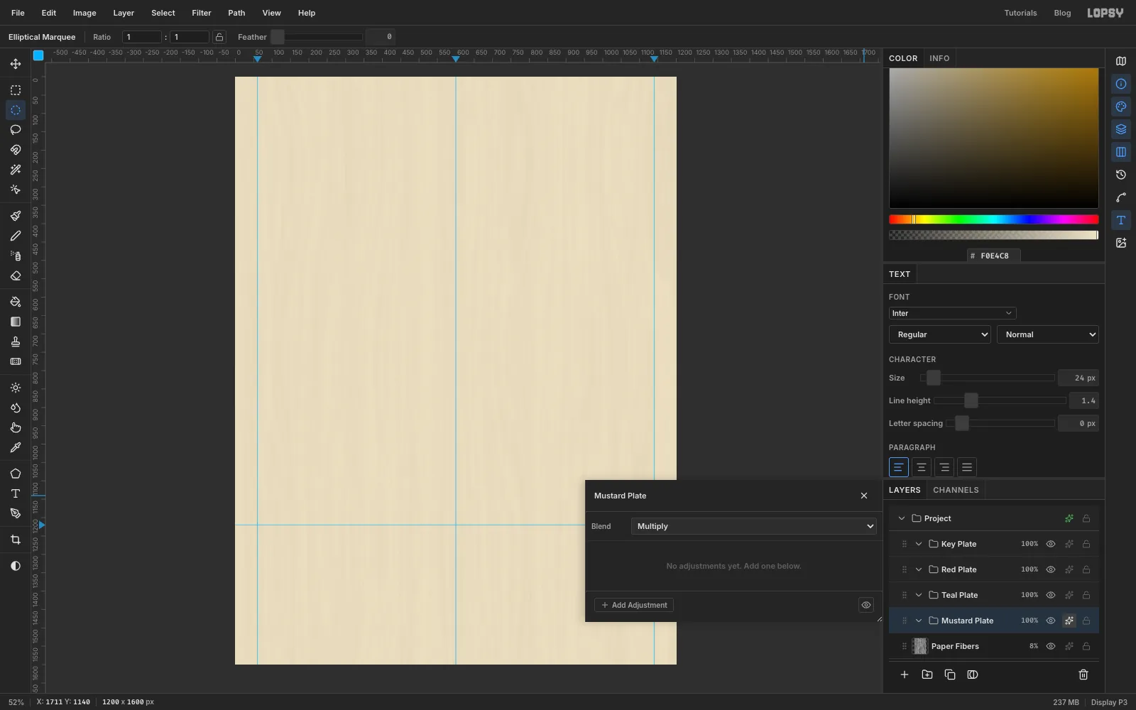
Select Paper Fibers and click New Group at the bottom of the Layers panel. Rename it
Key Plate. Select Paper Fibers again before each new group, so the groups sit side by side instead of nesting inside each other, and makeRed Plate,Teal PlateandMustard Plate. You should end up with Key at the top and Mustard at the bottom, just above the paper.Select each group, open its drawer with the effects button on its row, and set Blend to Multiply. From now on, wherever two inks overlap they darken each other, like real ink: red over teal turns almost black, and teal over mustard turns olive.
-
Shade the sun with a gradient
Select Mustard Plate, click Add Layer (it lands inside the group) and rename it
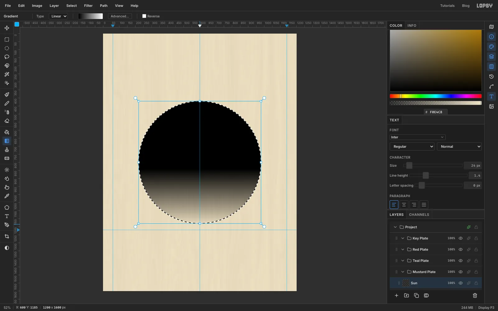
Sun.With the Elliptical Marquee, hold Cmd (Ctrl) to keep it a perfect circle and drag one about 760 px across, centred on the middle guide: from about 220, 420 to 980, 1180.
Pick the Gradient tool, set it to Linear, click Advanced… and make the stops plain black to white. Drag from a little below the middle of the circle (around y 840) straight down to its bottom edge. The top of the sun becomes solid black and the bottom fades to white.
The black isn't the final colour. It's a tone map that tells the halftone filter where to put big dots and where to put small ones.
-
Turn it into halftone dots
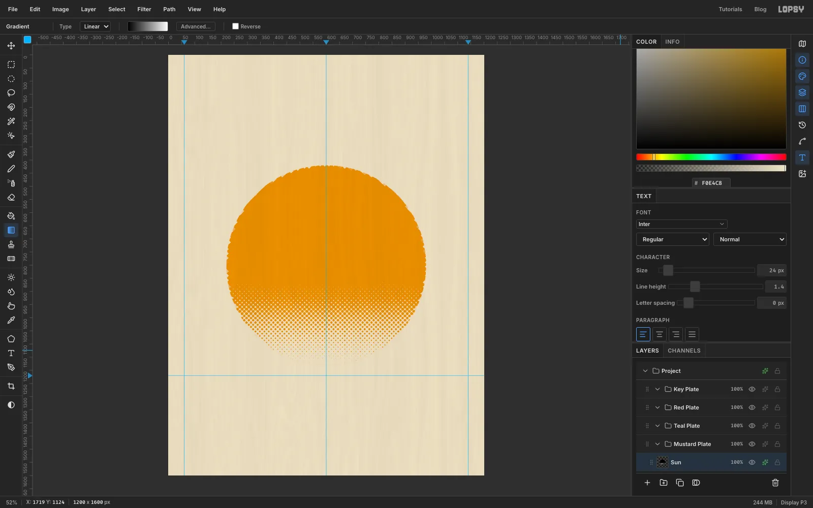
With the circle still selected, choose Filter → Halftone… and set Dot Size
18, Density1.5, Angle45and Softness0.6. Density 1.5 packs the dots tightly enough that the black area closes up into solid ink, and the dots shrink and vanish through the fade.Press Cmd+D to deselect. Then open the effects drawer for Sun, turn on Color Overlay and set it to mustard . The overlay recolours every dot without touching their shapes.
-
Trim the sun's rim
The halftone leaves the top of the sun's edge a little ragged. With nothing selected, click once with the Elliptical Marquee without dragging. That opens the Elliptical Selection dialog, where you can type exact corners. Enter From
223, 423and To977, 1177: the same circle, 3 px smaller all round. Choose Select → Inverse and press Delete. The sun now has a clean, round edge.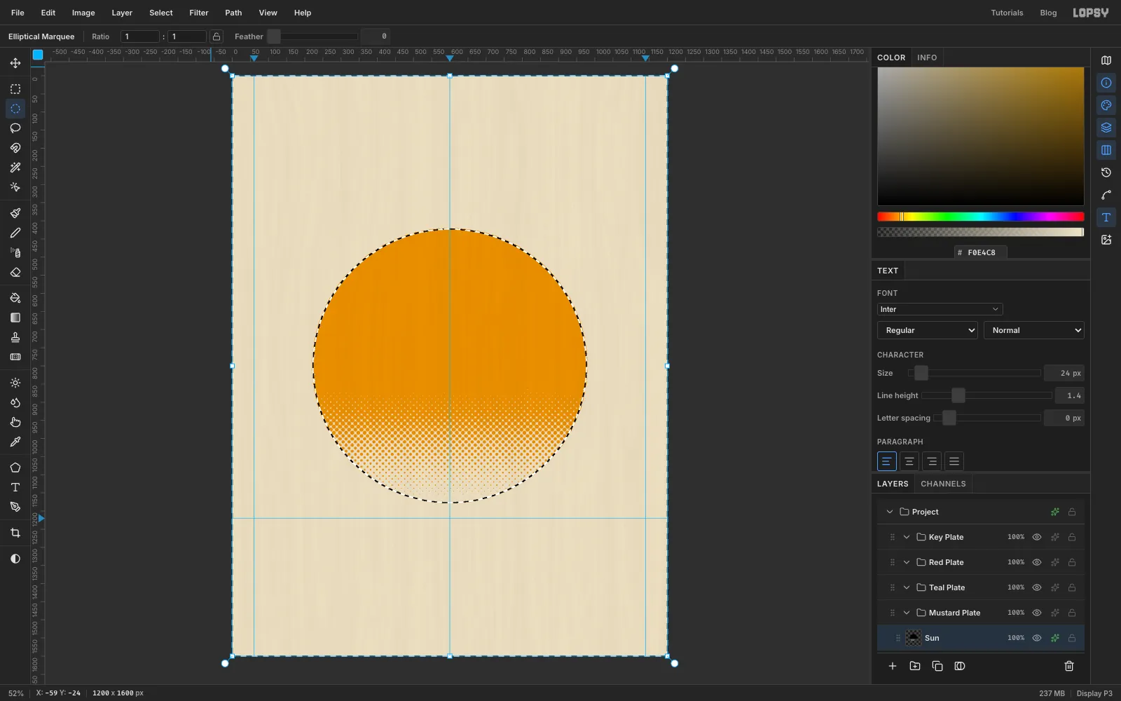
-
Draw a rolling hill
Select Teal Plate, click Add Layer and name it
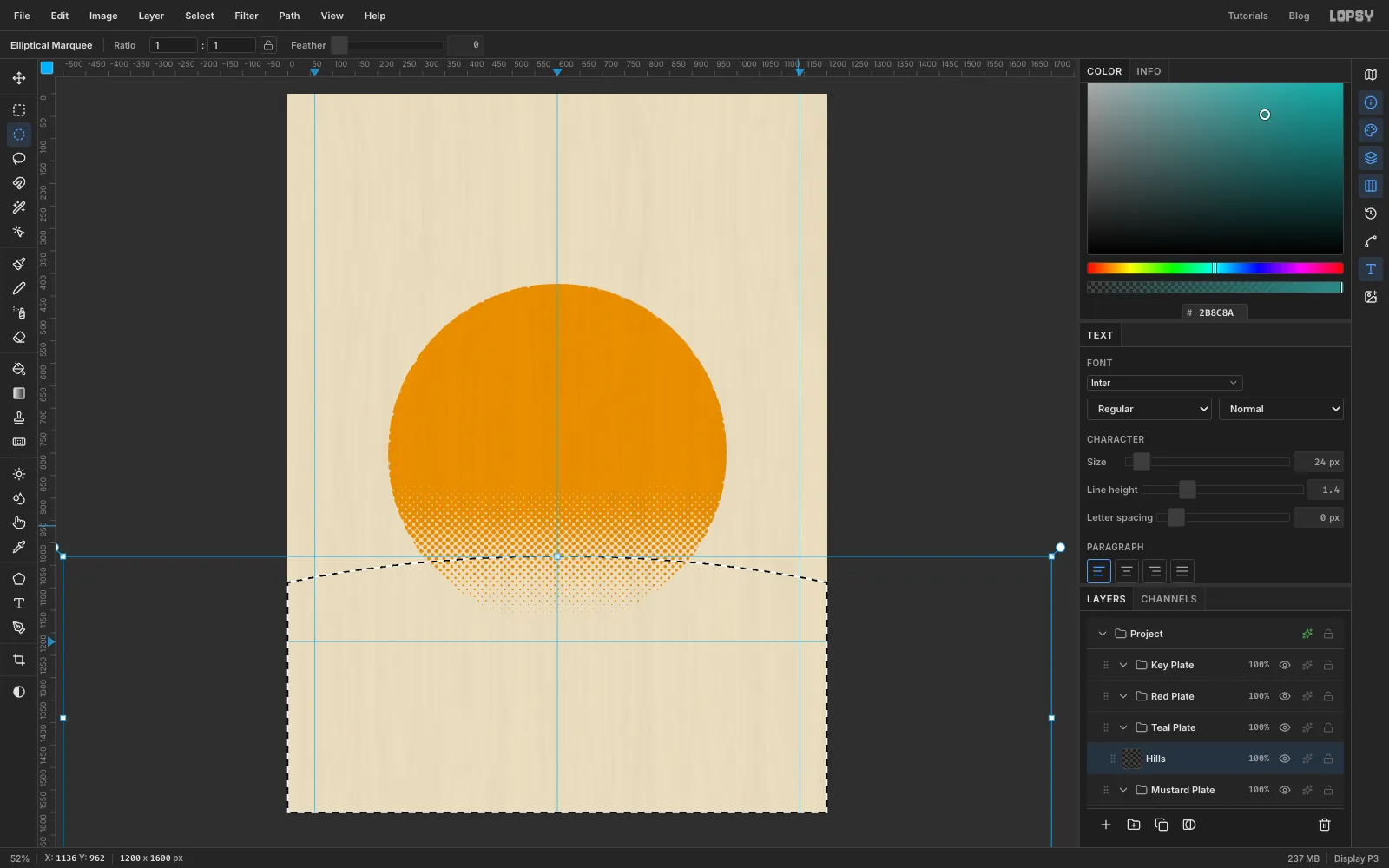
Hills. Set the foreground to teal .The hill is a very wide, flat ellipse that runs off both sides of the page, so it's easiest to type. With nothing selected, click once with the Elliptical Marquee to open the Elliptical Selection dialog and enter From
-500, 1030and To1700, 1750. The top of the curve sits 1030 px down at the centre guide and drops to about 1090 px at the edges of the paper. Choose Edit → Fill.The ellipse runs off the bottom of the page, and the ground needs a straight bottom edge that tucks just under the info band you'll add later. Click once with the Rectangular Marquee and enter From
0, 1359and To1200, 1600, then press Delete and Cmd+D.The teal crosses the halftone dots at the bottom of the sun and overprints them dark green. That's the Multiply plate doing its job.
-
Knock out the wheels
First turn off View → Snap to Guides. Several circles from here on end within a few pixels of the ground guide, and snapping would pull them onto it.
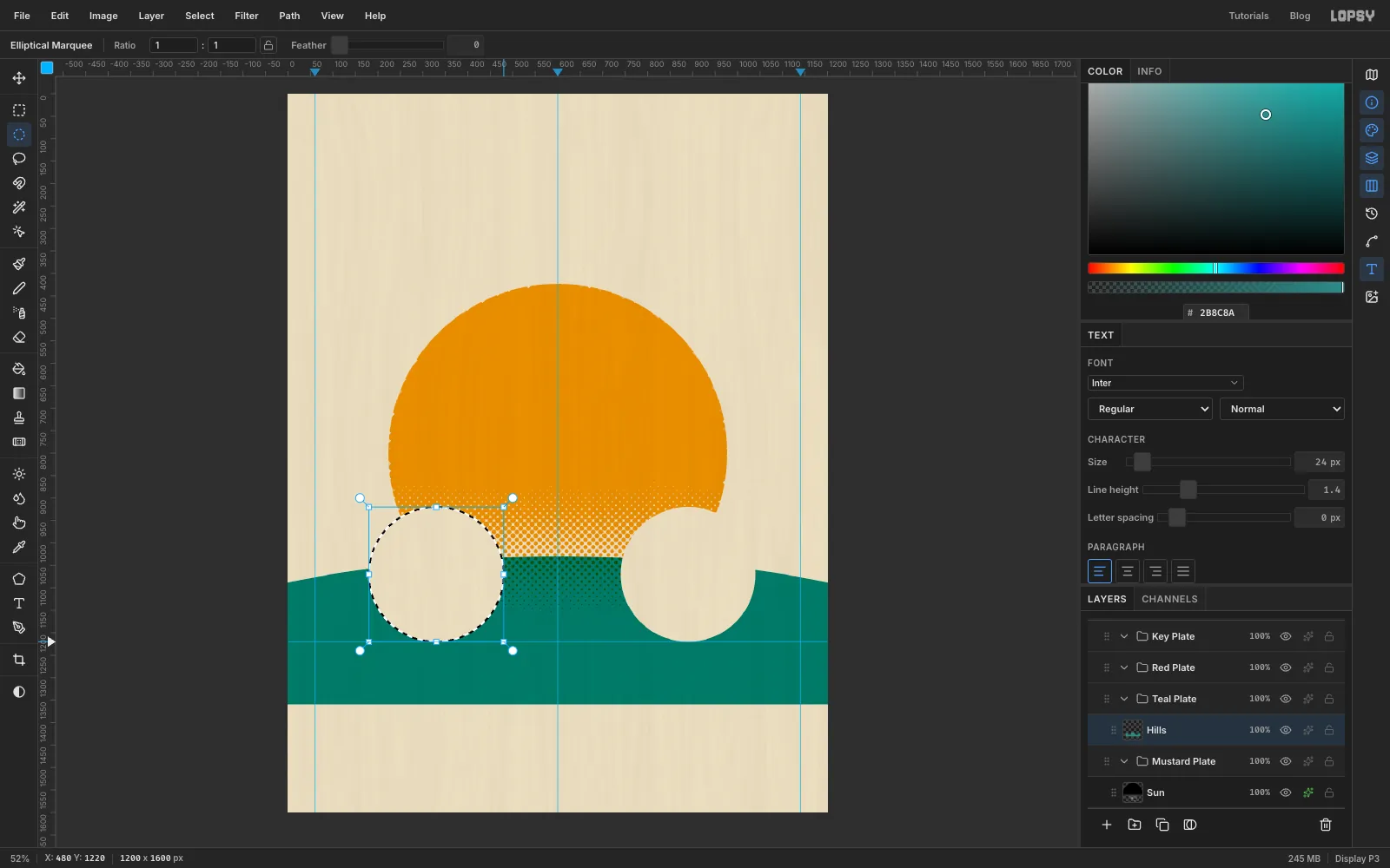
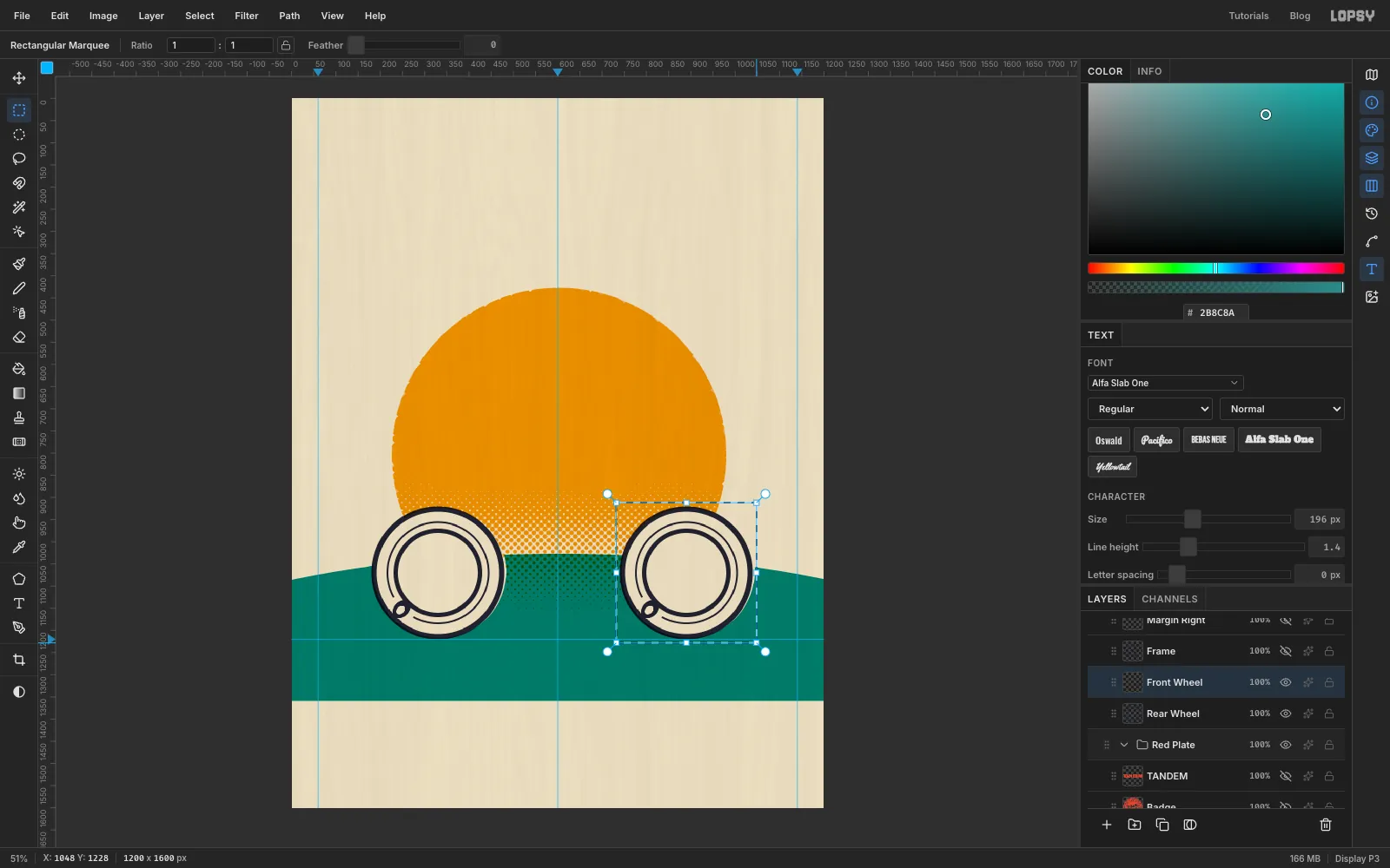
The wheels are paper-coloured saucers, and a Multiply plate can only make things darker. So, like a real printer, cut the shapes out of the inks underneath. Cmd-drag a 300 px circle for the back wheel from 180, 920 to 480, 1220, so it sits on the ground guide (or type those corners into the dialog). Select Sun and press Delete, then select Hills and press Delete again.
Do the same for the front wheel: a 300 px circle from 740, 920 to 1040, 1220.
-
Draw the saucer, cup and handle
Select Key Plate, add a layer named
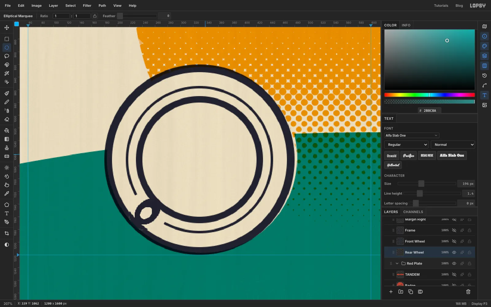
Rear Wheeland set the foreground to navy .Each ring is two circles with the same centre: select the bigger one and Fill it, then select the smaller one and press Delete. The circles have to be concentric, so type them into the Elliptical Selection dialog rather than dragging. The dialog only opens when nothing is selected, so press Cmd+D after each fill or delete, then click once with the marquee for the next circle. The back wheel's centre is 330, 1070:
- Saucer rim: fill
180, 920→480, 1220, delete192, 932→468, 1208. That leaves a 12 px rim on the knockout's edge. - Saucer groove: fill
214, 954→446, 1186, delete218, 958→442, 1182, for a thin 4 px line. - Cup rim: fill
230, 970→430, 1170, delete240, 980→420, 1160.
For the handle, first break the groove where it will go: with the Lasso, loosely circle the stretch of groove at the lower left of the cup (about 7:30 on a clock face) and press Delete. Then lasso a small oval, about 45 px long and 35 px wide, that overlaps the cup's rim and points out towards the lower left, and Fill it. Lasso a smaller oval inside it and press Delete to open up the loop. From above, that's exactly what a cup handle looks like.
- Saucer rim: fill
-
Copy and paste the front wheel
Drag a Rectangular Marquee around the whole back wheel, leaving a few pixels to spare. Press Cmd+C, give it a second or two to reach the clipboard, then press Cmd+V. The copy is pasted in place as a new layer, right on top of the original. Rename it
Front Wheeland press Cmd+D.Switch to the Move tool (V) and drag the copy 560 px to the right, onto the second knockout. Fine-tune it with the arrow keys until its saucer sits exactly on the cut-out circle and its bottom touches the ground guide.
-
Pour the coffee and cut a latte heart
The coffee is an overprint. Select the Red Plate group, click Add Layer and name it
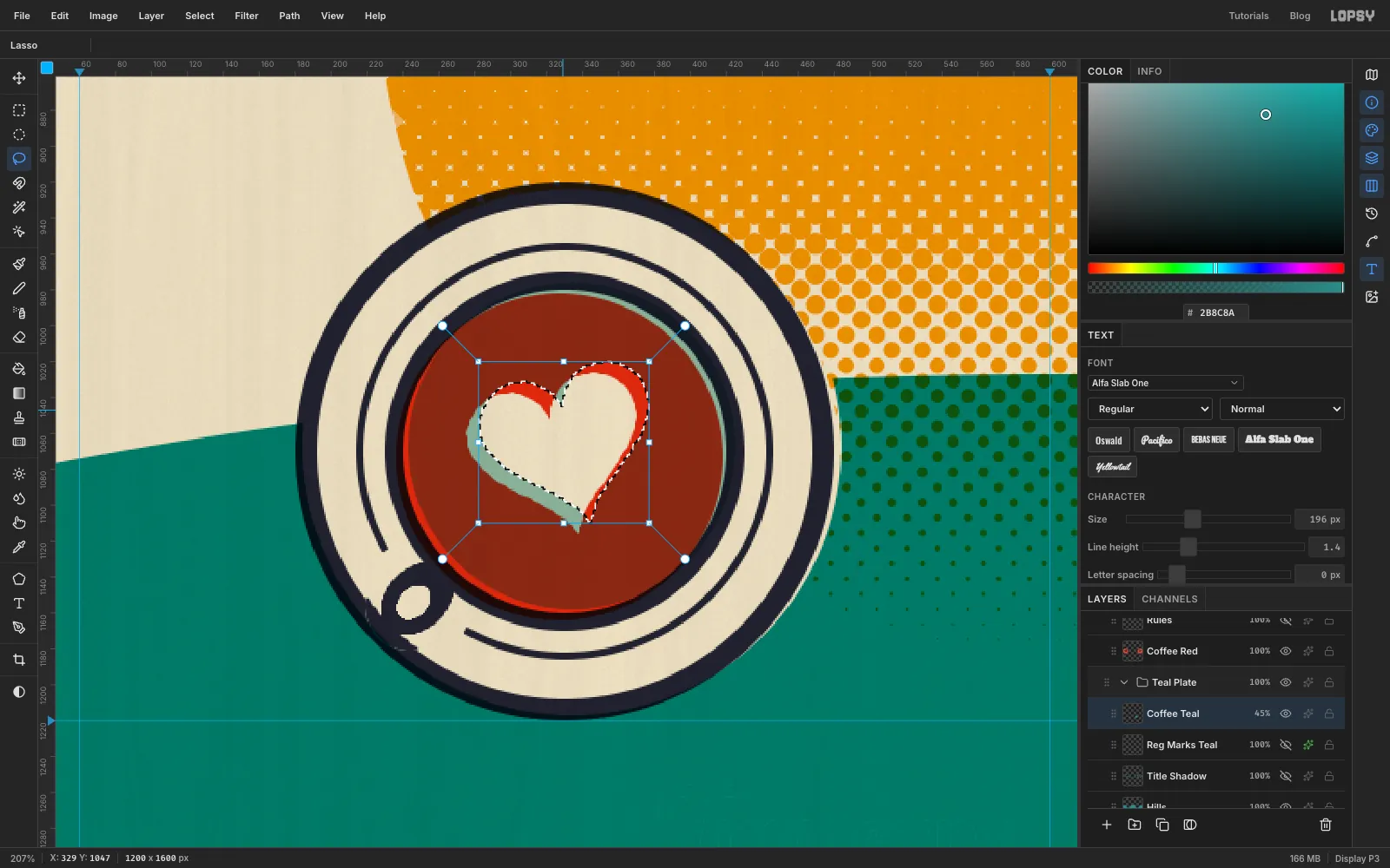
Coffee Red. Set the foreground to red and fill a 182 px circle inside each cup rim (239, 979→421, 1161for the back cup and799, 979→981, 1161for the front). Then select Hills, add a layer namedCoffee Teal(it lands in Teal Plate) and fill the same two circles with teal .Red over solid teal is almost black, which is too dark for coffee. Turn Coffee Teal's opacity down to
45%, and the overlap becomes a warm espresso brown.For the latte art, use the Lasso to draw a heart over each cup, about 100 px wide. Tilt the back one a little to the left and the front one a little to the right. With the heart selected, press Delete on Coffee Teal, then on Coffee Red. The cream paper shows through as milk foam.
-
Draw the tandem frame
Select Front Wheel and add a layer named
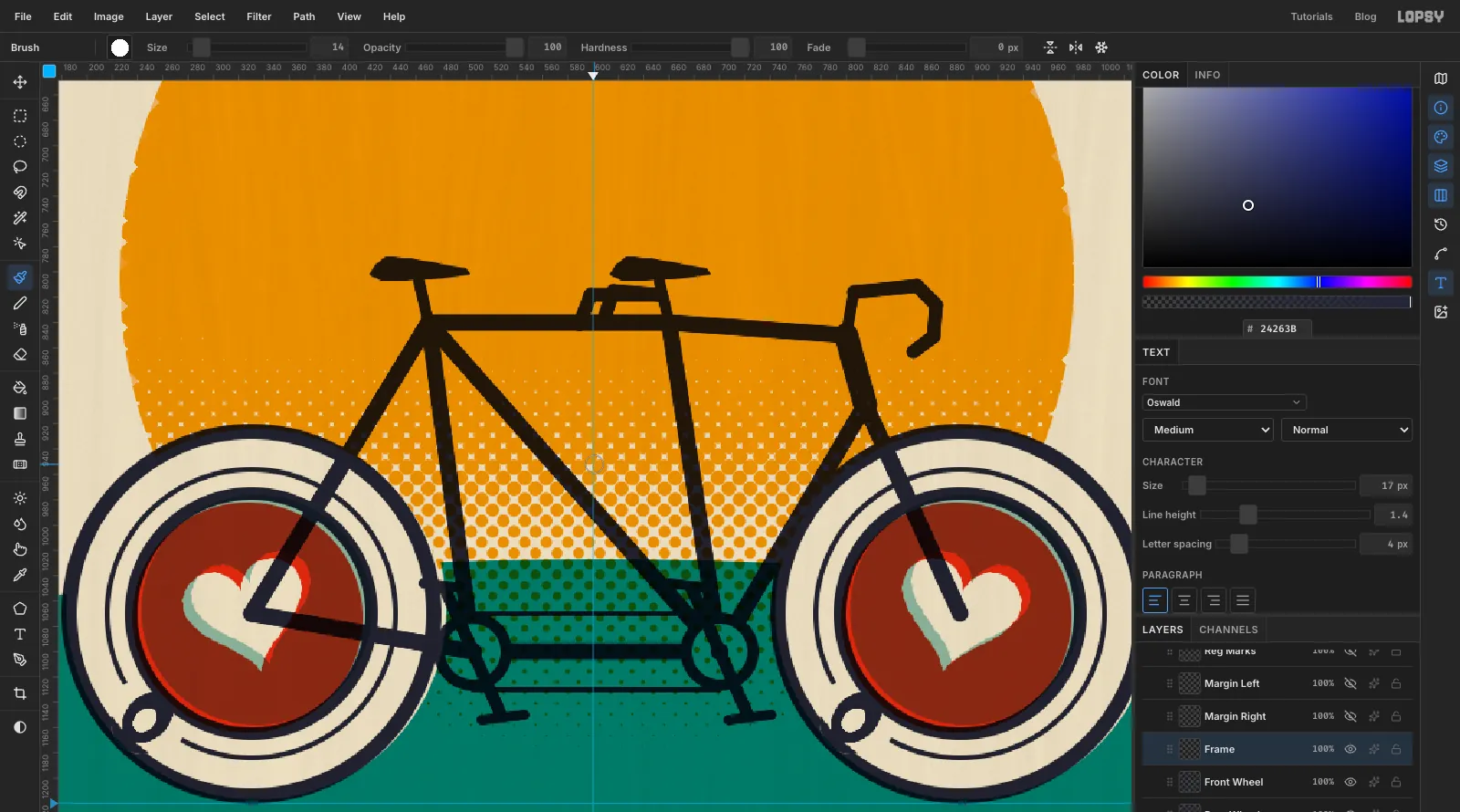
Frame. Set the foreground back to navy , pick the Brush (B), and set Size to14and Hardness to100.Every tube is a straight line. Click where it starts, then hold Shift and click where it ends. Draw them in this order:
- Chainstay: from the back cup's centre to the back bottom bracket, just outside the back saucer (about 505, 1100).
- Seat stay: from the back cup's centre up to the back seat cluster, at about 470, 840.
- Back seat tube: from the back bottom bracket up to the back seat cluster.
- Front seat tube: from the front bottom bracket, about 700, 1100, up to the front seat cluster at about 660, 840.
- Top tube: from one seat cluster to the other, and on to the head tube at about 800, 850.
- Fork: from the bottom of the head tube, about 815, 905, down to the front cup's centre.
- Down tube: from the bottom of the head tube to the front bottom bracket.
- Boom tube: joining the two bottom brackets.
- Diagonal: from the back seat cluster to the front bottom bracket. This brace is what makes it look like a tandem.
Draw the head tube itself at Brush Size
20. Then add the small parts:- Seat posts and stem: short Shift-click lines, about 35 px long, at Brush Size
10. - Chainrings: one ring at each bottom bracket. Fill a 62 px circle, delete a 44 px circle from the same centre, then fill a 14 px dot in the middle. Deleting the inner circle also clears the tube ends inside the ring, so the chainring reads as sitting in front of the frame.
- Timing chain: two straight lines at Brush Size
5, joining the tops and the bottoms of the two chainrings. - Cranks: at Brush Size
11, one crank about 55 px long on each chainring pointing down and one pointing up. - Pedals: short bars, about 35 px long, at Brush Size
9across the ends of the cranks. - Saddles: small wedge shapes drawn with the Lasso and filled.
- Drop handlebars: four or five short Shift-click segments at Brush Size
12, curling forward and down from the stem. - Stoker bar: at the same size, a short horizontal bar off the front seat post with a little drop at the end. This is what the back rider holds.
-
Clear the tubes out of the cups
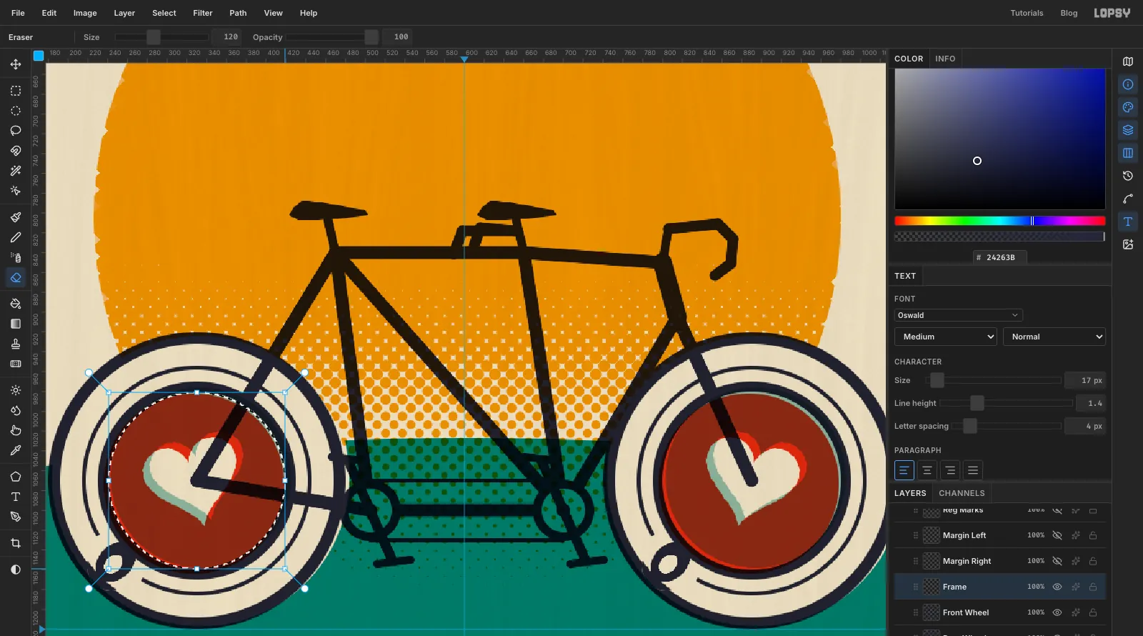
The chainstay and the fork cross the coffee and spoil the hearts. Select the circle just inside the back cup's rim, about 178 px across (
241, 981→419, 1159). Pick the Eraser (E), set it to a large size such as120, and scrub over the circle. The selection stops it from touching anything outside the circle.Do the same on the front cup. The tubes now stop at the cup rims, as if each cup were the wheel's hub cover.
-
Set the TANDEM headline
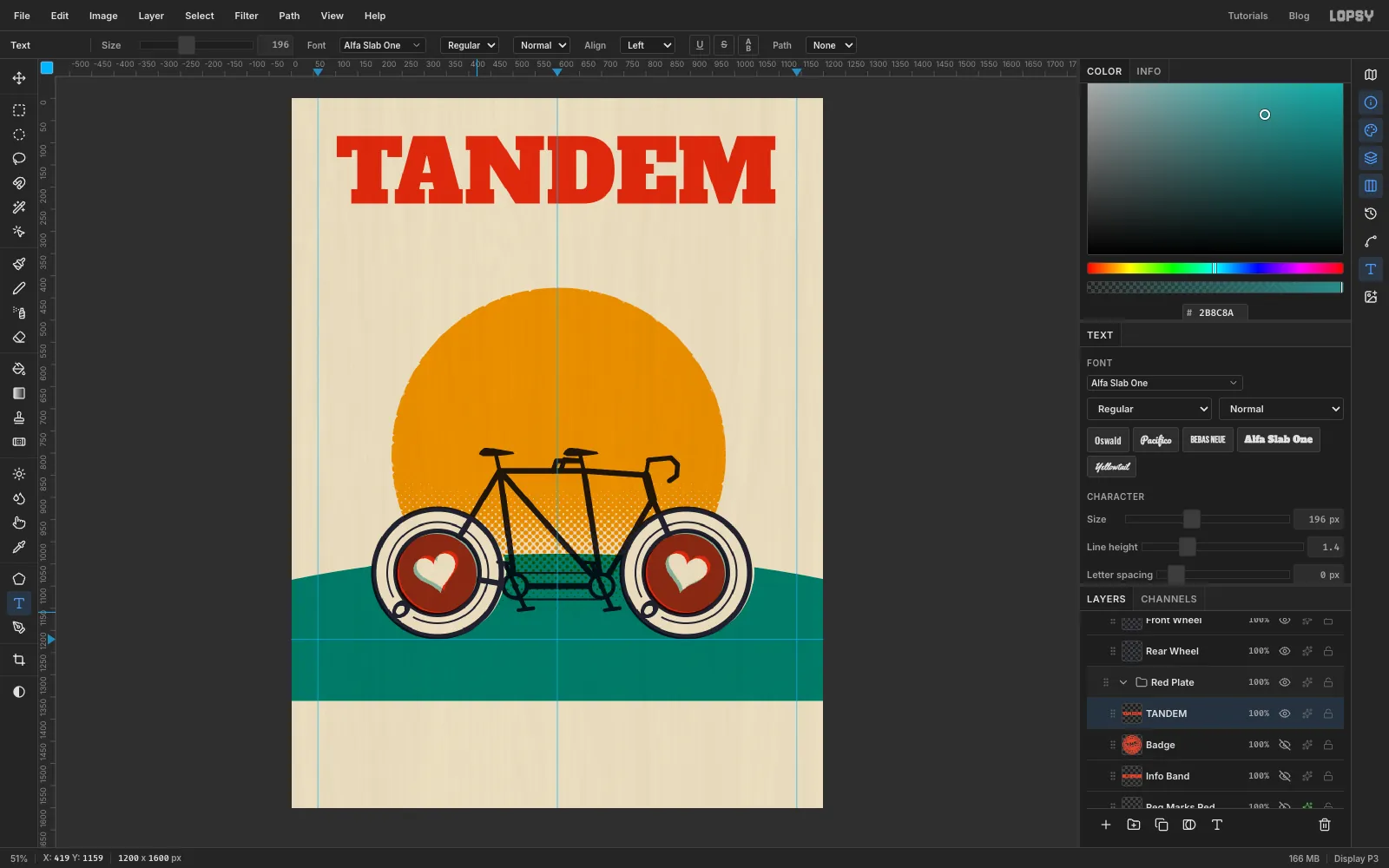
Select Coffee Red so the text lands in Red Plate. Pick the Text tool (T), choose Alfa Slab One, set the size to
196, set the colour to red , click near the top left and typeTANDEM. Press Tab to finish.Switch to the Move tool and click Align center horizontally in the options bar. Then nudge it with the arrow keys until the top of the letters is about 80 px from the top edge. At this size the word fills the space between the two margin guides almost exactly.
-
Print a teal shadow with a trap
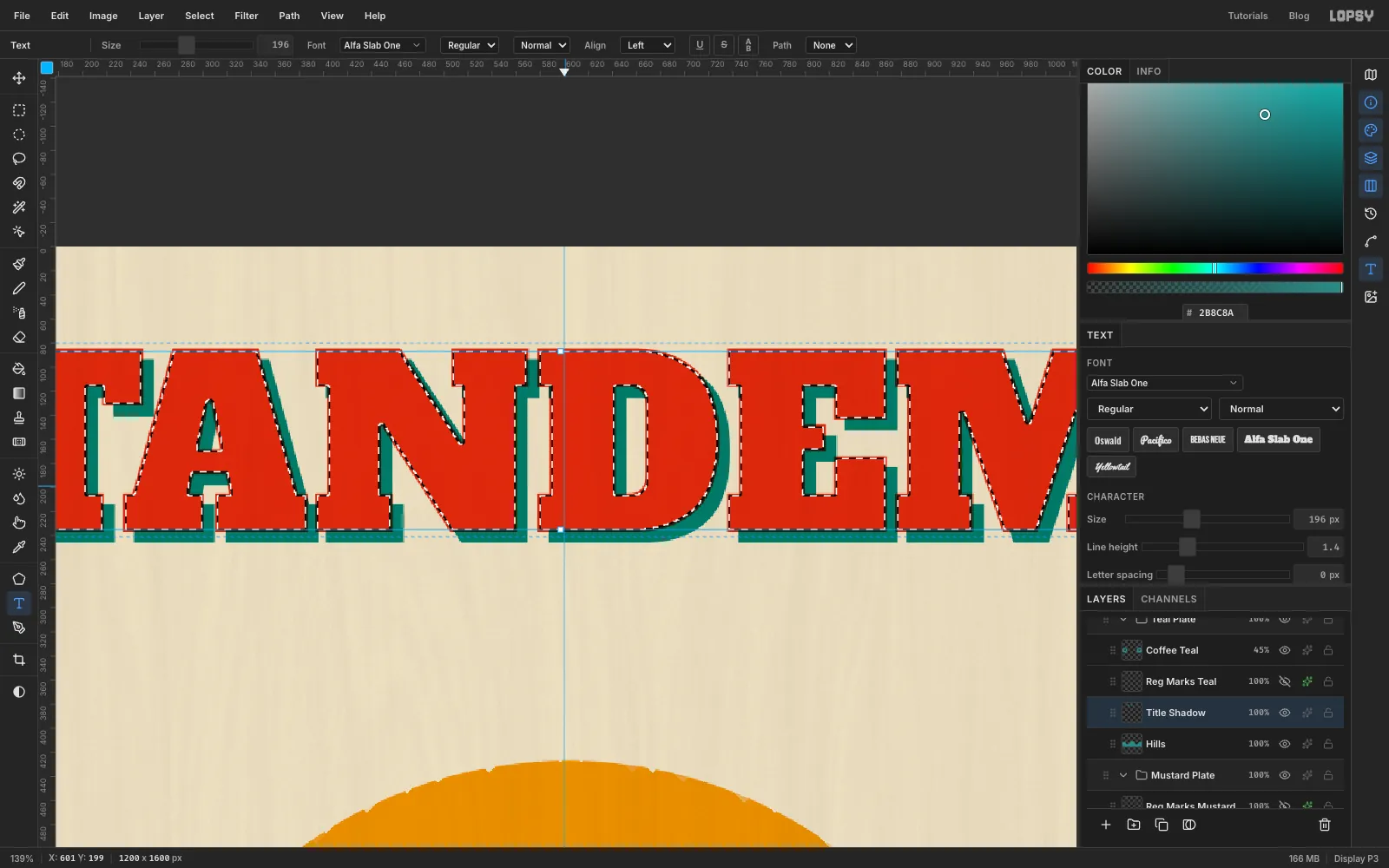
Gig posters love a solid offset shadow. Print it as its own ink, not as a layer effect:
- Select Hills and add a layer named
Title Shadow, so it sits in Teal Plate. - Cmd-click (Ctrl-click) the TANDEM thumbnail in the Layers panel to select the shape of the letters. Set the foreground to teal and Fill. Press Cmd+D.
- With the Move tool, press Right nine times and Down nine times.
- Cmd-click the TANDEM thumbnail again, choose Select → Shrink… by
2px, and press Delete on Title Shadow.
Step 4 knocks the shadow out from under the red letters, but leaves a 2 px overlap all the way round. Printers call that a trap: it hides small registration errors. Where red and teal overlap they overprint a thin, dark line, which gives the letters a crisp edge.
- Select Hills and add a layer named
-
Add ESPRESSO and two rules
Select Frame so the text lands in Key Plate. With the Text tool, choose Bebas Neue at
112in navy, and typeESPRESSO. Open the Text panel and set Letter spacing to55px. Centre it with Align center horizontally, then nudge it up so it sits about 30 px under TANDEM.Add a layer in Red Plate named
Rulesand set the foreground to red . With the Brush at Size9, Shift-click a short line on each side of ESPRESSO, halfway up the letters. Start each rule at the edge of TANDEM, so the whole title block lines up on both sides.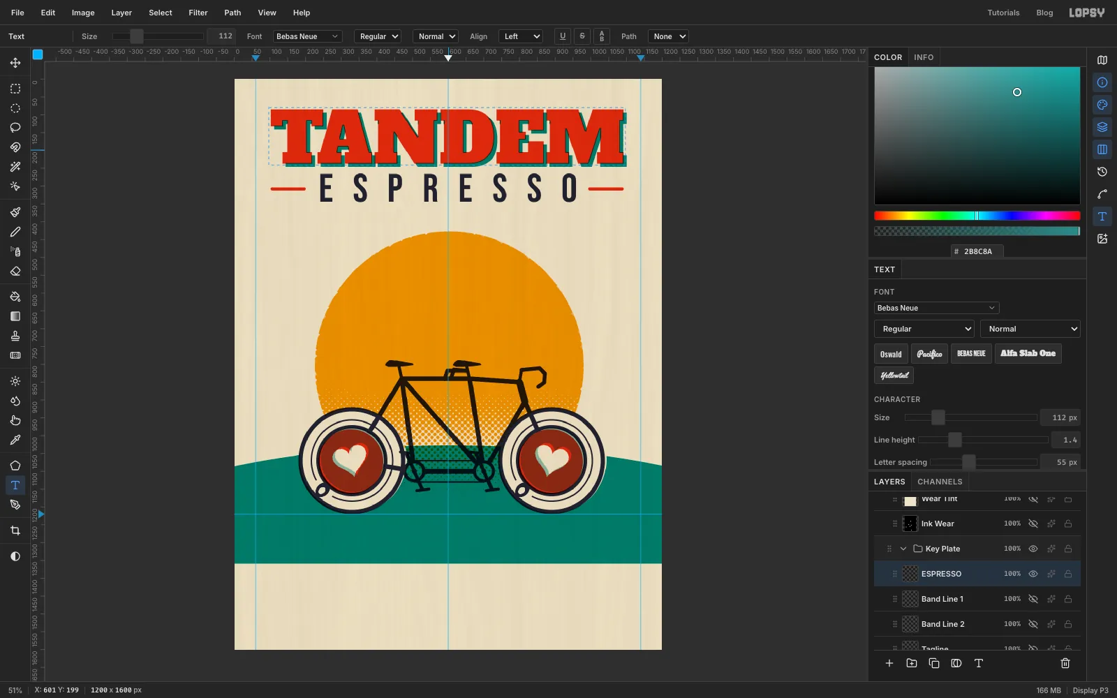
-
Knock the info out of a red band
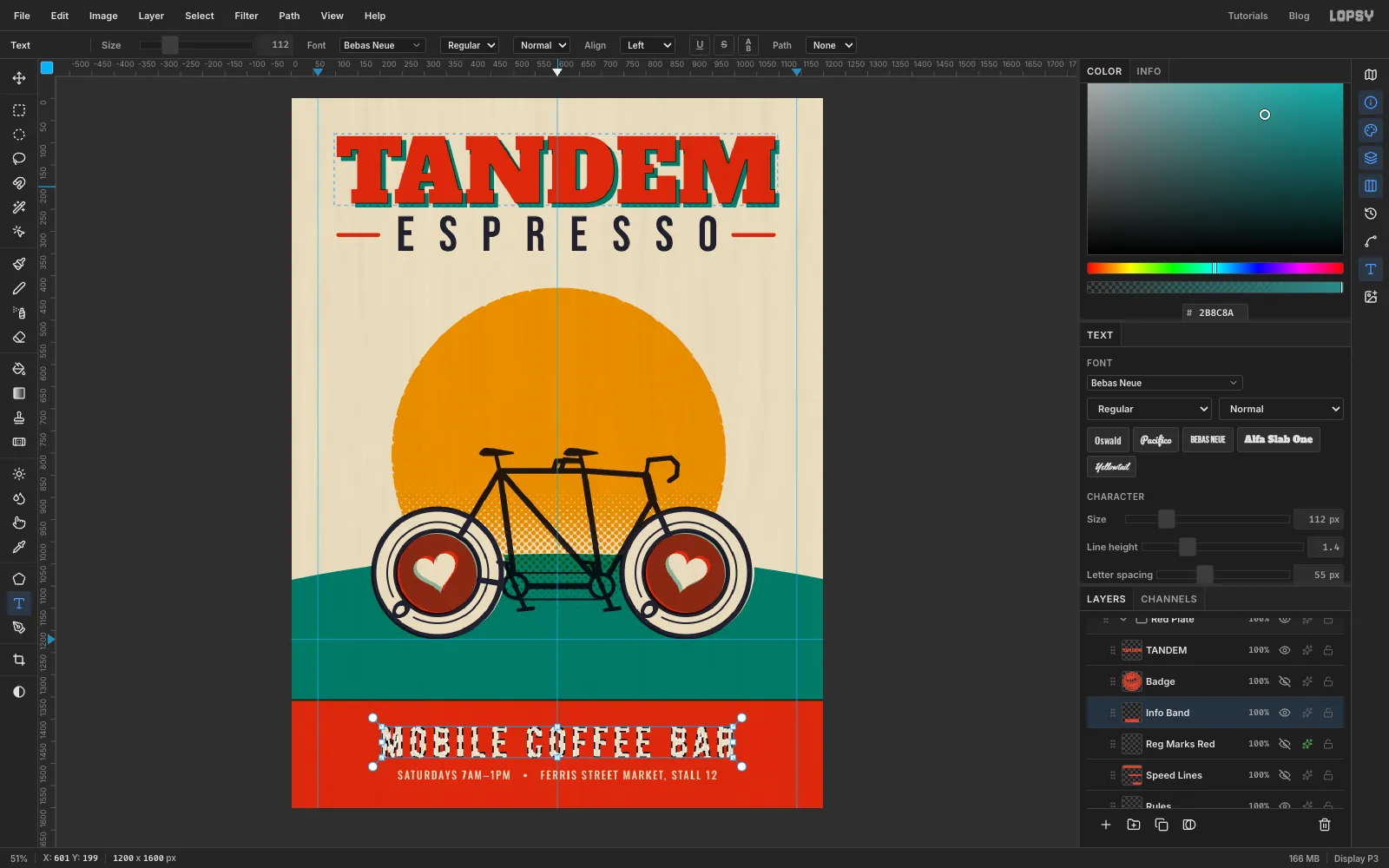
Add a layer named
Info Bandin Red Plate. With the Rectangular Marquee, click once on the canvas without dragging. That opens fields for exact corners. Enter From0, 1352and To1200, 1600, then Fill it with red. It overlaps the bottom of the teal hill by a few pixels, so another thin dark trap line appears where the two inks meet.Select Frame and type two lines of text in navy. Each one is its own text layer:
MOBILE COFFEE BARin Bebas Neue at96, letter spacing14.SATURDAYS 7AM–1PM • FERRIS STREET MARKET, STALL 12in Oswald Medium at24, letter spacing3.
Centre both with Align center horizontally. Then nudge them so the pair sits in the middle of the band, with about 60 px above the first line and below the second, and about 30 px between them. The small line comes out exactly as wide as ESPRESSO, so the top and bottom of the flier echo each other.
Cmd-click the first line's thumbnail, select Info Band and press Delete. Do the same for the second line. Then hide both text layers with their eye icons. The words are now bare paper showing through the red, like a real knockout, and the text layers stay editable if you need them.
-
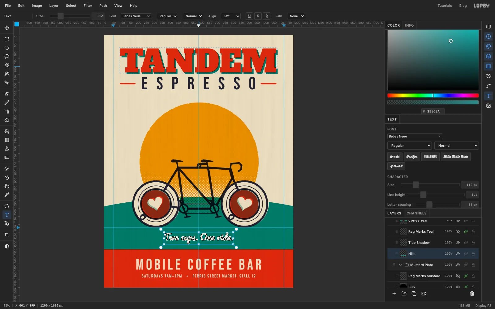
Cut the tagline out of the hill
Select Frame and type
Two cups. One ride.in Pacifico at54. Pacifico is a joined-up script, so make sure Letter spacing is0, or the letters come apart.Centre it, then nudge it so it sits halfway between the bottoms of the saucers and the top of the red band, with about 30 px above and below it. Cmd-click its thumbnail, select Hills, press Delete, and hide the text layer.
-
Set type around a circle
Now for the offer. Build the stamp at a generous size over the sun's top-right edge. It overlaps the sun for now, which doesn't matter, because you'll shrink it and move it onto bare paper in a moment. Add a layer named
Badgein Red Plate and, with the Elliptical Selection dialog again, make three circles around a centre of 975, 560 (press Cmd+D between them so the dialog opens each time):- Fill
871, 456→1079, 664(208 px) with red. - Delete
881, 466→1069, 654(188 px). - Fill
885, 470→1065, 650(180 px).
That leaves a thin paper keyline just inside the edge.
For the ring of text, pick the Shape tool, choose Ellipse and set Output to Path. Shapes grow from the point you press, so press at the stamp's centre (975, 560) and drag diagonally to 1041, 626, holding Cmd to keep it round. That gives a circular path 132 px across, which starts at 12 o'clock.
Select Frame and type
BRING THIS FLIER • SATURDAYS ONLY •in Oswald SemiBold at19, in navy. Press Tab, then pick Path 1 from the Path menu in the Text options bar. The words wrap around the circle with their feet on the path.Adjust Letter spacing in the Text panel until the gap after the last bullet matches the other gaps. It's
2.4here. If the last bullet disappears, the text is too long for the circle, so reduce the spacing.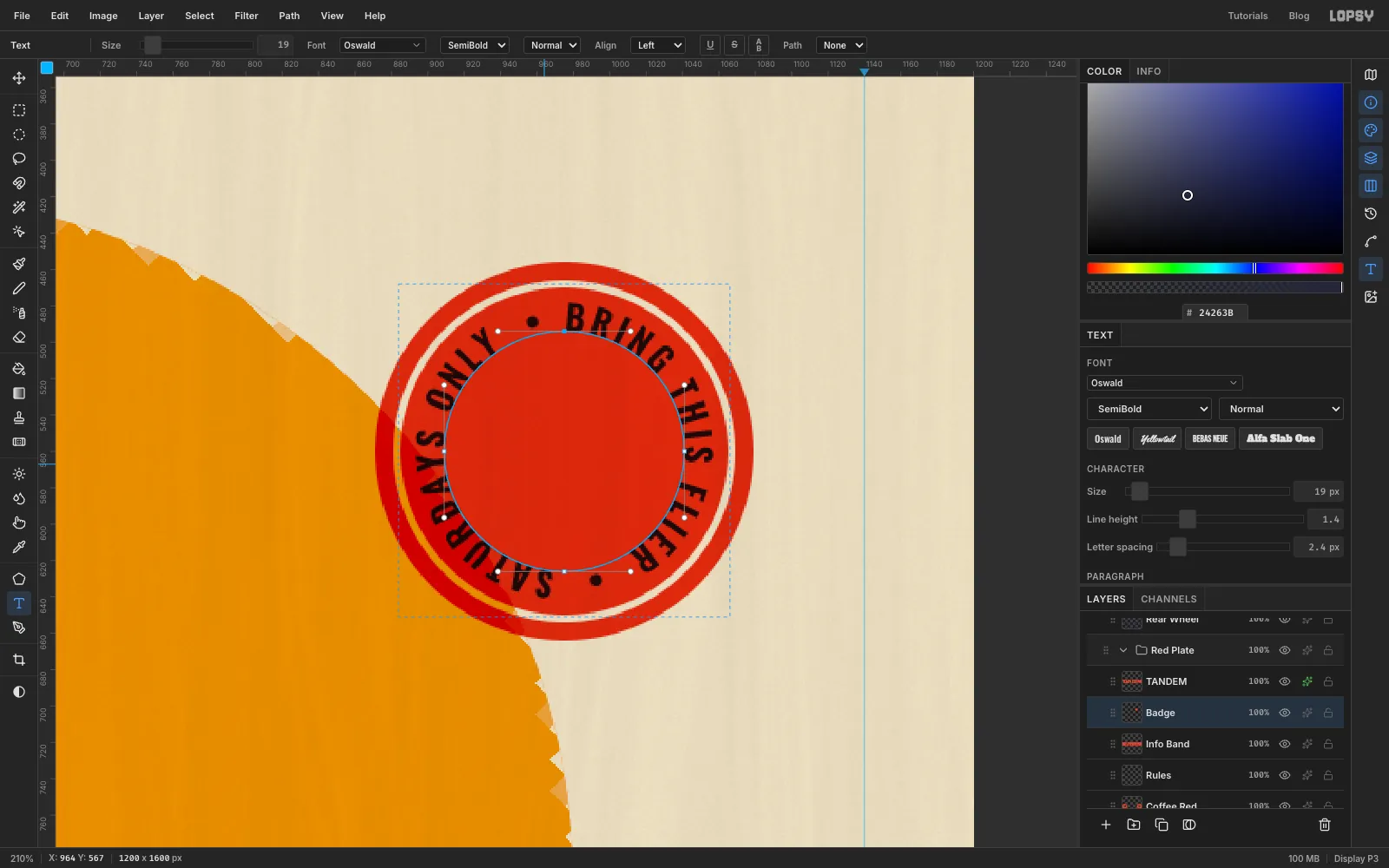
- Fill
-
Knock the stamp's text out
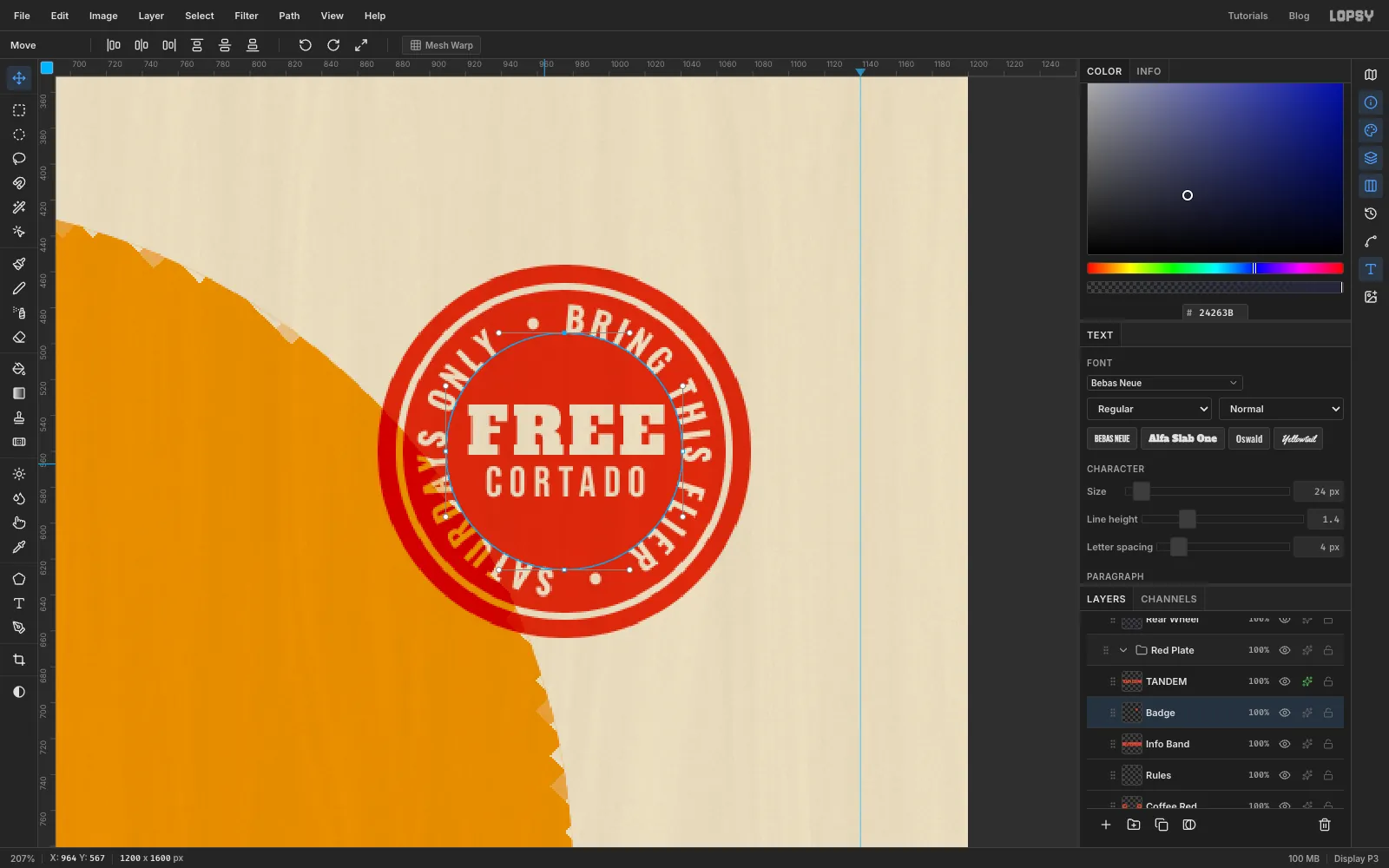
In the middle of the stamp, type
FREEin Alfa Slab One at36andCORTADOin Bebas Neue at24with letter spacing4. Move them so the pair is centred in the disc. Keep at least 6 px between FREE's corners and the ring of text.Then Cmd-click each of the three text thumbnails in turn, select Badge and press Delete each time. Hide the three text layers.
-
Shrink the stamp and move it into the corner
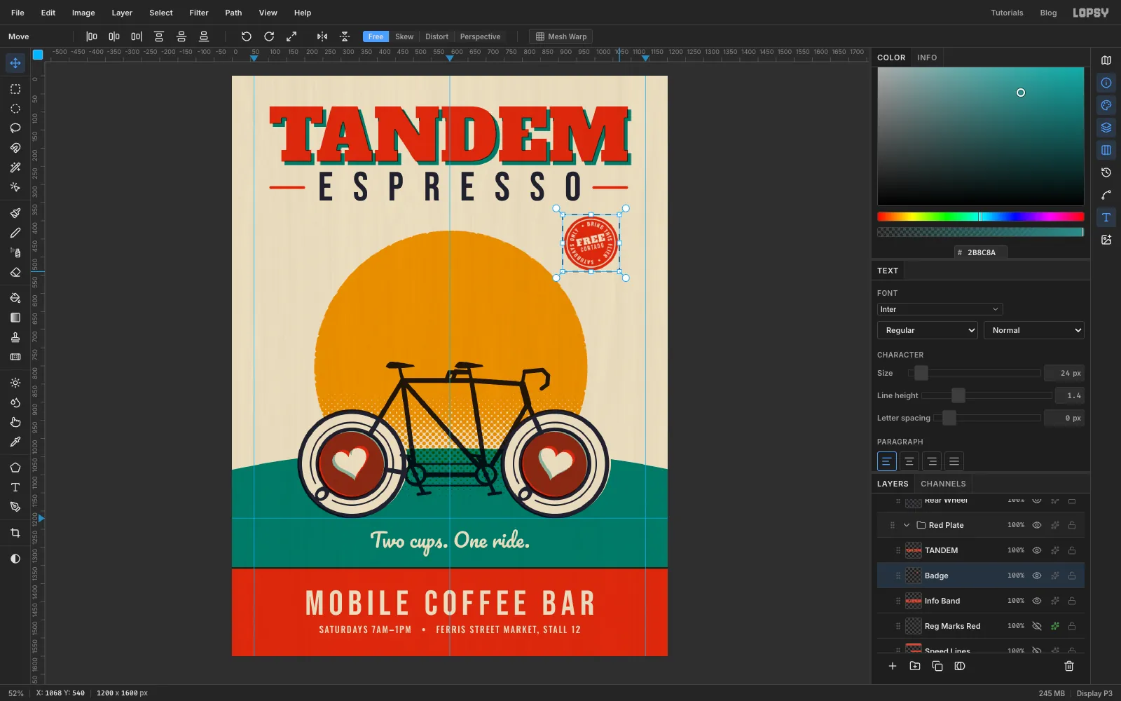
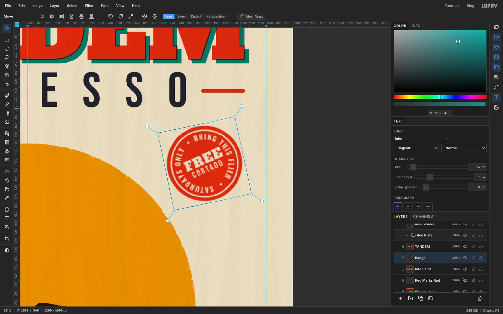
The stamp shouldn't compete with the bike, so make it smaller. Draw a Rectangular Marquee around it, switch to the Move tool, hold Cmd and drag the bottom-right handle inwards until it's about 172 px across. Cmd keeps it perfectly round. Press Cmd+D to apply the scale.
Then drag it up into the empty paper in the top right, under the end of the right-hand rule, so it sits clear of the sun and the margin.
-
Tilt the stamp
Draw a marquee around the stamp again. With the Move tool, hover just outside a corner handle until the cursor changes to rotate, then drag anticlockwise about 12°. Press Cmd+D.
A rubber stamp is never quite straight, and the tilt makes it feel added by hand.
-
Add speed lines on the grid
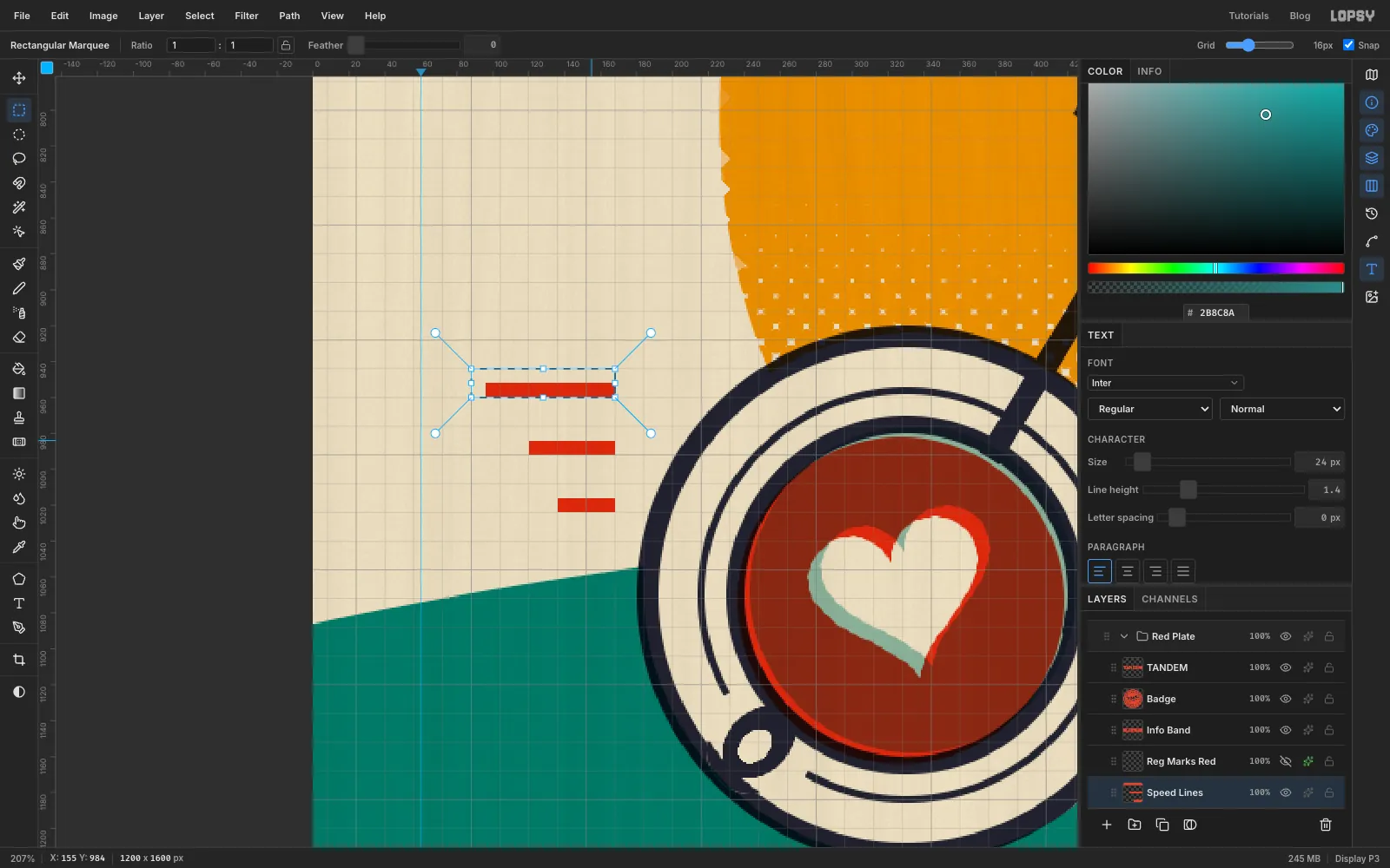
Add a layer named
Speed Linesin Red Plate. Turn on View → Show Grid. With the Rectangular Marquee active, set Grid to8pxin the options bar and make sure Snap is ticked.Draw three bars, each one grid square tall and four grid squares (32 px) apart, all ending at the same point about 10 px behind the back saucer: 72, 48 and 32 px long, from top to bottom. Fill each one in red. The grid keeps them perfectly level and evenly spaced. Turn the grid off again when you're done.
-
Add registration marks and knock the plates out of register
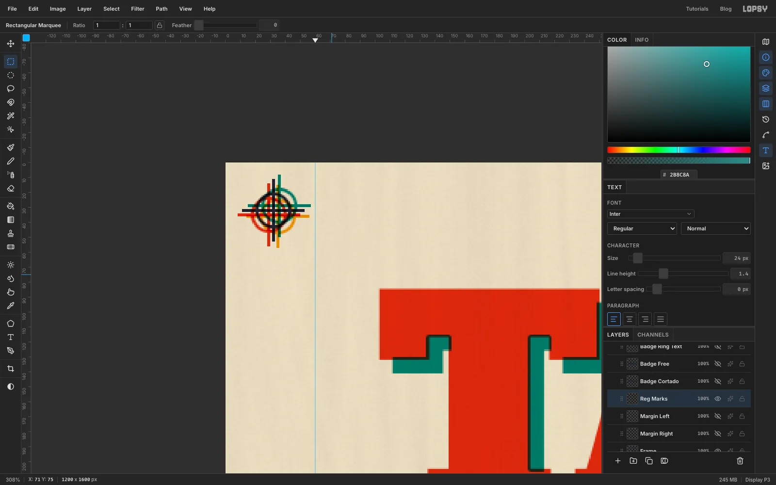
Real prints carry little crosshair targets in the margins so the printer can line the inks up. Add a layer named
Reg Marksin Key Plate and draw one in each top corner, about 32 px in from the edges. Each one is a 24 px ring (fill a 24 px circle, delete a 20 px circle) with a crosshair of two 40 px Pencil lines at Size2.Copy the marks with a marquee over the top strip and Cmd+C. Then select a layer in each of the other three plates in turn and press Cmd+V, which pastes the marks into that plate. Give each copy a Color Overlay in that plate's ink.
Now knock the plates out of register. Select a plate group, switch to the Move tool, and nudge the whole group with the arrow keys:
- Teal Plate: 4 px right, 3 px up
- Red Plate: 3 px left, 3 px down
- Mustard Plate: 3 px right, 4 px down
Leave Key Plate where it is. The marks fan out into four colours, thin cream and coloured fringes appear round the hearts, and the knockouts no longer line up exactly. That's what makes it look hand-pulled.
-
Run small print up the margins
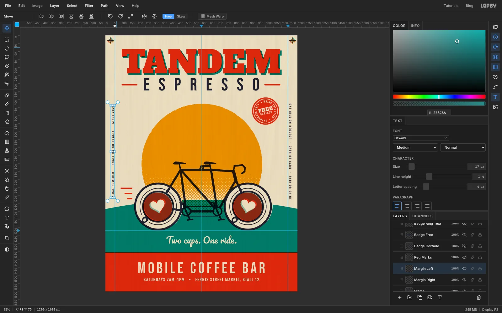
Select Frame and type
PEDAL-POWERED · SMALL-BATCH ROASTS · SINCE 2026in Oswald Medium at17, letter spacing4. With the Move tool, click Rotate 90° CCW in the options bar. The text stays live, now reading from bottom to top.Type a second line,
OAT MILK ON REQUEST · CASH OR CARD · RAIN OR SHINE, and click Rotate 90° CW.Drag each one to about 40 px from its edge of the paper. Grab it a third of the way along rather than in the middle, so you don't catch a transform handle. Keep both on the bare paper above the hill, running from about y 430 down to 1015, level with the stamp and the sun.
-
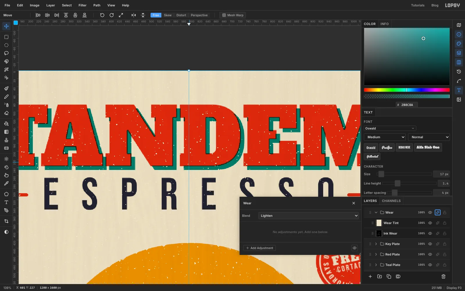
Wear the ink with paper specks
Ink never covers perfectly. To add tiny gaps:
- Select Paper Fibers, add a layer named
Ink Wear, and drag it to the very top of the Layers panel, above Key Plate. - Fill it with mid grey , then run Add Noise… at
100(Mono, Uniform), Gaussian Blur… at3px, and Threshold… at147. That leaves about one pixel in a hundred white, in small clumps, on black. - With Ink Wear selected, choose Layer → Group Layers and rename the group
Wear. - Add a layer above Ink Wear inside the group, name it
Wear Tint, fill it with the paper colour , and set it to Multiply. That turns the white specks paper-coloured and leaves the black black. - Set the Wear group's Blend to Lighten.
Lighten ignores the black completely and only lets the paper-coloured specks through where the ink underneath is darker than paper. So the specks show on the red, teal, mustard and navy, and disappear on bare paper, just like real ink dropout.
- Select Paper Fibers, add a layer named