Design a Chrome Lettering Flier for a Plating Shop
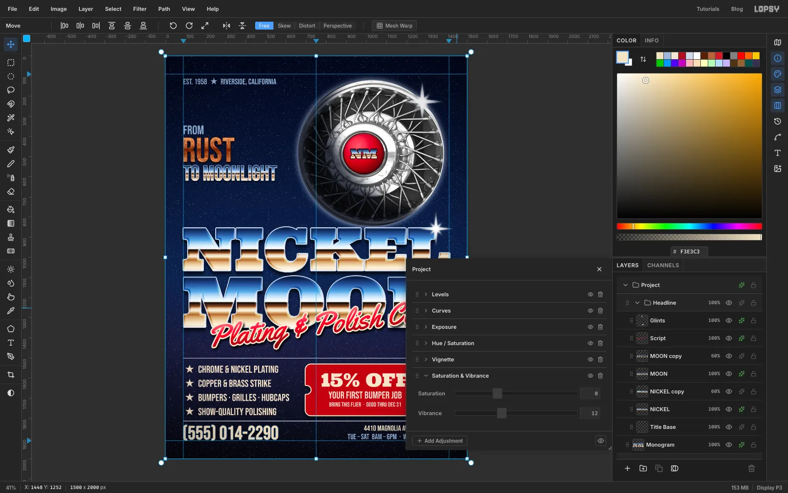
Make a retro chrome flier in Lopsy with sky-and-horizon chrome type, a hubcap photo turned into a moon, a red script, Sunburst glints and a coupon ticket.
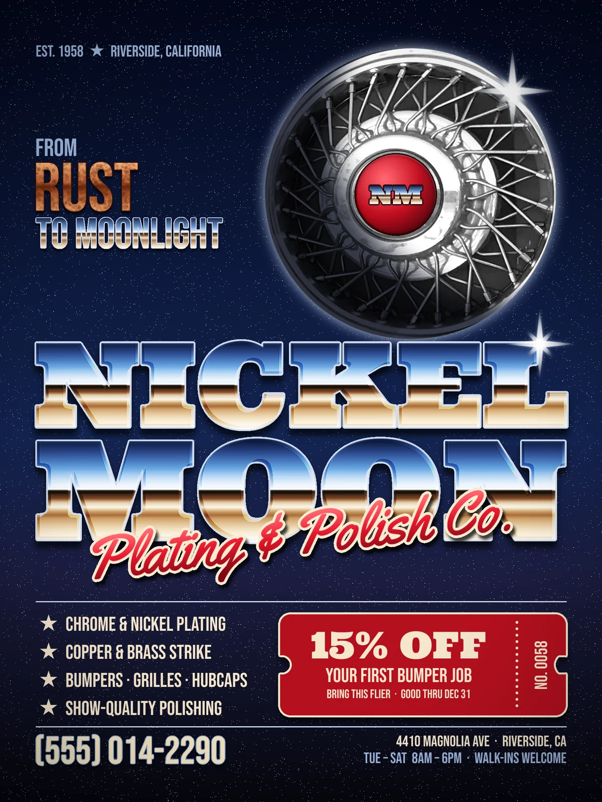
Chrome lettering was everywhere in the 1980s: on album covers, movie posters and the side of every arcade cabinet. The look comes from one trick. Shiny metal reflects the world around it, so the letters show a blue sky on top, a bright white horizon in the middle and brown ground underneath. Get that gradient right, add a crisp outline and a couple of glints, and flat type turns into polished metal.
In this tutorial you'll use that trick on a flier for an imaginary small business, Nickel Moon Plating & Polish Co. It's a chrome-plating shop for classic cars and motorcycles. A photo of a wire-spoke hubcap becomes the "nickel moon" in a starry sky, with the shop's monogram on its centre badge. Underneath, the flier does what a small-business flier has to do: list the services, make an offer and say how to get in touch.
The fonts are free Google Fonts:
- Ultra for NICKEL MOON, the badge monogram and the coupon headline
- Yellowtail for the Plating & Polish Co. script
- Bebas Neue for everything else
The palette:
-
Midnight sky
-
Chrome sky
-
Chrome ground
-
Candy red
-
ticket red
-
Copper
-
Badge enamel
-
Cream
-
steel blue
-
silver outline
The hubcap is from a public-domain (CC0) photo of a wall of hubcaps in the WordPress Photo Directory. Any straight-on photo of a wire-spoke hubcap or wheel cover will work. Crop it to just the hubcap, about 550 px square, before you start.
The moon and its badge sit directly in the Project group, and the rest is built in three groups: the headline, the tagline and the services panel. New layers and text appear above whichever layer is selected, so before you start each group you'll select a layer at the right level of the stack.
-
Paint a midnight sky and set the margins
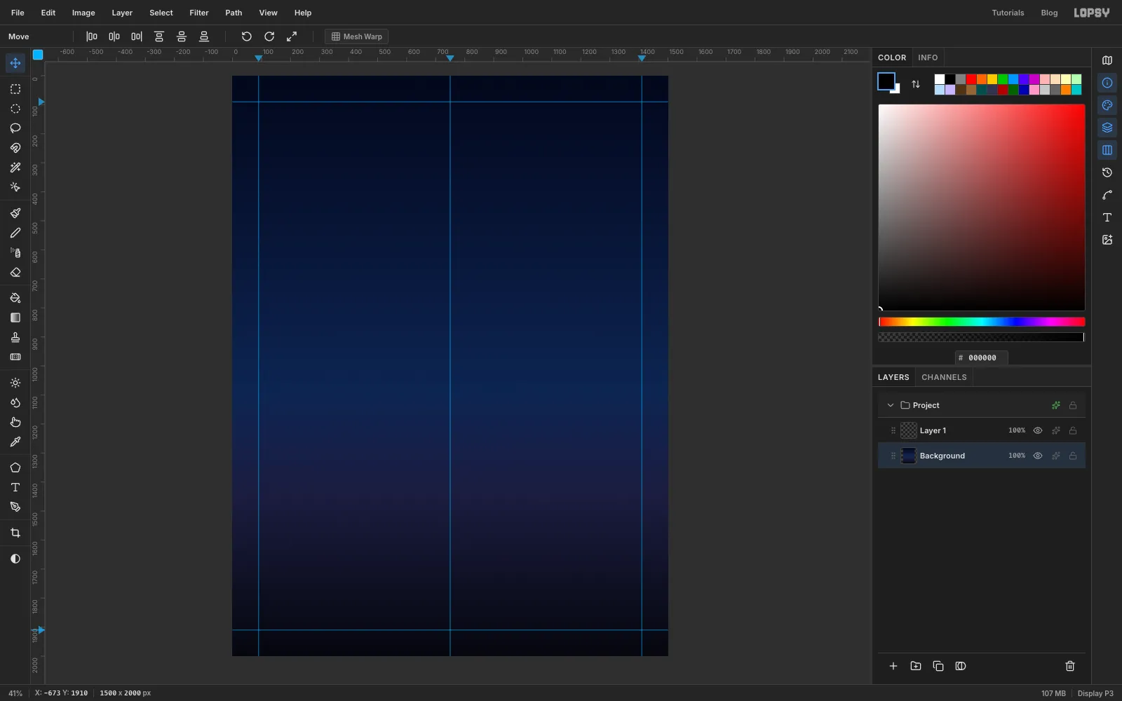
Open Lopsy and create a 1500 × 2000 pixel document. That's a 3:4 portrait, which prints well as a letter-size or A4 flier.
Select Background and pick the Gradient tool (Linear). Click Advanced… and set four stops:
- at 0 %
- at 55 %
- at 72 %
- at 100 %
Hold Cmd and drag from the top of the canvas to the bottom. Cmd snaps the angle in 15° steps, so the drag stays exactly vertical.
Now add guides. Click the top ruler at 90, 750 and 1410 for three vertical guides, and the left ruler at 90 and 1910 for two horizontal ones. Everything important stays inside the outer four, and the middle one marks the centre of the page.
-
Scatter a starfield
Rename Layer 1 to
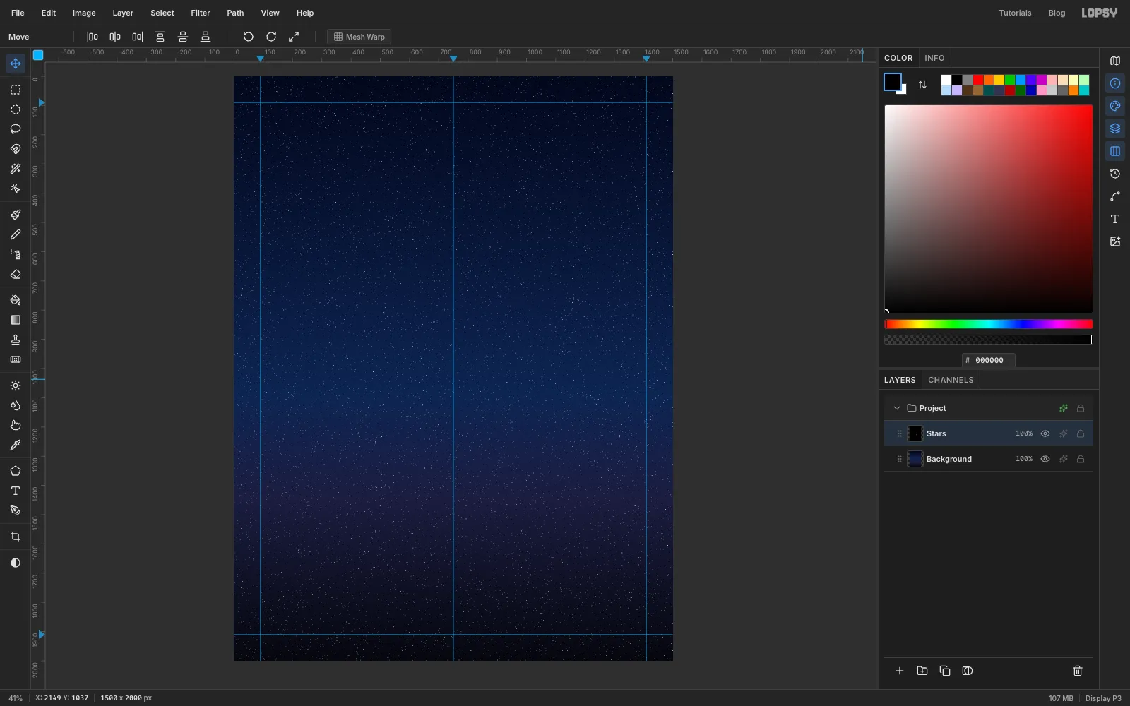
Stars. Set the foreground to black and choose Edit → Fill to fill the layer.Run Filter → Add Noise… with Amount 100, Mono and Uniform, then Filter → Gaussian Blur… at Radius 1. Now run Filter → Threshold… at Level 48. Noise on black never gets much brighter than that, so only the brightest few specks turn white. Those are your stars.
Click the effects button (the sparkle icon) on the Stars row to open its Layer Effects panel, and set the blend mode at the top to Screen. The black disappears and the stars sit on the sky. You'll use this panel for every blend mode and effect from here on.
-
Paste the hubcap and cut it out
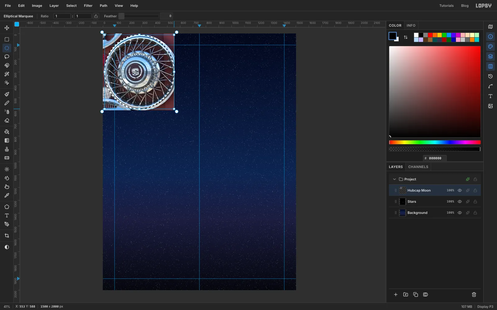
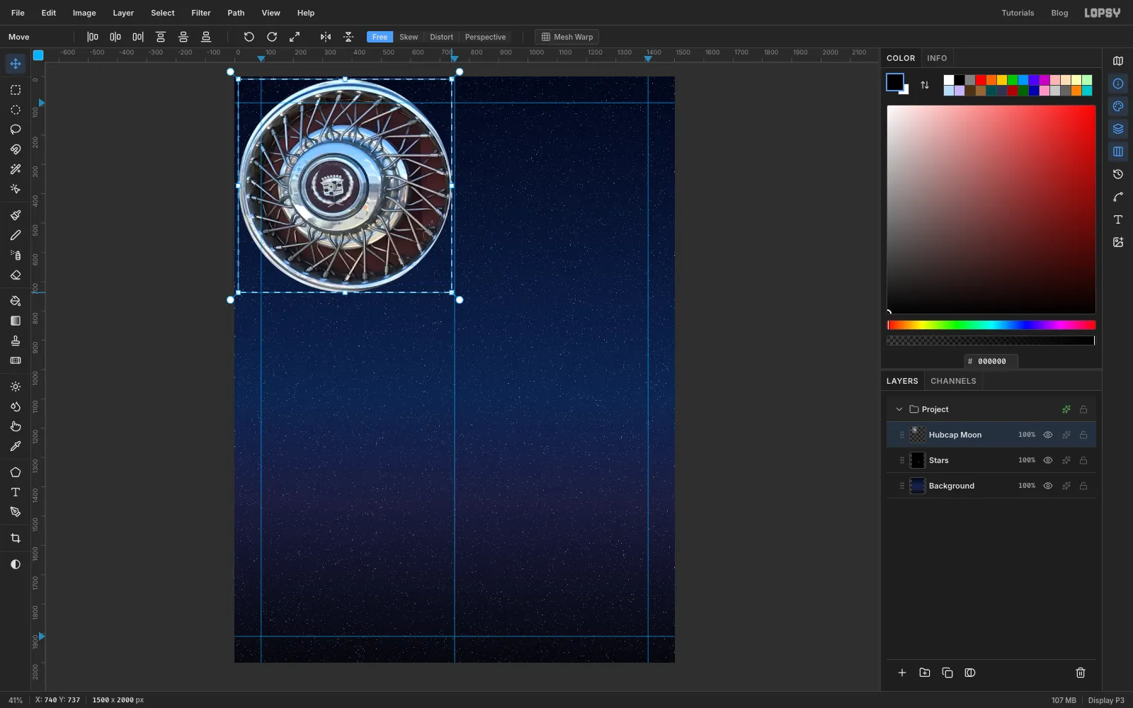
Copy your hubcap crop and paste it with Cmd+V. It lands in the top-left corner as Pasted Layer, so rename it
Hubcap Moon.Pick the Elliptical Marquee and drag a selection that hugs the outside of the chrome rim. The rim in a photo is rarely a perfect circle, so take your time. Then choose Select → Inverse and press Delete to clear the wall behind the hubcap.
-
Scale the hubcap into a moon
Draw a Rectangular Marquee around the hubcap and switch to the Move tool. Drag the bottom-right corner handle down and to the right until the hubcap is about 725 px across. If your hubcap is slightly oval like this one, drag a little further sideways than down so it ends up round. Press Cmd+D to apply the transform and deselect.
Drag the hubcap up into the top-right corner. Its right edge should sit just inside the right guide and its top about 120 px from the top of the page.
-
Desaturate it to nickel
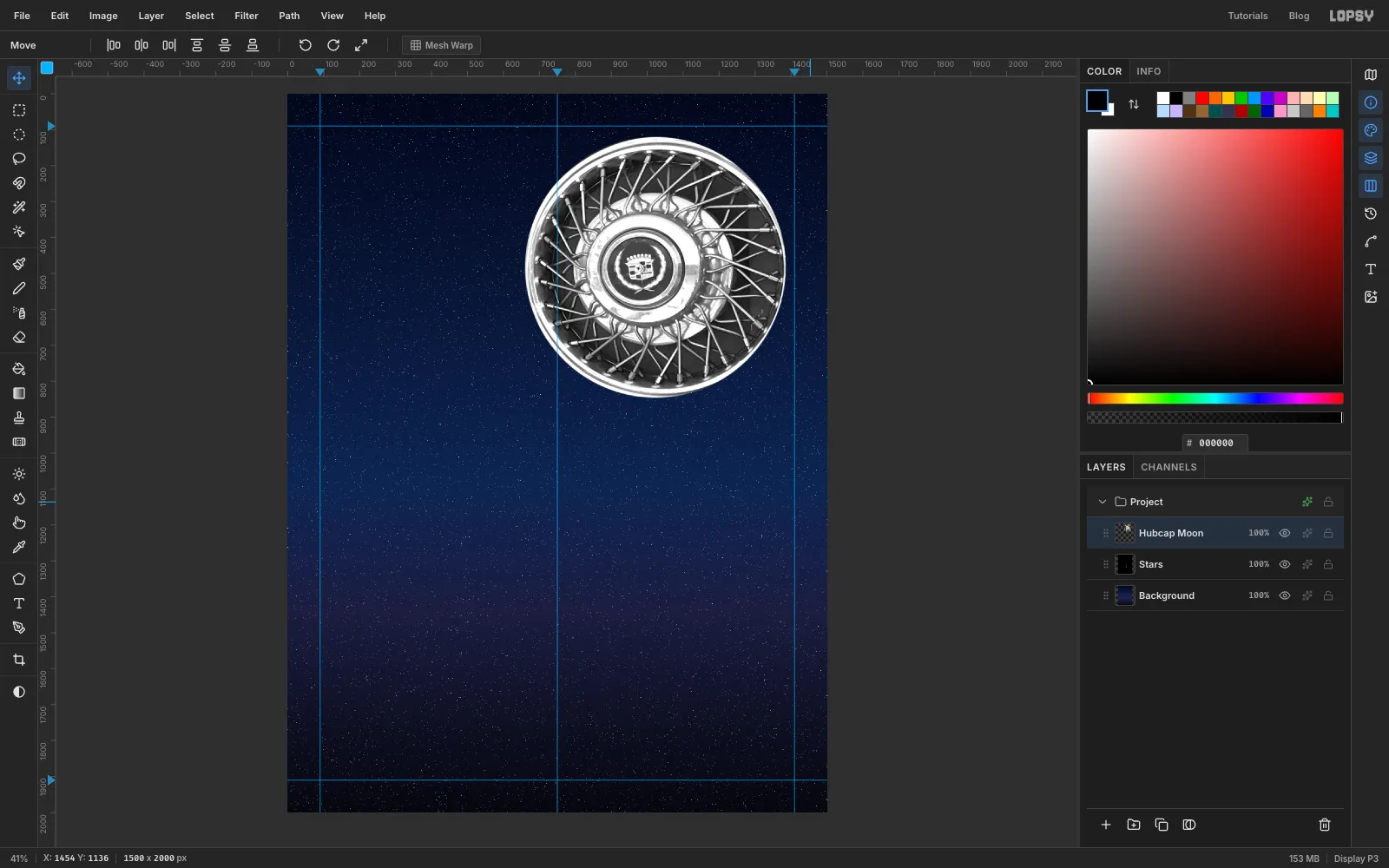
Choose Filter → Desaturate to strip out the colour. Then run Filter → Brightness/Contrast… with Brightness 14 and Contrast 30.
The brightness matters here. It lifts the black gaps between the spokes to a dark grey, so the hubcap reads as a lit disc like a moon, not a black hole.
-
Dodge and burn the rim
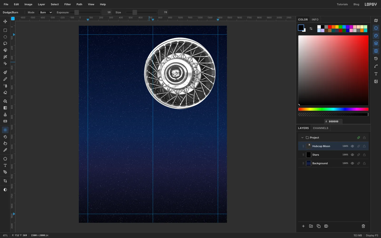
Pick the Dodge/Burn tool. Set Mode to Dodge, Exposure 20 and Size 46, then trace along the upper-right part of the chrome rim in one stroke. Switch Mode to Burn, Exposure 18 and Size 70, and trace the lower-left part of the rim.
This exaggerates the light so it clearly comes from the upper right. That matters for the next step.
-
Shade the moon
Click Add Layer and name it
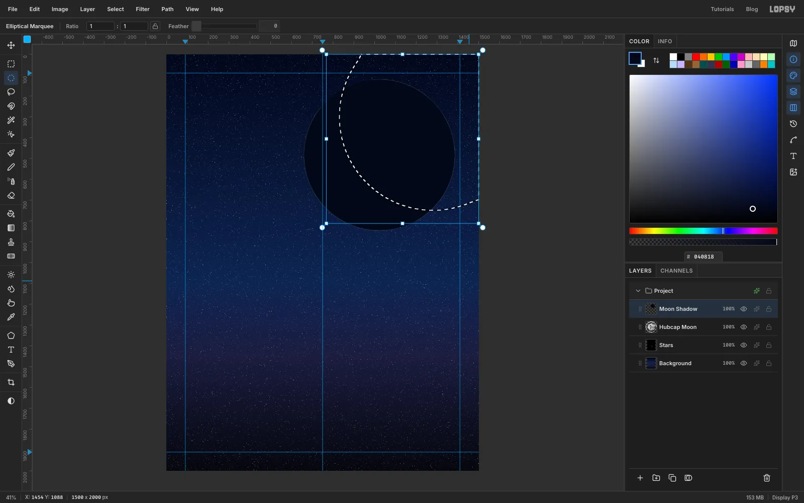
Moon Shadow. Cmd-click the Hubcap Moon thumbnail to select its shape, then select Moon Shadow again. Fill the selection with (Edit → Fill) and deselect.Now draw a large circle with the Elliptical Marquee, about 900 px across. Its lower-left edge should run through the middle of the moon, with most of the circle above and to the right of it. Choose Select → Feather… with a radius of 90 and press Delete. That leaves a soft crescent of shadow on the moon's lower-left side. Deselect, then set Moon Shadow to Multiply at 80 % opacity so the hubcap shows through the shadow.
-
Add a moonlight glow
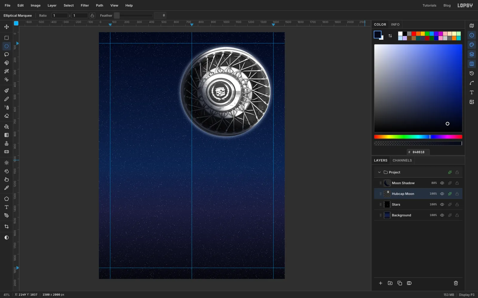
Select Hubcap Moon, open its Layer Effects and turn on Outer Glow. Use colour , Size 40, Spread 15 and Opacity 75. Now the moon looks lit against the sky.
-
Make a chrome monogram and an enamel badge
The hubcap's original maker's badge has to go. You'll cover it with the shop's own: a red enamel disc with NM in chrome.
First, set up the chrome gradient. You'll reuse it for all the chrome type. Pick the Gradient tool and open Advanced…. Set these ten stops:
- at 0 %, at 30 %, at 47 % and at 49 %. That's the sky, fading to a white horizon.
- at 51 %. The jump from white to near-black in two percent is the hard horizon line that makes chrome read as chrome.
- at 58 %, at 66 %, at 74 %, at 90 % and at 100 %. That's the ground, with a second reflection band in it.
Select Moon Shadow and click Add Layer. Name the new layer
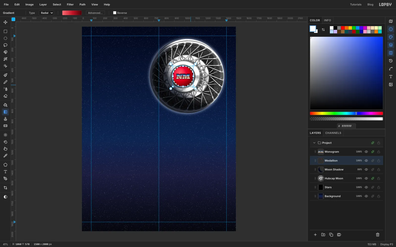
Medallion. Type NM in Ultra at size 64 in white, clicking just above and to the left of the badge, then nudge it onto the middle of the badge with the arrow keys (Shift+arrow moves 10 px at a time). Rename the text layerMonogramand rasterize it (the Rasterize Layer button under the Layers panel). Cmd-click its thumbnail and drag the gradient from the top of the letters to the bottom. Give it a 3 px Stroke in dark red .For the disc, switch the Gradient tool's Type to Radial and set three stops: , at 55 % and . This replaces the chrome stops, so keep a note of them. You'll enter them again for the headline. Select Medallion and draw a circle about 200 px across with the Elliptical Marquee, centred on the badge. Drag the gradient from a point just up and left of the centre out past the lower-right edge. The off-centre start gives the enamel a glossy highlight.
-
Bevel the badge
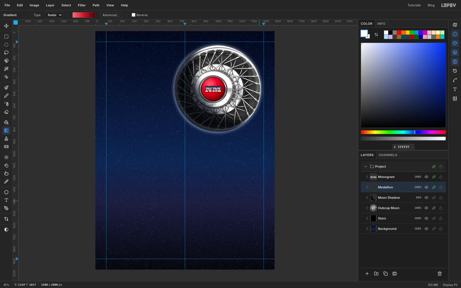
Deselect, then run Filter → Emboss… on Medallion with Strength 35 to give the disc a slight bevel. In its Layer Effects, add a 3 px Stroke in and an Inner Glow in black at Size 18, Opacity 60. The disc now looks set into the hub, not stuck on top.
-
Set the headline
Select Monogram and click New Group. Name the group
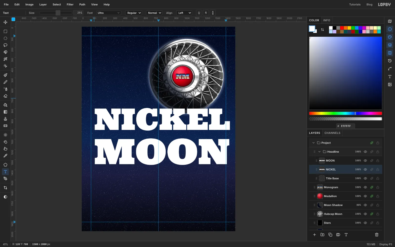
Headline, then click Add Layer and name the new layerTitle Base. With Title Base selected, anything you add goes inside the group.Pick the Text tool, choose Ultra in white, and type
MOONat size 342 in the empty space under the moon. Select Title Base again and typeNICKELat size 291 above it. At those sizes, both words span exactly from the left guide to the right one.Position them with the arrow keys:
- NICKEL with its top at about 850, just clear of the moon.
- MOON with its top at about 1093, leaving a gap of about 20 px.
-
Fill the letters with chrome
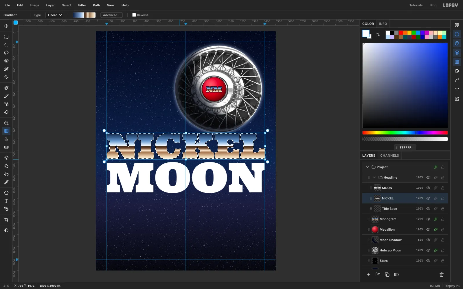
Rasterize both words. Pick the Gradient tool, set Type back to Linear and re-enter the ten chrome stops from the badge step in Advanced…. Then Cmd-click the NICKEL thumbnail to select the letters, hold Cmd and drag from the very top of the letters to the very bottom.
Do the same for MOON. Drag across its own letter height, not NICKEL's, so the horizon cuts through the middle of each word.
-
Add an outline, edge light and shadow
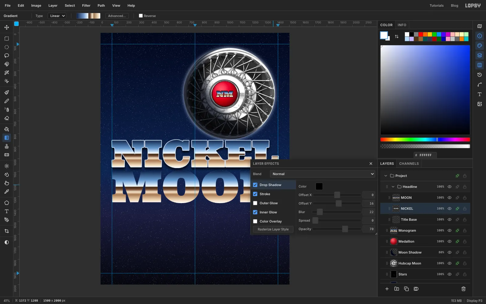
Open NICKEL's Layer Effects and turn on three effects:
- Stroke: outside, Width 4, colour . A thin silver outline separates the chrome from the navy sky.
- Inner Glow: white, Size 6, Opacity 70. It catches light along the inside of every edge.
- Drop Shadow: Offset X 0, Offset Y 16, Blur 22, Opacity 70, in black.
Give MOON exactly the same three effects.
-
Bevel the chrome with Emboss
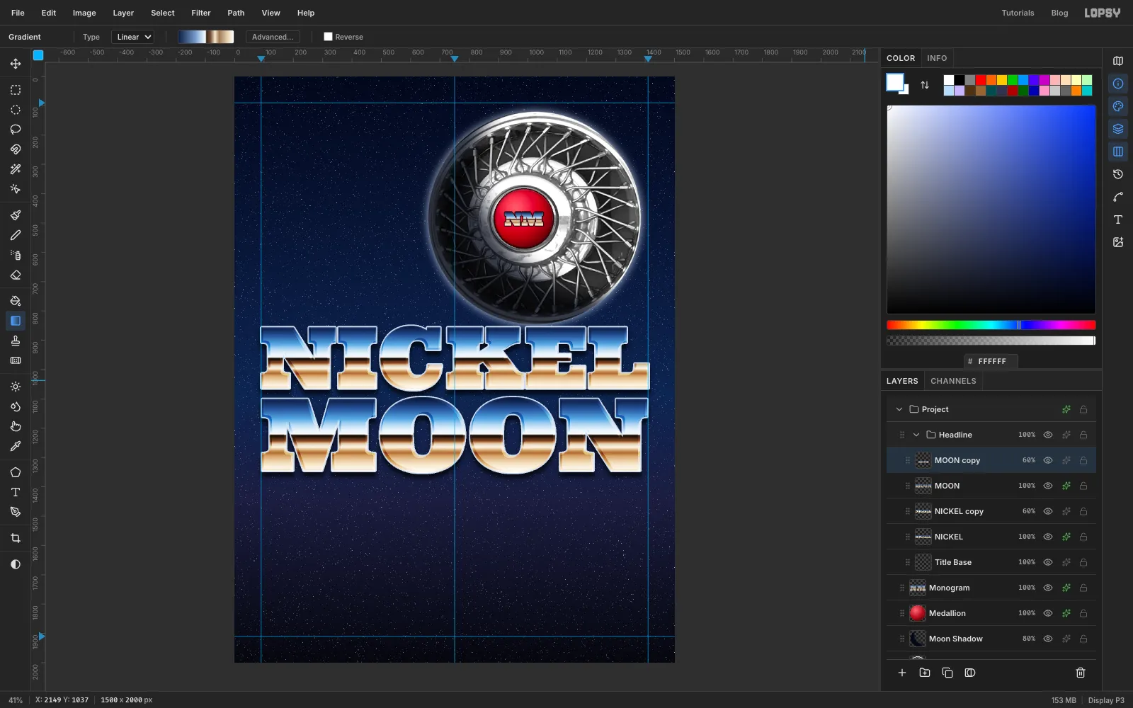
Select NICKEL and choose Layer → Duplicate Layer. In the copy's Layer Effects, turn all three effects off. Run Filter → Emboss… at Strength 70. Then set the copy's blend mode to Overlay and its opacity to 60 %.
Emboss adds light and dark edges to the letters. Overlay works them into the chrome underneath, so the letters look bevelled and the colours get punchier. Repeat for MOON.
-
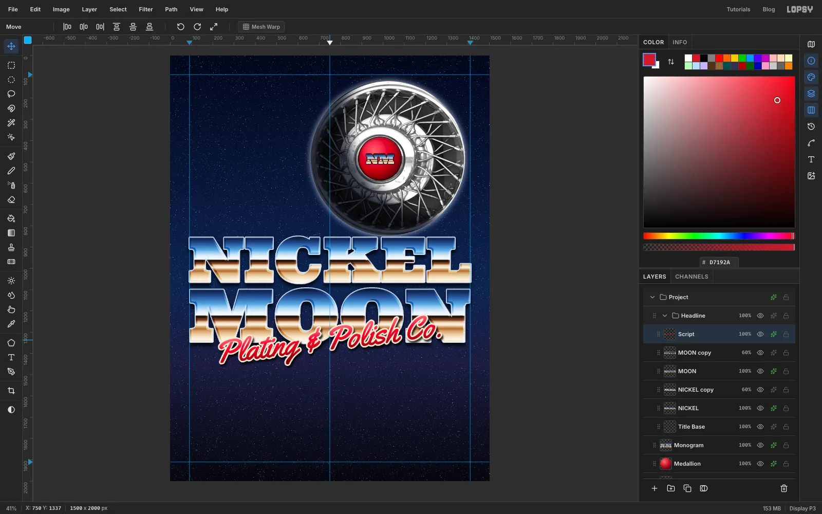
Write and tilt the script
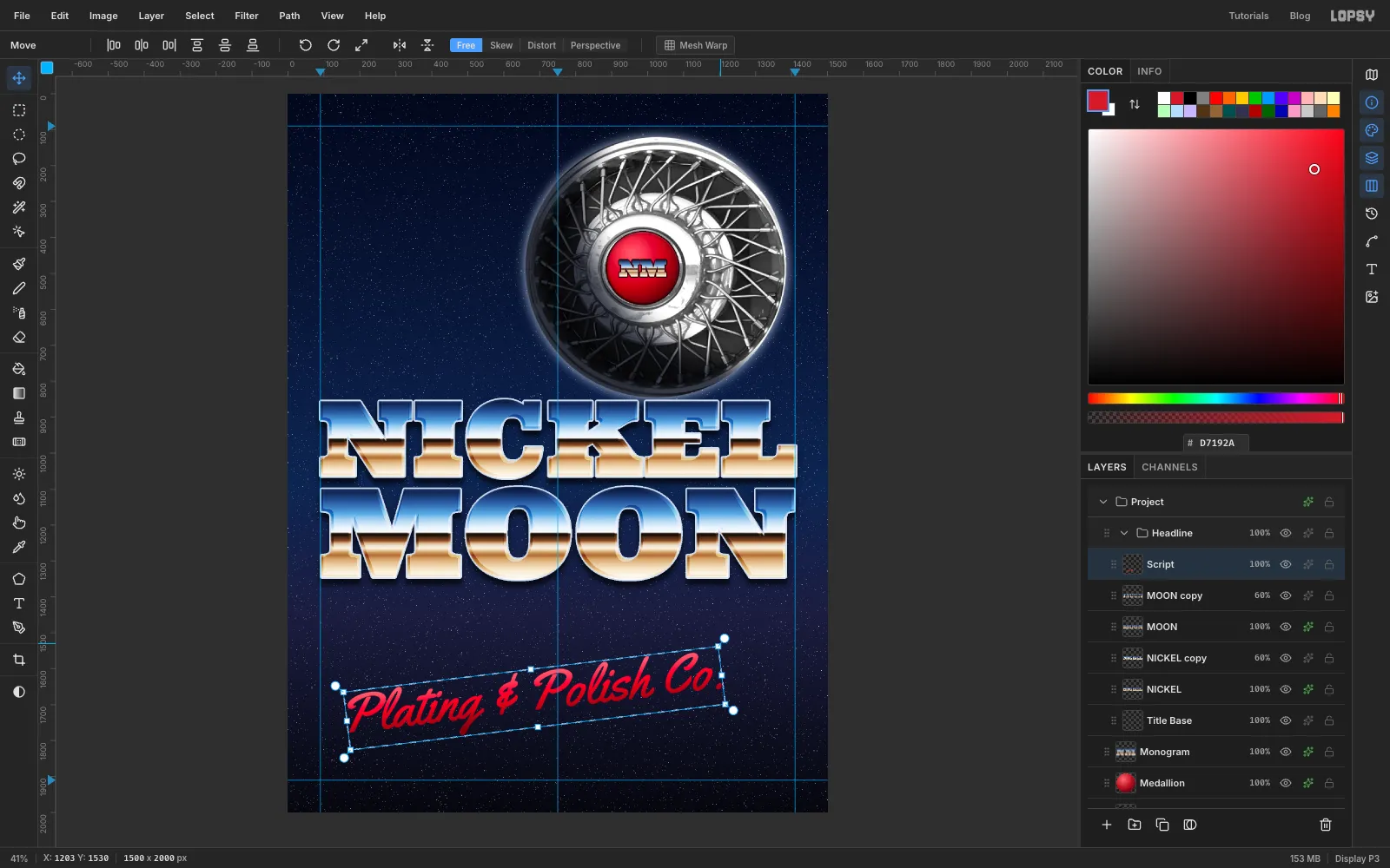
Select MOON copy so the script lands at the top of the Headline group. In the empty space at the bottom of the page, type
Plating & Polish Co.in Yellowtail at size 150. Rename the layerScriptand rasterize it.Set a three-stop linear gradient: , at 45 % and . Cmd-click the script's thumbnail and drag the gradient from the top of the letters to the baseline. Now it looks like candy-apple paint.
Draw a Rectangular Marquee around the script and switch to the Move tool. Drag just outside a corner handle to rotate it about 7° counter-clockwise, so it climbs to the right. Press Cmd+D to apply the rotation and deselect.
-
Seat the script over MOON
Give the script a Stroke (outside, Width 7, ) and a Drop Shadow (Offset X 6, Offset Y 10, Blur 10, Opacity 75).
Drag it up so it's centred on the middle guide and overlaps the bottom half of MOON. The thick cream outline keeps it readable where it crosses the dark band of the chrome. Leave at least 40 px between the bottom of the g and the rule you'll add under it later.
-
Draw a glint with Sunburst
Glints are the classic chrome finishing touch. Two are plenty. More than that and they start to compete.
Select Script and add a layer called
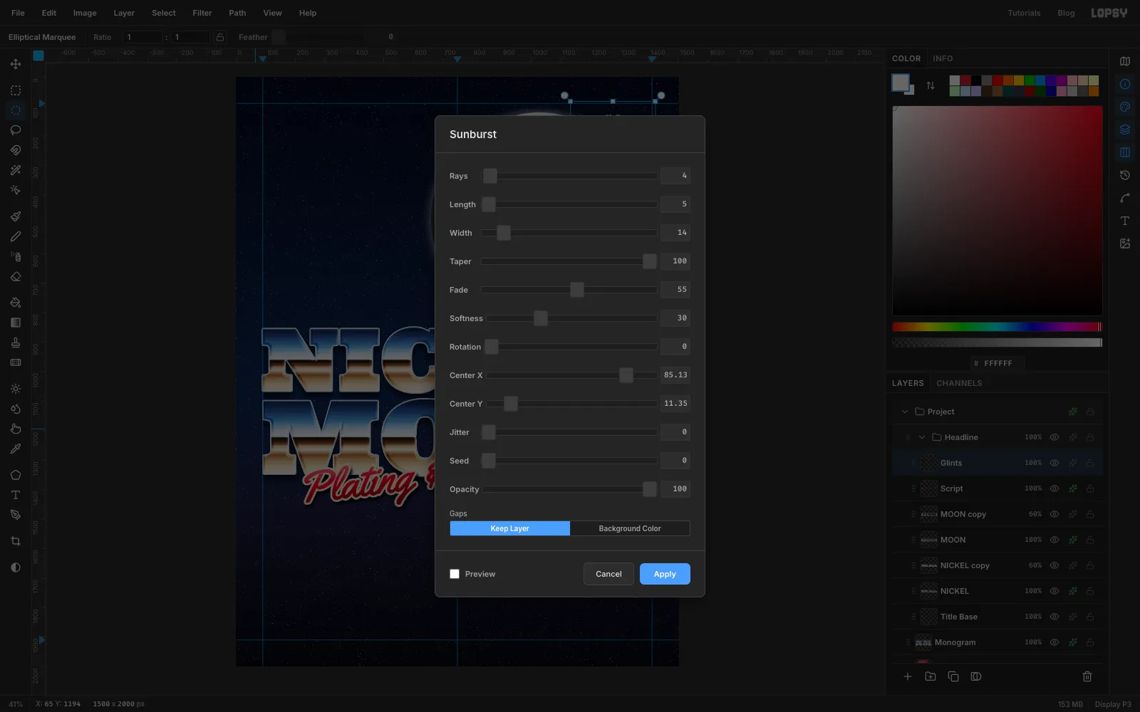
Glints. With the Elliptical Marquee, draw a circle about 200 px across, centred on the brightest point of the moon's upper-right rim. Feather it by 45 (Select → Feather…).Set the foreground to white and open Filter → Sunburst…:
- Rays 4, Length 5, Width 14, Taper 100, Fade 55, Softness 30, Rotation 0.
- Center X and Center Y are percentages of the page. Divide the point's x by 15 and its y by 20 (the page is 1500 × 2000). For the rim highlight, that's about 85 and 11.
Taper 100 turns each ray into a sharp spike, and the feathered selection fades out the tips.
-
Finish the glints
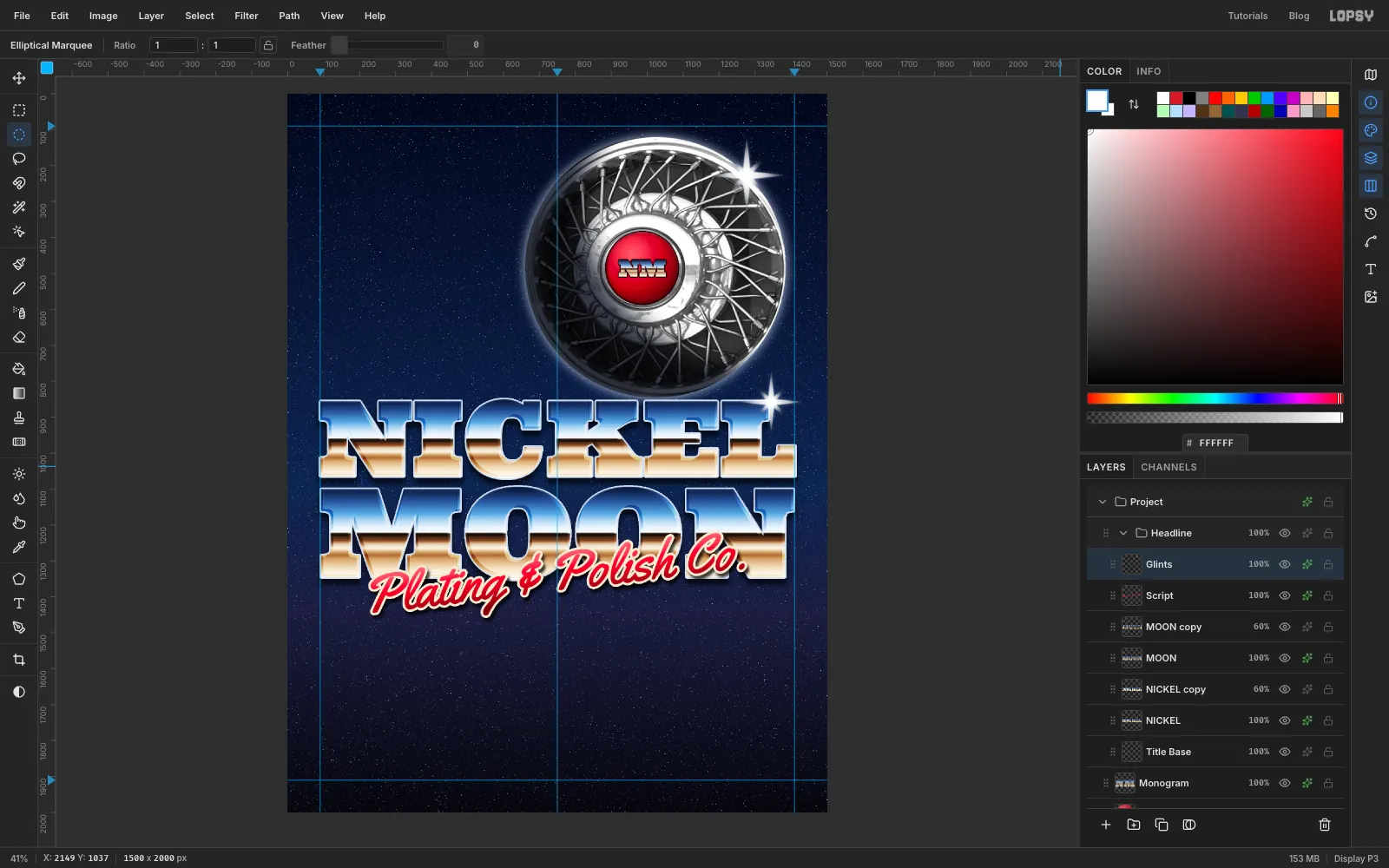
Draw a smaller circle, about 90 px across, at the same centre and feather it by 25. Run Sunburst again with the same settings except Width 10, Rotation 45 and Opacity 90. That adds four shorter diagonal rays, so you get an eight-point star.
Make the second glint the same way on the top-right corner of the L in NICKEL, around (1345, 858). Use slightly smaller circles there: about 170 px feathered by 38 for the first pass, and about 75 px feathered by 20 for the diagonal pass. Center X and Y are about 90 and 43. Finally, give the Glints layer an Outer Glow in at Size 14, Opacity 60.
-
Set the tagline
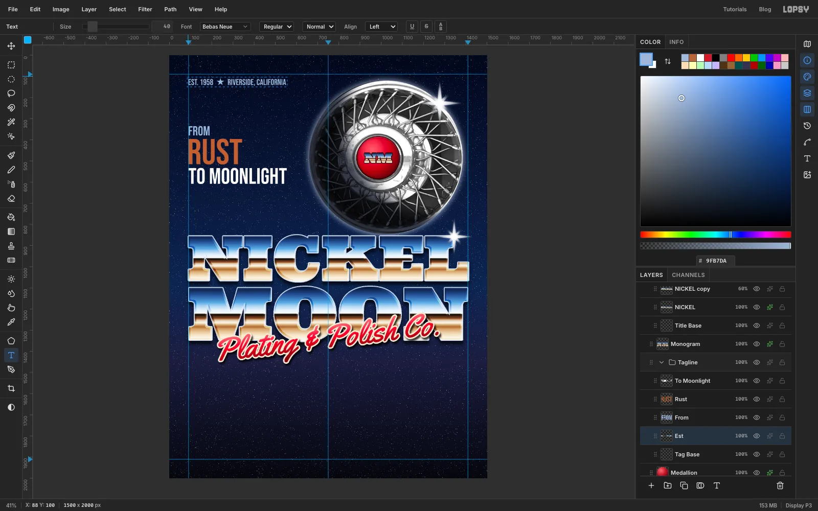
The empty sky to the left of the moon is the place for the shop's story. Select Medallion and click New Group. Name it
Tagline, then add a layer calledTag Baseinside it.Add these four lines in Bebas Neue. Before typing each one, click Tag Base so your new font settings don't restyle the previous line.
EST. 1958 ★ RIVERSIDE, CALIFORNIAat 40 in steel blue , at the top marginFROMat 62 inRUSTat 170 in (the copper comes next)TO MOONLIGHTat 106 in white
Line up the left edge of every line with the left guide. Stack FROM, RUST and TO MOONLIGHT tightly, centred top to bottom on the moon. Their tops go at about 345, 404 and 542.
-
Turn RUST into copper
Rasterize RUST and Cmd-click its thumbnail. Set a five-stop linear gradient:
- at 0 %
- at 42 %
- at 50 %
- at 62 %
- at 100 %
Drag it from the top of the letters to the bottom. It's the chrome idea again, in copper.
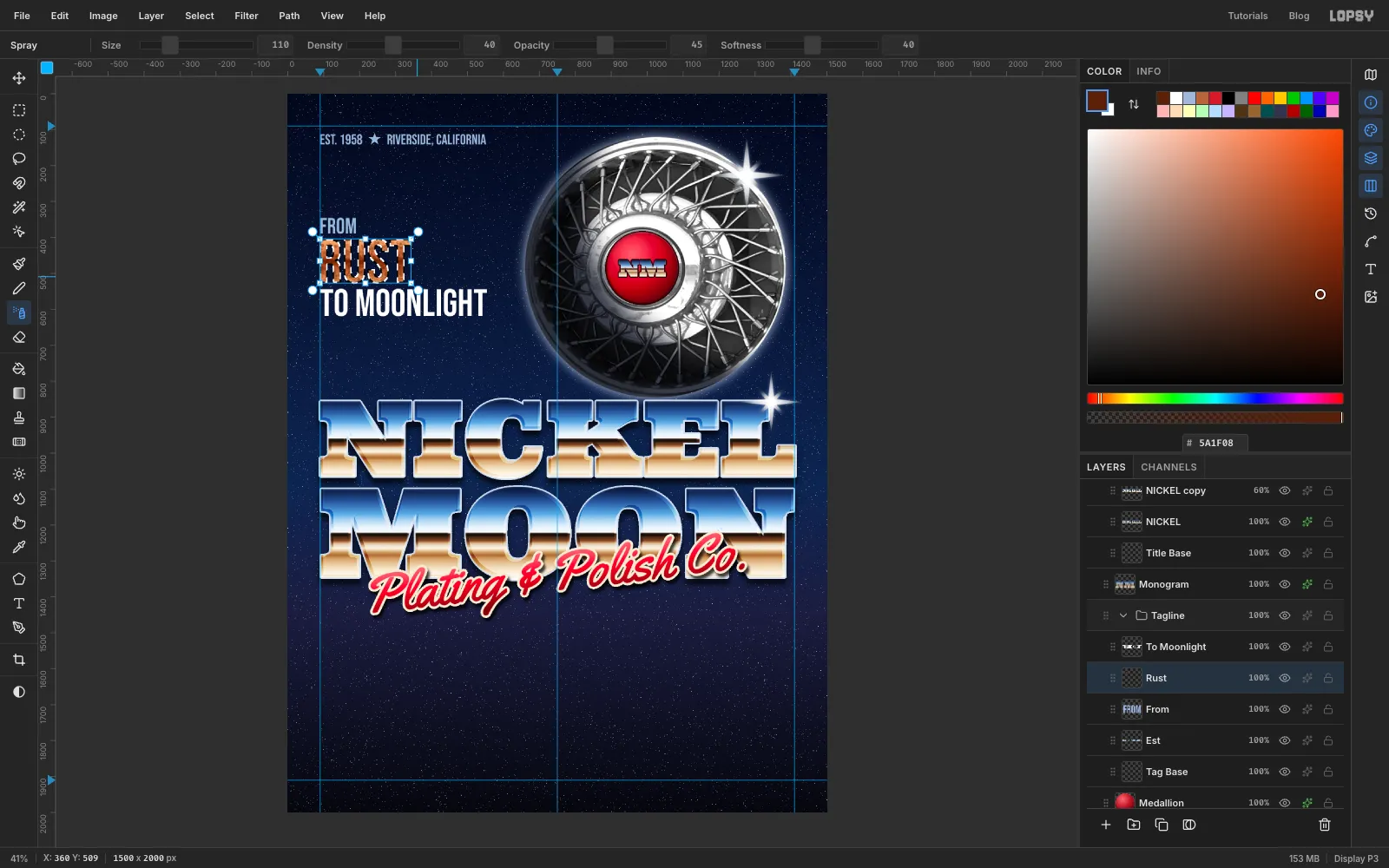
Keep the selection. Pick the Spray tool with Size 110, Density 40, Opacity 45 and Softness 40, set the foreground to , and sweep across the letters three or four times. The speckle looks like patina and keeps the copper from looking too clean next to the chrome. Deselect.
-
Chrome the payoff line
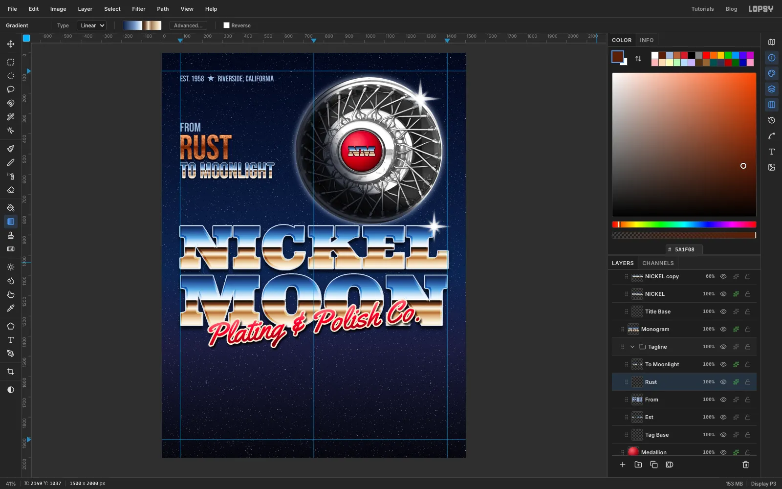
Rasterize TO MOONLIGHT. Switch the Gradient tool back to the ten linear chrome stops (the copper replaced them), Cmd-click the layer's thumbnail and drag the gradient across its letters, just as you did for the headline.
Give TO MOONLIGHT a 2 px outside Stroke in and a Drop Shadow (Offset Y 6, Blur 8, Opacity 70). Give RUST the same shadow and a 2 px stroke in dark brown .
-
List the services between two rules
Select Medallion and click New Group. Name the group
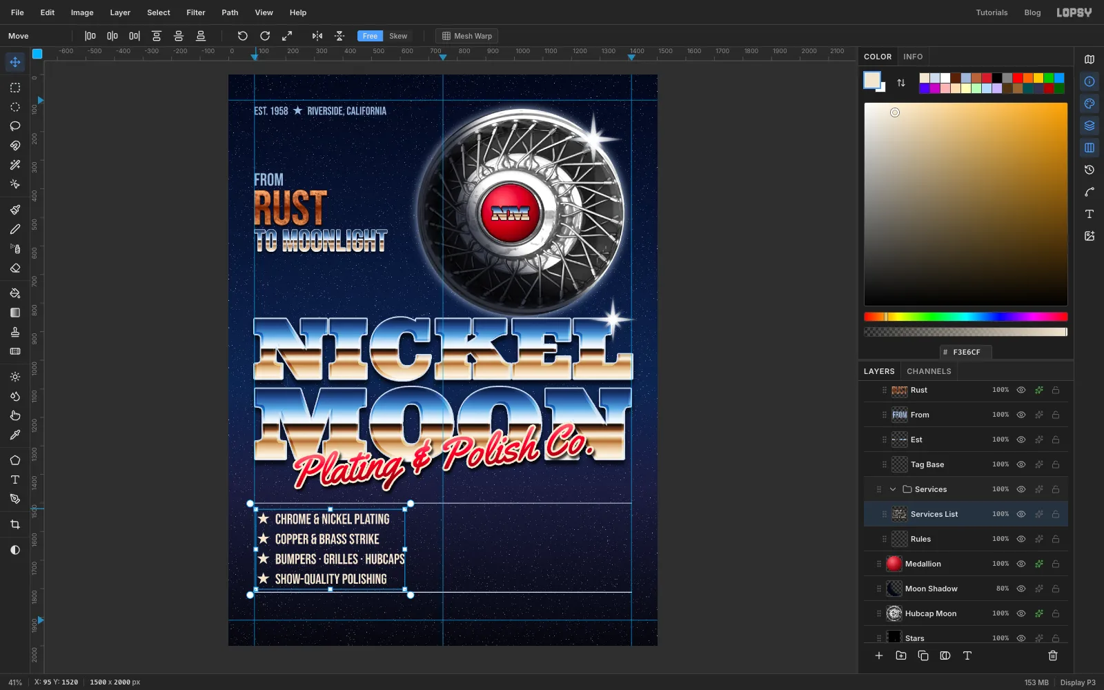
Services, then add a layer calledRules.Pick the Pencil at Size 3 in . Click on the left guide at a height of 1500, then Shift-click on the right guide for a straight rule. Draw a second rule the same way at 1812.
Add the services as one text layer in Bebas Neue at 50 in cream , one per line, each starting with a star and two spaces. Name the layer
Services List.★ CHROME & NICKEL PLATING★ COPPER & BRASS STRIKE★ BUMPERS · GRILLES · HUBCAPS★ SHOW-QUALITY POLISHING
Place the block just inside the left guide, with its top about 30 px below the first rule.
-
Draw the coupon ticket
Select Services List and add a layer called
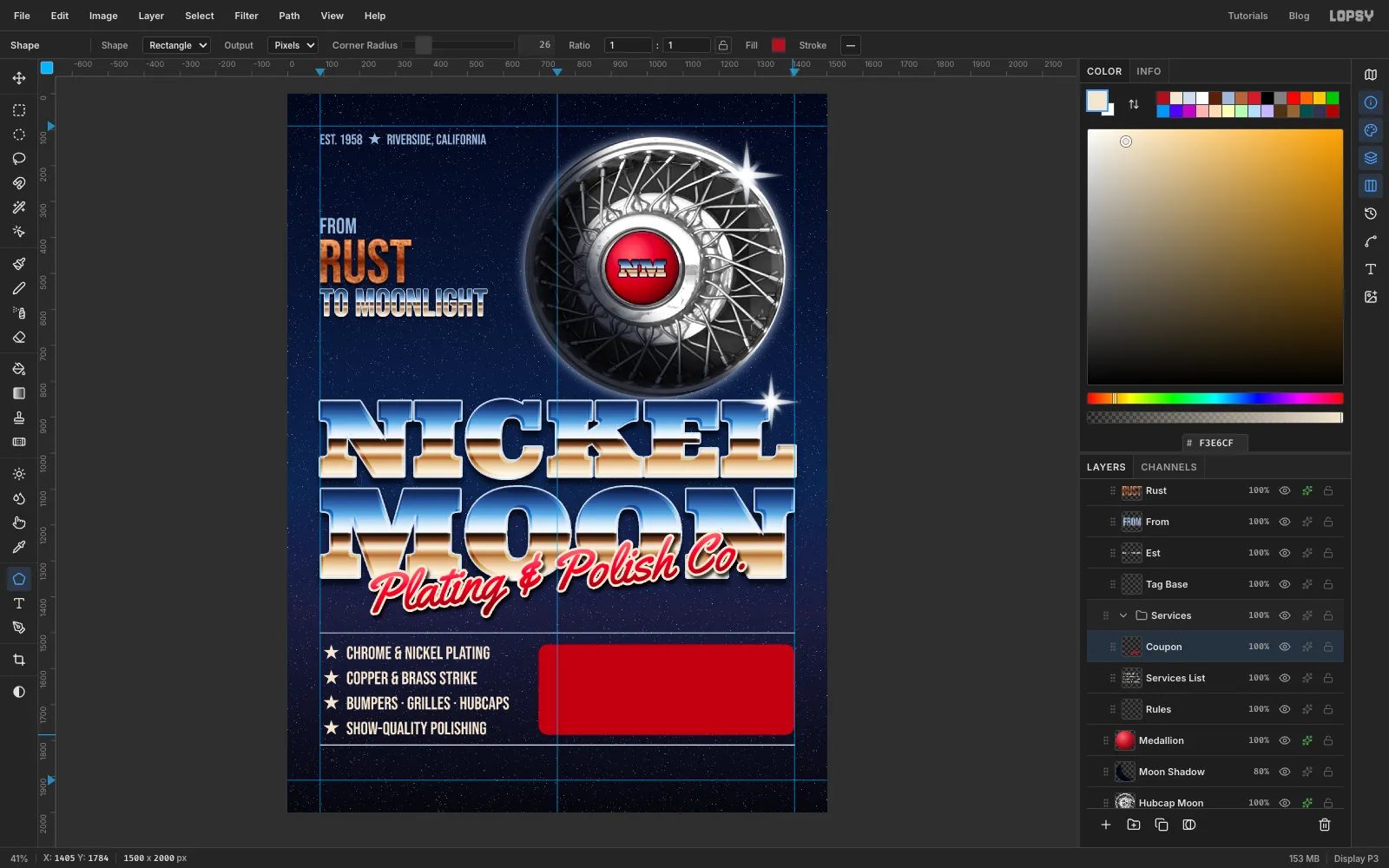
Coupon. Pick the Shape tool with Rectangle, Output Pixels, Corner Radius 26, fill and no stroke. Pixels matters, because the next step cuts notches out of the ticket with Delete.Shapes draw outward from the centre. Press in the middle of the right half of the space between the rules, at about x 1055, and drag out to the right guide. The ticket should run from about x 700 to the right margin and from just under the first rule to just above the second.
-
Notch and perforate it
Zoom in close on the left end of the ticket. Draw a 48 px circle with the Elliptical Marquee, centred about 5 px inside the edge, and press Delete. Do the same on the right end.
Give Coupon an outside Stroke (Width 5, cream ) and a Drop Shadow (Offset Y 10, Blur 18, Opacity 65).
For the perforation, add a layer called
Perforationand pick the Brush in cream. Click the brush preview at the left of the options bar to open Brushes. On the Shape tab, set Size 8, Hardness 100 and Spacing 220. That spaces the dabs out into separate dots. Close the panel, click near the top of the ticket about 120 px in from its right end, and Shift-click straight below it near the bottom.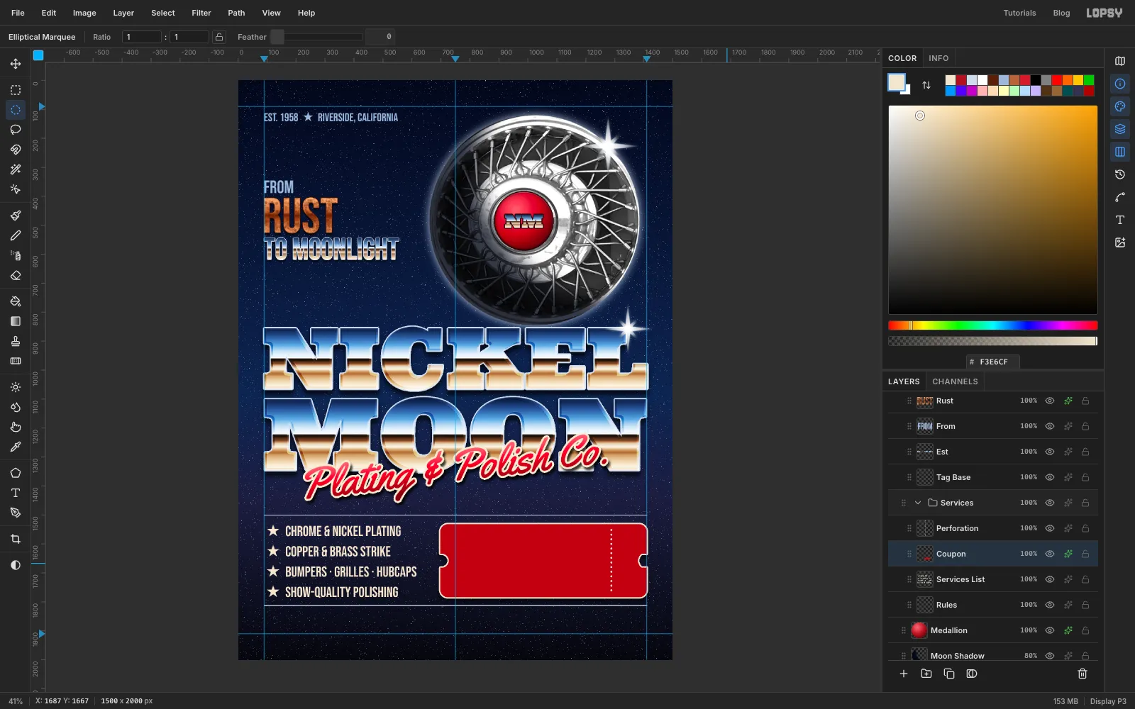
-
Write the offer
Select Perforation before each new line of text, so each one lands above the ticket and none of them restyles another. Type these lines in cream :
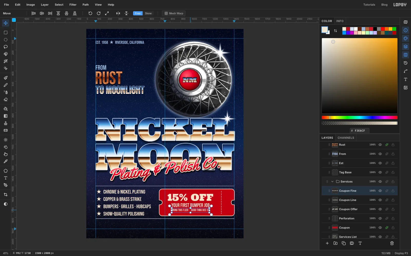
15% OFFin Ultra at 92YOUR FIRST BUMPER JOBin Bebas Neue at 50BRING THIS FLIER · GOOD THRU DEC 31in Bebas Neue at 31
Centre all three on x ≈ 995, the middle of the part of the ticket to the left of the perforation, and space them evenly from top to bottom. Cream on red stays easy to read even at the smallest size.
-
Rotate a serial number into the stub
Select Perforation again and type
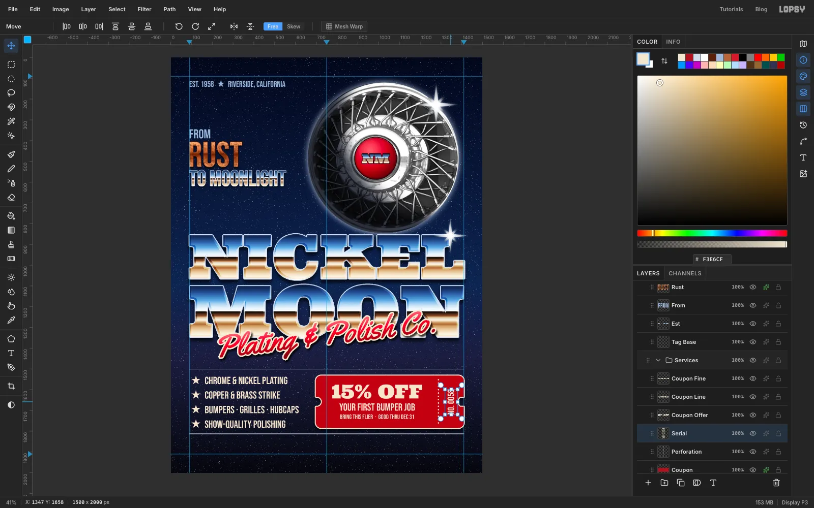
No. 0058in Bebas Neue at 44, in cream. With the text layer selected, switch to the Move tool and click Rotate 90° CCW in the options bar.The text stays editable after it's rotated, so you can change the number later. Drag it into the middle of the stub.
-
Add the contact details
Select Rules and add a layer called
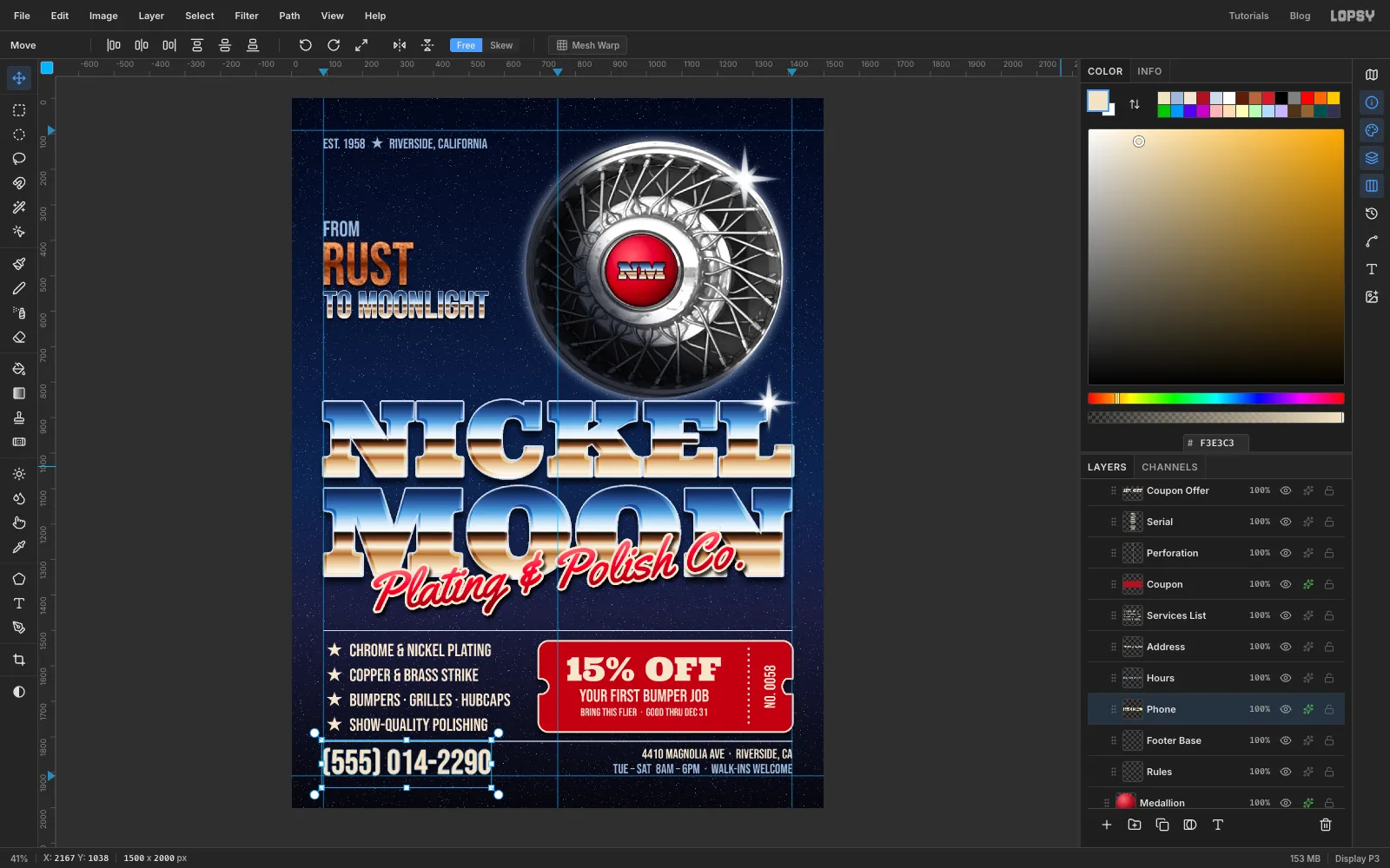
Footer Base. Then add three lines of text, selecting Footer Base before each one:(555) 014-2290in Bebas Neue at 96 in cream4410 MAGNOLIA AVE · RIVERSIDE, CAat 38 in creamTUE – SAT 8AM – 6PM · WALK-INS WELCOMEat 38 in steel blue
The phone number is the most important call to action, so keep it solid cream. Chrome would lose its lower half against the dark navy. Give it a 2 px Stroke in and a small Drop Shadow (Offset Y 6, Blur 8).
Put the phone number on the left guide and the two smaller lines flush against the right guide. Line the bottom of the hours up with the bottom of the phone number's digits, so the footer shares one baseline.
-
Finish with a vignette and a little vibrance
Select the Project group at the top of the Layers panel and open its effects to get the adjustment stack. Click Add Adjustment, choose Vignette and set it to 35. Add Saturation & Vibrance and set Vibrance to 12.
The vignette darkens the corners and pulls the eye toward the centre. The vibrance gives the chrome's blue and tan and the candy red a little more punch, without blowing out the cream.
Save the project with File → Save Project, and export with File → Quick Export PNG.