Paint an Abstract Expressionist 80th Birthday Card
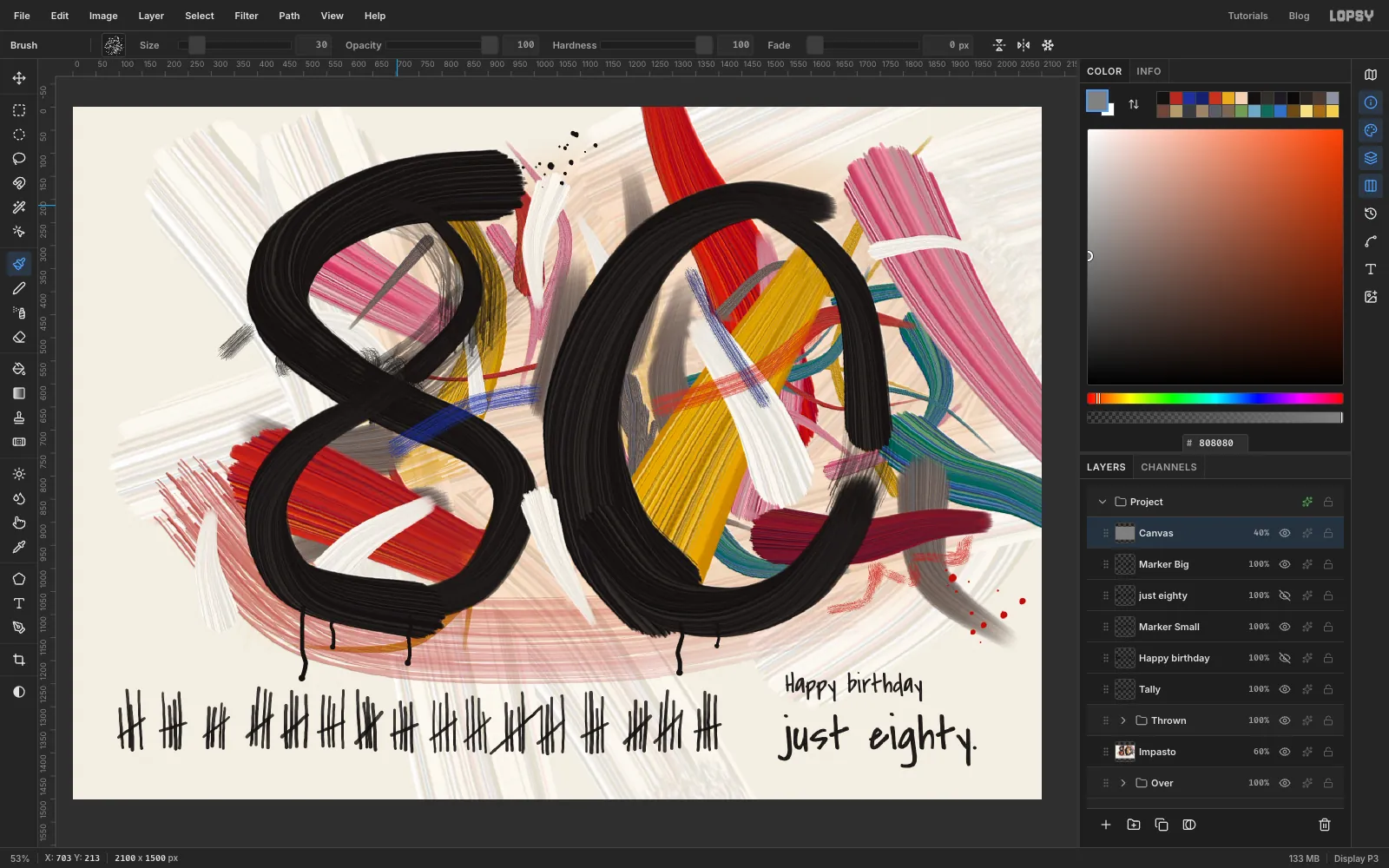
Paint a loud, gestural 80 in Lopsy with sprayed colour brush tips, dry-brush tears, drips and a row of eighty tally marks that counts the years.
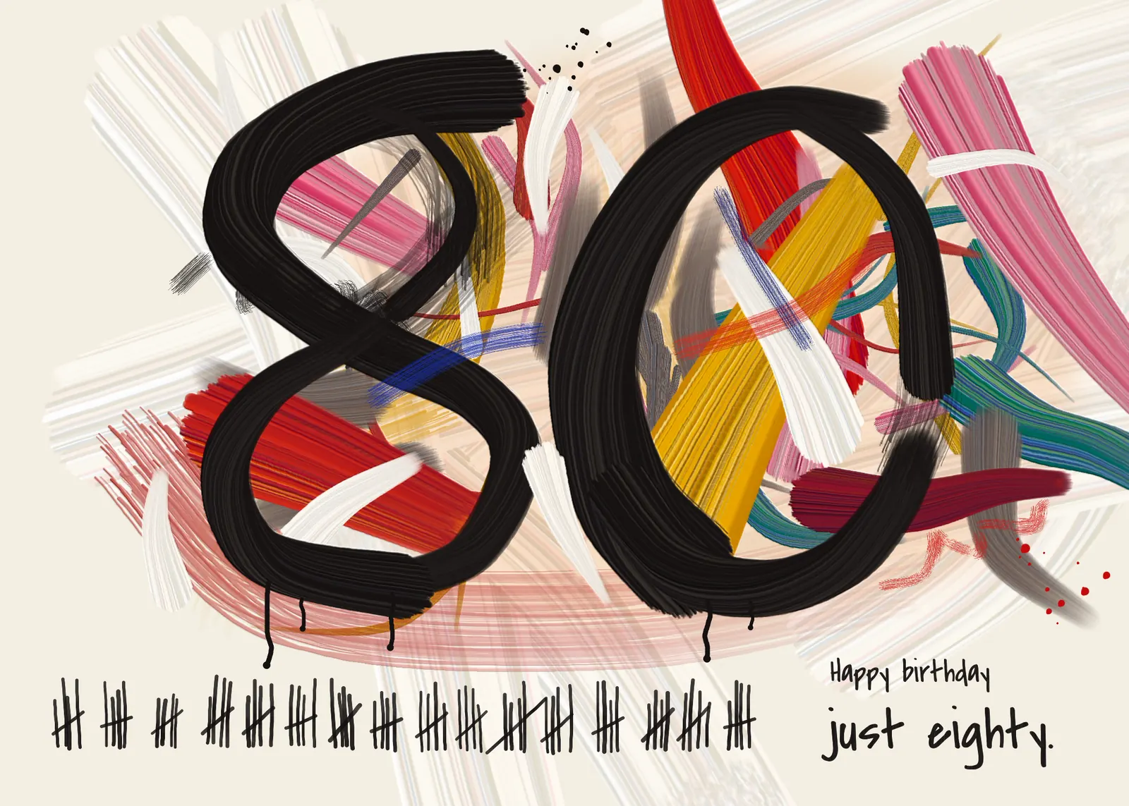
This card is for someone turning eighty who'd rather you didn't make a fuss. You'll make a fuss anyway: a huge painted 80, a row of eighty hand-drawn tally marks, and a very small note that says just eighty.
The style comes from the New York School of the 1950s:
- Joan Mitchell's tangled, high-colour strokes on a scrubbed white ground
- Franz Kline's fat black gestures, with paint that runs out partway through
- Cy Twombly's scratchy lines, like crayon on a wall
Clean digital strokes look wrong in this style, so most of this tutorial is about making brushes that behave like paint. You'll spray a cloud of coloured dots, turn the cloud into a colour brush tip, and drag it. Each dot leaves its own streak, so one stroke looks like a brush loaded with several colours.
Along the way you'll use:
- Spray, Edit → Define Color Brush and Edit → Define Brush
- the Brushes modal's Taper, the Fade slider and the Smudge tool
- Copy, Paste and the Move tool's scale and rotate handles
- groups, guides and arrow-key nudges
- Copy Merged, Emboss, Hue/Saturation, Add Noise and Motion Blur
- Multiply and Overlay blend modes
- point text painted through a selection
Here are the colours:
-
Ground
-
warm stain
-
Whites
-
Hot
-
Bloom
-
Gold
-
Cool
-
Mud
-
Ink
-
Start a landscape card
A 7 × 5 inch card at 300 dpi is 2100 × 1500 pixels. Open Lopsy. In the New Document dialog, set the unit to Pixels, set Width to
2100and Height to1500, and click Create.
-
Lay the ground and the guides
- Double-click
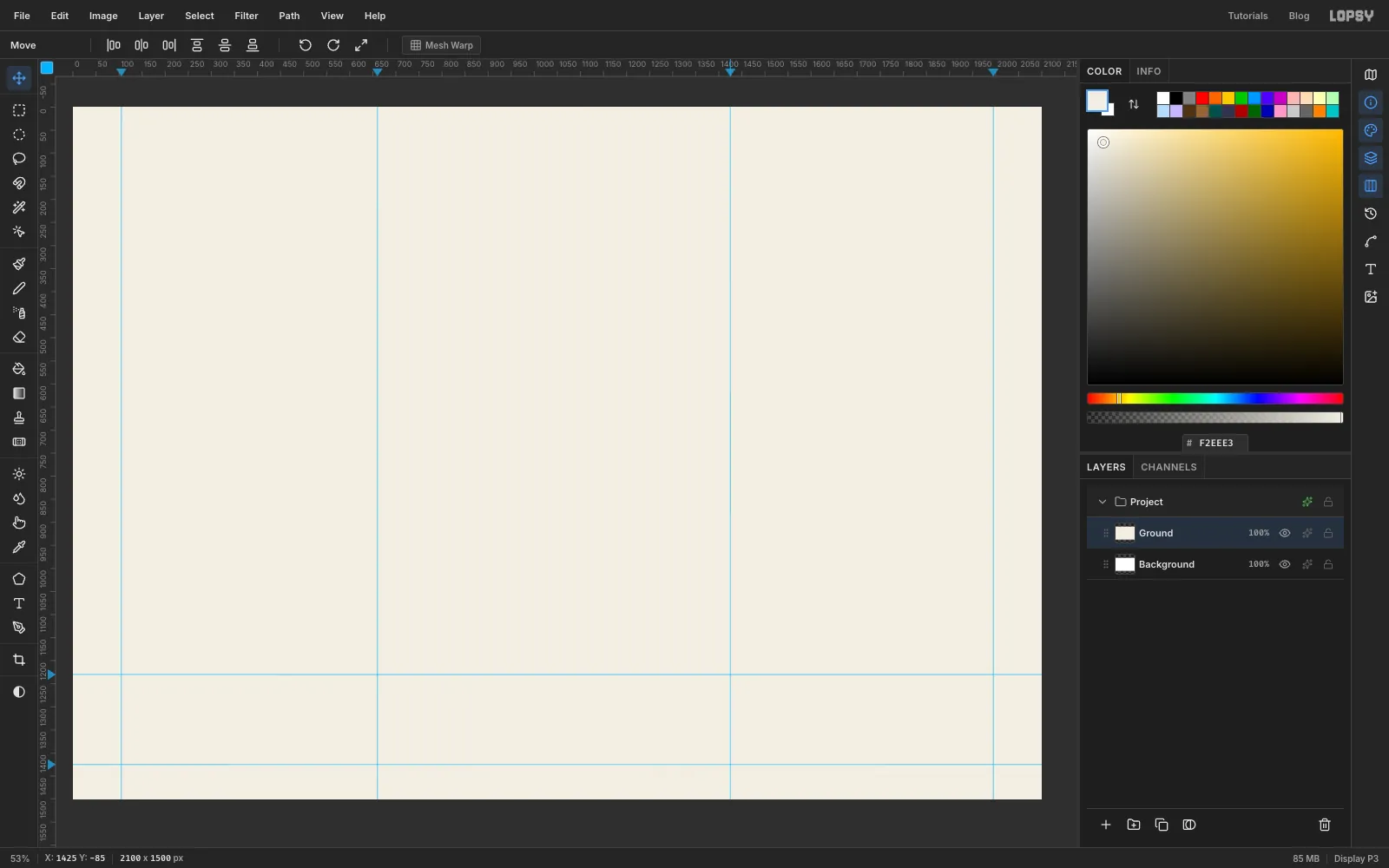
Layer 1in the Layers panel and rename itGround. - Set the foreground to and choose Edit → Fill.
- Click the top ruler at about
105and1995for the side margins, then at660and1425to mark the middle of each numeral. The status bar shows your cursor position if you want to check. - Click the left ruler at
1230and1425. Those two guides fence off the band at the bottom where the tally marks and the words will go. Keep the colour out of it. The white scrub you'll paint later can run through.
- Double-click
-
Spray your first colour tip
A brush tip made of scattered dots paints streaks in whatever direction you drag it, like the bristles of a real brush. You'll make nine of these discs in a grid, so leave clear space between them and keep them away from the guides. A marquee edge that snaps to a guide can clip dots, or turn off View → Snap to Guides while you work.
- Click Add Layer and name the layer
Tips. It's a scrap layer you'll delete later. - Press J for the Spray. In the options bar set Size
220, Density40, Opacity100and Softness10. - Set the foreground to and click once near the top left of the canvas. That sprays a disc of chunky dots.
- Set Size to
66and Density to30. Pick each of these colours in turn and scribble a quick spiral over the disc: , , , , , . The small dots become your fine bristles. - Press M and drag a marquee around the disc, leaving a little room on every side.
- Choose Edit → Define Color Brush…, type
Whitesand confirm. Press Cmd+D to deselect.
Lopsy now has a tip called
Whites, and it's the active brush. That matters, because Spray stamps with the active brush tip. If you spray again now you'll get tiny copies ofWhites, whatever your foreground colour. So before each new tip, press B, click the tip thumbnail at the left of the options bar to open the Brushes modal, click Hard Round on the Presets tab, close the modal, and press J to go back to the Spray.Now make
Hotto the right of the first disc. At Size220and Density40, click once each with and . Then at Size66and Density30, spiral , , , , , and . The screenshot shows it just before Define Color Brush….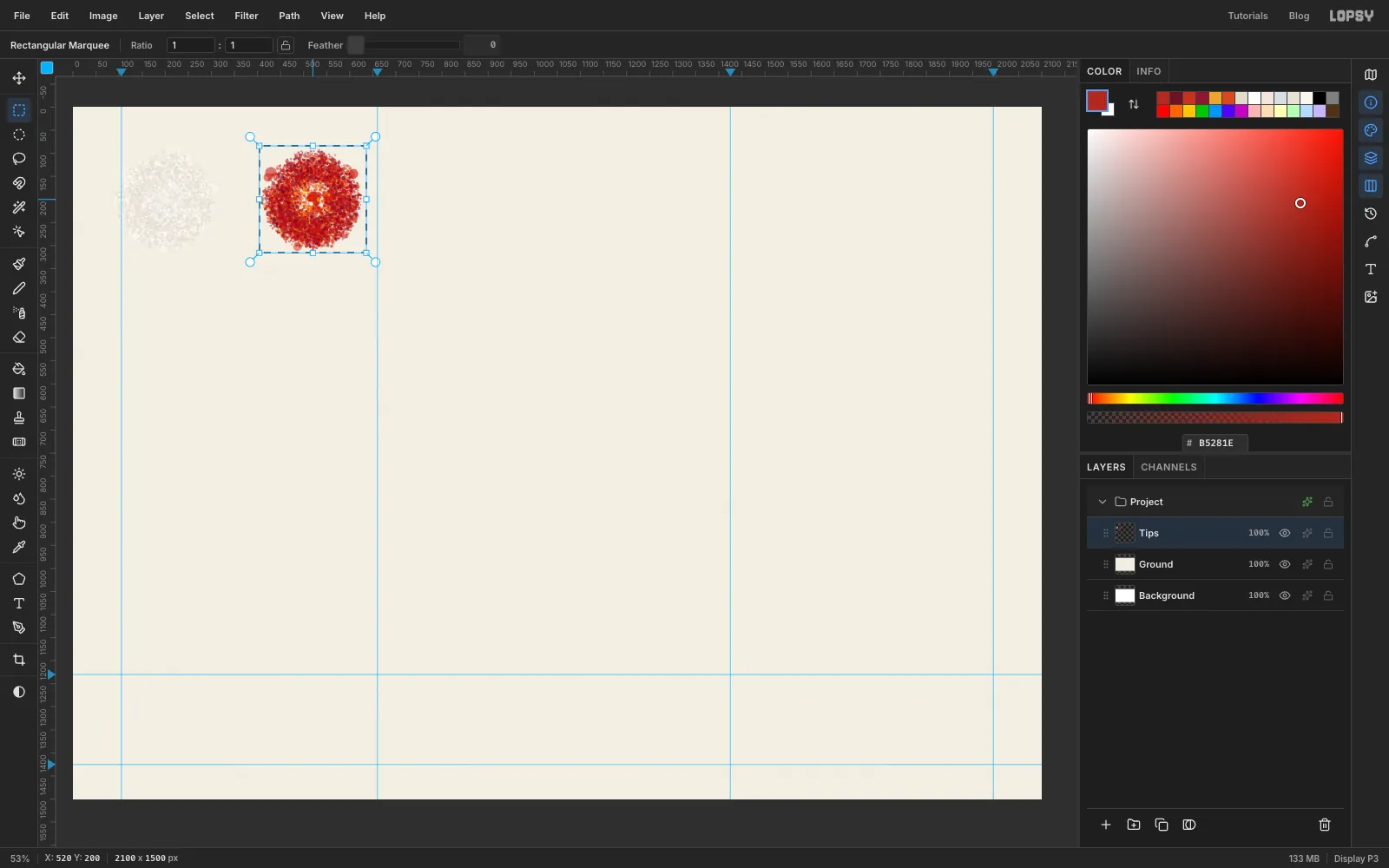
- Click Add Layer and name the layer
-
Make the rest of the tips
Make four more colour tips the same way. Reset to Hard Round before each one, spray the two big colours once each at Size
220and Density40, spiral the rest at Size66and Density30, then marquee the disc and use Define Color Brush…:Bloom: big , . Spirals , , , , , .Gold: big , . Spirals , , , , , .Cool: big , . Spirals , , , , , .Mud: big , . Spirals , , , , , .
Start a second row for the next one.
Inkis the black for the numerals. Spray twice at Size220, then spiral , , , , and , and define it as a colour tip too.The last two tips use Edit → Define Brush… instead. A plain Define Brush keeps only the shape, so these two paint in whatever foreground colour you choose. Reset to Hard Round before each, and keep the foreground at .
Dragis a dry brush. Set Spray Size66and Density14, and spiral twice over an empty patch, about as wide as the other discs. Marquee it and choose Define Brush….Tearis a nearly empty brush. Set Spray Size80and Density14. Click seven times in a ring and once in the middle, so you get a thin scatter about as wide as the others. Marquee it and define it the same way. Gaps here are the point: they'll let the canvas show through.
Click the
Tipslayer and click Delete Layer. The brushes stay, but only until you reload the page, so paint the rest of the card in one sitting. The Brushes modal's Export button will save them to a file if you need a break.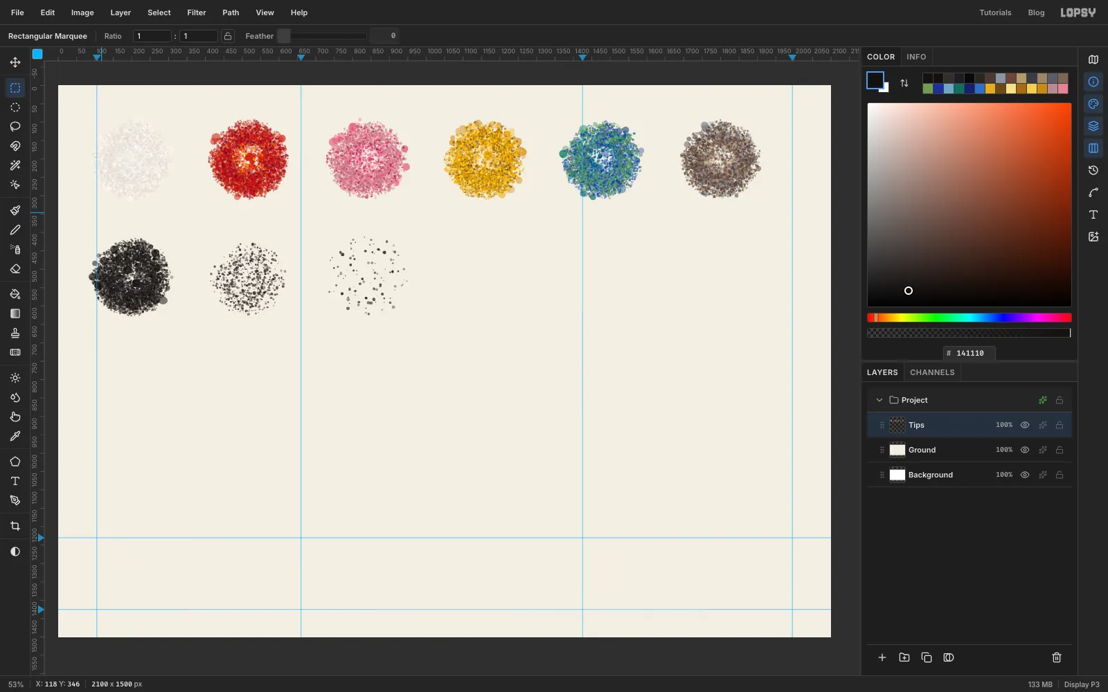
-
Scrub in the white ground
Mitchell's white is never flat, because she painted it as hard as the colours.
From here on, pick a tip means this: press B, open the Brushes modal, go to the Presets tab and click the tip. That resets Size, Opacity, Taper, Fade, Angle and Texture, so set those after you pick. The Shape tab shows the same grid, but clicking there only swaps the tip and keeps everything else, so don't pick from it.
- Click the
Groundrow and click New Group. Name the groupUnderpainting. - With the group selected, click Add Layer and name the layer
Whites. - Pick
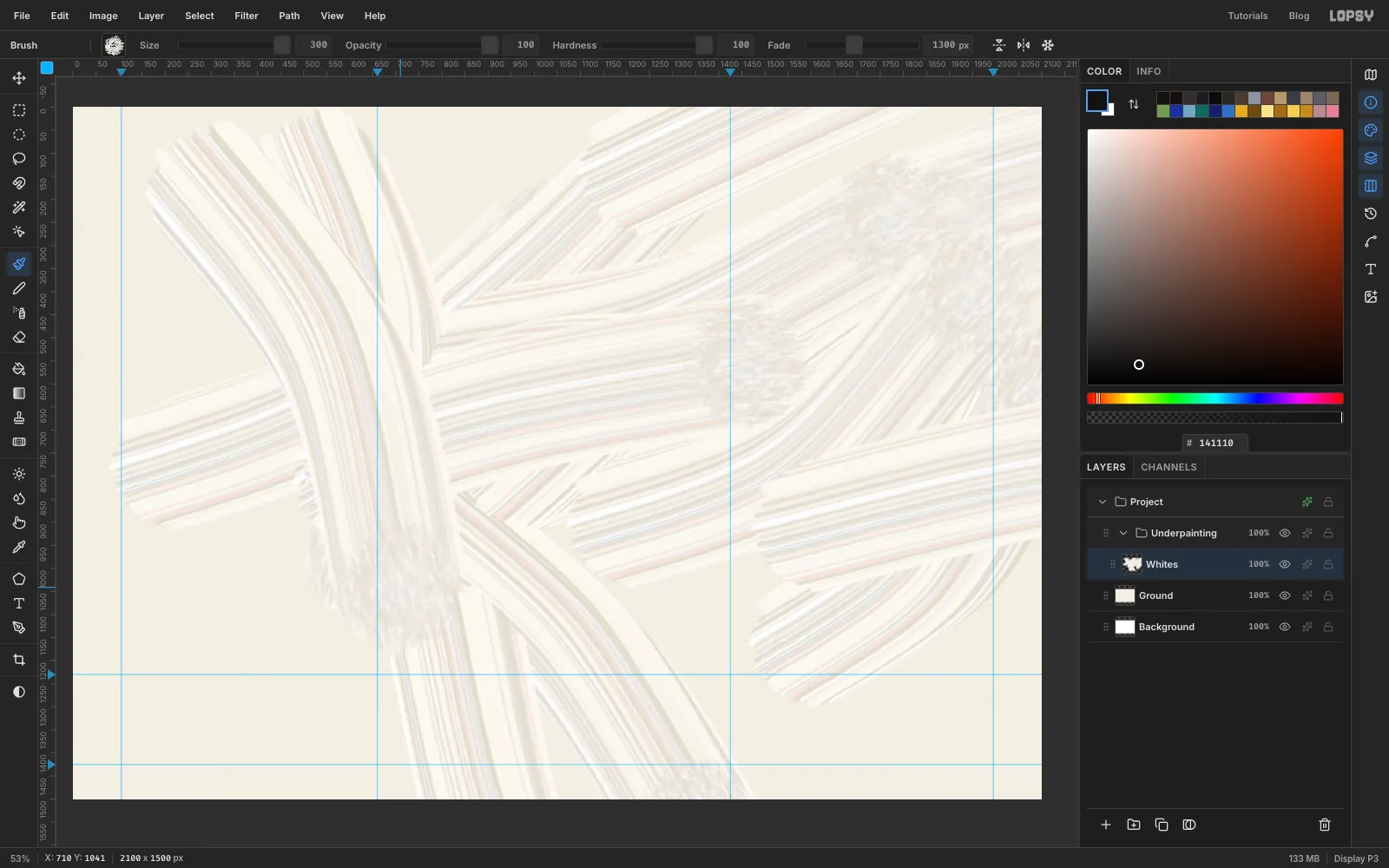
Whites. On the Shape tab set Size to300. Close the modal and set Fade in the options bar to1300. - Paint about 16 long strokes all over the canvas, including the bottom band, each roughly half the card's width. Most should rise to the right, and the rest should fall steeply. Bow them a little, from the shoulder.
Fade fades a stroke out over that many pixels, then paints nothing more until you let go. A loaded colour tip stays opaque until almost the end, so the paint seems to run out instead of stopping dead. If a stroke dies before you've finished, raise Fade.
Keep moving while you paint. If you stop for a second and a half, the brush smooths the stroke and drops its taper and fade.
- Click the
-
Warm up the middle
The painting will lean to the right, so the warmth should too.
- Click Add Layer and name it
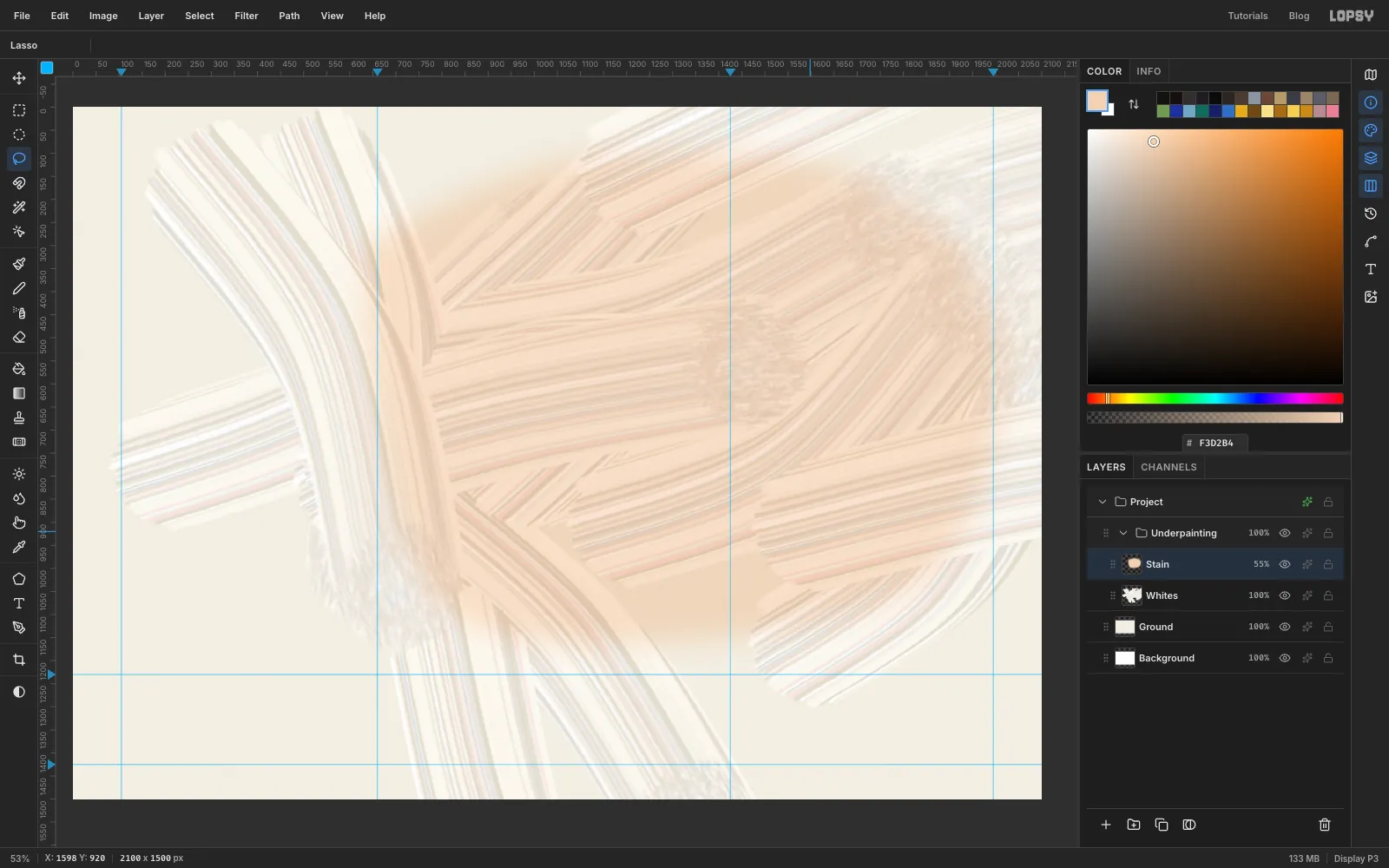
Stain. Set the foreground to . - Press L and lasso a big lopsided blob. Start left of centre, go over the top and out to the right edge, and come back along the top of the bottom band.
- Choose Select → Feather… with
90, then Edit → Fill. Press Cmd+D. - Click the ✦ button on the layer's row and set the blend mode to Multiply. Close the drawer.
- Choose Filter → Add Noise… with Amount
8and Mono. - Click the opacity figure on the row and drag the slider that appears to about
55%.
- Click Add Layer and name it
-
Paint one huge gesture
Every painting like this needs one mark far bigger than the others. Paint it on its own layer, well inside the canvas, so you can copy it whole.
- Click the
Underpaintingrow and click the arrow beside it to collapse the group. With the group's row still selected, click New Group and name itRiot. A new layer or group goes inside an open group but beside a collapsed one, which is why you collapse first. You'll do this again later. - Click Add Layer and name it
Red Sweep. - Pick
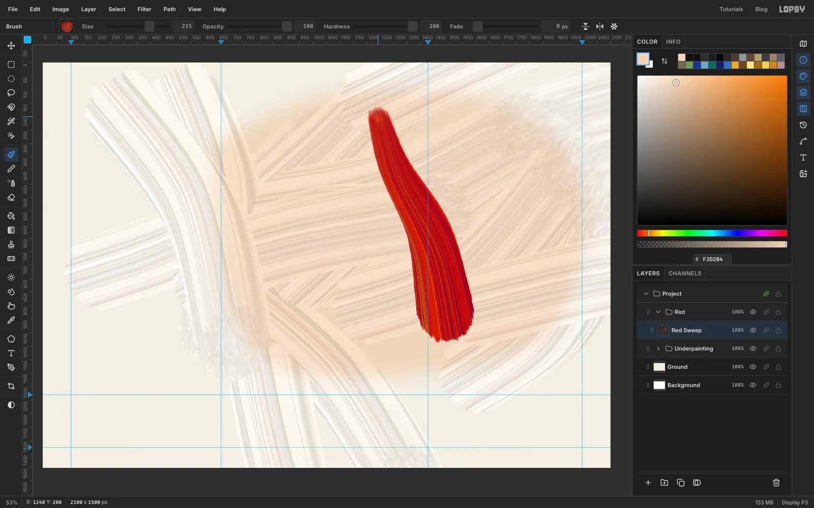
Hot. On the Shape tab set Size215and Taper1150, then set Fade to about800. Taper's slider stops at 1000, so type bigger values into its number box. - Start a little right of the
1425guide, about two-thirds of the way down the canvas, and sweep up and to the left in one S-curve until you're close to the top. It should be nearly 800 px long.
Taper narrows the stroke as it travels, like a brush lifting off the canvas.
- Click the
-
Copy the gesture and shrink it
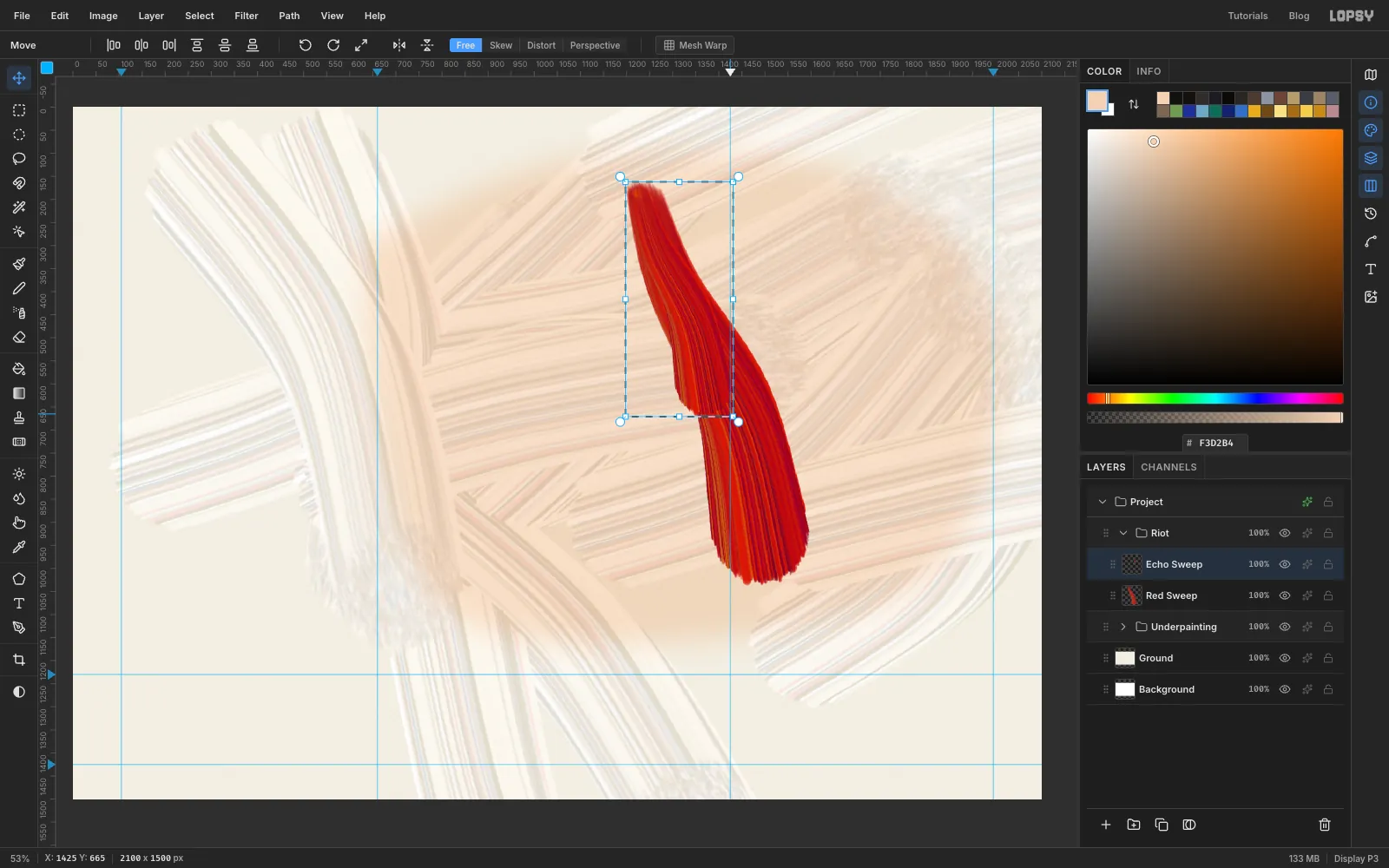
- Press M and drag a marquee around the whole sweep, with a margin on every side.
- Press Cmd+C and then Cmd+V. Rename the new layer
Echo Sweepand press Cmd+D. - Press M again, drag a fresh marquee closely around the copy, and press V for the Move tool.
- Hold Cmd and drag the bottom-right corner handle inward until the copy is a bit over half its size. Cmd keeps the proportions.
- Press Cmd+D to commit.
-
Turn the copy on its side
Press M and drag another marquee around the small copy. Press V, then drag the round rotate handle just outside the top-right corner clockwise by a little more than a quarter turn, about
105°. Press Cmd+D.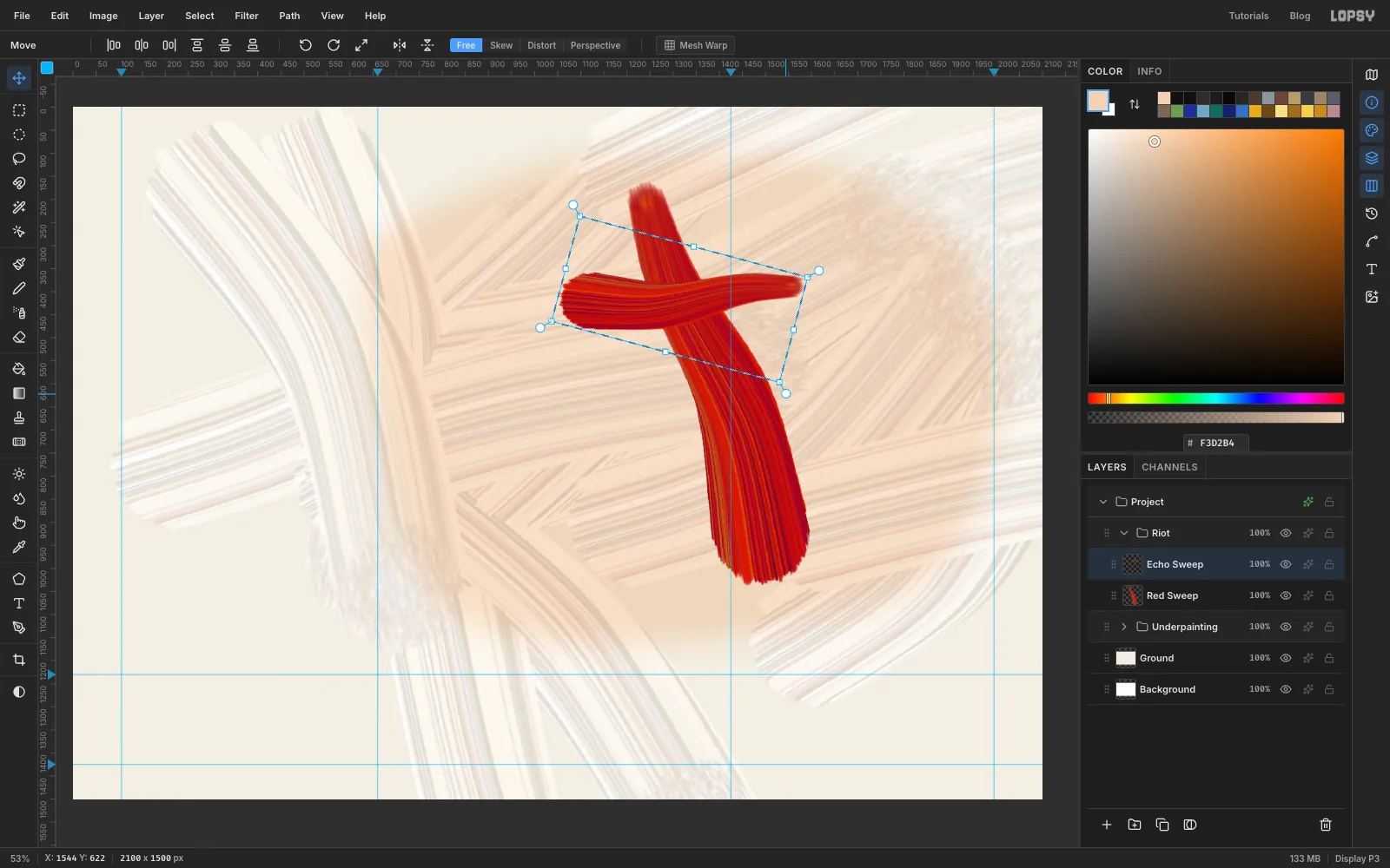
-
Place both sweeps
- Choose Filter → Hue/Saturation… with Hue
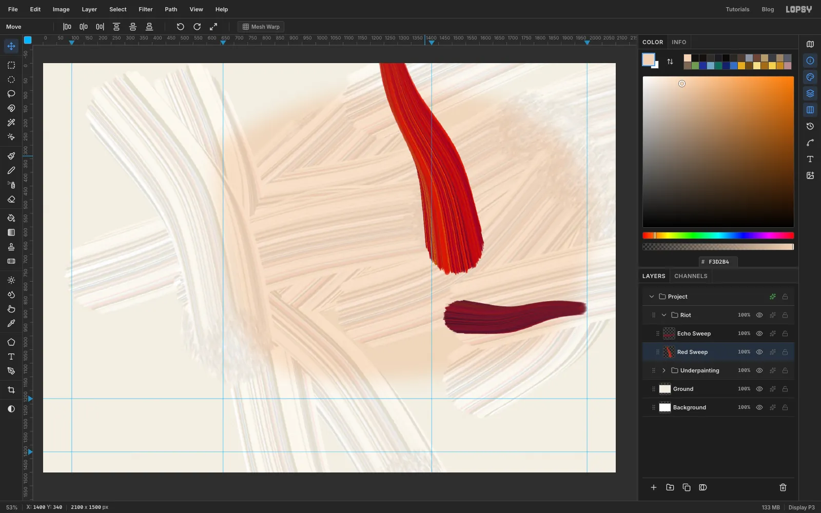
-14, Saturation-18and Lightness-14, so the copy turns a darker crimson. - Drag the copy with the Move tool to the lower right, so its centre sits at about
1730, 930. - Click the
Red Sweeprow and drag that stroke straight up by about 260 px, so its thin end runs off the top of the canvas. Lopsy keeps pixels that hang past the edge. A stroke leaving the canvas tells the eye the painting is bigger than the card.
- Choose Filter → Hue/Saturation… with Hue
-
Throw in the gold
The danger from here on is that every stroke ends up the same size. Change the width on nearly every stroke, and keep the marks to the middle and right.
- With
Red Sweepstill selected, click Add Layer and name itBack Strokes. It sits aboveRed Sweepand belowEcho Sweep. - Pick
Goldand drag the Brushes modal over the right-hand panels. It has no backdrop, so you can leave it open and keep painting. - Paint 7 strokes, each about a quarter of the card's width, with sizes jumping around:
16,34,70,120. Start them near the middle and flick outward, with a few straight up or down.
Before each stroke, set Taper a bit longer than the stroke you're about to paint, and Fade about equal to it. Thin strokes can take more Taper. A stroke that lifts and fades doesn't end in a round stamp of dots, which is the giveaway of a tip like this.
Now pick
Tear, set the foreground to , and drag two wide dry passes at Size150and190, with Fade about their length. This is what a brush looks like when it's nearly out of paint.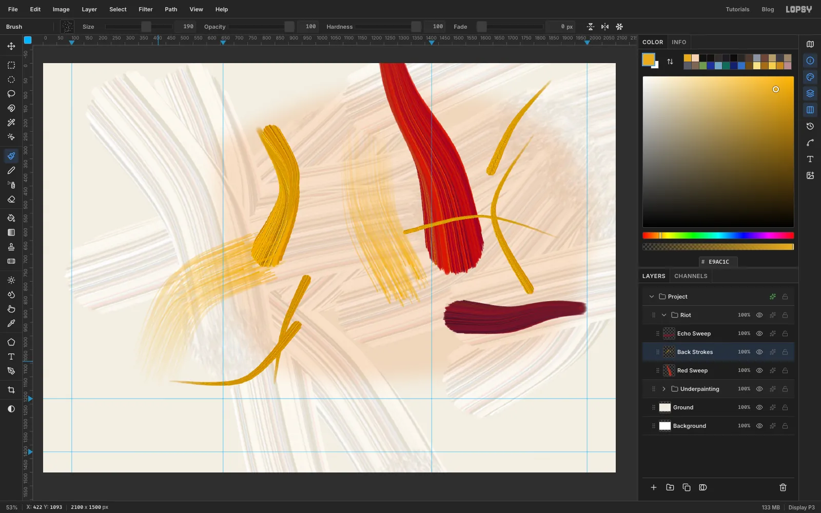
- With
-
Add pink and blue-green
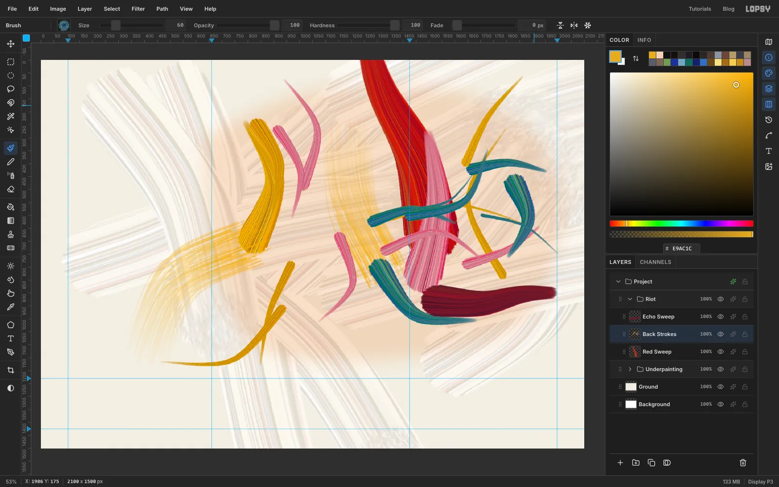
Keep going on the same layer, with the same habits. Pick
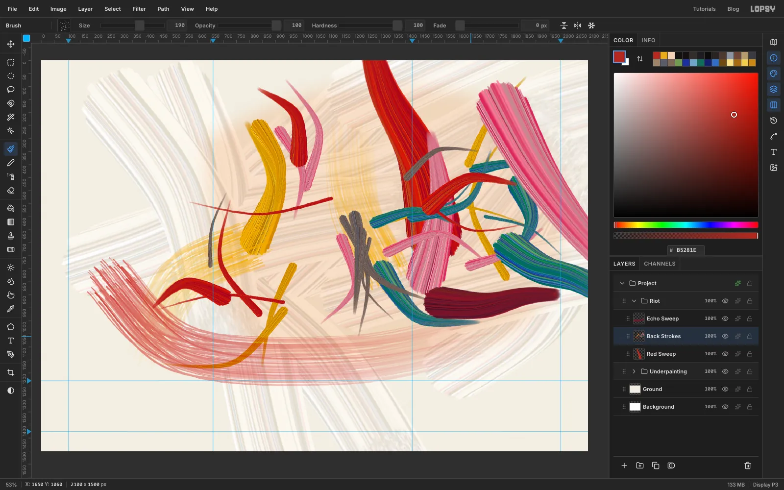
Bloomand paint 6 strokes at sizes from18up to150. Then pickCooland paint 7 shorter ones, from a hairline14up to84.Let them cross each other. Each new stroke covers what's beneath it, so a thin blue across a fat pink reads as depth.
-
Add mud, red and the big slabs
Clean colours alone look like a party flag, so dirty them.
- Pick
Mudand paint 6 strokes at sizes16to70. Keep them left of the crowded right edge. - Pick
Hotand paint 7 more, at sizes14to120. - Pick
Bloom, set Size200, Taper1400and Fade about750, and drag one slab from the top right, down and out past the right edge of the canvas. - Pick
Cool, set Size130, Taper1200and Fade about430, and drag another from the middle of the right side out past the same edge. Running these off the canvas means you never see their ends. - Pick
Tear, set the foreground to , Size190and Fade about1500. Drag one long drained stroke from the left side, curving down and right under where the numerals will go, and finish about three-quarters of the way across. Stay above the1230guide the whole way.
- Pick
-
Cut back in with white
Mitchell cut into her colour with white, and that's where the air comes from. Pick
Whitesand paint 5 strokes at sizes40,90and150, right through the busiest parts. Use the same Taper and Fade habit as before. Don't be polite about it.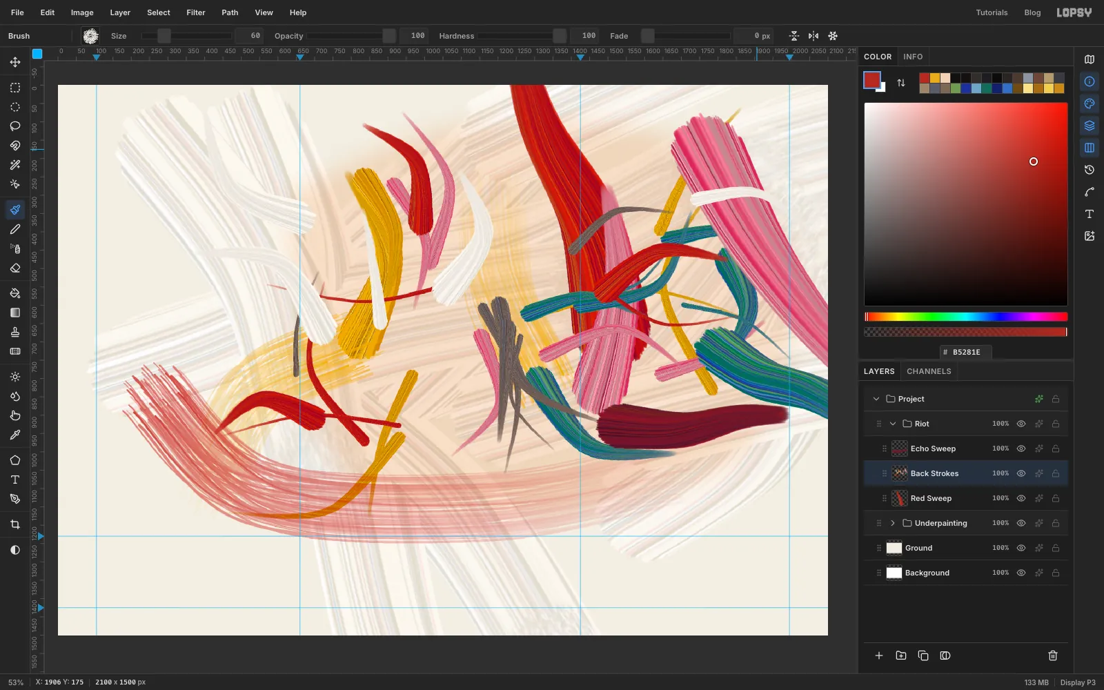
-
Dirty it up
- Pick
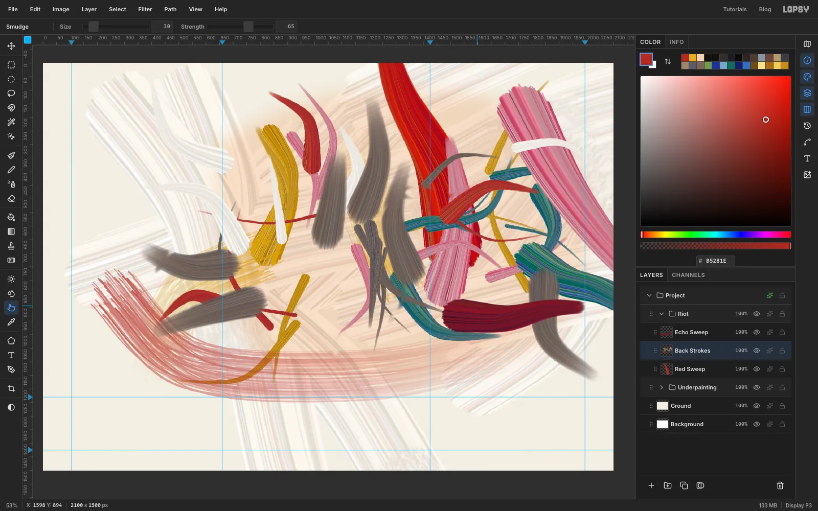
Mud. On the Shape tab set Opacity to15, Size120and Taper700. Drag about 6 short strokes where colours cross, with Fade about each stroke's length. A colour tip builds up within a stroke, so these come out as soft grey-brown drags, much stronger than 15% suggests. - Press R for the Smudge tool. Set Size
30and Strength65, and make about 8 short drags across places where two colours meet, so one pulls into the other. - With
Back Strokesselected, choose Filter → Hue/Saturation… and set Saturation to-22. Everything calms down a little, and it reads less like candy.
- Pick
-
Fill the counters
The holes in the numerals are the brightest places on the card, because the black will frame them. You're painting them before the numerals exist, so here's where they'll be. The 0 will be about 620 px wide and 900 tall, centred on the right guide, with its hole around
1425, 650. The 8 will sit on the left guide, with its top hole near670, 380and its bottom hole near660, 880. Check against the picture.Click Add Layer and name it
Counters. Press B and use these marks. Where a Taper is given, set Fade to about the stroke's length too.Inside the 0:
- Pick
Gold, Size250, Taper1180: one slab from the lower left of the hole to the upper right, about 740 px long. - Pick
Whites, Size140, Taper800: scrub back down across the gold, from lower right to upper left. - Pick
Tear, Size46, foreground : a dry slash across the middle, from upper right to lower left. Leave Fade at0. - Keep
Tear, Size30, foreground : a thin dark slash down from the top of the hole.
Inside the 8:
- Pick
Bloom, Size170, Taper800: a slab across the top hole, going down to the right. - Pick
Mud, Size30, Taper320: a thin slash across the pink the other way. - Pick
Hot, Size215, Taper1200: a slab across the bottom hole, going down to the right. - Pick
Whites, Size90, Taper460: a scrub up across the red.
Then choose Filter → Hue/Saturation… with Saturation
-10.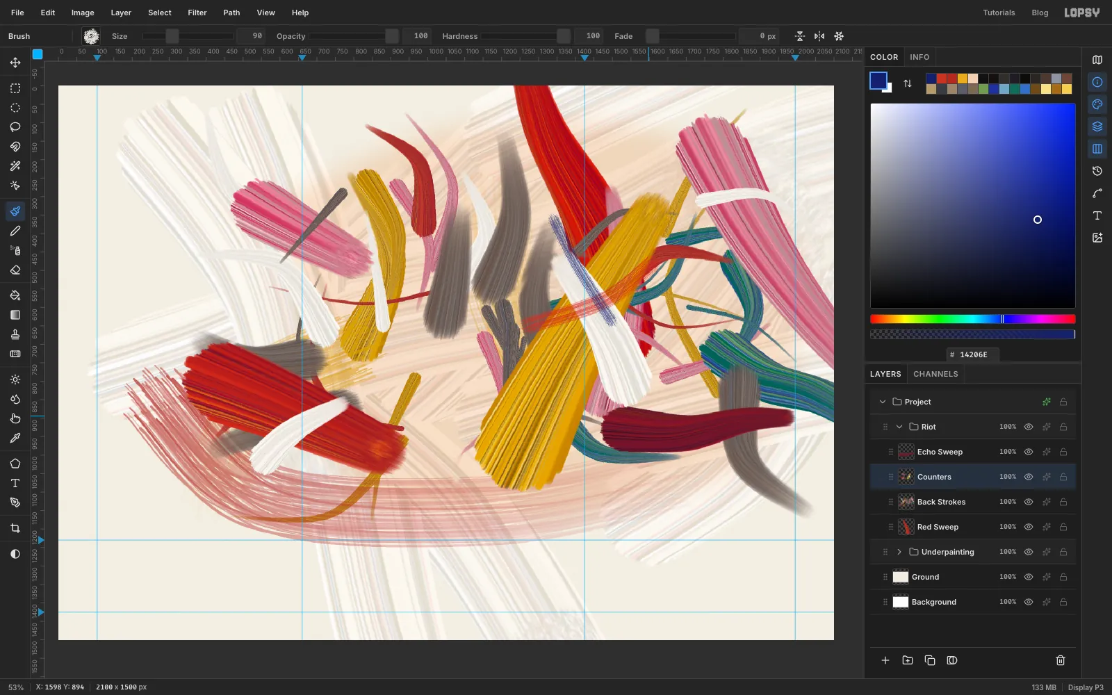
- Pick
-
Paint the first slash of the 8
Don't draw an outline. A big 8 is two or three hits with a loaded brush, and the width should change as you go.
- Click the
Riotrow, collapse the group, keep its row selected, and click New Group. Name itEighty. - Click Add Layer and name it
Eight. - Pick
Ink. Set Size165, Taper2900and Fade about1640. - Start past where the top of the 8 will be, at the upper right, near
930, 190. Sweep left over the top, down the left of the top bowl, diagonally through the waist to the lower right, around the outside of the bottom, and stop at the bottom middle. It's one long S.
If it comes out stiff, undo it and go again, faster. The stroke should thin noticeably by the time it reaches the bottom. The screenshots show Fade back at
0because I reset it after each stroke.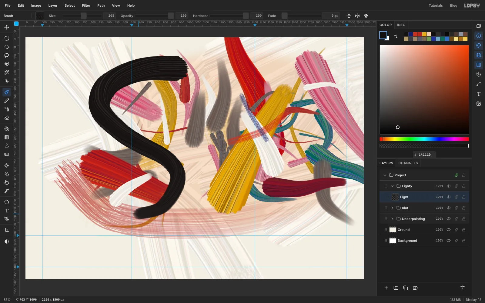
- Click the
-
Finish the 8 with an empty brush
- Pick
Inkagain, with Size130, Taper1450and Fade about875. Start at the bottom middle, overlapping the end of your first stroke. Sweep left around the bottom, up the lower left, and stop in the waist. - Pick
Inkonce more, with Size56, Taper900and Fade about500. Start at the waist and go up around the right of the top bowl to the top. This thin line makes sure the 8 still reads as an 8. - Pick
Tearand set the foreground to . At Size150and Fade about400, drag from the waist up to the right, past the 8 and into the space between the numerals. That's the overshoot. - At Size
140and Fade about400, drag up the right side of the top bowl and over to the top, right on top of the thin line from step 2.
The torn black over that thin line is the part that looks most like paint running out.
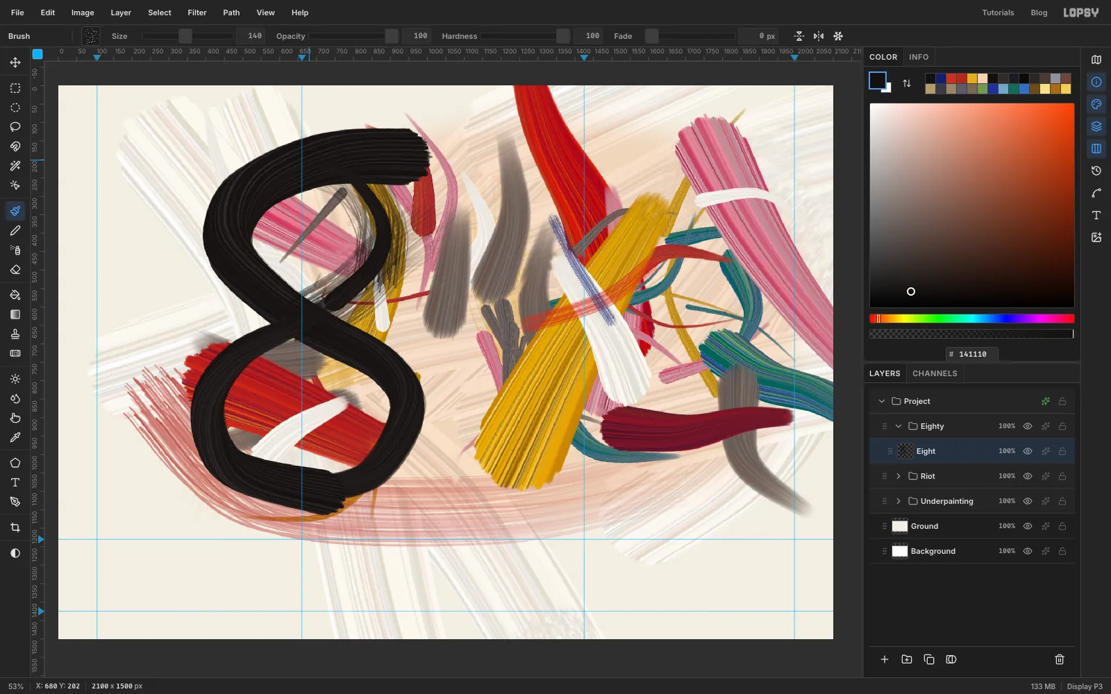
- Pick
-
Paint the 0
The 0 has a much bigger width change than the 8. The left side is huge and the top is about a quarter of that.
- Click Add Layer and name it
Zero. - Pick
Ink, Size215, Taper1640, Fade about1250. Start at the bottom, left of centre on the 0's guide. Go up the left side, around the top, and stop at the upper right. The stroke should be over 200 px wide at the start and about 50 at the end. - Pick
Ink, Size135, Taper2000, Fade about750. Start inside the fat lower left of the first stroke, so the join is hidden. Go along the bottom and up to the lower part of the right side. - Pick
Tearwith the foreground still , Size120, Fade about190, and drag up the right side for about 200 px. This is a short dry break. - Pick
Ink, Size104, Taper1250, Fade about585. Start at the top of the dry break and go up the right side and over to the top, joining the first stroke.
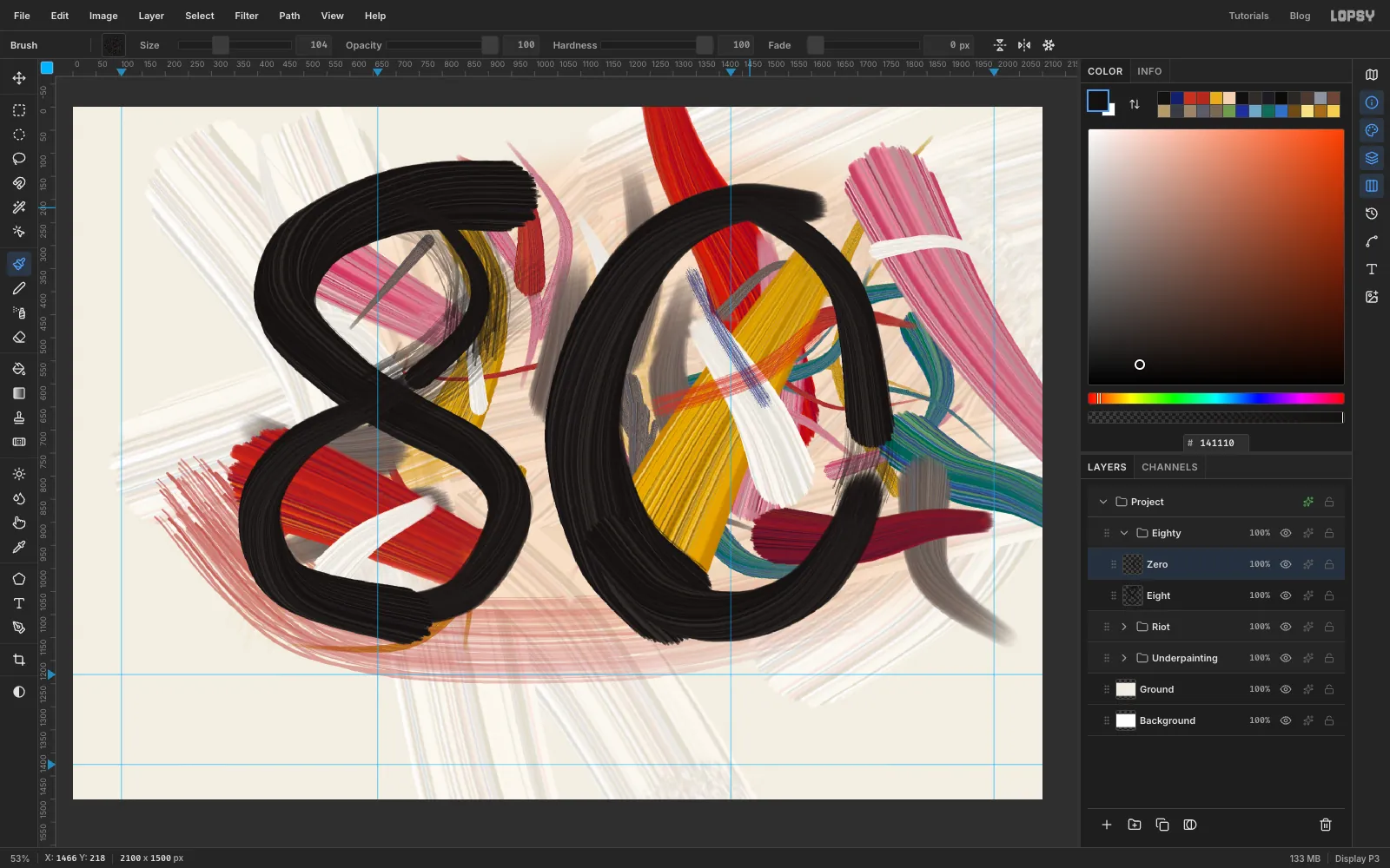
- Click Add Layer and name it
-
Lean the numbers
Upright numerals look typeset, so give them a tilt.
- Click the
Eightrow, press M and drag a marquee around the whole 8. - Press V and drag the rotate handle about
3.5°anticlockwise. Press Cmd+D. - Click the
Zerorow and do the same, with M then V, turning it about3°clockwise. Press Cmd+D. - Click the
Eightygroup's row. With the Move tool active, press Shift+Up once to lift both numbers 10 px together.
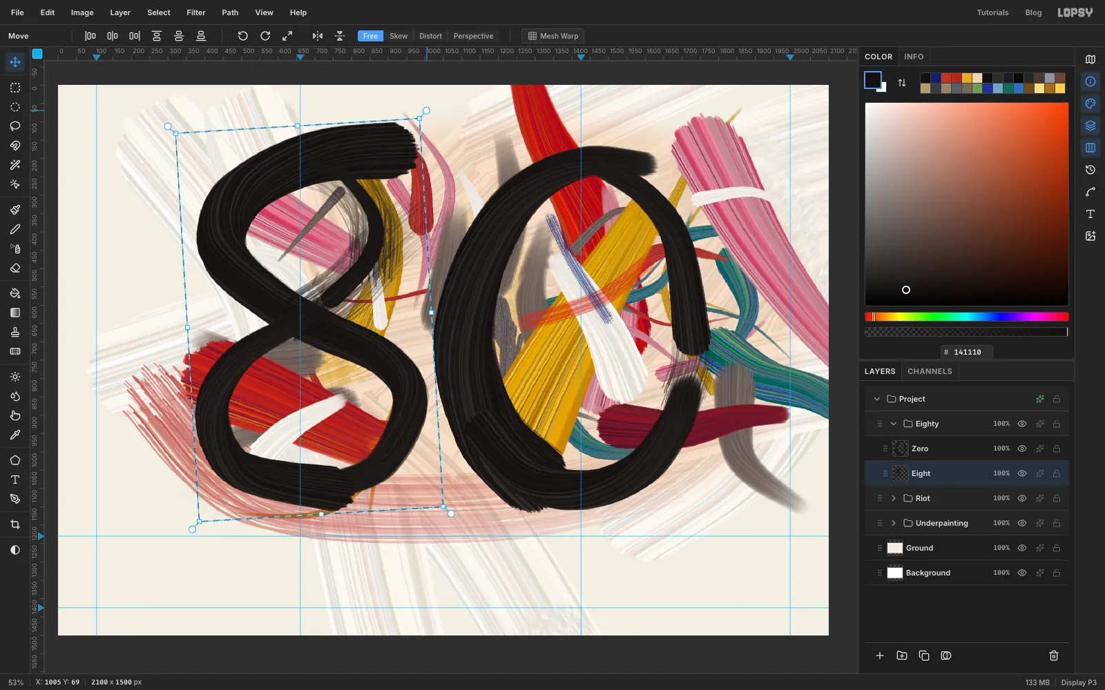
- Click the
-
Tie the numbers into the paint
The numerals are sitting on top of the painting like a sticker. A few strokes over the black fix that.
- Click the
Eightyrow, collapse it, keep its row selected and click New Group. Name itOver. - Click Add Layer and name it
Over Strokes. - Pick
Whites, Size80, Taper340, Fade about280. Paint three short strokes that bite into the black edge: one above the gap between the numerals, one low in that gap, and one at the lower left of the 8. - Pick
Tear, set the foreground to and Size to44. With Fade at0, drag one dry blue slash across the waist of the 8.
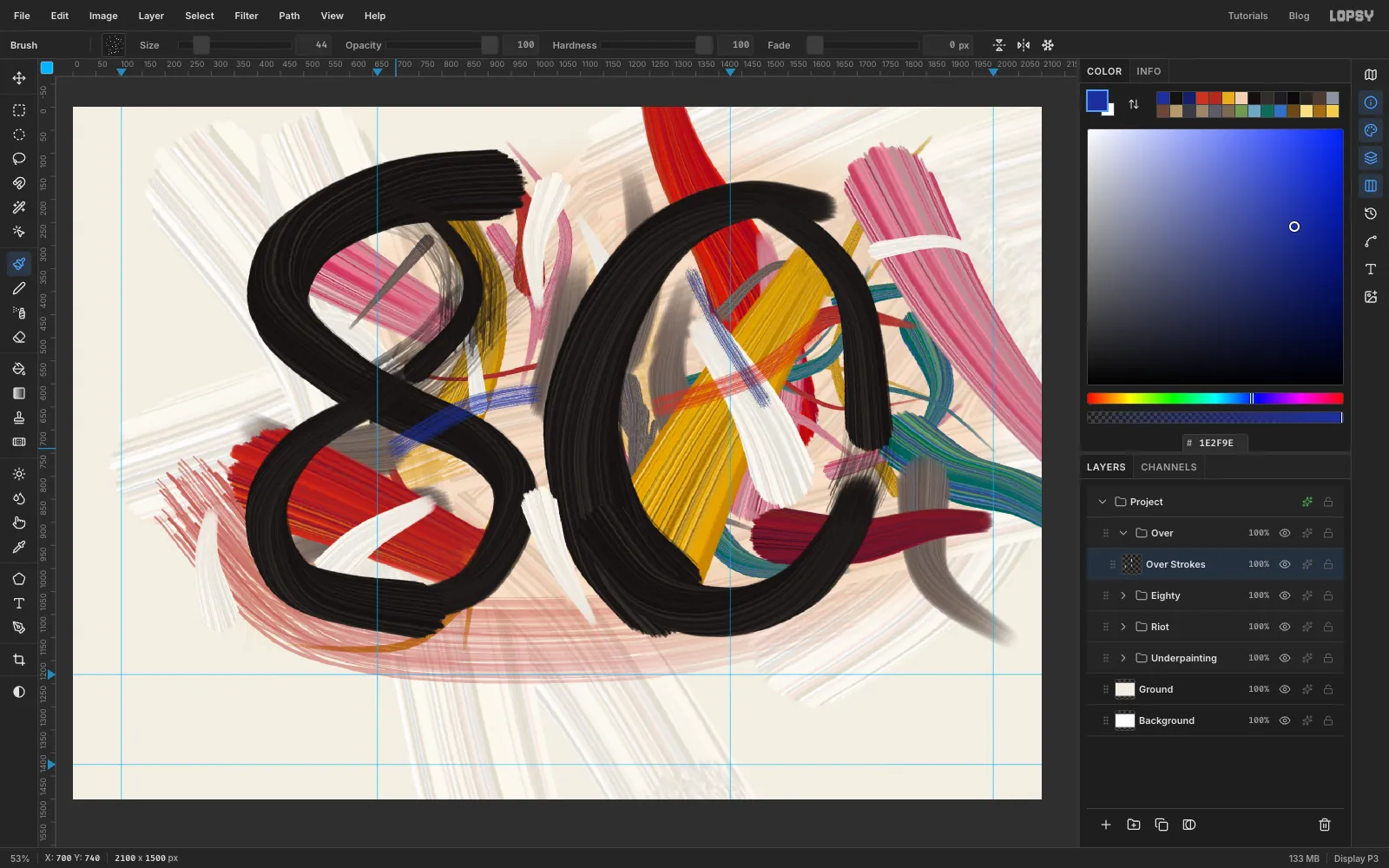
- Click the
-
Give the paint some thickness
This step adds a slight relief to the streaks. Stay subtle: too much and every stroke looks like a die-cut sticker.
- Click the
Overrow and collapse it. - Press Cmd+Shift+C (Edit → Copy Merged), then Cmd+V. Press Cmd+D and rename the layer
Impasto. - Choose Filter → Emboss… with Strength
16and Angle315. - Set the layer's opacity to about
60%.
From here on, everything goes above
Impasto, so these last marks stay flat and sharp, the way a crayon line would.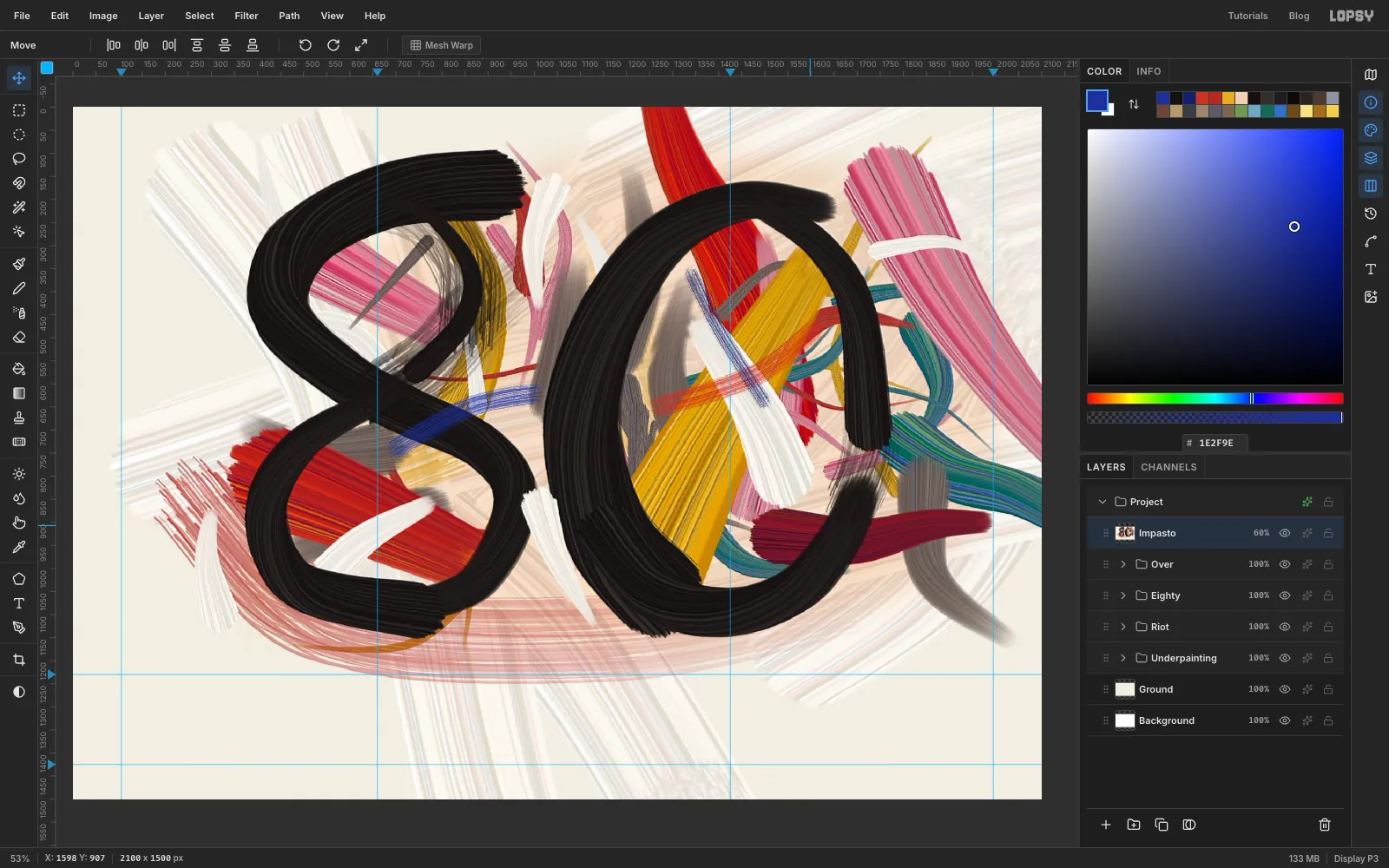
- Click the
-
Scratch in the oil stick
- With
Impastoselected, click New Group and name itThrown. Click Add Layer and name itOil Stick. - Pick
Tearand set the foreground to . Starting left of the 8, scribble a jagged line to the right across the waist in short bursts. Lift every 50 to 120 px, leave a small gap, and change Size each time, between24and44. Keep the zigzags irregular, because a regular rhythm reads as a machine. - Set the foreground to and do a smaller scrawl at the lower right at sizes
20to32.
At these sizes
Tearleaves a grainy line that skips, a lot like wax on canvas.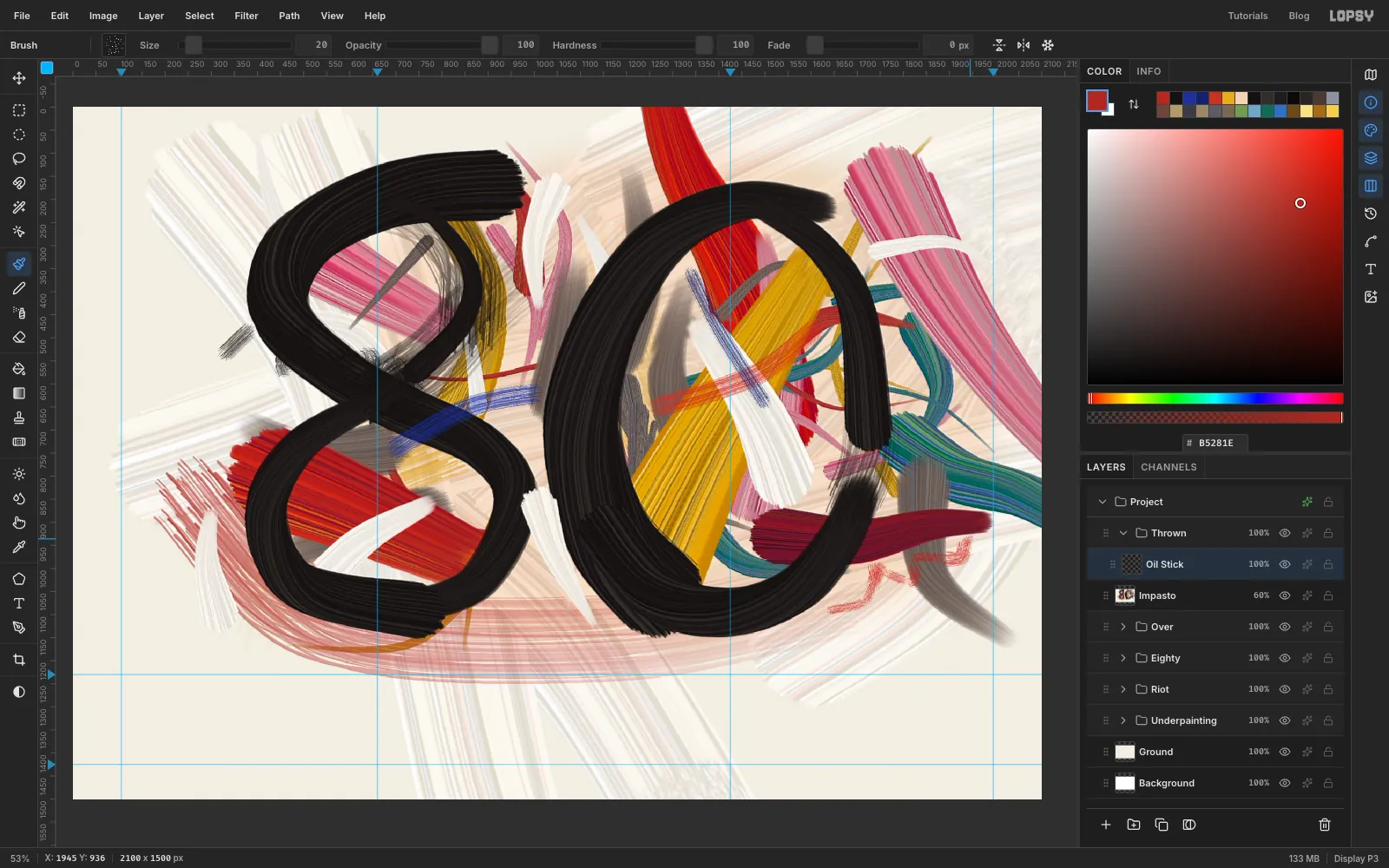
- With
-
Let a few drips run
Click Add Layer and name it
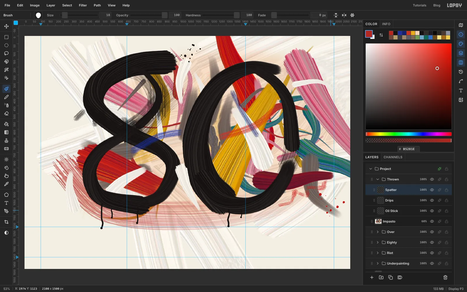
Drips. Pick Hard Round and set the foreground to .Paint each drip downward from inside the black edge, letting it wander a little from side to side. Then raise Size by half and click once at the bottom to make the bead. Three drips hang from the 8 and two from the 0, and each one stops at a different height. Stop them all above the
1230guide, except the longest, which can end just past it.Good sizes are
7to10. Don't reach for Taper here: a drip stays about the same width as it runs, and a tapered one looks like a pin.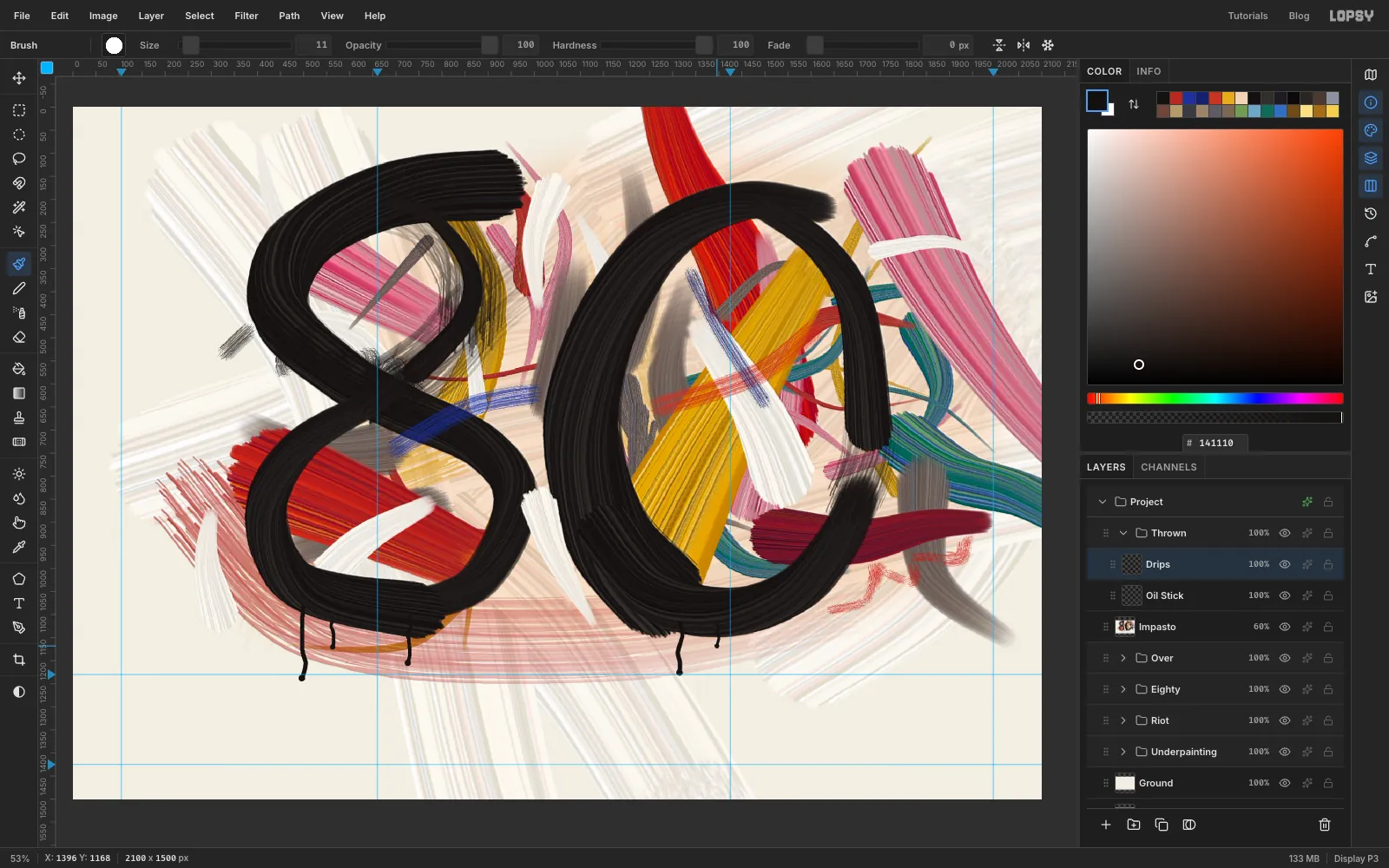
-
Flick some spatter
- Click Add Layer and name it
Spatter. - Pick the Oblong preset. On the Shape tab, click the angle dial so the oval points in the direction your paint is flying.
- With the foreground still , click about 16 times in a loose cluster off the tip of the 8's first stroke, up and to the right, changing Size between
4and30. Use lots of tiny specks and only a couple of big ones, and let them spread out as they travel. - Point the dial down and to the right, set the foreground to , and do the same off the crimson stroke at the lower right.
If you can see a line of dots, it's too neat. Undo a few and scatter them more.
- Click Add Layer and name it
-
Count to eighty
- Click the
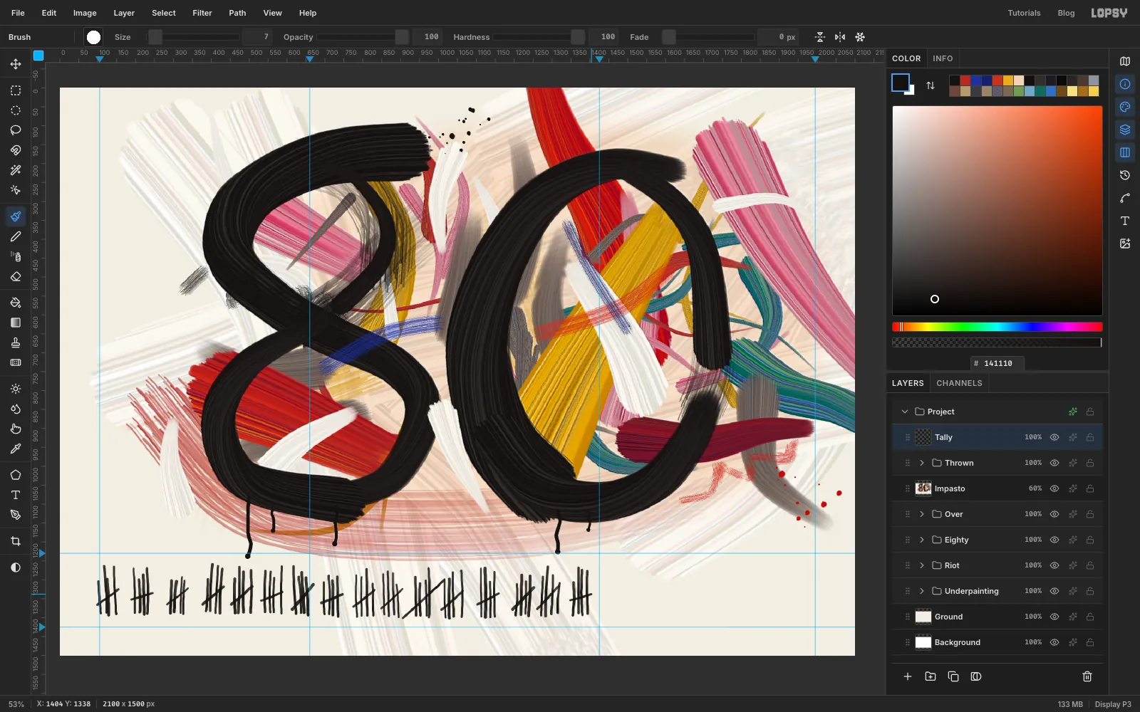
Thrownrow and collapse it. Click Add Layer and name itTally. - Pick Hard Round, Size
8. On the Texture tab choose Grain with blend mode Multiply and Scale60. Set the foreground back to . - Close the modal and zoom in if you want to. Starting at the left margin guide, draw four quick downward strokes about 12 px apart, ending about 30 px above the lower guide. Make some shorter and some taller, and let them lean. Slash across them from lower left to upper right. That's five years.
- Do it fifteen more times, spacing the bundles 65 to 95 px apart. Press
[and]now and then to change the size between6and9.
Yes, that's eighty strokes, and it takes about four minutes. Don't copy and paste: the unevenness is what makes it look like someone counted. If one slash goes wild and hits the next bundle, keep it.
- Click the
-
Add the words
The joke wants to be quiet.
- Press T for the Text tool. With
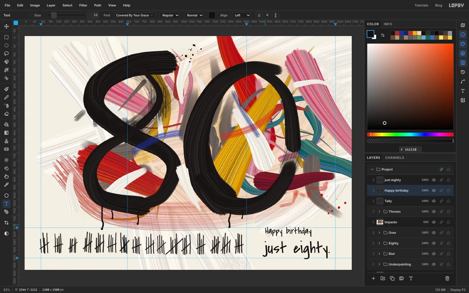
Tallystill selected, set Size104, pick the font Covered By Your Grace and check the foreground is still . - Click in the empty ground at about
1540, 1290, typejust eighty.and press Tab to commit. Its baseline should line up with the feet of the tally marks. Rename the layerjust eighty. - Click the
Tallyrow, so the next change doesn't restyle the text you just made. Set Size to58, click about 80 px above just eighty with the left edges roughly lined up, and typeHappy birthday. Press Tab.
Make the lower line first, because a click just under existing text can land inside its box and edit it.
- Press T for the Text tool. With
-
Run the marker dry
Those letters are too perfect, so repaint them with the dry brush.
- Click the
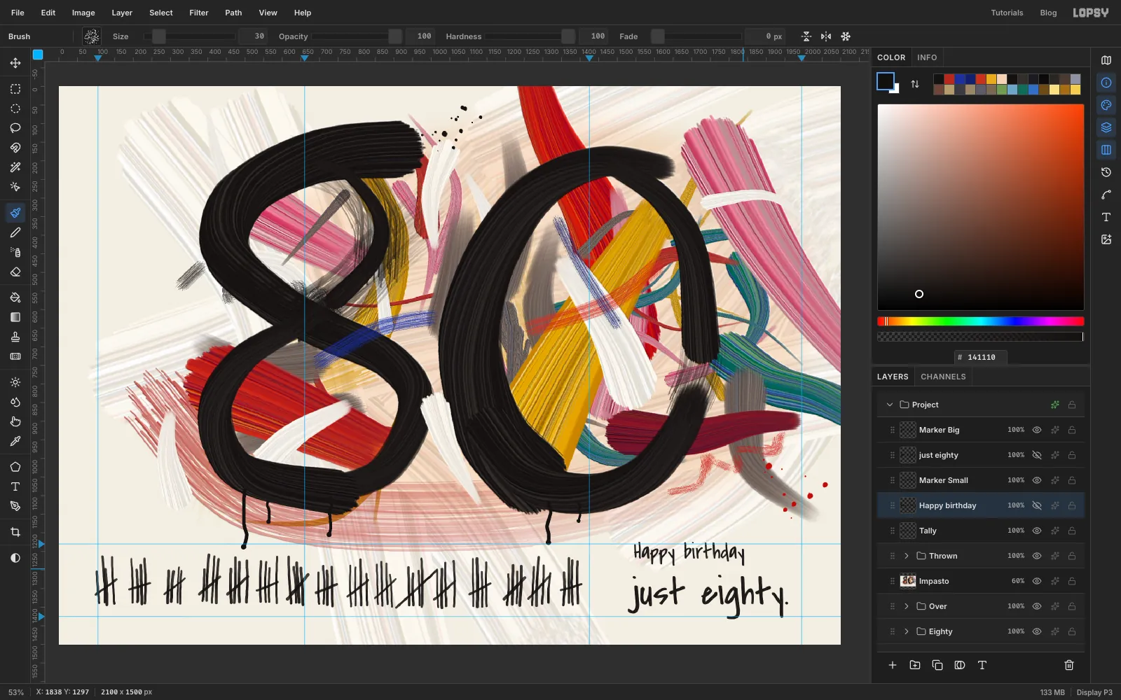
just eightyrow and click Add Layer. Name itMarker Big. - Hold Cmd and click the thumbnail of the
just eightylayer. Its letters are now a selection. Click theMarker Bigrow. - Pick
Drag, Size44, foreground . Pull straight down through the words, moving about 18 px to the right each time, from one end of the line to the other. The streaks now run along the stems, as they would with a marker. - Press Cmd+D. Click the
just eightyrow and click its eye to hide it. - Do the same for
Happy birthday, with a new layerMarker SmallandDragat Size30, moving about 13 px each time.
- Click the
-
Add the canvas weave
- Click the top layer,
Marker Big, click Add Layer and name itCanvas. - Set the foreground to and choose Edit → Fill.
- Choose Filter → Add Noise… with Amount
40and Mono, then Filter → Motion Blur… with Angle0and Distance7. - Choose Filter → Add Noise… with Amount
30and Mono, then Filter → Motion Blur… with Angle90and Distance5. - Click ✦ on the layer's row, set the blend mode to Overlay and close the drawer. Set the opacity to about
40%. - Choose View → Show Guides to hide the guides.
Save it with File → Save Project, and use File → Quick Export PNG for the printer. Print it on heavy cream stock, and write something rude inside.
- Click the top layer,