Design a Vintage Americana Strawberry Festival Flier
Make a letterpress-style Americana flier in Lopsy with a sunburst badge, a halftone strawberry, arched wood type on a path, bunting and real print wear.
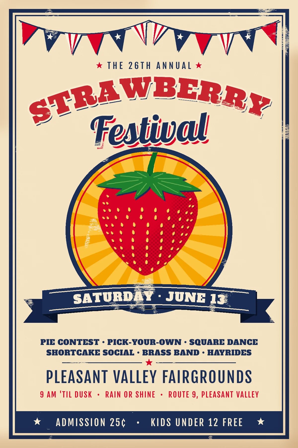
Small-town fair posters were set by hand. The printer used wood type, carved cuts and two or three flat inks, then ran the sheet through a letterpress. That look is worth copying because it comes from limits: flat colour, hard offset shadows, halftone dots for shading, and ink that didn't quite cover.
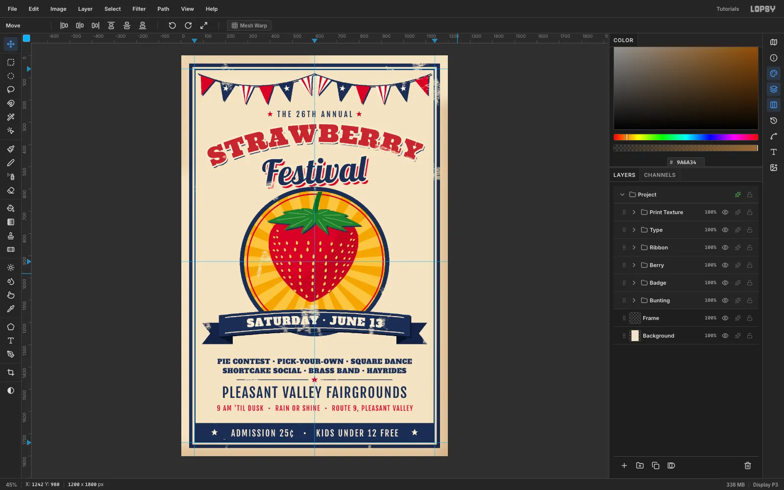
In this tutorial you'll make a 1200 × 1800 px flier for the fictional 26th Annual Strawberry Festival. Everything is drawn in Lopsy with lasso polygons, marquees, filters and type. Nothing is imported.
The palette is four inks on cream paper:
- Paper
#F2E4C6, cream ink#F7ECD3 - Navy
#1F2D52, red#C8272F, shade red#9E1B24 - Mustard
#E9A825and#F3C65A, seed gold#F4D06A, leaf green#3F7F38
Fonts: Ultra (the arched wood type), Lobster (the script), Alfa Slab One and Fjalla One (the details).
-
Set up the paper and guides
Choose File → New, set the unit to Pixels, and create a 1200 × 1800 document with a white background.
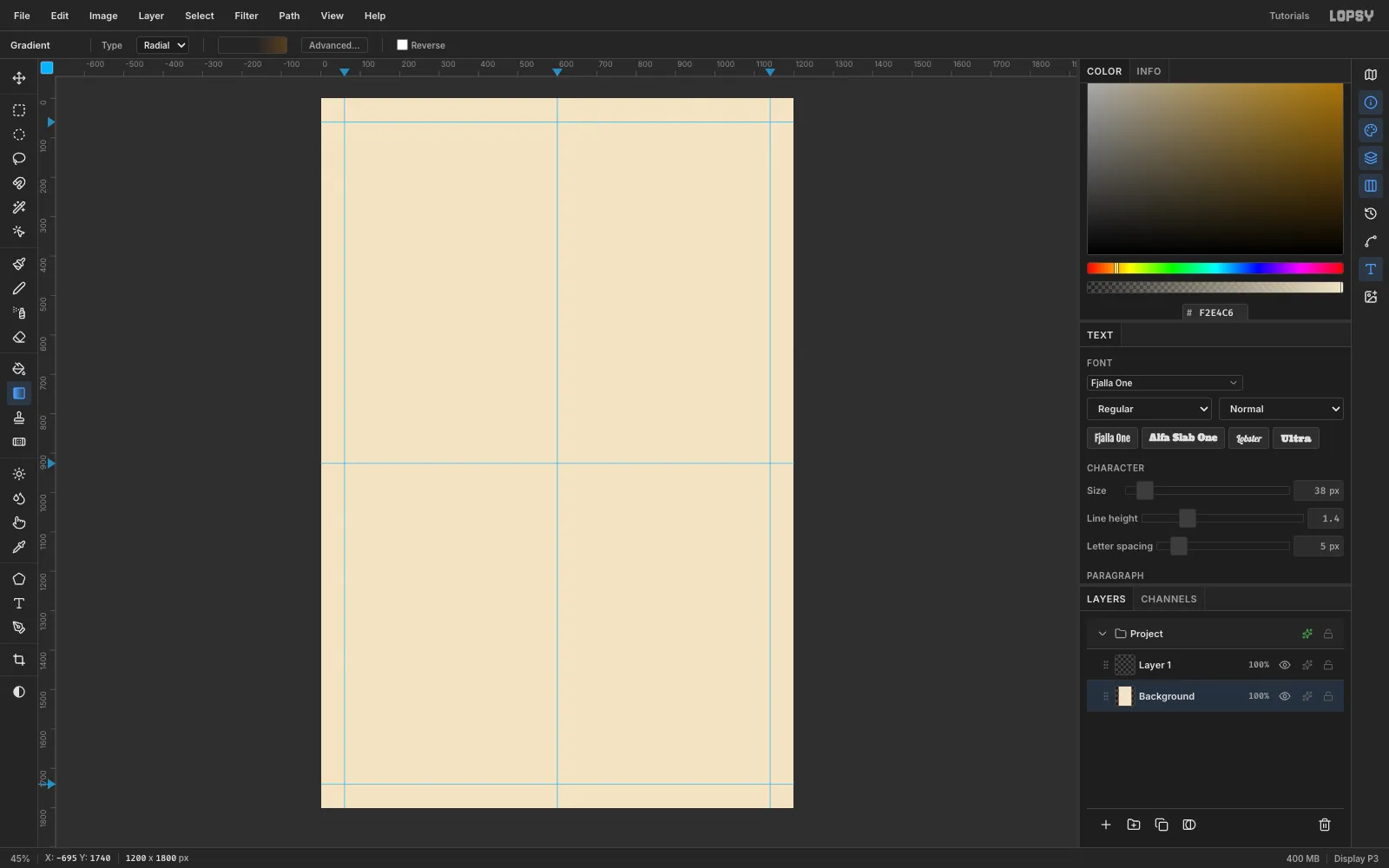
- Select Background, set the foreground to
#F2E4C6, and choose Edit → Fill. - Choose Filter → Add Noise, click Mono and Gaussian, and set Amount 7. This gives the paper a faint tooth.
- Click the top ruler at 60, 600 and 1140. Click the left ruler at 60, 926 and 1740.
The 926 guide marks the centre of the badge you'll build later.
- Select Background, set the foreground to
-
Rule a double frame
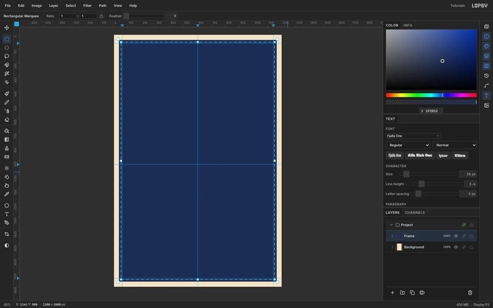
Rename Layer 1 to Frame and set the foreground to navy
#1F2D52.- With the Rectangular Marquee, drag from (36, 36) to (1164, 1764) and choose Edit → Fill.
- Choose Select → Shrink… and enter 14, then press Delete. That leaves a 14 px border.
- Repeat from (60, 60) to (1140, 1740) with a Shrink of 4 for a thin inner rule.
Fill, shrink, then delete is the fastest way to draw any ring or border in Lopsy. You'll use it again for the badge and the ribbon stitching.
-
Draw a sunburst with one lasso
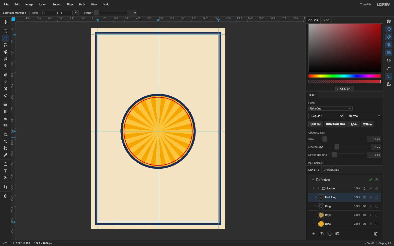
Click New Group and name it Badge. Then add a layer called Disc, make an Elliptical Marquee of radius 330 centred on (600, 926), and fill it with
#E9A825.On a new layer called Rays, draw the sunburst as one Lasso polygon. Alternate between a point near the centre and two points 420 px out, twenty times around. Fill it with the lighter mustard
#F3C65A.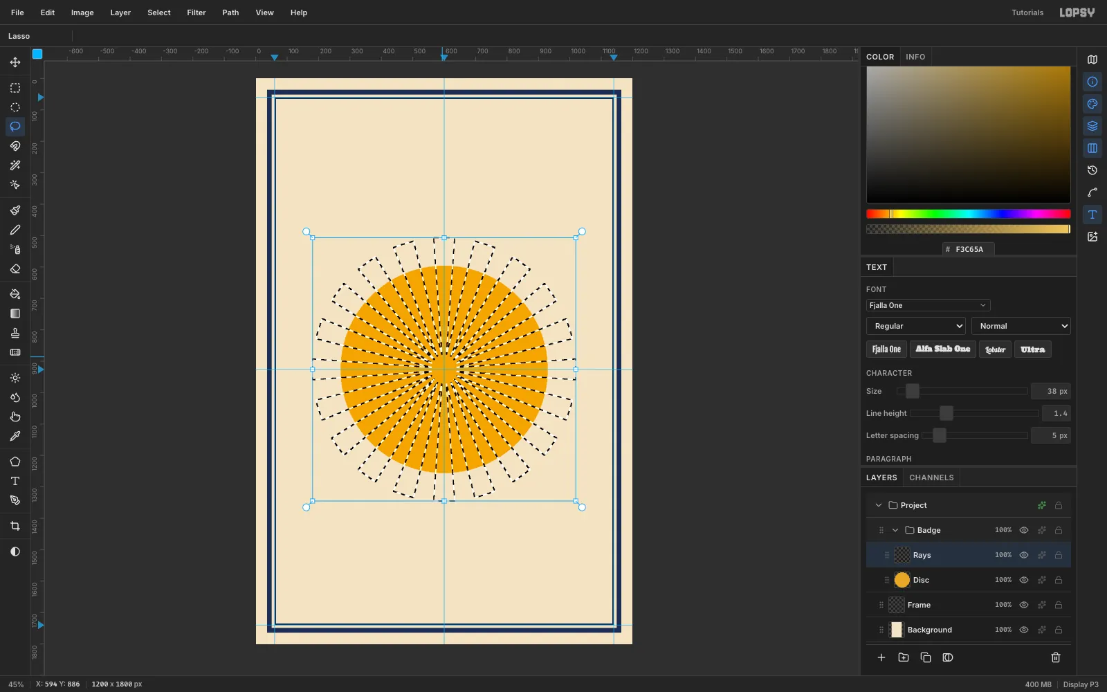
-
Clip the rays and ring the badge
- Make an ellipse of radius 318 on the same centre, choose Select → Inverse, and press Delete on the Rays layer.
- On a new Ring layer, fill a radius-336 circle with navy, Shrink 18, and delete.
- On a Red Ring layer, fill a radius-308 circle with red, Shrink 5, and delete.
Keep the red ring on its own layer. At the end you'll nudge it off register, the way a real second ink plate slips.
-
Cut the strawberry
Click the Frame row, click New Group (Berry), and drag the group's row above Badge. Inside it:
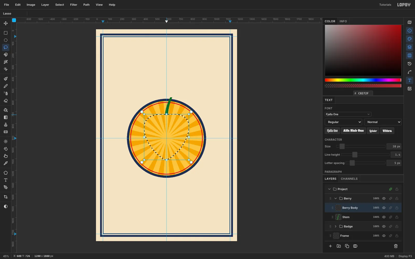
- On a Stem layer, lasso a short curved stem up from (600, 724) and fill it with
#2F6A2E. - On a Berry Body layer, lasso the berry: broad shoulders at about y 830, sides that taper to a tip at (594, 1110), and a slightly fuller left side. Fill it with red
#C8272F.
Keep the tip at least 30 px above where the ribbon will go (about y 1140), so the two edges don't touch.
- On a Stem layer, lasso a short curved stem up from (600, 724) and fill it with
-
Shade it with halftone dots
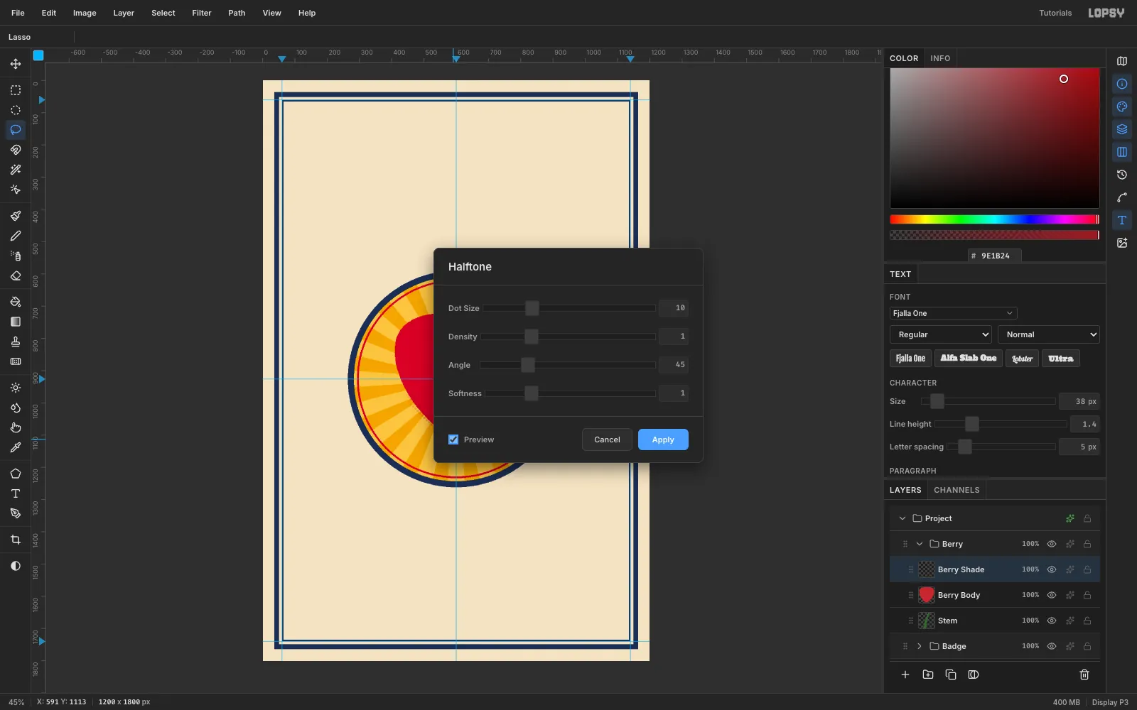
On a Berry Shade layer, fill the berry lasso with shade red
#9E1B24. Then lasso a copy of the berry shifted up and to the left, and delete it. That leaves a crescent on the lower right.- Filter → Gaussian Blur, Radius 28.
- Filter → Halftone: Dot Size 10, Angle 45, Softness 1.
- Lasso the berry again, Select → Inverse, and Delete to trim the dots to the edge.
The blur's falloff becomes dot size, which is exactly how a printer fakes shading with one ink. You'll widen this crescent in a later step.
-
Place the seeds along the surface
On a Seeds layer, fill small teardrop lassos with
#F4D06A, one per seed, about seventy in all. Put them in staggered rows, and make them narrower and closer together toward the sides so the berry reads as round.Then open Layer effects ✦ and turn on Drop Shadow: colour
#7A1320, offset X 2, Y 3, Blur 0, Spread 1. The hard shadow becomes the little pocket each seed sits in.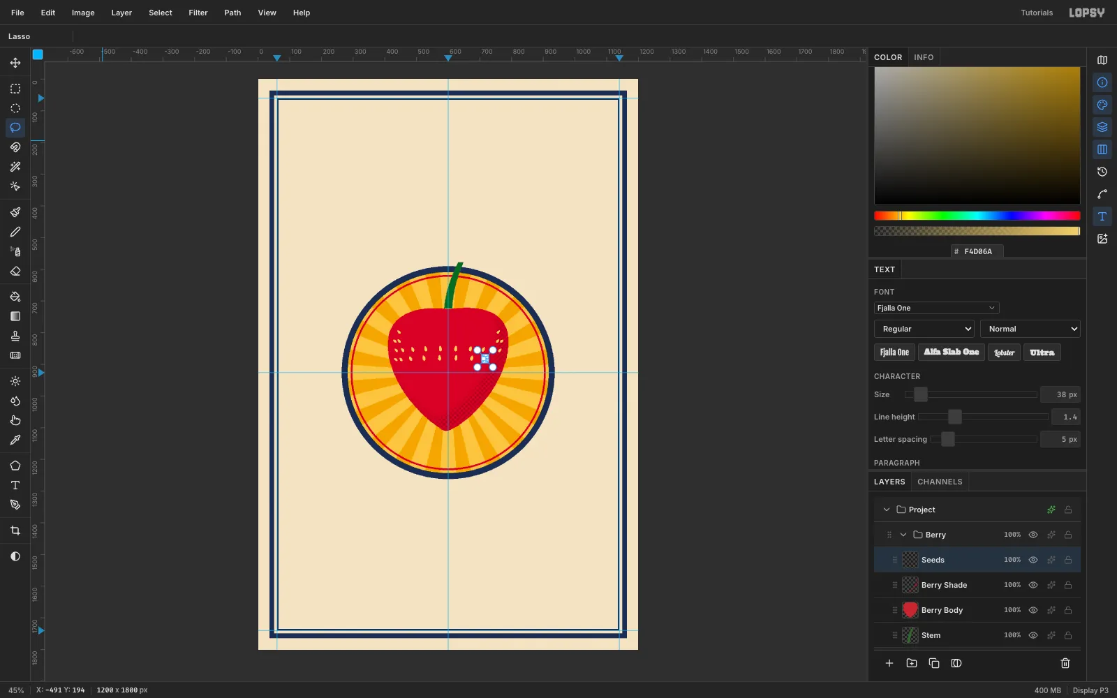
-
Add the calyx with a hard shadow
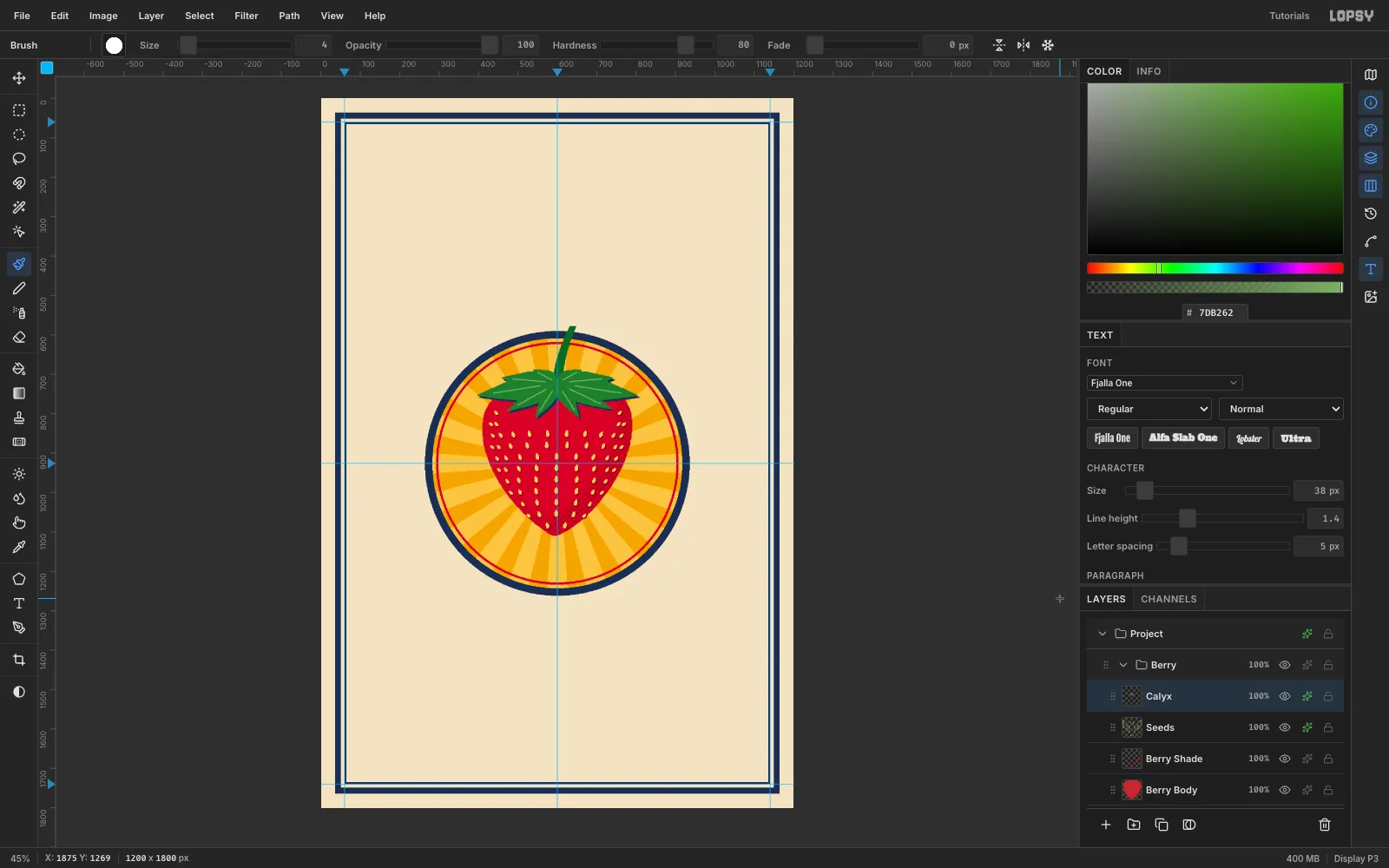
On a Calyx layer, lasso ten pointed sepals radiating from (600, 724), and fill them with
#3F7F38. Fill a small ellipse over the hub to close the centre.- Brush at size 4 in
#7DB262: draw one vein down the middle of each sepal. - Drop Shadow: navy, offset 5 / 5, Blur 0.
That 5 px navy offset with no blur is the flier's only shadow style. Every shadow on the sheet uses it.
- Brush at size 4 in
-
Build the ribbon and its stitching
Create a Ribbon group above Berry.
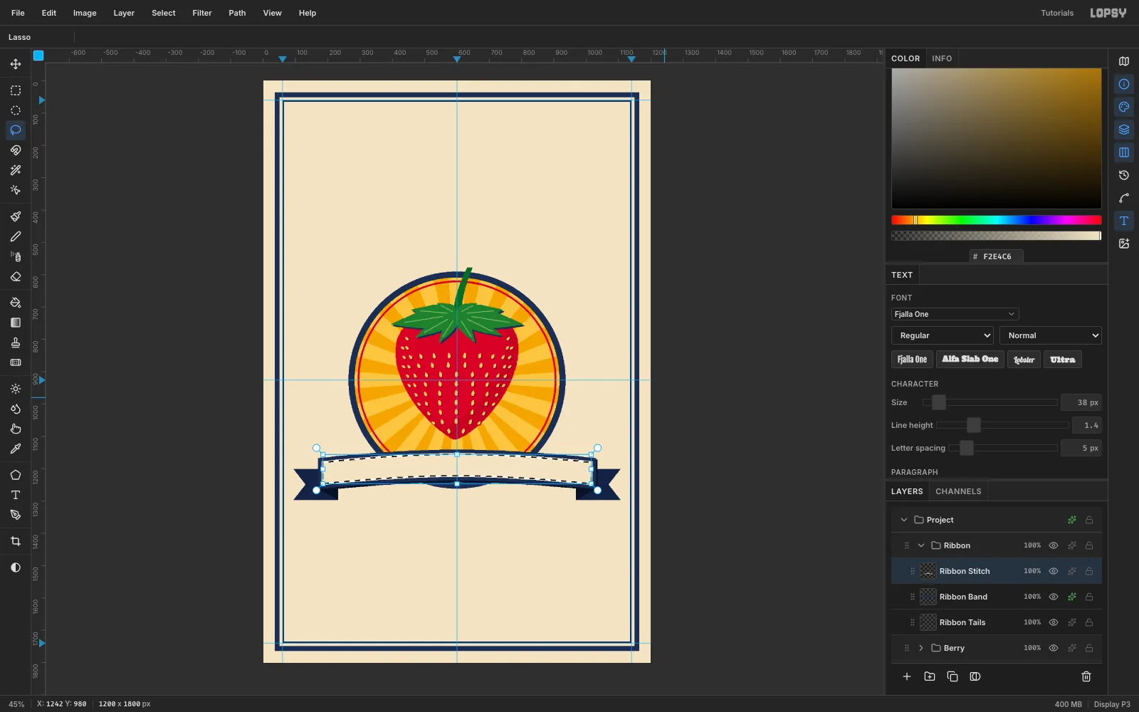
- On Ribbon Tails, lasso two swallow-tailed ends in
#172243, plus the dark folds in#0B1227. - On Ribbon Band, lasso a gently arched band from x 170 to 1030 (96 px deep, rising 26 px in the middle). Fill it with navy and add the 5 / 5 navy shadow.
- On Ribbon Stitch, lasso the band again, Shrink 10, fill with paper cream, Shrink 3, and delete. Marquee-delete the short vertical ends so only the top and bottom stitch lines remain.
- On Ribbon Tails, lasso two swallow-tailed ends in
-
Hang half the bunting
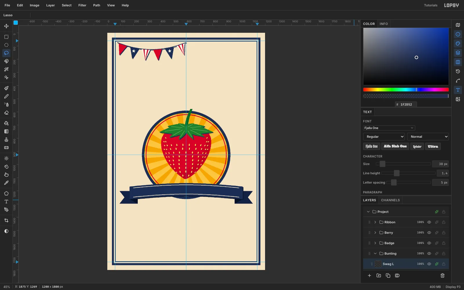
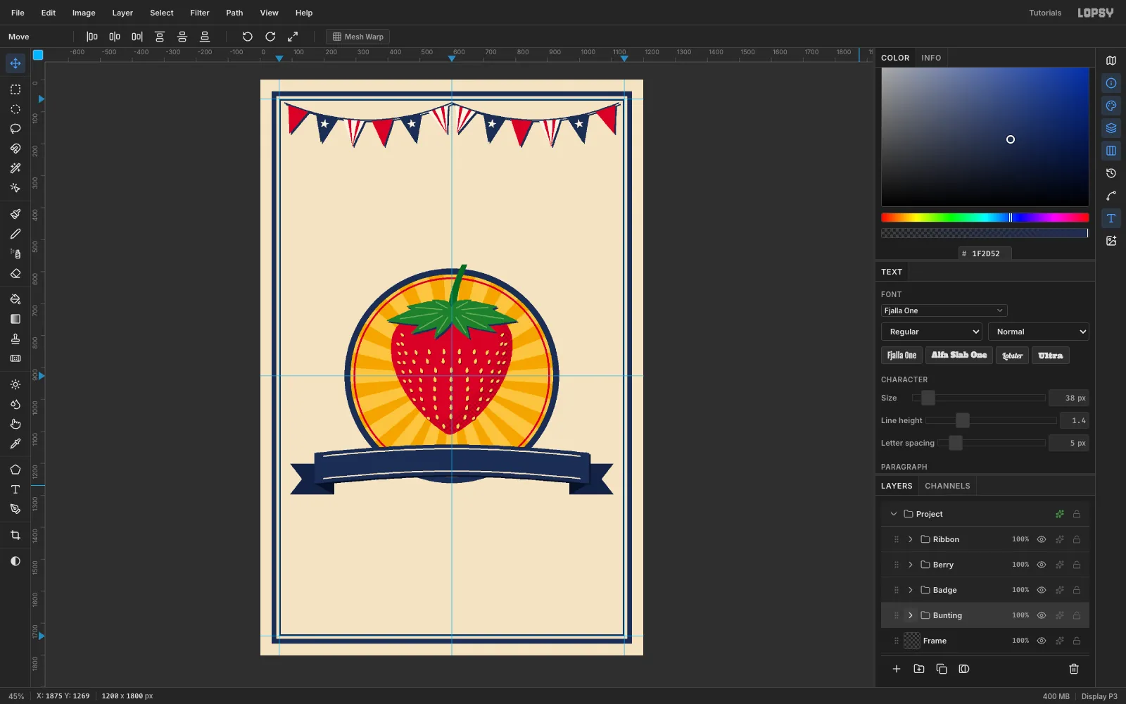
Create a Bunting group and a Swag L layer. Lasso six triangular pennants along a gentle sag from (76, 72) to (600, 72). Rotate each triangle to the string's slope and fill them in turn with red, navy and
#FBF4E4.Add two red stripe wedges to each cream pennant and a small star to each navy one. Then fill a thin lasso for the string and give the layer the 5 / 5 navy shadow.
-
Copy and flip the swag
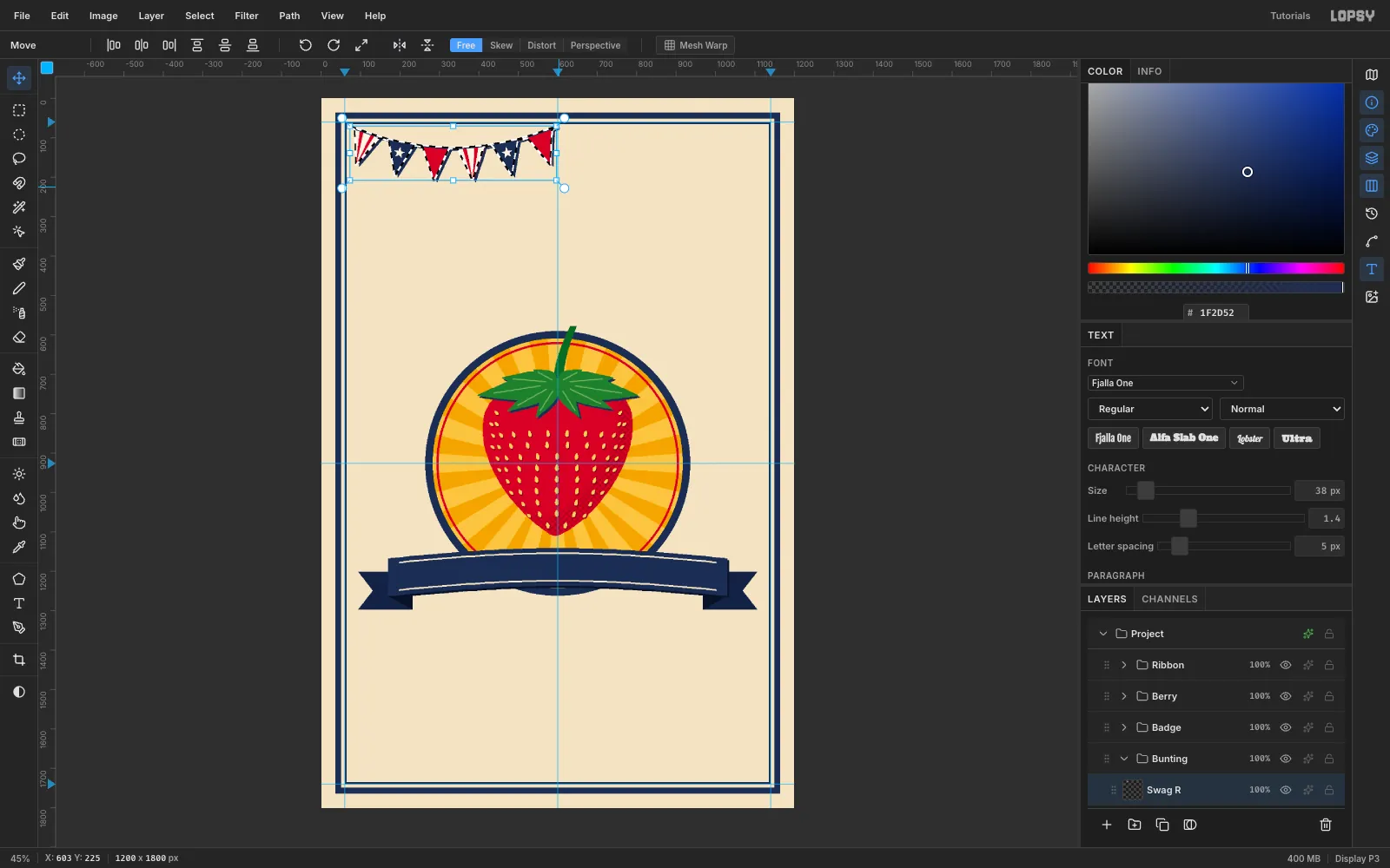
Marquee (70, 60) to (603, 225), then press Cmd+C. Wait a couple of seconds and press Cmd+V. The paste lands in place as a new layer, so rename it Swag R.
Marquee the same area again, switch to the Move tool, and click Flip Horizontal in the options bar. Press Cmd+D to commit.
-
Slide it into mirror position
With the Move tool, drag Swag R to the right until its left edge touches the 600 guide, about 527 px. Finish with the arrow keys for an exact meet, then add the same 5 / 5 navy shadow.
Because the copy is a true mirror, the colours read red, navy, stripe outward from the middle on both sides.
-
Set STRAWBERRY on an arch
Create a Type group above Ribbon. Inside it, marquee (64, 1652) to (1136, 1736) on an Admission Band layer and fill it with navy for the footer.
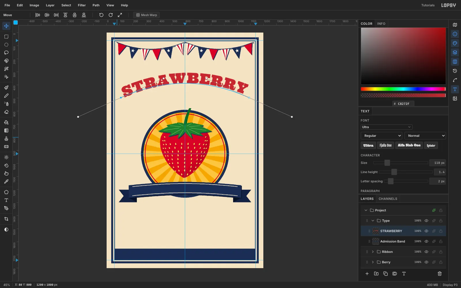
- With the Pen tool, press at (110, 497) and drag to (437, 350). Then press at (1090, 497) and drag to (1417, 644). Click Commit path.
- Click the Admission Band row (so type settings don't restyle another text layer). With the Text tool, set Ultra, Size 110, red, then click in empty canvas, type
STRAWBERRY, and press Tab. - In the options bar Path dropdown, pick your new path. In the Text panel, set Letter spacing to 2.
- Switch to the Move tool and nudge with the arrow keys until the word is centred on x 600.
-
Give the wood type a cream outline and a navy shade
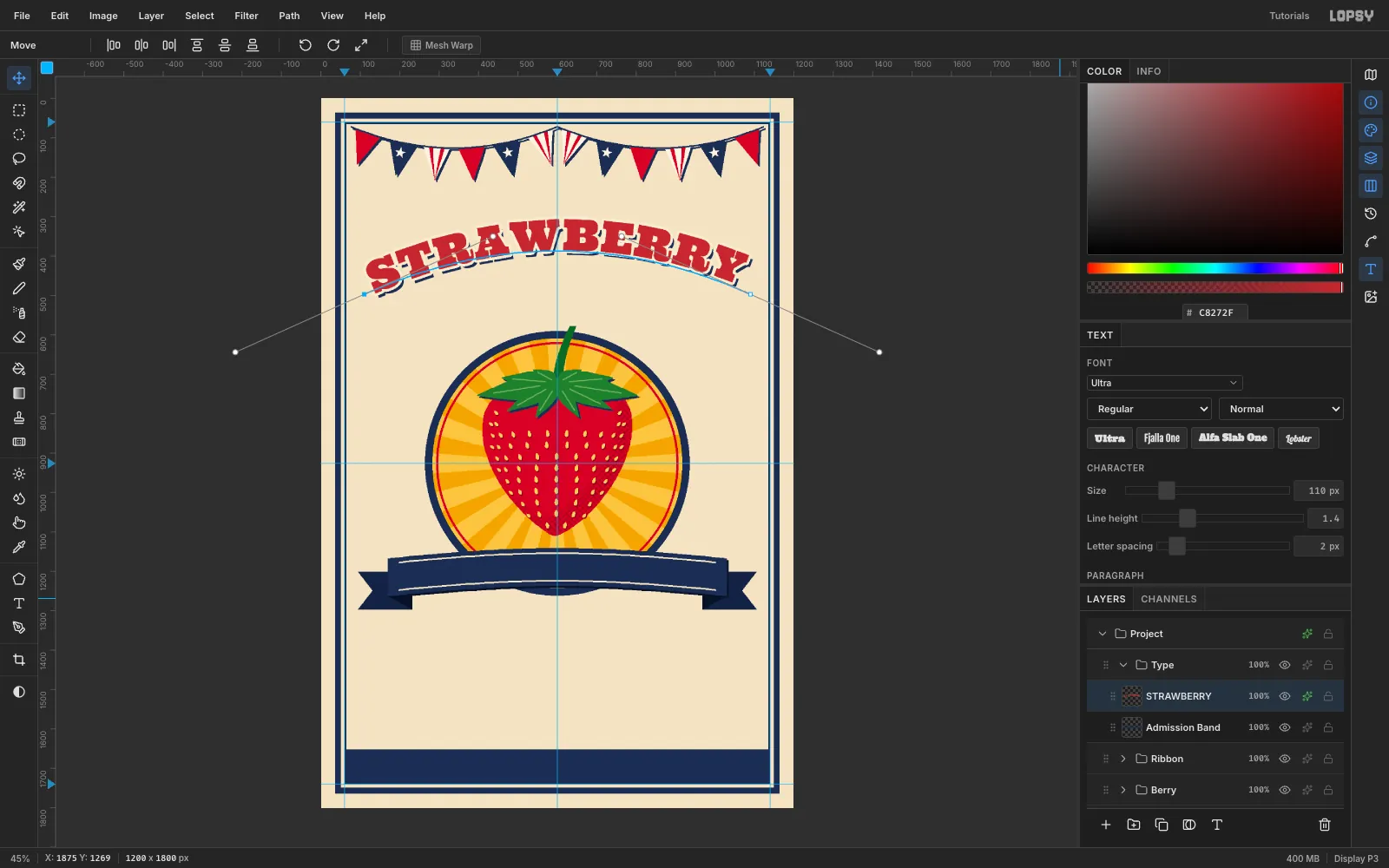
Open Layer effects ✦ on STRAWBERRY.
- Stroke:
#F7ECD3, Width 7, position outside. - Drop Shadow: navy, offset 9 / 11, Blur 0, Spread 7.
The spread makes the shadow as fat as the outlined letters, so it reads as a solid second ink printed behind them. It's the classic Hatch Show Print look.
- Stroke:
-
Scale the script to fit under the arch
Click the Admission Band row again. Create
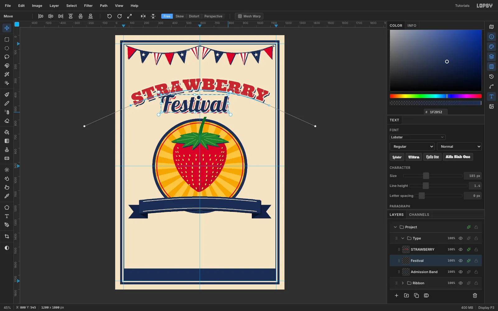
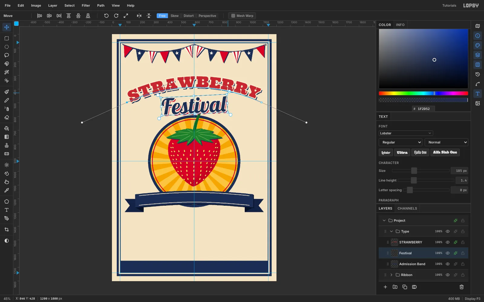
Festivalin Lobster at Size 185 in navy, and click Rasterize Layer in the Layers footer.Give it a cream Stroke of 6 and a red Drop Shadow of 8 / 10, Blur 0, Spread 6.
It has to clear both the arch and the badge, so it needs to shrink. Marquee it, switch to the Move tool, and hold Cmd while you drag the bottom-right handle inward to about 86 %, then press Cmd+D. Holding Cmd keeps the scale uniform.
-
Tilt the script
Move Festival so it's centred at x 600 with its top at about y 454. That leaves at least 20 px under the arch's ends.
Marquee it again, and with the Move tool drag the rotate handle just outside the top-right corner 3° counter-clockwise. Press Cmd+D.
A small upward tilt adds energy without fighting the symmetric arch above.
-
Curve the date along the ribbon
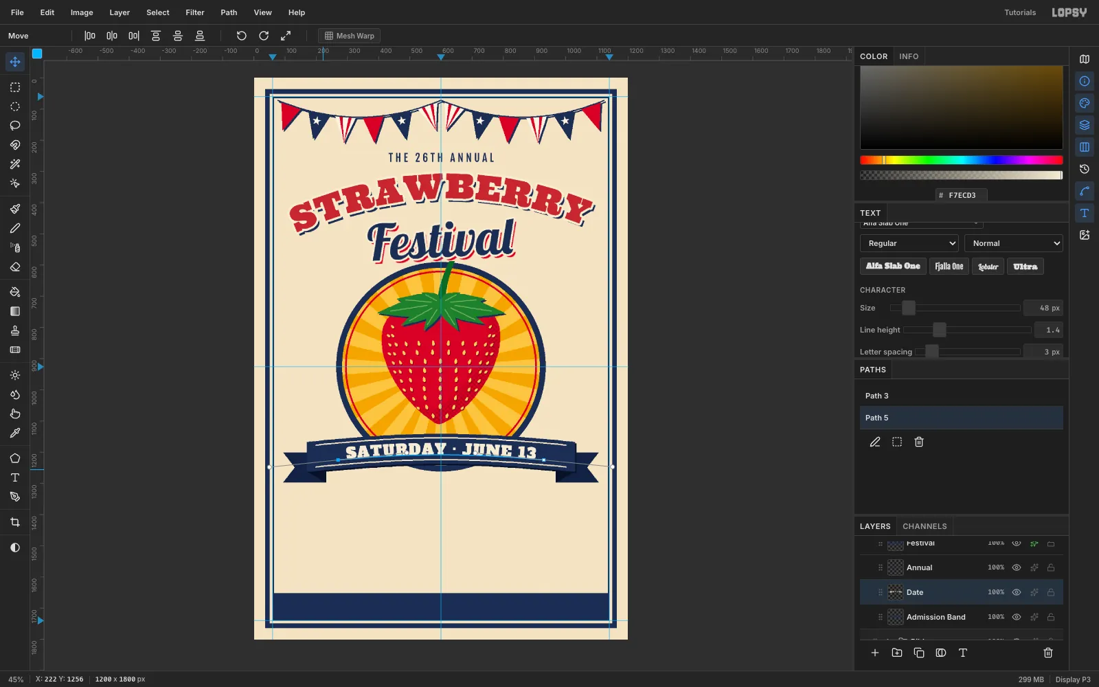
Pen a second path that follows the ribbon's centre line. Press at (270, 1225) and drag to (490, 1202), then press at (930, 1225) and drag to (1150, 1247), and commit it.
Create
SATURDAY · JUNE 13in Alfa Slab One at Size 48, in cream, with letter spacing 3. The two leading spaces push the start inward. Bind it to the new path.Nudge it until the caps sit centred between the stitch lines. Here that's 14 px above and 14 px below at the centre.
-
Stack the details and ornaments
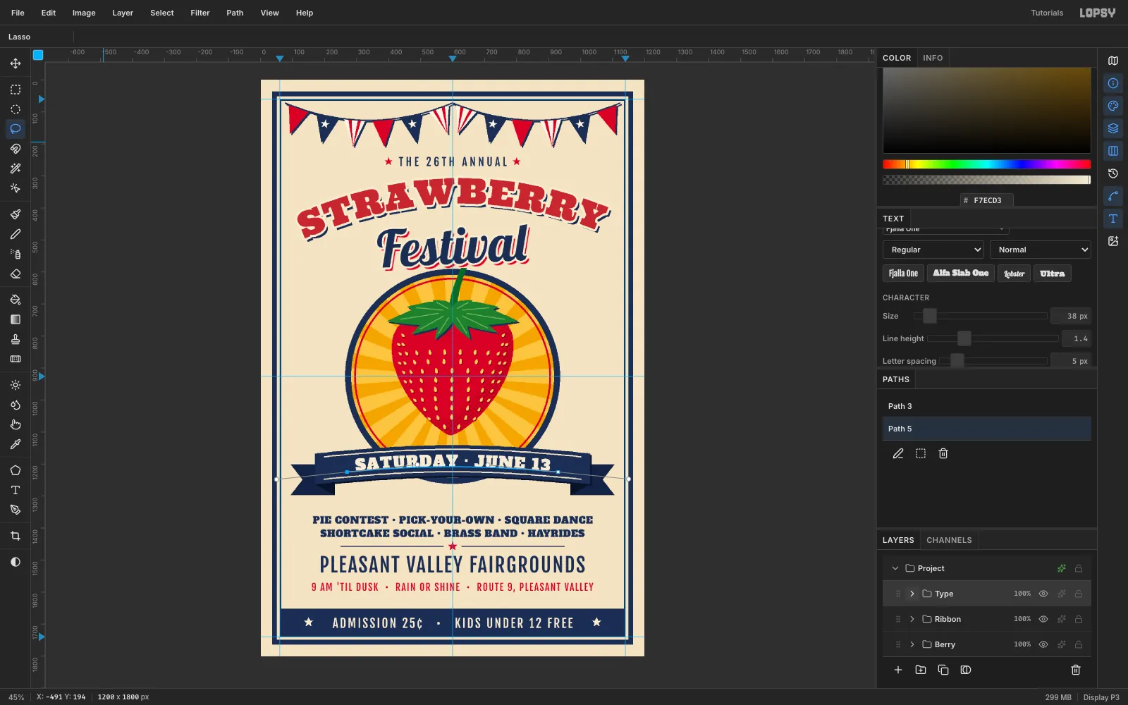
Create each line in empty canvas, then click Align center horizontally and move it to its row:
- Two event lines in Alfa Slab One 30, navy, letter spacing 1, at y 1362 and 1404. Keep each under 880 px wide.
PLEASANT VALLEY FAIRGROUNDSin Fjalla One 62, letter spacing 4, at y 1486.- The hours in Fjalla One 30, red, letter spacing 3, at y 1568.
ADMISSION 25¢ • KIDS UNDER 12 FREEin Fjalla One 38, cream, centred in the band.
On an Ornaments layer, lasso red stars either side of the tagline and at the centre of a thin two-part navy rule at y 1457. Add cream stars at the ends of the band.
-
Loosen the top with group and selection nudges
The pennant tips and the tagline were crowding each other.
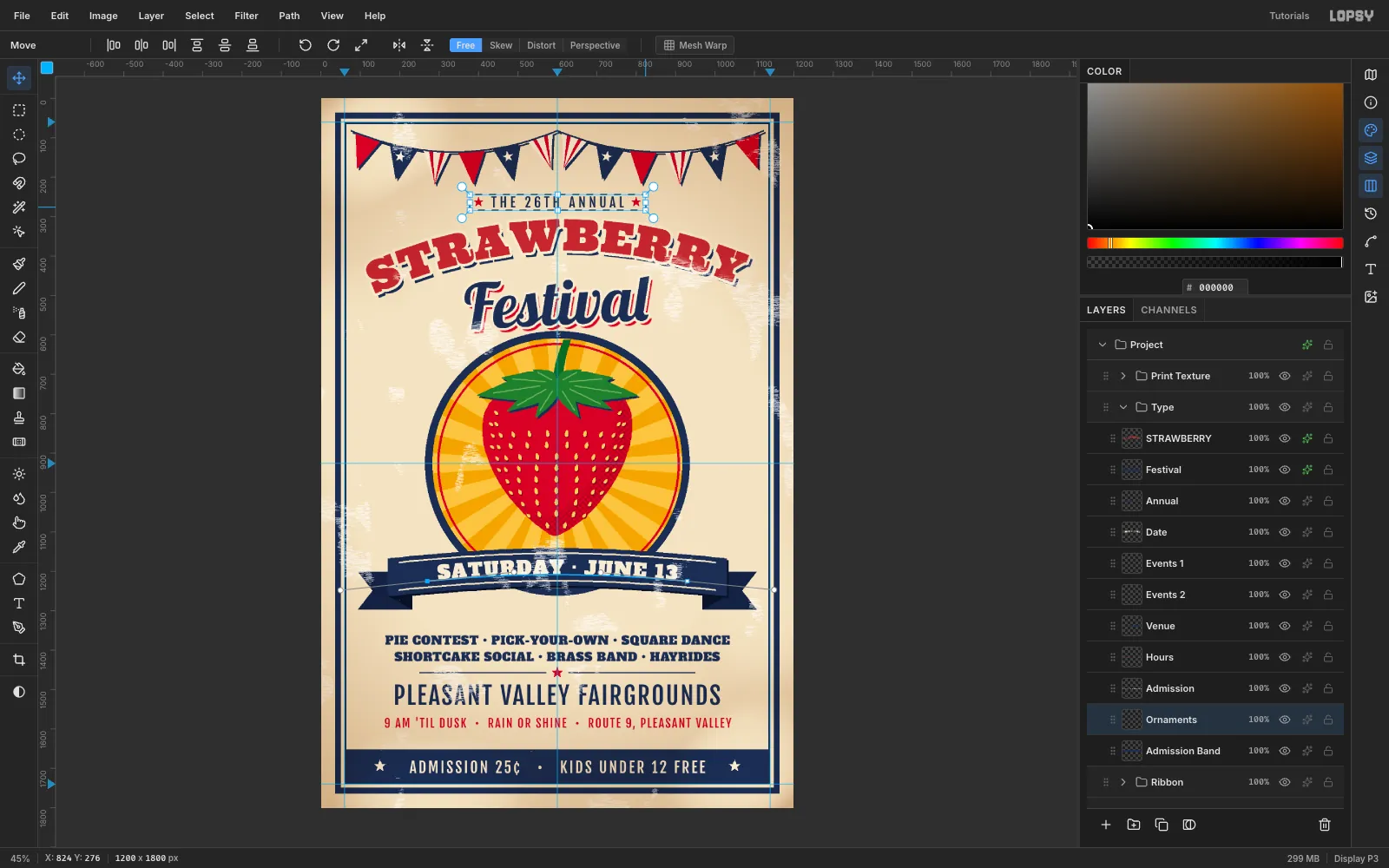
- Click the Bunting group row, switch to the Move tool, and press Down ten times. The whole garland moves together.
- Nudge the Annual text down 8.
- On Ornaments, marquee just the two tagline stars and press Down eight times. With a selection active, the arrows move only the selected pixels.
-
Deepen the halftone shade
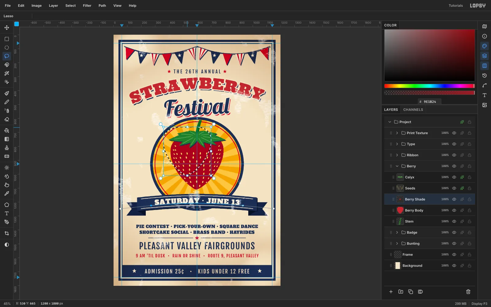
A thin crescent makes the berry look flat. Clear Berry Shade, refill the berry lasso with shade red, then lasso a smaller copy (90 % size) shifted −70, −80 and delete it.
Run Gaussian Blur at 40 and Halftone at 10 / 45° / 1, then trim to the berry again. Now the dots cover the whole lower-right third.
-
Merge and bulge the berry
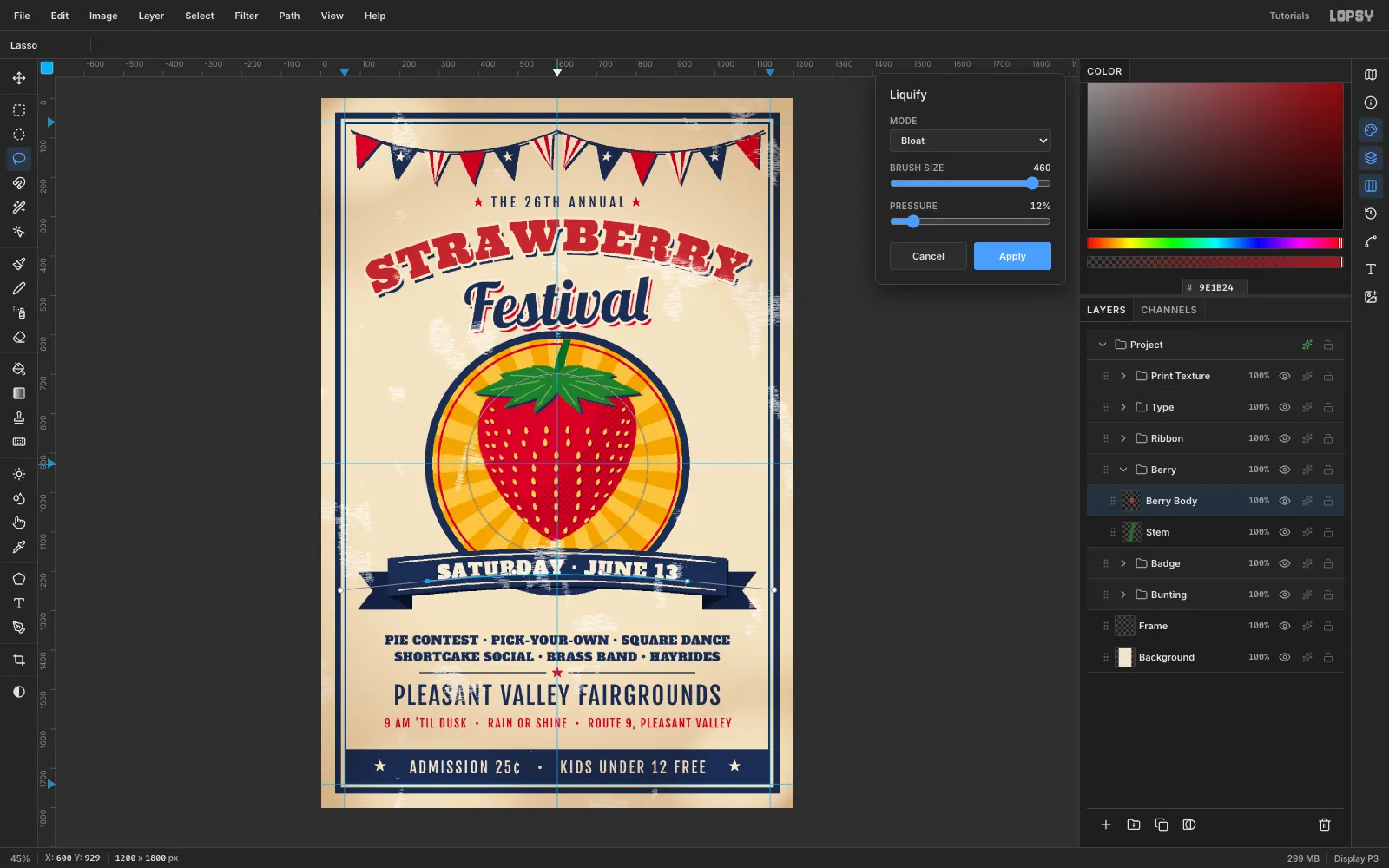
Click Calyx and choose Layer → Merge Down three times. Calyx, seeds and shade fold into Berry Body, and their shadows bake in.
Open Filter → Liquify, choose Bloat, and set Brush size 460 and pressure 12. Press once at the middle of the berry with the smallest wiggle, then click Apply.
The centre seeds swell and the edge seeds stay small, so the rows now wrap around a sphere.
-
Break the symmetry with Distort
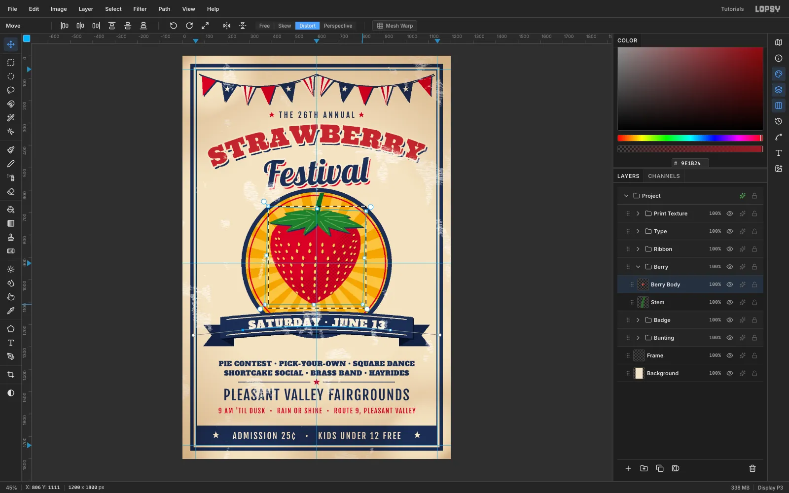
Marquee the berry. With the Move tool, click Distort in the options bar and drag the corner handles:
- Top-right corner down about 22 px to drop the right shoulder.
- Both bottom corners 15 px left and 16 px up to move the tip off centre.
Press Cmd+D. A real berry is never symmetric, and this also opens up clear paper between the tip and the ribbon. Finally, marquee-delete the top of the Stem above y 612 so it stops just inside the ring.
-
Knock the red plate off register
Two-colour presses never line up perfectly. Fake it:
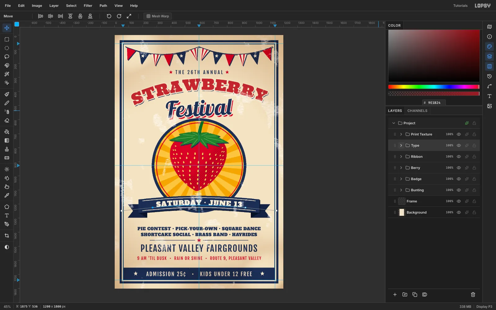
- Nudge Red Ring 3 right, 2 down, and Hours 2 right, 1 down.
- Nudge STRAWBERRY 3 right, 2 down, then change its shadow offset to 6 / 9 so the navy stays put.
- Change Festival's red shadow to 10 / 12.
The result is a hairline of cream where the inks drift apart.
-
Build an ink-wear texture
Create a Print Texture group and drag it to the top of the stack. Make sure the target row is in view, and close the Color and Text panels if the Layers list is short.
On an Ink Wear layer:
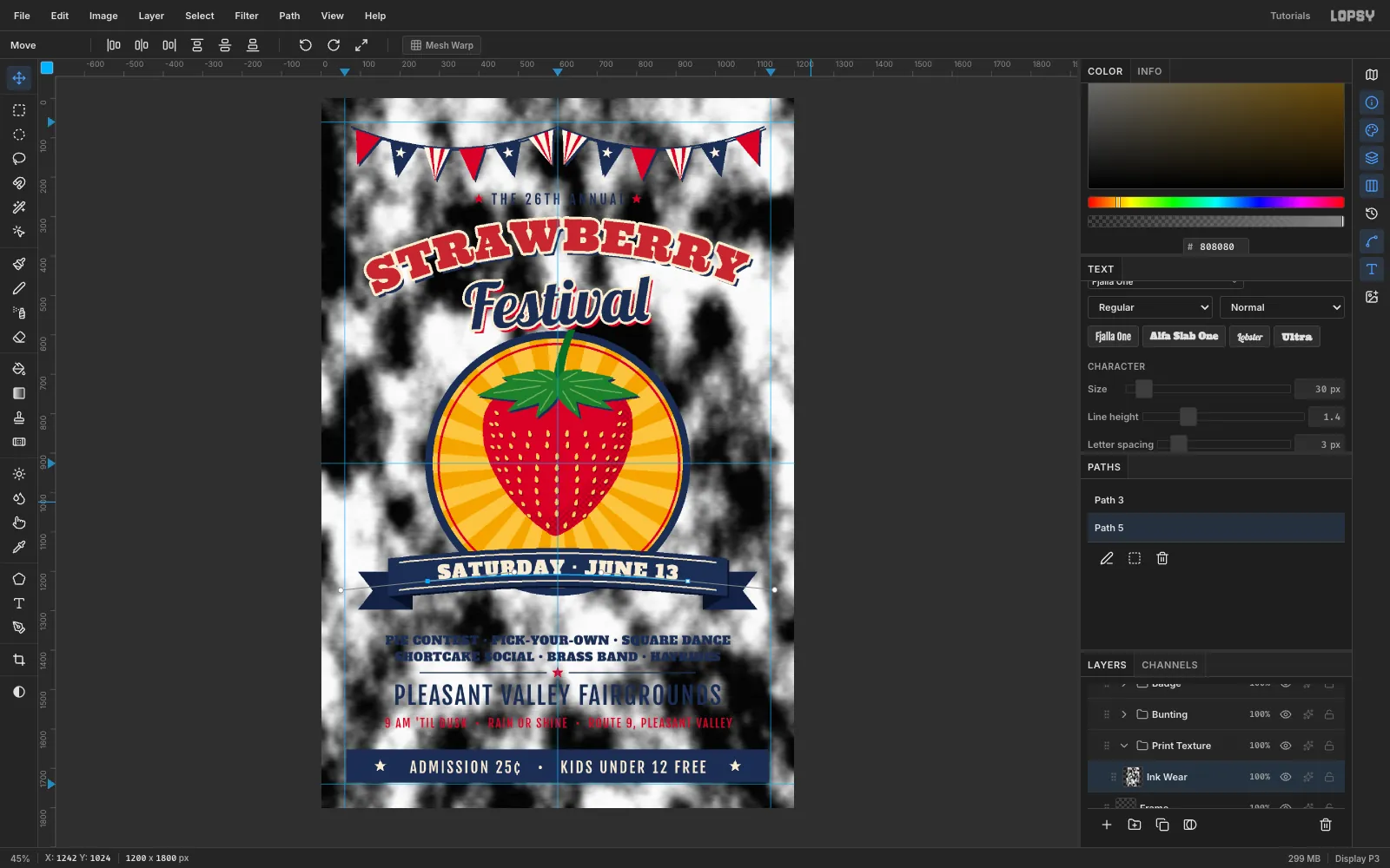
- Fill it with grey
#808080. - Filter → Clouds, Scale 12, to get clumps.
- Filter → Add Noise, Mono, Gaussian, 70.
- Filter → Motion Blur, Angle 0, Distance 14, to streak it like a roller.
- Filter → Threshold at 250. About 4 % of the pixels stay white.
Marquee-delete the texture over the small text lines so they stay readable.
- Fill it with grey
-
Turn it into paper showing through
Worn ink should only ever show paper, and only where there was ink.
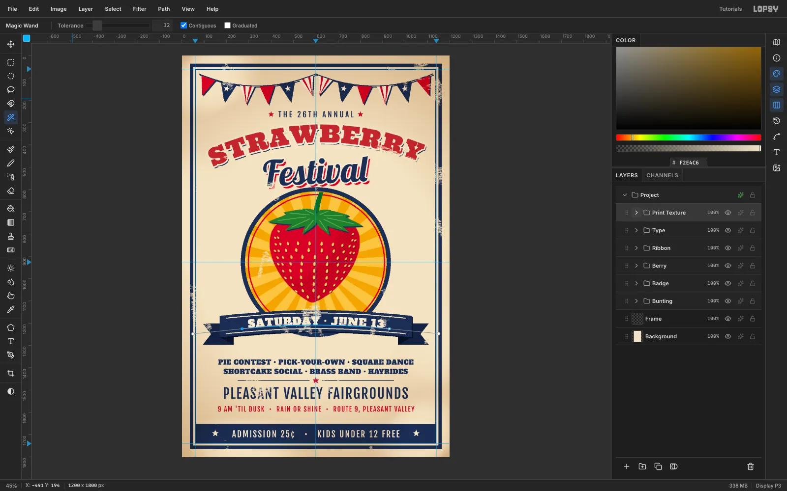
- Take the Magic Wand, untick Contiguous, and click a white speck on Ink Wear.
- Click Add Layer (Paper Show), set the foreground to paper
#F2E4C6, and choose Edit → Fill. Press Cmd+D straight away. - Delete the Ink Wear layer and set Paper Show to 85 %.
On bare paper the specks match the paper and vanish. On the inks they read as dropouts. Marquee-delete any specks that land in small text.
-
Tone the edges unevenly
Add an Edge Toning layer set to Multiply at 45 %. With the Brush at Size 170, Hardness 0 and foreground
#9A6A34:- At 60 % opacity, paint down the right edge and along the bottom.
- At 30 %, paint a short run at the top-left.
Finish with Gaussian Blur 40. Uneven, soft toning looks like years in a shop window, where a uniform radial vignette looks like a camera.
Save with File → Save Project, then File → Quick Export PNG.