Design a Typographic Hot Sauce Party Invitation
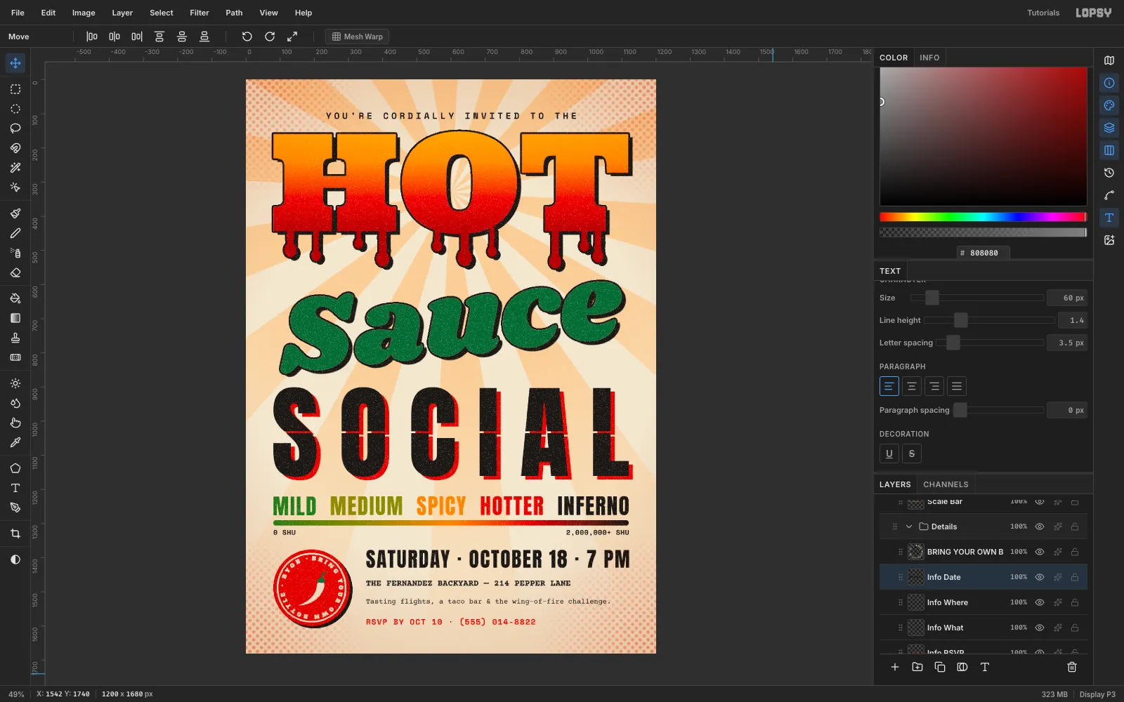
Make a wood-type style party invitation in Lopsy with flame-gradient lettering, sauce drips, a misregistered red plate, a heat scale and text on a circle.
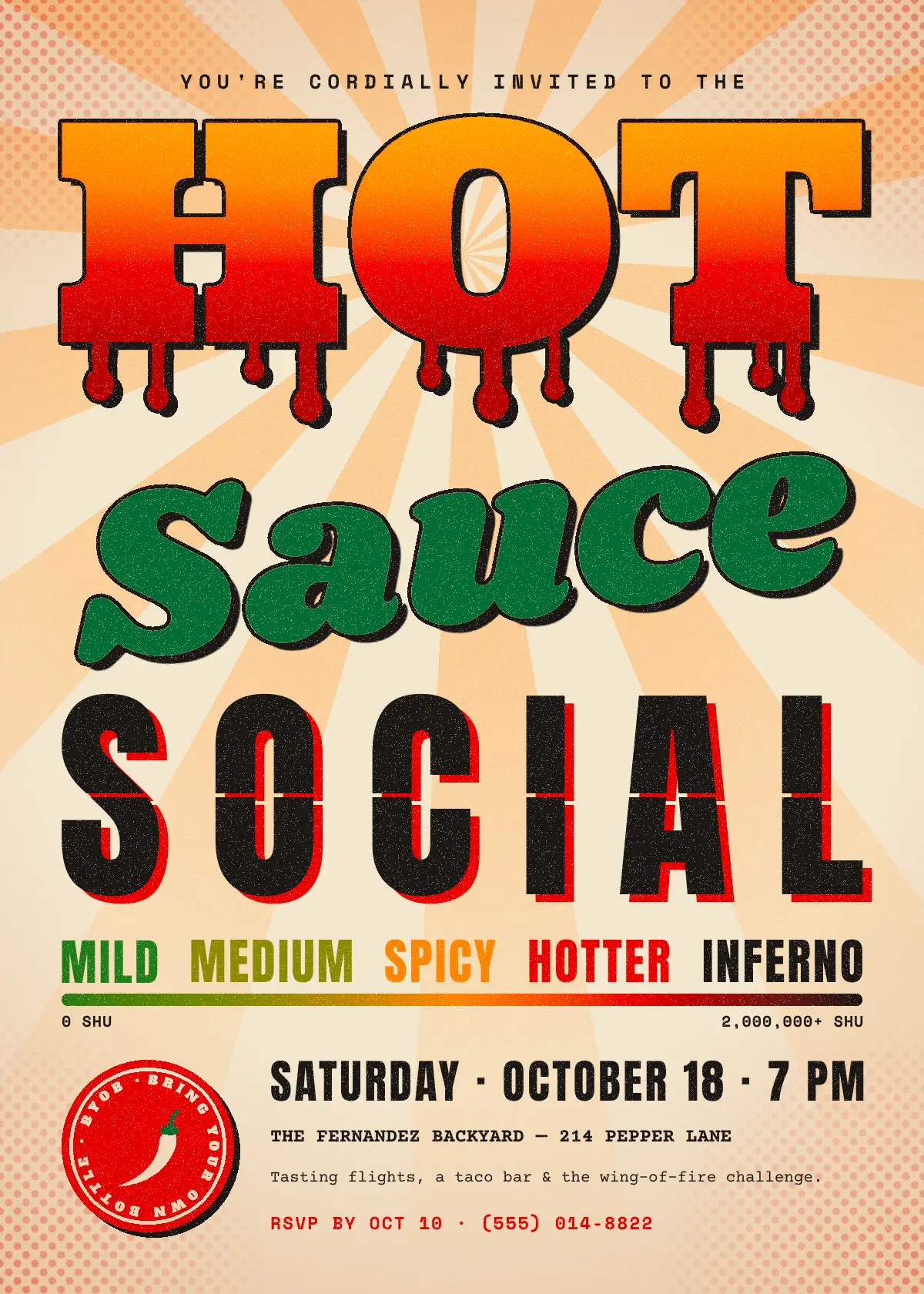
In a typographic poster the letters are the picture. This tutorial builds Hot Sauce Social, a 1200 × 1680 px (5 × 7) invitation in the style of an old wood-type print shop. It has three big words in three contrasting faces, each with its own print trick, plus a small, well-organised details block.
Along the way you'll use rasterized type with the Magic Wand for gradient fills, Brush drips, a hand-offset second ink plate, a gradient heat scale, a Layer Mask, Halftone, Text on a path, and a grain made from Add Noise and Threshold.
The palette:
- Paper
#F1E6D0, ink#1B1714 - Chili red
#D62718, deep sauce red#A80F12, habanero#F28A1E - Jalapeño green
#2E6B3A, plus#3E7D2Aand olive#8C8A1Afor the heat scale - Sunburst peach
#F4CF9C, halftone red#E0301A
One rule keeps it coherent: every display element gets the same hard offset, 12 px right and 10 px down with no blur. Dark type gets a red plate. Colored type gets an ink shadow.
-
Set up the paper and margins
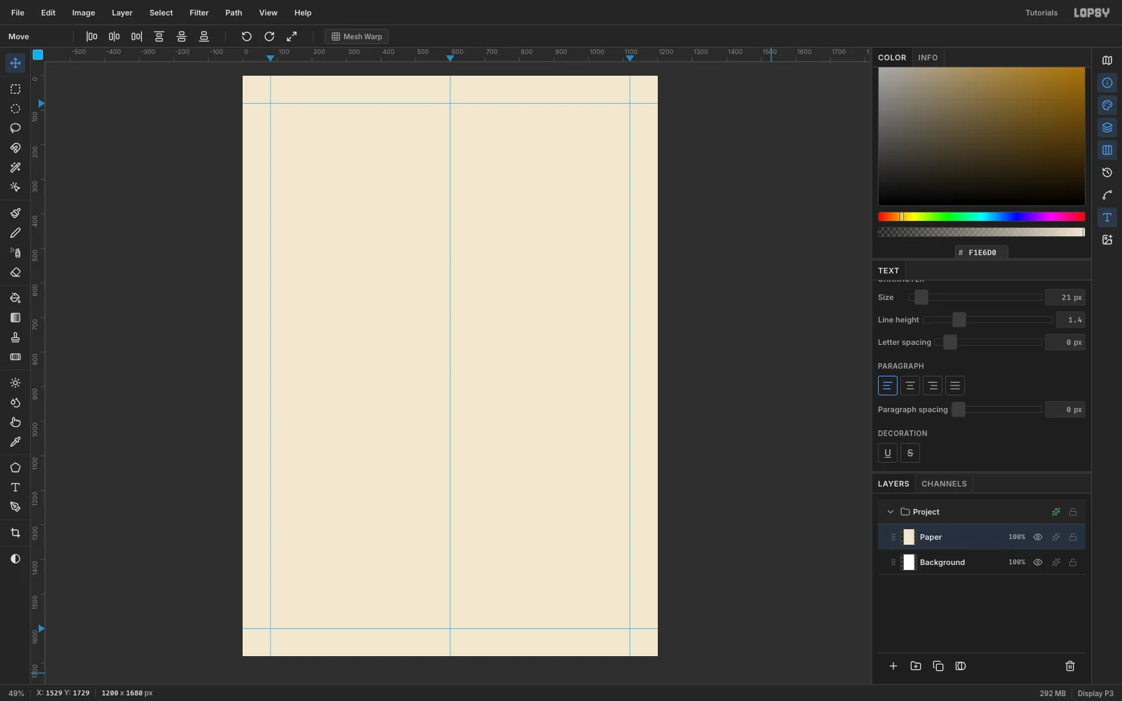
Choose File → New, keep the unit on Pixels, and create a 1200 × 1680 document. Rename Layer 1 to Paper. Select all, then Edit → Fill it with
#F1E6D0.Click the top ruler at 80, 600 and 1120, and the left ruler at 80 and 1600. That gives an 80 px safe margin on every side and a centre line. Guides only drop while View → Show Guides is ticked.
-
Draw a sunburst with the Lasso
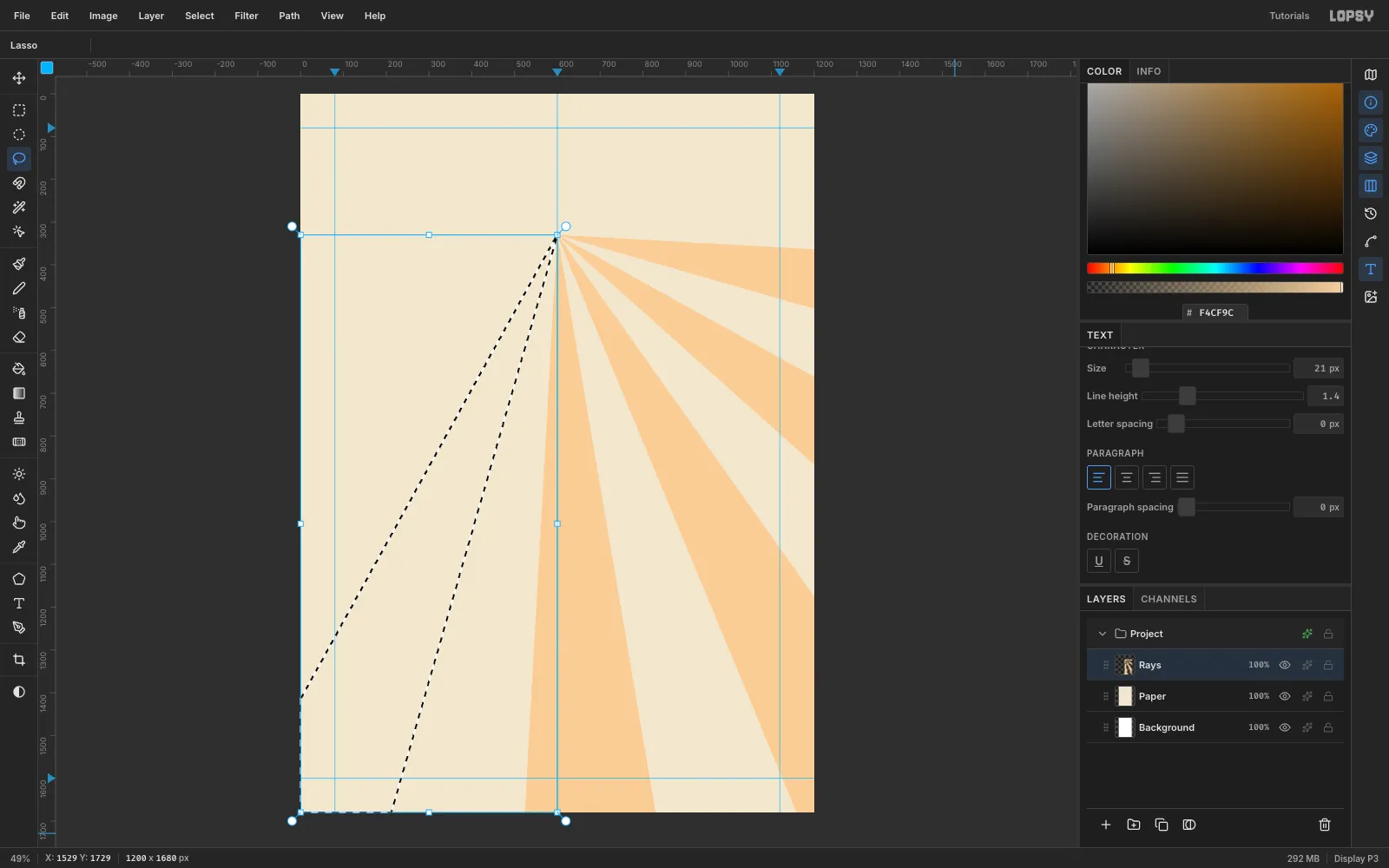
Add a layer called Rays. Every ray starts at the same point, (600, 330), which will sit inside the O of HOT. Split the circle into 28 equal slices and fill every other one with
#F4CF9C. That's 14 rays.For each ray, use the Lasso to click from the centre out to the canvas edge, trace along the edge, and come back to the centre. Then choose Edit → Fill. Let the far points run about 40 px past the canvas edge, so no ray ends in a sliver.
-
Fade the rays with a layer mask
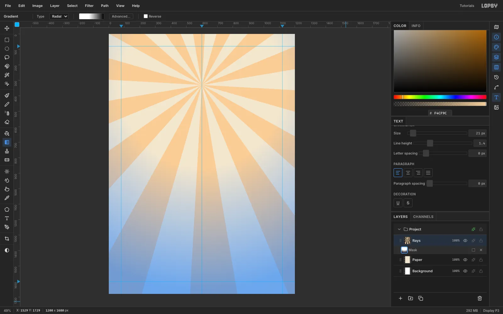
With Rays selected, click Add Mask in the Layers panel, then click the Mask row to edit it. Open the Gradient tool's Advanced… editor and set three stops: white at 0, white at 40% and black at 100%. Pick Radial and drag from (600, 330) down to (600, 1650).
The rays stay strong behind the headline and fade out behind the small type, where they would hurt readability. Click the Rays layer row to stop editing the mask.
-
Halftone the corners
Add a layer called Dots. For each corner, draw a 360 × 360 Rectangular Marquee tucked into it. Drag a Radial gradient from the corner outwards, from
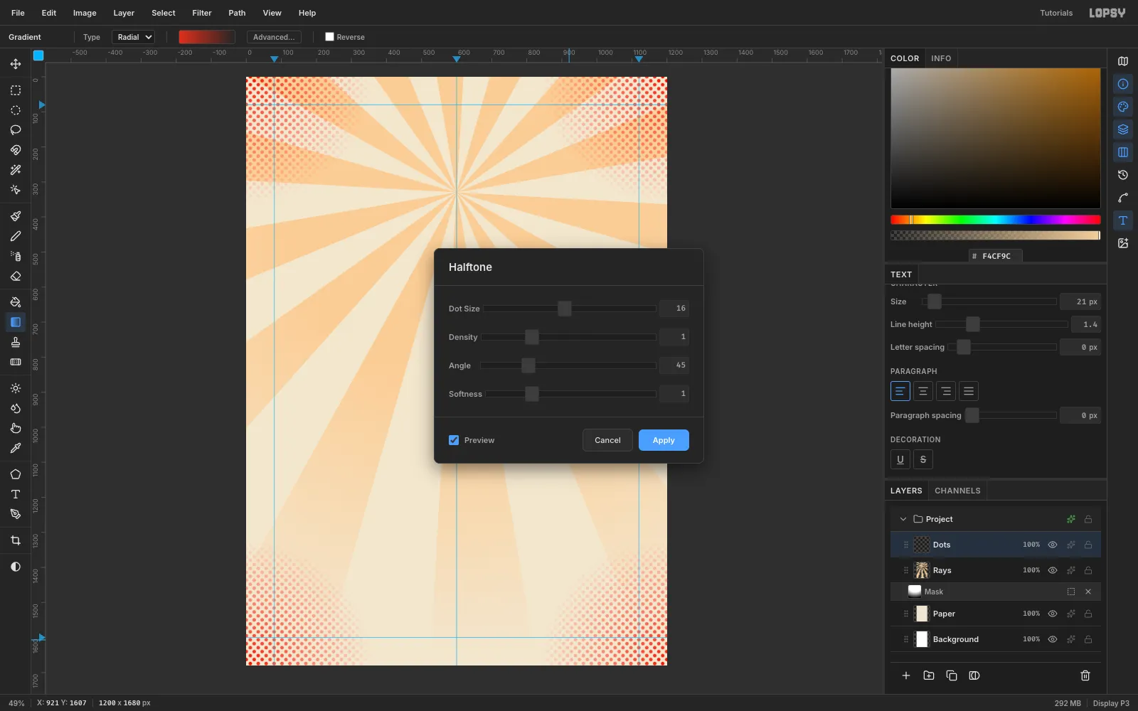
#E0301Aat full opacity to the same red at 0% opacity.Deselect, then choose Filter → Halftone… with Dot Size 16. Set the layer to Multiply at 40% in the effects drawer. Dots in all four corners keep the page from feeling top-heavy.
-
Set the kicker and the HOT headline
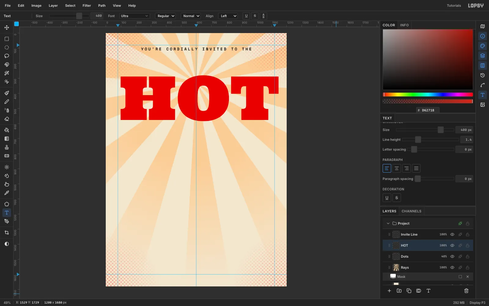
Select the Dots layer, so new type doesn't restyle anything, and pick the Text tool. In the Text panel, set Letter spacing to 8. Type
YOU'RE CORDIALLY INVITED TO THEin Space Mono, weight 700, at 26 px in ink. With the Move tool, click Align center horizontally, then nudge it so the tops of the letters sit at y 96.Reset the letter spacing to 0 and type HOT in Ultra at 400 px. Ultra is a chunky slab serif that looks like cut wood type.
-
Scale HOT to the margins
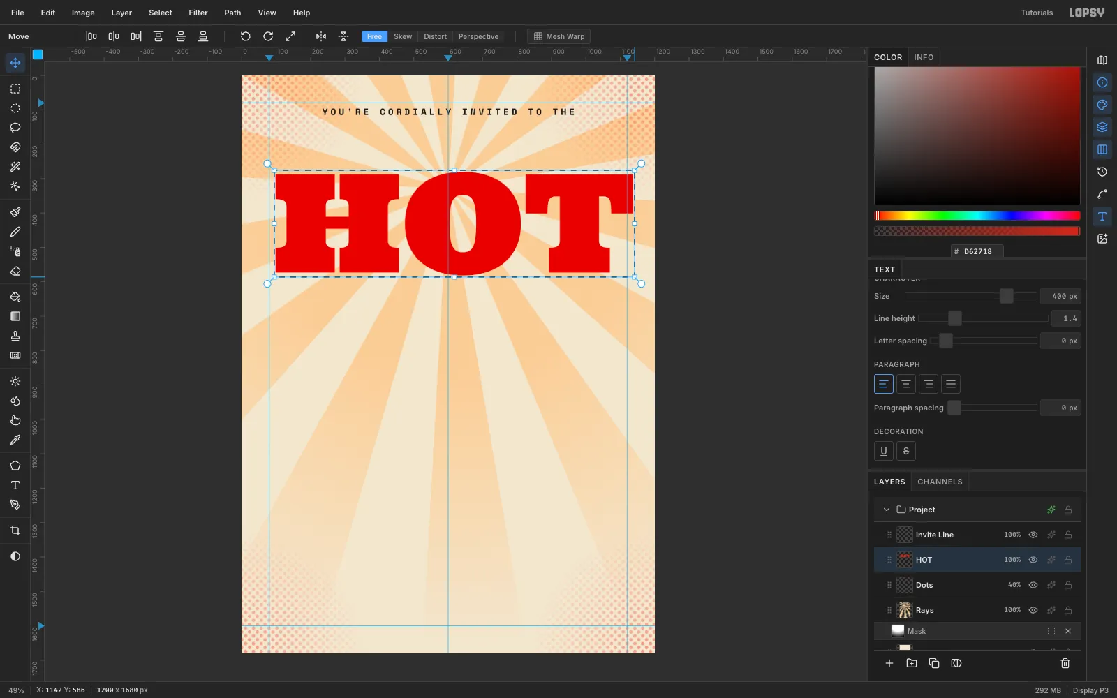
Click Rasterize Layer at the bottom of the Layers panel. Draw a marquee around the letters, switch to the Move tool, and hold Cmd while you drag the bottom-right handle. Cmd keeps the scale uniform. Stop when the letters are 1040 px wide, then press Cmd+D to commit.
Move the word so its top-left corner is at (80, 150). Use the arrow keys for the last few pixels.
-
Fill the letters with a flame gradient
Pick the Magic Wand, untick Contiguous, and click one letter. All three letters are now selected.
Set gradient stops of
#FFB22E(0),#F7931E(30%),#E0301A(65%) and#A80F12(100%). Drag a Linear gradient straight down from the top of the letters (y 150) to the bottom (y 453). Heat rises, so the top is hot yellow and the bottom is thick sauce red.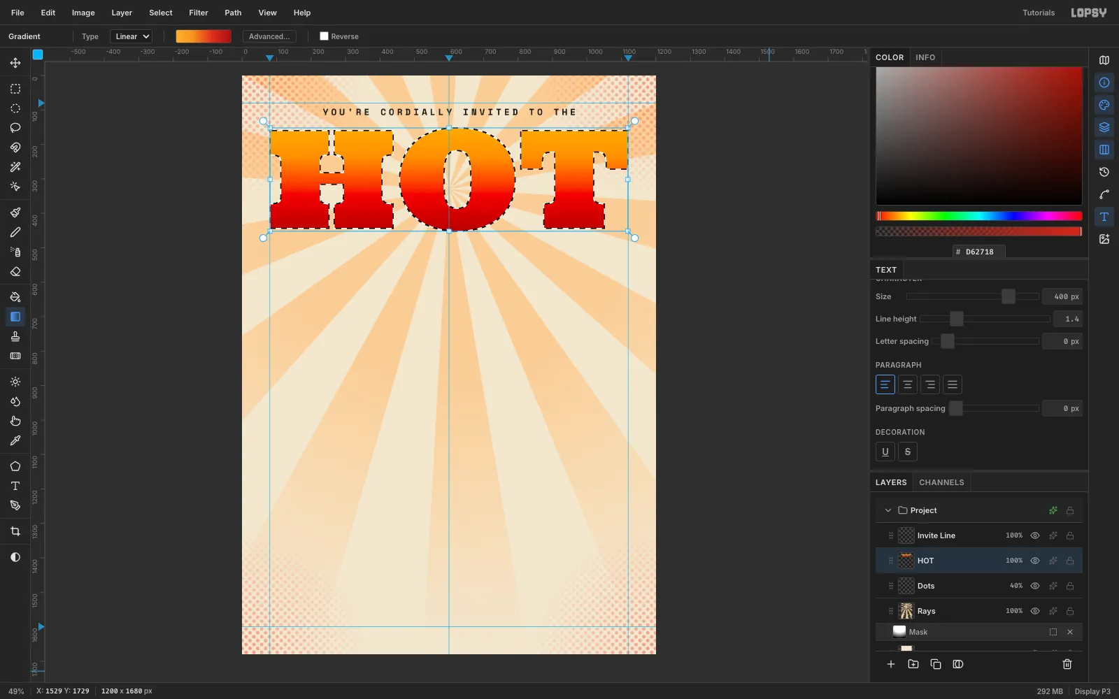
-
Paint the sauce drips
Deselect. Pick the Brush at Hardness 100 with
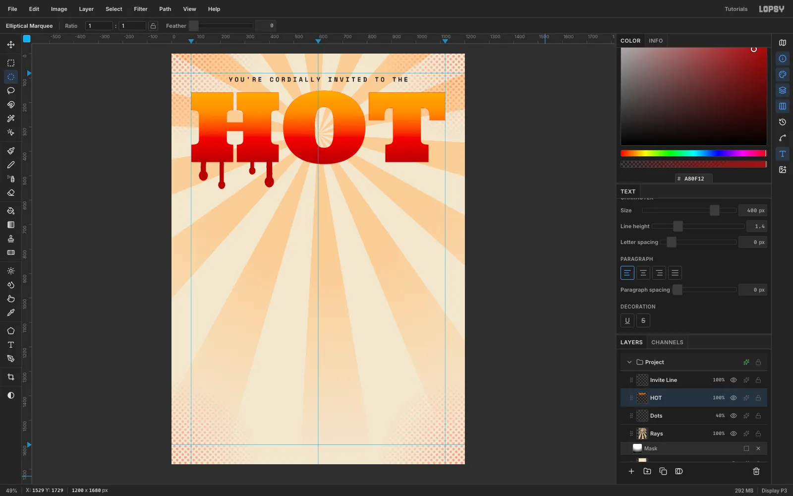
#A80F12, the same red as the bottom of the gradient. Starting just inside a letter's bottom edge (y 436), paint ten vertical drips at sizes 16–26 px, 38 to 98 px long.Finish each drip with an Elliptical Marquee blob about 1.6 times the brush width and Edit → Fill. Put the drips where letters have flat feet: two or three under each H stem, the O's curve and the T's stem. Vary the lengths so they don't look like a comb.
-
Add a keyline and a hard shadow
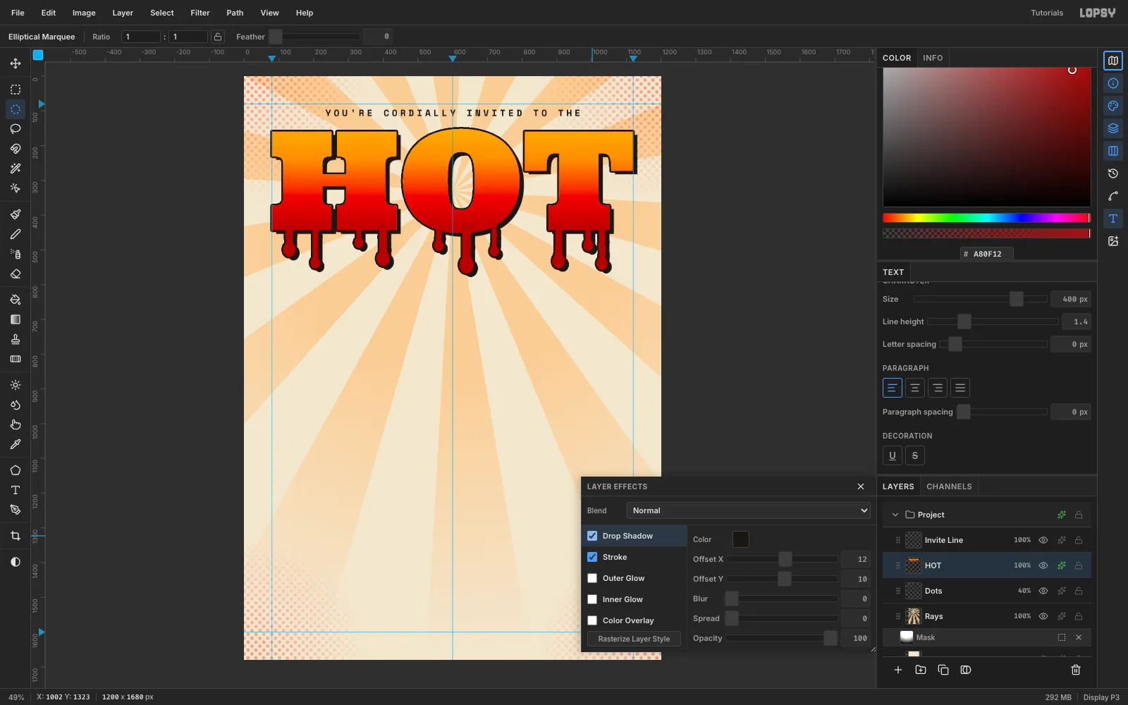
Open Layer effects on HOT. Enable Stroke in
#1B1714, Width 5, and Drop Shadow in#1B1714: Offset X 12, Offset Y 10, Blur 0, Opacity 100.The keyline keeps the pale top of the gradient from dissolving into the cream paper. The hard shadow is the first use of the 12 / 10 offset. Because the effects wrap the whole layer, the drips get them too.
-
Set Sauce in a tilted script
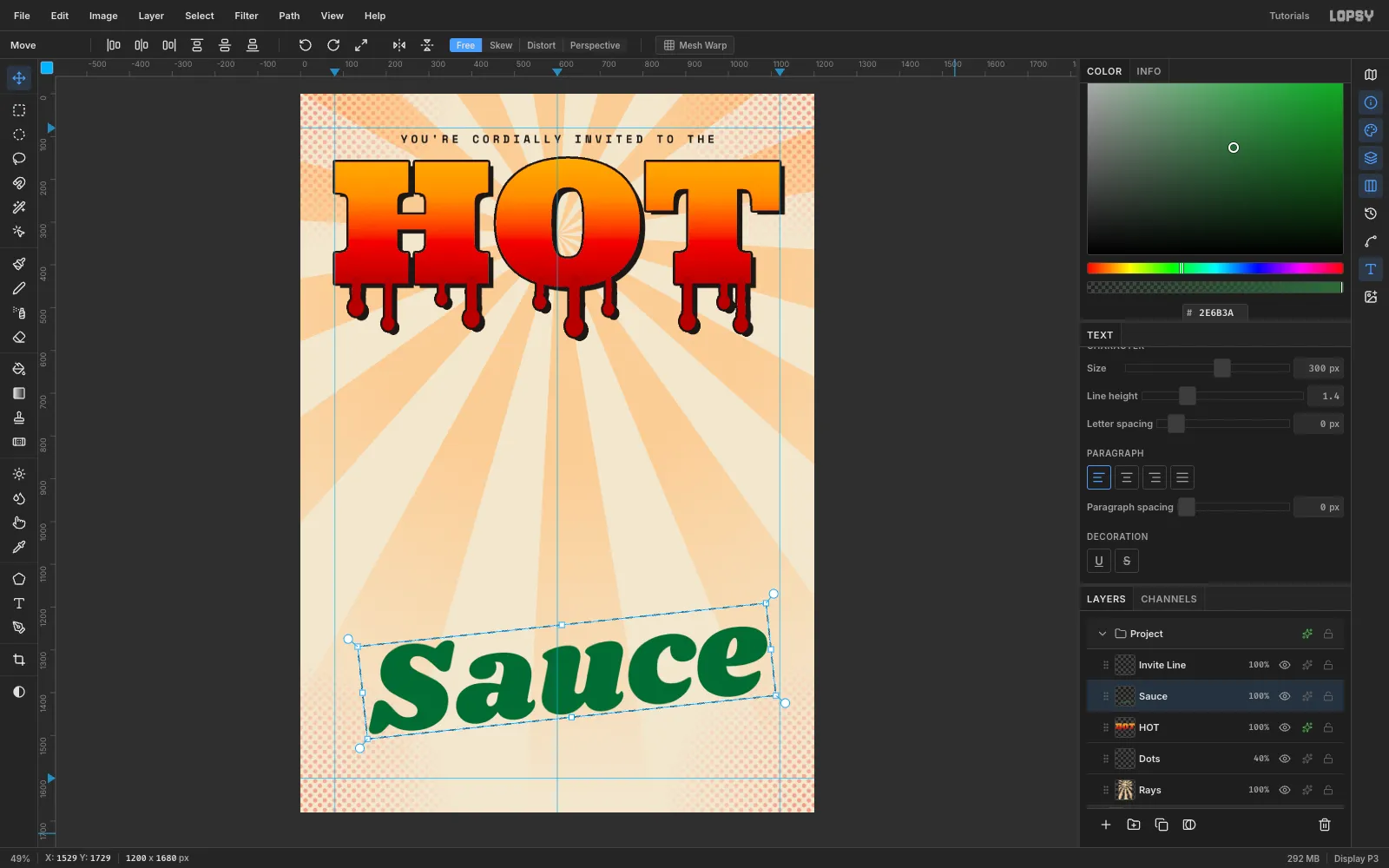
With HOT selected, type Sauce in Shrikhand at 300 px in
#2E6B3A. It's the one cool colour in the design. Rasterize it, draw a marquee around it, and drag just outside the top-right corner with the Move tool to rotate it −6°. Press Cmd+D.Rasterize type before you rotate it. That way the next text click can't pick up the live layer.
Draw a new marquee and Cmd-scale Sauce to 1000 px wide, then move it to (100, 590). Its left edge should sit just inside the margin, and every drip should clear its cap line. Give it the same Stroke 5 and Drop Shadow 12 / 10 as HOT.
-
Cut an inline stripe through SOCIAL
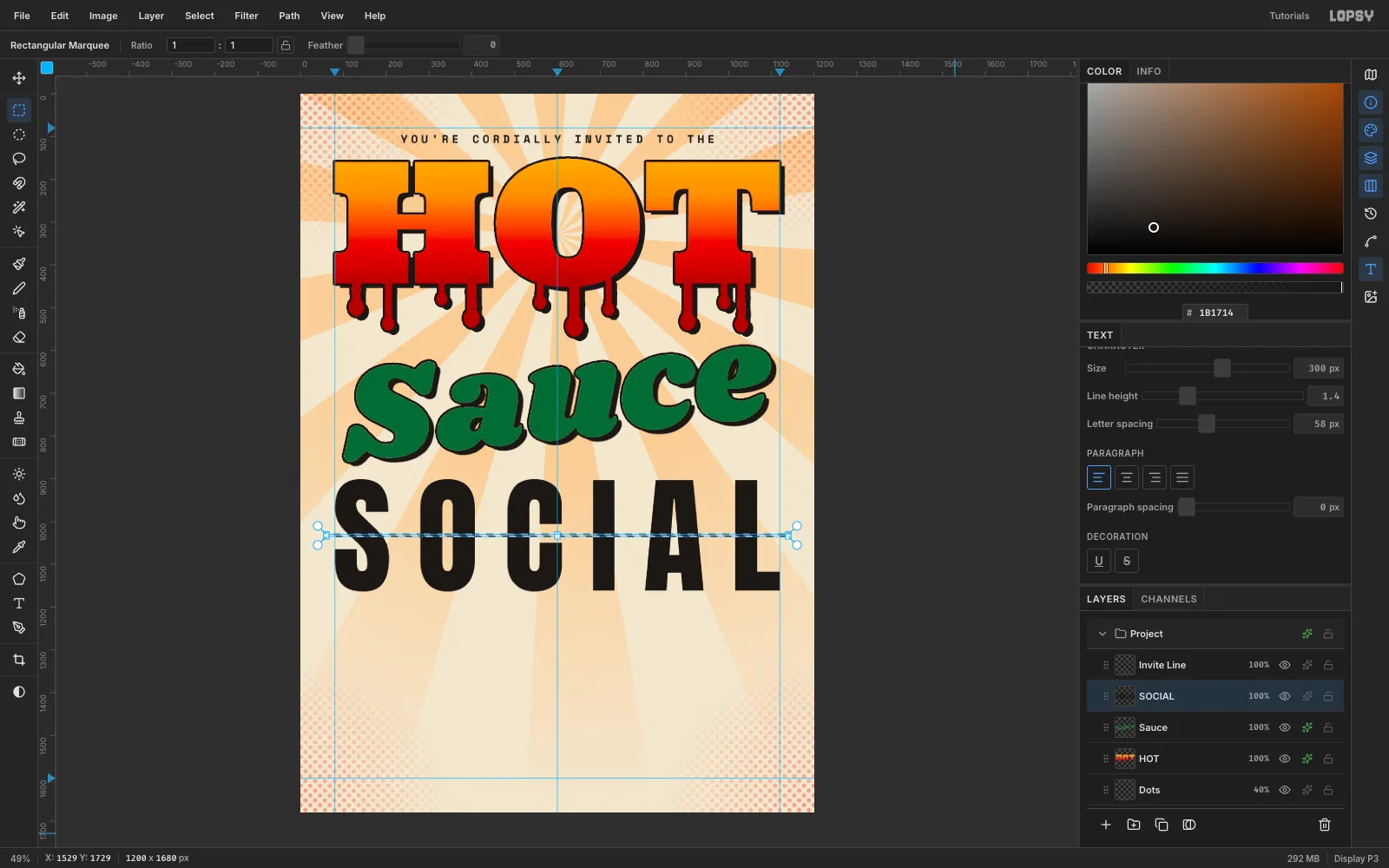
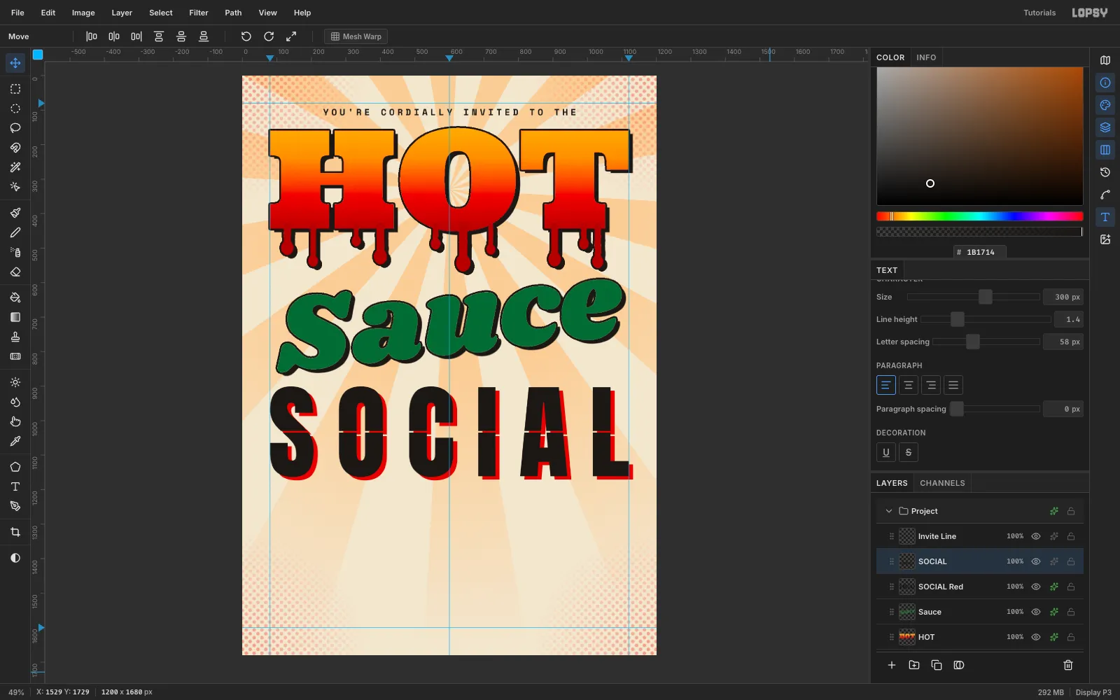
Set Letter spacing to 58 and type SOCIAL in Anton at 300 px in ink. Adjust the tracking until the word spans exactly 1040 px, then centre it with its top at y 900. Rasterize it.
Untick Snap, because it can collapse a thin marquee. Draw a 5 px tall Rectangular Marquee right across the middle of the cap height (y 1030) and press Delete. This one clean cut gives an "inline" wood-type look. Two cuts looked like a glitch.
-
Offset a red plate under SOCIAL
Choose Layer → Duplicate Layer. The copy lands 10 px down and right, so nudge it back with Shift+Left and Shift+Up.
Select the original underneath, add a Color Overlay in
#D62718, and nudge it 12 px right, 10 px down: Shift+Right then two Right presses, and Shift+Down. Rename the layers SOCIAL and SOCIAL Red.The red plate peeks through the inline cut, like a second ink run that missed the first.
-
Type the heat scale
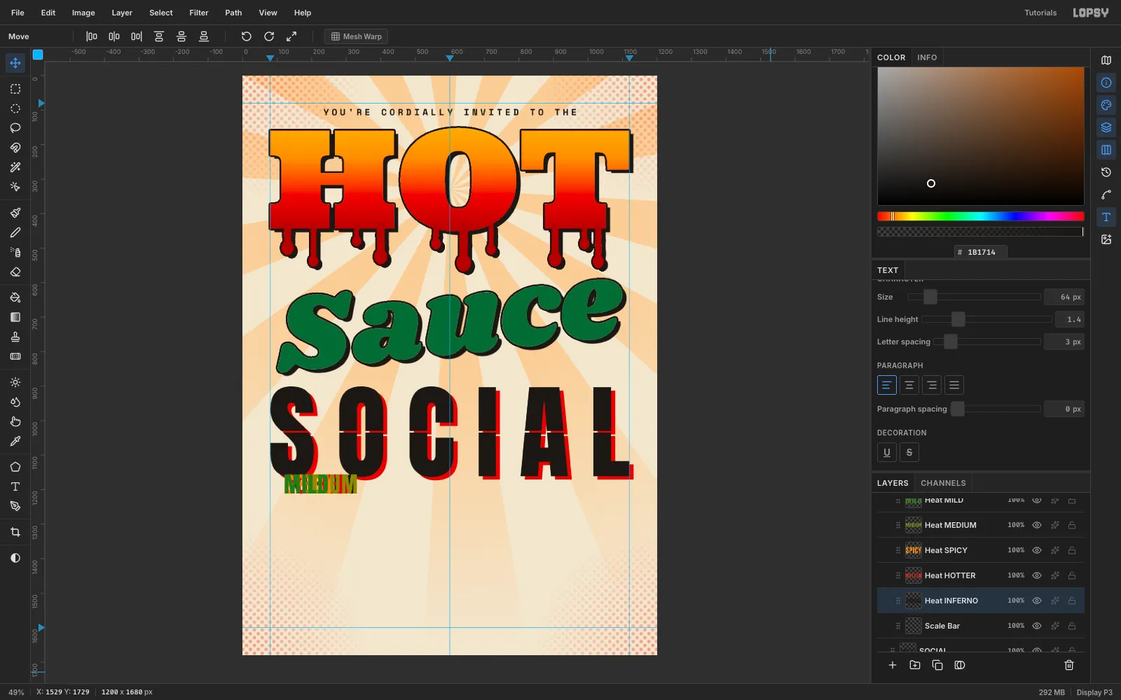
With SOCIAL selected, click New Group and name it Heat Scale. Add a layer inside it called Scale Bar. Select Scale Bar before each word, so the words land in the group without restyling each other.
Type each word in Anton 64 px with letter spacing 3, then rasterize it. Use a single face for the whole scale. Five different fonts read as a font sampler, and "SPICY" avoids repeating the headline's HOT.
- MILD
#3E7D2A - MEDIUM
#8C8A1A - SPICY
#F28A1E - HOTTER
#D62718 - INFERNO
#1B1714
Justify the row across the margins with equal gaps. The words total 868 px, so each of the four gaps is 43 px. Their left edges sit at x 80, 248, 500, 687 and 913, all on one baseline at y 1275.
- MILD
-
Add a gradient scale bar
On Scale Bar, build a 1040 × 16 capsule at y 1290 from a Rectangular Marquee plus two circle ends, filled in ink. Magic Wand it, then drag a Linear gradient from x 80 to x 1120 using the five heat colours as stops: 0, 25, 50, 72 and 100%.
Label the ends in Space Mono 700, 20 px:
0 SHUflush left and2,000,000+ SHUflush right, with their tops at y 1318.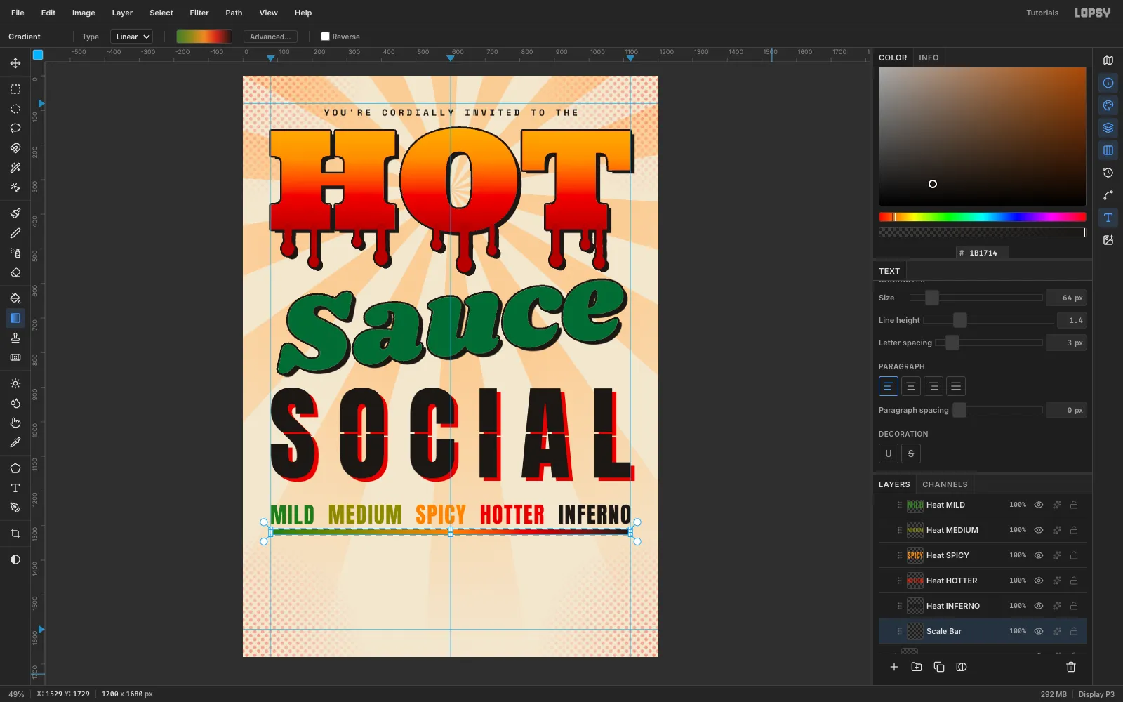
-
Build the BYOB badge
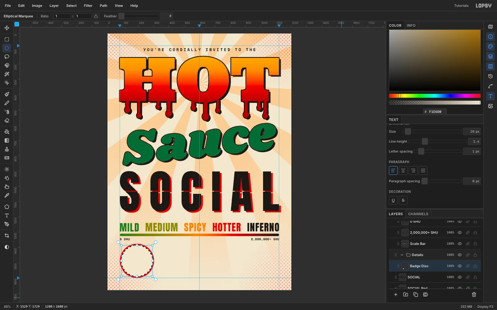
Select SOCIAL again and create a Details group with a Badge Disc layer inside it. Draw a 224 px Elliptical Marquee centred on (192, 1488). Its left edge sits on the 80 px margin and its bottom on the 1600 guide. Fill it with
#D62718.Choose Select → Shrink… by 9 and fill with the paper colour. Then Shrink by 4 more and fill red again. That leaves a crisp 4 px cream ring. Add a Drop Shadow in ink at 8 / 7, blur 0. The badge is smaller, so it gets a slightly smaller offset.
-
Draw a chili with the Lasso
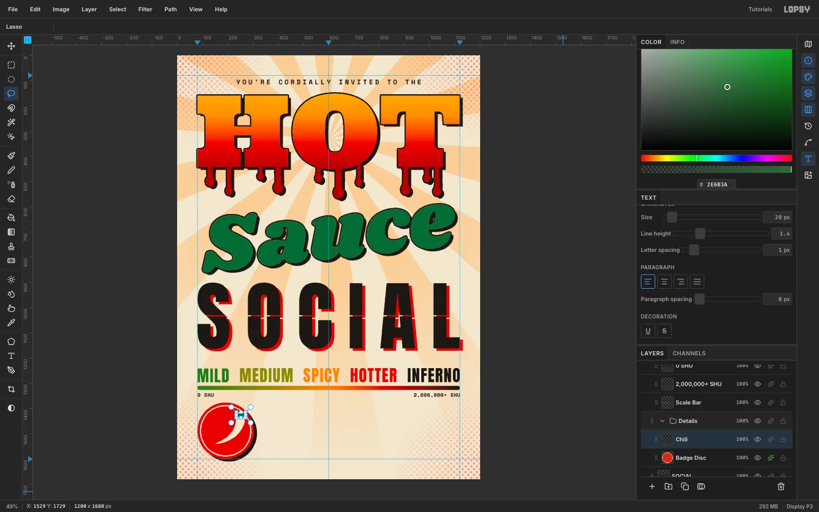
On a new Chili layer, lasso a tapered crescent in
#F1E6D0. It should be fat at the shoulder and curve down to a sharp point. Lasso a small green#2E6B3Acalyx on top and a thin curled stem.Draw a marquee around the chili and Cmd-scale it to about 64%. Then drag it with the Move tool until it's centred on the badge.
-
Run text around the badge
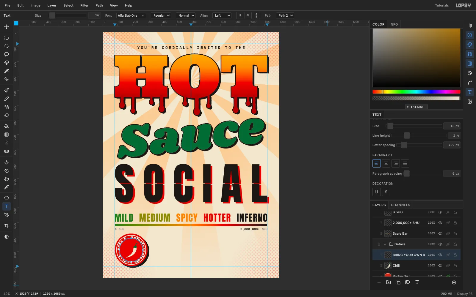
Pick the Shape tool, set Shape to Ellipse and Output to Path, and drag from the badge centre out 80 px. That makes a circular path starting at 12 o'clock.
With Chili selected, set letter spacing to 6 and type
BRING YOUR OWN BOTTLE • BYOB •in Alfa Slab One, 16 px,#F1E6D0. Paste it if your keyboard can't type the bullets. Press Tab, then choose the path in the Text options bar's Path dropdown.Adjust the letter spacing until the gap at the seam matches the gaps around the bullets. At this size and radius, 6 closes the circle evenly.
-
Set the details block
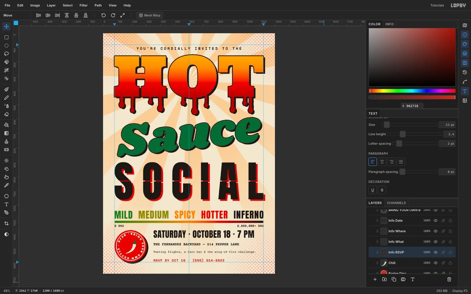
Line the details up with the badge. The block starts at x 352, its first line's cap top matches the badge top (y 1376), and its last line sits on the 1600 guide:
- Date:
SATURDAY · OCTOBER 18 · 7 PM, Anton 60 px, letter spacing 3.5, so it ends right on the 1120 margin under INFERNO. Top at y 1376. - Where:
THE FERNANDEZ BACKYARD — 214 PEPPER LANE, Courier Prime 700, 25 px. Top at y 1467. - What:
Tasting flights, a taco bar & the wing-of-fire challenge., Courier Prime 400, 21 px. Top at y 1520. - RSVP:
RSVP BY OCT 10 · (555) 014-8822, Space Mono 700, 23 px,#D62718. Top at y 1576.
The three gaps between the lines are equal, so the block reads as one unit with the badge.
- Date:
-
Trim the drips so Sauce can breathe
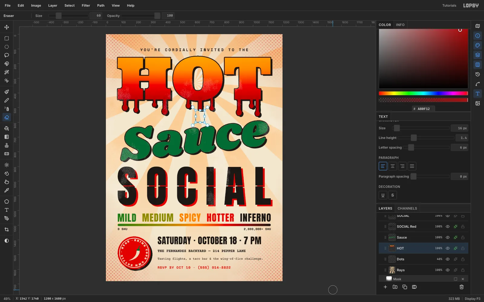
Check that every drip clears Sauce by at least 30 px. For any that don't, draw a marquee over the bottom of the drip on the HOT layer and scrub it out with the Eraser at Size 60. The marquee keeps the eraser off everything else.
Fill a new ellipse drop about 22 px higher. The stroke and shadow re-wrap the new end automatically.
-
Add a fine print grain
Add a layer called Wear. Fill it with
#808080, run Filter → Add Noise… at Amount 100 in Mono, then Filter → Threshold… at 174. About 4% of the pixels are now white specks on black.Set the layer to Lighten at 40%. The black does nothing, and the white specks knock tiny holes of paper colour into the ink.
Drag the layer's grip to the top of the Layers panel, so the grain covers every element evenly.
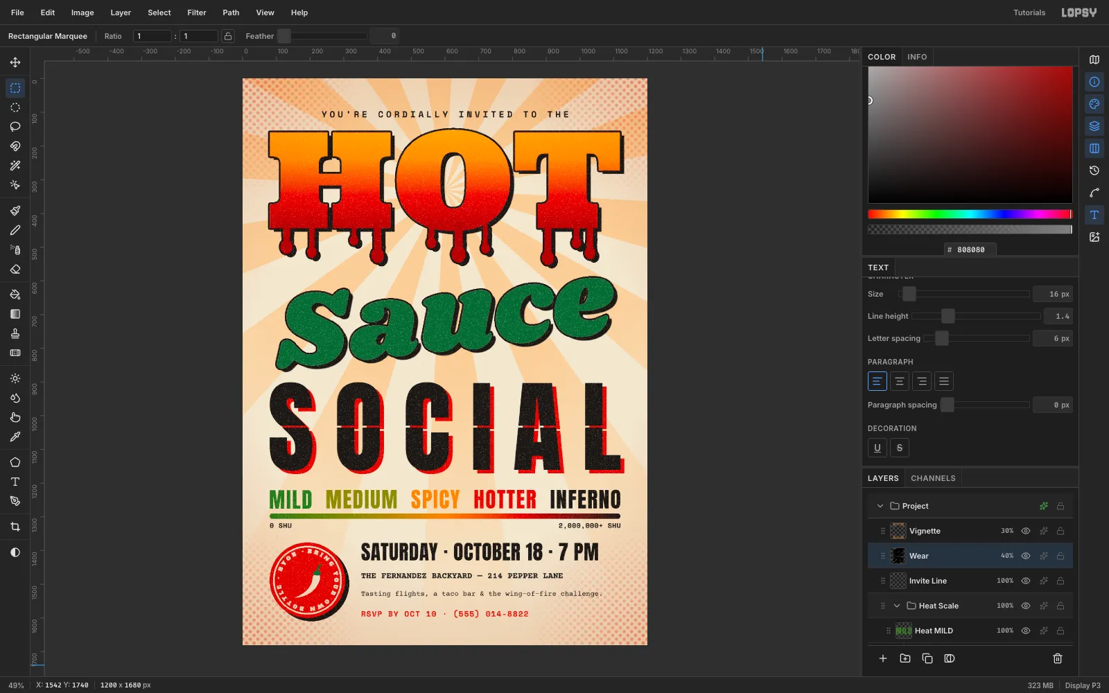
-
Finish with a warm vignette
Add a top layer called Vignette. Drag a Radial gradient from the page centre (600, 840) to (600, 1900). Use
#C77A3Astops: transparent from 0 to 55%, then fully opaque at 100%. Set it to Multiply at 30%.This warms the edges without the muddy brown of a burn. Hide the guides with View → Show Guides, then File → Quick Export PNG.