Design a Swiss Style Exhibition Poster
Build a Swiss International Style exhibition poster in Lopsy with a strict grid, giant grotesk type, eccentric circles, halftone shading and a rotated caption.
The Swiss International Typographic Style grew up in Zürich and Basel in the 1950s. Designers like Josef Müller-Brockmann and Emil Ruder built posters from a strict grid, flush-left sans-serif type, flat colour and a single strong geometric idea. Their concert posters often turned sound into concentric or offset circles.
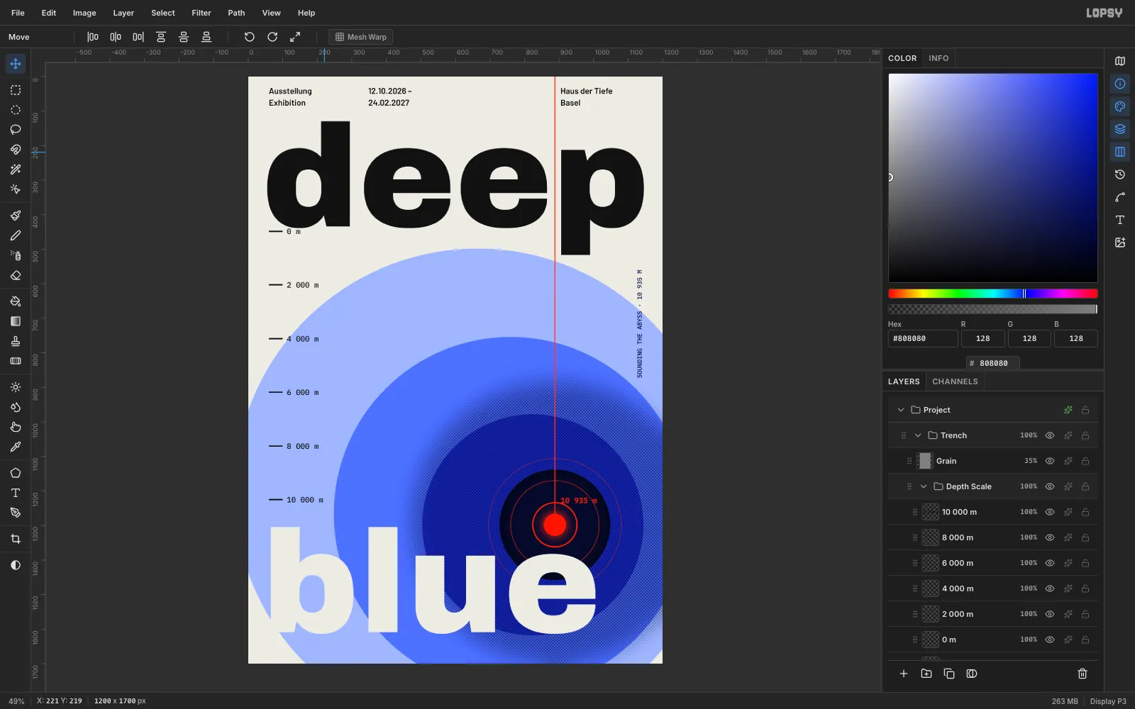
In this tutorial you'll use that approach for an invented exhibition about the deep sea called deep blue. A red sounding line drops through the gap between two letters, into a tunnel of offset blue discs, and ends at a glowing probe. You'll work with a grid and guides, elliptical marquees, a feathered selection turned into halftone dots, shape-tool rings, copy and paste, a rotation transform and a grain overlay.
The palette is: paper #EDEBE4, ink #111111, four blues (#A3B5FF, #5470FF, #1F2FD6, #0A0F3C) and one signal red #FF3D1F.
-
Set up the canvas, grid and guides
Open Lopsy. In the New Document dialog, type
1200for Width and1700for Height, choose a White background, and click Create.Choose View → Show Grid, then set the Grid slider in the options bar to
32pxand tick Snap. Click the top ruler at60,1140and888to add vertical guides, and click the left ruler at60and1640for horizontal ones. The guide at 888 is where the sounding line will go.Select the Background layer, set the foreground colour to
#EDEBE4in the Color panel's hex field, press G for the Paint Bucket and click the canvas.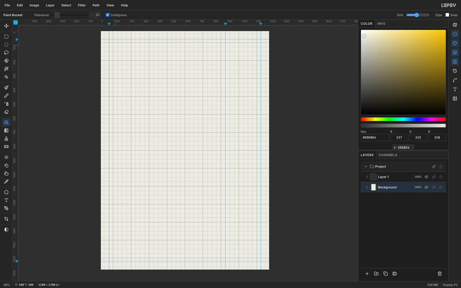
-
Set the headline
Select Layer 1 and set the foreground to
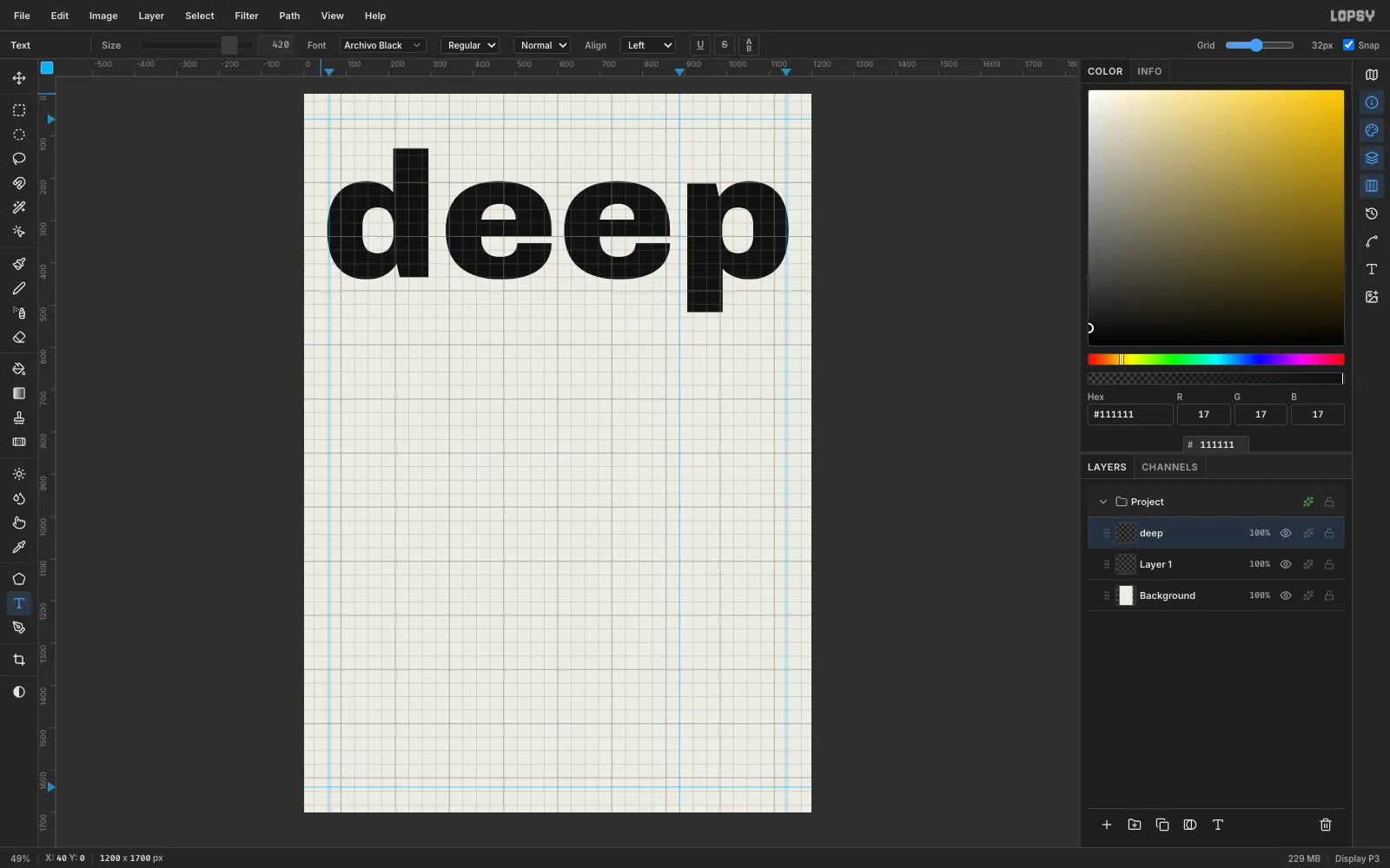
#111111. Press T for the Text tool. In the options bar, open the Font browser, search forArchivo Blackand pick it, then set Size to420. Click near the top-left corner at about (40, 0), typedeepin lowercase, and press Tab to commit.At this size the word runs from margin to margin. Notice the gap between the second e and the p: it sits right on the 888 guide.
-
Marquee the trench discs
With
deepactive, click New Group in the Layers panel footer and name the groupTrench. The group goes abovedeep, so the discs will cover the descender of the p.Click Add Layer, name it
Disc 1, pick the Elliptical Marquee and drag a circle from (−40, 498) to (1368, 1906). It bleeds off the left, right and bottom edges. Set the foreground to#A3B5FFand fill the circle with the Paint Bucket. Then addDisc 2and marquee from (248, 754) to (1272, 1778).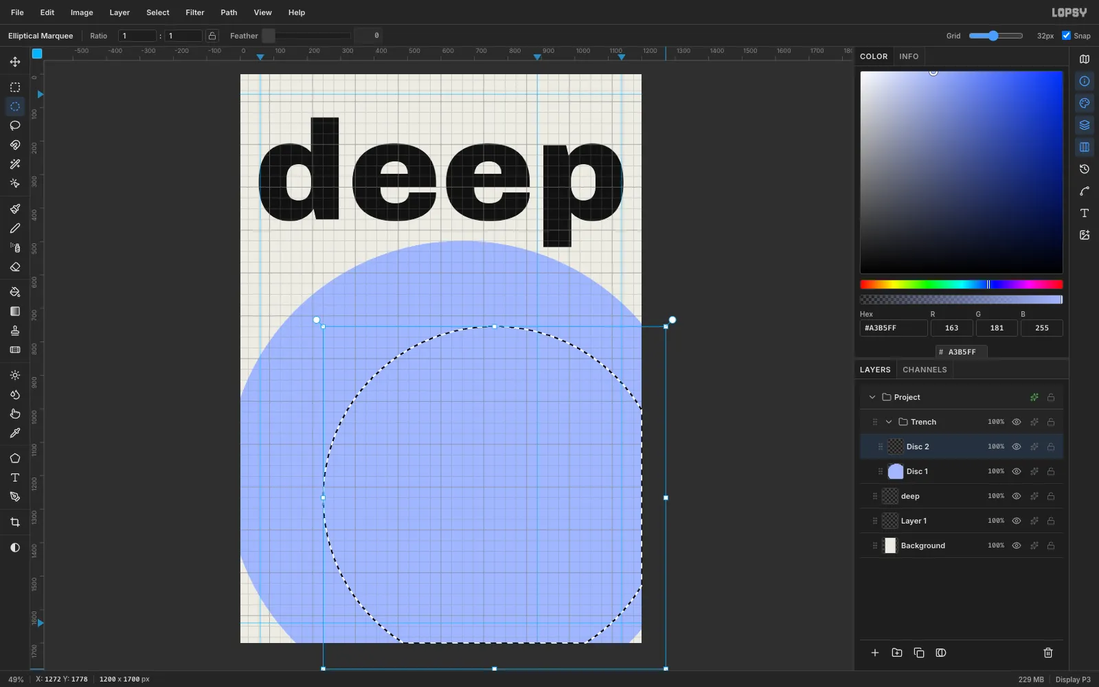
-
Complete the eccentric trench
Fill
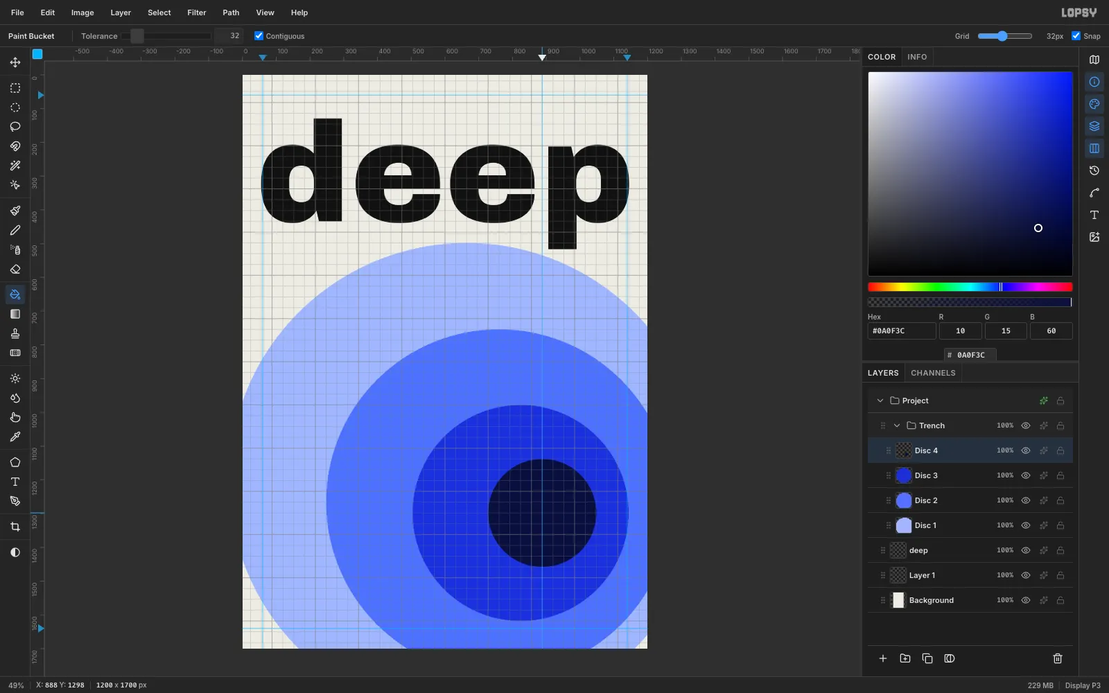
Disc 2with#5470FF. AddDisc 3with a marquee from (504, 978) to (1144, 1618), filled with#1F2FD6. AddDisc 4from (728, 1138) to (1048, 1458), filled with#0A0F3C. Press Cmd+D to deselect.Each disc is smaller, darker and shifted towards the lower right, so the circles read as a tunnel dropping away. Four big steps work better than lots of small ones, which look like a UI gradient.
-
Feather a shade selection
Click Add Layer and name it
Halftone Shade. Choose the Elliptical Marquee, set Feather to160in the options bar, and drag a circle from (472, 882) to (1304, 1714), centred on the probe point at (888, 1298). Fill it with#0A0F3C. Deselect, then set Feather back to0so later marquees stay crisp.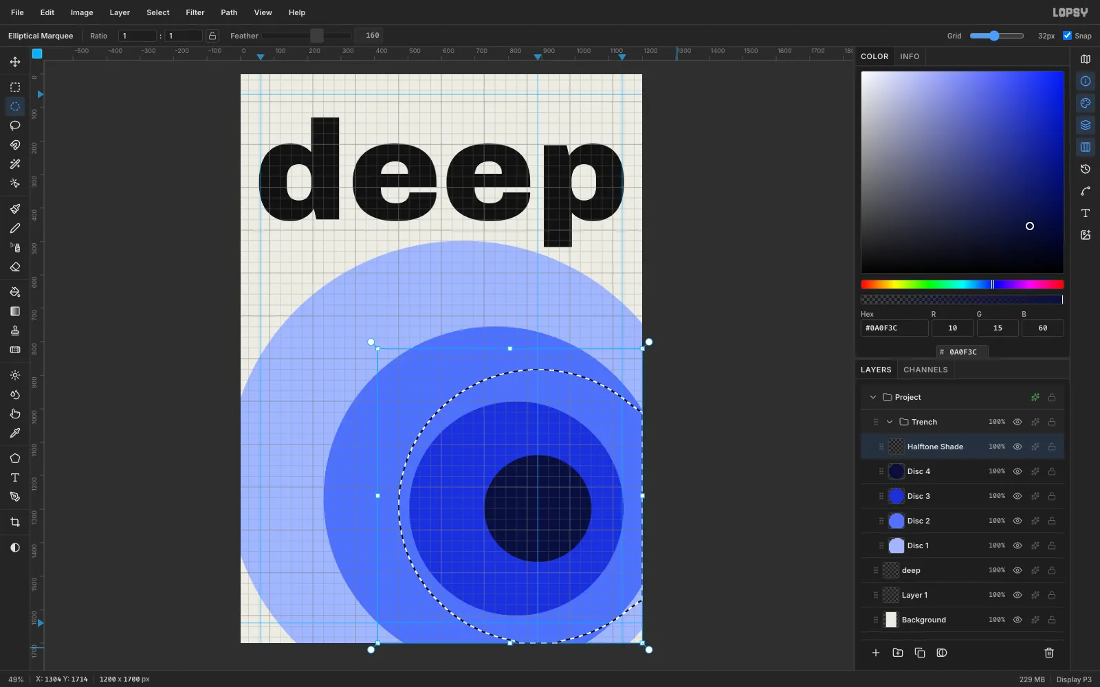
-
Turn the shade into halftone dots
Choose Filter → Halftone…, set Dot Size to
6, tick Preview, and click Apply. The soft falloff becomes a dot screen that grows denser towards the centre, a classic Swiss print detail.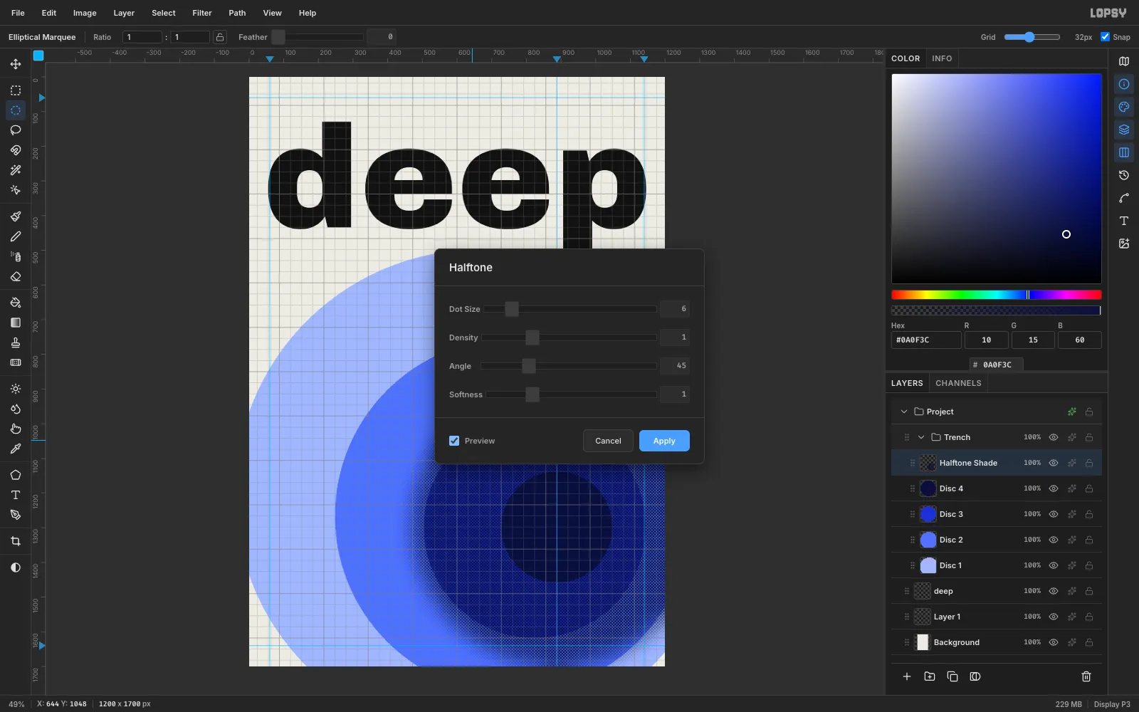
-
Clip the dots to the discs
The halftone mustn't spill onto the paper. With the Elliptical Marquee, drag the same circle as
Disc 1, from (−40, 498) to (1368, 1906). Press Cmd+Shift+I to invert the selection, press Delete, and deselect.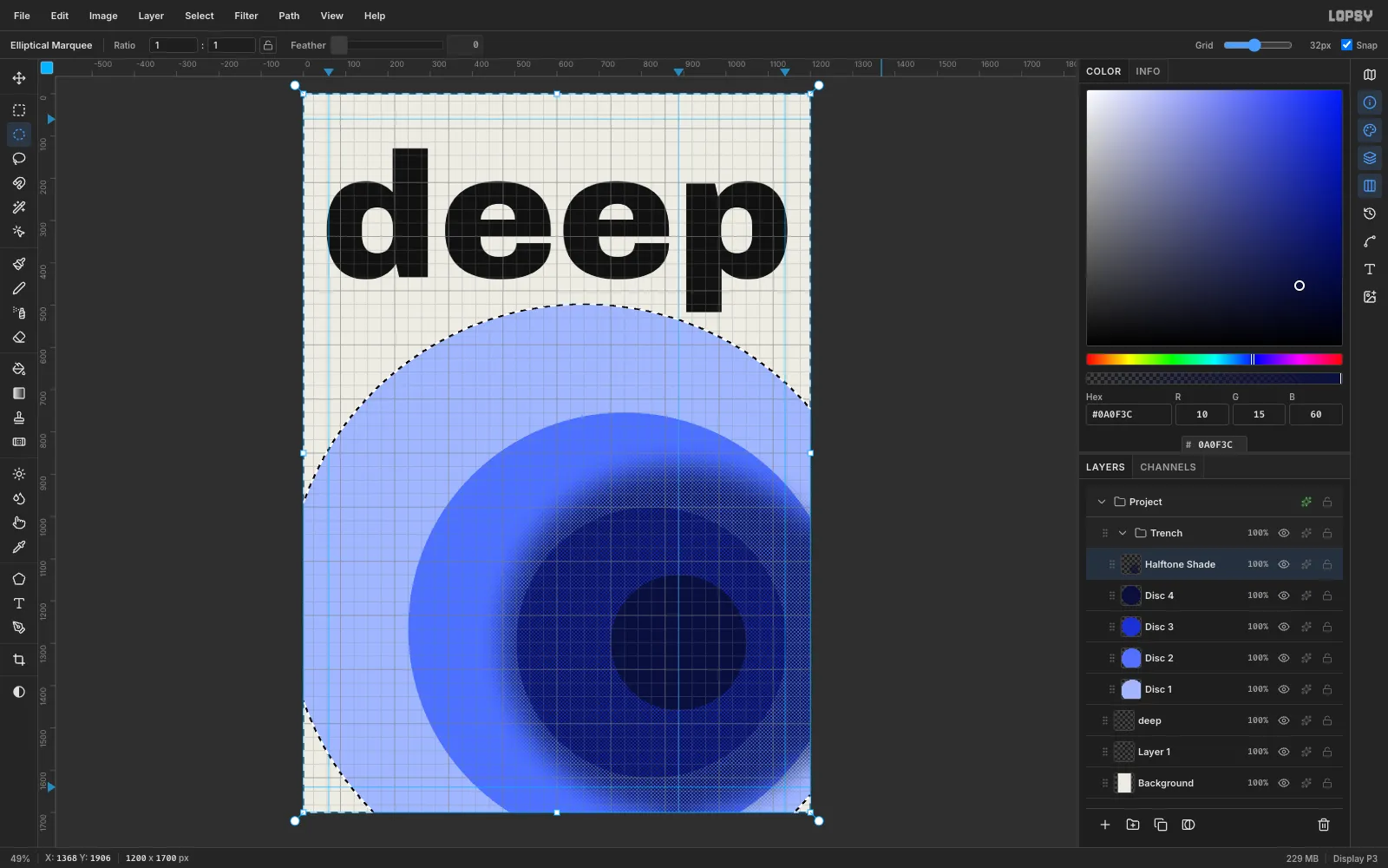
-
Multiply the halftone
Click the ✦ button on the
Halftone Shaderow to open Layer Effects and set Blend to Multiply. Then click the row's opacity readout and drag the slider to60%. The dots now darken the discs underneath, not just cover them.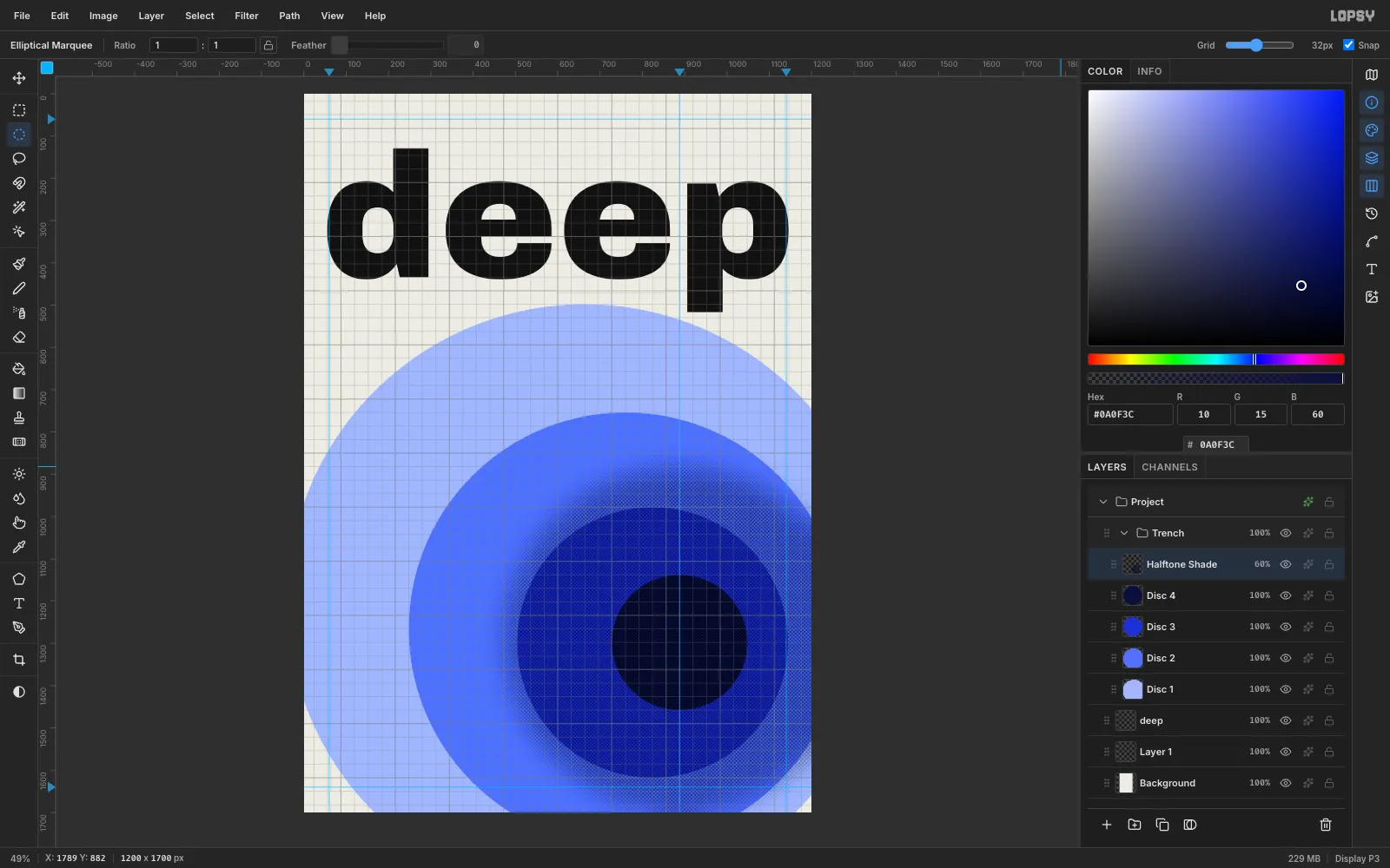
-
Drop the sounding line
Add a layer named
Sounding Line. Set the foreground to#FF3D1F, press B for the Brush, and set Size4, Hardness100and Opacity100. Click at (888, 0), then Shift-click at (888, 1298) to draw a perfectly straight line down the guide.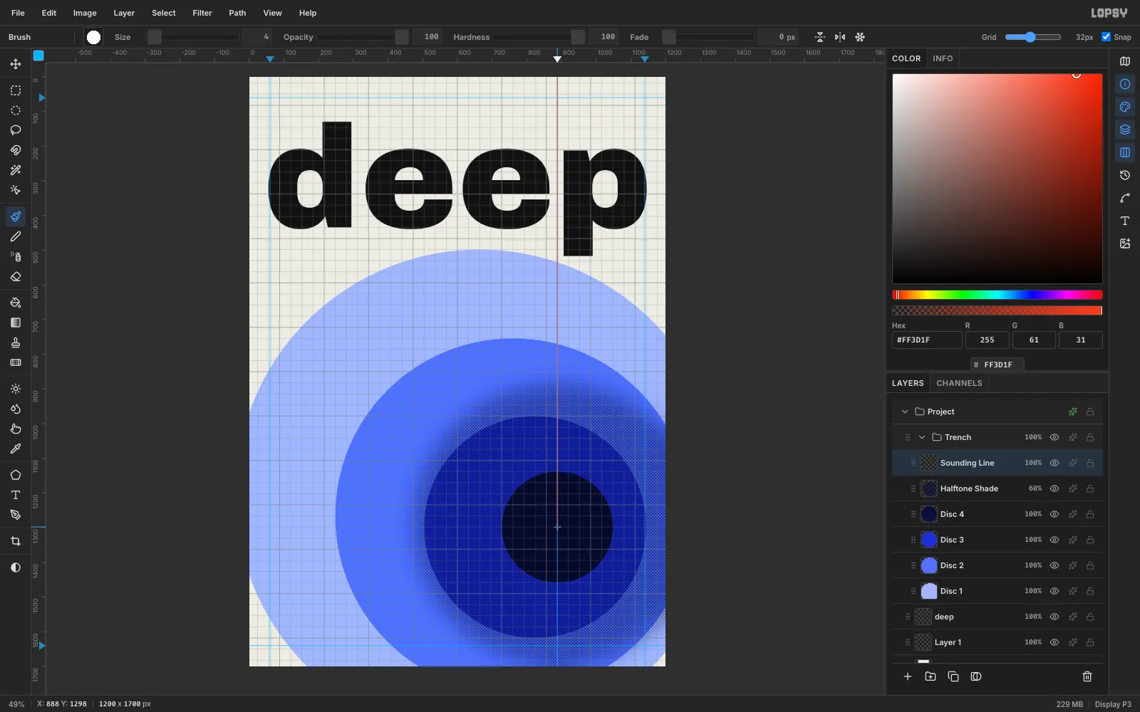
-
Add the probe and its glow
Add a layer named
Probe. Marquee a circle from (856, 1266) to (920, 1330) and fill it with the same red. In Layer Effects, tick Outer Glow, set the glow colour to#FF3D1F, and set Size40, Spread10and Opacity85.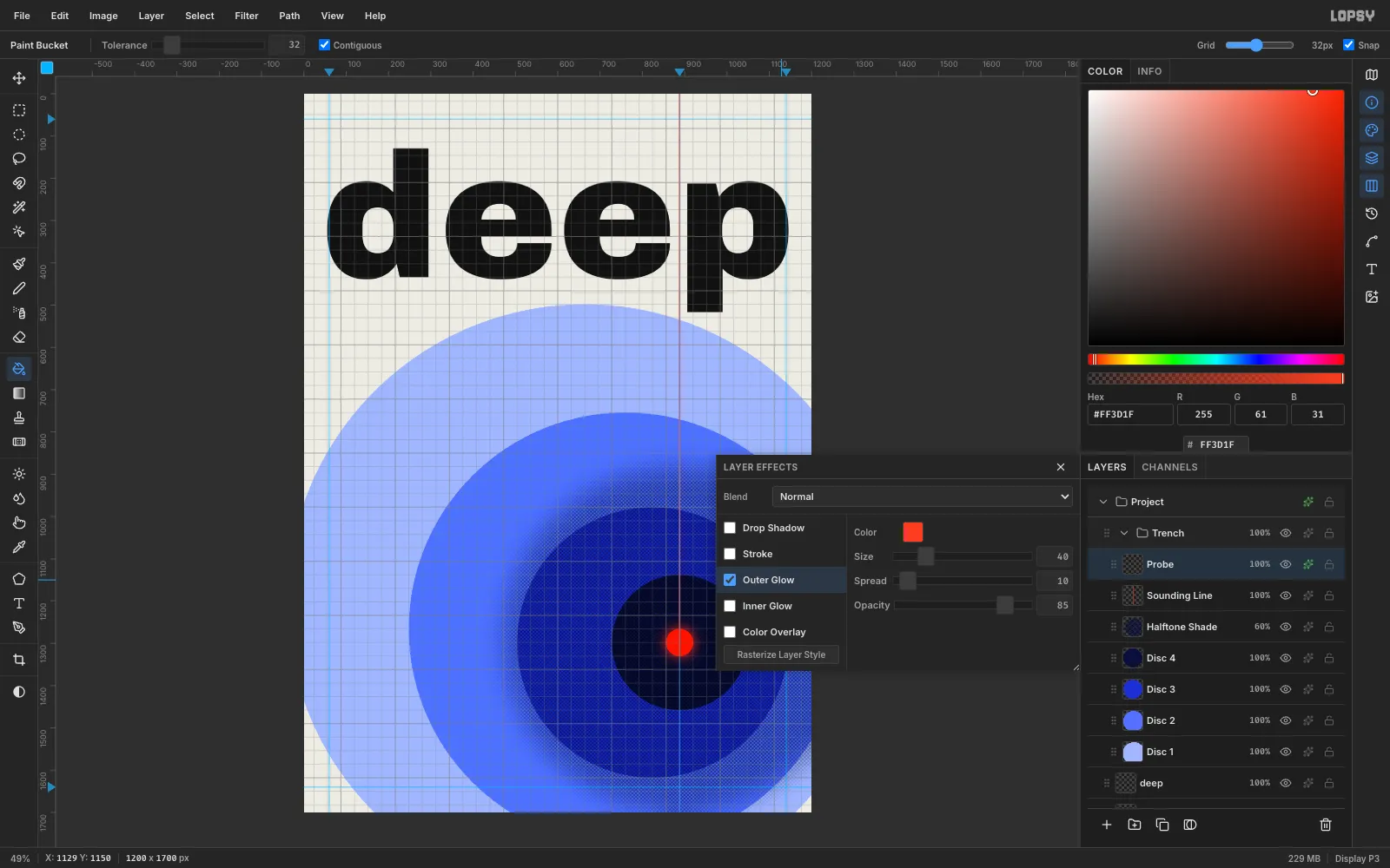
-
Draw the sonar rings
Add a layer named
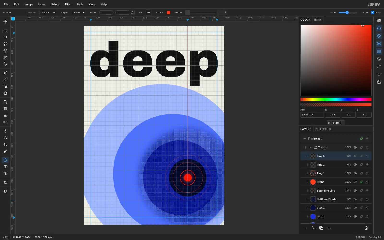
Ping 1. Press U for the Shape tool and choose Ellipse. Click the Fill swatch and choose Remove fill, then click Add stroke color and typeFF3D1Fin its hex field. Set Width to2, hold Cmd, and drag from the probe centre (888, 1298) out 64 px for a perfect circle.Add
Ping 2andPing 3the same way, with Width1and radii of 128 and- Set their opacities to
70%and40%, so the signal fades as it spreads.
- Set their opacities to
-
Knock out the second word
With
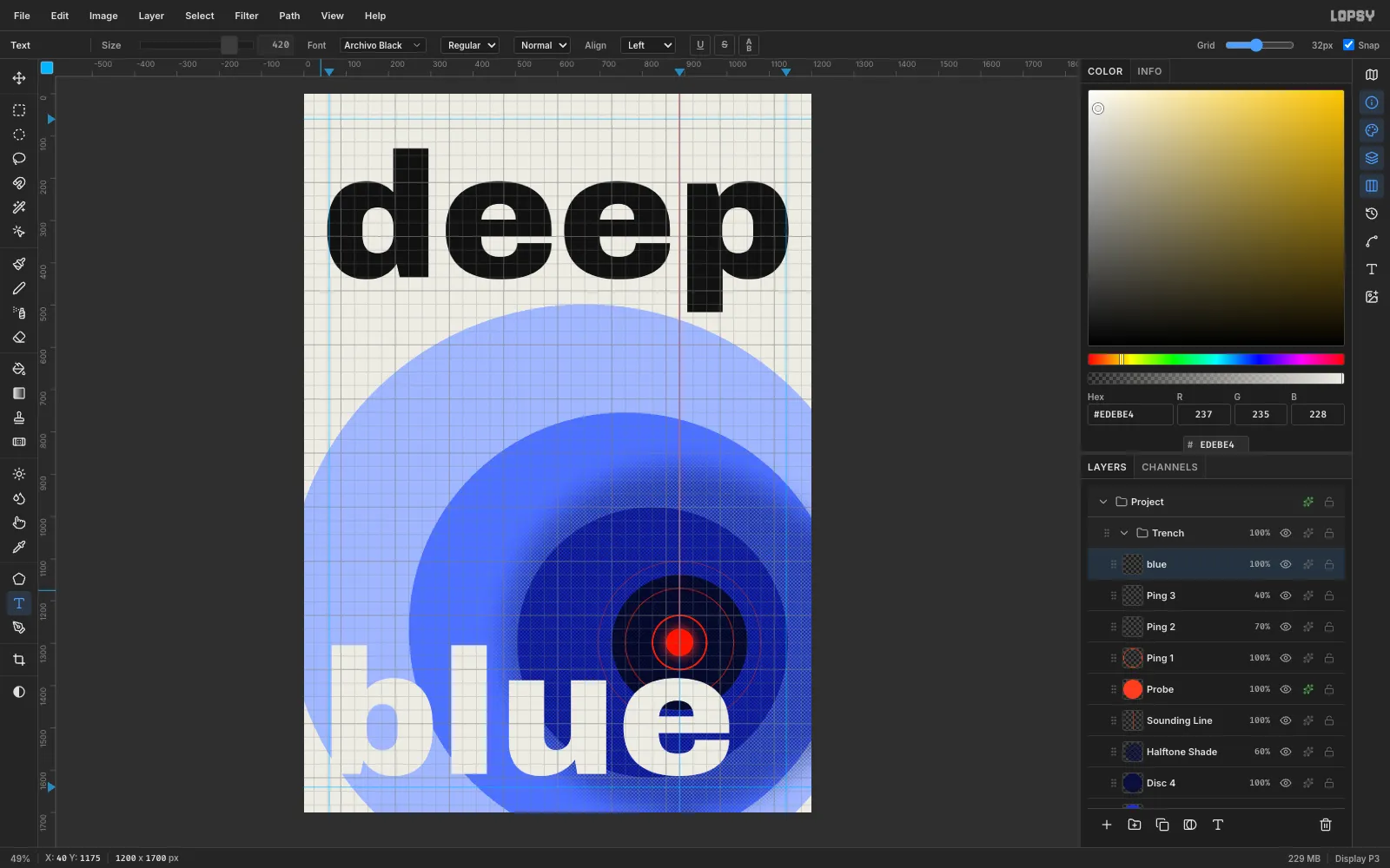
Ping 3active, set the foreground to the paper colour#EDEBE4, press T, and click at (40, 1175). Typeblueand press Tab. It uses the same Archivo Black at 420 px, flush left underdeep.Because the word is paper-coloured, it looks like a hole cut through the discs. It also sits above the rings, so the e cleanly cuts the outer ping.
-
Paste the first depth tick
With
blueactive, click New Group and name itDepth Scale, then add a layer namedTicks. Untick Snap first, because the grid would collapse a 4 px marquee.The scale starts at the baseline of
deep(y 448 = 0 m) and ends at the probe (y 1298 = 10 935 m, the depth of the Challenger Deep), so every 2 000 m is about 155 px. Marquee a 40 × 4 px tick at (60, 446) and fill it with#111111. Marquee slightly around it, press Cmd+C and Cmd+V, then drag the pasted tick down with the Move tool V to y 603.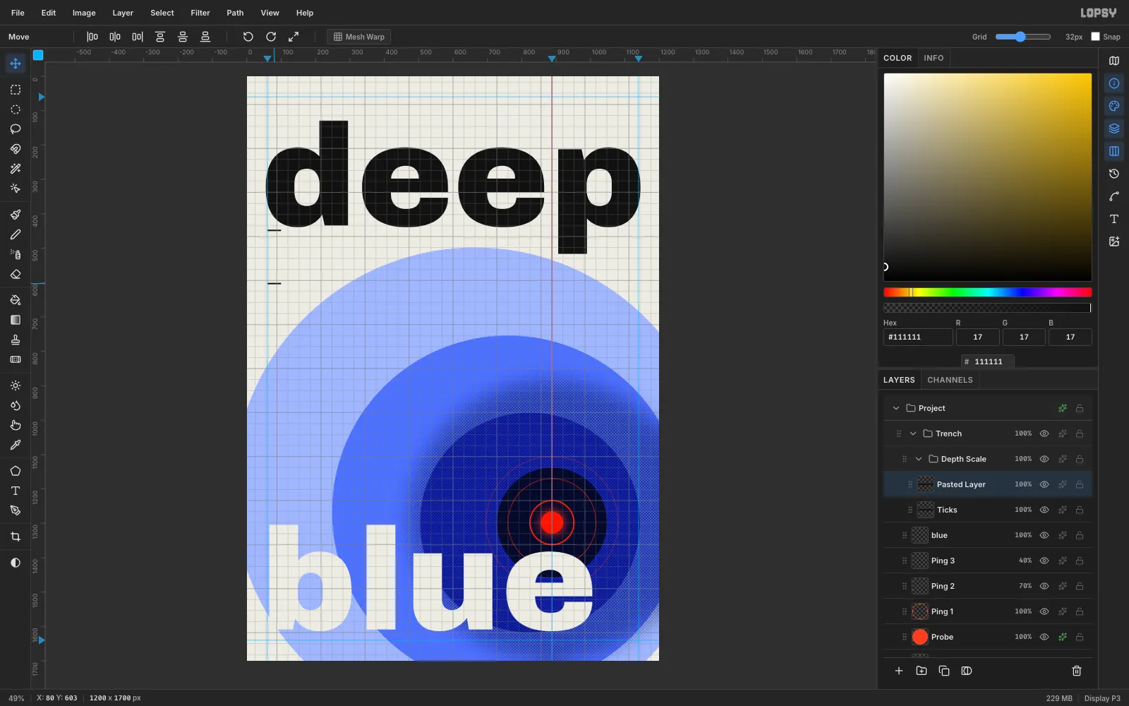
-
Finish the tick column
Paste and drag four more ticks to y 759, 914, 1070 and 1225. Then choose Layer → Merge Down five times to fold all the pasted layers back into
Ticks.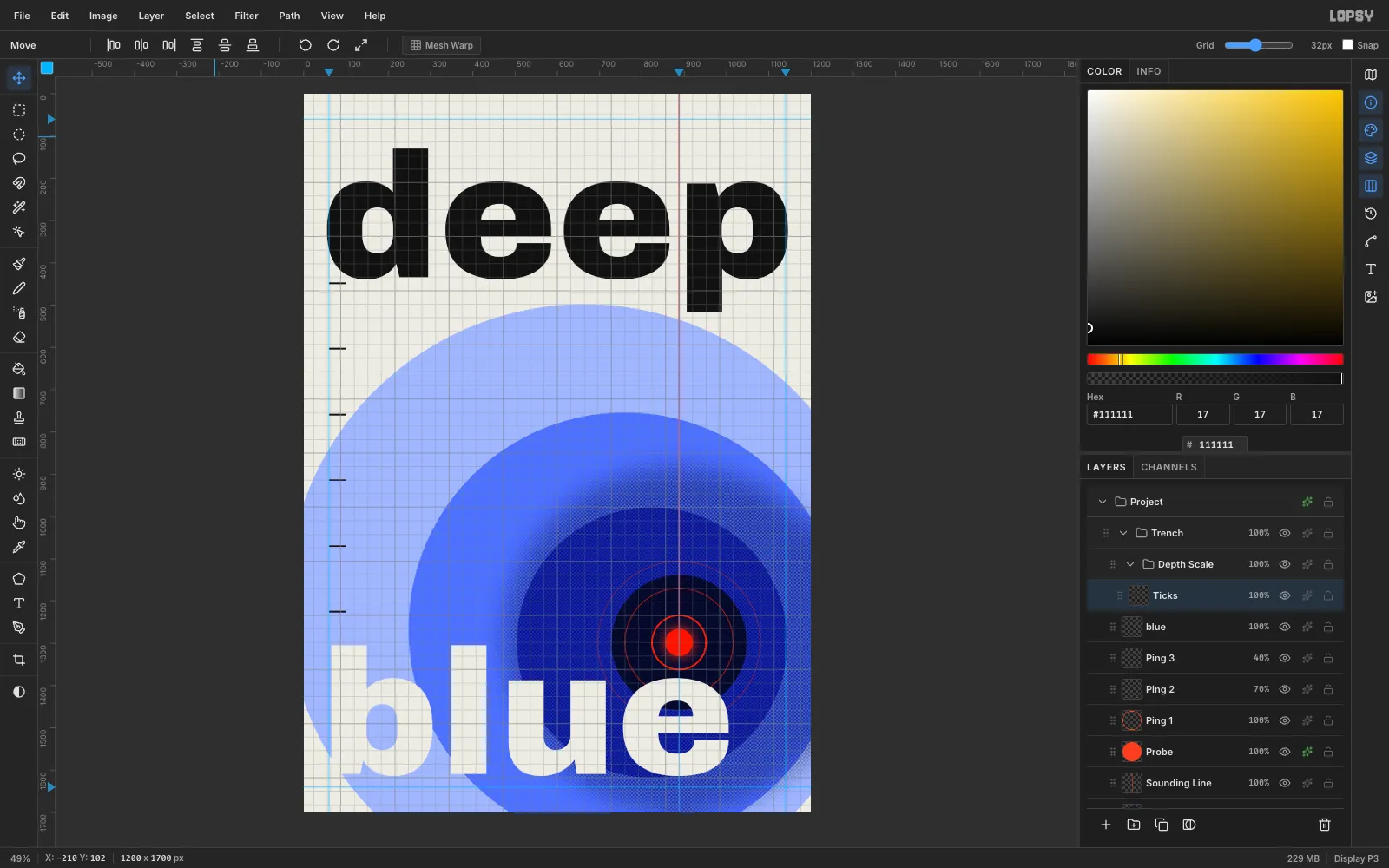
-
Label the scale
With
Ticksselected, set the foreground back to#111111, press T, and choose IBM Plex Mono at weight Medium (500) and Size22. Click at x 112, about 15 px above each tick, and type0 m,2 000 m,4 000 m,6 000 m,8 000 mand10 000 m. Press Tab after each one.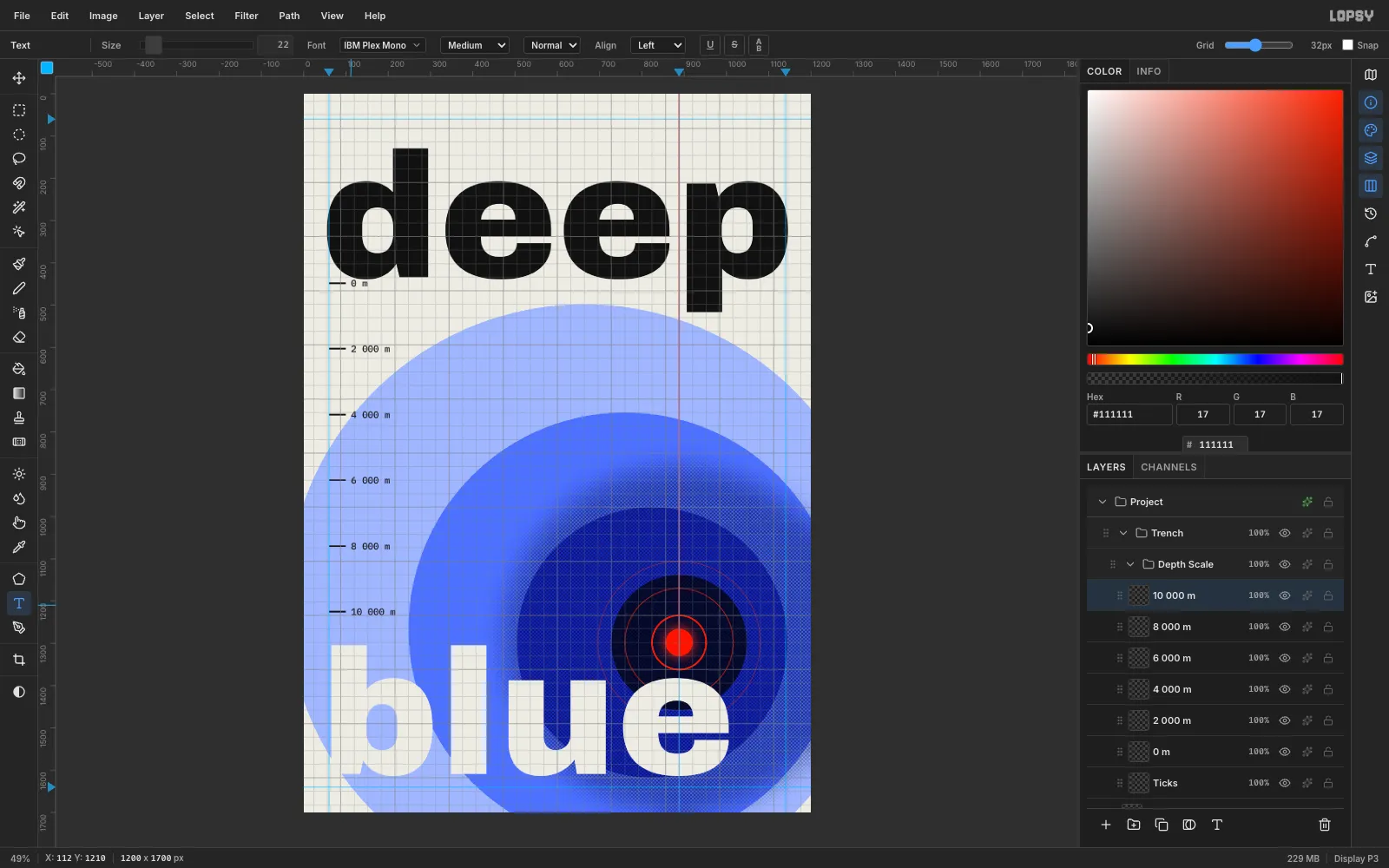
-
Add the probe's reading
Select
Ticksagain so you don't restyle the last label. Set the foreground to#FF3D1F, switch the weight to SemiBold (600), and click at (904, 1212) to type10 935 m. The final depth reading belongs to the probe itself, so it sits right beside the red dot.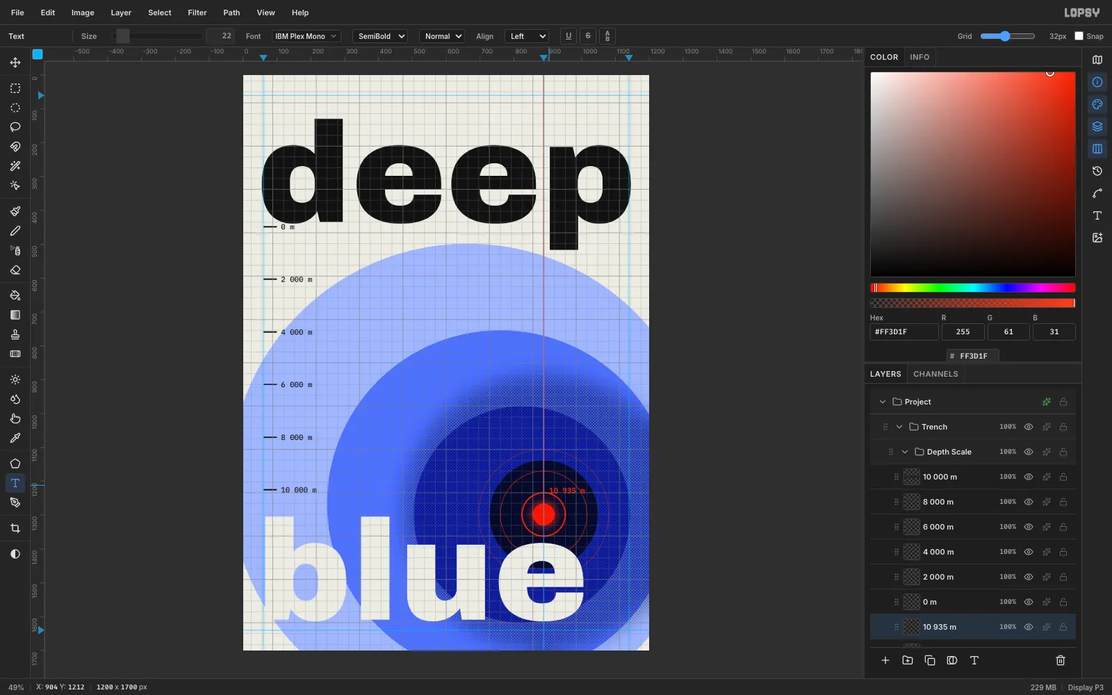
-
Set the header in three columns
Select
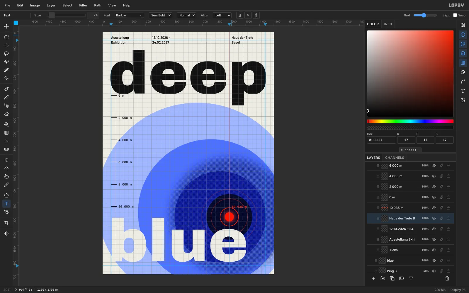
Ticksonce more, choose Barlow at SemiBold (600) and Size24, and set the foreground to#111111. At y 24, create three two-line blocks (press Enter for the line break):- x 60:
Ausstellung/Exhibition - x 348:
12.10.2026 –/24.02.2027 - x 904:
Haus der Tiefe/Basel
The third column starts 16 px right of the sounding line, so the red line acts as its column rule.
- x 60:
-
Select the caption
Select
Ticksagain. With IBM Plex Mono Medium at Size18and the foreground#0A0F3C, click in empty space at (300, 540) and typeSOUNDING THE ABYSS · 10 935 M. Click Rasterize Layer in the Layers panel footer. Then use the Rectangular Marquee to draw a box tightly around the text.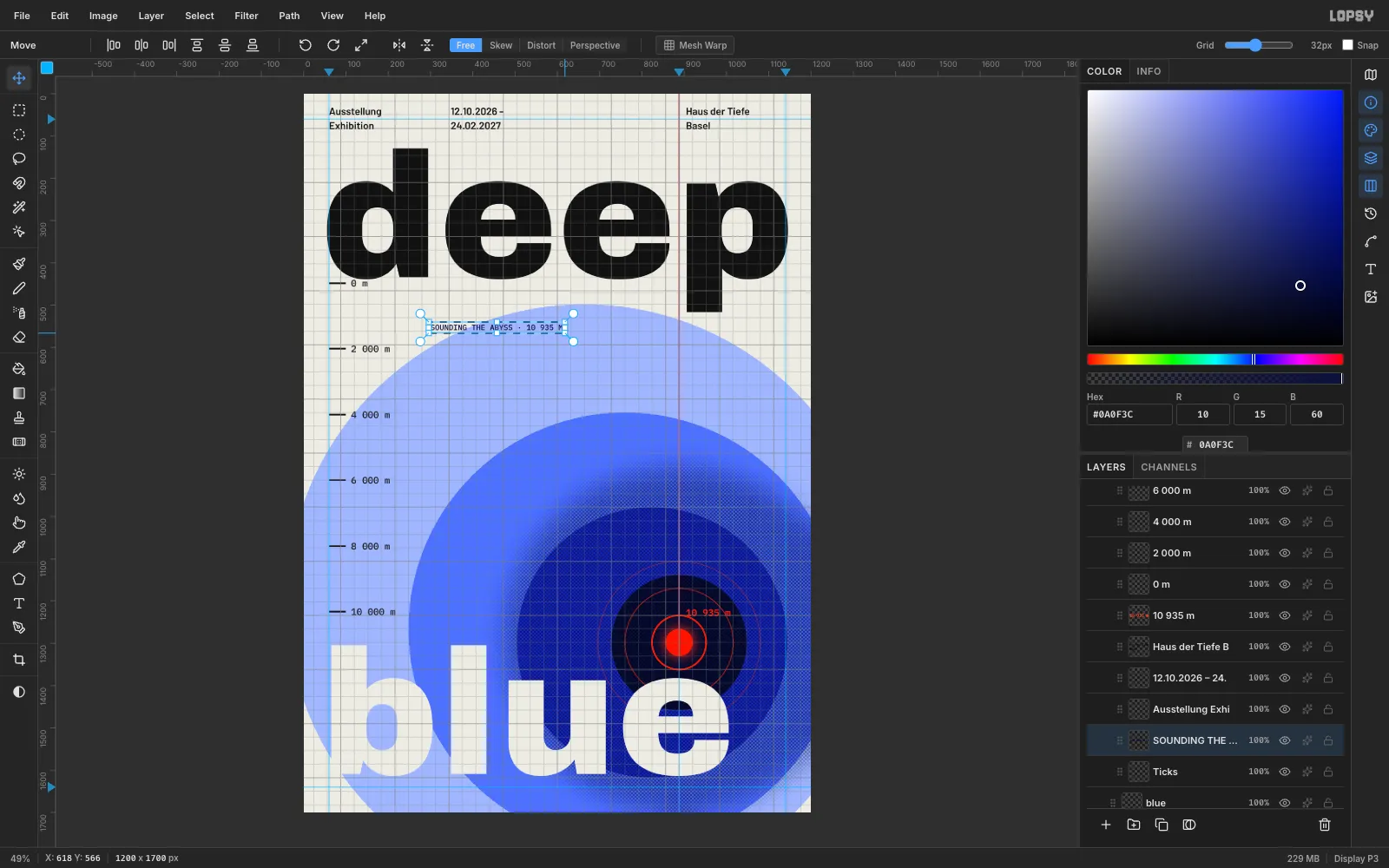
-
Rotate the caption 90°
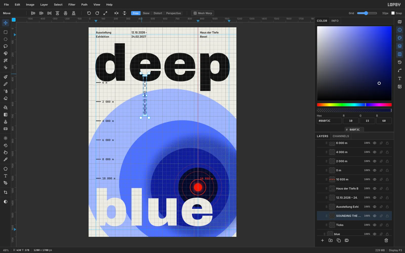
Press V for the Move tool. Hold Cmd so rotation snaps to 15° steps, and drag the top-right rotation handle a quarter turn anticlockwise. Press Enter to commit the transform, then Cmd+D.
-
Place the caption on the right margin
Drag the caption with the Move tool until its right edge is on the 1140 guide and its top is at about y 560, just under the p of
deep. It now runs over the paper and the pale disc, where it's easy to read.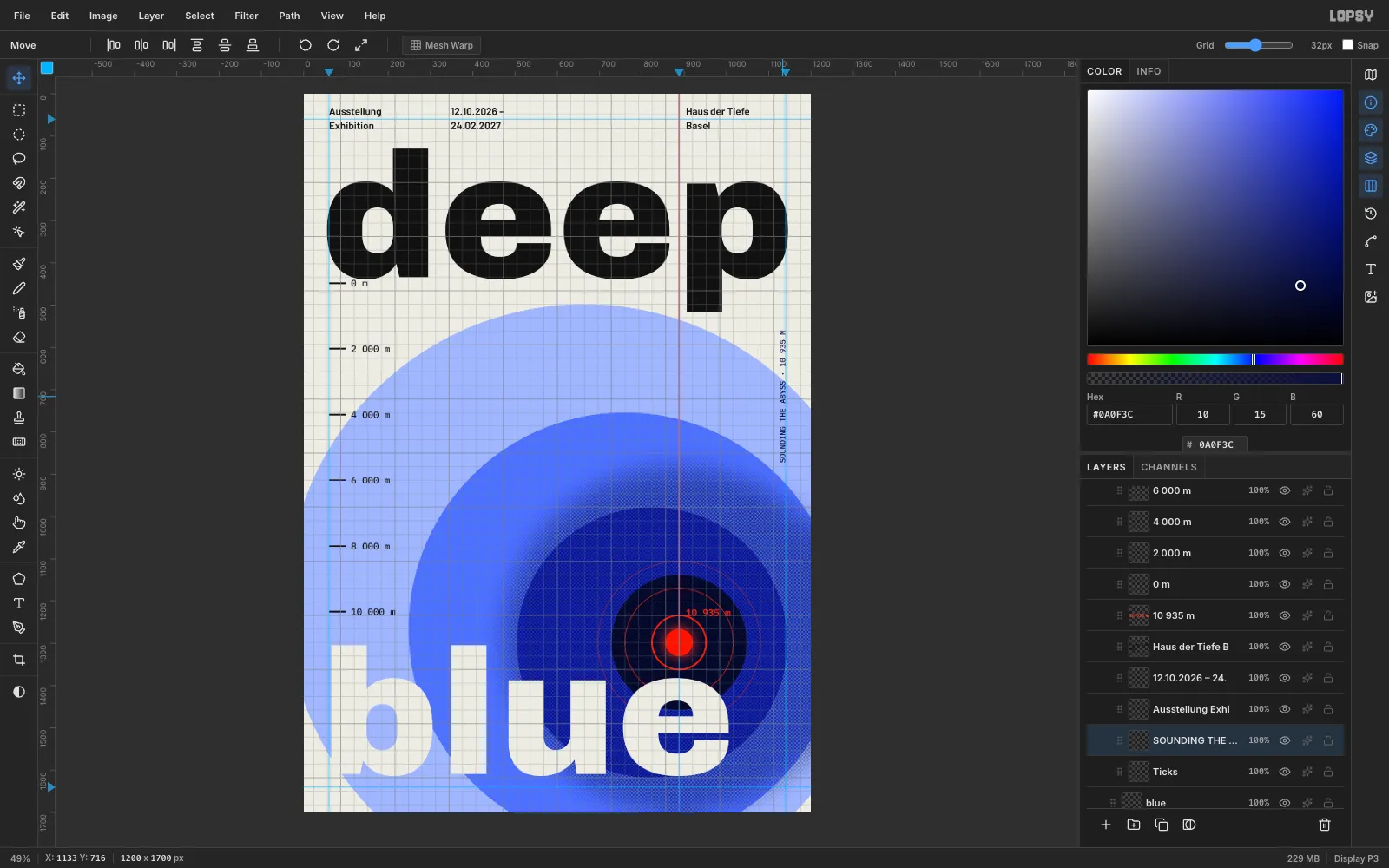
-
Make paper grain
Select the
Trenchgroup and click Add Layer to put aGrainlayer at the top. Fill it with#808080. Choose Filter → Add Noise…, set Amount to40, pick Mono and Gaussian, and click Apply.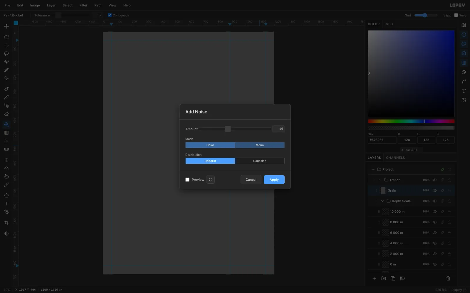
-
Blend the grain
Set the
Grainlayer's blend mode to Overlay and its opacity to about35%. Mid-grey disappears in Overlay, so only the speckle remains. It takes the digital flatness off the colour fields.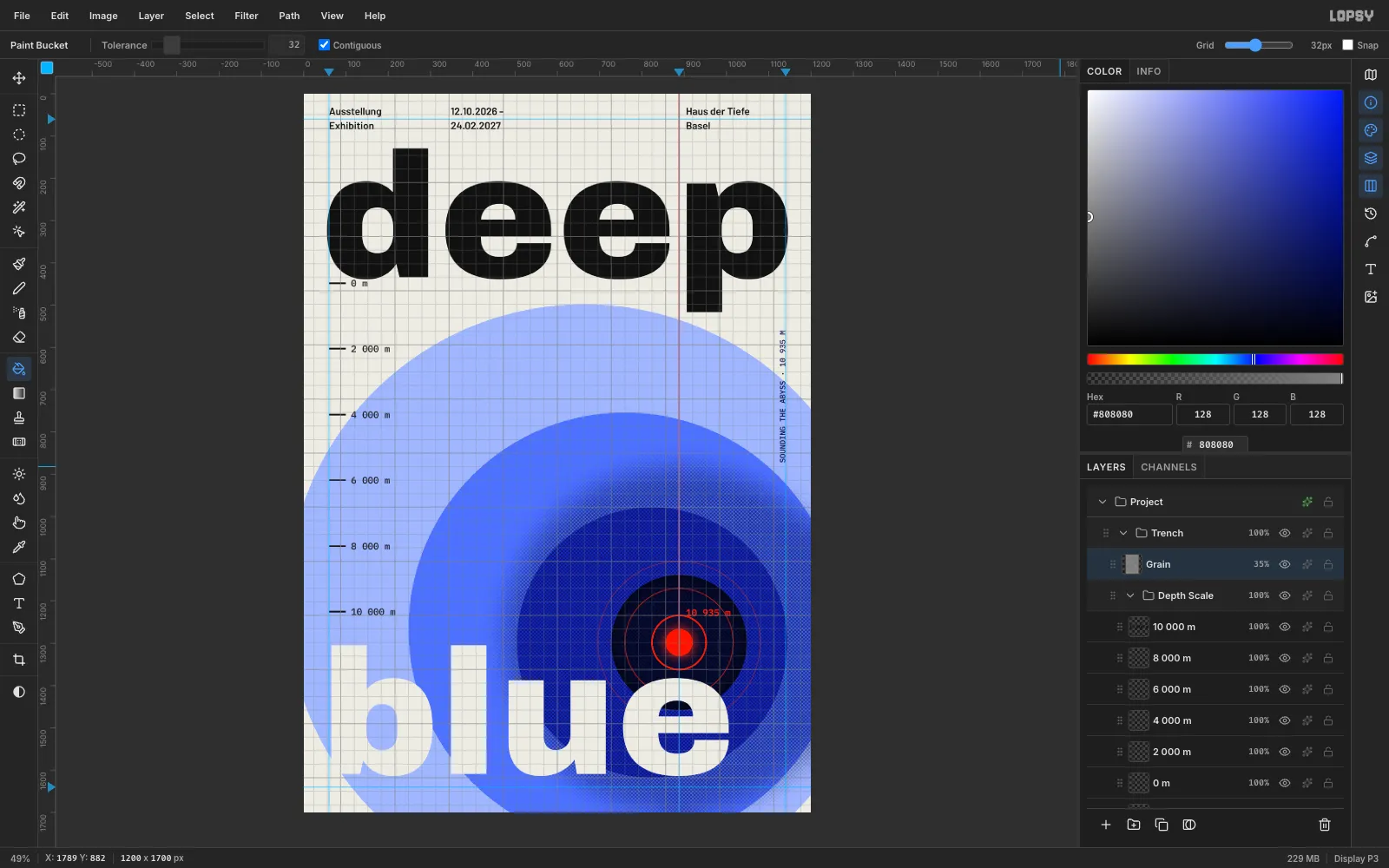
-
Export the poster
Turn off View → Show Grid and View → Show Guides to check the clean result. Then choose File → Quick Export PNG to export it, and File → Save Project to keep an editable
.lopsyfile with all the groups.For a series, keep the grid and type and change only the idea in the middle. Try "high tide" with stacked horizontal bands, or "echo" with rings that repeat outwards.