Design an Anti-Design Photocopy Magazine Cover
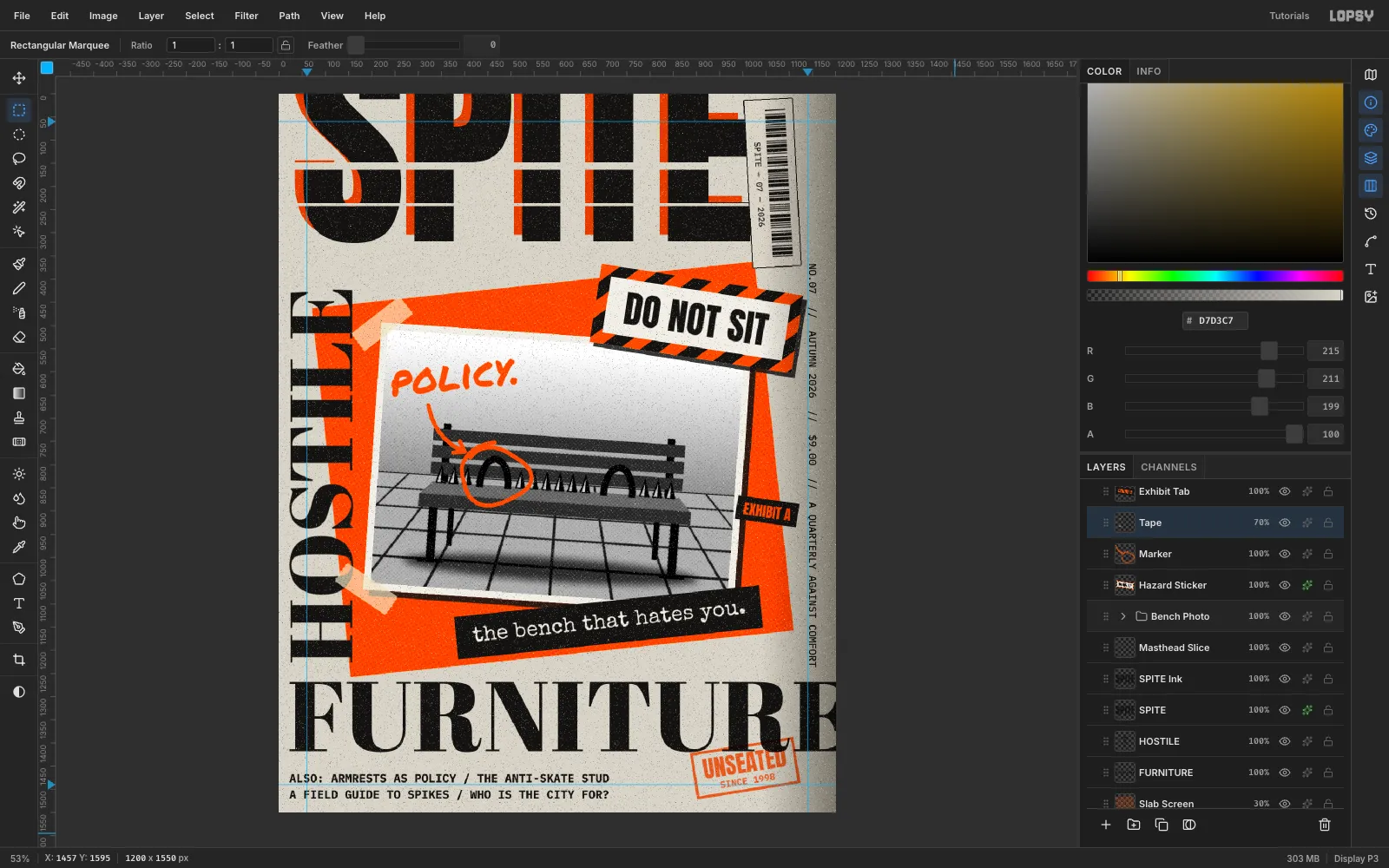
Build a Ray Gun-style SPITE magazine cover in Lopsy with a xeroxed photo collage, sliced type, a hazard sticker, rubber stamp and toner grain.
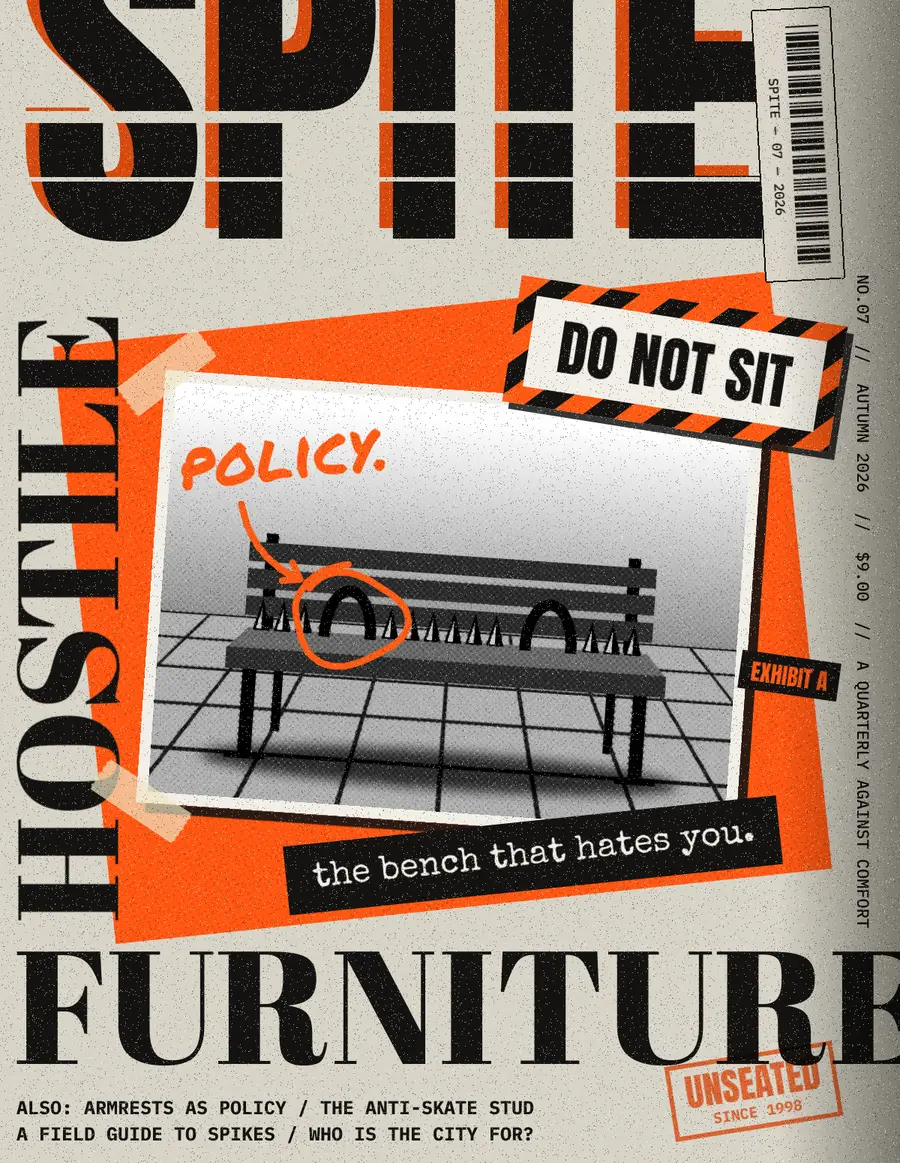
Anti-design covers, the kind David Carson made for Ray Gun in the 90s, break rules on purpose. Type runs off the page, baselines break, and the whole cover looks like it went through a cheap photocopier. The trick is to make that chaos look deliberate, not accidental.
In this tutorial you'll make the cover of SPITE, a fictional quarterly, for an issue about hostile furniture: benches built so nobody can lie on them. The document is 1200 × 1550 px. You'll use a Perspective transform, Halftone, Threshold and Motion Blur for the xerox look, Pattern Fill for the hazard stripes, rotated live text, copy and paste, layer effects and groups.
The palette uses three inks:
- Photocopy paper
#D7D3C7 - Toner black
#141312 - Safety orange
#FF5A14(stamp red-orange#FF4A00)
-
Make the photocopy paper
Choose File → New, set 1200 × 1550 with Unit: Pixels, and click Create. Click the Background row, set the foreground to
#D7D3C7and choose Edit → Fill. Then run Filter → Add Noise with Mono, Gaussian and Amount 16 so the paper has grain.Rename Layer 1 to Copier Edge. With the Gradient tool, drag a linear gradient from
#3A372Fto transparent from the right edge 160 px inwards. Set the layer to Multiply at 55%. That's the shadow a photocopier lid leaves. Click the rulers to add margin guides at 60 px from each edge.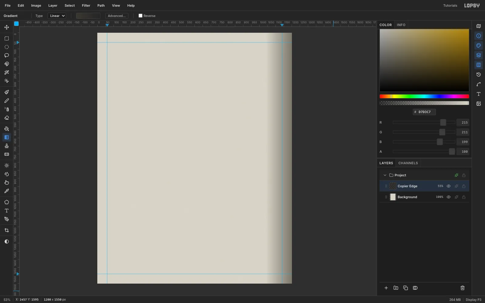
-
Rotate a safety-orange slab
Add a layer called Hazard Slab. Draw a rectangular marquee from (110, 410) that's 960 × 800 and fill it with
#FF5A14. Deselect, marquee the slab again with a few pixels of padding, switch to the Move tool (V) and drag a corner's round rotation handle to about −6°. Press Cmd+D to commit. Rotating commits on Cmd+D, not Enter.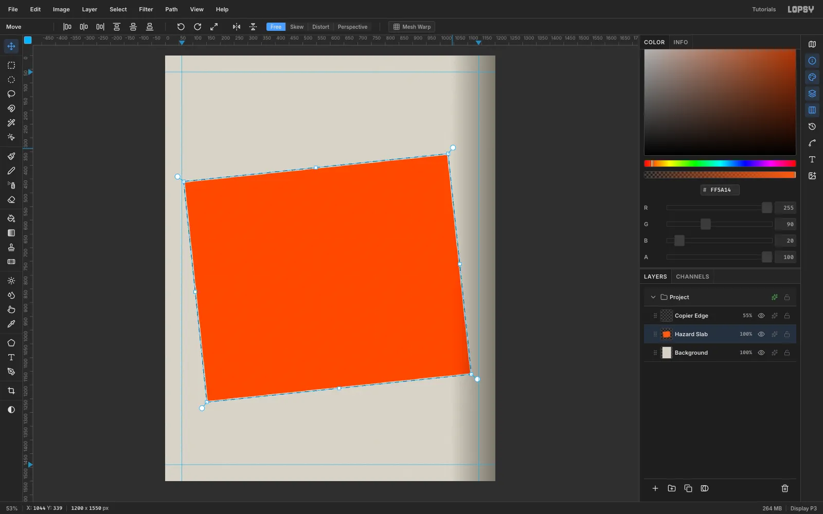
-
Add a halftone screen to the slab
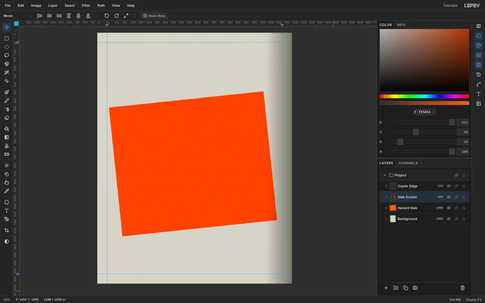
Flat vector orange looks too clean for print. Choose Layer → Duplicate Layer, rename the copy Slab Screen, and nudge it back into place with the arrow keys if the duplicate landed 10 px off. Run Filter → Halftone with Dot Size 8, Angle 30 and Softness 2. Set the copy to Multiply at 30%. The dots now read as printed ink.
-
Build the pavement in perspective
Click the New Group button and call it Bench Photo. Inside it, add Photo Wall with a vertical
#D4D0C6→#85827Agradient in a marquee at (200, 520), 800 × 330. Add Pavement: fill (200, 840), 800 × 260 with#9A968C. Then draw 4 px strips in#3A3833every 52 px down and every 80 px across.Marquee the pavement, pick the Move tool and click Perspective in the options bar. Drag the bottom-right corner 300 px to the right. The bottom-left mirrors it, and the rows foreshorten like a real floor. Press Cmd+D, click Free, then marquee the photo area, Select → Inverse and press Delete to trim the overhang.
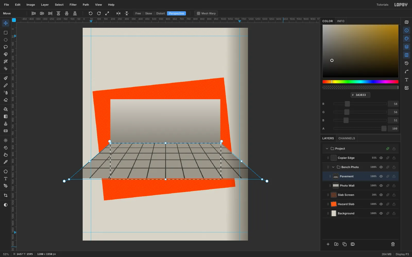
-
Draw the bench and its hoop armrests
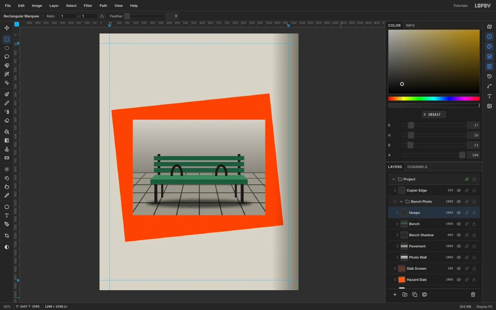
Add Bench Shadow. Set the elliptical marquee's Feather to 16, fill a wide flat ellipse under the bench area with black, then set Feather back to 0. Set the layer to Multiply at 60%.
On a Bench layer, draw the frame with marquee fills: 16 px uprights, 18 px legs and small feet. Add three 26 px back slats and a 28 px front seat slat, with a lighter lasso trapezoid for the seat top. The hostile part goes on a Hoops layer. For each divider, fill a 76 × 128 ellipse, delete a 46 × 98 ellipse inside it, then delete the bottom half with a rectangle. That leaves an arch that stops anyone lying down.
-
Duplicate the spikes with copy and paste
On a Spikes layer, use the Lasso to fill three triangles, each 22 px wide and 40 px tall, in
#1B1A17. Add a thin#A8A69Fhighlight triangle on each one's left side. Marquee the three spikes, press Cmd+C, then Cmd+V and drag the paste into the next gap with the Move tool. Repeat until every gap between the hoops is spiked. Then click the top Pasted Layer and choose Layer → Merge Down three times.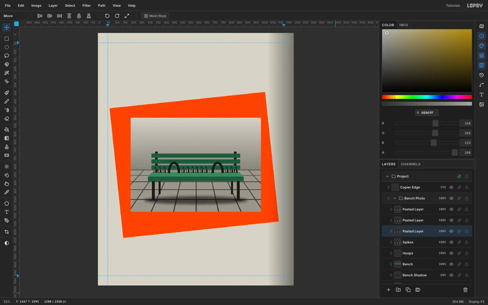
-
Desaturate and crush the contrast
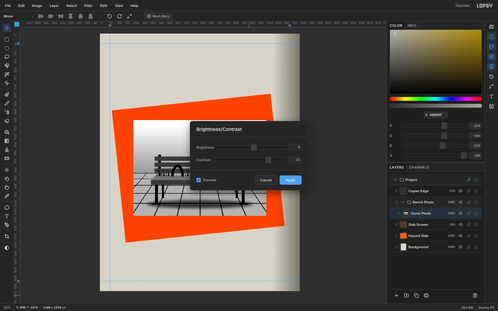
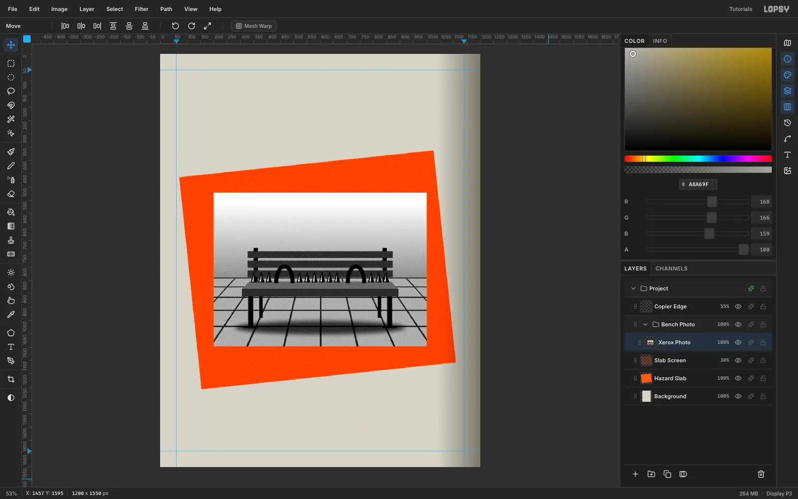
Click the top photo layer and choose Layer → Merge Down until Spikes, Hoops, Bench, Bench Shadow and Pavement are merged into Photo Wall. Rename it Xerox Photo. Run Filter → Desaturate, then Filter → Brightness/Contrast with Brightness 8 and Contrast 55. Photocopies blow out the highlights and crush the darks, and that's the point.
-
Screen it like a photocopy
Duplicate Xerox Photo and nudge the copy back to (0, 0). Run Filter → Halftone with Dot Size 6, Angle 45 and Softness 2. Set the copy to Multiply at 60% and Merge Down. Finish with Filter → Add Noise (Mono, Gaussian, 14). Now the clip-art bench reads as a grainy newspaper photo.
-
Turn it into a taped print
Marquee the photo, rotate it +4° with the Move tool's rotation handle, and press Cmd+D. It now leans against the slab. Open the layer's effects and add a Stroke in
#F1EEE6, Width 14, with Position: inside. That's the white border of a photo print. Add a Drop Shadow in#141312with Offset 12 / 14, Blur 0 and Opacity 90, so it sits on the slab like a paste-up.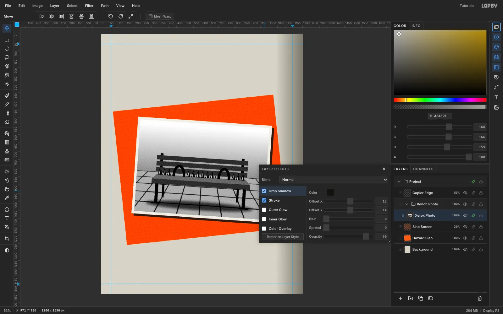
-
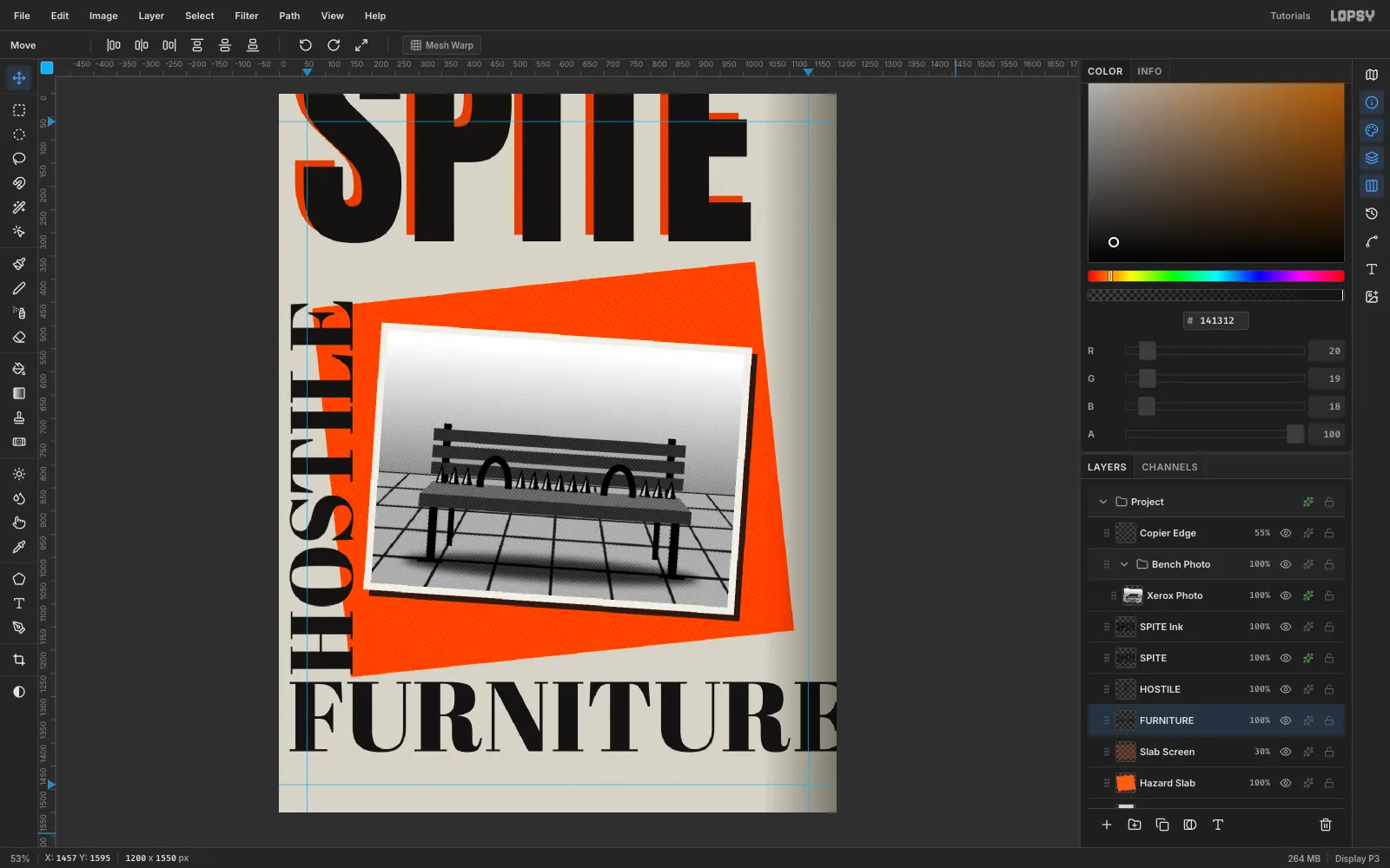
Slice the masthead off the page
Click Slab Screen so the text lands at the root. Choose the Text tool, set Anton at 500 px in
#141312, click in empty canvas and type SPITE. Drag it so the letter tops sit about 130 px above the canvas top. The page cuts the masthead, and that's the anti-design move.Duplicate Layer, rename the copy SPITE Ink, and nudge it a further 8 px right and 4 px down. On the original SPITE underneath, add a Color Overlay in
#FF5A14and set it to Multiply. The orange ghost reads as a misregistered second ink.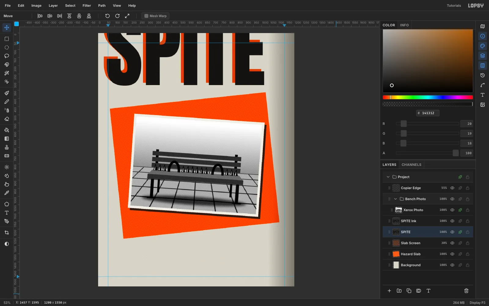
-
Run HOSTILE up the left edge
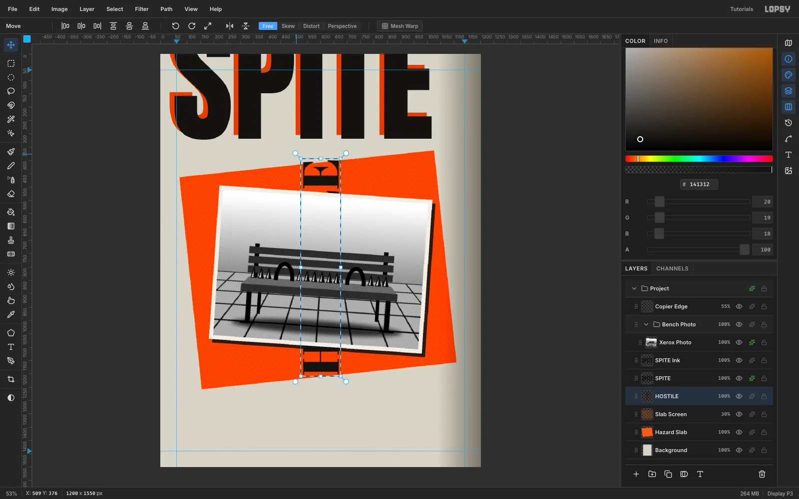
Create HOSTILE in Abril Fatface at 190 px in empty space. A clashing high-contrast serif against the condensed masthead is part of the look. Drag it to the middle of the canvas, press Cmd+D, marquee it and hold Cmd while dragging a rotation handle so it snaps to −90°. Press Cmd+D again, then drag it to the left edge so it runs from about y 420 to y 1225, starting at x 22.
-
Hinge FURNITURE under it
Create FURNITURE in Abril Fatface at 214 px. Move it so its left edge is at x 22, flush with HOSTILE, and its cap line is at y 1268. The two words form an L-shaped hinge. The right edge cuts through the final E, but the E's arms still show, so it reads as FURNITURE and not FURNITURI. Keep at least 40 px between HOSTILE's bottom and FURNITURE's cap line. A gap of 15 px looks like a mistake, not a choice.
-
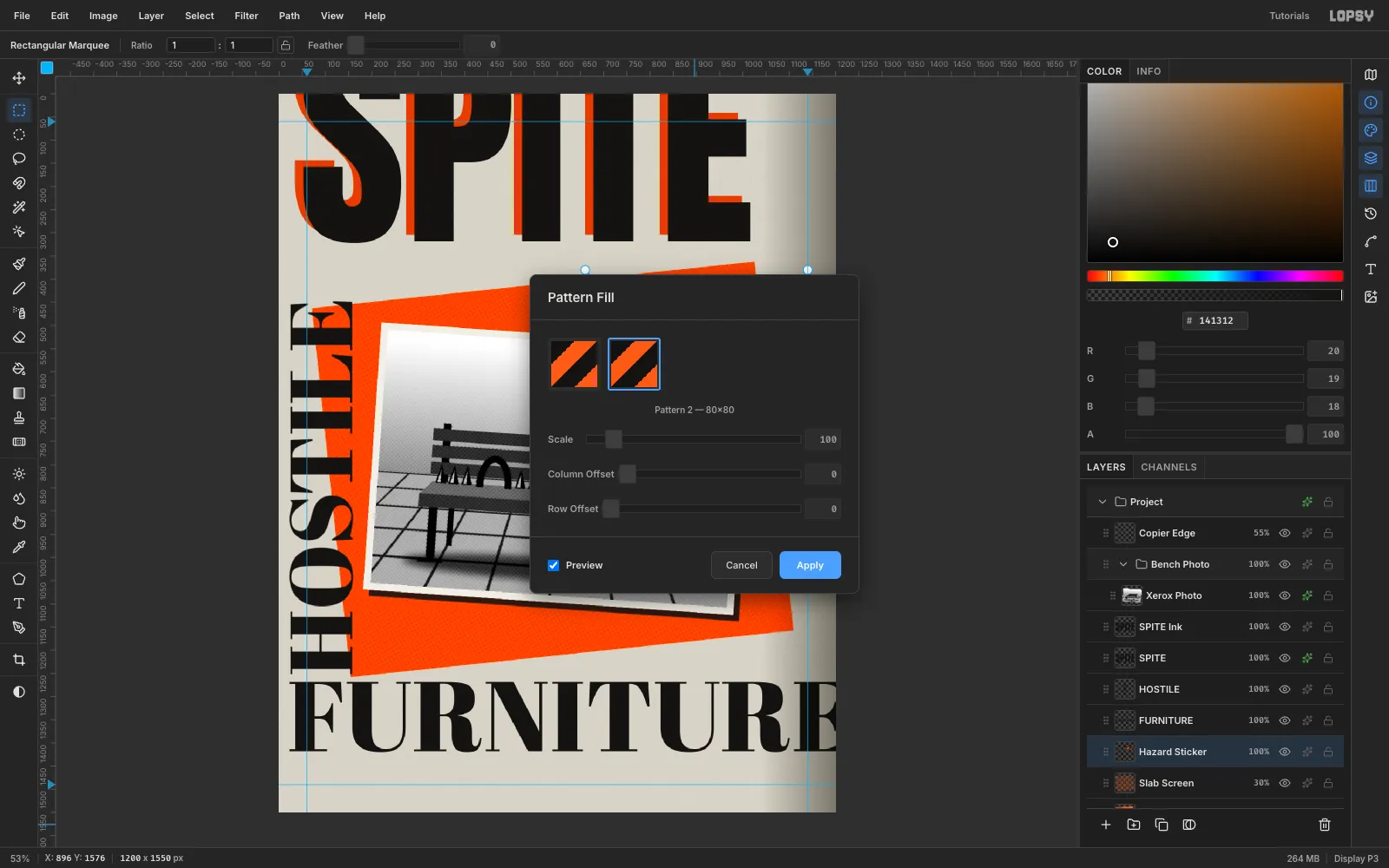
Make a hazard-stripe pattern
On a temporary Tile layer, fill an 80 × 80 square with
#FF5A14. Lasso-fill two black shapes to make diagonal stripes: the triangle (0,0)–(40,0)–(0,40), and the band (80,0)–(80,40)–(40,80)–(0,80). Marquee the tile exactly and choose Edit → Define Pattern, then delete the Tile layer.Add a Hazard Sticker layer, marquee (680, 400) at 440 × 170, and choose Edit → Fill with Pattern. Pick the new pattern.
-
Build the DO NOT SIT sticker
Fill a
#F1EEE6label inset by 24 px on every side, which is (704, 424), 392 × 122. Type DO NOT SIT in Anton 80 and centre it on the label. Measure the glyph box so padding is equal on both sides: here it's 42 / 41 px across and 26 / 26 px top and bottom. Merge Down the text, rotate the sticker +9°, and add a hard black Drop Shadow (8 / 10, blur 0, 85%). Drag its row above the Bench Photo group so it overlaps the photo's corner.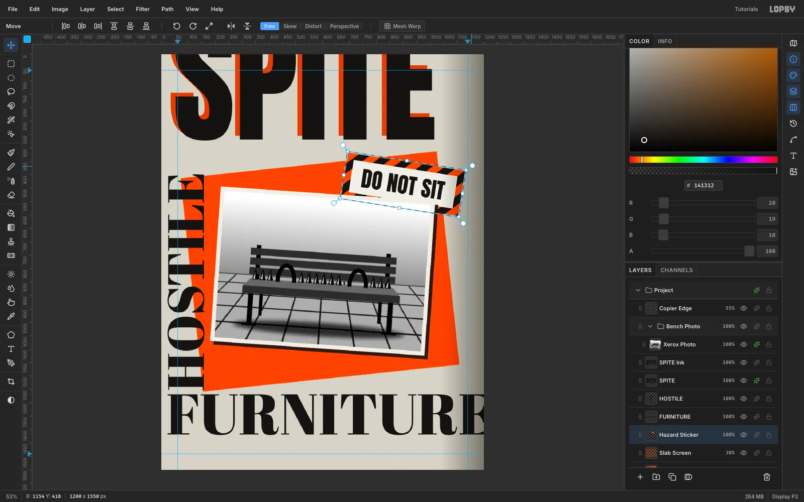
-
Add the tagline strip
Type the bench that hates you. in Special Elite 46 in
#F1EEE6and measure it (589 × 42). Fill a black strip with 36 px of padding left and right and 25 px top and bottom: (380, 1094), 661 × 92. Centre the text, Merge Down, then rotate the strip −6° so it matches the slab. It should clear FURNITURE by about 50 px.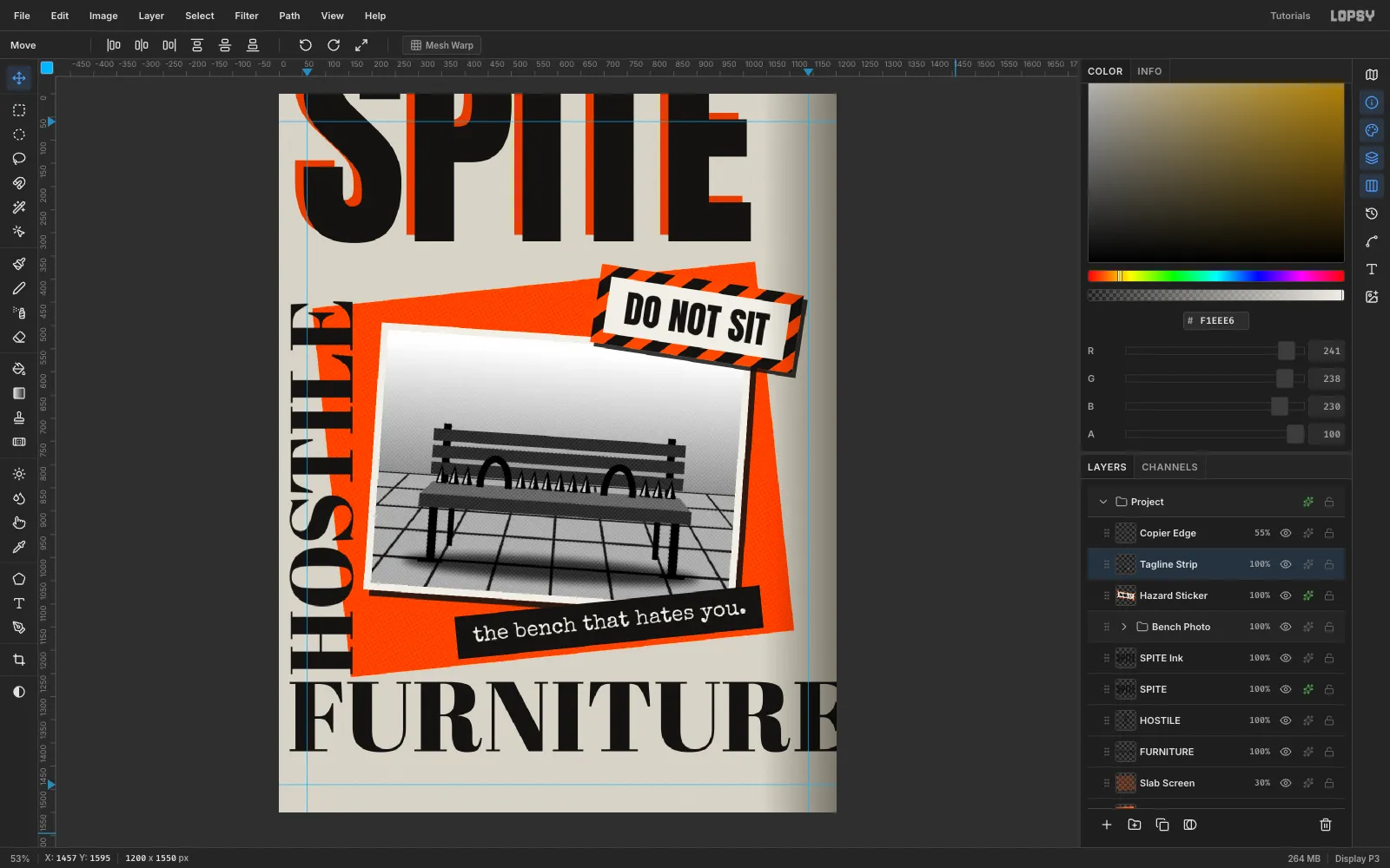
-
Add a barcode label
Build the label flat first. Fill a
#D9D3C7rectangle 360 × 104, set*SPITE07*in Libre Barcode 39 at 74 px, and add SPITE — 07 — 2026 in IBM Plex Mono (Medium, 18 px) below it. Merge them down, rotate the label 87° (upright, minus 3° of tilt) and drag it so it overlaps the masthead's E by about 10 px. A 2 px black inside Stroke makes it look like a printed sticker.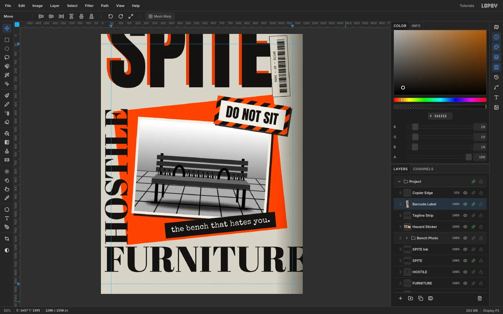
-
Circle the evidence in marker
On a Marker layer, set the Brush to Size 10, Hardness 90, in
#FF5A14. Draw a loose loop around the left hoop that overshoots where it closes, then draw a curved arrow that stops about 15 px short of the loop. Add policy. in Permanent Marker at 90 px (it sets in capitals), rotate it −6° and place it above the arrow on the photo's light wall area.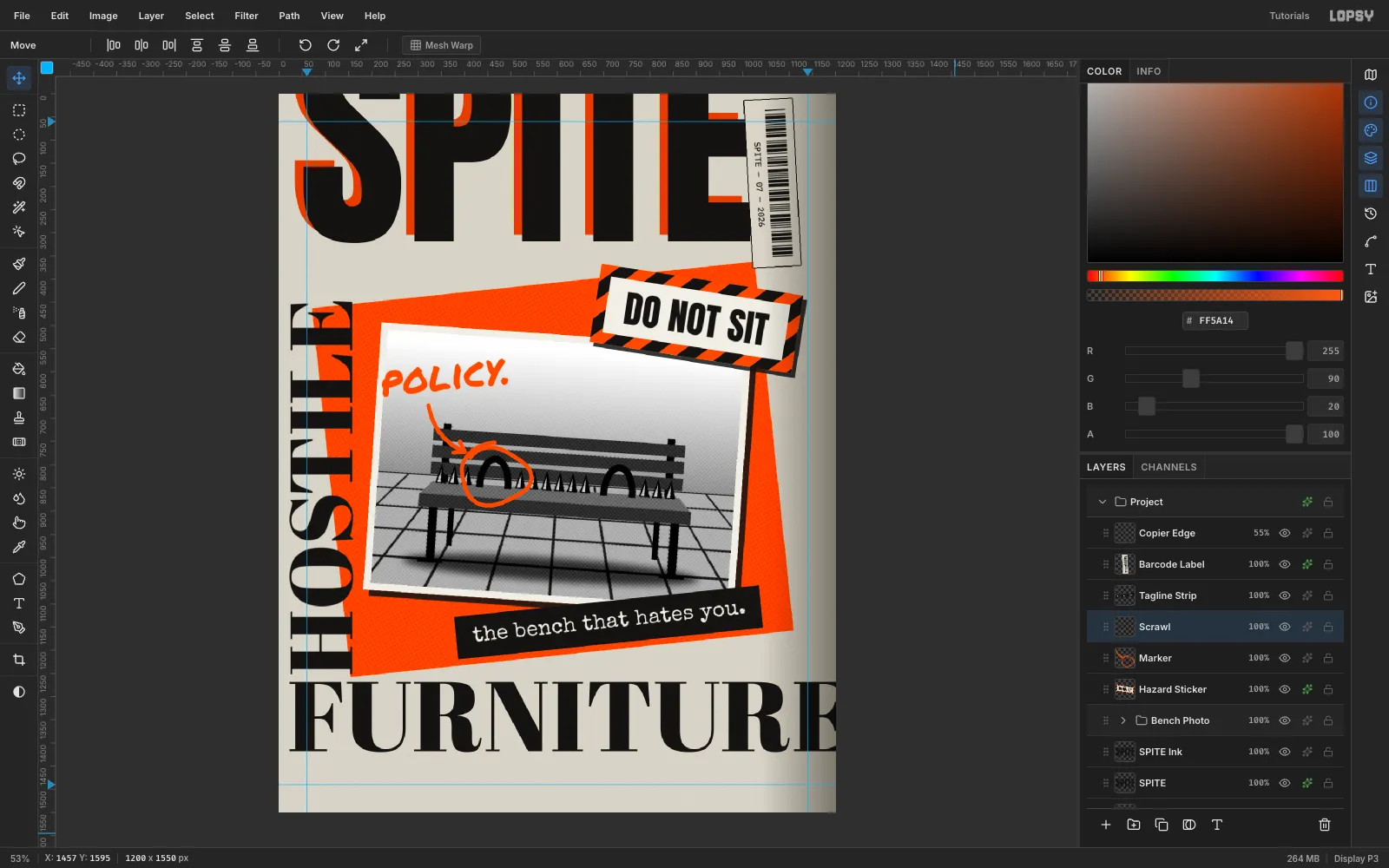
-
Tape the photo down
On a Tape layer, fill a 160 × 48 rectangle in
#EFE4C2over the photo's top-left corner and rotate it −38°. Make Tape 2 over the bottom-left corner, rotate it +34° and Merge Down. With the Eraser at Size 12, zig-zag across each end so the tape looks torn. Set the layer to 70% and give it Add Noise (Mono, 22) so it isn't a flat peach.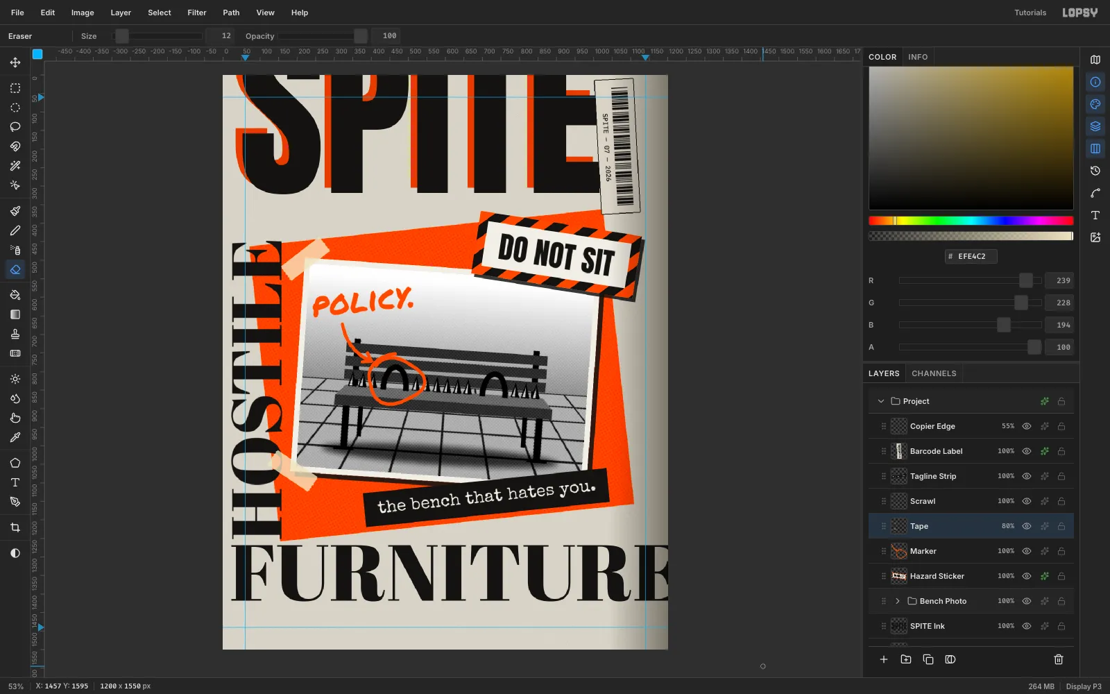
-
Fill the dead zones
Two empty areas make the layout feel unfinished. Beside the photo, set EXHIBIT A in Anton 30, orange on a black box with 16 px / 13 px padding. Merge Down and tilt it +8°.
For the stamp, fill a 226 × 101 rectangle in
#FF4A00, run Select → Shrink by 5 and press Delete to leave a frame. Centre UNSEATED (Anton 50) and SINCE 1998 (IBM Plex Mono Bold, 20) inside it, then merge both. Rotate the stamp −9° and set it to Multiply at 75%. Nudge it up so it overlaps FURNITURE's baseline, not just touches it.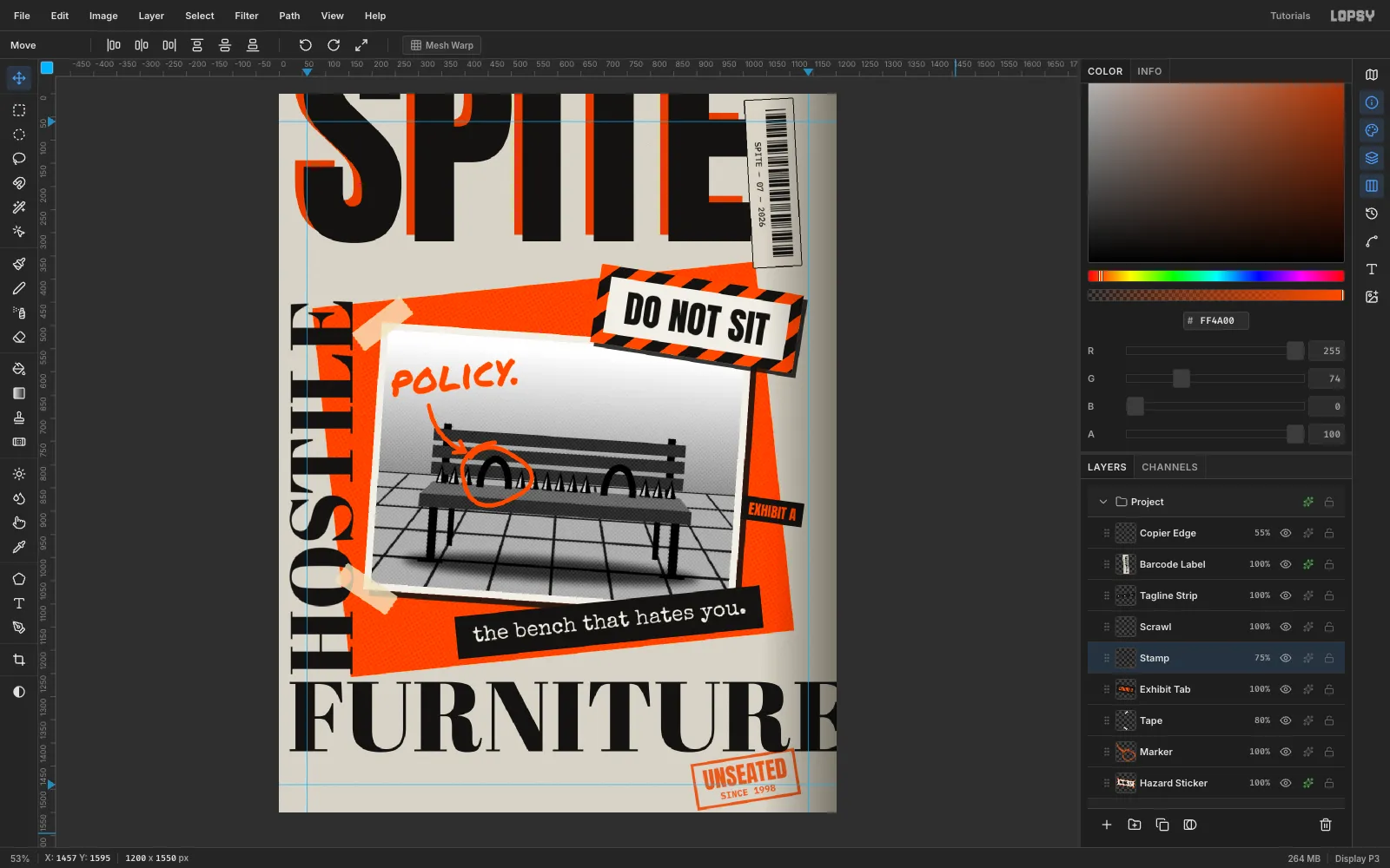
-
Set the coverlines on the grid
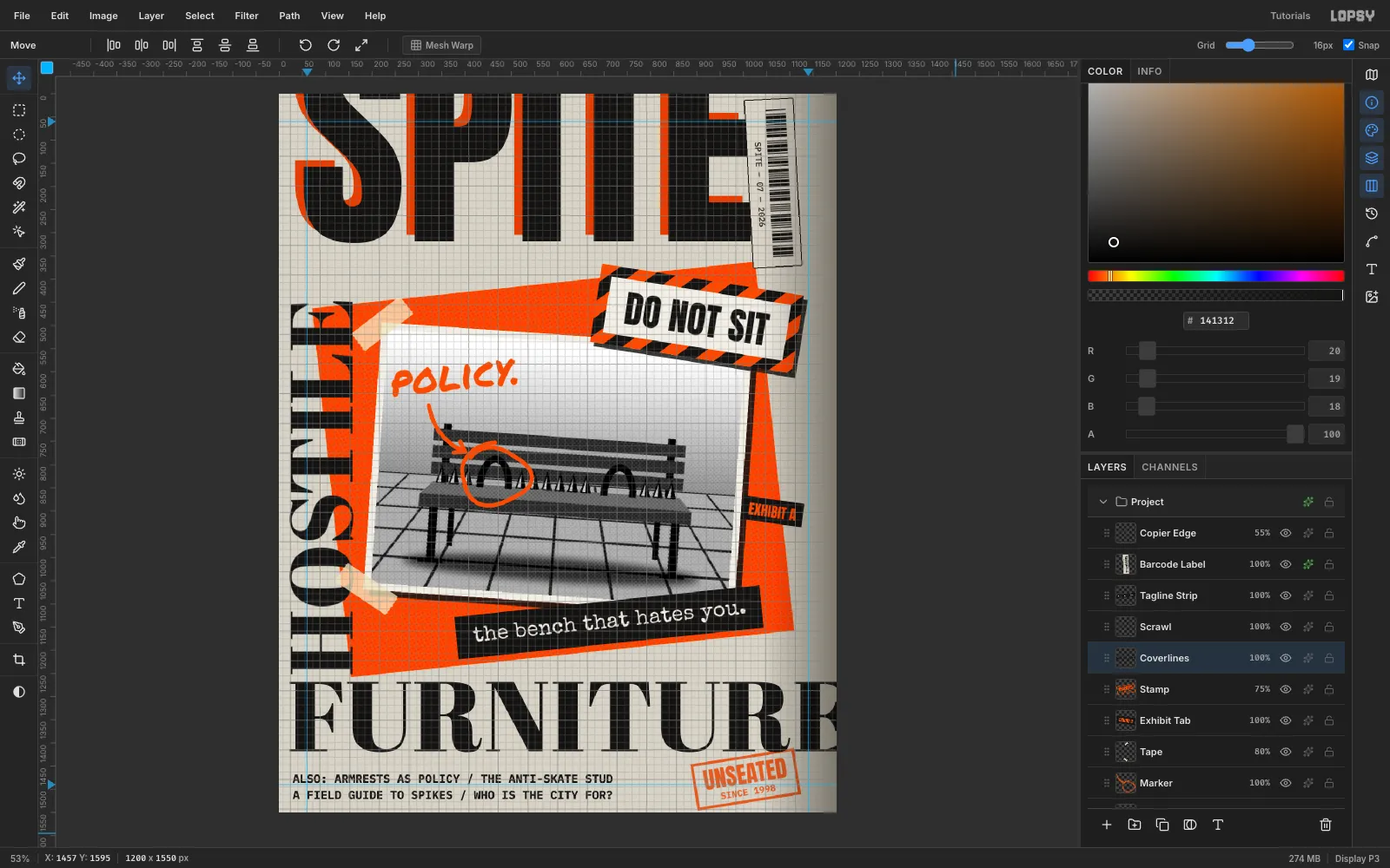
Turn on View → Show Grid, which also turns on Snap. Type the coverlines in IBM Plex Mono Bold at 25 px on two lines: ALSO: ARMRESTS AS POLICY / THE ANTI-SKATE STUD and A FIELD GUIDE TO SPIKES / WHO IS THE CITY FOR?. Drag them near x 22, y 1466. Then hide the grid, untick Snap, and use the arrow keys to land exactly on x 22 so the left edge lines up with HOSTILE and FURNITURE. That hidden grid keeps the chaos readable.
-
Run the issue line down the right edge
Type NO.07 // AUTUMN 2026 // $9.00 // A QUARTERLY AGAINST COMFORT in IBM Plex Mono Medium, 22 px,
#111111. Rotate it +90° with Cmd held for the 15° snap, then drag it onto the right margin guide at x 1140. Put it and the coverlines in a Small Type group: click New Group, then drag each row's grip onto the group row. Now you can move both blocks together.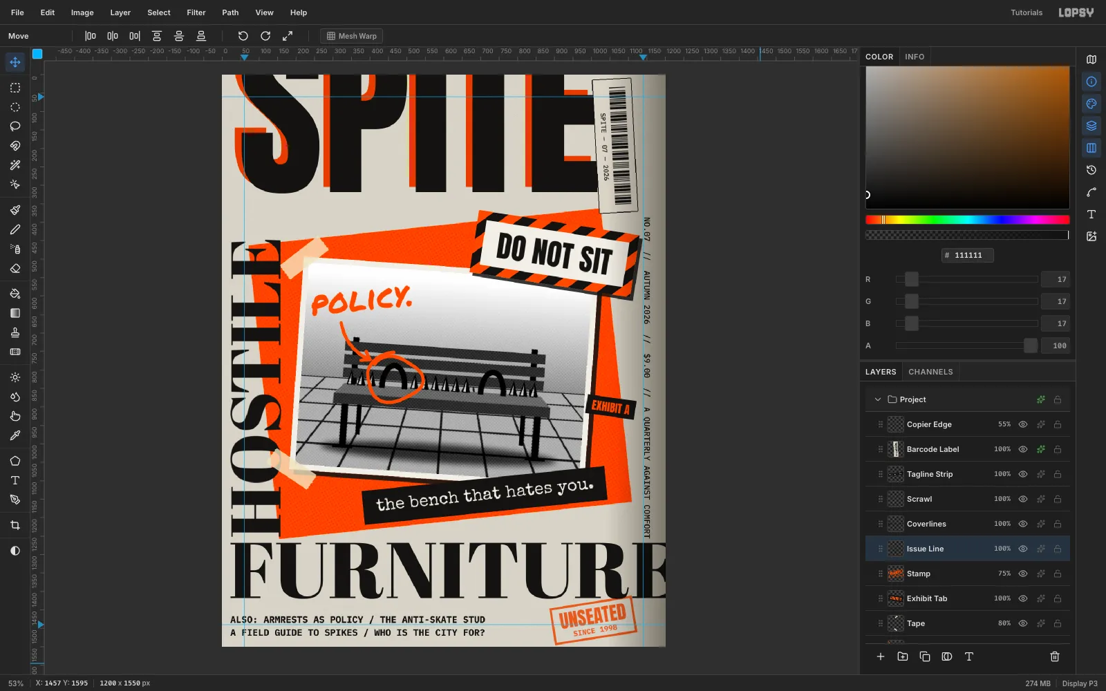
-
Add toner specks
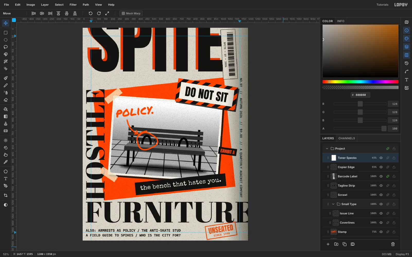
Above Copier Edge, add Toner Specks. Fill it with
#808080and run Add Noise (Mono, Uniform, 100). That spreads values from about 78 to 178. Run Filter → Threshold at Level 80: only the darkest 2% turn black and everything else turns white. Set the layer to Multiply at 45%, and the white disappears.Make a Dropouts layer the same way, but use Threshold 176 and set it to Screen at 55%. It leaves white specks where the toner didn't stick.
-
Add copier streaks
Add Copier Streaks: fill with
#808080, run Add Noise (Mono, Gaussian, 60), then Filter → Motion Blur with Angle 90 and Distance 80. Set it to Overlay at 45%. The vertical streaks look like a dirty photocopier drum dragging toner down the page.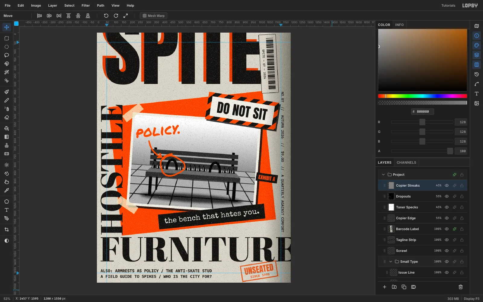
-
Slice through the masthead
Cropping the top of SPITE isn't enough on its own. Click SPITE Ink, add a Masthead Slice layer, and fill two paper-coloured (
#D7D3C7) bands across the masthead: one 16 px tall at y 148 and one 6 px tall at y 236. Give the layer Add Noise (Mono, 16) so the bands match the paper grain. The letters now look cut apart and re-pasted.Save with File → Save Project and export with File → Quick Export PNG.