Design an Anti-Design Book Cover Styled as a Marked-Up Proof
Make an anti-design book cover in Lopsy, styled as a marked-up printer's proof: stretched Times type, a pixelated eye, a hyperlink title and proof marks.
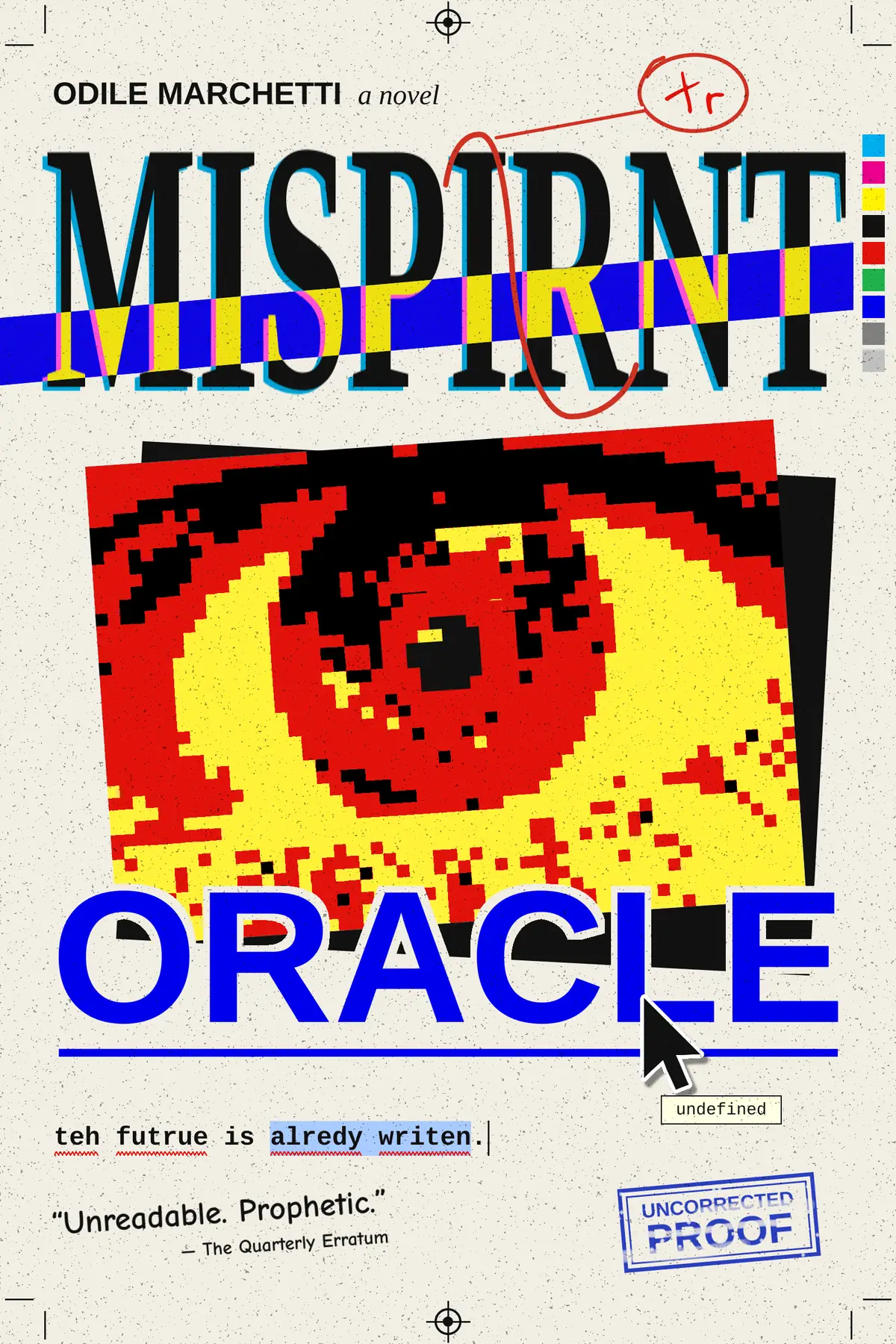
Anti-design breaks the rules on purpose: default-looking fonts, clashing colours, type stretched out of shape, and bits of computer interface where they don't belong. The trick is that every broken rule still has to look like a decision. In this tutorial you'll make the front cover for an imaginary novel, Misprint Oracle, about an oracle that speaks in typos.
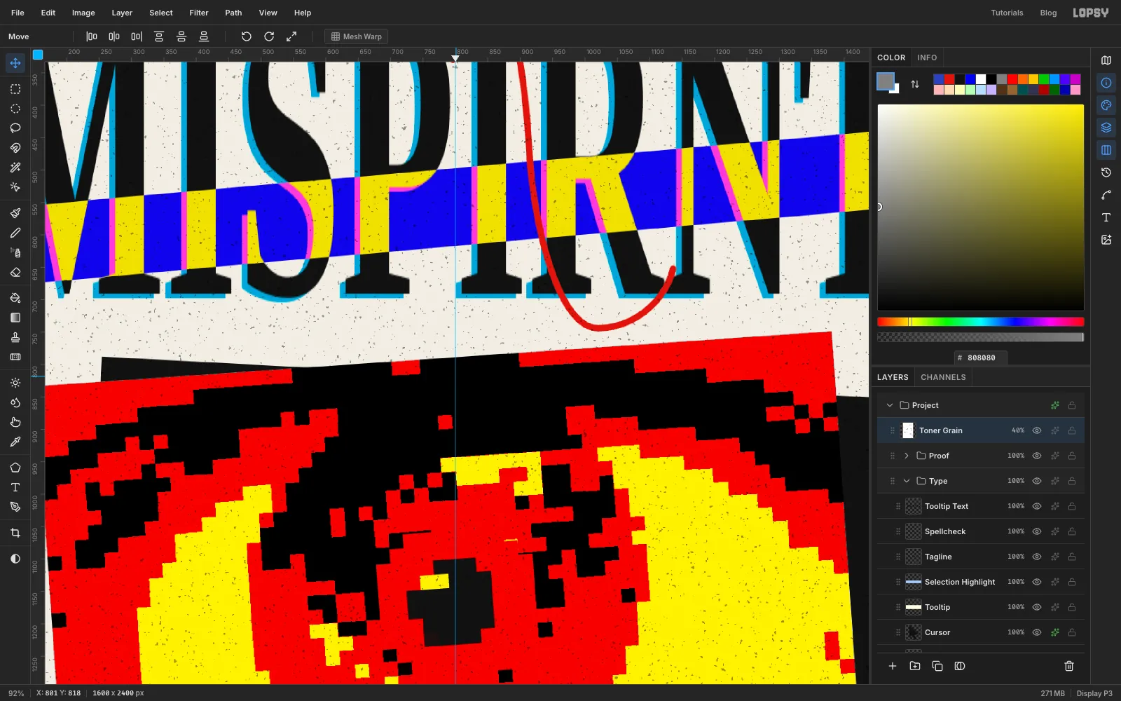
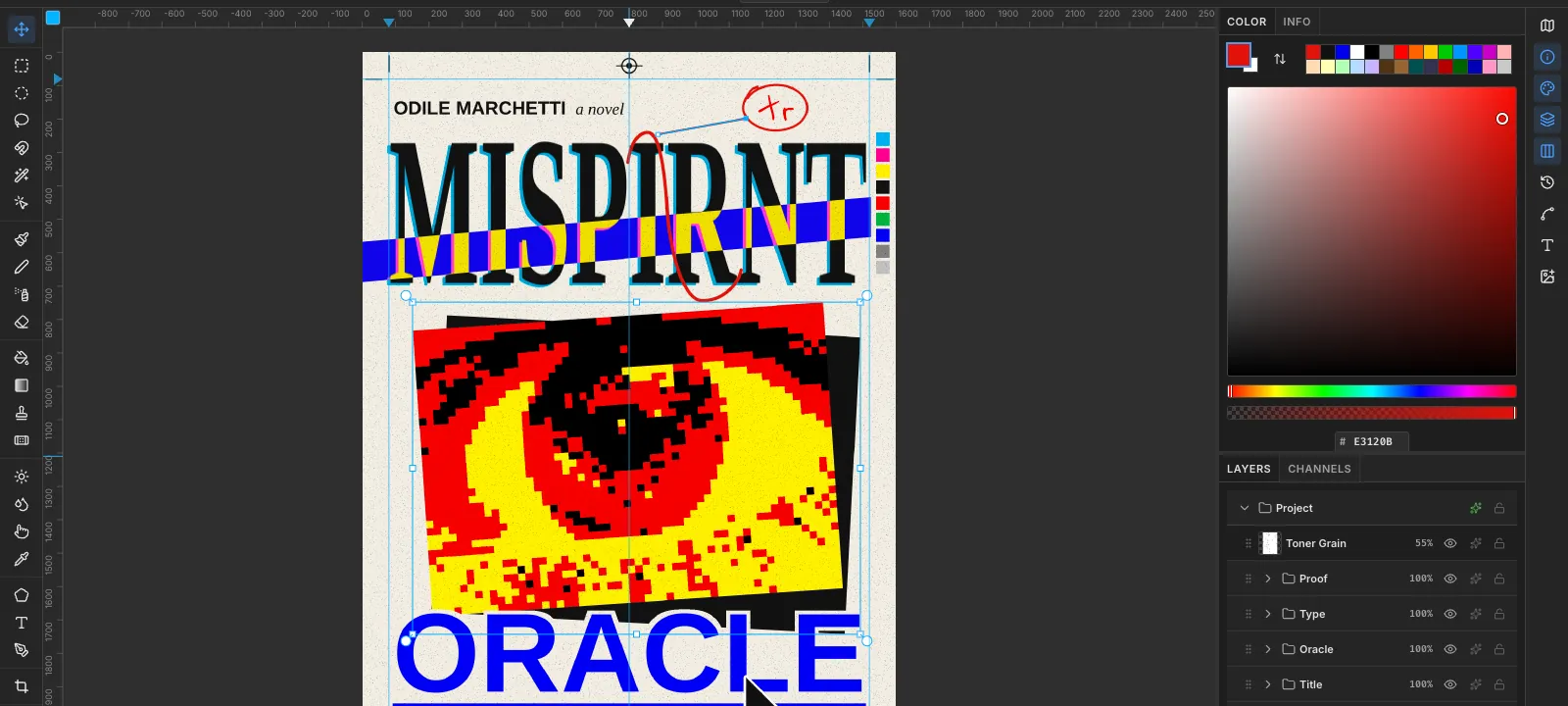
The cover pretends to be a printer's proof that's been marked up and sent back. The title is misspelled MISPIRNT, and a red proofreader's mark tells the printer to swap the I and the R. The page also has crop marks, registration targets, a colour bar and a cyan plate that's slipped out of register. In the middle, a photo of an eye is pixelated and printed in three flat inks. Below it, ORACLE is set like a web link, with a cursor hovering over it.
The fonts are free Google Fonts that stand in for the defaults everyone recognises:
- Tinos (Times New Roman) for the title and a novel
- Arimo (Arial) for ORACLE, the author and the stamp
- Cousine (Courier) for the tagline and tooltip
- Comic Neue (Comic Sans) for the blurb
- Reenie Beanie for the handwritten margin note
The palette:
-
Paper
-
ink
-
Proof red
-
eye yellow
-
Misregistration cyan
-
band yellow
-
Link blue
-
selection blue
-
tooltip cream
-
Stamp blue
-
Colour bar
The eye is a public-domain (CC0) close-up photo from Wikimedia Commons, A human male brown eye. Any sharp close-up of an eye will work.
Each part of the cover gets its own group. New layers appear above whichever layer is selected, so every group starts with an empty base layer: click it, and anything you add lands inside that group. Some screenshots were re-taken from the finished file, so the Layers panel sometimes lists a layer you haven't made yet.
-
Set up the paper and margins
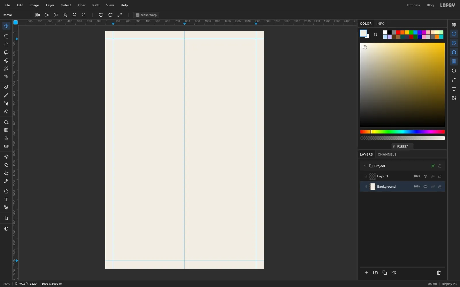
Open Lopsy and create a 1600 × 2400 pixel document. That's a 2:3 portrait, the usual shape for a paperback.
Select Background, set the foreground to paper and choose Edit → Fill. Rename the empty Layer 1 to
Toner Grainand leave it empty until the last step.Now add guides. Click the top ruler at 80, 800 and 1520 to make three vertical guides, and click the left ruler at 80 and 2320 for two horizontal ones. The outer four mark the trim: keep everything that matters inside them. The middle one is the centre line.
-
Print a registration target
Printers put small targets outside the trim so they can line up each ink. Add them here and the cover reads as a proof sheet straight away.
Click New Group and name it
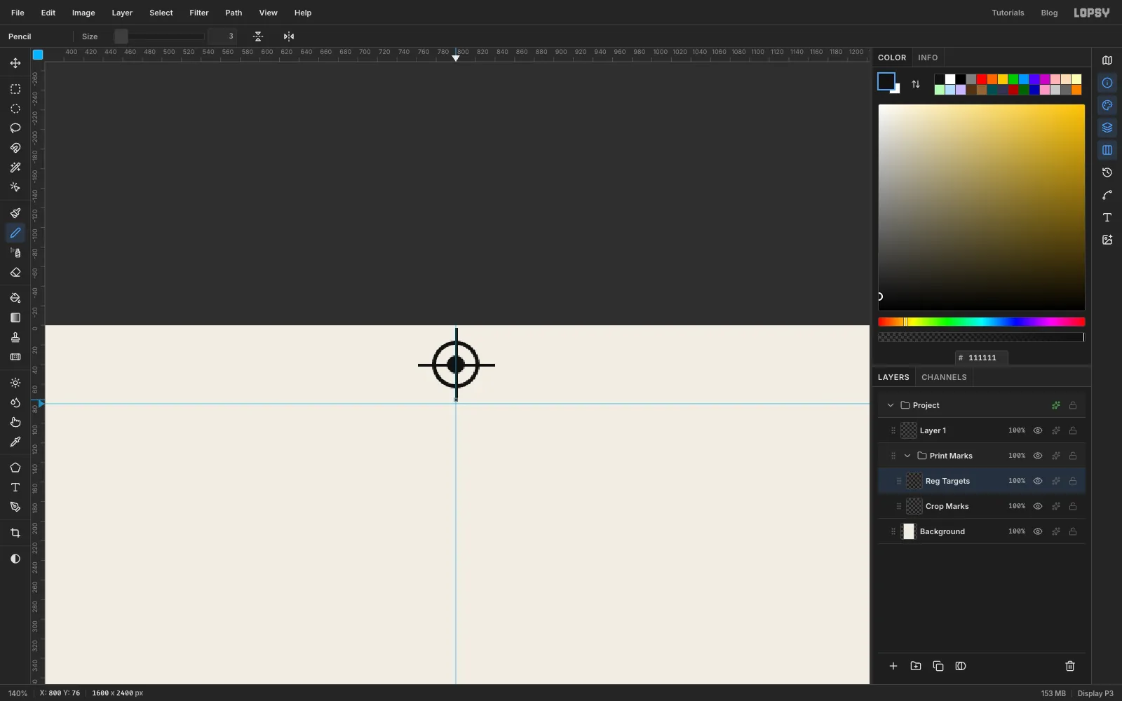
Print Marks. Inside it, add a layer calledCrop Marks. Pick the Pencil at Size 3 in ink . At each corner, click and Shift-click two lines about 50 px long in the margin, one lined up with each trim guide and pointing away from the page. Leave a small gap between each line and the corner.Add a layer called
Reg Targets, then zoom in to the top margin where it meets the centre guide. Centre the target on the guide, about 40 px down from the top edge.- Drag an Elliptical Marquee about 48 px across and choose Edit → Fill.
- Drag a circle about 40 px across on the same centre and press Delete, which leaves a thin ring.
- Drag a small circle about 18 px across in the middle and fill it.
- With the Pencil, Shift-click a horizontal and a vertical line through the centre, each a little longer than the ring.
Make a second target in the bottom margin.
-
Add a colour bar
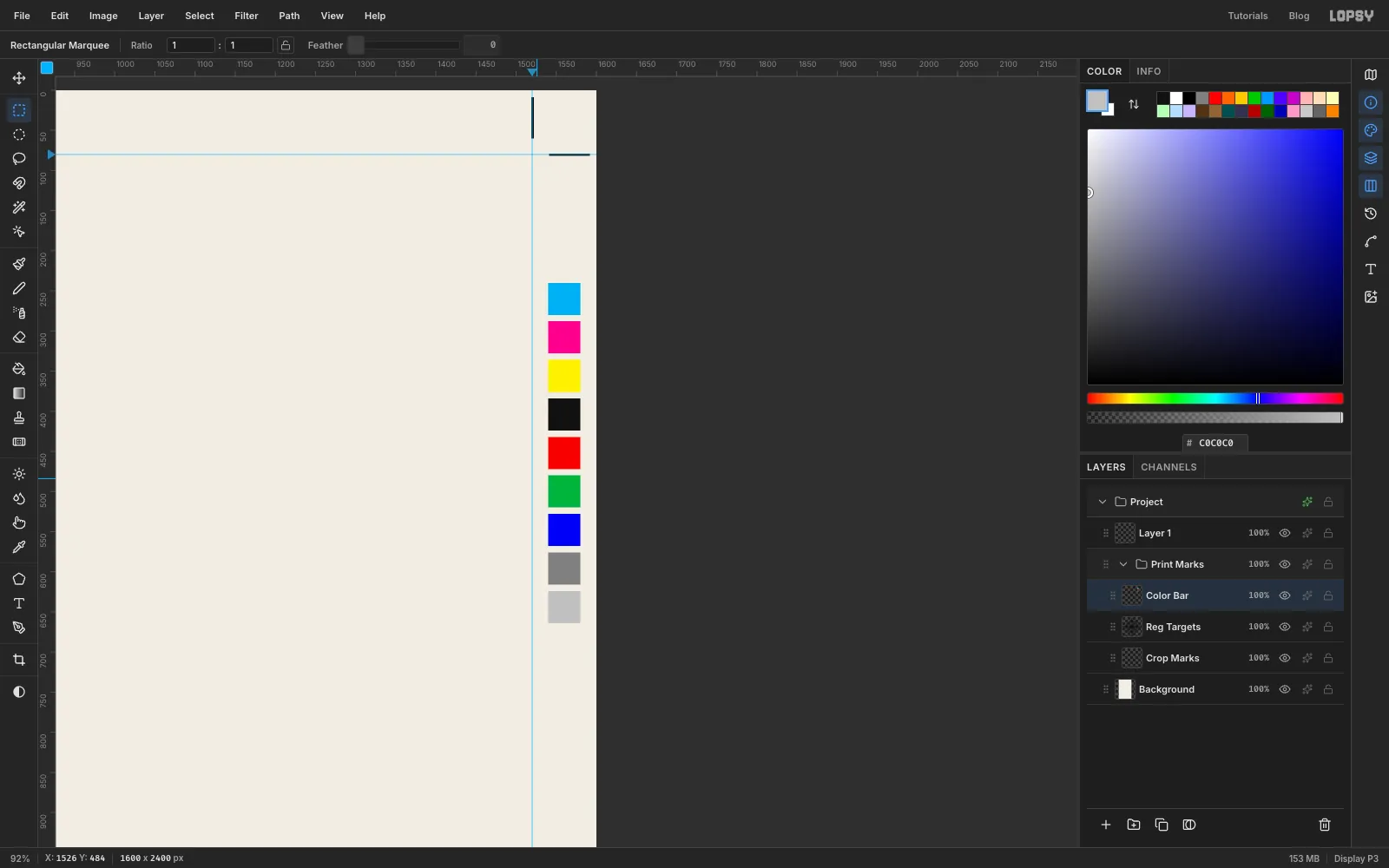
Add a layer called
Color Bar. You'll make a column of nine 40 px squares in the right margin, 8 px apart, starting about 240 px from the top.Choose the Rectangular Marquee and click once on the canvas without dragging. That opens a dialog where you type the corners exactly. For the first square, enter From 1540, 240 to 1580, 280, then fill it with cyan . Repeat for each square, moving down 48 px each time, and fill them in order with magenta, yellow, black, red, green, blue, mid grey and light grey.
-
Set the misspelled title
Click the
Print Marksgroup and choose New Group. Name itTitleand add an empty layer inside it calledTitle Base.Pick the Text tool. Choose Tinos, Bold, size 288, in ink. Click in the empty space below the top margin and type
MISPIRNT. Yes, it's spelled wrong. That's the joke the proof marks will fix later. Press Tab to commit.At this size the word spans almost the full width between the margin guides. Rename the layer
Title Type.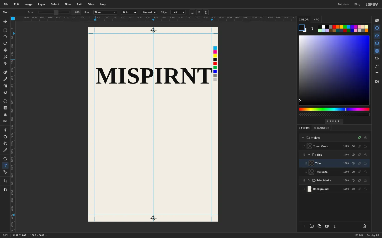
-
Stretch the title
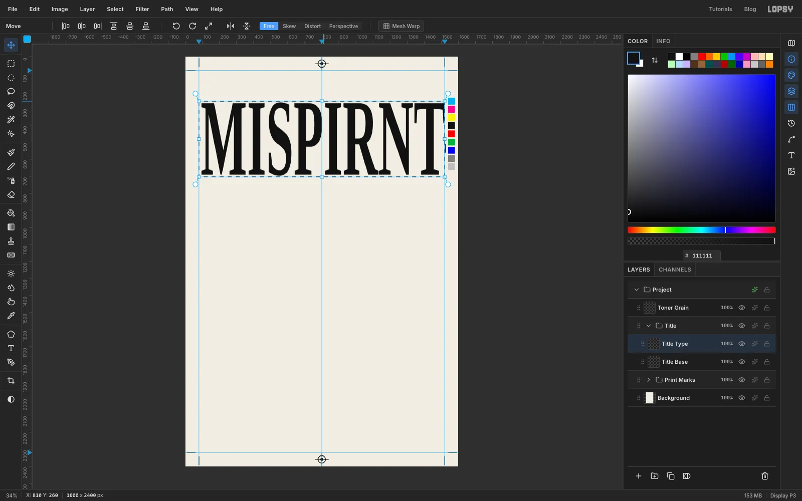
Distorted type is a classic anti-design move. You'll stretch the title to more than twice its height without changing its width.
- Click Rasterize Layer in the Layers panel.
- Drag a marquee tightly around the word.
- Switch to the Move tool and drag the top middle handle up by about 240 px. The letters should now be roughly 430 px tall.
- Press Cmd+D to commit.
Nudge the word with the arrow keys until it's centred between the margins.
-
Knock the cyan plate out of register
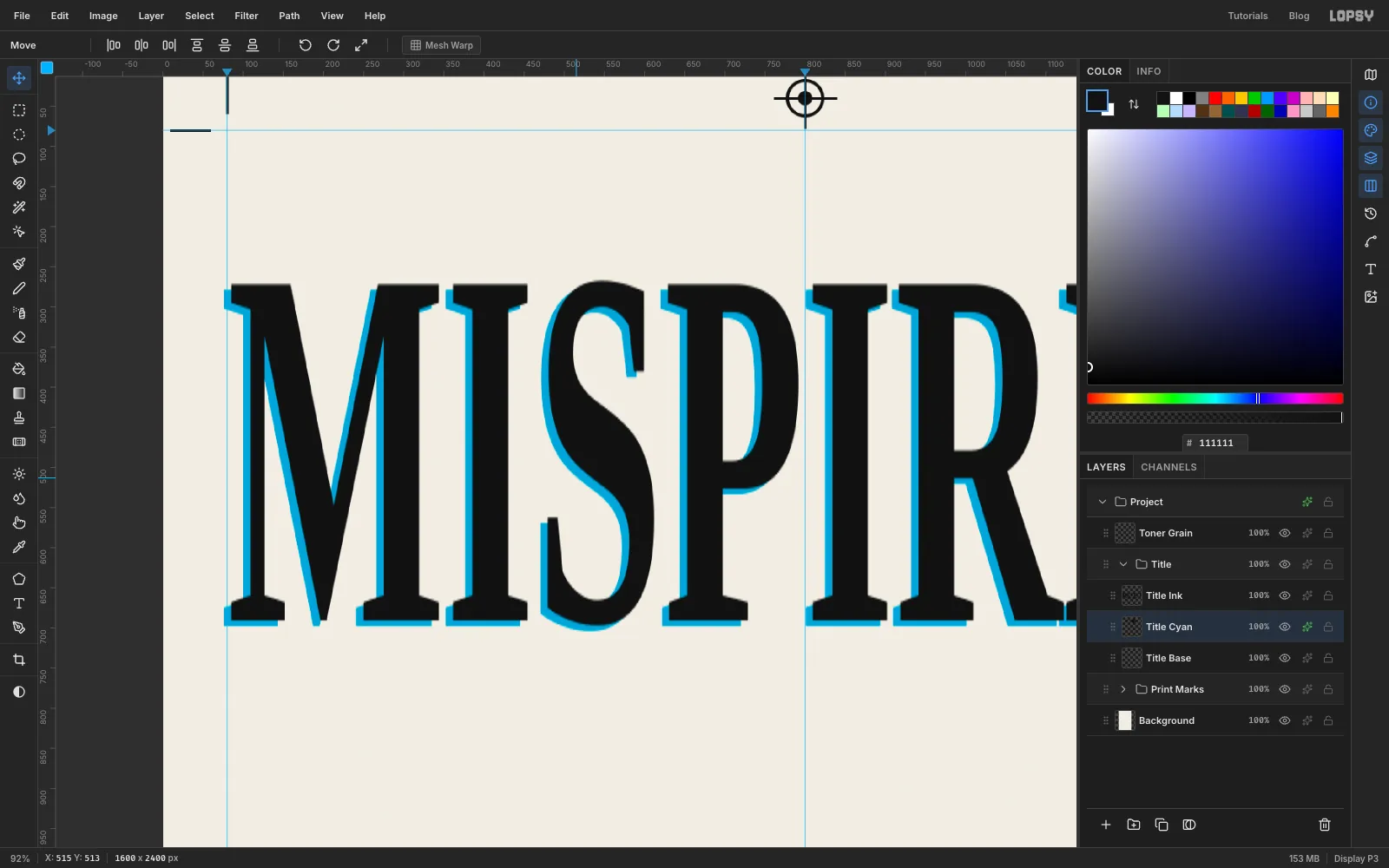
On a cheap print run the inks don't always line up. Fake it with a cyan copy:
- With
Title Typeselected, click Duplicate Layer. Click the copy's row, then rename itTitle Ink. - Rename the original, which is underneath, to
Title Cyan. - Give
Title Cyana Color Overlay effect in cyan . Then set the layer's own blend mode in the Layers panel to Multiply. - With the Move tool, nudge
Title Cyanabout 9 px left and 7 px down.
- With
-
Cut a Difference band through the title
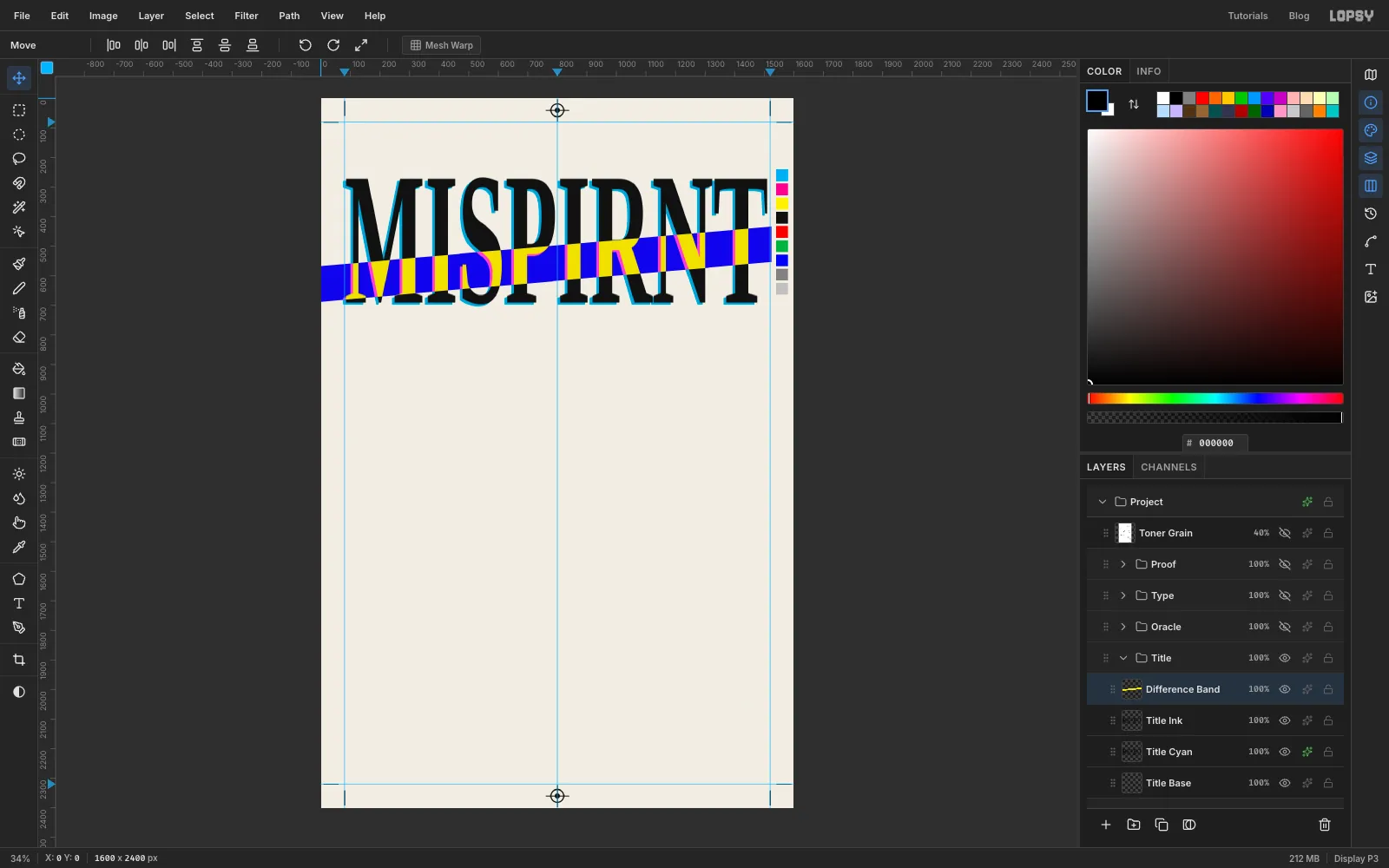
Add a layer called
Difference BandaboveTitle Ink. With the Lasso, draw a long, thin slanted band, about 120 px tall, across the lower half of the letters. Start it at the left edge of the page and end it at the right trim guide, so it doesn't run into the colour bar. Let it rise gently from left to right.Fill the band with yellow and set the layer to Difference. Difference subtracts colours. Yellow taken away from the off-white paper leaves a deep blue, and yellow taken away from black ink stays yellow. One fill gives you a blue band with yellow letters inside it, and the cyan fringe turns hot pink.
-
Paste, pixelate and tilt the eye
Collapse
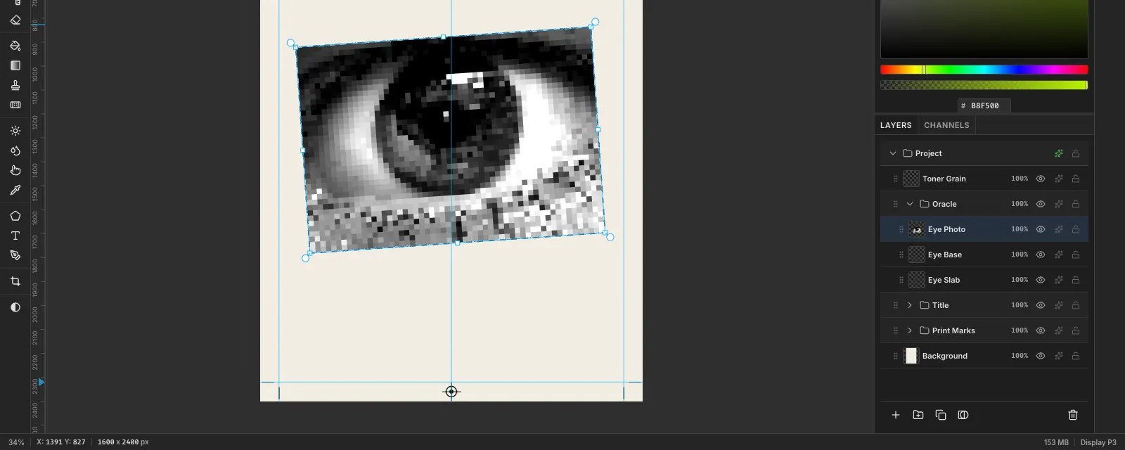
Title, click it and make a new group calledOracle. Inside it, add two empty layers:Eye Slabfor the black card you'll add later, thenEye Baseabove it as the base layer for the paste. You can deleteEye Baseonce the photo is in.First crop and scale your photo to about 1240 × 850. Copy it, click
Eye Baseand press Cmd+V. It pastes as a new layer at the top-left corner with a transform box. Press Cmd+D to drop the paste selection, then rename the layerEye Photo.- Filter → Desaturate.
- Filter → Brightness/Contrast… with Brightness −5 and Contrast 40.
- Filter → Pixelate… with Block Size 22.
- With the Move tool, drag the eye down into the middle third of the page, centred left to right.
- Marquee around it and drag the rotate handle (just outside the top-right corner) about 4° anticlockwise. Press Cmd+D.
-
Separate the eye into three inks
Now print the eye in three flat inks, like a cheap screen print.
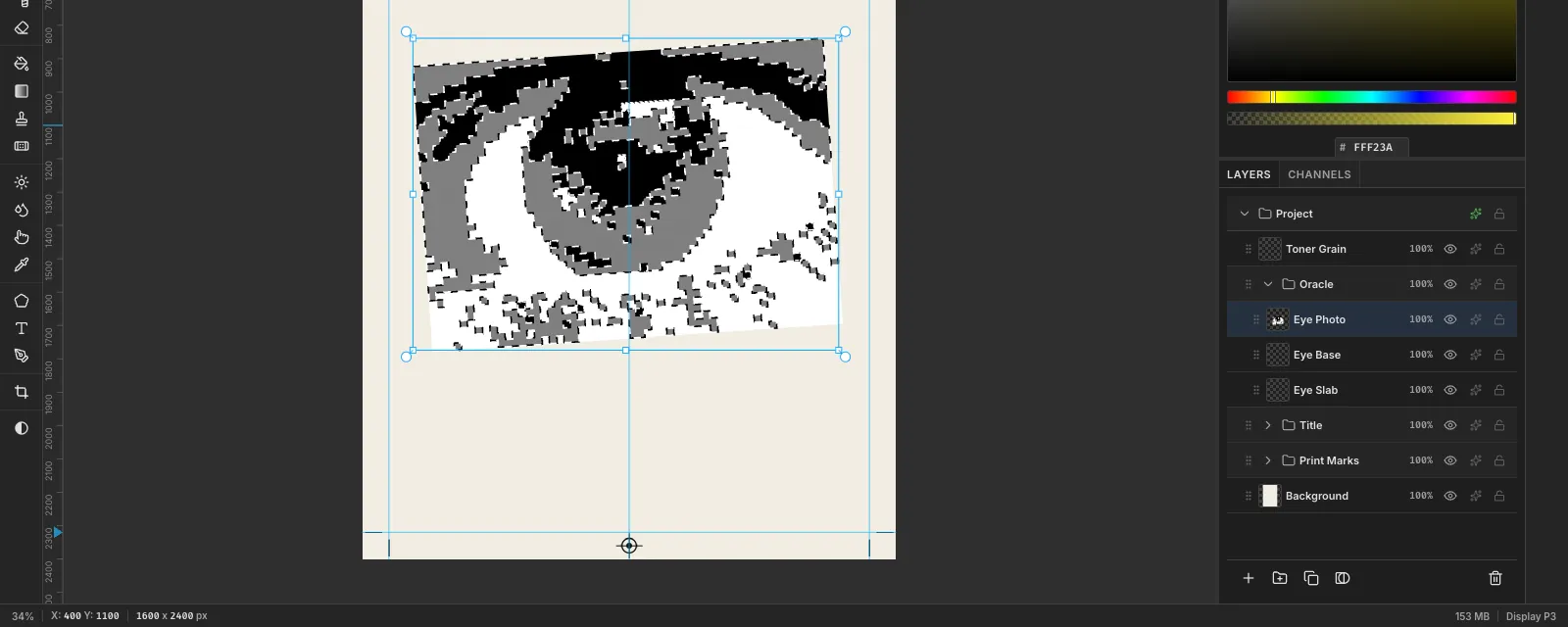
- Run Brightness/Contrast again at Brightness 22, Contrast 15. This lightens the brown iris so it doesn't merge with the pupil.
- Run Filter → Posterize… with Levels 3. Every block is now black, mid grey or white.
- Pick the Magic Wand with Tolerance 20 and Contiguous turned off. Click any grey block to select all of them, and fill the selection with red .
- Press Cmd+D, click a white block, and fill with yellow .
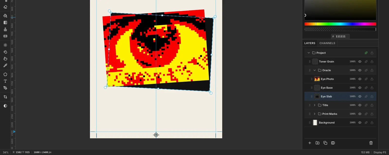
The black stays black. The iris becomes a red ring around a black pupil, the white of the eye turns yellow, and the lashes stay black.
-
Put a black slab behind it
Select
Eye Slab. Drag a marquee about the size of the eye panel, but offset about 50 px to the right and 30 px down from it. Fill it with ink.Switch to the Move tool and rotate the slab about 3° clockwise, the opposite way to the eye. Press Cmd+D. The two tilts disagree, so the card peeks out on the right and along the bottom. That looks like a badly pasted-up print, not a drop shadow.
-
Set ORACLE as a hyperlink
Collapse
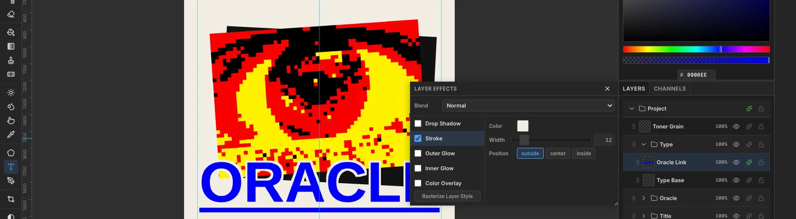
Oracle, click it and make a group calledTypewith an empty layer inside calledType Base.Pick the Text tool and turn on Underline in the options bar. Choose Arimo, Bold, size 336, in link blue . Click in empty space, type
ORACLEand press Tab. Rename the layerOracle Link.Move it so the top third of the letters overlaps the bottom of the eye. Blue on black is hard to read, so give the layer a Stroke effect in paper at Width 12. That cuts a clean outline through the eye wherever the letters cross it.
-
Add a cursor and a tooltip
A mouse pointer resting on the link makes it obvious this is a web link.
- Add a layer called
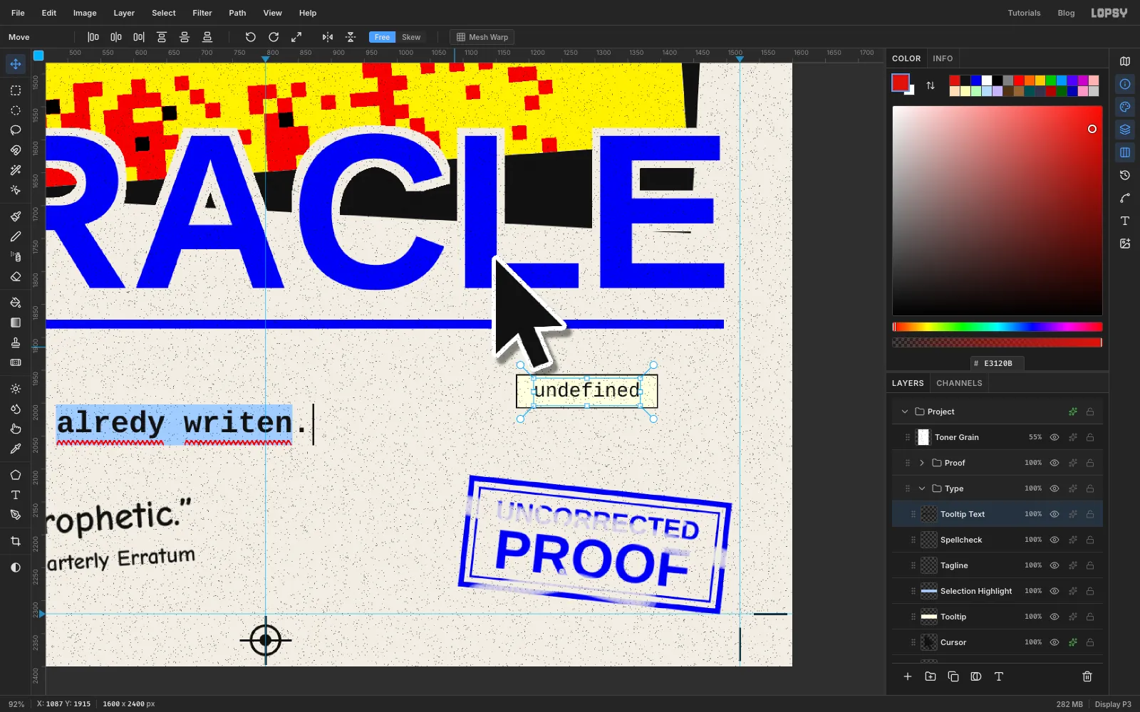
CursoraboveOracle Link. Zoom in and use the Lasso to draw a classic arrow pointer from straight segments, about 160 px tall, with its tip on the bottom of the L. Go from the tip straight down the left side, slant in to the notch where the tail starts, down and right along the tail, back up the other side of the tail, out to the right-hand point of the arrowhead, and back to the tip. Fill it with ink. - Give it a white Stroke at Width 7 and a soft Drop Shadow (Offset X 8, Offset Y 10, Blur 6, Opacity 45).
- Add a layer called
Tooltip. Marquee a box about 216 × 52 px just under the cursor's tail and fill it with ink. Choose Select → Shrink… by 2 and fill with tooltip cream , which leaves a 2 px border. - Type
undefinedin Cousine at 30 in ink, name the layerTooltip Text, and centre it in the box with the arrow keys.
- Add a layer called
-
Spell-check the tagline
Add a layer called
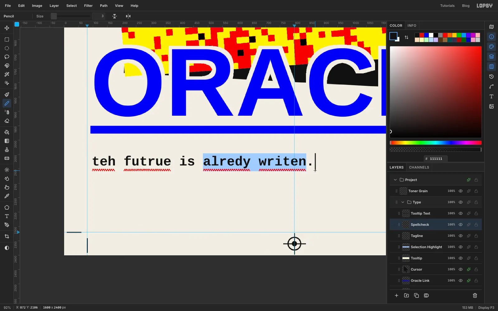
Selection Highlightfirst, then set the tagline above it. Typeteh futrue is alredy writen.in Cousine, Bold, 46, in ink. Line its left edge up with the O of ORACLE, about 120 px below the underline. Name the layerTagline.Cousine is monospaced, so every letter is the same width. That makes the rest easy to line up.
- Selection. On
Selection Highlight, marquee from the start of alredy to the end of writen, a little taller than the line, and fill with selection blue . - Squiggles. Add a layer called
Spellcheckabove the tagline. With the Pencil at Size 2 in proof red, zoom in and drag a tight zig-zag under each misspelled word: teh, futrue, alredy and writen. Zig up and down about 6 px every 3–4 px along. The red wavy line from a word processor's spell-checker is what you're imitating. - Caret. With the Pencil at Size 3 in ink, Shift-click a short vertical line just after the full stop.
- Selection. On
-
Draw the transposition mark
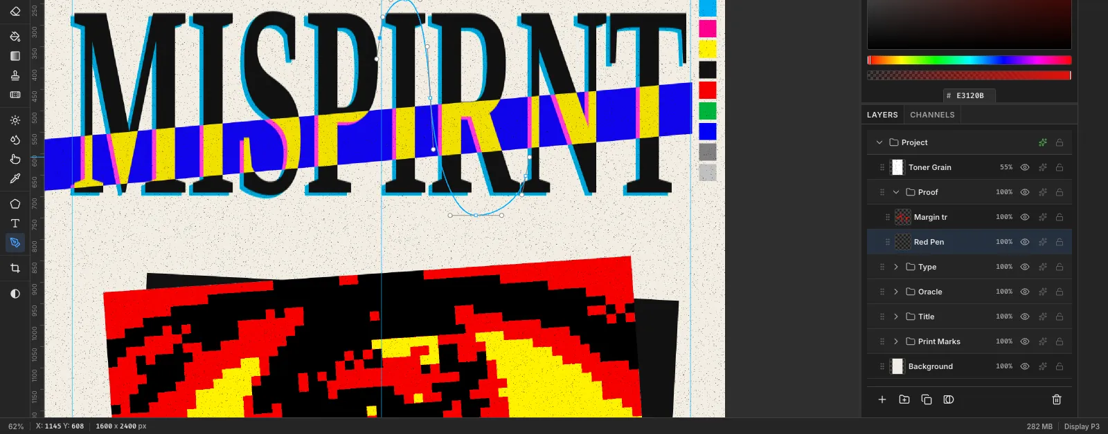
Proofreaders mark two swapped letters with an S-shaped line. It goes over the first letter, crosses down between them, and goes under the second.
Make a group called
ProofaboveType, with a layer inside calledRed Pen. Set the foreground to proof red. Pick the Pen tool and set Stroke to 10 in the options bar.Drag out five smooth anchors. At each one, press and drag in the direction the line should travel:
- Start on the left side of the I, partway up, and drag upwards.
- Go just above the top of the I and drag to the right.
- Go into the narrow gap between the I and the R, halfway down, and drag straight down with long handles.
- Go just below the bottom of the R and drag to the right.
- Finish on the right side of the R and drag upwards.
Press Enter to stroke the path in red.
-
Circle the margin note and add the author
A proof mark always comes with a note in the margin.
- Type
trin Reenie Beanie at 150 in proof red, and move it to the top margin, above the R and N. Name itMargin tr. - On
Red Pen, draw a loose circle around it with the Pen, using five smooth anchors. End slightly past the start and a little outside it, so it looks drawn by hand rather than with a compass. Press Enter at Stroke 7. - Draw a two-anchor line from the circle down to the top of the S-curve and stroke it at 6. Start at the circle, not the S-curve: if you click on a path that's still selected, the Pen adds an anchor to it instead of starting a new line.
Click
Type Basein theTypegroup. On the left of the same margin, type the author's name,ODILE MARCHETTI, in Arimo Bold at 56 in ink, and name itAuthor. Then typea novelin Tinos, Italic, at 50 in ink, on the same baseline, and name itA Novel. Switch the Text tool back to Normal style afterwards, or the next text will be italic too.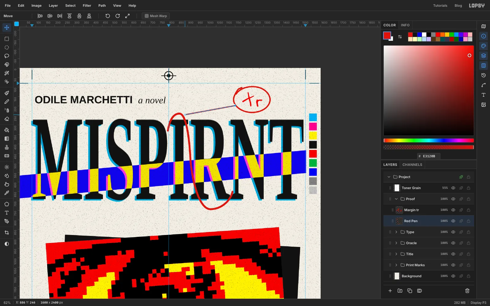
- Type
-
Tilt the blurb as a group
Inside
Type, make a group calledBlurbwith an emptyBlurb Baselayer. Type“Unreadable. Prophetic.”in Comic Neue, Bold, 58 in ink, and— The Quarterly Erratumin Comic Neue, Regular, 34 in ink. Put the quote at the left margin, under the tagline, then move the attribution under it so its right end lines up with the closing quote mark.Rasterize both layers. Then click the
Blurbgroup row, pick the Move tool with nothing selected and drag the rotate handle about 4° anticlockwise. Both lines turn together around one centre. Press Escape to commit. A transform with nothing selected is committed with Escape. Cmd+D is for transforms of a marquee selection.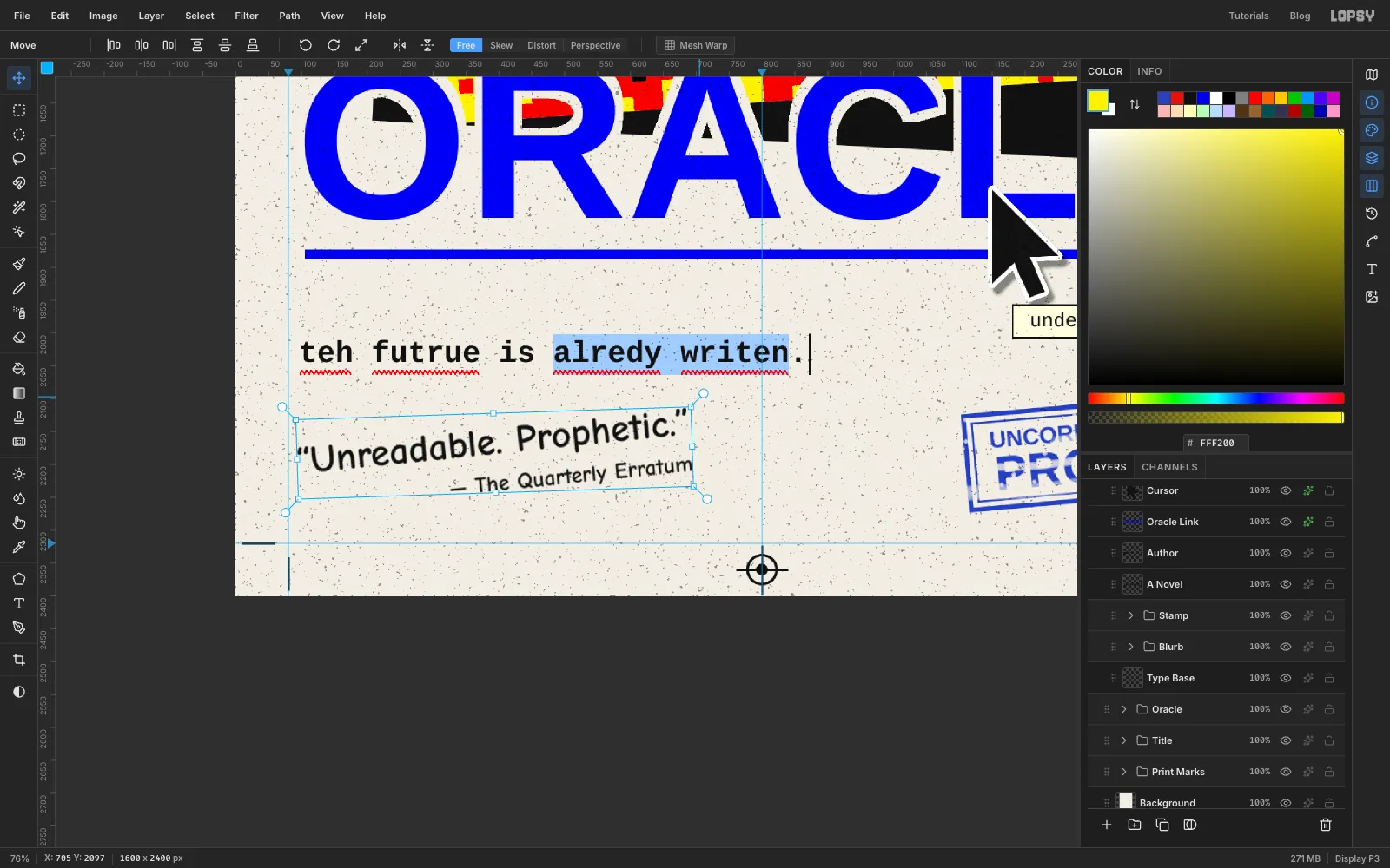
-
Stamp it UNCORRECTED PROOF
Make a group called
StampinsideType, with a layer calledStamp Ink. Work in stamp blue , which is duller than the link blue, so the stamp doesn't compete with ORACLE.- Frame. Marquee about 350 × 150 px at the bottom right, inside the margins, and fill it. Shrink the selection by 7 and press Delete. Marquee a second box whose edges sit 14 px inside the outside of the first, fill it, Shrink by 3 and delete again to leave a thin inner frame.
- Words. Type
UNCORRECTEDin Arimo Bold at 35 andPROOFat 74. Centre them both in the inner frame with an equal gap above and below. - Rasterize both, then use Layer → Merge Down twice to merge them into
Stamp Ink. - Click the
Stampgroup row and rotate it about 5° anticlockwise with the Move tool, as you did the blurb. That's the same direction as the blurb. Press Escape to commit. - Wear. Pick the Eraser at Size 26, Opacity 28. Drag two long streaks that follow the stamp's angle, one through the top line and one along the bottom. Add a thinner streak at Size 14, then click a scatter of small specks at Size 7, Opacity 80.
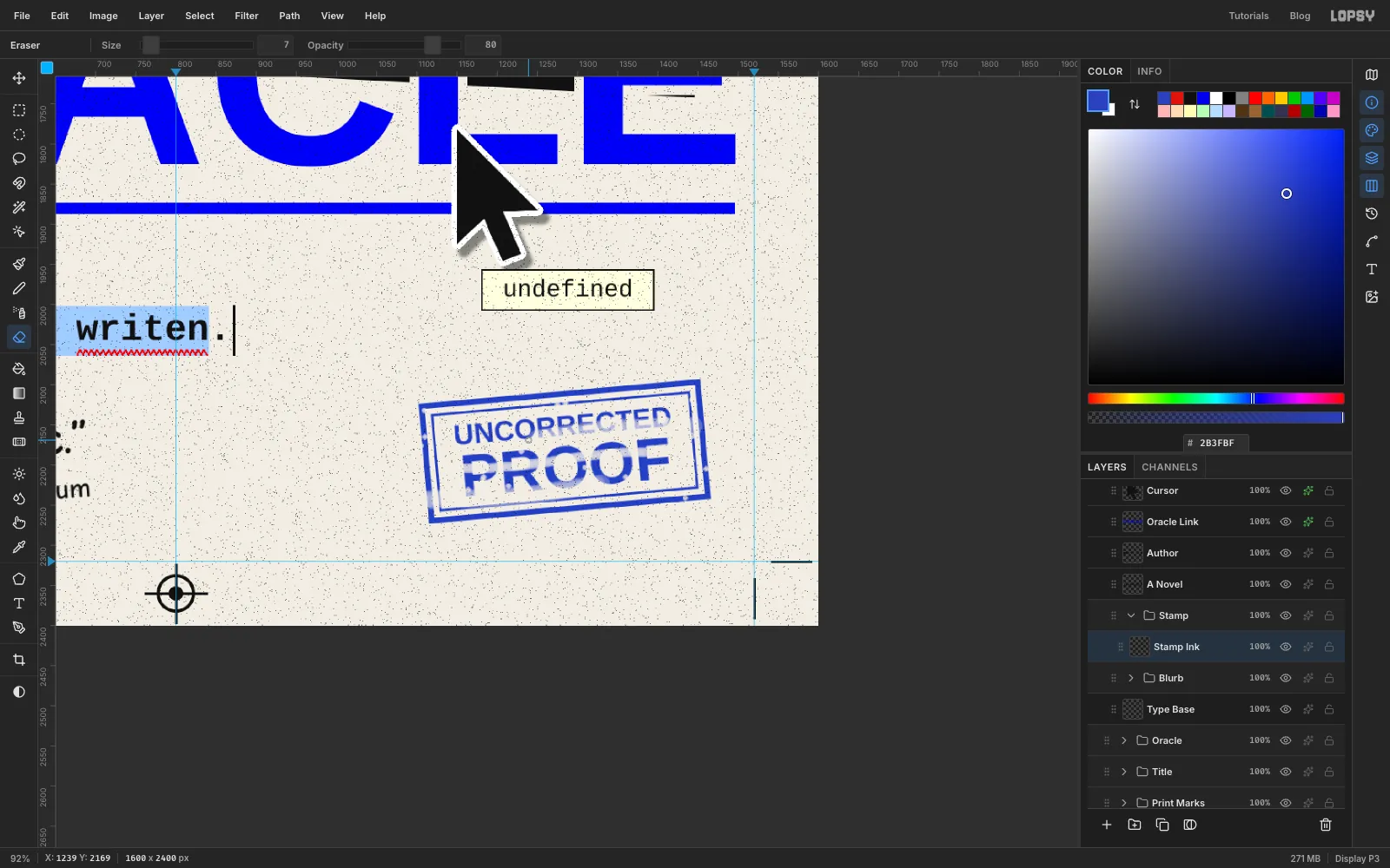
-
Close the gap with a group move
Step back and look at the whole page. There's a dead band of empty paper between the title and the eye, which splits the cover in two. Pull everything closer together:
- Click the
Oraclegroup row, pick the Move tool, and drag the eye up about 90 px. The eye and its slab move as one. - Click
Oracle Link, then Shift-clickCursorto select both. With the Move tool, press Shift+↑ nine times. Each press moves 10 px, so they go up the same 90 px. - Select the tagline layers the same way,
Selection HighlightthroughSpellcheck. Press Shift+↑ four times and ↑ four times to move them up 44 px. - Move
TooltipandTooltip Textby the same amount so the box sits just under the cursor's tail again.
- Click the
-
Trim the underline
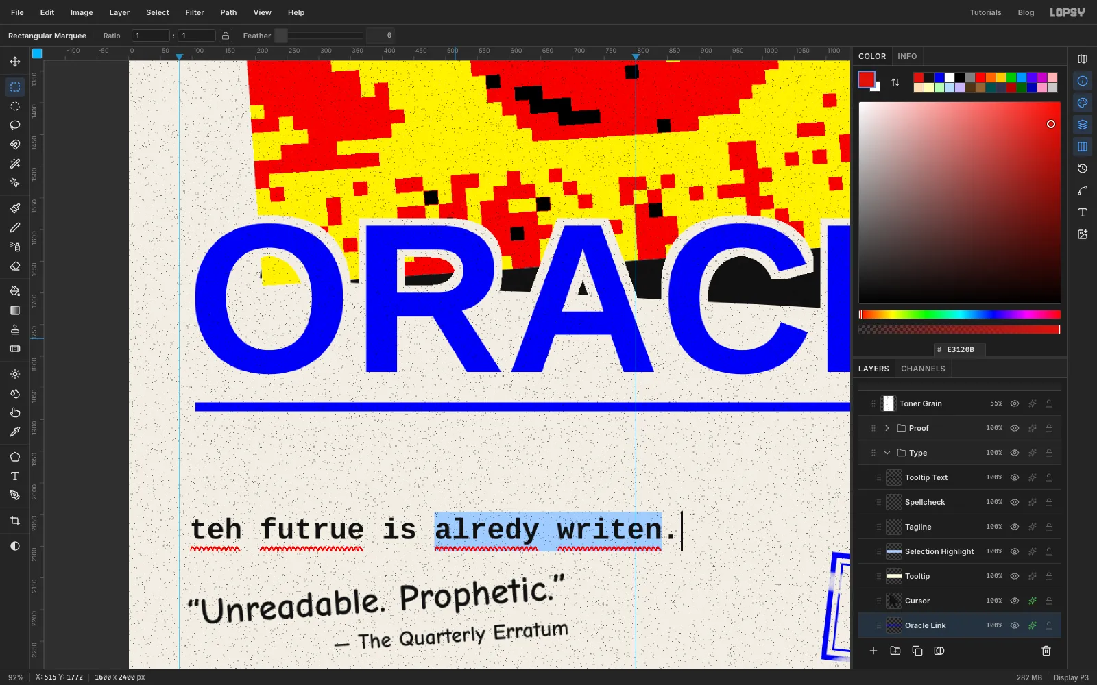
A text underline runs the full width of the text box, so it starts a little left of the O. It's also quite heavy. Rasterize
Oracle Linkand zoom in on the underline:- Drag a marquee over the top half of the underline, across the whole width of the page, and press Delete. That leaves a line about 14 px thick.
- Marquee and delete the short bits that stick out past the left edge of the O and the right edge of the E.
-
Give the eye a pupil
The posterized pupil is a ragged blob, so add a clean one on top.
- In the
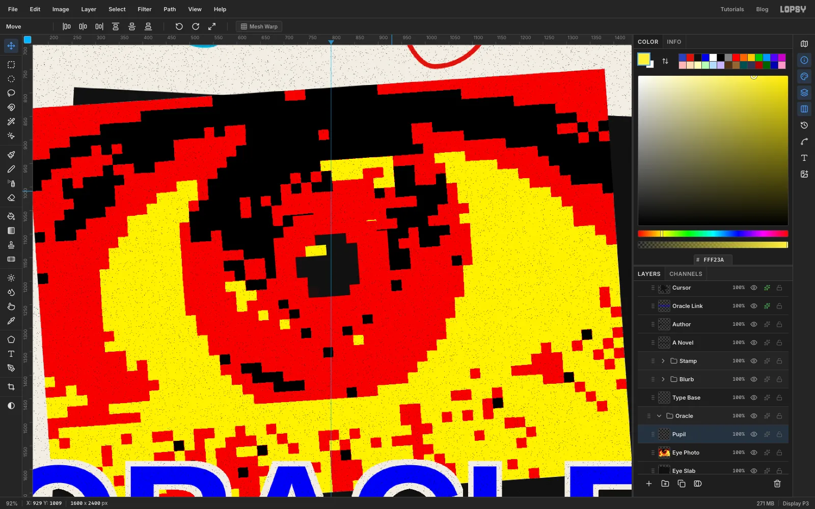
Oraclegroup, add a layer calledPupilaboveEye Photo. - Drag a circle about 256 px across over the iris and fill it with proof red. On the same centre, drag a circle about 136 px across and fill it with ink.
- Marquee a small rectangle, about two blocks wide and one tall, at the top-left of the pupil, and fill it with eye yellow. That's the catch-light.
- Run Pixelate at 22 so the pupil matches the eye's blocks. Marquee it and rotate it 4° anticlockwise to match the eye's tilt.
- In the
-
Add photocopier toner
Finish with the speckle a photocopier leaves behind. Select the empty
Toner Grainlayer at the top of the stack.- Fill the layer with mid grey .
- Run Add Noise at 100 with Mono and Uniform.
- Run Gaussian Blur at 3 so the noise clumps into small blobs.
- Run Threshold at about 111, so only a sparse scatter of the darkest blobs stays black and everything else turns white. The right level depends on the noise, so watch the preview.
- Set the layer to Multiply at 40%. The white disappears and only the specks print.
Save with File → Save Project, then File → Quick Export PNG.