Make an Anti-Design Movie Poster with a Win98 Error Dialog
Build a deliberately broken anti-design film poster in Lopsy with photo duotones, glitch slices, a Difference-blend title and a fake Windows 98 dialog.
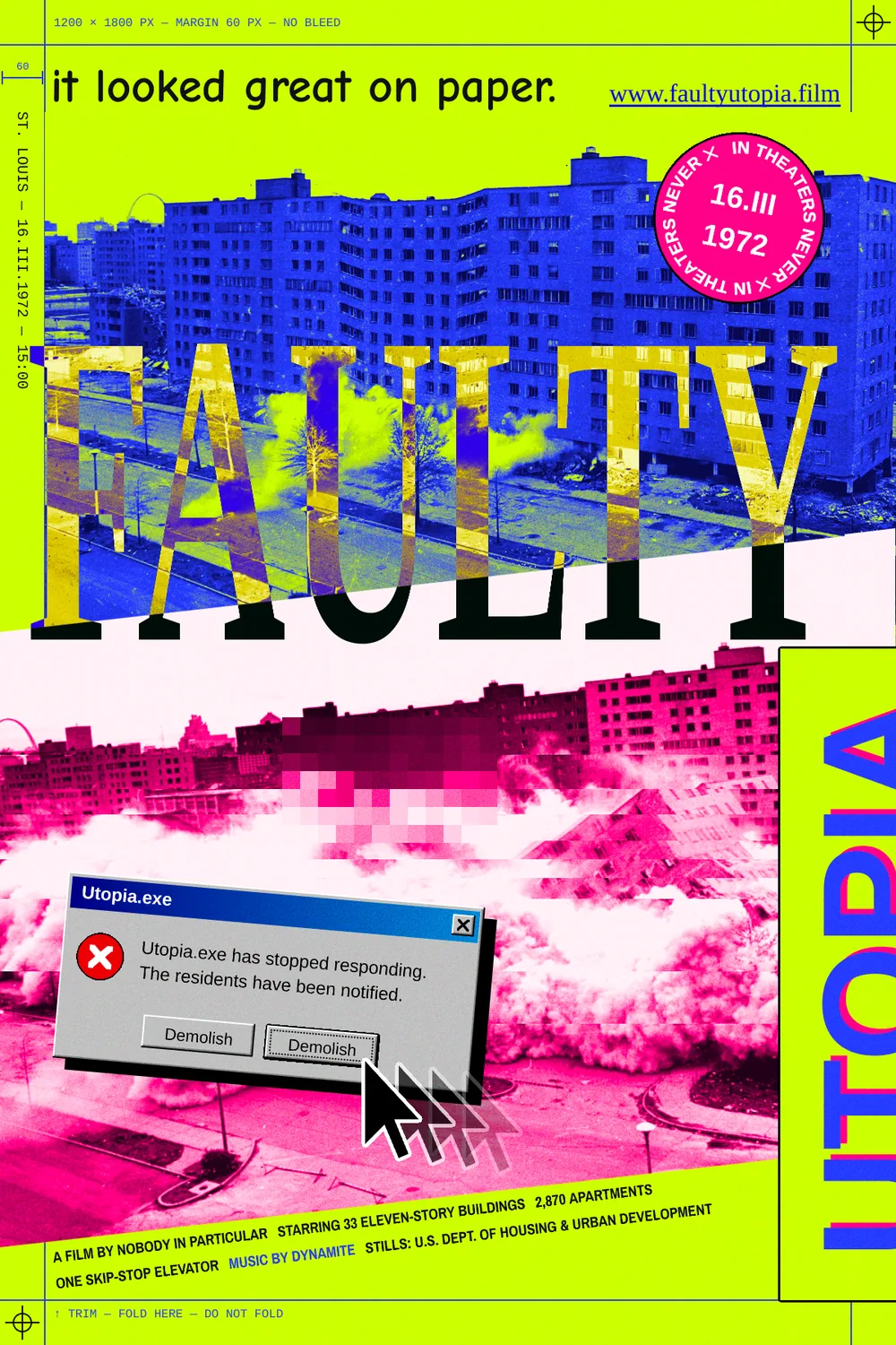
Anti-design breaks the rules on purpose. It uses clashing colours, the fonts every computer ships with, visible construction lines and screen furniture that has no business being on a poster. Done well, it's still carefully controlled. Every "mistake" is placed, aligned and finished, so the viewer can tell it's a decision.
In this tutorial you'll make a poster for Faulty Utopia, an imaginary film about the Pruitt-Igoe housing project in St. Louis. Its 33 eleven-storey blocks opened in 1954–55. The first was demolished on 16 March 1972, and that's the date on the poster. The poster is 1200 × 1800 px. It uses two frames from the U.S. Department of Housing and Urban Development's photos of the second, televised demolition in April 1972, which are in the public domain in the US. Download Pruitt-igoe collapse-series.jpg from Wikimedia Commons. It's four frames stacked top to bottom, each about 1890 × 1150 px. Before you start, crop the first frame (the block still standing) and the third (the block falling) into two separate JPEGs with any image viewer's crop tool.
Along the way you'll use:
- Gradient Map on groups to turn photos into blue and pink duotones
- the Move tool's scale and rotation handles on photos, on live text and on a whole group
- marquee slices, Pixel Stretch and Pixelate for glitches, and the Clone Stamp
- live text stretched with handles and set to the Difference blend mode
- Color Overlay, Stroke, Drop Shadow and Inner Glow effects
- the Pencil with Shift-click lines for Windows 98 bevels and construction lines
- the Pen tool and Path to Selection for a mouse pointer
- Selection → Path and text on a path for a sticker
- copy and paste and layer drag-and-drop for a frozen pointer trail
- Tinos, Arimo, Cousine, Archivo Narrow and Comic Neue, the "default" fonts of anti-design
The palette:
-
Acid lime
-
electric blue
-
hot pink
-
Blue duotone
-
Pink duotone
-
Window grey
-
bevel grey
-
title bar
-
Stop red
-
link blue
-
ink
-
grain grey
-
Fill the canvas and drop the guides
Choose File → New, enter 1200 × 1800 and click Create. Click the Background row, set the foreground to lime and choose Edit → Fill.
Click the top ruler at
60,600and1140to drop three vertical guides, then click the left ruler at60and1740. Those are a 60 px margin all round and a centre line.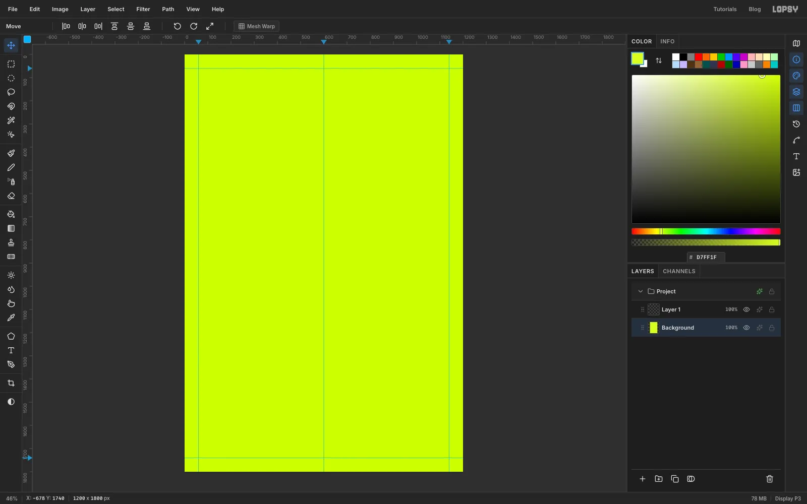
-
Draw the construction lines
Anti-design shows its working, so draw the margin box into the poster. Rename Layer 1 to Construction. Pick the Pencil, set Size to
2and the foreground to electric blue .Click at the very top of the
60guide, then Shift-click at the very bottom. That's a straight line. Do the same down the1140guide, then across the60and1740guides from the left edge to the right edge. The lines cross at the corners and run out to the trim like crop marks. At fit-to-screen zoom they hide under the guides, so zoom into a corner to check them.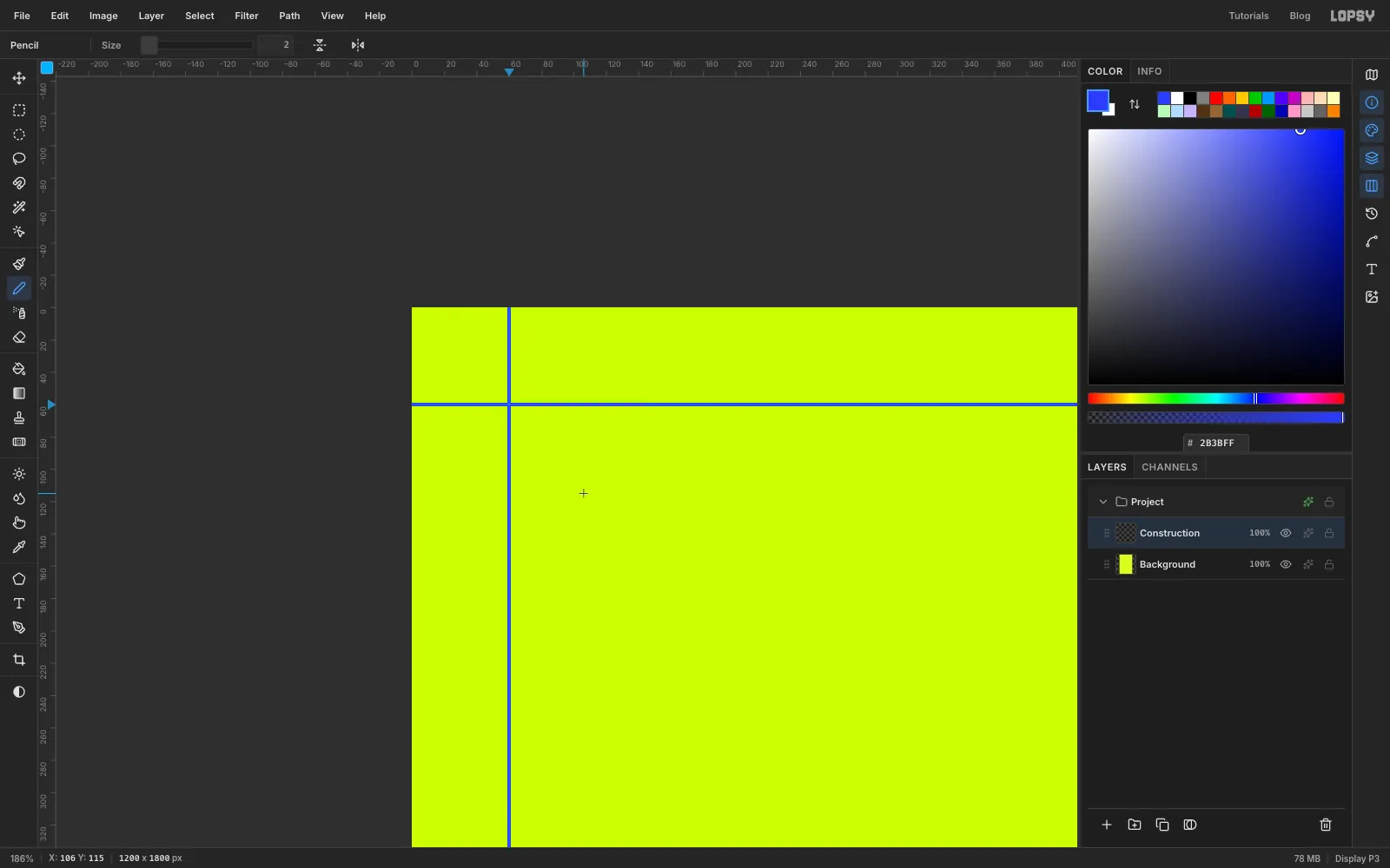
-
Drop in the standing tower block
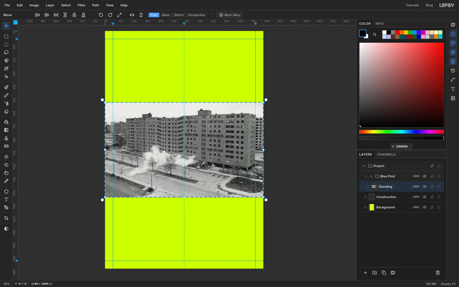
With Construction selected, click New Group at the bottom of the Layers panel and name it Blue Print. Drag the first photo (the block still standing) from your desktop onto the canvas. It lands inside the group as Pasted Layer, shrunk to the canvas width, with its pixels selected. Rename it Standing.
-
Slide it onto the margin
Press Cmd+D first to drop the selection, so the Move tool moves the whole layer rather than the selected pixels. A whole layer can hang off the canvas safely. Pick the Move tool and drag the photo up and to the right until its left edge sits on the
60guide and its top is at150. Use the arrow keys for the last few pixels. The right-hand 60 px now hang off the canvas, which is what you want: the photo bleeds off the right side.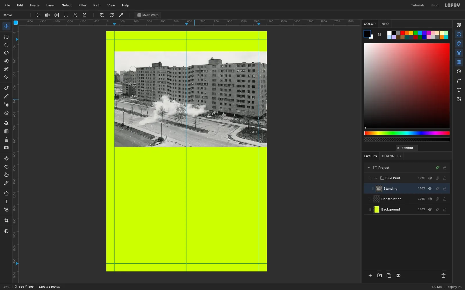
-
Strip the colour and add punch
With Standing selected, choose Filter → Desaturate. Then choose Filter → Brightness/Contrast…, set Contrast to
35and click Apply. The Gradient Map in the next step will recolour the greys, so strong contrast here gives a crisp duotone.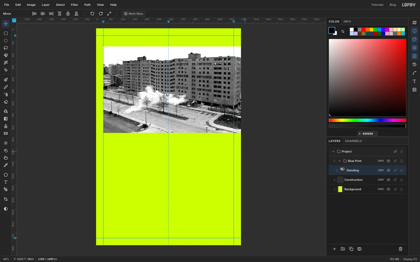
-
Print it in blue with a Gradient Map
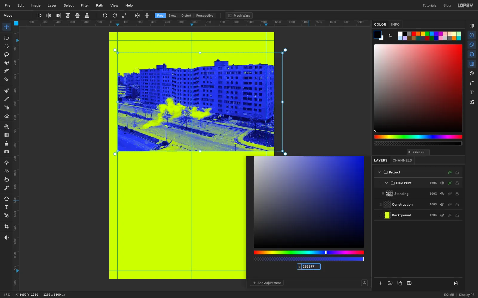
Click the Blue Print group row and open its effects drawer (the sparkle icon on the row). Click Add Adjustment → Gradient Map. Click the left stop and type
08084Ain the hex field, then click the right stop and typeD7FF1F. Click the middle of the gradient bar to add a third stop and make it2B3BFF. Close the drawer.The shadows become deep navy, the mid-tones electric blue and the sky turns the same lime as the paper, so the building looks printed straight onto the poster.
-
Scale and tilt the collapsing block
Collapse the Blue Print group with its arrow, keep it selected, and click New Group. Name the new group Pink Print. Drag the third photo (the block falling) onto the canvas and rename it Collapse.
Cmd-click its thumbnail to select its pixels, pick the Move tool and Cmd-drag the bottom-right corner handle out by about
140px, so the photo is about 1340 px wide. Cmd keeps the proportions. Press Cmd+D.Now drag the whole layer so its left edge hangs about 150 px off the left side and its top is at about
780. Cmd-click the thumbnail again and drag the round rotation handle at the top-right corner anticlockwise by about 6°, so the right side rises. Press Cmd+D to commit. The pale sky at the top of the photo now cuts across the poster in a tilted band.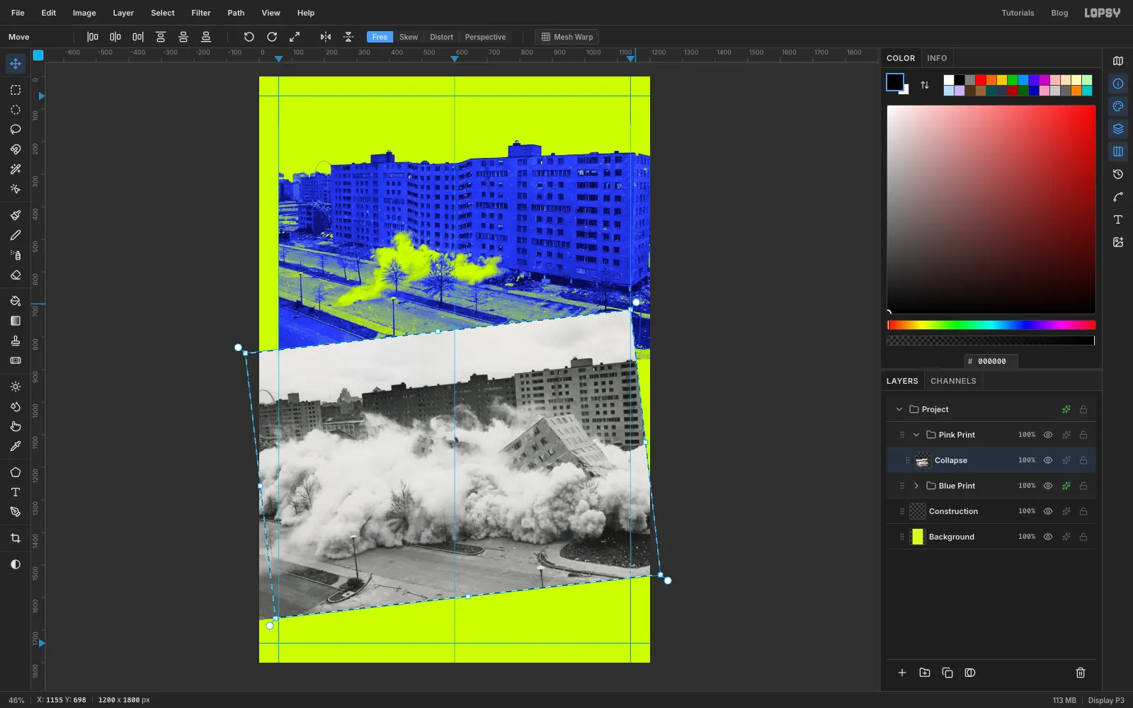
-
Print it in pink
With Collapse selected, run Filter → Desaturate and Filter → Brightness/Contrast… with Contrast
40. Then click the Pink Print group, open its effects drawer and add a Gradient Map with three stops:1E0016on the left,FF2E88a little left of the middle (at 45%), andFFF2F7on the right.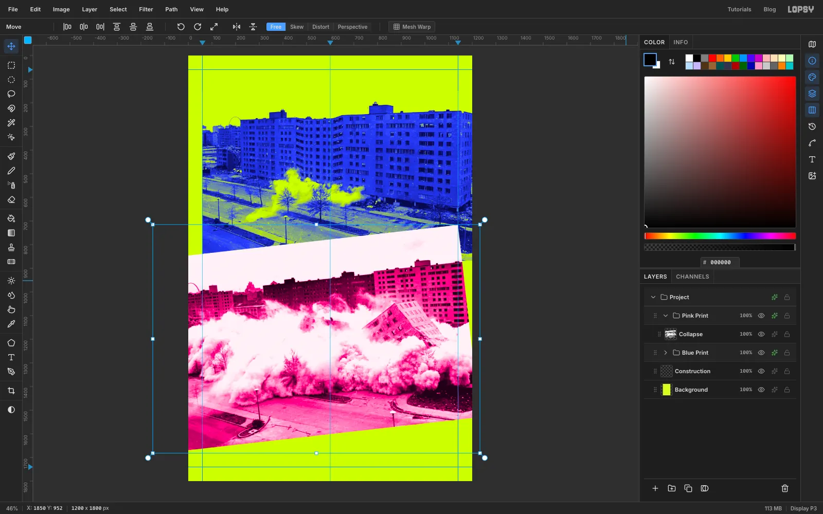
-
Shift some slices sideways
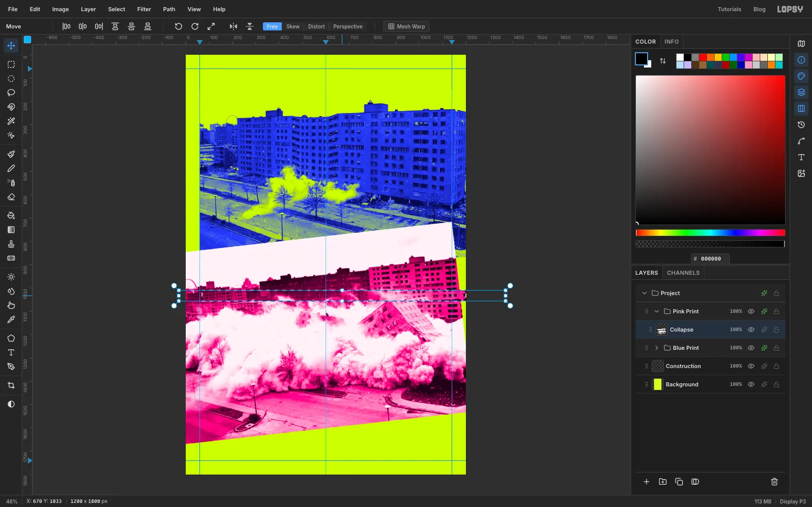
Click Collapse. With the Rectangular Marquee, drag a thin band right across the photo, starting off the left edge of the canvas and ending off the right edge, from about
1010to1056down. Switch to the Move tool, drag inside the band70px to the right, and press Cmd+D.Do two more:
- a band from
1175to1203, moved55px left - a band from
1300to1370, moved34px right
On the left, a band that touches the canvas edge carries along the pixels hanging past it, so no gap opens there. A gap may open at the right edge, but the lime strip you add later covers it.
- a band from
-
Smear one band with Pixel Stretch
Marquee another full-width band from
1090to1150. Choose Filter → Pixel Stretch… and set Amount60, Bands8, Seed412and RGB Split0.6. Click Apply. Filters stay inside the selection, so only this band streaks like a corrupted video frame.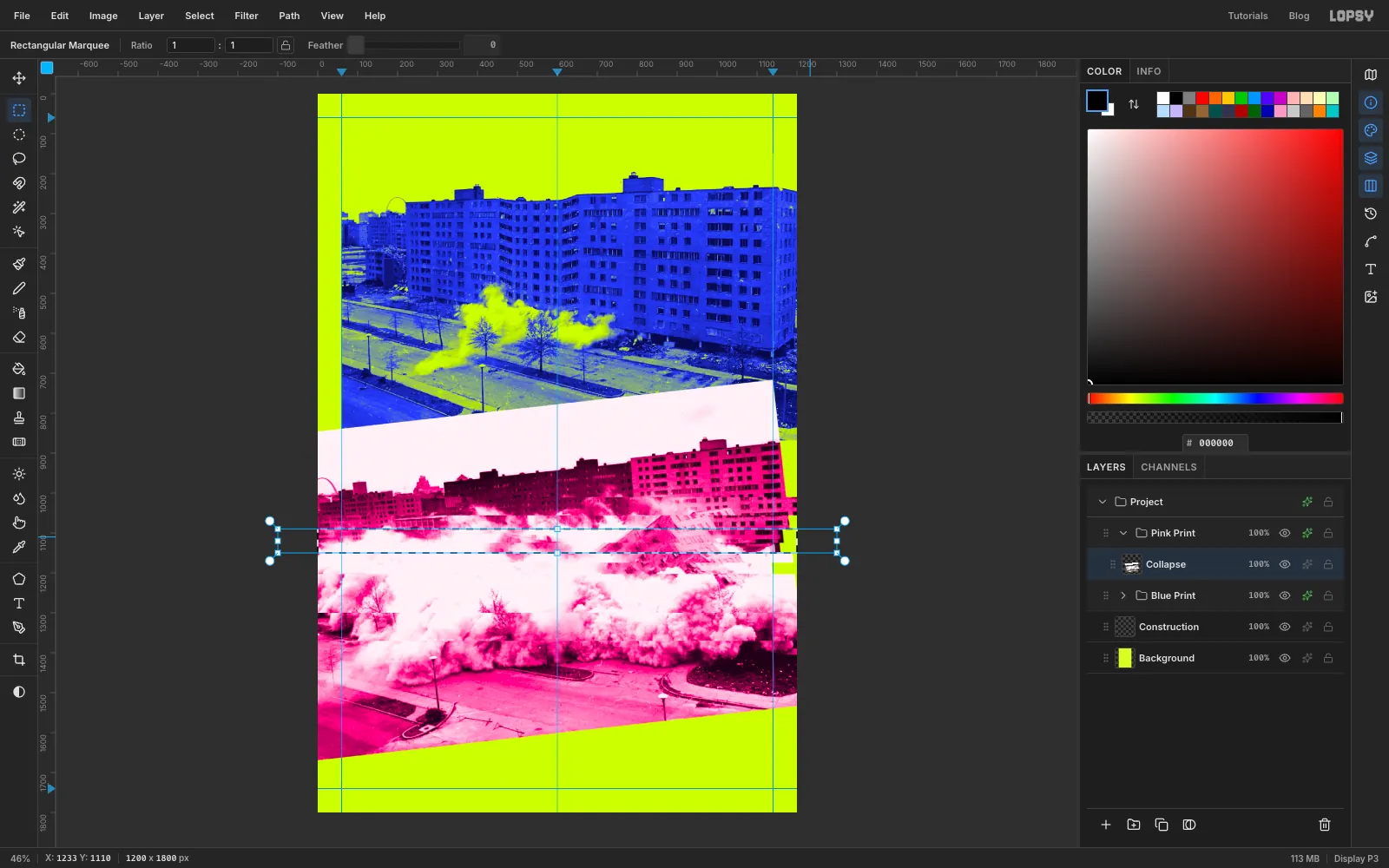
-
Censor the dust with a mosaic block
With the exact-corners dialog, select from
378, 960to666, 1128. Choose Filter → Pixelate…, set Block Size to24and click Apply. Pixelate's grid starts at the layer's top-left corner, not the canvas corner. This selection is 12 × 7 blocks and lines up with that grid, so every block comes out whole, with no half cells along the edges. If your photo's left edge isn't exactly 150 px off the canvas, the edge blocks may come out as part cells. Undo, nudge the selection a few pixels sideways and try again. Deselect.There's a faint dark smudge in the pale sky band at about
960, 795, right of where the title will go. Pick the Clone Stamp at Size60, Alt-click clean sky at about1080, 790, then paint over the smudge.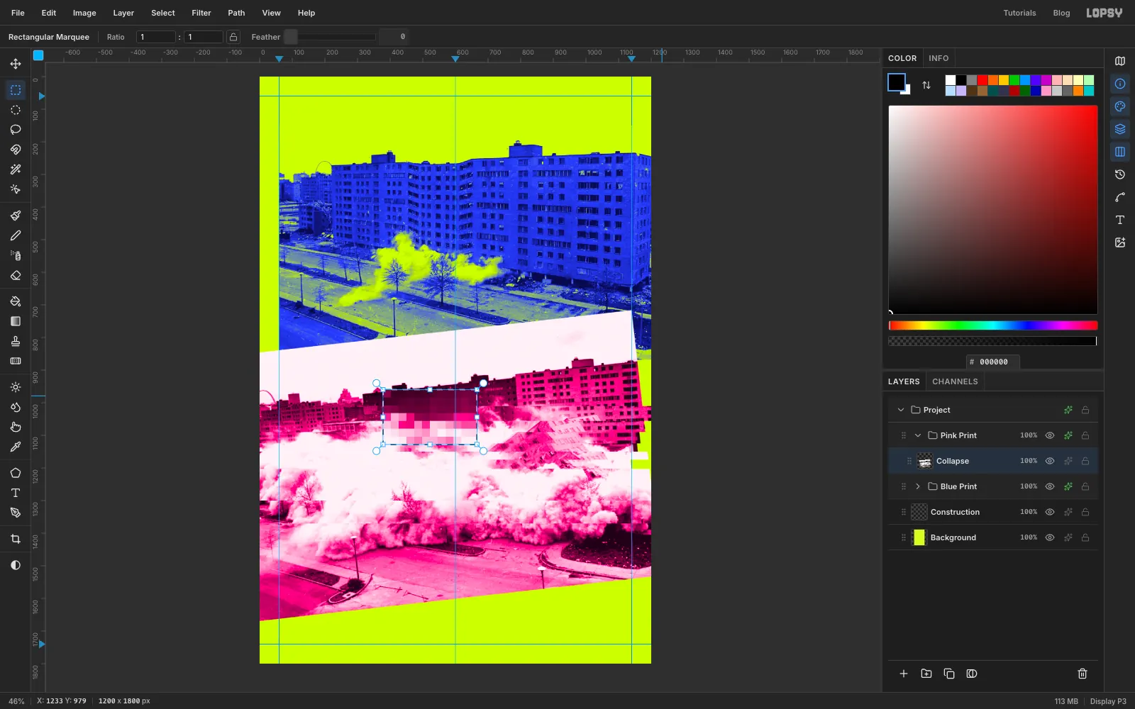
-
Type FAULTY
Click the Pink Print group and collapse it. Pick the Text tool. In the options bar set the font to Tinos (an open-source twin of Times New Roman), weight Bold, size
300, and the colour to white . Click at about70, 380and typeFAULTY. Press Tab to commit. Rename the layer FAULTY.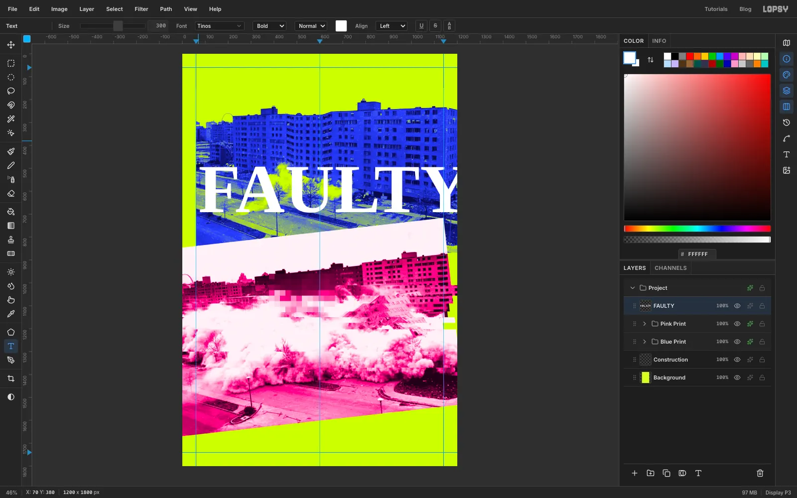
-
Stretch it to fill the width
With the Move tool, text gets its own transform handles and stays editable. Drag the right-middle handle until the word is about 1080 px wide, the distance between the two margin guides. Then drag the bottom-middle handle down about
420px, so the letters are roughly twice as tall. Press Cmd+D.Nudge the word with the arrow keys so its left edge sits at about
40(the F hangs 20 px into the margin) and the letters run from about460to860down. The bottoms of the letters should land on the pale sky band, clear of the pink rooftops.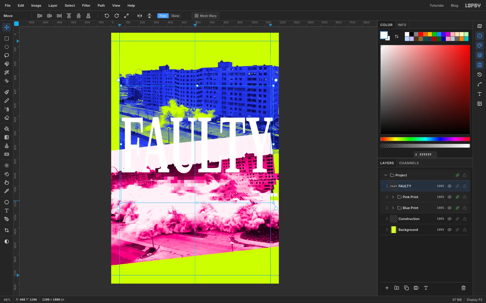
-
Flip the title with Difference
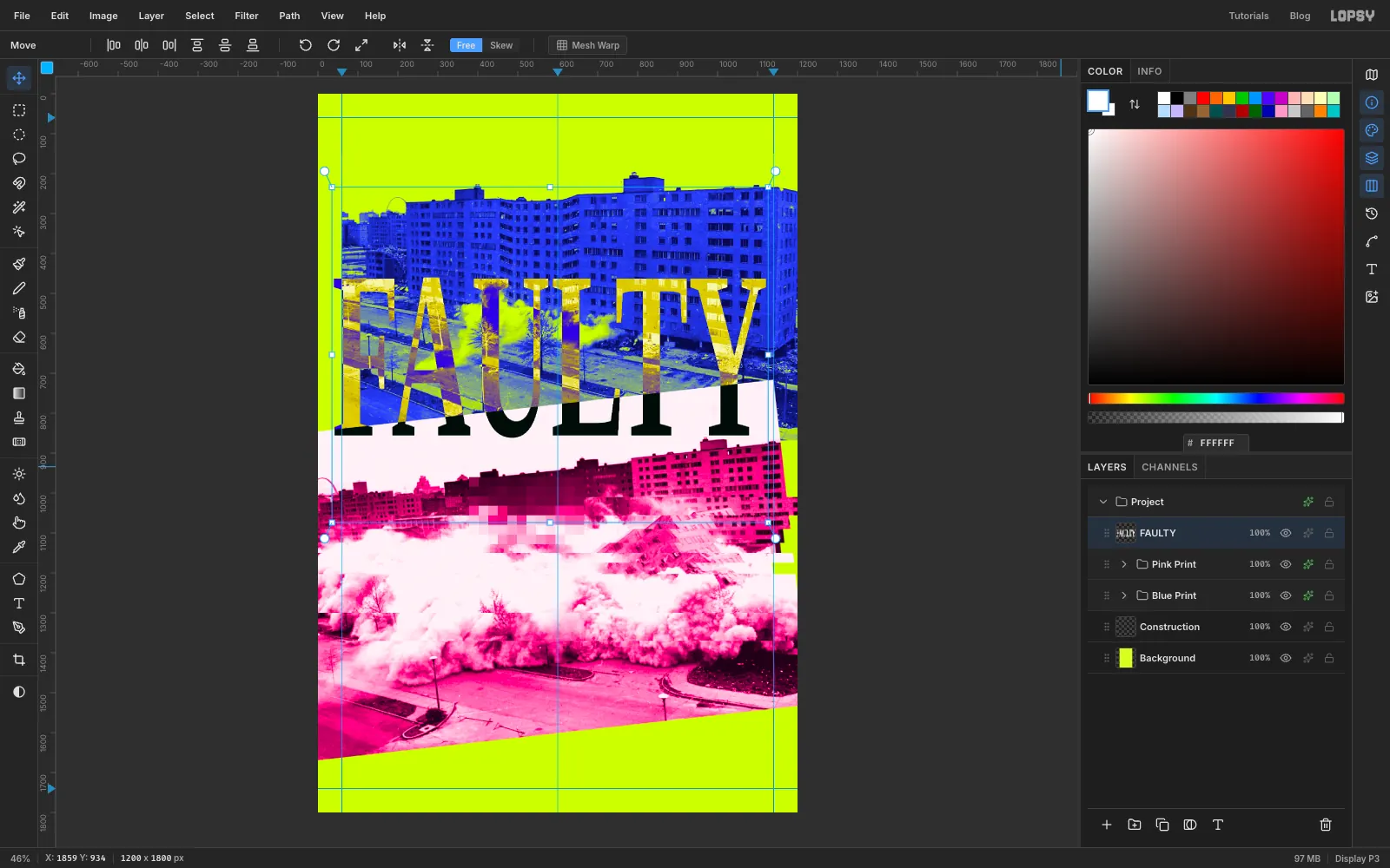
Open the FAULTY effects drawer and set its Blend to Difference. White text in Difference inverts whatever is underneath, so the letters turn ochre over the blue building, violet over the lime, and black over the pale band. The lower third reads as solid black type, and the upper two thirds show the building through the letters.
-
Run UTOPIA up a lime strip
Click Pink Print and add a layer named Lime Strip. Select from
1045, 868to1200, 1740, fill it with lime and deselect. In its effects drawer turn on Stroke, black , Width3.Type
UTOPIAin Arimo Bold, size200, electric blue, somewhere in open space. With the Move tool, click Rotate 90° CCW in the options bar so it reads upwards. Then nudge it into the strip, centred from top to bottom, with the letters' baseline about 40 px past the right edge. Cropping a big slice off reads as a choice rather than a slip.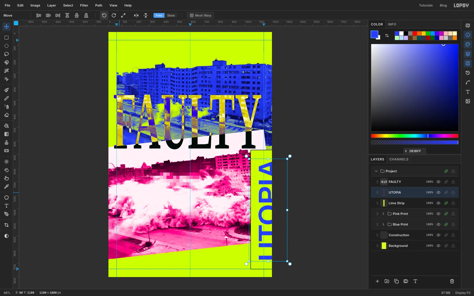
-
Knock a second plate out of register
Choose Layer → Duplicate Layer and rename the copy UTOPIA Misprint. Turn on Color Overlay with hot pink . Drag the copy's row by its grip down below UTOPIA. Then select it, pick the Move tool and nudge it
9px right and7px up with the arrow keys. The pink peeks out on two sides, like a second ink printed out of register.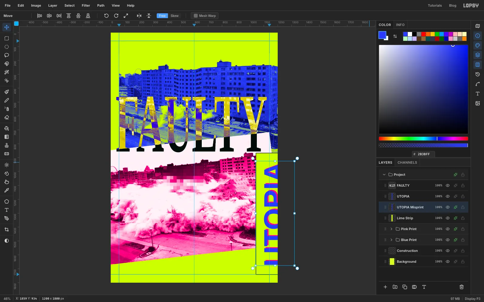
-
Set the tagline, slug and printer's notes
Click Lime Strip before each new line of type so they all stack above the photos:
- Tagline:
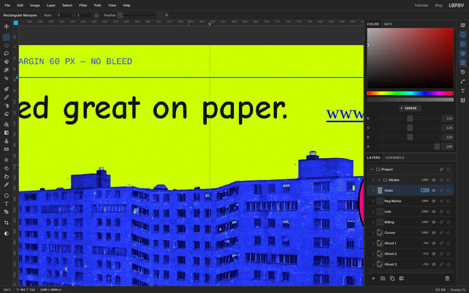
it looked great on paper.in Comic Neue Bold,64, ink . Click at about72, 80, type it, then nudge it with the Move tool until the i sits on72(12 px inside the margin) and the tops of the letters are at about93. - Spec line:
1200 × 1800 PX — MARGIN 60 PX — NO BLEEDin Cousine,16, blue, at72, 20, above the top margin line. - Fold note:
↑ TRIM — FOLD HERE — DO NOT FOLDin Cousine16, blue, at72, 1748, just under the bottom line. The arrow isn't on the keyboard, so copy it from this page. - Slug:
ST. LOUIS — 16.III.1972 — 15:00in Cousine20, ink. Type it in open space, click Rotate 90° CW with the Move tool, and nudge it into the left margin, centred on x30, with its top level with the photo at150.
Finally add a real dimension mark. On a new layer, use the Pencil (Size
2, blue) to draw a line from3, 104to57, 104, with ticks from3, 96to3, 112and from57, 96to57, 112. Type60in Cousine14, blue, in open space (well away from the slug, or the click will edit it) and nudge it so it sits centred just above the line, at about30, 88.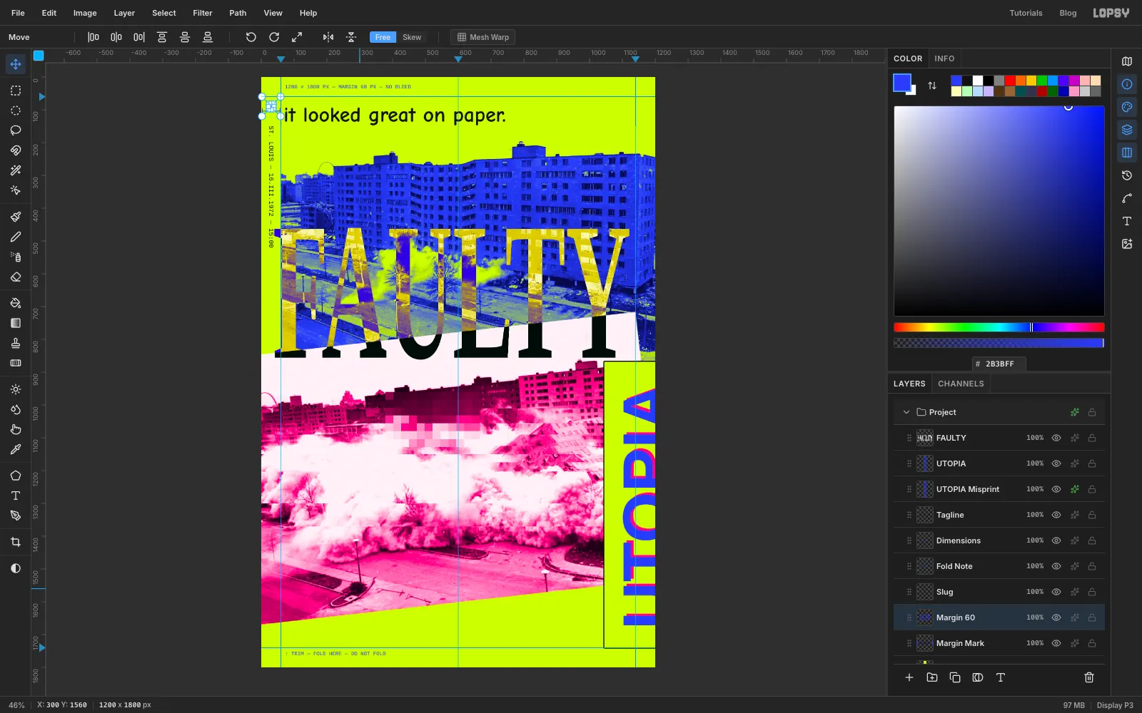
- Tagline:
-
Build a Windows 98 window
Click FAULTY and click New Group. Name the group Error Dialog. Add a layer named Window, select from
80, 1190to640, 1440and fill it with grey . Deselect.The Windows 98 look comes from a 2 px bevel. Zoom in, pick the Pencil at Size
2, and draw each colour as an L: a click, then two Shift-clicks.- white :
81, 1438→81, 1191→638, 1191(up the left edge and along the top) - black :
81, 1439→639, 1439→639, 1191(along the bottom and up the right edge) - dark grey :
83, 1437→637, 1437→637, 1193(one line in from the bottom and right)
Give the layer a Drop Shadow: black, Offset X
16, Offset Y16, Blur0, Opacity100. That gives a hard, offset shadow.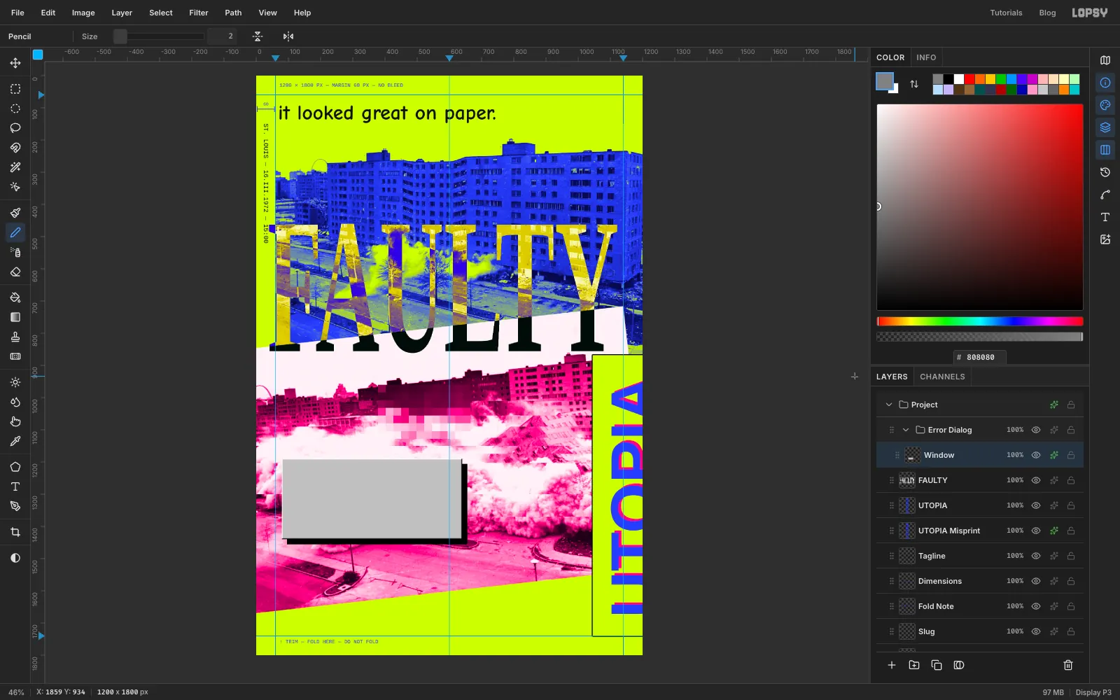
- white :
-
Add the title bar gradient
Add a layer named Title Bar and select from
86, 1196to634, 1238. Pick the Gradient tool, open Advanced…, and set the two stops to navy and blue . Drag from the left end of the selection to the right end, then deselect.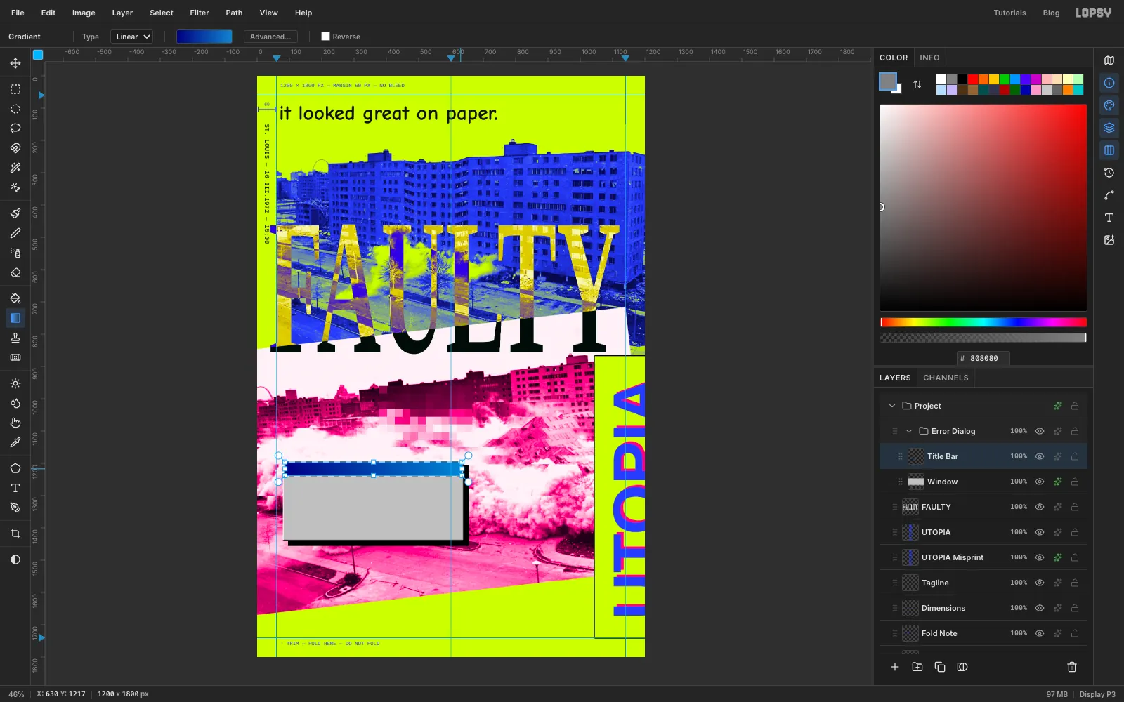
-
Add the close box, stop icon and buttons
Each button and the close box is its own layer, built like the window: an exact selection, a grey fill and the same three-colour bevel 1 px in from its edges. The stop icon is different.
- Close Box:
598, 1202to628, 1230, with a black X drawn by the Pencil at Size3. - Stop Icon: an Elliptical selection from
102, 1270to162, 1330filled with red . Add a white X with the Pencil at Size7, then a black Stroke of2. - Button A:
197, 1372to347, 1416. - Button B:
363, 1372to513, 1416. This is the default button, so give it a black Stroke of2.
For the dotted focus rectangle, set the foreground back to black , pick the Brush, open the brush settings and set Size
2, Hardness100and Spacing200. At that spacing each dab is a separate dot. On Button B, click at369, 1378and Shift-click round the other three corners (506, 1378,506, 1409,369, 1409) and back to the start.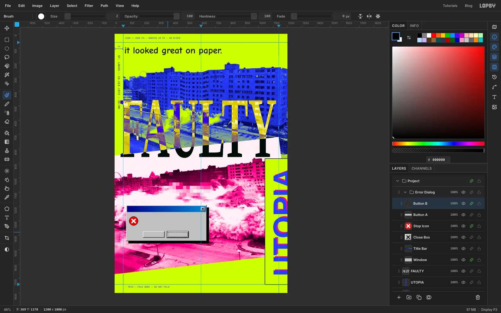
- Close Box:
-
Write the dialog text
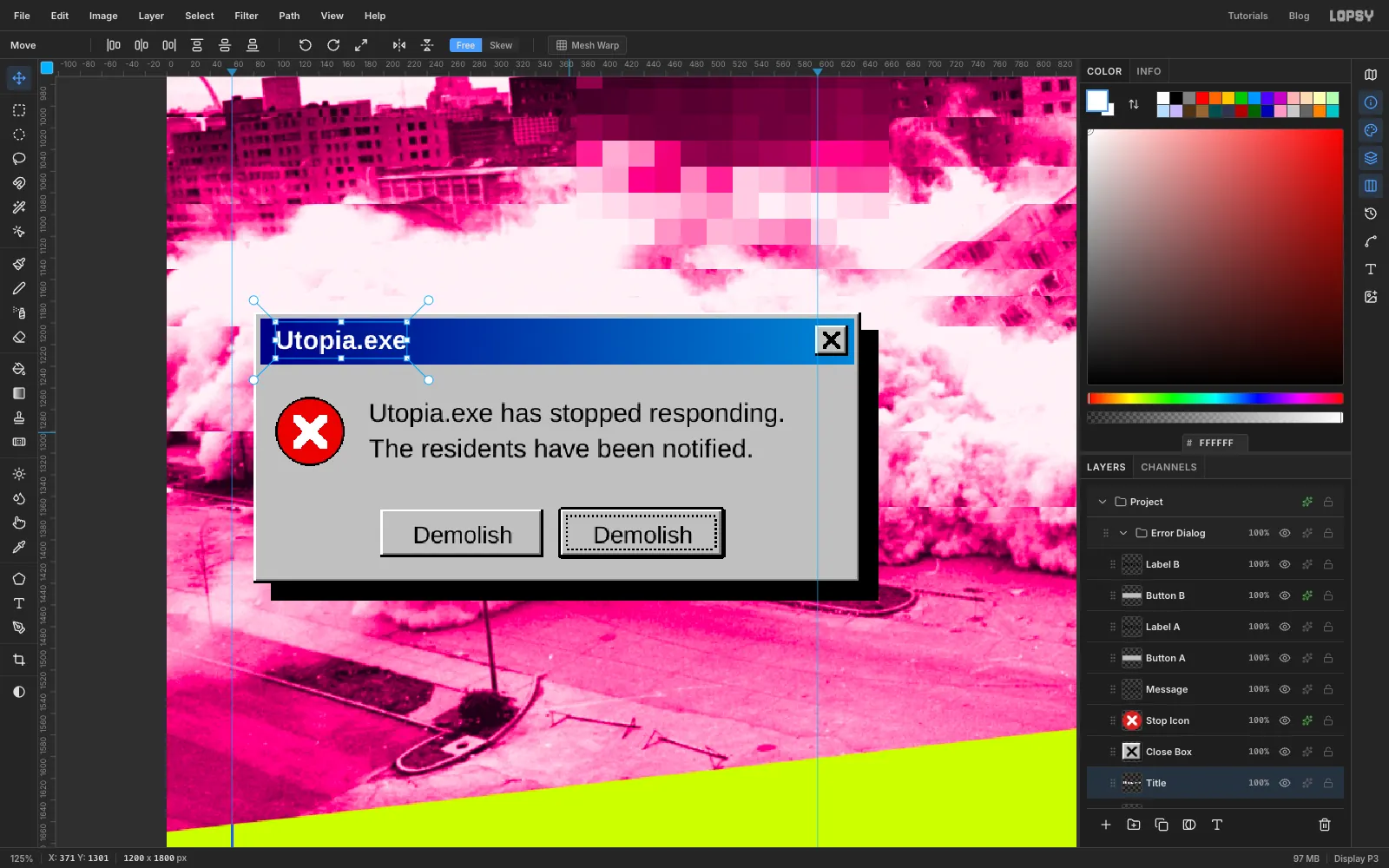
Set all the dialog text in Arimo, an open-source twin of Arial. Type each piece in open space below the dialog and nudge it into place. Click the layer you want it to sit above first.
- Above Button B:
Demolish, Regular22, black, centred in the button at438, 1394. - Above Button A: the same word centred at
272, 1394. - Above Stop Icon:
Utopia.exe has stopped responding., then Enter andThe residents have been notified., Regular24, starting at186, 1266. - Above Title Bar:
Utopia.exe, Bold24, white, starting at100and centred on the bar's height.
Both buttons do the same thing. That's the joke.
- Above Button B:
-
Tilt the whole dialog
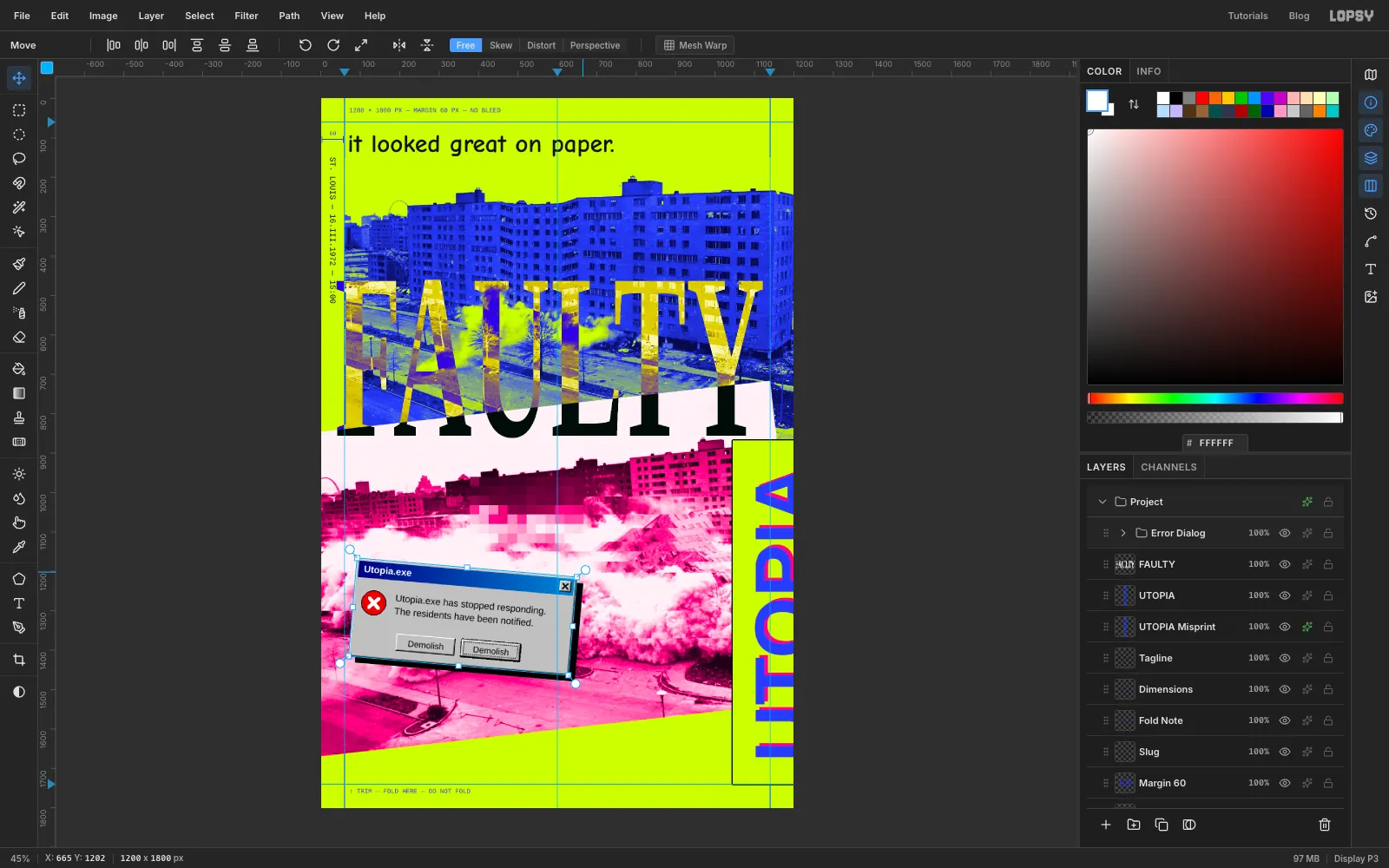
Collapse the Error Dialog group and click its row. Pick the Move tool and make sure nothing is selected. The handles now frame everything in the group. Drag the top-right rotation handle about 5° clockwise and press Cmd+D. The text stays live inside the turned group.
Press Cmd+Z to watch it snap back level, then Cmd+Shift+Z to redo the tilt.
-
Draw a giant mouse pointer with the Pen
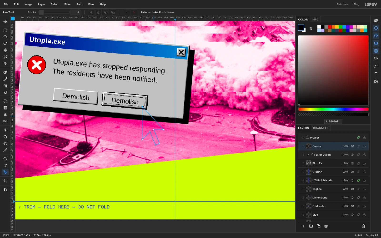
With Error Dialog still selected, add a layer named Cursor. Pick the Pen tool and click these seven points in order. Then click the first point again to close the path:
489, 1420(the tip) →489, 1531→515, 1505→535, 1550→548, 1544→528, 1498→561, 1498That's the classic arrow pointer at 6.5× size. Its tip sits in the padding at the default button's bottom-right corner, clear of the Demolish label.
-
Fill the pointer and give it a keyline
Open the Paths panel and click Path to Selection. Set the foreground to black, choose Edit → Fill and deselect. In the effects drawer turn on Stroke, white, Width
5. Back in the Paths panel, click Delete Path. You'll pick a different path for text in the next step, and an extra path would clutter that list.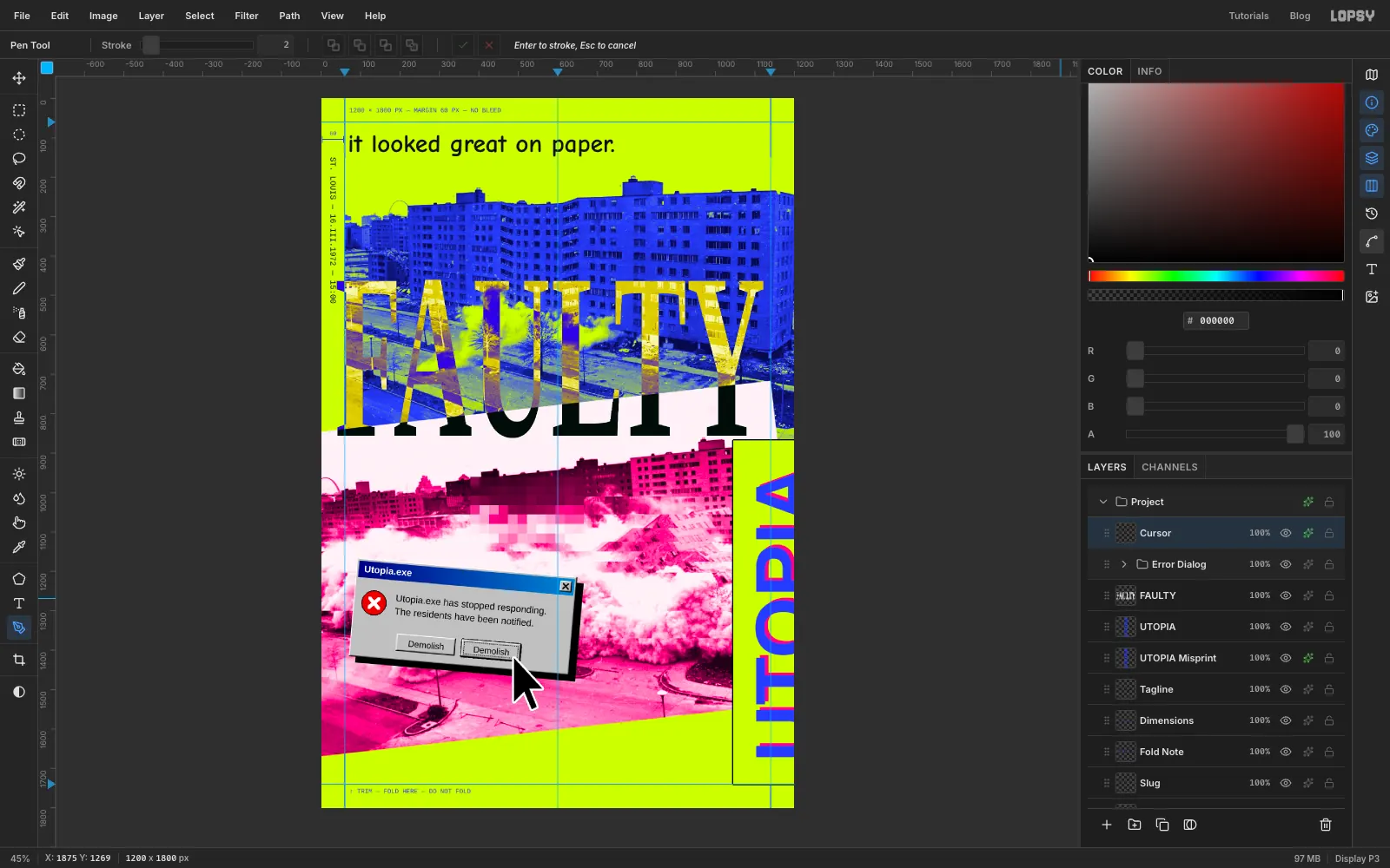
-
Wrap text round a sticker
Add a group named Sticker and a layer named Disc. Select a circle from
878, 180to1102, 404, fill it with hot pink and give it a black Stroke of3.Select a smaller circle from
904, 206to1076, 378, choose Selection → Path from the Select menu, then deselect. With Disc selected, click in open space (the bottom-left corner is fine) and typeIN THEATERS NEVER ✕ IN THEATERS NEVER ✕(note the space at the end) in Arimo Bold,22.7, white. The ✕ isn't on the keyboard, so copy it from this page. Rename the layer Ring Text. Then choose that new path in the options bar's Path dropdown. The letters wrap round the circle. The size is chosen so the text runs all the way round, with the same gap at both ✕ marks.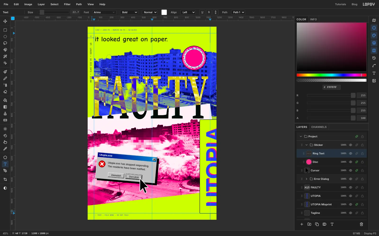
-
Add the date and finish the sticker
Click Disc and type
16.III, Enter,1972in Arimo Bold40, white, Align center, in open space. With the Move tool, nudge it to the middle of the disc, drag its rotation handle about 12° clockwise and press Cmd+D. Open the Paths panel and click the selected path's row to deselect it, so its anchors stop showing.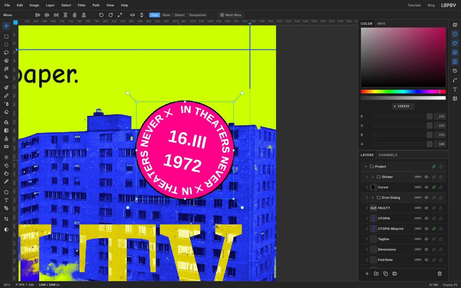
-
Add a hyperlink-blue web address
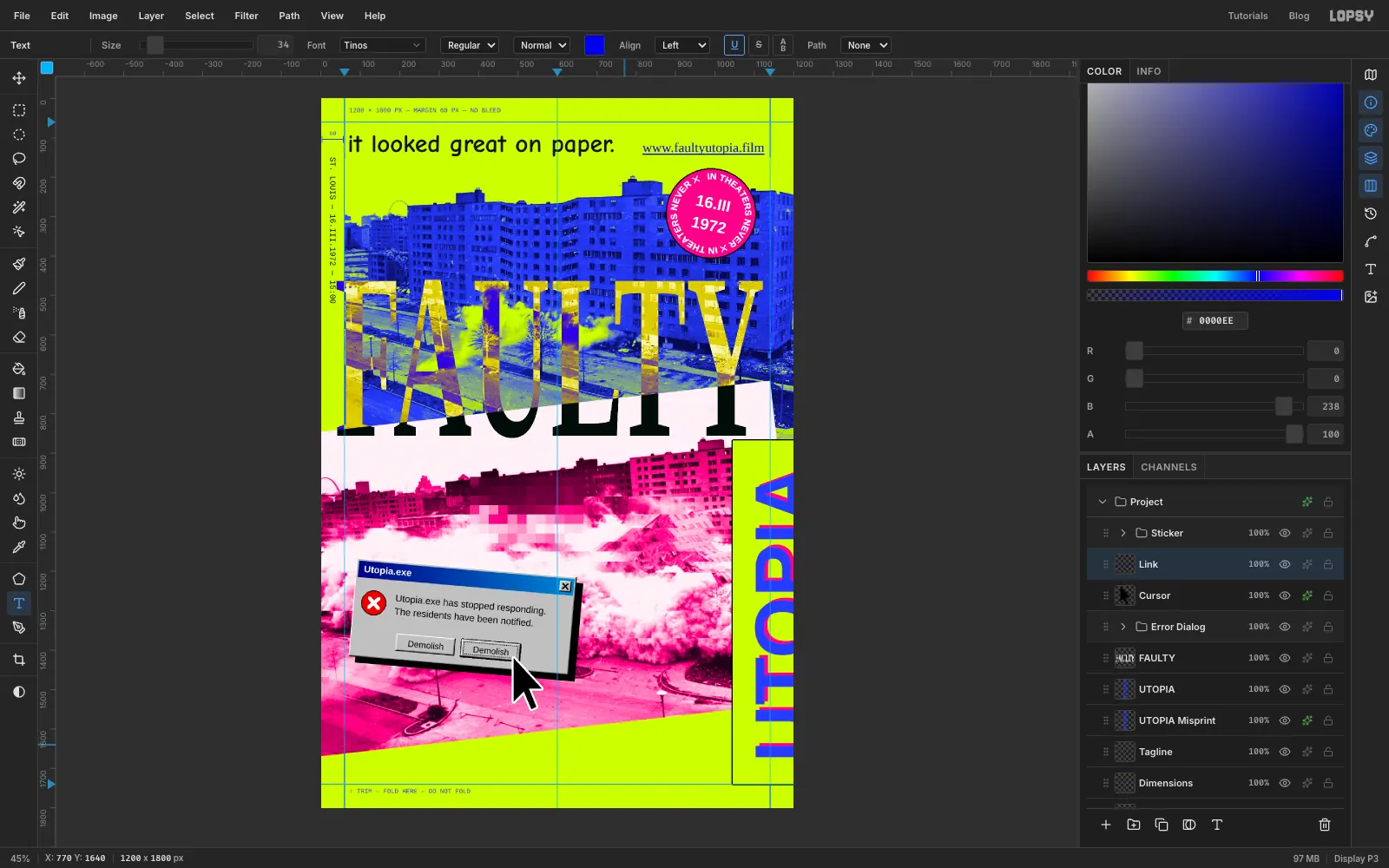
Click Cursor and type
www.faultyutopia.filmin Tinos,34, in the classic unvisited-link blue , and rename the layer Link. Nudge it until the end of "film" sits at1124, 16 px inside the right margin, and the bottoms of its letters line up with the bottom of "it looked" in the tagline. Then pick the Text tool (the layer stays selected) and click U in its options bar to underline it.Selecting a text layer copies its settings into the Text tool, so the underline is now switched on for new text too. Click Cursor and click U again to turn it off.
-
Type the billing block
With Cursor selected, click at
72, 1560and type the credits in Archivo Narrow Bold20, ink:A FILM BY NOBODY IN PARTICULAR STARRING 33 ELEVEN-STORY BUILDINGS 2,870 APARTMENTSEnter
ONE SKIP-STOP ELEVATOR MUSIC BY DYNAMITE STILLS: U.S. DEPT. OF HOUSING & URBAN DEVELOPMENTPress Tab to commit and rename the layer Billing. Click back into the second line just before the M of MUSIC, then hold Shift and press Right until MUSIC BY DYNAMITE is highlighted (or drag across the three words). Click the Text color swatch in the options bar, type
2B3BFF, click the swatch again to close it and press Tab. Only that credit turns blue.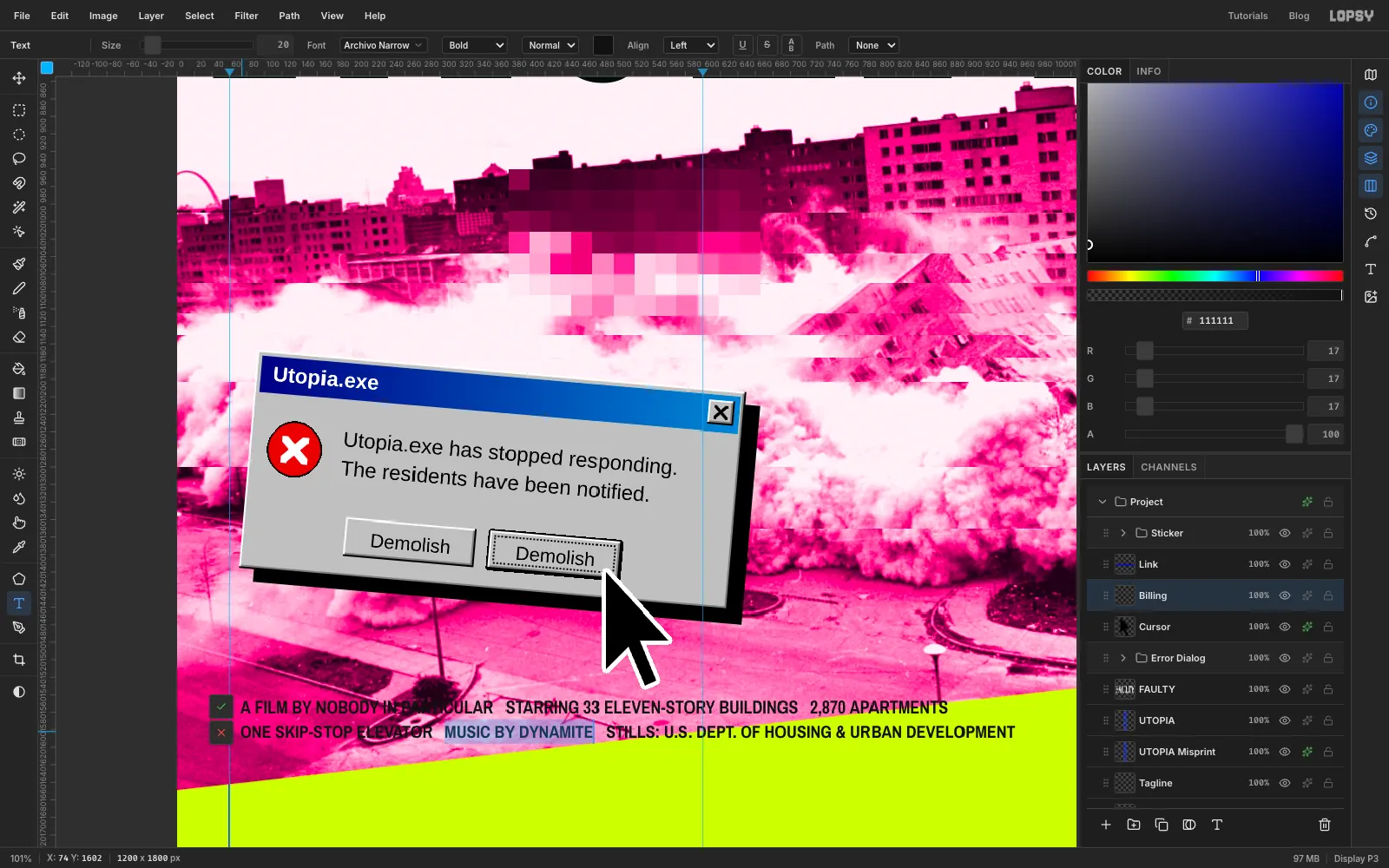
-
Open the leading and tilt the billing
Select the Billing layer, open the Text panel and set Line height to
1.75so the two lines breathe. Close the panel.With the Move tool, drag the billing's rotation handle anticlockwise until it runs parallel to the photo's bottom edge. That's the same angle you gave the photo, about 6–6.5°. Press Cmd+D. Then nudge it so it starts at
72and sits about 24 px below the photo all the way along.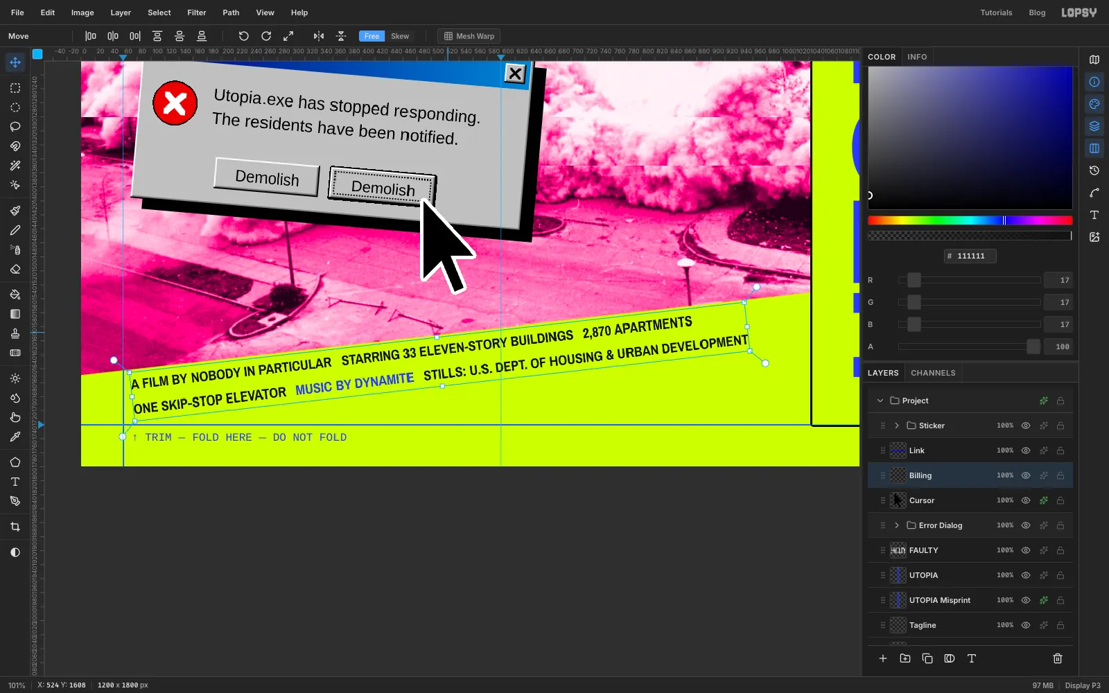
-
Patch the sky band
Where the tilted photo's corner stops short of the right edge, a sliver of the blue photo shows through. Expand Pink Print, click Collapse and add a layer named Sky Patch above it. A layer inside the group goes through the group's Gradient Map, so white paints in exactly the pale pink of the band.
With the Pen, click
1131, 715,1199, 707,1199, 872,1147, 872and back to the first point. Use Path to Selection, fill with white, deselect and delete the path. Then pick the Brush, and in the brush settings set Size46, Hardness40, and put Spacing back to10(the focus rectangle left it at 200). Paint out any blots left in the pale band, for example around990, 785and along1065–1140, 755, just right of the Y. Collapse Pink Print again.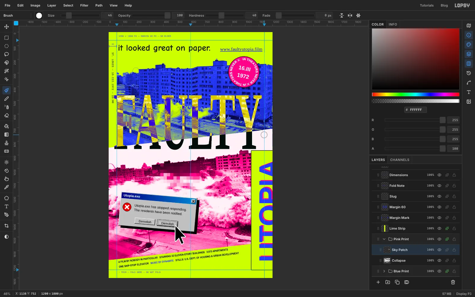
-
Copy and paste a frozen pointer trail
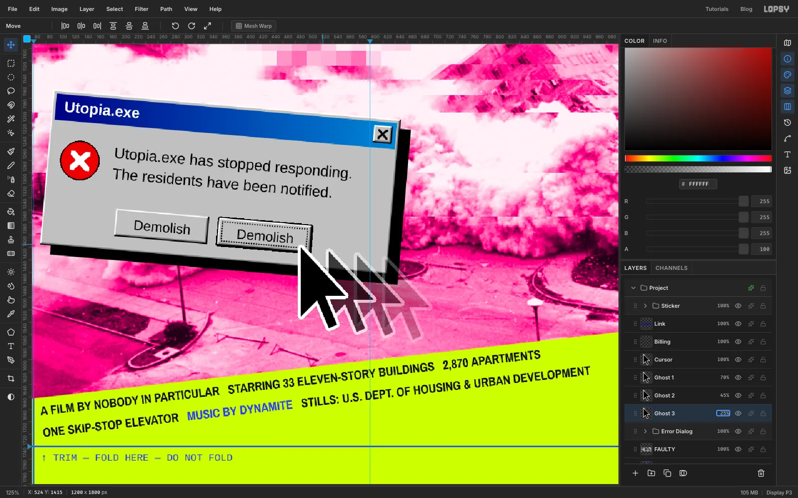
When Windows froze, the pointer left a trail. Select Cursor, open its effects drawer and click Rasterize Layer Style, so the white keyline becomes real pixels. Then, three times:
- Click Cursor and Cmd-click its thumbnail.
- Edit → Copy, then Edit → Paste. The copy lands in place as a new layer. Rename it Ghost 1, Ghost 2 or Ghost 3.
- Press Cmd+D, then nudge it with the Move tool:
45px right and6down for Ghost 1,90and12for Ghost 2,135and18for Ghost 3. - Set its opacity:
70%,45%,25%.
Each paste lands above Cursor, so finally drag the Cursor row by its grip up above Ghost 1. The real pointer sits on top and the copies fade away behind it.
-
Add registration marks
Click Link and add a layer named Reg Marks. With the Pencil (Size
2, ink ), draw a cross 44 px wide at30, 1770in the bottom-left corner and another at1170, 30in the top-right.For the bottom-left ring, add a layer, select a circle from
17, 1757to43, 1783and fill it with ink. Then select19, 1759to41, 1781, press Delete to leave a thin ring, deselect and choose Layer → Merge Down. Repeat for the top-right ring with1157, 17to1183, 43, then1159, 19to1181, 41.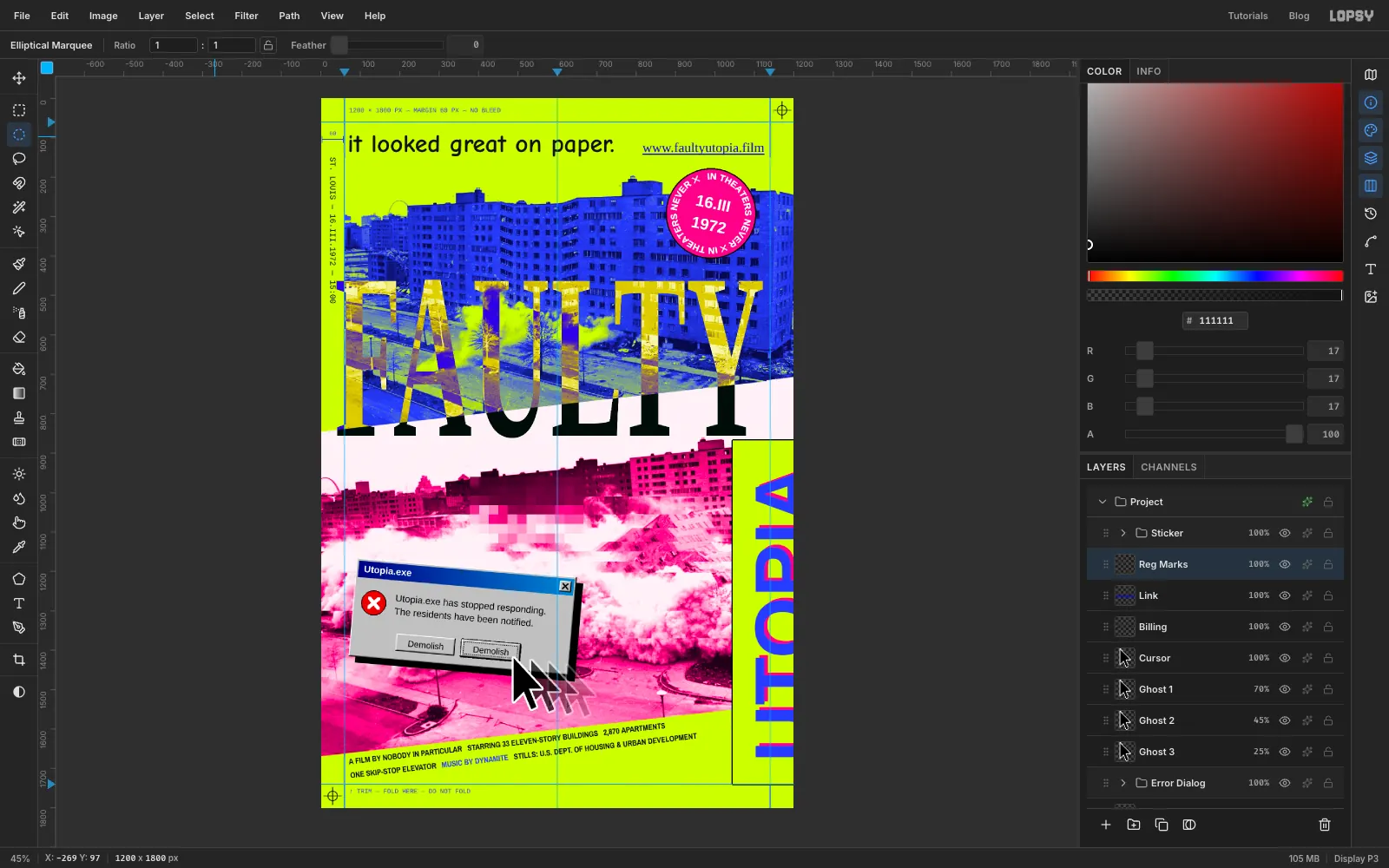
-
Add print grain and export
With Reg Marks selected, add a layer named Grain. It lands just under the Sticker group, so the sticker stays clean, as if it were stuck on after printing. Fill the whole canvas with grey . Choose Filter → Add Noise… with Amount
80. Set the layer's Blend to Overlay and its opacity to 60%. Mid grey disappears in Overlay and only the noise shows, so the flat lime, the photos and the dialog all look printed together.Choose View → Fit to Screen to check the whole poster. Export with File → Quick Export PNG and keep a copy with File → Save Project.