Design a De Stijl Movie Poster with a Mondrian Martini
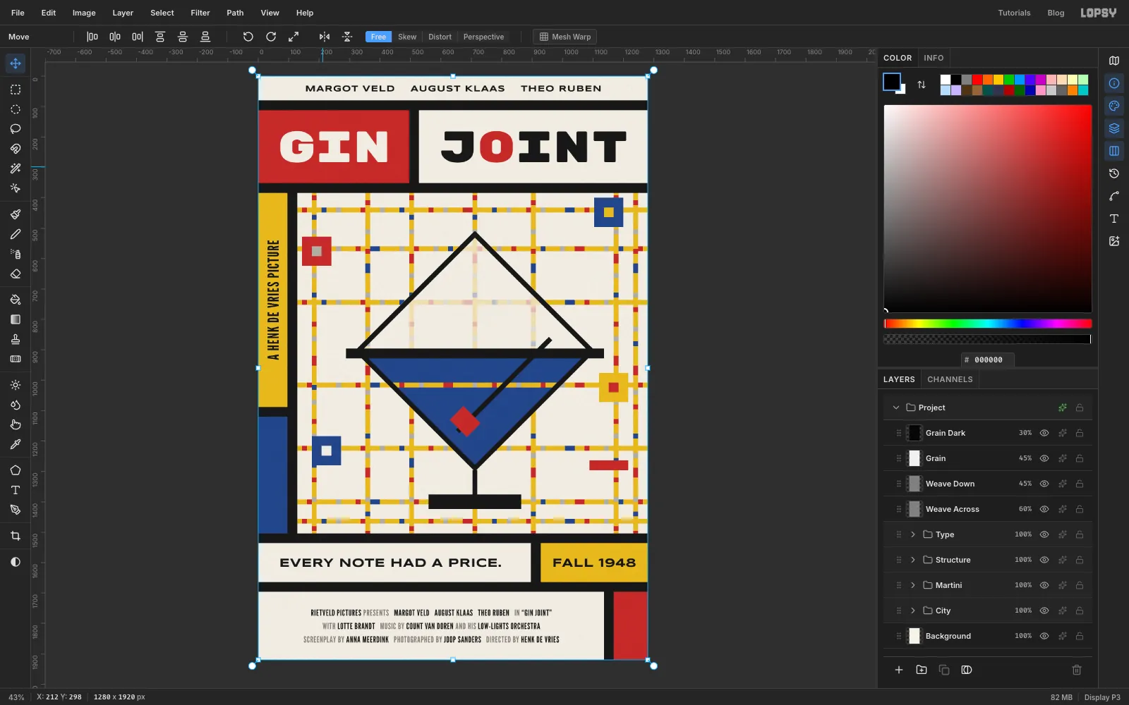
Build a Mondrian jazz movie poster in Lopsy with a Boogie-Woogie street grid, a lozenge that doubles as a martini glass, bold title cells and billing.
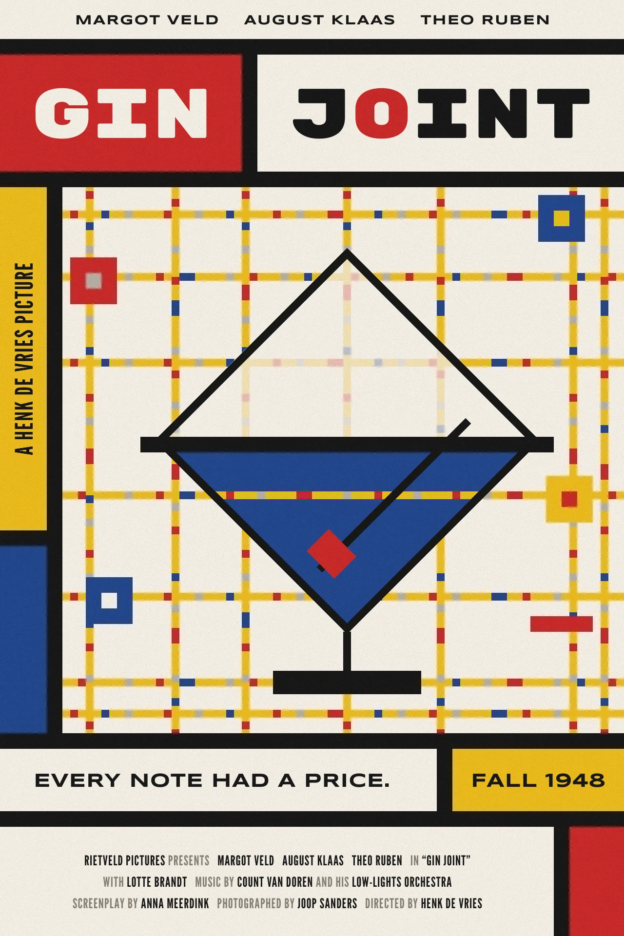
De Stijl was the Dutch art movement of Piet Mondrian and Theo van Doesburg. It used black lines, flat red, yellow and blue, and nothing that wasn't horizontal or vertical. Mondrian ended his career in New York with Broadway Boogie-Woogie. That painting drops the black lines for yellow streets studded with little coloured blocks, like taxis and traffic lights seen from above, set to jazz. Earlier, he had turned some square canvases 45° and called them lozenges.
This poster puts the two ideas together for an imaginary 1948 jazz-club film, GIN JOINT. A Boogie-Woogie street grid fills the middle, and a Mondrian lozenge turns into a martini glass: blue gin in the bottom half, a black rim across the middle, a stem, a foot and an olive on a pick. You'll build it at 1280 × 1920 px, the 2:3 shape of a cinema one-sheet.
Almost everything is a rectangle, so the grid does most of the work. At 16 px with Snap on, every marquee lands exactly on a grid line. Read positions off the X/Y readout in the status bar as you drag: every number in this tutorial is a grid line.
Along the way you'll use:
- Show Grid with Snap, ruler guides, and zooming in with Cmd + scroll
- the Rectangular Marquee with Shift-add and Shift+Alt-intersect, Select → Inverse, Shrink and the Lasso
- copy and paste in place, Flip Horizontal/Flip Vertical, Rotate 90° CW and Merge Down
- the Move tool's rotate handle with Cmd to snap rotations to 45° and 90°
- groups, a whole-group nudge, and undo and redo
- the Stroke layer effect, layer opacity, and the Overlay, Soft Light, Multiply and Screen blend modes
- text in Rubik Mono One, Syncopate and League Gothic: alignment, line height, letter spacing, per-letter colour and a rotated line
- Add Noise, Motion Blur, Gaussian Blur, and a Hue / Saturation adjustment on the whole document
The palette:
-
Cream
the paper and every white cell
-
Black
bars, glass and type
-
Red
-
blue
-
yellow
-
Street grey
-
Billing grey
the small connecting words
-
Set up the canvas, grid and guides
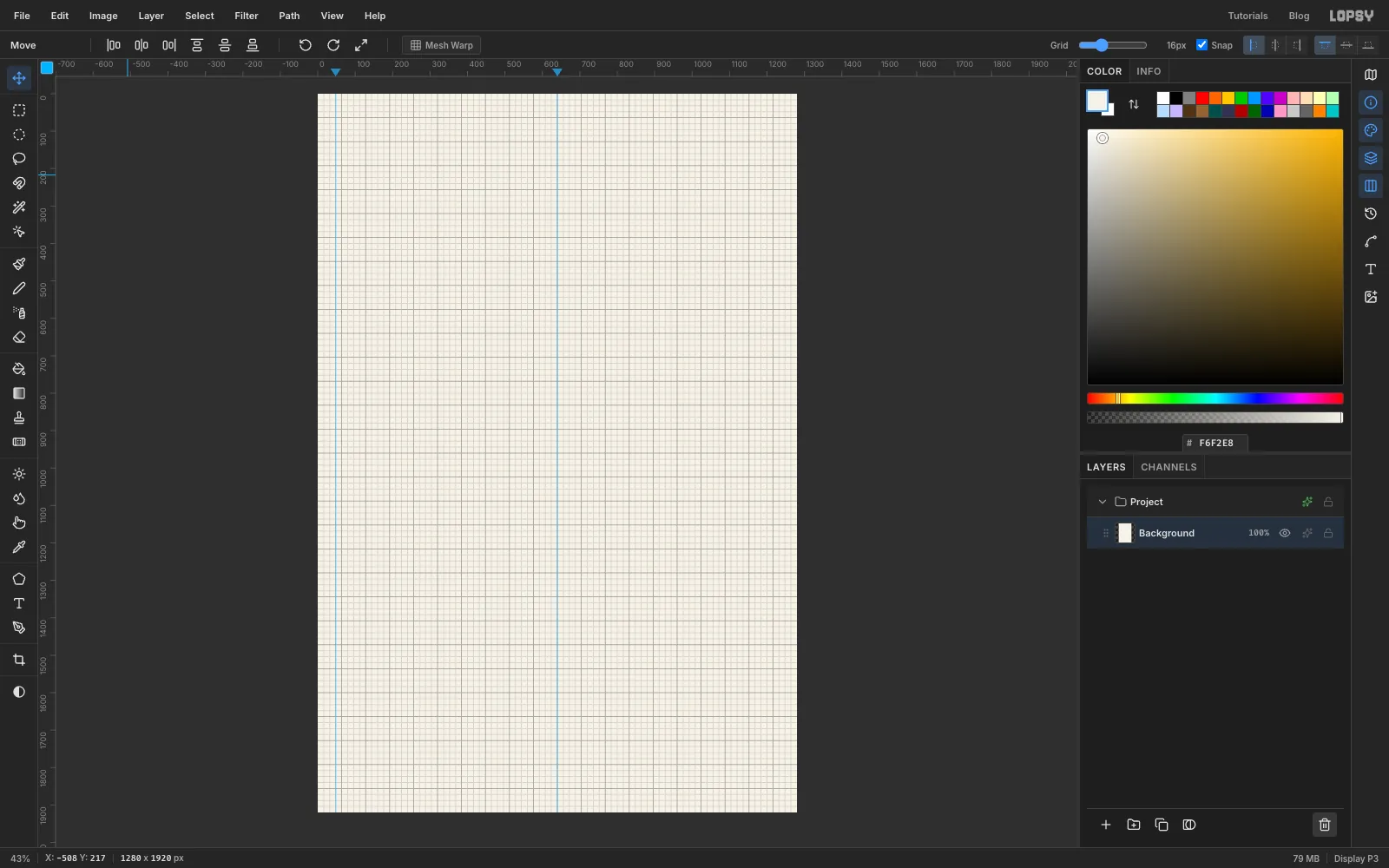
Choose File → New, enter 1280 × 1920 pixels and click Create. Set the foreground to cream in the Color panel's hex field, select Background and choose Edit → Fill. The new document also comes with an empty Layer 1. Select it and click the trash button at the bottom of the Layers panel, because every part of this poster gets its own named layer.
Choose View → Show Grid. The grid size slider in the options bar should read 16px, and Snap should be ticked. Then click the top ruler at 48 and at 640 to drop two vertical guides. The first marks the middle of the narrow side column you'll add later, and the second marks the centre of the page.
-
Paint the first Boogie-Woogie street
Select Background and click New Group at the bottom of the Layers panel. Name the group City, then click Add Layer and name the new layer BW Horizontals. It lands inside the group.
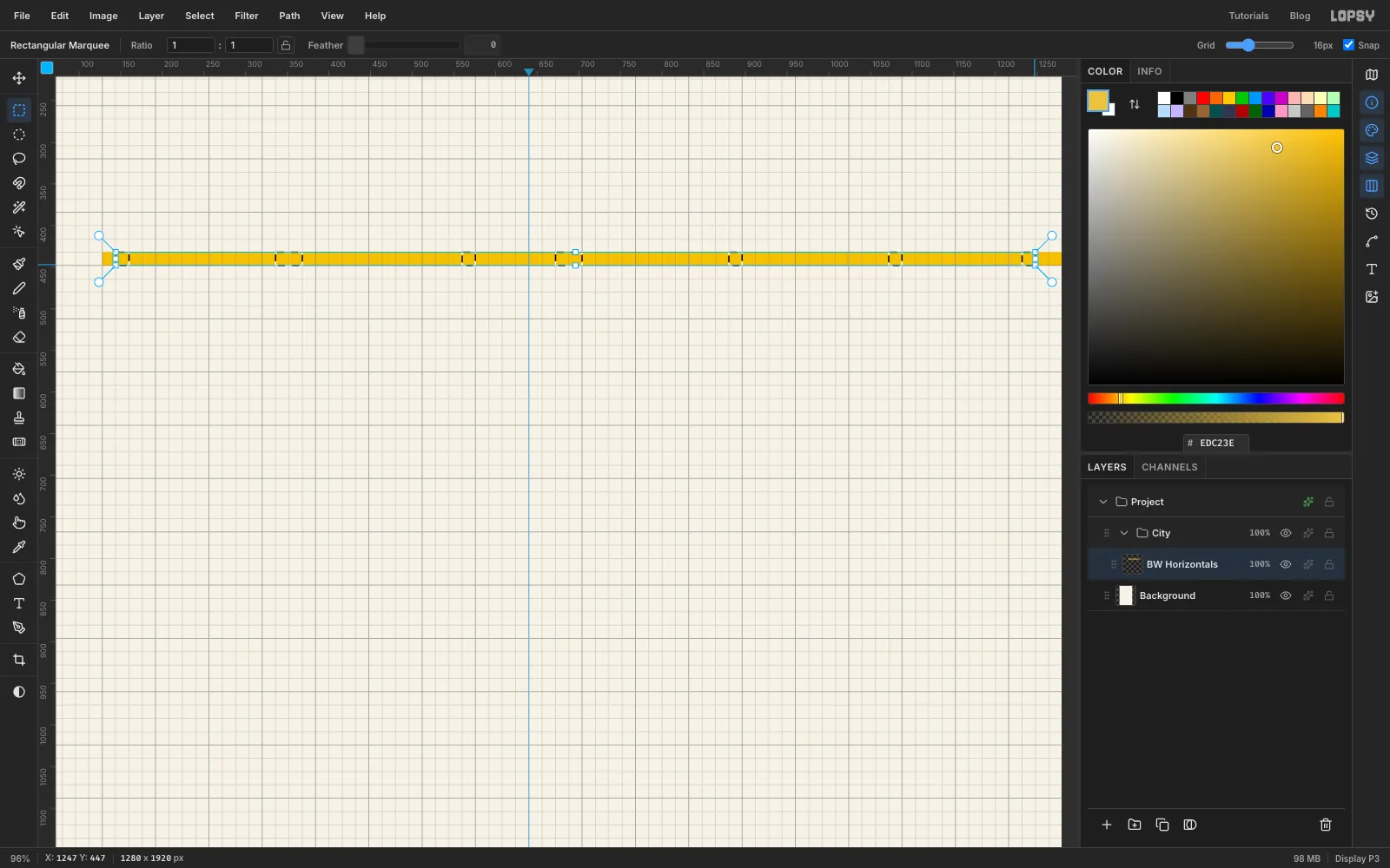
The street field will run from x 128 to the right edge, and from y 384 down to 1504. Hold Cmd and scroll up over the top of the field until you're at about 100%. Pick the Rectangular Marquee and drag a strip one grid cell tall from x 128, y 432 to the right edge of the canvas. Set the foreground to yellow and choose Edit → Fill.
Now add the coloured blocks. Drag a one-cell square on the strip about one cell in from the left end. Then hold Shift and drag more one-cell squares along the strip, 2–5 cells apart, making every fifth one a two-cell dash. Shift adds each square to the selection. Select roughly a third of the block positions this way and fill them red . Blue and grey go in the gaps next.
-
Finish the master street
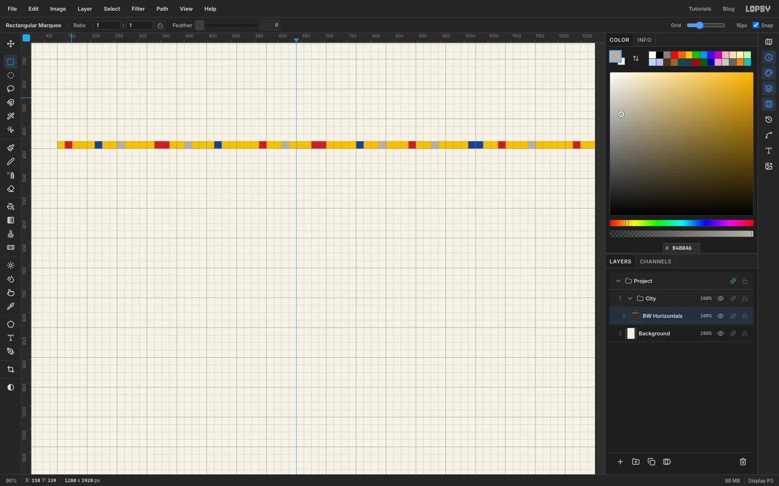
Do the same for blue and then for grey . Start each colour with a plain drag, then Shift-drag the rest of its squares into the gaps the previous colours left. Fill each colour once and press Cmd+D to deselect.
The spacing should look irregular, like traffic. You'll reuse this one strip for every street, and flipping some of the copies hides the repeat. Choose View → Fit to Screen when you're done.
-
Copy the street down the page
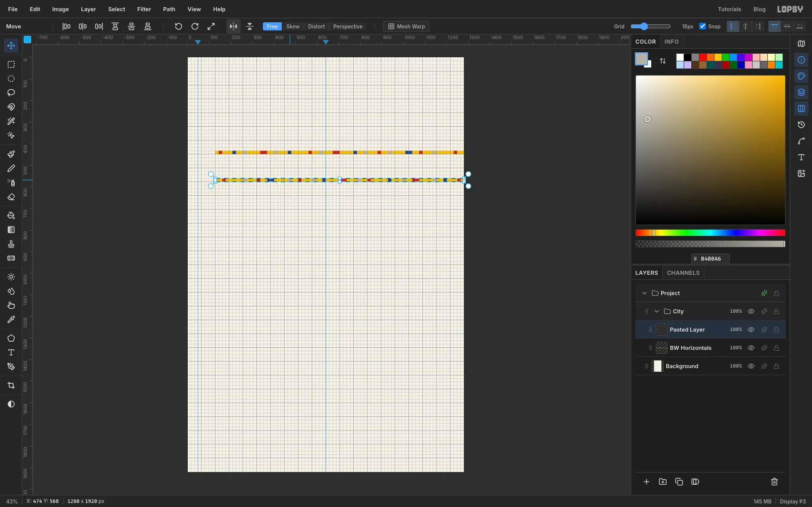
Marquee the whole strip again and press Cmd+C, then Cmd+V. Lopsy pastes the copy in place on a new layer, selects it and switches to the Move tool. Drag the copy straight down to the next street at y 560. With Snap on, the drag moves in whole grid cells, so the copy lands exactly on the line. Keep the pointer level as you drag so the copy doesn't shift a cell sideways.
Click Flip Horizontal in the options bar so this copy's blocks run in the opposite order. Press Cmd+D, then choose Layer → Merge Down to fold it into BW Horizontals.
-
Add the other horizontal streets
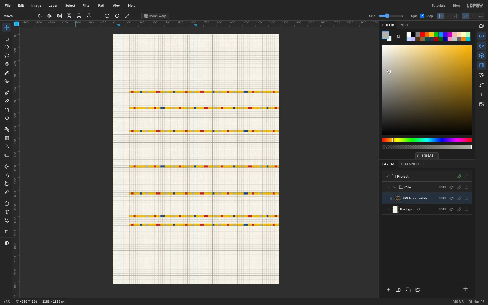
The clipboard still holds the master strip, so you can keep pasting it: press Cmd+V, drag the copy to the next street and merge it down. Put streets at y 736, 1008, 1216, 1392 and 1456. Flip the copies at 1008 and 1392, as you did the one at 560, and leave the rest as they are. The last two streets sit close together on purpose, like Mondrian's busy bottom edge.
-
Turn a copy into a vertical street
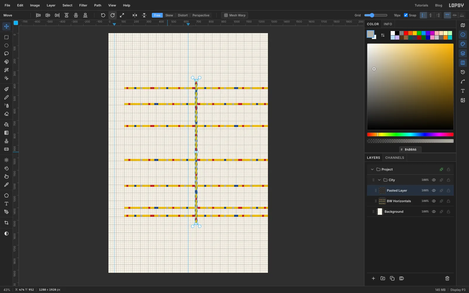
Marquee the top street again, copy it and paste it. Drag the copy down until its top edge sits on y 944, halfway down the field. Then click Rotate 90° CW in the Move tool's options bar. The strip turns about its centre and becomes a vertical street from the top of the field to the bottom. Press Cmd+D and rename the pasted layer BW Verticals.
The strip is 72 cells long, so its centre is not on a grid line, and it lands half a cell (8 px) left of the grid. Untick Snap, press Right eight times so its left edge sits on x 704, then tick Snap again.
-
Fill in the vertical streets
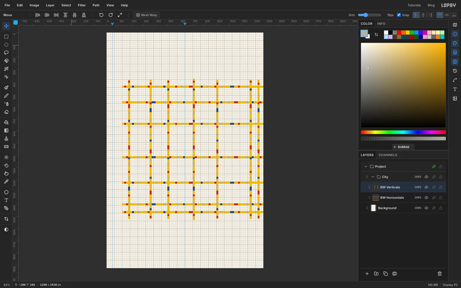
Drag a marquee around the whole vertical street, including the bits that hang over the top and bottom of the field, and copy it. Paste it six times, dragging each copy sideways so its left edge lands at x 176, 352, 496, 896, 1168 and 1232. Click Flip Vertical on the copies at 352, 896 and 1232, and Merge Down after each one.
Don't worry that the verticals poke out a little above and below the field. You'll trim them in a moment.
-
Add the big Boogie-Woogie blocks
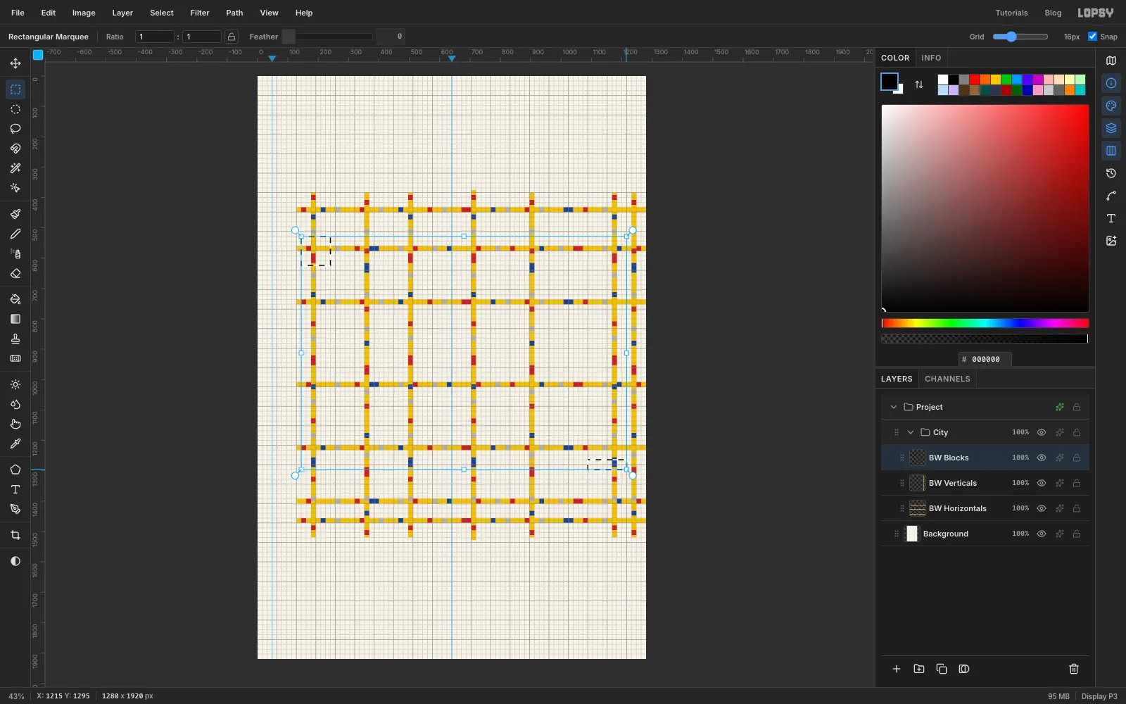
Add a layer called BW Blocks. Broadway Boogie-Woogie has a few larger blocks, often with a smaller square of another colour centred inside. Make four six-cell squares and one thin bar. Each sits across a street rather than just touching one:
- red, x 144–240, y 528–624, with a grey inner square at x 176–208, y 560–592
- blue, x 1104–1200, y 400–496, with a yellow inner square at x 1136–1168, y 432–464
- yellow, x 1120–1216, y 976–1072, with a red inner square at x 1152–1184, y 1008–1040
- blue, x 176–272, y 1184–1280, with a cream inner square at x 208–240, y 1216–1248
- a thin red bar, x 1088–1216, y 1264–1296, with no inner square
Shift-drag both red outer shapes, then fill. Do the same for the two blue squares, then the yellow one. Finish with the two-cell inner squares, filling all the inner squares of one colour in one go.
-
Trim the overhang with Inverse
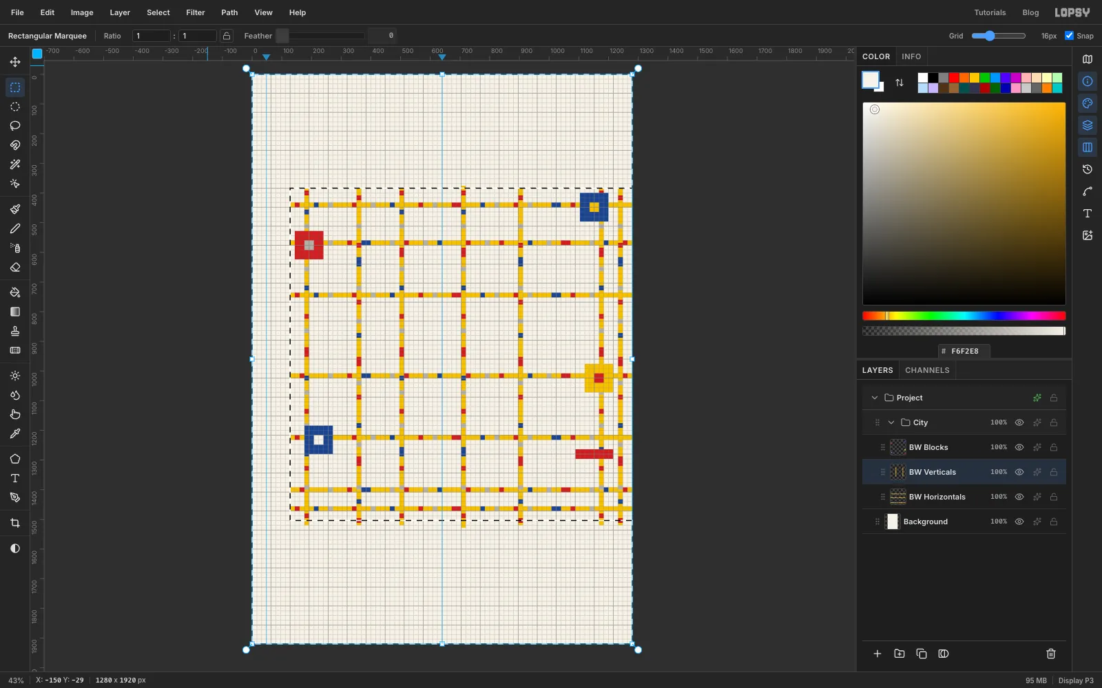
Select BW Verticals. Drag a marquee around the whole field, from x 128, y 384 to the bottom-right corner of the field at y 1504. Choose Select → Inverse: now everything except the field is selected. Press Delete, then Cmd+D.
-
Paint the colour cells
Collapse the City group with its arrow and click its row. Click New Group and name it Structure. Because City is collapsed, the new group goes above it rather than inside it. Add a layer called Cells.
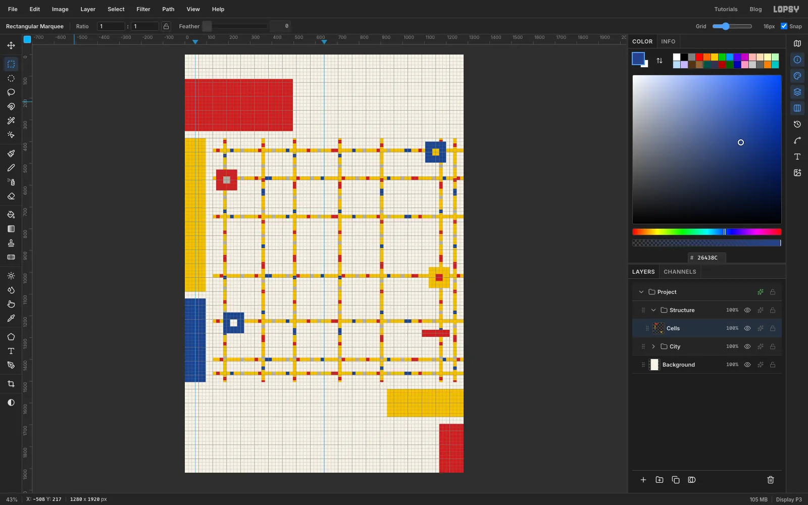
These are the big Mondrian colour fields. Fill each one with a plain marquee (use Shift to do both reds in one fill):
- red: the title cell at the top left, x 0–496, y 112–352
- yellow: the side column, x 0–96, y 384–1088
- blue: the rest of the side column, x 0–96, y 1120–1504
- yellow: the date cell, x 928 to the right edge, y 1536–1664
- red: the bottom-right corner, x 1168 to the right edge, y 1696 to the bottom
-
Lay the black bars
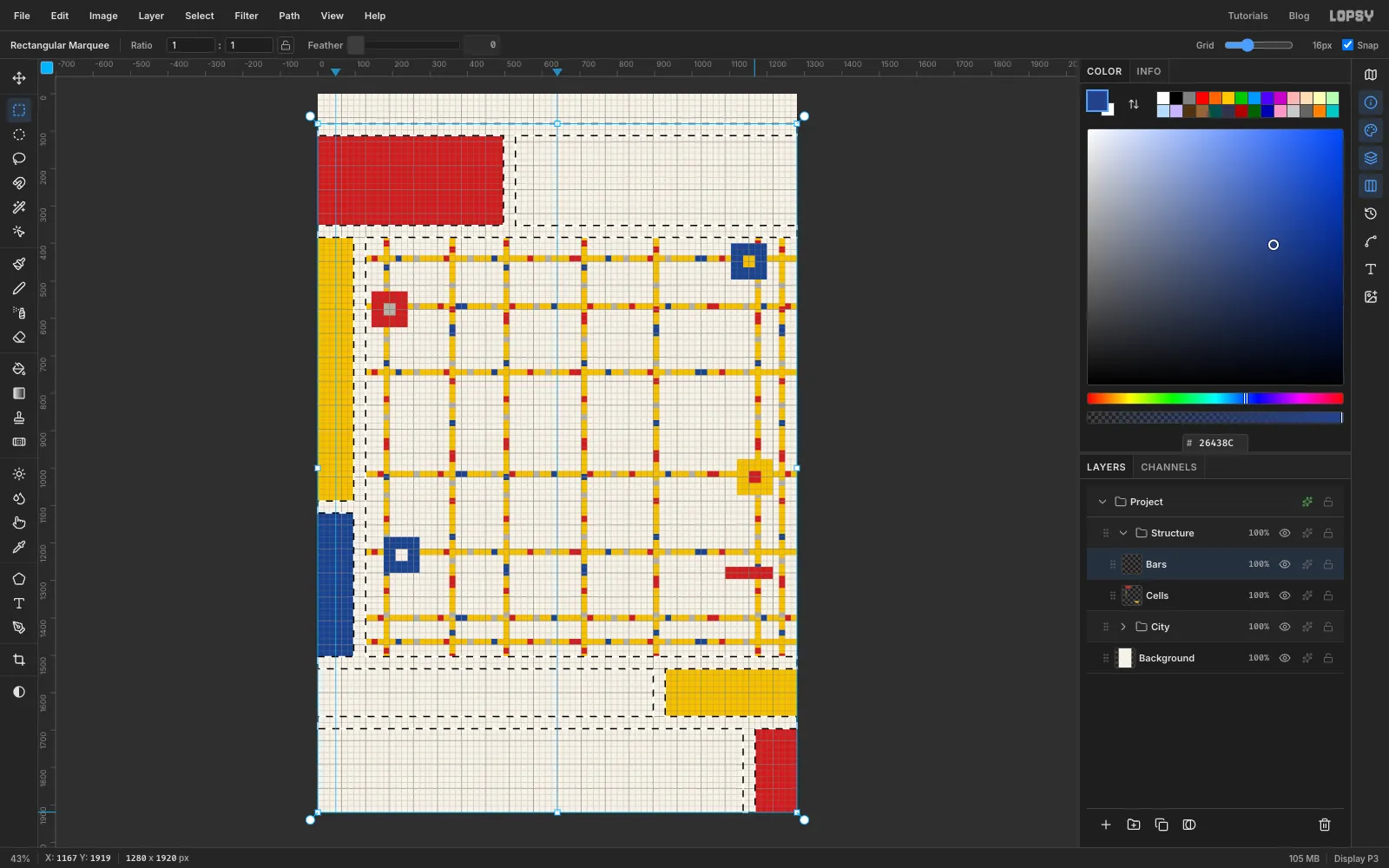
Add a layer called Bars. Every bar is two grid cells (32 px) thick. Drag the first one, then hold Shift for each of the rest:
- across the page at y 80, under the cast line
- across the page at y 352, under the title
- down between GIN and JOINT, at x 496, from y 112 to y 352
- down beside the side column, at x 96, from y 384 to y 1504
- across the side column at y 1088, from x 0 to x 96
- across the page at y 1504, under the field
- down between the tagline and the date, at x 896, from y 1536 to y 1664
- across the page at y 1664
- down beside the red corner, at x 1136, from y 1696 to the bottom
Fill with black and deselect. Every cell edge now has a bar on it.
-
Draw the lozenge square
Collapse Structure, click the City row and click New Group. Name it Martini. It goes between City and Structure. Add a layer called Lozenge.
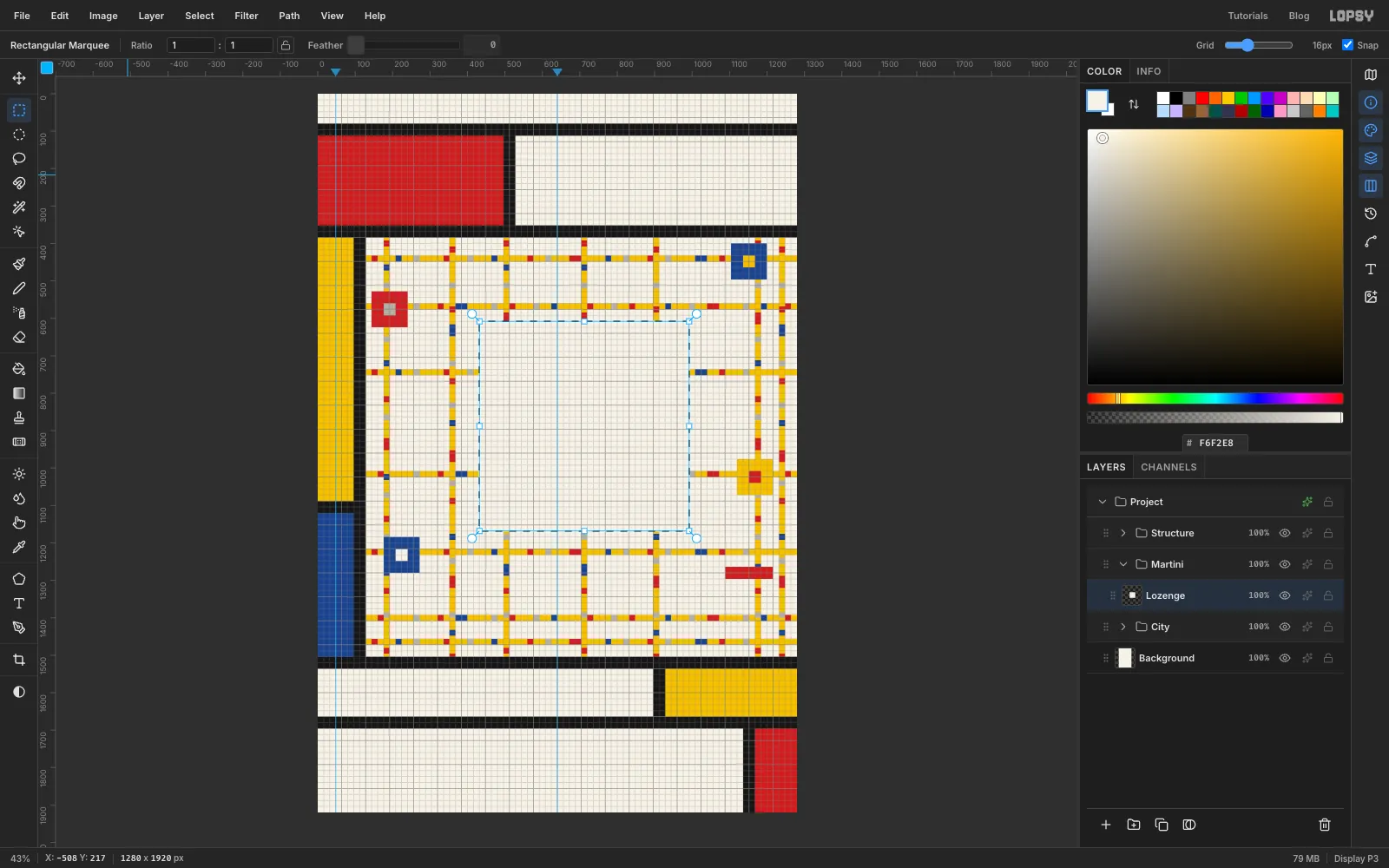
Drag a square marquee 35 cells wide, from x 432, y 608 to x 992, y 1168. Fill it with cream . Leave the selection active.
You'll build the whole glass one grid cell higher than its final spot, so nothing collides with a street while you work. At the end you'll drop the finished group into place with a single nudge.
-
Turn it 45° into a lozenge
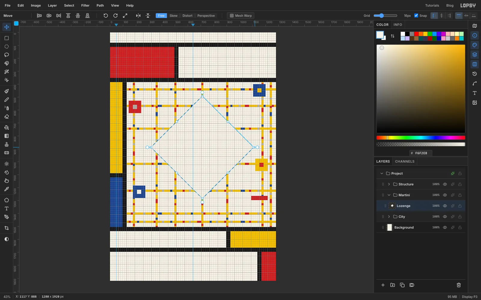
With the Move tool, hover just outside the square's top-right corner until the cursor becomes a rotate arrow. Hold Cmd and drag clockwise. Cmd snaps the angle to 15° steps, so stop at the third step, 45°. The square stands on its corner. Press Cmd+D to commit.
-
Fill the gin with an intersected selection
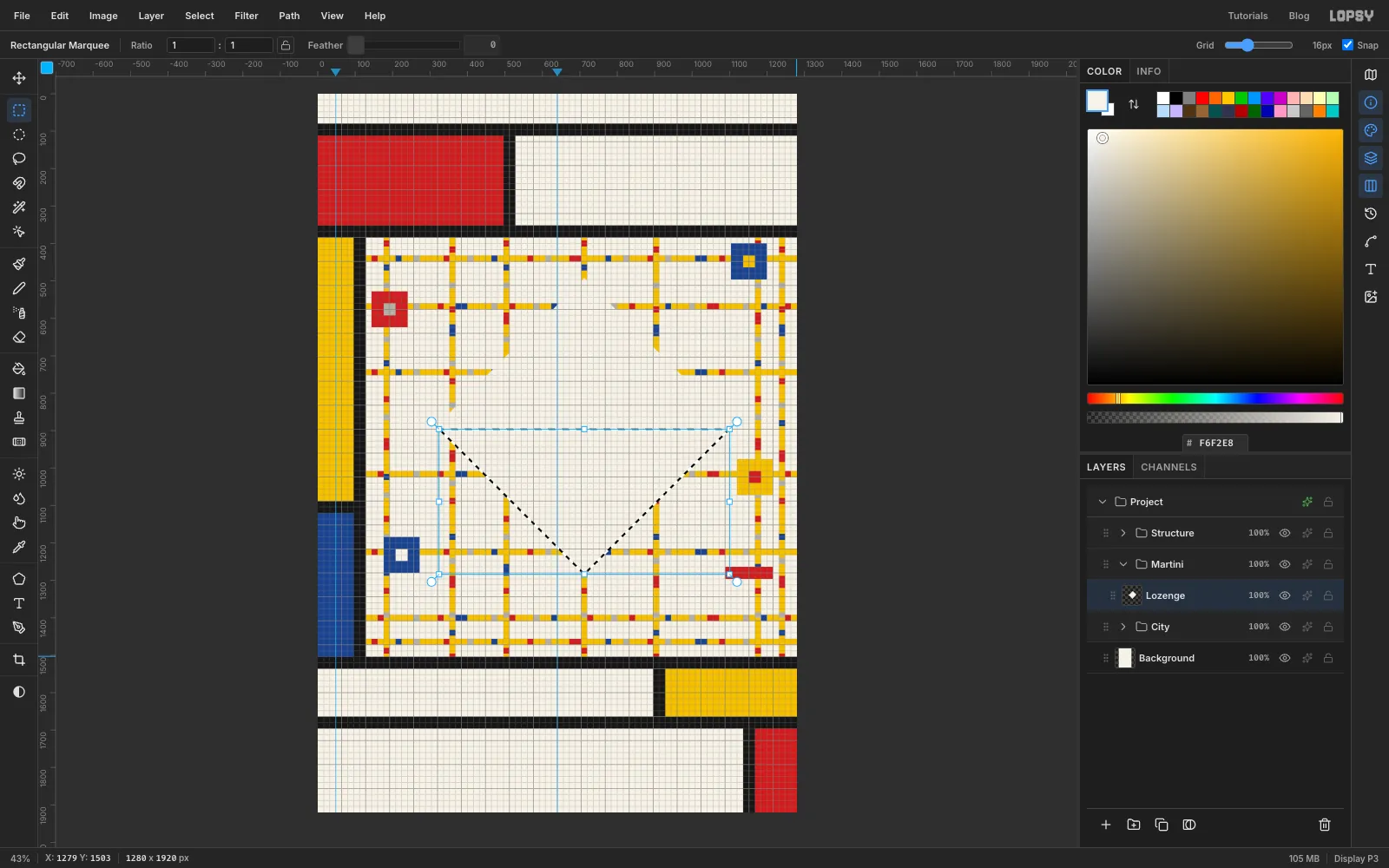
Cmd-click the Lozenge thumbnail in the Layers panel to select the diamond. Pick the Rectangular Marquee, hold Shift+Alt and drag from x 128, y 896, just below the diamond's side corners, to the right edge of the canvas below the diamond's bottom point. Shift+Alt intersects, so only the lower triangle stays selected. The rim bar will cover the thin cream strip left above it. That's the bowl of the glass. Fill it with blue and deselect.
-
Frame the lozenge with a Stroke effect
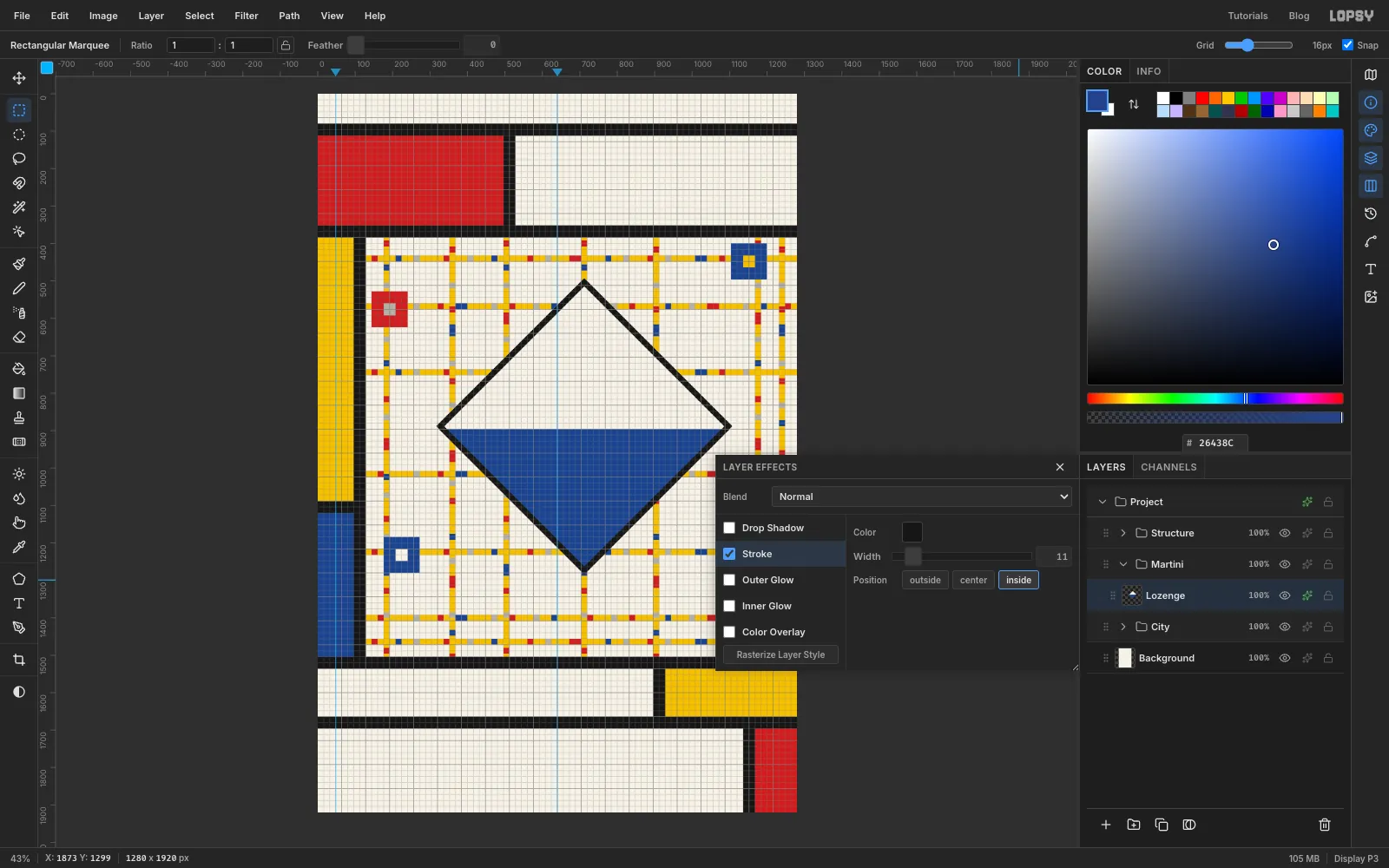
Click the effects button on the Lozenge row. Tick Stroke, set the colour to black , Width 11 and position Inside. On these 45° sides, Width 11 draws a band about 16 px thick, the same weight as the streets. The black frame runs round the whole diamond like the frame on one of Mondrian's lozenge paintings. Close the drawer.
-
Cut open the top of the lozenge
A solid cream top half reads as a hole in the poster. Opening it so the streets show through reads better, because the top of a glass is air.
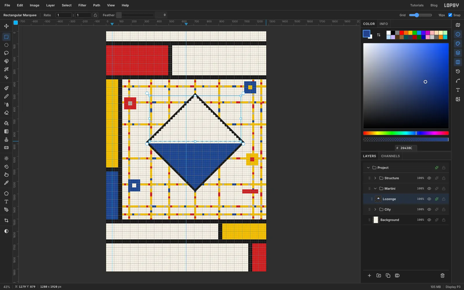
Cmd-click the Lozenge thumbnail, then choose Select → Shrink… by 16 px. The selection now matches the inside edge of a 16 px frame. With the Rectangular Marquee, Shift+Alt-drag from the top-left of the field down to the right edge at y 880, level with the top of where the rim will go. Only the upper triangle inside the frame stays selected. Press Delete.
The Stroke effect follows the layer's new outline, so the frame stays solid all the way round.
-
Haze the upper triangle
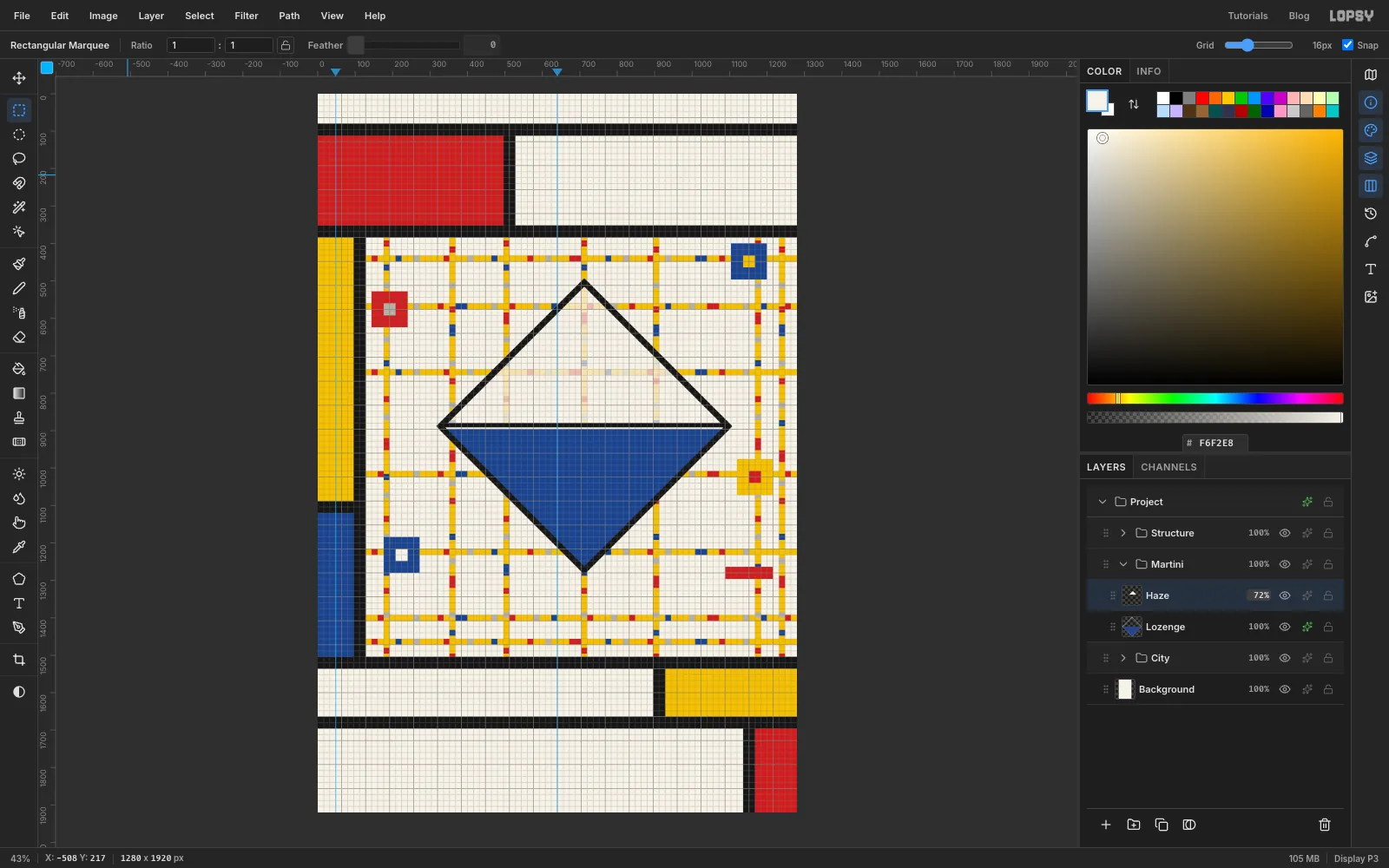
Keep the triangle selected and add a layer called Haze. Fill it with cream , deselect, and set the layer's opacity to 72% from the opacity button on its row. The streets now show faintly through the top of the glass.
-
Run the street through the gin
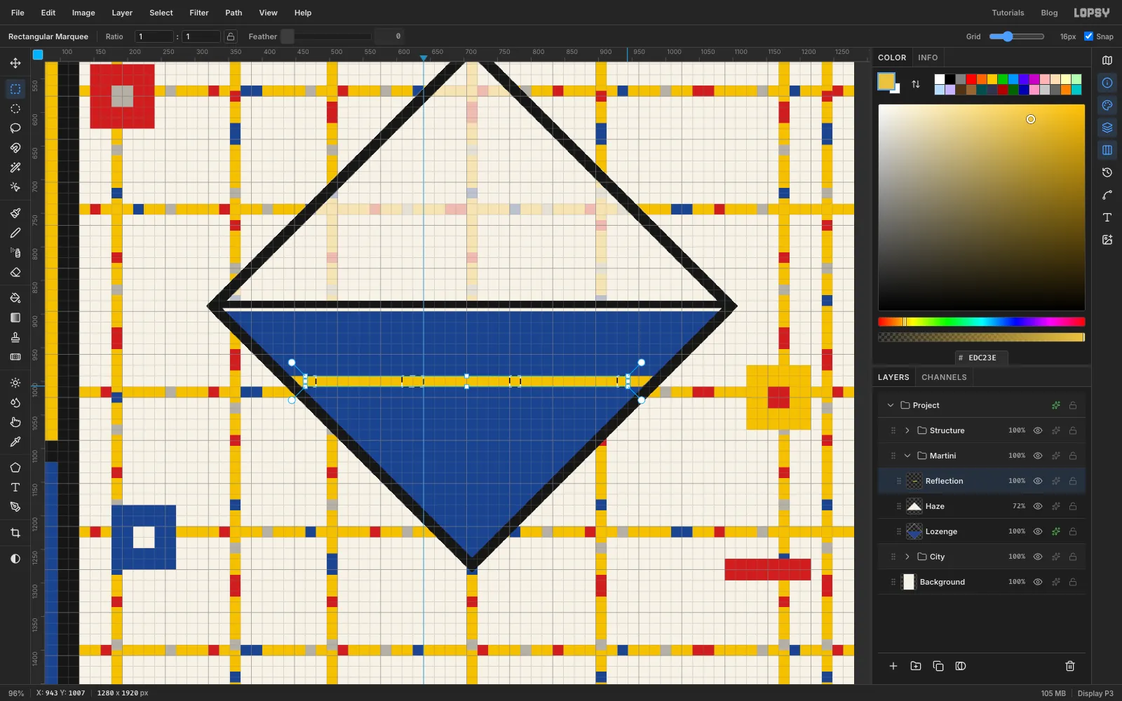
Add a layer called Reflection. Cmd-click the Lozenge thumbnail, then choose Select → Shrink… by 16 px, so the stripe stops at the frame. With the Rectangular Marquee, Shift+Alt-drag a one-cell band across the whole field at y 992. That's one cell above the y 1008 street, and it will line up with the street when you drop the glass at the end. Fill it yellow and deselect.
Zoom in to about 100% and add the same kind of blocks as on the streets, in red and grey only: blue would vanish into the gin. Space them about four cells apart.
-
Build the rim, stem and foot
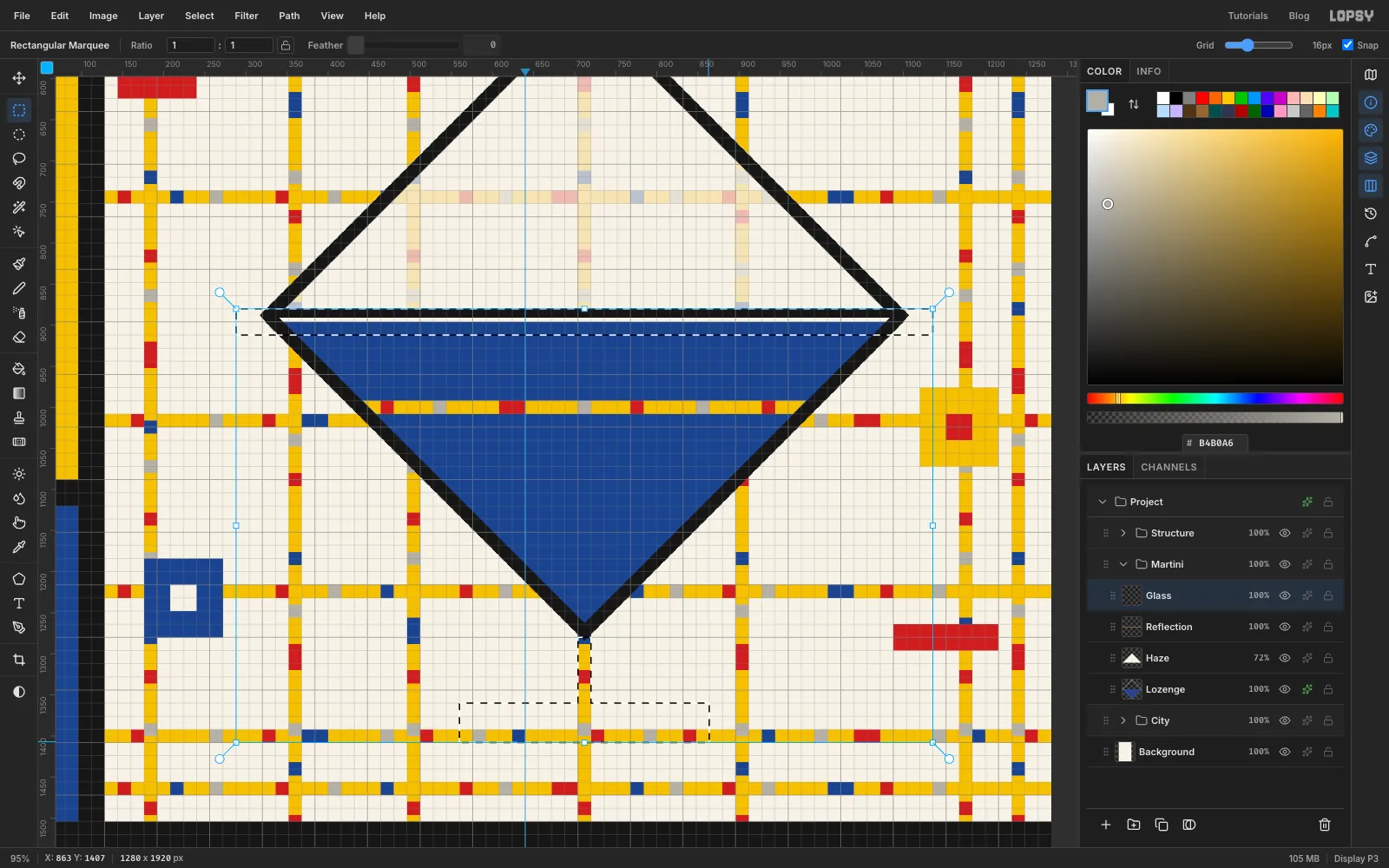
Add a layer called Glass. Zoom in to about 100% on the bottom of the glass and Shift-drag three rectangles:
- the rim: x 288 to 1136, y 880 to 912. It sticks out a little past the diamond's side corners, like the lip of a glass.
- the stem: x 704 to 720, from the diamond's bottom point at y 1280 down to y 1360. It's one cell wide, right under the point, and continues the vertical street at x 704.
- the foot: x 560 to 864, y 1360 to 1408. It's three cells tall, so it reads as a solid base.
Fill with black and deselect.
-
Add the cocktail pick
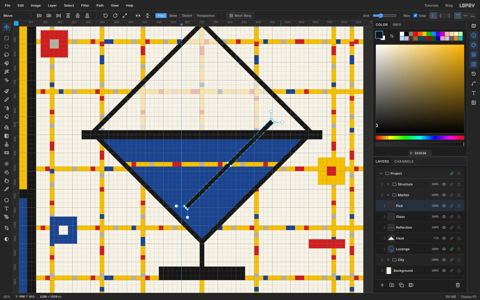
Add a layer called Pick. Drag a marquee one cell wide and 27 cells tall, from x 800, y 784 to x 816, y 1216, and fill it black. With the Move tool, Cmd-drag its rotate handle 45° clockwise, just like the lozenge, and press Cmd+D. The pick now runs from inside the top of the glass down into the gin. Rotating a bar gives it square ends, which suit De Stijl better than a round brush stroke.
-
Spear the olive
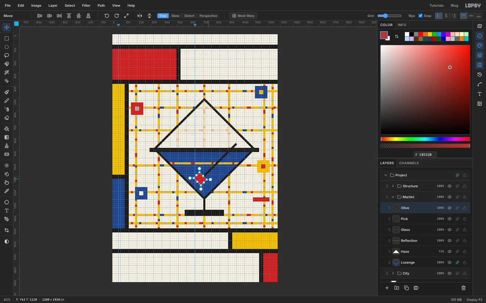
Add a layer called Olive. Drag a four-cell square from x 656, y 1088 to x 720, y 1152, fill it red , and turn it 45° with the Cmd-rotate handle again. Its centre sits on the pick, and the pick's tail pokes out a little below-left of the olive, as if it has been speared. Press Cmd+D.
-
Set the billing block
Collapse Martini and Structure, click the Structure row, and click New Group. Name it Type. Untick Snap so you can place type to the pixel.
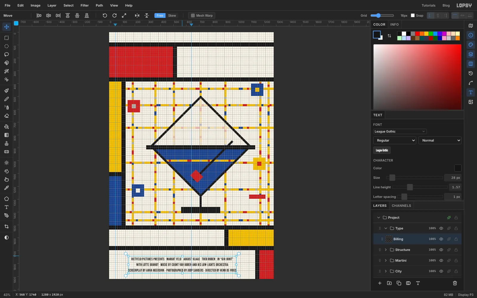
Pick the Text tool. Set the font to League Gothic, size 28, Align Center, colour black. Click in the middle of the bottom cream cell (x 568) and type three lines, pressing Enter between them. Each slash below marks three spaces between credits:
- RIETVELD PICTURES PRESENTS / MARGOT VELD / AUGUST KLAAS / THEO RUBEN / IN “GIN JOINT”
- WITH LOTTE BRANDT / MUSIC BY COUNT VAN DOREN AND HIS LOW-LIGHTS ORCHESTRA
- SCREENPLAY BY ANNA MEERDINK / PHOTOGRAPHED BY JOOP SANDERS / DIRECTED BY HENK DE VRIES
Use curly quotes around GIN JOINT. On a Mac they're Option + [ and Option + Shift + [. Press Tab to commit, and rename the layer Billing. In the Text panel set Line height to 1.57 and Letter spacing to 1. Then drag the block with the Move tool until it's centred in the cell, at about x 568, y 1808.
-
Grey out the connecting words
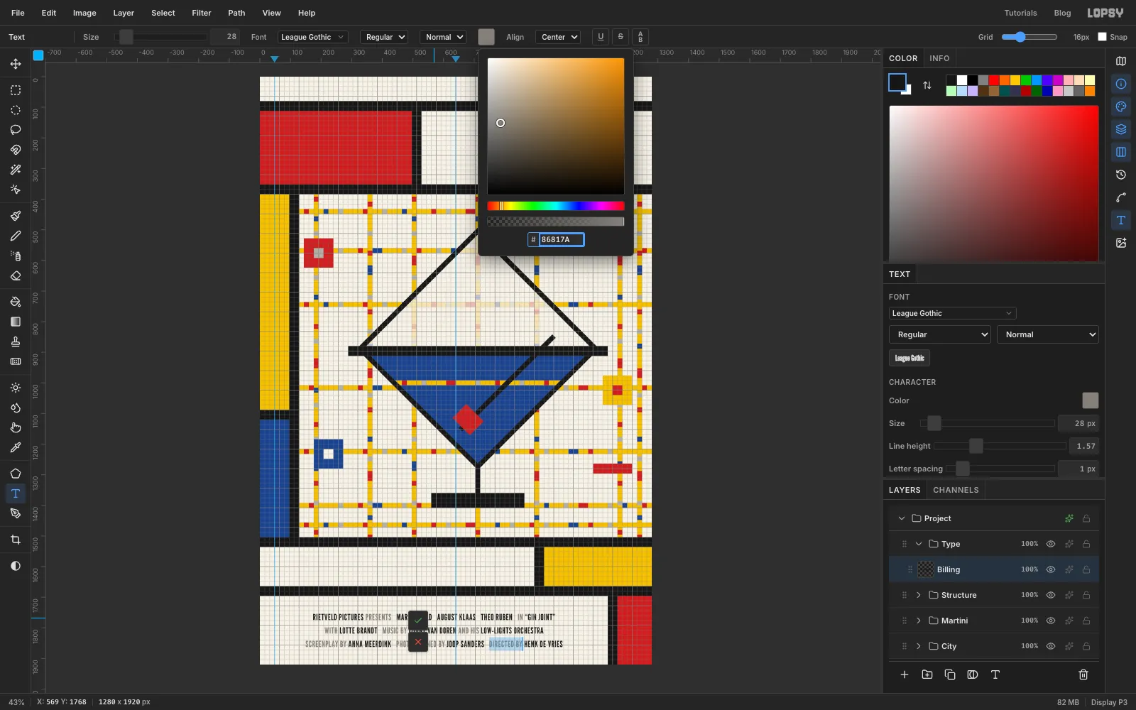
Real billing blocks set the small linking words lighter than the names. With the Text tool, click into the billing block. Select PRESENTS (drag across it, or use Shift + arrow keys), click the Text color swatch in the options bar and type
86817Ain its hex field. Only the selected letters change. Close the picker by clicking the swatch again.Repeat for IN, WITH, MUSIC BY, AND HIS, SCREENPLAY BY, PHOTOGRAPHED BY and DIRECTED BY, then press Tab.
-
Add the tagline and date
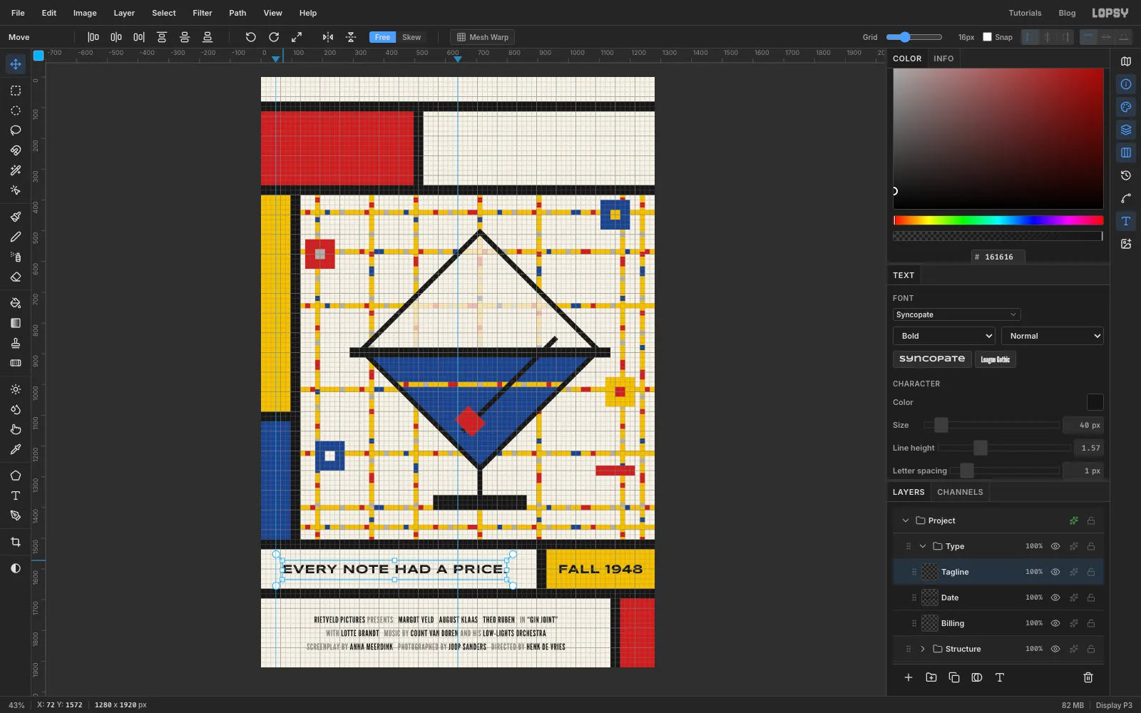
Click the Type group row first, so the next text is a new layer instead of a restyle of the billing block. Set Syncopate, weight Bold, size 40, Align Center, and click at the middle of the yellow date cell to type FALL 1948. Commit with Tab and rename the layer Date. The Text panel keeps the billing block's Letter spacing 1, which is what you want here.
Click the Type row again, switch to Align Left, click near the left of the band and type EVERY NOTE HAD A PRICE. Rename it Tagline. Click the top ruler at 73 to drop a guide, the same margin GIN will have, and move the tagline until its first letter touches the guide. Centre both lines on y 1600, the middle of the band.
-
Set the side credit
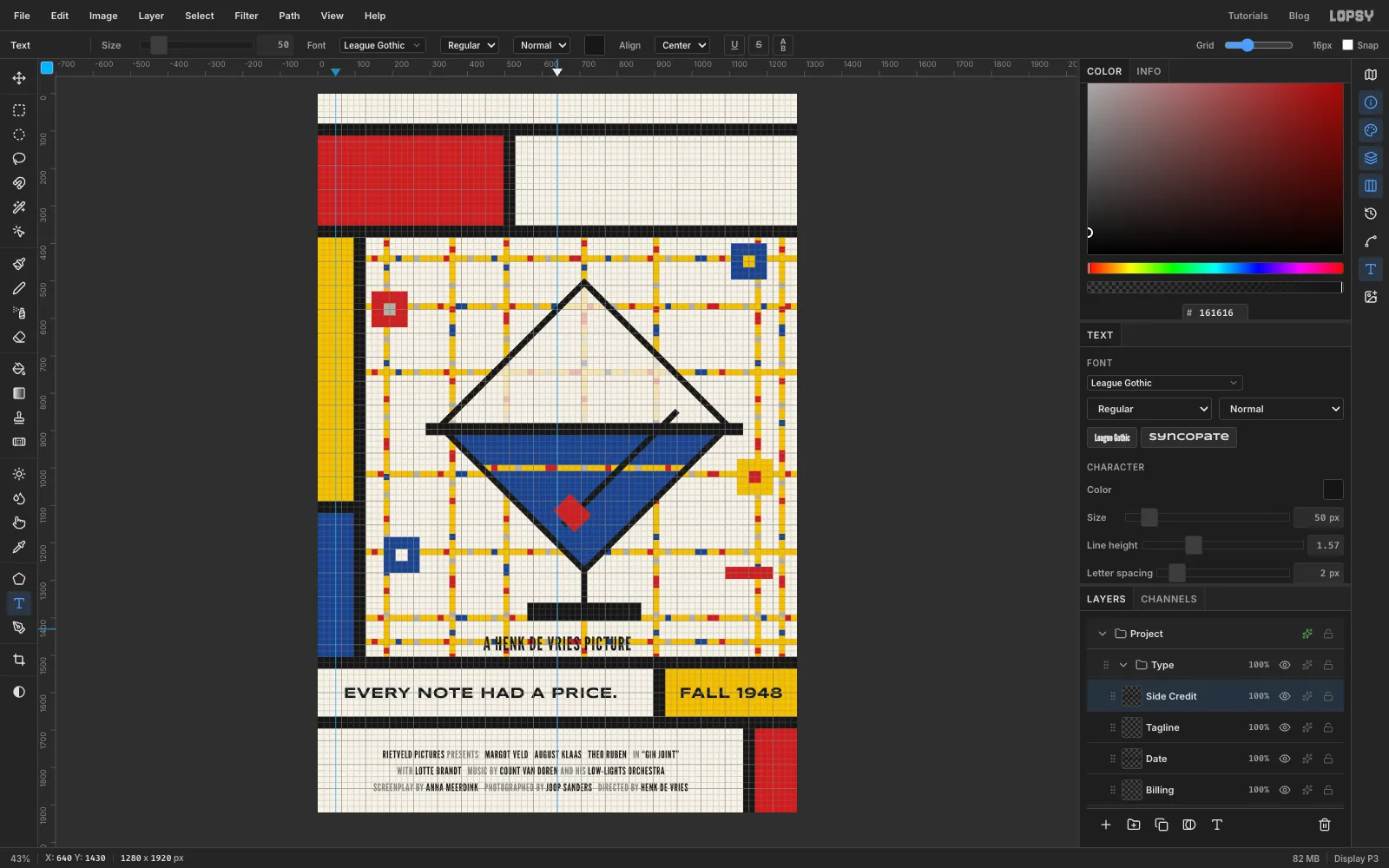
Click the Type row, then set League Gothic, size 50, Align Center. Click in an empty part of the field, away from the other text, and type A HENK DE VRIES PICTURE. Commit, rename the layer Side Credit, and set Letter spacing to 2 in the Text panel.
-
Stand the side credit on end
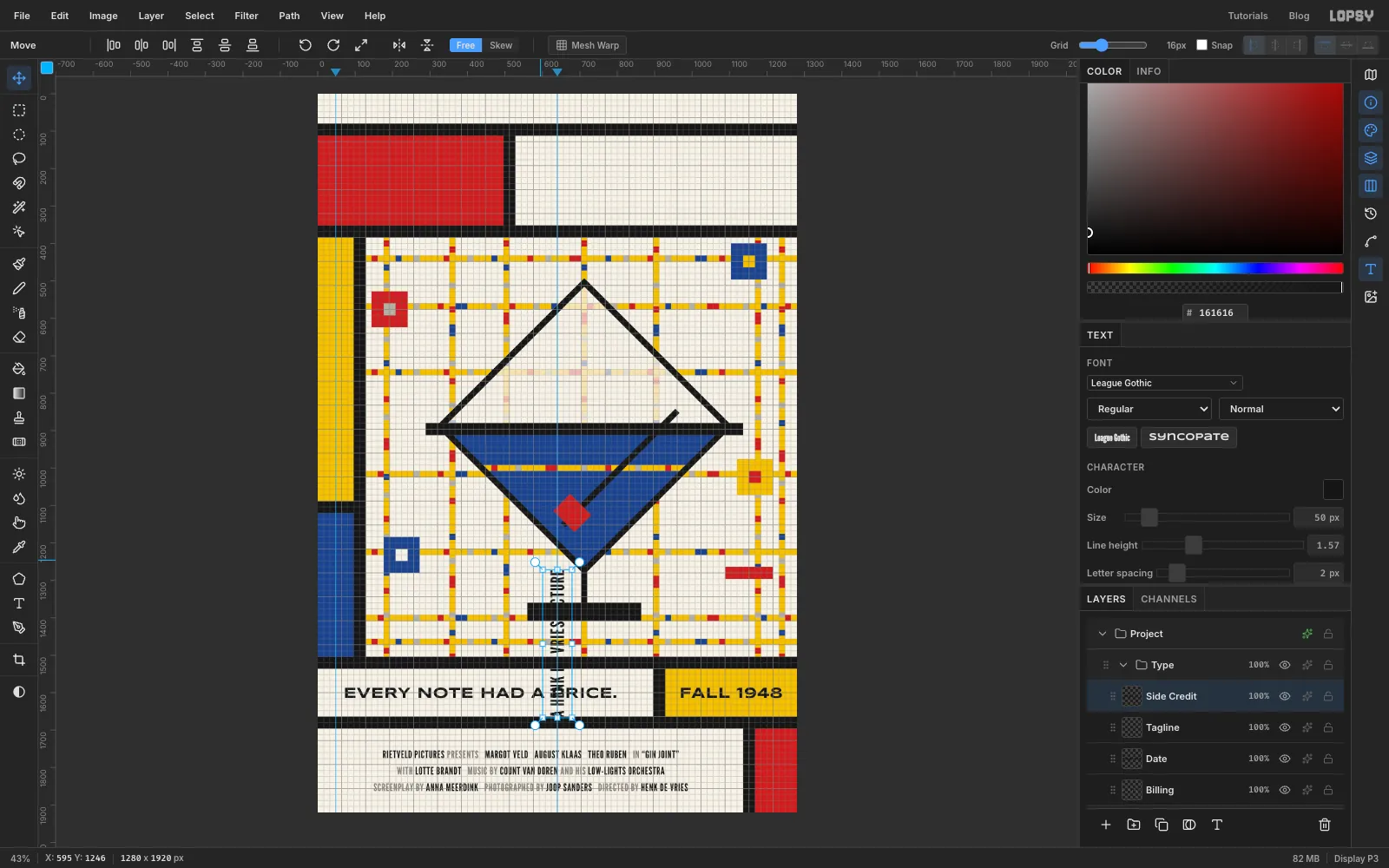
With the Move tool, the text shows handles around its box. Cmd-drag the rotate handle anticlockwise to −90°, so the line reads from bottom to top. The text is still live and editable. Drag it into the yellow column and centre it on the guide at x 48, halfway down the yellow part (y 736).
-
Set the cast line and the title
Click the Type row before each of these. All three keep Letter spacing 2 from the side credit.
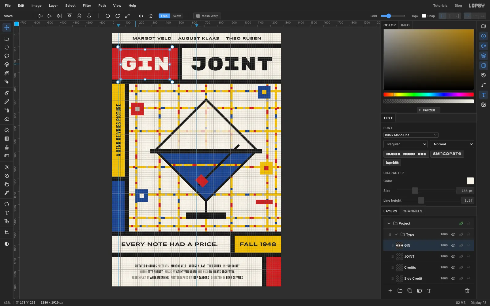
- Cast line: Syncopate Bold, 28, Align Center. Click on the centre guide in the top strip and type MARGOT VELD, four spaces, AUGUST KLAAS, four spaces, THEO RUBEN. Rename it Credits and centre it in the strip.
- JOINT: Rubik Mono One (Regular), 144, black, Align Center. Click at the middle of the cream title cell and type JOINT. Rename it JOINT and centre it in the cell both ways.
- GIN: the same font and size in cream . Click at the middle of the red cell, type GIN, rename it GIN and centre it across the cell. Then nudge it up or down until its bottom lines up exactly with JOINT's.
With the red cell 496 px wide, GIN and JOINT both end up about 73 px from their bars, so the two cells look like a matched pair.
-
Turn the O of JOINT red
With the Text tool, click into JOINT, press Home, then Right once and Shift+Right once to select the O. Open the Text color swatch and enter
C0332B. The red O echoes the olive. Close the picker and press Tab.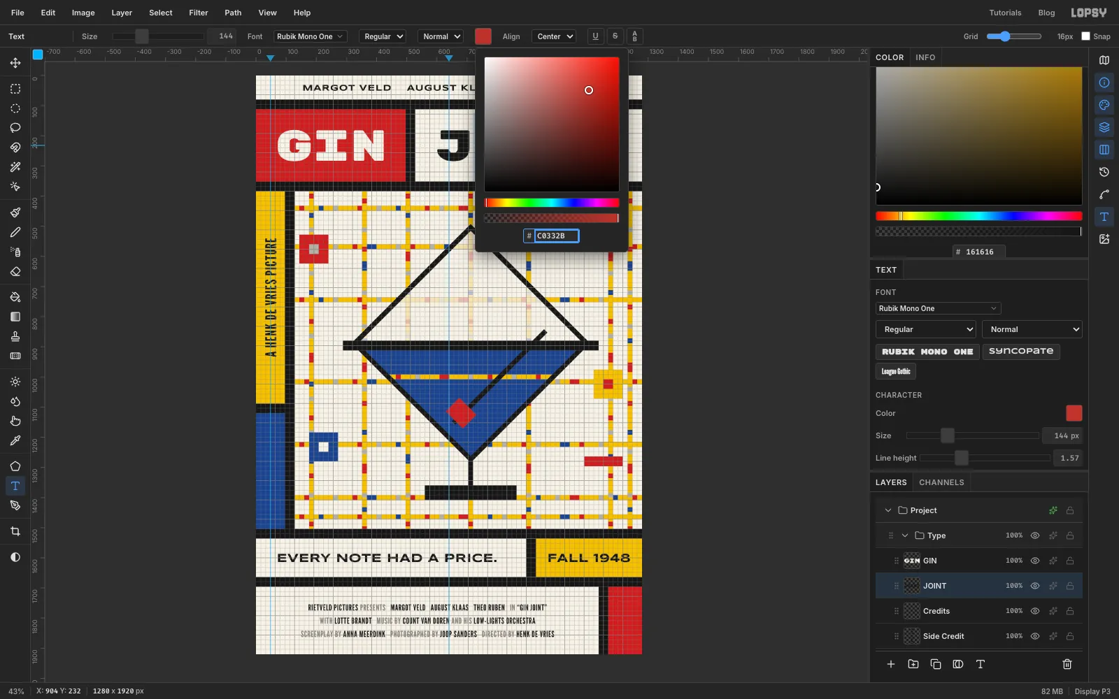
-
Nudge the whole glass down one cell
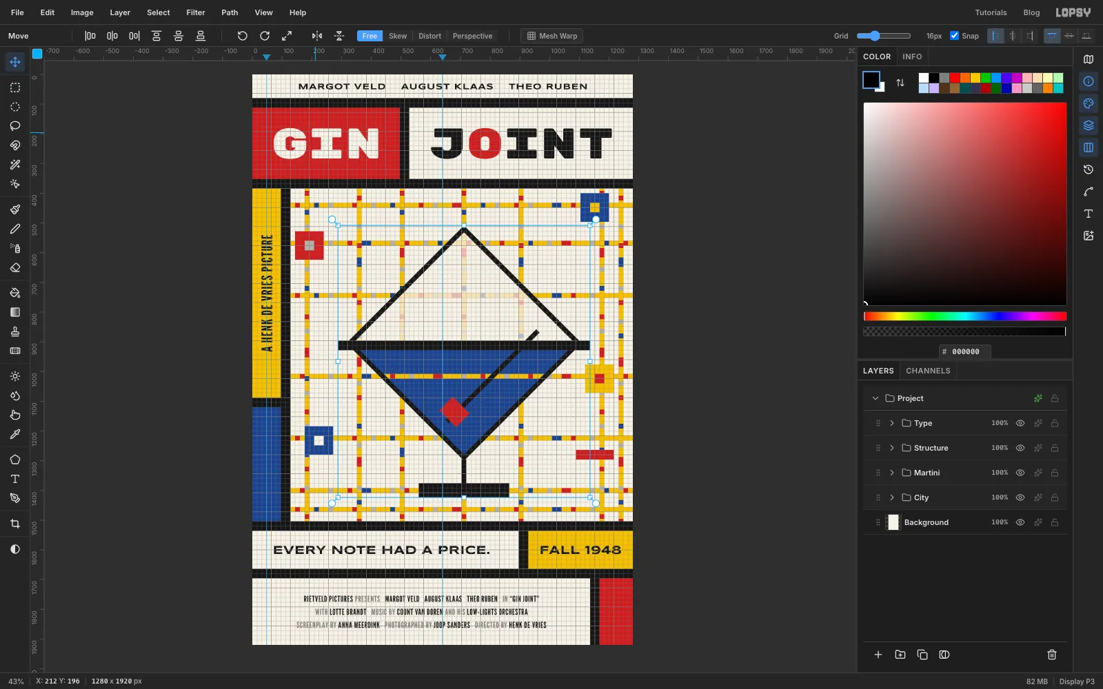
Look at the foot: it sits on top of the y 1392 street rather than across it. Tick Snap again, collapse the Martini group, click its row, pick the Move tool and press Down once. With the grid on, a nudge moves a whole grid cell, so the entire glass drops 16 px as one piece. The foot now straddles the street, the gin stripe lines up with the street at y 1008, and the top of the glass sits clear of the street above it.
-
Add a woven canvas texture
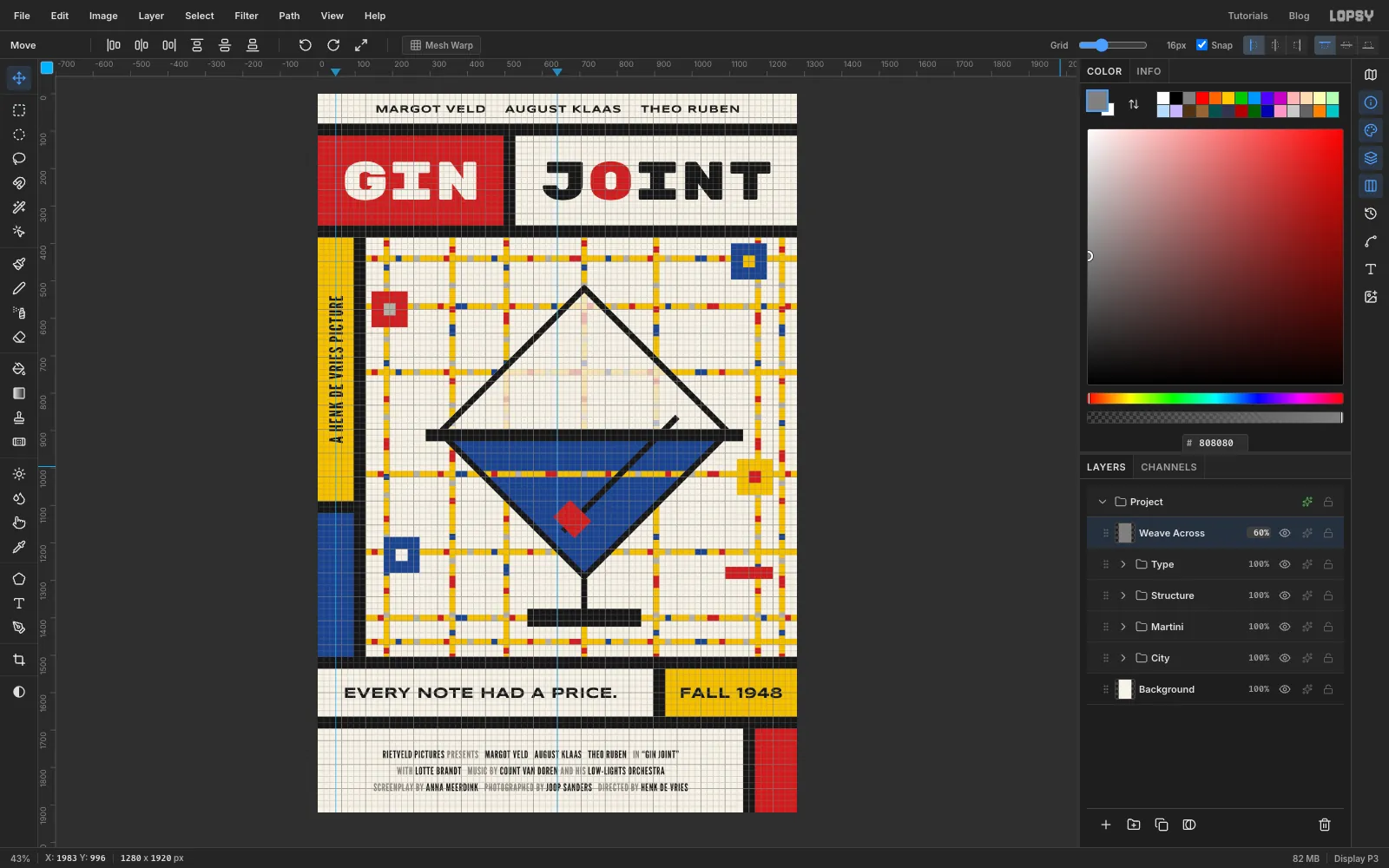
Collapse Type, click its row and click Add Layer. Name the layer Weave Across. Fill it with . Run Filter → Add Noise… with Amount 60, Mono and Gaussian. Then run Filter → Motion Blur… with Angle 0 and Distance 14. In its effects drawer set the blend mode to Overlay, then set the opacity to 60%.
-
Cross the weave
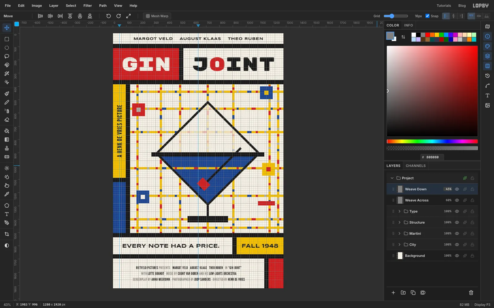
Add Weave Down. Fill it with , Add Noise at 80 (Mono, Gaussian), then Motion Blur at Angle 90, Distance 30. Set it to Soft Light at 45%. The two layers together read like brushed paint on canvas.
-
Add paper grain to the light areas
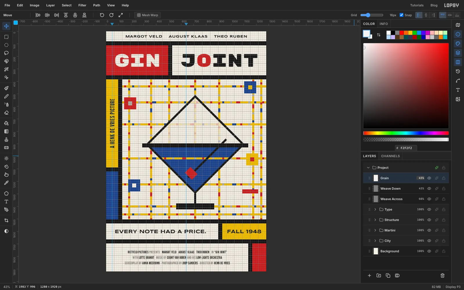
Overlay hardly changes near-white, so the cream still looks flat. Add a layer called Grain, fill it with , Add Noise at 60 (Mono, Gaussian) and Filter → Gaussian Blur… at 1. Set it to Multiply at 45%. Multiply can only darken, and only a little, so the cream gets a printed speckle without changing colour.
-
Add grain to the darks
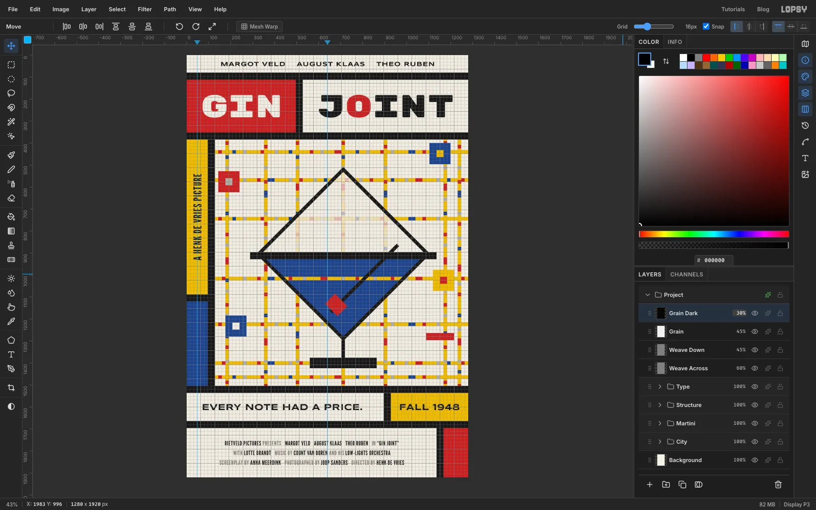
Multiply doesn't show on black. Add Grain Dark, fill it with black, Add Noise at 100 (Mono, Gaussian) and set it to Screen at 30%. Screen only lightens, so the bars and the blue cells pick up a faint speckle and the light areas hardly change.
-
Knock the inks back slightly
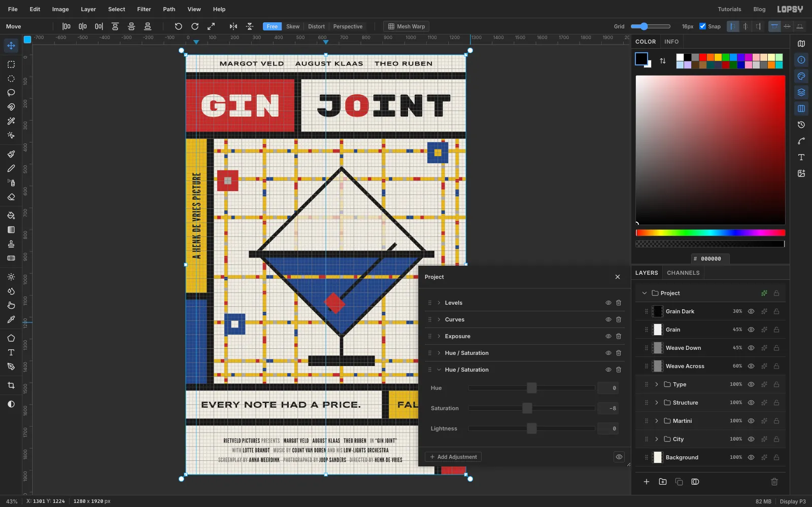
Click the effects button on the top Project row to open the document's own adjustments. Click + Add Adjustment → Hue / Saturation and set Saturation to −8. This adds a second Hue / Saturation node below the default one. The primaries drop from screen-bright to printing-ink bright. Close the drawer.
-
Check the poster, save and export
Choose View → Show Grid and View → Show Guides to hide them, and look over the poster:
- no street ends exactly on a block's edge
- the glass's point, stem and the vertical street all share one centre line
- every line of type is centred in its cell
Save with File → Save Project and export with File → Quick Export PNG.