Make an ASCII Art Diner Menu on Dot-Matrix Paper
Design a retro ASCII art restaurant menu in Lopsy, printed on green-bar fanfold paper with a halftone dot-matrix look, two ink colours and coffee stains.
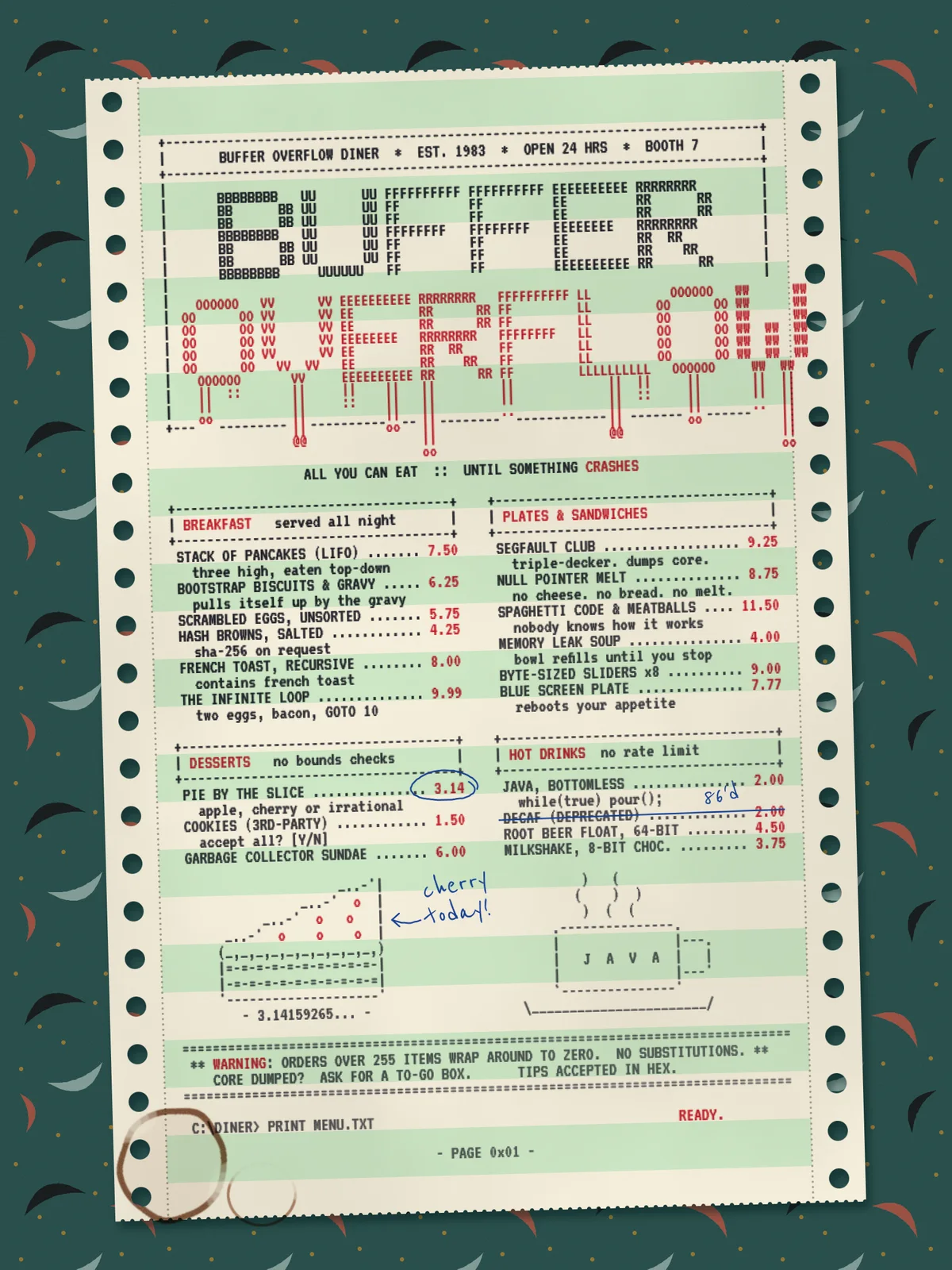
Before laser printers, restaurants, offices and computer labs printed on fanfold paper. It came as one long strip with holes down both edges for the printer's sprockets, and pale green stripes so you could follow a row across the page. A dot-matrix printer hammered every letter out of tiny pins through an inked ribbon. Some ribbons had two colours, black and red. People made big banners from repeated keyboard characters, which is where ASCII art comes from.
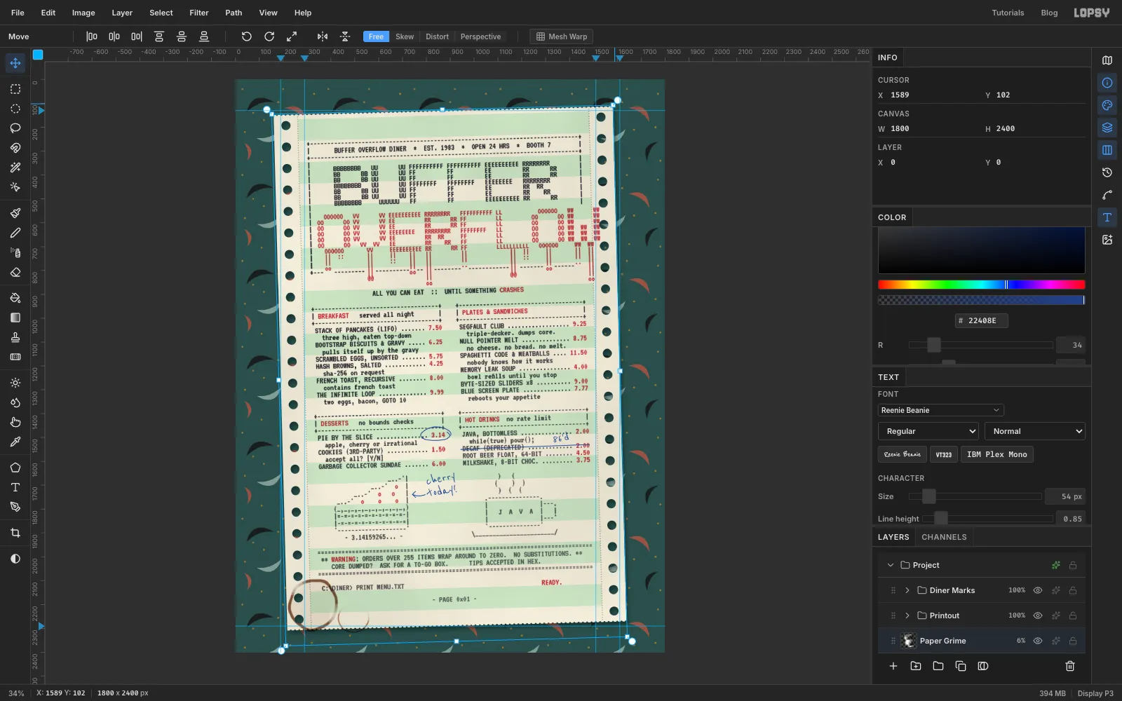
This tutorial makes a menu for an imaginary all-night diner called BUFFER OVERFLOW. In programming, a buffer overflow is data that runs past the space set aside for it, so the joke is a title that spills out of its own box. The menu is 1800 × 2400 px. It's a single torn-off sheet lying at a slight angle on a 1950s formica counter, with a waitress's pen marks and two coffee-cup rings.
Every letter is real text in a pixel-style monospace font, so the hard part is lining characters up. The dot-matrix look comes from one filter, applied after the type is finished.
The tools you'll meet along the way:
- Edit → Define Pattern and Fill with Pattern for the formica counter
- Guides, Snap to Guides and Duplicate Layer for evenly spaced stripes and tractor holes
- the Brush with a wide Spacing setting for perforated edges
- VT323, a pixel terminal font, as live text, and Reenie Beanie for the handwriting
- Filter → Halftone, Color Overlay and the Multiply blend mode for printed ink
- a layer mask with a gradient for a fading ribbon
- Select → Shrink, Liquify and the Eraser for coffee stains
- groups, multi-layer selection, and the Move tool's rotate handle
The palette is two inks on pale paper, over a dark teal counter:
-
Counter teal
-
boomerangs
-
flecks
-
Paper
-
green bar
-
perforations
-
Black ribbon
-
red ribbon
-
Ballpoint blue
-
Coffee
-
Create the document
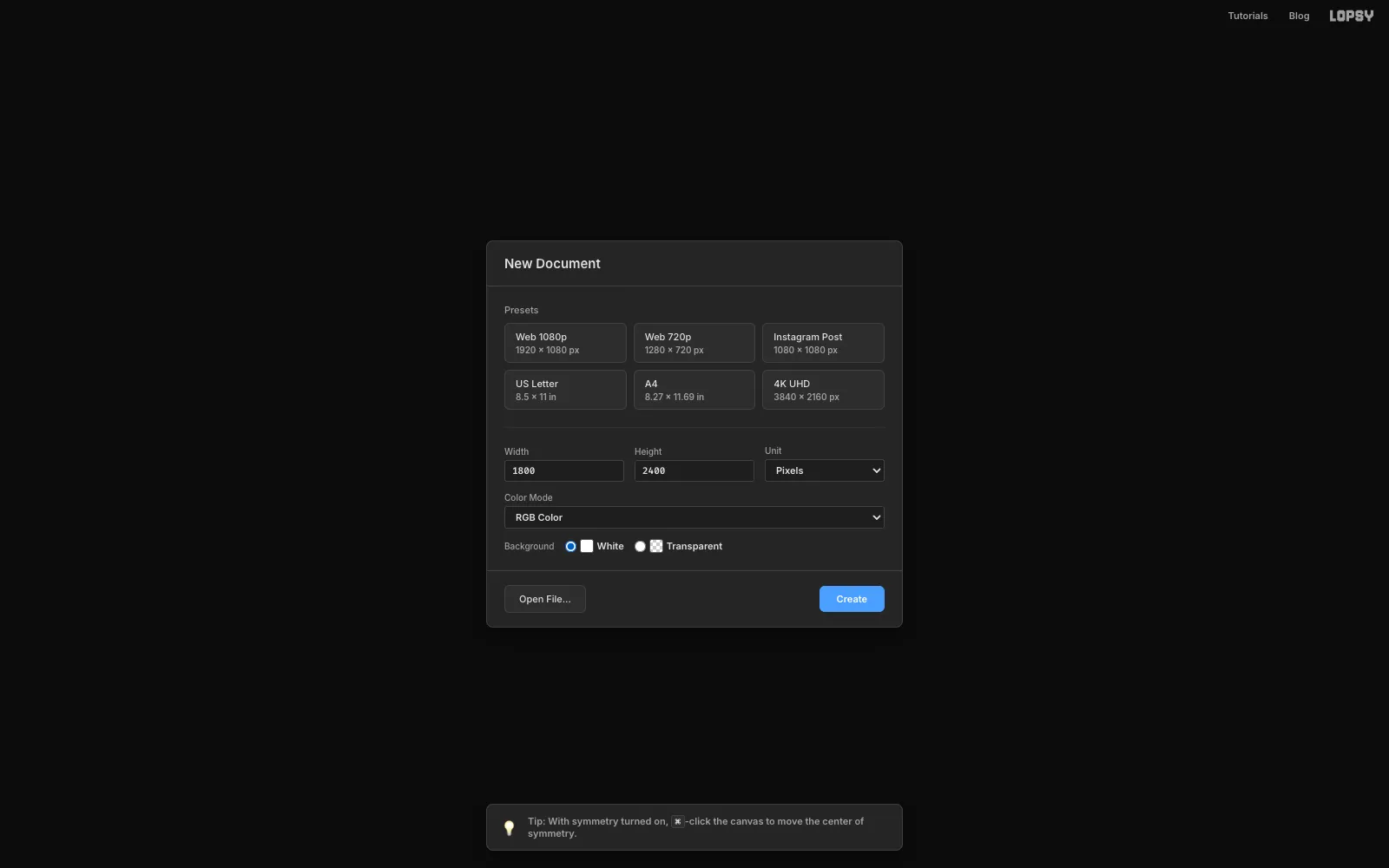
Choose File → New. Make sure Unit is set to Pixels, type 1800 for the width and 2400 for the height, pick a White background and click Create. The finished menu is about the shape of a letter-size page.
-
Draw one tile of boomerang formica
Diner counters of the 1950s were covered in boomerang laminate: little curved wings and flecks scattered over a flat colour. You'll draw one square of it and tile it.
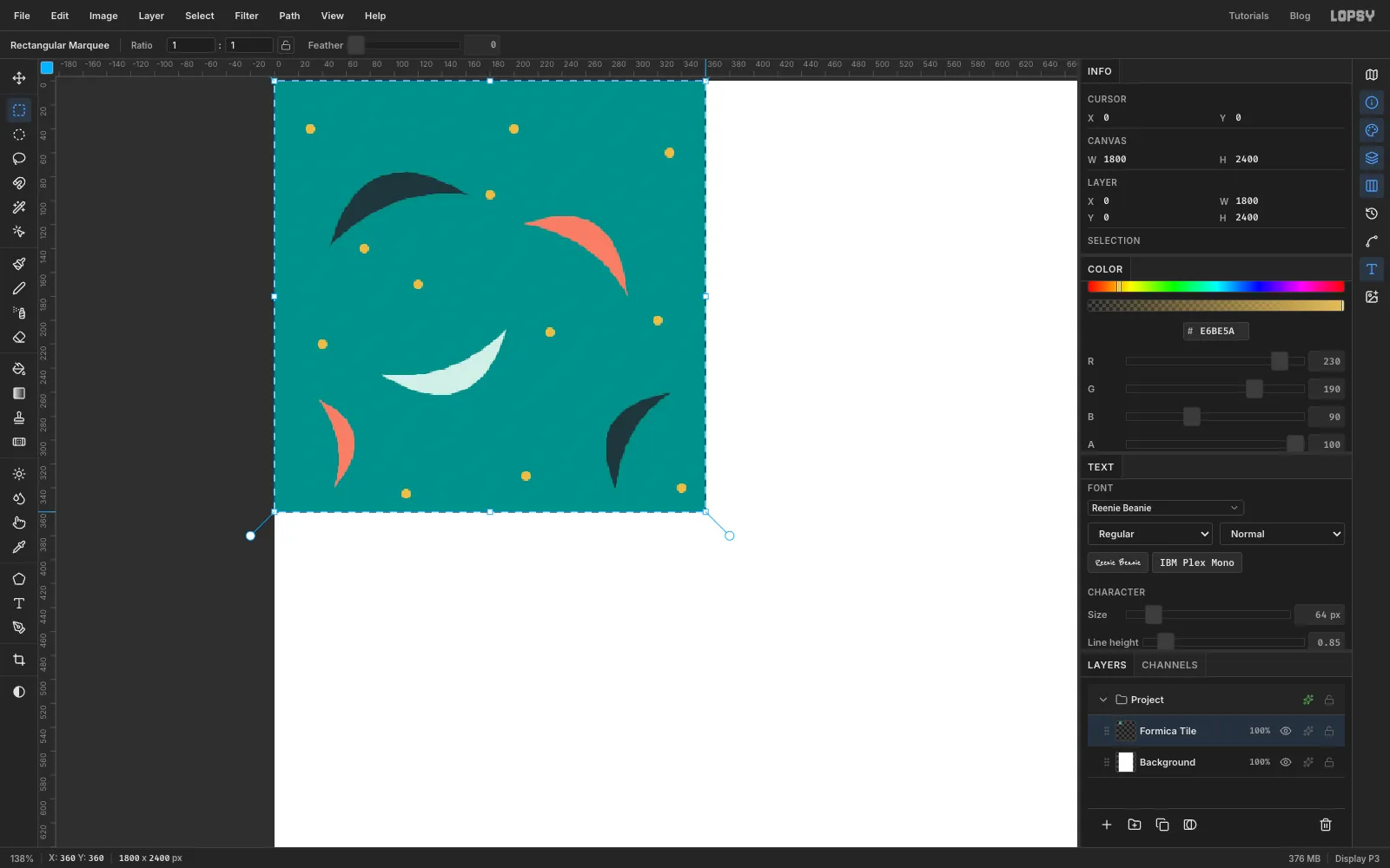
Add a layer and name it Formica Tile. Zoom in on the top-left corner, pick the Rectangular Marquee and drag a 360 × 360 px square starting at the corner. Fill it with teal (Edit → Fill fills a selection with the foreground colour).
Now pick the Lasso and draw five boomerangs: a thick arc that tapers to a point at each end, like a crescent moon with a shallow bite. Fill each one as you go, two in dark slate , two in coral and one in pale mint . Turn them in different directions and keep them a little away from the edges of the square, so none gets cut off when the tile repeats.
Finish with gold flecks. Pick the Brush, set Size to 9 and Hardness to 100, set the colour to and click a dozen single dots between the shapes.
-
Define the pattern and fill the counter
Drag the marquee over the square again, exactly from corner to corner, and choose Edit → Define Pattern. Lopsy saves it as Pattern 1.
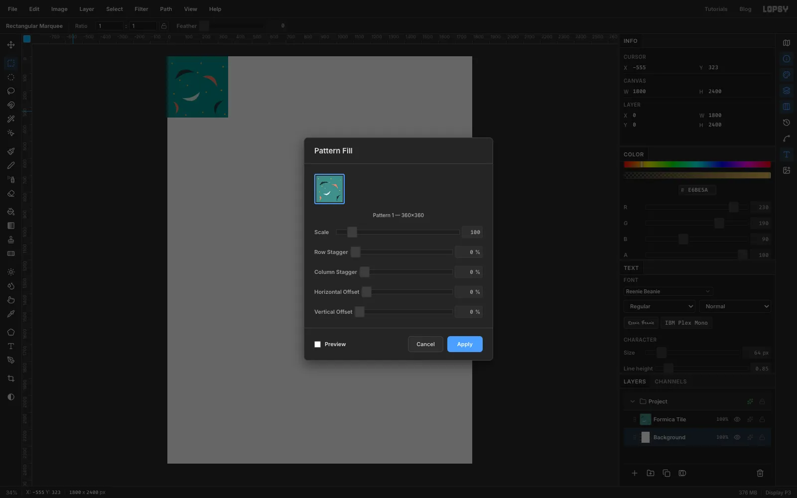
Click the Background layer and choose Edit → Fill with Pattern…. Pick the boomerang tile, leave Scale at 100 and all the offsets at 0, and click Apply. The whole background is now formica. Delete the Formica Tile layer, because you don't need it any more.
-
Age the formica
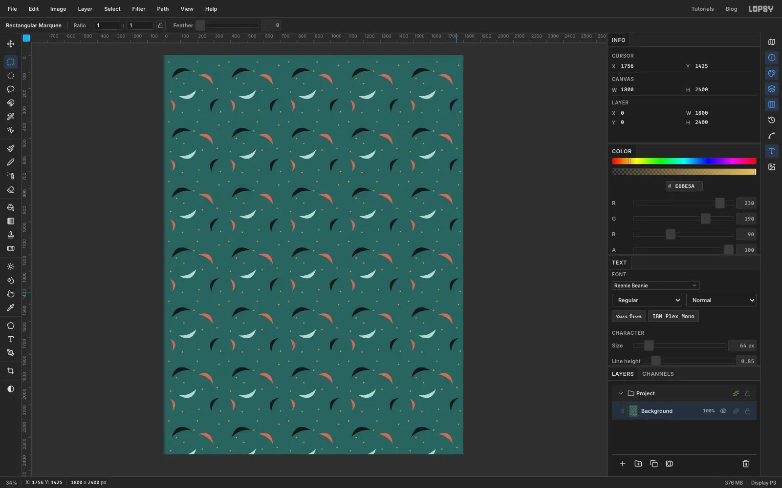
Fresh laminate looks too clean. With the Background still selected, run Filter → Add Noise… with Amount 10 and Mode set to Mono, for a fine grain. Then open Filter → Hue/Saturation… and set Saturation to −30 and Lightness to −10. The counter should look like it's been wiped down for thirty years.
-
Mark out the sheet with guides
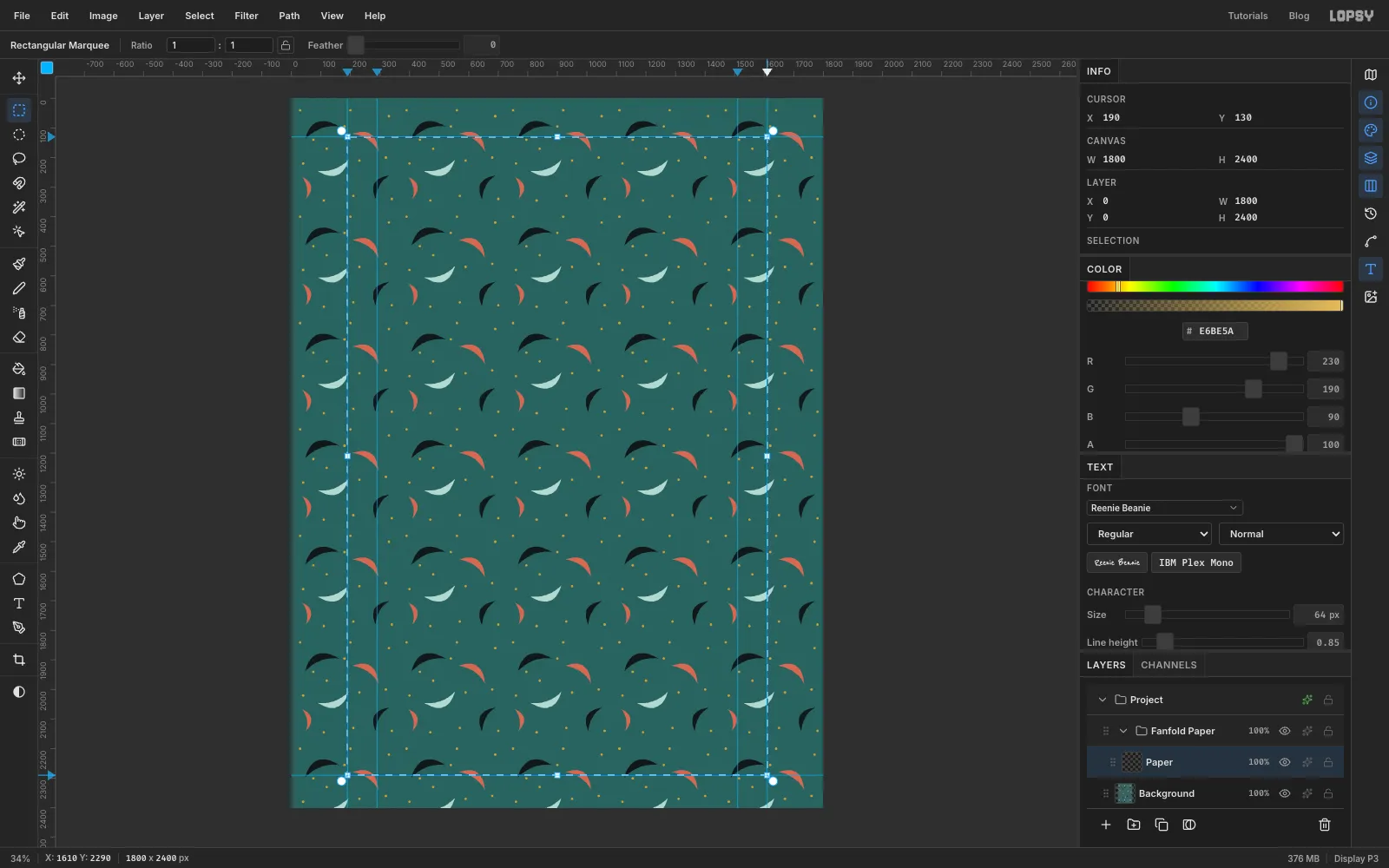
Turn on View → Show Rulers if they aren't showing. Click the top ruler at 190, 290, 1510 and 1610 to drop four vertical guides. The outer pair is the paper's edge and the inner pair is where the tractor-feed strips end. Click the left ruler at 130 and 2290 for the top and bottom of the sheet. Zoom in while you place them: at fit-to-screen each screen pixel covers about three document pixels.
Make sure View → Snap to Guides is ticked. Choose Layer → New Group and call it Fanfold Paper. Inside it, add a layer called Paper. Then drag the Rectangular Marquee from the top-left guide crossing to the bottom-right one, so it snaps neatly to all four edges.
Fill the marquee with paper cream , then run Filter → Add Noise… at Amount 5 with Mode set to Mono, so it looks like paper rather than flat colour. Press Cmd+D to deselect.
-
Draw the first green bar
Green-bar paper alternates three lines of green with three lines of white. Here each band is 90 px tall.
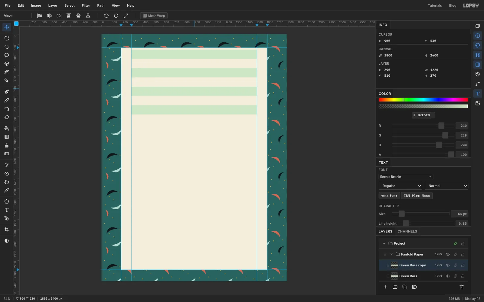
Add a layer called Green Bars. With the Rectangular Marquee and nothing selected, click once on the canvas without dragging: a Rectangular Selection dialog opens. Enter From 290, 150 and To 1510, 240, so the band runs between the two inner guides, and confirm. Fill it with green and deselect.
To repeat a band without drawing each one, double it:
- Choose Layer → Duplicate Layer.
- Use the Move tool to drag the copy down by 180 px, which is one green band plus one white band. Watch the layer position in the Info panel, and use the arrow keys for the last pixel or two.
- Choose Layer → Merge Down.
You now have two bars. Do it again, moving the copy down 360, then 720, then 1440 px. Each round doubles the count, so four rounds make sixteen bars, which is more than the sheet needs.
-
Trim the bars to the sheet
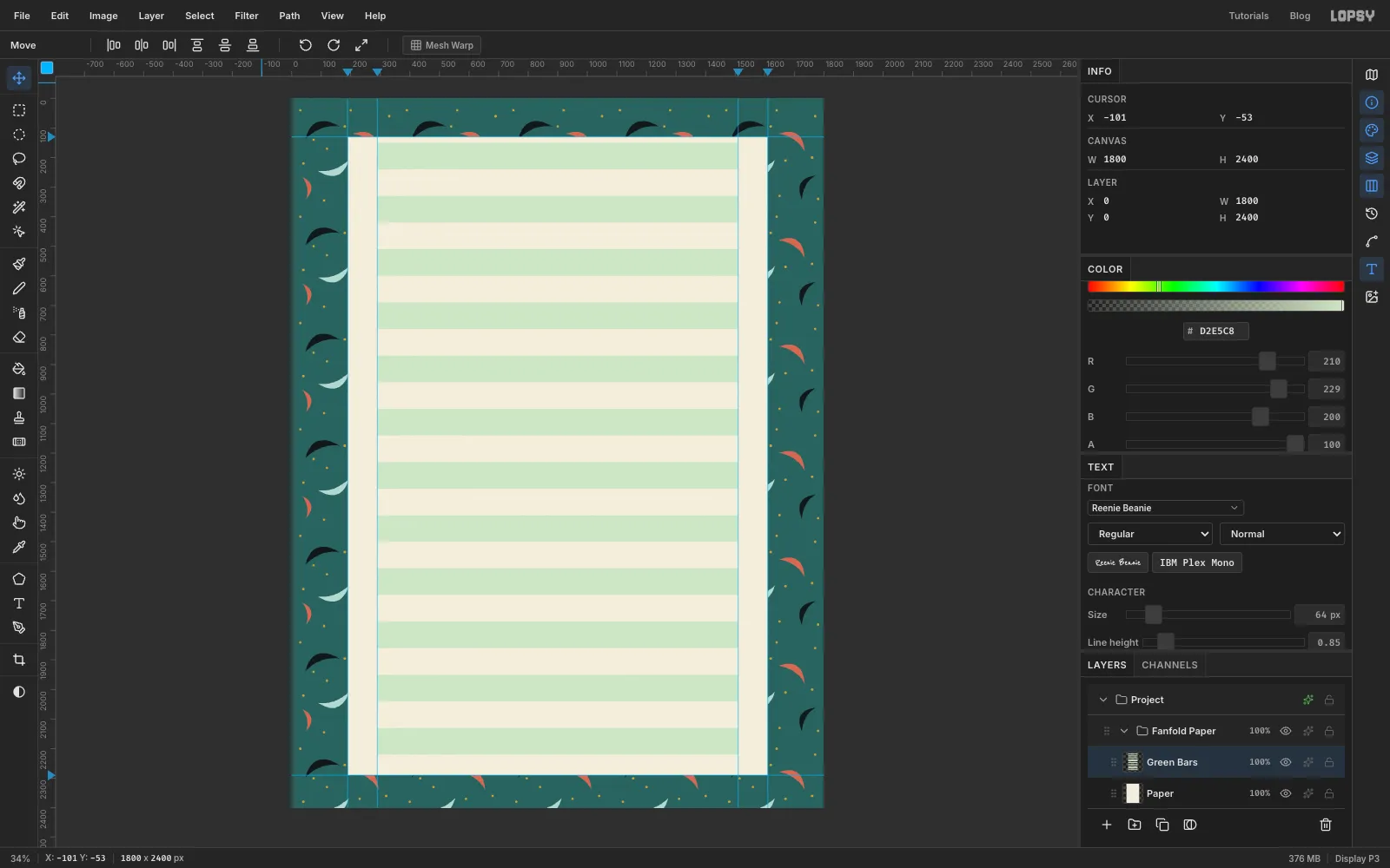
The last few bars hang off the bottom of the sheet. Cmd-click the Paper layer's thumbnail to select the paper's shape, click back on Green Bars, choose Select → Inverse and press Delete. Everything outside the paper goes.
-
Make one column of tractor holes
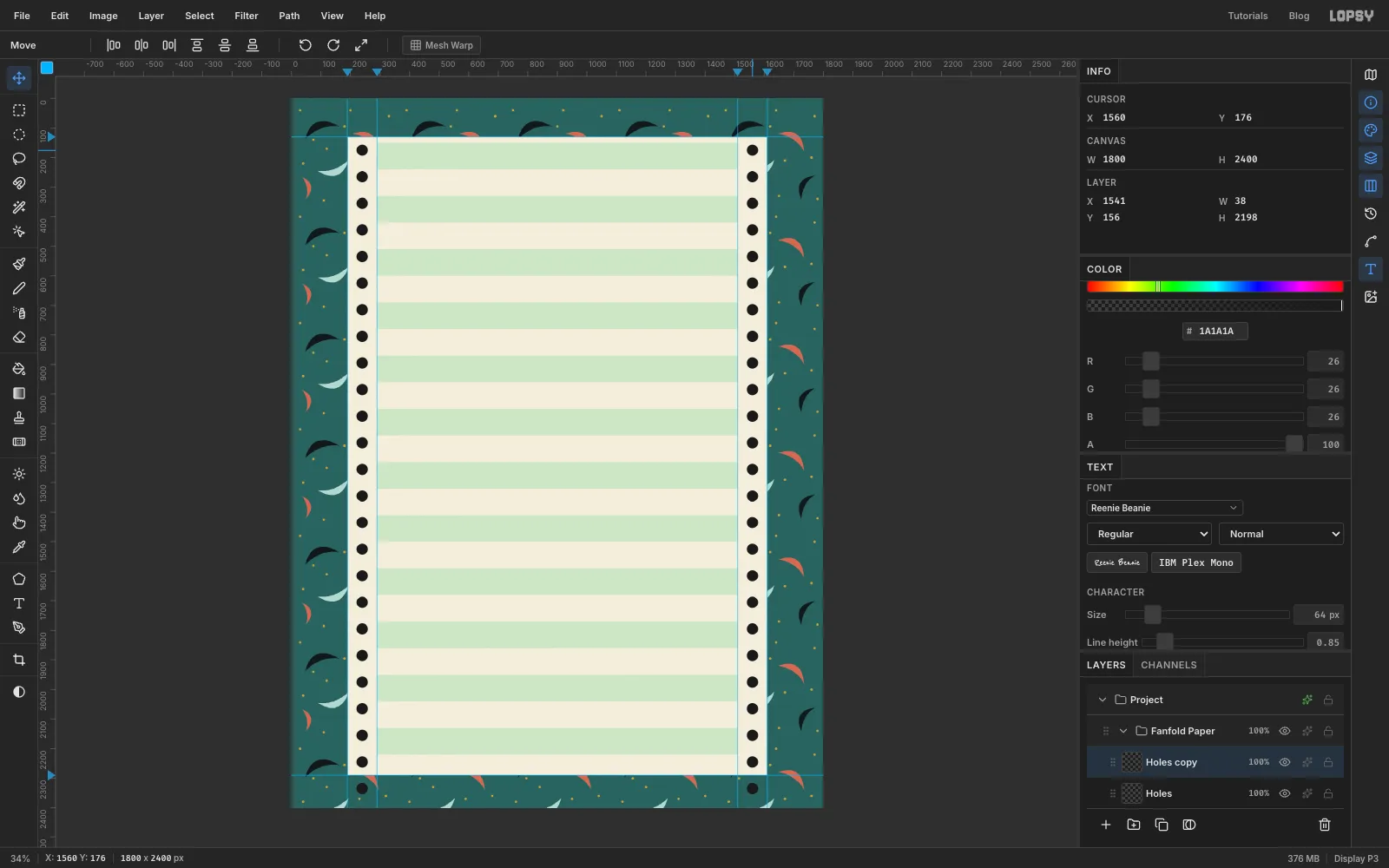
Add a layer called Holes. Pick the Elliptical Marquee, hold Shift and drag a circle about 38 px across. Centre it in the left strip (between the paper's edge and the first inner guide), level with the middle of the first band. Fill it with near-black .
Use the same duplicate, move and merge trick, but with a 90 px step, so there is one hole per band: 90, 180, 360, 720, 1440. Finally duplicate the whole column once more, drag the copy 1320 px to the right into the right strip, and merge it down.
These black dots are only a stencil. In a moment you'll use them to punch real holes through the paper.
-
Add the torn perforation along the ends
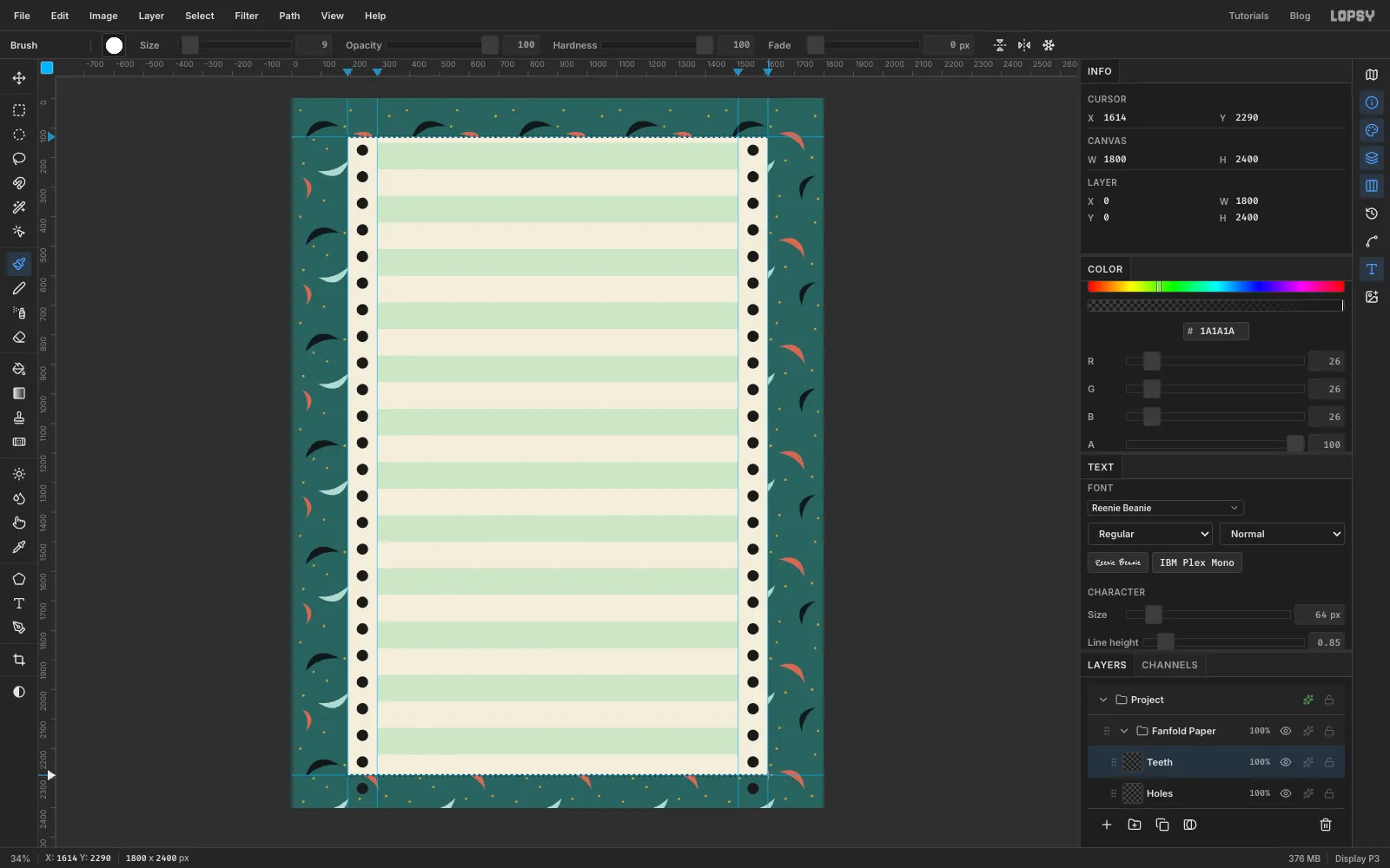
When a sheet is torn off a fanfold stack, the perforation leaves a scalloped edge. Add a layer called Teeth.
Pick the Brush, open the Brushes panel (the brush preview at the left of the options bar), choose Hard Round and, on the Shape tab, set Size 9 and Spacing 200. That spacing leaves a gap of one dot between every dot. Click on the top-left corner of the sheet, hold Shift and click the top-right corner to stamp a straight row of dots. Do the same along the bottom edge.
-
Punch the holes through the paper
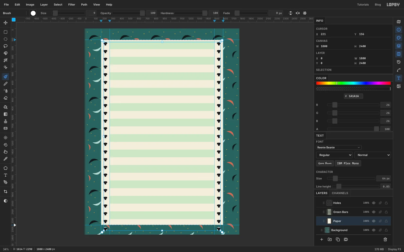
Cmd-click the Holes thumbnail to select every hole, click the Paper layer and press Delete. Hide Holes with its eye icon. Repeat with Teeth: Cmd-click its thumbnail, select Paper, Delete, and hide Teeth.
Now you can see the counter through the holes, and the ends of the sheet are scalloped.
-
Draw the strip perforations
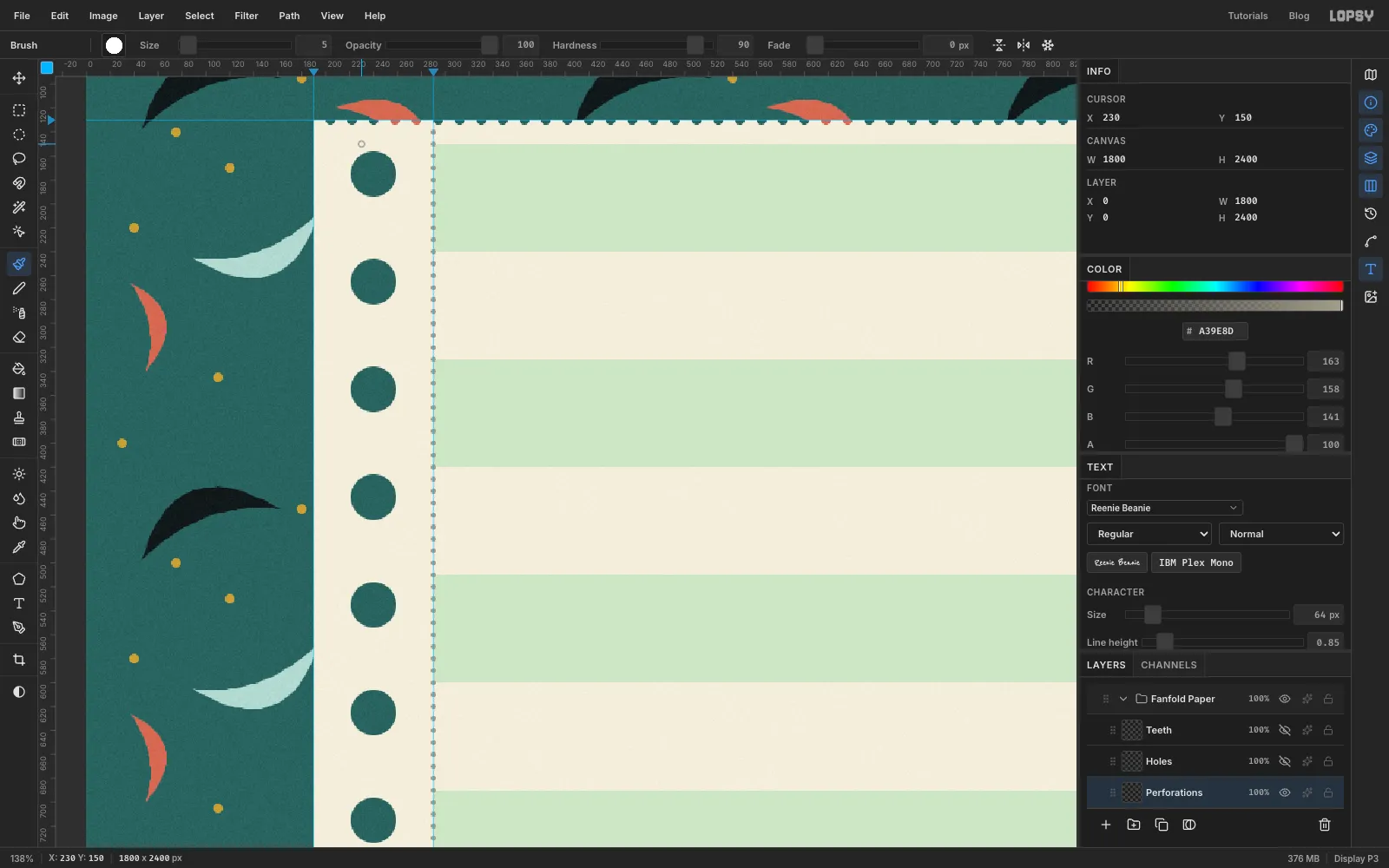
The side strips tear off too, so they need their own perforations. Add a layer called Perforations. Keep the Brush at Spacing 200, but set Size 5, Hardness 90 and the colour to warm grey . Click at the top of the left inner guide and Shift-click at the bottom. Repeat on the right.
-
Lift the sheet off the counter
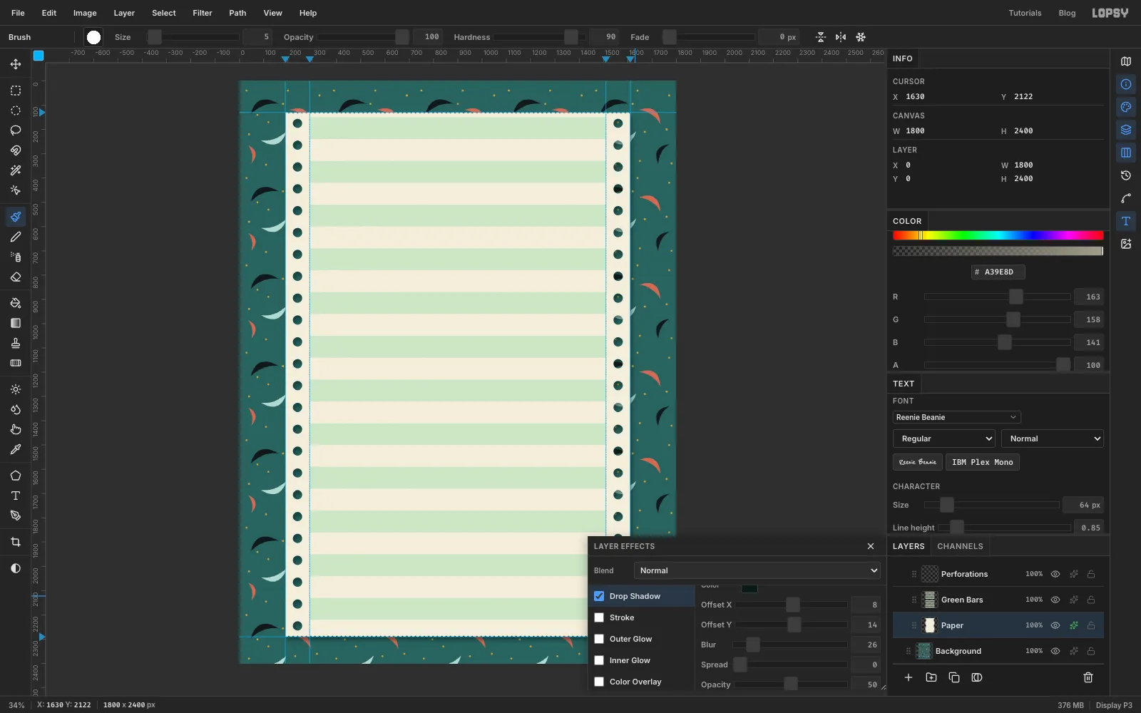
Select the Paper layer and open its layer effects (the ✦ button on its row). Tick Drop Shadow and set the colour to a very dark teal , Offset X 8, Offset Y 14, Blur 26 and Opacity
- The shadow falls on the counter and inside every punched hole, so the sheet now sits on the counter rather than being printed on it.
-
Tone the counter down
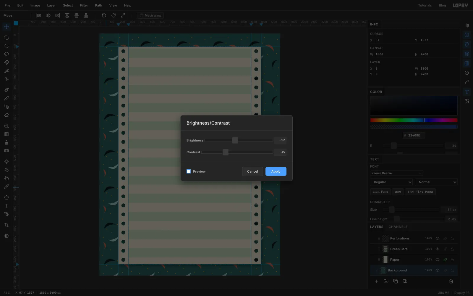
With the sheet in place, the black boomerangs fight the paper for attention. Select the Background and run Filter → Brightness/Contrast… with Brightness −12 and Contrast −35. The counter steps back and the white page becomes the brightest thing on the canvas.
While you're down here, add an empty layer called Paper Grime above the Fanfold Paper group. You'll fill it with grime near the end.
-
Write the banner in a text editor
Old banner programs built each big letter on a 5 × 7 grid. Every filled square is the letter typed twice and every empty square is two spaces, with one space between letters. The sheet above shows every letter you need. Lining up dozens of spaces is much easier in a plain text editor than in an image editor, so build both words there first.
For OVERFLOW, add up to six extra lines under the word for drips. Under some of the letters, put
||on each line and end the drip withoo,@@or... Make them different lengths, from a single::to five lines long.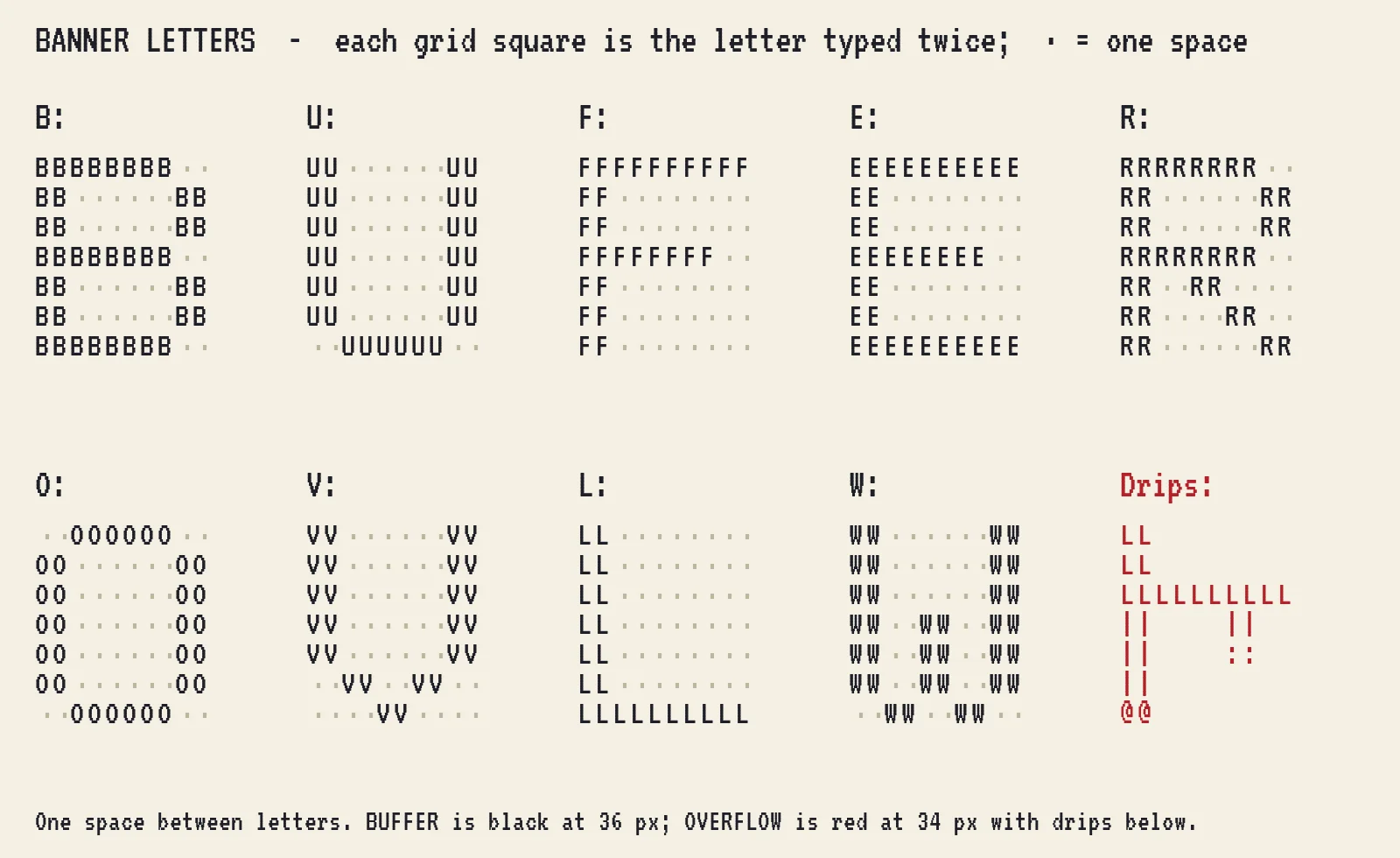
-
Type the BUFFER banner
Choose Layer → New Group and call it Printout. Everything printed goes in here.
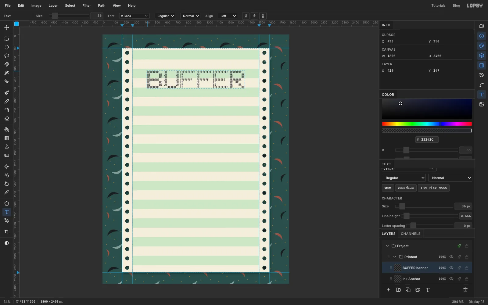
Add one empty layer inside the group (it's Ink Anchor in the screenshots). New layers appear above whichever layer is active, so with this one selected, new text lands inside the group. It also stops the Text tool's font settings from restyling a text layer that happens to be selected. You can delete it at the end.
Copy BUFFER from your text editor. Pick the Text tool and choose VT323 in the font browser. Set Size to 36, and in the Text panel set Line height to 0.67 so the rows sit 24 px apart and the letters look square. Click inside the top part of the sheet and paste with Cmd+V. Press Tab to commit and drag it with the Move tool until it is centred.
-
Make OVERFLOW spill out
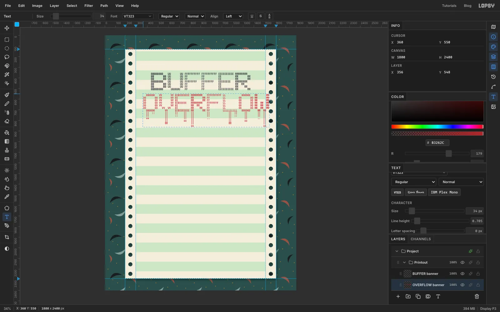
OVERFLOW is the joke, so it should break out of the layout. Click the Ink Anchor layer again and copy OVERFLOW with its drips.
Set the foreground to red , size 34 and line height 0.71 (slightly smaller than BUFFER, because OVERFLOW has eight letters). Paste it under BUFFER and line it up so the final W runs past the right inner guide onto the tractor strip. The drips should hang well below everything else in the title.
-
Draw the box around the title
Now the box the title is supposed to stay inside. Make it 80 characters wide, the width of a classic printer line:
- a top border:
+, 78 dashes,+ - one row reading
BUFFER OVERFLOW DINER * EST. 1983 * OPEN 24 HRS * BOOTH 7, centred between two|bars - a second border
- fifteen rows with a
|at each end and spaces between - a bottom border
Set black , size 36 and line height 0.83 (rows 30 px apart), paste it so the top border sits about 100 px below the top of the sheet, and move it so the box frames both banners.
Now break the box. Click into the box text and delete the right-hand
|beside each row the red W covers, and the dashes in the bottom border wherever a drip crosses it. OVERFLOW now looks like it has broken through.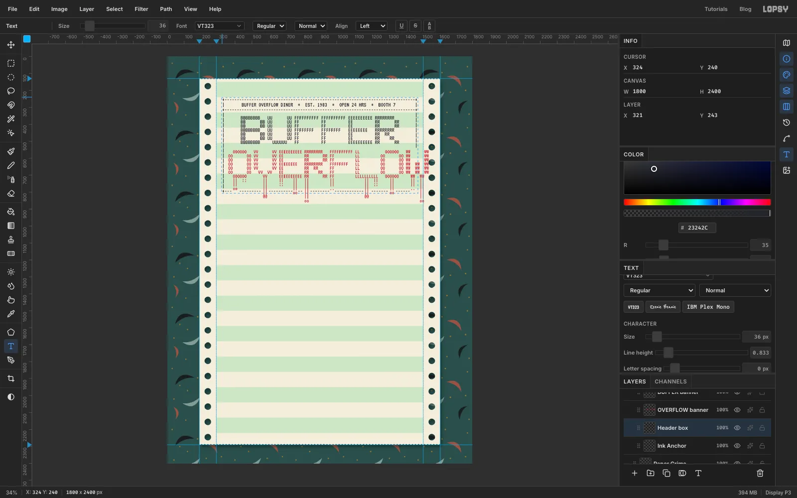
- a top border:
-
Set the menu in two columns
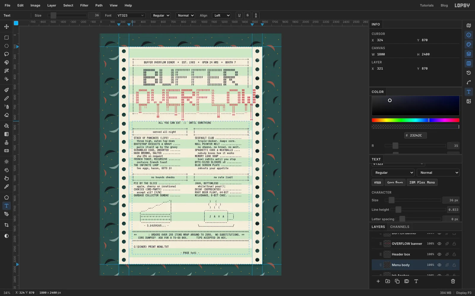
Write the menu in your text editor as 80-character lines. Each column is 38 characters wide with a 4-space gutter, and every item follows the same rule: name, a space, dots, a space, then the price ending exactly on the column edge (
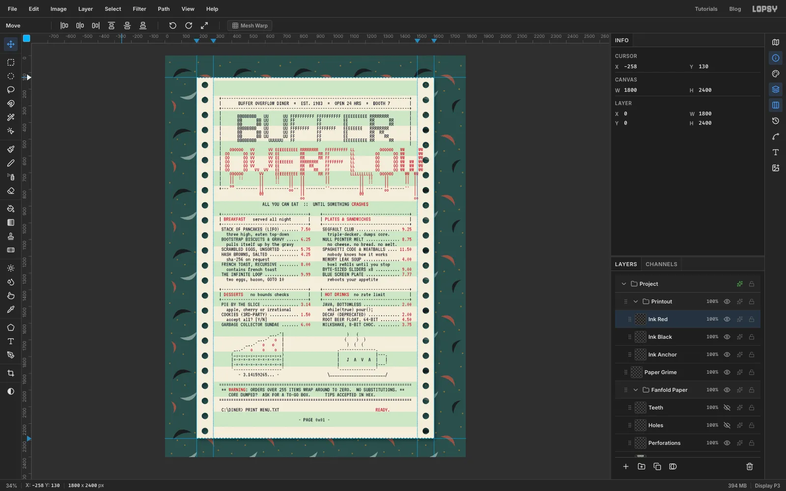
STACK OF PANCAKES (LIFO) ....... 7.50). Section headings sit in little+---+boxes. The pie is a slice drawn with_..-'steps and a|back wall over a crust of(_,_,_,). The mug is a box with a|---.handle on a\____/saucer.The menu has four sections: BREAKFAST (served all night), PLATES & SANDWICHES, DESSERTS and HOT DRINKS, with names like Stack of Pancakes (LIFO), Segfault Club and Java, Bottomless. Above them sits a tagline, ALL YOU CAN EAT :: UNTIL SOMETHING CRASHES. Below them are a WARNING footer between two rows of
=, aC:\DINER> PRINT MENU.TXTprompt with READY. at the right, and a centred- PAGE 0x01 -.The headings and prices will be printed in red, so before you paste, make a copy of the menu in your editor and replace every red word (the section titles, prices, WARNING, CRASHES and READY.) with the same number of spaces. Paste that black version with the same black, size 36 and line height 0.83, so it starts on the 30 px rhythm just below the title box.
-
Add the red ribbon
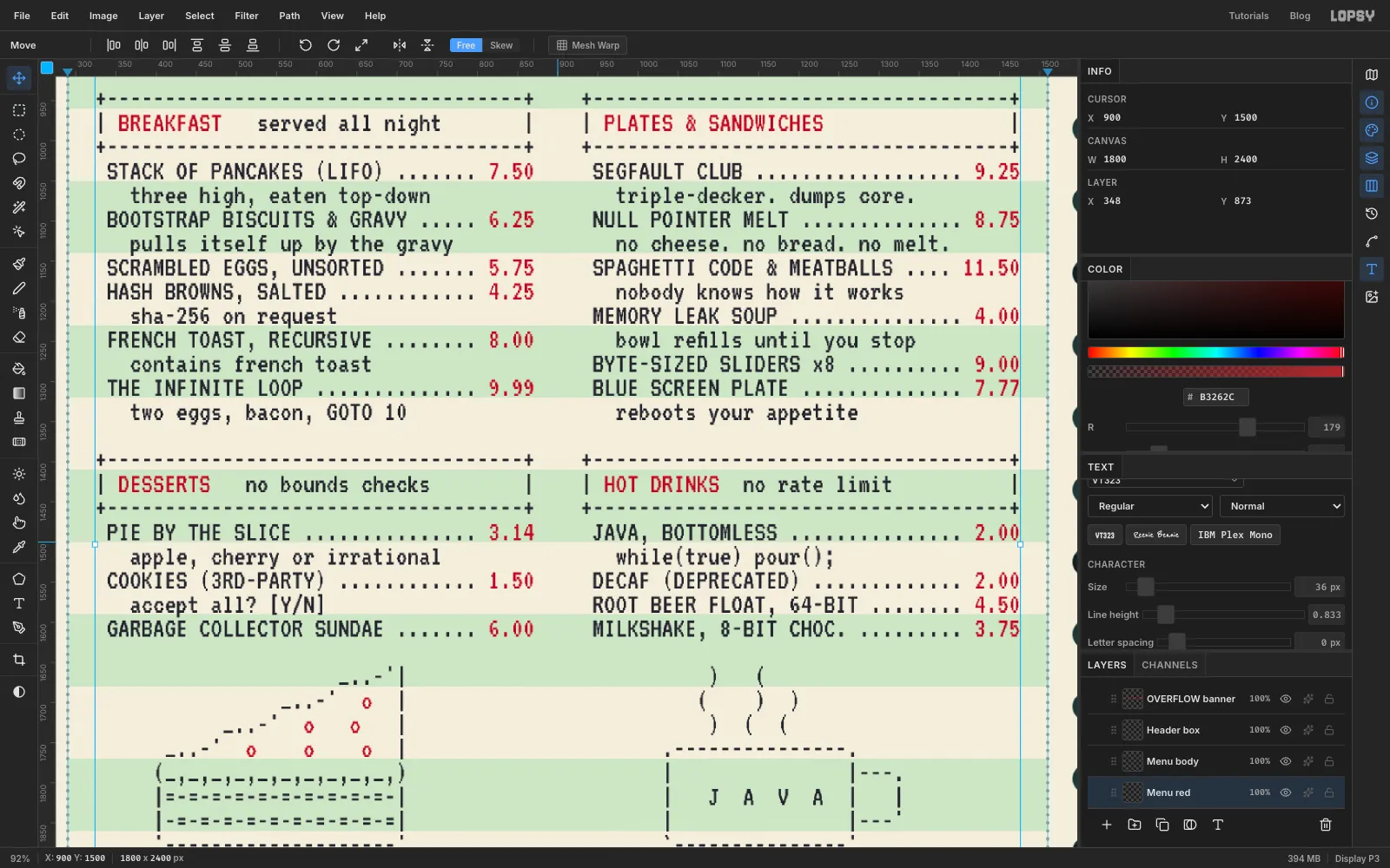
Two-colour ribbons printed headings and prices in red. Make a second copy of the menu in your editor that keeps only the red words and turns everything else into spaces.
Rasterize the black menu with the Rasterize Layer button at the bottom of the Layers panel, so the Text tool starts a new layer instead of editing it. Select Ink Anchor, click where you clicked for the black menu and paste the red version in red . Because the font is monospaced, every red word drops into its gap. Compare the two layers' X and Y in the Info panel and nudge with the arrow keys until they match.
-
Merge the inks into two layers
Rasterize the remaining text layers. Drag the rows so all the black layers (box, BUFFER, menu) are next to each other with the red ones (OVERFLOW, red menu) above them. Then Merge Down until you have just two ink layers: Ink Black and Ink Red. Treating each ribbon colour as one layer makes the next steps quick.
-
Turn the type into dot-matrix print
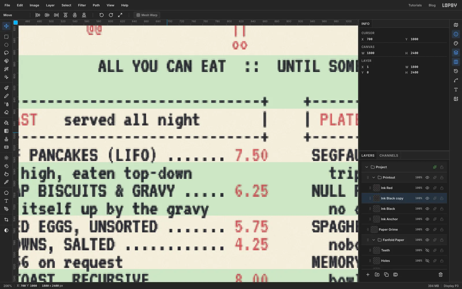
Select Ink Black and choose Filter → Halftone…. Set Dot Size 3, Density 1.5, Angle 0 and Softness 1, then Apply. With the angle at 0 the dots line up in a square grid, like the pins in a print head. Do the same on Ink Red.
Dot-matrix printers made bold text by striking each line twice, slightly offset. Copy that: Duplicate Layer, switch to the Move tool, press the right arrow key once to shift the copy 1 px, and Merge Down. Do it for both inks. Zoom right in to check that letters like M and W still read. A bigger dot or a bigger offset fills in their middle strokes.
-
Colour the ink and press it into the paper
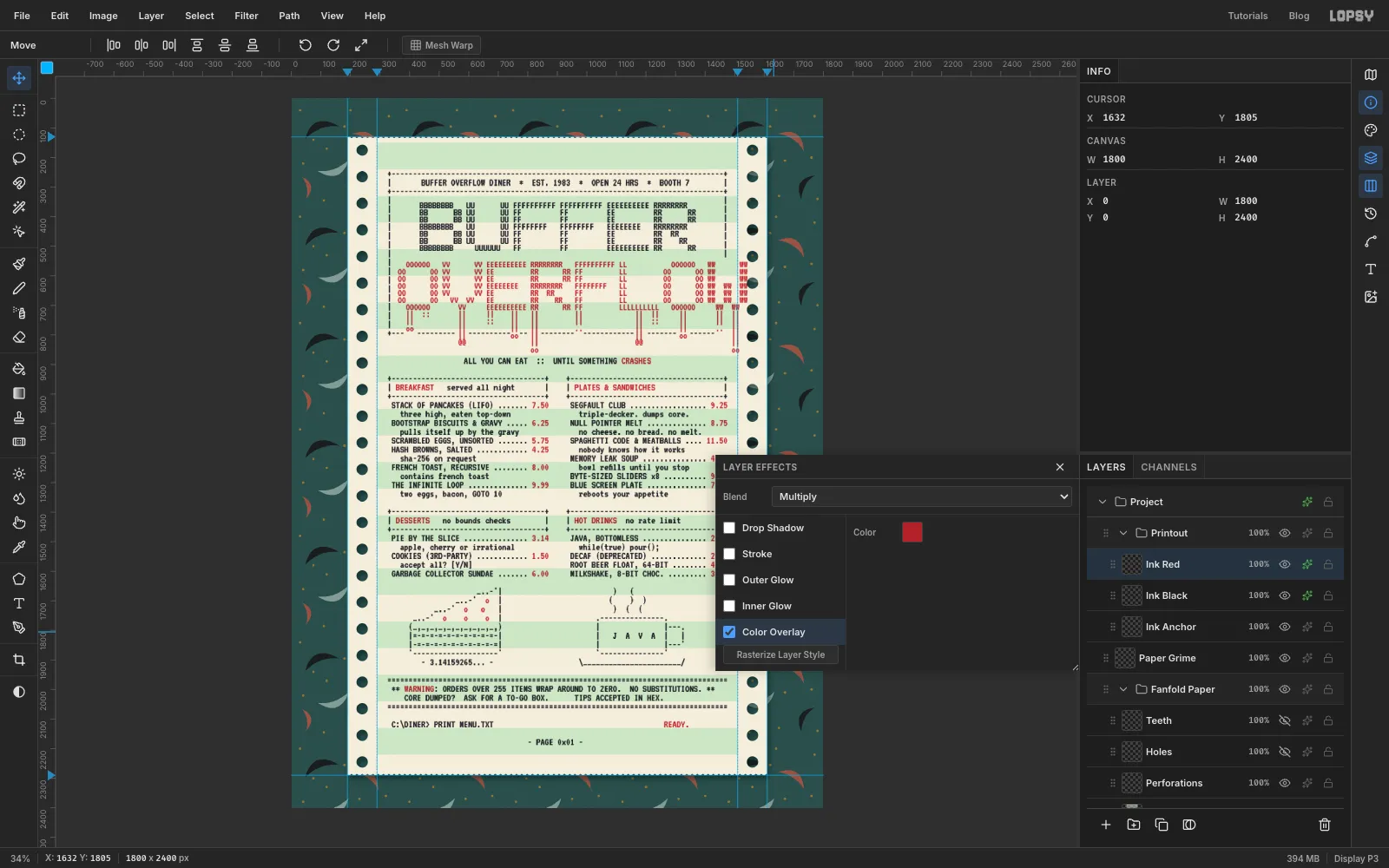
Halftone leaves slightly uneven colours. Open the layer effects for Ink Black, tick Color Overlay and set it to . Then set the layer's Blend to Multiply, so the green bars show through the ink the way they would on real paper. Do the same on Ink Red with .
Ink can't land in a hole that isn't there, and the W of OVERFLOW runs over the tractor strip. Cmd-click the hidden Holes layer's thumbnail, select Ink Red and press Delete.
-
Fade the ribbon with a mask
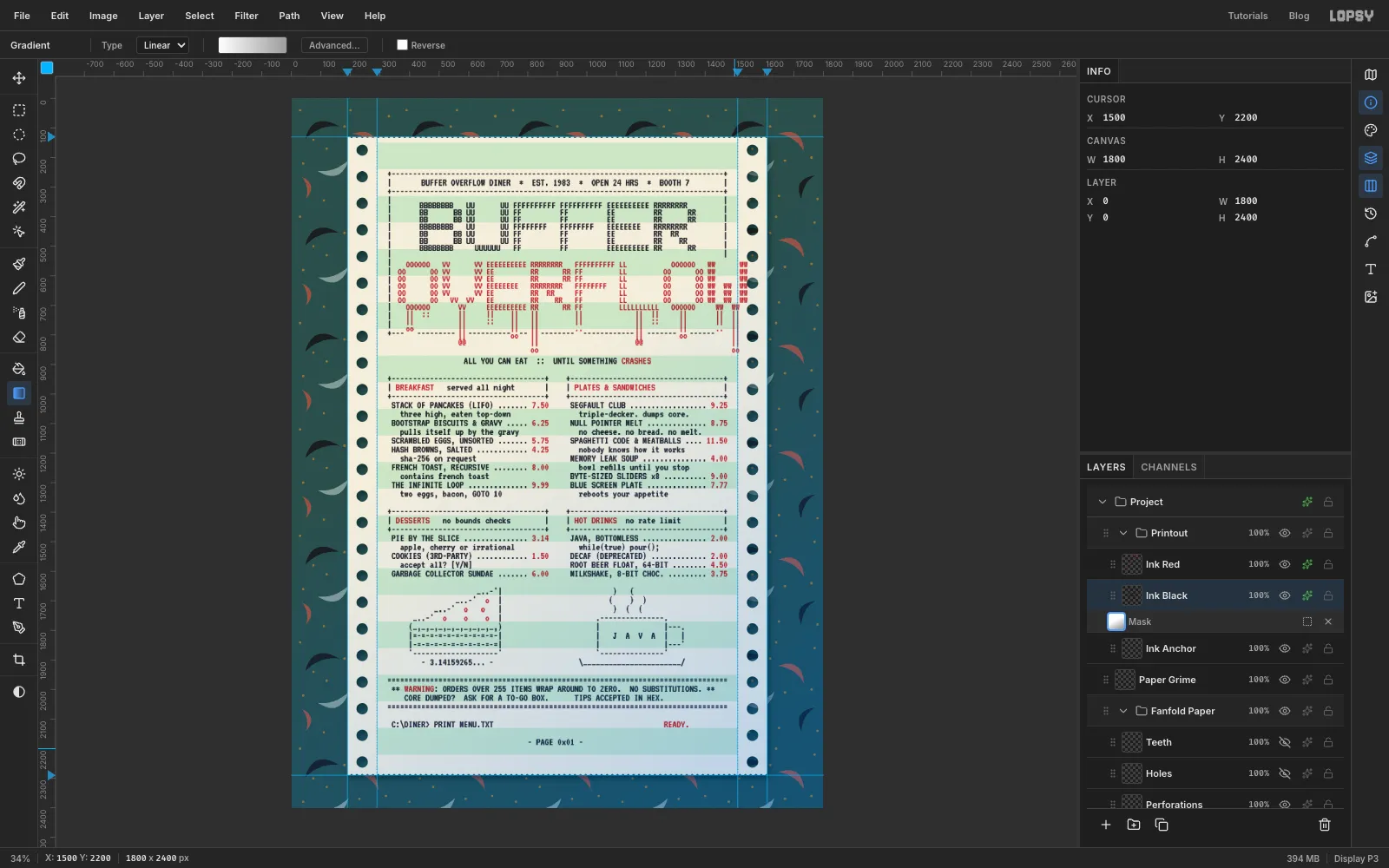
A ribbon runs dry as it prints, so the text gets lighter towards the end of the page. Select Ink Black and click Add Mask at the bottom of the Layers panel, then click the new mask thumbnail to edit the mask. The canvas turns blue while you're editing it.
Pick the Gradient tool, click Advanced…, and set the stops to white and light grey . Drag from the middle of the menu down to the bottom-right corner. Grey in a mask means partly transparent, so the lower right of the menu prints a little paler. Click the layer's own thumbnail when you're done to leave mask editing.
For a little grime, select the empty Paper Grime layer you made earlier. Run Filter → Clouds… at Scale 3, then trim it to the paper the same way as the bars (Cmd-click Paper, Select → Inverse, Delete). Set it to Multiply at 6% opacity.
-
Start a coffee ring
Coffee rings are dark at the rim and almost clear in the middle, because the coffee dries towards the edge. Add a layer called Coffee Ring at the top of the stack, outside the groups.
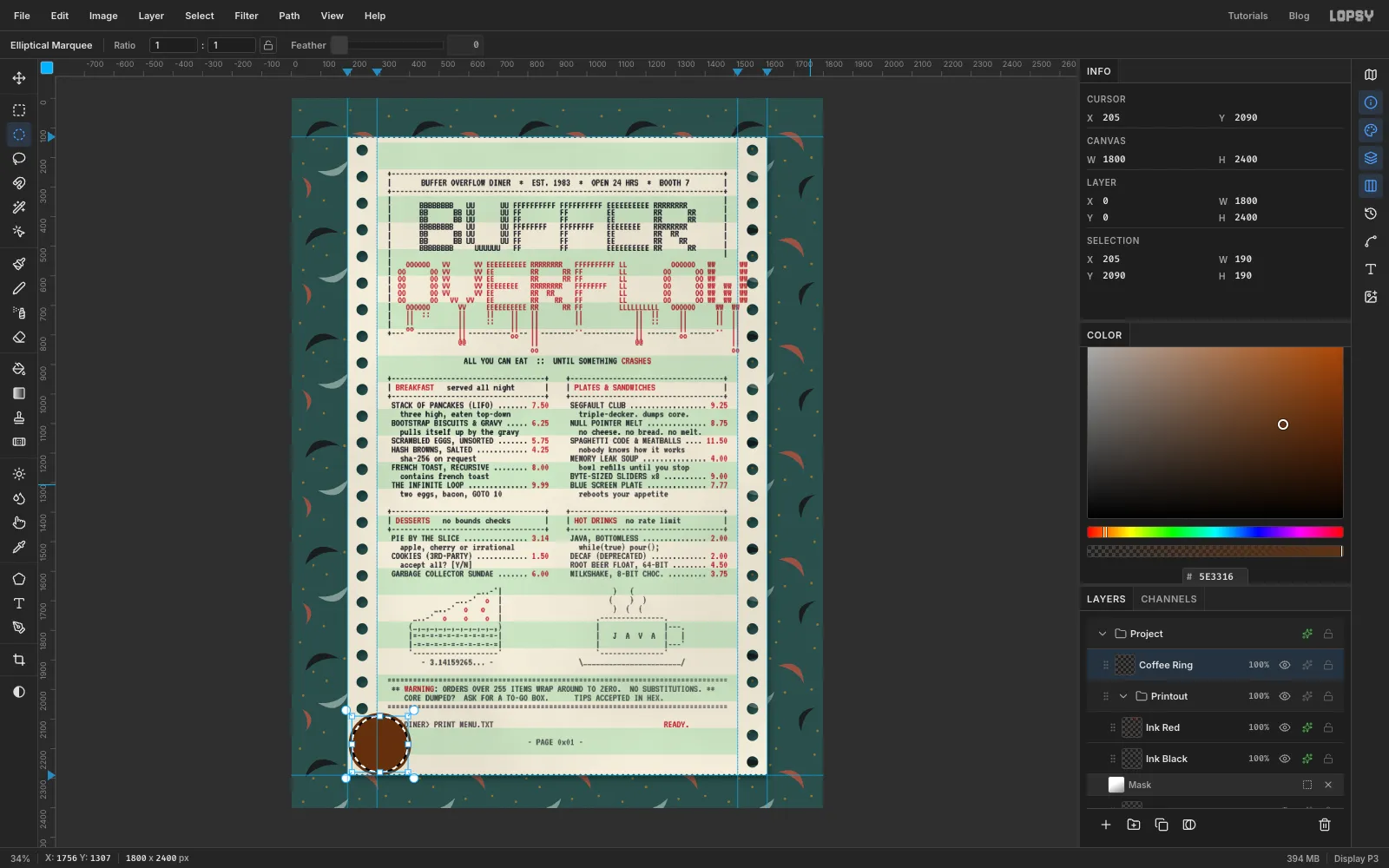
Draw a circle about 210 px across with the Elliptical Marquee, half over the left tractor strip near the bottom of the sheet, and fill it with dark coffee . Choose Select → Shrink…, enter 11 and Apply, then press Delete. You're left with a thick ring and the inner circle still selected. Fill that circle with the same brown at about 10% in the colour picker's A (alpha) field, for a faint stain. Set alpha back to 100 afterwards.
-
Make the ring look spilled, not stamped
A real ring is never perfectly round. Deselect, open Filter → Liquify…, keep Push Forward, and nudge the rim outward or inward in three or four places with short drags. Then Apply.
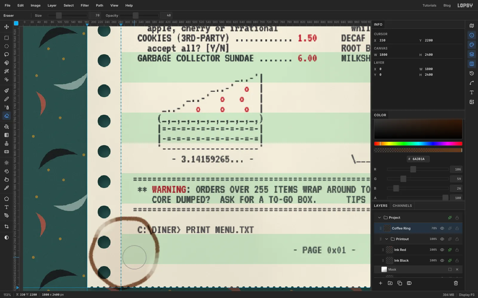
Run Filter → Gaussian Blur… at 3 px to soften it and Add Noise… at 35 with Mode set to Mono for a grainy edge. Set the layer to Multiply at 78%. Finally pick the Eraser with Size 70 and Opacity 40 and drag across two short parts of the rim, so the ring fades out where the cup didn't sit flat.
-
Add a second, fainter ring
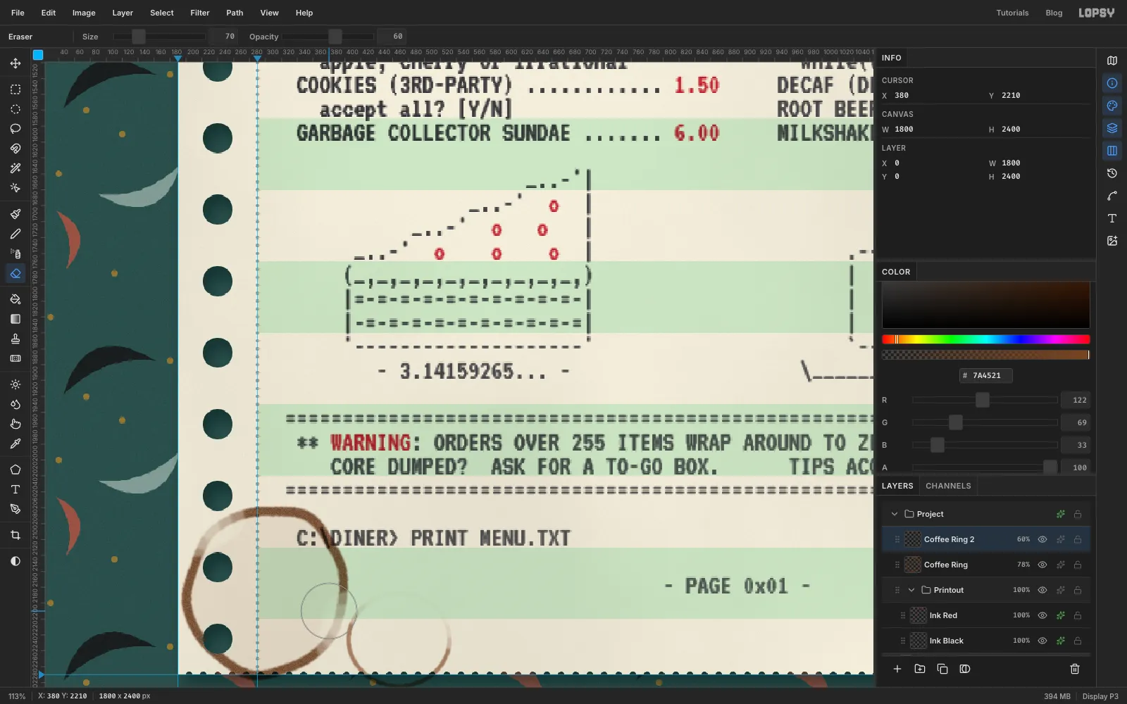
Add a layer called Coffee Ring 2. Draw a slightly oval selection about 130 px wide overlapping the first ring on the right, fill it with a lighter coffee , Shrink by 5 and Delete. Blur it by 2, set it to Multiply at 60%, and erase most of its top half with one Eraser stroke at 60% opacity. Two rings of different weights look like someone set their cup down twice.
The rings shouldn't be visible inside the punched holes. On each ring layer, Cmd-click the Holes thumbnail and press Delete.
-
Mark up the menu in ballpoint
Waitresses always scribble on the menu. Add a layer called Ballpoint. Pick the Brush with Hard Round, set Size 4, Spacing 10, Hardness 85 and the colour to ballpoint blue .
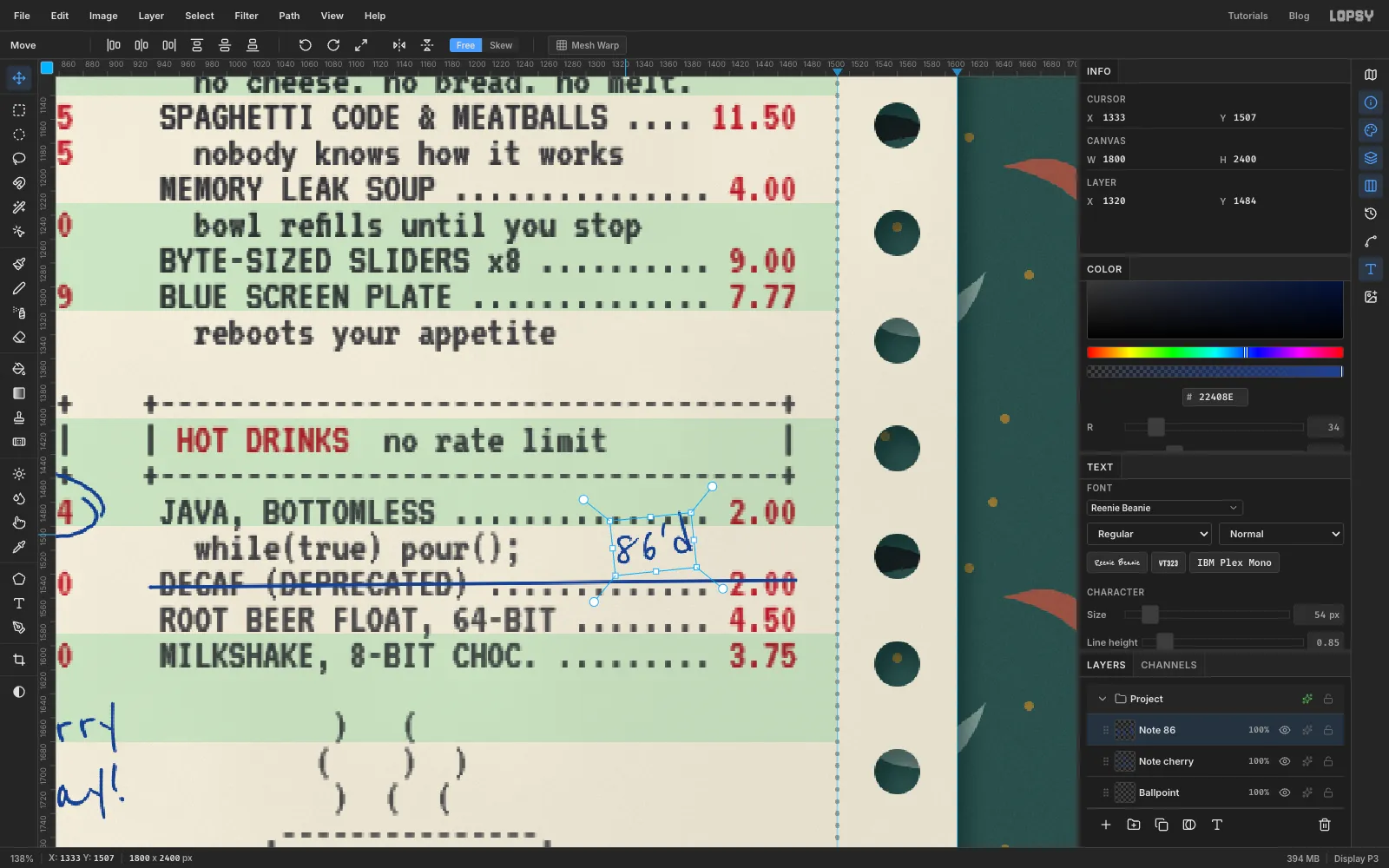
- To cross out a line, click at the start of DECAF and Shift-click past its price.
- To circle a price, drag one loose loop around the pie's 3.14 and let the end overshoot the start, the way a hand does.
Then switch to the Text tool, choose Reenie Beanie at 54 px in the same blue, and click in the clear space on the row above the crossed-out price to write 86'd (diner slang for "we're out"). Drag it with the Move tool so it sits right above the struck-out 2.00.
-
Write a note and tilt the handwriting
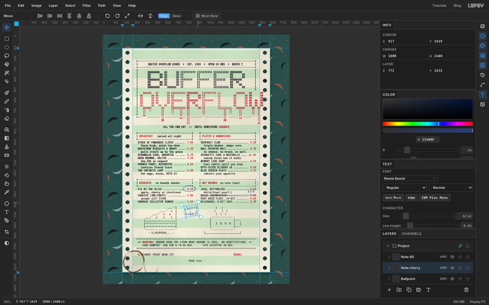
Make another Reenie Beanie text at 62 px with Line height 0.85 in the clear space beside the pie: cherry on one line and today! on the next. With the Move tool, drag just outside a corner handle until the cursor turns into a curved arrow, then turn the note a little anticlockwise, about as far as a minute hand moves in a minute and a half. Press Cmd+D to commit. Tilt 86'd a few degrees the same way. Nobody writes level on a menu.
Back on the Ballpoint layer, draw an arrow from the note towards the pie with one curved stroke, plus two short Shift-click barbs at the tip. Stop it a little short of the pie so it doesn't touch the ASCII art.
Click Coffee Ring, Shift-click the top note, and choose Layer → Group Layers. Name the group Diner Marks.
-
Select the whole sheet
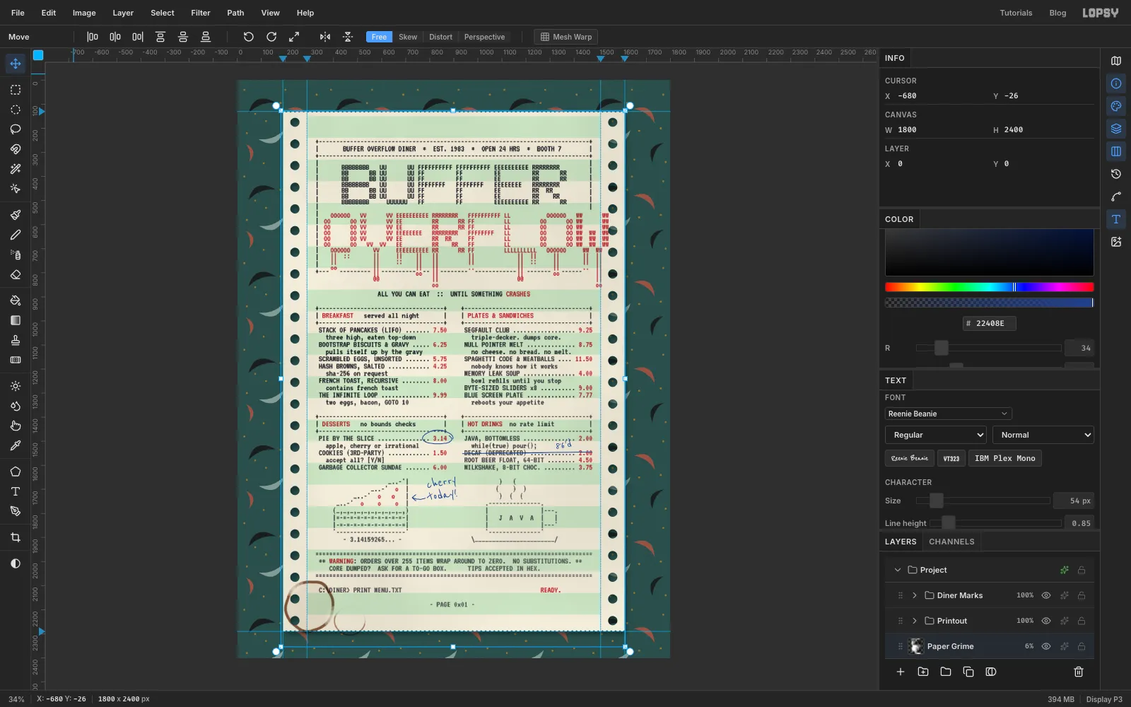
The last touch is to knock the sheet off square, as if it had been dropped on the counter. Collapse the groups. Click Fanfold Paper, then Shift-click Diner Marks, so Fanfold Paper, Paper Grime, Printout and Diner Marks are all selected. Leave the Background out. Pick the Move tool with nothing selected on the canvas. One set of handles appears around everything you selected.
-
Rotate the sheet
Drag just outside the top-right handle and turn the sheet slightly anticlockwise, until its top edge drops by about 40 px across its width. It doesn't need more than that. Everything turns together around the middle: paper, shadow, ink, pen marks and stains. Press Cmd+D to commit.
Press Cmd+Z and Cmd+Shift+Z to flick between straight and tilted and judge the angle. Then delete the empty Ink Anchor layer, export with File → Quick Export PNG and save the project with File → Save Project.