Design a Constructivist Restaurant Menu with Photomontage
Build a Rodchenko-style canteen menu in Lopsy from a public-domain photo, with a duotone cutout, a diagonal masthead band, a coin badge and aligned prices.
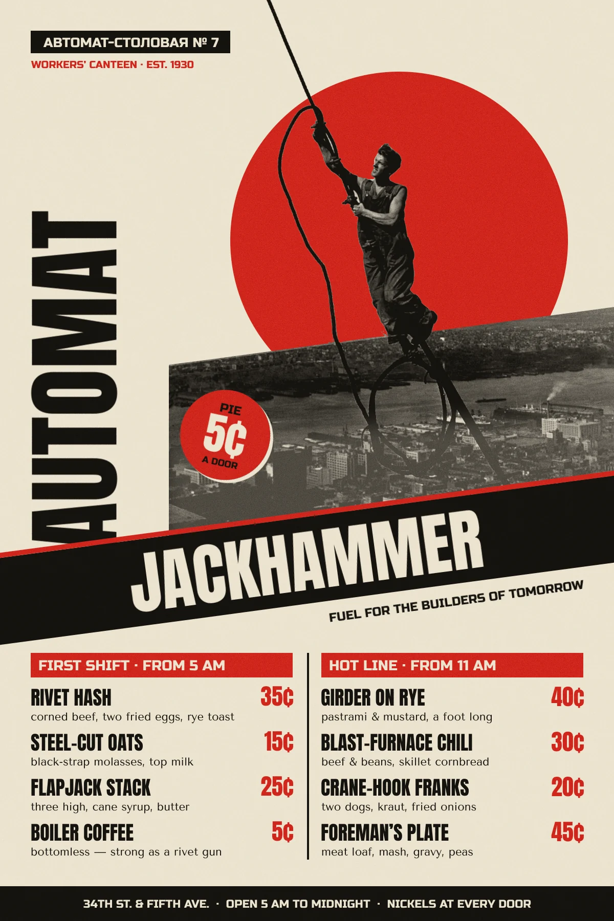
Soviet constructivist posters from the 1920s were built from a small kit of parts:
- a cut-out photograph,
- one flat red,
- black bars at a steep diagonal, and
- heavy sans-serif type set sideways.
Rodchenko used that kit to sell biscuits and books, so it suits a menu as well. This tutorial makes a menu for a made-up 1930 workers' canteen beside the Empire State Building construction site: Jackhammer Automat, "fuel for the builders of tomorrow".
The photo is Lewis Hine's Icarus, Empire State Building (1930). The Metropolitan Museum of Art has released it as CC0 on Wikimedia Commons (Icarus, Empire State Building MET DP106525.jpg). Download the 1920 px version. The cable the worker is riding gives the whole design its diagonal.
The palette is one paper, one ink and one red:
-
Paper
-
Ink
-
Constructivist red
Fonts: Anton for the masthead, the vertical word and the dish names, Russo One for labels and the Cyrillic, and Tenor Sans for the descriptions.
-
Set up the page and guides
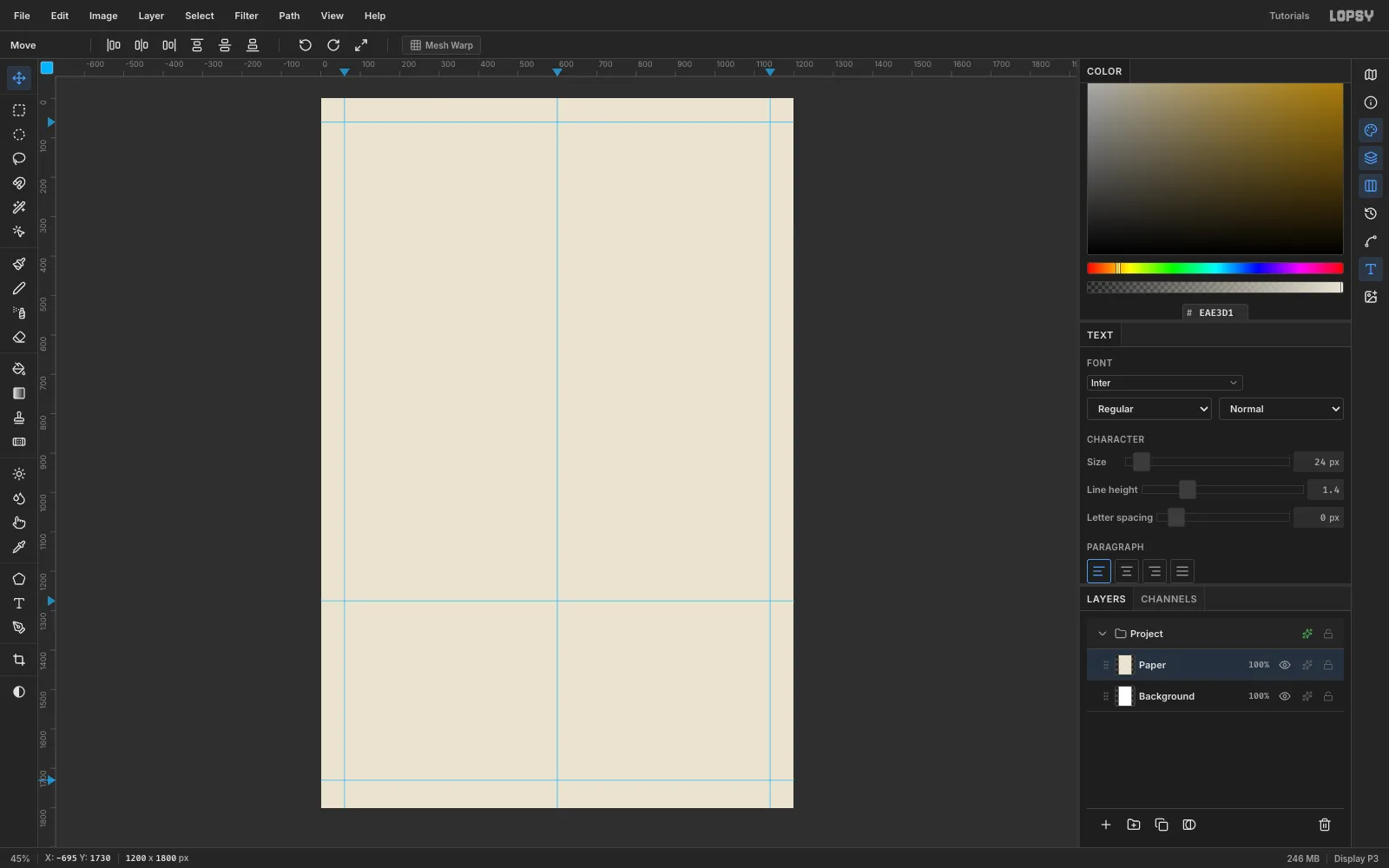
- Create a 1200 × 1800 px document with a white background. Keep the unit on Pixels.
- Rename Layer 1 to
Paperand fill it with (Edit → Fill). - Click the rulers to add guides. A click on the top ruler adds a vertical guide, and a click on the left ruler adds a horizontal one.
- Vertical guides: 60, 600 and 1140 (the margins and the column split).
- Horizontal guides: 60, 1275 (the top of the menu) and 1730 (the top of the footer).
-
Draw the red sun
- Add a layer called
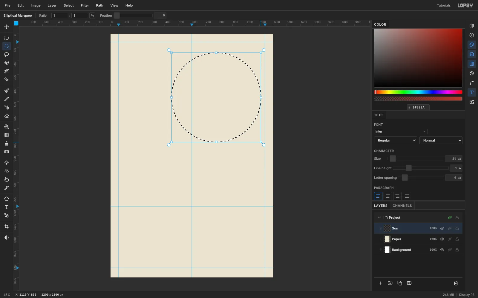
Sun. - With the Elliptical Marquee, drag a circle from (450, 140) to (1110, 800). That is a 660 px sun centred at (780, 470).
- Fill it with the red , then press Cmd+D.
This is the only large red shape in the design. Everything else in red stays small, so the sun keeps its weight.
- Add a layer called
-
Paste and scale the photo
- With
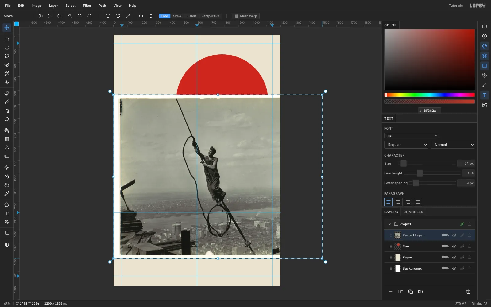
Sunactive, copy the photo and press Cmd+V. Lopsy fits it to the canvas, centres it and switches to the Move tool with the transform box live. - Hold Cmd and drag the bottom-right handle out so the photo is about 1500 × 1176 px. The top-left corner stays pinned.
- Press Cmd+D to commit, rename the layer
Icarus, and drag it 47 px right and 520 px up. The worker's fist should sit inside the sun, near its top-left.
Most of the photo now runs off the top and right of the canvas. That's fine, because you'll cut away the sky.
- With
-
Desaturate and punch up the contrast
- Run Filter → Desaturate.
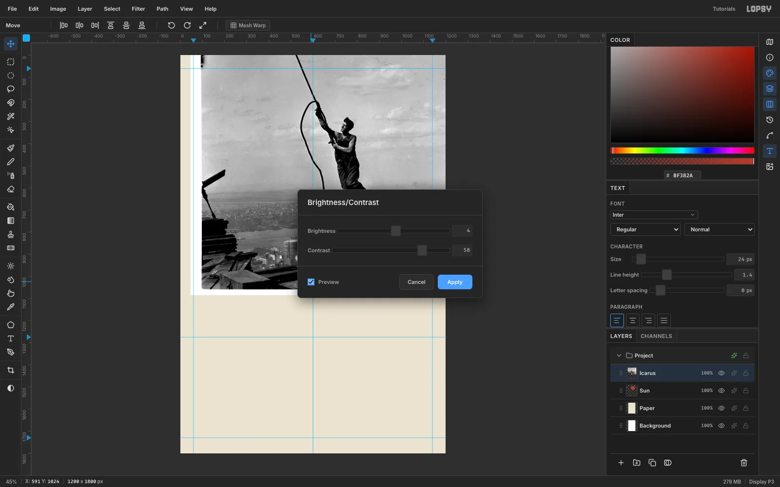
- Open Filter → Brightness/Contrast…, set Brightness 4 and Contrast 58, and check that Preview is on.
The overalls and cable should reach near black, and the sky should stay light grey. Strong blacks are what make the cutout read as a print later.
-
Protect the face before you cut
The worker's face and arms are nearly as pale as the sky. The Magic Wand would eat straight through his nose and chin, so copy them to a layer of their own first.
- Zoom in on the worker (Ctrl + scroll wheel).
- With the Lasso, trace just inside the lit skin: the hair, the forehead, the nose, the lips, the chin and neck, the top of the shoulder and the lower hand. Follow the dark hair and clothing edges wherever they touch sky.
- Press Cmd+C, wait a second, then press Cmd+V. An internal copy pastes back in place, on a new layer above the photo.
- Rename the new layer
Figure.
However hard the wand bites the photo below, the face now survives on the
Figurelayer.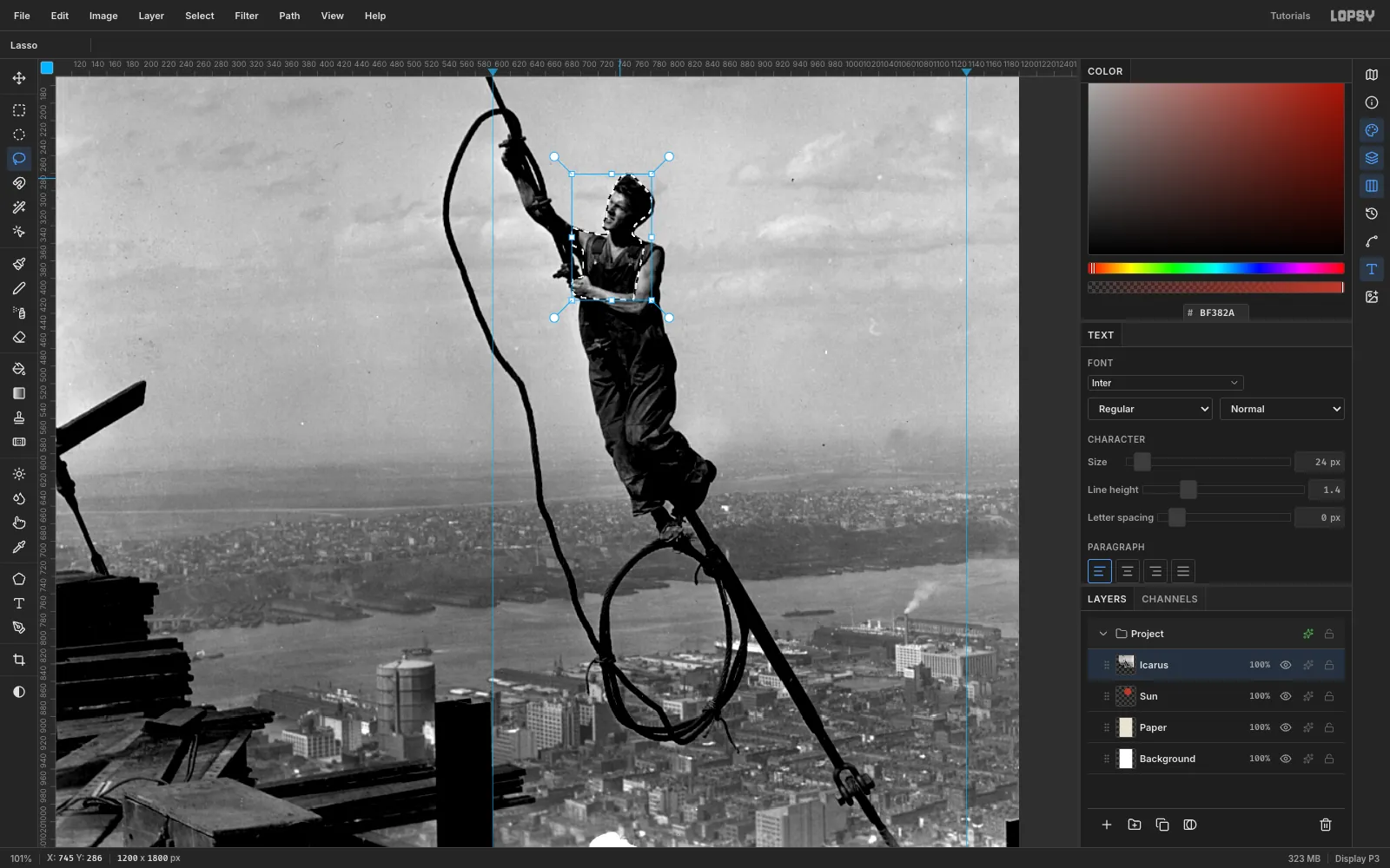
-
Cut the city into a hard-edged block
Constructivist photomontage cuts photos with a ruler, not around the subject. Lift the city onto its own slab:
- On
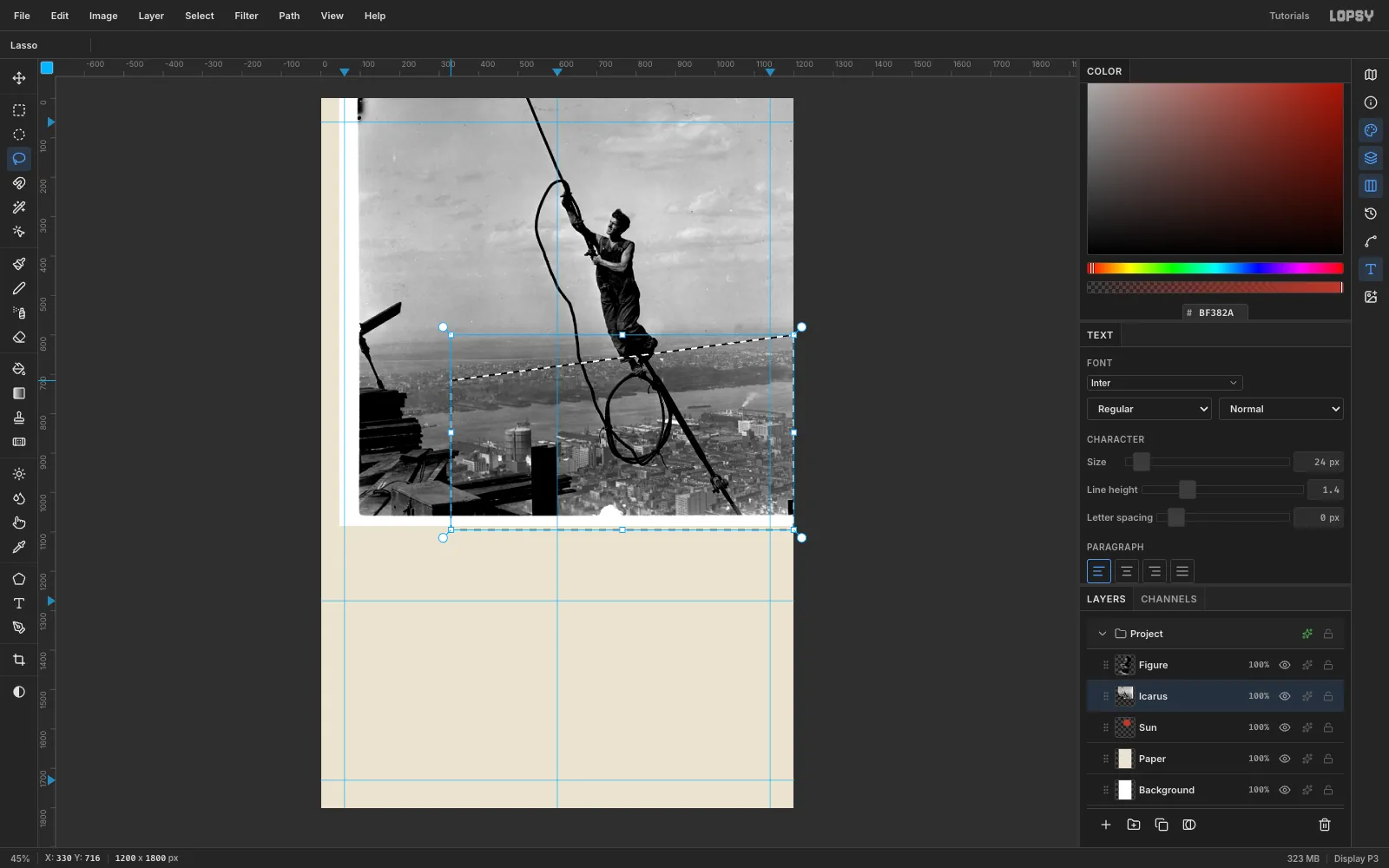
Icarus, lasso a four-sided shape with corners at (330, 716), (1215, 598), (1215, 1095) and (330, 1095). The top edge climbs at the same angle the black band will use. - Press Cmd+C, wait, then Cmd+V, and rename the new layer
City.
The haze on the horizon has no clean edge, so a ruled cut is both easier and more authentic than tracing it.
- On
-
Wand away the sky
- Select
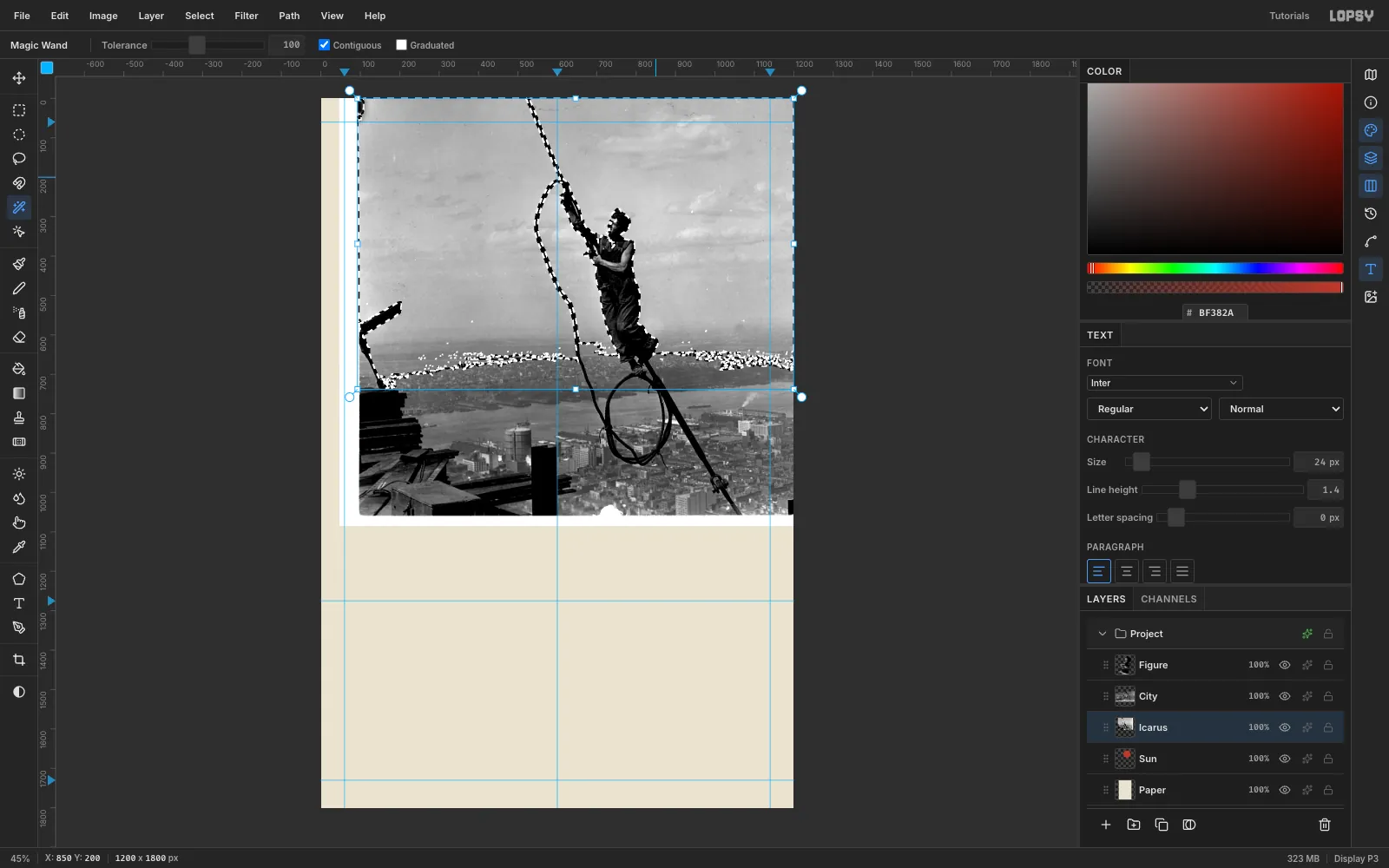
Icarusand pick the Magic Wand. Set Tolerance to 100, turn Contiguous on and Graduated off. - Click the sky, then Shift-click every separate pocket of sky: inside the cable loop, between the cable and the worker, and down both sides.
- Run Select → Feather… at 1 px. It softens the stair-stepped wand edge without leaving a halo.
- Press Delete, then Cmd+D.
- Lasso everything left of the city block and the timbers in the bottom-left corner, and delete that too.
Then zoom along the cable and the legs. Lasso any leftover specks of haze above the city's cut line and delete them. Stay above the line, so the city block's top edge stays razor straight.
- Select
-
Turn the photo into a duotone
- In the Layers panel, click
Icarus, then Shift-clickFigureto select all three photo layers. - Choose Layer → Group Layers and rename the group
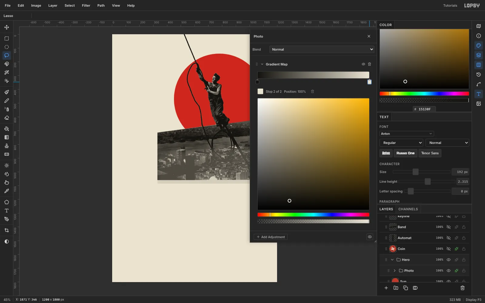
Photo. - Open the group's effects drawer (the sparkle button on its row) and click Add Adjustment → Gradient Map.
- Click the left stop and set it to ink . Click the right stop and set it to paper .
Every grey in the photo now maps onto your two printing colours, so the photo's whites are the paper, not a cold grey.
Finally, select
Cityand run Brightness/Contrast at −22 / +34. The skyline gets real blacks, so it reads as a slab and not as haze.That can crush the bottom of the slab into a solid black mass against the band. To lift it:
- Lasso the lower part of the city, from about y 860 down past the band.
- Run Select → Feather… at 40 px.
- Run Brightness/Contrast at +20 / −6.
The feather hides the edge of the change.
- In the Layers panel, click
-
Lay the black band and its red keyline
- Add a layer called
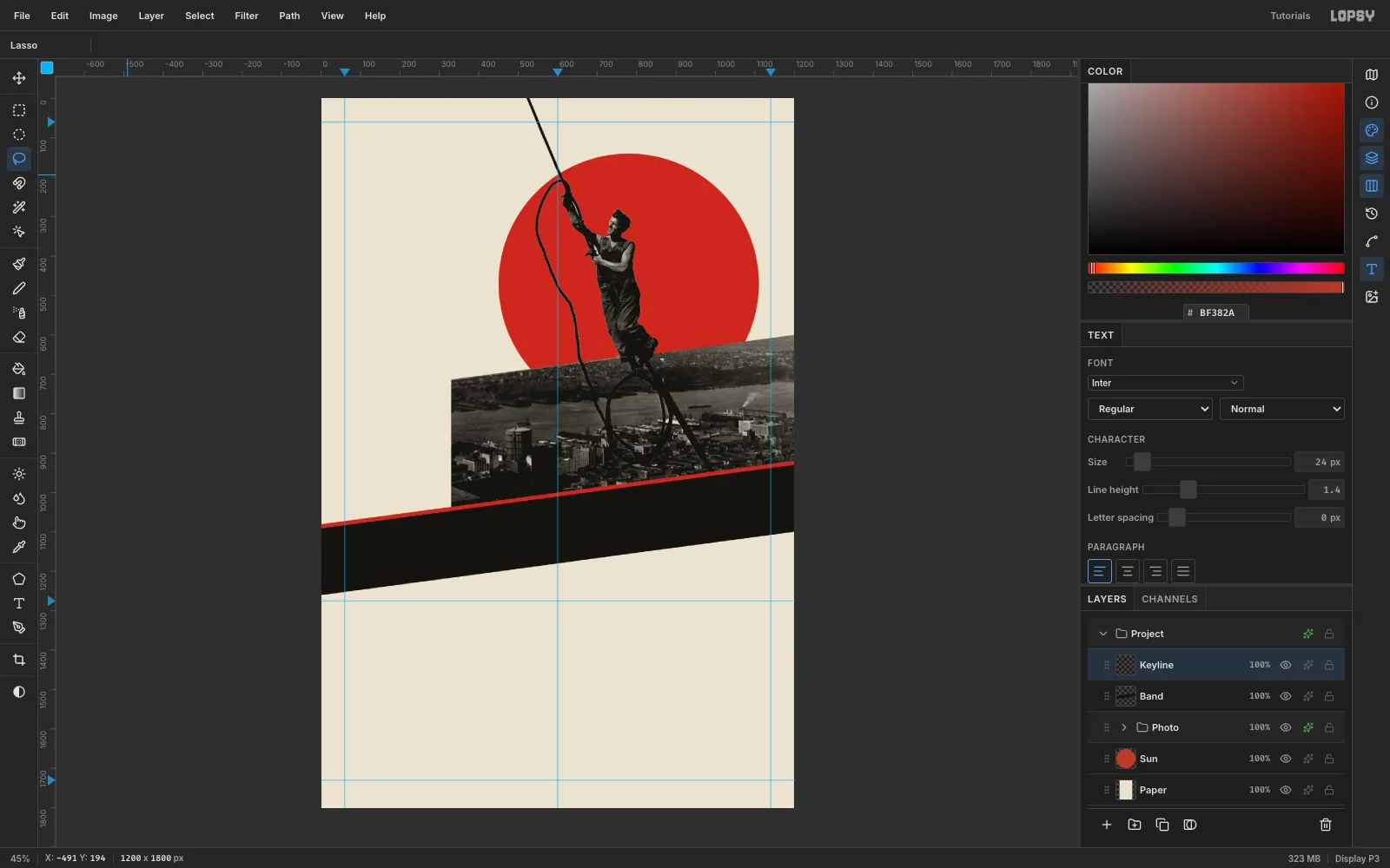
Bandand drag it above thePhotogroup. - Lasso a strip whose top edge runs from (−20, 1093) to (1220, 927) and whose bottom edge runs from (−20, 1263) to (1220, 1097). Start the lasso on the canvas; points can then run past the edges. Fill it with ink.
- Add a layer called
Keylineand fill a 10 px strip along the band's top edge with red.
The slope is −7.6° (it rises 2 px for every 15 px across). The city's top edge, the band and every rotated word share this one angle.
The keyline matters more than it looks: without it, the dark girders at the bottom of the photo merge into the black band.
- Add a layer called
-
Set the masthead on the band
- Click
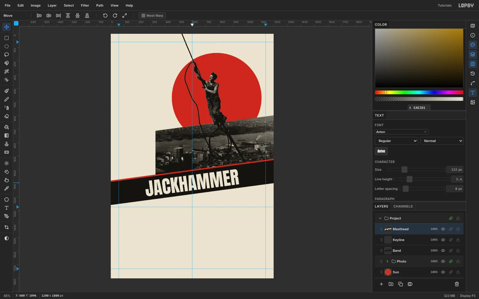
Keyline, pick the Type tool and set Anton at 132 px in paper colour. - Click in an empty part of the page and type
JACKHAMMER, then press Tab to commit. - Click Rasterize Layer in the Layers panel. Rotated live text is fragile, so rasterize it first.
- Draw a Rectangular Marquee just larger than the word, switch to the Move tool, and drag just outside the top-right corner to rotate it −7.6°.
- Press Cmd+D and drag the word onto the band. Centre it at x 600 with about 27 px of band above and below.
- Click
-
Plug AUTOMAT into the band
- Click
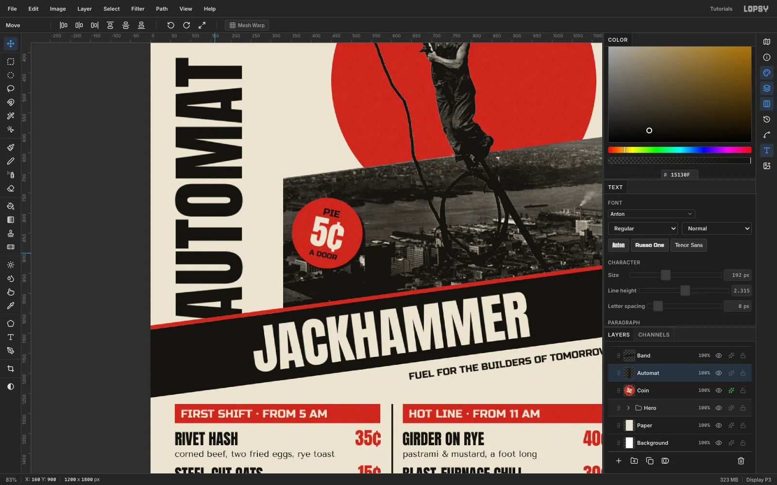
Bandand set Anton at 192 px in ink. TypeAUTOMATin empty canvas, press Tab and rasterize it. - Marquee the word, switch to the Move tool, and hold Cmd while you drag the rotate handle. The angle snaps in 15° steps, so stop at −90°. The word now reads bottom to top.
- Press Cmd+D and move it so its left edge sits on the 60 guide and its bottom at y 1072.
- Drag the
Automatrow belowBandin the Layers panel.
The keyline and band now slice across the foot of the first A at the band's angle: a Lissitzky-style joint where the vertical word plugs into the diagonal. Keep the A's crossbar and counter above the cut, or the word reads "?UTOMAT".
AUTOMAT is set smaller than JACKHAMMER on purpose. It is taller, but JACKHAMMER on its black band must stay the first thing you read.
- Click
-
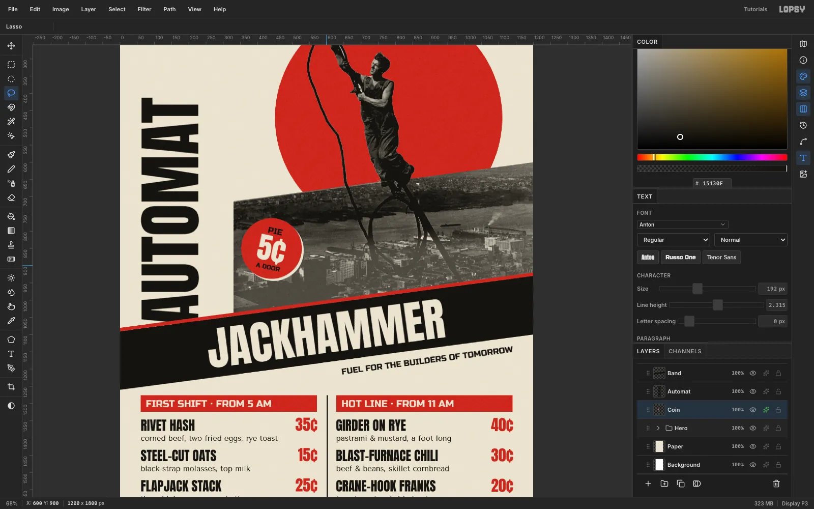
Add the nickel coin
- Click
Automat, add a layer calledCoin, and fill a 176 px circle centred at (440, 850) in red. - Add three centred lines:
PIEin Russo One 24 px, ink,5¢in Anton 84 px, paper, andA DOORin Russo One 18 px, ink.
Leave about 24 px of red above PIE and below A DOOR.
- Rasterize the three text layers. Click the top one and run Layer → Merge Down three times, which merges them into the disc.
- Marquee the coin and rotate it +12°. That's a deliberate counter-diagonal against the band.
- In Layer effects → Drop Shadow, set Color to paper, Offset 6 / 6, Blur 0 and Opacity 100.
A black shadow disappears into the dark city. A paper-coloured one reads like a second, misregistered print pass.
- Click
-
Rule the menu on a grid
- Select
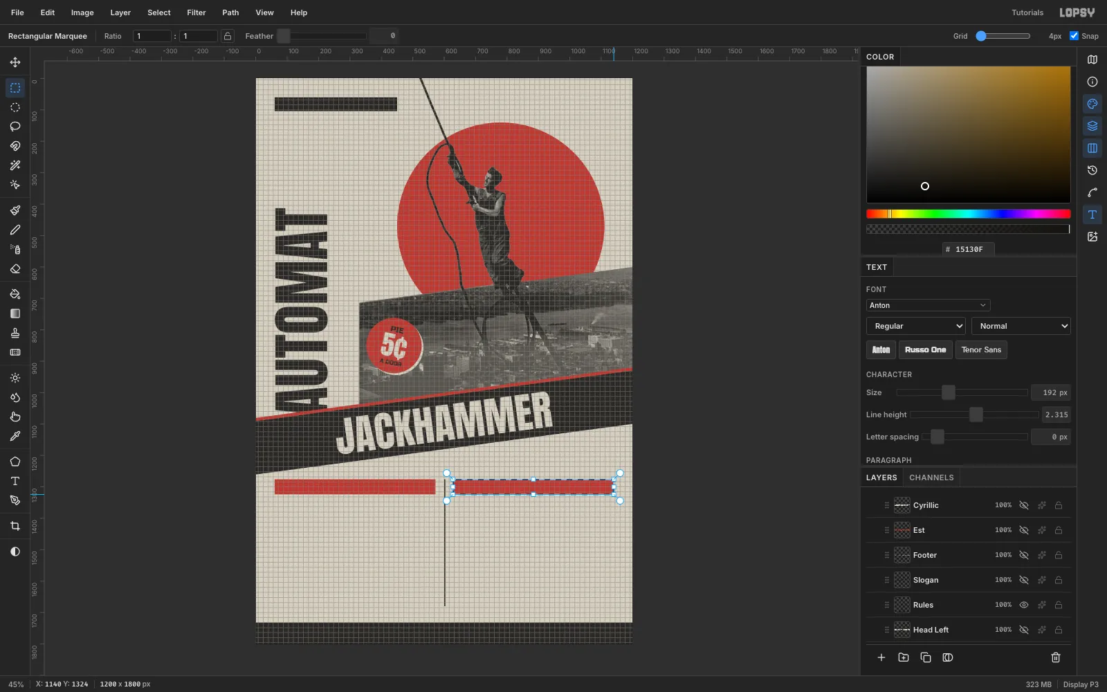
Masthead, click New Group and call the groupMenu. Add a layer calledHeader Barsinside it. - Turn on View → Show Grid, set Grid to 4 px, and tick Snap.
- Snap two red bars from (60, 1276) to (572, 1324) and from (628, 1276) to (1140, 1324).
- On a
Ruleslayer, snap these in ink:
- a 4 px column rule down the centre, from y 1276 to 1680,
- a 68 px footer bar across the bottom, and
- a nameplate bar from (60, 60) to (450, 104). It ends exactly at the sun's left edge.
- Hide the grid and untick Snap before you place any type. With snap on, arrow nudges jump a whole grid cell.
- Select
-
Set the dishes and align the prices
Put each block of type in its own text layer, and space the lines with Line height instead of typing one layer per line.
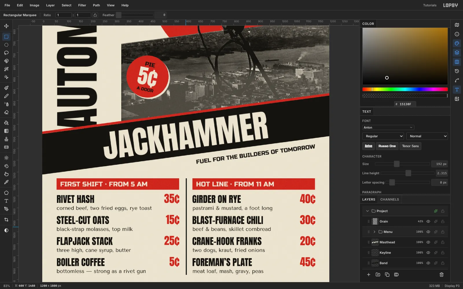
- Headers:
FIRST SHIFT · FROM 5 AMandHOT LINE · FROM 11 AMin Russo One 28 px, paper, 16 px in from the left of each bar and centred vertically. - Dish names: Anton 38 px, ink, with Line height set to 2.316 in the Text panel before you click, to give an 88 px pitch. Type all four names as one block per column. Left column:
RIVET HASH,STEEL-CUT OATS,FLAPJACK STACK,BOILER COFFEE. Right column:GIRDER ON RYE,BLAST-FURNACE CHILI,CRANE-HOOK FRANKS,FOREMAN’S PLATE. - Descriptions: Tenor Sans 22 px with Line height 4 (the same 88 px pitch). Place them 46 px below the names, so each sits about 10 px under its dish.
- Prices: drag an area text box instead of clicking, type the four prices, and set Align to Right in the options bar. Anton 44 px, red, Line height 2. Move each block so its right edge sits on the header bar's right edge (572 and 1140).
Point text ignores alignment, but area text doesn't. A right-aligned area box lines up
5¢under35¢exactly.Reset Line height to 1.4 when you're done, because the Text panel remembers it for the next layer.
- Headers:
-
Add the nameplate, slogan and footer
- Nameplate:
АВТОМАТ-СТОЛОВАЯ № 7("Automat-Canteen No. 7") in Russo One 26 px, paper, centred on the black bar. Russo One has Cyrillic, and pasting the text with Cmd+V is the most reliable way to enter it. - Subline:
WORKERS’ CANTEEN · EST. 1930in Russo One 20 px, red, 14 px under the bar. - Slogan:
FUEL FOR THE BUILDERS OF TOMORROWin Russo One 24 px, ink. Rasterize it, rotate it −7.6°, and tuck it under the band with its right end on the 1140 guide. - Footer:
34TH ST. & FIFTH AVE. · OPEN 5 AM TO MIDNIGHT · NICKELS AT EVERY DOORin Russo One 22 px, paper, centred in the footer bar.
To finish the structure, select
Sunand Shift-click thePhotogroup, then choose Layer → Group Layers and call the groupHero. Now you can drag the whole sun-and-photo unit around to test the balance. Cmd+Z and Shift+Cmd+Z step it back and forth exactly.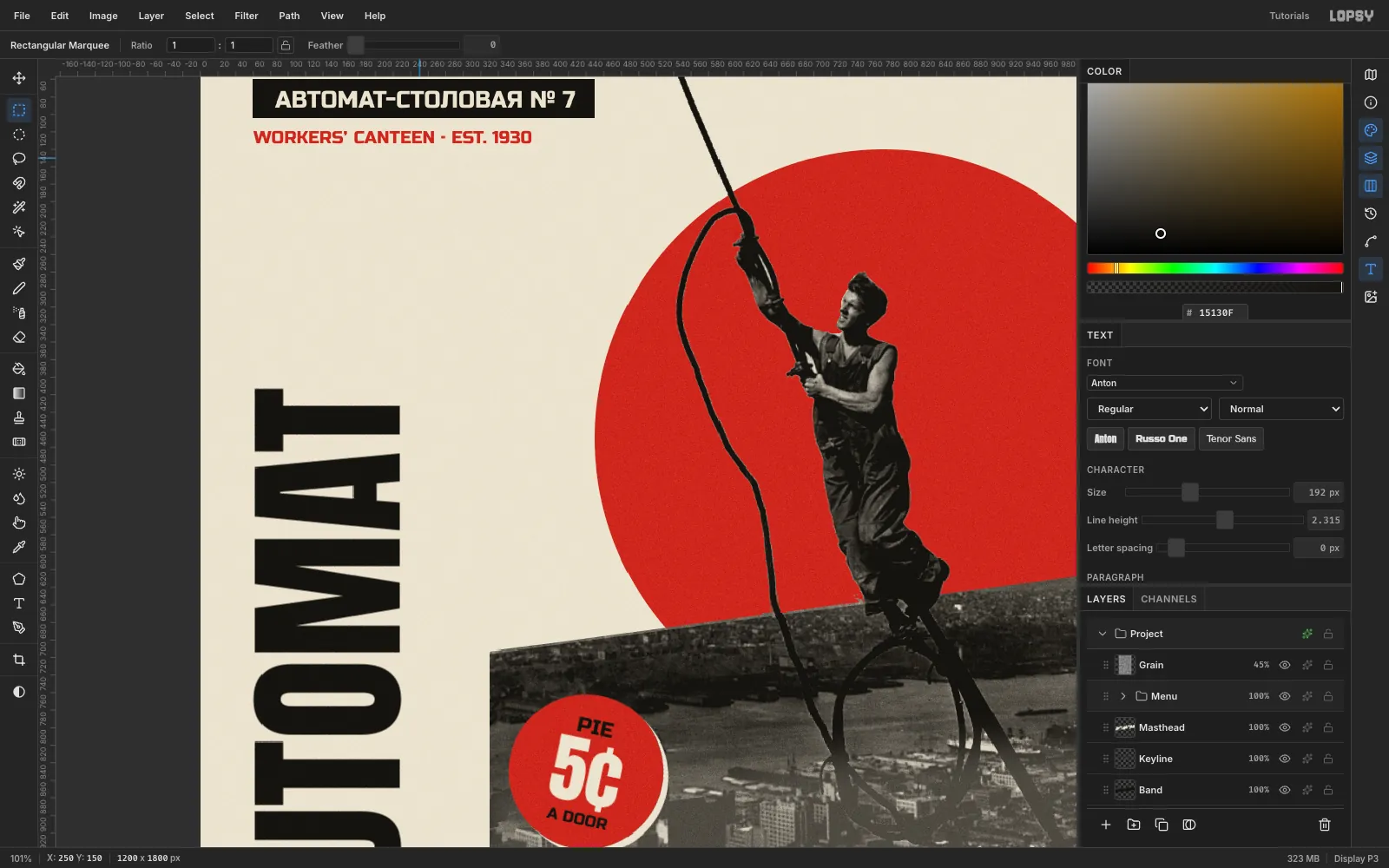
- Nameplate:
-
Print it on paper
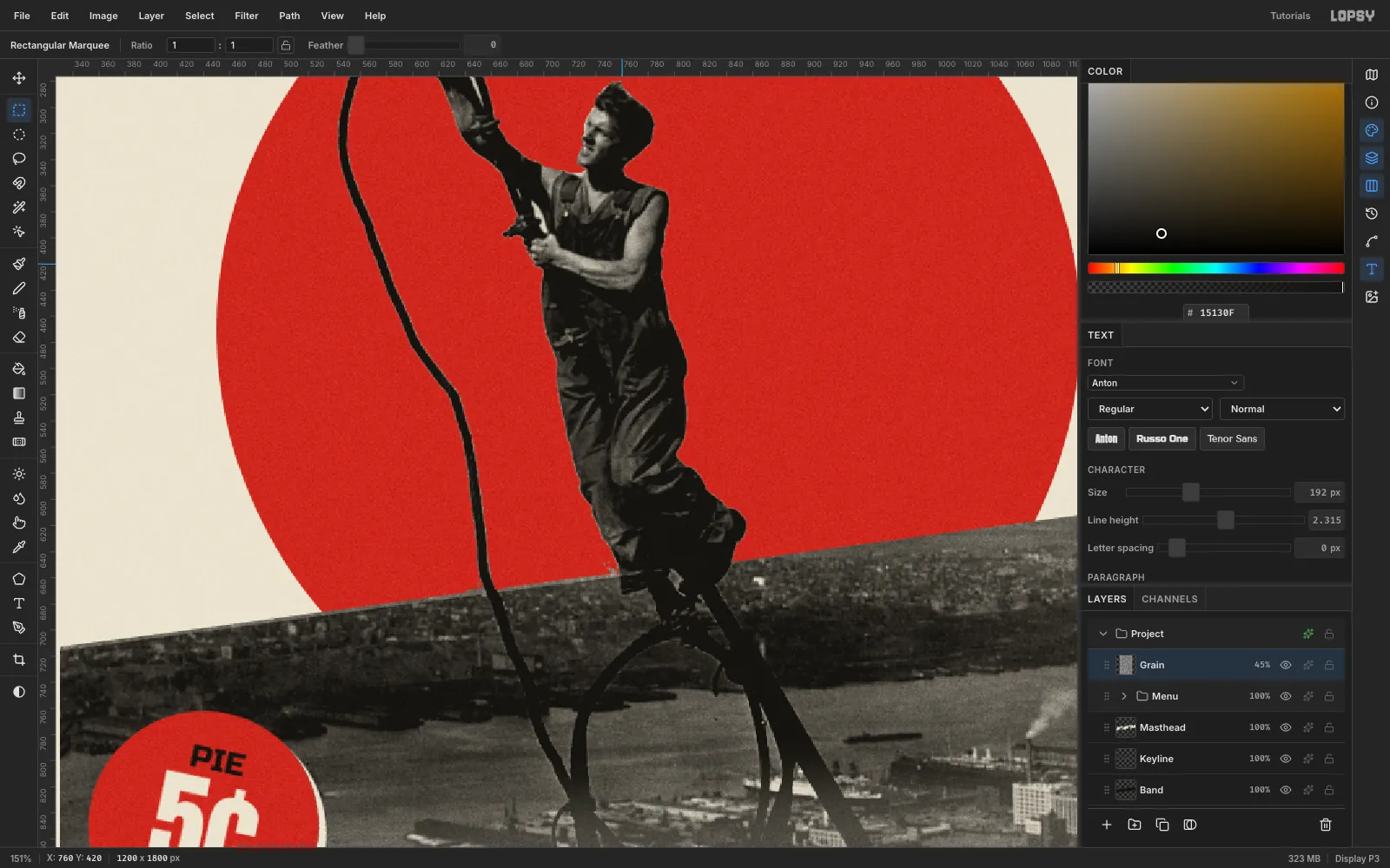
A flat red on flat cream still looks like a screen. Add a grain layer at the very top of the stack, above the
Menugroup:- Fill it with .
- Run Filter → Add Noise… at 100, Mono, Gaussian.
- Run Gaussian Blur at 1.2, so the grain looks like paper tooth, not digital noise.
- Set the layer to Overlay at 45%.
Export with File → Quick Export PNG, and keep the layers with File → Save Project.