Design a Dadaist Collage Restaurant Menu
Make a Dada sausage-stand menu in Lopsy with giant scattered red letters, torn paper slips, a found engraving, a rubber stamp and print wear.
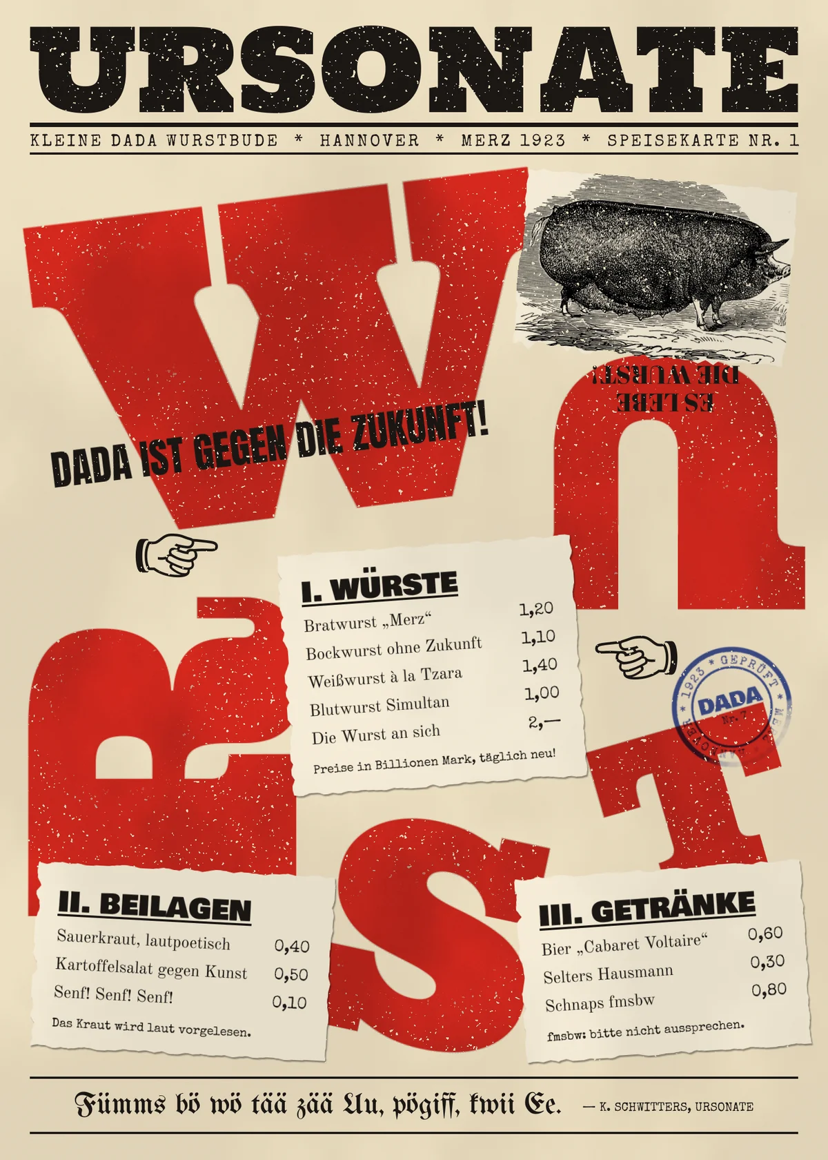
In 1922 Kurt Schwitters and Theo van Doesburg printed the Kleine Dada Soirée poster: a huge red DADA scattered in every direction, overprinted with black type in a dozen faces. In this tutorial you'll borrow that idea for a menu. Ursonate Wurst is a made-up 1923 Hannover sausage stand named after Schwitters' sound poem Ursonate. Its prices are "in billions of marks, new every day", a hyperinflation joke.
The menu works because one rule holds the chaos together. The red letters go wherever they like, but everything a diner has to read is printed on calm paper slips with even margins.
Along the way you'll use:
- point text, area text with left and right alignment, underline and letter spacing
- Rasterize Layer, ⌘-drag scaling, rotate handles and 180° flips
- Clouds, Add Noise, Gaussian Blur and Threshold
- the Magic Wand to cut one layer to another layer's shape
- a pasted public-domain engraving, torn-edge lassos and Merge Down
- text on a circular path for a rubber stamp
- Multiply, Soft Light and Lighten blend modes
- groups, guides and the Eraser
The palette is two inks, a stamp colour and two papers:
-
Newsprint
-
slip paper
-
Vermilion
-
Ink black
-
Stamp blue
-
Lay down the newsprint
Open Lopsy. In the New Document dialog, set Width
1500and Height2100, choose a White background and click Create.- Select Background, set the foreground to and choose Edit → Fill.
- Rename Layer 1 to
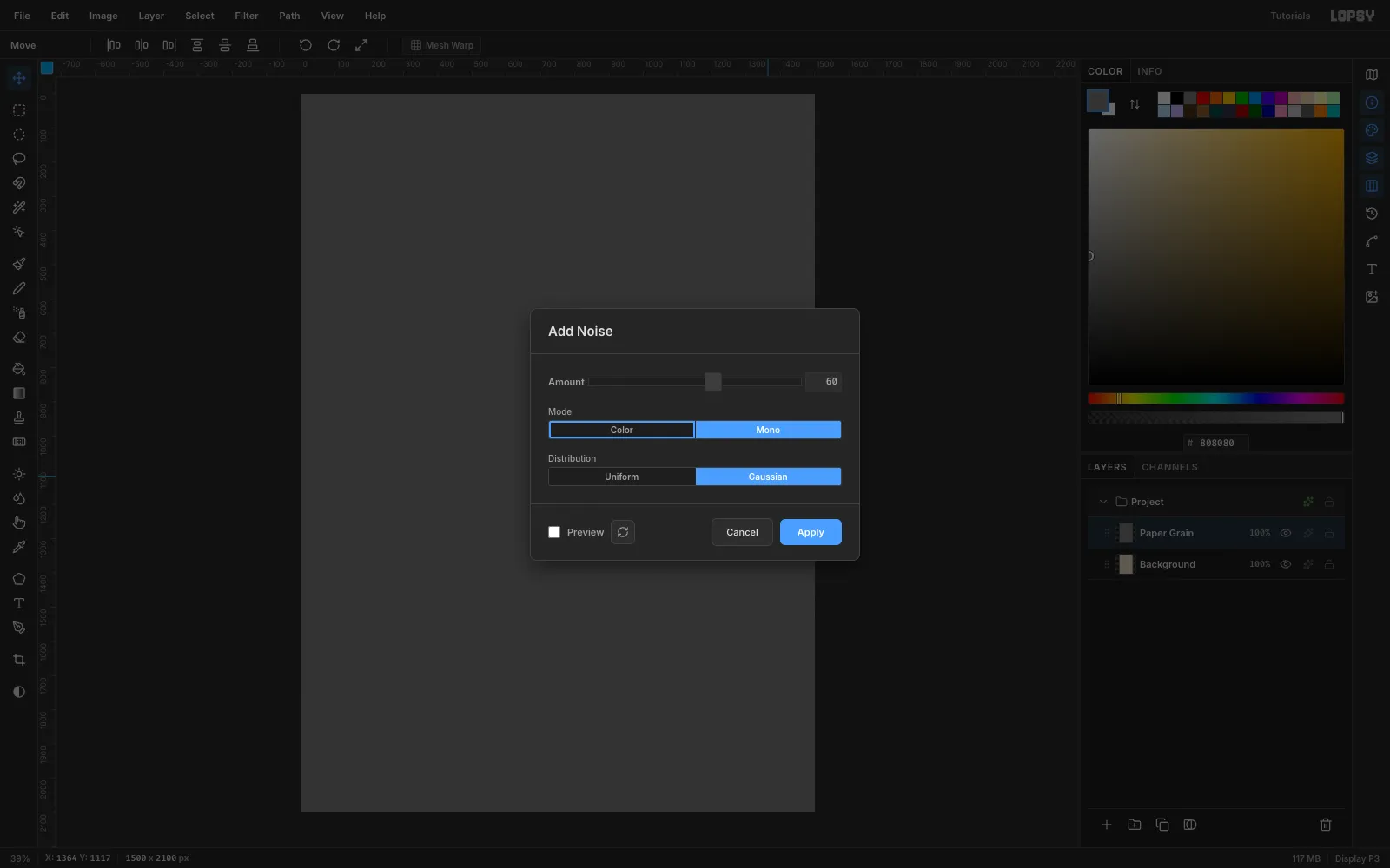
Paper Grain, fill it with , then choose Filter → Add Noise…. Set Amount60, click Mono and Gaussian, and Apply. - Open the layer's effects (✦), set the blend mode to Soft Light, and set its opacity to 35%.
- Add a layer named
Toning, fill it white, run Filter → Clouds… and set it to Multiply at 6%.
Keep Paper Grain and Toning at the top of the stack as you go. They texture every ink above the paper, so the whole sheet looks printed at once.
-
Set a giant W
Choose New Group in the Layers panel and name it
Red Letters. With the group selected, click Add Layer and name the new layerRed Anchor. Type every red letter with this layer selected, so they all land in the group.Pick the Text tool (T). Choose Ultra in the font browser, type
800into the Size field (the slider stops at 500) and set the colour to . Click in the canvas, typeWand press Tab. Click Rasterize Layer in the Layers footer.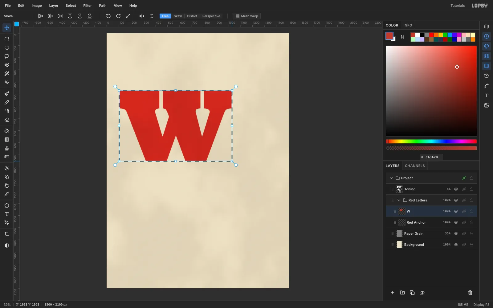
-
Tilt it
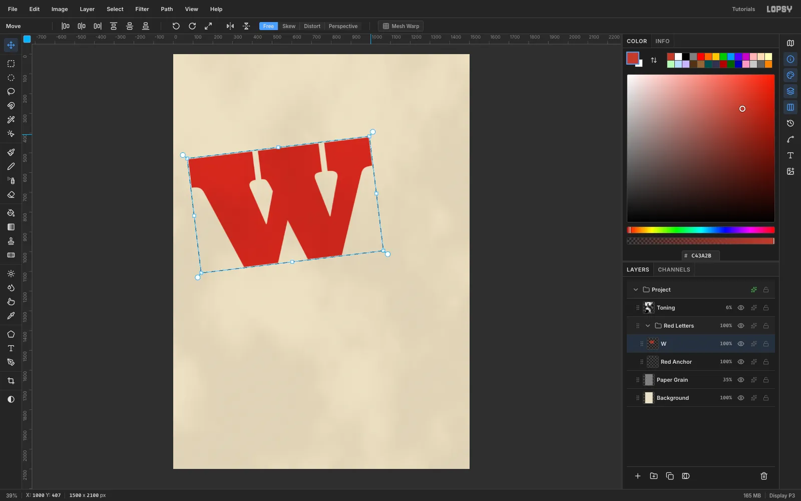
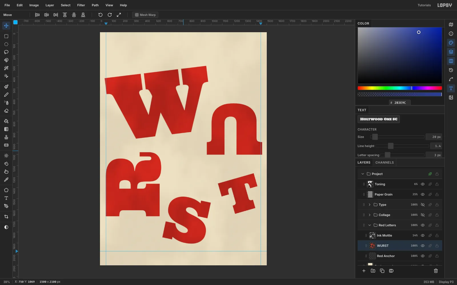
Marquee the W. Switch to the Move tool (V), hover just outside the top-right corner until the cursor turns into a crosshair, then drag to rotate it about −7°. Press Cmd+D and drag the W so its top-left sits around (40, 300).
-
Scatter the rest of WURST
Make each remaining letter the same way: select
Red Anchor, type the letter at its size, rasterize it, then rotate and move it.- U: Size
625, rotated 180° so it hangs upside down, at (960, 640) - R: Size
675, rotated −90° so it lies on its back, at (50, 1080) - S: Size
550, rotated 12°, at (560, 1480) - T: Size
425, rotated −16°, at (1060, 1270)
Turned upside down, Ultra's slab feet almost close the U's counter, so it reads as a keyhole. Marquee from (1120, 950) to (1228, 1110) on the U layer and press Delete to open the counter.
- U: Size
-
Add ink density
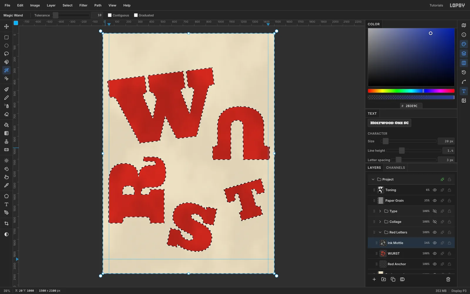
Real litho red is never perfectly flat. Click the W row and choose Layer → Merge Down four times so all five letters become one layer, then rename it
WURST.- Add a layer named
Ink Mottle, fill it white and run Filter → Clouds… with Scale7. - Pick the Magic Wand, untick Contiguous, select WURST and click any empty part of the canvas. That selects everything except the letters.
- Click the Ink Mottle row and press Delete, then Cmd+D.
- Set Ink Mottle to Multiply at 14%.
- Add a layer named
-
Paste in a found engraving
Dada collages reused printed scraps. This one is a public-domain Berkshire pig from Brett's Colonist's Guide (1883), found on Wikimedia Commons.
Collapse Red Letters, create a group named
Collageand drag its grip so it sits above Red Letters. Add a layer namedPig Scrapinside it. Copy the engraving in your browser and press Cmd+V. It lands at the top-left with its transform box live. Cmd-drag the corner down to 56% and press Cmd+D. Rename the layerPig, rotate it about 5° and set it to Multiply so its white paper disappears.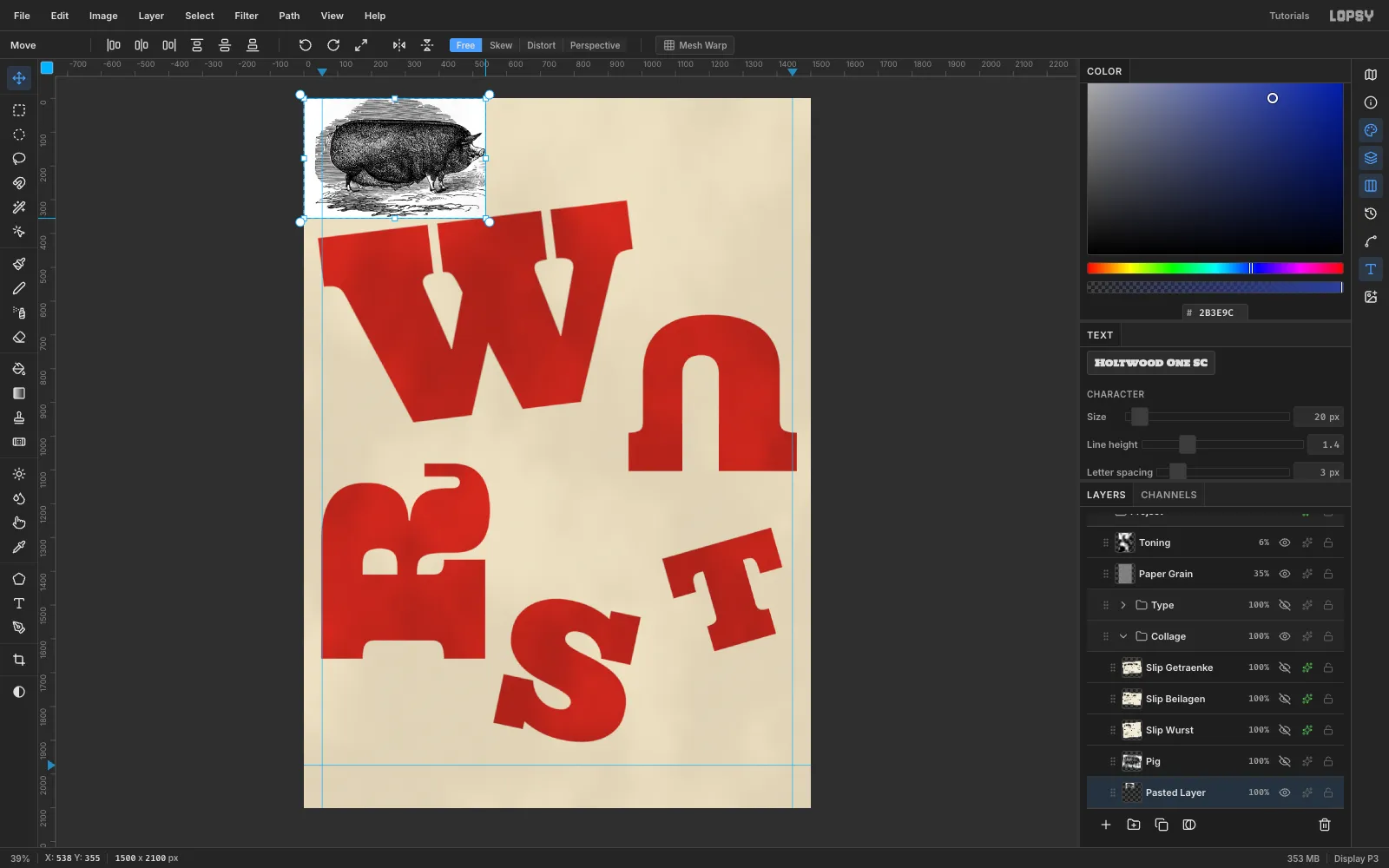
-
Tear it out of the page
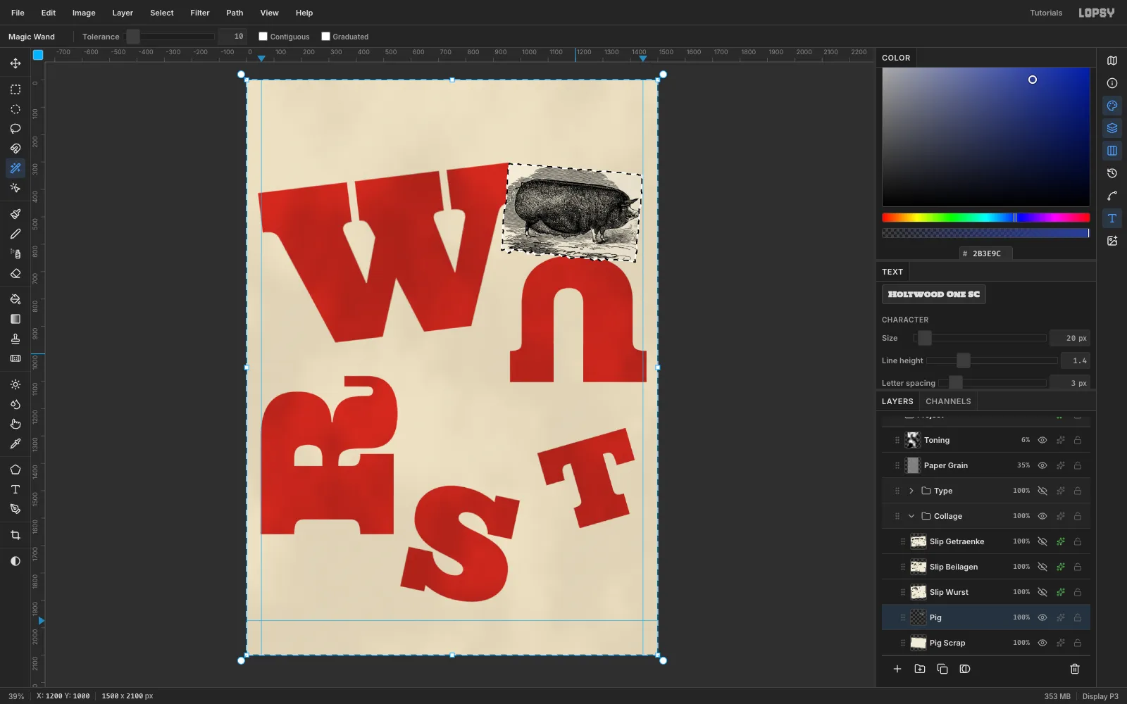
On Pig Scrap, use the Lasso to draw a rough rectangle around the pig, about 490 × 320. Zigzag the edges by a few pixels every 15 px or so, with slightly bigger tears on one side. Fill it with . Place the scrap so its right edge stops at x 1444.
To trim the engraving to the scrap, select Pig Scrap, click its empty surroundings with the Magic Wand (Contiguous off), then click the Pig row and press Delete. The selection survives the row click, so everything outside the paper disappears. Slide the pig before you trim so its snout stays on the paper.
-
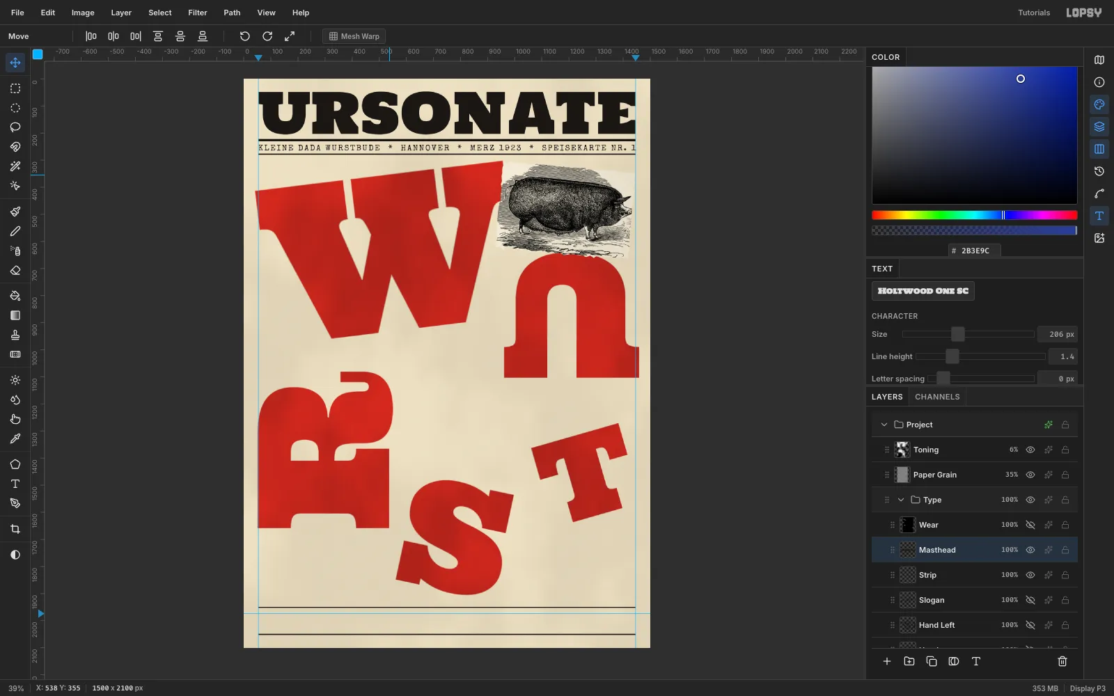
Set the masthead
Create a
Typegroup above Collage with an emptyType Baselayer inside. Click the top ruler at 54 and 1446 to drop margin guides.- With Holtwood One SC at size
206and colour , typeURSONATEand move it to x 54, y 46. - Add a layer named
Rulesand pick the Pencil (N). Its square tip is centred on each click, so start and stop half a tip inside the guides. At Size8, click (58, 226) and Cmd+Shift-click (1442, 226) for a thick rule. At Size4, draw a thin rule from (56, 278) to (1444, 278). - In Special Elite at
30, typeKLEINE DADA WURSTBUDE * HANNOVER * MERZ 1923 * SPEISEKARTE NR. 1. Special Elite has no ✶ glyph, so use typewriter asterisks. - Open the Text panel and raise Letter spacing until the line spans the guides exactly. Here that was
4.3. Centre it between the rules.
- With Holtwood One SC at size
-
Overprint a slogan across the W
Select Rules, choose Anton at
74, and typeDADA IST GEGEN DIE ZUKUNFT!("Dada is against the future"). Then click Rasterize Layer. Marquee it and rotate it about −7° with the rotate handle so its baseline follows the tilt of the W. Press Cmd+D. Black type over the red reads cleanly and gives the giant letter a job.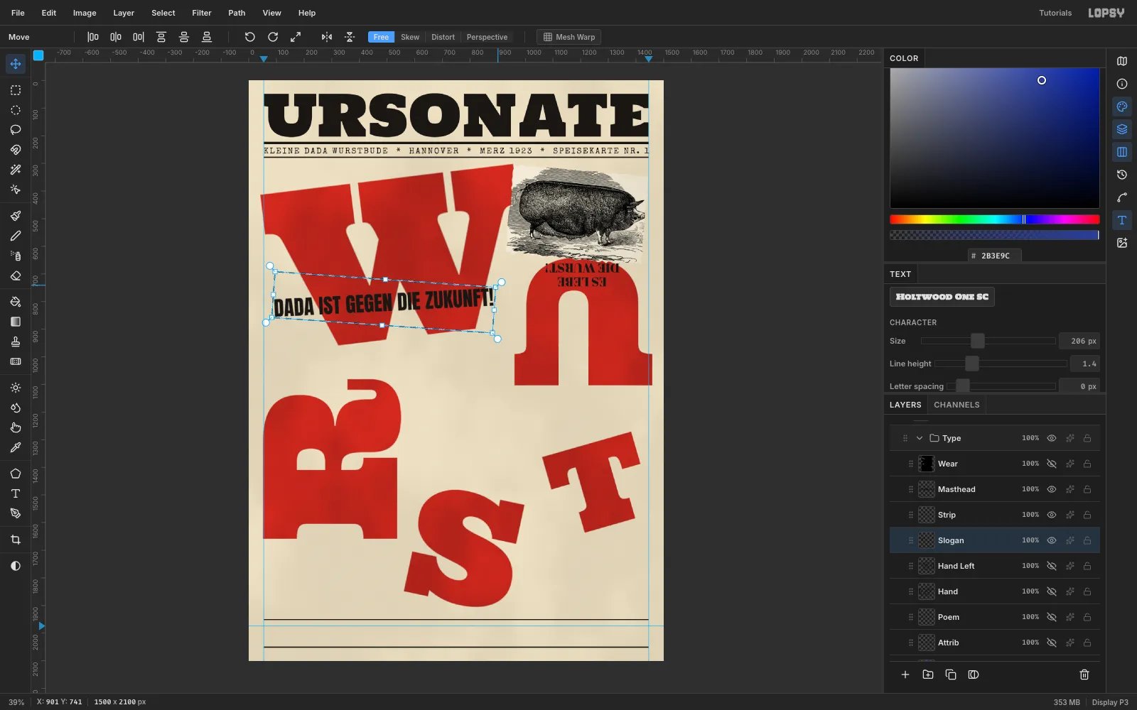
-
Hang a slogan upside down
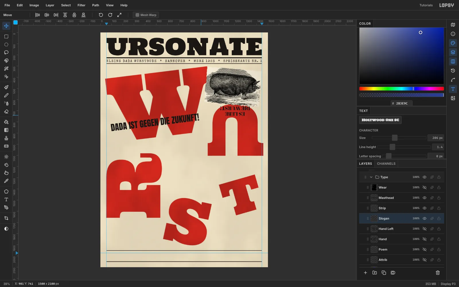
Drag an area-text box about 340 px wide. In the options bar choose Abril Fatface at
56and Align Center, set Line height to1.1in the Text panel, and typeES LEBEEnterDIE WURST!("long live the sausage!").Rasterize it, rotate it 180°, then Cmd-drag it down to 82%. Centre it on the U's arch at about (1206, 703). Check that it sits fully on red, with clear space above the counter and below the pig scrap.
-
Set a menu slip
Each menu section is printed on its own scrap of paper. Inside Collage, add a layer named
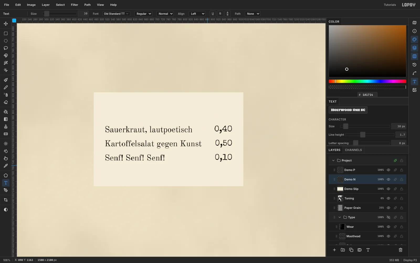
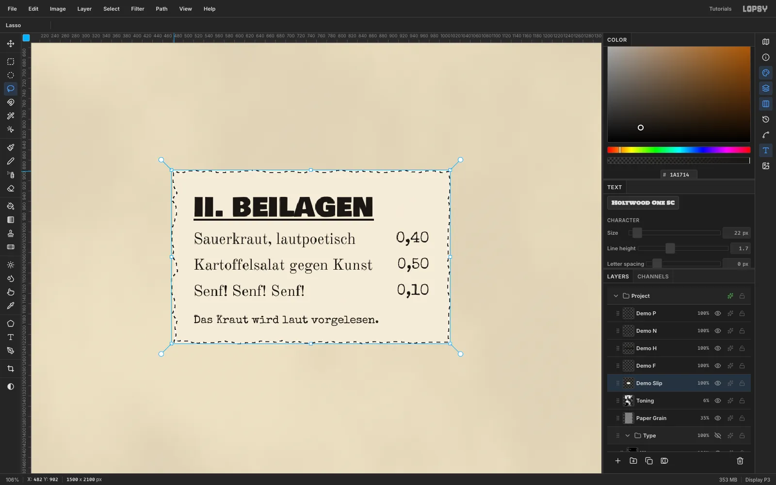
Slip Beilagen, marquee from (60, 1572) to (600, 1909) and fill it with . In the Text panel, set Letter spacing back to0and Line height to1.7, so every row is 51 px apart.- Prices: drag an area box from x 470 to 560, 110 px below the slip's top. Use Special Elite
30with Align Right, and type0,40,0,50and0,10on separate lines. - Dishes: drag a second box from x 100 to 470, starting at the same height. Use Old Standard TT
30with Align Left, and typeSauerkraut, lautpoetisch,Kartoffelsalat gegen KunstandSenf! Senf! Senf!.
Area text has an exact hit box, so the two columns can sit side by side. Keep 40 px of paper on every side and at least 55 px between the longest dish and its price.
- Prices: drag an area box from x 470 to 560, 110 px below the slip's top. Use Special Elite
-
Head it, foot it and tear it
Select the slip layer, turn on Underline in the options bar, and type
II. BEILAGENin Bowlby One SC at50, 40 px in from the top-left. Select the slip layer again and turn underline off. Then addDas Kraut wird laut vorgelesen.in Special Elite22, clicking on blank paper 12 px below the last dish.Lasso a zigzag rectangle 2 px inside the slip, choose Select → Inverse and press Delete. Then click each text row, starting with the one directly above the slip, and choose Layer → Merge Down until the slip is one layer.
-
Paste the slip down
Marquee the slip and rotate it 3°, then press Cmd+D. In its effects add a Drop Shadow with Offset X
2, Offset Y3, Blur3and Opacity40. A tight contact shadow makes it look pasted down; a big soft one makes it float.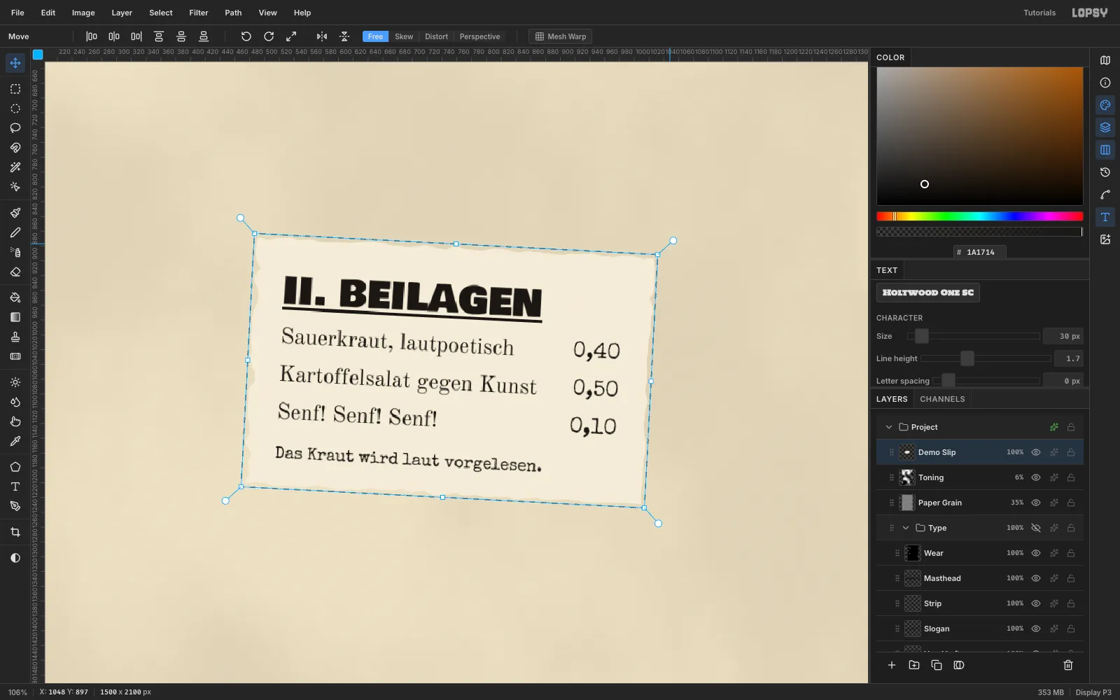
-
Make all three slips match
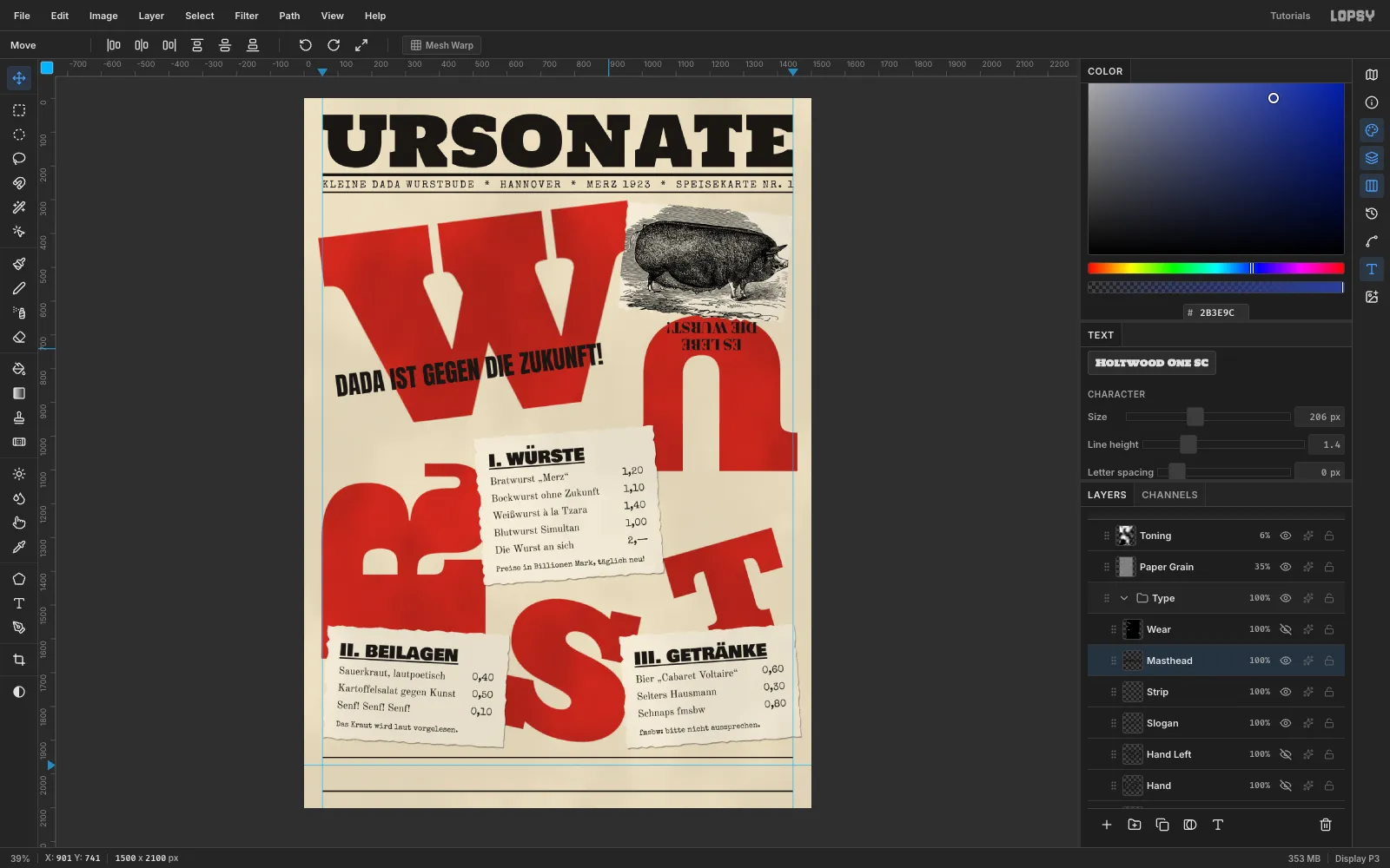
Build the other two slips with exactly the same padding, row pitch, fonts and shadow:
- I. WÜRSTE, from (515, 985) to (1050, 1424), rotated −4°: Bratwurst „Merz“ 1,20 · Bockwurst ohne Zukunft 1,10 · Weißwurst à la Tzara 1,40 · Blutwurst Simultan 1,00 · Die Wurst an sich 2,—, with the footnote
Preise in Billionen Mark, täglich neu! - III. GETRÄNKE, from (942, 1572) to (1462, 1909), rotated −4°: Bier „Cabaret Voltaire“ 0,60 · Selters Hausmann 0,30 · Schnaps fmsbw 0,80, with the footnote
fmsbw: bitte nicht aussprechen.
Number the slips in reading order: I in the middle, then II on the left and III on the right. The red letters can run wild because the slips stay calm and readable.
- I. WÜRSTE, from (515, 985) to (1050, 1424), rotated −4°: Bratwurst „Merz“ 1,20 · Bockwurst ohne Zukunft 1,10 · Weißwurst à la Tzara 1,40 · Blutwurst Simultan 1,00 · Die Wurst an sich 2,—, with the footnote
-
Add printer's fists
In Noto Sans Symbols 2 at
130, paste the glyph☞into a new text layer and rasterize it. Put it at about (245, 965), pointing at the Würste heading.For a matching fist on the other side, marquee it, press Cmd+C and then Cmd+V. The copy lands in place above the original. Choose Image → Flip Horizontal, rename it
Hand Leftand drag it to about (1078, 1150) so it points back at the slip.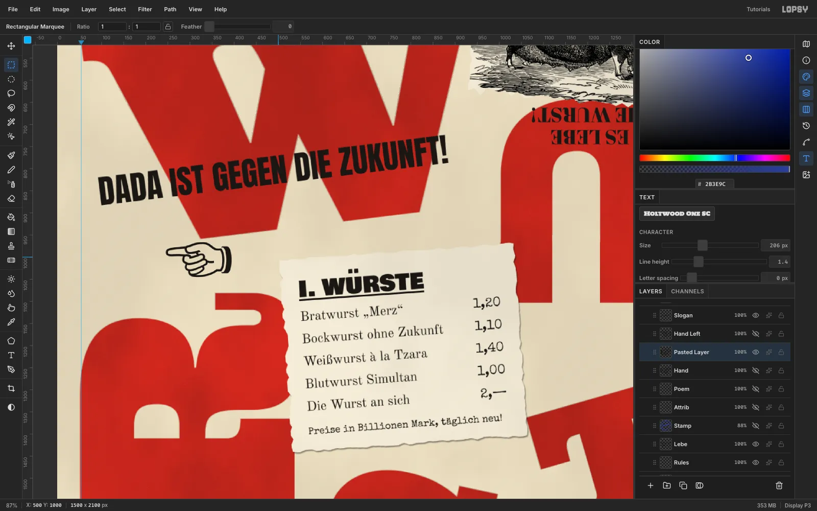
-
Close with a sound-poem footer
On Rules, draw two more Size
4Pencil rules, from (56, 1951) to (1444, 1951) and from (56, 2051) to (1444, 2051). The bottom margin then matches the top.Set the first line of the Ursonate,
Fümms bö wö tää zää Uu, pögiff, kwii Ee., in UnifrakturMaguntia at54. Select Rules again and add— K. SCHWITTERS, URSONATEin Special Elite22. Centre the pair between the guides and the two rules, and line up the attribution with the Fraktur baseline.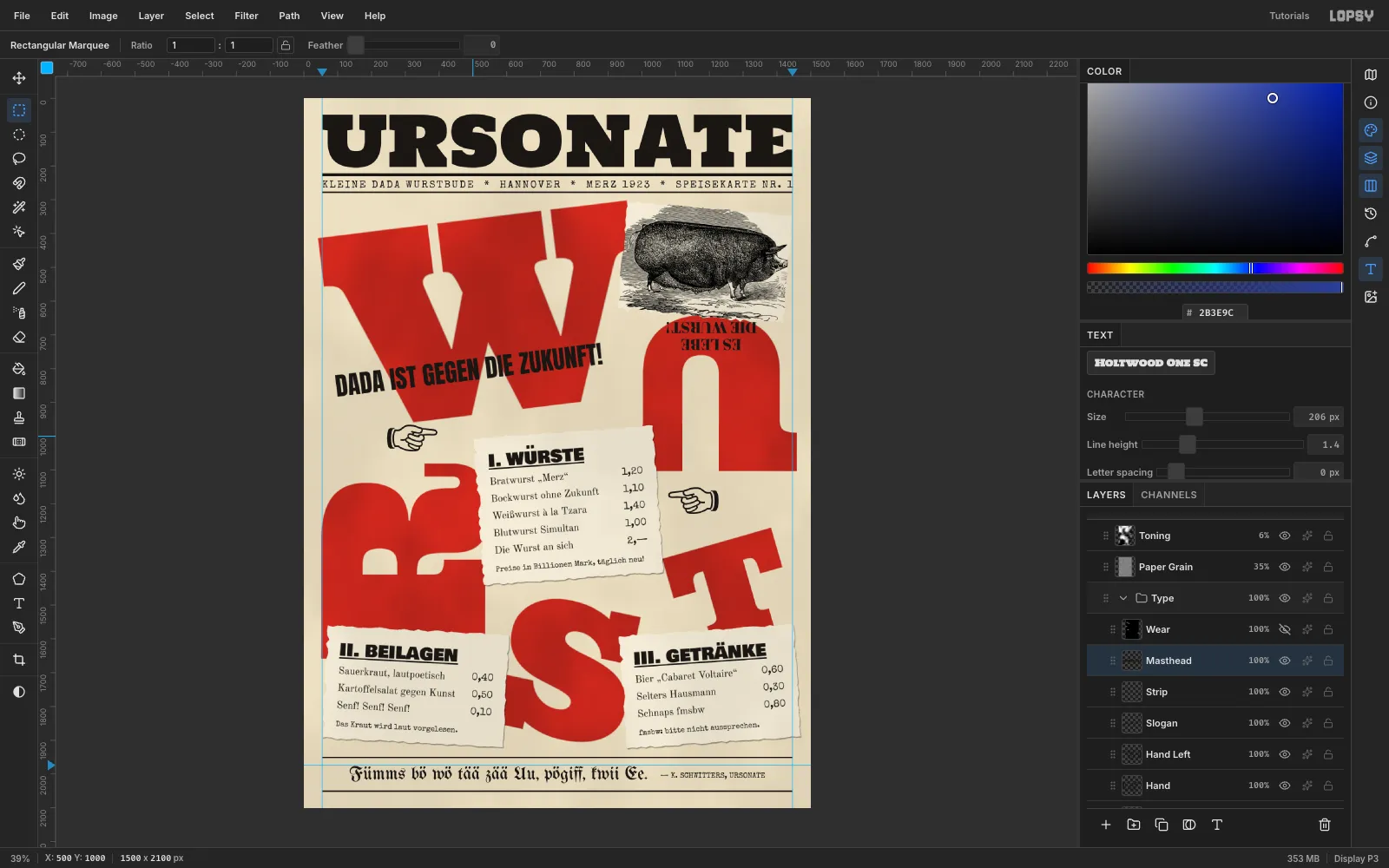
-
Cut the stamp rings
Add a layer named
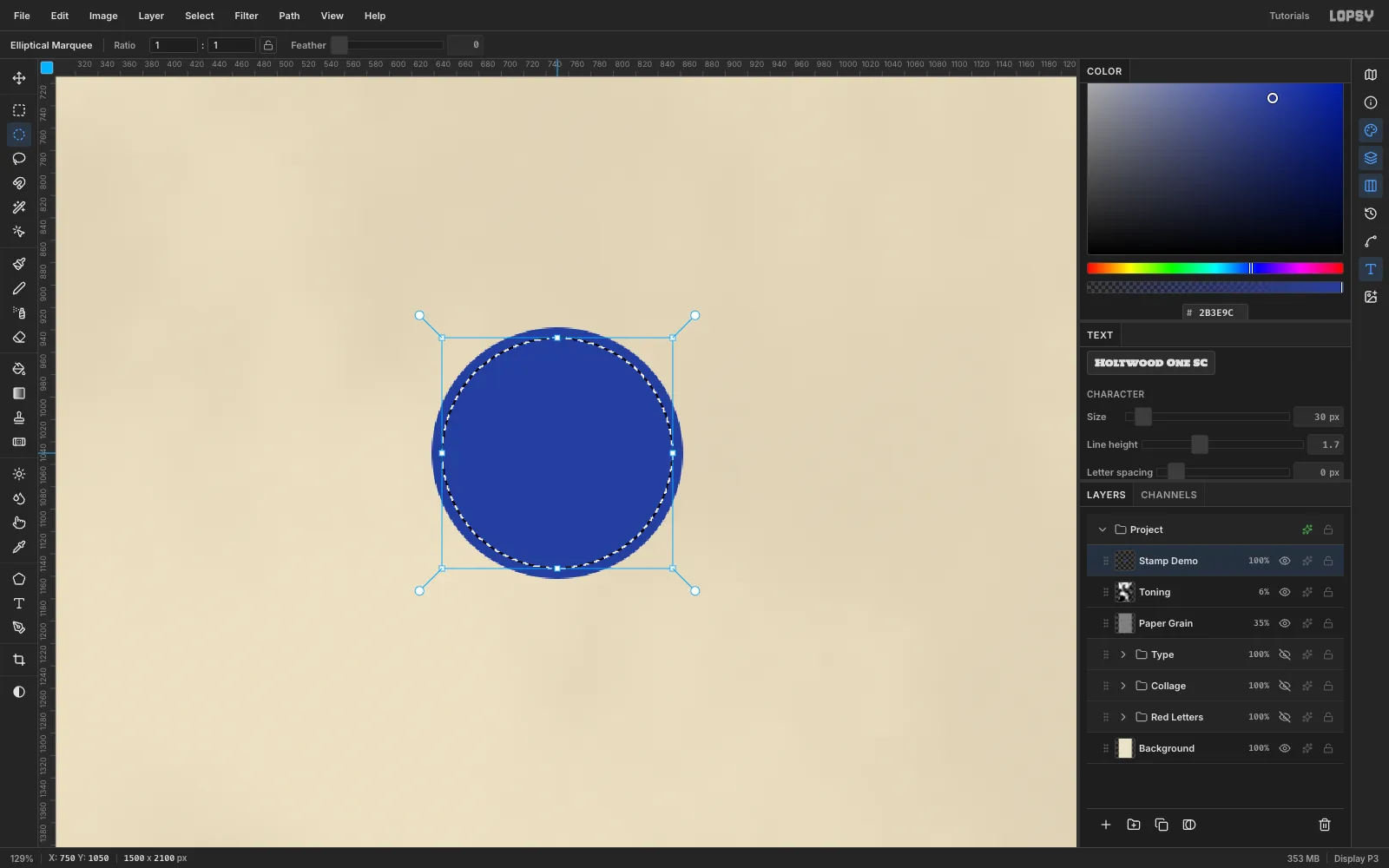
Stampand set the foreground to . It's easiest to build the stamp large on empty paper (hide the groups for a moment), then shrink it into place.- Draw an Elliptical Marquee with radius 112, choose Edit → Fill, then Select → Shrink… by
9and press Delete. That leaves the outer ring. - Draw a radius-76 circle at the same centre, fill it, Shrink by
4and press Delete.
- Draw an Elliptical Marquee with radius 112, choose Edit → Fill, then Select → Shrink… by
-
Run text around a circle
Pick the Shape tool, set Shape to Ellipse and Output to Path, and drag from the stamp's centre out 81 px. This makes a circular path that starts at 12 o'clock.
Type
GEPRÜFT * MERZ * HANNOVER * 1923 *(ending with a space) in Special Elite22, press Tab, and choose the new path in the Path dropdown in the options bar. Then nudge Letter spacing until the end of the text meets the start.3closed the gap here. Glyphs sit on the outside of the path, so a path radius a little inside the outer ring keeps them between the two rings.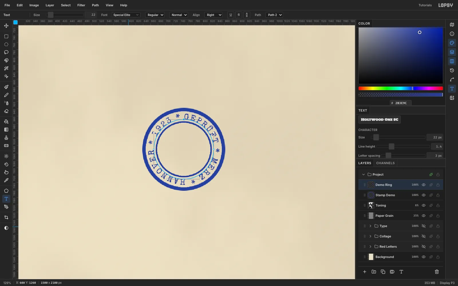
-
Finish the stamp
Select Stamp and type
DADAin Bowlby One SC38on blank paper beside the stamp. Select Stamp again and typeNr. 7in Special Elite20the same way. Centre both inside the inner ring with the Move tool. Merge the three text layers down into Stamp, rotate it −14°, and set it to Multiply at 88% so it overprints like ink. In the Paths panel, click the path's row to hide its outline.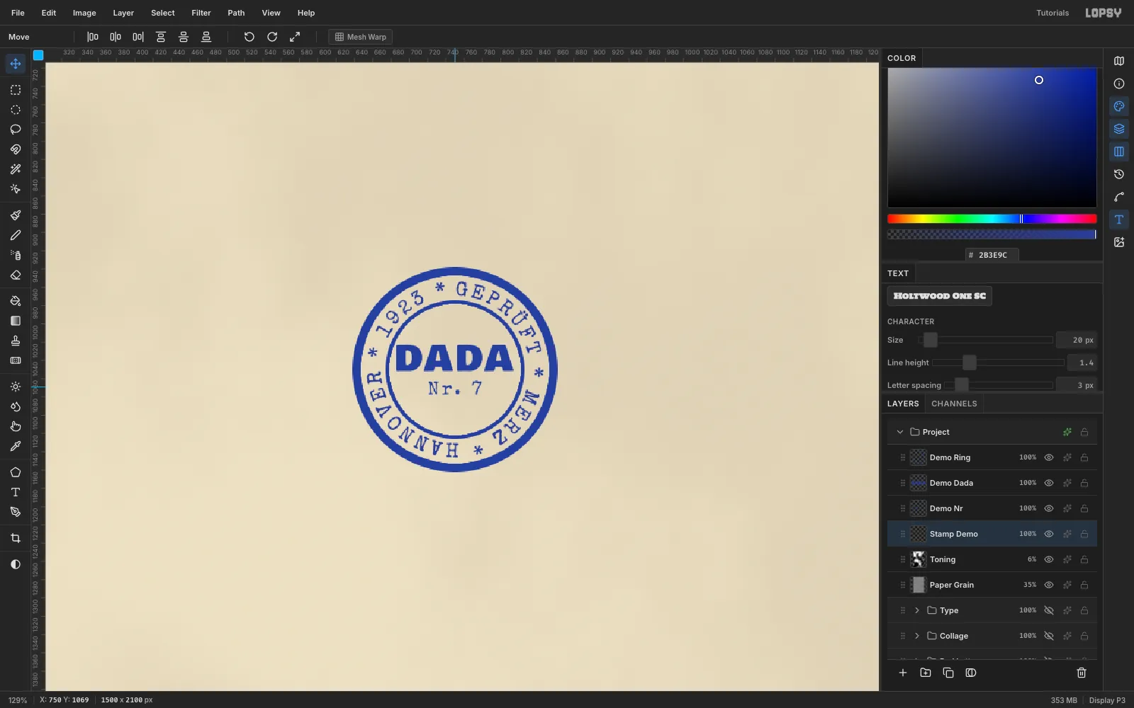
-
Place it where it reads
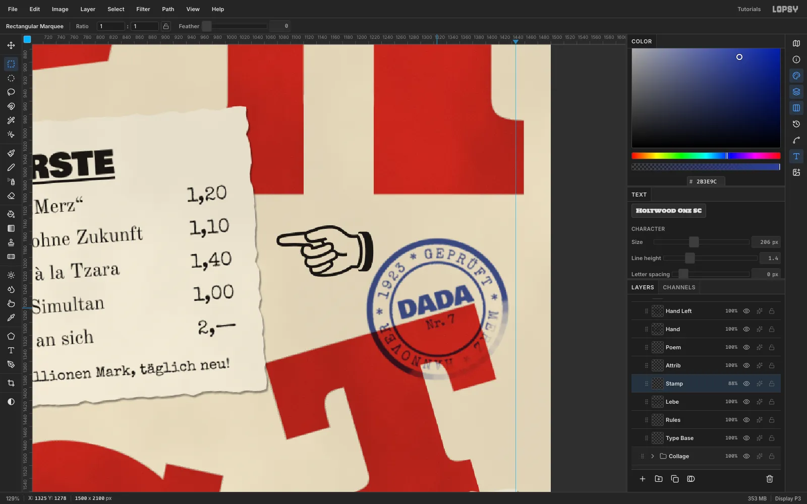
Show the groups again. At its build size (an outer radius of about 110) the stamp is already right. Centre it at (1325, 1278), in the cream pocket under the U's leg. Blue on cream reads clearly. Over red it turns a muddy purple, so let only about a third of the stamp cross the T. Leave at least 25 px between the ring and any text.
-
Give it uneven pressure
A rubber stamp is never inked evenly. Pick the Eraser, set Size
110and Opacity45, and drag one arc along the lower-right of the ring. That side now looks lightly pressed.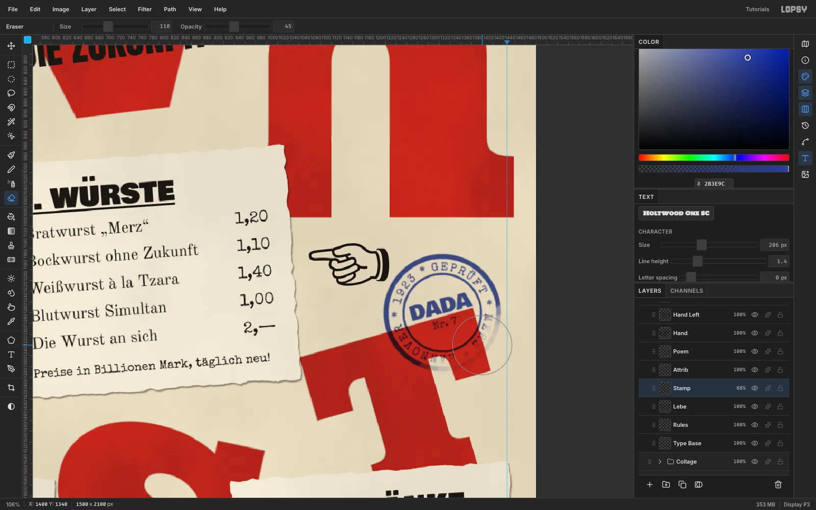
-
Print in some wear
At the top of the Type group, add a layer named
Wearand fill it with .- Run Add Noise with Amount
100, Mono and Gaussian. - Run Gaussian Blur with Radius
4. - Run Threshold at
135, which leaves about 3% white specks. Run Gaussian Blur0.8to soften their edges. - Add a layer filled with , set it to Multiply and Merge Down, which turns the specks newsprint-coloured.
- Set Wear to Lighten. Black does nothing, and each speck knocks a paper-coloured chip out of the ink underneath.
Specks inside small type change letters (an
lbecomes!). Cmd-click each slip's thumbnail, choose Select → Grow…4, and Edit → Fill Wear with black. Do the same with marquees over the strip and the footer.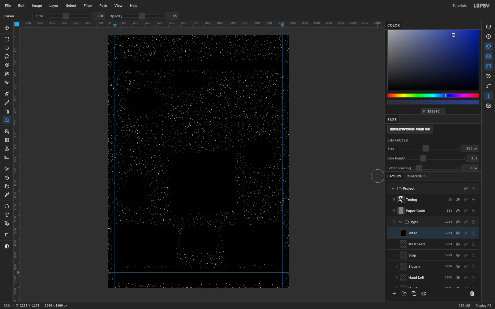
- Run Add Noise with Amount
-
Break up the pattern
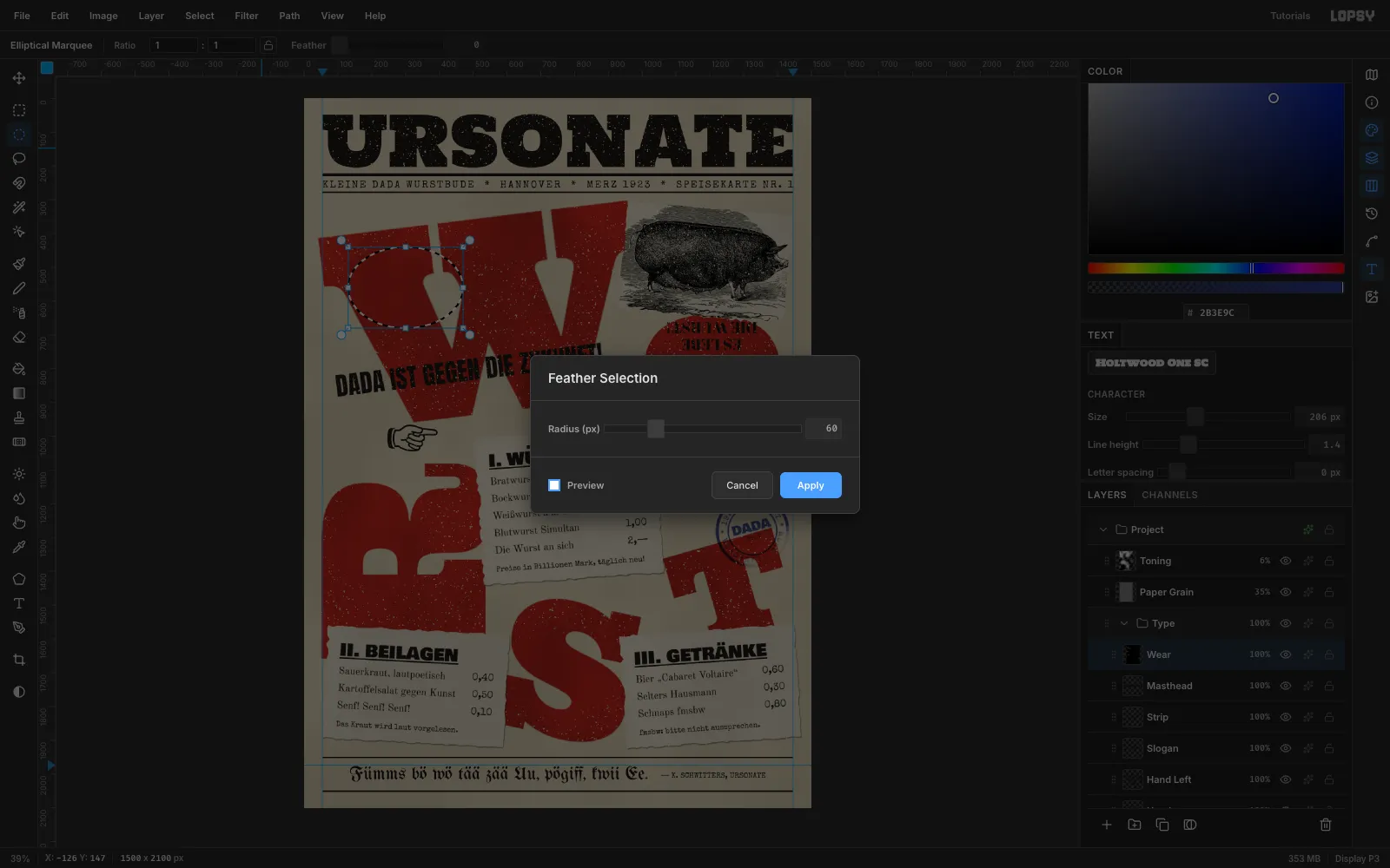
Even speckle everywhere looks like a filter. Draw a few large Elliptical Marquees over the letters, choose Select → Feather… with
60, and fill them with black on Wear. This leaves cleaner, better-inked patches. Finally, drag Paper Grain up to sit just under Toning, so the grain textures the inks too.Save with File → Save Project and export with File → Quick Export PNG.