Make a Deconstructivist Restaurant Menu
Design a deconstructivist menu in Lopsy with sliced Difference-blend type on a black plate, molten gradients, a halftone plane and a clean grid.
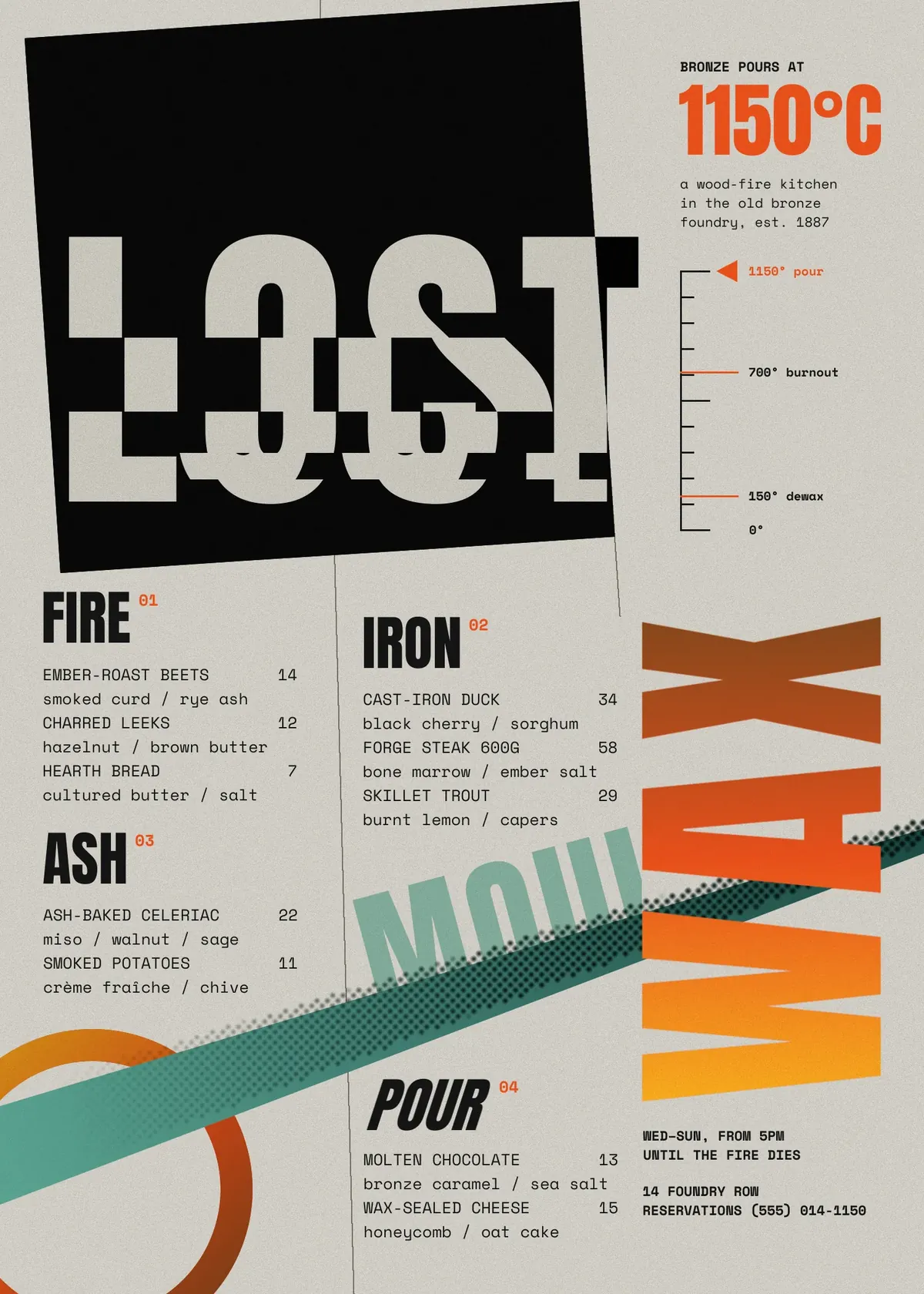
Deconstructivist graphic design grew out of the late 1980s and early 1990s. Students at Cranbrook Academy of Art, the magazine Emigre, and art directors like David Carson and Neville Brody took the tidy Swiss grid and started pulling it apart. They sliced words into strips, let letters fall off the edges of the shapes they sat on, layered type over type, and tilted whole planes. It looks chaotic, but the best of it hides a very orderly grid underneath.
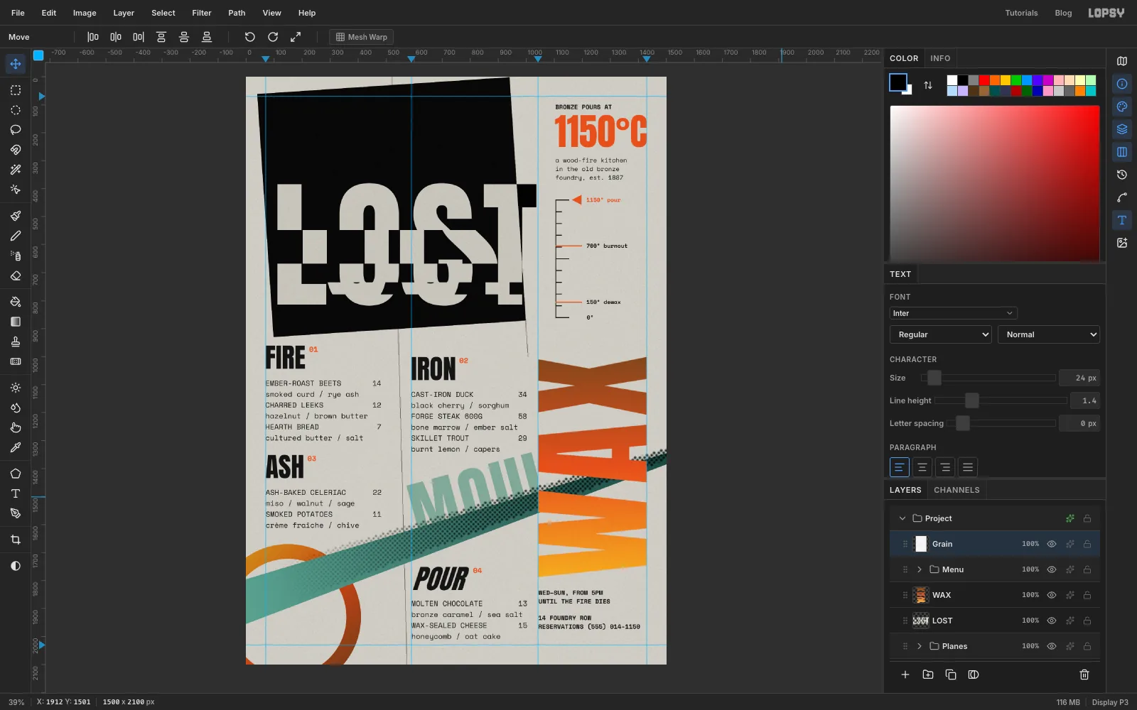
That balance suits a menu, because people still have to be able to order from it. In this tutorial you'll make the menu for an imaginary restaurant called Lost Wax, a wood-fire kitchen in an old bronze foundry. The name comes from lost-wax casting, where the mould is broken open to free the metal, which is a good excuse to break the type. All the deconstruction happens in the display type and the planes. The dishes and prices sit on a plain two-column grid.
The page is 1500 × 2100 px, a 5:7 sheet. Everything is drawn in Lopsy, so you don't need any photos.
The tools you'll use along the way:
- guides, the Pencil with Shift-click straight lines, and the Lasso
- the Gradient tool, inside selections and on a layer mask
- Filter → Add Noise and Filter → Halftone
- the Difference and Multiply blend modes and a Color Overlay effect
- the Rectangular and Elliptical Marquee, including their exact-size dialogs
- Rasterize Layer and the Move tool's rotate, scale and Skew modes
- Anton and Space Mono text, letter spacing and line height
- layer groups
The palette is concrete paper, near-black ink, molten orange and verdigris:
-
Concrete paper
-
grain grey
texture layer only
-
Plate black
-
ink
-
hairline grey
-
Molten
-
Verdigris band
-
dot ink
-
ghost
-
Create the page
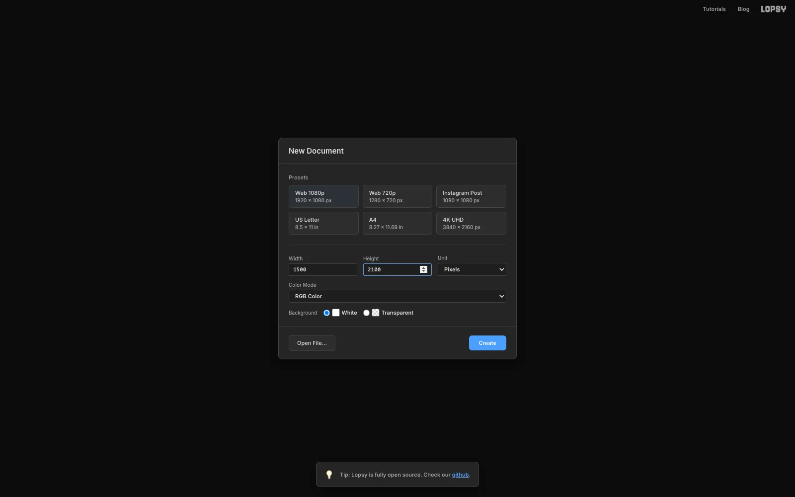
Choose File → New. Keep the unit on Pixels, type 1500 for the width and 2100 for the height, keep the white background, and click Create.
-
Paint the concrete paper
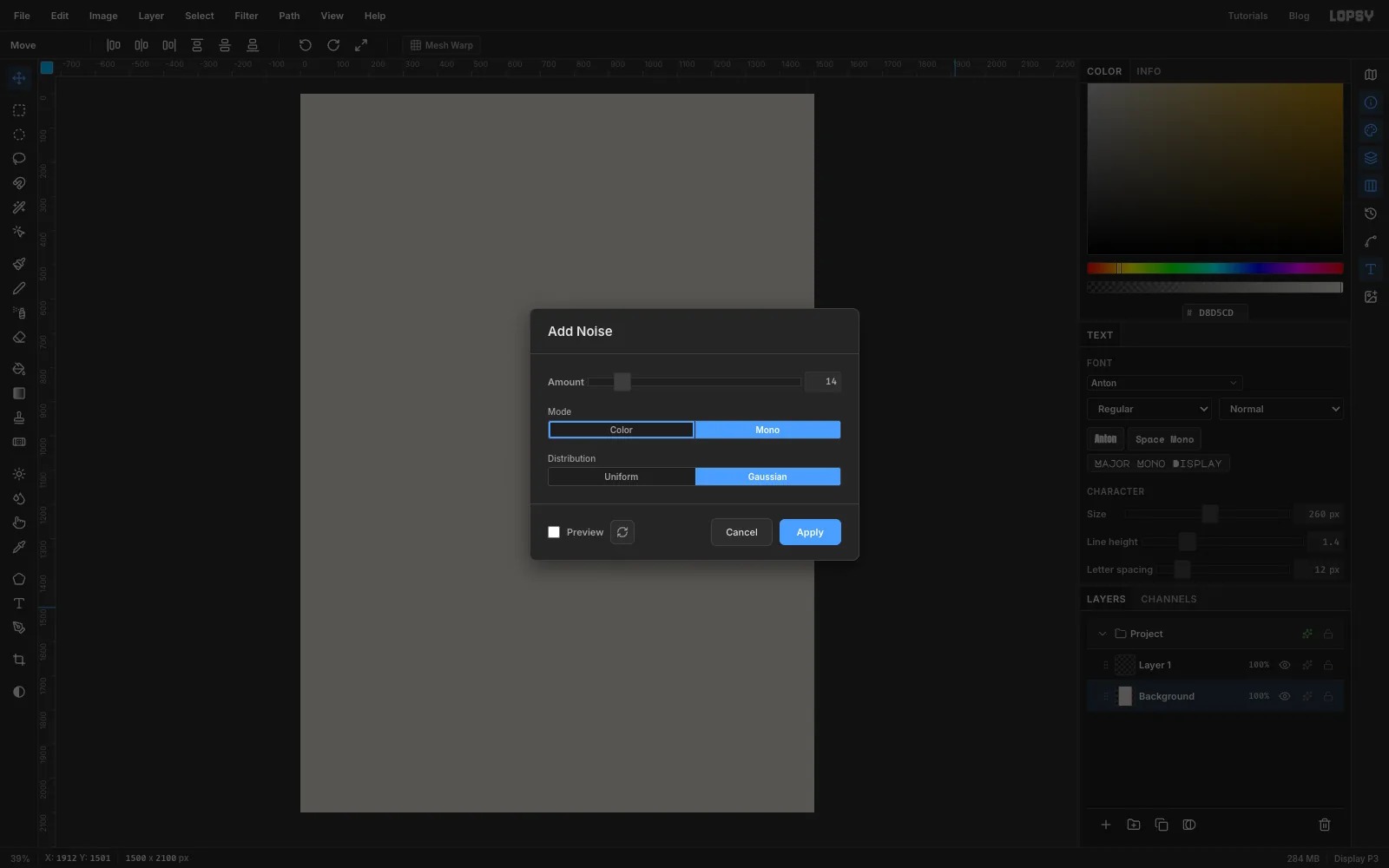
Click the Background row, set the foreground colour to and choose Edit → Fill. Then choose Filter → Add Noise, pick Mono and Gaussian, set Amount to 14 and click Apply. The page now has a faint speckle, like poured concrete or cheap uncoated stock.
-
Lay down the guides
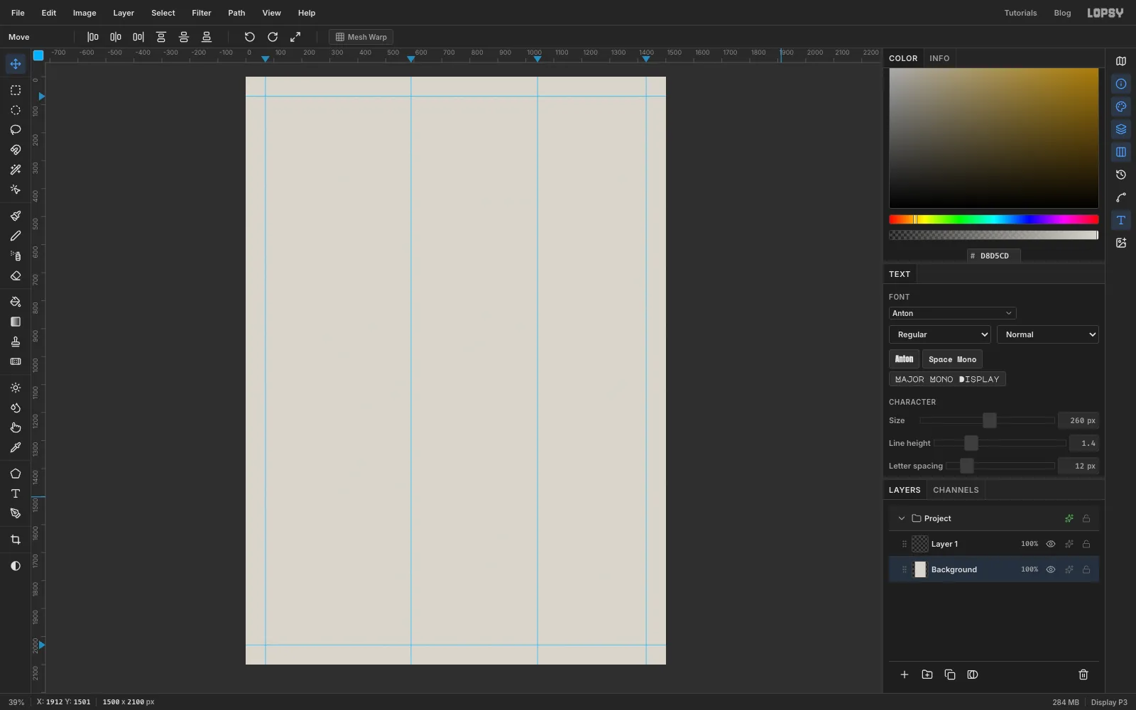
A click on a ruler drops a guide at that spot. Click the top ruler at 70, 590, 1042 and 1430, then click the left ruler at 70 and 2030 for the top and bottom margins. Zoom in if you want them exact. A few pixels either way won't hurt anything.
These guides are the hidden order under the chaos:
- 70 and 590 are the left edges of the two menu columns.
- 1042 to 1430 is a narrow column for the word WAX.
-
Draw two construction lines
Draftsmen leave their construction lines on the drawing, and so will you.
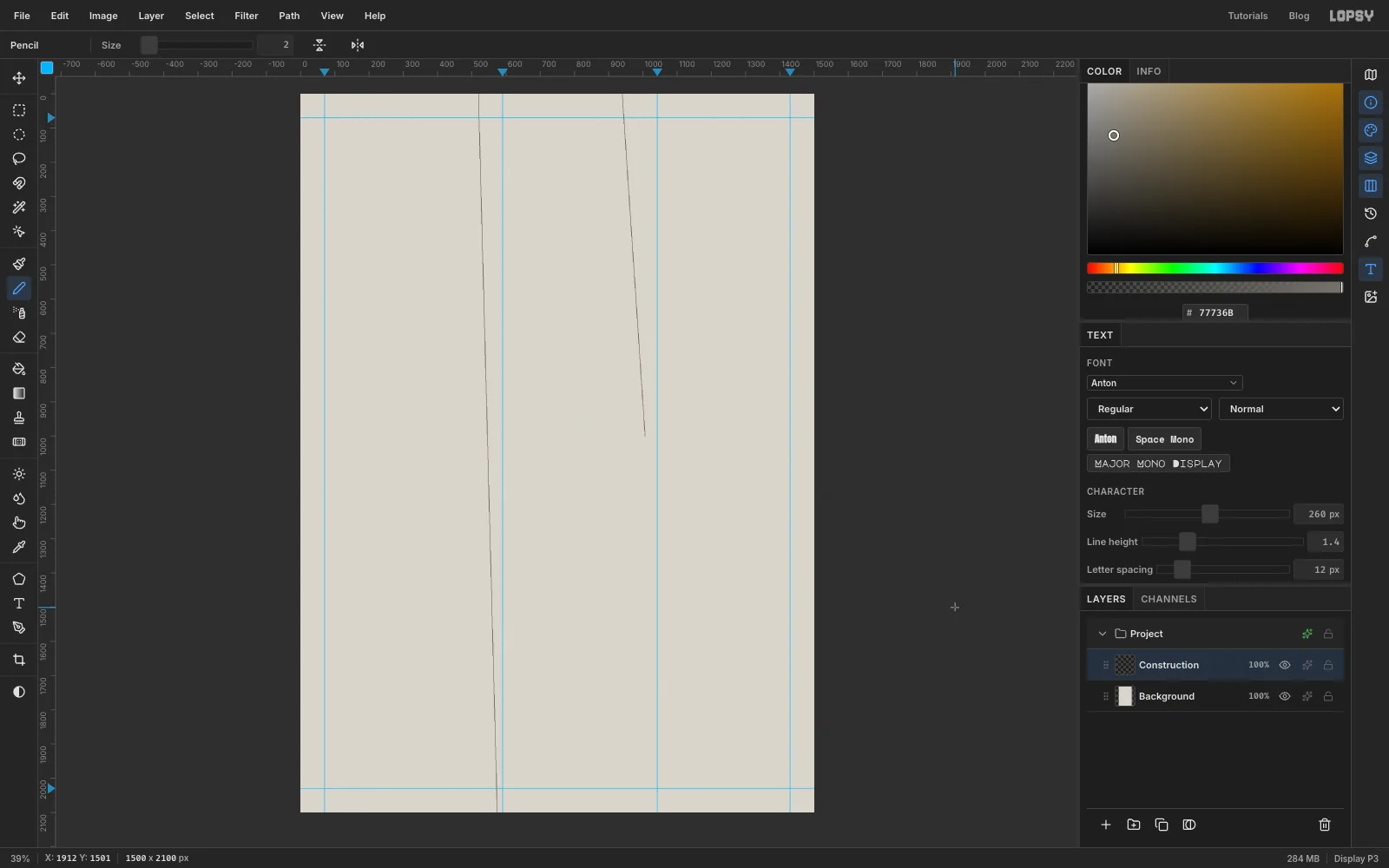
Rename Layer 1 to Construction by double-clicking its name. Set the foreground to hairline grey , pick the Pencil (N) and set Size to 2. A Pencil click followed by a Shift-click draws a straight line between the two points.
- The first line will mark the right edge of the black plate. Click on the top edge of the page a little left of the 1042 guide (about x 940). Then Shift-click about halfway down the page, just left of the same guide (about x 1007, y 1000). That's where WAX will start.
- The second line runs down the gutter between the two menu columns. Click on the top edge about 70 px left of the 590 guide. Then Shift-click on the bottom edge just left of that guide.
-
Lasso the black plate
Click Add Layer in the Layers panel and name the new layer Slab.
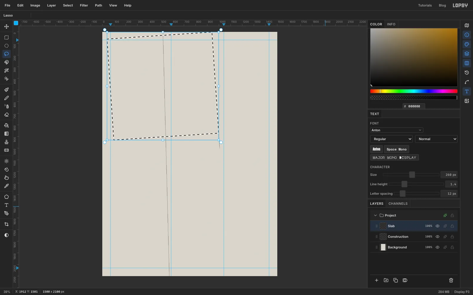
Pick the Lasso (L) and trace a big, slightly tilted square. Hold the mouse button down and drag in straight runs between the corners:
- Start just right of the left margin, about 60 px below the top edge.
- Go to the top edge where your first construction line starts.
- Follow that line down to about y 870.
- Cut back across to the left, finishing about 70 px lower than the right-hand corner.
- Return to the start.
The plate ends up about 900 px wide and tipped about 4° anticlockwise.
-
Fill the plate and give it grain
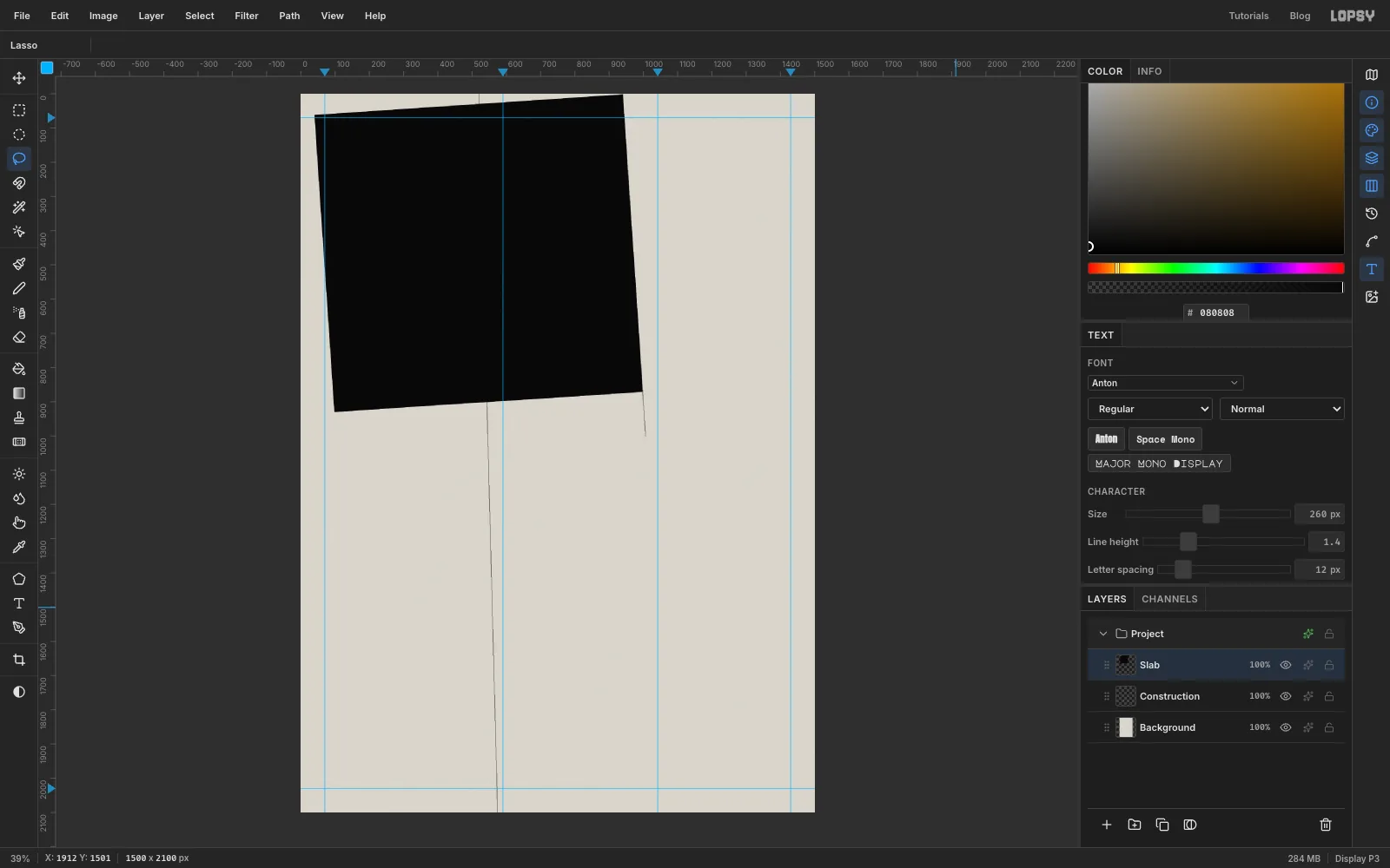
Set the foreground to and choose Edit → Fill. While the selection is still active, choose Filter → Add Noise again with Mono, Gaussian and Amount 16, then press Cmd+D to deselect.
Why near-black and not pure black? Noise can't go darker than black, so a pure plate keeps almost no grain and looks pasted on. At the grain survives, and the plate still matches the pure black that LOST will turn into where it leaves the plate.
-
Cut the ring
With Slab selected, click Add Layer and name the new layer Ring. It lands above the plate. Set the foreground to .
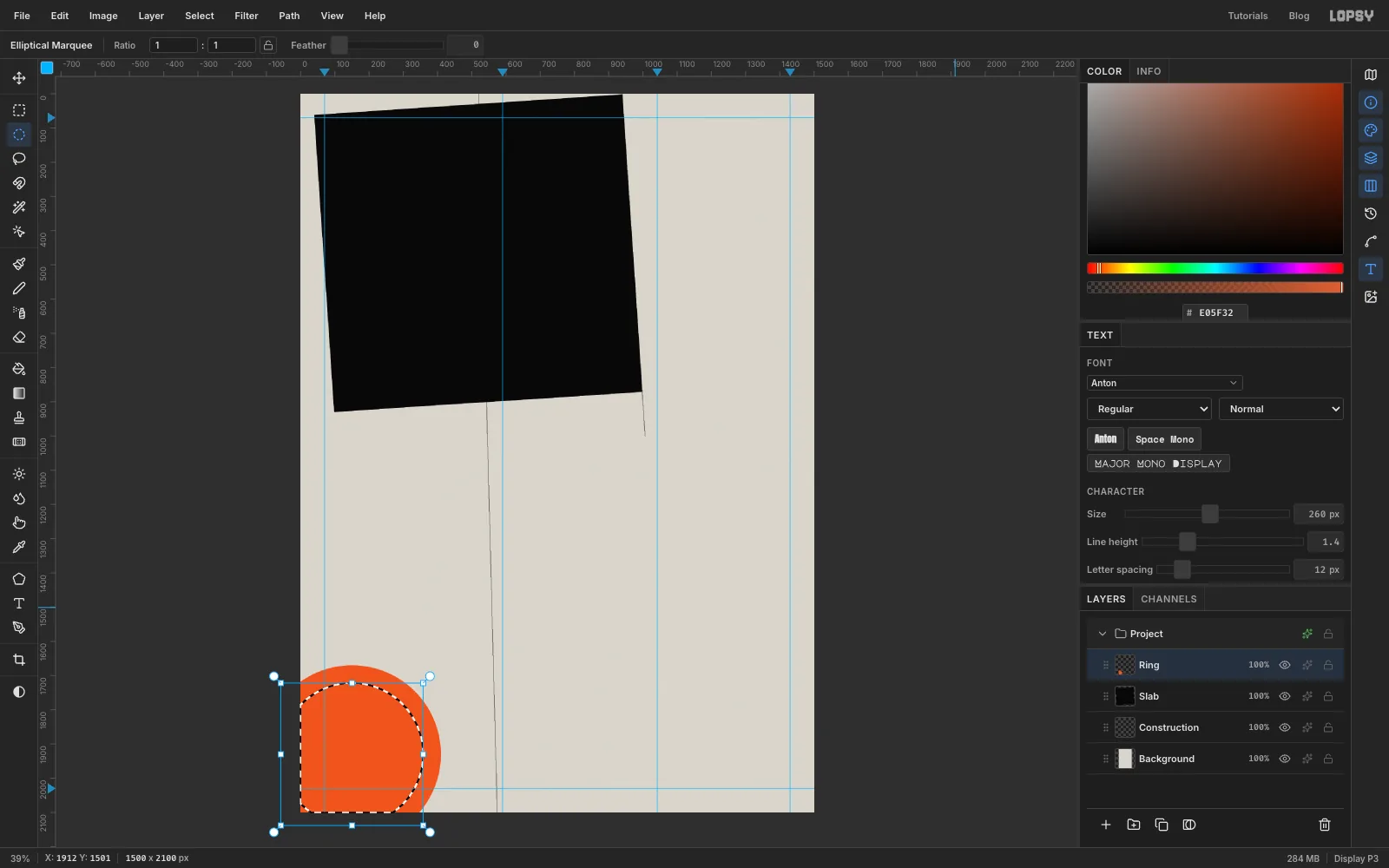
Pick the Elliptical Marquee and click once on the canvas without dragging. That opens the Elliptical Selection dialog, where you can type exact corners. Enter From x -110, y 1670 and To x 410, y 2190, then click OK. The values can run past the canvas edge, so the circle hangs half off the bottom-left corner. Choose Edit → Fill.
Click once more and enter From x -58, y 1722 and To x 358, y 2138. That's a smaller circle with the same centre. Press Delete to punch out the middle, then Cmd+D.
-
Pour a molten gradient into the ring
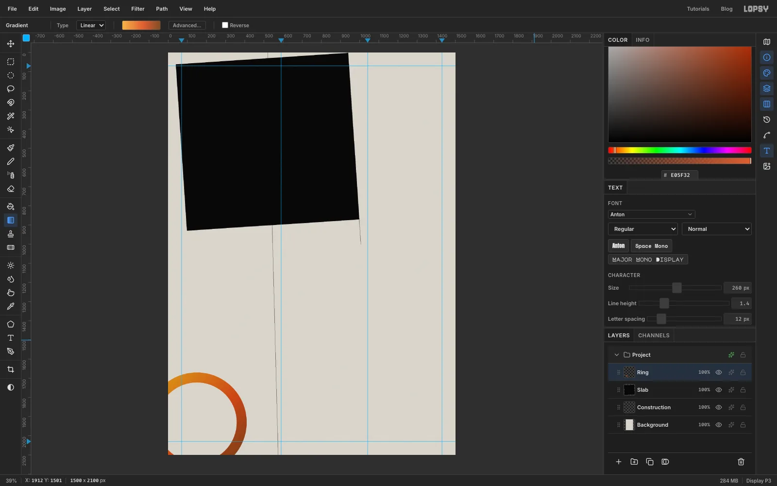
Cmd-click the Ring thumbnail in the Layers panel to select its pixels. Pick the Gradient tool, choose Linear, and click Advanced… to set three stops:
- at the left end
- at about 55%
- at the right end
Drag from just outside the ring's top left to just outside its bottom right, then press Cmd+D.
Open the layer's effects drawer with the sparkle button on its row, and set the Blend dropdown to Multiply. The ring picks up the paper's texture as if it were printed ink.
-
Cut the verdigris band
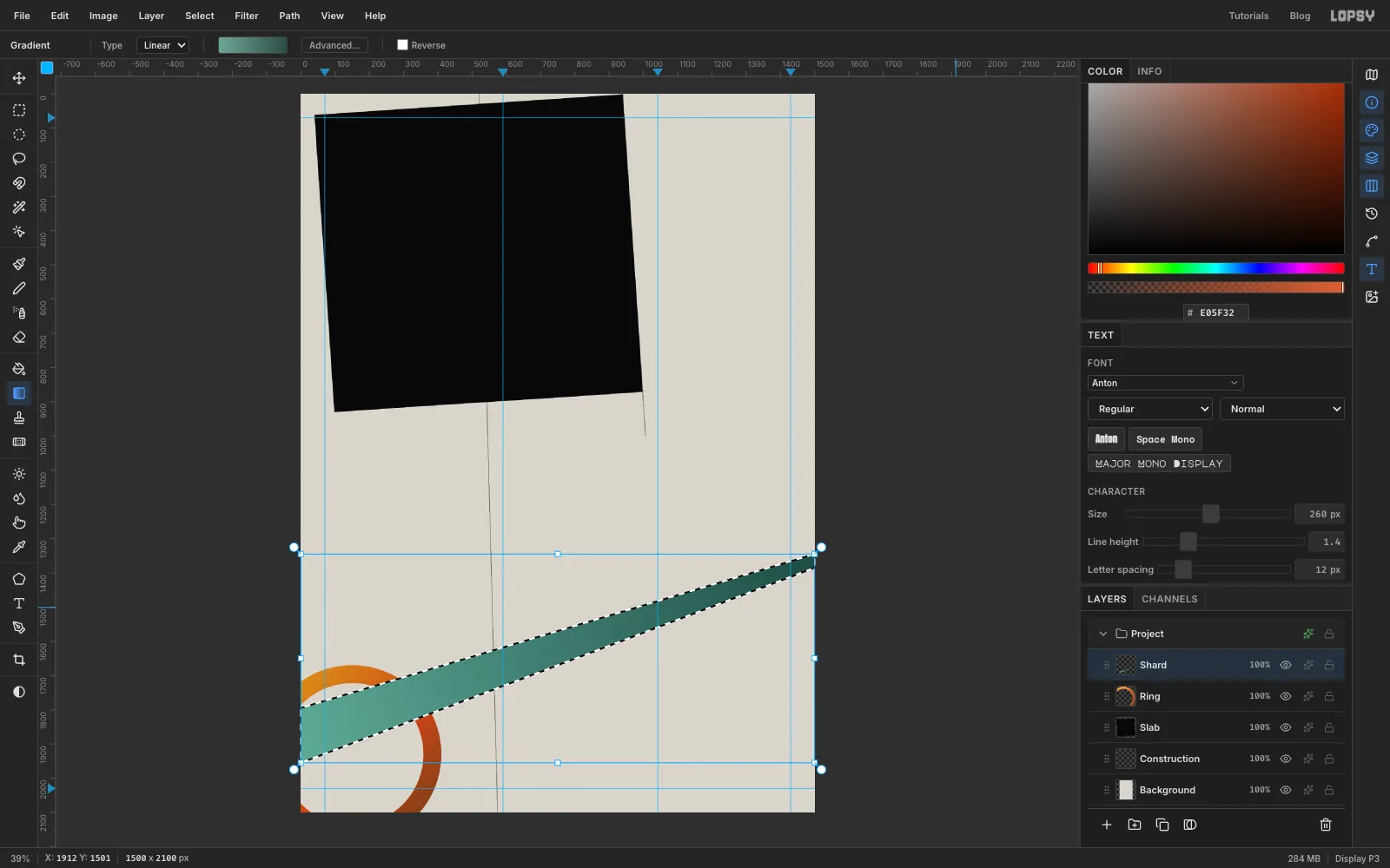
Click Add Layer and name the layer Shard. With the Lasso, trace a long sliver that climbs from left to right:
- Start on the left edge about a quarter of the way down the ring (around y 1795).
- Run to the right edge about two-thirds of the way down the page (y 1345).
- Drop down about 40 px.
- Come back to the left edge, about 160 px below where you started.
The band is about 160 px thick on the left and narrows to a blunt 40 px end on the right.
With the Gradient tool, set Advanced… to two stops, on the left and on the right. Drag along the band from its left end to its right end.
-
Turn a copy into a halftone plate
Press Cmd+D, switch to the Move tool (V) and choose Layer → Duplicate Layer. Rename the copy Shard Dots.
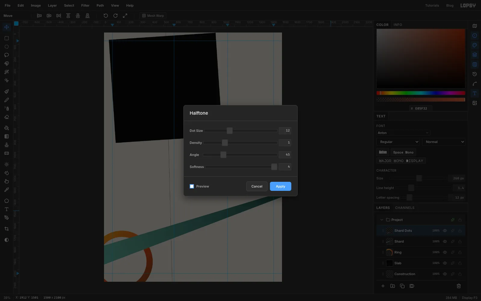
Choose Filter → Halftone and set Dot Size to 12, Angle to 45 and Softness to 8. Click Apply. The gaps between the dots are transparent, so the copy acts like a second printing plate.
-
Ink the dots and knock them off register
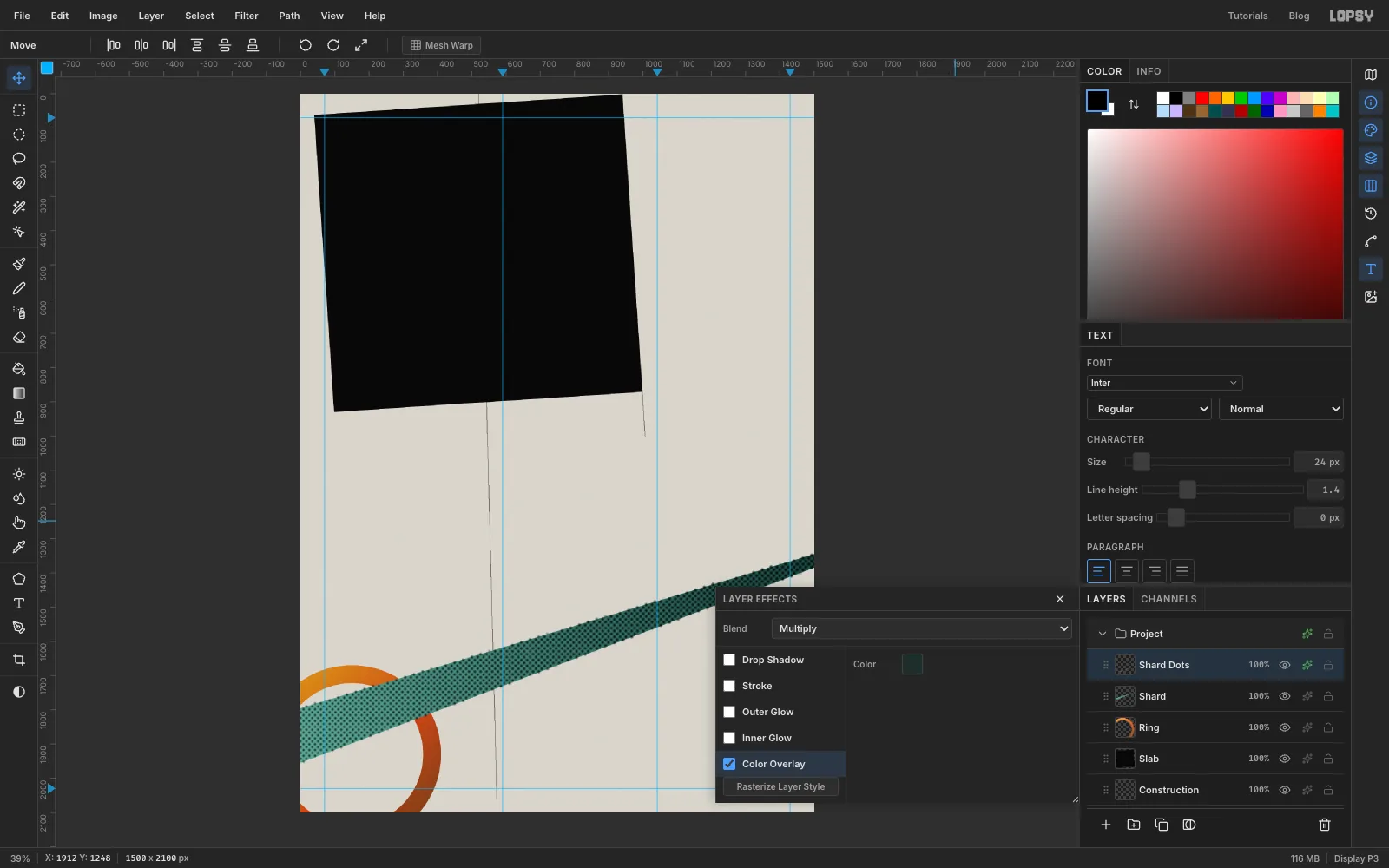
On Shard Dots, open the effects drawer, enable Color Overlay, and set its colour to dot ink . Set the Blend dropdown to Multiply.
Now shift the plate off register. With the Move tool active and nothing selected, use the arrow keys to nudge the layer about 14 px right and 22 px up. Shift+arrow moves it 10 px at a time. The dots now spill just past the band's top edge, like a screen print where the second colour landed a little off.
-
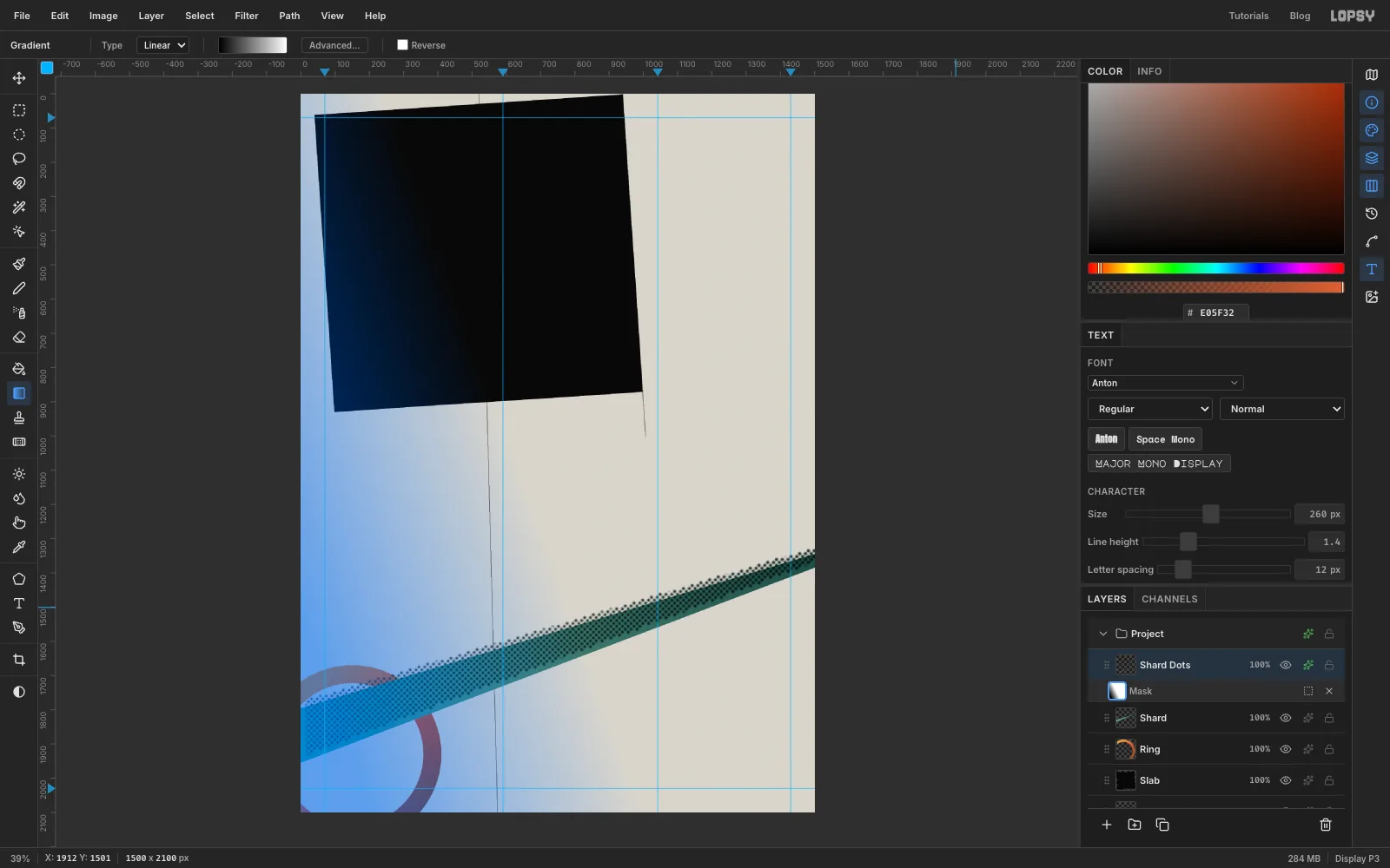
Fade the dots with a layer mask
With Shard Dots selected, click Add Mask at the bottom of the Layers panel, then click the new mask thumbnail to edit it. The canvas gets a blue wash while you're painting on a mask.
With the Gradient tool, set Advanced… to black at the left and white at the right. Drag from the band's lower-left end to about the middle of the band. Black hides and white shows, so the dots now fade in from nothing on the left. Click the Shard Dots layer thumbnail (not the mask) to go back to editing pixels.
-
Set the word LOST
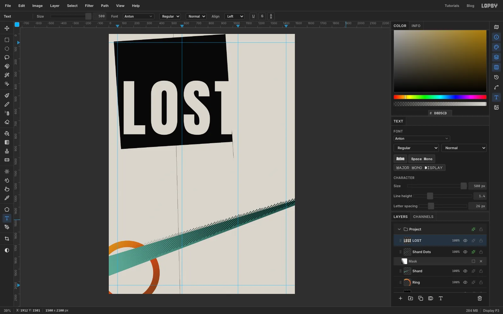
Make sure Shard Dots is the active row, so the type lands above everything you've made so far. Pick the Text tool (T). In the options bar, choose the font Anton and set Size to 500. In the Text panel, set Letter spacing to 26. Set the foreground colour to paper .
Click in an empty spot near the top of the page, type LOST, and press Tab to finish. The layer is named LOST after its text. With the Move tool, drag the word so the L sits about 70 px inside the plate's left edge and the cap tops are at y 380. The very end of the T's crossbar should hang just past the plate's right edge.
-
Knock it out with Difference
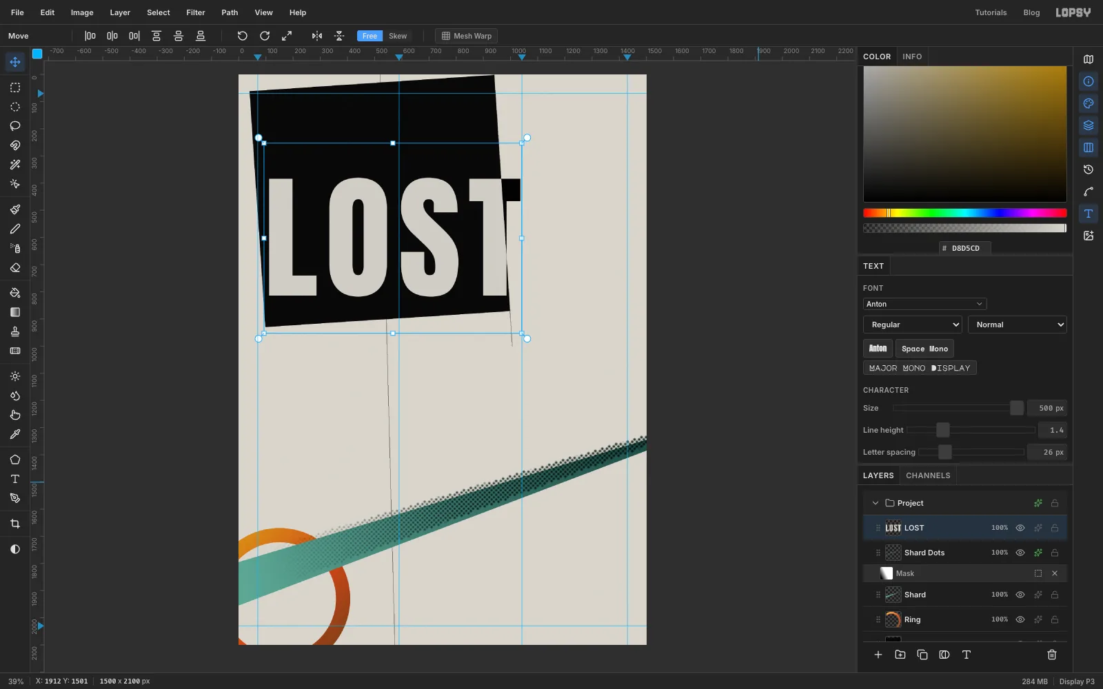
Open the effects drawer for LOST and set Blend to Difference.
Difference subtracts one colour from the other. On the black plate the letters still come out paper-coloured. Where a letter leaves the plate, it sits on paper, and paper minus paper is black. So the T's crossbar tip now reads as a black notch cut out of the page. That one blend mode gives you deconstructivism's favourite move, type that changes colour as it crosses from one plane to another.
-
Slice the word
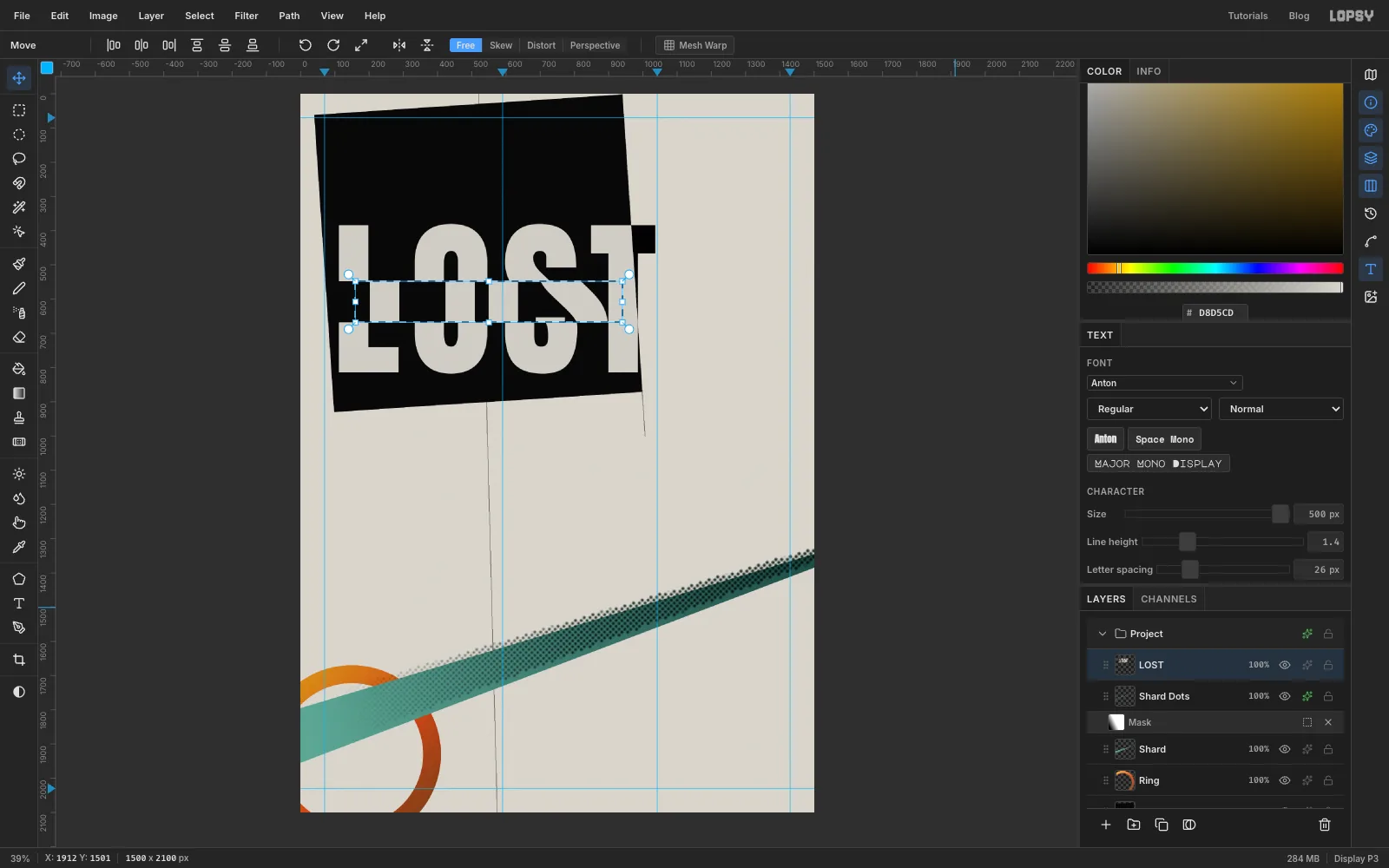
To cut type with selections it has to be pixels. Click the Rasterize Layer button at the bottom of the Layers panel. It's the T icon that appears while a text layer is selected.
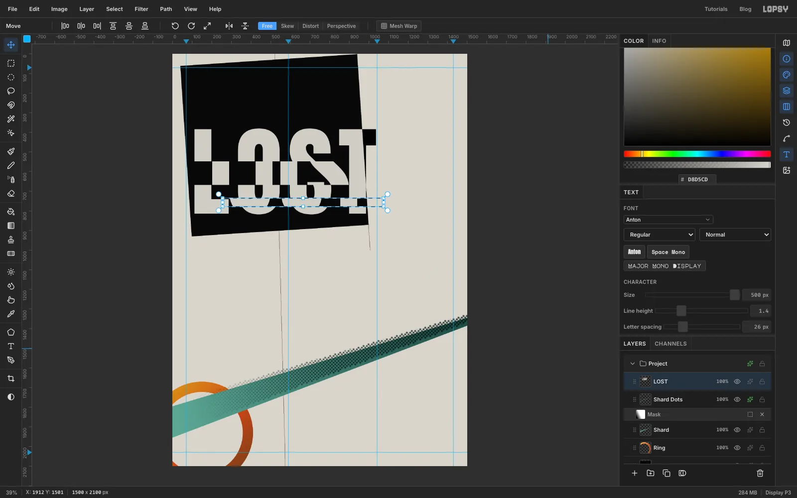
With the Rectangular Marquee (M), draw a band through the middle of the L, O and S. Run it from just left of the L to the gap between the S and the T, covering roughly the middle third of the letters' height (about 120 px). If you'd rather type it, click once without dragging and enter From 60, 548 and To 850, 668.
Switch to the Move tool and drag inside the selection about 90 px to the right. Keep the drag level, and stop before the S's strip touches the T. Press Cmd+D.
-
Slide a thin band the other way
Draw a second, much thinner band low across the O, S and T. Start it in the gap between the L and the O and run it just past the T. Make it about 43 px tall, ending about 40 px above the baseline (y 735 to 778). With the Move tool, drag it about 45 px to the left. Press Cmd+D.
Two cuts, going in opposite directions, are enough. The cap tops and the baseline still carry the word, so LOST stays readable even though its middle is broken.
-
Set WAX and fill it with molten metal
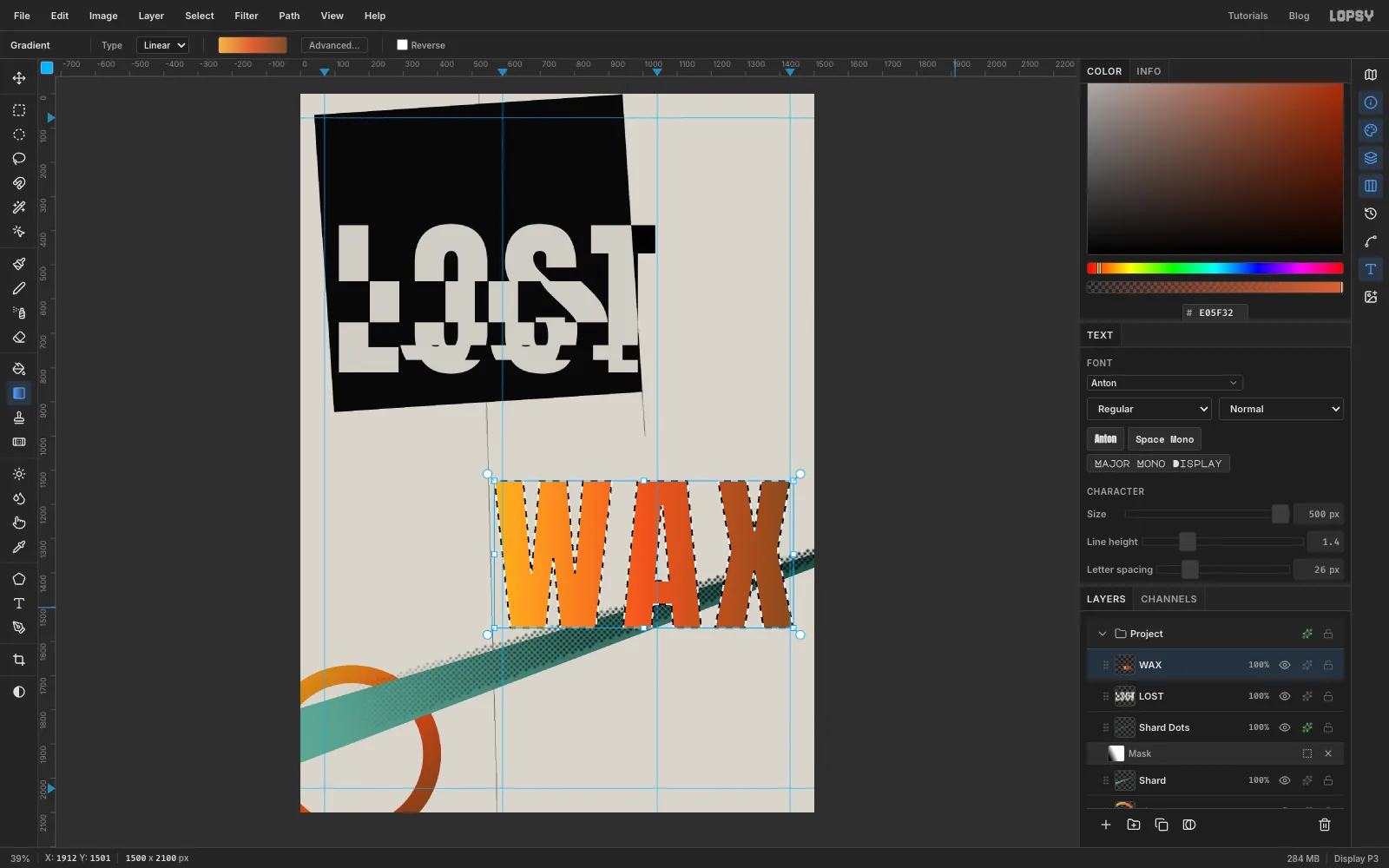
With LOST still active, pick the Text tool. Keep Anton at 500, set the colour to , click in the empty lower half of the page and type WAX. Press Tab, then click Rasterize Layer.
Cmd-click the WAX thumbnail. With the Gradient tool, set Advanced… to , at 50% and , and drag from the left edge of the W to the right edge of the X. Press Cmd+D.
-
Stand WAX on end
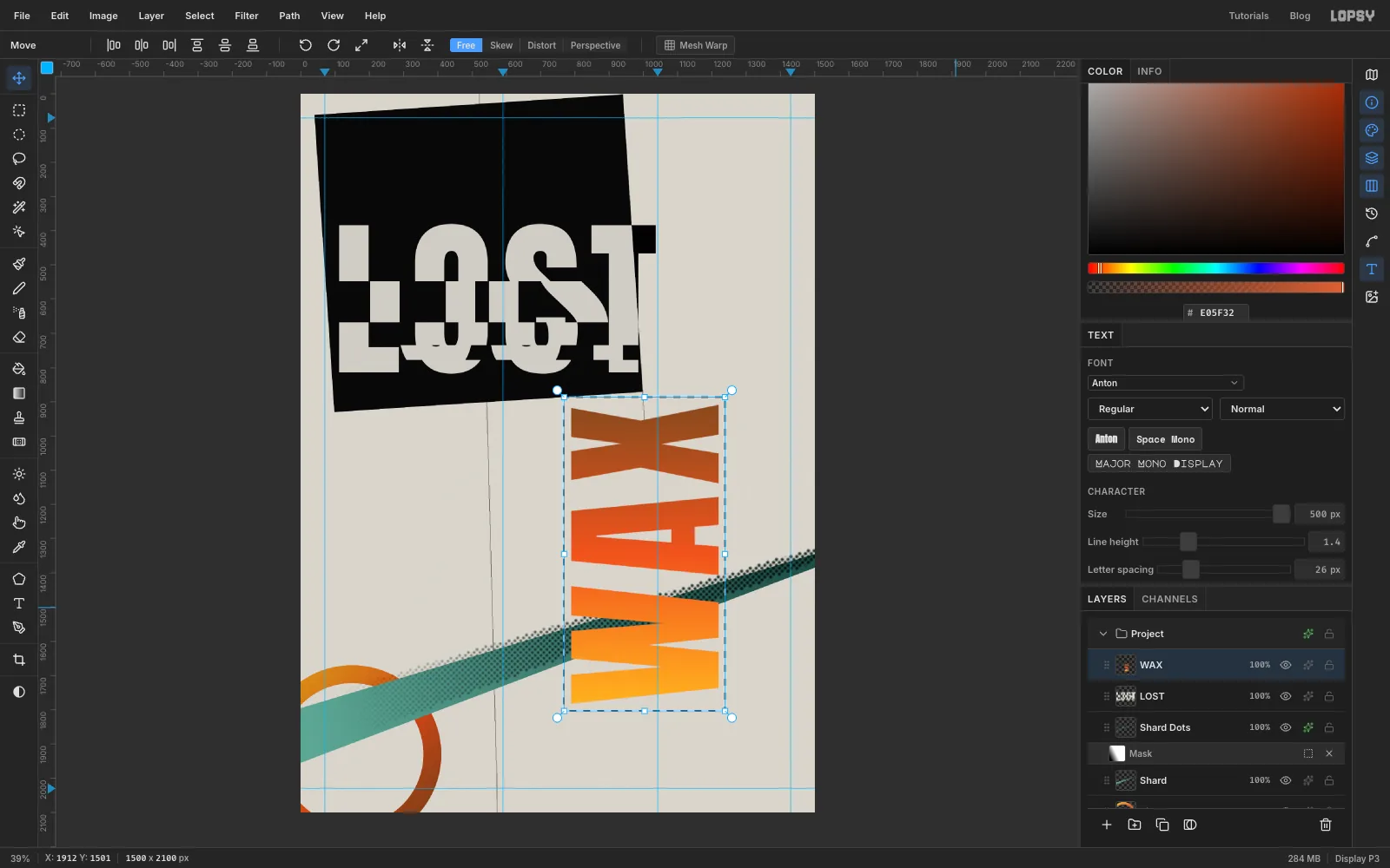
Draw a Rectangular Marquee around WAX with a little room to spare. Keep its edges at least 20 document pixels away from the guides, because a marquee edge that comes close to a guide snaps onto it and can cut letters off. Switch to the Move tool.
Move the pointer just outside the box's top-right corner until it turns into a rotate cursor. Then hold Cmd and drag anticlockwise. Cmd snaps the angle to 15° steps, so stop at -90°. WAX now reads from bottom to top, and the yellow end of the gradient is at the bottom, like hot metal settling. Press Cmd+D.
-
Scale WAX to fit its column
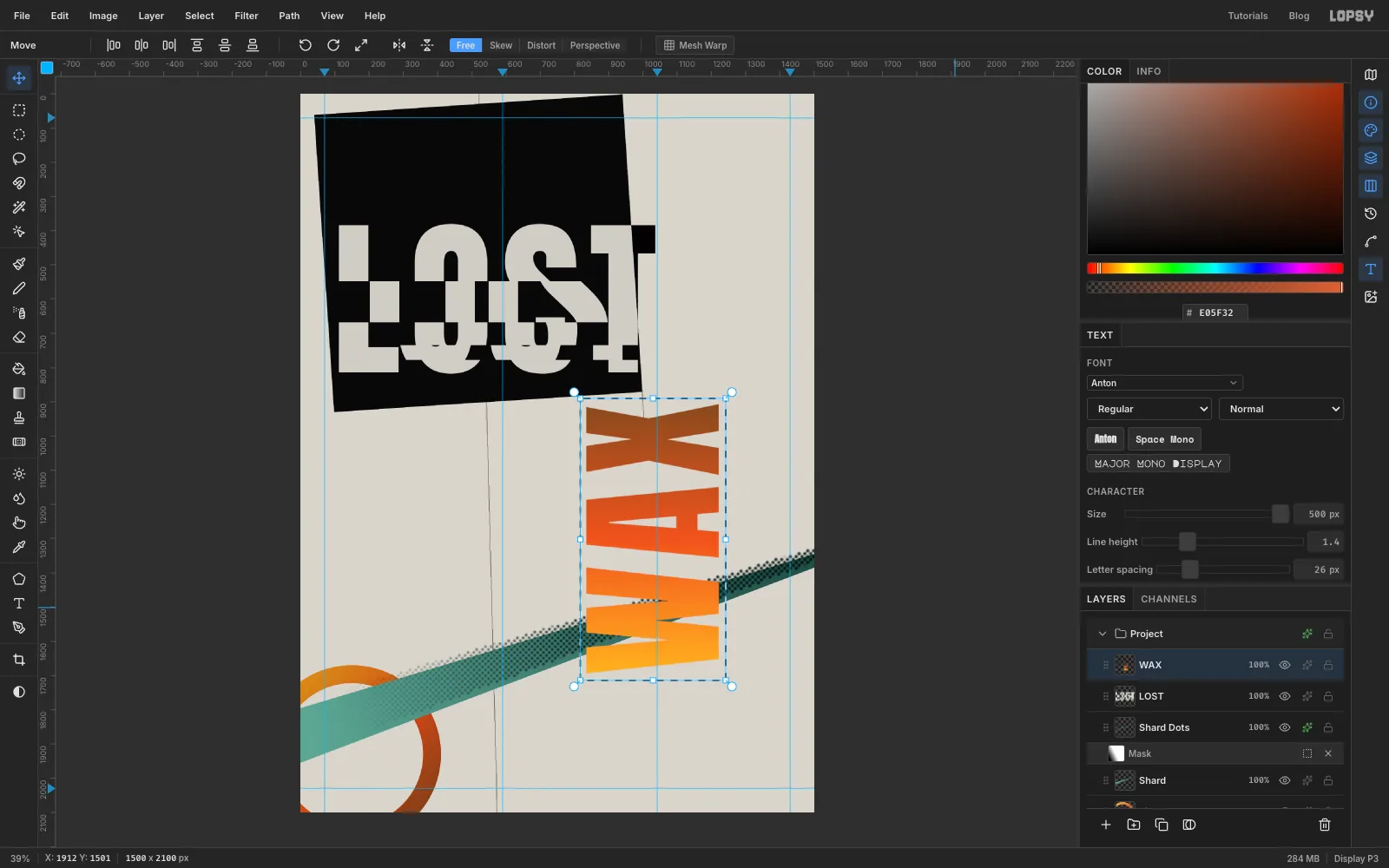
Draw a new marquee around the upright WAX. With the Move tool, hold Cmd and drag the bottom-left corner handle up and to the right until the box is about 90% of its size. Cmd keeps the proportions, and the opposite top-right corner stays where it is. The word ends up about 390 px wide, which fits between the 1042 and 1430 guides. Press Cmd+D.
-
Seat WAX on the grid
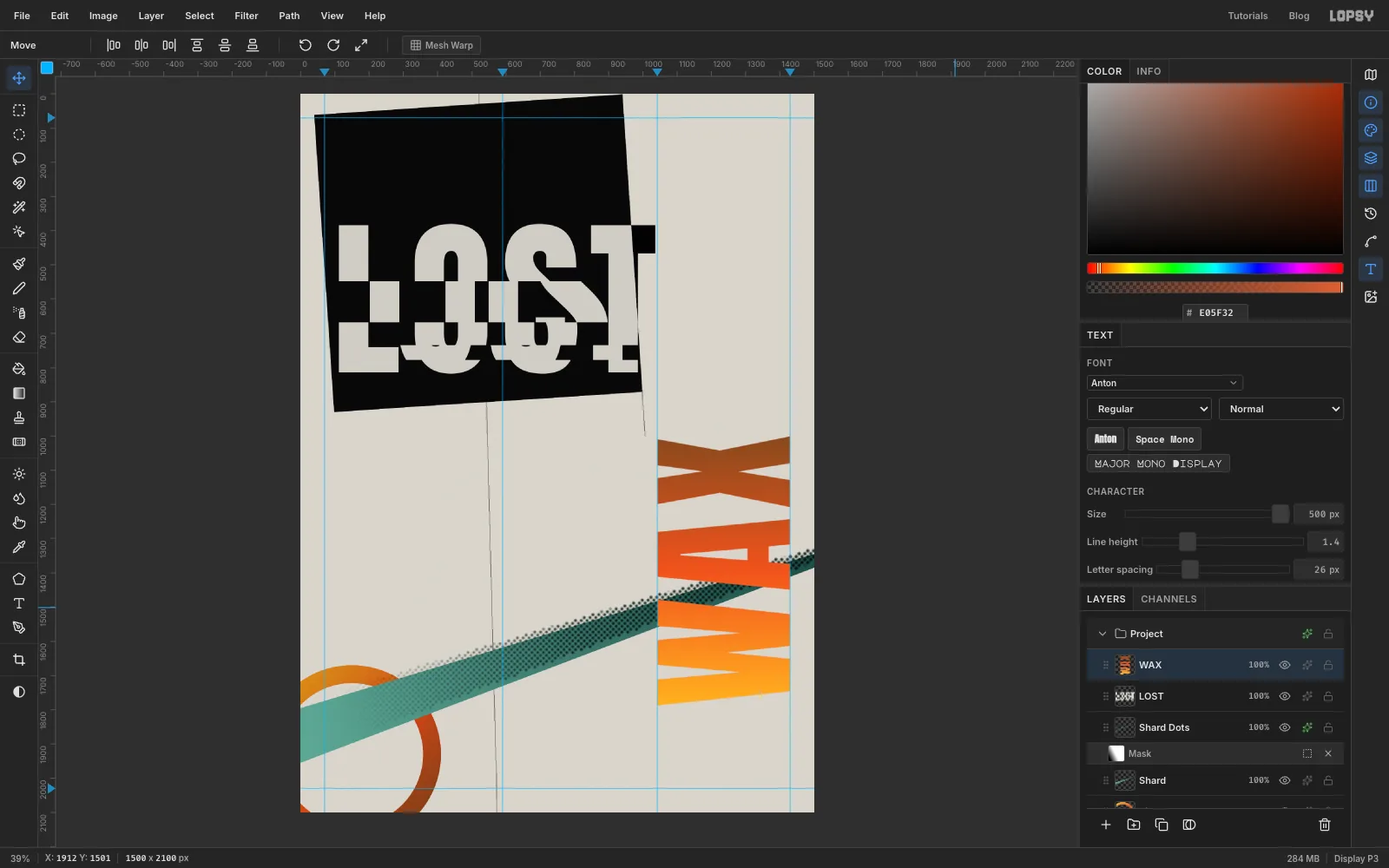
Drag WAX so its right edge sits on the 1430 guide and the top of the X is at about y 1000, where your first construction line stops. Use the arrow keys for the last few pixels. Its left edge now lands on the 1042 guide, and its top will line up with the IRON heading.
-
Set the four section headings
With WAX selected, click New Group and name it Menu. Click Add Layer to put an empty layer inside the group, and name it Rules. Rules does two jobs. It's where you'll draw the gauge later, and clicking it before you start each new piece of text keeps the text inside Menu.
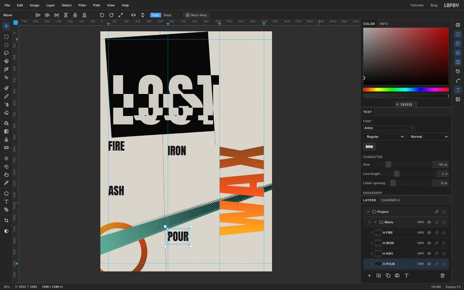
Set the headings in Anton at 96, in ink , with letter spacing back at 0. Put FIRE on the 70 guide just under the plate's bottom-left corner, with its cap top at y 960. Put IRON on the 590 guide, 40 px lower, so its cap top lines up with the top of WAX. Put ASH on the 70 guide at y 1350 and POUR on the 590 guide at y 1750.
Lopsy names a text layer after its text. Rename the headings H FIRE, H IRON, H ASH and H POUR, so they're easy to tell apart from the lists you're about to add.
-
Set the dishes
Set the dish lists in Space Mono Regular at 26, ink . In the Text panel, set Line height to 1.5 and Letter spacing to 0.
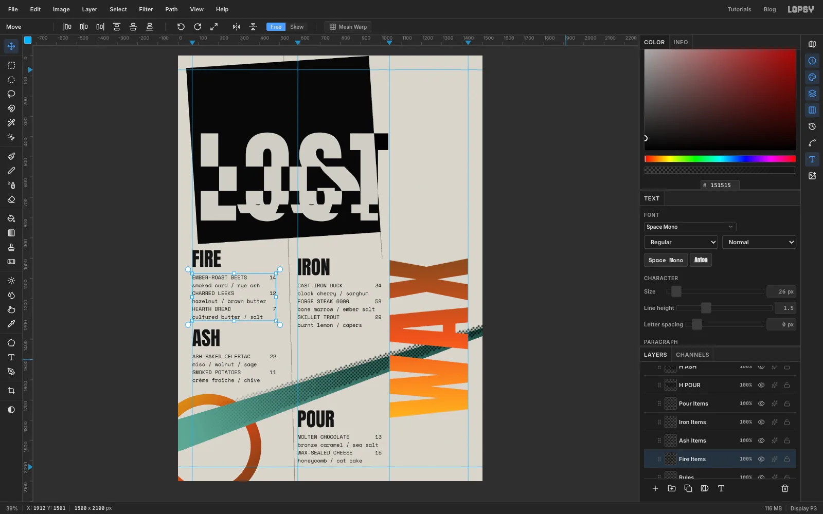
Each dish takes two lines. The first line is the name in capitals with the price at the end. The second line is the ingredients in lower case. Press Return between lines. Space Mono is monospaced, so you can line the prices up with spaces. Pad each name line so that the name, the spaces and the price add up to exactly 26 characters. The prices then end in the same column, about 410 px from the left edge of the block.
The dishes used here are:
- FIRE:
EMBER-ROAST BEETS 14with smoked curd / rye ash,CHARRED LEEKS 12with hazelnut / brown butter,HEARTH BREAD 7with cultured butter / salt - IRON:
CAST-IRON DUCK 34with black cherry / sorghum,FORGE STEAK 600G 58with bone marrow / ember salt,SKILLET TROUT 29with burnt lemon / capers - ASH:
ASH-BAKED CELERIAC 22with miso / walnut / sage,SMOKED POTATOES 11with crème fraîche / chive - POUR:
MOLTEN CHOCOLATE 13with bronze caramel / sea salt,WAX-SEALED CHEESE 15with honeycomb / oat cake
Put each list on its column's guide, about 40 px below its heading. Rename the lists Fire Items, Iron Items, Ash Items and Pour Items.
- FIRE:
-
Number the sections and add the hours
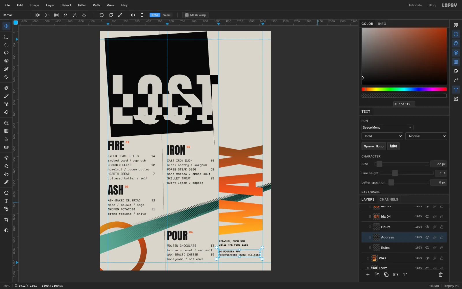
Type 01, 02, 03 and 04 in Space Mono Bold, 26, orange . Create them in empty space at the right of the page, because a click right next to a heading would edit the heading. Then drag each one to sit 16 px right of its heading, level with the cap tops.
Under WAX, on the 1042 guide, set the hours and address in Space Mono Bold 22 with Line height 1.4:
- WED–SUN, FROM 5PM / UNTIL THE FIRE DIES, about 50 px below the bottom of WAX, named Hours
- 14 FOUNDRY ROW / RESERVATIONS (555) 014-1150, a line's height lower again, named Address
-
Skew POUR so it runs like poured metal
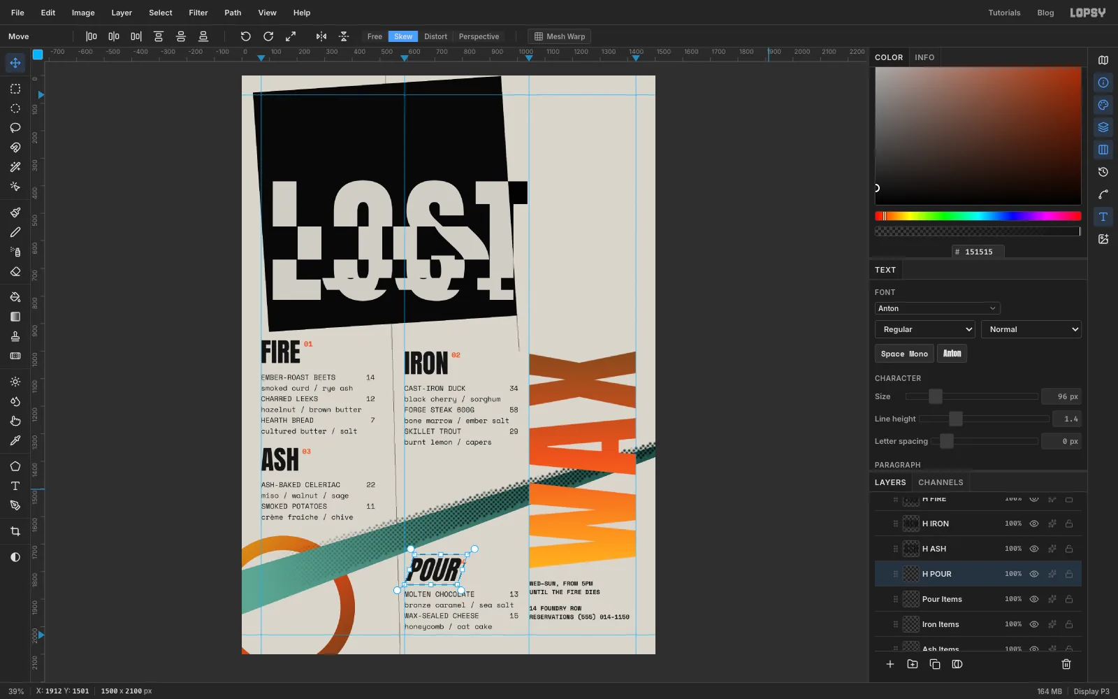
Select H POUR, click Rasterize Layer, and draw a marquee around it with a little room to spare. Switch to the Move tool and click Skew in the options bar. Drag the top-middle handle about 36 px to the right. The bottom edge stays put, so the word leans forward like an italic. Press Cmd+D and click Free to leave Skew mode.
The R now leans into the 04. Nudge the 04 right until it sits 16 px past the slanted R again.
-
Draw the pour-temperature gauge
The empty top-right corner gets a little scientific instrument. It's a scale from 0° at the bottom to 1150° at the top, with the stages of a bronze casting marked on it.
Click Rules, set the foreground to ink , and pick the Pencil at Size 3.
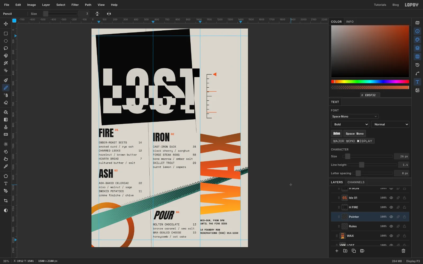
- Draw the spine about 60 px right of the 1042 guide. Click at y 440 and Shift-click straight below it at y 860. That's 420 px for 1150°.
- Add eleven ticks to the right of the spine, one every 42 px, each a click and a Shift-click. Make the top, middle and bottom ticks about 46 px long and the rest about 20 px.
Click Add Layer and name it Pointer. Set the foreground to . Lasso a small triangle pointing left at the top tick, choose Edit → Fill and press Cmd+D. Then use the Pencil to draw two 92 px orange lines out from the spine at the 700° and 150° marks. On a 420 px scale those fall at y 604 and y 805.
Label the marks in Space Mono Bold 20, each centred on its line: 1150° pour in orange next to the pointer, then 700° burnout, 150° dewax and 0° in ink. Those are the real temperatures for pouring bronze, burning the wax out of the mould, and melting the wax. Name the labels Scale 1150, Scale 700, Scale 150 and Scale 0.
-
Add the temperature headline
Above the gauge, set three pieces of type that share its left edge:
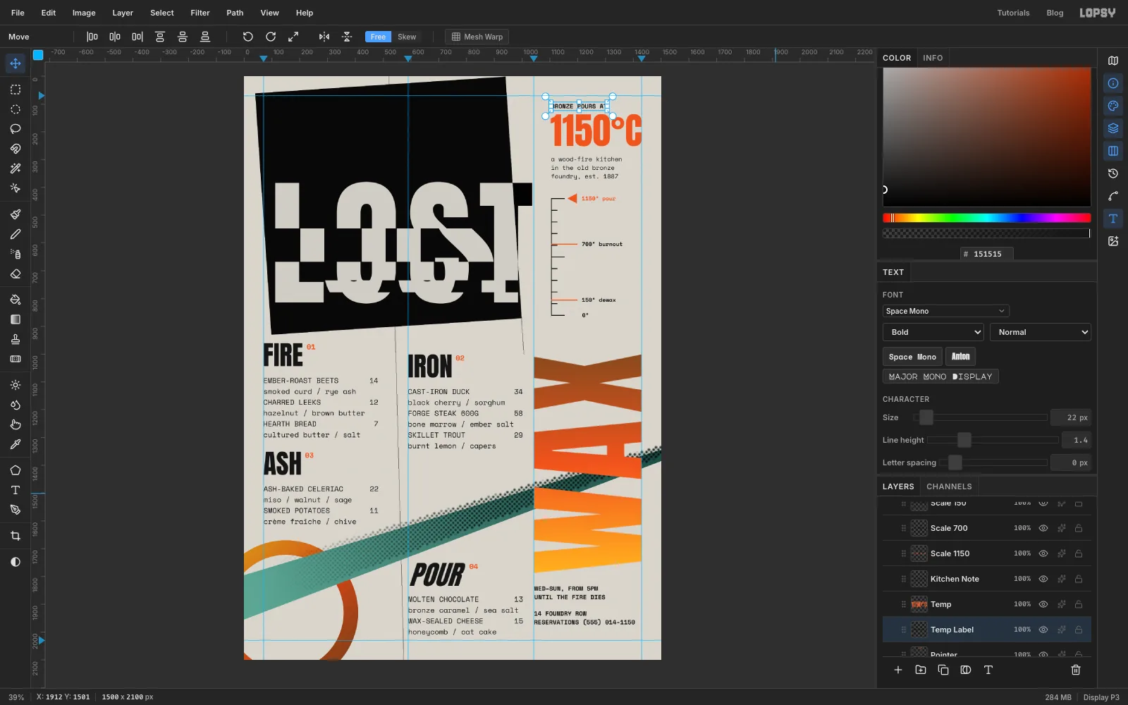
- 1150°C in Anton 132, orange , named Temp. Drag it until its right edge sits on the 1430 guide, with its cap top at y 136. At this size its left edge lands right above the gauge's spine.
- BRONZE POURS AT in Space Mono Bold 22, ink, named Temp Label. Line its left edge up with 1150°C's left edge, about 20 px above it.
- a wood-fire kitchen / in the old bronze / foundry, est. 1887 in Space Mono Regular 22 with Line height 1.4, named Kitchen Note. Put it on the same left edge, about 40 px below 1150°C.
-
Ghost the word MOULD
The column under IRON is empty, and the deconstructivists hated a quiet gap. Fill it with a ghost word that slides behind the band.
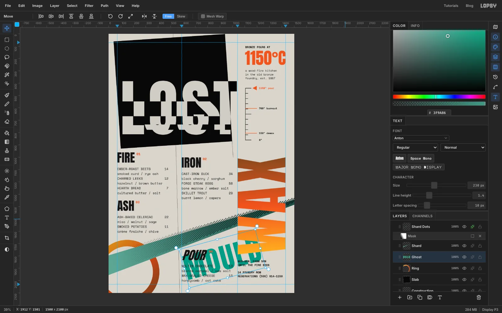
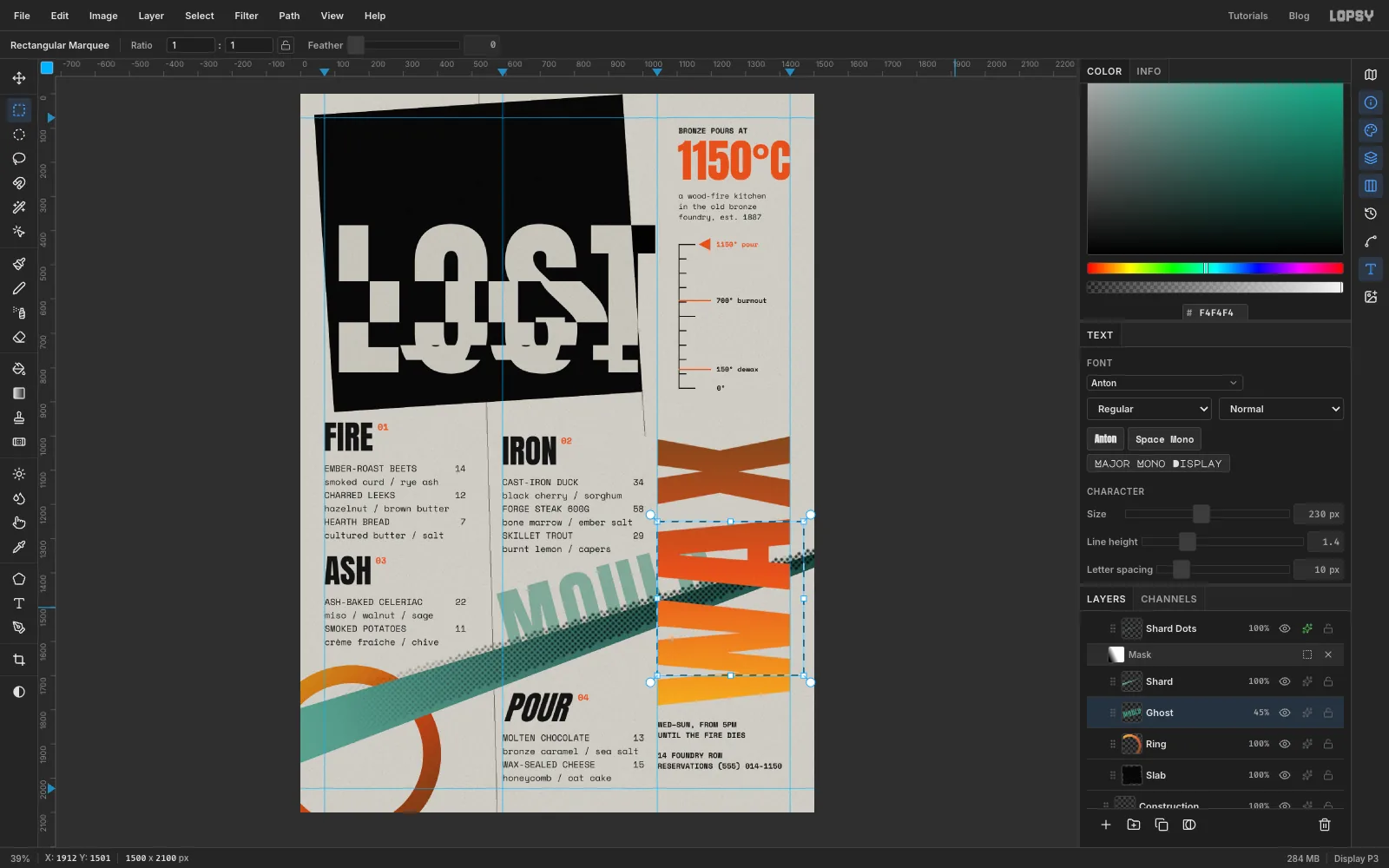
Click the Ring row, so the new text lands between the ring and the band. Set the Text tool to Anton 230, Letter spacing 10, and the colour to . Type MOULD in an empty spot near the bottom of the page, press Tab, and rename the layer Ghost.
With the Move tool and nothing selected, the live text gets a transform box of its own. Hold Cmd and drag a rotate handle until the word tilts 15° anticlockwise. That's roughly the angle of the band.
-
Tuck MOULD behind the band and WAX
Drag MOULD into the empty space under IRON. The M should start just right of the gutter hairline, the bottoms of the letters should slide under the band, and the far end should run behind WAX. Set its Blend to Multiply and its opacity to 45%, so it reads as a ghost behind the menu.
Part of the D still shows in the gaps between WAX's letters. Click Rasterize Layer to turn Ghost into pixels. Then draw a marquee that starts on the 1042 guide (the marquee snaps to it) and covers everything of MOULD to its right. Press Delete and Cmd+D.
-
Group the planes
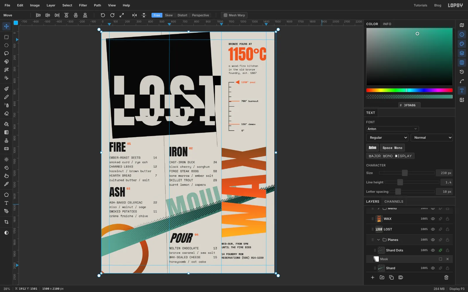
Click the Slab row, then Shift-click the Shard Dots row to select everything from the plate up to the dots. Choose Layer → Group Layers and name the group Planes. The stacking order stays the same, and the background shapes now fold away under one row.
-
Print it with grain
Click the Project row and click Add Layer. The new layer goes on top of everything. Name it Grain, fill it with grain grey using Edit → Fill, then run Filter → Add Noise with Mono, Gaussian and Amount 40. Set the layer's Blend to Multiply. The grain grey nearly vanishes in Multiply, and only the speckle stays, over the inks as well as the paper.
Export with File → Quick Export PNG, and keep an editable copy with File → Save Project.