Design a Duotone Data Visualization Poster
Build a duotone infographic poster in Lopsy with a honeycomb and bee hero, a Gradient Map, an accurate bar chart, and clean editorial type.
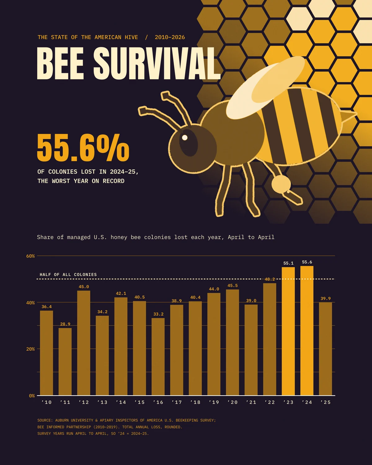
A duotone poster uses two inks, and that makes a strong data visualization. Colour stops decorating and starts carrying meaning. Everything ordinary is one ink, and the one thing you want the reader to see is the other.
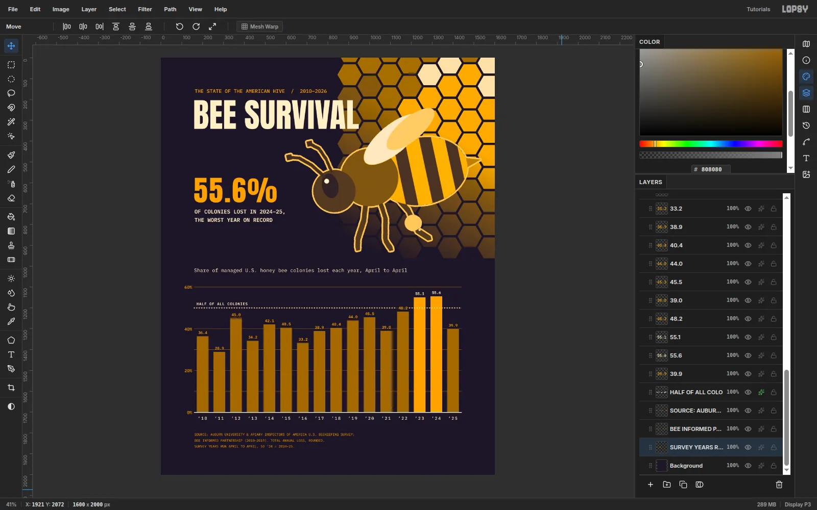
In this tutorial you'll make Bee Survival, a 1600 × 2000 px poster about the share of managed U.S. honey bee colonies lost each year from 2010 to
- It uses the published annual-loss figures from the Auburn University / Apiary Inspectors of America survey and the earlier Bee Informed Partnership survey, rounded to one decimal. If you publish your own version, check the figures against the latest report.
You'll draw the bee and the honeycomb in greyscale, then turn the whole illustration duotone with one Gradient Map. The chart is built with marquees on exact pixel values, so every bar is honest.
The palette:
- Ink:
#1C1526 - Honey:
#F2A516, with darker bars in#9C6B1C - Cream:
#FFF1C9
The chart data, as annual loss in %:
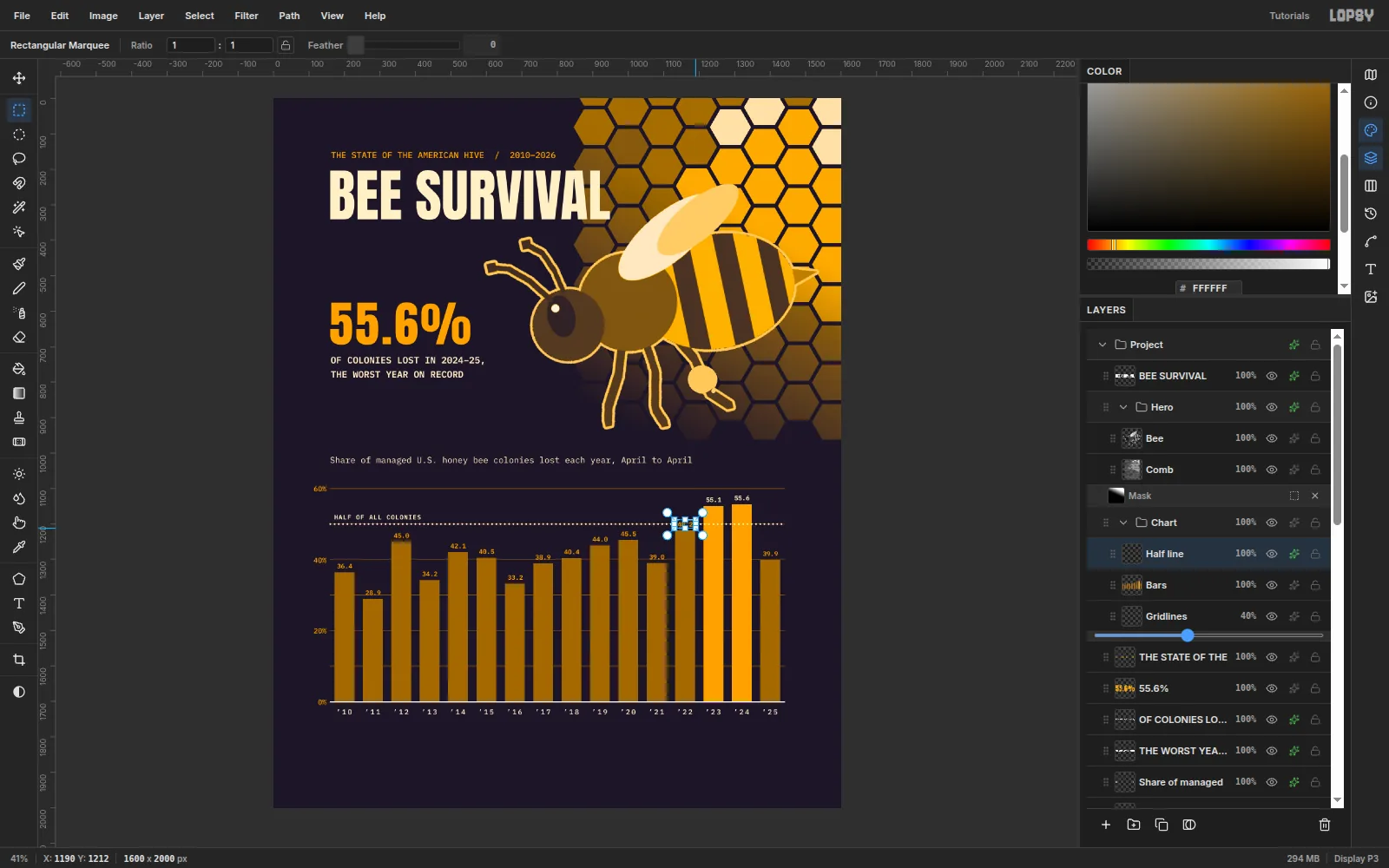
- '10 36.4, '11 28.9, '12 45.0, '13 34.2, '14 42.1, '15 40.5, '16 33.2, '17 38.9
- '18 40.4, '19 44.0, '20 45.5, '21 39.0, '22 48.2, '23 55.1, '24 55.6, '25 39.9
-
Set up the canvas and guides
Choose File → New, set Width to 1600 and Height to 2000 px, and click Create.
- Select the Background layer, set the foreground colour to
#1C1526, press G for the Fill tool and click the canvas. - Click the top ruler at 160, 800 and 1440 for the margins and centre line.
- Click the left ruler at 1100 and 1700. These mark the top of the chart (the 60% line) and its baseline.
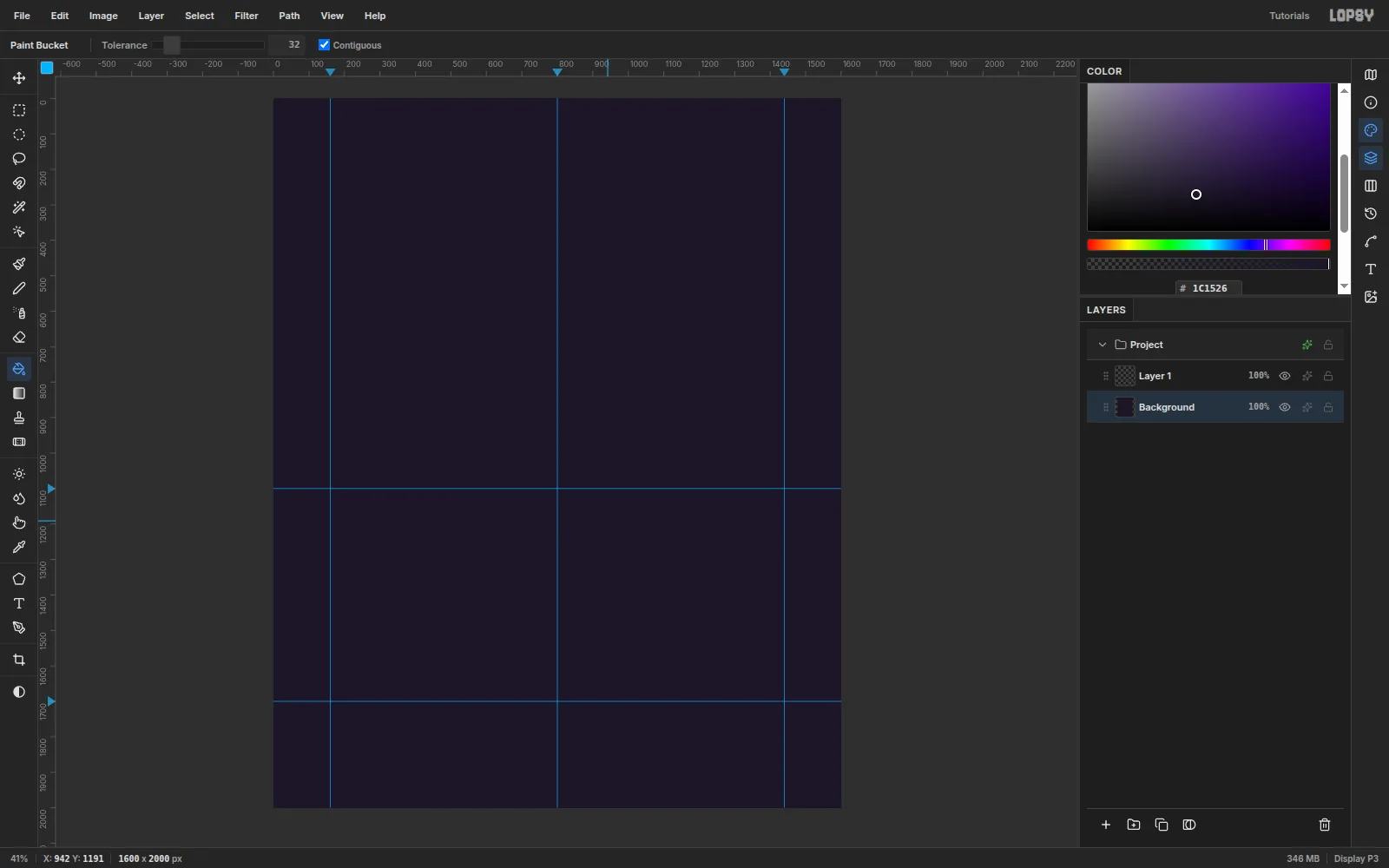
- Select the Background layer, set the foreground colour to
-
Draw a column of hexagons
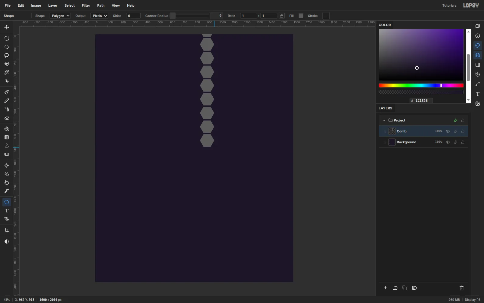
Rename Layer 1 to Comb. Press U for the Shape tool, set Shape to Polygon with 6 sides, and set the fill swatch to a mid grey (
#5C5C5C).The Shape tool draws from the centre outwards. Drag from each centre 58 px down and to the right to make a hexagon about 116 px across. Place nine centres at x 904, starting at y −30 and stepping down 111 px (−30, 81, 192 … 857).
-
Duplicate and offset the column into a comb
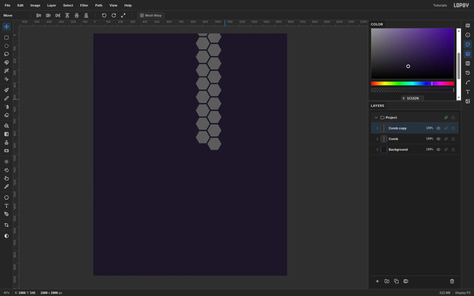
Click Duplicate Layer in the Layers panel, then click the copy's row so that only the copy is selected. Press V and drag the copy 96 px right and 55 px down. It starts 10 px off, so the drag itself is 86 × 45. The cells now interlock.
Press Cmd+E (Merge Down). Then duplicate and move again:
- Duplicate, move 192 px right, merge.
- Duplicate, move 384 px right, merge.
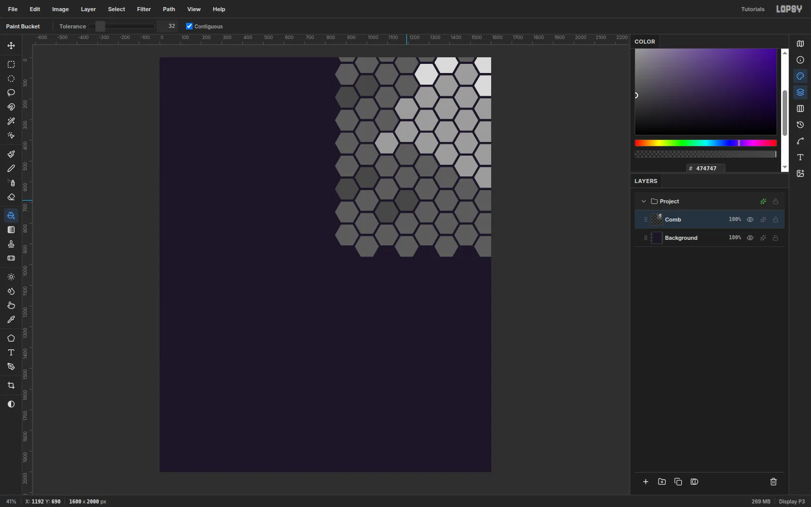
You now have eight columns filling the top-right corner.
-
Vary the cells with the Fill tool
Press G and click single cells to give the comb some life:
#9C9C9Cfor honey-filled cells in a band through the middle.#DADADAfor five capped cells in the top-right corner.#474747for six empty cells scattered down the left edge.
-
Clip the abdomen stripes
Build the bee from separate layers above Comb:
- Legs: press N for the Pencil, Size 16, colour
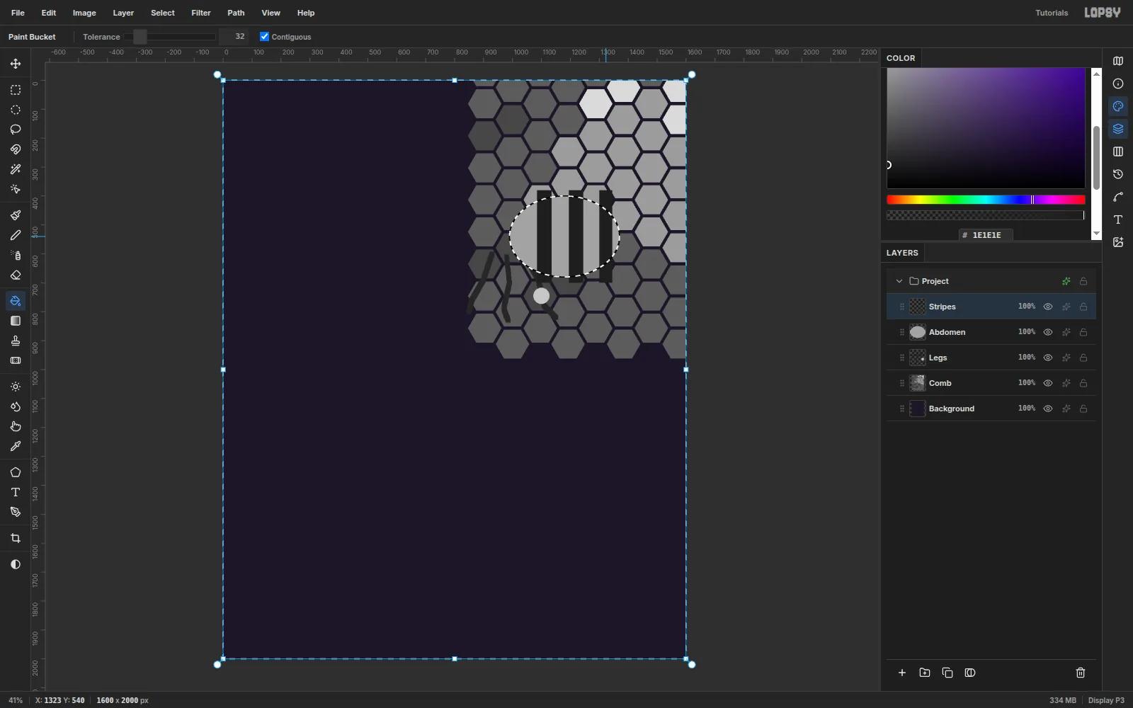
#262626, and draw three bent legs down from about (930, 600), (980, 610) and (1040, 600). With the Shape tool in Ellipse mode, add a small pale ellipse (#C7C7C7, dragged 28 px out from its centre at (1100, 745)) on the back leg as a pollen basket. - Abdomen: drag a
#A3A3A3ellipse from its centre at (1180, 540) out 190 px across and 140 px down. - Stripes: with the Rectangular Marquee, fill three
#1E1E1Ebands from y 380 to 700, at x 1085–1135, 1195–1245 and 1300–1345.
To trim the stripes to the body, Cmd-click the Abdomen thumbnail to load its shape as a selection. Then click the Abdomen row and click back on Stripes. Choose Select → Invert (Shift+Cmd+I) and press Delete.
- Legs: press N for the Pencil, Size 16, colour
-
Add the head, thorax and antennae
Add Thorax and Head layers above Stripes, and use the Shape tool in Ellipse mode:
- Thorax:
#424242, dragged from (960, 520) out 120 px both ways. - Head:
#242424, dragged from (805, 545) out 88 px. Add an eye in#0A0A0A, dragged from (792, 520) out 34 × 52 px, and a#F2F2F2highlight dragged 10 px out from (782, 498).
On Head, draw two antennae with the Pencil, Size 10 and
#1A1A1A, curving up and left from the top of the head. Click once at each tip with Size 22 to club them. On Abdomen, use the Lasso to draw a small triangle off the tail, from (1360, 522) to (1428, 544) to (1360, 566), and fill it with#6E6E6Efor the stinger.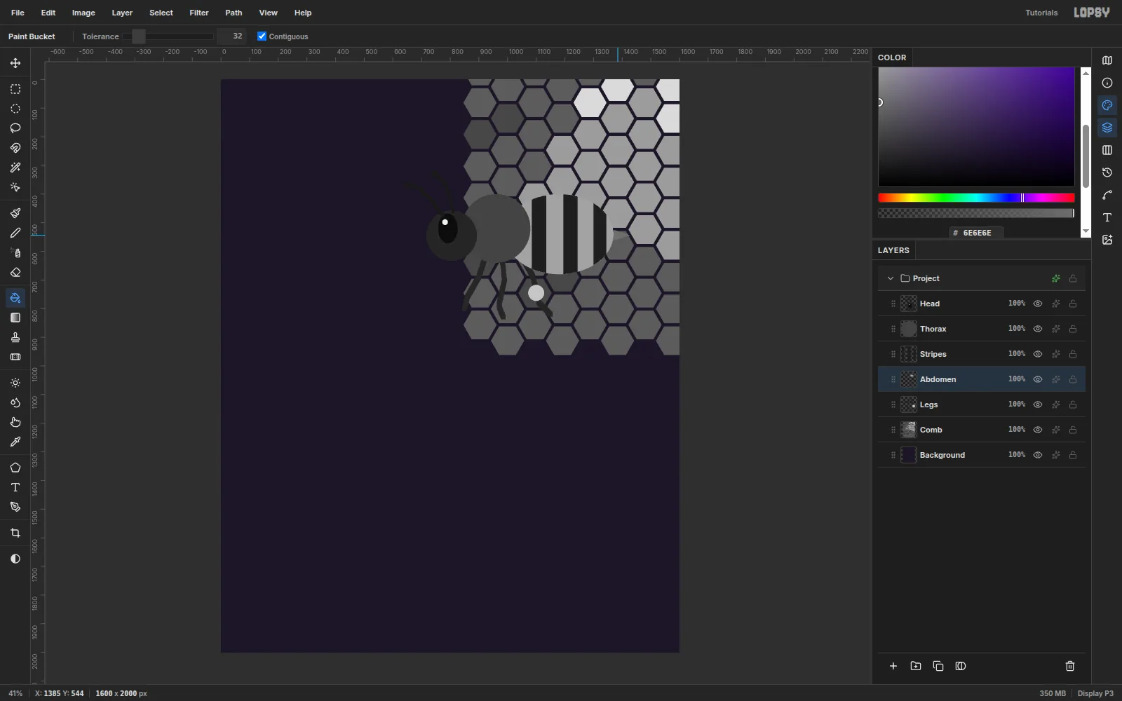
- Thorax:
-
Merge the bee and outline it
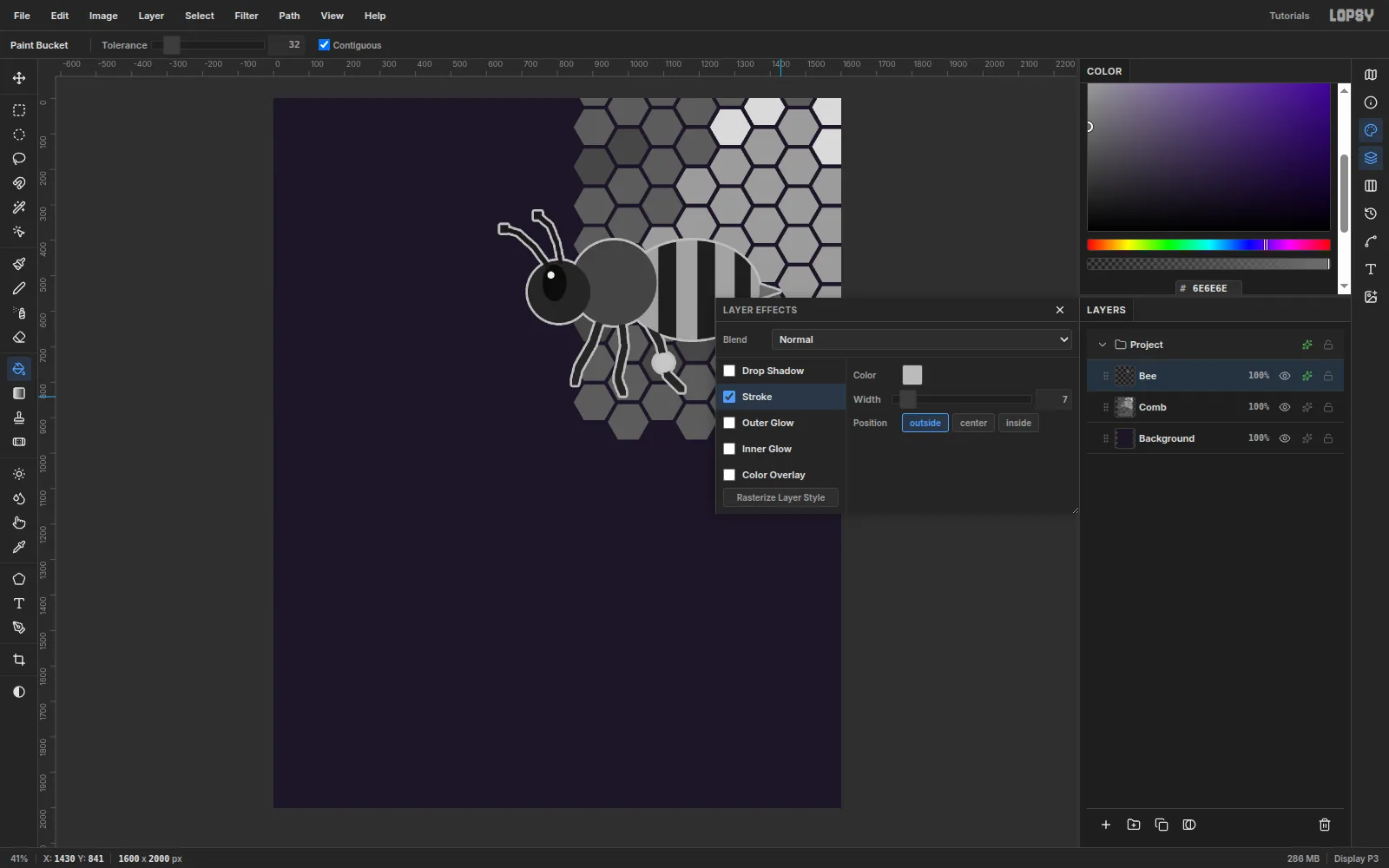
Select Head and press Cmd+E four times to merge the parts into one layer. Rename it Bee.
Open the layer's effects, tick Stroke and set:
- Colour
#BDBDBD - Width 7
- Position outside
The outline becomes cream after the Gradient Map. It separates the dark body from the dark comb, the way a print keyline does.
- Colour
-
Draw and rotate the wings
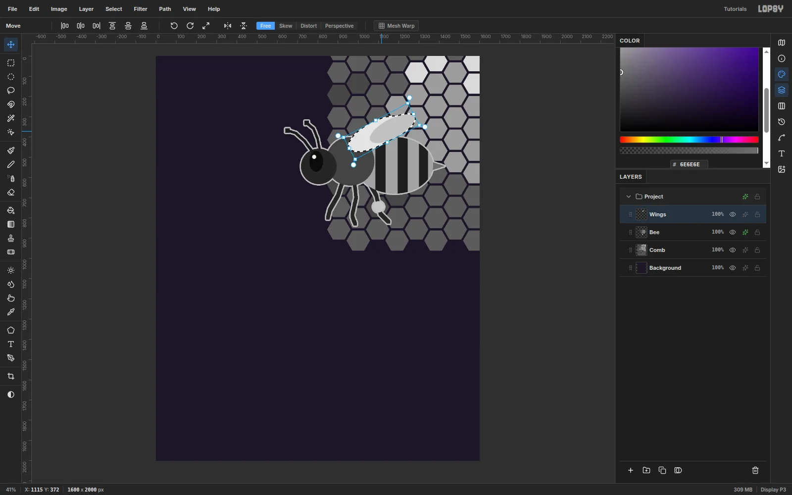
Add a Wings layer above Bee. Draw two ellipses from their centres: a
#E6E6E6one from (1000, 395) out 150 × 60 px, and a smaller#C2C2C2one from (1085, 410) out 125 × 48 px.Cmd-click the Wings thumbnail and press V. Drag the top-right rotation handle (the circle just outside the corner) until the wings tilt up about 28°. Then drag inside the box to move them about 85 px right and 24 px up, onto the thorax. Press Cmd+D to commit and Cmd+E to merge them into Bee.
-
Scale and tilt the whole bee
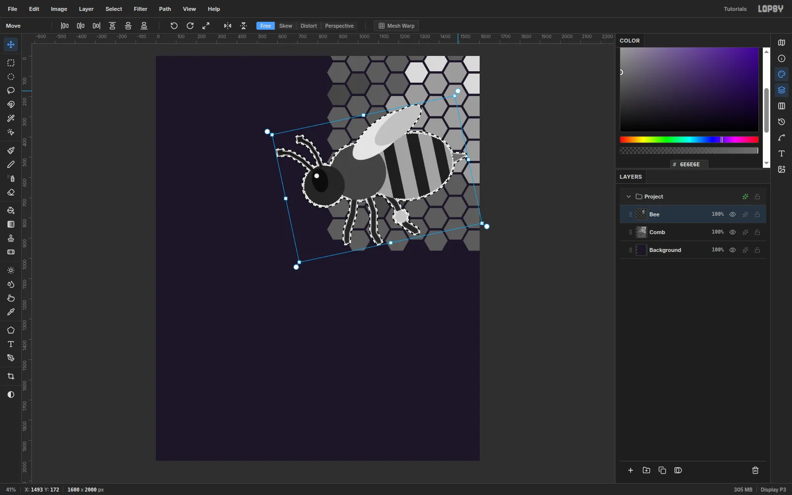
Cmd-click the Bee thumbnail, press V, and Cmd-drag the bottom-right corner handle out to 115%. Hold Cmd to keep the proportions. Press Cmd+D.
Load the selection again and drag a rotation handle 12° counter-clockwise, so the bee climbs toward the headline. Press Cmd+D.
-
Make it duotone with a Gradient Map
Click Comb, Shift-click Bee, and choose Layer → Group Layers. Rename the group Hero.
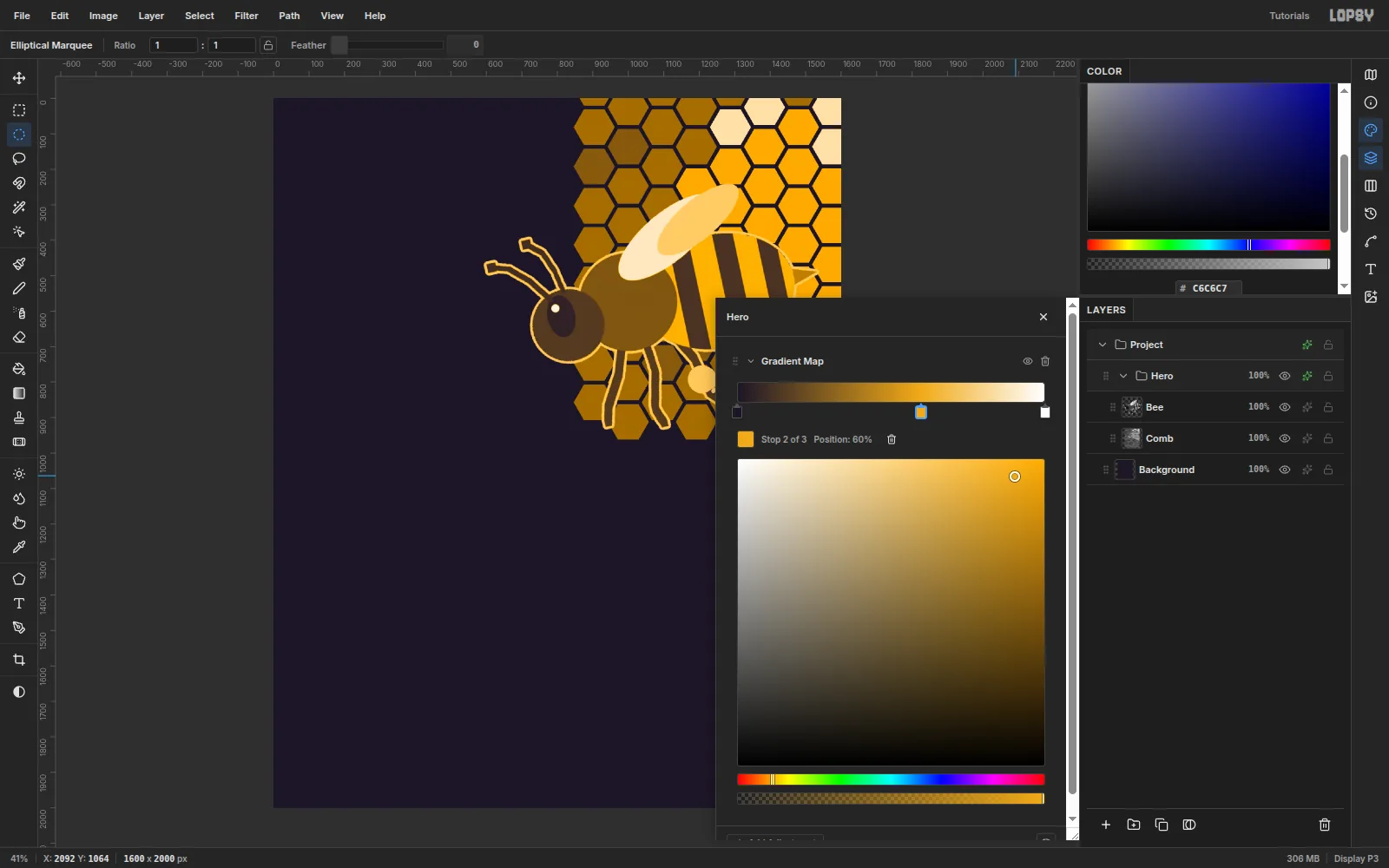
Click the group's effects button to open its adjustment stack. Choose Add Adjustment → Gradient Map and edit the stops:
- Left stop:
#1C1526. - Click the handle row at 60% to add a stop, and set it to
#F2A516. - Leave the right stop white.
Every grey now maps onto the ink-to-honey ramp. The dark stripes and eye become ink, and the pale wings and capped cells become cream.
- Left stop:
-
Fade the honeycomb into the ink
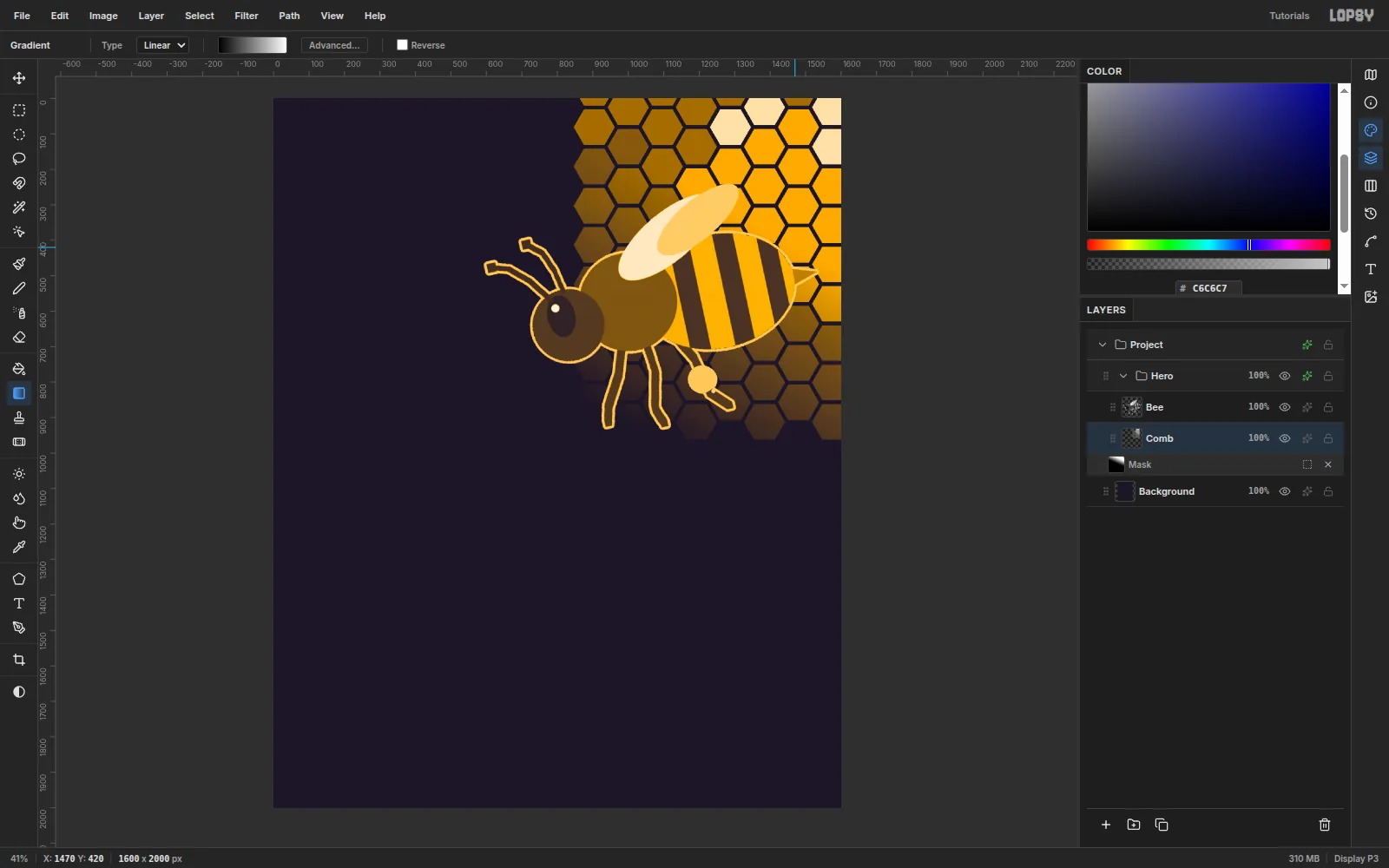
Select Comb and click Add Mask. Click the mask thumbnail to edit the mask. Choose the Gradient tool (Linear, black to white) and drag from (1150, 1000) up to (1470, 420).
Press Esc and click another layer's row to leave mask editing. The cells now fade diagonally into the background, and the bottom row disappears completely.
-
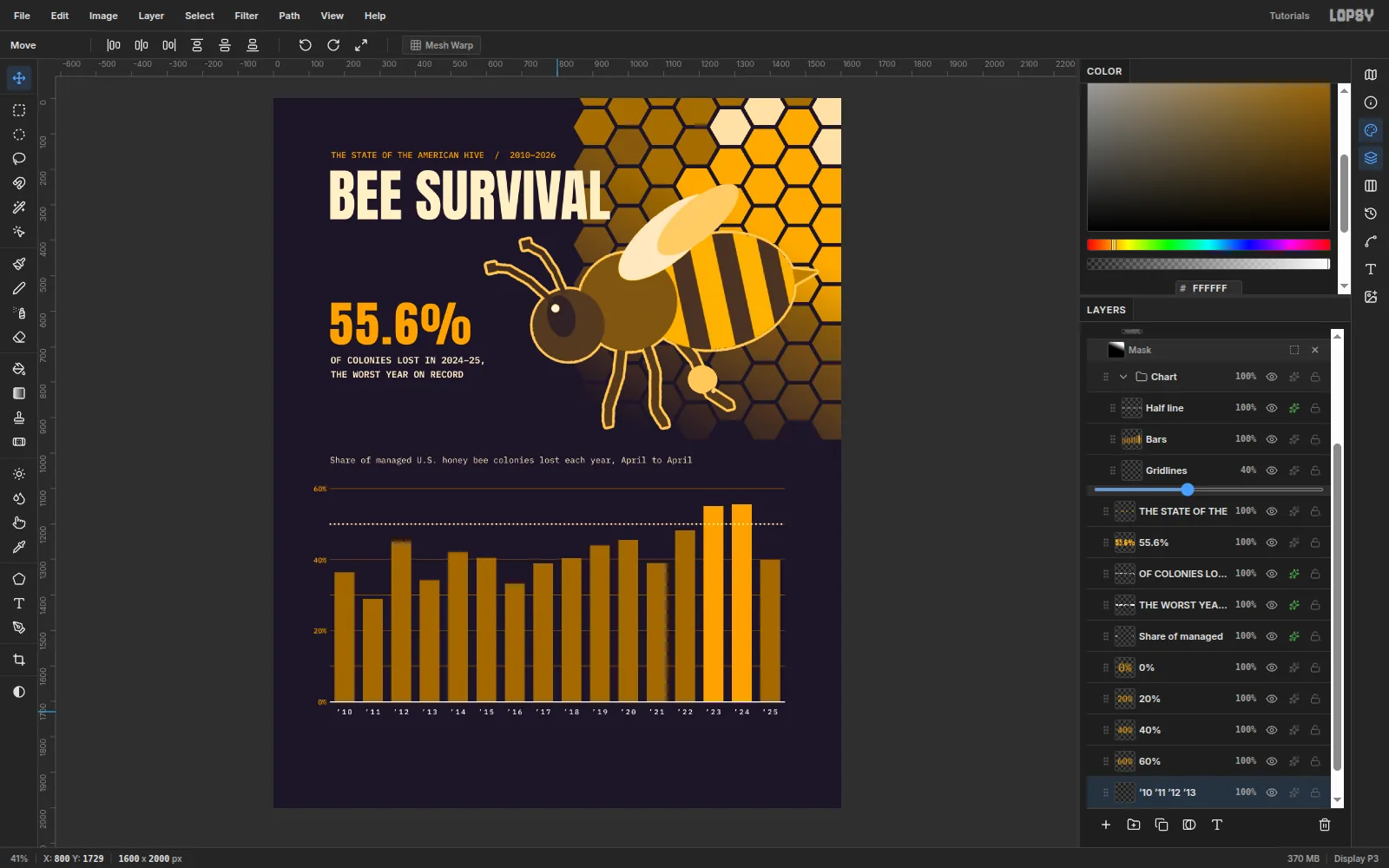
Draw the bars on exact values
Select Background and add a Gridlines layer. Press N (Pencil, Size 2,
#F2A516). For each of y 1600, 1500, 1400, 1300, 1200 and 1100 (10% to 60%), click at x 160 and Shift-click at x 1440 to draw a straight line. Set the layer to 40% opacity.Add a Bars layer. Turn the grid on with Cmd+' and untick Snap. The grid is only a visual reference here. Snap would round each bar top to a grid line, and the chart has to be exact.
For each bar i (0 to 15), marquee from x 172 + 80 × i, 56 px wide, from y 1700 − 10 × value down to 1700. Click inside with the Fill tool in
#9C6B1C. That scale is 10 px per percentage point, so '15 (40.5%) runs from y 1295 to 1700.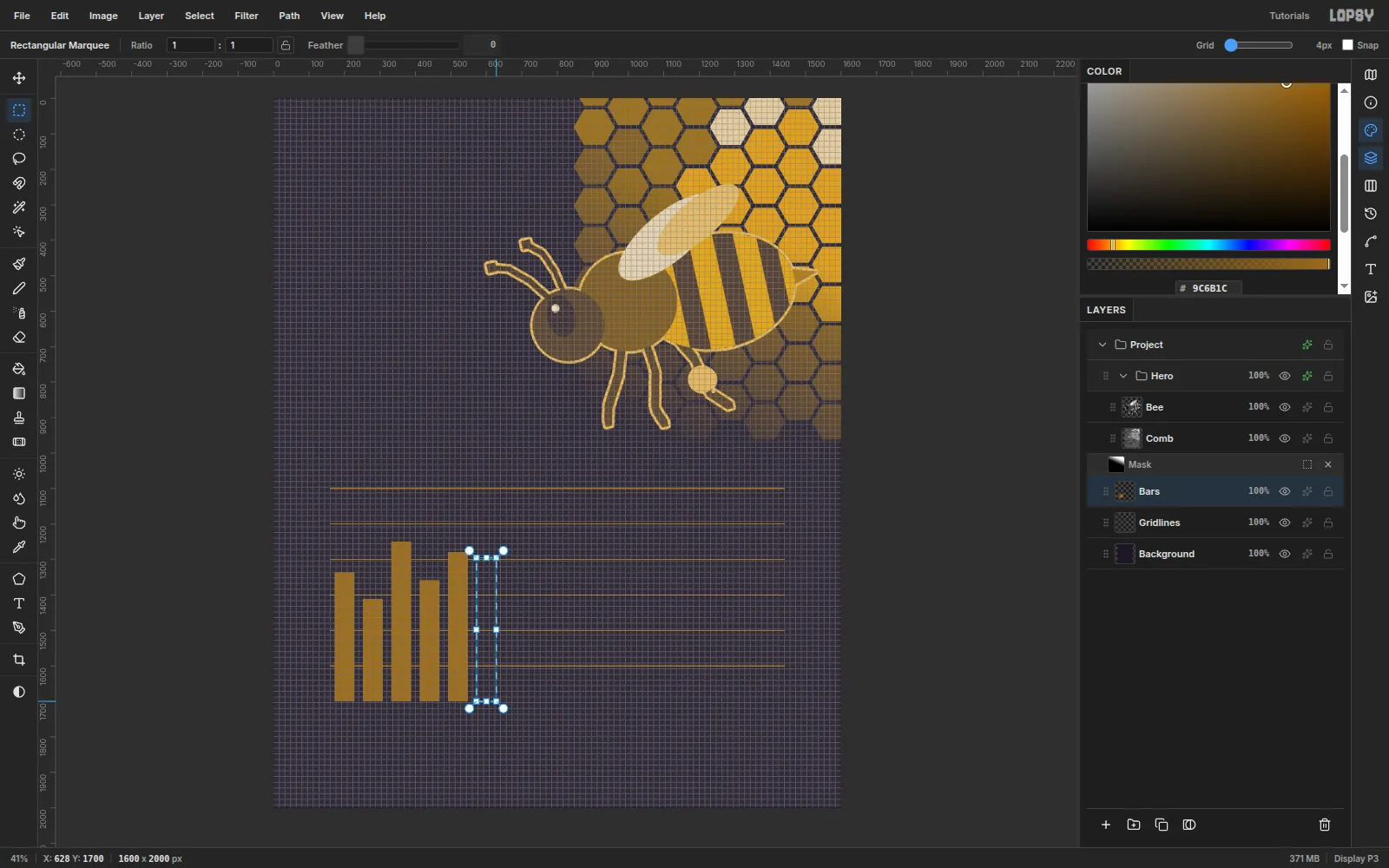
-
Highlight the record years
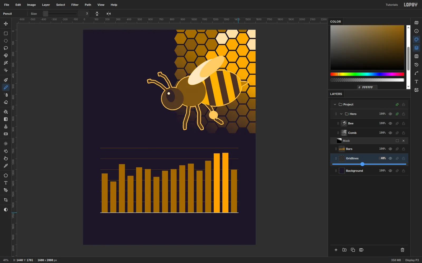
Marquee the '23 and '24 bars again and fill them with
#F2A516. These two record years are the story, so they get the bright ink.With the Pencil at Size 3 in white, click at (160, 1701) and Shift-click at (1440, 1701) for the baseline. Turn the grid off.
-
Make a dotted 50% line
Add a Half line layer above Bars. Press B, set Size 6 and Hardness 100, and open the brush presets. On the Shape tab, set Spacing to 300. Each dab is now its own dot.
Click at (160, 1200) and Shift-click at (1440, 1200). Give the layer a Color Overlay of
#FFF1C9.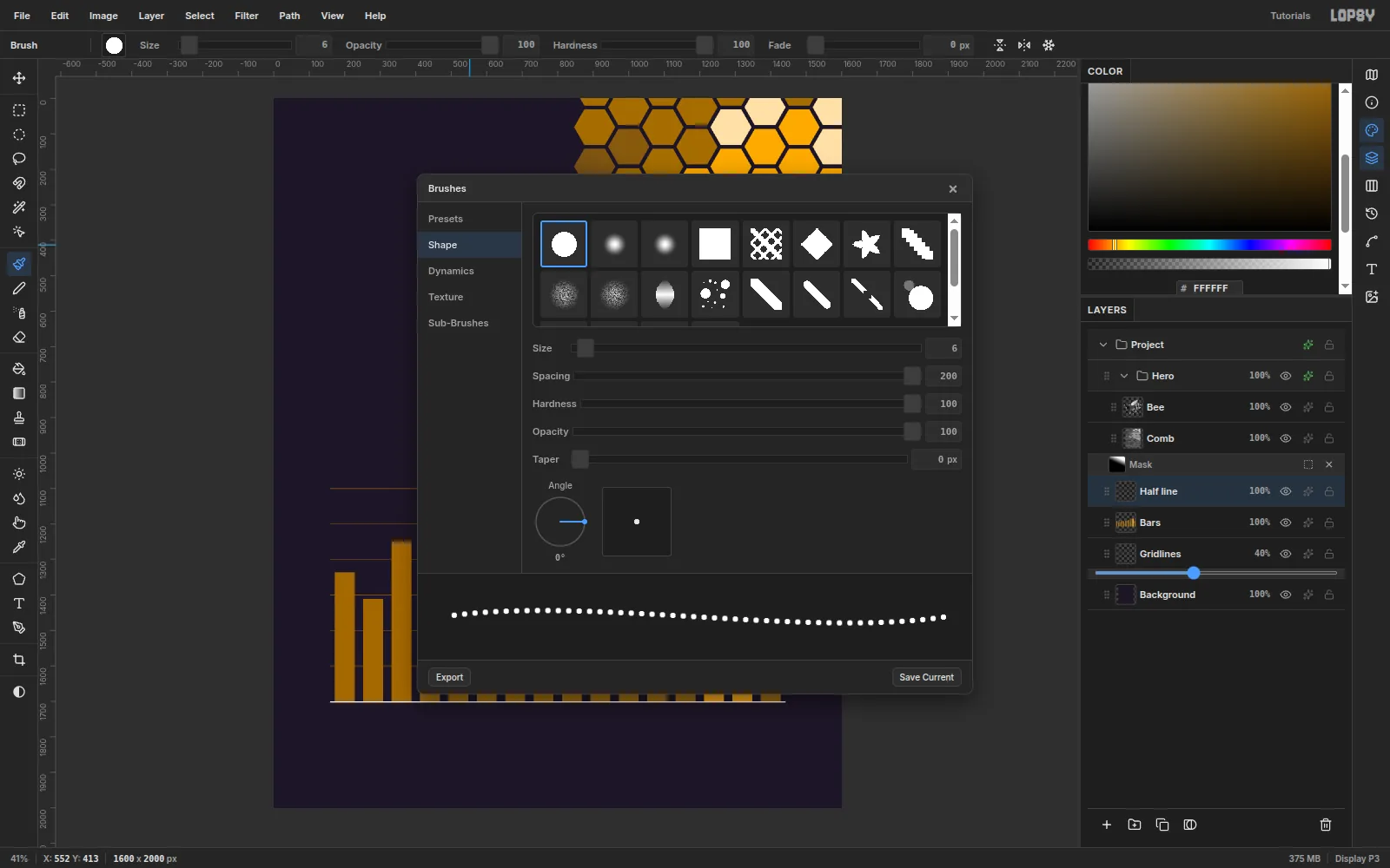
-
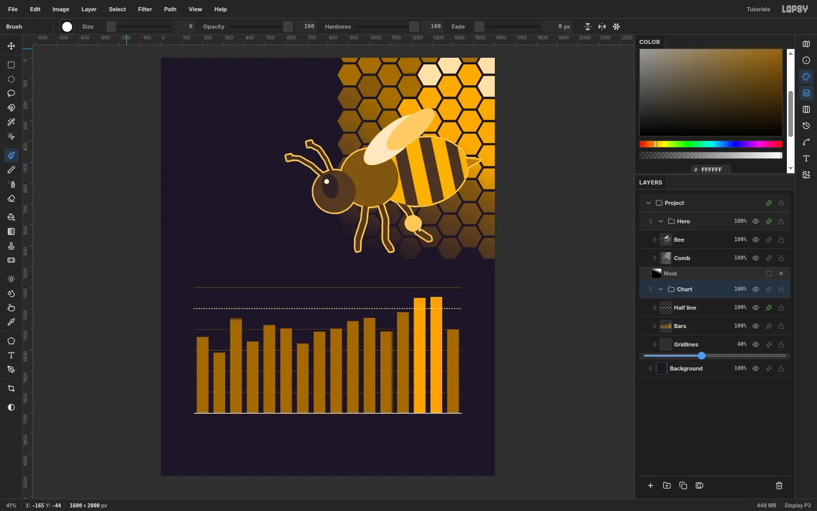
Group the chart
Click Gridlines, Shift-click Half line, and choose Layer → Group Layers. Rename the group Chart. Now the whole chart can be moved or hidden in one step.
-
Set the headline
Before each new text layer, click the Background row. Font and size changes apply to the active text layer, and this keeps them off the text you've already set. Also click to type in empty canvas, well away from other type, and move the layer into place afterwards. A click just below a big headline edits the headline instead.
- Kicker: IBM Plex Mono, Medium, 24,
#F2A516:THE STATE OF THE AMERICAN HIVE / 2010–2026. Move its letters to start at (162, 150). - Title: Anton, Regular, 160, white:
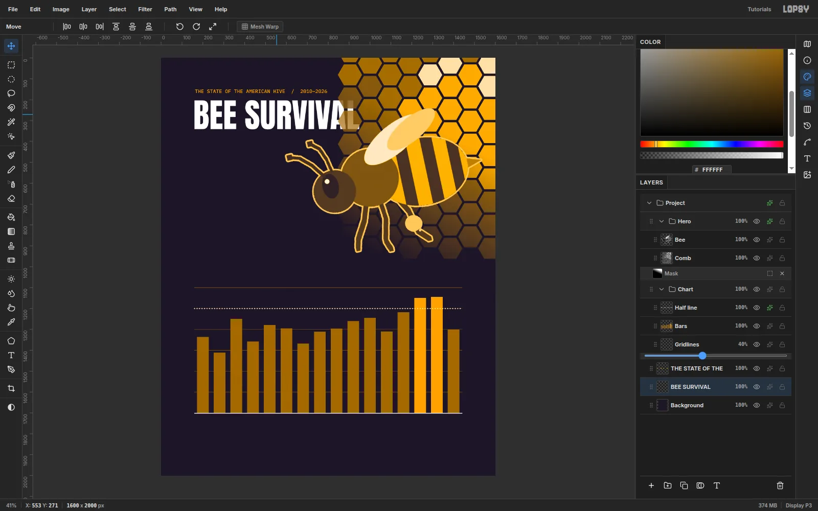
BEE SURVIVAL. Move it so the caps start at (160, 202), 32 px under the kicker.
The L sits behind the honeycomb, because text layers land above Background, below Hero.
- Kicker: IBM Plex Mono, Medium, 24,
-
Bring the title above the honeycomb
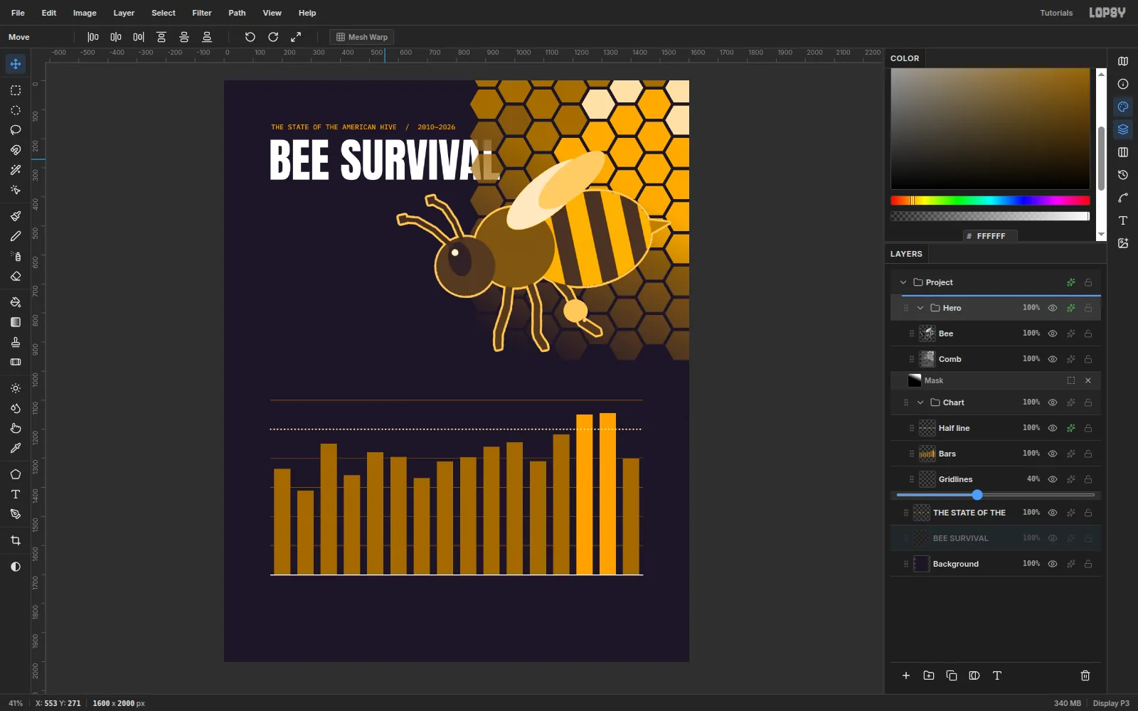
Drag the BEE SURVIVAL row by its grip (the dotted handle on the left) up to the top half of the Hero row. The title now sits over the comb. The top-left cells are faded dark honey, so the headline stays readable.
-
Add the stat and the chart's dek
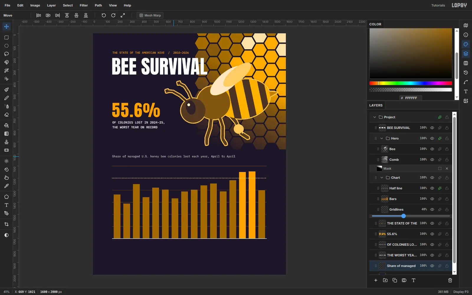
A good data poster pulls one number out of the chart:
- Anton 136 in
#F2A516:55.6%. In the Text panel, set Letter spacing to 6 so the period doesn't touch the fives. Place it at (160, 575). - IBM Plex Mono SemiBold 26, white:
OF COLONIES LOST IN 2024–25,at (162, 728) andTHE WORST YEAR ON RECORDat (162, 768). - IBM Plex Mono Regular 24, white:
Share of managed U.S. honey bee colonies lost each year, April to Aprilat (160, 1010).
Every block now starts on the x 160 margin.
- Anton 136 in
-
Warm the whites to cream
Pure white is a third colour on a duotone poster, so warm it to the paper tone. On BEE SURVIVAL, the two stat lines and the dek, open Layer Effects, tick Color Overlay and set it to
#FFF1C9.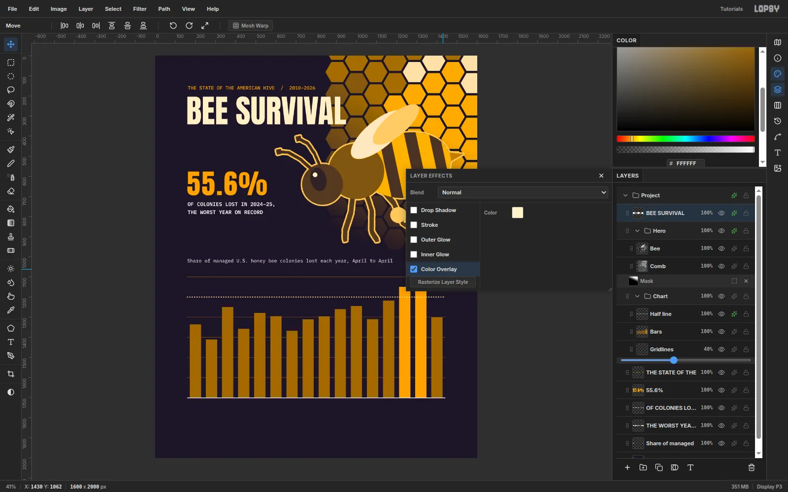
-
Label the axes
Axis labels are IBM Plex Mono Medium 20:
0%,20%,40%and60%in#F2A516, right-aligned to x 148 and centred on their gridlines.- One text layer for the years:
’10 ’11 ’12…’25with two spaces between each, in white. In the Text panel, set Letter spacing to 4. The labels then land on the 80 px bar pitch. Centre the layer on x 800 with its top at y 1722, and give it the cream Color Overlay.
-
Label every bar and knock out the line
Label all 16 bars with IBM Plex Mono SemiBold 18. Use
#F2A516for most and#FFF1C9for 55.1 and 55.6. Centre each one on its bar at x 200 + 80 × i, with its bottom 12 px above the bar's top. One label style with no % signs is quicker to read than mixed styles.Add
HALF OF ALL COLONIES(18 SemiBold, Letter spacing 1.5, cream overlay) just above the dotted line at (172, 1174).The 48.2 label sits right on the dotted line. Select Half line, marquee from (1130, 1188) to (1190, 1212), and press Delete to knock the dots out behind it.
-
Add the source note
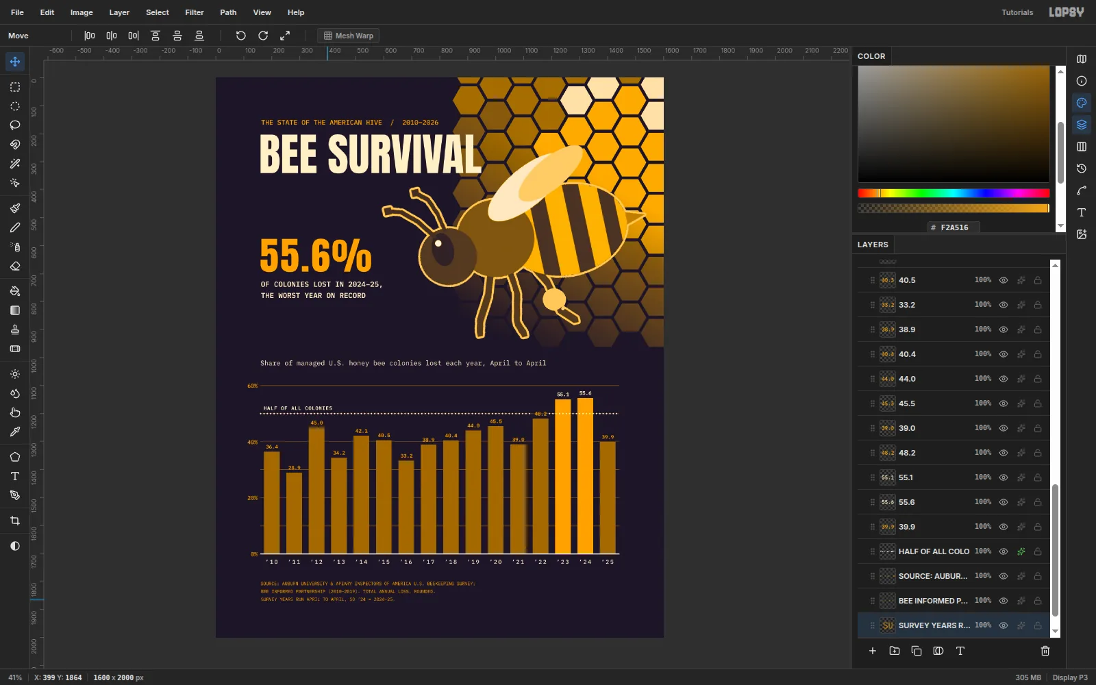
In IBM Plex Mono Regular 16,
#F2A516, set three lines at x 162, at y 1802, 1830 and 1858:SOURCE: AUBURN UNIVERSITY & APIARY INSPECTORS OF AMERICA U.S. BEEKEEPING SURVEY;BEE INFORMED PARTNERSHIP (2010–2019). TOTAL ANNUAL LOSS, ROUNDED.SURVEY YEARS RUN APRIL TO APRIL, SO ’24 = 2024–25.
The last line tells the reader what each year label means.
-
Make a grain layer
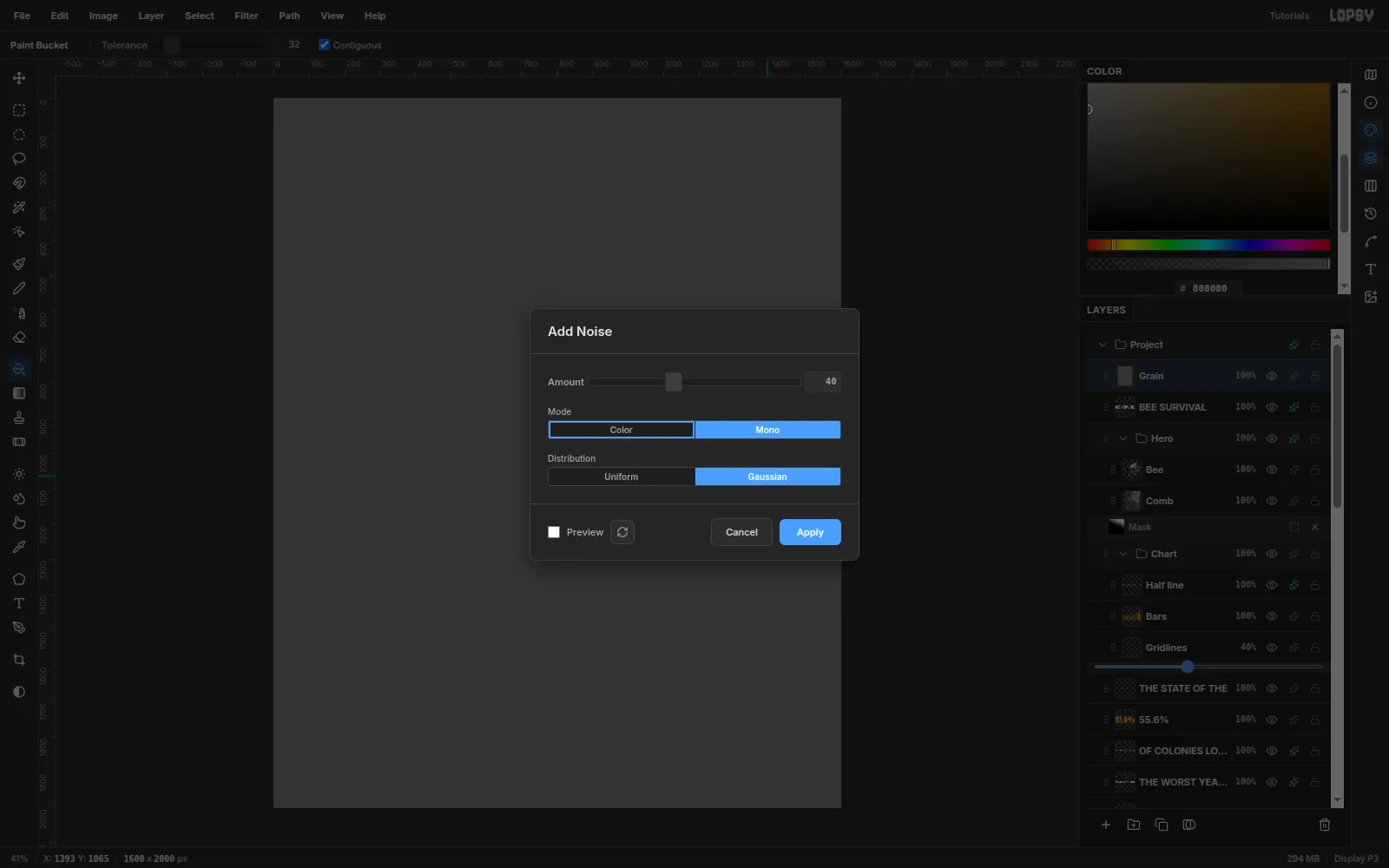
Select the BEE SURVIVAL row so the new layer lands on top, then add a Grain layer. Fill it with
#808080. Choose Filter → Add Noise… and set:- Amount 40
- Mono
- Gaussian
Click Apply.
-
Blend the grain and export
Set Grain to Overlay and 45% opacity. The flat ink and honey pick up a fine print texture, and mid-grey noise leaves the colours where they were.
Choose File → Quick Export PNG to save the poster.