Glitch Art Gallery Invitation with a Tiger Moth Photo
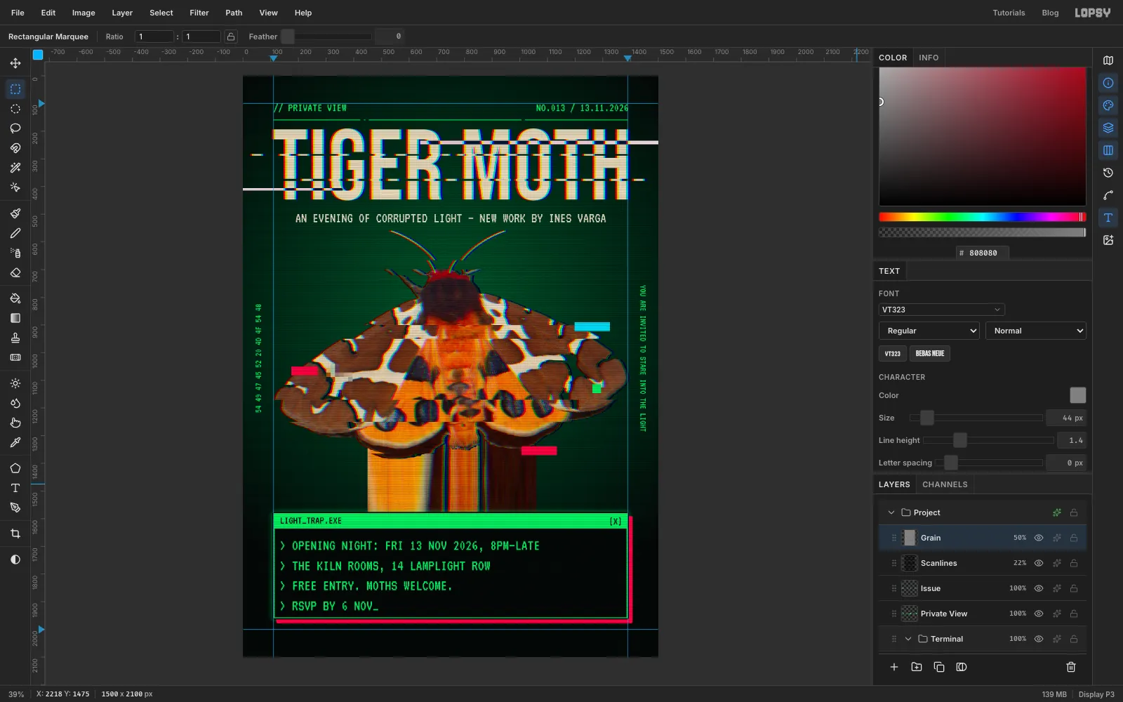
Make a glitch-art private view invitation in Lopsy from a public-domain moth photo, with slice tears, RGB split, a pixel-sort drip and CRT scanlines.
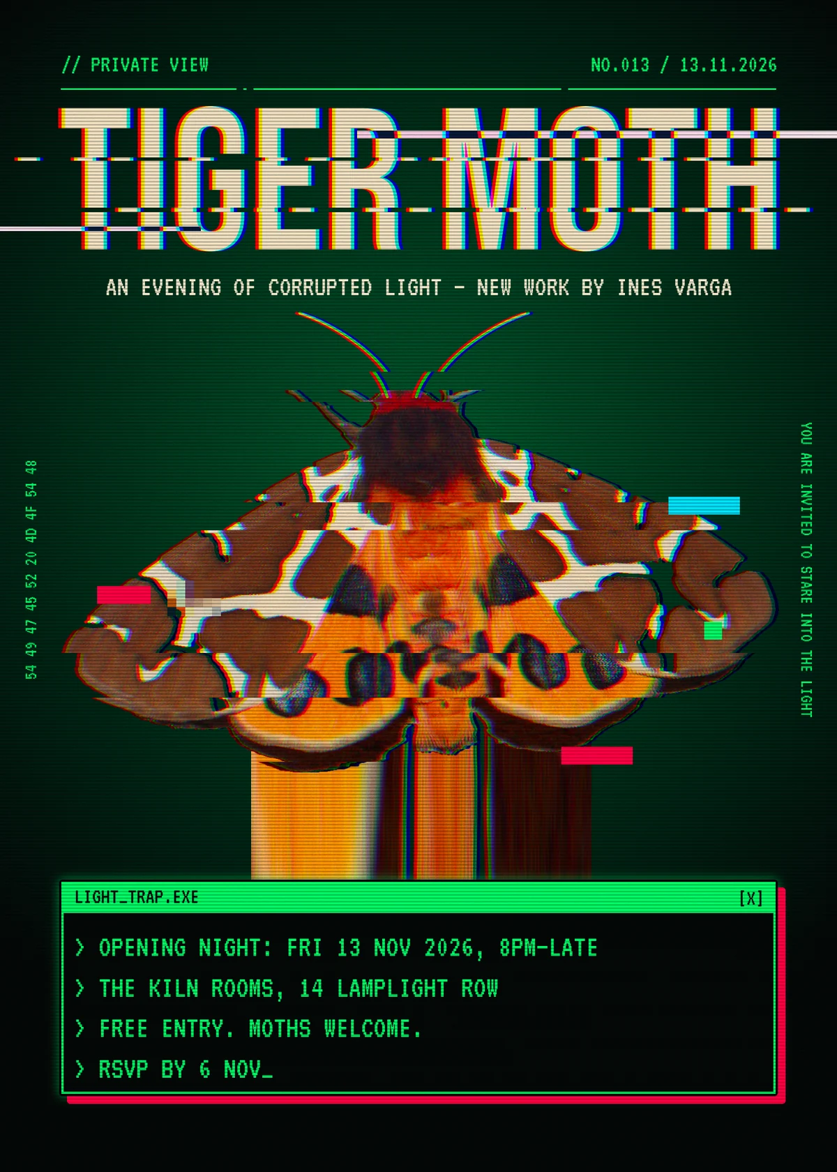
Moths fly at lights, and these days the brightest light in the room is usually a screen. This invitation is for TIGER MOTH, a made-up private view of new work by a made-up artist, Ines Varga. The card treats the moth as if it got too close to an old CRT monitor. Its wings tear into slices, its colour channels slip apart, and the bottom of the photo melts into a pixel-sort drip that runs down into a terminal window holding the event details.
Glitch art is easy to overdo. If you pile every effect onto the photo, the moth turns to mud and nobody can tell what it was. The rules that keep this card readable are:
- Leave the subject recognisable. Use three slice tears, a small RGB split and one pixelated block, and leave most of each wing intact.
- Keep the effects on their own layers. The drip, the blocks, the scanlines and the grain are all separate, so you can tone any of them down later.
- Use one screen colour. Everything that belongs to the "computer", including the rule, the header, the terminal and the margin text, is the same phosphor green.
The document is 1500 × 2100 px, a 5 × 7 inch card at 300 dpi.
The photo is Arctia caja 2010 by Tlusťa on Wikimedia Commons, in the public domain. It's shot from straight above on a flat grey wall, which makes it easy to cut out. Download the 1920 px version.
The palette:
-
Night
the glow
-
Phosphor
-
Title cream
-
Subtitle cream
-
Glitch red
-
Glitch cyan
-
Antennae
Two habits save trouble throughout:
- V then a handle. Only the Move tool moves or transforms pixels. Draw a marquee with M, press V, then drag inside it to move what's selected, or drag a handle to scale. Press ⌘D when you're done, which also commits the change. Enter doesn't.
- Click a plain layer before you type. If a text layer is active, changing the font or size in the options bar restyles that layer. Before each new piece of text, click a raster layer in the Layers panel (the step tells you which one).
-
Paint the night and the glow
- Create a 1500 × 2100 document with a White background.
- Click Background, set the foreground colour to and choose Edit → Fill.
- A new document comes with an empty Layer 1 above Background. Double-click its name and rename it Glow.
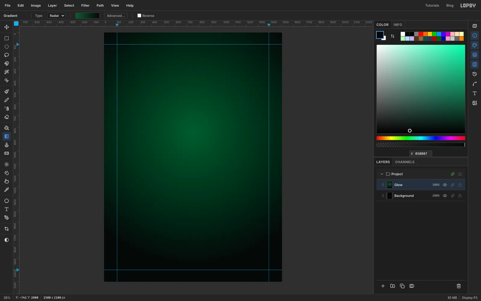
- Pick the Gradient tool and set Type to Radial. Click Advanced…, set the left stop to and the right stop to , and click Done.
- Drag from the middle of the page, a little above centre, straight down to just above the bottom edge. The glow should be brightest where the moth's body will go.
- Click the top ruler at 110 and 1390 to drop two vertical guides, and click the left ruler at 100 and 2000 for two horizontal ones. These are your margins.
-
Drop in the moth
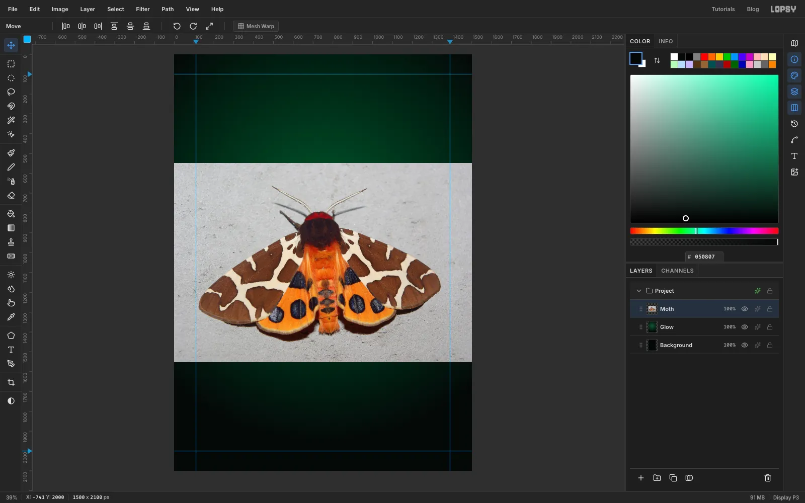
- Drag the moth photo from your file browser onto the canvas. Lopsy shrinks it to the page's width, centres it, and names the layer Pasted Layer.
- Rename the layer Moth and press ⌘D, because a paste leaves its pixels selected.
-
Select the wall through a blurred copy
The wall has a rough plaster grain, and a Magic Wand click on the photo itself leaves hundreds of unselected specks. A blurred copy smooths the grain out, so the wand sees one even grey.
- With Moth active, choose Layer → Duplicate Layer and rename the copy Helper.
- Run Filter → Gaussian Blur… with Radius 5.
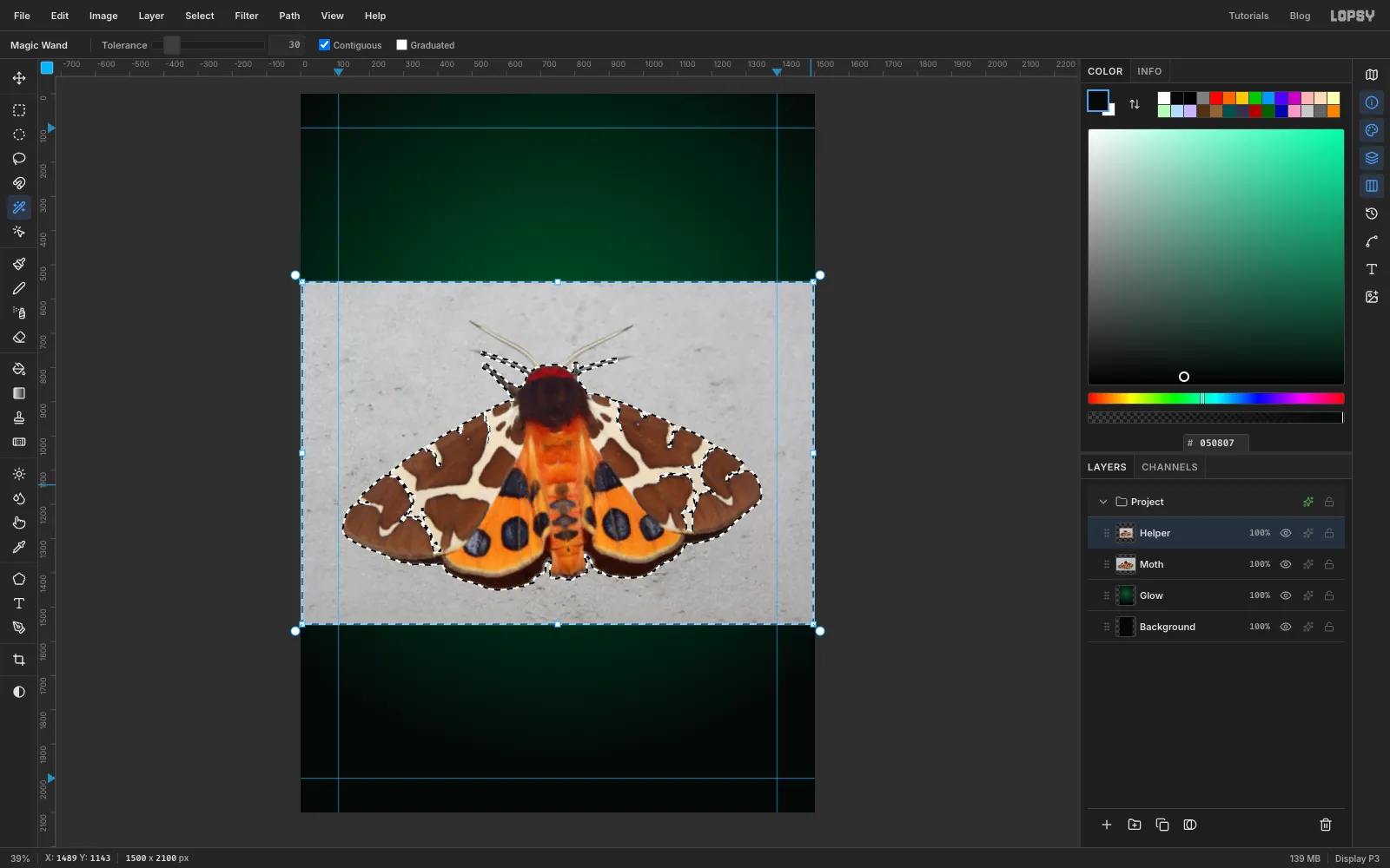
- Press W for the Magic Wand. Set Tolerance to 30 and leave Contiguous ticked.
- Click the wall in the top-left corner. The light falls off towards the bottom, so hold
Shiftand click about nine more spots around the moth: down the left side, along the bottom, up the right side and along the top. - Choose Select → Grow… with 4, then Select → Shrink… with 4. Growing and shrinking by the same amount fills the small holes the grain left in the selection without moving its edge.
-
Cut out the moth
- Click the Moth row and press Delete.
- Click the Helper row and click the bin icon at the bottom of the Layers panel to delete it. Press ⌘D.
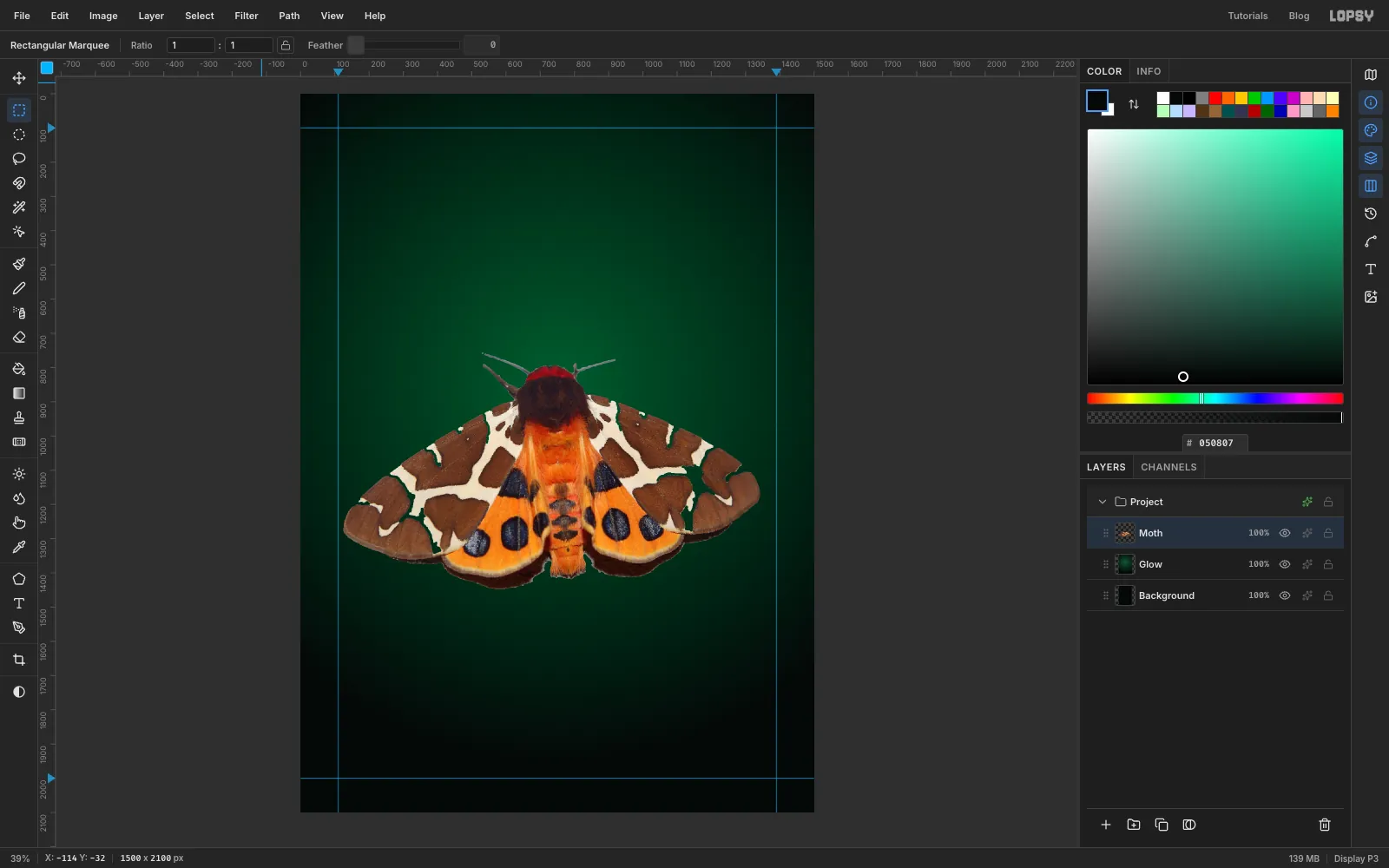
- Shrinking the selection pulled it a few pixels away from the photo's edge, so a thin grey frame is left around it. Press M and drag a marquee just inside the photo's edges, choose Select → Inverse, press Delete, then ⌘D.
- The wing edges still carry a dark rim of the wall's shadow.
⌘-click the Moth thumbnail to select its outline, then choose Select → Shrink… with 2, then Select → Inverse. Press Delete and then ⌘D.
-
Scale the moth to the margins
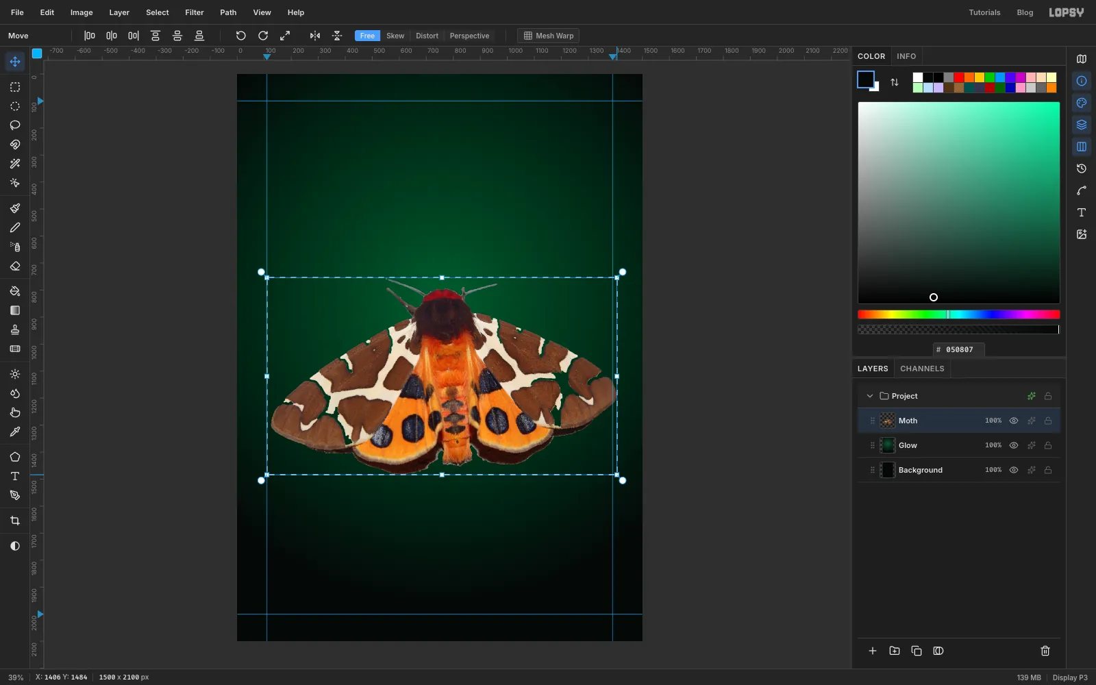
- Press M and drag a marquee snugly around the whole moth, antennae included.
- Press V. Hold
⌘and drag the bottom-right corner handle outwards until the wing tips touch the guides on both sides.⌘keeps the proportions. - Press ⌘D to commit the scale.
- Drag the moth with the Move tool until the wings are centred between the guides and the body sits just below the middle of the page.
-
Redraw the antennae
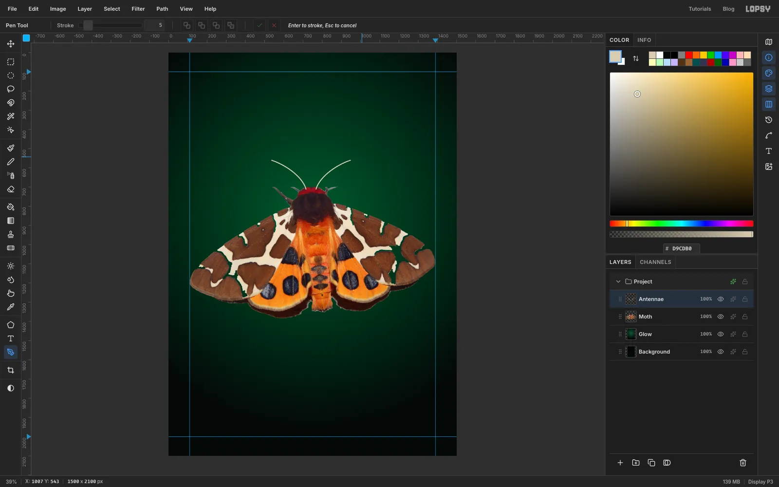
The wand couldn't separate the feathery antennae from the wall, so they came out as grey bars with plaster stuck to them. It's quicker to paint new ones.
- With Moth active, press M and marquee from just above the antenna tips down to the top of the red collar on the moth's head, keeping clear of the wings. Press Delete and ⌘D.
- Click the + at the bottom of the Layers panel to add a layer, and name it Antennae. Set the foreground to .
- Press P for the Pen and set Stroke to 5 in the options bar. Press at the left side of the collar and drag a short handle upwards. Then press about 200 px to the left and 150 px up, and drag that handle further out to the left, so the line curves outwards like a feeler. Press Enter to stroke the path.
- Open the Paths panel from the panel buttons on the right edge of the window and click Delete Path. The stroke stays on the layer.
- Draw the right antenna the same way: press at the right side of the collar and drag a short handle upwards, then press about 200 px to the right and 150 px up and drag that handle outwards to the right. Press Enter, then delete this path too.
-
Merge and warm the colours
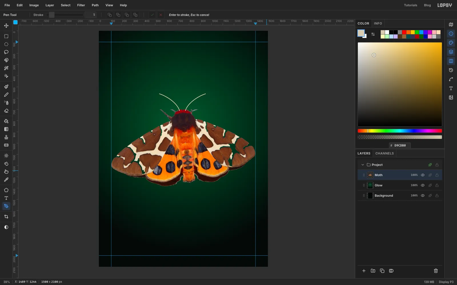
- With Antennae active, choose Layer → Merge Down so the antennae become part of Moth.
- Run Filter → Hue/Saturation… with Saturation 15. The photo was shot under a flat white light, and the glitch effects later will dull it a little.
-
Tear the wings into slices
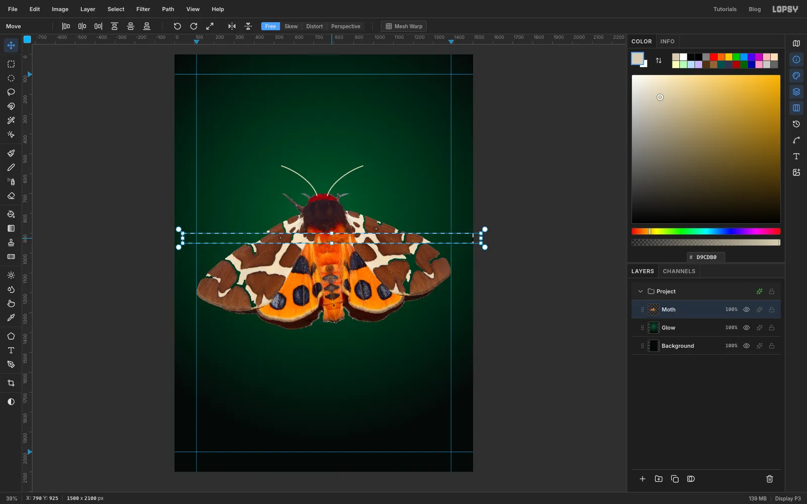
A slice tear is just a band of the image moved sideways. Each one is a full-width marquee, so the whole band moves and the edges of the cut stay perfectly straight.
- Press M and drag a marquee across the full width of the page through the upper forewings, about 50 px tall.
- Press V, drag inside the marquee about 40 px to the right, and press ⌘D.
- Repeat on a taller band, about 80 px, through the row of black spots on the hindwings, dragging it 30 px to the right.
- Make a third band across the middle of the antennae and drag it about 22 px to the left, so the feelers kink.
Three tears are enough. More than that and the wing pattern stops reading as a tiger moth.
-
Split the colour channels
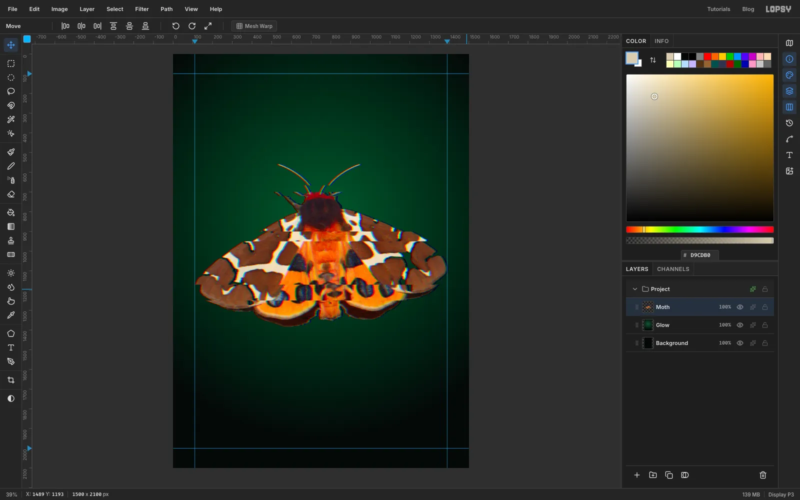
- With Moth active and nothing selected, run Filter → Chromatic Aberration… with Amount 6 and Direction 0.
The red channel slides one way and the blue the other, so every edge gets a red fringe on one side and a cyan fringe on the other. Keep the amount small. At 10 or more the whole moth goes soft.
-
Stretch the lower edge
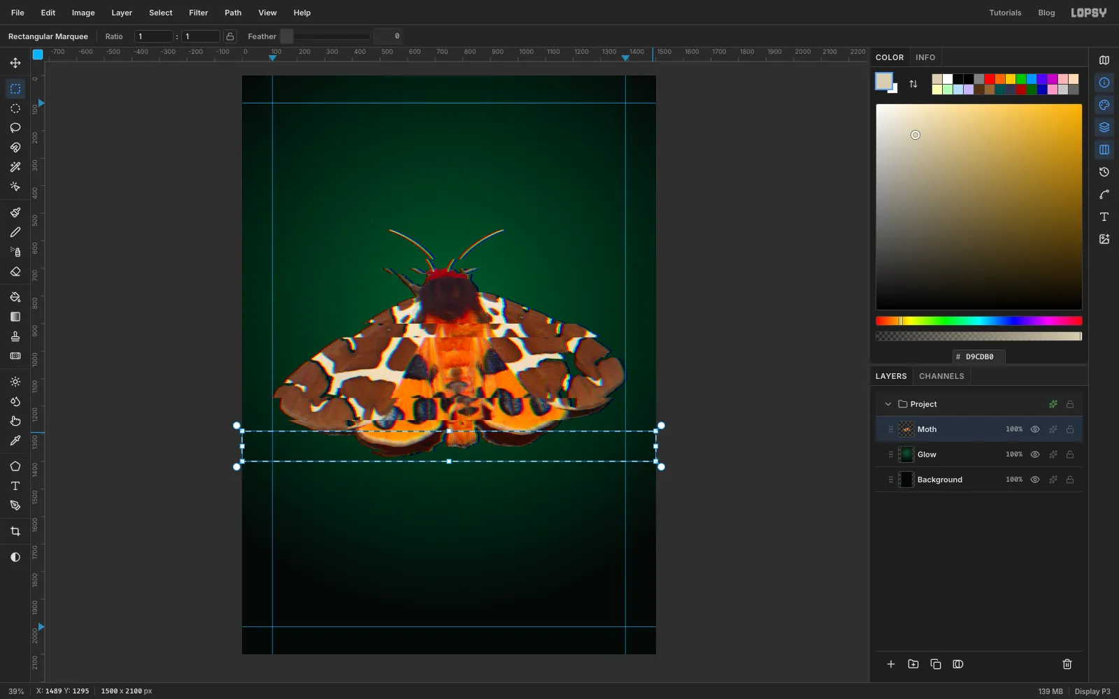
- Press M and marquee a full-width band over the bottom edge of the hindwings, about 110 px tall.
- Run Filter → Pixel Stretch… with Amount 90, Bands 40, Seed 7 and RGB Split 0.6. Only a few of the 40 bands land inside your marquee and get shifted, which gives you broken scan lines rather than a smear. If nothing visible happens, try a different Seed.
- Press M and marquee a small block, about 96 × 64 px, on the left wing, between the two wing tears, and run Filter → Pixelate… with Block Size 16. This is the one "compression artefact" on the moth.
- Press ⌘D.
-
Pull a pixel-sort drip
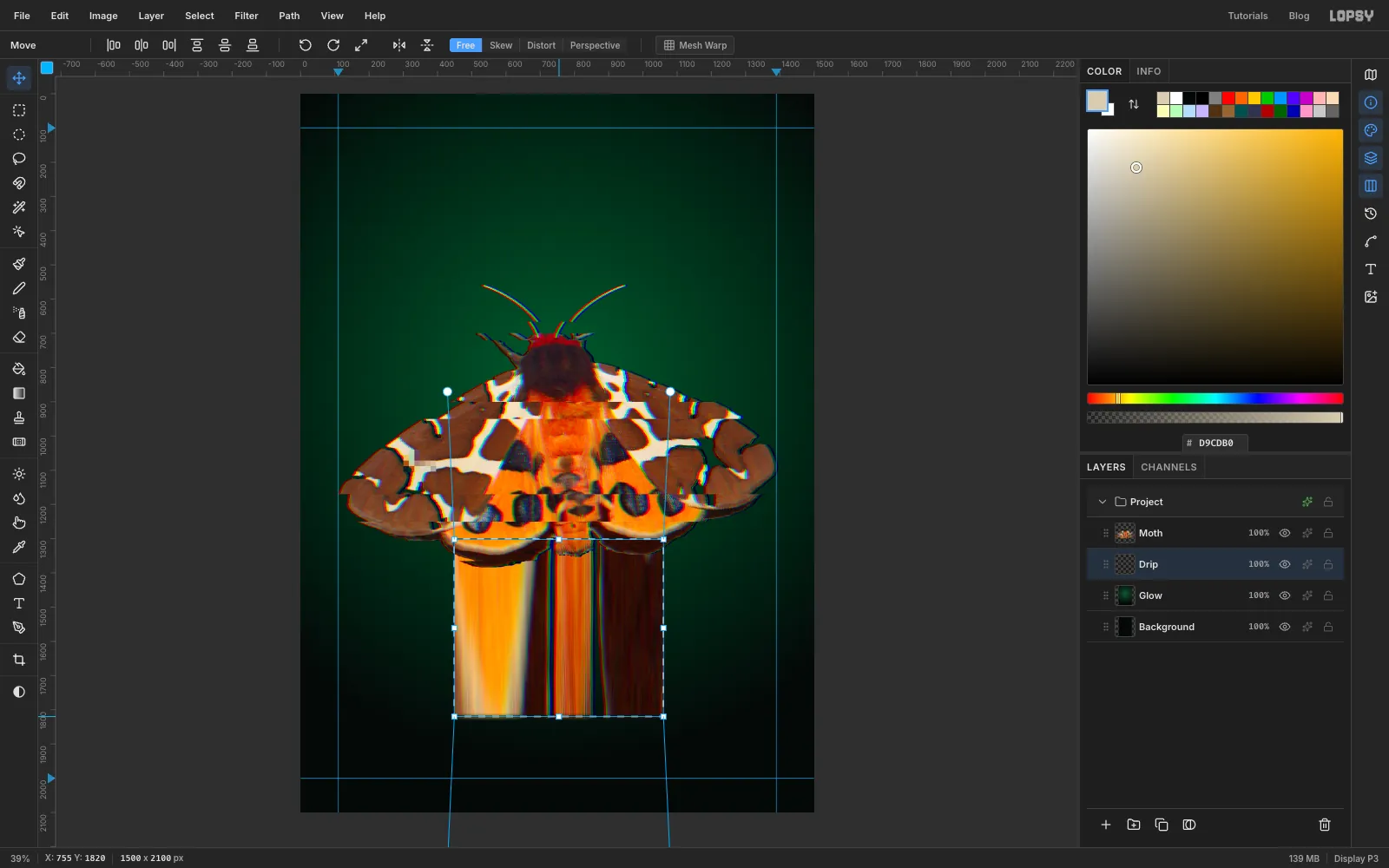
Real pixel sorting reorders pixels by brightness. You can fake its look by stretching a thin strip of the image a long way, so that each pixel becomes a vertical streak.
- With Moth active, press M and marquee a strip about 24 px tall across the bottom of the hindwings, from below the inner edge of the left hindwing to below the right one, roughly the middle 600 px. Leave out the wing tips, because they're mostly transparent there and would leave smudgy stubs.
- Press ⌘C. Click the Glow row and press ⌘V. The paste lands just above Glow, which puts it under the moth. Rename it Drip and press ⌘D.
⌘-click the Drip thumbnail to select exactly the strip, press V, and drag the bottom-middle handle straight down to about 1820 (watch the Y readout in the status bar). The streaks start behind the moth and run down past where the terminal window will go, so the window hides their ends.- Press ⌘D.
-
Set the title
- Click the Moth row and click the folder icon at the bottom of the Layers panel to add a New Group. Rename it Title.
- With the group selected, click + to add a layer inside it, called Scratch. It's only there so the text tool has a plain layer to start from.
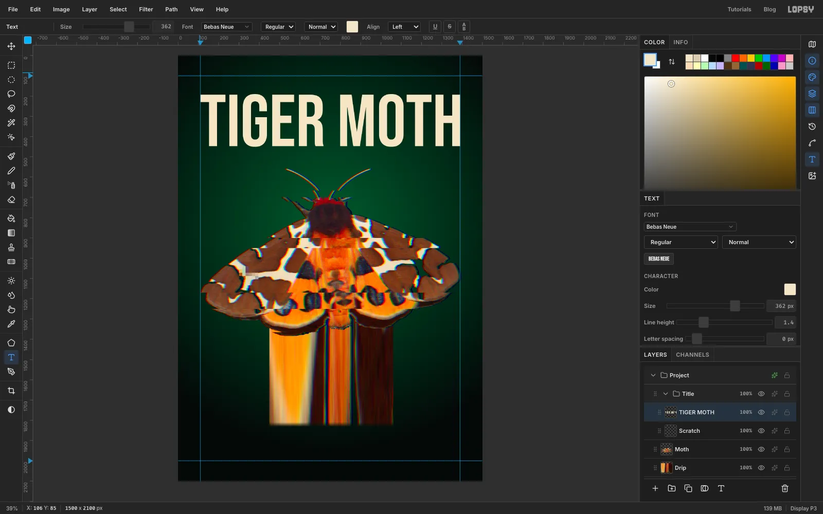
- Press T. Set the font to Bebas Neue, Size to 362 and the colour to . Click near the top-left guide, about 85 px from the top, type
TIGER MOTHand press Tab. You click above where the letters should start because the text box includes the font's space above the capitals. - Bebas Neue at 362 px is almost exactly as wide as the margins. Press V and nudge with the arrow keys (
Shiftmoves 10 px at a time) until the first letter sits on the left guide and the tops of the capitals are about 190 px from the top. - Click Rasterize Layer at the bottom of the Layers panel. The tears in the next step need pixels, not live text.
-
Tear the title
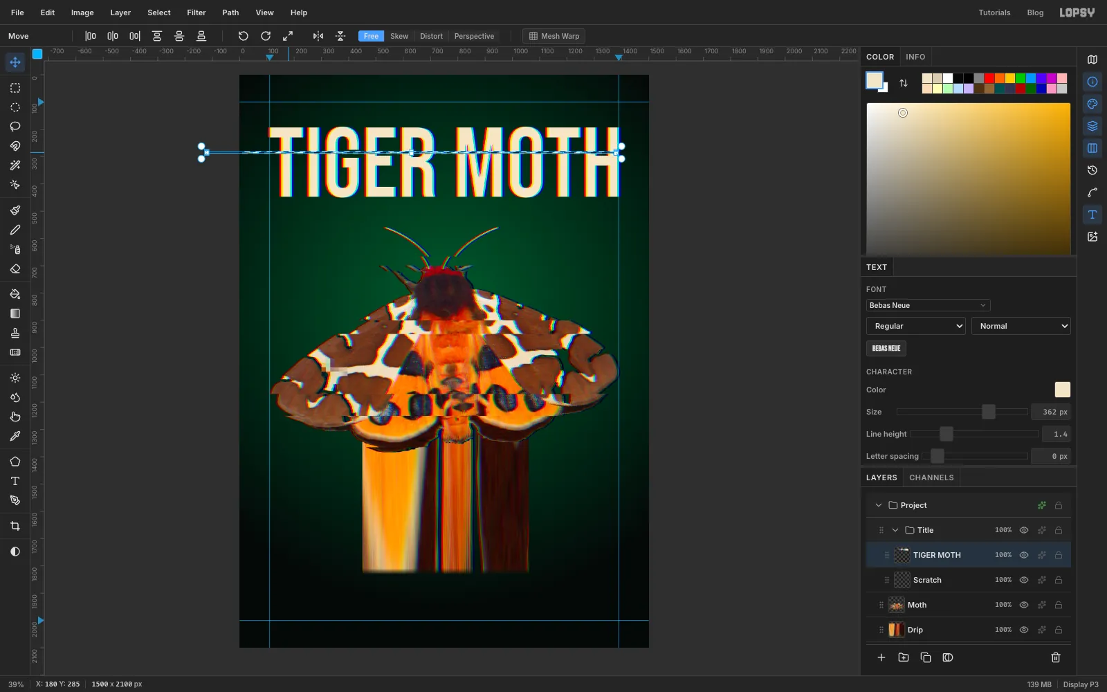
Wide tears through a condensed face like Bebas make the letters look doubled, because a shifted band of stems reads as a second line of type. Use thin streaks instead.
- Run Filter → Chromatic Aberration… on the title with Amount 6 and Direction 0.
- Press M and marquee a full-width band only 6 px tall through the upper third of the letters. Press V and drag it about 120 px to the left. Press ⌘D.
- Press M again and marquee an 8 px band just below the middle of the letters. Press V, drag it 60 px to the right, and press ⌘D.
- Click the Scratch layer and delete it.
-
Cross it with Difference bars
- Click the TIGER MOTH row and add a layer above it called Invert Bar.
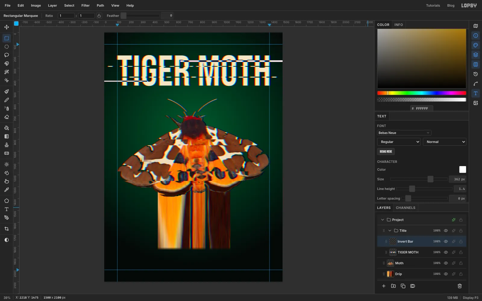
- Set the foreground to white. Press M and marquee a 14 px bar from the gap between the two words to the right edge of the page, through the tops of the letters, and choose Edit → Fill.
- Press ⌘D, then marquee an 8 px bar from the left edge of the page to just past the G, near the bottom of the letters, and fill it too. Press ⌘D.
- Click the sparkle icon on the Invert Bar row and set Blend to Difference. Over the dark background the bars stay white, and where they cross the cream letters they turn dark. Close the effects drawer.
-
Add the header and subtitle
- Click the arrow on the Title group to collapse it, then click its row and add a layer called Rule. With the group collapsed, the new layer goes above it rather than inside it.
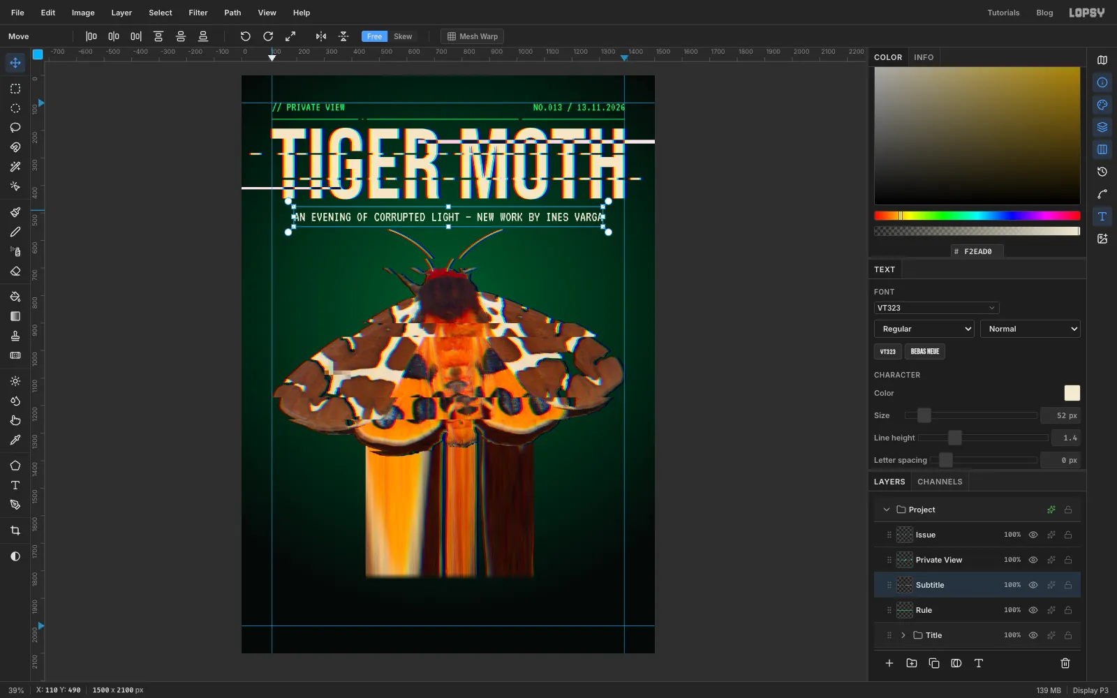
- Set the foreground to . Press N for the Pencil with Size 3. Click on the left guide 160 px from the top, then
Shift-click on the right guide at the same height. - Press E for the Eraser with Size 14 and click three times on the rule: twice close together on the left and once on the right. The gaps look like signal dropouts.
- With Rule active, press T and set VT323, Size 44, colour . Click in the empty space top right, type
NO.013 / 13.11.2026and press Tab. Double-click the new layer's name and rename it Issue. Press V and nudge it until its right edge is on the right guide and its top is 100 px from the top of the page. - Click the Rule row again, press T, click in empty space near the top left and type
// PRIVATE VIEWin the same style. Press Tab, rename the layer Private View, and line it up with the left guide at the same height. - Click Rule again and press T. Set Size to 52 and the colour to , click in empty space and type
AN EVENING OF CORRUPTED LIGHT — NEW WORK BY INES VARGA(VT323 draws the dash short, like a hyphen). Press Tab and rename the layer Subtitle. Centre it under the title, about 50 px below the bottom of the letters.
-
Build the terminal window
Draw the window a little low first, then move the finished group up into place once its text is in.
- Click the Subtitle row and add a New Group called Terminal. Inside it, add a layer called Window.
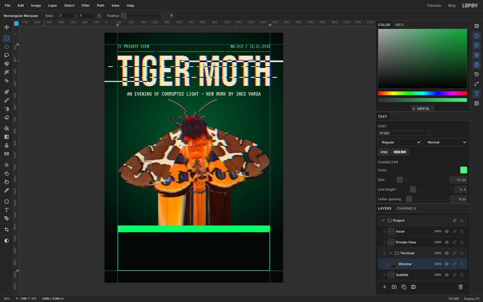
- Press M and, with nothing selected, click once on the canvas to open the exact-corners dialog. Enter X 110 to 1390 and Y 1620 to 2020. That's guide to guide, hanging 20 px past the bottom guide for now. Set the foreground to and choose Edit → Fill.
- Choose Select → Shrink… with 4. Set the foreground to and Edit → Fill again. That leaves a 4 px green frame. Press ⌘D.
- Click once again for the dialog and enter X 110 to 1390 and Y 1620 to 1676: a 56 px bar across the top of the frame. Set the foreground to , choose Edit → Fill and press ⌘D.
-
Make it glow
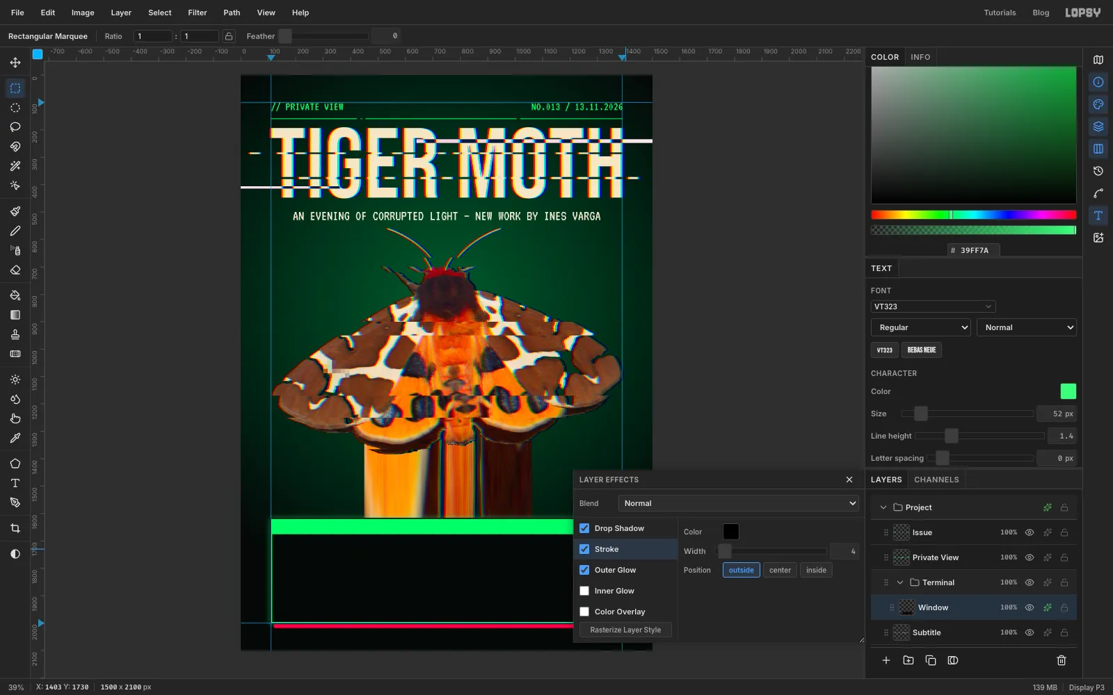
Open the effects drawer from the sparkle icon on the Window row, and turn on:
- Outer Glow: colour , Size 28, Opacity 55. This is the phosphor bloom.
- Drop Shadow: colour , Offset X 14, Offset Y 14, Blur 0, Spread 0, Opacity 100. With no blur it reads as a red "ghost" of the window that has slipped out of register.
- Stroke: colour , Width 4. It separates the window from the drip running behind it.
-
Type the details
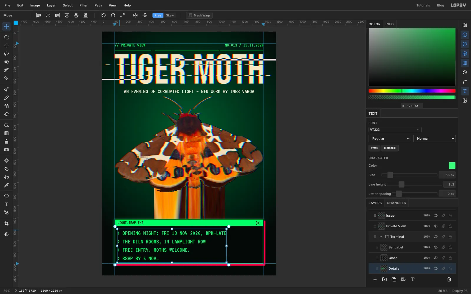
- With Window active, press T, set VT323, Size 40 and colour . Click on the green bar near its left end, type
LIGHT_TRAP.EXEand press Tab. Rename the layer Bar Label. Press V and nudge it so it starts 26 px in from the left edge of the frame and sits in the middle of the bar's height. - Click Window, press T, click near the right end of the bar and type
[X]. Press Tab, rename it Close, and nudge it so its right edge is 26 px in from the frame's right edge. - Click Window again and press T. Set Size to 56 and the colour to , click inside the window below the bar, and type these four lines, pressing Enter between them:
> OPENING NIGHT: FRI 13 NOV 2026, 8PM–LATE> THE KILN ROOMS, 14 LAMPLIGHT ROW> FREE ENTRY. MOTHS WELCOME.> RSVP BY 6 NOV_
- Press Tab and rename the layer Details. In the Text panel set Line height to 1.3.
- Press V and move the block so its left edge lines up with
LIGHT_TRAP.EXE, with equal space above it (below the green bar) and below it (above the frame). Check the descenders on the commas: they should sit well inside the frame.
- With Window active, press T, set VT323, Size 40 and colour . Click on the green bar near its left end, type
-
Move the whole window up
- Click the Terminal group row so the whole group is active.
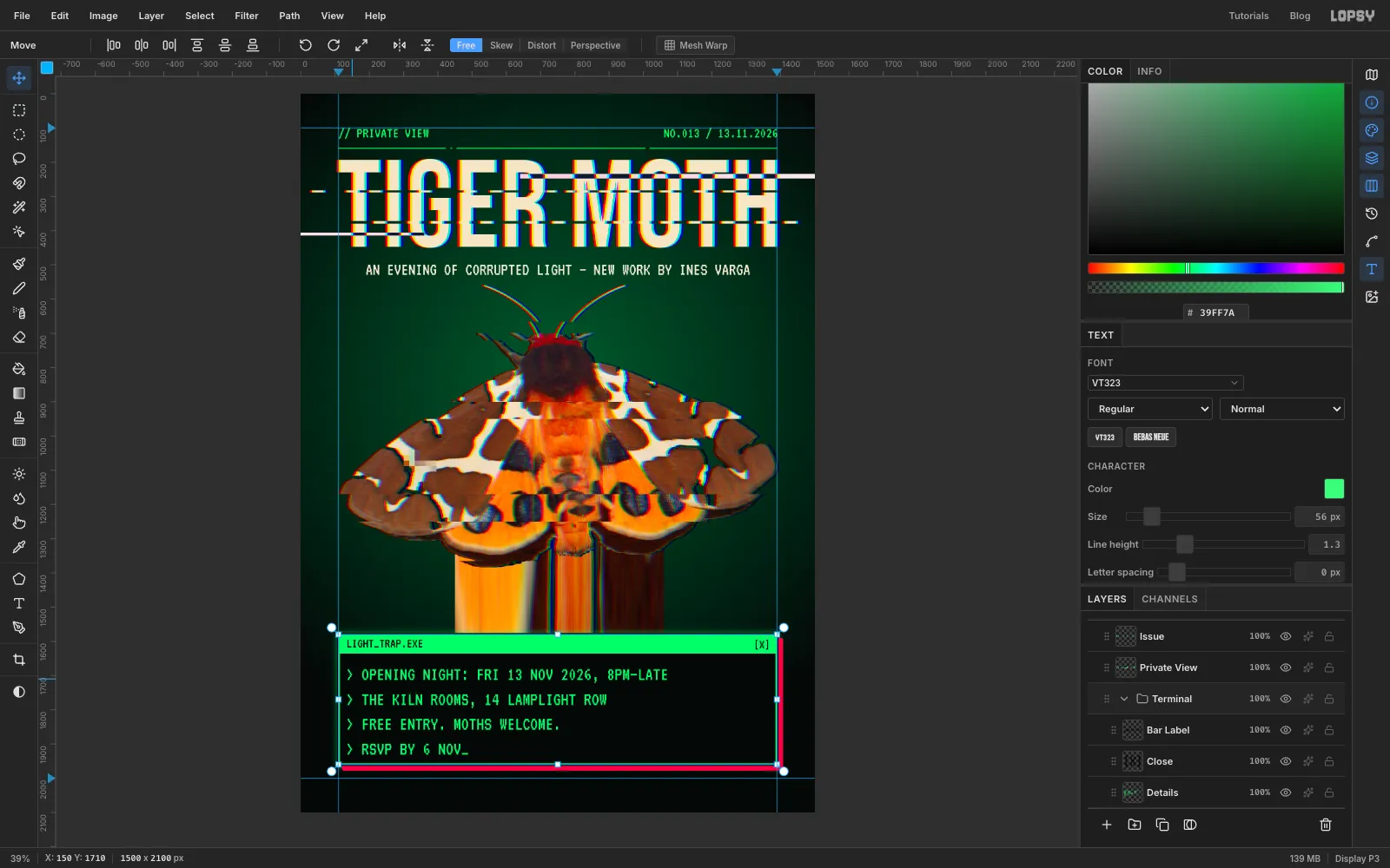
- Press V, then press
Shift+↑ four times. Each press moves the group 10 px, so the frame, the effects and all three pieces of text go up 40 px together.
The frame now ends 20 px above the bottom guide, which leaves room for the red shadow, and the space under the shadow matches the space above the header.
-
Run text up the margins
- Click Rule. Press T, set VT323, Size 34 and colour , click in an empty area and type
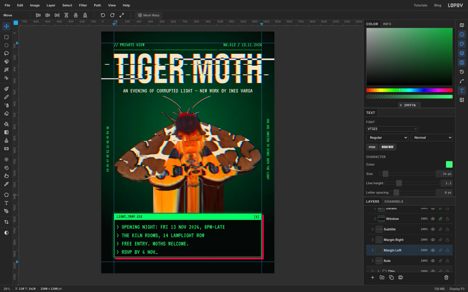
YOU ARE INVITED TO STARE INTO THE LIGHT. Press Tab, rename the layer Margin Right and click Rasterize Layer. - Press V and click Rotate 90° CW in the options bar. Move the line into the gap right of the right guide, centred on the moth.
- Click Rule again and do the same with
54 49 47 45 52 20 4D 4F 54 48on a layer named Margin Left, which is "TIGER MOTH" in hexadecimal. Rotate it with Rotate 90° CCW so it reads bottom to top, and centre it in the left margin.
- Click Rule. Press T, set VT323, Size 34 and colour , click in an empty area and type
-
Scatter the glitch blocks
- Click the Moth row and add a layer called Blocks.
- Choose View → Show Grid, drag the Grid slider in the options bar to 32px, and check that Snap is ticked. On this page the 32 px grid lines fall exactly on the side guides.
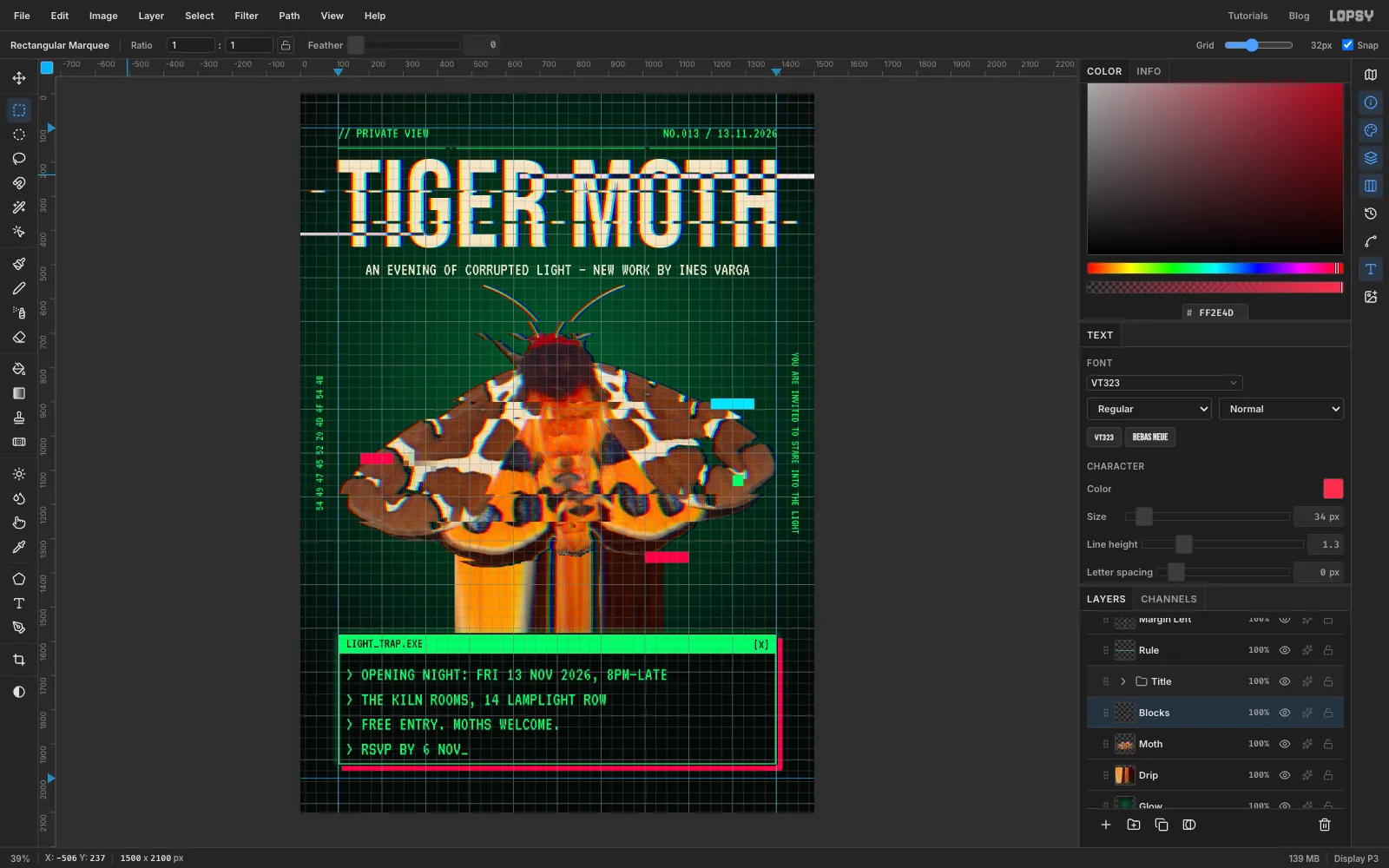
- Make four blocks, each one cell tall and lined up with a tear so they look like they broke off it. For each one, press ⌘D, press M, drag the marquee (it snaps to the grid), set the foreground colour and choose Edit → Fill:
- cyan , four cells wide, just right of the top tear on the right wing
- red , three cells wide, on the left wing beside the pixelated block
- phosphor , a single cell, on the right wing
- red , four cells wide, under the right hindwing over the drip
- Press ⌘D and choose View → Show Grid again to hide the grid.
-
Make a scanline pattern
- Click the top layer, Issue, and add a layer called Scanlines. Set the foreground to .
- Press M and, with nothing selected, click once on the canvas to open the exact-corners dialog. Enter X 0 to 4 and Y 0 to 3, and choose Edit → Fill.
- Press ⌘D, click once on the canvas again, and enter X 0 to 4 and Y 0 to 6. Choose Edit → Define Pattern. That's one 3 px dark line and 3 px of clear space.
- Press ⌘D, then ⌘A and Delete to clear the tile off the layer, and ⌘D again.
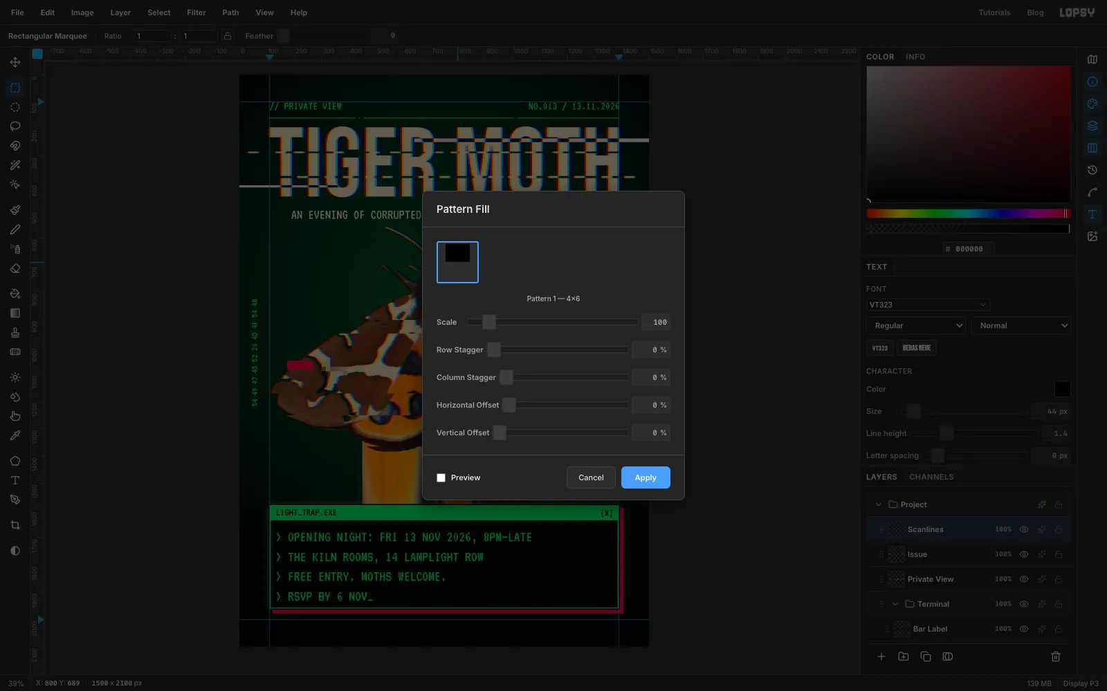
- Choose Edit → Fill with Pattern…, click your 4 × 6 tile and click Apply.
-
Finish with scanlines and grain
- Set Scanlines to Multiply and drop its opacity to 22%. Heavier than that and the thin subtitle starts to break up.
- Add a layer called Grain. Set the foreground to and choose Edit → Fill, then run Filter → Add Noise… with Amount 40 and Mono selected.
- Set Grain to Overlay at 50%. Mid-grey disappears in Overlay, so you only see the noise.
- Export with File → Quick Export PNG and save the project with File → Save Project.
Try it with your own insect, or any small creature shot from above on a plain background. Just keep the glitches in a few bands, so it still reads as the animal at a glance.