Design an Op-Art Line-Screen Eye Billboard
Turn an eye photo into a Bridget Riley-style line screen in Lopsy, with a radial iris, a fitted type panel and a rotated sticker, for an eye clinic billboard.
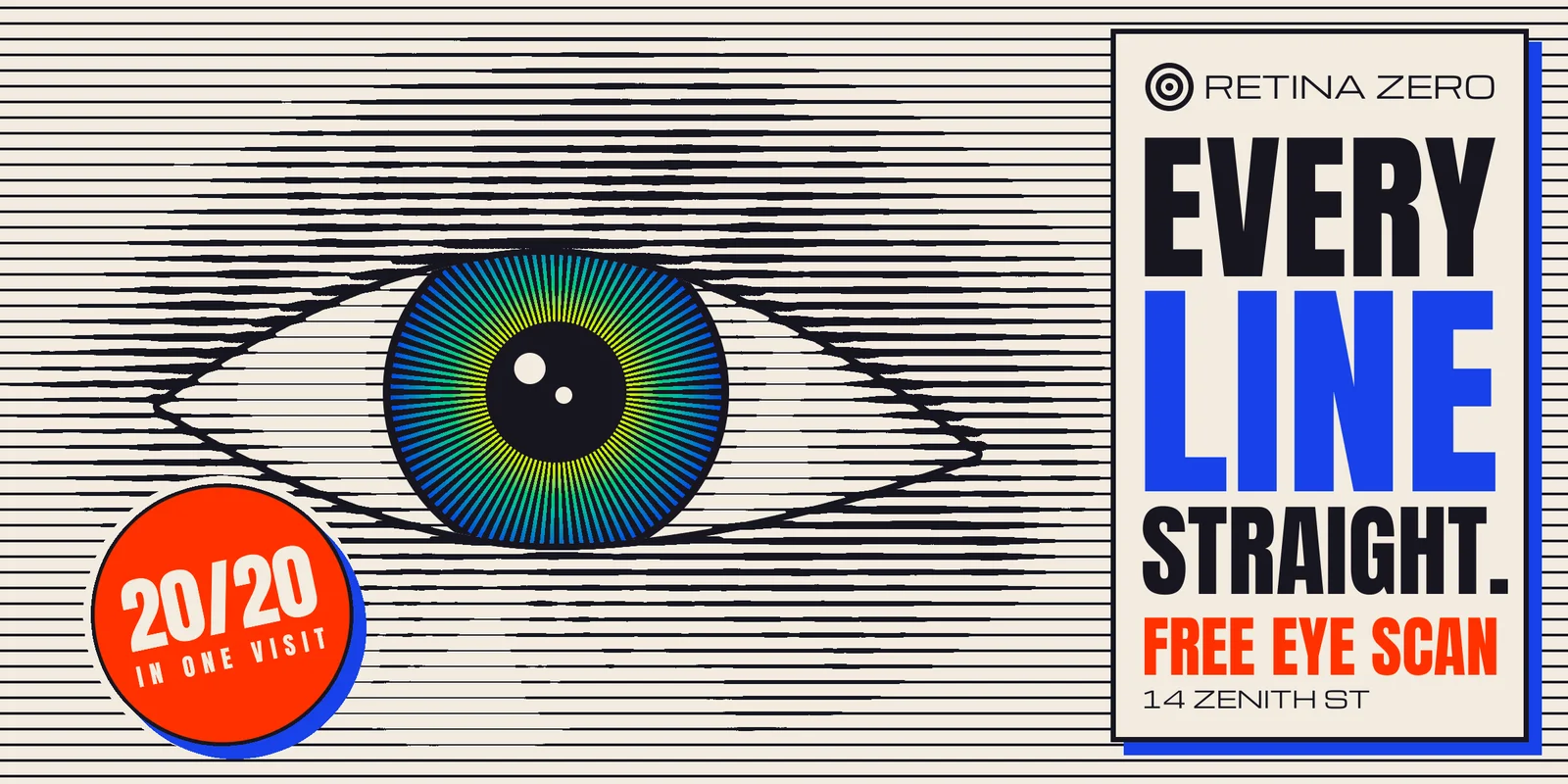
Op art makes the eye do the work. Bridget Riley and Victor Vasarely used nothing but flat black lines and shapes, and let the viewer's eye see the movement, the bulges and the pictures. One of their simplest tricks is the line screen: a field of parallel lines that swell where the picture is dark and thin where it is light. Up close it is just stripes. From across the street it is a face, or here, an eye.
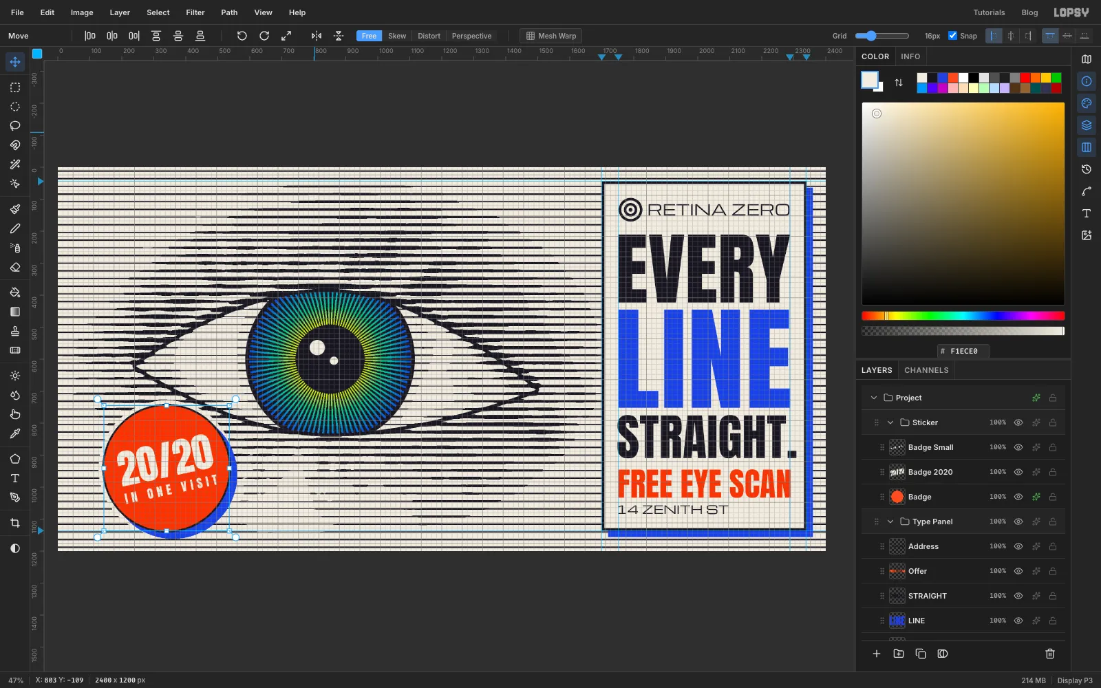
In this tutorial you'll make a billboard for Retina Zero, an imaginary laser eye clinic. The headline, EVERY LINE STRAIGHT., is a joke on the picture: every line on the board really is straight, and it's your eye that turns them into an eye. You'll build it at 2400 × 1200 px, the 2:1 shape of a 48-sheet roadside billboard.
The eye starts as a photo: Brown eye.jpg on Wikimedia Commons, by Entertheninja, released into the public domain (CC0). Download the original (803 × 512 px). Any front-on, level close-up of an eye works the same way, but you'll need to adjust the coordinates: every position below assumes this photo, scaled 2.4× and shifted 90 px left. The type is set in Anton and Michroma, both free Google Fonts under the SIL Open Font License.
Along the way you'll use:
- ruler guides, Snap to Guides, the grid and the marquee's exact-corners dialog
- a gradient tile, Define Pattern and Fill with Pattern with a vertical offset
- Desaturate, Brightness/Contrast, Gaussian Blur, Motion Blur, Sunburst and Threshold
- the Pen tool and Path to Selection, ⌘-click thumbnail selections with intersect, Grow, Shrink, Feather and Inverse
- the Brush, the Magic Wand and radial gradients
- layer opacity, Merge Down, Color Overlay, Stroke, Drop Shadow and Outer Glow
- text in Anton and Michroma, fitted to a measure with Size and letter spacing
- copy and paste in place, scaling, moving and rotating a whole group, and undo and redo
The palette:
-
Paper
-
ink
-
Iris
-
Cobalt
LINE and the shadows
-
Vermilion
the offer and the sticker
-
Tone-map greys
working values, never seen in the finished board
-
Set up the canvas and guides
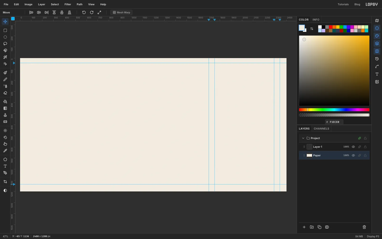
Choose File → New, enter 2400 × 1200 pixels and click Create. Select the Background layer, set the foreground colour to , choose Edit → Fill and rename the layer Paper.
Now drop guides for the type panel. Click the top ruler at 1700 and 2340 for the panel's sides and at 1752 and 2288 for its text margins. Click the left ruler at 44 and 1136 for the panel's top and bottom. Later, when you set the type, it helps to add two more on the left ruler, at 211 and 1084, for the top of the headline and the bottom of the last line.
-
Make a soft stripe tile
The line screen needs stripes that fade smoothly from black to white and back, not hard bars. That smooth ramp is what lets a line grow thicker or thinner later.
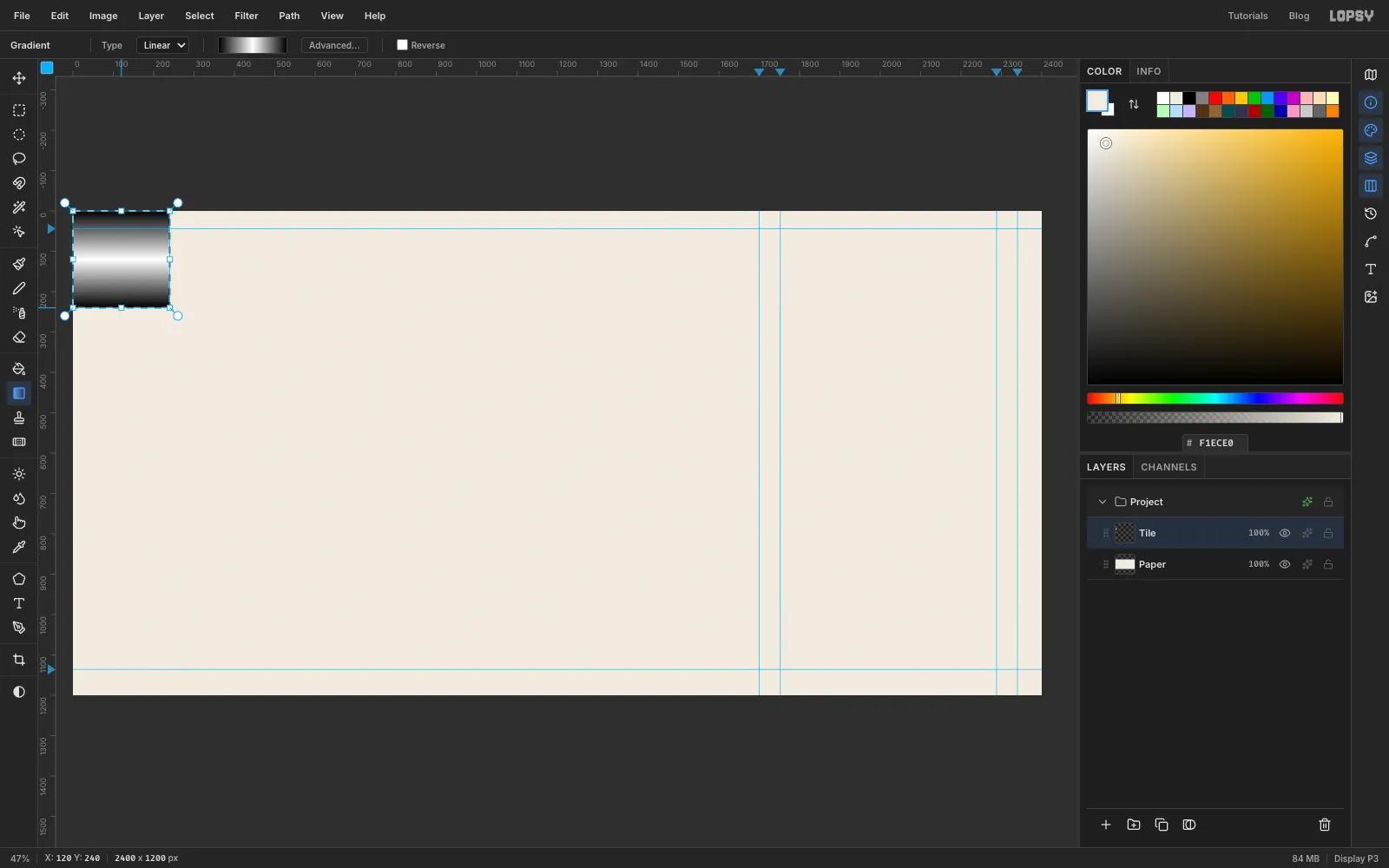
Select Layer 1 and rename it Tile. Pick the Rectangular Marquee and click once on the canvas without dragging. A dialog opens where you can type exact corners. Enter From 0, 0 and To 240, 240.
Pick the Gradient tool, set the type to Linear and click Advanced…. The editor opens with two stops. Click one, type
000000in its Hex field, then do the same for the other. Click the bar halfway along to add a third stop and make itFFFFFF. You now have black, white, black. Click Done. Drag from the top of the square straight down to its bottom edge.Choose Edit → Define Pattern, press Cmd+D and delete the Tile layer with the trash button. The pattern is kept.
-
Bring in the eye photo
Select Paper and click Add Layer. Name it Tone, set the foreground to and choose Edit → Fill. This flat grey becomes the open field of lines around the eye.
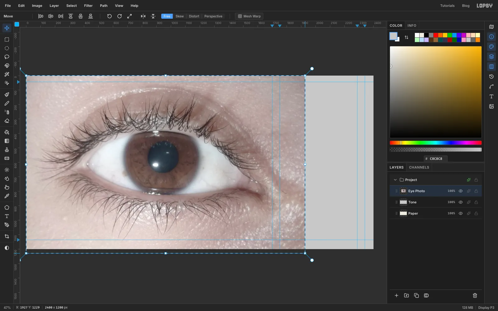
Drag the photo file from your desktop onto the canvas. It lands in the top-left corner as Pasted Layer, already selected with handles. Rename it Eye Photo. Hold Cmd and drag its bottom-right handle down and right until the photo's right edge reaches about 1927 on the top ruler. That's 2.4 times its size, and the bottom now hangs just past the canvas. Press Cmd+D to commit.
With the Move tool active, press Shift+← nine times to move the photo 90 px to the left. That puts the middle of the iris at about (851, 600) and leaves the right side of the board clear for the panel. Some of the photo now hangs off the left edge, which is fine.
-
Fade the photo into the grey
Choose Filter → Desaturate. Only the photo's light and dark matter from here on.
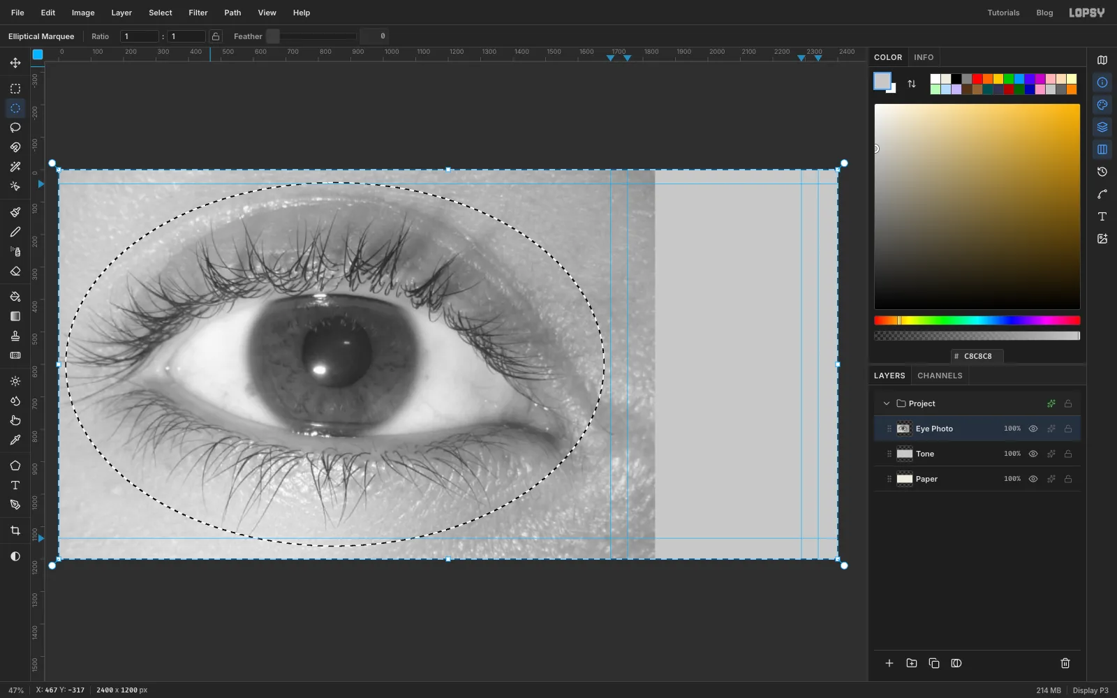
Pick the Elliptical Marquee, click once and enter From 21, 40 and To 1681, 1160. Choose Select → Feather…, enter 63 and click Apply. That's the largest feather Lopsy applies; bigger values look the same. Choose Select → Inverse and press Delete. The photo now fades softly into the flat grey, so the lines will run on without a seam. Press Cmd+D.
Choose Layer → Merge Down to merge the photo into Tone. A merged layer keeps the name of the layer underneath, so it's still called Tone.
-
Smooth the tone map
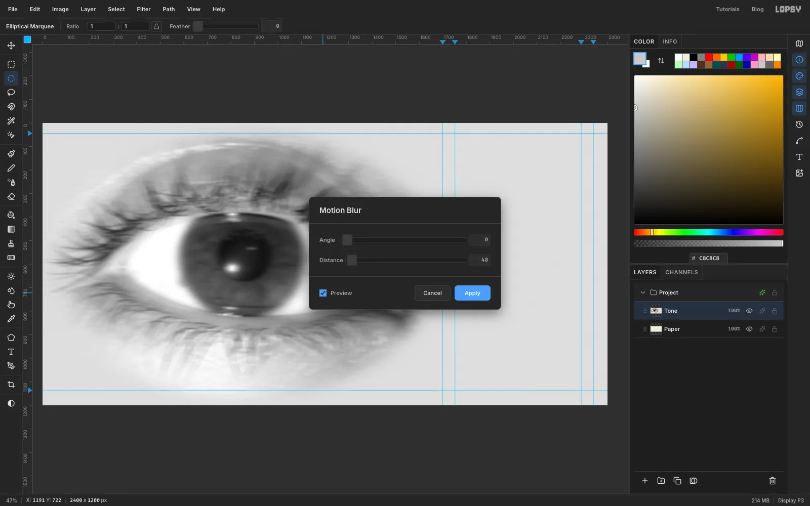
Every speck in this layer will show up as a lump in a line, so soften it first. Choose Filter → Brightness/Contrast…, set Contrast to 30 and click Apply. Then choose Filter → Gaussian Blur… with Radius 6.
Finally choose Filter → Motion Blur…, set Angle 0 and Distance 40, and click Apply. A sideways smear evens out each line along its length, so the lines swell smoothly instead of wobbling.
-
Trace the eye opening
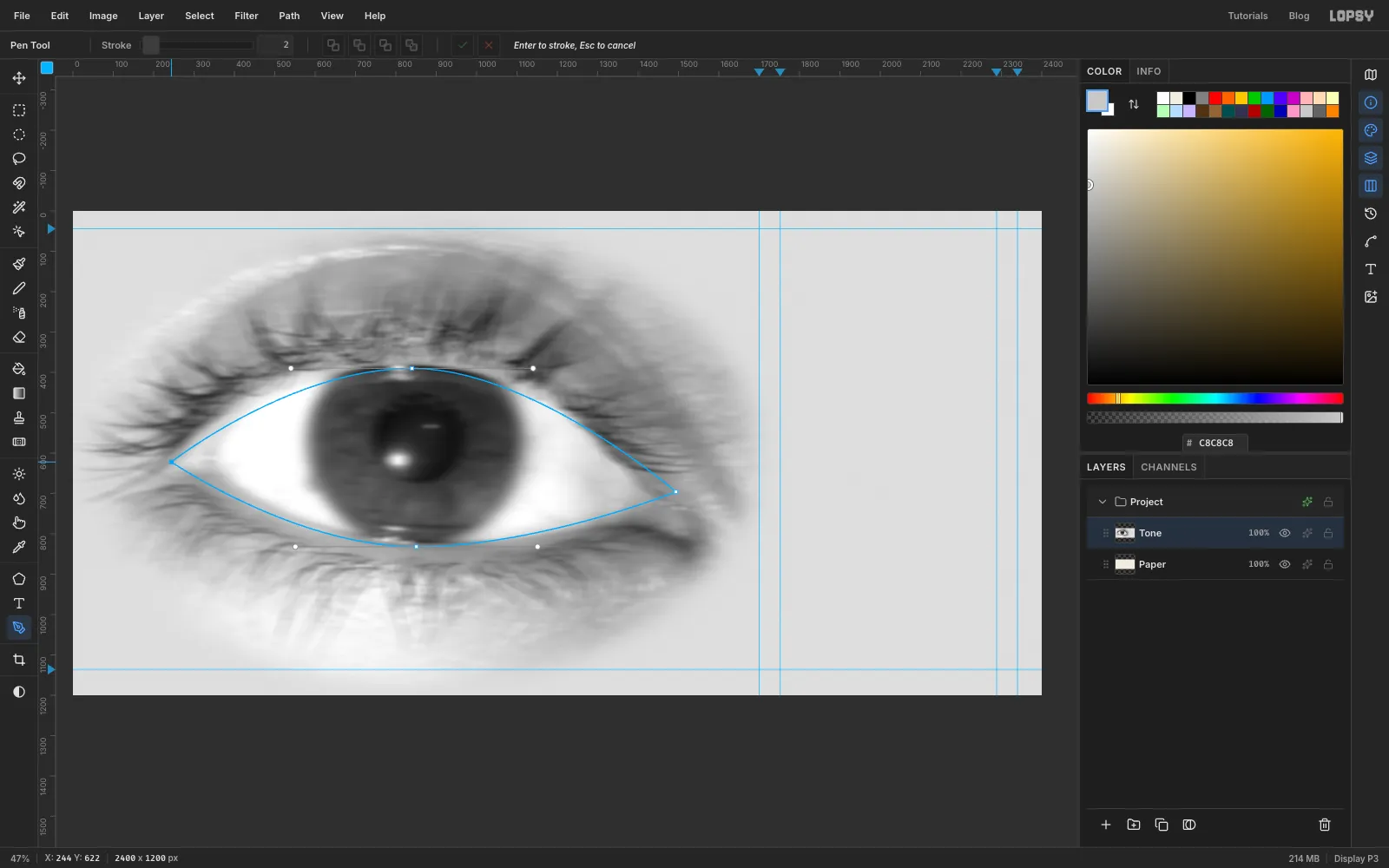
The iris has to tuck under the lids, so you need the exact shape of the eye opening. Pick the Pen tool and draw a closed almond:
- Click the inner corner of the eye at about (244, 622).
- Press at the top of the opening, about (840, 390), and drag right to about (1140, 390) to pull out a curved handle.
- Click the outer corner at about (1494, 696).
- Press under the iris at about (851, 832) and drag left to about (551, 832).
- Click the first point again to close the path.
The top passes over the iris, about 50 px below its top edge, and the bottom passes just above its bottom edge.
Open the Paths panel and click Path to Selection, then Delete Path. Click Add Layer, name it Opening, fill the selection with any bright colour and press Cmd+D. Hide the layer with its eye icon. It's a helper you'll ⌘-click later to load the opening as a selection.
-
Darken the lids
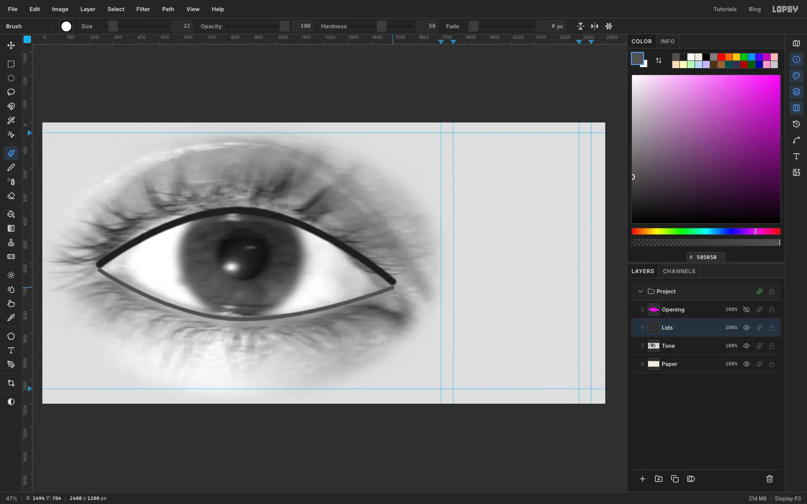
Select Tone and click Add Layer. Name it Lids. Pick the Brush and open the brush settings: Size 40, Hardness 50, Spacing 10, Opacity 100. Set the foreground to and paint one smooth stroke along the upper lash line, just above the top of the opening, from corner to corner.
Change the brush Size to 22 and the foreground to , and paint along the lower lid, just below the opening. Choose Layer → Merge Down. The strokes merge into Tone.
Dark areas on this map become thick lines, so these strokes make the almond read clearly in the finished screen.
-
Flatten the iris tone
The photo's iris has blotches that would show up as grey smudges in the rays, so replace it with a clean ramp.
First, light up the white of the eye right up to the iris. With the Elliptical Marquee, click once and enter From 562, 311 To 1140, 889. Hold Cmd+Shift+Alt and click the Opening thumbnail in the Layers panel. That intersects the circle with the opening. Set the foreground to , choose Edit → Fill and press Cmd+D.
Now click once again and enter the iris itself: From 592, 341 To 1110, 859. Intersect it with the Opening thumbnail the same way. Pick the Gradient tool, set it to Radial, and open Advanced…. Click the middle stop left over from the tile and remove it with the trash button, then set the two end stops to
9A9A9Aand303030. Drag from the centre of the iris (851, 600) straight out to its edge. Press Cmd+D.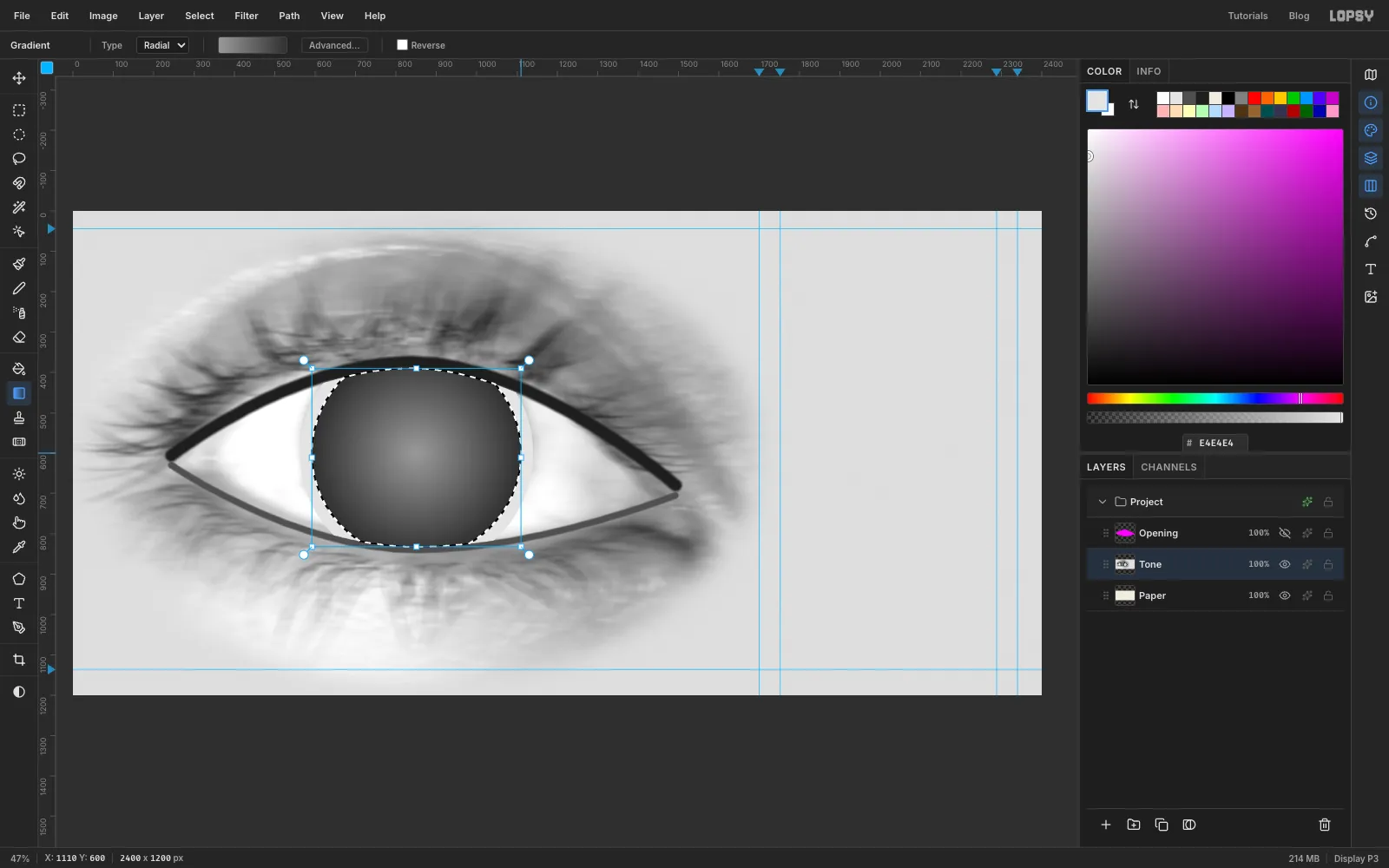
-
Keep every line open
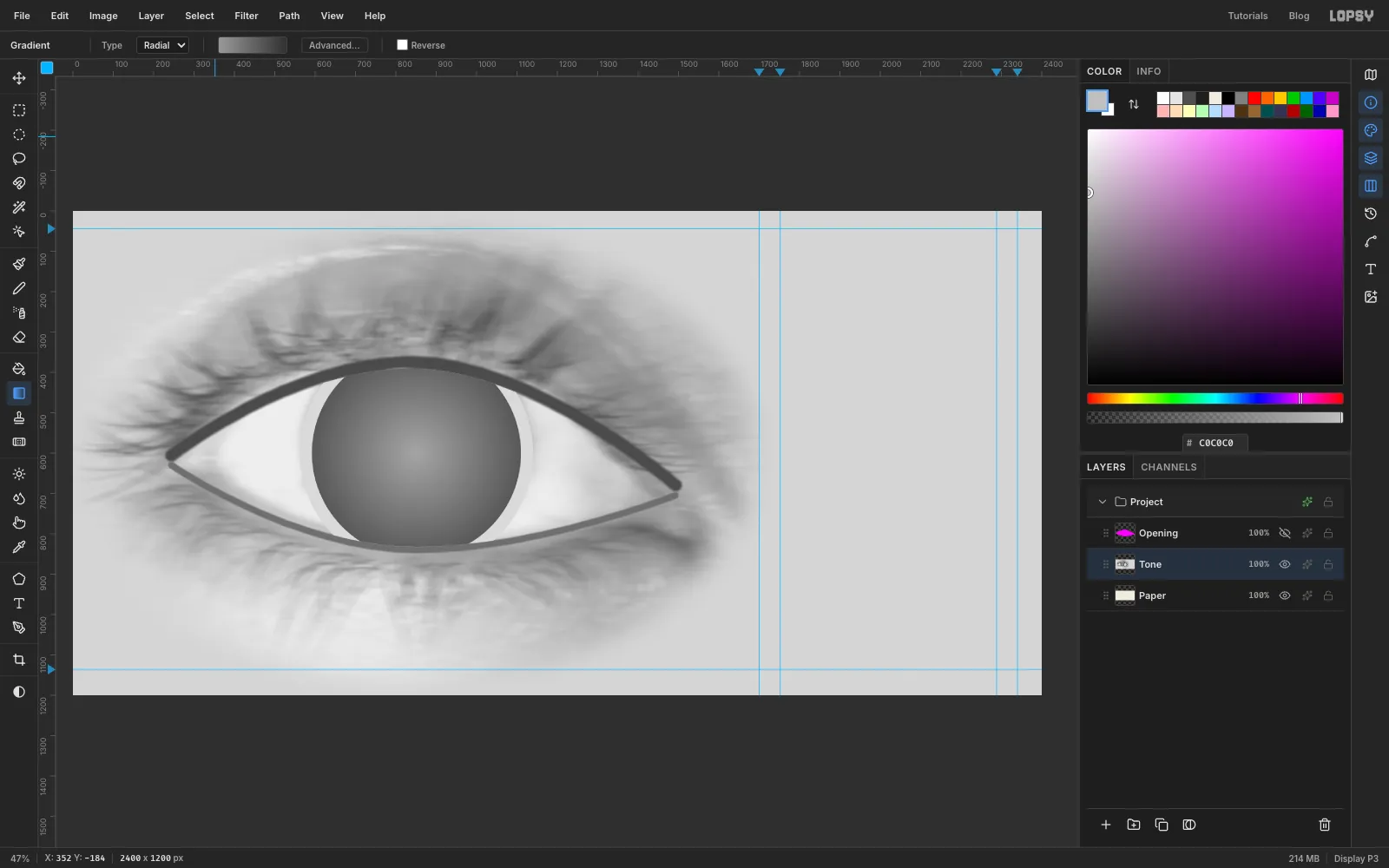
If the map has pure white, a line vanishes. If it has pure black, two lines fuse into a slab. Squeeze the range so neither can happen.
Select Paper and click Add Layer. Name it Clamp Grey and fill it with . Select Tone, set its opacity to 72 % and choose Layer → Merge Down. Rename the result Tone. The darkest lines now stop just short of touching, and the lightest stay a thin hairline.
-
Fill a layer with stripes
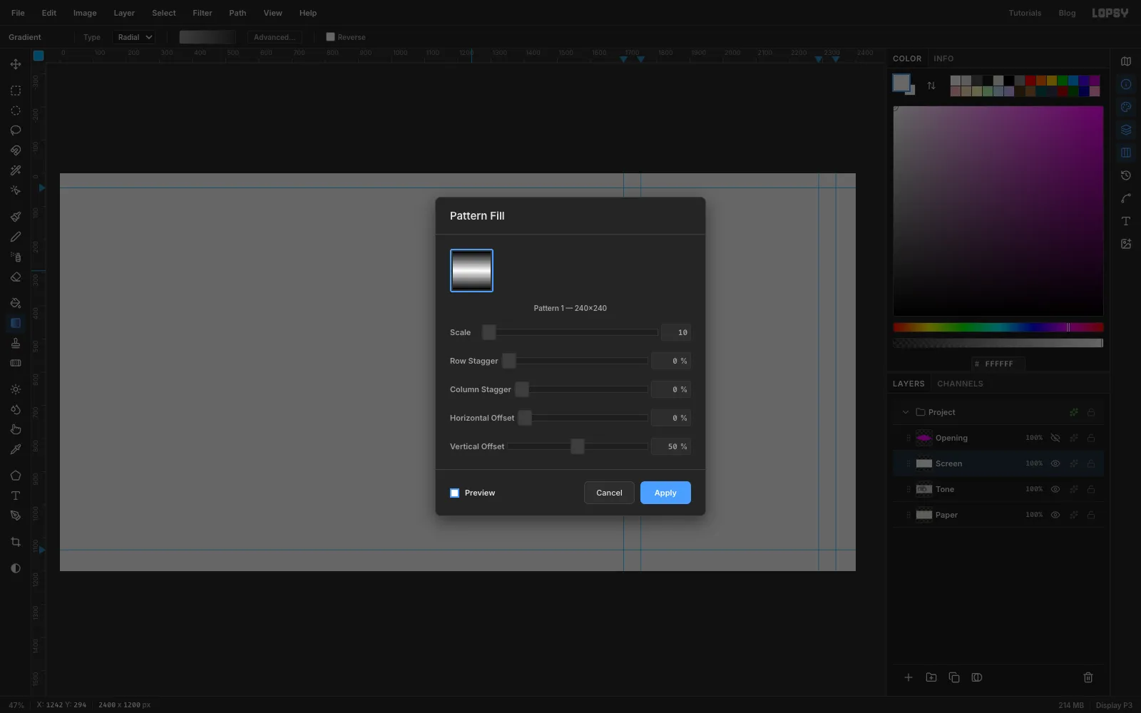
With Tone selected, click Add Layer and name it Screen. Choose Edit → Fill with Pattern… and click your gradient tile. Set Scale to 10 %, so the 240 px tile repeats every 24 px, and Vertical Offset to 50 %, so the first and last lines aren't cut in half at the edges. Click Apply.
-
Select the visible iris
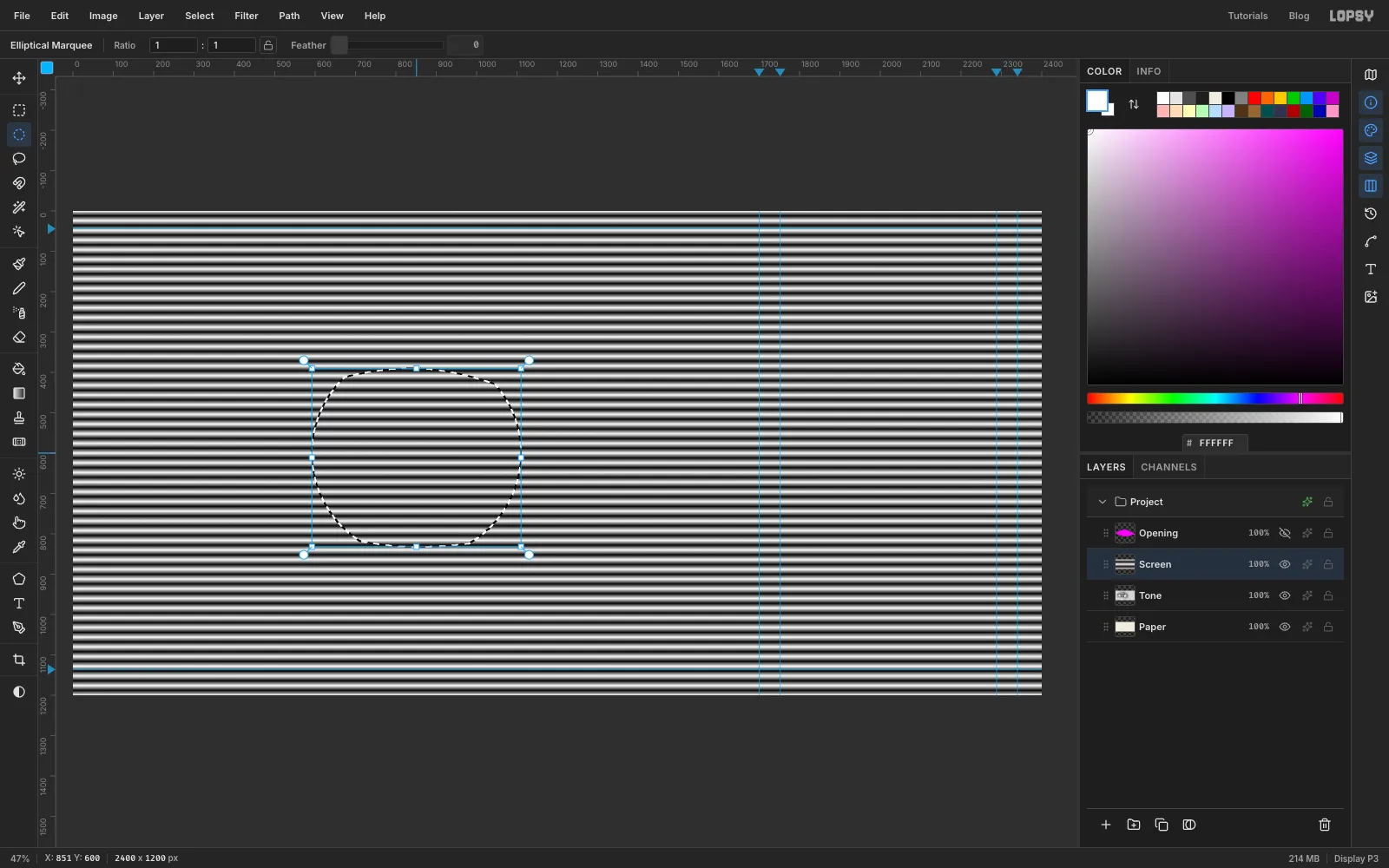
Inside the iris, the horizontal stripes give way to rays. With the Elliptical Marquee, click once and enter the iris again: From 592, 341 To 1110, 859. Hold Cmd+Shift+Alt and click the Opening thumbnail. You're left with only the part of the iris the lids don't cover.
-
Burst rays inside the iris
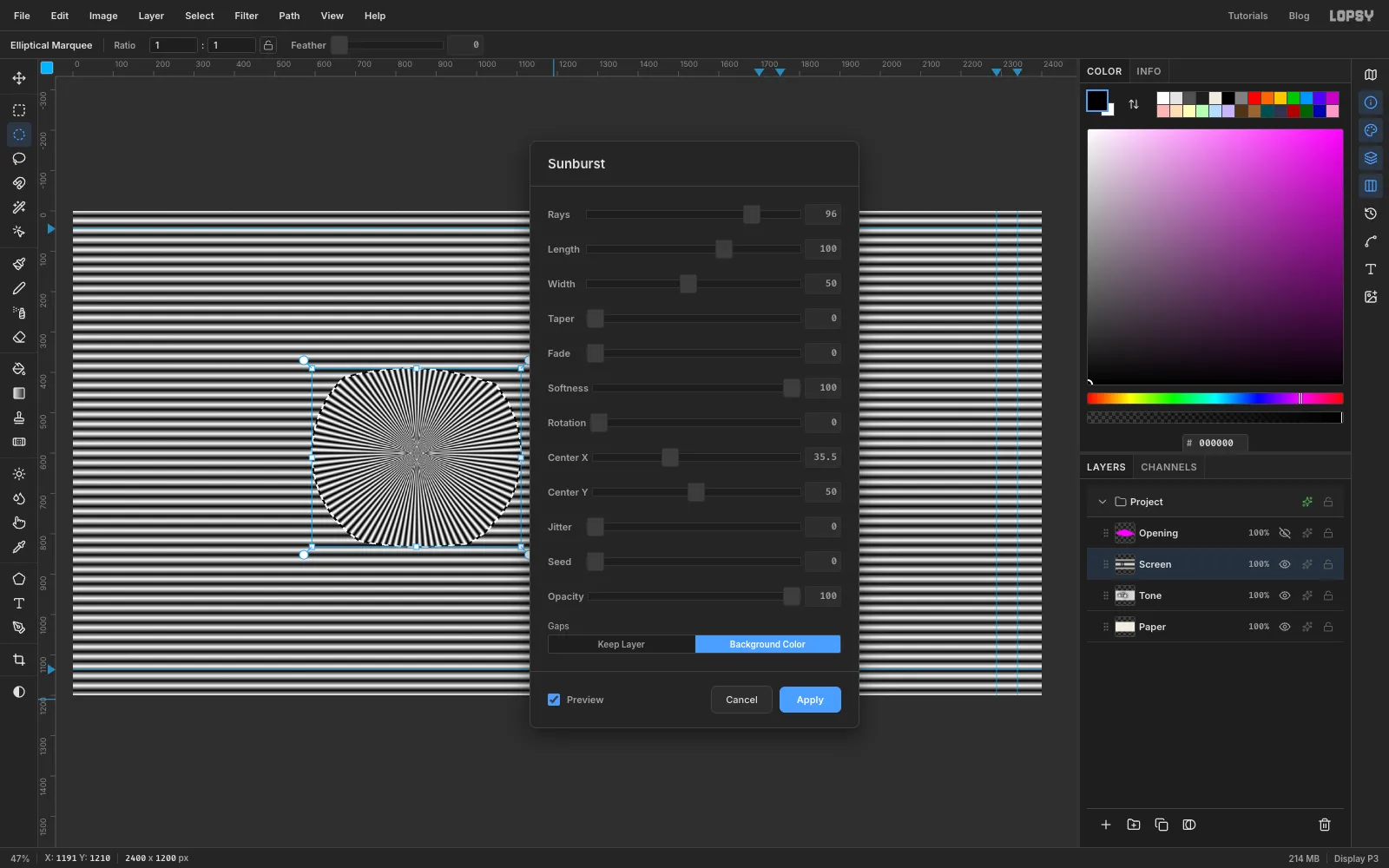
Sunburst paints its rays in the foreground colour and fills the gaps with the background colour. Set the foreground to , press X to swap it into the background, then set the foreground to .
Choose Filter → Sunburst… and set Rays 96, Length 100, Width 50, Softness 100, Center X 35.5 and Center Y 50. The centre is a percentage of the document, and 851 px across a 2400 px board is 35.5 %. Under Gaps click Background Color. Softness 100 gives each ray the same smooth black-to-white ramp as the stripes. Click Apply.
-
Mix the screen with the tone
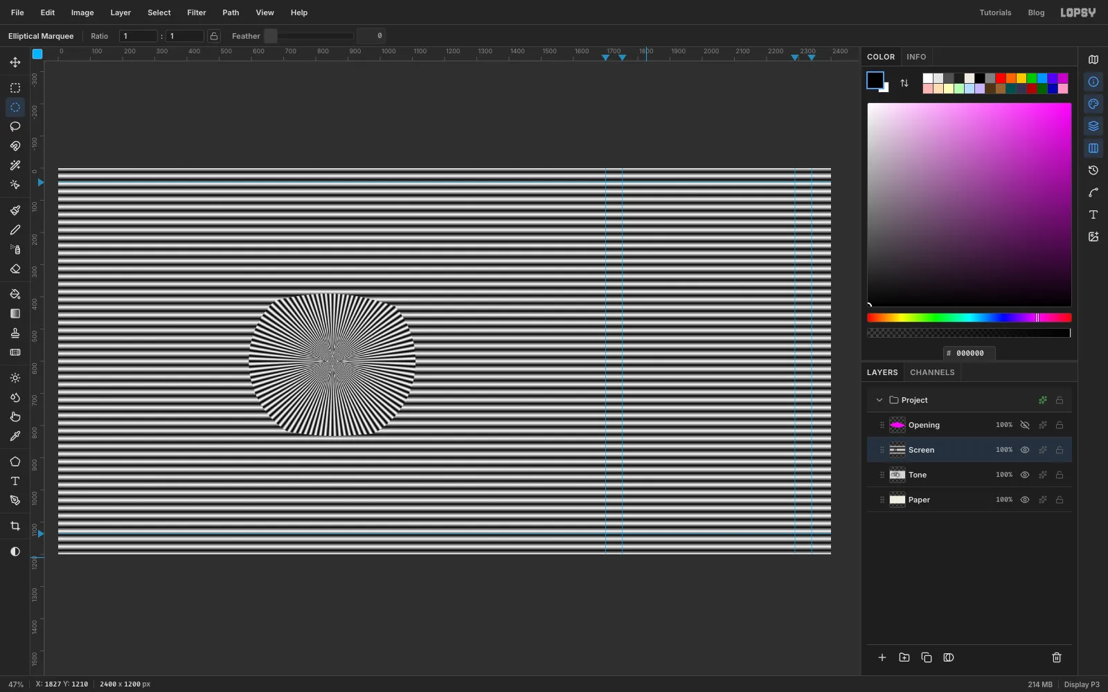
Press Cmd+D. Set the Screen layer's opacity to 50 % and choose Layer → Merge Down. The merged layer is still called Tone. Rename it Lines.
The layer now holds half stripe, half photo. Where the photo is dark, more of each stripe falls below middle grey, and that's what the next step turns into thick lines.
-
Threshold it into lines
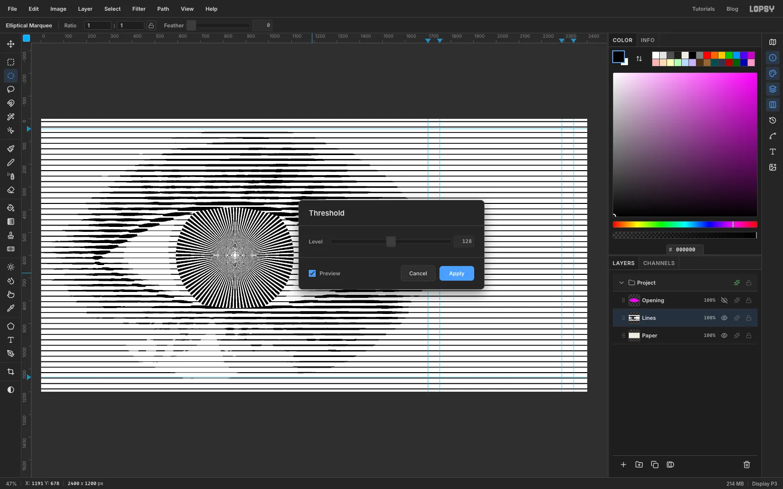
Choose Filter → Threshold…, leave Level at 128 and click Apply. Everything darker than middle grey becomes black, and everything lighter becomes white. The eye appears, drawn only in lines.
To smooth any stair-steps on the edges, run Filter → Gaussian Blur… at Radius 2, then Filter → Threshold… at 128 again.
-
Knock out the paper
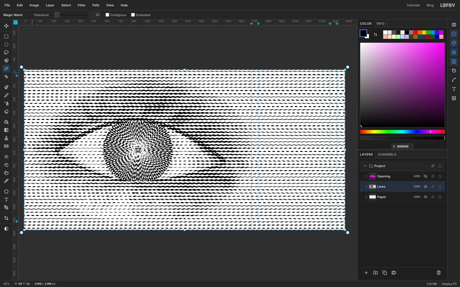
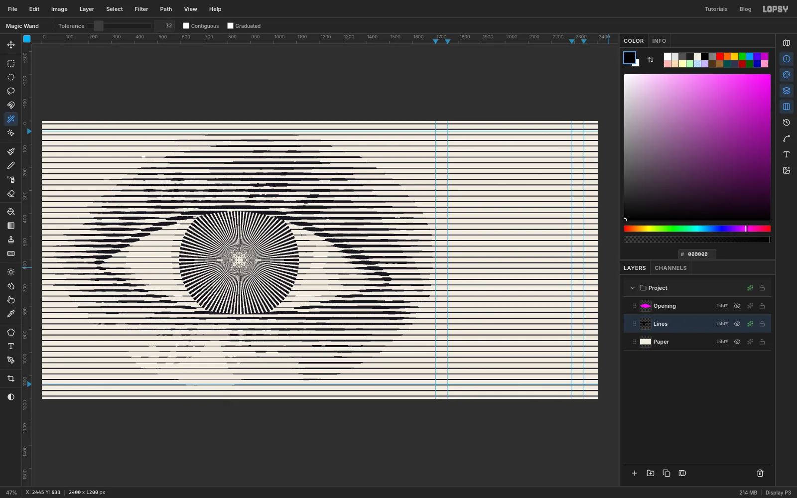
Pick the Magic Wand and untick Contiguous. Click any white gap between two lines, for example near the top-left corner. Every white pixel on the layer is selected. Press Delete, then Cmd+D. The cream Paper now shows through the gaps.
-
Ink the lines
Click the effects button (the sparkle icon) on the Lines row to open the layer effects, and enable Color Overlay. Set its colour to . Pure black looks harsh next to the cream; this blue-black ink is softer and still reads as black.
-
Colour the iris
Select Paper and click Add Layer. Name it Iris Color. Make the visible-iris selection again: the iris circle, From 592, 341 To 1110, 859, intersected with the Opening thumbnail.
Pick the Gradient tool (still Radial) and open Advanced…. Click the bar twice to add two stops, so there are four. Set
D8F23Cat the left end,D8F23Cat about 45 %,12B8A6at about 72 % and2340E0at the right end. Drag a stop to move it along the bar. Drag from the centre of the iris to its edge and press Cmd+D. The colour sits under the lines, so it only shows in the gaps between the rays.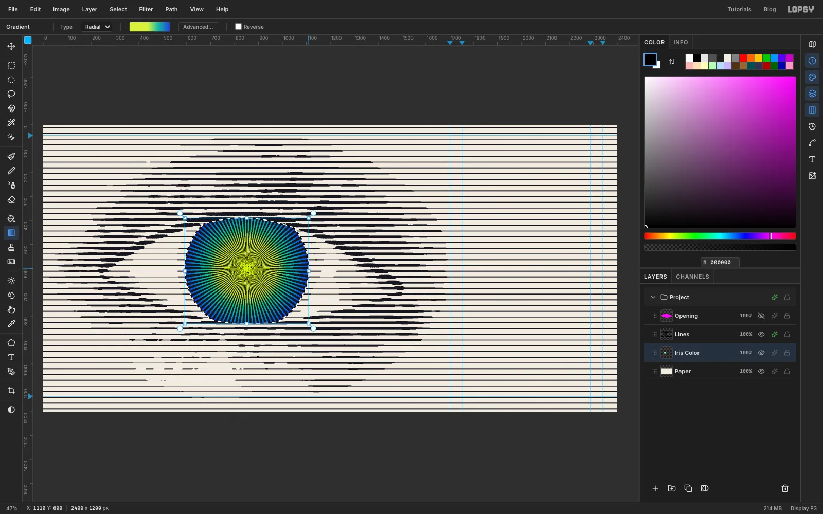
-
Add the limbus ring
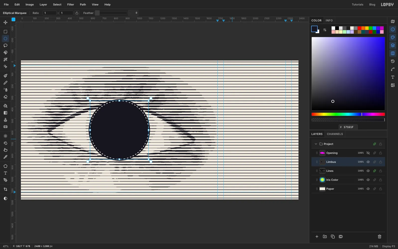
Select Lines and click Add Layer. Name it Limbus. Set the foreground to . Click once with the Elliptical Marquee and enter From 586, 335 To 1116, 865, then choose Edit → Fill. Choose Select → Shrink…, enter 12 and press Delete. That leaves a ring round the iris.
Now tuck the ring under the lids too. Cmd-click the Opening thumbnail, choose Select → Inverse, click the Limbus layer and press Delete. Press Cmd+D.
-
Outline the lids
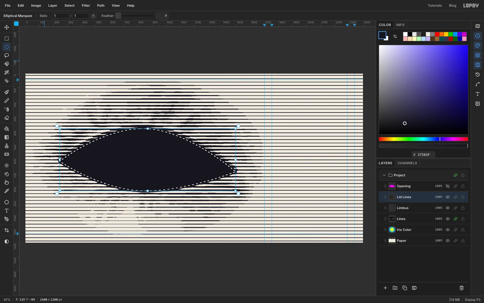
Click Add Layer and name it Lid Lines. Cmd-click the Opening thumbnail, choose Select → Grow… with 10, and fill with . Cmd-click the Opening thumbnail again, click Lid Lines and press Delete. You're left with a 10 px outline running just outside the opening, so the iris disappears under the lid line at the top and bottom. Press Cmd+D.
The Opening helper has done its job. Select it and delete it.
-
Draw the pupil and catchlights
Select Lid Lines and click Add Layer. Name it Pupil. Click once with the Elliptical Marquee, enter From 743, 492 To 959, 708 and fill with . Press Cmd+D. The pupil is centred on the iris. The photo's pupil sat a little high, which pressed it against the lid.
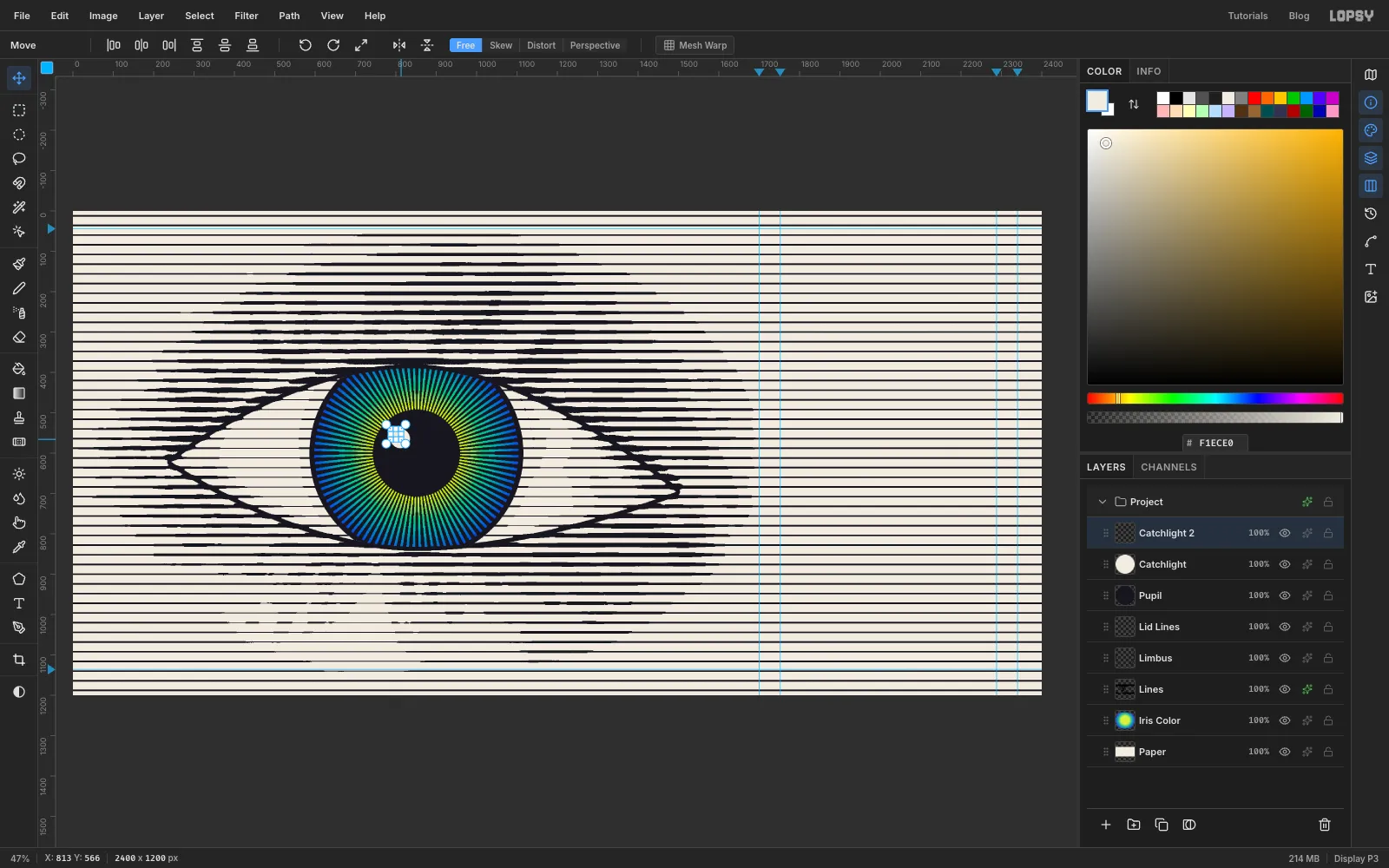
Click Add Layer and name it Catchlight. Set the foreground to , click once and enter From 787, 540 To 835, 588, and choose Edit → Fill. Press Cmd+C and Cmd+V. The copy pastes in place, already selected. Rename it Catchlight 2, hold Cmd and drag its bottom-right handle inward until it is about half the size. Press Cmd+D.
-
Move the second catchlight
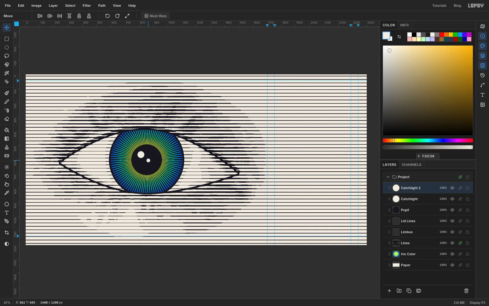
With the Move tool, press Shift+→ six times and Shift+↓ five times. That moves Catchlight 2 60 px right and 50 px down, just right of the pupil's centre. Two catchlights, one big and one small, make the eye look wet and round.
-
Draw the panel
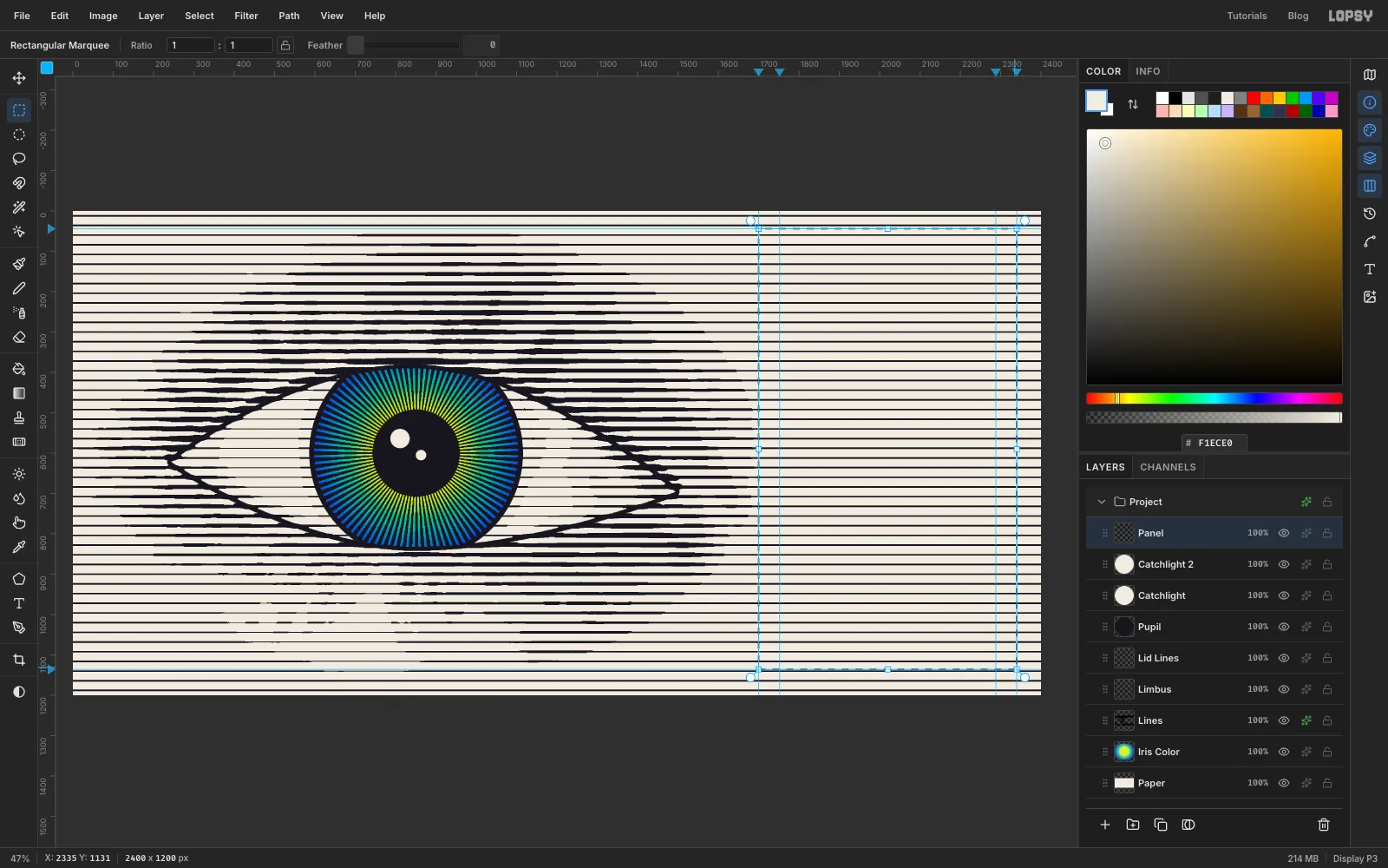
Select Catchlight 2 and click Add Layer. Name it Panel. Open the View menu and check that Snap to Guides has a tick (it's on by default). Pick the Rectangular Marquee and drag from the top-left guide crossing (1700, 44) to the bottom-right one (2340, 1136). The edges snap exactly to the guides. Fill with and press Cmd+D.
The guides put the panel's top border and its shadow's bottom edge in the gaps between two lines, so neither one touches a stripe.
-
Give the panel a frame and a shadow
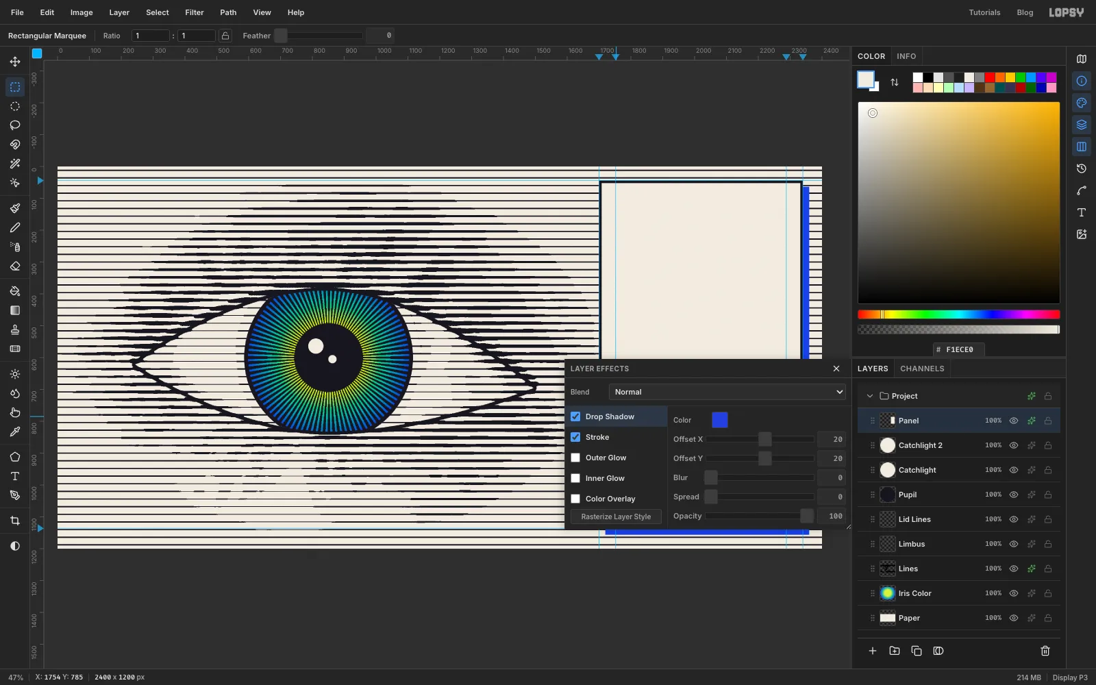
Click the effects button on the Panel row. Enable Stroke, set Width to 8, the colour to and the position to Inside. Enable Drop Shadow with Offset X 20, Offset Y 20, Blur 0, Spread 0, Opacity 100 and colour . A hard, flat shadow looks printed; a blurred one would look like a web button.
-
Type the copy
Make sure Panel is the selected layer before each new text, so the Text options don't restyle the last text layer. Before you start, open the Text panel and check Letter spacing is 0.
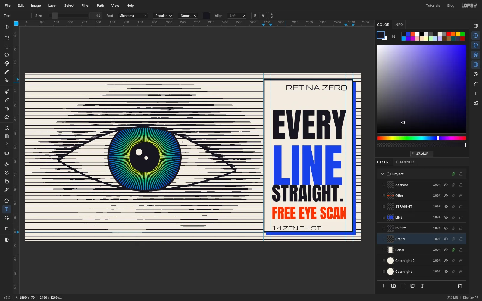
A text layer's click area reaches a little below its letters, so clicking just under a line re-opens it for editing. Typing from the bottom up avoids that. Pick the Text tool. For each line, set the font and size in the options bar and the foreground to its colour, click inside the panel (bottom line first, each one higher than the last), type, and press Tab to finish:
- 14 ZENITH ST, Michroma 36,
- FREE EYE SCAN, Anton 100,
- STRAIGHT., Anton 140,
- LINE, Anton 330,
- EVERY, Anton 240,
- RETINA ZERO, Michroma 46, , near the top
Rename the layers Address, Offer, STRAIGHT, LINE, EVERY and Brand. Don't worry about sizes or positions yet.
-
Fit the type to the measure
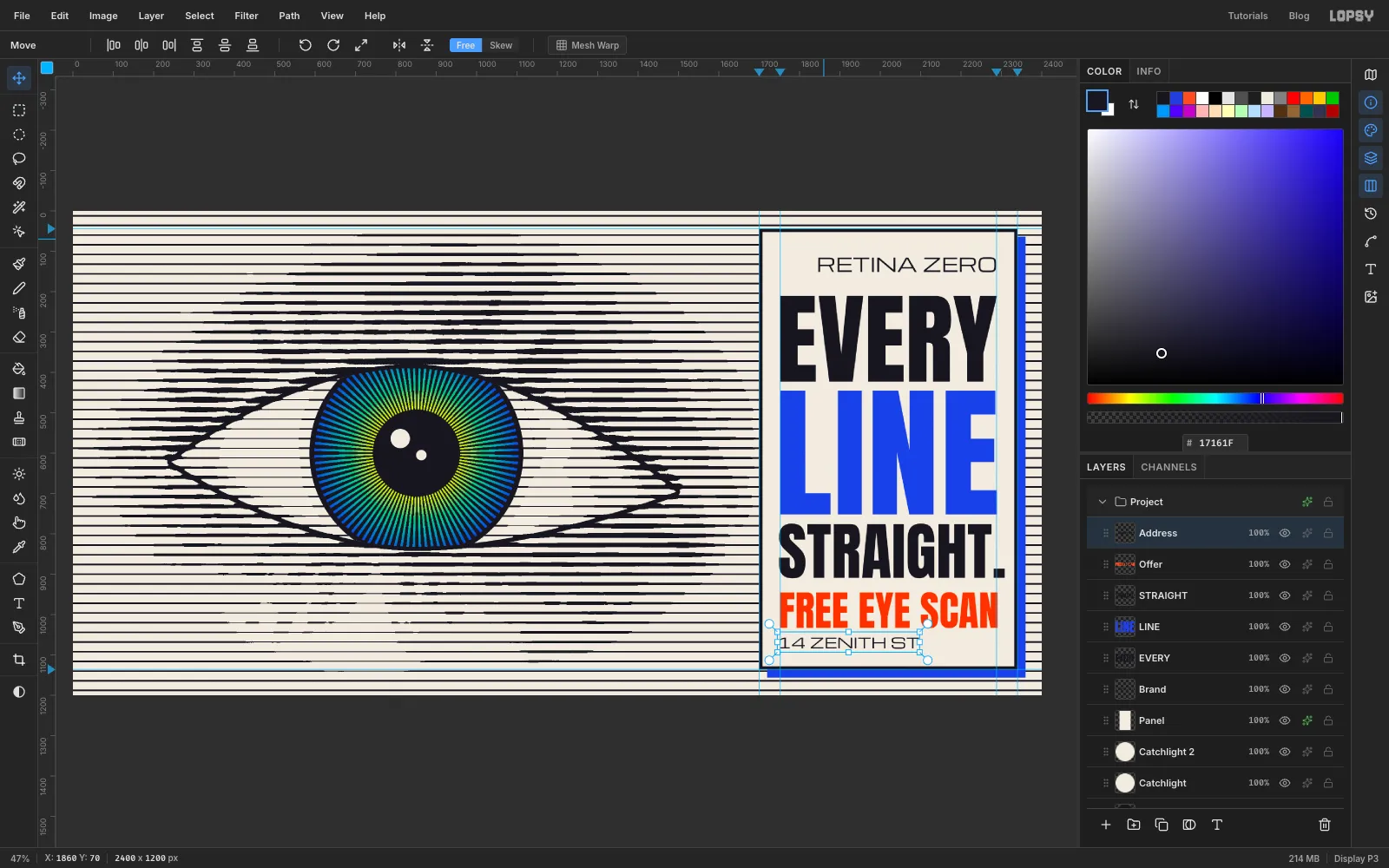
Each headline line should run exactly from the 1752 guide to the 2288 guide. Select a text layer and change Size in the options bar until it fits. These are the sizes that work:
- EVERY 247
- STRAIGHT. 155: the T stops about 14 px short of the right guide, so the full stop hangs just past it. A hanging stop looks straighter than one tucked inside the measure
- FREE EYE SCAN 102
- RETINA ZERO 47, which runs from 1846 to the right guide, leaving room for the logo
- LINE 357 with Letter spacing 3 in the Text panel
Then line them up with the Move tool and the arrow keys (Shift+arrow moves 10 px). Click the left ruler at 211 and 1084 to add two guides, and zoom in to check edges against them.
- Put every left edge on the 1752 guide. Round letters look indented against a straight edge, so let the S of STRAIGHT. sit 3 px past it.
- Sit the top of EVERY on the 211 guide and the bottom of 14 ZENITH ST on the 1084 guide.
- Leave the same gap (about 22 px) between EVERY, LINE and STRAIGHT., a larger one (about 34 px) above FREE EYE SCAN, and 22 px again above the address.
- Centre RETINA ZERO vertically about 80 px above the 211 guide. The logo goes to its left in the next step.
That leaves the same 44 px of paper inside the frame on all four sides.
-
Draw the ring logo
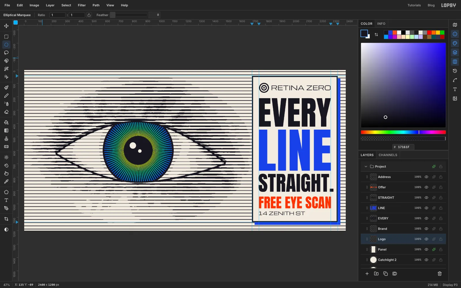
Select Panel and click Add Layer. Name it Logo and set the foreground to . Make a target from five circles, all centred on (1790, 133), working from the outside in. For each one, click once with the Elliptical Marquee, type the corners, and fill or clear. A marquee click with a selection active just deselects, so press Cmd+D before each one:
- From 1753, 96 To 1827, 170: Edit → Fill
- From 1761, 104 To 1819, 162: Delete
- From 1769, 112 To 1811, 154: Edit → Fill
- From 1777, 120 To 1803, 146: Delete
- From 1784, 127 To 1796, 139: Edit → Fill
Press Cmd+D when you're done. The logo's top sits on the panel's 44 px margin, level with RETINA ZERO. The ring echoes the iris and the line screen in one small mark.
-
Make the sticker
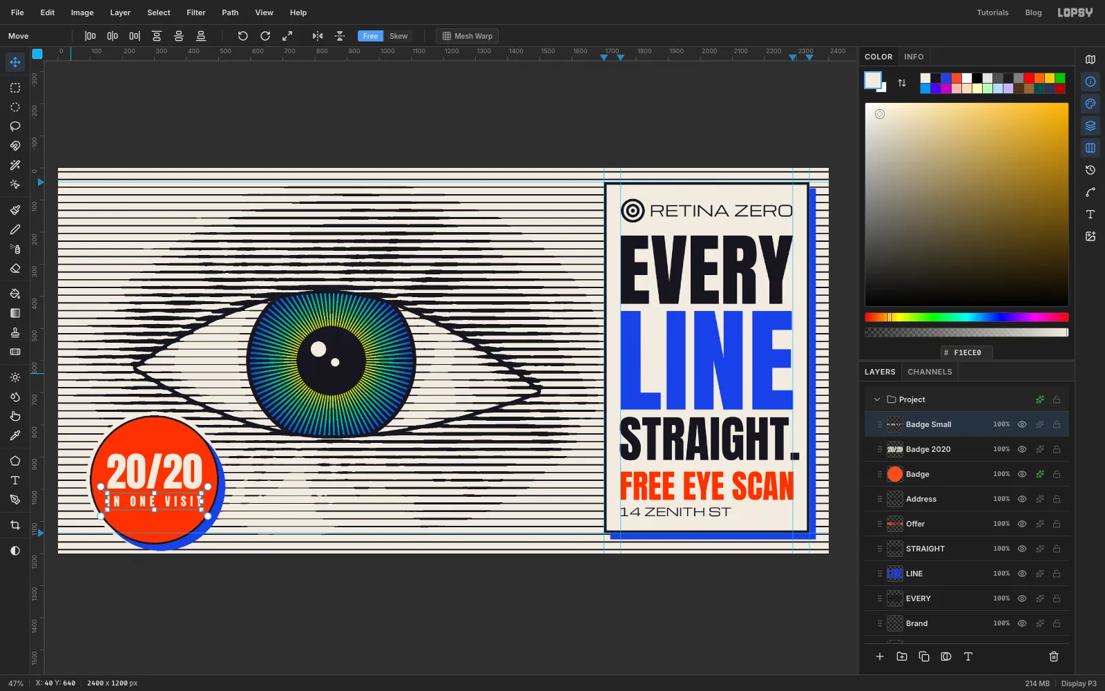
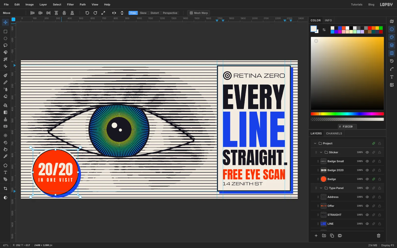
Select Address (the top layer) and click Add Layer. Name it Badge and set the foreground to . Click once with the Elliptical Marquee, enter From 105, 776 To 495, 1166 and fill. Press Cmd+D.
Open the layer effects from the Badge row and enable Stroke with Width 6, , position Outside. Enable Drop Shadow with Offset X 20, Offset Y 20, Blur 0, Opacity 100 and colour , the same as the panel. Enable Outer Glow with colour , Size 12, Spread 100 and Opacity 100. The glow is a thin paper halo that keeps the stripes off the sticker's outline.
With Badge selected and the foreground set to , use the Text tool to type IN ONE VISIT in Anton 37, then set its Letter spacing to 12 in the Text panel. Select Badge again and type 20/20 in Anton 126, and set its Letter spacing back to 0. Click over the line field at the far left, away from other text, for each one, then move it onto the disc. Rename the layers Badge Small and Badge 2020. Centre 20/20 on the disc with IN ONE VISIT 22 px below it, and the pair as a block on the disc's centre, (300, 971).
-
Group the layers
Click Iris Color, Shift-click Catchlight 2 and choose Layer → Group Layers. Name the group Eye. Do the same for Panel to Address (call it Type Panel) and Badge to Badge Small (call it Sticker).
-
Move and tilt the sticker
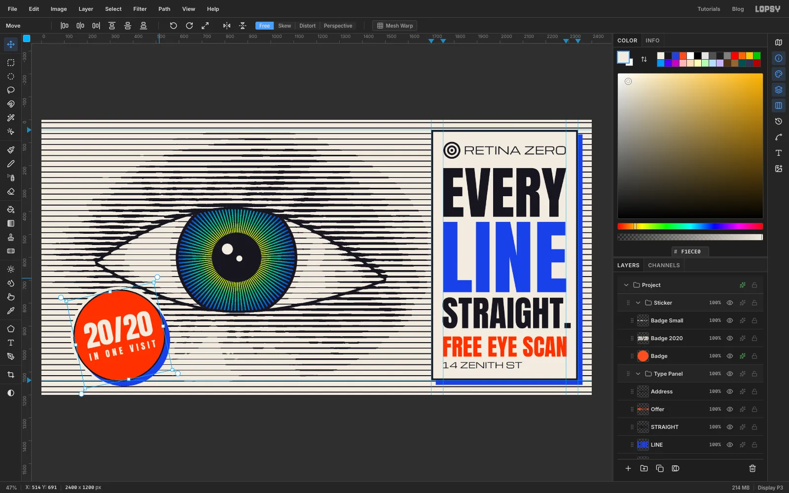
Click the Sticker group's row and pick the Move tool. Press Shift+→ four times and Shift+↑ three times. That moves the whole sticker 40 px right and 30 px up, so its centre sits at (340, 941) and the bottom of its cobalt shadow lines up with the panel's shadow.
Now hover just outside the top-right corner of its box until the cursor changes to the rotate cursor, and drag anticlockwise about 12°, a little less than the 15° step you'd get holding Cmd. The disc and both lines of text turn together. Press Cmd+D to commit.
-
Check the layout and export
Turn on View → Show Grid. The grid makes it easy to see that the panel's shadow and the sticker's shadow end on the same row, and that the eye's outer corner sits well clear of the panel. Showing the grid also switches on Snap in the Move options, so turn the grid off afterwards and untick Snap. Turn off View → Show Guides too.
Choose File → Quick Export PNG to export the billboard and File → Save Project to keep a
.lopsyyou can come back to.Step back from the screen, or zoom out until the board is small. The lines should melt into an eye. If one area looks blotchy, the fix is almost always on the tone map, before the threshold, rather than on the lines themselves.