Design a Pop-Art Comic Logo for a Toast Café
Draw a shocked toast mascot, Ben-Day dots, a comic burst and an arched wordmark in Lopsy, then print it in four Warhol-style colourways.
Pop art took the cheapest printing in America and put it on gallery walls. Roy Lichtenstein painted comic-book dots by hand, and Andy Warhol silkscreened the same image again and again in loud, slightly misaligned colours. Those habits still make a great logo: thick black outlines, a few flat inks and one big idea you can read from across the street.
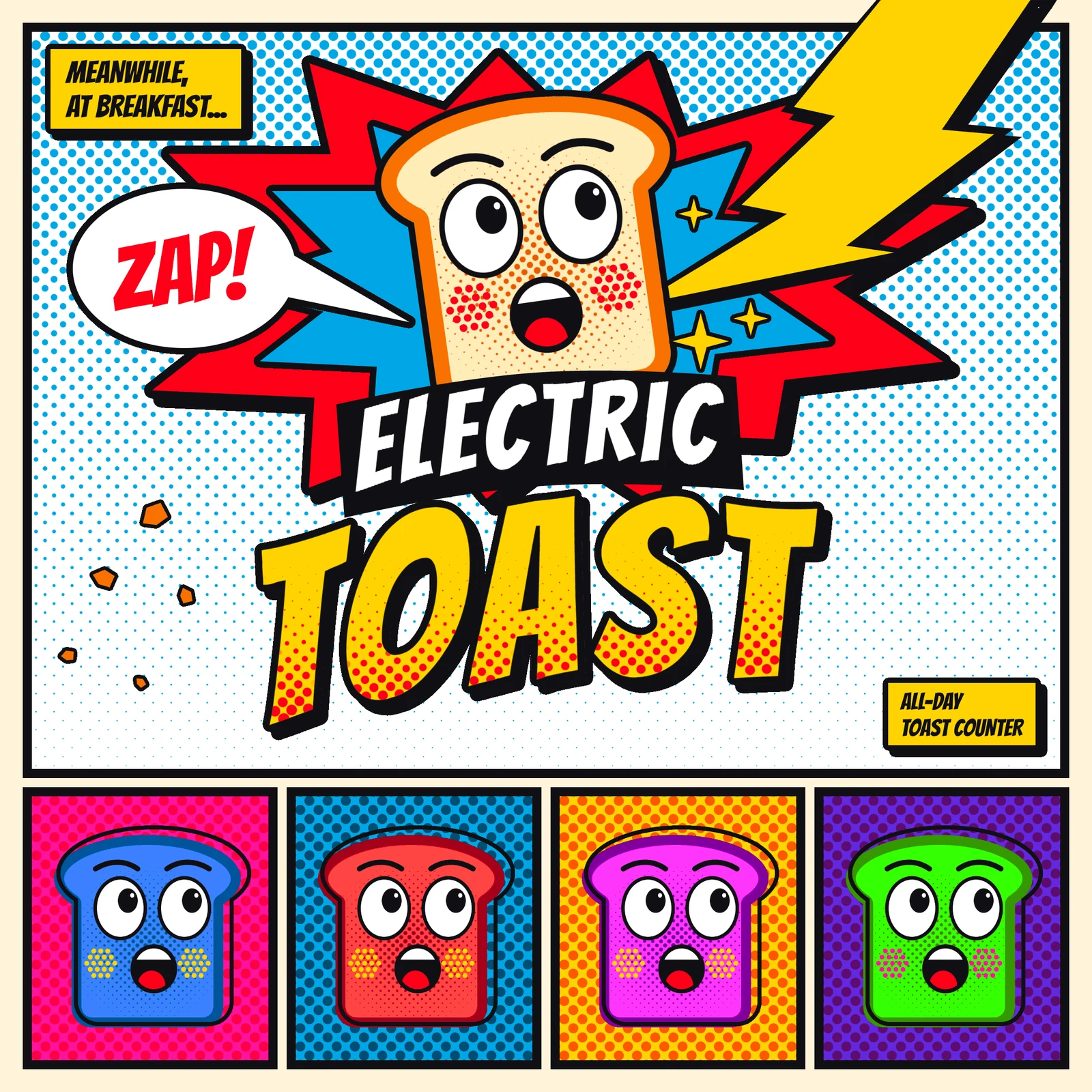
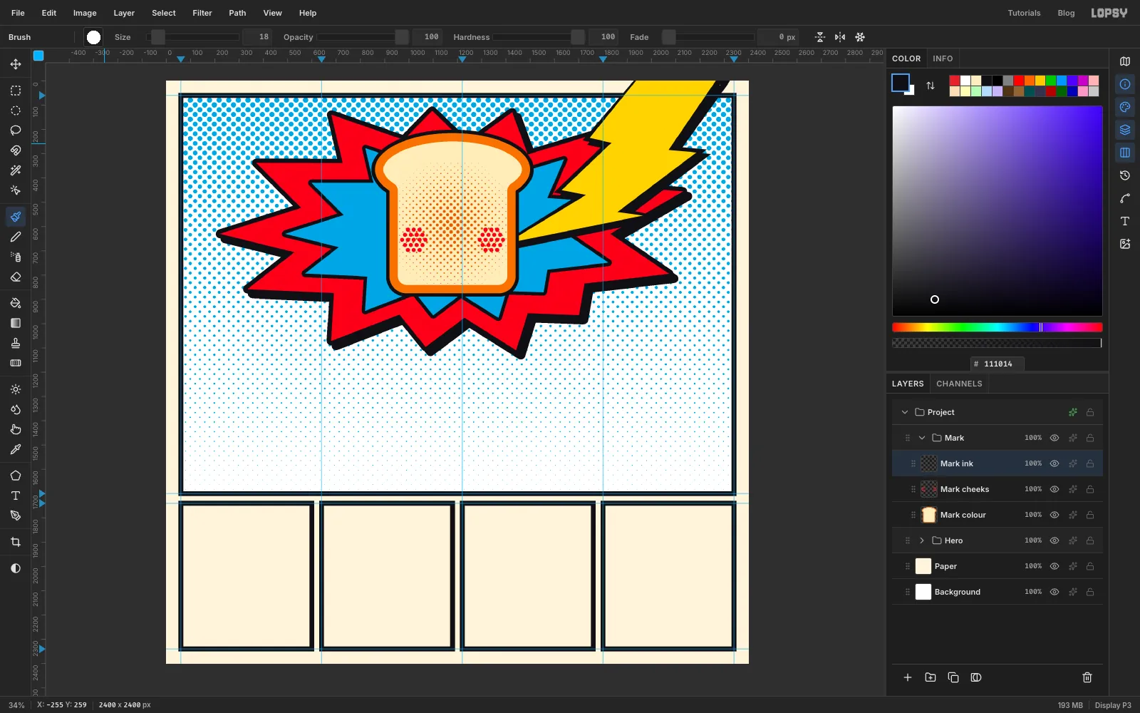
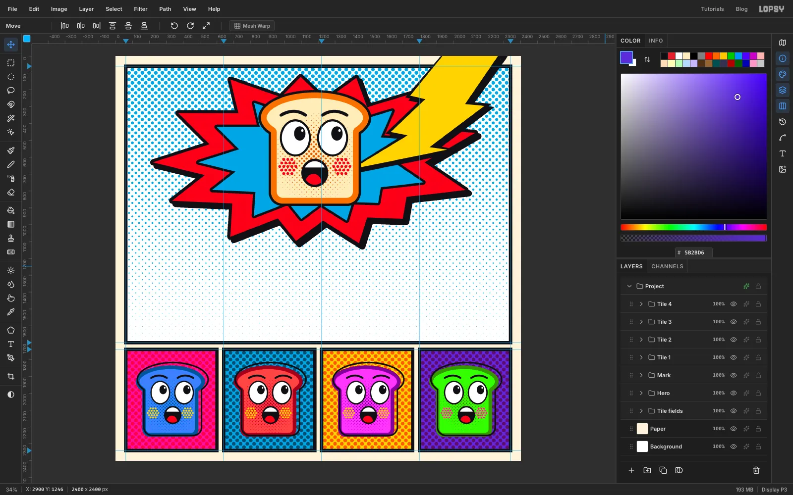
In this tutorial you'll make a logo sheet for a made-up all-day toast counter, Electric Toast. The sheet is laid out like a comic page. The top panel holds the main logo, where a shocked slice of toast gets hit by lightning. Four small panels below repeat the mascot Warhol-style.
The mascot is the key to the whole page. You'll build it as three separate layers, called colour, cheeks and ink, just as a screen printer would split it into separate screens. That's what makes the Warhol panels quick: copy the group, shift the colour layer's hue, and nudge the ink out of register.
Along the way you'll use:
- Filter → Halftone on gradients for dots that swell and fade.
- Color Overlay plus Rasterize Layer Style to turn those dots into one flat ink.
- The Pen tool, with Path to Selection, for the burst and the bolt.
- Select → Grow and Shrink for the crust and the outline.
- Shift+Alt intersect selections for the teeth and tongue.
- Define Pattern and Fill with Pattern for dotted backgrounds.
- Duplicate, scale and rotate on whole groups.
- Mesh Warp to arch the lettering.
There is one free Google Font, Bangers, used for all the lettering. If the letters first appear in a plain font, give it a moment to download before you carry on.
The palette is the primary colours of cheap comic printing, plus the toast:
-
Ink
-
paper
-
Process red
-
Process cyan
-
Process yellow
-
Crust
-
crumb
-
toasted dots
-
Hot pink
-
violet
for the Warhol panels
The numbers below are the ones I used on a 2400 × 2400 px page. Shapes you draw by hand won't match them exactly, and that's fine. The status bar at the bottom left shows the pointer's X and Y, which is handy for measuring. Hold Cmd and scroll to zoom at the pointer, and press Cmd+0 to fit the page again. Zoom in whenever the work gets small.
-
Set up the page and its guides
The layout comes first, because everything else has to fit inside it.
- Create a 2400 × 2400 px document. It starts with a
Backgroundlayer and aLayer 1. - Double-click
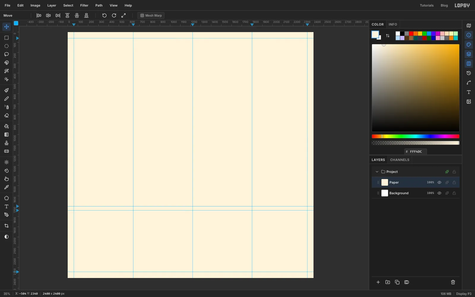
Layer 1and rename itPaper. Set the foreground colour to and choose Edit → Fill. - Click the top ruler to add vertical guides at 60, 640, 1220, 1800 and 2340.
- Click the left ruler to add horizontal guides at 60, 1700, 1740 and 2340.
The ruler shows the position beside the pointer, and being a few pixels off is fine because the frames will cover the difference. That gives a big panel on top and the left edges of four small panels below. Each small panel is 540 px wide with a 40 px gap between panels, which you'll set exactly when you draw the frames.
- Create a 2400 × 2400 px document. It starts with a
-
Lay a gradient for the sky
Ben-Day dots look best when they swell and shrink. To get that, you make the dots from a gradient.
- With
Paperselected, click New Group at the bottom of the Layers panel and name itHero. Click Add Layer and name the new layerSky paper. - Press M for the Rectangular Marquee and drag from guide to guide around the top panel. The marquee's edges snap to the guides. Set the foreground to white and choose Edit → Fill. Press Cmd+D to deselect.
- Add another layer called
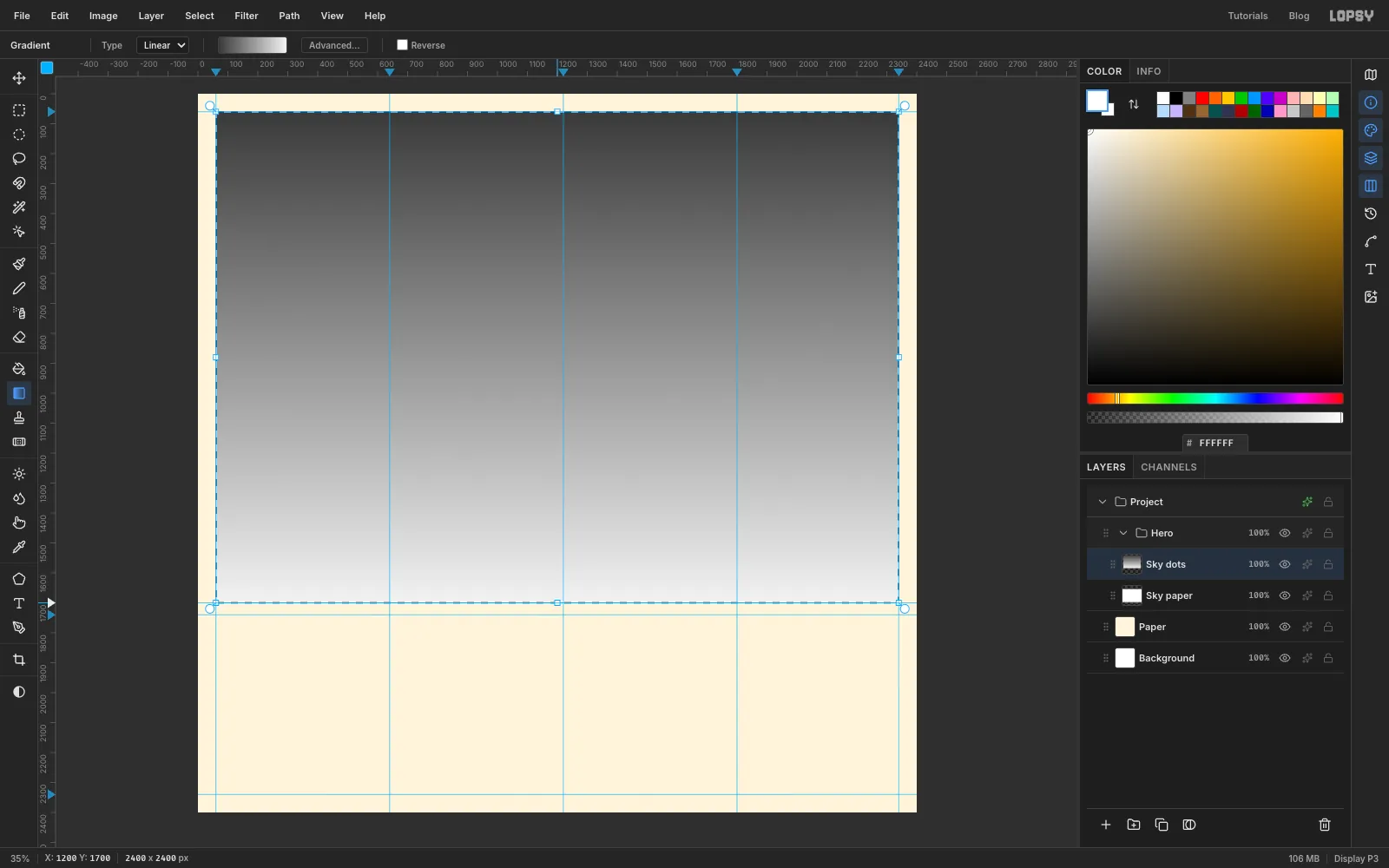
Sky dotsand marquee the same panel. - Pick the Gradient tool, set it to Linear and click Advanced…. Set two stops, on the left and on the right. To set a stop, click its handle and type the colour into the hex field. Click Done.
- Drag from the top of the panel to the bottom.
- With
-
Turn the gradient into dots
Press Cmd+D, then choose Filter → Halftone. Use Dot Size
28, Density1, Angle45and Softness1.Dark areas become big dots and pale ones become tiny dots. The gaps between dots are transparent, so the white
Sky paperlayer shows through.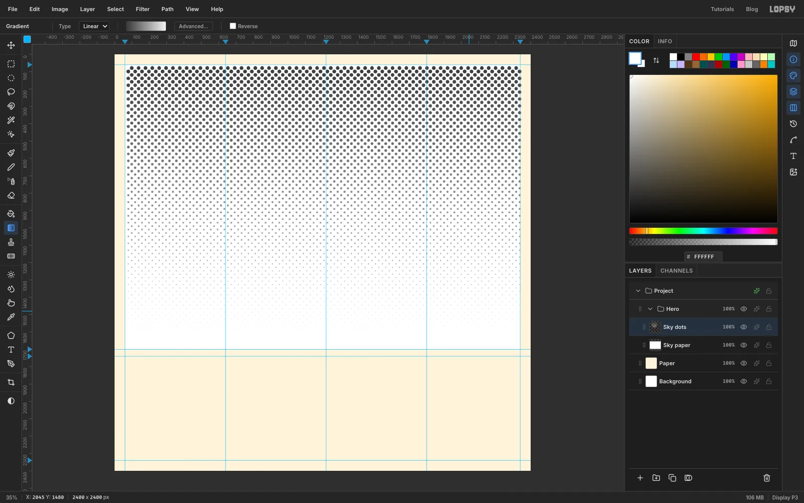
-
Print the dots in cyan
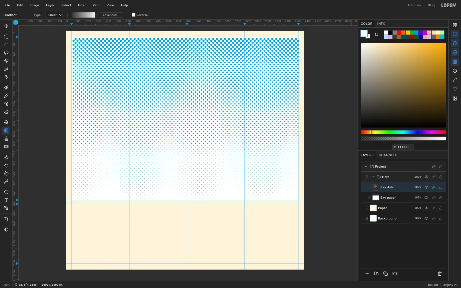
Click the effects button on the
Sky dotsrow. Enable Color Overlay and set the colour to . Close the drawer.The bottom of the panel stays pale on purpose, because the wordmark goes there and it needs a calm background.
-
Draw the comic frames
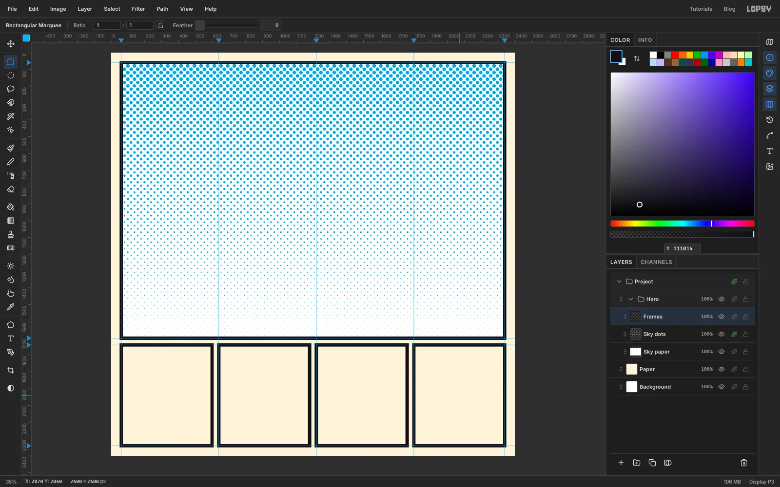
Frames need to be exact, so use the marquee's corner dialog. Clicking once with the marquee, without dragging, opens a box where you can type the corners.
- Add a layer called
Frames, set the foreground to and press M. - Click once with the marquee and enter a rectangle 10 px outside a panel on every side. Press Enter, choose Edit → Fill, then press Cmd+D. The dialog only opens when nothing is selected.
- Click once again and enter a rectangle 10 px inside the same panel. Press Enter, then Delete, then Cmd+D. You now have a 20 px frame.
- Do this for all five panels:
- The top panel runs from 60, 60 to 2340, 1700.
- The small panels all run from y 1740 to y 2340, with x from 60 to 600, 640 to 1180, 1220 to 1760 and 1800 to 2340.
- Add a layer called
-
Pen a comic explosion
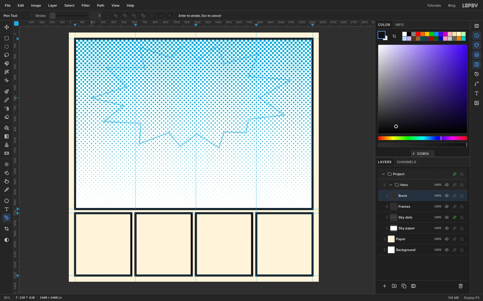
A comic burst looks explosive when its spikes are uneven. A regular star looks like a price sticker.
- Add a layer called
Burst. - Press P for the Pen and click around the middle of the panel, going back and forth between a long point and a short valley. I used 13 of each.
- Make the left and right points the longest, reaching almost to the panel's sides. Keep the top and bottom points shorter, so the whole burst is wider than it is tall.
- Leave the lower part of the panel empty for the wordmark.
- Click the first anchor to close the path.
- Add a layer called
-
Fill the burst and outline it
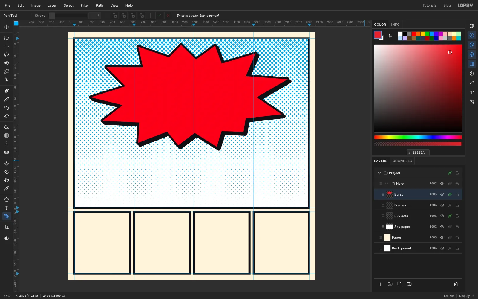
- Open the Paths panel from the icon strip at the far right and click Path to Selection, then Delete Path.
- Set the foreground to , choose Edit → Fill and press Cmd+D.
- Open the layer's effects. Enable Stroke, with Width
18and colour . - Click Rasterize Layer Style at the bottom of the drawer. This bakes the outline into the layer.
- Enable Drop Shadow with Offset X and Y both
20, Blur1, Opacity100and colour . Close the drawer.
Baking makes the outline part of the layer's pixels, so the red and black now behave as one shape.
-
Add a cyan core
Add a layer called
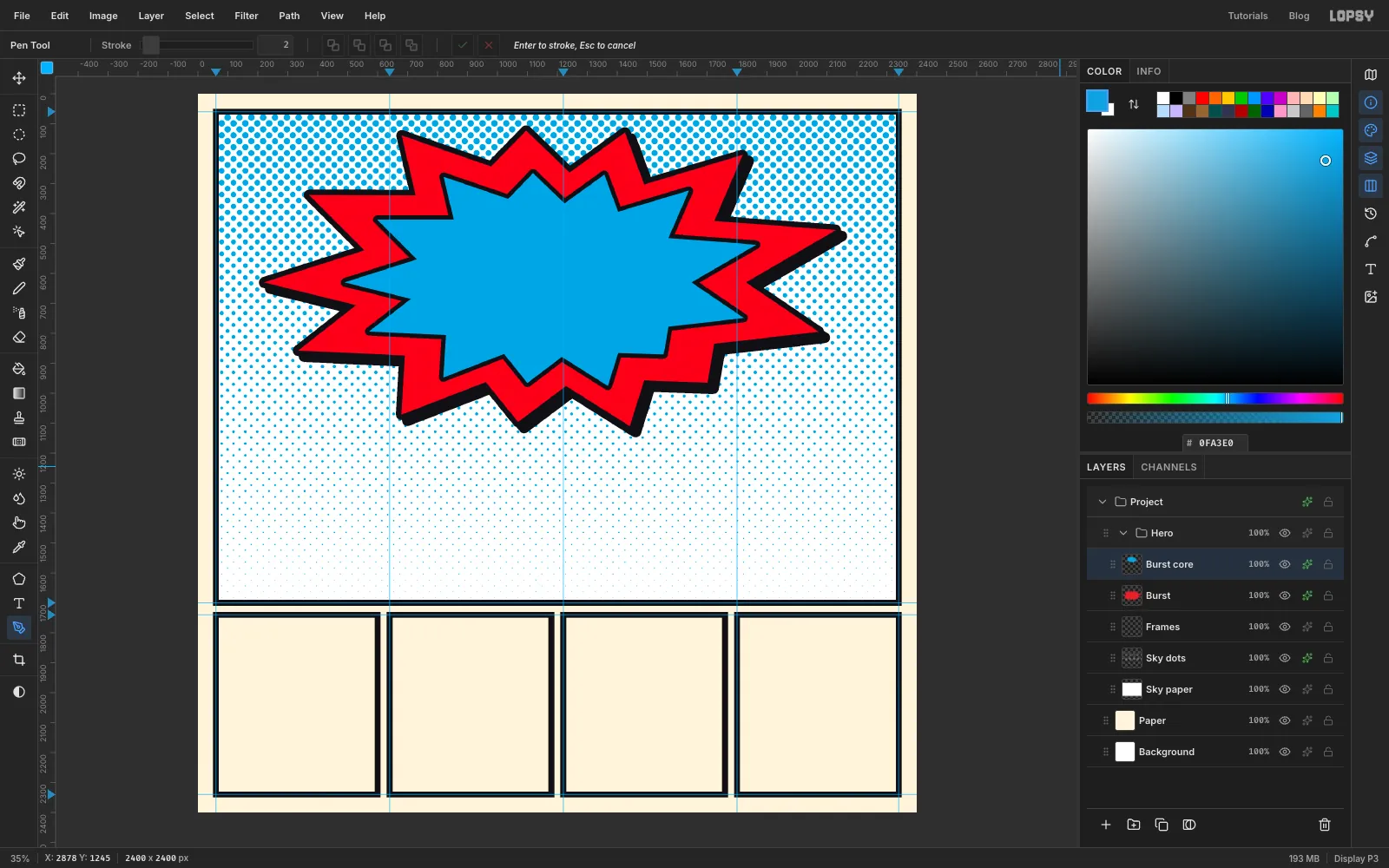
Burst core. Press P and draw a second burst inside the first, with the same rhythm at about 70 % of the size. Close it, then use Path to Selection and Delete Path as before.Fill it with , press Cmd+D, and give it a Stroke of Width
14in . This one doesn't need a shadow. Close the drawer.Cyan is the opposite of the orange crust you're about to draw, so the toast will stand out. It also leaves yellow free for the bolt.
-
Pen the lightning bolt's outline
I drew the bolt's outline as its own path, because a Stroke effect rounds the corners and a lightning bolt should be sharp.
- Add a layer called
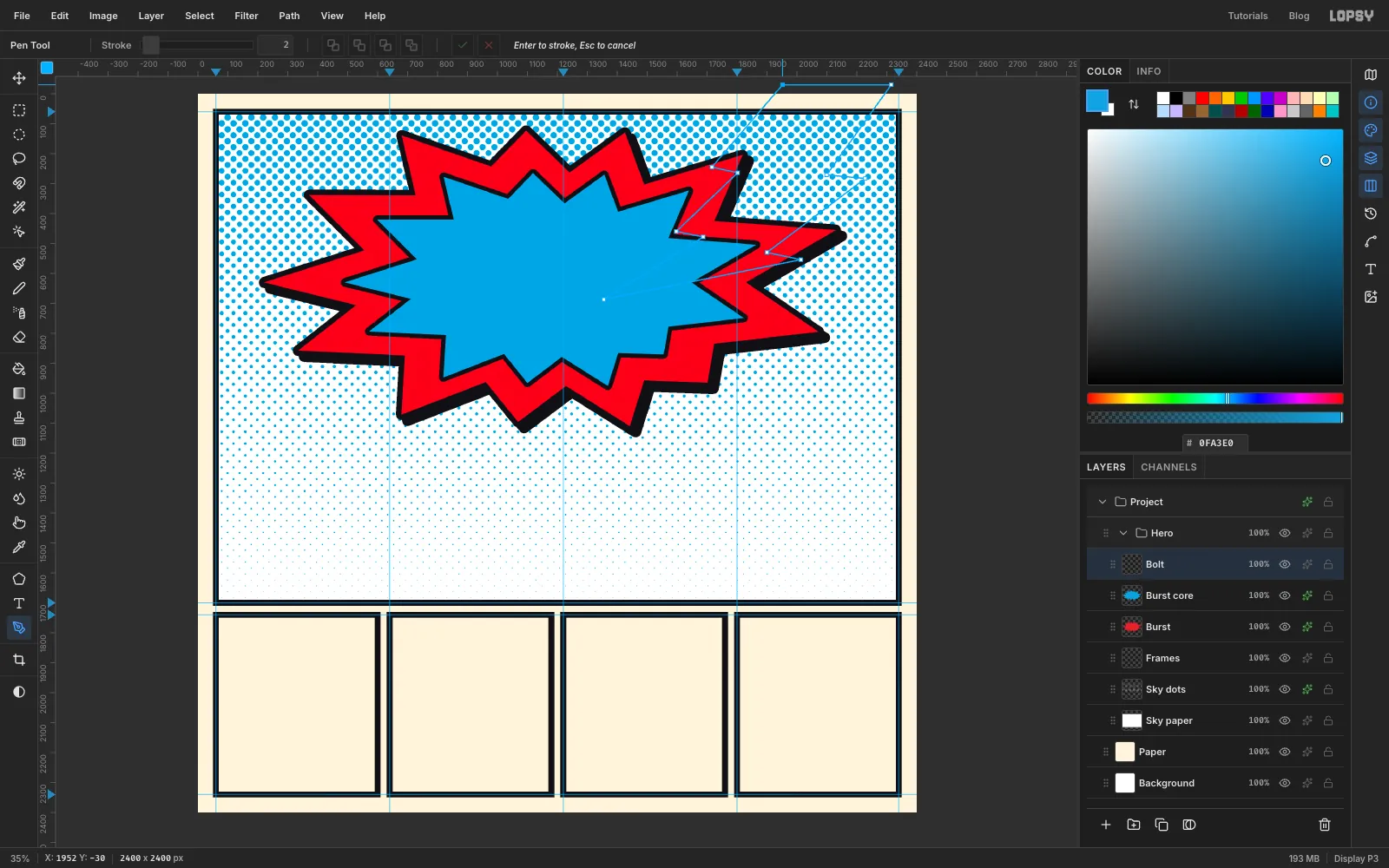
Bolt. - Press P. Click twice on the grey pasteboard just above the page, near the right side, for the bolt's wide top edge. The pasteboard strip is narrow, so zoom out a little if you need to: a click on the ruler would add a guide instead.
- From the second anchor, work down the bolt's right-hand side: a slant down and to the left, a small step back to the right, another slant, another step, then one long run to a sharp tip.
- Put the tip well inside the burst, near the centre-right. The toast will hide it, so the bolt seems to land on the slice.
- Come back up the left-hand side with the same zigzag, stopping below the first anchor. That's 11 anchors in all.
- Click the first anchor to close the path, then use Path to Selection and Delete Path.
- Add a layer called
-
Fill the bolt
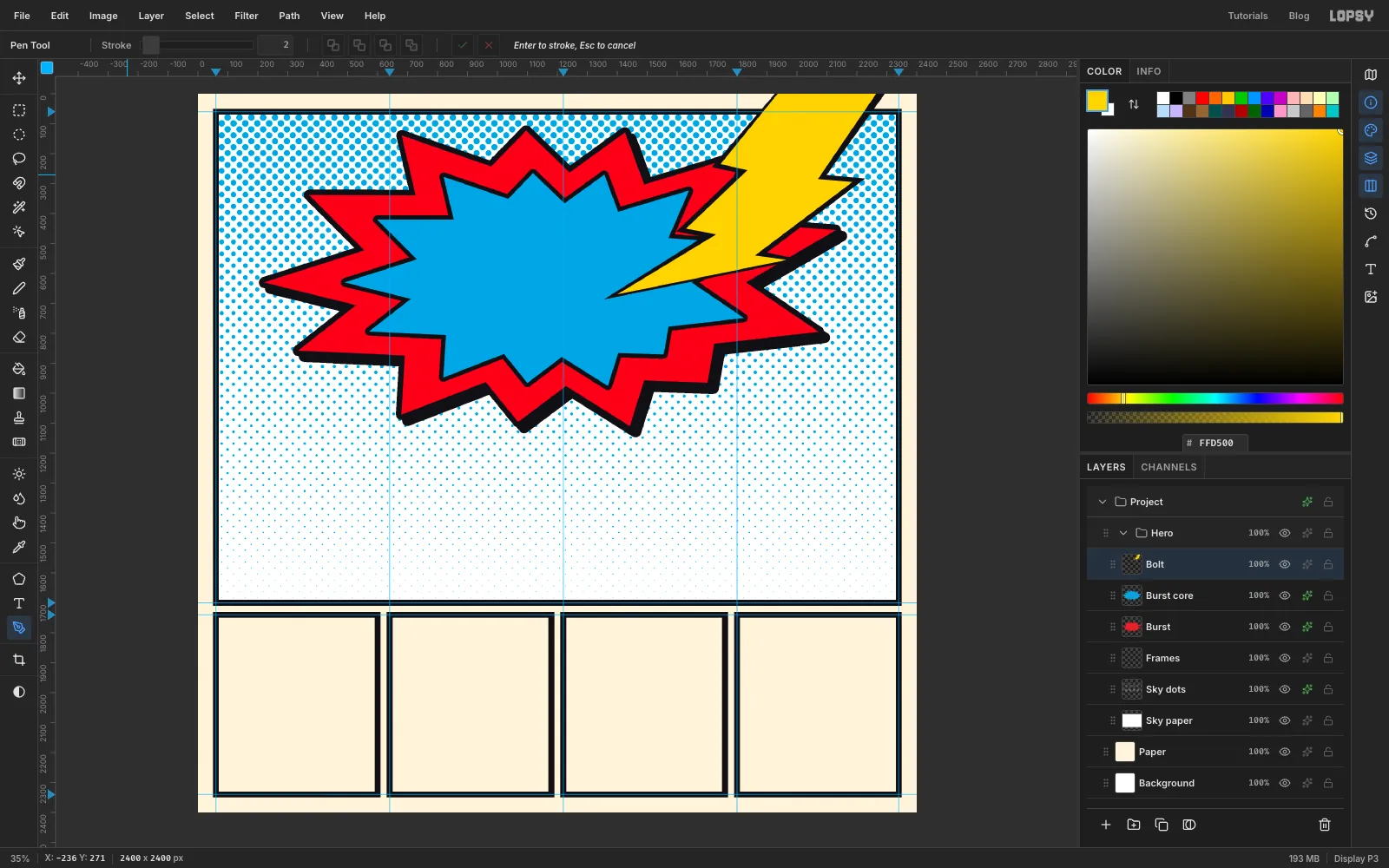
- Fill the selection with and press Cmd+D.
- Zoom in to about 50 %, press P again and click the same zigzag about 16 px inside the black shape. Keep the top two anchors up on the pasteboard, like the first time. Close it, then use Path to Selection and Delete Path.
- Fill with and press Cmd+D.
Breaking the frame on purpose is a classic comic trick. Commit to it: a bolt that only just touches the frame looks like a mistake.
-
Give the bolt a shadow
On
Bolt, enable Drop Shadow with Offset X and Y both18, Blur1, Opacity100and colour . Close the drawer.Zoom in where the bolt leaves the page. The shadow stops 18 px below the top edge, because it's an offset copy of a layer that ends at the page edge. To finish it off, add a layer called
Bolt patchand Pen a four-point shape that continues the shadow's slant up to the page edge. Use Path to Selection and Delete Path, fill with , then press Cmd+D and Cmd+0.Then collapse the
Herogroup.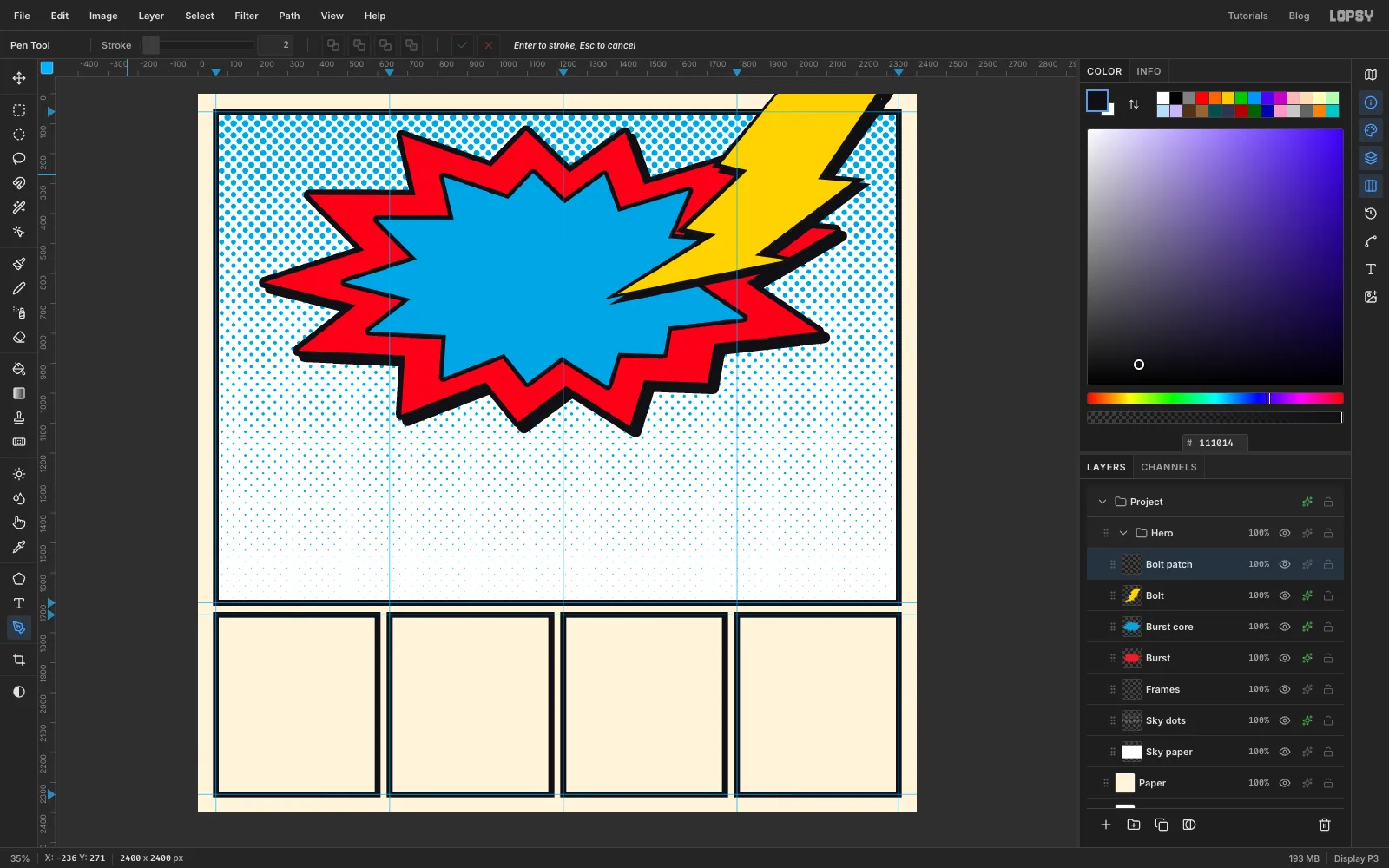
-
Build the loaf from two shapes
The slice of toast is just a rounded square with a wide oval on top.
- Click the
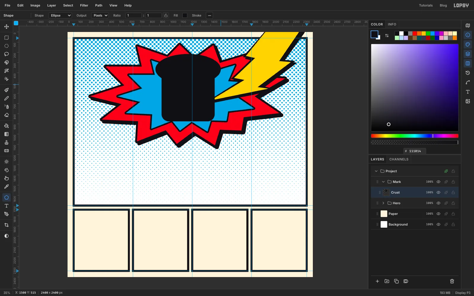
Herorow, click New Group and name itMark. Add a layer calledCrust. - Press U for the Shape tool, with Output set to pixels. Choose Rectangle and set Corner Radius to
70. - Shapes grow from where you press. Press just below the centre of the burst and drag out to a box of about 520 × 520 px. Hold Cmd to keep it square.
- Switch the Shape to Ellipse. Press near the top of the square and drag out to about 640 × 300 px, so it overhangs the square on both sides. That overhang is the muffin-top of a slice of bread.
The fill colour doesn't matter, because you're about to replace it.
- Click the
-
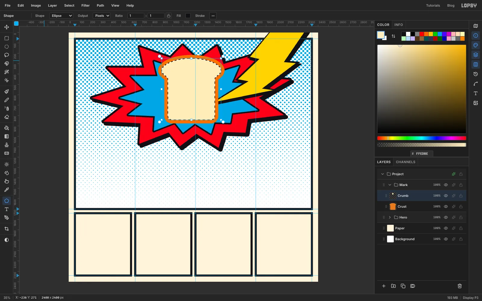
Colour the crust and crumb
- Cmd-click the
Crustthumbnail in the Layers panel to select its shape. - Fill with .
- Choose Select → Shrink and enter
34. - Add a layer called
Crumband fill the selection with . Keep the selection active.
- Cmd-click the
-
Add a toasted patch
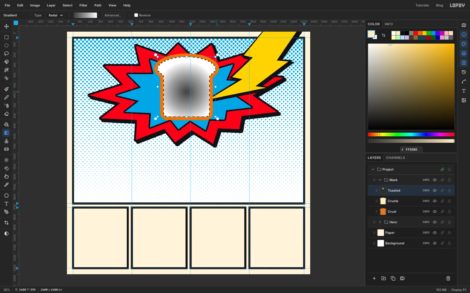
The toasted look comes from the same trick as the sky.
- Add a layer called
Toasted. The crumb selection is still active, so the gradient will stay inside the bread. - Pick the Gradient tool and set it to Radial. In Advanced…, set three stops: on the left, just past the middle and on the right. Click an empty spot on the handle row to add the middle stop, then drag it into place.
- Drag from the middle of the slice out towards its side edge.
- Add a layer called
-
Print the toast marks as flat dots
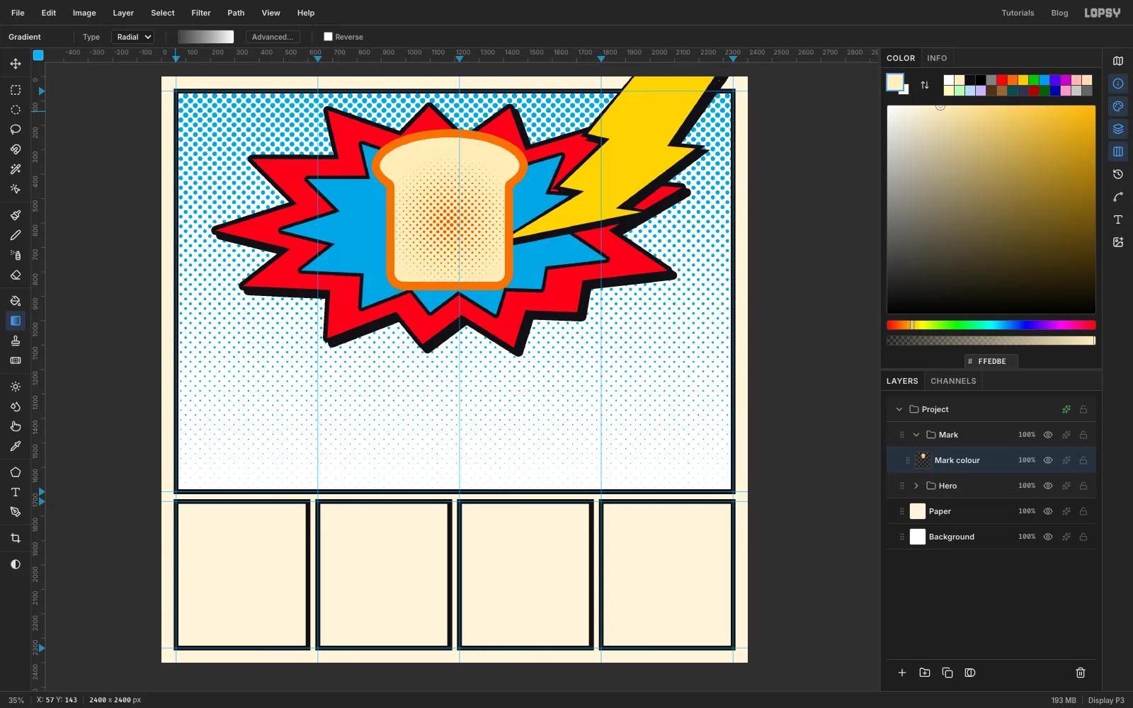
- Press Cmd+D and run Filter → Halftone with Dot Size
20, Density1, Angle45and Softness1. - Open the effects drawer, enable Color Overlay with , then click Rasterize Layer Style. Close the drawer.
- Choose Layer → Merge Down to merge the dots into
Crumb. - Choose Layer → Merge Down again to merge
CrumbintoCrust. - Rename the result
Mark colour.
Color Overlay gives each dot one flat ink. If you fill grey dots with a colour instead, the soft edges turn muddy.
- Press Cmd+D and run Filter → Halftone with Dot Size
-
Dot the cheeks by hand
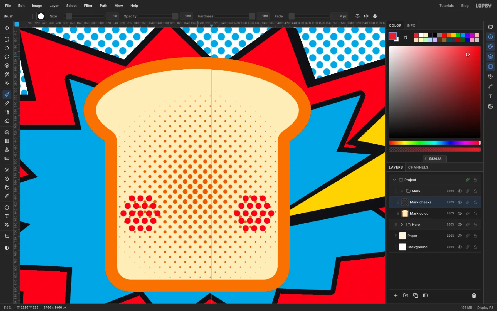
A marquee full of dots would slice some of them in half, so place whole dots with the Brush.
- Zoom in on the slice and add a layer called
Mark cheeks. Keeping the cheeks on their own layer lets you recolour them later. - Set the foreground to , press B for the Brush, and set Size
18and Hardness100. - Click once for each dot. Make five rows of 3, 4, 5, 4 and 3 dots, about 24 px apart, with each row offset by half a step like a honeycomb.
- Do the same on the other cheek, low on the slice and well inside the crust.
- Zoom in on the slice and add a layer called
-
Outline the slice in ink
- Add a layer called
Mark ink. - Cmd-click the
Mark colourthumbnail and choose Select → Grow with14. - Set the foreground to and choose Edit → Fill. The slice is now covered by a black shape on this layer.
- Cmd-click the
Mark colourthumbnail again and press Delete. That removes the middle fromMark ink, leaving a 14 px outline.Mark colouritself isn't touched, because Cmd-clicking a thumbnail doesn't change the active layer. - Press Cmd+D.
- Add a layer called
-
Draw the eyes
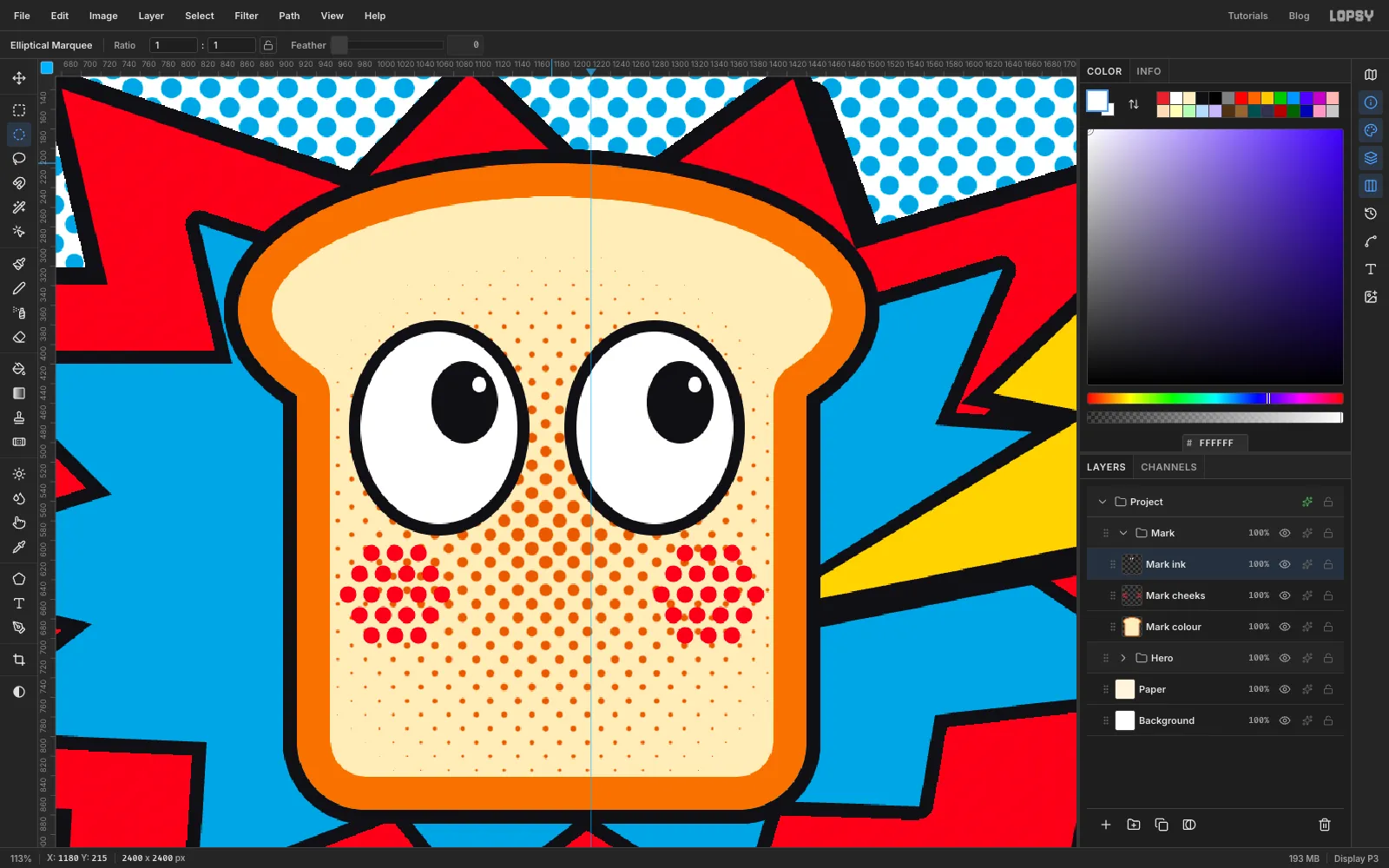
The joke is in the eyes: the toast is looking up at what's about to hit it. Stay on
Mark inkfor all of this, zoomed in on the slice. Draw each eye with the Elliptical Marquee, whose icon sits below the Rectangular Marquee in the toolbox, and Edit → Fill, pressing Cmd+D between fills.- Fill a tall oval, about 184 × 220 px, with , high on the slice and left of centre.
- Fill a slightly smaller oval, about 160 × 196 px, with white, centred on the first one.
- Fill a pupil, about 68 × 84 px, with . Place it up and to the right inside the eye, towards the bolt.
- Fill a tiny white highlight near the top right of the pupil.
- Repeat for the second eye, right of centre, leaving only a small gap between the two eyes.
-
Select the teeth
A plain red oval on a face reads as a clown's nose. A dark mouth with teeth and a tongue reads as a shout.
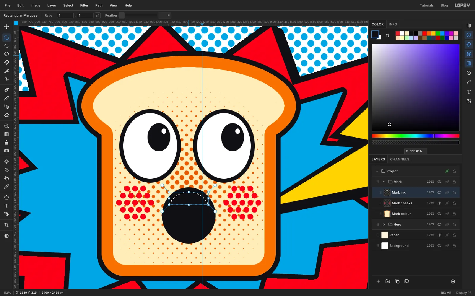
- With the Elliptical Marquee, fill an oval of about 160 × 168 px with , centred low on the slice below the eyes. Press Cmd+D.
- Draw a slightly smaller oval, about 132 × 140 px, inside it. Leave the selection active.
- Press M for the Rectangular Marquee. Hold Shift+Alt before you press, then drag a wide, shallow box across the top of the oval. Shift+Alt intersects, so only the part inside both shapes stays selected.
-
Add the teeth, tongue and brows
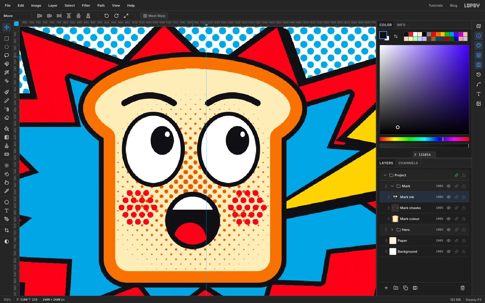
- Fill the band with white and press Cmd+D.
- Switch back to the Elliptical Marquee and draw the same inner oval again. Then hold Shift+Alt and drag a smaller oval across the bottom of the mouth, starting about halfway down and running past the bottom edge.
- Fill with and press Cmd+D.
- Set the foreground to . Press P for the Pen and set Stroke to
18. - The brows sit above the eyes, just inside the crust. Press and drag at the inner end of one eyebrow, drawing the handle up and outwards. Press and drag again at the outer end, then press Enter to stroke the path.
- In the Paths panel, click Delete Path so the next click starts a fresh path. Repeat for the other brow.
- Collapse the
Markgroup.
-
Make the dotted panel backgrounds
Now for the Warhol panels. Start by making one dot tile that you can reuse.
- Select
Paperand add a temporary layer. Set the foreground to . - The tile is too small to draw by eye, so use the corner dialog again. Inside one of the empty small panels, use the Elliptical Marquee to fill a 22 px dot centred on each corner of a 40 × 40 px square, pressing Cmd+D after each. For a corner at 400, 2000, that's 389, 1989 to 411, 2011. Add one more dot in the centre of the square.
- Press M, click once and enter the square itself, 400, 2000 to 440, 2040. Choose Edit → Define Pattern. Press Cmd+D and delete the temporary layer.
- Select
Paper, click New Group and name itTile fields. Add a layer calledFields. - Fill each small panel with one colour, from left to right: , , , . Click once with the marquee and use the same small-panel rectangles you used for the frames, pressing Cmd+D after each fill. The frames sit on a higher layer and cover the edges.
- Add a layer called
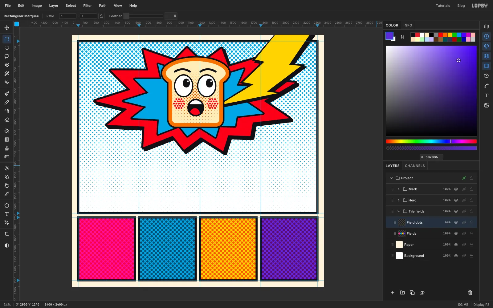
Field dots. Click once with the marquee, enter each small panel's rectangle in turn, choose Edit → Fill with Pattern…, pick your tile and click Apply. Press Cmd+D between panels. - In the effects drawer, set this layer's blend mode to Multiply and close the drawer. Set its opacity to 60 % in the layer row. Collapse the group.
- Select
-
Scale a copy of the mascot
- Select the
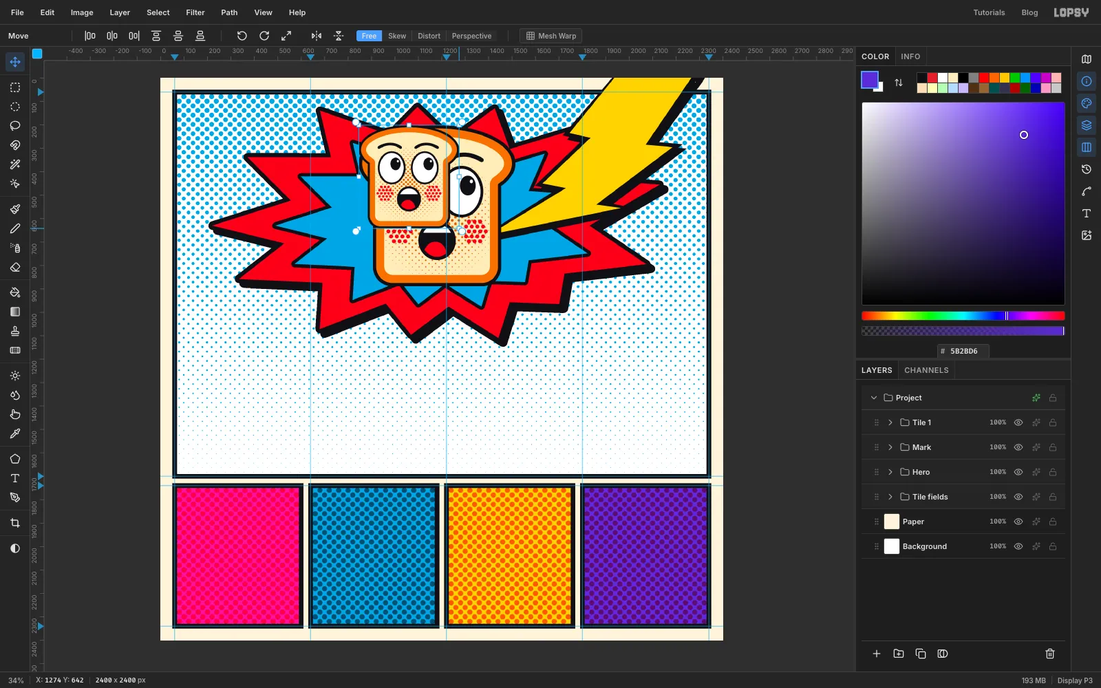
Markgroup and click Duplicate Layer. Name the copyTile 1. - Press Cmd+D to make sure nothing is selected, then press V for the Move tool. Transform handles appear around the whole group.
- Hold Cmd and drag the bottom-right corner inwards, until the slice is a little narrower than a small panel, about 64 % of its size. Cmd keeps the proportions. At fit-to-screen zoom the corner is a small target, so hover until the cursor becomes a diagonal arrow.
- Press Esc to commit the scale.
Working on the group means all three layers scale together and stay lined up.
- Select the
-
Move the copy into the first panel
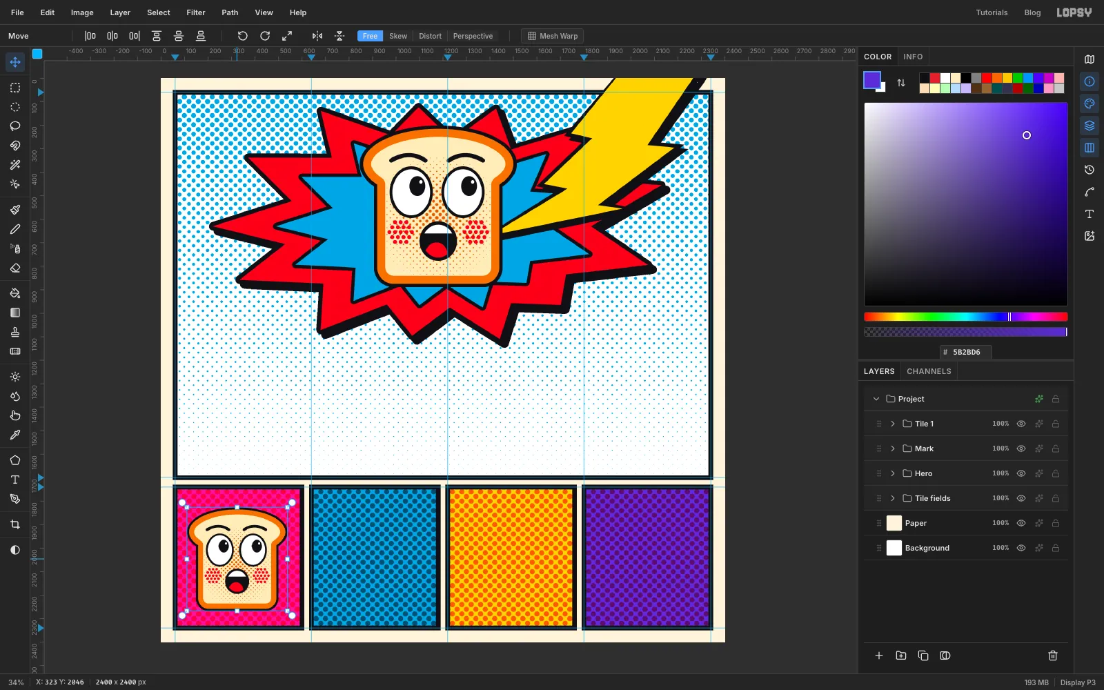
Drag the group down into the first small panel and centre it by eye. Leave a little more room on its right and top, because you'll offset the ink in that direction soon. Then collapse the group.
-
Repeat it across the row
- Select
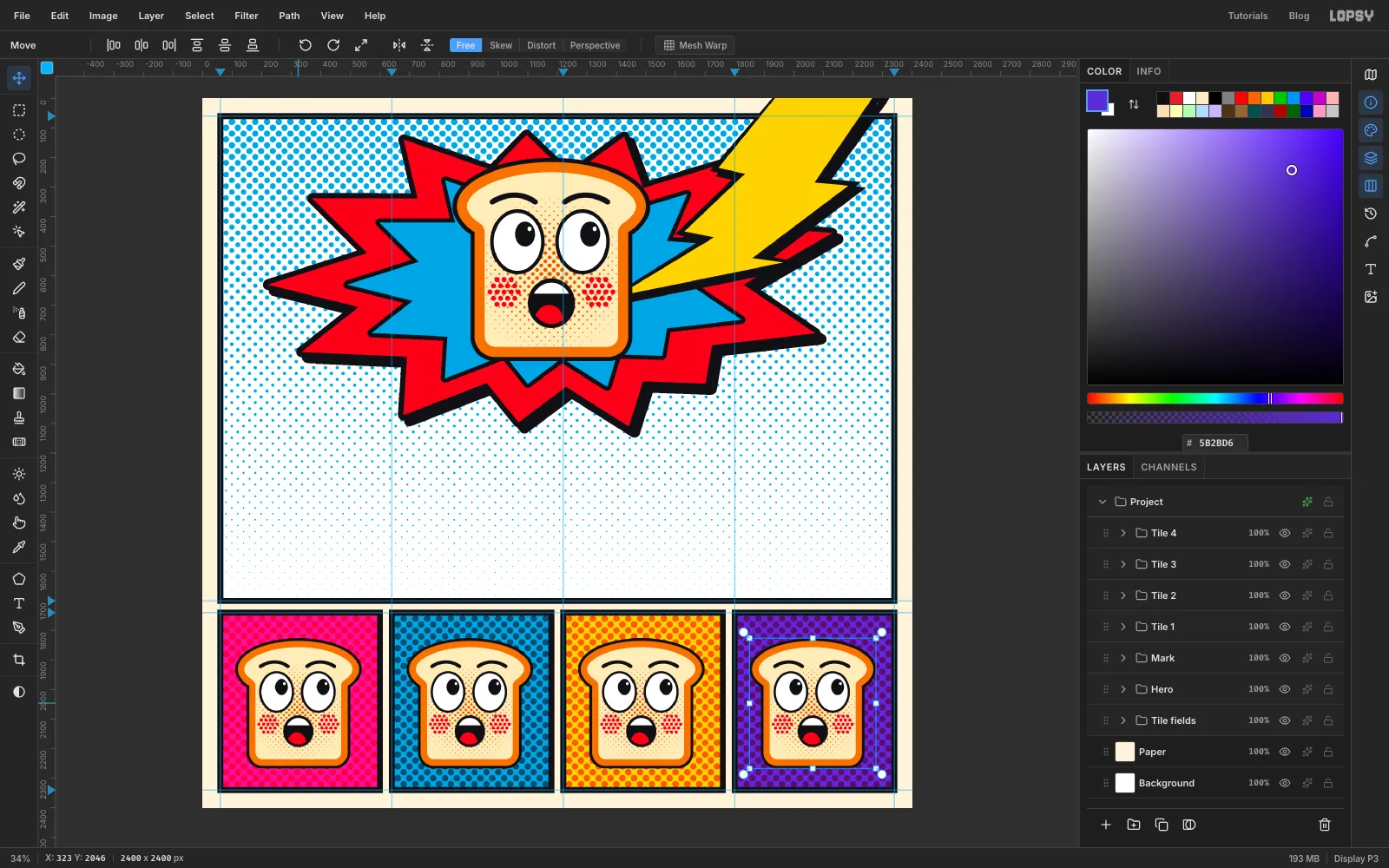
Tile 1, click Duplicate Layer and name the copyTile 2. - Press Cmd+D and V, then press Shift+→ 58 times. Each press moves the group 10 px, so that's exactly 580 px, the distance from one panel to the next.
- Do the same for
Tile 3andTile 4, always duplicating the most recent one.
The mascots land in exactly the same spot in every panel.
- Select
-
Recolour the four tiles
Expand each tile group and make these three changes. It helps to rename the layers
T1 colour,T1 cheeksandT1 inkas you go.- Colour: select the tile's colour layer and run Filter → Hue/Saturation. Use Saturation
100and Lightness-22on all four, with Hue set to:
- Tile 1:
180 - Tile 2:
-40 - Tile 3:
-100 - Tile 4:
60
- Cheeks: on the cheeks layer, enable Color Overlay. Use on tiles 1 to 3 and on tile 4. Close the drawer.
- Ink: select the ink layer, press V, and nudge it 14 px right and 12 px up with the arrow keys. Shift+arrow moves 10 px at a time.
Use the same offset on all four. When the misregistration is identical everywhere, it reads as a printing style and not as an accident. Collapse each group when you're done.
- Colour: select the tile's colour layer and run Filter → Hue/Saturation. Use Saturation
-
Tilt the main mascot
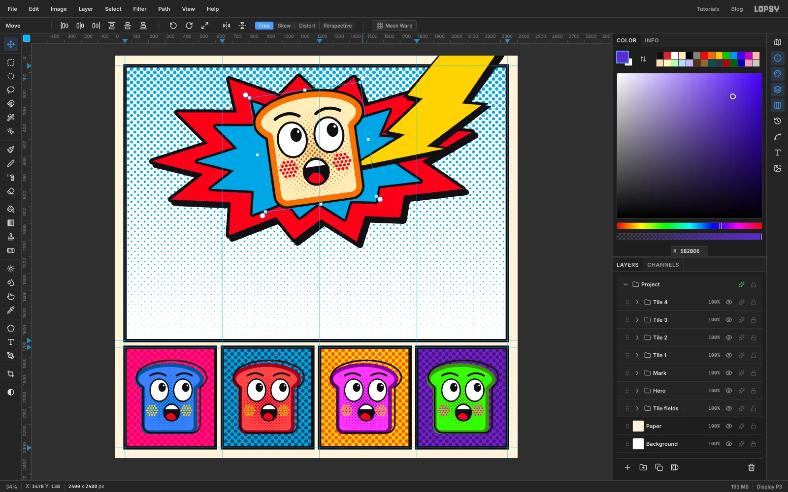
A slice that's standing straight looks calm, and this one has just been hit by lightning.
- Select the
Markgroup and press Cmd+D. Press V for the Move tool. - Hover just outside the top-right corner of the handles until the cursor changes to the rotate cursor.
- Drag anticlockwise by about 8°, then press Esc to commit.
- Select the
-
Draw the speech balloon
- Select the
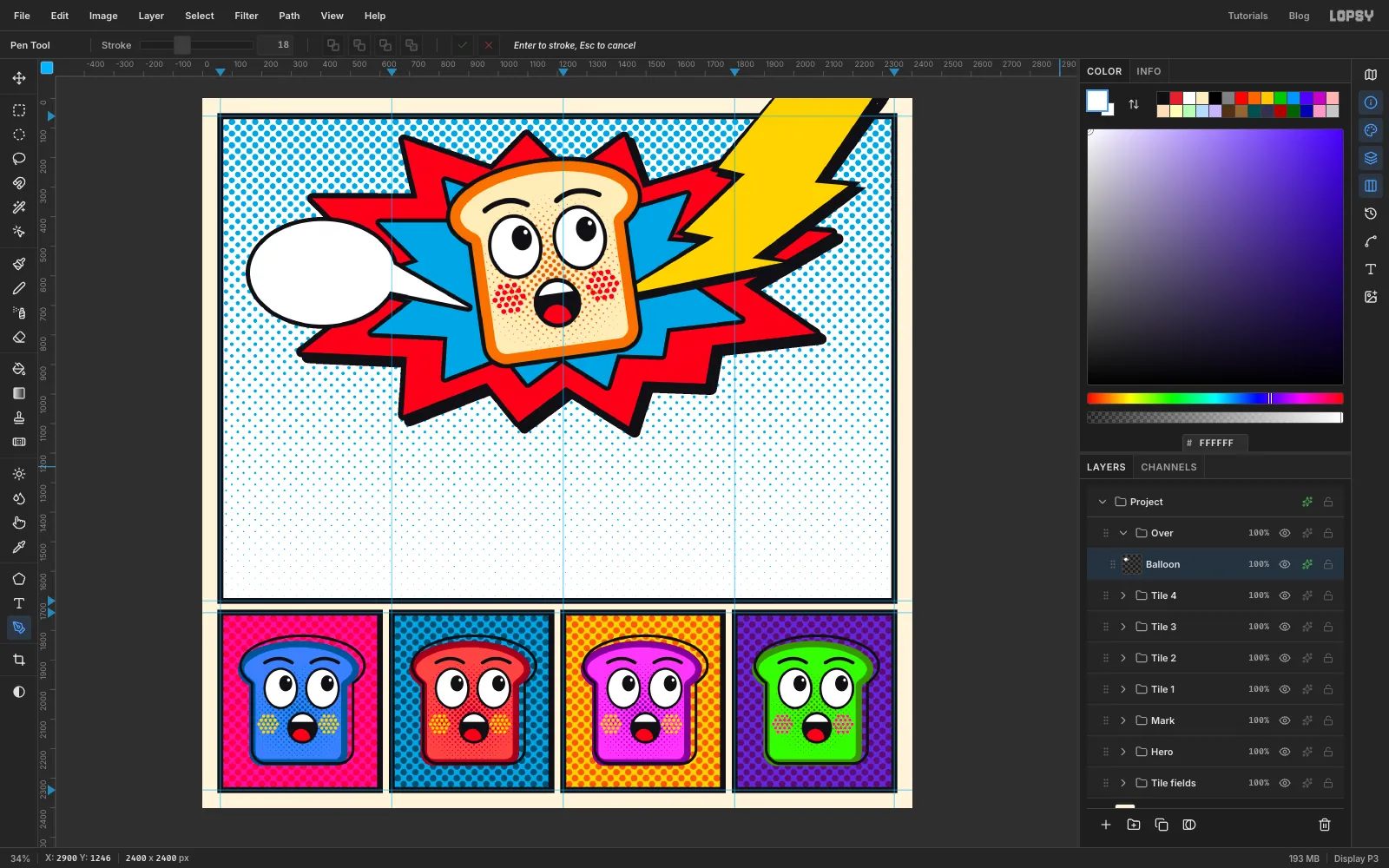
Tile 4group while it's collapsed, click New Group, and name itOver. Add a layer calledBalloon. - Set the foreground to white. With the Elliptical Marquee, fill an oval of about 490 × 350 px at the left of the panel, overlapping the burst's left-hand points. Press Cmd+D.
- Press P and click three anchors for a tail: two on the balloon's right side, and a tip pointing at the toast's mouth. Stop short of the crust. Click the first anchor to close the path.
- Use Path to Selection and Delete Path, fill with white, and press Cmd+D.
- Enable Stroke with Width
14in . It wraps around the oval and tail as one shape. Close the drawer.
- Select the
-
Letter ZAP! in the balloon
- With
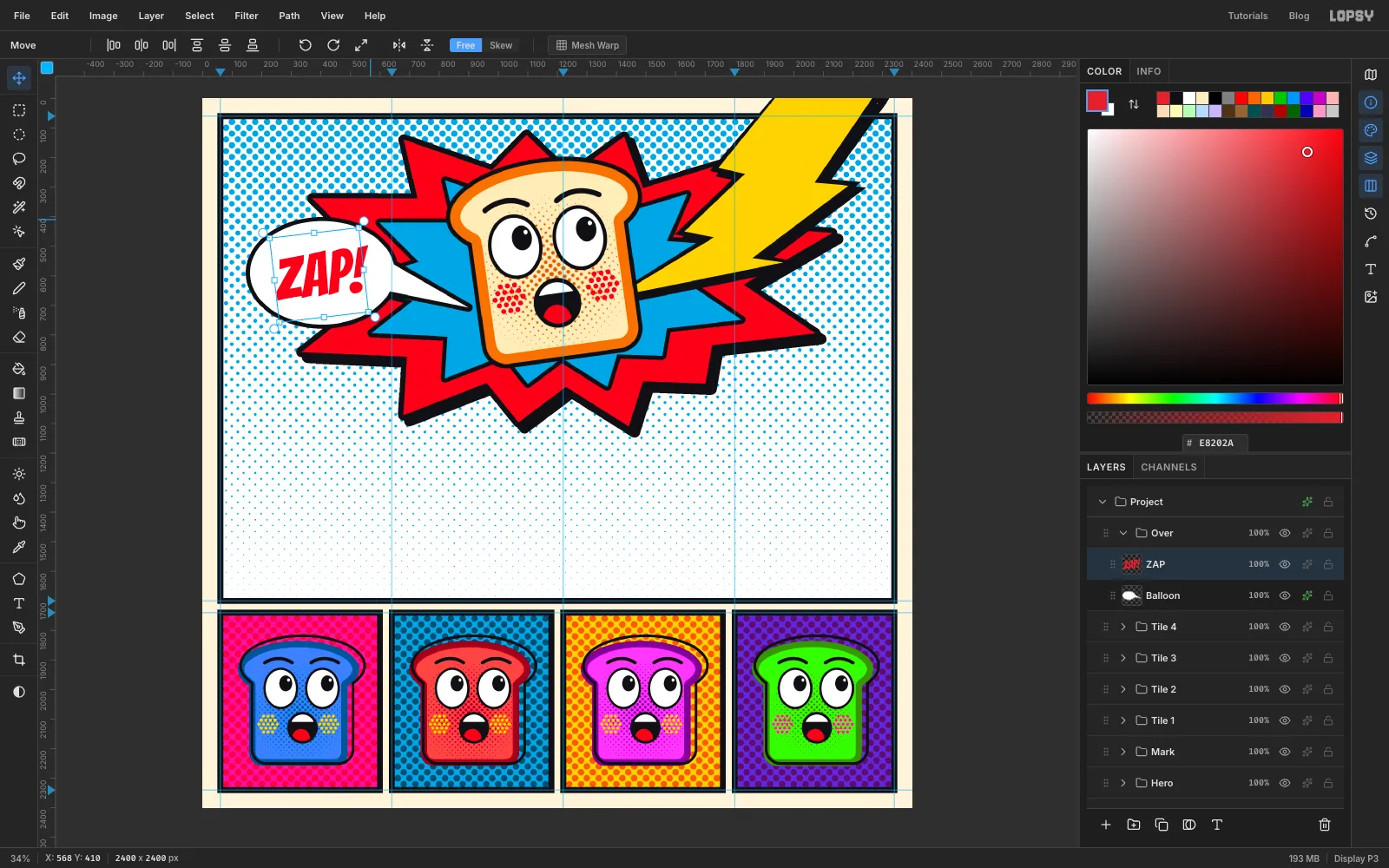
Balloonselected, set the foreground to . - Press T for the Text tool, choose Bangers and set Size to
205. - Click inside the balloon, type
ZAP!and press Tab to finish. - Press V, hover just outside a top corner of the text's box, and rotate it about 7° anticlockwise. Press Esc.
- Nudge it with the arrow keys until the margins are even on both sides. Nothing should touch the outline, especially the exclamation mark.
- With
-
Add the caption boxes
Comics use yellow boxes for the narrator's voice. These two sit in opposite corners and balance each other.
- With
Balloonselected, add a layer calledCaption. - Set the foreground to , press T and set Size to
68. Click near the top-left corner of the panel and typeMEANWHILE,, then press Enter and typeAT BREAKFAST.... Press Tab. - In the Text panel, set Line height to
1.1. - Select the
Captionlayer. Press M and marquee a box around the text, with about 32 px of space at the sides and 24 px above and below. Fill it with and press Cmd+D. - Enable Stroke at Width
12in , click Rasterize Layer Style, then enable Drop Shadow with both offsets14, Blur1, Opacity100and colour . Close the drawer. - Do the same for a
Taglayer at the bottom right, withALL-DAYandTOAST COUNTERat Size52. Use about 26 px of space at the sides and 20 px above and below.
Try to leave the same gap between each box and its nearest frame corner, so the two boxes look like a pair.
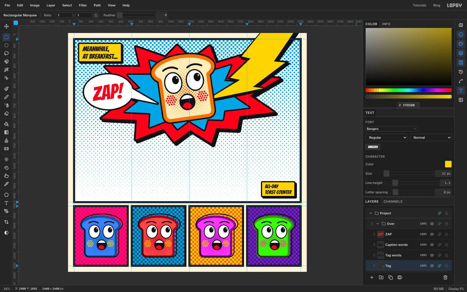
- With
-
Add sparks at the strike
- With
Tagselected, add a layer calledSparks. Zoom in, because these tiny shapes need room for the clicks. - Press P and draw a four-pointed star with eight clicks, alternating long tips and tight valleys. Click the first anchor to close the path. Use Path to Selection and Delete Path, fill with , and press Cmd+D.
- Make three of these, in different sizes, on the cyan around the bolt's tip.
- Enable Stroke at Width
9in . Close the drawer.
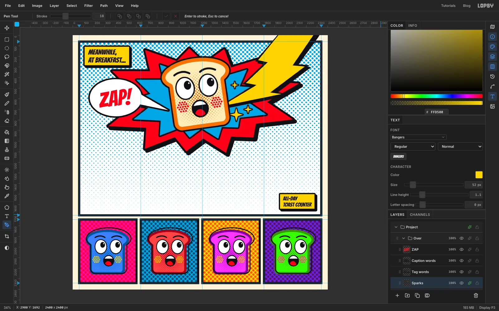
- With
-
Scatter some crumbs
The bottom left of the panel is empty, and some flying crumbs add a small joke there.
- Add a layer called
Crumbs. - Zoom in and Pen five small, lumpy shapes with five clicks each, getting smaller as they fall away from the toast. Use Path to Selection and Delete Path on each, fill with , and press Cmd+D.
- Enable Stroke at Width
8in . Close the drawer. - Collapse the
Overgroup.
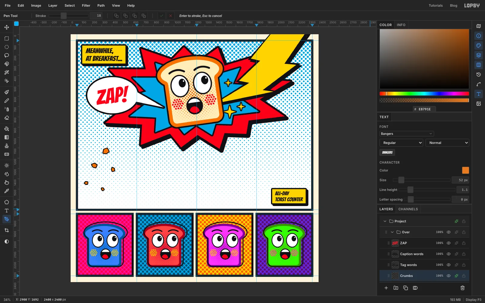
- Add a layer called
-
Type the main word
- Select the
Overgroup, click New Group and name itWordmark. - Set the foreground to , press T and type
540into the Size box. The slider stops at 500, but the box goes higher. - Text starts where you click, so click about a fifth of the way across the page, just below the burst. Type
TOAST, then press Tab. - In the Text panel, set Letter spacing to
30. - Click Rasterize Layer at the bottom of the Layers panel. Mesh Warp only works on pixels.
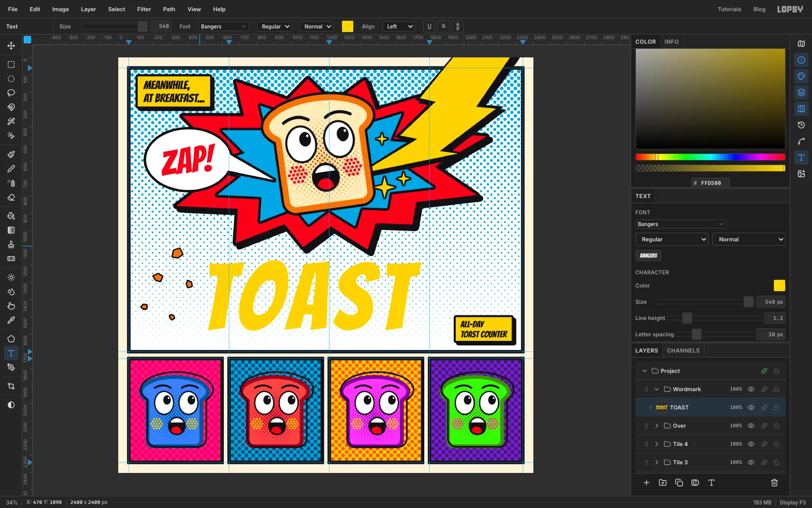
- Select the
-
Arch the letters with Mesh Warp
- Press M and marquee around the word. Leave about 70 px spare at the sides and 120 px above and below, because handles on the outer edge of the warp box can't move outside it.
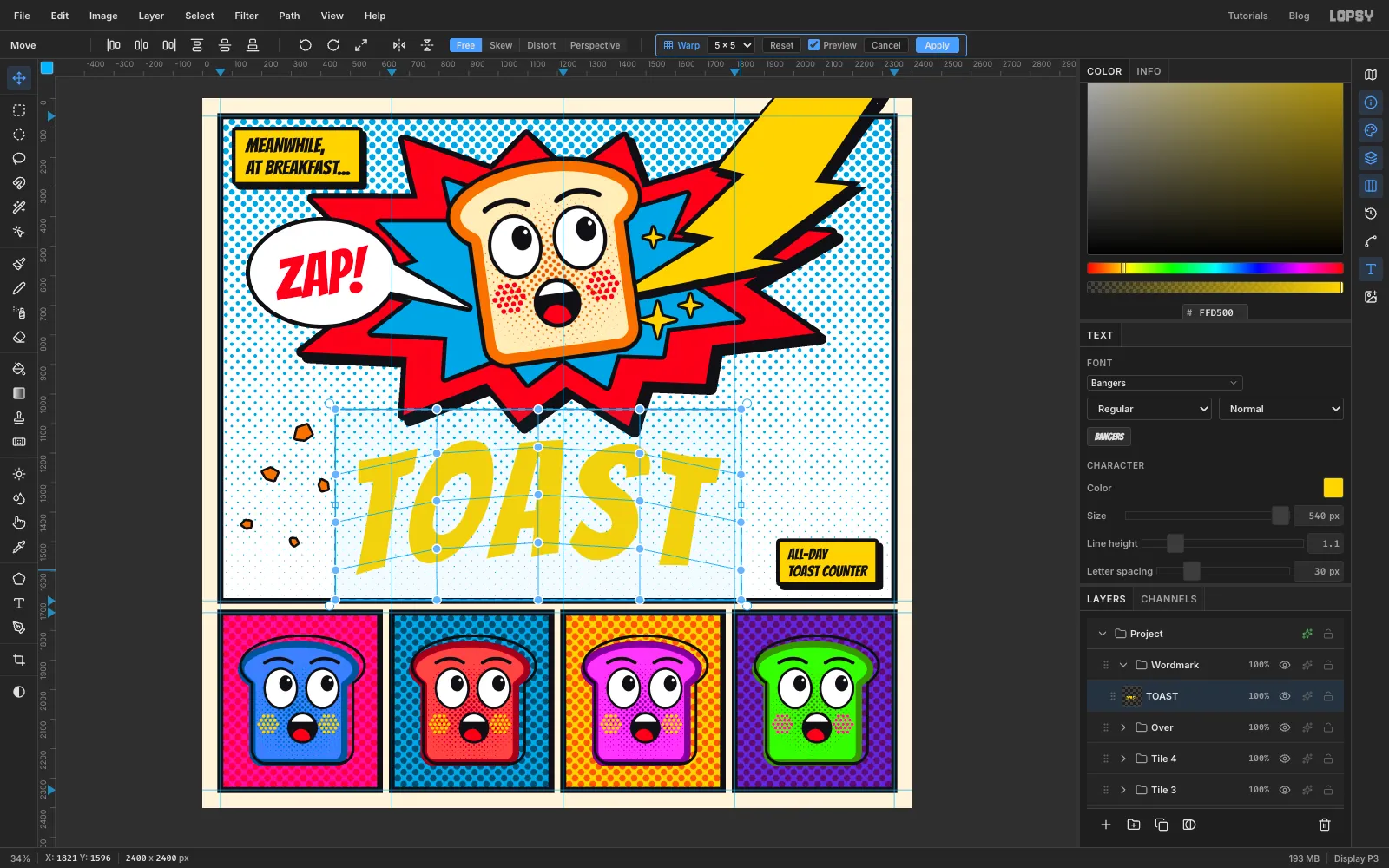
- Press V and click Mesh Warp in the options bar. Set the grid to 5 × 5.
- Leave the top and bottom rows of handles alone. On each of the three middle rows, drag the handles straight up or down:
- The two end handles go down by about 60 px.
- The two handles next to them go up by about 12 px.
- The centre handle goes up by about 33 px.
- Tick Preview to check the shape, then click Apply and press Cmd+D.
-
Lay a gradient over the letters
- Cmd-click the
TOASTthumbnail to select the letters. - Add a layer called
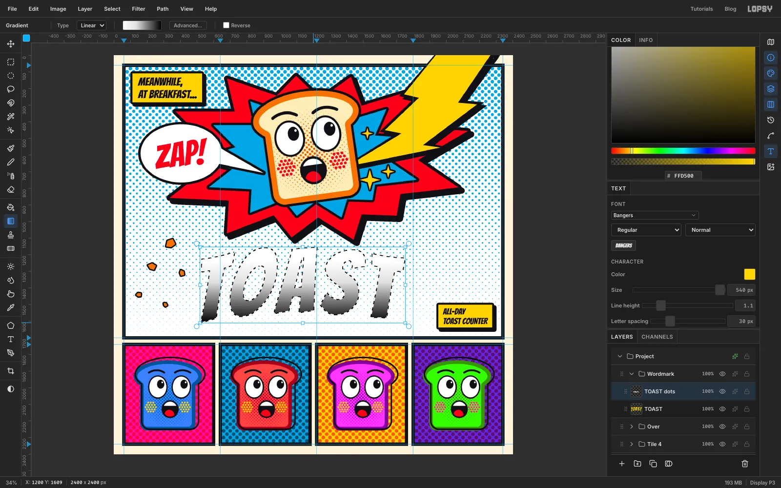
TOAST dots. - Pick the Gradient tool, set it to Linear, and in Advanced… set three stops: on the left, about a third of the way along and on the right.
- Drag from just below the top of the letters to their bottom edge.
The top of each letter stays clean and the feet get the heaviest dots, as if the word is toasting from below.
- Cmd-click the
-
Print the dots in red
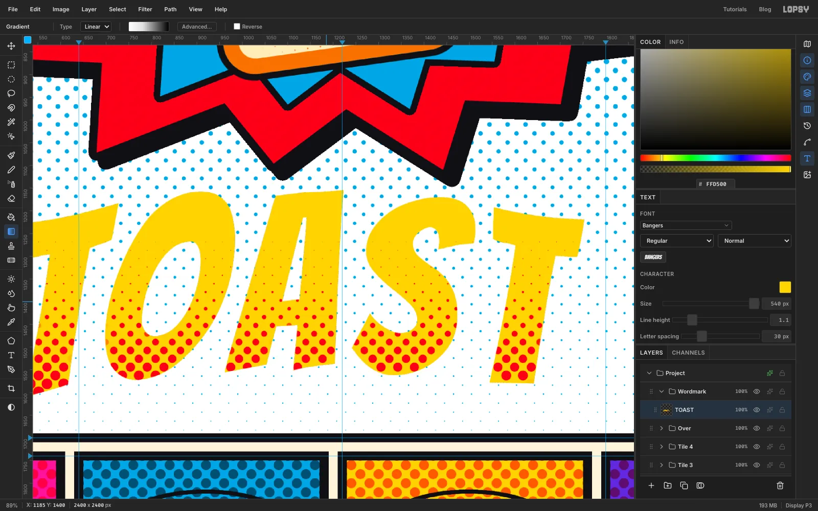
- Press Cmd+D and run Filter → Halftone with Dot Size
26, Density1, Angle45and Softness1. - Dots near the edges can hang outside the letters. Cmd-click the
TOASTthumbnail, choose Select → Inverse, press Delete, then press Cmd+D. - Enable Color Overlay with , click Rasterize Layer Style, and close the drawer.
- Choose Layer → Merge Down to merge the dots into
TOAST.
- Press Cmd+D and run Filter → Halftone with Dot Size
-
Tilt and outline TOAST
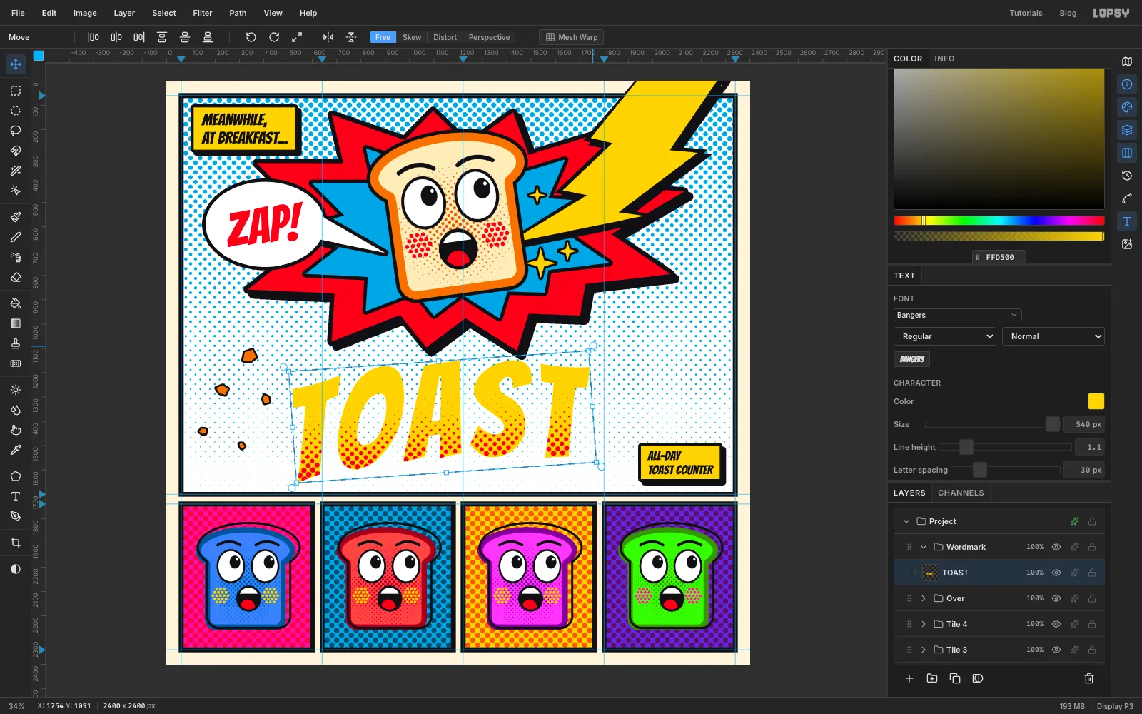
- Press M and marquee tightly around the word. Press V, hover just outside the top-right corner and rotate about 4° anticlockwise.
- Press Cmd+D to commit, then drag the word into position. Centre it under the burst and leave about 60 px of clear space between its lowest point and the frame, including room for the shadow you're about to add.
- Enable Stroke at Width
16in , click Rasterize Layer Style, then enable Drop Shadow with both offsets18, Blur1, Opacity100and colour . Close the drawer.
-
Letter ELECTRIC
- Select the
TOASTlayer. Set the foreground to white, press T and set Size to250. Click in the middle of the burst and typeELECTRIC, then press Tab. - In the Text panel, set Letter spacing to
14. - Click Rasterize Layer.
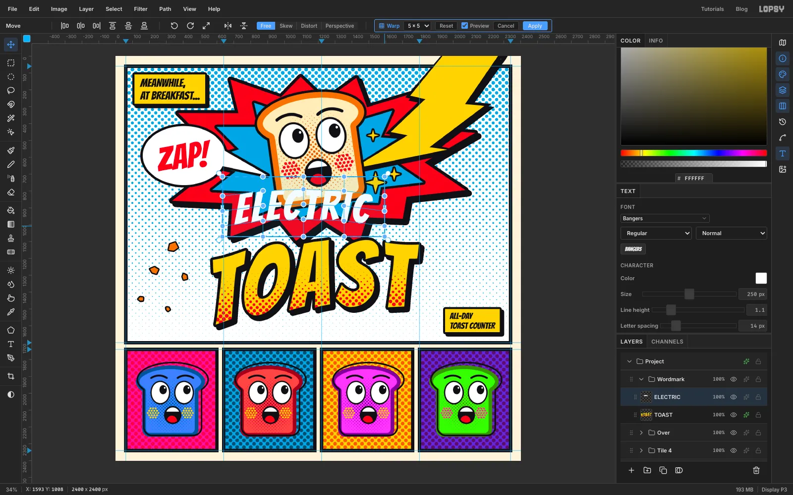
- Press M and marquee around the word, leaving about 70 px at the sides and 90 px above and below. Press V and use Mesh Warp at 5 × 5 with the same pattern on the middle rows, but gentler: ends down about 26 px, next handles up about 5 px, centre up about 14 px. Apply it and press Cmd+D.
- Press M, marquee tightly around the word, press V and rotate it about 4° anticlockwise to match TOAST. Press Cmd+D.
- Drag it so its bottom edge just overlaps the top of TOAST, with both words centred on the same line.
- Select the
-
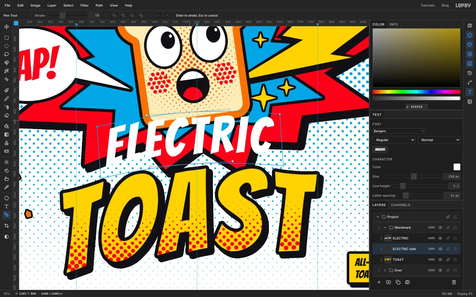
Pen a slab behind ELECTRIC
White letters on a busy burst won't read, and scraps of colour would show through the gaps. A solid black slab solves both problems.
- Select
TOASTand add a layer calledELECTRIC slab. It lands between the two words. - Press P and click the slab's top-left corner, about 36 px outside the word.
- Press and drag at the top centre, pulling the handle to the right, so the top edge arches over the letters.
- Click the top-right corner, then the bottom-right corner.
- Press and drag at the bottom centre, pulling the handle to the left.
- Click the bottom-left corner, then click the first anchor to close the path.
Follow the slant of the word, and let the slab's bottom edge overlap the tops of the TOAST letters.
- Select
-
Fill the slab
Use Path to Selection and Delete Path, fill with , and press Cmd+D.
The slab now locks the mascot and both words into a single unit, which you could lift straight off this page and use on its own as the logo. Check that the mouth still has some space above the slab. If it doesn't, move
ELECTRICand the slab down a little.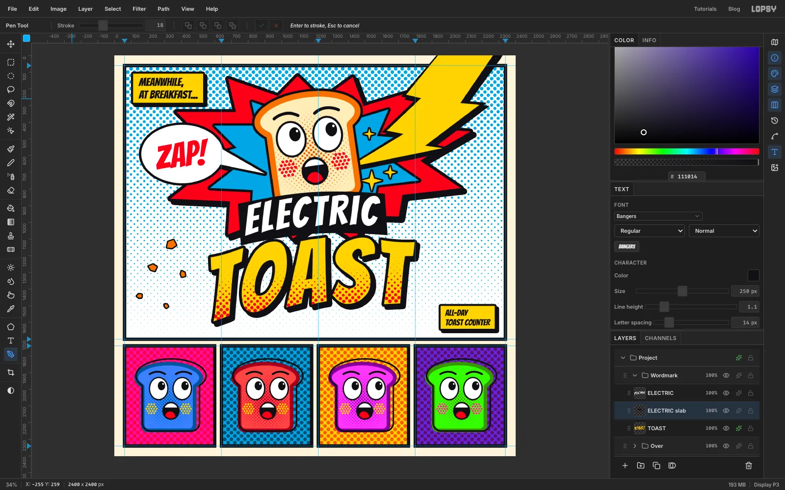
-
Finish the sheet
- Collapse the
Wordmarkgroup and choose View → Show Guides to turn the guides off. - Step back and check the page at a small size. The slice and the wordmark should still read when the page is only a couple of hundred pixels wide.
Export with File → Quick Export PNG and save your work with File → Save Project.
To try another colourway later, expand a
Tilegroup and run Hue/Saturation again on its colour layer. The ink stays black because it's on its own layer, just like changing one screen on a silkscreen press.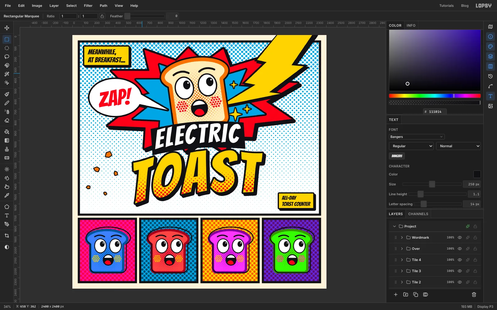
- Collapse the