Design a Rococo Tea App Mockup with Gilded Ornament
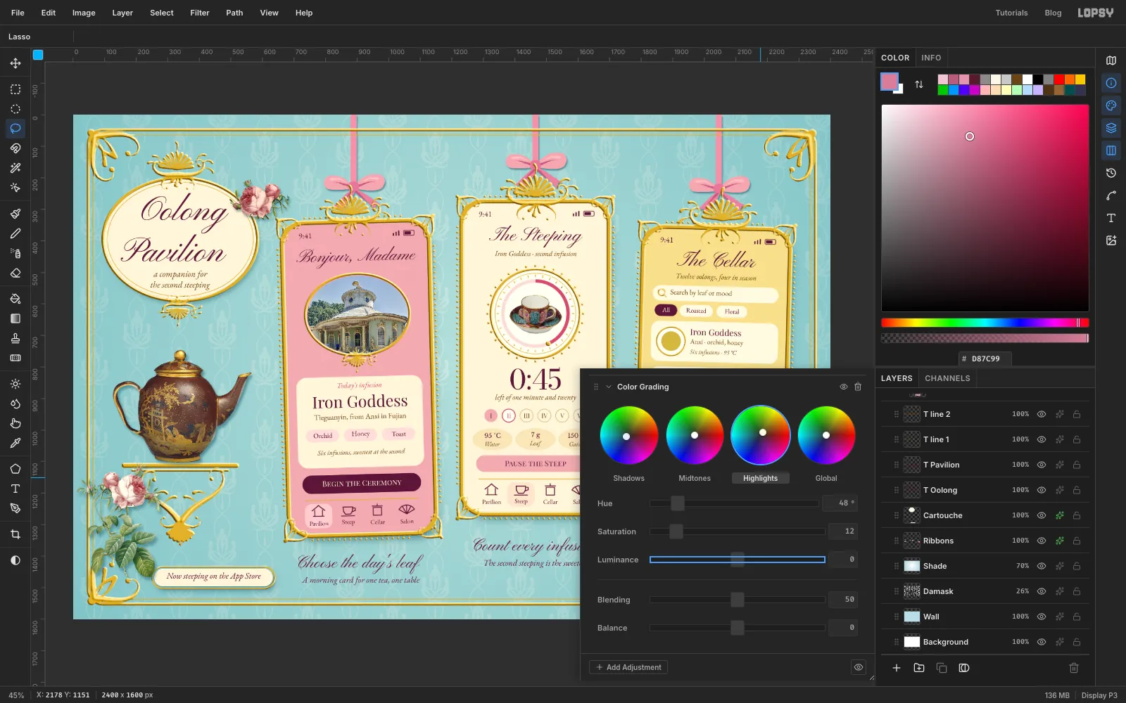
Hang three phone screens like gilt miniatures in Lopsy, with hand-painted rocaille scrolls, a cast-gold effect, damask and Sèvres porcelain photos.
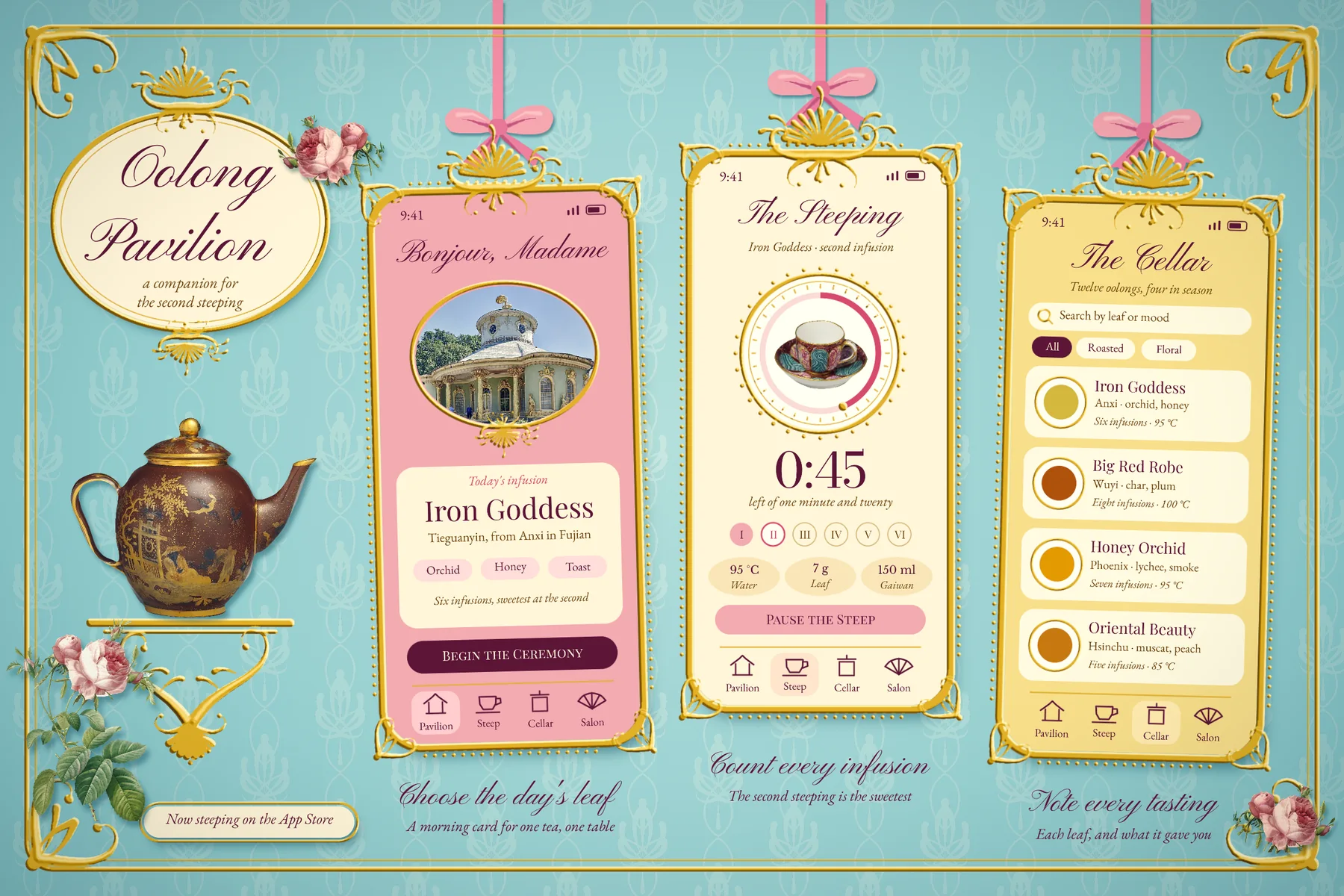
Rococo is the French decorative style of the mid 1700s: pale rooms, gold scrollwork, shells, ribbons and porcelain. The word comes from rocaille, the shell and pebble work used to line garden grottoes. Its ornament is built from C and S curves that swell and curl, and it's happiest when things don't quite match, so the left side of a shell is rarely the same as the right. Rococo's best colours came from the Sèvres porcelain factory: a turquoise called bleu céleste, a pink later named rose Pompadour, and a yellow called jonquille.
In this tutorial you'll present an imaginary app in that language. Oolong Pavilion helps you steep tea slowly. It's named for the kind of garden tea house Frederick the Great built at Sanssouci. The board is 2400 × 1600 px and holds:
- a blue damask wall that you paint and tile yourself
- a gold wall rail with scrolled corners
- three phones in cast-gold frames, hanging from ribbons like portrait miniatures
- a timer screen with a real Sèvres cup inside a beaded dial, a home screen with a tea house medallion, and a tea list
- an oval title, a Sèvres teapot on a wall bracket, and Redouté roses
The one big idea is the gold. You won't paint any gold at all. Everything metal is painted in flat grey first, then turned into relief with Emboss and coloured all at once with a Gradient Map on one group. Light falls the same way on every piece because the emboss happens after the pieces are assembled, so mirrored copies don't end up lit from the wrong side.
You'll need four images from Wikimedia Commons, all free to use. Download the 1920 px wide version of the first three, and the file itself for the fourth:
- Small tray, cup and saucer (déjeuner carré) MET DP201025.jpg, a Sèvres cup from about 1765 (CC0)
- Chinese House Potsdam-, Germany.jpg, the tea house at Sanssouci (CC0)
- Teapot with cover MET DP229672.jpg, a Sèvres teapot from 1780 (CC0)
- Redoute - Rosa centifolia foliacea.jpg, a Redouté rose print on white (public domain)
The tools you'll use:
- the Brush with Taper, Hardness, Spacing, Symmetry Vertical and Radial Symmetry, and Shift-click for straight lines
- the Shape tool's click-to-size dialog, with corner radius, fill and stroke
- Define Pattern and Fill with Pattern
- the Lasso (with Alt to subtract), Magic Wand, Elliptical Marquee, Select → Grow / Shrink / Inverse, and Cmd-click on a thumbnail
- Copy, Paste, the Move tool's flip buttons and handles, and transforming a group and a layer together
- Emboss, Gaussian Blur, Hue/Saturation and Unsharp Mask
- group adjustments: Gradient Map, Color Grading and Vignette
- layer effects: Drop Shadow, and the Multiply blend mode
- live text in Pinyon Script, Playfair Display, Playfair Display SC, EB Garamond, Bodoni Moda and Libre Baskerville
The palette:
-
Wall
-
shading
-
Rose Pompadour
-
deep rose
-
Porcelain cream
-
card cream
-
Jonquille
-
Aubergine ink
-
bronze ink
-
Metal before gilding
-
Gold
-
Ribbon
-
Fill the wall
Choose File → New, keep the units on Pixels, and make the document 2400 wide and 1600 high with a white background.
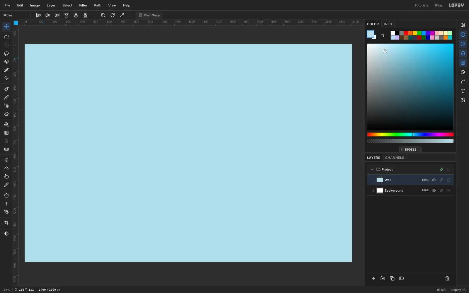
Click the empty Layer 1 and double-click its name to rename it Wall. Set the foreground to in the Color panel and choose Edit → Fill.
-
Paint a damask tile with the mirror on
Damask is a woven pattern of one motif inside a pointed oval, called an ogee. You only have to paint half of it.
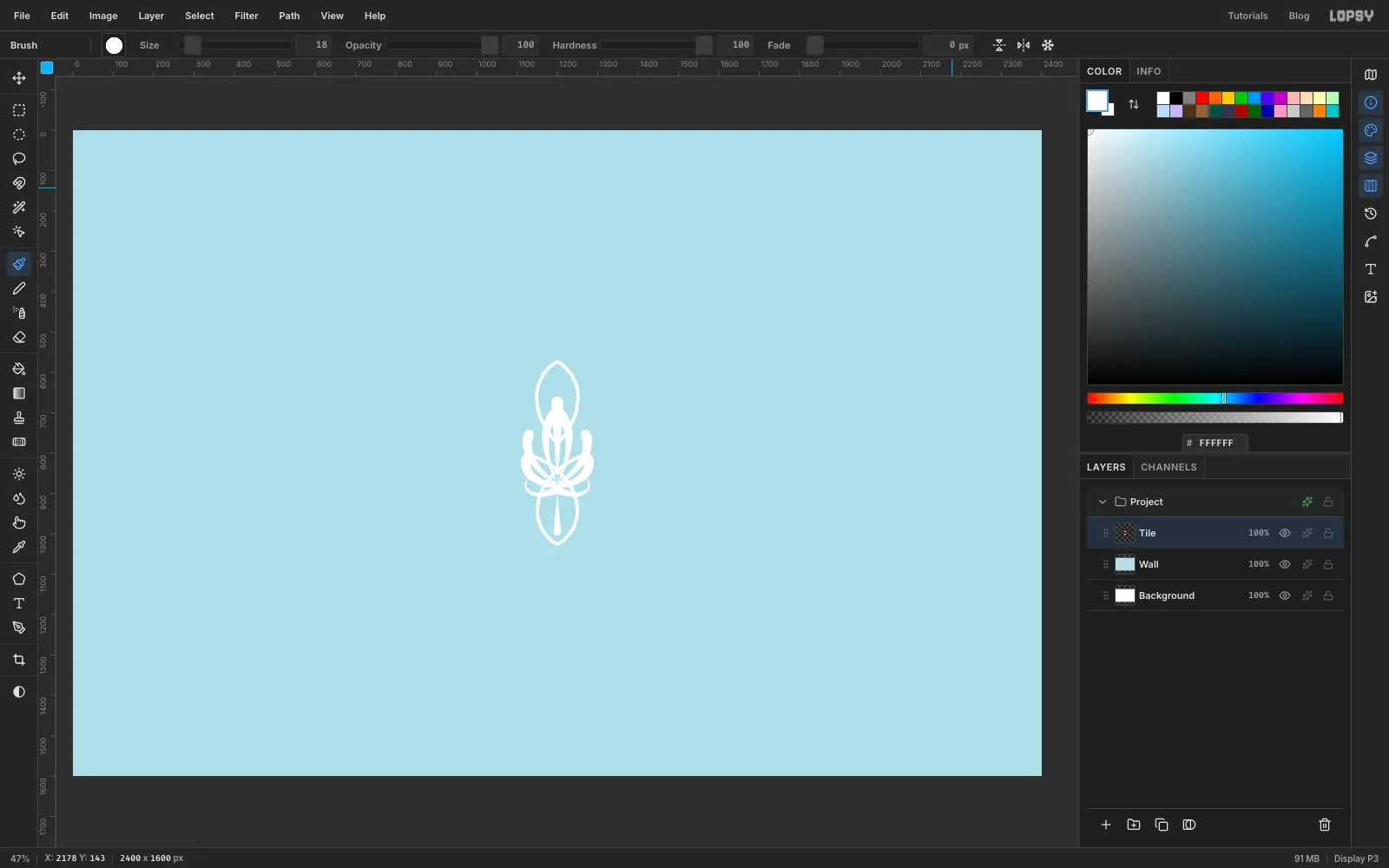
Click Add Layer at the bottom of the Layers panel and name the layer Tile. Set the foreground to white and press B for the Brush. In the options bar, click Symmetry Vertical, the mirror button that reflects left and right. The mirror line starts at the centre of the canvas, which is where you'll paint.
Click the brush-tip thumbnail at the left of the options bar to open the Brushes modal. Size, Hardness, Spacing and Taper are all on its Shape tab. It can stay open while you paint, but it opens over the middle of the canvas, so drag it aside by its title bar.
Taper thins a stroke as it travels. It's the distance in pixels over which the stroke narrows to nothing, so a stroke starts fat and ends in a point. That's the whole secret of rococo line, and you'll use it for almost everything.
- The ogee. Set Hardness 100, Size 9, Taper 0. Start on the mirror line about 225 px below the centre of the canvas and draw one long curve upwards, bulging about 50 px to the right, then crossing back over the line near the height of the canvas centre. Then start 225 px above the centre and curve down, bulging 50 px the same way, until you're back on the line just above the centre. The mirror draws the other side, and the crossing makes the pinched waist.
- The leaves. Set Size 26, Taper 190. Paint three leaves on the right, each from its rounded tip in towards a point about 80 px below the centre. Make them about 175, 150 and 110 px long, fanning from almost upright to about 45°. Painting towards the stem gives you a round tip and a thin base, like a petal. Painting the other way gives you a spike, and a spiky damask looks like a marijuana leaf.
- The curl. Set Size 18, Taper 120. From about 90 px below the centre, draw a short curl out to the right that hooks round at the end.
Now click Symmetry Vertical again to turn the mirror off. For the centre stem, set Size 30, Taper 200 and draw straight down the mirror line, from 125 px above the centre to about 80 px below it. Then set Size 18, Taper 100 and draw straight up the line, from about 195 px below the centre to about 95 px below it.
-
Tile the pattern across the wall
Press M for the Rectangular Marquee. With nothing selected, click once on the canvas to open its exact-corners dialog, enter From 1065, 570 and To 1335, 1030, and click Select. That box leaves a little air either side of the motif, so the columns will sit close together.
Choose Edit → Define Pattern, then press Cmd+D to deselect. Delete the Tile layer with the bin button at the bottom of the Layers panel, because the pattern is stored now.
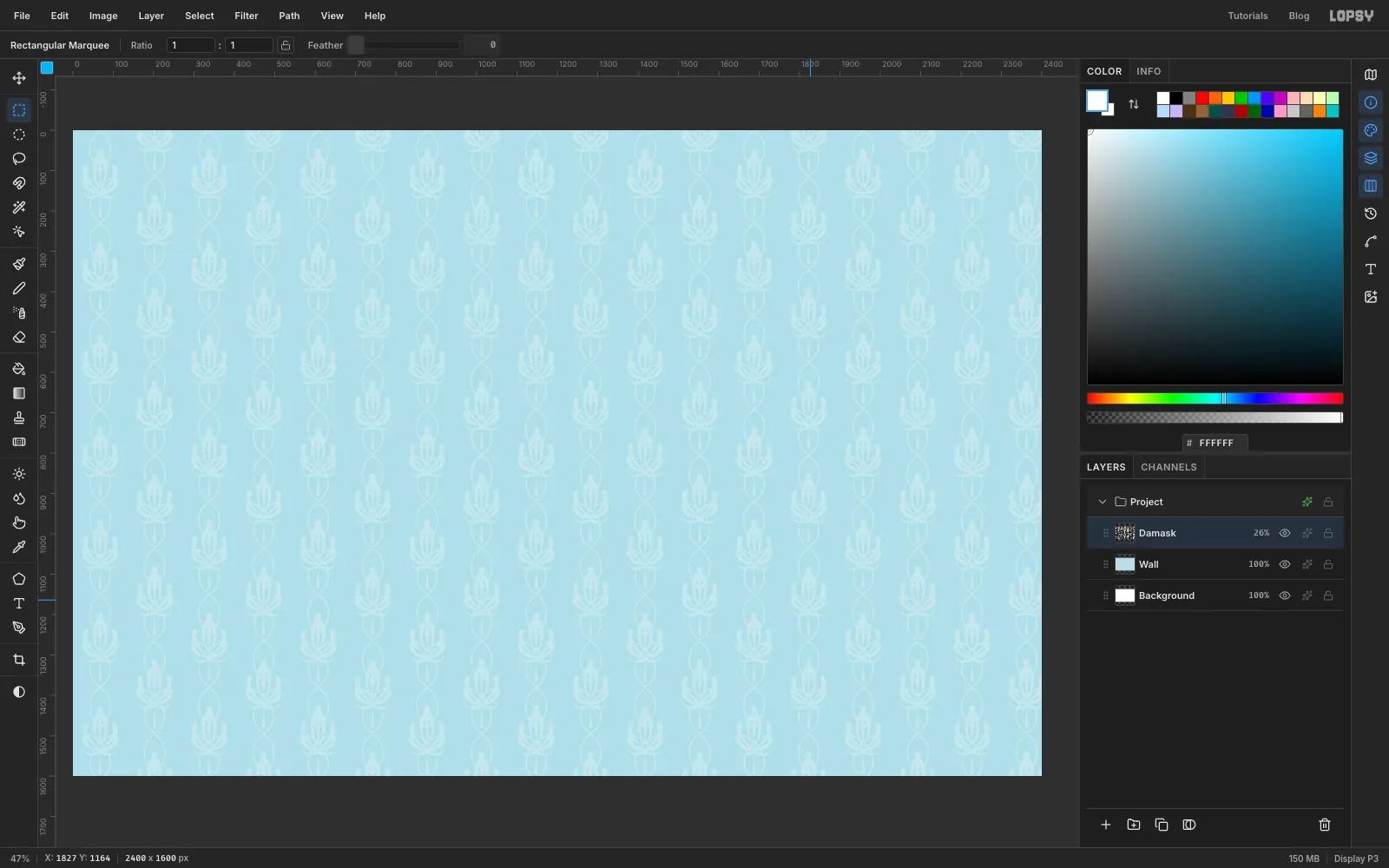
Add a layer called Damask and choose Edit → Fill with Pattern…. Click your new swatch, set Scale to 50 and Column Stagger to 50, and click Apply. The stagger drops every other column by half a tile, which is how real damask repeats.
Click the percentage on the Damask row and drag its Opacity down to 26. Silk damask is one colour with a change of sheen, and it should sit well behind everything.
-
Shade the wall
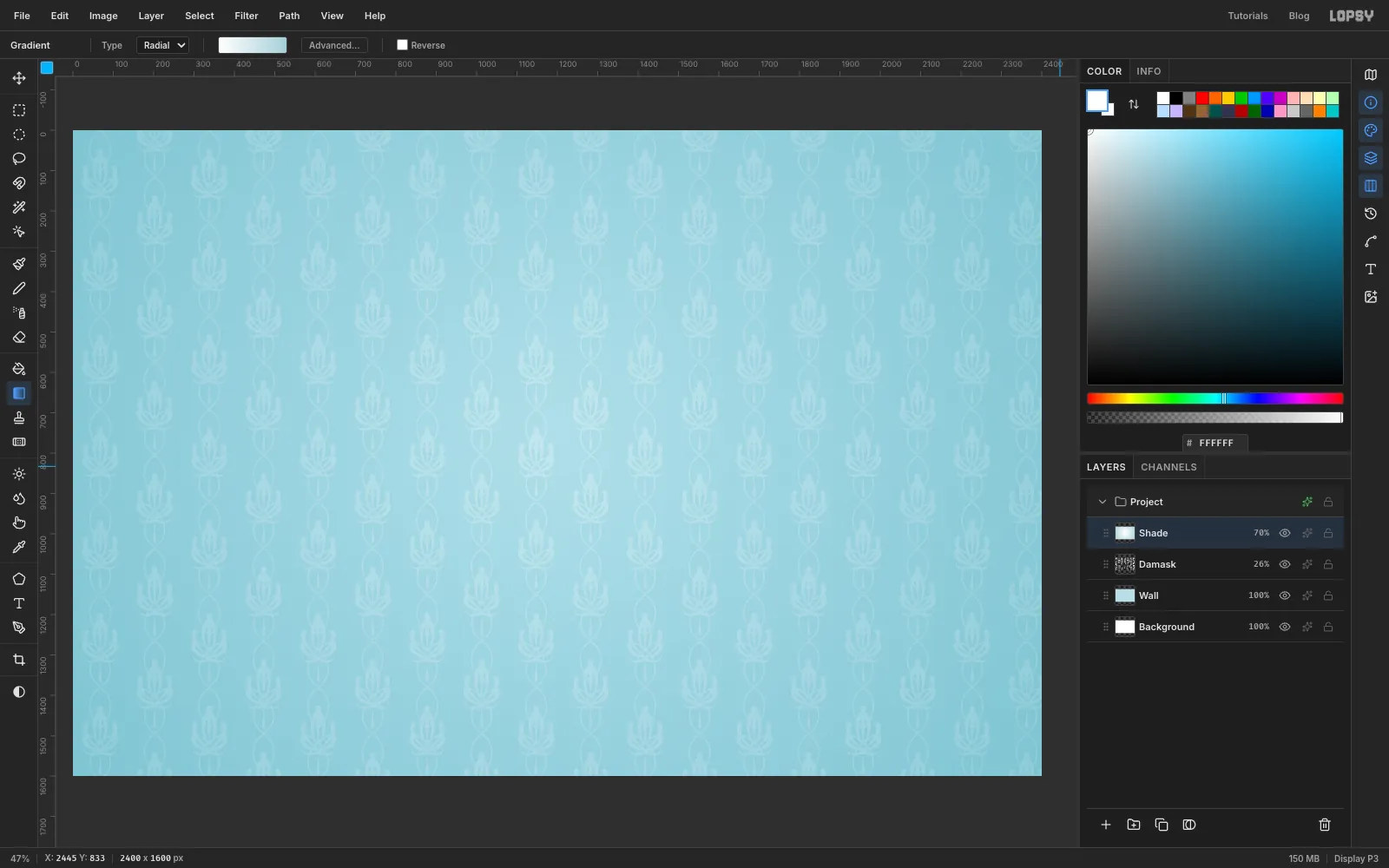
Add a layer called Shade and click the Gradient tool in the toolbox. Set Type to Radial and click Advanced…. Make the left stop white and the right stop , using the Hex field for each, and click Done.
Drag from the middle of the canvas to just past the bottom right corner. Then open the layer's effects with the sparkle button on its row, set the Blend to Multiply and close the drawer. Set the layer's Opacity to 70. White does nothing on Multiply, so only the corners darken.
Now build the layer stack, so everything you make later has somewhere to go. New layers land directly above the active layer, and a layer added while a group is active goes inside that group.
- Add five layers, in this order: Ribbons, Cartouche, Bloom, Pot, Spray.
- Click the Cartouche row, click New Group at the bottom of the panel and name it Gilt.
- Click Cartouche again, click New Group, name it Phone C, then click Add Layer and name that layer C UI.
- Do the same for Phone B with a layer B UI, then Phone A with a layer A UI, clicking Cartouche first each time.
- Click the Gilt group row and add six layers inside it, in this order: Rail, Title Gilt, A Gilt, B Gilt, C Gilt, Master.
From the bottom up you should have the wall layers, Ribbons, Cartouche, the three phone groups, Gilt, then Bloom, Pot and Spray on top.
-
Draw the wall rail
From here until the gilding step, all metal is painted in flat grey . It will look dull for a long time. Trust it.
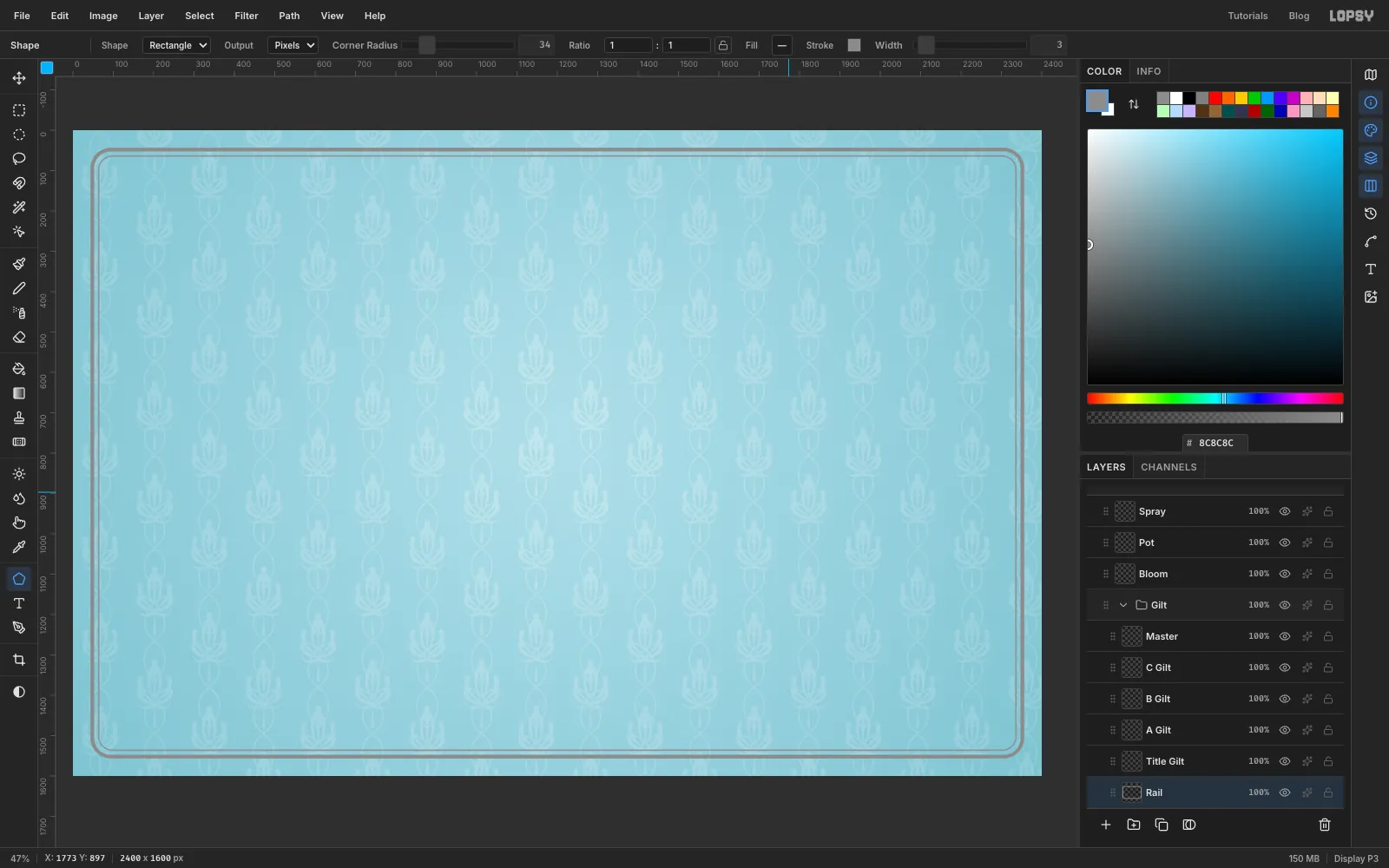
Click Rail. Press U for the Shape tool. In the options bar set Shape to Rectangle, Output to Pixels and Corner Radius to 46. Click the Fill swatch and choose Remove fill. Click Stroke, type in the popover's hex field, and set Width to 9. Click in the status bar to close the popover.
Click once in the centre of the canvas (x 1200, y 800), without dragging. The Shape Size dialog opens. Enter 2304 × 1504 and click Create. Shapes grow from where you click, so it lands centred.
Set Corner Radius to 34 and Width to 3, click the same centre again and make it 2272 × 1472. That's the thin inner line of the moulding.
-
Paint a corner scroll
Add a layer called Corner directly above Rail. Set the foreground to and press B for the Brush. Check that the mirror is off.
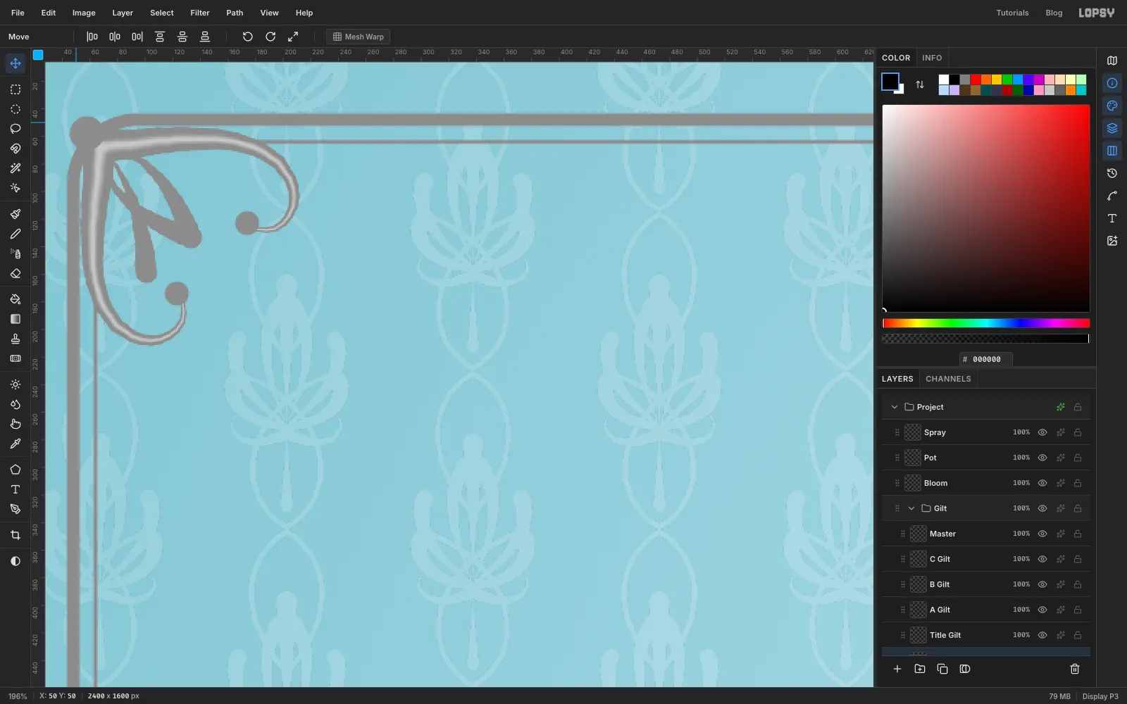
In the Brushes modal set Hardness 100, Size 24, Taper 240. Start just inside the rail's top left corner, at about x 68, y 68. Draw one stroke to the right, about 210 px long, that starts almost straight and curls down and back on itself at the end like a fern. Then draw a second one from the same point, straight down, curling in towards the first.
Set Size 16, Taper 100 and paint three leaves between the arms, each from its rounded tip back into the corner point.
Next comes a trick that makes the emboss look round rather than flat. Set the foreground to , set Hardness 0, Size 13, Taper 240, and repeat the two big strokes down the middle of what you painted. You're painting a soft ridge line along the spine.
Set the foreground back to , and Hardness 100, Taper 0. Click a dot at Size 18 in the eye of each curl, and one at Size 26 right on the corner point.
-
Mirror the corner to the other three
Press M and draw a marquee around the scroll, a little bigger than it, then press Cmd+C and Cmd+D.
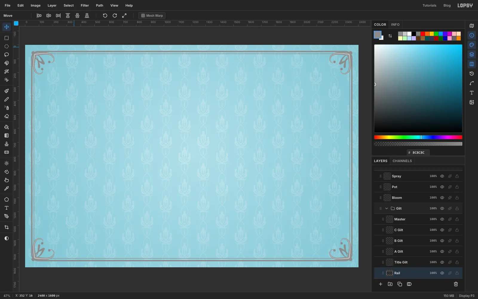
Press Cmd+V. A paste lands exactly where it was copied from, with its pixels selected and the Move tool active. Click Flip Horizontal in the options bar, press Cmd+D, then click in the status bar so the options bar lets go of the keyboard. Drag anywhere on the canvas to slide the copy into the top right corner. With no selection, a drag moves the whole active layer, so you don't need to grab the scroll itself. The copy can be dragged straight across, because the rail is symmetrical.
Paste again and use Flip Vertical for the bottom left. Paste once more and use both flips for the bottom right, dragging it diagonally across the board.
The new layers stack above Corner. With the top one active, choose Layer → Merge Down four times, until everything has merged into Rail.
-
Draw the middle phone's frame
Click B Gilt. The three phone screens will be 480 × 1040 px, with their centres at:
- Phone A: x 905, y 835
- Phone B: x 1465, y 770
- Phone C: x 2030, y 855
They sit at slightly different heights because a perfectly level row of miniatures looks like a shop display.
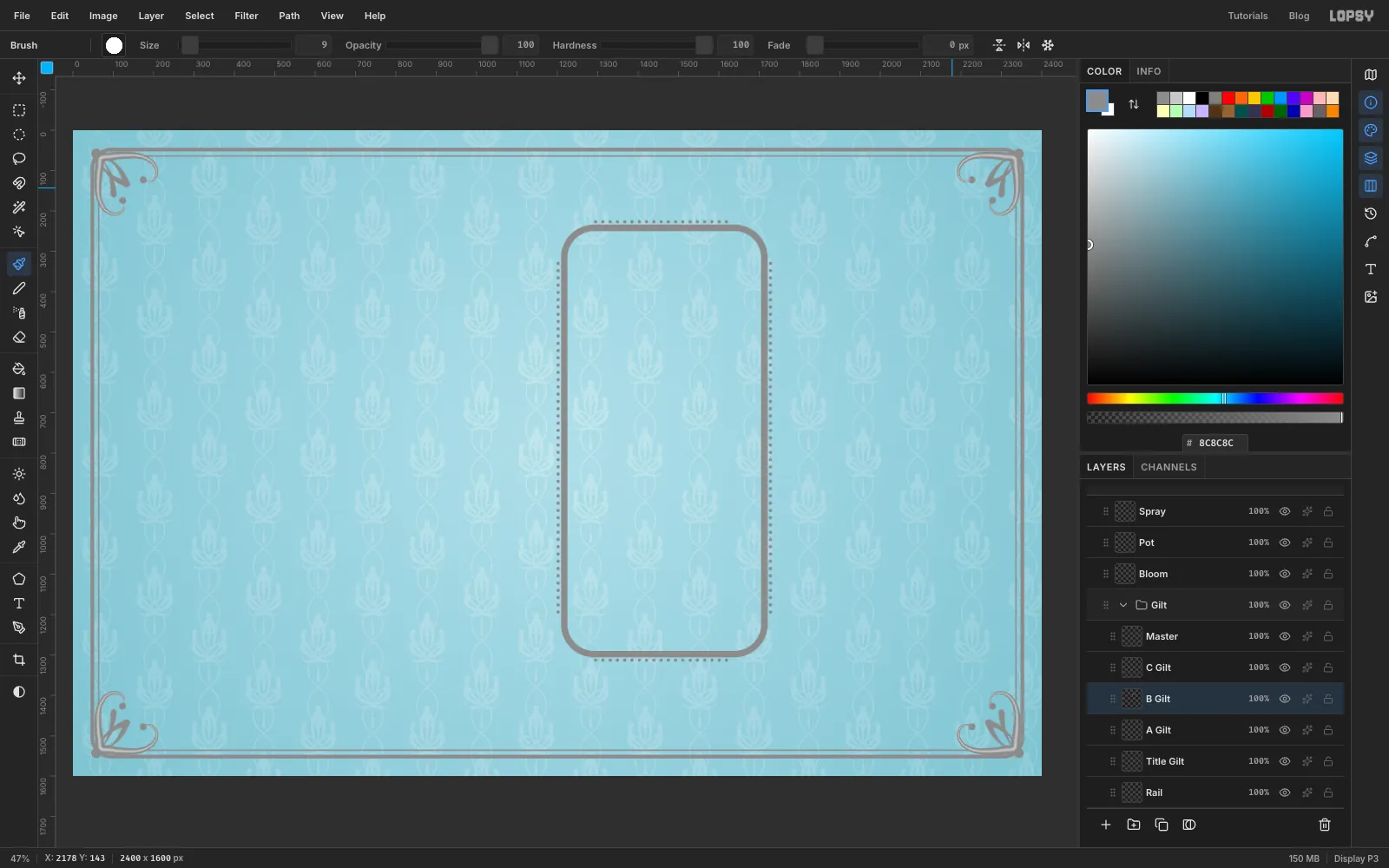
Press U for the Shape tool. Keep Rectangle, no fill and a stroke, and set Corner Radius to 74 and Width to 16. Click at x 1465, y 770 and make it 496 × 1056.
Now the row of pearls just outside it. Press B, and in the Brushes modal set Hardness 100, Size 9, Taper 0 and Spacing 200. With Spacing that wide, a stroke prints separate dots. Click just outside the left of the frame, about a pearl's width clear of it and well short of the top corner. Hold Shift and click at the same distance out, well short of the bottom corner. A Shift-click draws a straight line from the last point. Do the same down the right side, then along the top and bottom, stopping short of the corners each time. The corners will be covered by scrolls later.
Set Spacing back to 1 before you forget.
-
Paint the shell crest
The crest is the piece that makes the board look rococo, and it's worth some care. Click Master. Everything here is centred on the top of the middle phone's frame, at about x 1465, y 200.
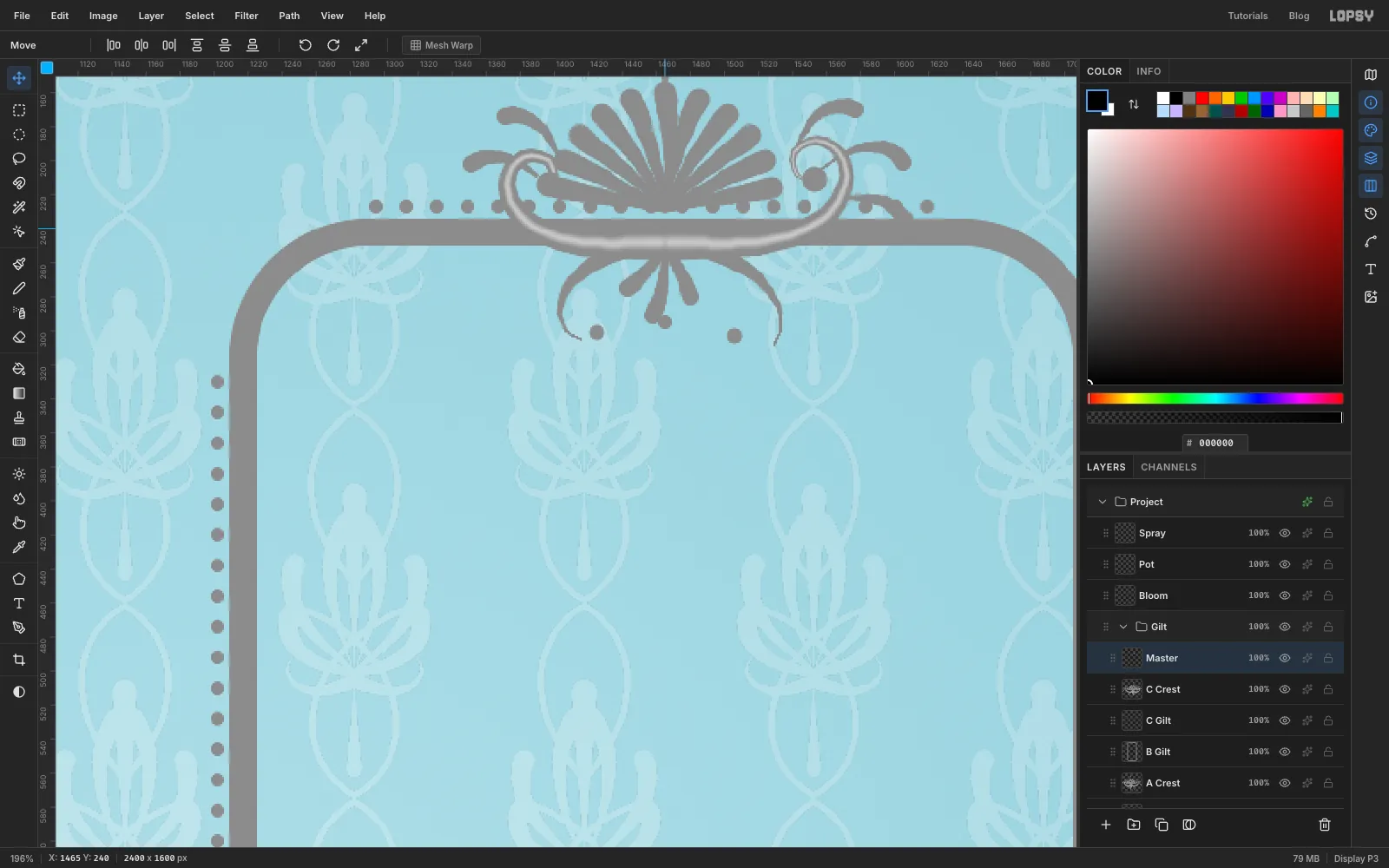
- The shell. Set Hardness 100, Size 14, Taper 90. Pick a hinge point at about y 229. Paint eleven ribs, each starting on an imaginary half-circle about 75 px above and around the hinge and running in to the hinge. Go from the far left round to the far right. Each stroke starts round and fat on the rim and thins to nothing at the hinge, so the ribs make a scalloped edge on their own.
- The big scrolls. Set Size 22, Taper 220. Start just under the hinge and draw a long C to the right, about 190 px, running nearly flat under the shell and then curling up and back on itself. Do the same to the left, but shorter, about 155 px. The uneven pair matters: rococo avoids exact symmetry.
- The lower scrolls. Set Size 14, Taper 90. From about the same start, draw a shorter curl down and out on each side. These hang into the screen.
- The leaves. Set Size 11, Taper 60. Add three small curved leaves off the right scroll and two off the left, each from its rounded tip back to the scroll. Add three short drops hanging from the middle, and one flame-shaped leaf on top of the shell.
- The ridge. Set the foreground to , Hardness 0, Size 12, Taper 220, and repeat the two big scrolls down their middles. Set the foreground back to and Hardness 100.
- The dots. Set Taper 0. Click a Size 16 dot in the eye of each big scroll, Size 10 in each lower one, and Size 9 under the middle drop.
Don't try to match mine exactly. Yours will have its own wobble, and that's in the spirit of the thing.
-
Paste the crest onto the other frames and the title
Press M, draw a marquee around the crest, and press Cmd+C then Cmd+D.
Every paste selects itself and switches to the Move tool, so you can transform it straight away. A corner handle scales it, and holding Cmd keeps the proportions. Finish each one with Cmd+D and then drag it into place.
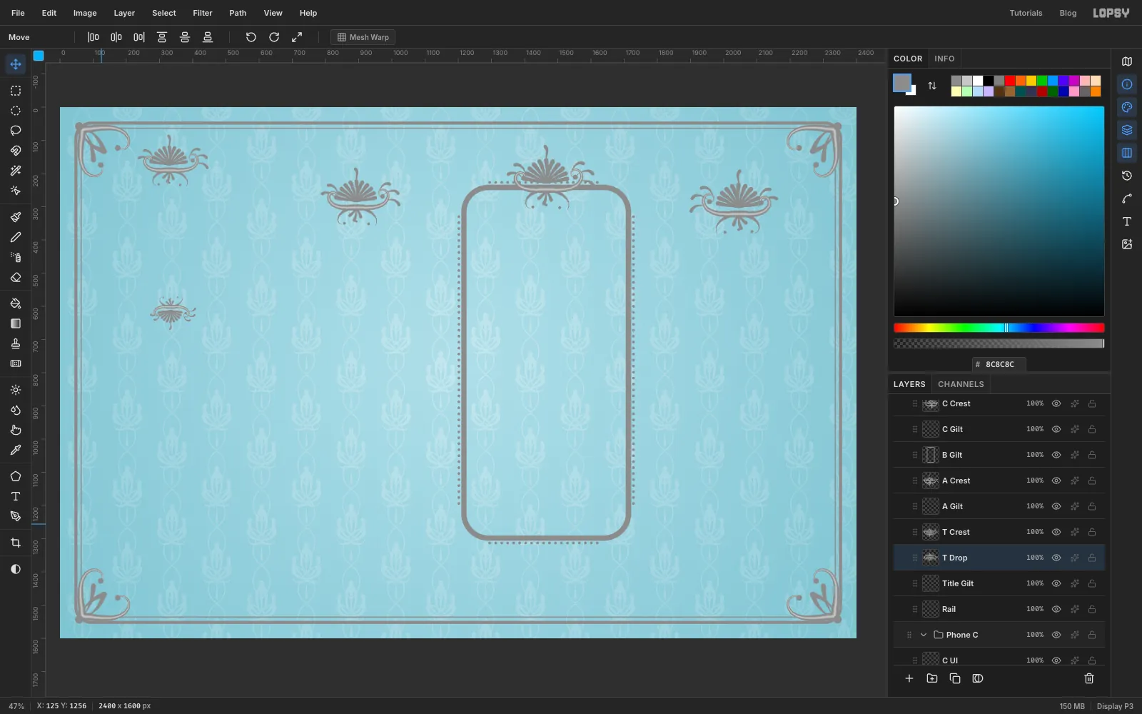
- Phone C. Click C Gilt and paste. Click Flip Horizontal, so the long scroll points the other way from the middle phone's. Press Cmd+D and drag it so it sits above the top of phone C's frame, centred on x 2030 with its centre at about y 285. Name the layer C Crest.
- Phone A. Click A Gilt and paste. Cmd-drag a corner handle in until it's about 90% of its size. Press Cmd+D and drag it above the top of phone A's frame, centred on x 905 at about y 270. Name the layer A Crest.
- Title top. Click Title Gilt and paste. Scale it to about 80%, press Cmd+D and drag it to x 340, y 160. Name it T Crest.
- Title bottom. Click Title Gilt and paste. Click Flip Vertical, scale it to about 52%, press Cmd+D and drag it to x 340, y 620. Name it T Drop.
Keep Master as it is. You'll copy from it twice more.
-
Finish all three frames
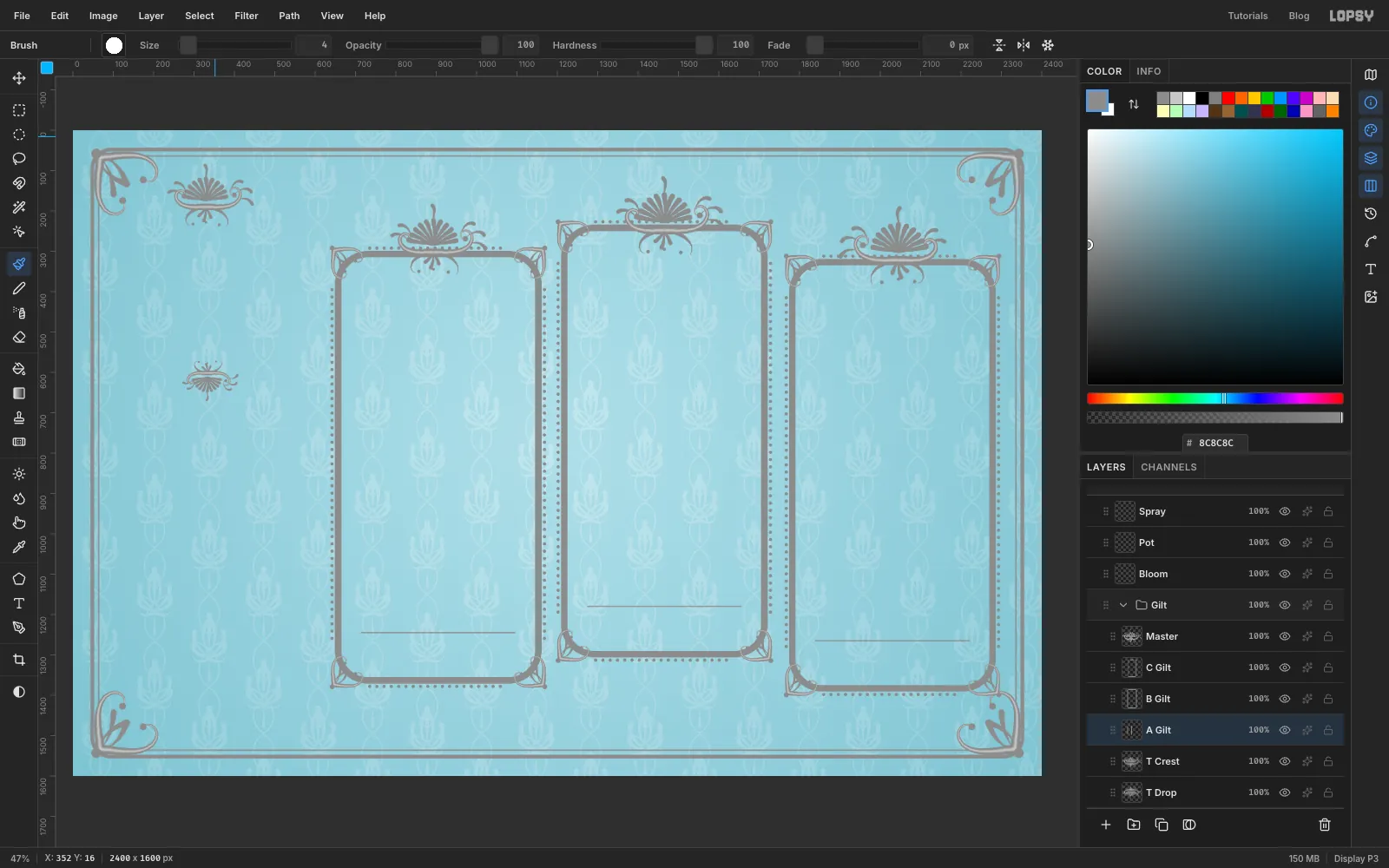
Small corners. Click B Gilt and add a layer Small Corner. Paint a miniature of the rail's corner scroll over the frame's top left corner, starting just outside the ring, in :
- the two arms at Hardness 100, Size 13, Taper 125, each about 105 px long
- the leaves at Size 8, Taper 50
- the ridge in , at Hardness 0, Size 7, Taper 125
- the dots in , at Hardness 100, Taper 0, Size 9 in the curls and Size 13 on the corner
Marquee it, copy, deselect, and paste three flipped copies into the other corners, exactly as you did with the rail. Merge Down four times to fold them all into B Gilt. Because the frame is symmetrical, each flip only needs a drag straight across, straight down, or diagonally for the last one.
The other two frames. Click A Gilt and repeat the frame ring and pearl rows for phone A's centre, set Spacing back to 1, then paste the small corner four times (flipping as before), dragging each to a corner of the new frame, and Merge Down four times. Do the same on C Gilt for phone C. The small corner is still on the clipboard. Each pasted corner lands at phone B's corner first, so you're dragging it across to the new phone.
Fold in the crests. Click C Crest and Merge Down so it joins C Gilt. Do the same with A Crest into A Gilt.
Tab bar lines. Each screen will have a thin rule 930 px below its top edge, and it belongs with the metal. The tops of the screens are at y 315 (A), y 250 (B) and y 335 (C). On each phone's Gilt layer, with Size 4, Hardness 100, Taper 0 and Spacing 1, click 190 px left of the centre line at that height, then Shift-click 190 px right of it.
-
Lay out the steeping screen
Time for the app. All three screens use the same system: flat shapes on one layer, then text above them.
In the phone sections from here on, "y 372" means 372 px below the top of that screen, and "in from the left" means from the screen's left edge. Phone B's screen has its top at document y 250 and its left edge at x 1225, so y 372 is document y 622. Everything sits on the phone's centre line, x 1465, unless it says otherwise.
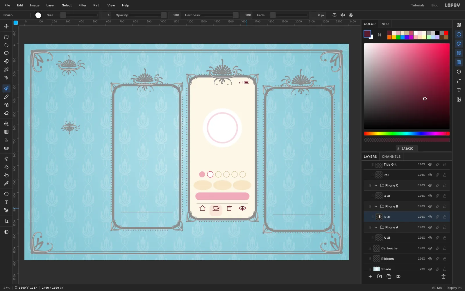
Click B UI and press U for the Shape tool. Each shape below is a click at the position given, with the size typed into the dialog. Rectangles use the Corner Radius shown. For circles and ovals, set Shape to Ellipse. Remember to remove the fill or stroke you aren't using.
- Screen: rectangle , 480 × 1040, radius 66, at the phone's centre
- Dial face: white ellipse, 290 × 290, at y 372 on the centre line
- Dial track: ellipse with no fill and a stroke, Width 11, 220 × 220, in the same place
- Infusion circles: six 44 × 44 ellipses at y 716, 60 px apart, starting 90 px in from the screen's left edge. The first is filled . The second is white with a stroke, Width 3. The other four have no fill and a stroke, Width 2.
- Stat ovals: three ellipses, 136 × 74, at y 796, centred 95, 240 and 385 px in from the left edge
- Button: rectangle , 400 × 56, radius 28, at y 878
Status bar. With the Brush at Size 5, Hardness 100, Taper 0 and foreground , make three little signal bars with Shift-click lines, starting 368 px in from the left, 9 px apart, standing on y 42 and 6, 10 and 14 px tall. Then add a battery to their right with the Shape tool, in : a 36 × 17 rectangle, radius 5, stroke only at Width 2, and a 22 × 10 filled rectangle, radius 2, inside it.
Tab bar. At y 982, make a 92 × 82 rectangle in , radius 24, centred 191 px from the left edge. That's the active tab's highlight, behind the second icon. Then, with the Brush at Size 4 in , draw four small line icons centred at y 966, at 92, 191, 290 and 389 px in from the left:
- Pavilion: a roof like a shallow upturned V, 44 px wide with its peak 18 px above the eaves, two posts 26 px apart and 20 px tall, and a ground line 36 px wide
- Cup: a U-shaped bowl 32 px wide and 24 px tall with a line across the top, a small handle on the right, and a saucer line 44 px wide below
- Caddy: a box 28 × 26 px, a lid line 34 px wide above it, and a 5 px knob on top
- Fan: five 30 px ribs spreading from one point across about 120°, with a curved line through their tips
Later you'll repeat this tab bar on the other two screens, with the highlight moved. Small differences between phones won't show.
-
Cut the elapsed arc
The timer shows how much of the steep has gone by. The easy way to draw a precise arc is to draw a whole ring and cut a wedge out of it.
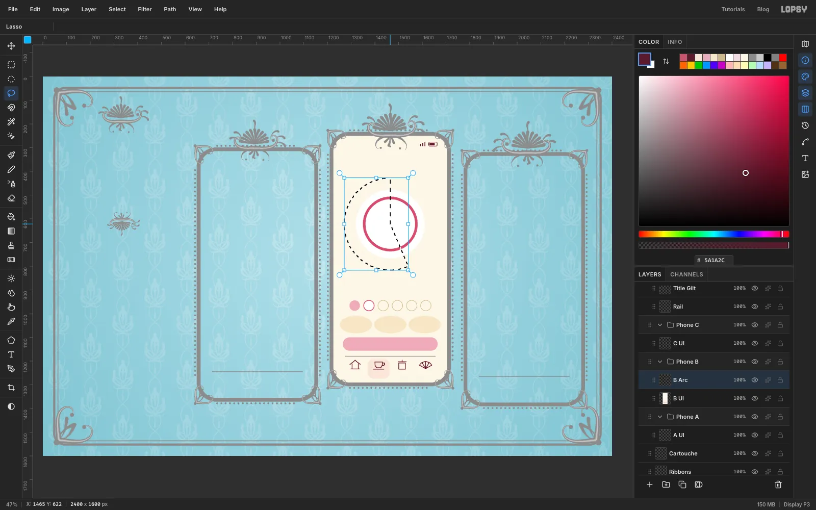
Add a layer B Arc above B UI. With the Shape tool, make an ellipse with no fill and a stroke, Width 11, 220 × 220, in the same place as the track.
Press L for the Lasso. Start in the centre of the dial and drag straight out past the ring at about five o'clock. Then go clockwise, well outside the ring, past six and nine, and all the way round to twelve. Come straight back to the centre and release. Press Delete, then Cmd+D. The pink is left from twelve o'clock round to five, a little under half the circle, which matches 35 seconds of an 80 second steep.
-
Trace the cup out of its photo
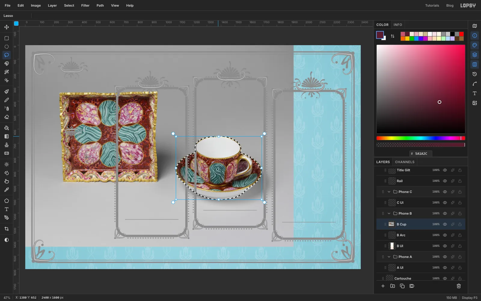
With B Arc active, drag the cup photo from your computer onto the canvas. It arrives as a new layer at the top left of the canvas with its pixels selected. Press Cmd+D and rename the layer B Cup.
The photo lands under the Gilt group, so the frames run across it. Click the eye on the Gilt row to hide them while you trace, and click it again when you're done.
Press L and trace carefully around the cup and saucer in one long drag, ignoring the tray. Stay just inside the edge, and leave out the shadow under the saucer. It's fine to include the handle's hole here, because the dark gap is small and reads as part of the handle.
Choose Select → Inverse and press Delete, then press Cmd+D.
-
Fit the cup into the dial
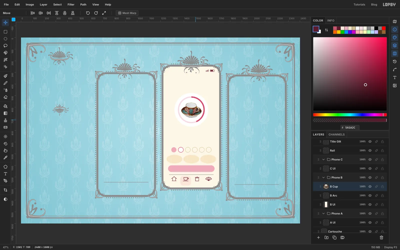
Press M and draw a marquee just around the cup. Press V for the Move tool, and Cmd-drag a corner handle inwards until the cup is about 176 px wide. It's a big reduction, and the handles show you the new box as you go. Press Cmd+D, then drag the cup into the middle of the dial.
Having a real object in the middle of a timer is what makes this screen. It tells you what you're waiting for.
-
Bead the dial with Radial Symmetry
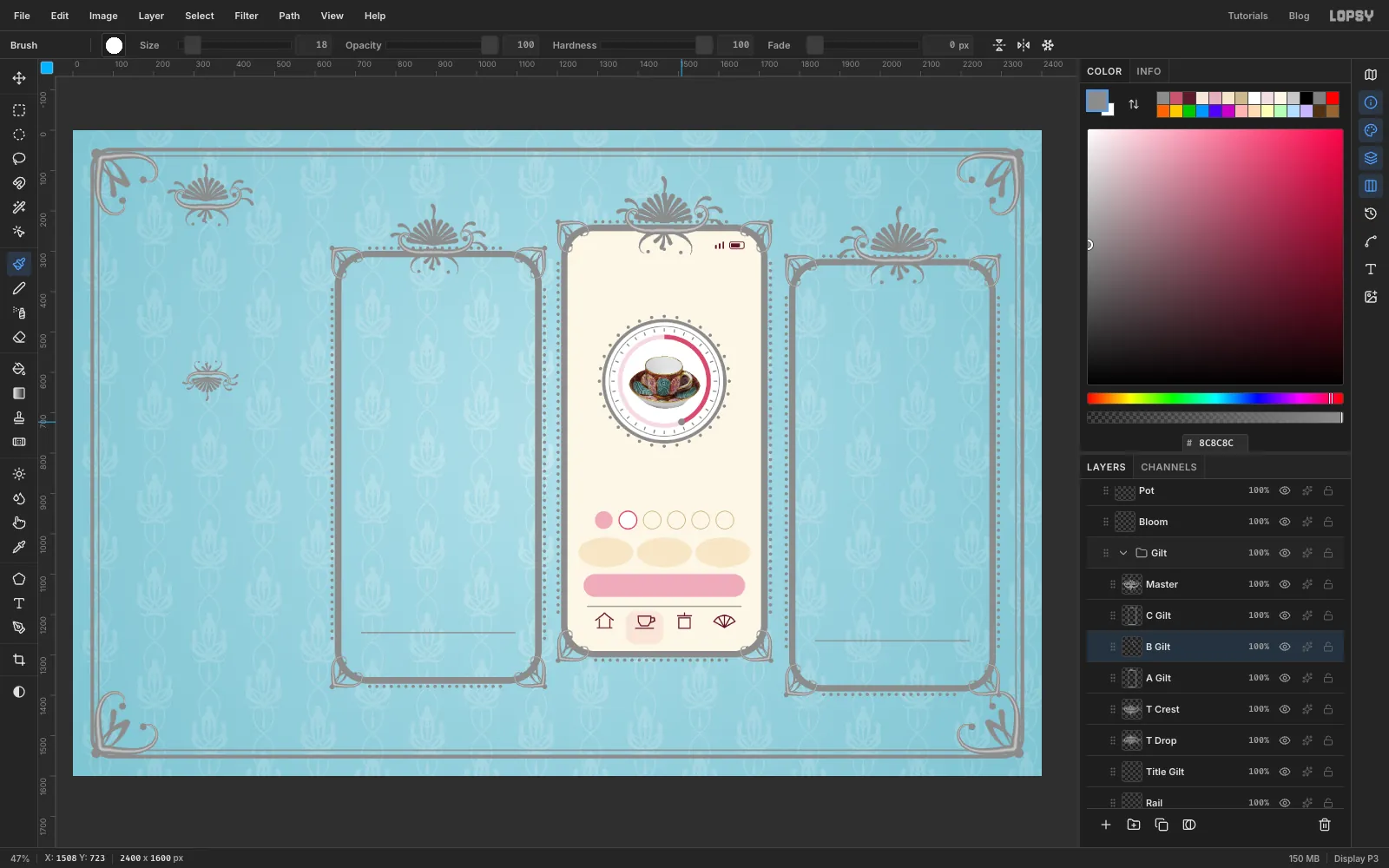
Click B Gilt. With the Shape tool, make two ellipses at the dial's centre, with no fill and a stroke: 300 × 300 at Width 8, and 272 × 272 at Width 2.
Set the foreground to . Press B and set Size 9, Hardness 100, Taper 0. Click Radial Symmetry in the options bar and set Segments to 32. Then Cmd-click the centre of the dial, which moves the centre of symmetry there without painting. A small marker shows where the centre is, and it isn't paint. Click once straight above the centre, just outside the outer ring. All 32 pearls appear at once.
Now set Size 4 and draw one tiny tick straight above the centre, just inside the thin ring. You get 32 ticks.
Click Radial Symmetry again to turn it off. It hijacks every Cmd-click until you do. Set Size 18 and click once at the end of the pink arc, at about five o'clock, for the knob.
-
Set the steeping screen's type
A note on setting text. Clicking with the Text tool inside or just beside an existing line edits that line instead of starting a new one. So on every screen, work from the bottom up. Each new click is then above what's already there, and it can't hit it.
Each line goes like this:
- Click the screen's UI layer (B UI here), so the new text doesn't restyle the last one.
- Press T, and set the font, Size and colour in the options bar. Set the style menu next to the weight to Normal, or Italic if the line says italic, because it stays as you left it.
- Click roughly where the line goes, type, and press Tab to finish.
- Press V for the Move tool and use the arrow keys to place it. Shift+arrow moves 10 px at a time. Text layers name themselves after their words, so you can tell them apart.
The y values below give the middle of each line. They're there to save you measuring, and your eye gets the last word.
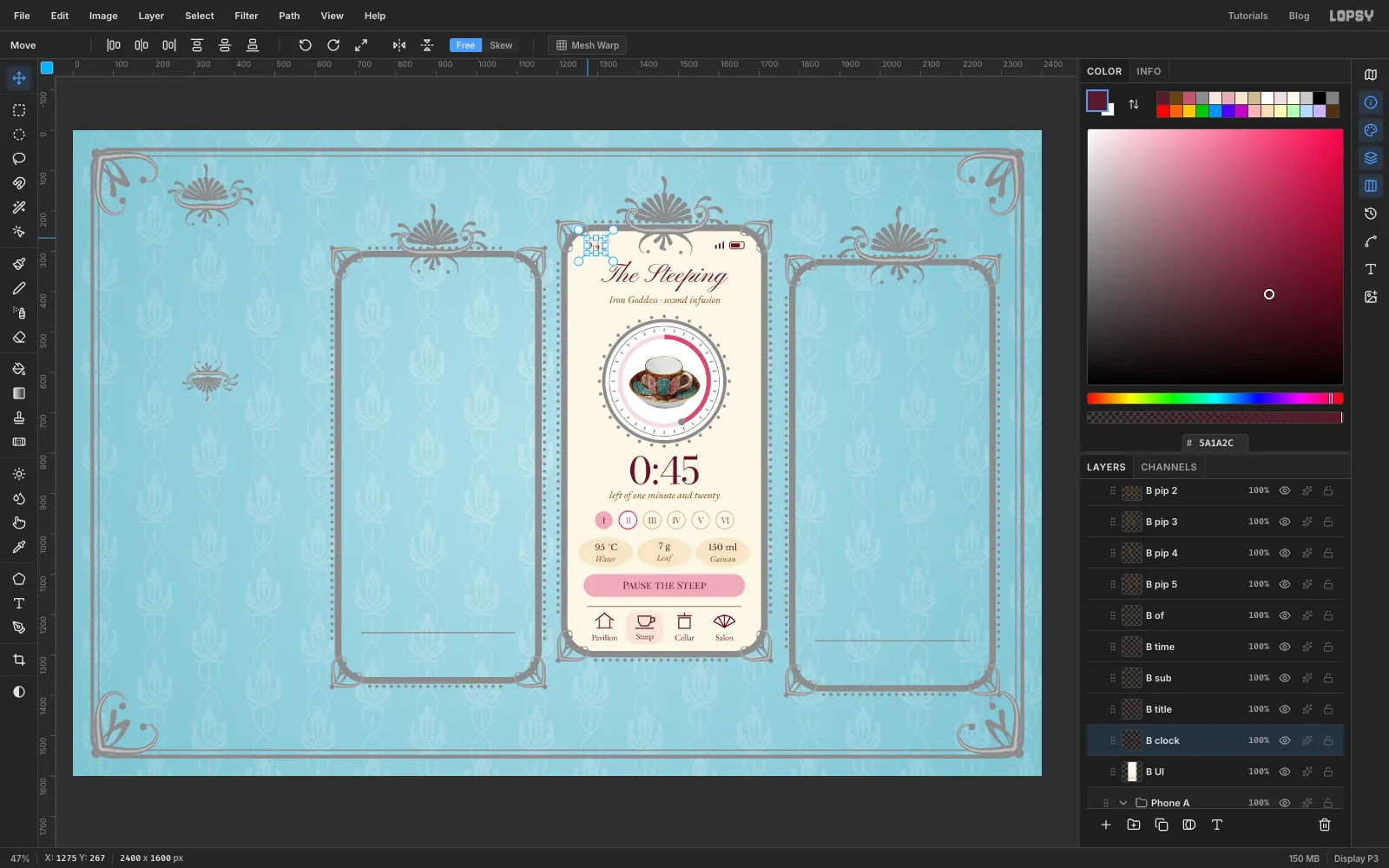
Everything on this screen is centred on the phone's centre line unless it says otherwise. From the bottom up:
- Tab labels in EB Garamond 21 , at y 1006, under each icon: Pavilion, Steep, Cellar, Salon
- Pause the Steep, Playfair Display SC 25 , y 876
- Oval labels in EB Garamond italic 21 , y 811: Water, Leaf, Gaiwan
- Oval values in Libre Baskerville 21 , y 782: 95 °C, 7 g, 150 ml
- I II III IV V VI as six separate layers in Playfair Display SC 21, y 716, centred in their circles. I is , II is , and the rest are . Click near the middle of each circle, or you'll hit the numeral beside it.
- left of one minute and twenty, EB Garamond italic 25 , y 656
- 0:45, Bodoni Moda 92 , y 590. Timers need lining figures, and Playfair's old-style numbers make the zero look like a small o.
- Iron Goddess · second infusion, EB Garamond italic 25 , y 172
- The Steeping, Pinyon Script 66 , y 112
- 9:41, EB Garamond 27 , y 36, with its left edge 50 px in from the screen's left edge
-
Cut the tea house into an oval
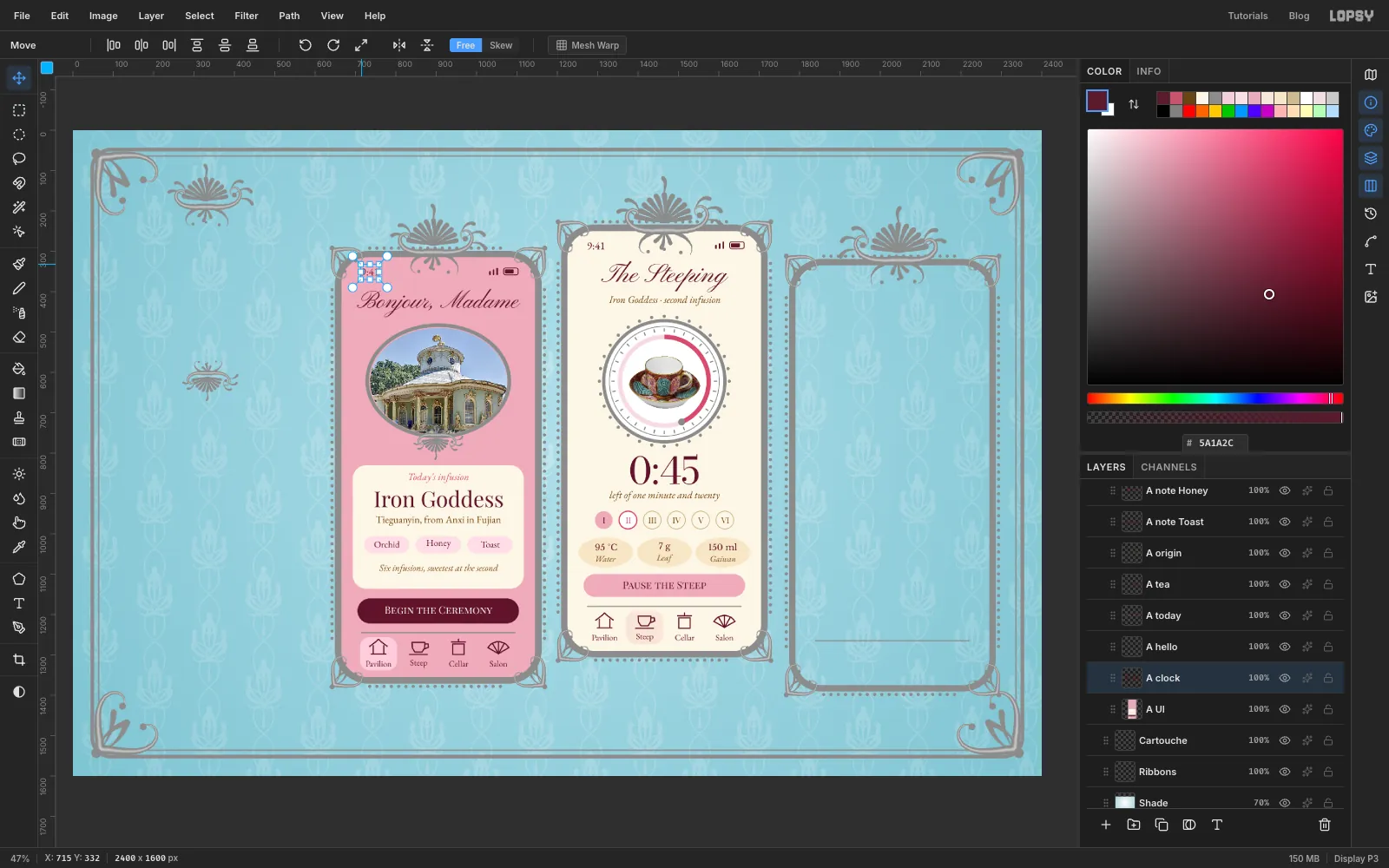
Now the home screen. Phone A's screen has its top at document y 315 and its left edge at x 665, and its centre line is x 905. As before, a y here is measured from the top of the screen. Click A UI and build its shapes with the Shape tool first:
- Screen: rectangle , 480 × 1040, radius 66, in the middle of the frame (document x 905, y 835)
- Card: rectangle , 424 × 306, radius 34, at y 668 on the centre line
- Note pills: three rectangles, 112 × 42, radius 21, at y 712, centred 112, 240 and 368 px in from the left edge
- Button: rectangle , 400 × 62, radius 31, at y 876
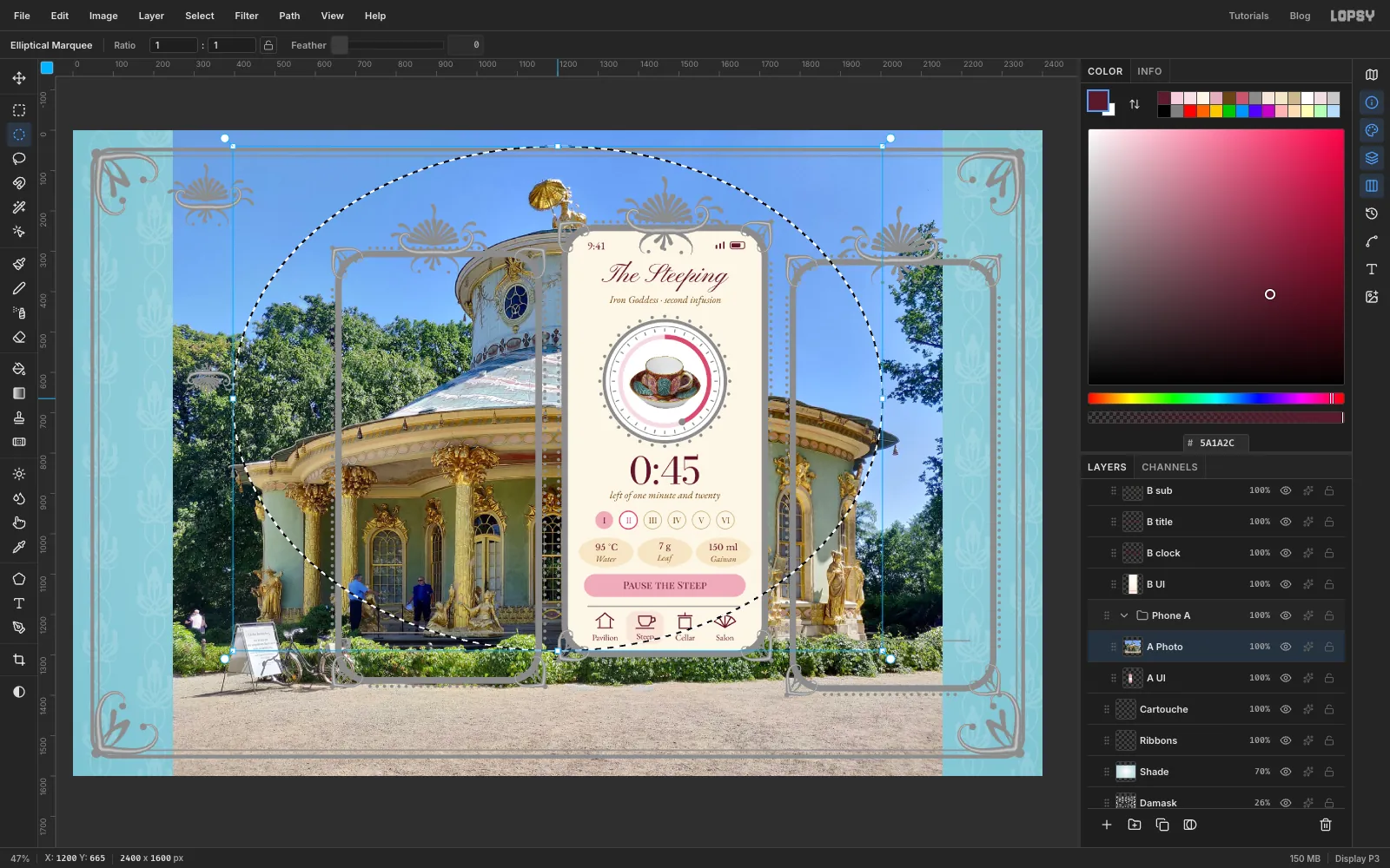
Add the status bar, and the tab bar with the same four icons and its highlight in behind the first icon. Then drag the tea house photo onto the canvas, press Cmd+D and rename the layer A Photo. It's slightly taller than the document, so Lopsy shrinks it to fit and centres it.
Pick the Elliptical Marquee in the toolbox. With nothing selected, click once for its exact-corners dialog, enter From 396, 40 and To 2004, 1290, and click Select. Those are document pixels. The oval takes in the whole building and trims off the foreground, so the people at the door become tiny details.
-
Tone the medallion and place it
Choose Select → Inverse, press Delete and press Cmd+D.
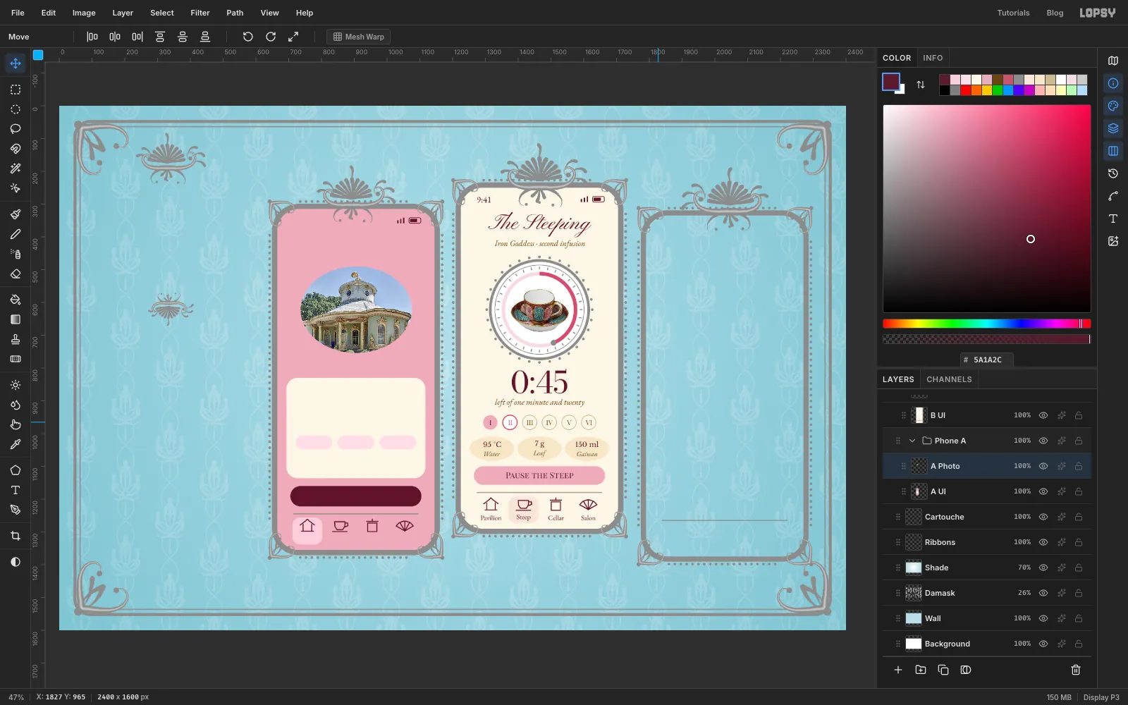
A daylight snapshot is much too modern for a porcelain painting. Choose Filter → Hue/Saturation…, set Saturation to −38 and Lightness to 5, and click Apply. Don't press Enter inside a filter's value box, because that applies the filter straight away. Press Tab to move on instead.
Press M, marquee the oval, press V and Cmd-drag a corner until it's 340 px wide. Press Cmd+D and drag it so its middle is at y 306 on the phone's centre line (document y 621). Reducing a photo this much softens it a little, so choose Filter → Unsharp Mask… with Radius 1 and Amount 0.5.
-
Finish the home screen
Click A Gilt. With the Shape tool, make an ellipse with no fill and a stroke, Width 9, 352 × 276, at y 306 on the centre line, around the photo.
Click Master, marquee the crest and press Cmd+C, then Cmd+D. Click A Gilt, paste, click Flip Vertical, Cmd-drag it down to about 46%, press Cmd+D and drag it to sit under the medallion at about y 456. Merge Down to fold it into A Gilt.
Now the text on A UI, from the bottom up, all centred unless it says otherwise:
- Tab labels as before, y 1006
- Begin the Ceremony, Playfair Display SC 25 , y 873
- Six infusions, sweetest at the second, EB Garamond italic 23 , y 772
- Orchid, Honey, Toast, EB Garamond 23 , y 710, centred in their pills
- Tieguanyin, from Anxi in Fujian, EB Garamond 25 , y 652
- Iron Goddess, Playfair Display 54 , y 598
- Today's infusion, EB Garamond italic 25 , y 546
- Bonjour, Madame, Pinyon Script 60 , y 112
- 9:41, as before
-
Build the cellar screen
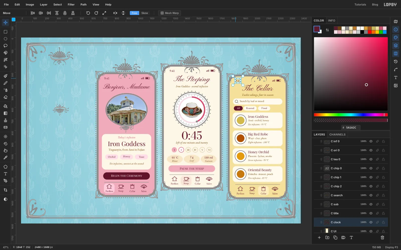
Phone C's screen has its top at document y 335 and its left edge at x 1790, and its centre line is x 2030. Click C UI and make the shapes:
- Screen: rectangle , 480 × 1040, radius 66, in the middle of the frame (document x 2030, y 855)
- Search field: rectangle , 424 × 52, radius 26, at y 216
- Chips: three rectangles, 40 tall, radius 20, at y 274. All is , 76 wide, centred 74 px in. Roasted is , 112 wide, centred 176 px in. Floral is , 104 wide, centred 296 px in.
- Four cards: rectangles , 428 × 136, radius 28, at y 378, 532, 686 and 840
- Bowls: on each card, 94 px in from the left edge, a 92 × 92 white ellipse, then a 66 × 66 ellipse of tea on top: , , and
Add the status bar and the tab bar, with the highlight in behind the third icon.
Click C Gilt. With the Shape tool, put a ring, 96 × 96, Width 5, no fill, around each bowl. Add a 22 × 22 ring at Width 4 in the search field, 58 px in, and a short Shift-click line off its lower right with the Brush at Size 4 in . That's the magnifying glass.
Then the text on C UI, from the bottom up. The three lines in each card are left-aligned, 158 px in from the screen's left edge. The rest are centred unless noted:
- Tab labels as before
- Card by card, bottom card first, with n as the card's y: the third line in EB Garamond italic 21 at n+36, the second in EB Garamond 23 at n+2, the name in Playfair Display 29 at n−34
- Oriental Beauty, Hsinchu · muscat, peach, Five infusions · 85 °C
- Honey Orchid, Phoenix · lychee, smoke, Seven infusions · 95 °C
- Big Red Robe, Wuyi · char, plum, Eight infusions · 100 °C
- Iron Goddess, Anxi · orchid, honey, Six infusions · 95 °C
- Chip labels in EB Garamond 22, y 272: All in , Roasted and Floral in
- Search by leaf or mood, EB Garamond 24 , y 214, starting 88 px in
- Twelve oolongs, four in season, EB Garamond italic 25 , y 160
- The Cellar, Pinyon Script 70 , y 98
- 9:41, as before
-
Set the title in its cartouche
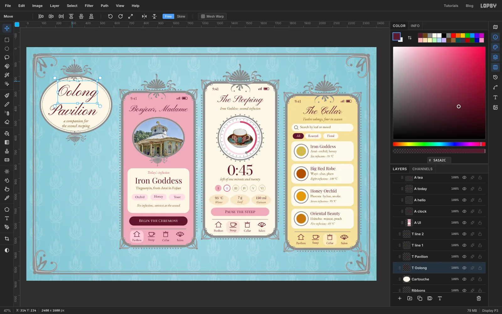
A cartouche is an ornamental frame around an inscription. All positions from here on are document pixels again. Click Cartouche and, with the Shape tool, make a ellipse, 480 × 380, at x 340, y 395.
Click T Drop. Make two ellipses in the same place with no fill and a stroke: 490 × 390 at Width 10, and 462 × 362 at Width 2.
Click Cartouche again for each line of text, bottom up, in for the title and for the rest:
- the second steeping, EB Garamond italic 28, y 541, centred on x 340
- a companion for, the same, y 507
- Pavilion, Pinyon Script 110, y 421, centred on about x 318
- Oolong, Pinyon Script 110, y 311, centred on about x 354
Staggering the two words sideways gives the tail of the g somewhere to go. Stacked straight, it runs into the l of Pavilion. Check that the descenders sit well clear of the tagline and that nothing touches the thin inner ring.
-
Trace the teapot, including the handle hole
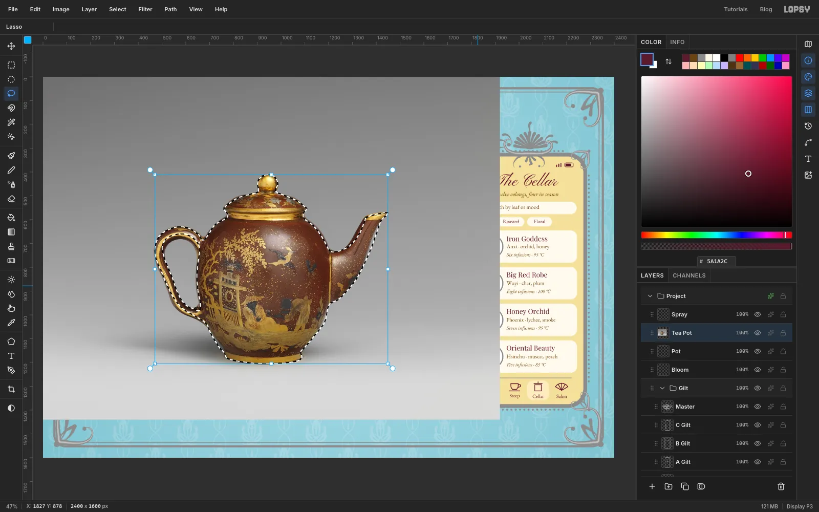
Click Pot, drag the teapot photo onto the canvas and press Cmd+D. Rename the layer Tea Pot.
Press L and trace around the outside of the whole pot in one drag, including knob, spout and handle. Follow the foot closely, and leave out the soft shadow on the table.
Now hold Alt and trace inside the handle's hole. Alt takes that area out of the selection, so the wall will show through the handle.
Choose Select → Shrink… and enter 3. Pulling the selection in by a few pixels removes the pale fringe that any hand trace leaves behind. Choose Select → Inverse, press Delete and press Cmd+D.
Press M, marquee the pot, press V, then Cmd-drag a corner until it's 440 px wide, press Cmd+D, and drag it to about x 345, y 924.
-
Hang the pot on a wall bracket
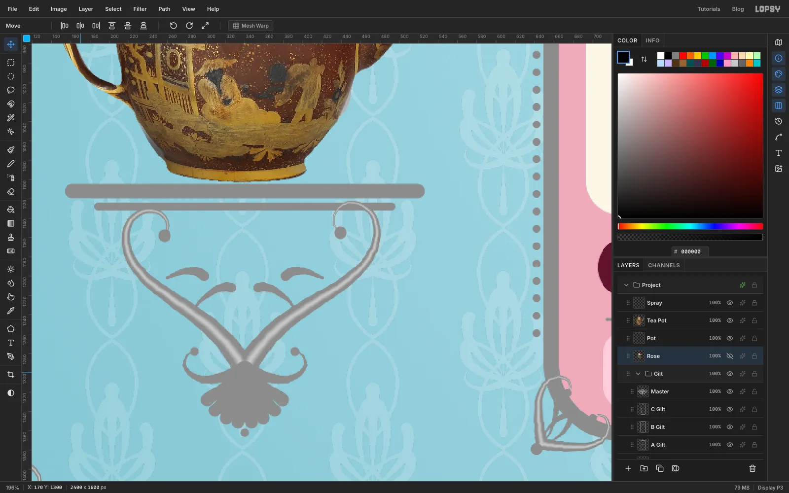
Rococo porcelain was often shown on a gilt bracket fixed to the wall.
Click T Drop. With the Shape tool, make two filled rectangles for the shelf and the rail below it: 372 × 15, radius 7, at x 340, y 1112, and 312 × 8, radius 4, at x 340, y 1128.
Press B, with the foreground at :
- Set Hardness 100, Size 23, Taper 300. Start at about x 342, y 1293 and draw up and to the right, in a long curve that swings out and then curls back on itself just under the shelf, about 285 px long. Do the same to the left, a little shorter. Together they make a heart.
- Set Size 14, Taper 90. Add a small hooked curl each side at the bottom, then eight shell ribs fanning downwards from the same point, each from the rim up to the point.
- Set Size 11, Taper 60, and add two small leaves inside each arm.
- Set the foreground to , Hardness 0, Size 13, Taper 300, and repeat the two big scrolls down their middles. Then back to , Hardness 100, Taper 0.
- Click dots at Size 14 at the end of each big scroll, Size 10 at the end of each hook, Size 20 where the scrolls meet, and Size 10 under the shell.
For the plaque, click Cartouche and make a rectangle, 376 × 56, radius 28, at x 445, y 1468. Click T Drop and make a stroke-only rectangle around it, 388 × 68, radius 34, Width 5.
-
Cut out the roses with the Magic Wand
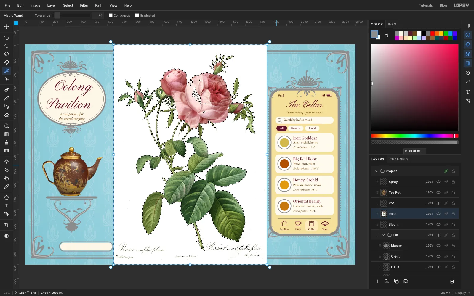
Click Bloom, drag the rose print onto the canvas and press Cmd+D. Rename the layer Rose. It's taller than the document, so it lands centred and shrunk to fit.
Press W for the Magic Wand. Set Tolerance to 20 and untick Contiguous, so it also takes the white between the stems. Click in the paper near a corner. Then click in the status bar to take focus off the options bar. Choose Select → Grow… with 2 to eat the pale fringe. Press Delete, then Cmd+D.
Press M, marquee the printed caption along the bottom of the plate, and press Delete and Cmd+D.
The wand also punches holes wherever a petal's highlight is nearly white. Click the empty Bloom layer below, set the foreground to , and fill an elliptical marquee behind each of the two big roses, a little smaller than the flower, with Edit → Fill. Press Cmd+D. Click Rose and choose Layer → Merge Down, then rename the result Rose. Now the holes show pale pink instead of the wall.
-
Place the roses
Two loose flowers break the frames and tie the two sides of the board together.
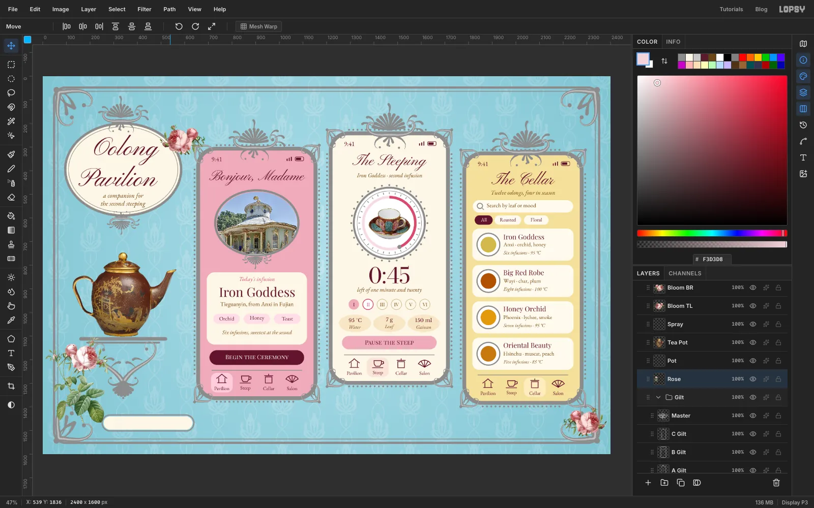
With Rose active, press L and loop around the two big blooms and their buds, then press Cmd+C and Cmd+D. Click Spray and paste:
- Cmd-drag a corner down to about 24%, press Cmd+D and drag the copy onto the lower right corner of the rail, overlapping the scroll. Rename it Bloom BR.
- Click Spray, paste again, click Flip Horizontal, scale to about 25%, press Cmd+D and drag it to where the oval nearly meets the first phone, overlapping the oval's edge. Rename it Bloom TL. Flipping means it isn't obviously the same flower twice.
Click Rose. Dark leaves would outweigh the phones, so choose Filter → Hue/Saturation… with Saturation −12 and Lightness 8. Press M and marquee the whole plant. Press V, Cmd-drag a corner until it's about 270 px wide, press Cmd+D, and drag it to the lower left corner of the board, beside the bracket, with its leaves clear of the plaque's text.
-
Add the captions
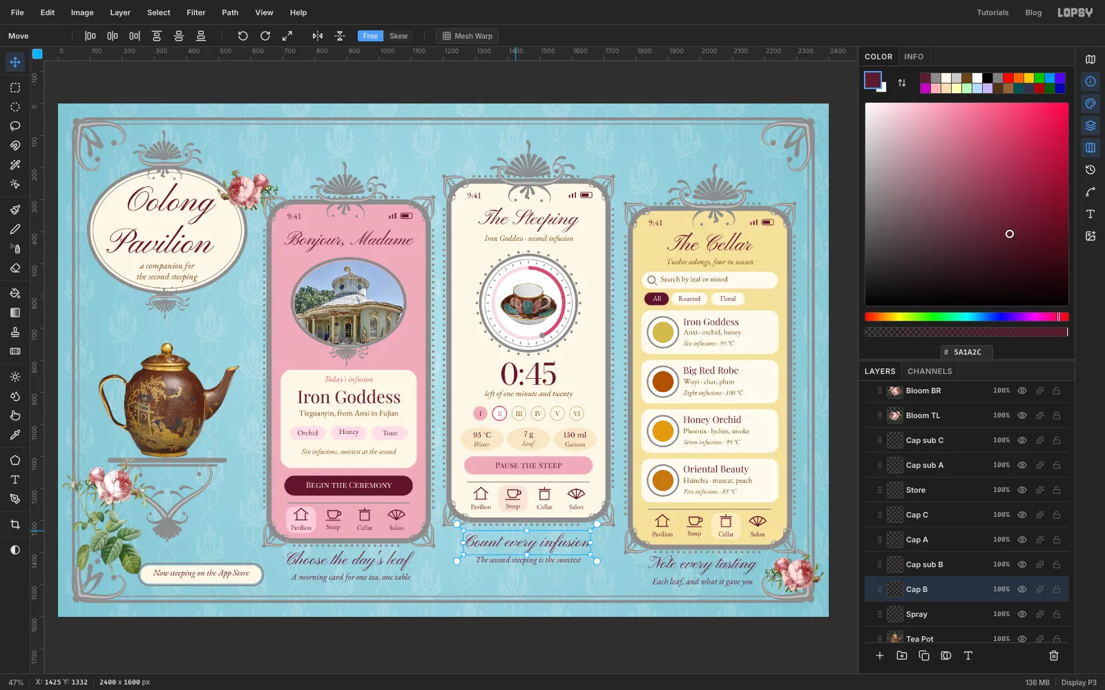
Click Spray before each new line, so the text goes on top. Use for all of it, and don't repeat words from the screens above. Captions should add something. Bottom lines first:
- Under phone A, centred on x 911: Choose the day's leaf in Pinyon Script 54 at y 1424, and A morning card for one tea, one table in EB Garamond italic 27 at y 1478
- Under phone B, centred on x 1465: Count every infusion at y 1370, and The second steeping is the sweetest at y 1424
- Under phone C, centred on x 2006: Note every tasting at y 1438, and Each leaf, and what it gave you at y 1492
- On the plaque, centred on x 445: Now steeping on the App Store in EB Garamond italic 27 at y 1465
-
Collect the metal
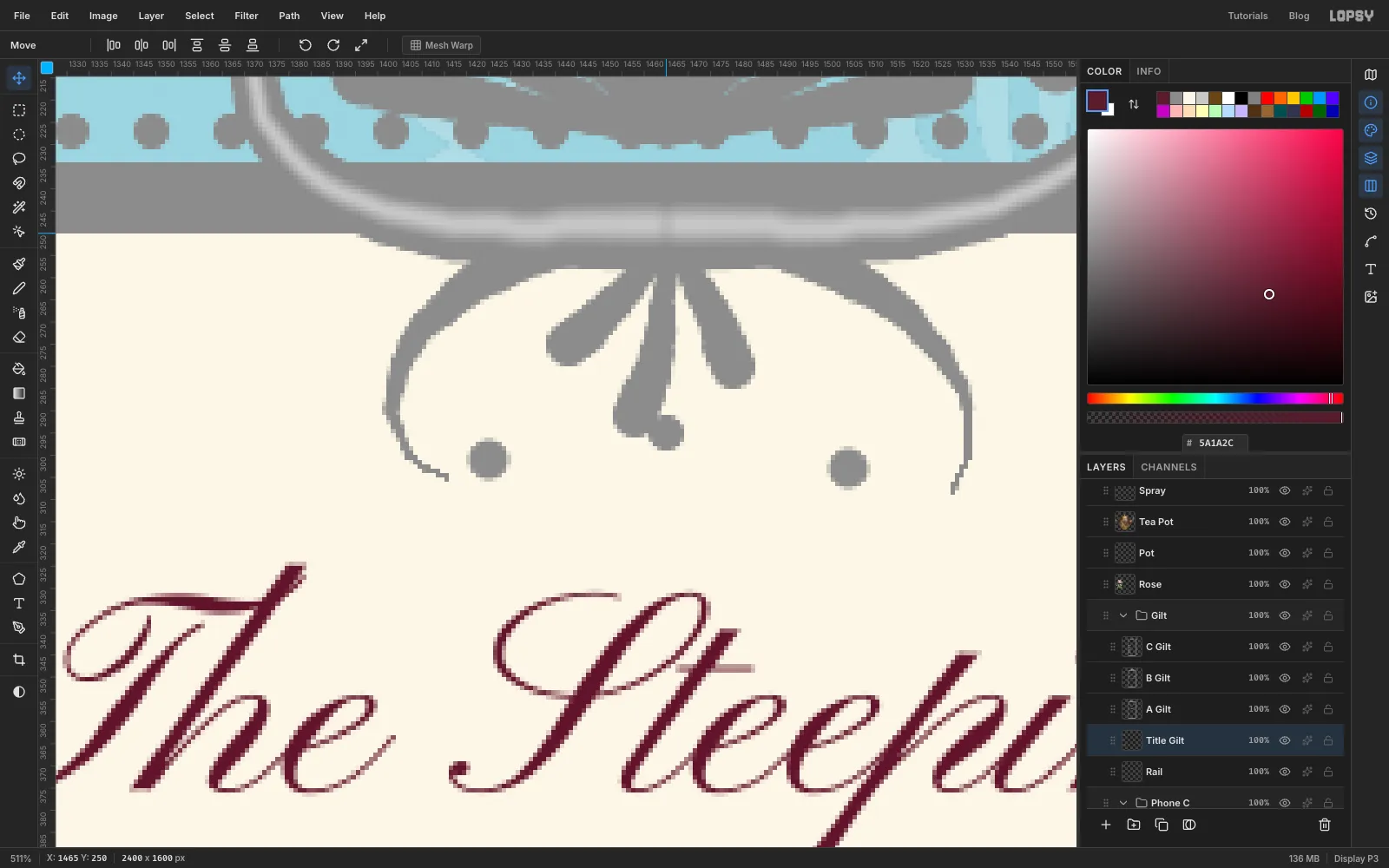
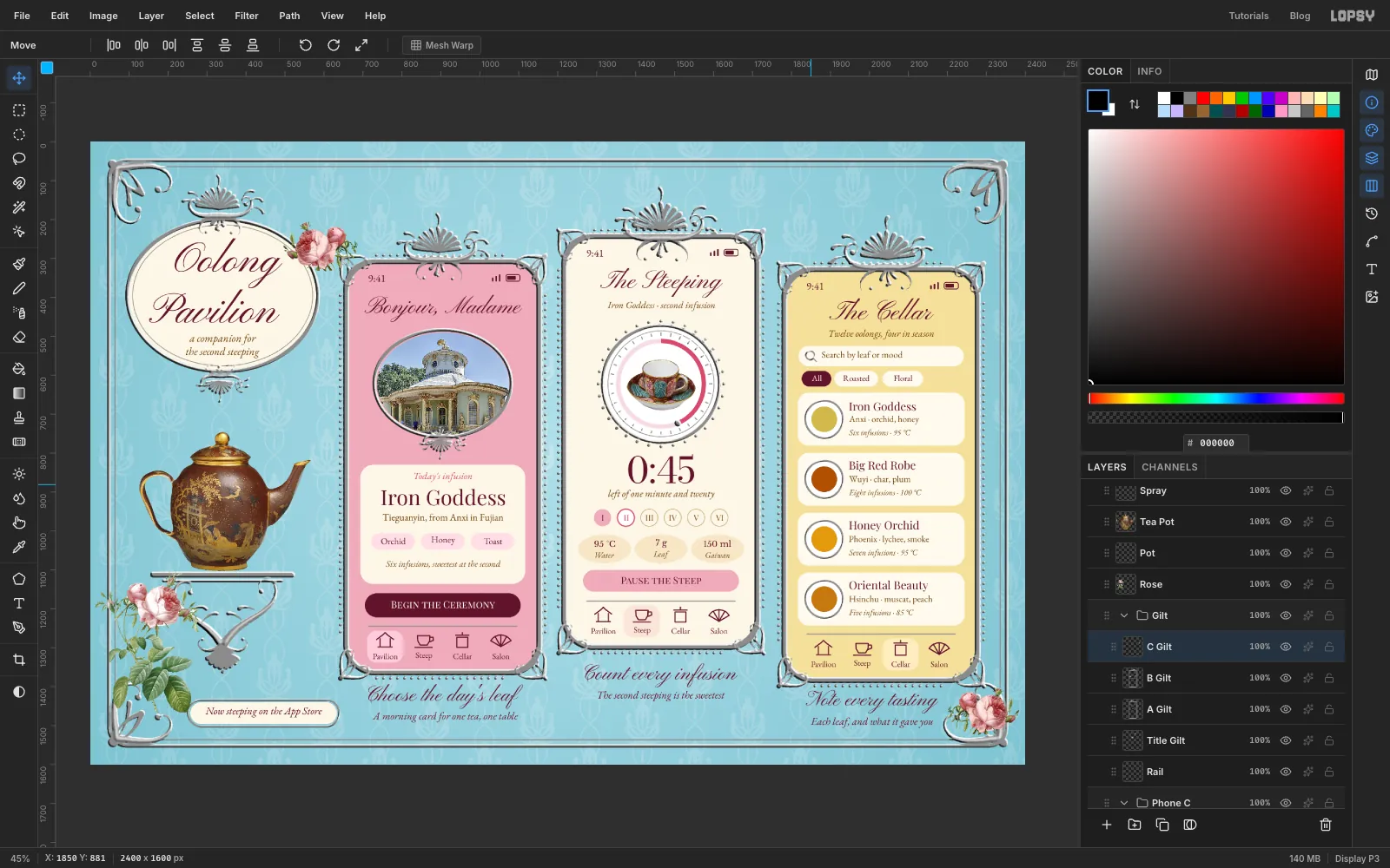
Nearly there. Look closely at your metal: it's flat, dull grey with a slightly lighter line down each big scroll. Next, tidy it into five layers.
- The master crest. Click Master, marquee the crest and copy, then press Cmd+D. Click B Gilt, paste (it lands in place), press Cmd+D, and Merge Down. Then click Master and delete it.
- The title pieces. Click T Crest and Merge Down twice, so T Crest and T Drop both fold into Title Gilt. Rename the result Title Gilt.
You should now have Rail, Title Gilt, A Gilt, B Gilt and C Gilt inside the Gilt group.
-
Emboss every piece of metal
Do these three steps on each of the five layers in turn. Filter dialogs reset every time, so check the values on each one.
- Click the layer and choose Filter → Emboss…. Keep Type on Emboss and Angle at 135, set Strength to 45, and click Apply. Emboss turns the flat grey into a mid-grey with light and dark edges, and the soft ridge lines from earlier become a raised spine.
- Hold Cmd and click the layer's thumbnail to load its shape as a selection.
- Choose Filter → Gaussian Blur… with Radius 2 and click Apply, then press Cmd+D.
Blurring inside a selection softens the hard edge of the relief but keeps the outline crisp. Without this step, the bevels look like two hard slices of colour. With it, they look like cast metal.
-
Turn the grey to gold
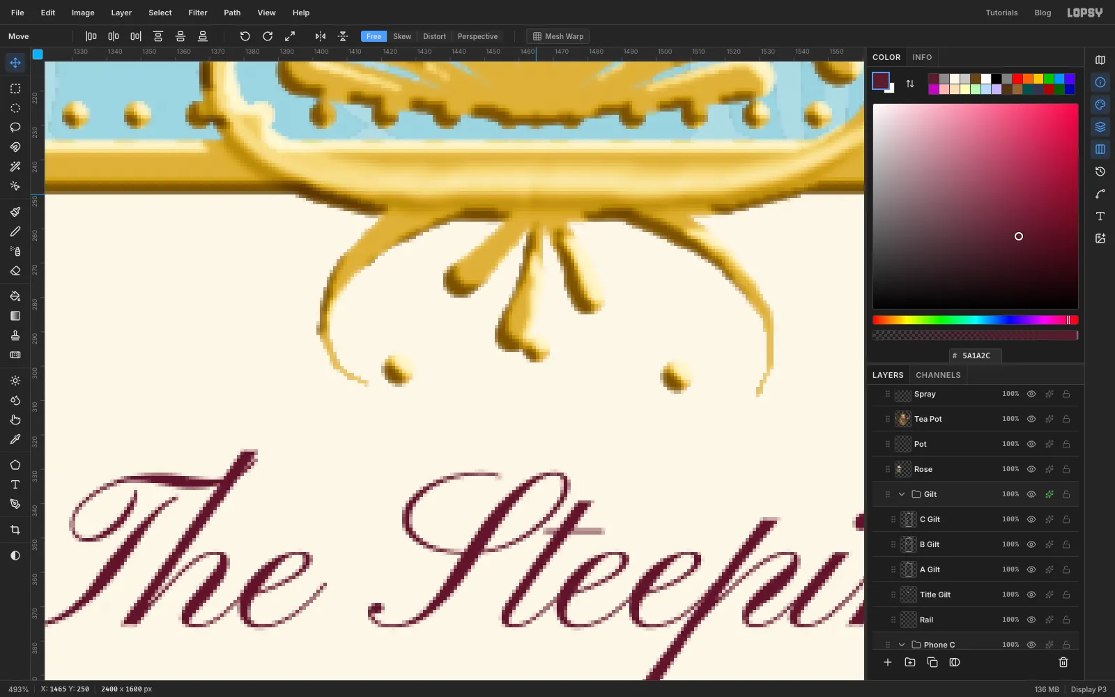
Click the sparkle button on the Gilt group's row to open its adjustments, click Add Adjustment and choose Gradient Map. A gradient map replaces each shade of grey with a colour from a gradient, and because it sits on the group, it colours all five layers at once.
Click the left stop and type in the Hex field. Click the right stop and type . Then click on the gradient bar itself to add three more stops. Each click adds a stop and selects it, ready for its hex:
- at about 28%,
- at about 50%,
- at about 70%,
Close the drawer. Everything you've painted over the last two hours turns to gold in one go, which is one of the better moments in this tutorial. Dark stops are kept a warm brown rather than black, because near-black lines make gold look like cheap clip art.
-
Add the shadows
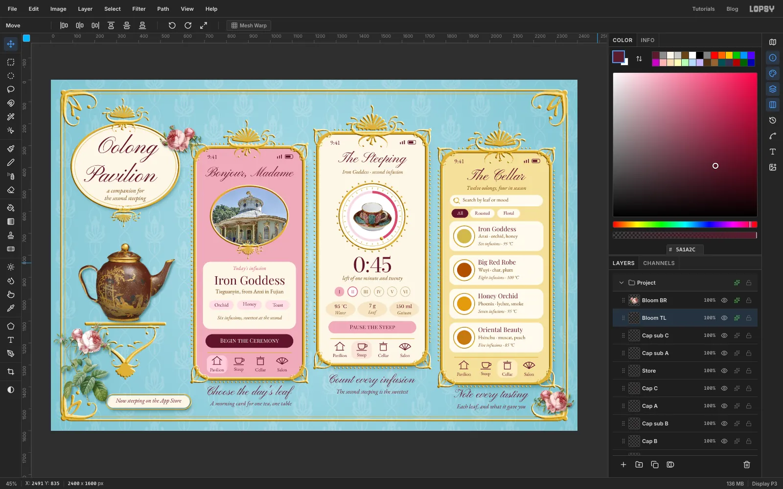
Open each layer's effects with its sparkle button, tick Drop Shadow, and click its name to show its controls. Click the colour swatch, which opens your system colour picker, and enter . A dark version of the wall colour looks like real shadow on a blue wall. Grey or black would look like a smudge. Use these values for Offset X, Offset Y, Blur and Opacity:
- Cartouche: 8, 14, 26, 45
- A UI, B UI, C UI: 12, 22, 40, 55
- Tea Pot: 6, 8, 12, 45
- Rose: 6, 10, 14, 40
- Bloom BR, Bloom TL: 4, 7, 10, 40
-
Scale and hang the phones
The phones are too close together, and frames that are perfectly straight look like a template. So you'll shrink each one slightly and let the outer two hang a touch crooked.
Each phone is two pieces now: its screen group and its metal layer. Lopsy can transform them as one.
- Press V for the Move tool and press Cmd+D, so there's no selection.
- Click the Phone A group's name, then hold Cmd and click the name A Gilt. Click the names, not the thumbnails, since Cmd-clicking a thumbnail loads a selection instead. The handles frame both together.
- Cmd-drag the bottom right corner handle in by about 6%, which is about 32 px across. That corner moves while the top left stays pinned.
- Drag from inside the box to slide the phone back to where it was, about 16 px right and 38 px down.
- Drag the round rotation handle just outside a corner, to tilt the phone very slightly anticlockwise, about 1.5°. The tip of the crest should swing about 16 px to the left. Don't hold Cmd here, because it snaps to 15°.
Do the same with Phone B and B Gilt, but don't rotate it. Then do it with Phone C and C Gilt, rotating about 1.5° clockwise. Live text stays live through all of this, so you can still fix a typo later.
Press Cmd+D when you're done.
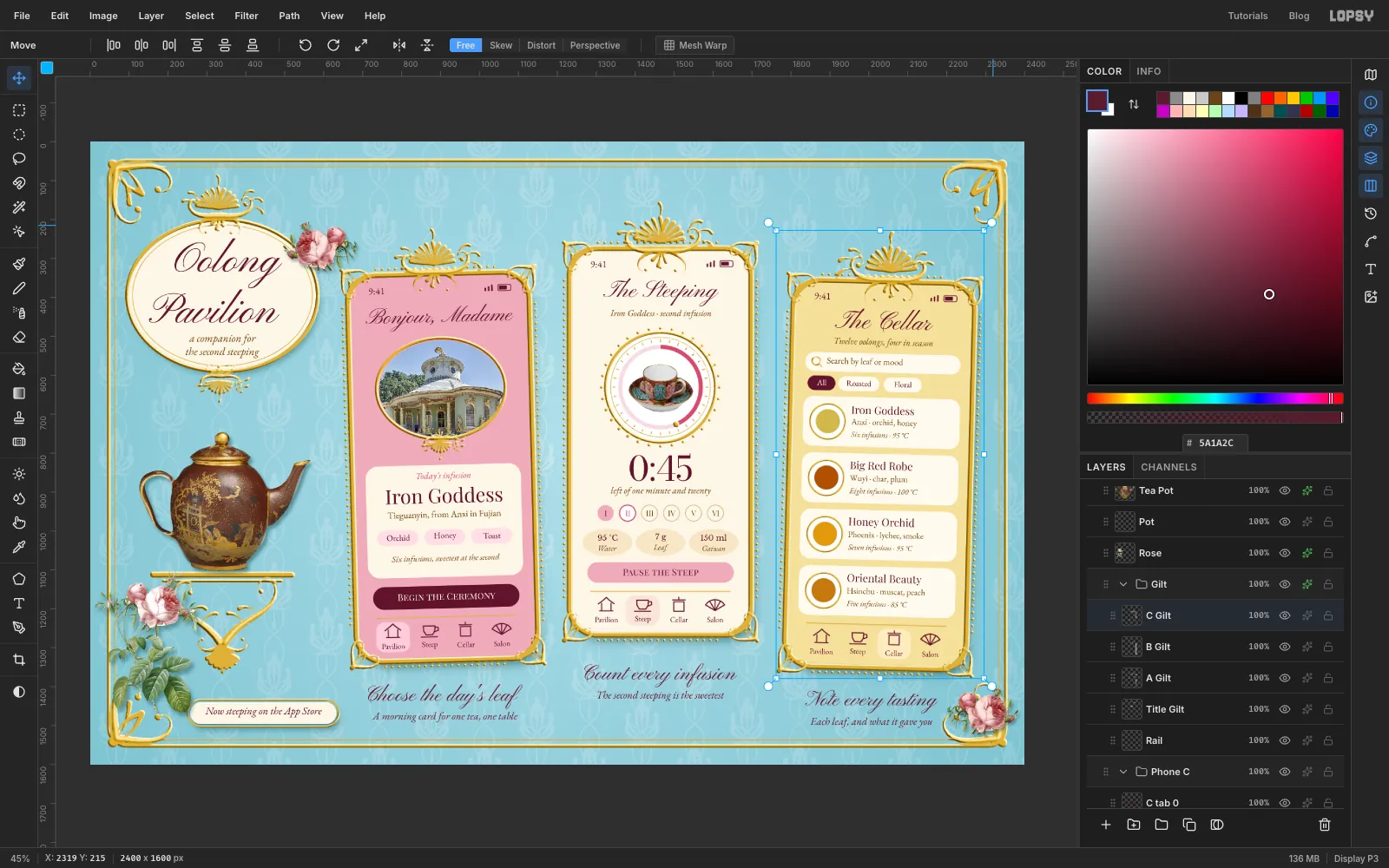
-
Tie the ribbons
Click Ribbons. It sits under everything else, so ribbons pass behind the rail and crests. Now that the phones have settled, you can see where the ribbons need to go. The tilt moves each crest about 16 px sideways, so phone A's ribbon sits at about x 889 and phone C's at about x 2046. Phone B's stays at x 1465.
Bands. Set the foreground to and the Brush to Size 20, Hardness 100, Taper 0. Click at the very top of the canvas and Shift-click down to the tip of each crest's flame. That's at about y 227 on phone A, y 159 on phone B and y 234 on phone C.
Bows. Each bow is centred where its band ends, right on the tip of the crest. Press L and draw each bow's parts freehand, using Edit → Fill on each selection and Cmd+D between them:
- two short tails, about 75 px long, slanting out and down from the centre, in . They tuck behind the crest.
- two rounded loops, about 95 px wide and 45 px tall, one each side, in
Folds. With the Brush at Size 10, Hardness 30, Taper 56 and , draw a line from the centre out along each loop and down each tail. With Size 12, Hardness 20, Taper 60 and , draw a short highlight along the top of each loop, from its outer end in towards the centre.
Knot. Last, so it covers the ends of the folds, lasso a small square about 30 px across in the centre and fill it with .
Reset the Brush to Taper 0, and add a Drop Shadow to Ribbons: , 3, 5, 6, 45.
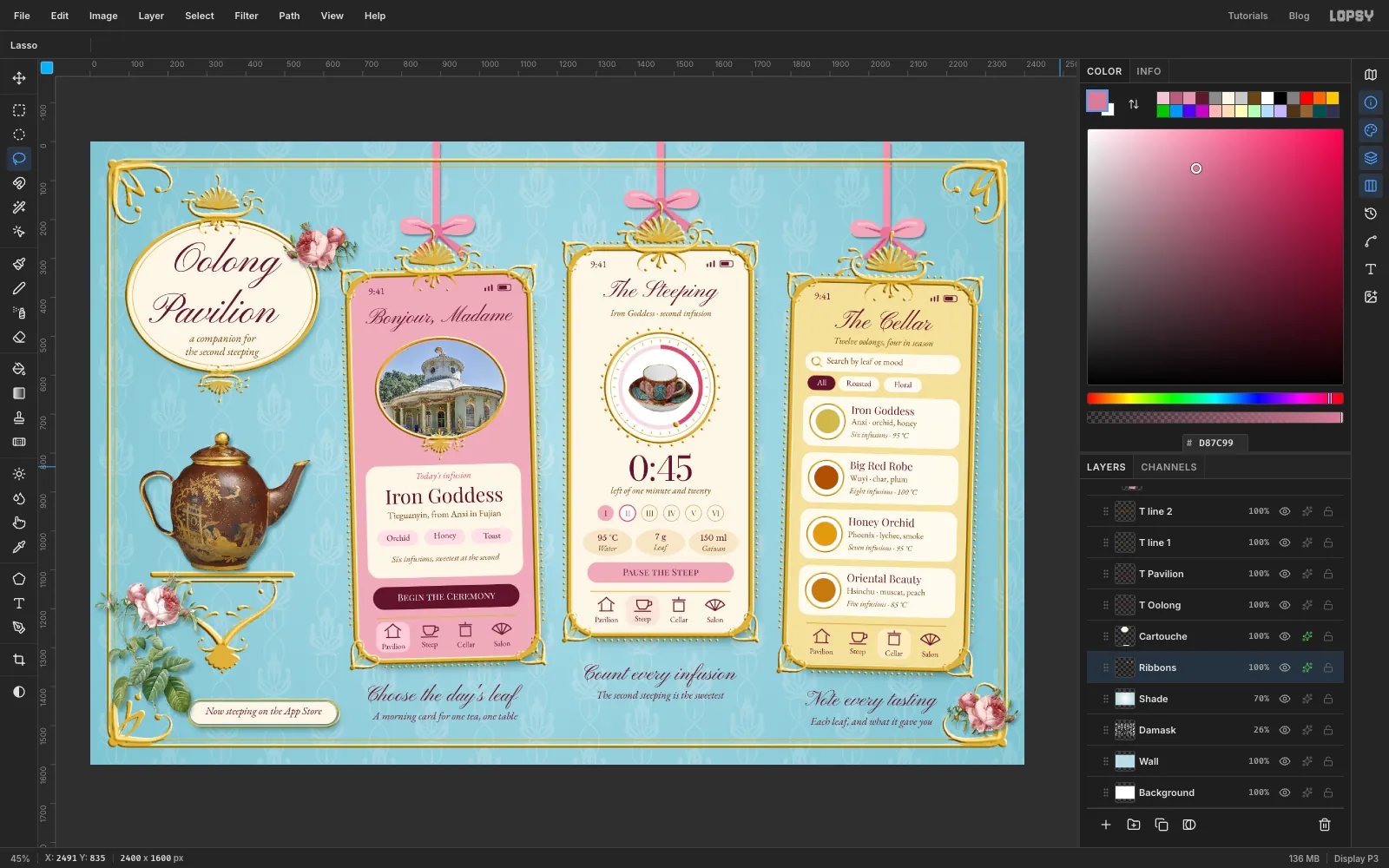
-
Grade the whole board
The photos, the flat UI and the gold still come from three different worlds. A gentle overall grade pulls them together. Choose Layer → Adjustment Layer…, and click Got it if the note appears. This opens the adjustments for the document's root group.
Click Add Adjustment and choose Color Grading. Each wheel tints a tonal range, and you can drag on the wheels or use the sliders below them:
- Click the Shadows label under the first wheel. Set Hue to 215 and Saturation to 10, which cools the shadows slightly.
- Click the Highlights label under the third wheel. Set Hue to 48 and Saturation to 12, which warms the highlights to the colour of old porcelain.
Click Add Adjustment again, choose Vignette and set it to 20.
Close the drawer and press Cmd+D. Check every line of text at 100% one last time, then choose File → Save Project and File → Quick Export PNG.