Design a Swiss Style Concert Invitation
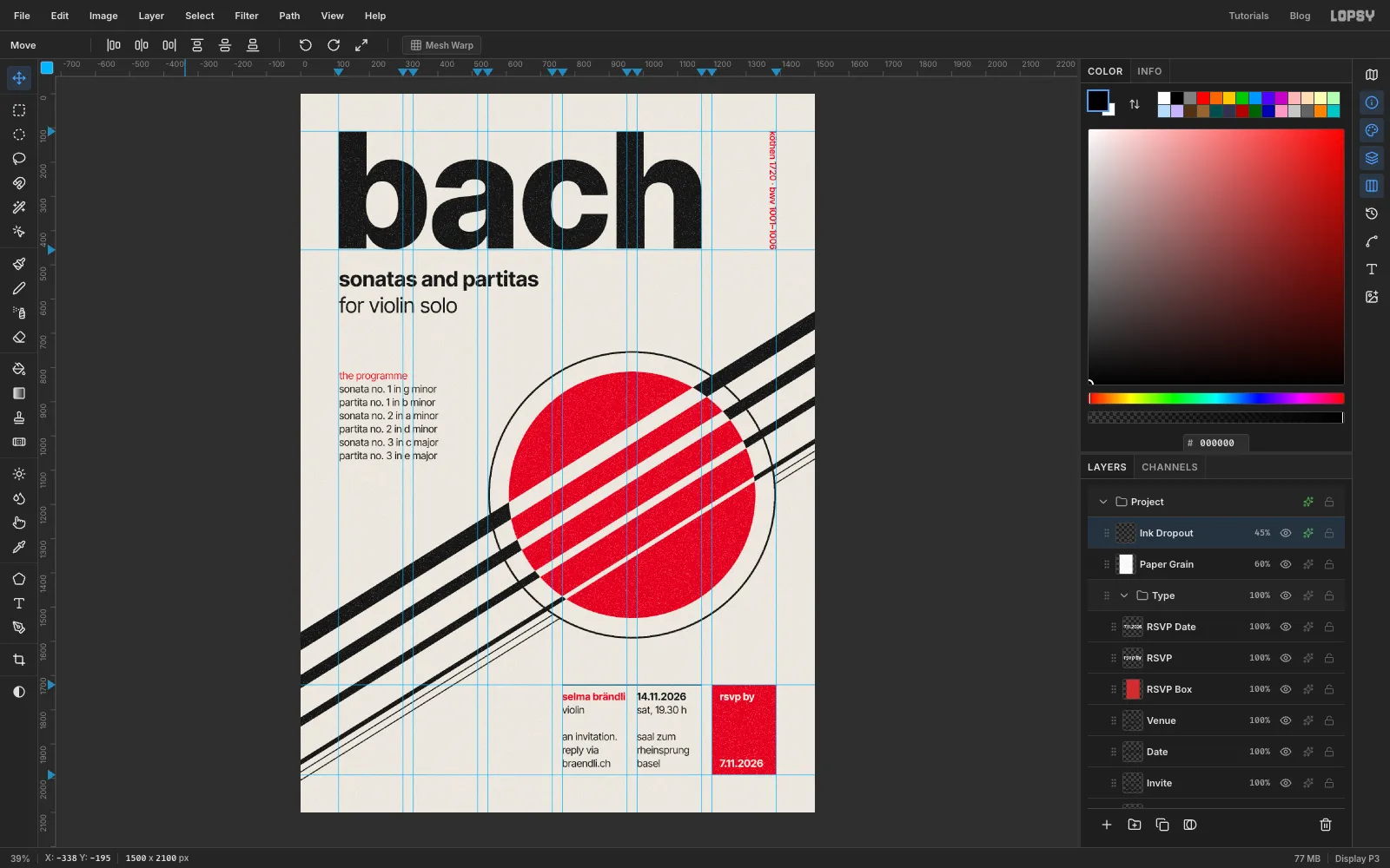
Design a Swiss Style recital invitation in Lopsy with a 6-column grid, a red disc pierced by four violin strings, a baseline grid and print grain.
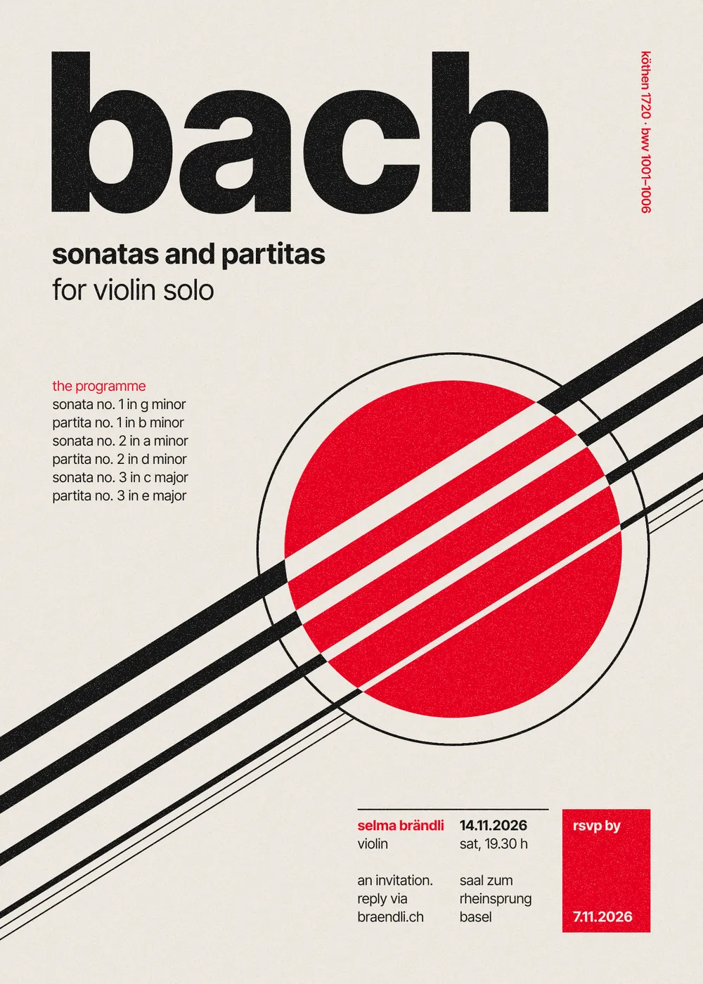
The Swiss International Typographic Style came out of Zürich and Basel in the 1950s. Josef Müller-Brockmann's concert posters for the Zürich Tonhalle are the best-known examples. Each one is built on a strict grid, with flush-left grotesque type, flat colour and one geometric idea that stands in for the music.
This tutorial uses that approach for an invitation to an invented recital of Bach's Sonatas and Partitas for solo violin. The idea is a violin seen from very close: a red disc for the sound and four strings for G, D, A and E, getting thinner from top to bottom. Where the strings cross the disc they become gaps, so you see the paper through the red. Everything else hangs from a 6-column grid and a 39 px baseline grid. At the end, a layer of grain and a few paper-coloured specks make the flat colour look printed.
The card is 1500 × 2100 px, a 5 × 7 inch card at 300 dpi.
The tools you'll use:
- guides on a 6-column grid, and Snap to Guides
- the Elliptical and Rectangular Marquee, including their exact-size dialog
- Select → Shrink, and Cmd-click on a layer thumbnail to load its shape as a selection
- the Brush and Pencil with Shift-click straight lines
- Add Noise, Threshold and the Magic Wand
- live text in Inter Tight at four weights, a per-line text colour, letter spacing, and rotating live text with the Move tool
- Merge Down, Group Layers, the Multiply blend mode and a Color Overlay layer effect
The palette is one red, one black and the paper:
-
Paper
-
light text on red
-
ink specks
-
Ink black
-
Swiss red
-
Set up the card and the column grid
Choose File → New and make a document 1500 px wide and 2100 px high.
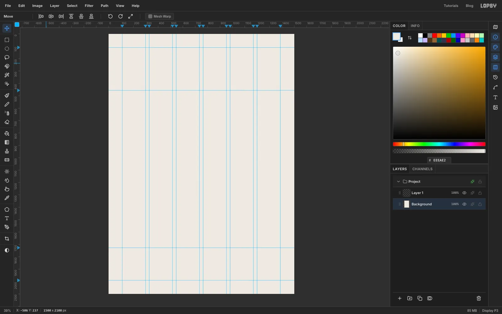
The grid has 110 px margins and six 188 px columns with 30 px gutters. Click the top ruler to drop a vertical guide at each column edge. Zoom in and watch the position readout in the status bar before you click, so each guide lands on the exact pixel:
- 110 and 298
- 328 and 516
- 546 and 734
- 764 and 952
- 982 and 1170
- 1200 and 1388
Click the left ruler to drop horizontal guides at 110 (the top margin), 456 (where the title will sit), 1727 (the top of the info block) and 1990 (the bottom margin).
Select the Background layer, set the foreground colour to and choose Edit → Fill.
-
Put a grain layer over everything
The grain goes on top of every other layer, so it textures the ink as well as the paper.
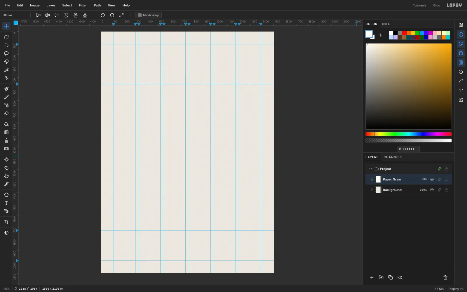
- Select Layer 1 and rename it Paper Grain. Set the foreground to white and choose Edit → Fill.
- Choose Filter → Add Noise…, set Amount to 80, and pick Mono and Gaussian. Click Apply.
- Open the layer's effects drawer, set the blend mode to Multiply, and drop the layer's opacity to 60%.
From now on, click Background before you add a new layer. New layers go directly above the active layer, so everything you add stays under the grain.
-
Draw the red disc
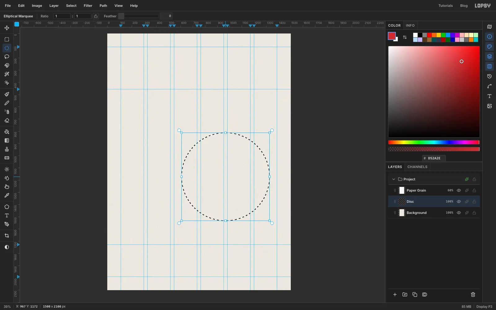
With Background selected, click Add Layer and name the new layer Disc.
Choose the Elliptical Marquee and click once on the canvas without dragging. That opens a dialog where you can type exact corners. Enter From 607, 812 and To 1327, 1532. That's a 720 px circle centred under columns 3 to 6.
Set the foreground to red , choose Edit → Fill and press Cmd+D to deselect.
-
Add a thin ring around the disc
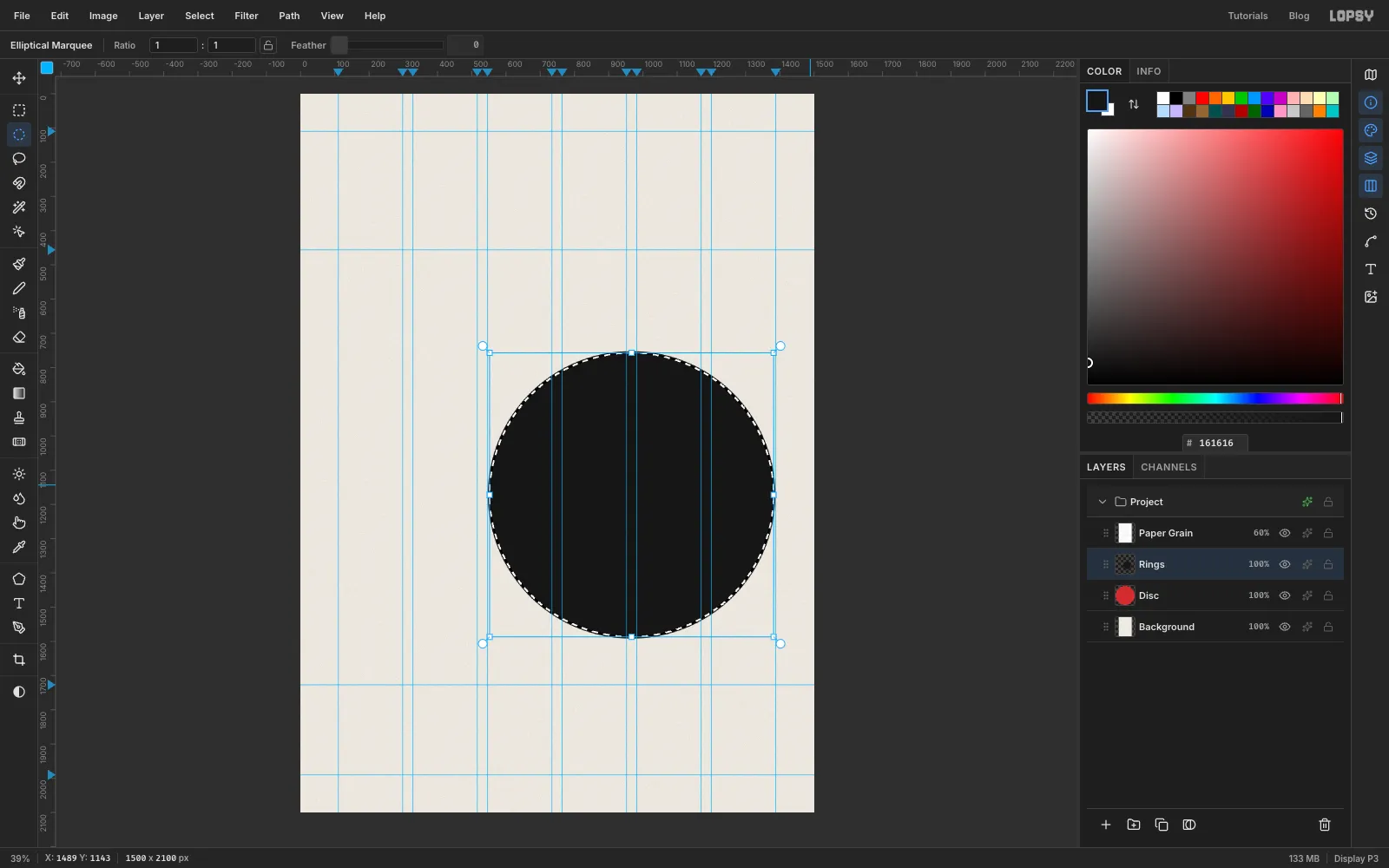
Add a layer called Rings. With the Elliptical Marquee, click once again and enter From 547, 752 and To 1387, 1592. This circle runs from just inside the left edge of column 3 to just inside the right margin.
- Set the foreground to and choose Edit → Fill.
- Choose Select → Shrink… and shrink by 5 px. You can see the smaller marquee sitting inside the black circle.
- Press Delete, then Cmd+D.
All that's left is an even 5 px ring.
-
Draw the first strings
Add a layer called Strings above Rings.
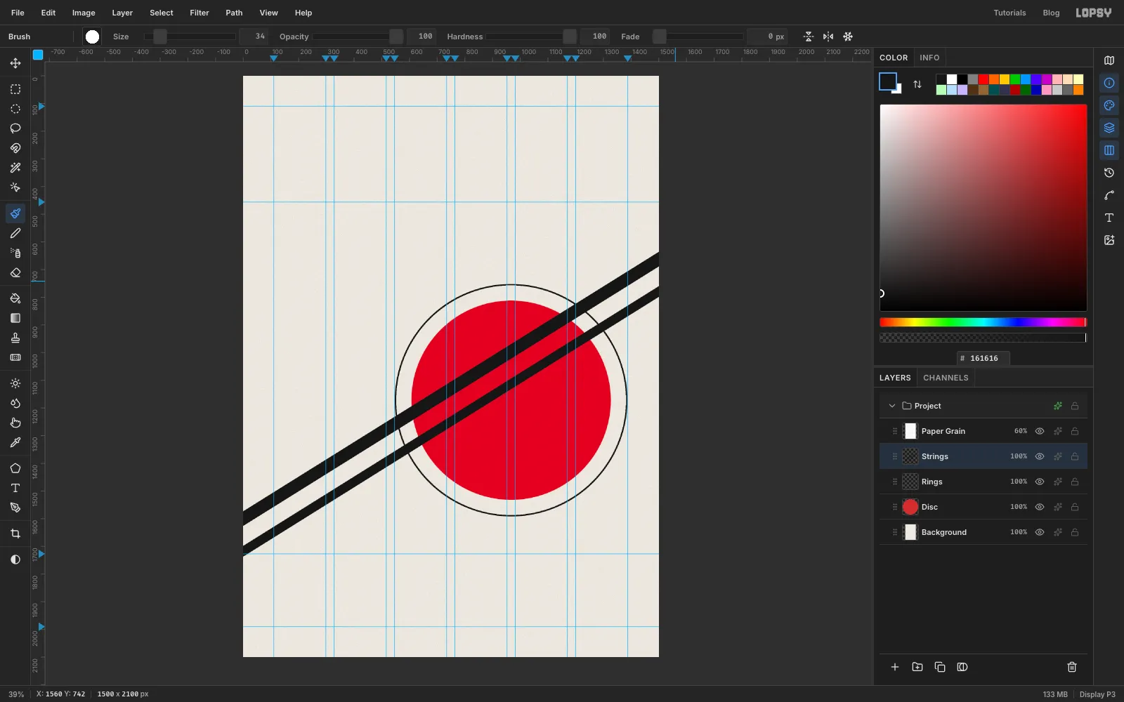
Set the foreground to and choose the Brush. In the brush settings, set Hardness to 100 so the edges are crisp, and Size to 46 for the G string.
The strings rise at about 32°, from the left edge of the card to the right edge. To draw a straight line, click once, then hold Shift and click the end point. Start and end each line just outside the canvas, so the round brush tips are cut off by the edge.
- G (size 46) leaves the left edge at about y 1599 and the right edge at about y 662.
- D (size 34) runs 118 px lower on both edges: about 1717 on the left and 780 on the right.
-
Finish the four strings
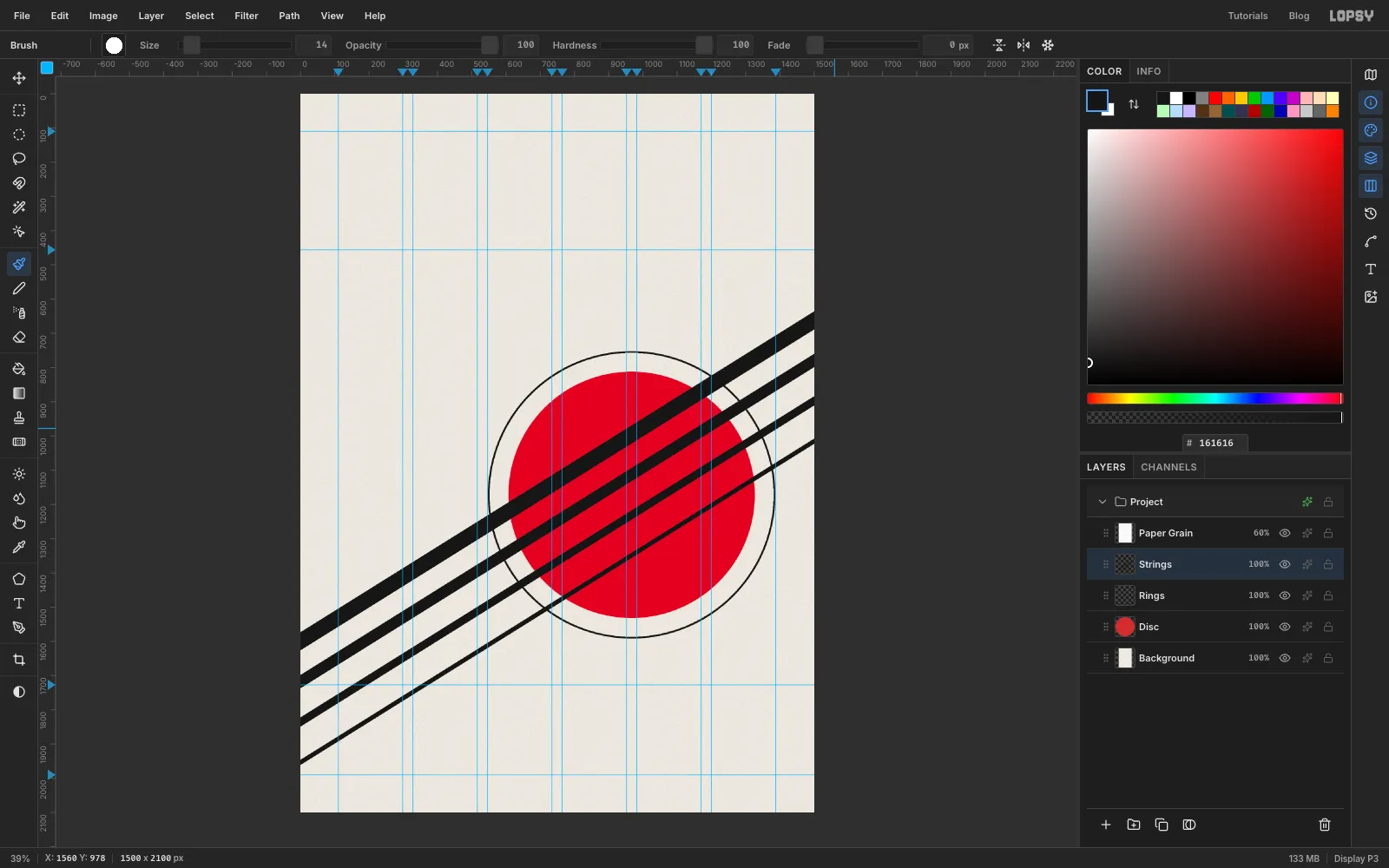
Draw the last two strings the same way, another 118 px lower each time:
- A at size 24, from about y 1835 on the left to 898 on the right
- E at size 14, from about y 1953 on the left to 1016 on the right
The spacing stays the same and only the thickness changes. That's the rhythm that makes them read as strings.
-
Punch the strings through the disc
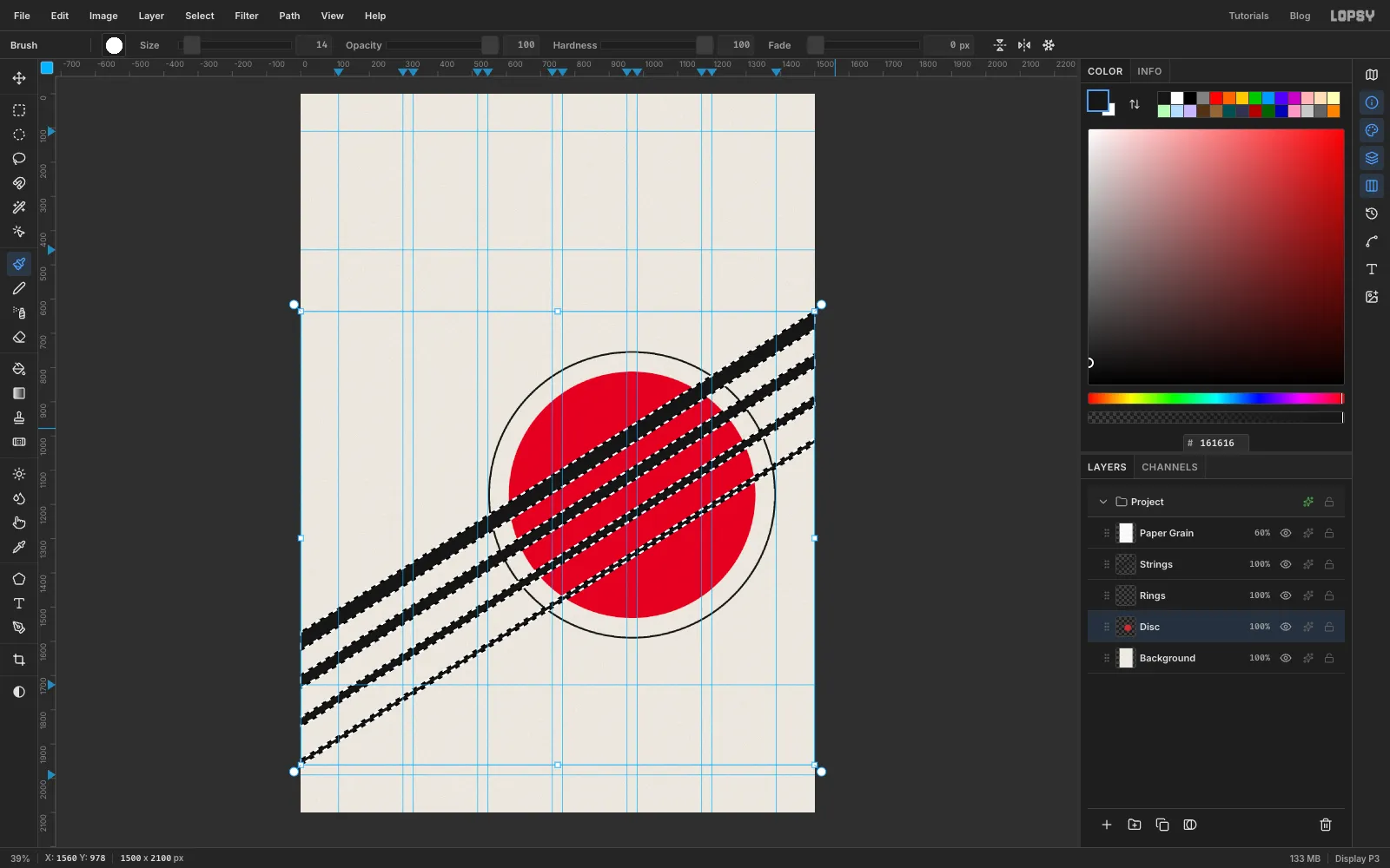
The strings should not cover the red. They should be holes in it, so the paper shows through.
- Hold Cmd and click the Strings layer's thumbnail. That loads the four strings as a selection.
- Click the Disc layer to make it active. The selection stays.
- Press Delete, then Cmd+D.
The disc now has four gaps cut along the strings.
-
Clear the strings inside the disc
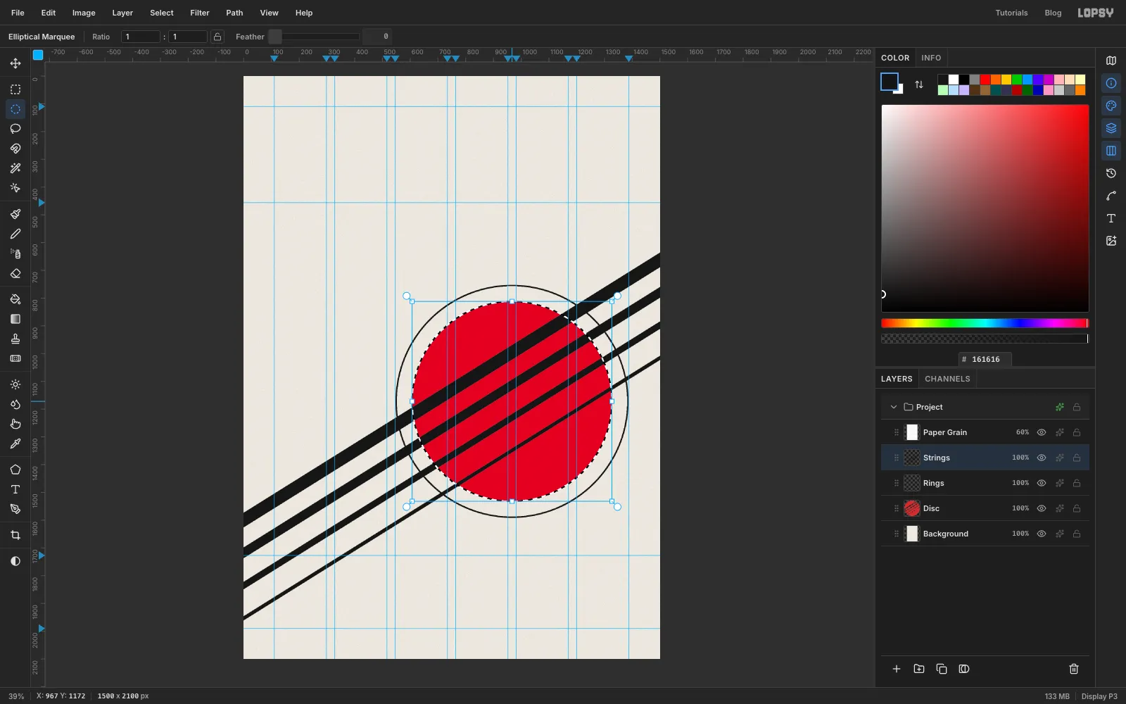
The black strings still run across the gaps. Select the Strings layer, click once with the Elliptical Marquee and enter the disc's corners again: From 607, 812 and To 1327, 1532. Press Delete and Cmd+D.
Inside the disc you now see paper where each string passes. Because the Paper Grain layer sits on top, the gaps have exactly the same texture as the rest of the card, so they read as holes, not as cream paint.
-
Add two echo lines to the E string
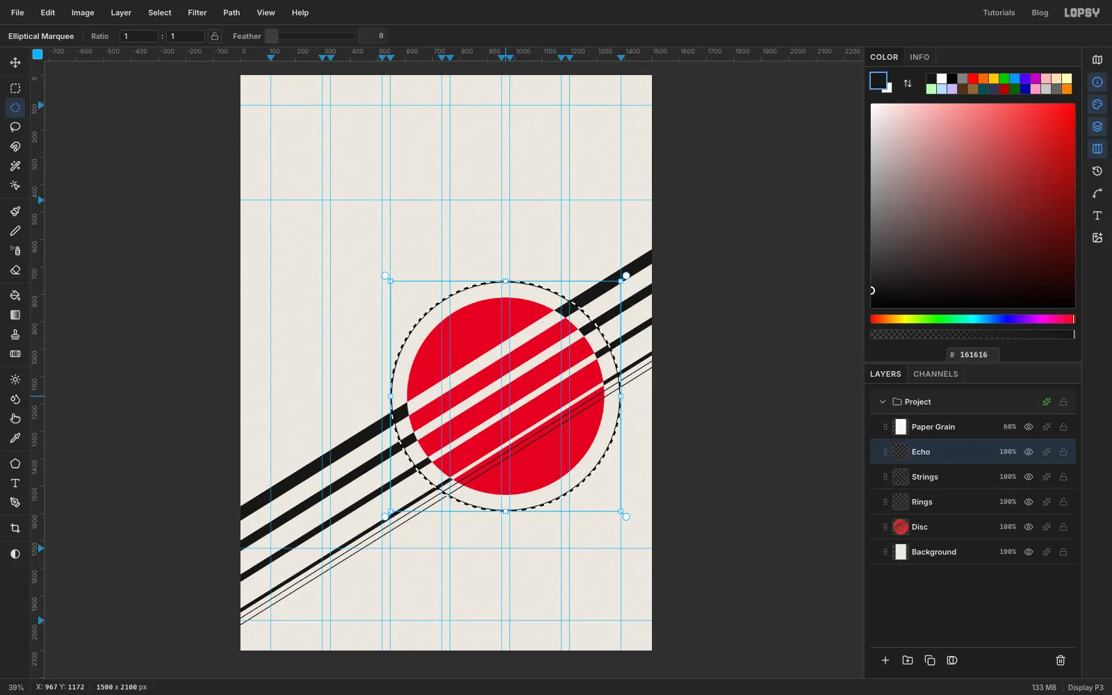
Add a layer called Echo. Set the Brush to size 4 and draw two hairlines parallel to the E string, using the same Shift-click method. Start the first one 28 px below where the E string meets each edge, and the second one 52 px below. That leaves a little more paper between the hairlines than the E string is thick.
The echoes should stop where they meet the ring, not cross it. Click once with the Elliptical Marquee, enter the ring's outer circle (From 547, 752 and To 1387, 1592), press Delete and deselect.
-
Merge the echoes into the strings
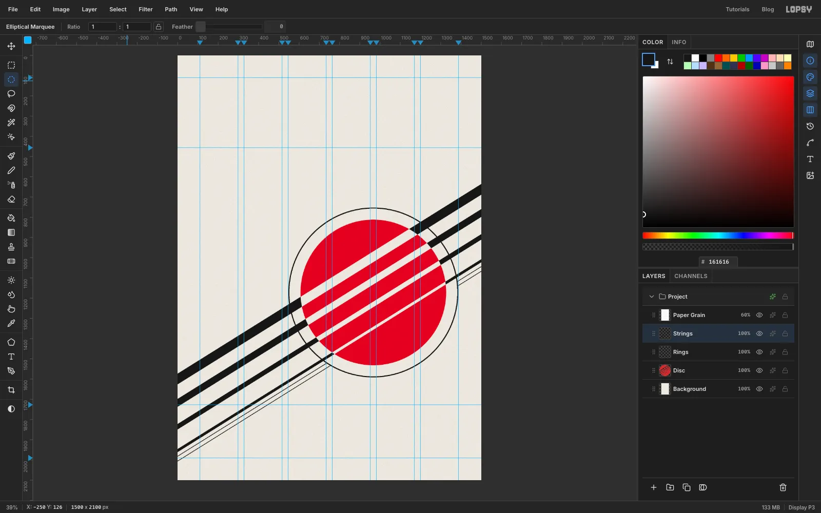
With Echo active, choose Layer → Merge Down. The hairlines join the strings on a single layer. If the merged layer's name isn't Strings, rename it.
Each hairline now meets the ring in a clean T-junction. There are no small slivers left between the ring and the disc.
-
Type the catalogue line
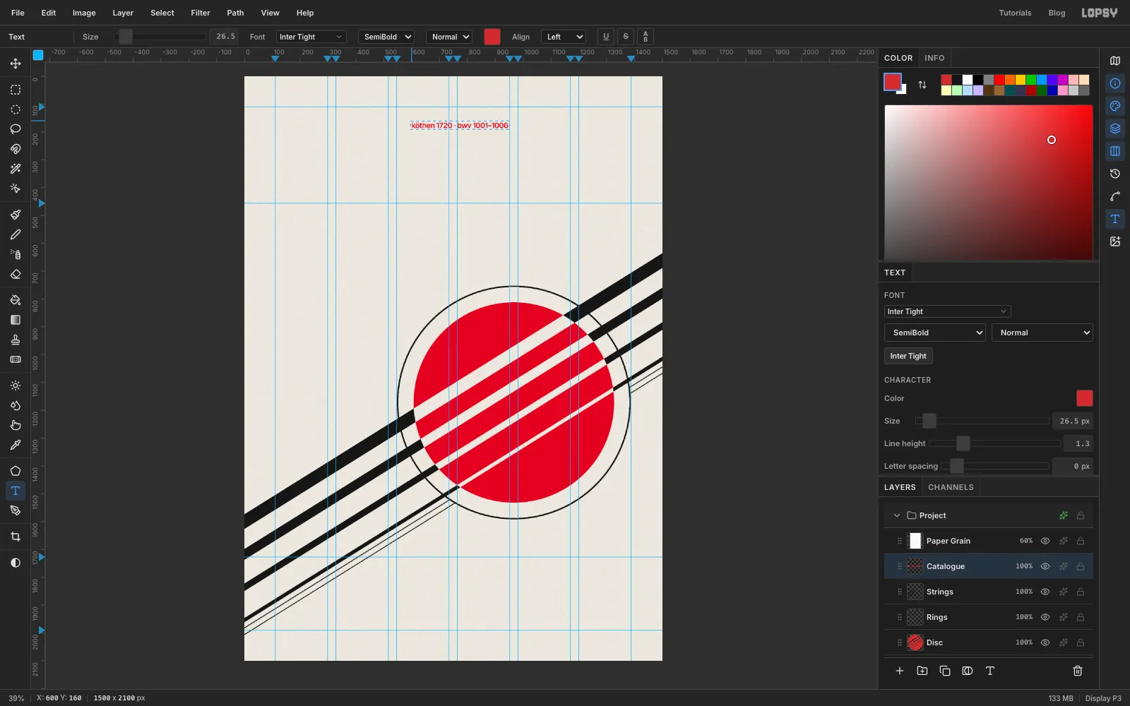
Select Strings so the new text lands above it. Choose the Text tool, then set the font to Inter Tight and the weight to SemiBold (600), at size 28. Set the foreground to red.
Click in an empty part of the top of the card and type
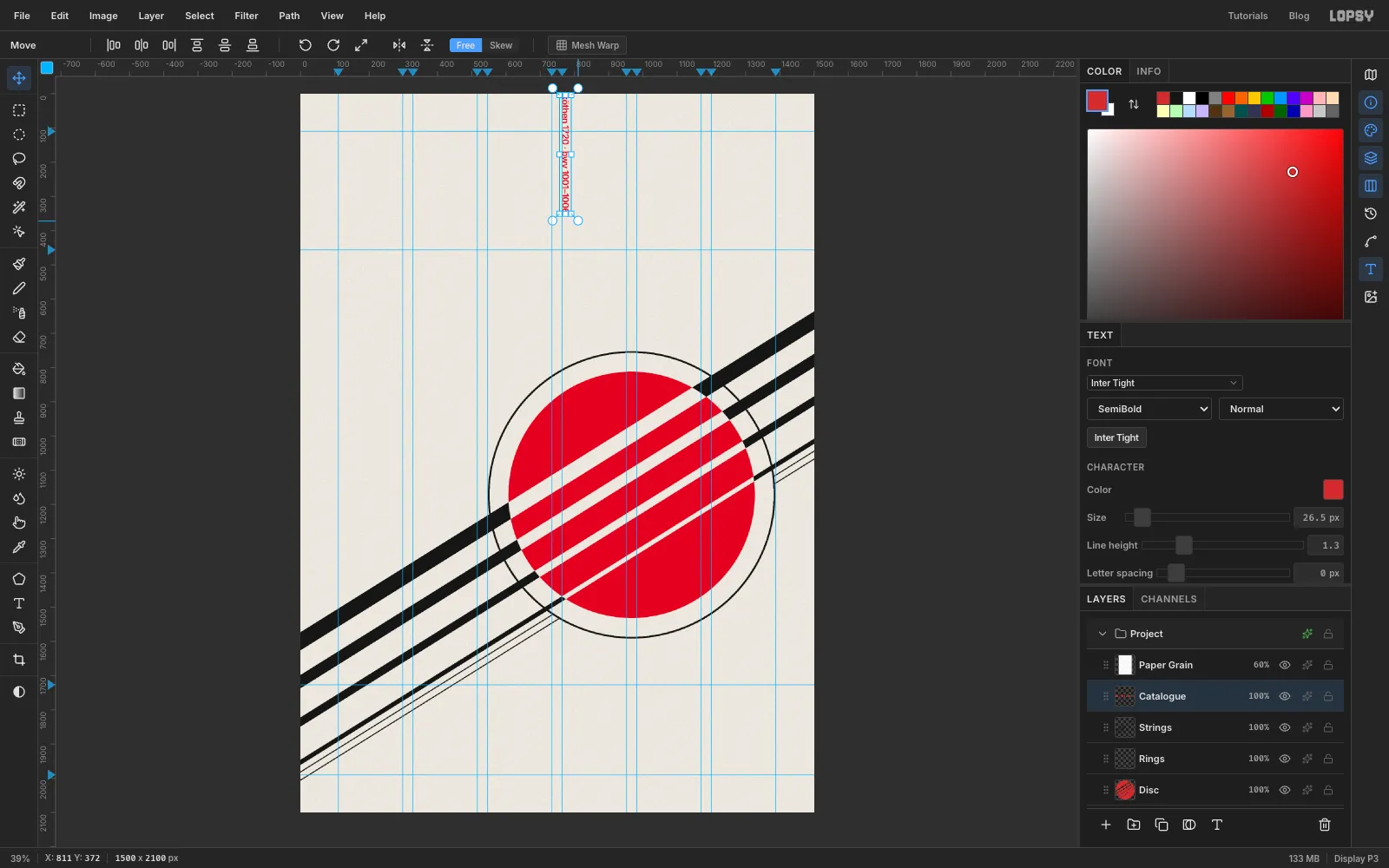
köthen 1720 · bwv 1001–1006. Click the ✓ Commit text button, then double-click the layer's name and rename it Catalogue.This line will run down the right margin, from the top margin guide (110) to the title guide (456). Adjust the Size in the Text panel until the line is that long. At 26.5 it spans 346 px, the gap between the two guides.
-
Rotate the line a quarter turn
Switch to the Move tool. A live text layer shows transform handles without needing a selection. Hold Cmd and drag the round rotation handle at the top-right corner clockwise. Holding Cmd snaps to 15° steps, so stop at 90°.
The text stays live: you can still edit it with the Text tool, and it stays sharp.
-
Place the line on the right margin
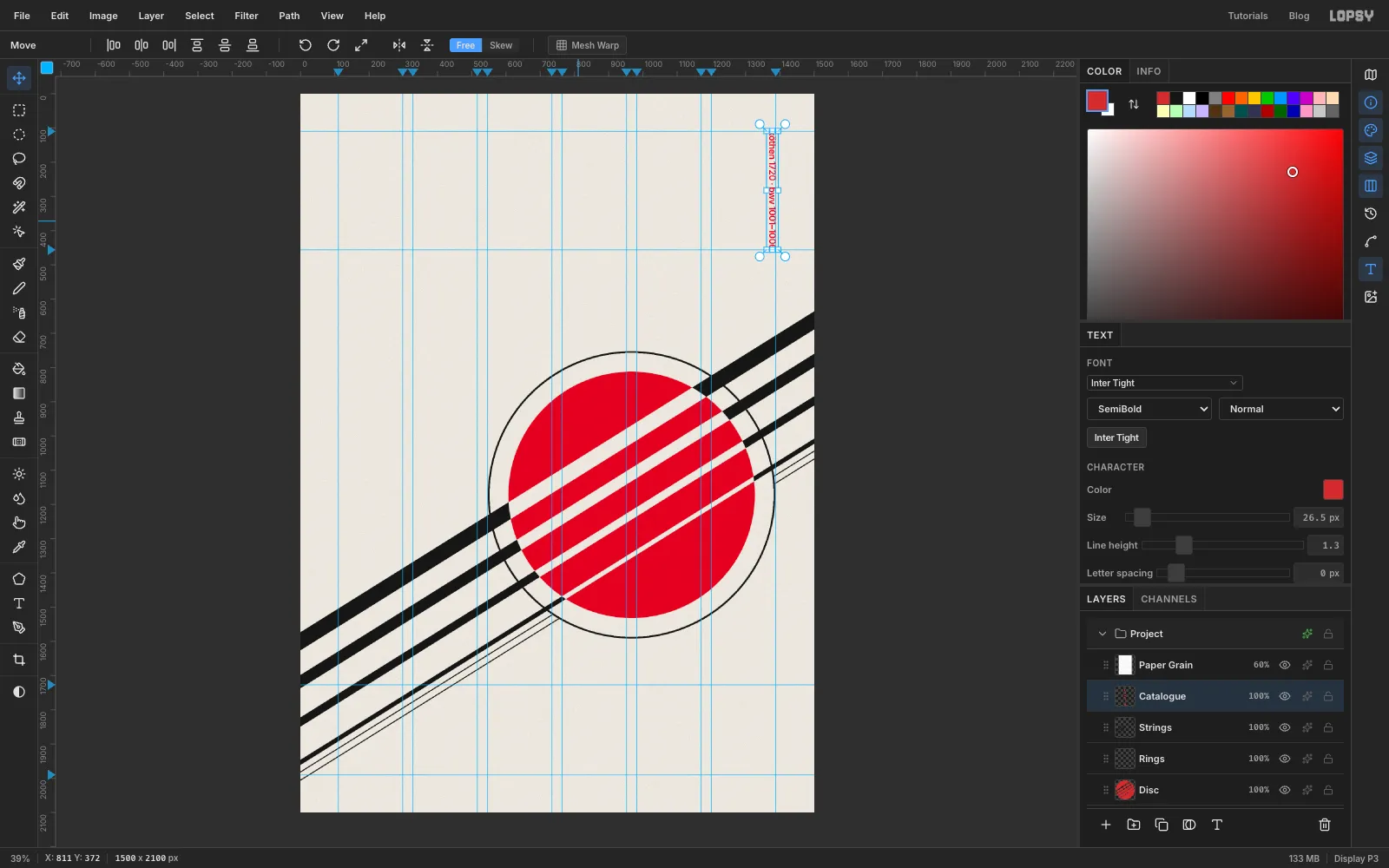
Drag the line to the top-right corner of the grid. Then zoom in and nudge it with the arrow keys (Shift+arrow moves 10 px) until:
- its right edge touches the 1388 guide
- its first letter touches the 110 guide
The last character should end right on the 456 guide, which is where the title will sit.
-
Draw the rule and the RSVP box
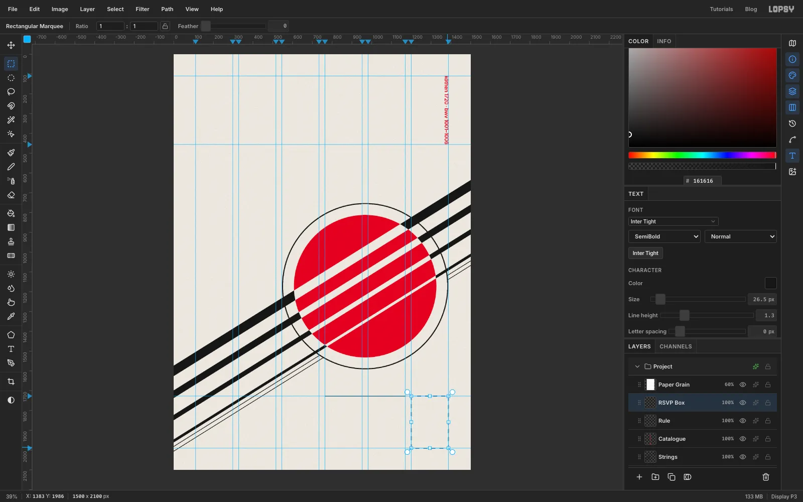
Add a layer called Rule. Set the foreground back to , choose the Pencil, set Size to 3, click on the 1727 guide at the left edge of column 4 (x 764), then Shift-click at the right edge of column 5 (x 1170).
Add a layer called RSVP Box. Choose the Rectangular Marquee and drag from just inside the top-left corner of column 6 (at the 1727 guide) to just inside the bottom margin at the right margin. With View → Snap to Guides on, both corners snap onto the guides. Fill the box with red and deselect.
The box shares its top with the rule and its bottom with the bottom margin.
-
Set the info columns on a baseline grid
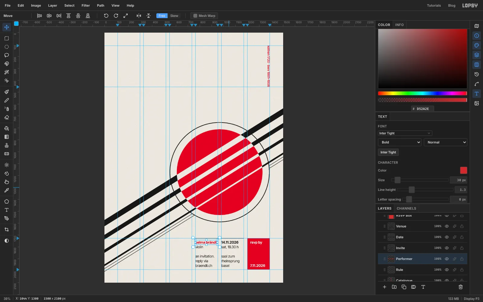
All the small type is Inter Tight 30 px with a Line height of 1.3 (set it in the Text panel), which gives a 39 px baseline grid. Drop two temporary guides on the left ruler at 1771 and 1966. These are the first and last baselines of the info block, five lines apart. Drag them back onto the ruler when you're done.
Each column is two text layers: a bold first line, and a Regular block underneath. Click well away from existing text each time, because a click inside an existing text layer edits that layer instead of starting a new one. Rename each layer as you go, so the Layers panel stays readable.
- The box. Select RSVP Box first, so these sit above it. Use Bold in :
rsvp by(layer RSVP), sitting on the 1771 guide7.11.2026(layer RSVP Date), sitting on the 1966 guide- Column 5. Select Rule first, and set the foreground to :
14.11.2026in Bold (layer Date), sitting on the 1771 guide- in Regular (layer Venue):
sat, 19.30 h, an empty line, thensaal zum/rheinsprung/basel. Its last line sits on the 1966 guide. - Column 4:
- in Regular, black (layer Invite):
violin, an empty line, thenan invitation./reply via/braendli.ch. Its last line sits on the 1966 guide. selma brändliin Bold, red (layer Performer), sitting on the 1771 guide
Drag each block into place with the Move tool, then zoom in and finish with the arrow keys. Column 4 starts on the 764 guide and column 5 on the 982 guide. The box text starts 24 px inside the box, at x 1224.
-
Type the title, subtitle and programme
Select the Rule layer and set the foreground to . Then make four more text layers in Inter Tight, all with a Line height of 1.3, and name them as shown in bold:
- Programme, in Regular 30 px:
the programme, then the six works, one per line:sonata no. 1 in g minor,partita no. 1 in b minor,sonata no. 2 in a minor,partita no. 2 in d minor,sonata no. 3 in c major,partita no. 3 in e major - Subtitle 2:
for violin soloin Regular 62 px - Subtitle 1:
sonatas and partitasin Bold 62 px - Title:
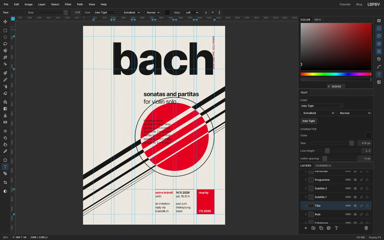
bachin ExtraBold 470 px, with Letter spacing set to −4 in the Text panel for now. You'll fine-tune it in the next step.
- Programme, in Regular 30 px:
-
Line the type up and colour the heading
Move each block with the Move tool, then zoom in and finish with the arrow keys:
- Title: put the left edge of the b on the 110 column guide, with the top of the b touching the 110 margin guide. At 470 px, the bottom of the letters then lands on the 456 guide. In the Text panel, raise Letter spacing from −4 to −2, so the right stem of the h lands on the 1170 guide at the right edge of column 5.
- Subtitles: drop a temporary guide at 640 and sit
for violin soloon it. Putsonatas and partitastwo lines (78 px) higher, so its baseline is at 562. - Programme: line the tops of its tallest letters up with the top of the red disc. Its first line then sits on the same 39 px grid as the info block.
To colour just the heading, choose the Text tool and click into the first line of the programme. Click a second time to place the caret, because the first click only starts editing. Press Home, then Shift+End to select that line. Click the colour swatch in the Text options bar, type
D52A2Einto its hex field, and click ✓ to commit. Only "the programme" turns red.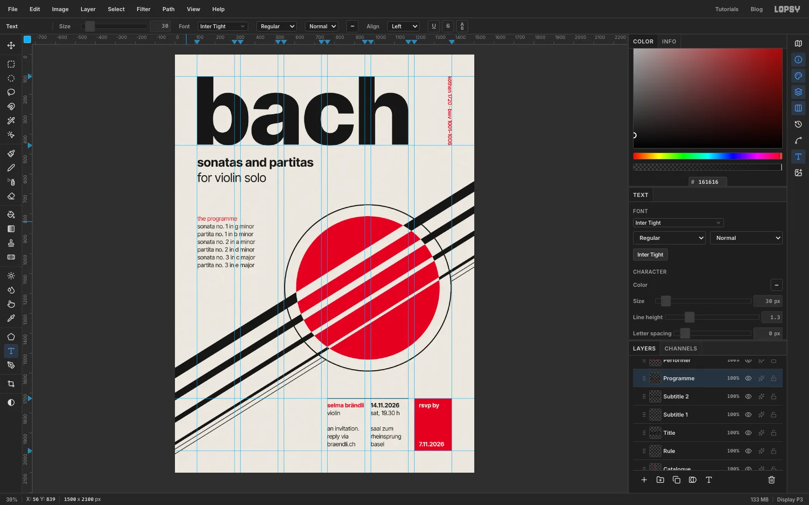
-
Group the layers
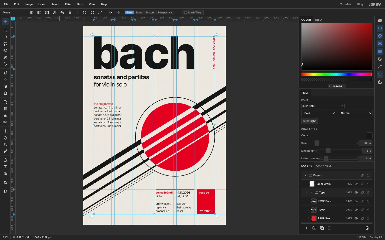
Click the top text layer (RSVP Date) and Shift-click Catalogue. That range also sweeps in Rule and RSVP Box, which belong with the type. Choose Layer → Group Layers and name the group Type. The Move tool's handles now wrap the whole group. Do the same with Strings, Rings and Disc, and name that group Instrument.
Try dragging the whole Instrument group somewhere else with the Move tool, then press Cmd+Z. It goes back exactly where it was, so you can test other placements without risk.
-
Make ink-dropout specks
Real offset printing leaves tiny paper-coloured specks in solid ink. Here's how to make them.
- Select Paper Grain and add a layer called Ink Dropout above it.
- Fill it with black.
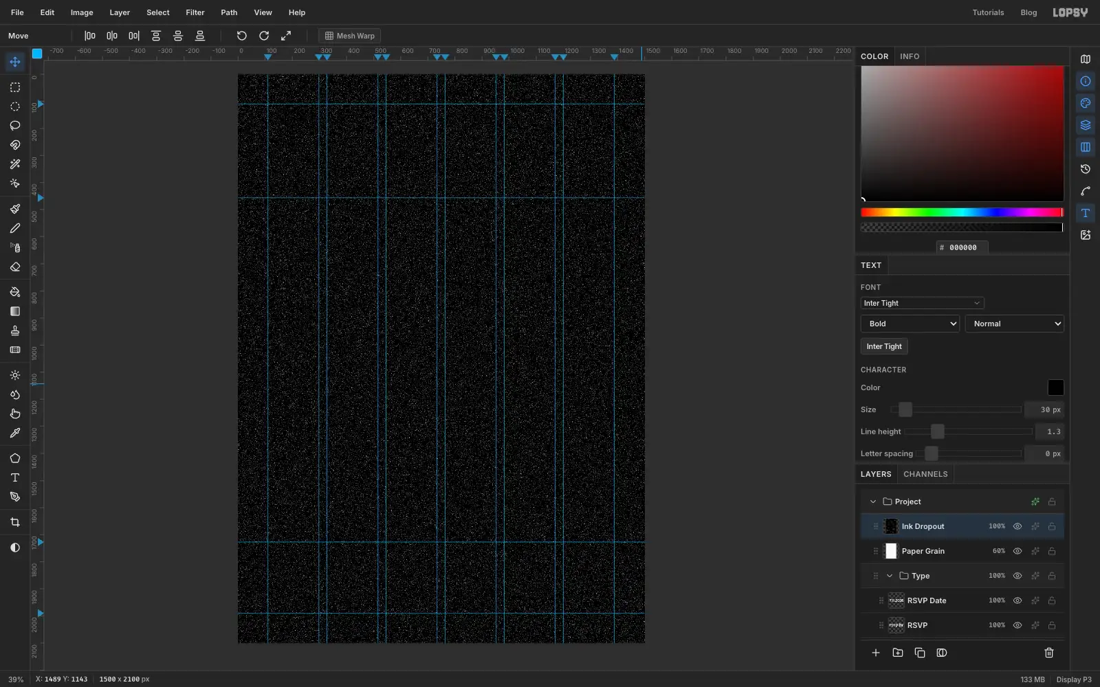
- Run Filter → Add Noise… with Amount 100, Mono and Gaussian.
- Run Filter → Threshold… at 29. About 4% of the pixels turn white, and the rest stay black.
-
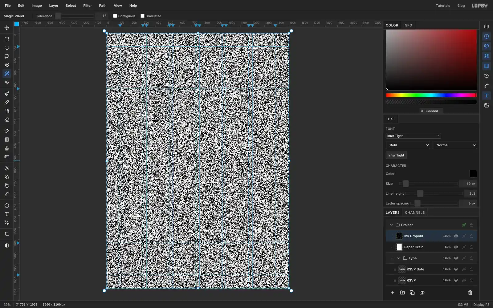
Delete the black
Choose the Magic Wand. Turn Contiguous off and set Tolerance to 10. Click any black pixel: every black pixel in the layer is selected at once. With thousands of marching ants, the layer looks much busier than it is. Press Delete and Cmd+D.
Only the scattered white specks are left on a transparent layer.
-
Tint the specks and finish
Open the Ink Dropout layer's effects and turn on Color Overlay in , the colour of the paper. Lower the layer's opacity to 45%.
Zoom in on the title or the disc: the solid ink now has a light, even speckle, like a printed card. Choose View → Show Guides to hide the guides, then File → Quick Export PNG.