Make a Typewriter ASCII Art Birthday Card
Type a bouquet of Queen Anne's lace from keyboard characters in Lopsy, with stems set on paths, a typed bow and moth, worn ribbon ink and a herbarium label.
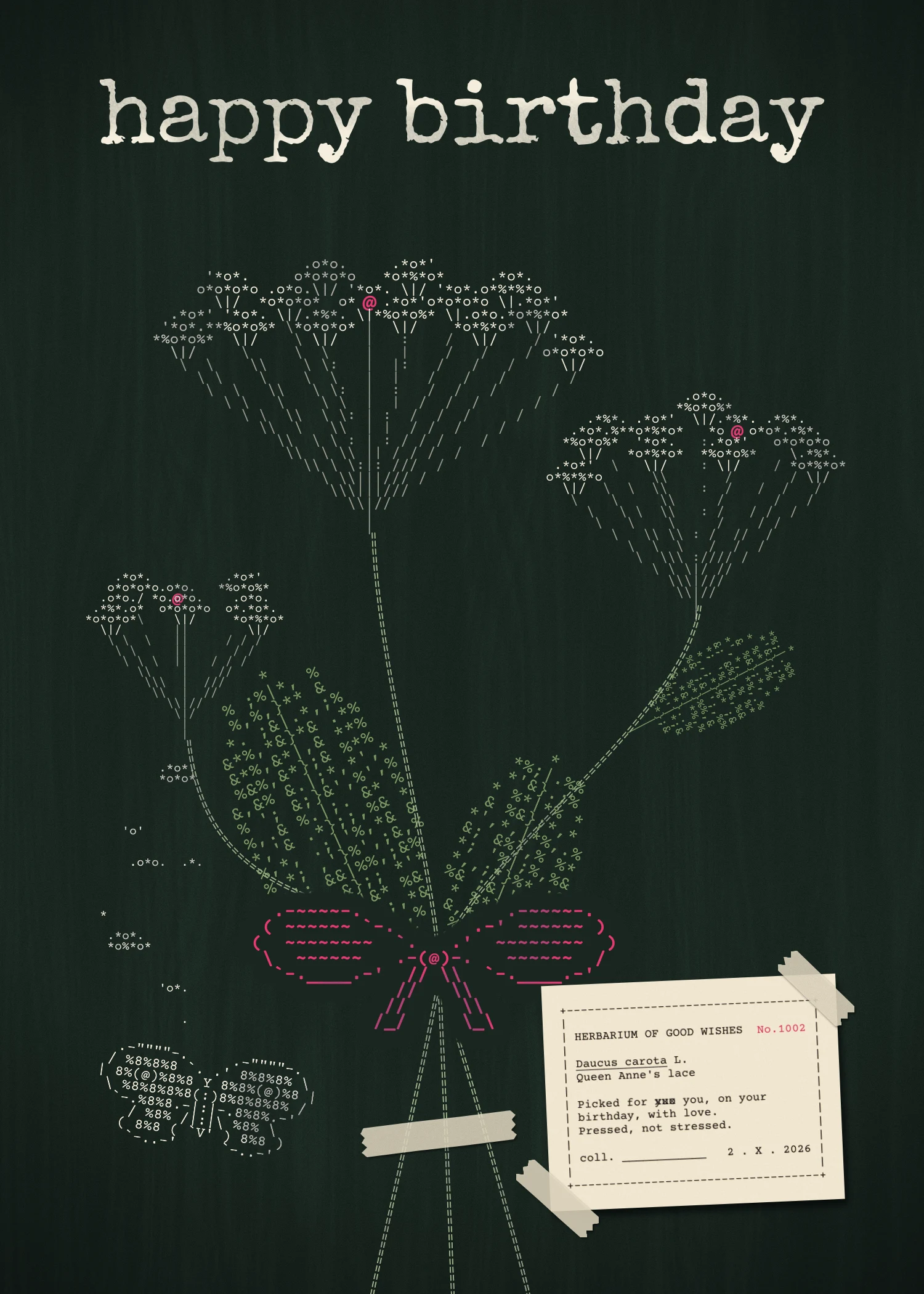
Long before computers, typists made pictures on their typewriters. In 1898 a secretary named Flora Stacey typed a butterfly out of brackets, dashes and slashes, and typewriter art has had a following ever since. Artists turned the paper in the roller to type at an angle, and typed over the same spot twice for darker tones. ASCII art grew out of the same idea.
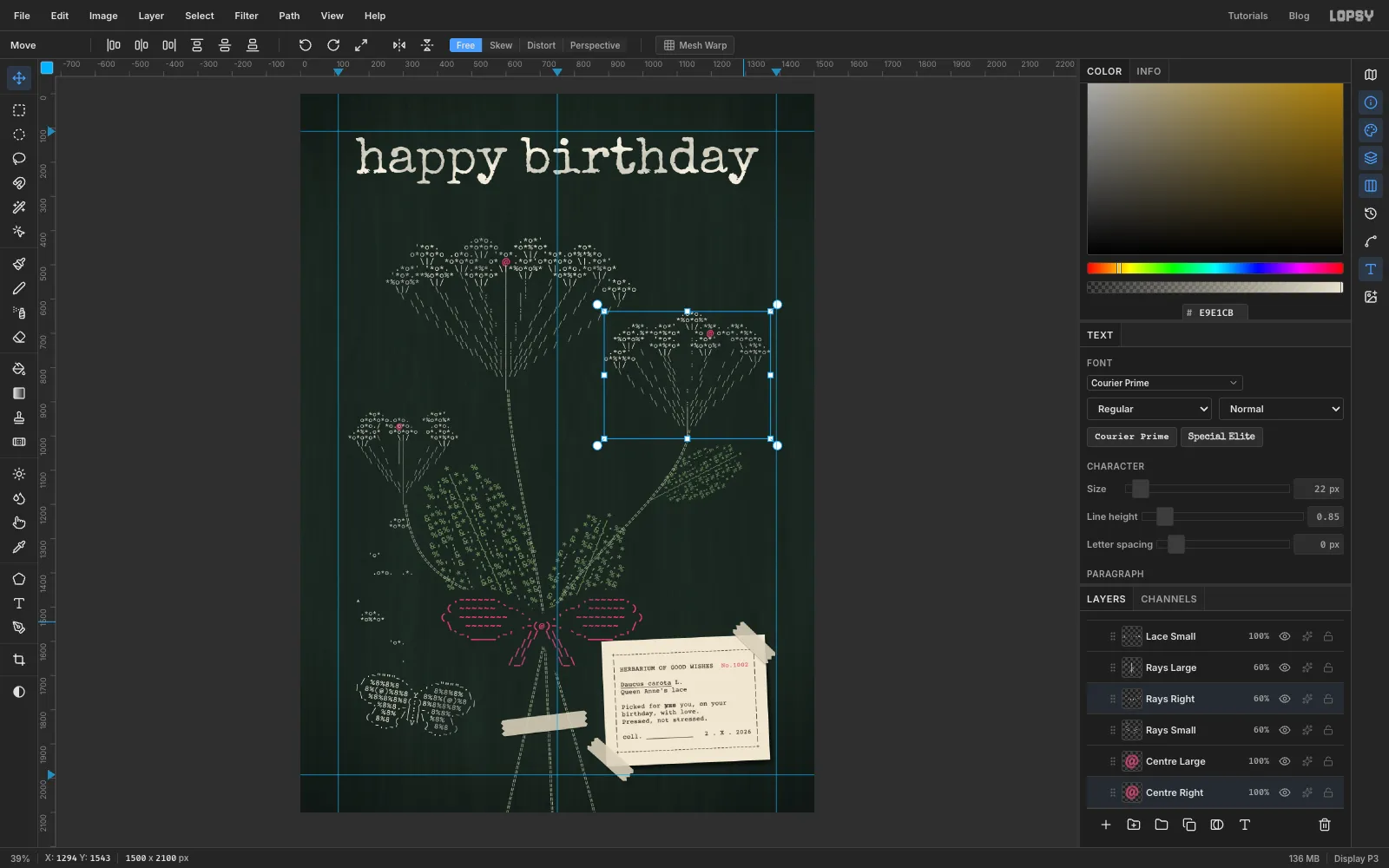
This tutorial uses that idea for a birthday card. It's a bouquet of Queen Anne's lace, the wild carrot with flat, lacy flower heads. Each head is made of dozens of tiny florets in clusters, with a single dark red floret in the very middle. Everything in the picture is typed:
- the lace from
*,oand. - the stems from
= - the leaves from
%and& - a bow, a moth and a botanist's specimen label
The card is 1500 × 2100 px, a 5 × 7 in card at 300 dpi.
You'll type most of it as live text in Courier Prime, a monospaced typewriter font. In a monospaced font every character is the same width, so the rows line up into a grid you can draw on. The tools you'll meet along the way:
- the Text tool with Line height, Align and the Path dropdown, which sets type along a curve
- the Pen tool for the stems
- the Move tool's rotate and scale handles on live text, and on several layers at once
- Filter → Fibers, Clouds, Hue/Saturation, Add Noise and Emboss
- the Darken, Soft Light, Multiply and Overlay blend modes
- a selection made from a layer's thumbnail, with Grow and Feather
- the Brush with the Chalk preset, the Lasso, Drop Shadow and Duplicate Layer
The palette is cream and raspberry on dark green, with a paper label:
-
Card stock
-
Lace and title
-
Stems
-
leaves
-
Raspberry
centre florets and bow
-
red ribbon
-
Label
-
typewriter ink
-
tape
-
Create the card
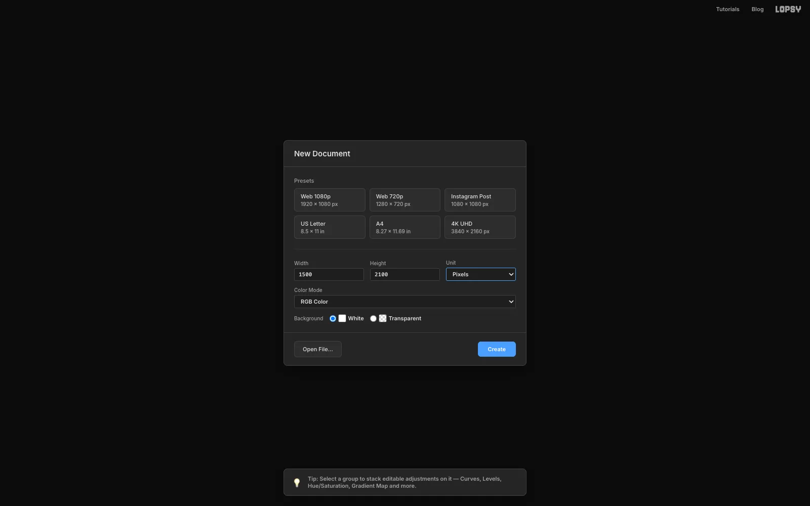
Choose File → New. Set Unit to Pixels, type 1500 for the width and 2100 for the height, keep the White background and click Create.
-
Fill the card stock
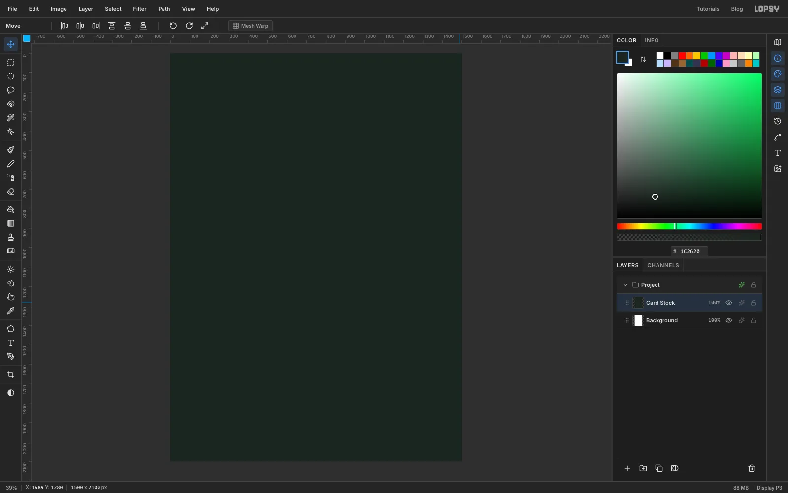
Rename Layer 1 to Card Stock by double-clicking its name. Set the foreground colour to dark green and choose Edit → Fill. With nothing selected, it fills the whole layer.
Real card isn't perfectly flat, so choose Filter → Add Noise…, pick Mono and set Amount to 8.
-
Add paper fibres
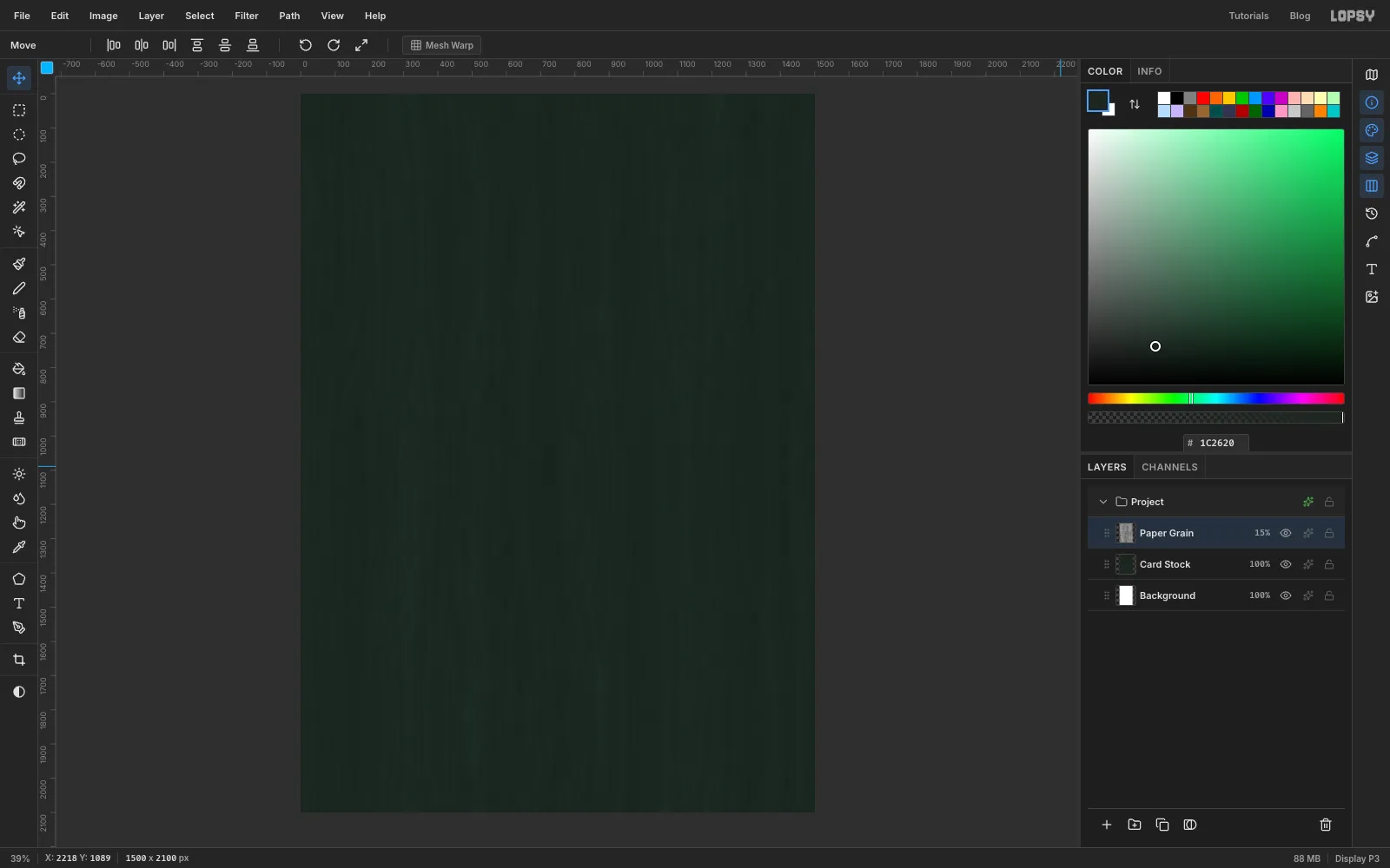
Click Add Layer at the bottom of the Layers panel and name the new layer Paper Grain. Choose Filter → Fibers… and set Variance to 24 and Strength to 10. This fills the layer with long vertical streaks.
Open the layer's effects with the ✦ button and set its blend mode to Soft Light. Then lower the layer's opacity to 15% so the streaks only just show, like pressed fibres in the card.
-
Darken the edges and set guides
Add a layer called Vignette and pick the Gradient tool. Set Type to Radial and click Advanced…. Make three stops, all black:
- transparent at the left end
- transparent again a little past halfway
- solid black at the right end
Drag from the centre of the card out past the bottom-right corner. Set the layer to Multiply at 70%.
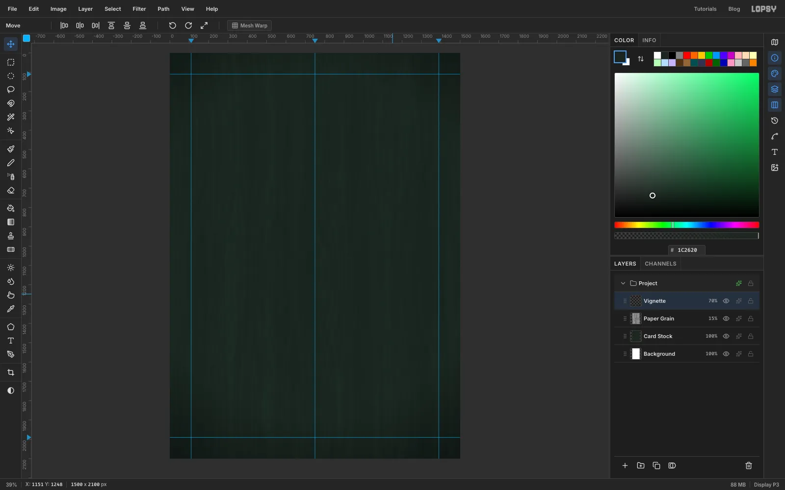
Now add guides. Click the top ruler at 110, 750 and 1390 to make vertical guides, and the left ruler at 110 and 1990 for horizontal ones. That gives you a margin all round and a centre line.
-
Type the title
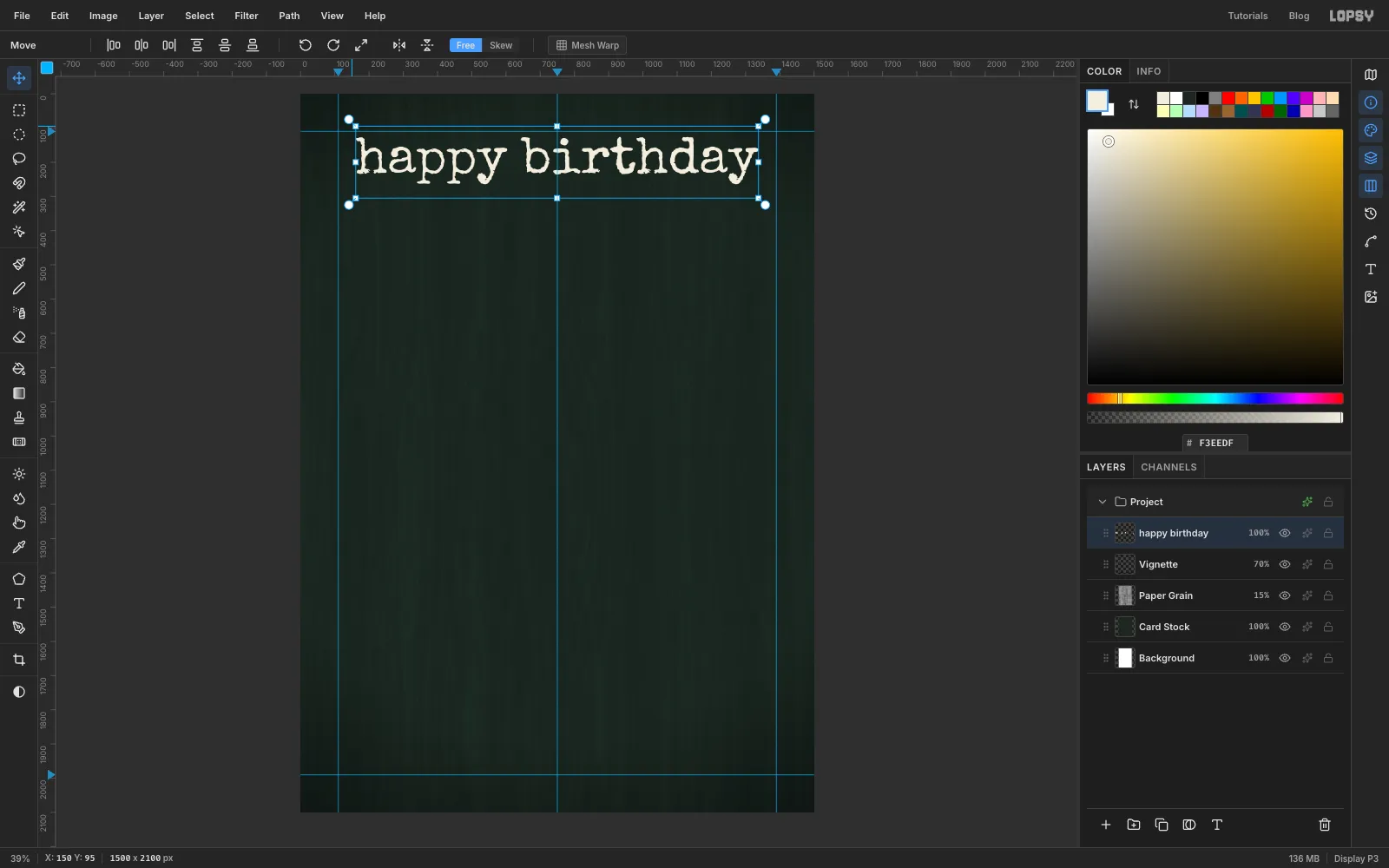
Pick the Text tool. Choose Special Elite in the font browser. It's a typewriter face with chewed, inky edges. Set Size to 150 and the colour to cream . Click near the top-left margin, type happy birthday in lower case and press Tab to commit.
Switch to the Move tool and click Align center horizontally in the options bar. The title should sit between the left and right guides with its top just under the top guide.
-
Type the lace caps
Choose Layer → New Group and name it Bouquet. Click Add Layer to put an empty layer inside it, called Bouquet Anchor. New layers appear just above the active one, so with this layer selected everything you add next lands inside the group.
Pick the Text tool and set it up before you type: Courier Prime, cream , size 24. In the Text panel, set Line height to 0.85 so the rows sit close together.
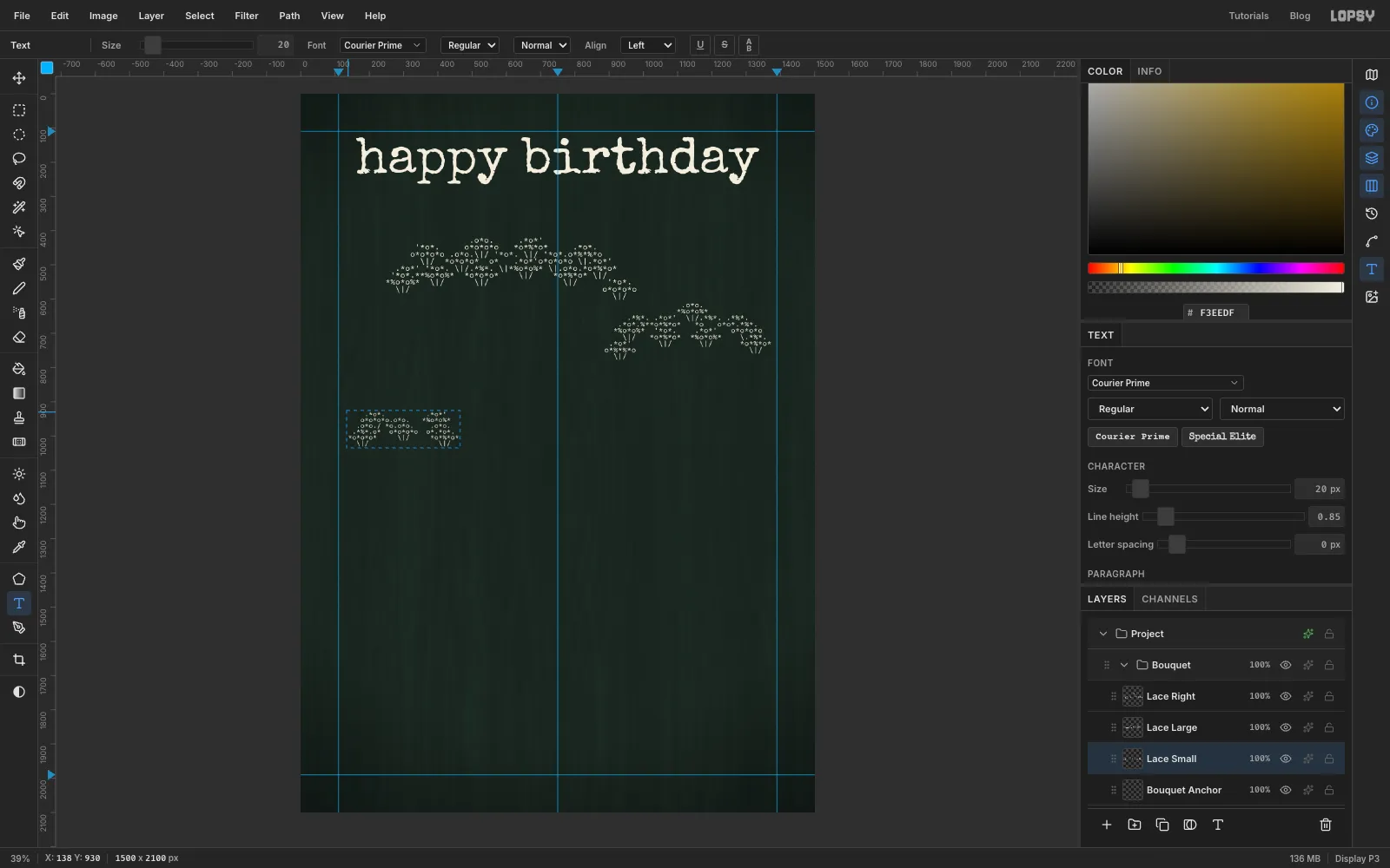
Each flower head is made of small clusters called umbellets. One umbellet is two typed rows with a short stalk under it:
.*o*.*o*%*o*\|/
A whole head is one text block about 50 characters wide and 8 lines tall. Each line runs through several umbellets side by side, with a space or two between them. Stagger them in three rows: the back row two lines higher than the middle row, and the front row lower still, so the cap looks gently domed. In the middle row, leave three empty cells in the centre umbellet for the red floret. For example, two lines from the large head's back and middle rows:
'*o*. o*o*o*o *o*%*o* .*o*.o*o*o*o .o*o.\|/ '*o*. \|/ '*o*.o*%*%*o
Click in the upper middle of the card, type the large head and press Tab. Name the layer Lace Large. Make a medium head at size 22, lower down on the right (Lace Right), and a small one at 20 on the left (Lace Small).
-
Add the rays
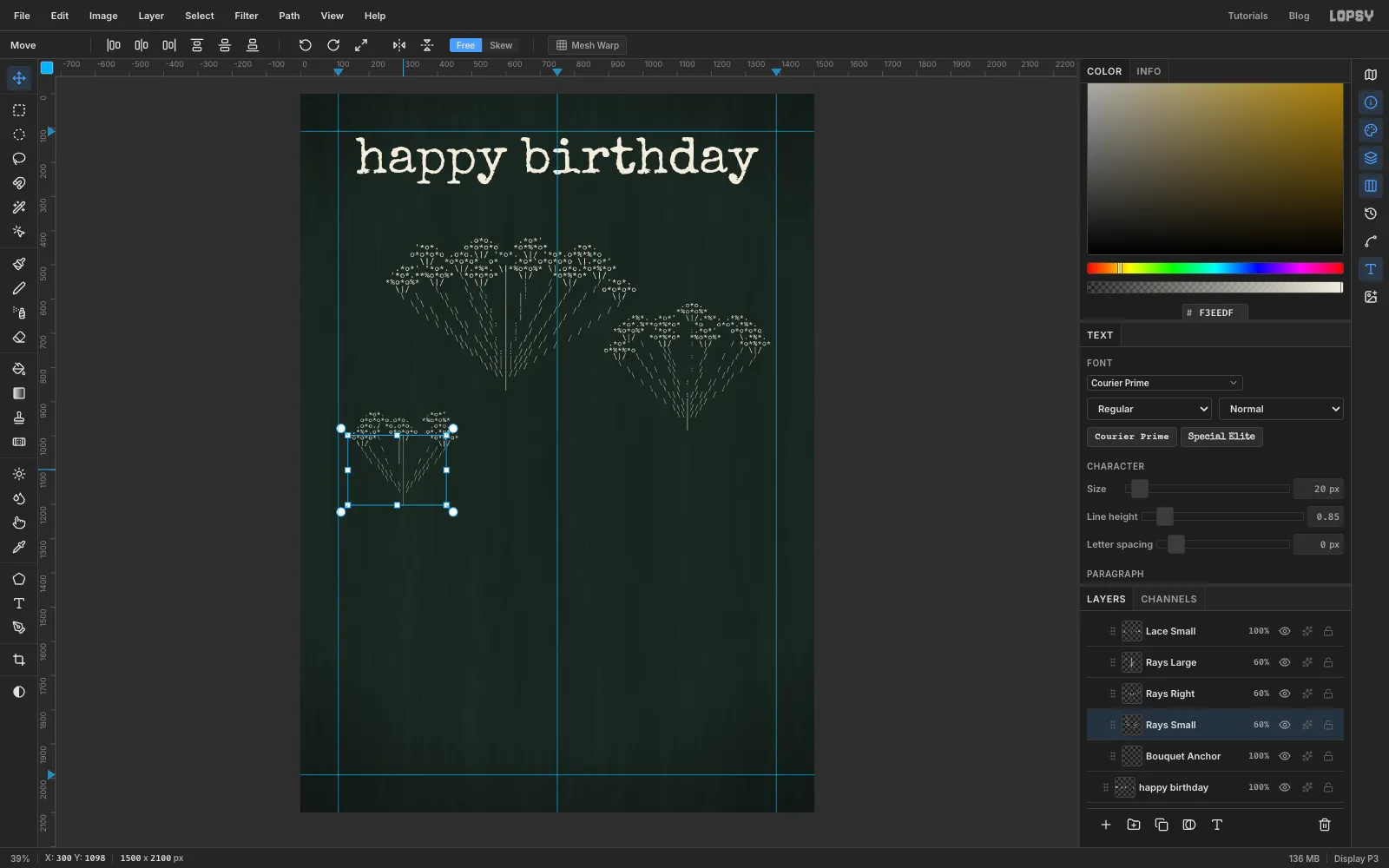
On the real flower, a spray of thin stalks called rays joins every umbellet to the top of the main stem. Type them on a separate layer so you can fade them.
Make a new text layer at the same size and line height as its cap, and name it Rays Large (then Rays Right and Rays Small). Start each ray under an umbellet's stalk and step it one row down and a little sideways each time:
- use
\on the left - use
|in the middle - use
/on the right
All the rays meet at one point about 11 rows below the cap. For the rays behind the cap, type
:on every other row so they read as further away.Line the ray layer up exactly with its cap. Type it in empty space, then use the Move tool and the arrow keys to slide it into place, checking that each ray starts right under a stalk. Set each ray layer to 60% opacity so the lace stays brightest.
- use
-
Drop in the red centre florets
Click empty canvas with the Text tool, then:
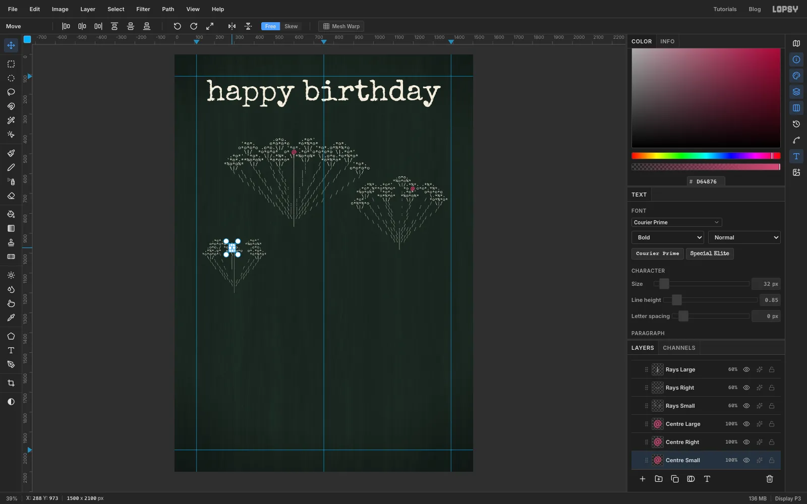
- Set the colour to raspberry , Size to 40 and Courier Prime Bold.
- Type a single
@, commit it and name the layer Centre Large. - Move it into the gap in the middle of the large cap.
Make two more for the other heads at 36 and 32 (Centre Right and Centre Small). They're bigger than the florets around them, so the red reads even at thumbnail size.
-
Draw the stem paths
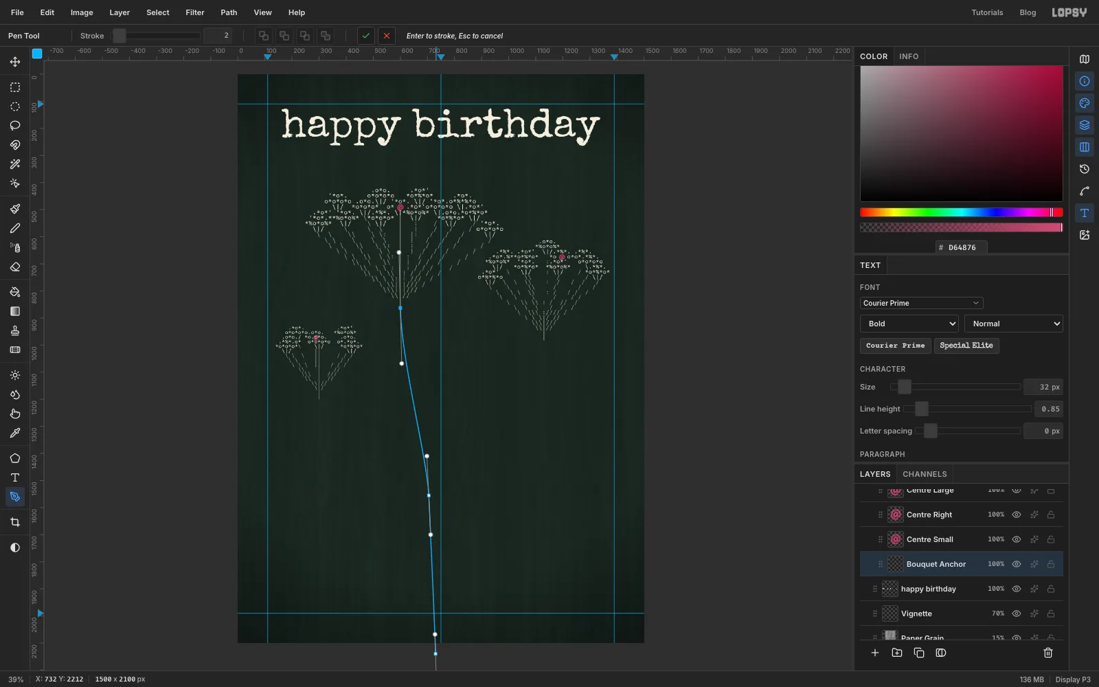
Pick the Pen tool. Each stem is one path with three anchors:
- Press at the point under a flower head and drag downwards to pull out a handle.
- Press at a point on the centre line about three-quarters of the way down, where all three stems will be tied. Drag along the direction the stem should keep going.
- Press a little below the bottom edge of the canvas and drag a short way.
Click the ✓ (Commit path) button in the options bar to keep the path without stroking it.
Draw one path for each flower. Make the stems cross at the tie point, so the right-hand flower's stem ends on the left and the small flower's stem ends on the right. Take the small flower's stem down and around below the spot where the left leaf will go.
-
Set the stems on the paths
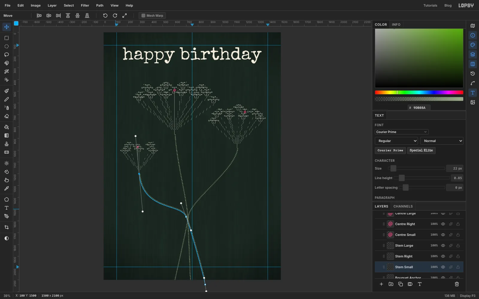
With Bouquet Anchor active, pick the Text tool. Set Courier Prime, regular weight, size 22 and sage green . Click in empty space and type a generous row of
=signs, about 100. Press Tab and name the layer Stem Large.With the new text layer still active, choose Path 1 in the Path dropdown in the options bar. The equals signs jump onto the curve and follow it, which gives a ribbed stem. Repeat for the other two paths (Stem Right and Stem Small). If a row runs out before the end of its path, select the layer and type more equals signs.
-
Turn the leaves like the typist turned the paper
Queen Anne's lace has feathery, finely cut leaves. Each leaf is about 20 lines tall: a central stalk of
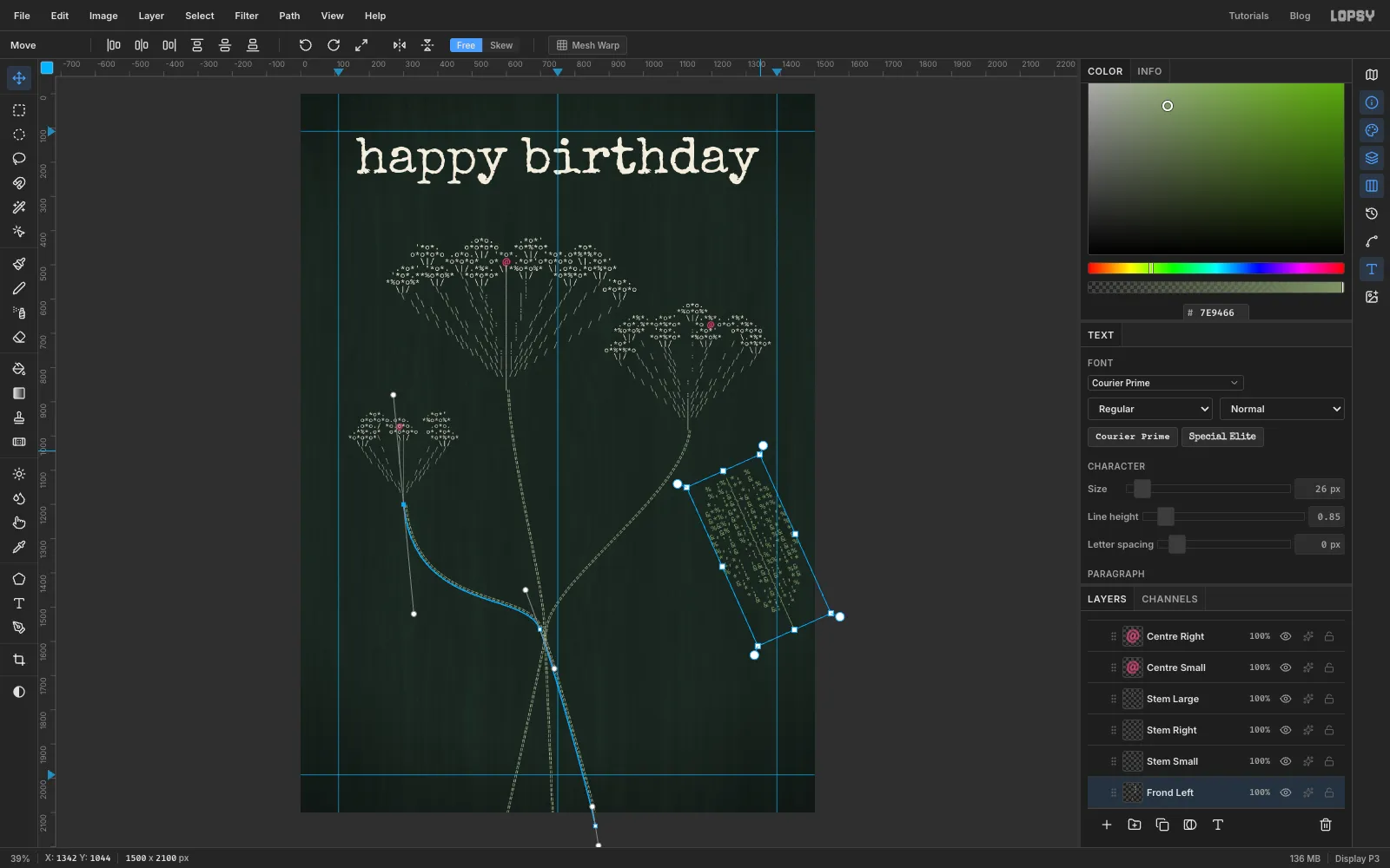
|and}running down the middle, with leaflets of%,&,*and;on both sides. The rows start a character or two wide at the tip, grow to about seven each side in the middle and narrow again, then three lines of plain|make the leaf stalk. A middle row looks like%&*; &%}*&;% *&.Click Bouquet Anchor first so the leaves sit behind the stems. Type the left leaf in olive at size 26, in empty space, and name it Frond Left. Switch to the Move tool. Handles appear around the live text. Drag just outside a corner to rotate it about 24° anticlockwise, so its tip leans towards the top-left. Typists turned the paper in the same way to type at an angle.
-
Scale and place the leaves
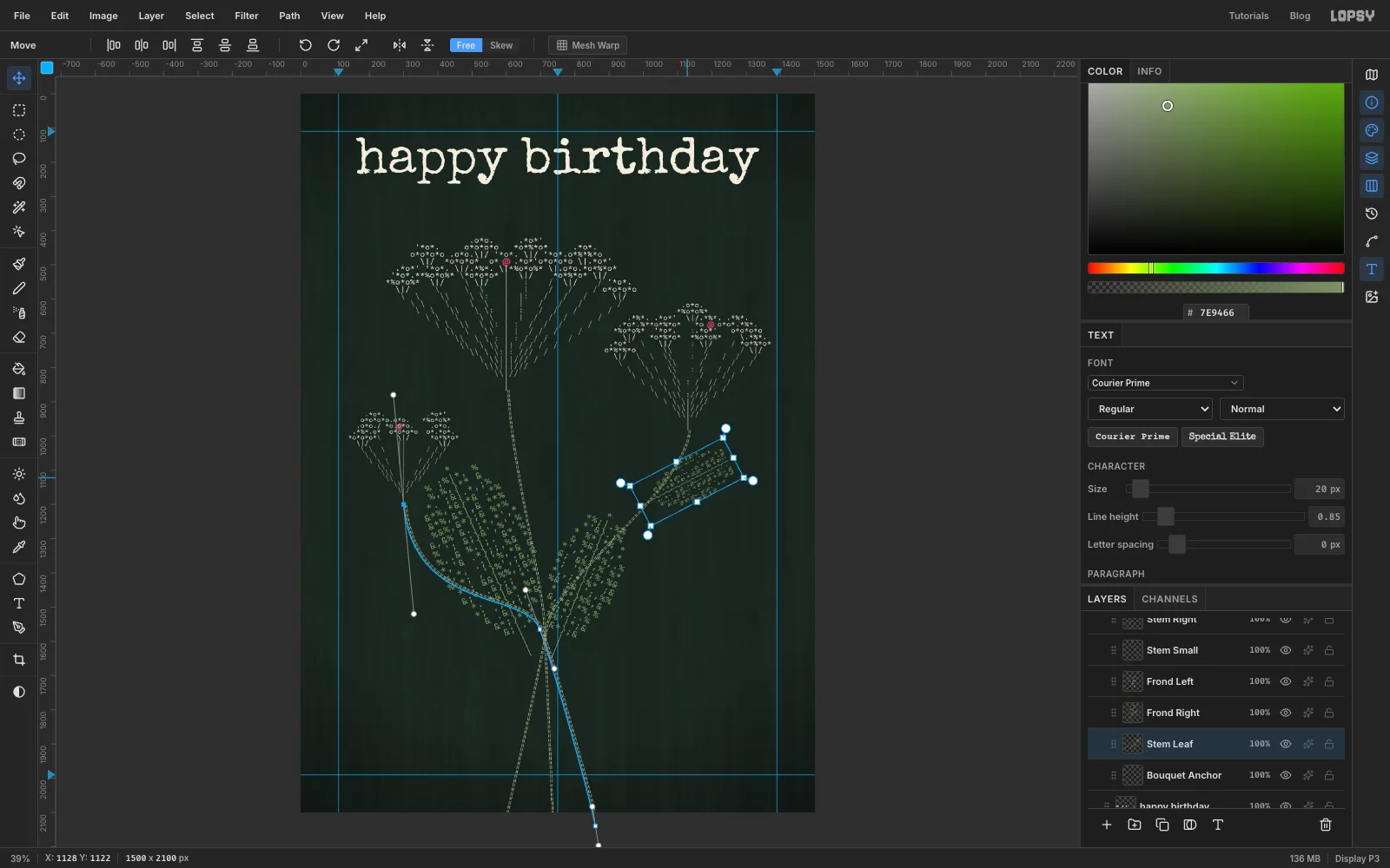
Hold Cmd and drag the leaf's top corner outward to scale it up by about a fifth without stretching it. Then drag it so its stalk ends at the tie point and it fans up and to the left behind the stems.
Make a second, shorter leaf at size 24 (Frond Right). Rotate it about 22° clockwise and scale it to match. Then a third at size 20 (Stem Leaf), rotated about 62° clockwise and placed so its stalk meets the edge of the right-hand stem. It fills the empty space on that side.
-
Type the bow
The bow goes on top of everything else in the bouquet. Click the top layer in the Bouquet group and add a layer called Bow Knockout. You'll use it in the next step.
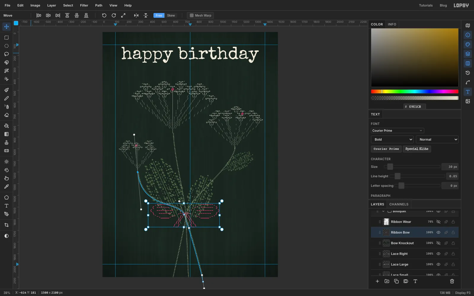
Type the bow in Courier Prime Bold, size 30, raspberry , and name it Ribbon Bow. It's eight lines and about 35 characters wide:
- two loops drawn with
( ) - . ' _and filled with rows of~. Make the right loop an exact mirror of the left, so both reach the same distance from the knot - a knot of
(@)in the middle - double tails of
//and\\with/_/and\_\notched ends
Move it so the knot sits exactly on the tie point. The project file has the full bow if you'd rather copy it.
- two loops drawn with
-
Knock the leaves out behind the bow
The leaves and stems show through the bow's loops. To hide them, give it a patch of card colour behind it.
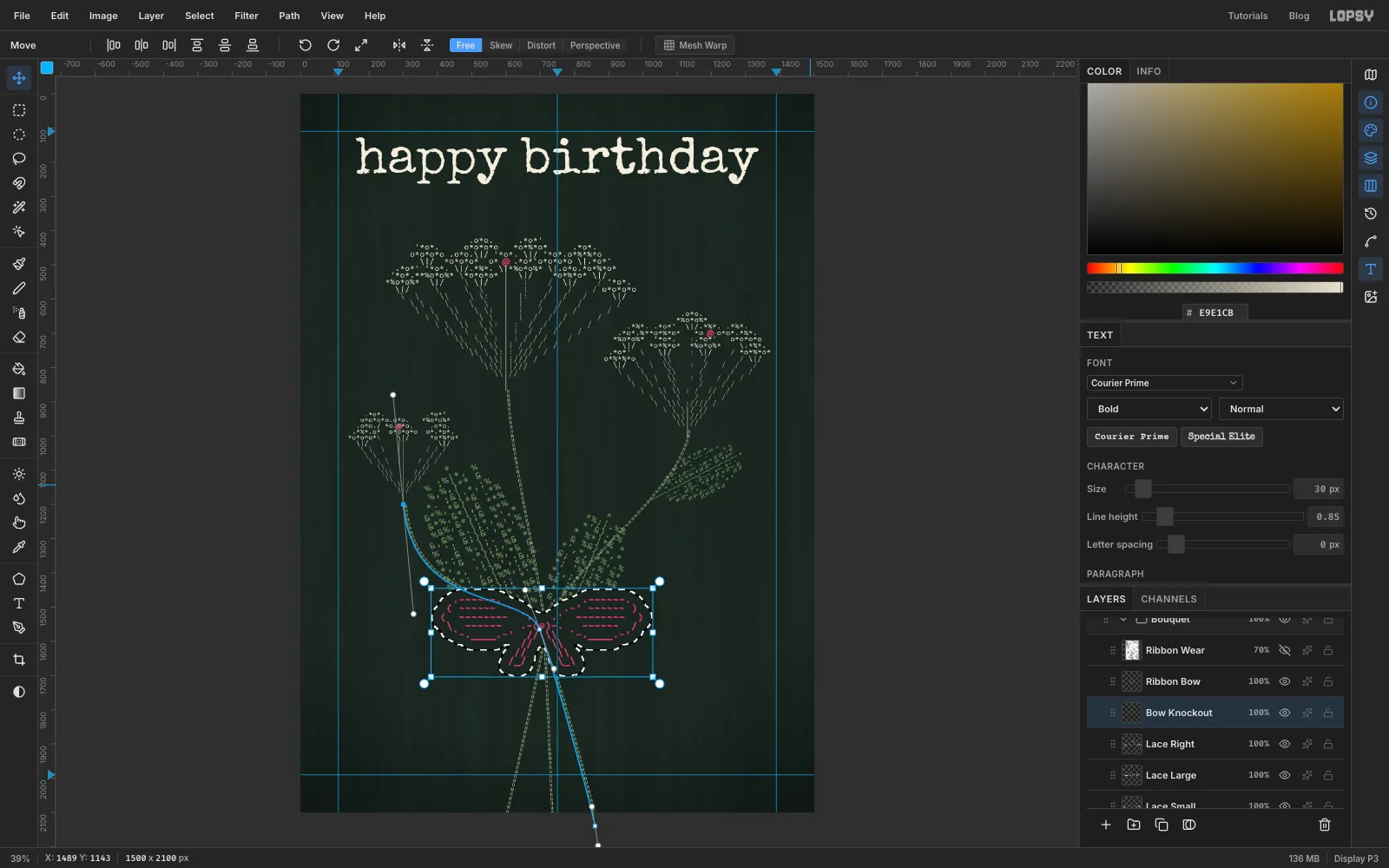
Cmd-click the bow's thumbnail in the Layers panel to load its letters as a selection. Choose Select → Grow… and grow it by 28 px, then Select → Feather… by 3 px.
-
Fill the knockout
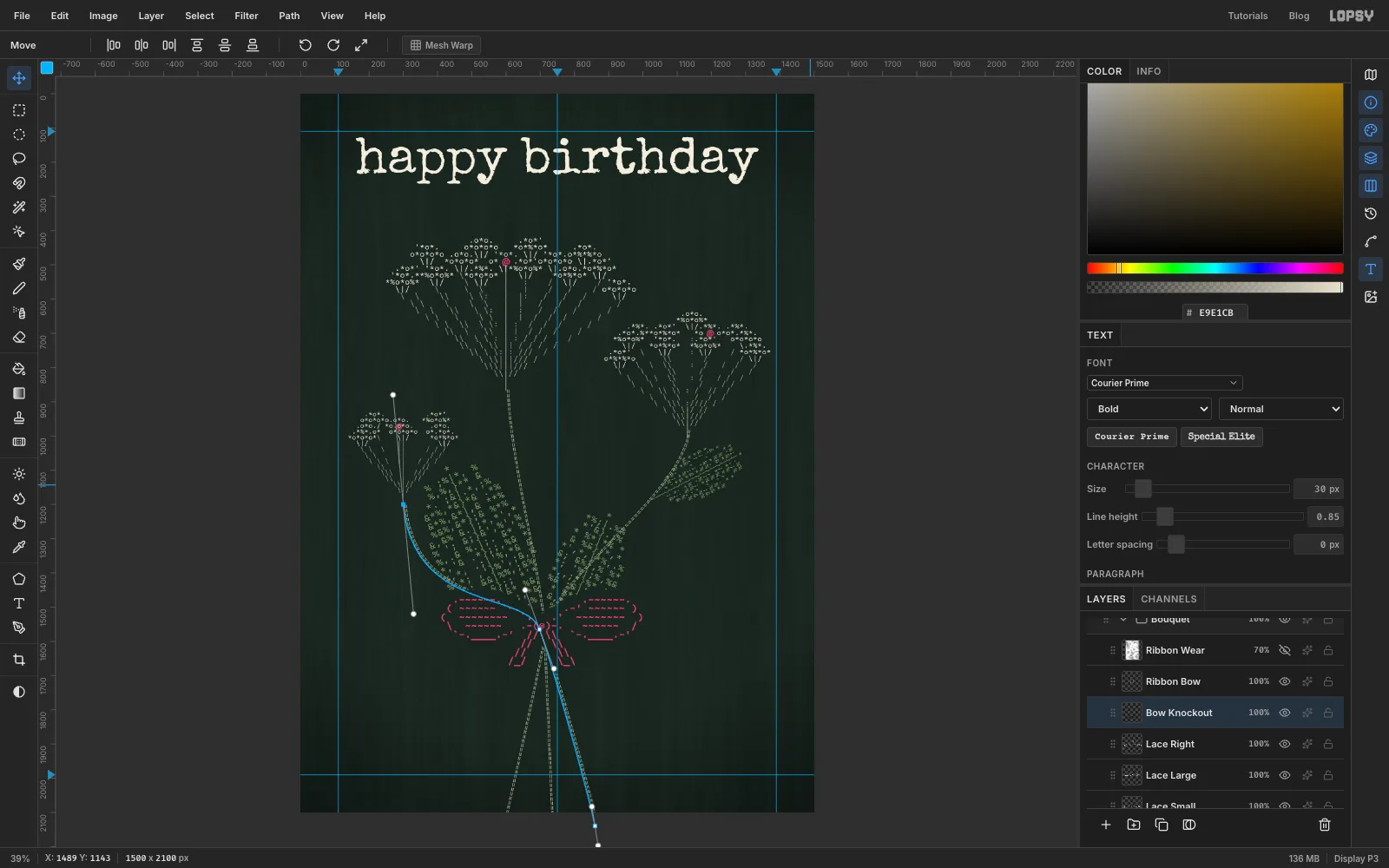
Click Bow Knockout, set the foreground colour to card green and choose Edit → Fill. Press Cmd+D to deselect.
-
Type the moth
In honour of Flora Stacey's butterfly, add a moth. Type it in cream, size 24, regular weight, about 24 characters wide and 8 lines tall, and name it Moth. Don't just outline the wings: fill them with
%and8so they look solid. Give each wing an eyespot(@)and the body a column of|:|under aYfor the antennae.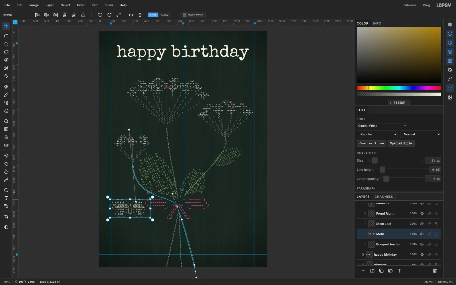
-
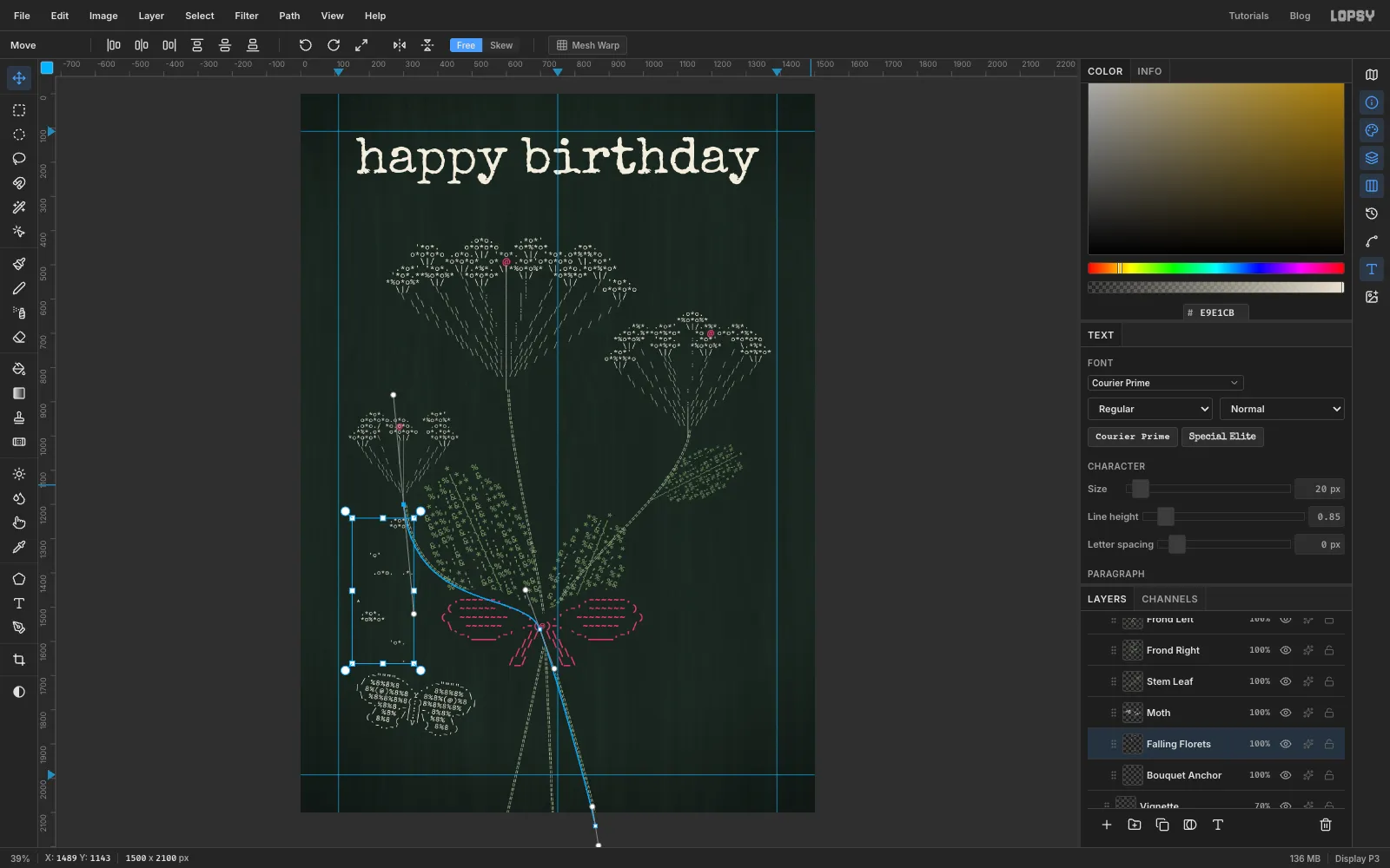
Fly the moth towards the florets
With the Move tool, rotate the moth about 8° clockwise so it heads up and to the right. Then drag it into the empty lower-left corner, the same distance from the left edge as the title.
Some florets are drifting down from the small flower towards the moth. Type them as one text block, Falling Florets, with blank lines between the clusters.
Vary them so they don't look like a list:
- a two-row cluster (
.*o*.over*o*o*) - a single
'o' - a pair side by side
- a lone
*
Indent each cluster so they swing out to the left and curve back in to just above the moth's head.
- a two-row cluster (
-
Wear the ribbon
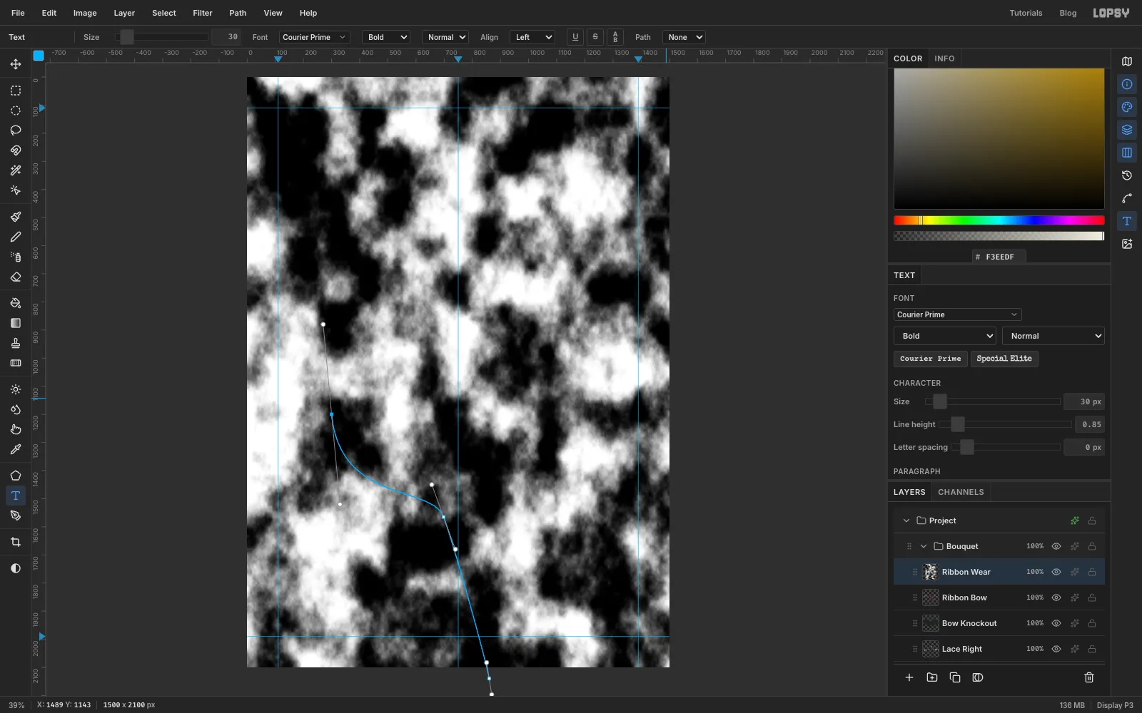
A typewriter ribbon never inks evenly, so some letters print fainter. At the top of the Bouquet group, add a layer called Ribbon Wear:
- Choose Filter → Clouds… with Scale at 14.
- Choose Filter → Hue/Saturation… and raise Lightness to 55. The clouds now run from mid grey to white.
- Choose Filter → Add Noise…, Mono, 30, for speckle.
-
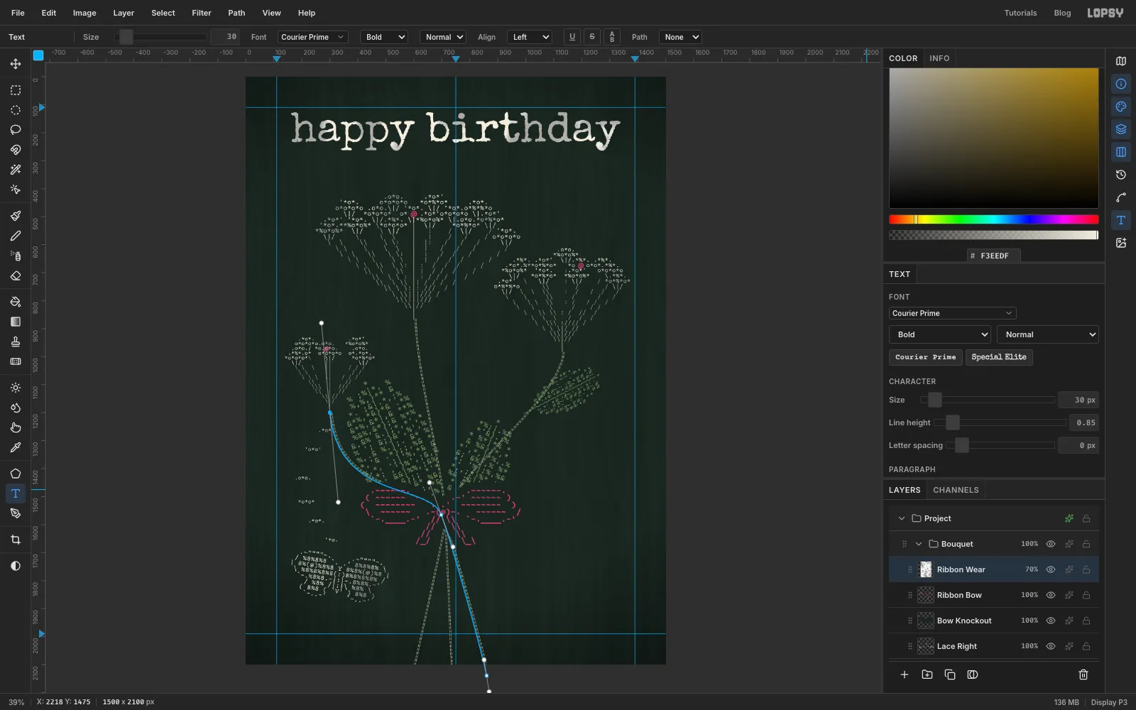
Set the wear to Darken
Set the layer's blend mode to Darken and its opacity to 70%. For now it wears the title too; you'll change that in the next step. Darken only keeps the parts of a layer that are darker than what's below them. The grey clouds are darker than the cream type, so they wear it down in patches. They're lighter than the dark green card, so the card doesn't change at all.
-
Wear the title by hand
Collapse the Bouquet group and drag the title's row above it in the Layers panel. The title now sits outside the clouds and gets its own wear.
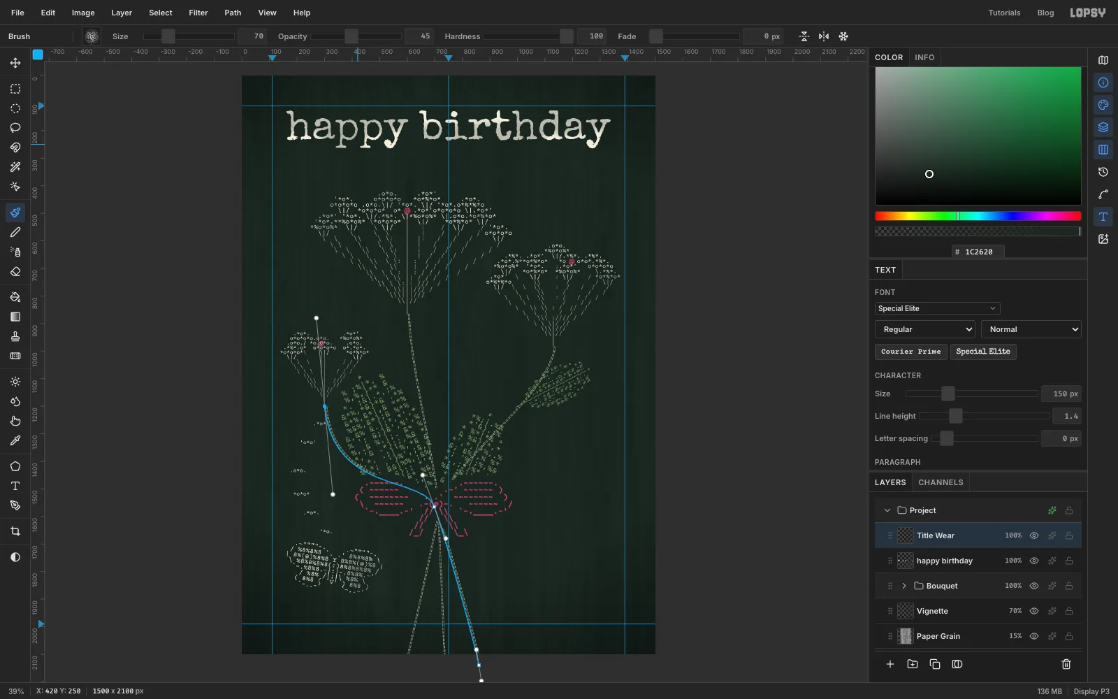
Add a layer above the title called Title Wear and set it to Darken. Pick the Brush and open the brush presets. Choose Chalk, then set Size to 70 and Opacity to 45%. With the foreground still card green , brush a few quick strokes across parts of the letters. The Chalk tip's speckle makes the ink look like it skipped. Since it's on Darken, the strokes can't lighten the card around the letters. Then lower the layer to about 65% so the title stays the brightest thing on the card.
-
Cut the label card
Botanists mount pressed plants on a sheet with a typed label in the corner. This card gets one as well.
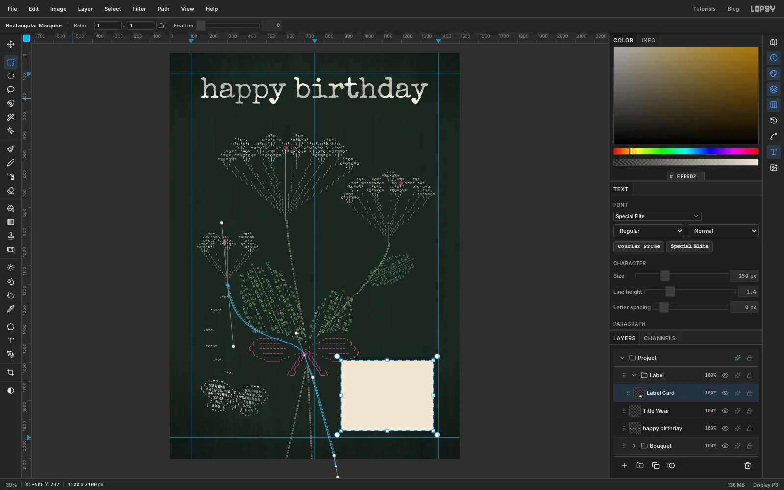
With Title Wear active, choose Layer → New Group and call it Label. It sits above the bouquet. Add a layer called Label Card inside it. Pick the Rectangular Marquee and drag a box about 480 × 365 px in the bottom-right corner, inside the guides. Fill it with cream using Edit → Fill.
Press Cmd+D, add Mono noise at 7 for paper texture, and give it a Drop Shadow: offset 6 and 10, Blur 18, Opacity 60.
-
Type the specimen label
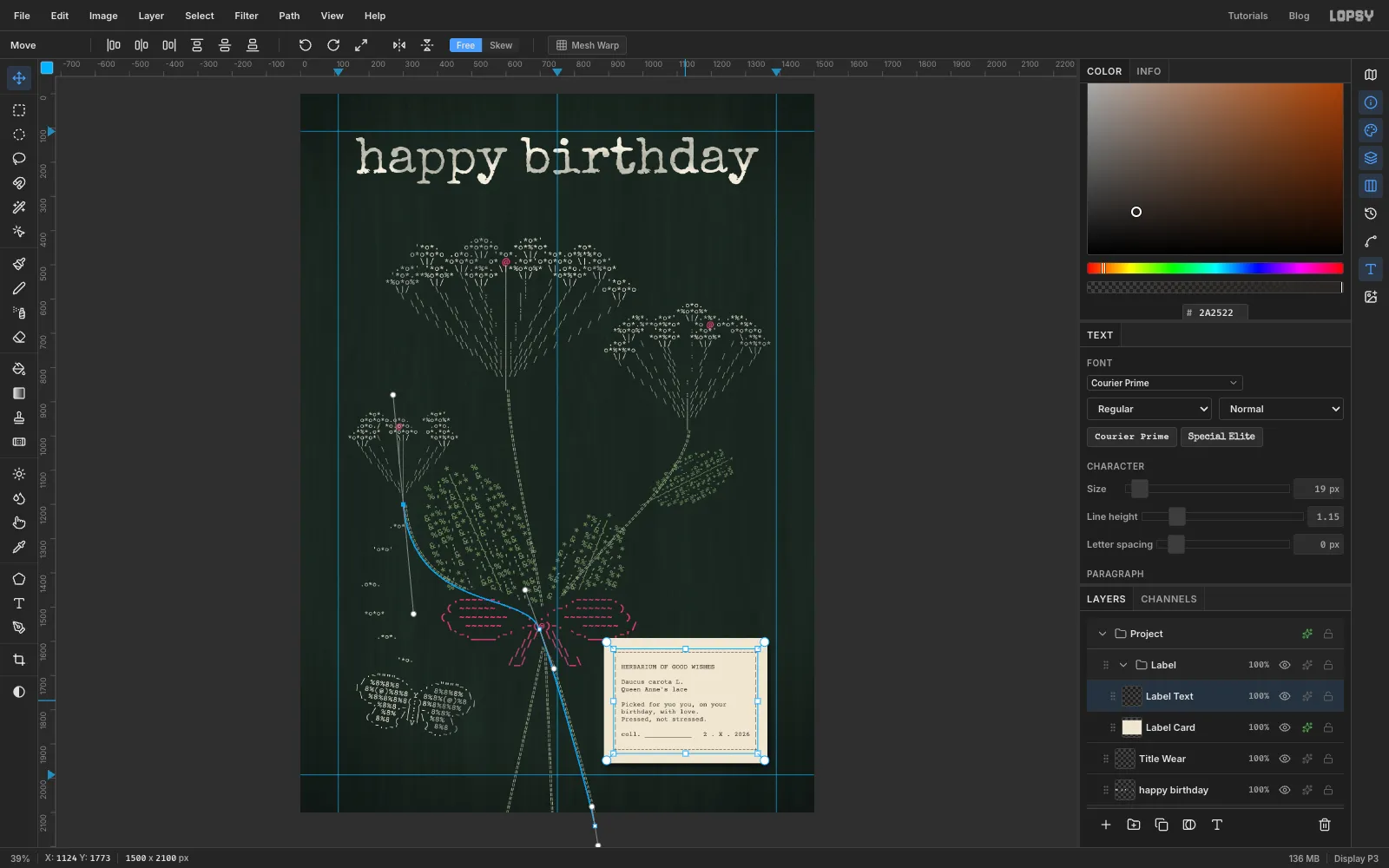
With Label Card active, type the label in Courier Prime, size 19, in typewriter ink , and set Line height to 1.15. Name the layer Label Text. Every row is exactly 37 characters wide:
- the top and bottom rows are a border of
+and- - every row in between starts and ends with
|, padded with spaces - leave an empty row just inside the top and bottom borders
Between the borders, the rows read:
- HERBARIUM OF GOOD WISHES
- (empty)
- Daucus carota L.
- Queen Anne's lace
- (empty)
- Picked for yuo you, on your
- birthday, with love.
- Pressed, not stressed.
- (empty)
- coll. ____________ 2 . X . 2026
Move it so the border sits evenly inside the card: about 30 px from each edge.
- the top and bottom rows are a border of
-
Strike out the typo
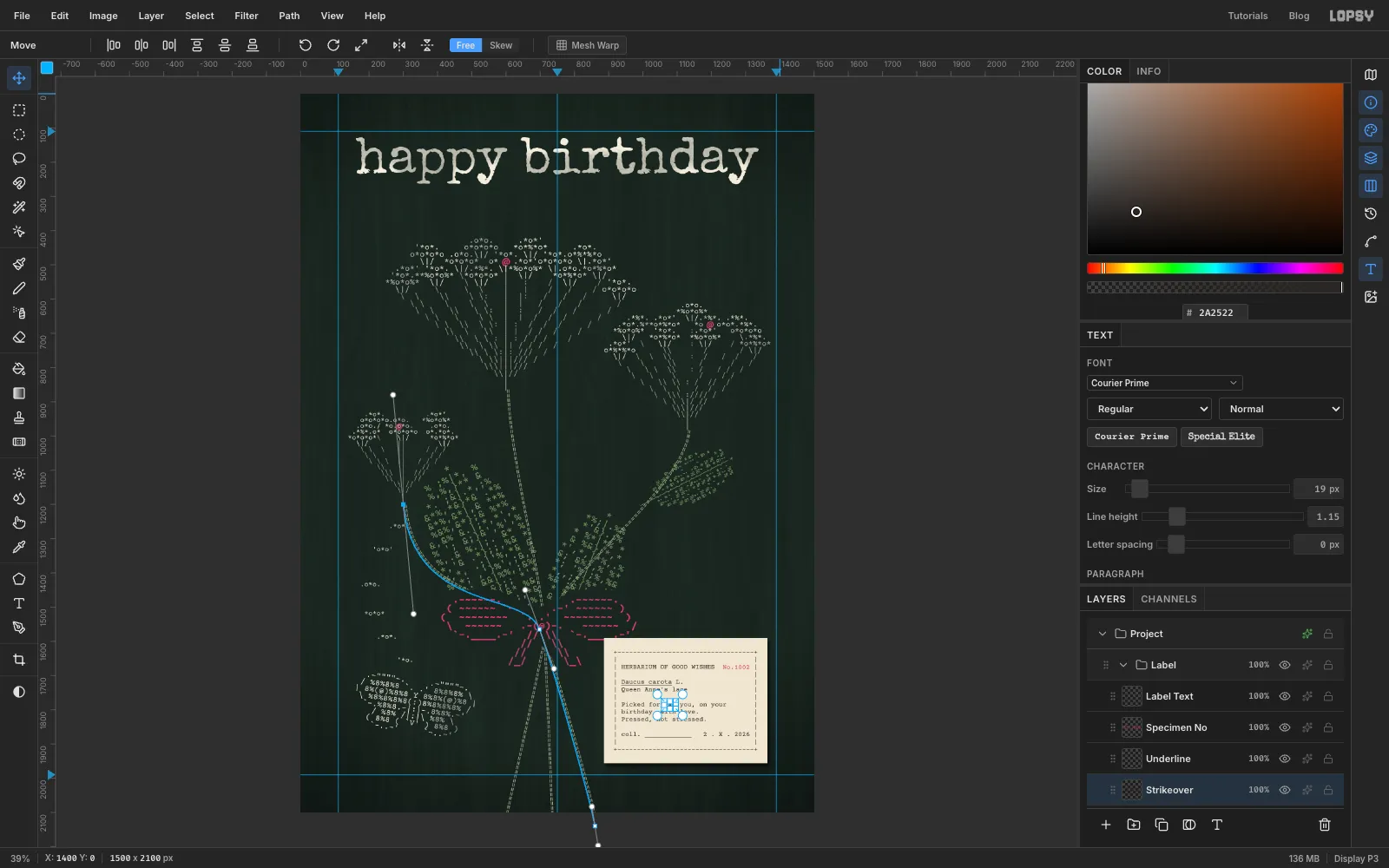
Typewriters can't delete, so typists x'd out their mistakes. Make three small text layers in the same font and size, then:
- Type
xxx, name the layer Strikeover and line it up exactly over yuo. - Type 13 underscores (Underline) and put them under Daucus carota. Scientific names are underlined in typescript, but not the author's initial L.
- Type No.1002 in red (Specimen No), the red half of a two-colour ribbon, and move it into the empty space at the right of the heading.
Because the font is monospaced, each one lines up on the same character cells as the text underneath. Use the arrow keys for the last few pixels.
- Type
-
Press the type into the paper
A typewriter's keys dent the paper. Select Label Text and click Duplicate Layer. Name the copy Label Deboss and click Rasterize Layer. Choose Filter → Emboss… with Strength at 30. Set the copy to Overlay at 60%. With the Move tool, nudge it 1 px right and 1 px down so the relief sits just off the letters.
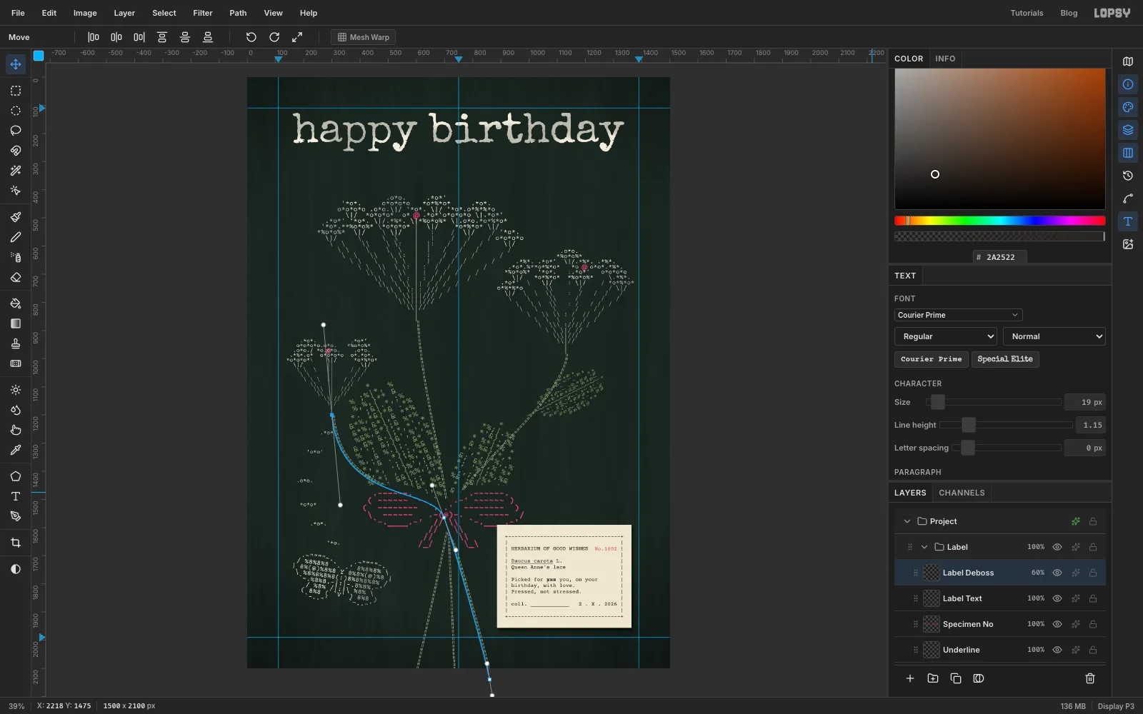
-
Turn the label
Click Label Card, then Shift-click Label Deboss to select all six label layers. With the Move tool, drag just outside the top-right handle and turn the label about 2.5° anticlockwise. The card, the live text and the embossed copy all turn together. Press Cmd+D to finish the transform.
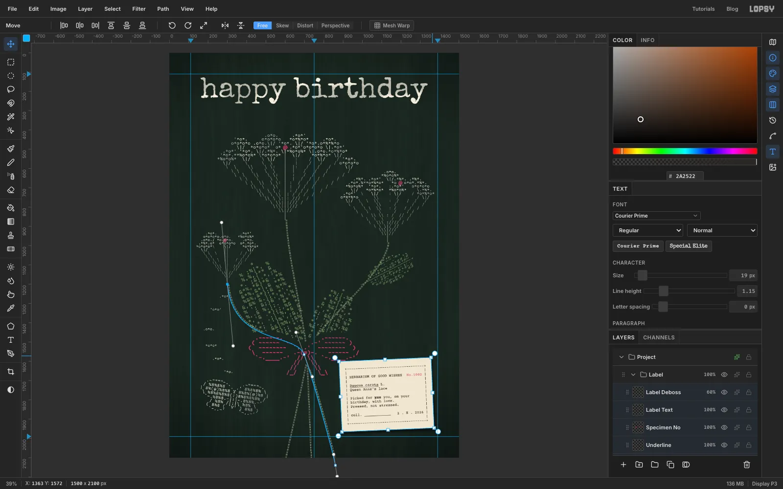
-
Tape it down
Add a layer called Tape above the label. Pick the Lasso and draw a strip across the top-right corner at about 45°. Make it about 130 px long and 44 px wide, and zigzag the two short ends so they look torn. Fill it with . Draw a second strip across the bottom-left corner and fill that too. Keep the tape off the top-left corner, or it will run into the bow's tail.
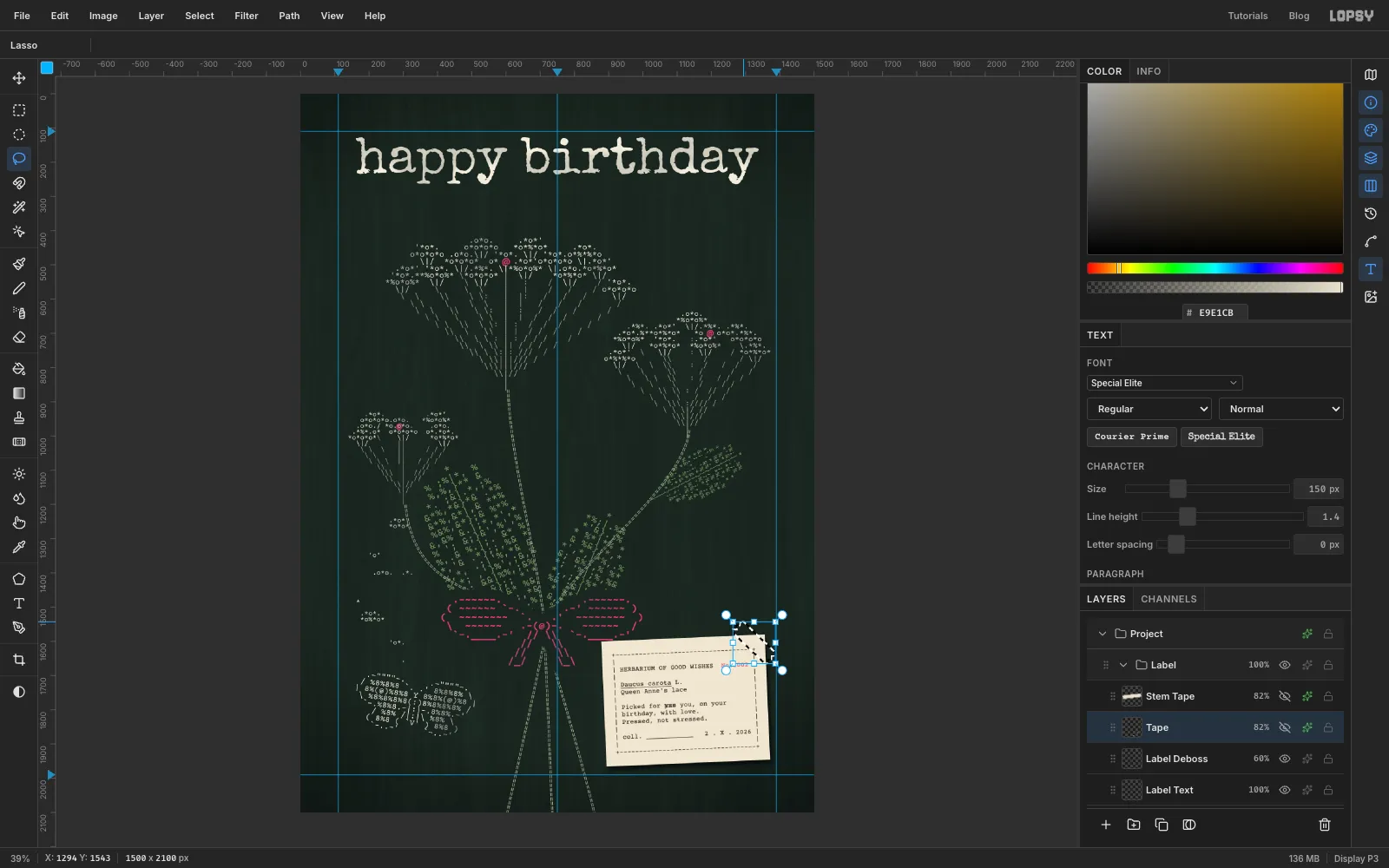
-
Finish the tape
Press Cmd+D and add Mono noise at 10. Lower the layer to 82% so the label shows faintly through the tape. Give it a soft Drop Shadow: offset 2 and 3, Blur 5, Opacity 40. Add a third strip on its own layer, Stem Tape, across the stems below the bow, the way a botanist straps down a specimen. Give it the same noise, opacity and shadow.
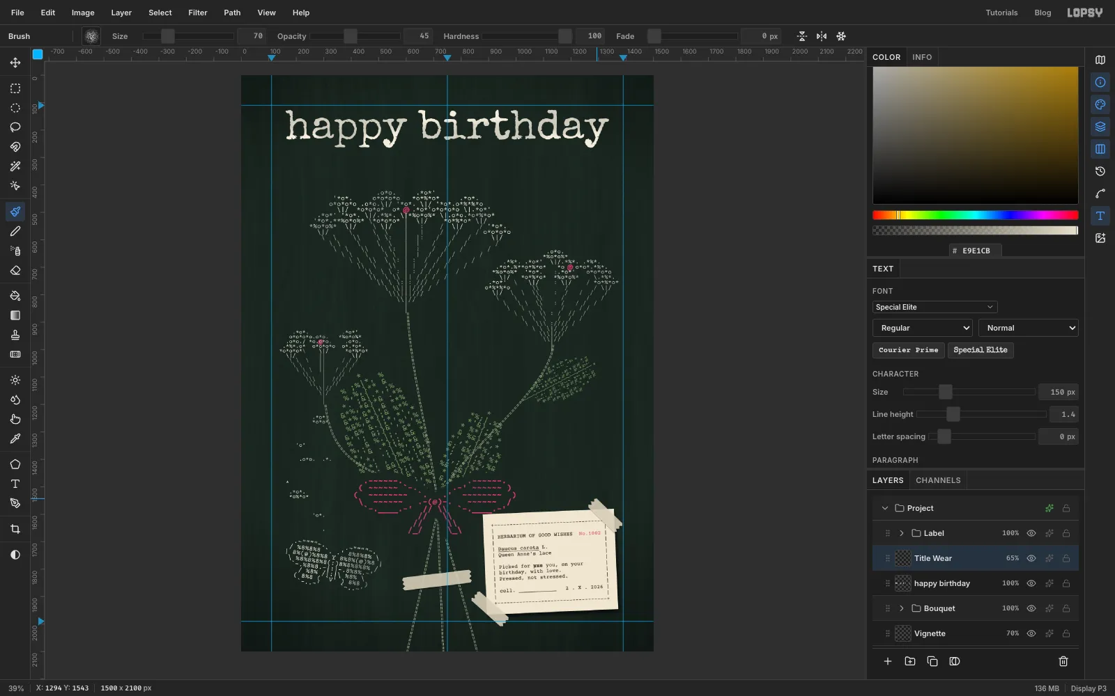
-
Check the spacing
Zoom out and look at the gaps between things. If two flower heads crowd each other, move one of them as a unit:
- Click its lace layer, for example Lace Right.
- Cmd-click its rays and centre floret layers to add them.
- With the Move tool, nudge them with the arrow keys. Hold Shift for 10 px steps.
Here the right head moved down a little, and its rays still meet the top of the stem. Check the margins too: the title, moth, right-hand flower and label should all sit inside the guides.
Export with File → Quick Export PNG and save the project with File → Save Project.