Make a Typographic Stencil Contact Sheet
Build a 35 mm contact sheet of hand-cut stencil letters in Lopsy, with punched film strips, spray-paint proofs, edge print, a loupe and grease pencil.
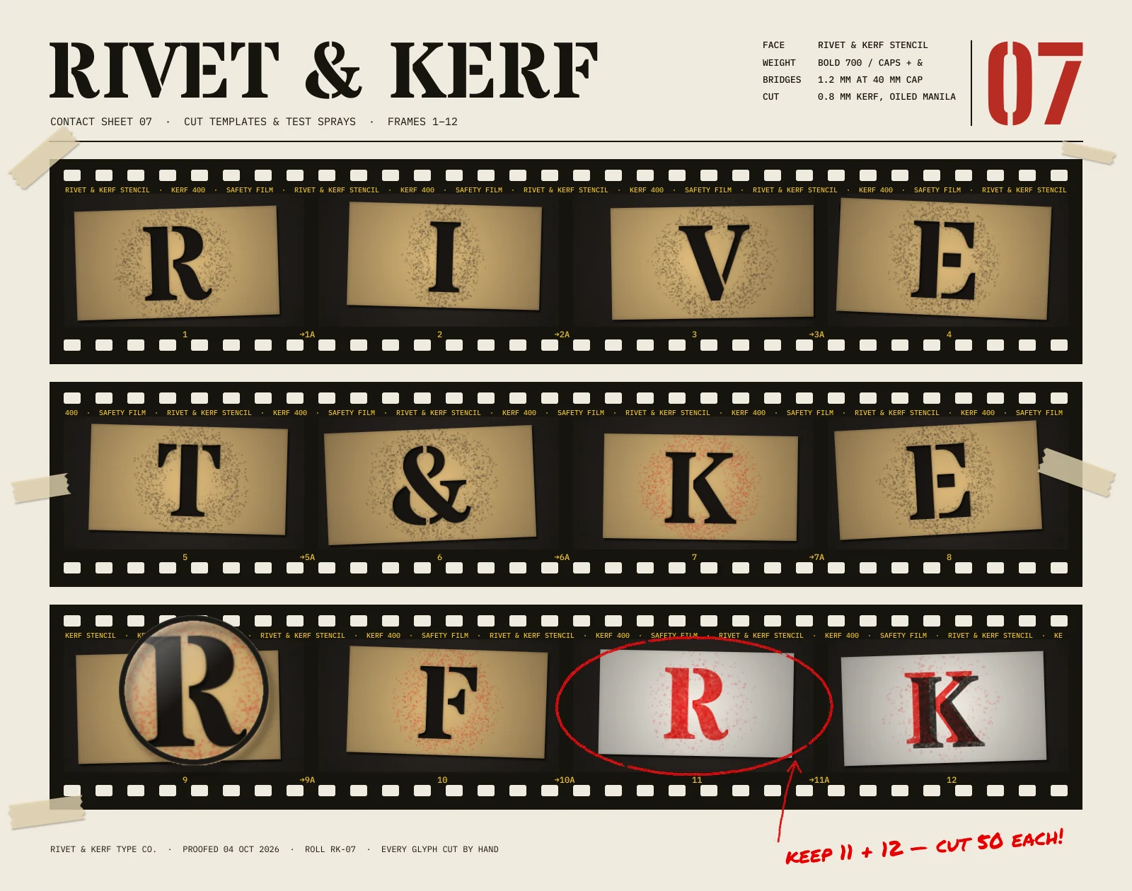
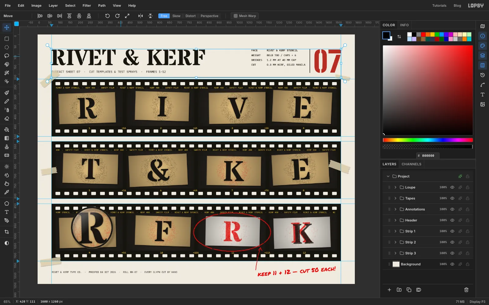
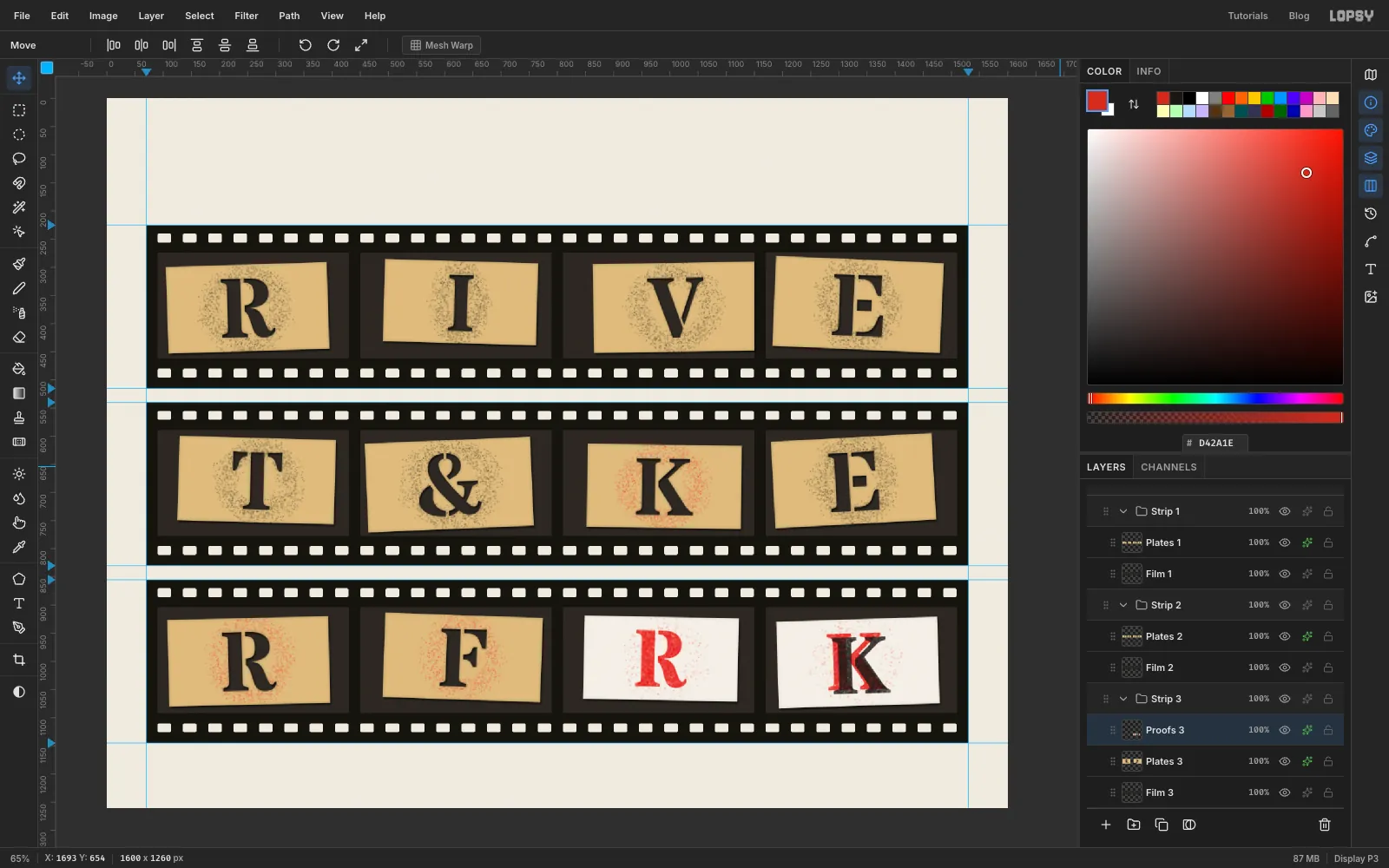
A type foundry checks a new stencil face by cutting the letters out of card, photographing them and spraying a few test proofs. Then it marks up the contact sheet with a grease pencil. This tutorial recreates that sheet for Rivet & Kerf, an invented stencil typeface. (A kerf is the width of a cut.) Three strips of 35 mm film run across the page. Each frame shows a manila card with one letter cut through it, so together they spell the name. The last two frames are spray-paint proofs.
Typography carries this piece. The letters are cut-out holes, the header sits on a baseline grid, and the film's edge print is set in a mono font so the frame numbers land exactly under each frame.
Along the way you'll use:
- Define Pattern and Fill with Pattern to punch rows of sprocket holes
- Cmd-clicking a layer thumbnail to load a letter as a selection, then Delete to cut it out of another layer
- the Spray tool inside a selection, both for overspray residue and for solid spray-painted letters
- rotating selections with the Move tool, Select → Inverse, Grow and Shrink
- Copy Merged and a Cmd-corner scale to build a magnifying loupe
- the Drop Shadow, Inner Glow and Color Overlay effects, a radial gradient vignette, and the Screen blend mode
- live text in Stardos Stencil, Big Shoulders Stencil, IBM Plex Mono and Permanent Marker, with Line height and a rotated note
- copy and paste, groups and group nudges
The palette is warm paper and black film, with manila card and two inks:
-
Paper
-
film
-
workbench
-
hole shade
-
Manila
-
proof card
-
masking tape
-
Spray black
-
spray red
-
Edge print
-
Sheet number
-
grease pencil
-
Loupe ring
-
ring highlight
-
Set up the paper and guides
Open Lopsy. In the New Document dialog, set Width to
1600and Height to1260, choose a White background and click Create.- Delete Layer 1 with the trash button at the bottom of the Layers panel. You'll make every layer yourself.
- Select Background, set the foreground colour to and choose Edit → Fill. With nothing selected, it fills the whole layer.
- Choose Filter → Add Noise…, set Amount to
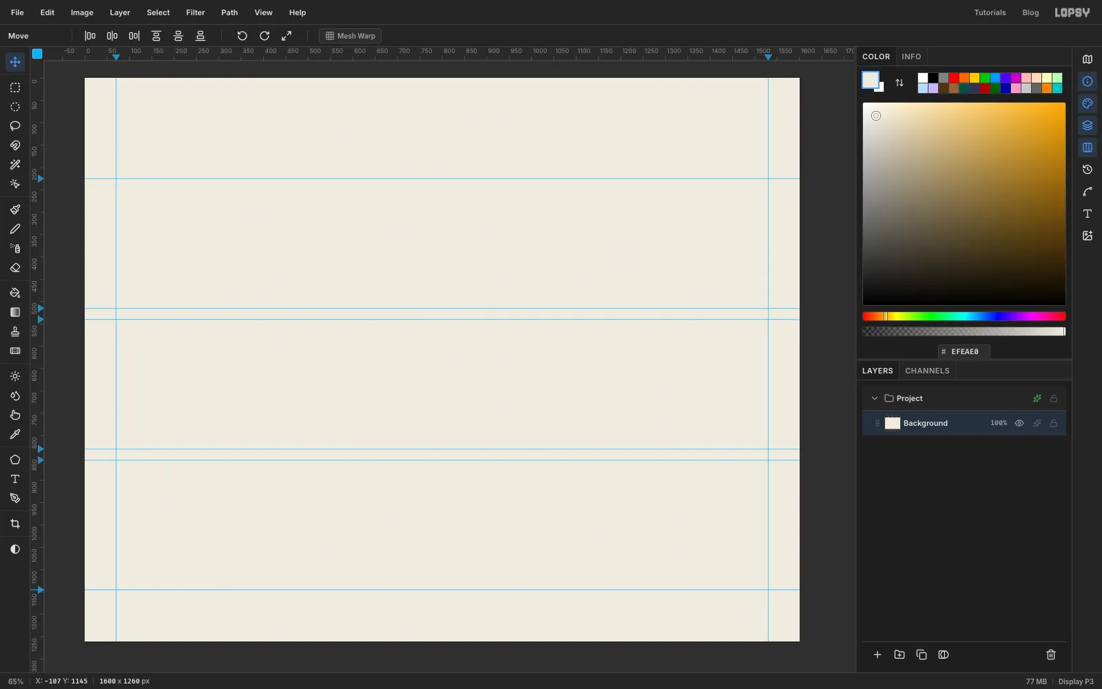
4and pick Mono and Gaussian. That gives the paper a faint tooth. - Click the top ruler at
70and1530for the side margins. - Click the left ruler at
225,515,540,830,855and1145. Those are the top and bottom of three film strips, 290 px tall with 25 px of paper between them.
-
Lay down the first film strip
Click New Group in the Layers panel and rename the group
Strip 1(double-click its name). With the group selected, click Add Layer. The new layer goes inside the group. Rename itFilm 1.Pick the Rectangular Marquee. Drag from where the left margin guide meets the
225guide to where the right margin guide meets the515guide. Set the foreground to , choose Edit → Fill, then deselect with Cmd+D.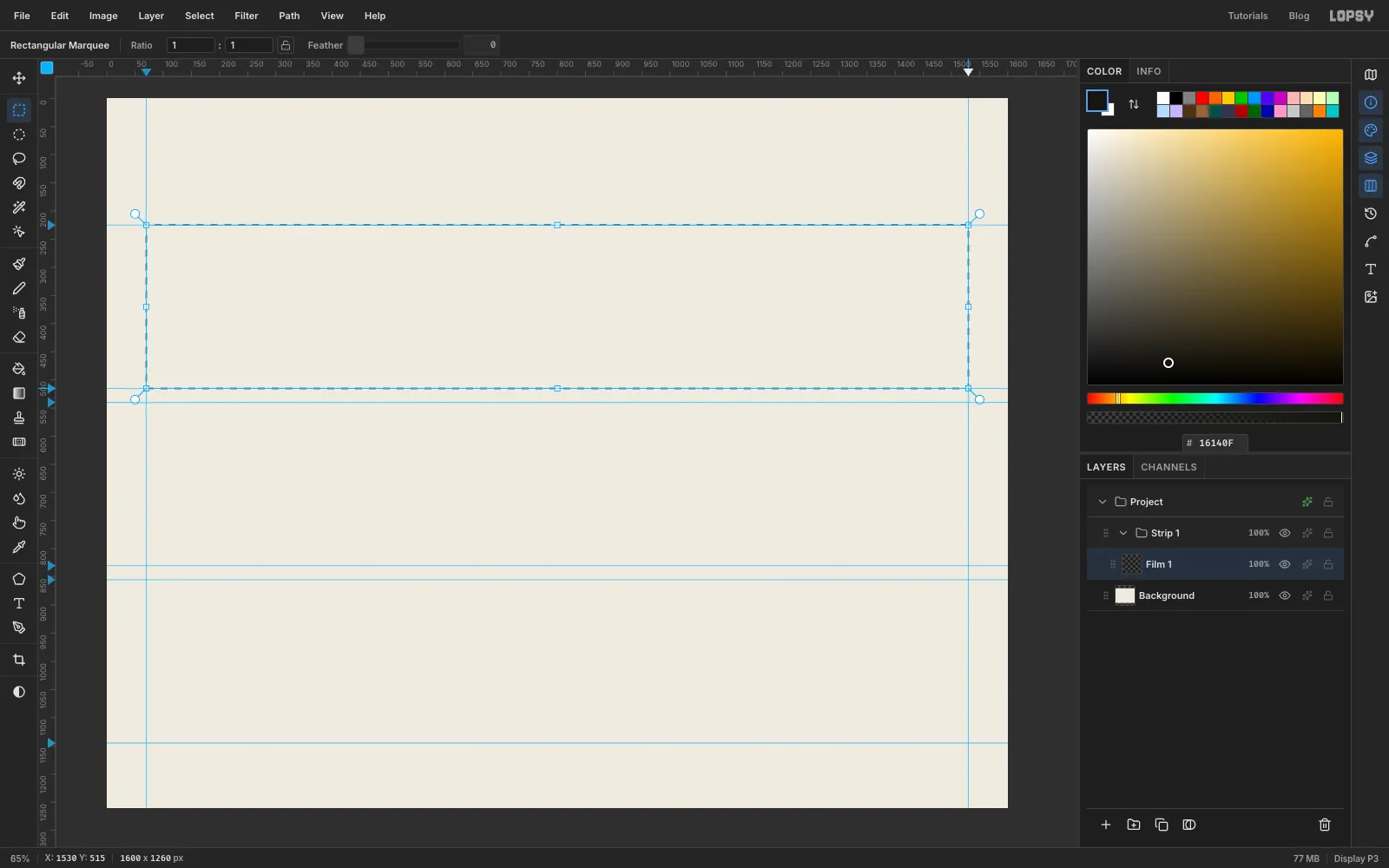
-
Cut four frame windows
Each frame is a photo, and the dark workbench in it shows around the stencil card. Add a layer named
Bench 1.The frames sit 20 px in from the strip ends, with room above for the edge print and below for the frame numbers. Draw a 340 × 188 marquee whose top-left corner is at
90, 274. Hold Shift and drag three more of the same size starting at450,810and1170on the same line. Shift adds each new rectangle to the selection, so you get four windows with 20 px gaps.Fill them with . Then run Add Noise with Amount
7, Mono and Gaussian, so the bench has some grain. Deselect.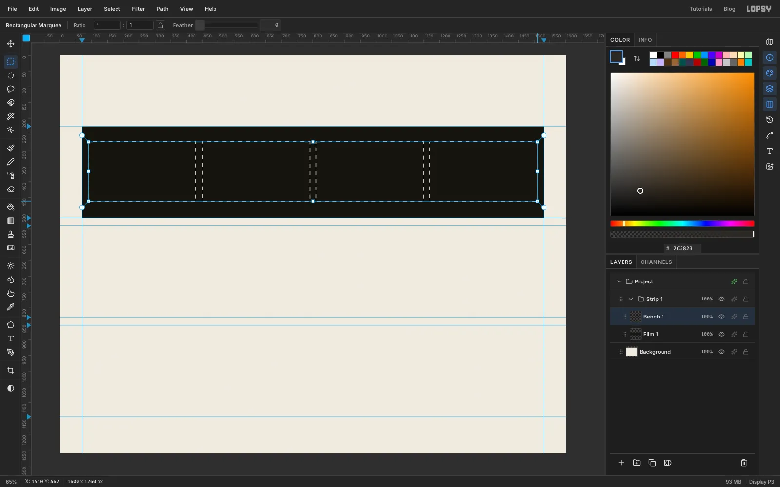
-
Draw a perforation tile
Sprocket holes are a repeating pattern, so you make one and let Fill with Pattern do the rest. Add a layer named
Perf Cutterand zoom into an empty patch of paper below the strips.- Pick the Shape tool, set Shape to Rectangle, Corner Radius to
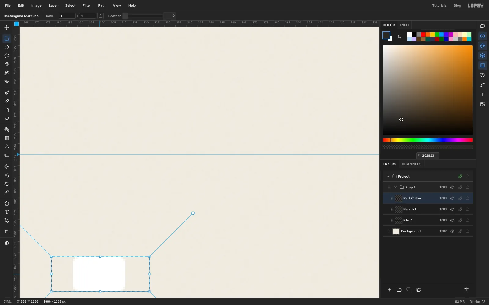
3and the fill to white. Click once (without dragging) and enter24×16in the size dialog. - Draw a marquee around the hole that is 45 px wide and exactly 16 px tall, with the hole 10 px from its left edge. The width is the spacing from one hole to the next. The height matches the hole, so the holes stack without seams.
- Choose Edit → Define Pattern. With a selection active, only the selected pixels become the tile.
- Press Delete to clear the tile (it has served its purpose) and deselect.
- Pick the Shape tool, set Shape to Rectangle, Corner Radius to
-
Fill the perforation rows
Lopsy tiles a pattern from the canvas's top-left corner. So if a row starts on a multiple of the tile's 16 px height, each row of tiles covers exactly one row of holes.
Still on
Perf Cutter, draw a marquee across the whole strip fromy 240to256. Hold Shift and add a second row from480to496. Choose Edit → Fill with Pattern…, pick the pattern you just made, leave Scale at100and click Apply. Deselect.The holes land 10 px off the frame grid, so switch to the Move tool and press ← ten times. Now the first hole starts at x
90, in line with the first frame, and there's 20 px to spare at each end.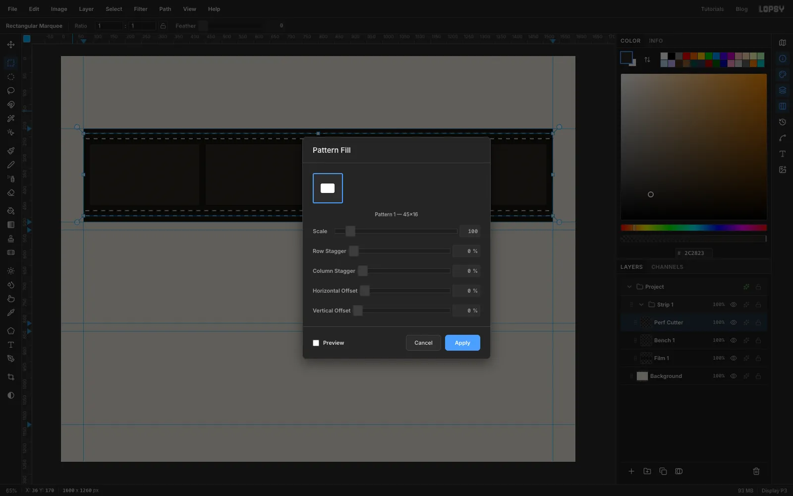
-
Punch the holes through the film
- Cmd-click the
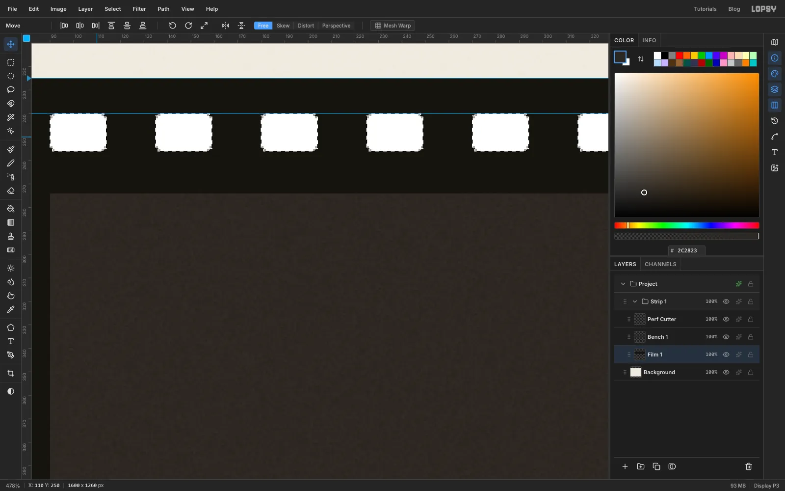
Perf Cutterthumbnail in the Layers panel. That loads its pixels as a selection. - Click the
Film 1row and press Delete. The holes are now cut through the film, and the paper shows through. - Deselect and delete the
Perf Cutterlayer. - Select
Bench 1and choose Layer → Merge Down so the strip is one layer.
- Cmd-click the
-
Copy the strip twice
- Click Background, then New Group. The group lands above Background, outside
Strip 1. Name itStrip 2and add a placeholder layer inside it. - Select
Film 1and press Cmd+A, then Cmd+C. - Select the placeholder and press Cmd+V. The copy is pasted in exactly the same place, already selected, with the Move tool active.
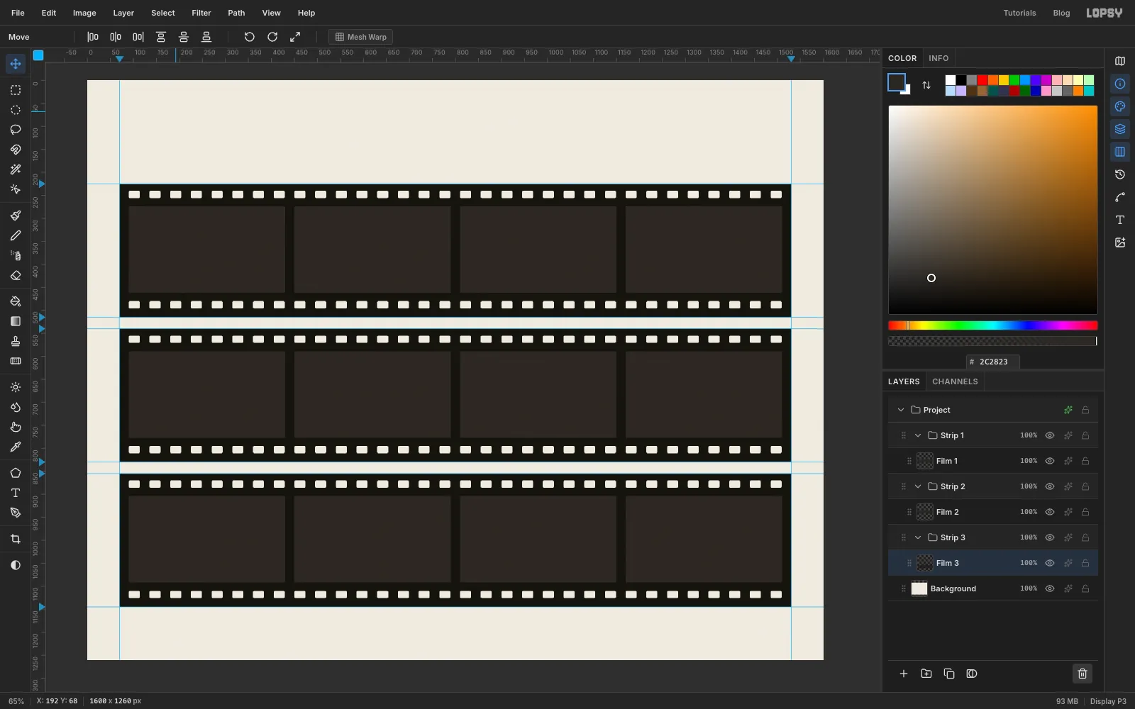
- Press Shift+↓ 31 times and ↓ 5 times to move it down 315 px. (Shift+arrow moves 10 px at a time.)
- Deselect, rename the pasted layer
Film 2and delete the placeholder. - Do the same for
Strip 3, moving it down 630 px.
- Click Background, then New Group. The group lands above Background, outside
-
Cut manila cards and set the letters
Select
Film 1and add a layer namedPlates 1above it.With the Rectangular Marquee, draw a card in each frame: a rectangle about 286 × 154 px. Shift-add the other three. Don't centre them perfectly. Offset each one by up to 15 px and make them slightly different sizes, so the frames look like four separate photos. Place the third card about 30 px right of centre, so it hangs off its frame. Fill with and run Add Noise with Amount
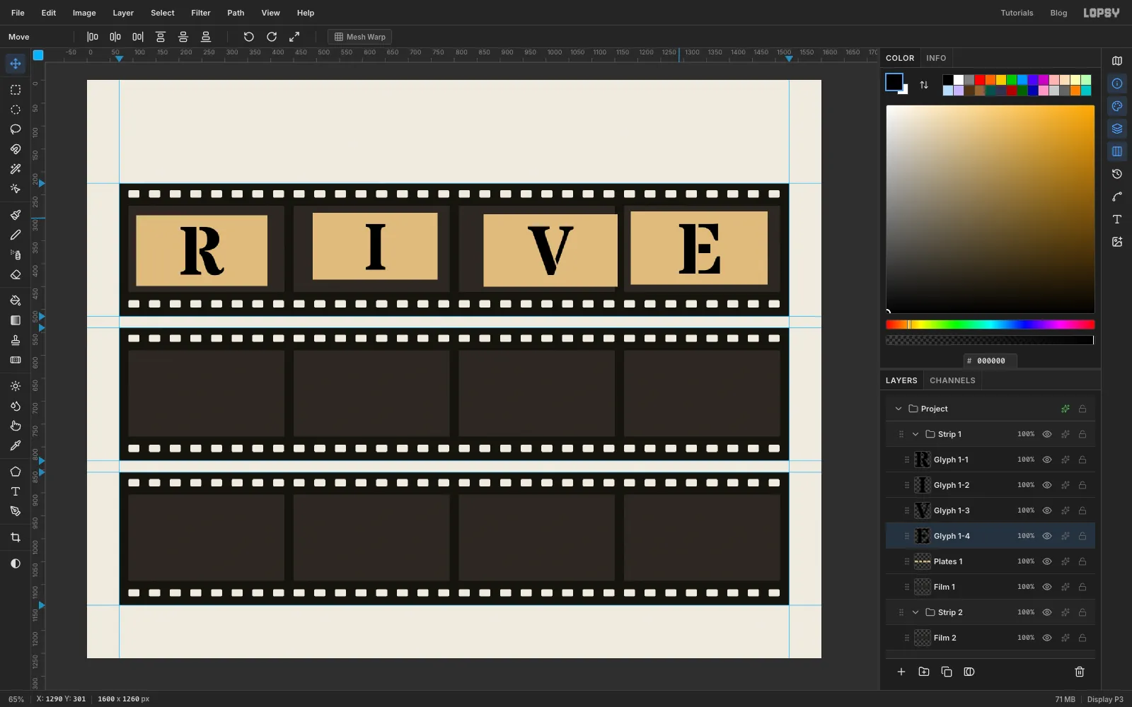
5.Now set the letters. Pick the Text tool, choose Stardos Stencil, weight Bold, size
150, colour black. Click on the first card, typeRand press Tab to commit. Click withPlates 1selected each time and typeI,VandEon the other cards. Each letter lands on its own layer abovePlates 1.Switch to the Move tool and centre each letter on its card with the arrow keys. Then select each letter layer and click Rasterize Layer (the T button at the bottom of the Layers panel). You're about to use them as cutters.
-
Knock the letters out of the card
For each letter:
- Cmd-click the letter's thumbnail to select its shape.
- Click
Plates 1and press Delete. - Delete the letter layer.
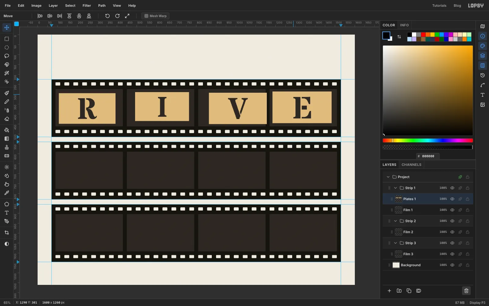
Stardos Stencil has bridges in its letterforms: the little gaps that keep a stencil's inner pieces from falling out. They come through as card. What you see through the holes is the bench on the film layer, just as you'd see the bench through a real stencil.
-
Spray some residue around the cuts
A used stencil has paint on it. Cmd-click the
Plates 1thumbnail. That selects the card but not the holes, so no paint can land in them.Pick the Spray tool and set Size
40, Density10, Opacity38and Softness60. With the foreground at , drag a loose, wobbly loop around each letter, then a second, tighter one. Make each loop a slightly different shape so no two cards match. Deselect when you're done.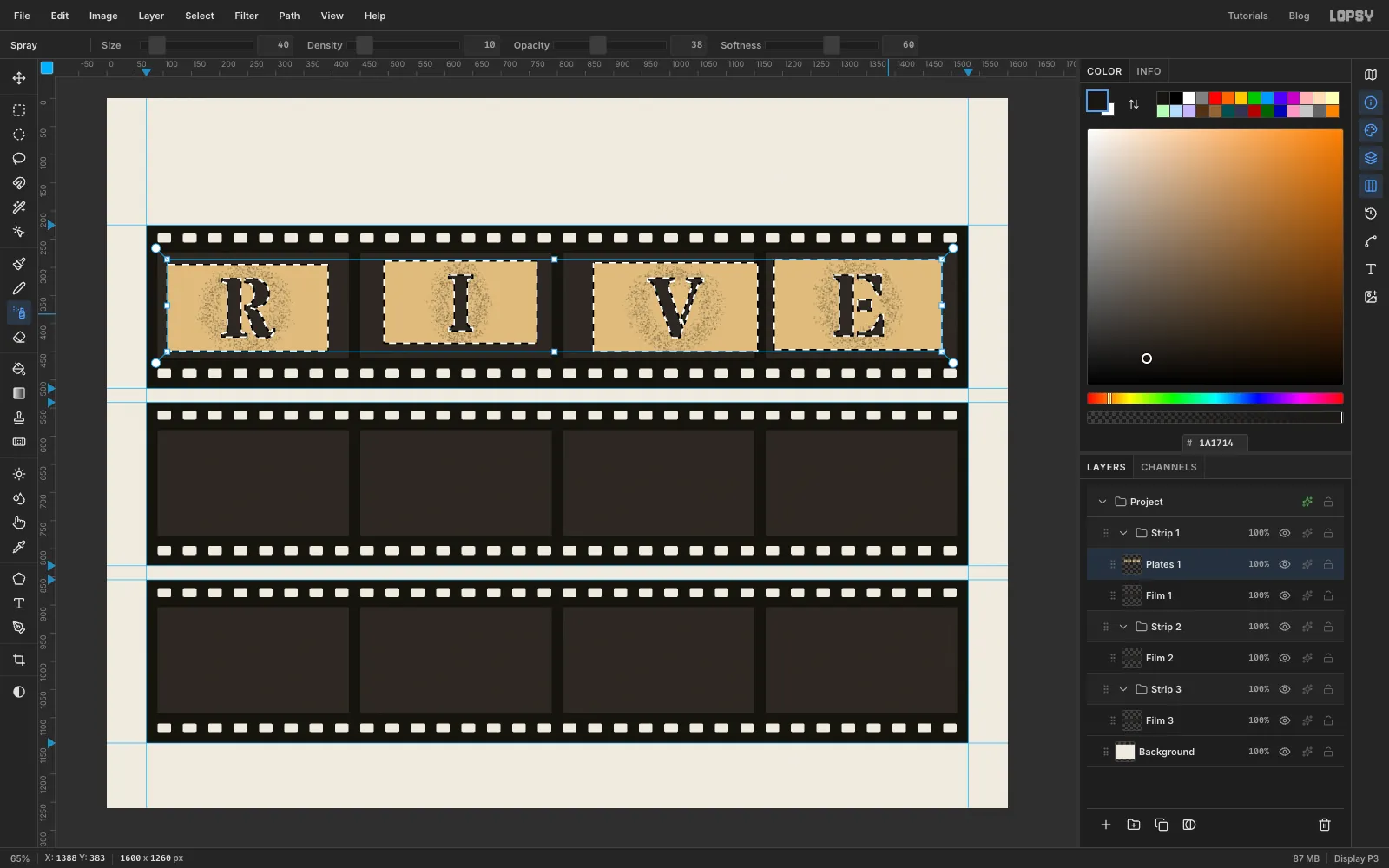
-
Tilt each card
Real cards never sit square. For each card:
- Draw a rectangular marquee around the card with a few pixels to spare.
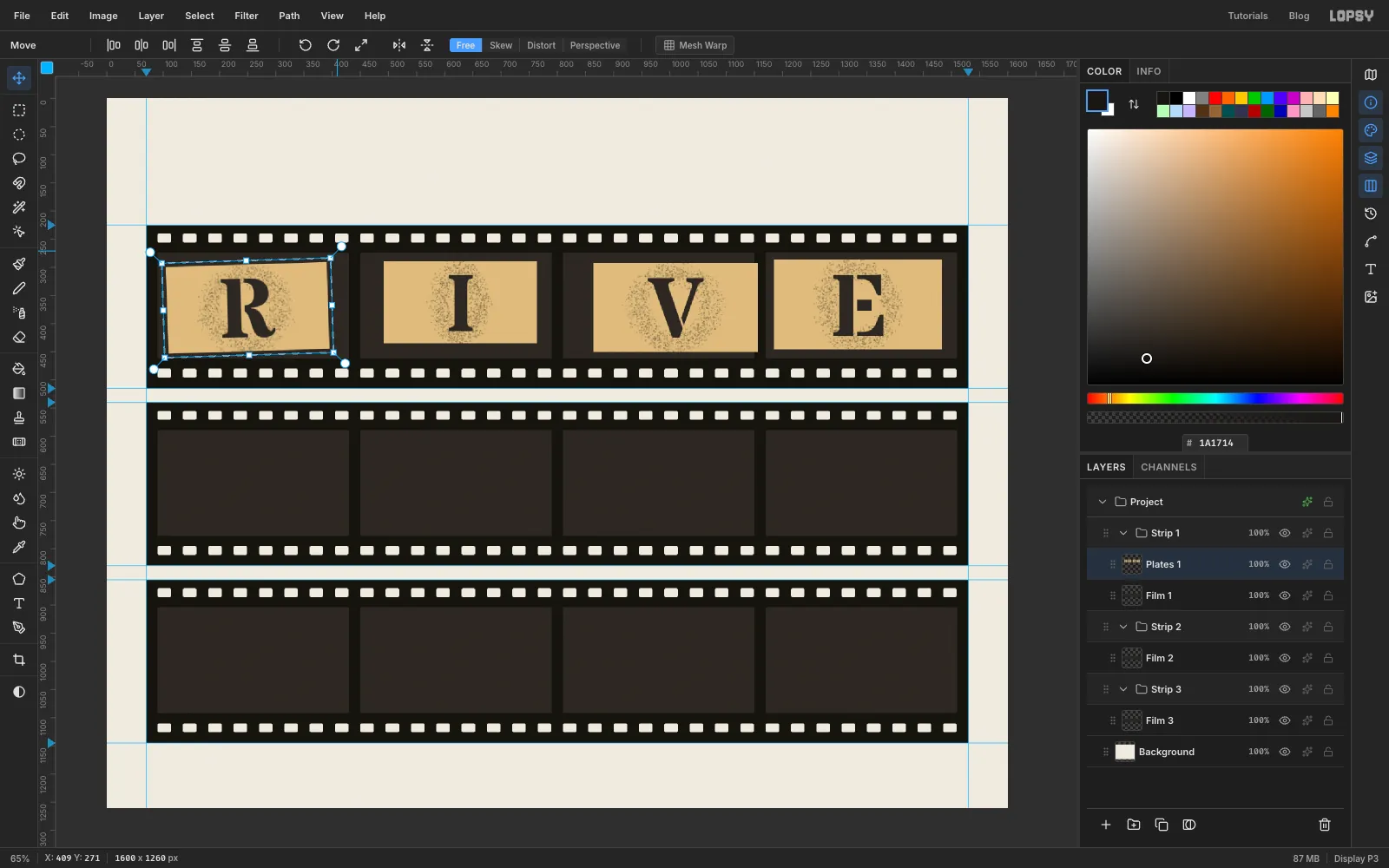
- Switch to the Move tool. Transform handles appear around the box, with round rotation handles sticking out from the corners. Drag a rotation handle to turn the card a degree or two, just enough that its edges aren't square.
- Press Cmd+D to commit.
Turn neighbouring cards in opposite directions. The holes and the residue are on the same layer, so they turn with the card.
-
Crop the cards to their frames
The third card hangs past the right edge of its frame, the way a careless photographer would frame it. It needs trimming at the frame line.
Draw the four 340 × 188 frame windows again (Shift-add as before), then choose Select → Inverse. With
Plates 1active, press Delete and deselect. Anything outside the frames is gone, and the third card now looks cropped by the camera.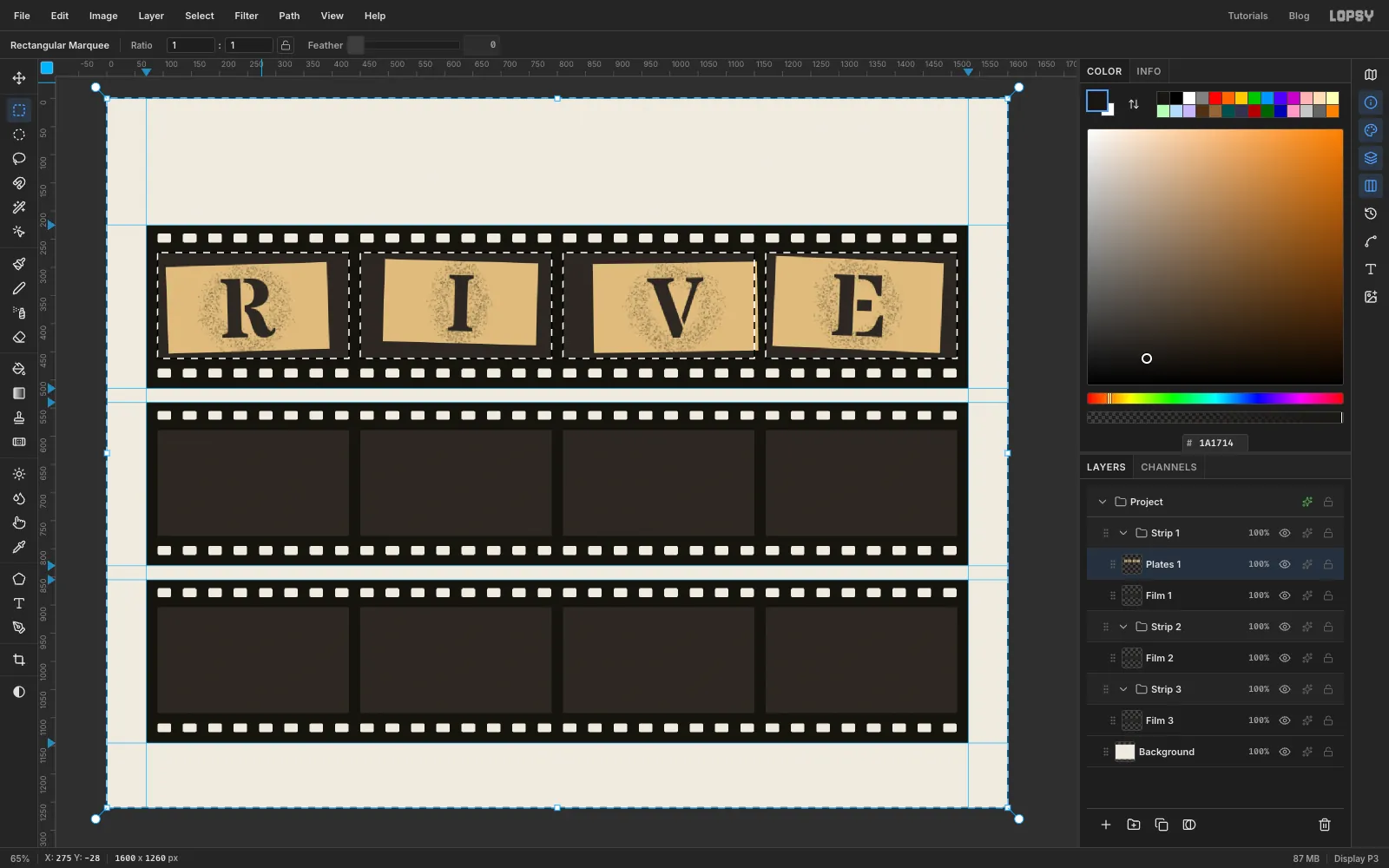
-
Give the cards depth
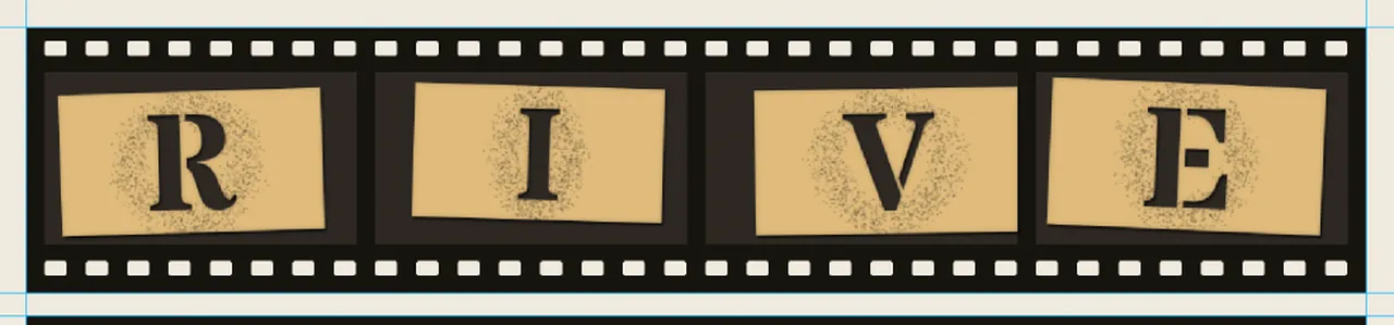
Click the effects button (the sparkle icon) on the
Plates 1row to open the effects drawer. Tick and set:- Drop Shadow: Offset X
2, Offset Y3, Blur4, Opacity60 - Inner Glow: colour black, Size
8, Opacity25
The shadow lifts the card off the bench and falls into the top and left edges of each cut, which helps them read as holes. The inner glow darkens the card's edges like a photo would.
- Drop Shadow: Offset X
-
Repeat for strips two and three
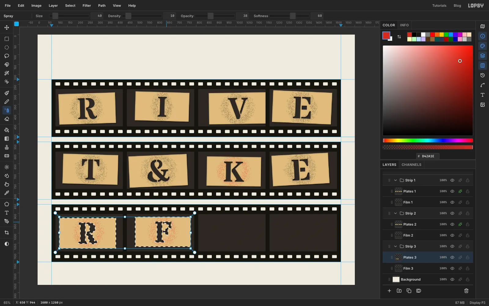
Repeat the last six steps for the other two strips. Each time, select the strip's film layer first (
Film 2, thenFilm 3) so the newPlates 2andPlates 3layers land in the right group. Everything sits 315 px lower per strip: strip 2's frame windows start aty 589and strip 3's at904.- Strip 2:
T,&,KandE. - Strip 3:
RandFin frames 9 and 10. Leave frames 11 and 12 empty for now.
Vary the details so the frames don't look cloned. The K plate in strip 2 and both plates in strip 3 were used for red paint, so spray their residue in . Give the second E a different tilt and offset from the first, so it doesn't look like a duplicate photo.
- Strip 2:
-
Spray paint inside a letter
The last two frames are test proofs: what the stencil sprays onto paper. Add a layer named
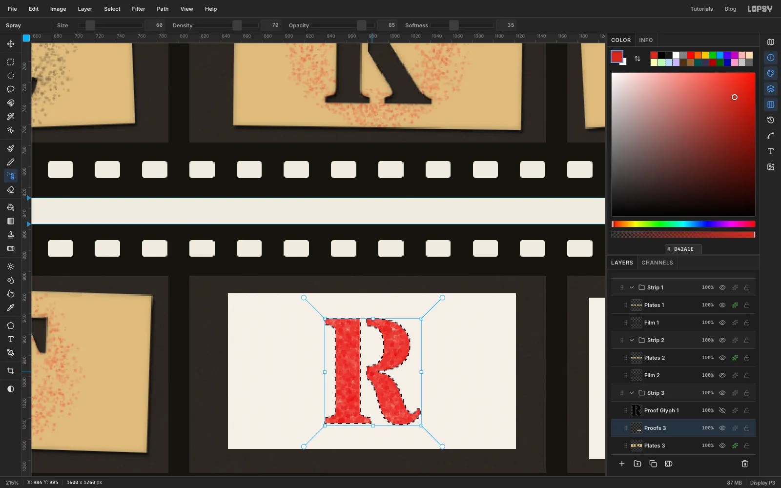
Proofs 3abovePlates 3and draw two cards with the marquee in frames 11 and 12. Fill them with and add noise at3.- Type an
Rin Stardos Stencil Bold at144, slightly smaller than the cut letters because the proof card is smaller. Centre it on the first proof card and rasterize it. - Cmd-click its thumbnail, then hide the letter layer with its eye icon so you can see the paint.
- Select
Proofs 3. Set the Spray tool to Size60, Density70, Opacity85and Softness35. - With the foreground at , zigzag back and forth over the letter until it is nearly solid.
The selection keeps the edges crisp and the speckle inside reads as spray paint. Deselect and delete the letter layer.
- Type an
-
Spray a misregistered proof
Frame 12 gets two coats that don't quite line up:
- Red pass: type a
K, centre it on the second card, then press ↑ and ← 4 times each. Rasterize it and spray it red exactly as before. - Black pass: type a second
K, centre it, then press ↓ and → 5 times each. Rasterize it and spray it in .
The red peeks out along one side, like a stencil that slipped between coats.
To finish the proofs:
- Cmd-click the
Proofs 3thumbnail. Spray a soft red mist around both letters with Size46, Density6, Opacity28and Softness70. - Tilt each card with a marquee and a rotation handle.
- Give the layer the same Drop Shadow, with an Inner Glow at
14opacity.
- Red pass: type a
-
Add a photographic vignette to every frame
Pick the Gradient tool, set Type to Radial and open Advanced…. Use two black stops: the first at 0% opacity and the last at 50%.
Add a layer named
Vignette 1abovePlates 1. For each frame, marquee the 340 × 188 window and drag the gradient from the frame's centre to just past its bottom-right corner. Do the same for strips 2 and 3. In strip 3, put the layer aboveProofs 3so the proof cards get the vignette too.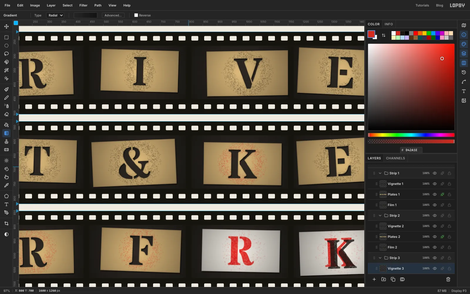
-
Set the header type
Collapse
Strip 1,Strip 2andStrip 3with the arrows on their rows. When a group is expanded, a new group goes inside it; when it's collapsed, the new group goes above it.Click the collapsed
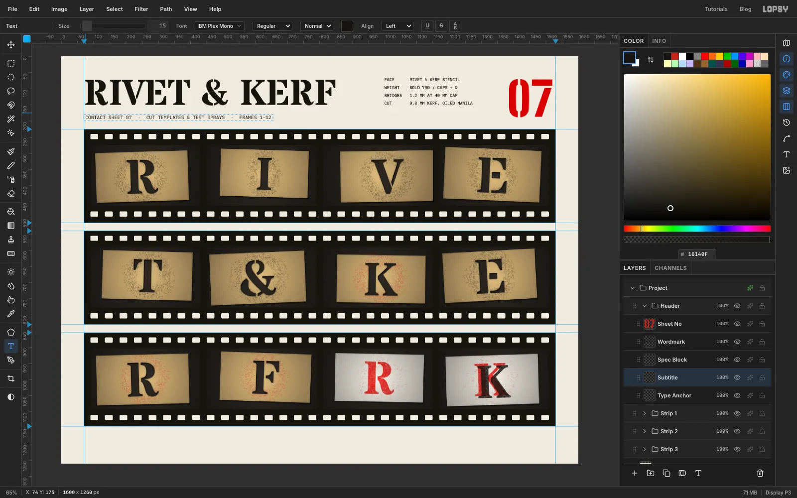
Strip 1group and click New Group. Name itHeader, then add an empty layer inside it calledType Anchor. New text appears above the selected layer, and if a text layer is selected, changing the font restyles it. Selecting the emptyType Anchorbefore each new piece of type avoids that. Commit each piece with Tab.- Sheet number:
07in Big Shoulders Stencil, Black, size145, colour . - Wordmark:
RIVET & KERFin Stardos Stencil Bold, size112, colour . - Spec block: four lines in IBM Plex Mono Medium, size
13, colour , pressing Enter between them. The lines areFACE,WEIGHT,BRIDGESandCUT, each padded with spaces to 10 characters, then the value. SoFACEgets 6 spaces beforeRIVET & KERF STENCIL,WEIGHT4 beforeBOLD 700 / CAPS + &,BRIDGES3 before1.2 MM AT 40 MM CAP, andCUT7 before0.8 MM KERF, OILED MANILA. - Line height: open the Text panel (the T icon in the strip on the right) and set Line height to
1.86. Text panel settings carry over to your next text, so set it back to1.4before the subtitle. - Subtitle:
CONTACT SHEET 07 · CUT TEMPLATES & TEST SPRAYS · FRAMES 1–12in IBM Plex Mono Regular, size15, colour .
- Sheet number:
-
Put the header on a baseline grid
Use the Move tool and the arrow keys to line everything up:
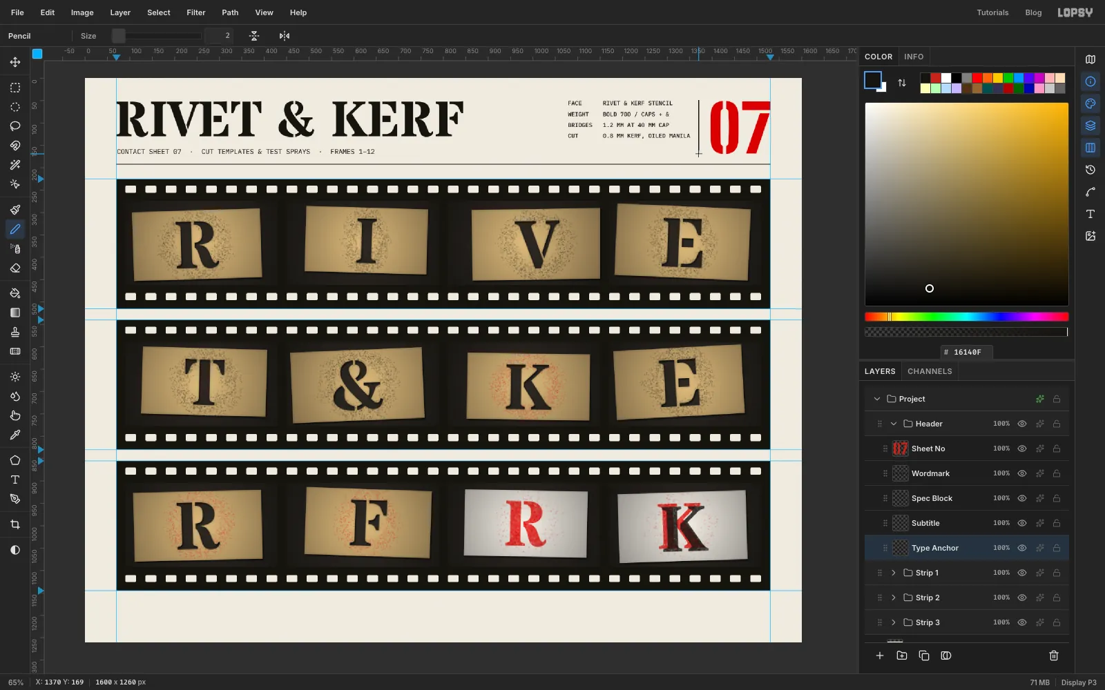
- Put the wordmark on the left margin, with its cap tops at
50. - Put the subtitle on the same margin, with its cap tops at
158. - Put the
07with its right edge on the1530guide and its top at50. Its foot lands on the subtitle's baseline. - Put the spec block with its cap tops at
50and its right edge at1350.
The Line height of 1.86 drops the last spec line onto the wordmark's baseline, so all three blocks share a top and bottom.
Select
Type Anchorand pick the Pencil at Size2with colour .- Click at the left margin on
y 192and Shift-click at the right margin for a straight rule. - Draw a vertical rule the same way at x
1373, fromy 50to169. That puts it halfway between the spec block and the 07, with 23 px on each side.
- Put the wordmark on the left margin, with its cap tops at
-
Add the edge print and frame numbers
Real film carries a line of yellow writing along its edge. Expand
Strip 1and selectFilm 1, so the text lands inside the strip.- Edge print: in IBM Plex Mono Medium at
10, colour , typeRIVET & KERF STENCIL · KERF 400 · SAFETY FILM ·over and over. Make it long enough to run from the first frame to the end of the strip, just under the top row of holes. Start strips 2 and 3 a few words into the sequence, so the three strips don't line up like copies. - Frame numbers: in IBM Plex Mono Medium at
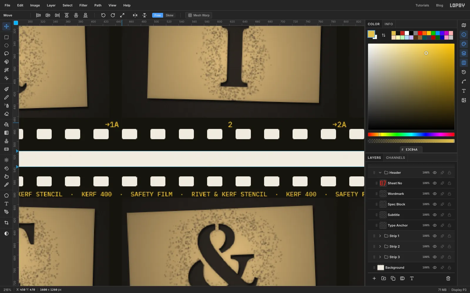
12, also , one line per strip, just above the bottom holes. Plex Mono's characters are 7.2 px wide at 12 px, so 50 characters is exactly one frame plus its gap (360 px). Click under the centre of the first frame and type the frame number. Add spaces until you've typed 23 characters, then→1Ato mark the frame line, then spaces until you reach 50. Repeat for each frame, using one fewer space after a two-digit number. Stop after the last number in each strip. Strip 2 counts from 5 and strip 3 from 9.
Collapse each strip again when you're done.
- Edge print: in IBM Plex Mono Medium at
-
Add the footer credit and a rotated note
Click the collapsed
Headergroup, click New Group and name itAnnotations. Add a layer inside it namedGrease Pencil.- Credit: type
RIVET & KERF TYPE CO. · PROOFED 04 OCT 2026 · ROLL RK-07 · EVERY GLYPH CUT BY HANDin IBM Plex Mono Regular at12, colour . Put it on the left margin, about 55 px from the bottom. - Note: type
keep 11 + 12 — cut 50 each!in Permanent Marker at30, colour . Place it in the bottom-right corner. - With the Move tool, drag one of the note's corner rotation handles to tip it about 5 degrees anticlockwise. It stays live, editable text.

- Credit: type
-
Copy a circle of the finished frame
A loupe on frame 9 shows off the stencil bridges. Collapse
Annotations, click it and click New Group, and name the groupLoupe. Add a temporary layer inside it.Pick the Elliptical Marquee and draw a circle about 140 px across, centred on frame 9's
R. Choose Edit → Copy Merged. That copies everything you can see inside the circle, not just one layer. Select the temporary layer and press Cmd+V. The circle is pasted in place on a new layer. Rename itLoupe Viewand delete the temporary layer.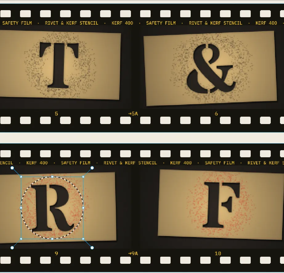
-
Magnify the view
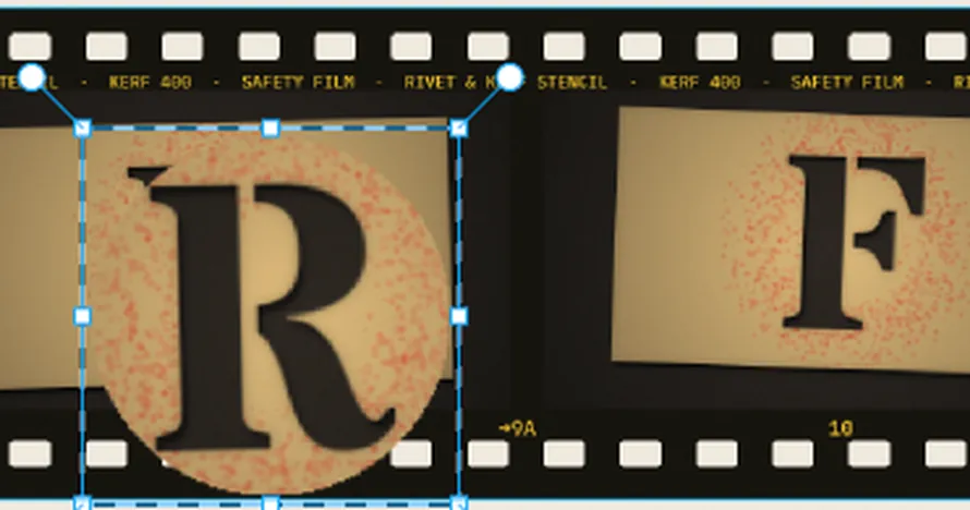
Draw a rectangular marquee around the pasted circle and switch to the Move tool. Hold Cmd and drag the bottom-right handle until the circle is 1.5× its size, about 210 px across. Cmd keeps it in proportion. Release, deselect, and nudge it with the arrow keys until it's centred over the R again.
-
Add the glass and the rim
- Glass: add a layer named
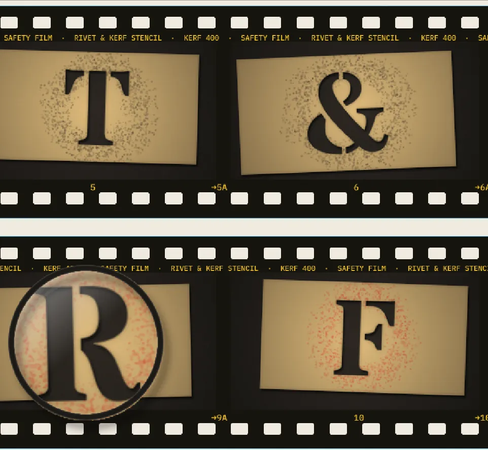
Loupe Glassand draw a circle selection about 196 px across, centred on the loupe. Set the Gradient tool to Linear, then open Advanced… and make both stops white: the first at 100% opacity and the last at 0%. Drag from just inside the top-left of the circle towards its centre. With a white Brush at size6, draw a short arc at about ten o'clock for a highlight. Set the layer to Screen at40%opacity. - Rim: add a layer named
Loupe Ring. Draw a circle about 212 px across, fill it with , choose Select → Shrink… with8px and press Delete. That leaves an 8 px ring. - Rim effects: a Drop Shadow of Offset X
8, Offset Y12, Blur16and Opacity45, so the loupe sits above the sheet. An Inner Glow in , Size3and Opacity70, for a polished metal edge.
- Glass: add a layer named
-
Nudge the loupe
The loupe covers frame 9's number. Select the
Loupegroup itself (not a layer inside it), switch to the Move tool and press → 22 times and ↑ 24 times. The view, glass and rim move together, and the 9 shows again.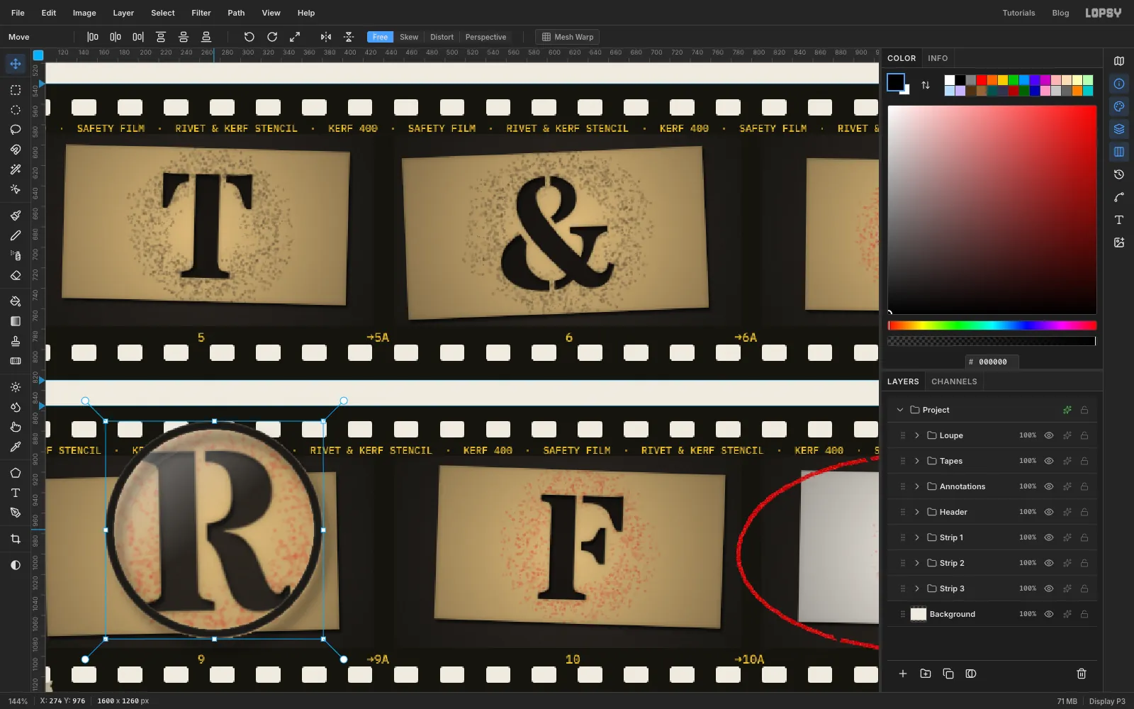
-
Tape the strips down
Collapse
Loupe, click the collapsedAnnotationsgroup and click New Group namedTapes, with a layer inside it namedTape Pieces. Set the foreground to .For each piece of tape:
- With the Rectangular Marquee, draw a rectangle about 110 × 34 px.
- Hold Alt and use the Lasso to draw a zigzag across each end. Alt subtracts from the selection, which gives the tape torn ends.
- Fill and deselect. Then marquee the piece, switch to the Move tool and drag a rotation handle to turn it into place.
Don't make the tapes symmetrical. This sheet has:
- a piece across the top-left corner turned 40°
- a short one on the top-right corner at 12°
- one at the bottom-left at a slight angle
- one across each end of the middle strip
Finish with Add Noise at
6and layer opacity78%. Add a small Drop Shadow of Offset X1, Offset Y2, Blur3and Opacity25.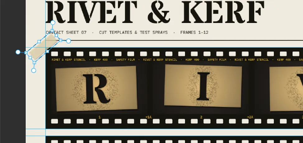
-
Finishing pass: darken the cut letters
Step back and look at the whole sheet. At this size the bench showing through the holes is about as light as the bench around the cards, so the letters can read as printed rather than cut. Real holes look darker because the card shades them. Add a shade under each layer of cards:
- Cmd-click the
Plates 1thumbnail. The selection covers the card but not the holes. - Choose Select → Grow…
20, then Select → Shrink…20. Growing fills in every letter-shaped hole, since no stroke is wider than 40 px. Shrinking brings the outer edges back but leaves the holes filled. - Select
Film 1, add a layer namedHole Shade 1(it goes between the film and the cards), fill with and set it to60%opacity.
The cards cover the shade everywhere except through the cuts. Repeat for strips 2 and 3. While you're there, run Add Noise at
4on each Plates layer to give the photos some grain.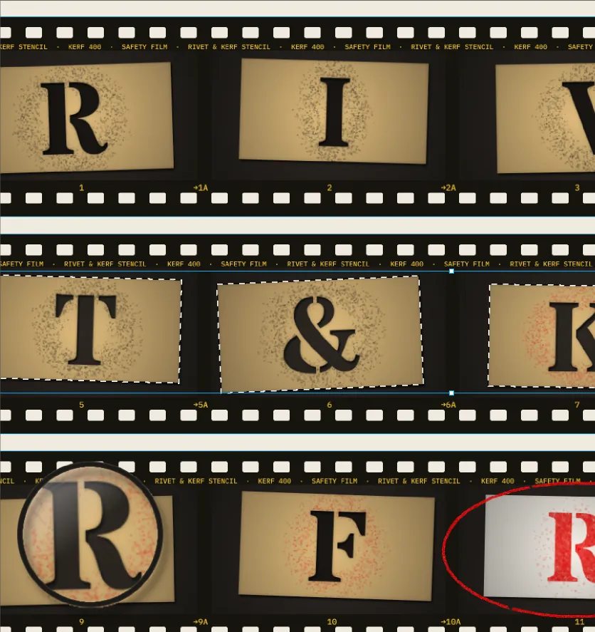
- Cmd-click the
-
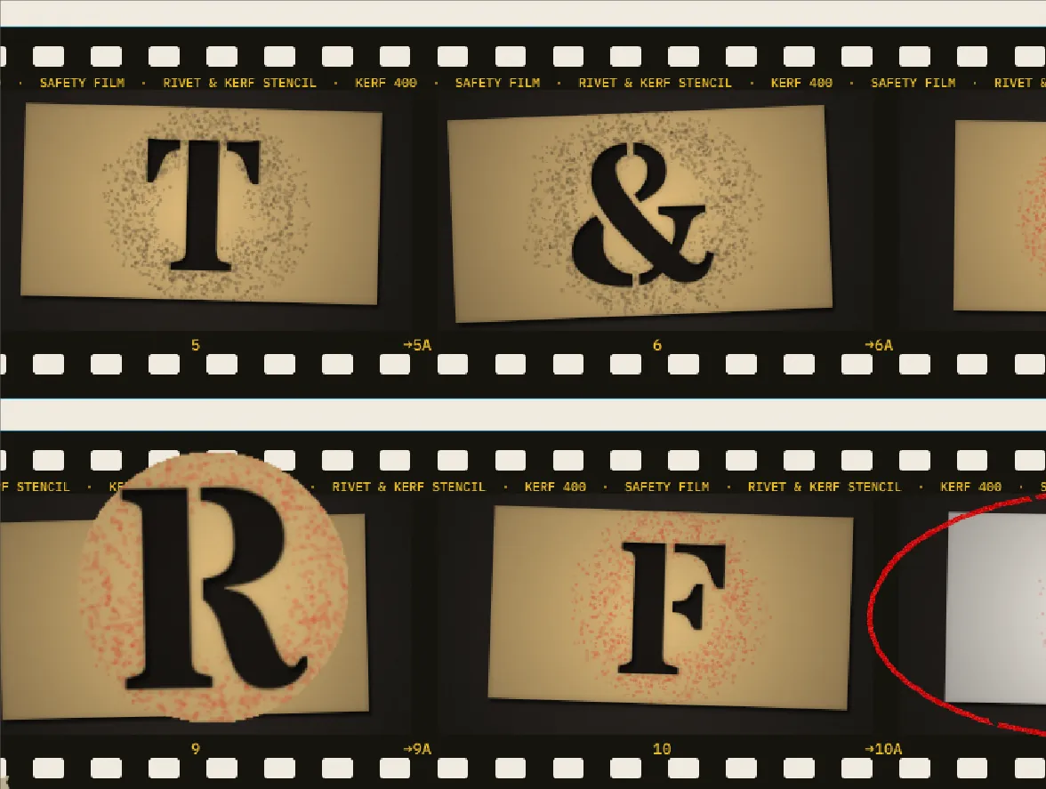
Refresh the loupe
Copy Merged takes a snapshot, so the loupe still shows the old, lighter holes. Rebuild just the view:
- Expand
Loupeand hideLoupe Ring,Loupe GlassandLoupe Viewwith their eye icons. - Draw the same 140 px circle over frame 9's R and choose Edit → Copy Merged.
- Select
Loupe Viewand paste. Delete the oldLoupe Viewand give the new layer its name. - Scale the new view to 150% as before, then nudge it to the loupe's new spot, up and to the right of the R.
- Show the glass and rim again.
- Expand
-
Mark it up with grease pencil
Expand
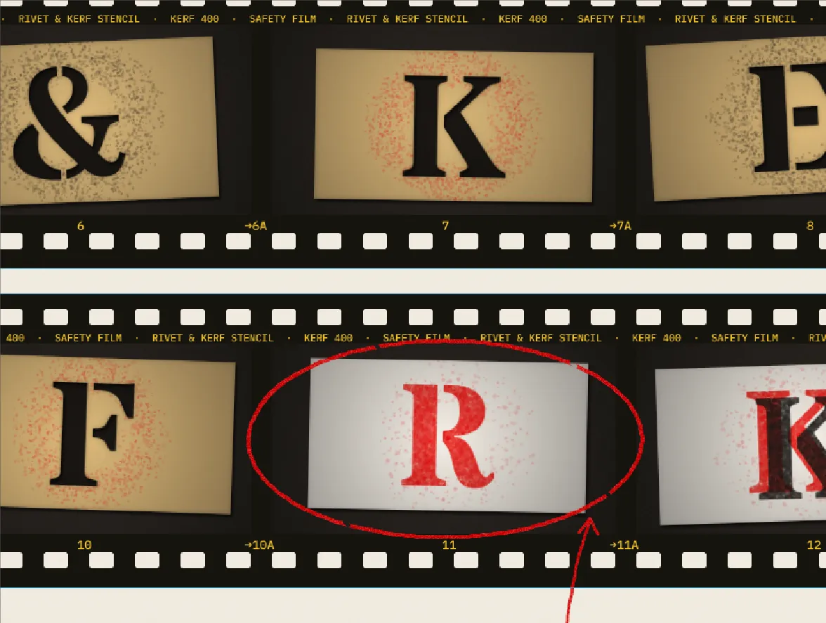
Annotationsand selectGrease Pencil. Pick the Brush at Size5, Hardness75, colour .- Draw one loop around frame 11, overlapping where it starts. Try to keep the bottom between the frame and its number so you don't cross out the 11. The top can brush the edge print, as a hurried pencil would.
- At Size
4, draw an arrow from the note up to the circle's lower-right edge, with two short strokes for the head. - Run Add Noise at
60(Mono) on the layer to break up the colour like wax. - Dab a size
4Eraser at a few points to make skips. - Set the layer to
92%opacity.
-
Print the 07 in a deeper red
With the grease pencil on, the bright
07competes with it for attention. Select the07layer and add a Color Overlay in , a deeper printed vermilion. An effect is quicker than editing the text colour, because you can toggle it on and off to compare the two reds, and the type stays live.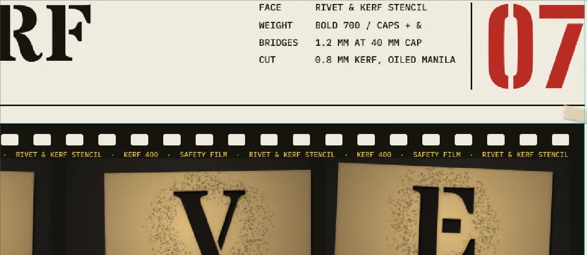
-
Check the spacing and move the header
Finally, check the vertical rhythm. The gap from the header rule to the first strip should match the 25 px between strips, but right now it's 33 px. Select the
Headergroup and drag the wordmark down with the Move tool: all the type and both rules move as one. Use the arrow keys to settle it exactly 8 px lower than where it started.Save the project with File → Save Project and export with File → Quick Export PNG.